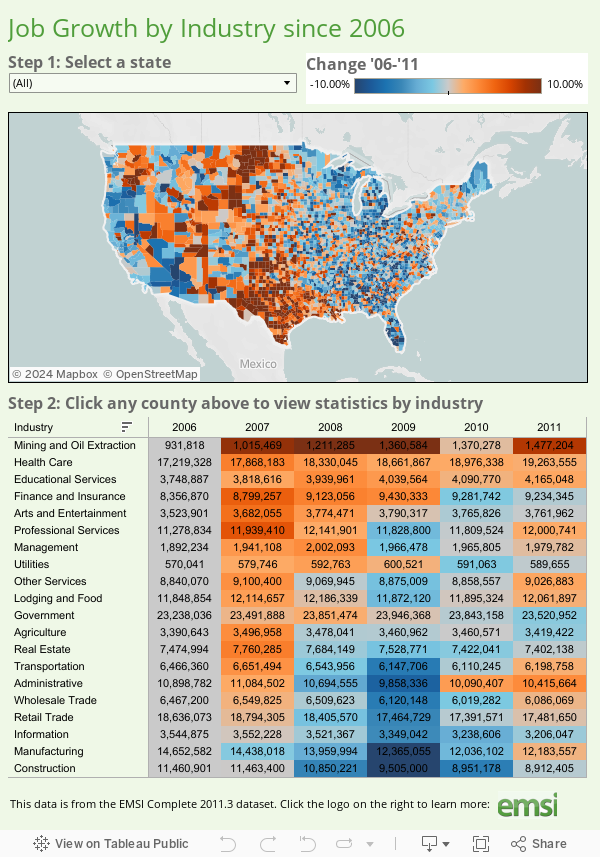
The fully interactive map below indicates job growth and decline for all US counties from 2006 to 2011. These show up as hot or cold spots; red for growth, blue for decline. You can select a state to zoom in on and find a county that way, or simply click on a county to drill in. Once you’ve chosen a county, the table under the map will show you job numbers by industry category.
The data for this graphic comes from EMSI’s Complete 2011.3 dataset, based on data from the Bureau of Labor Statistics and many other sources. Many thanks to Tableau for putting this together. If you have questions or comments about the graphic or the data behind it, please email EMSI’s Josh Stevenson.
Comments
15 responses to “Interactive Graphic: Job Growth by Sector for all Counties in the Nation”
Texas is on fire! Yuk yuk.
What? Too soon?
Hello,I love reading through your blog, I wanted to leave a little com
Thank you, Josh, for posting this interactive graphic. I work with the Campaign for Free Enterprise, a project of the U.S. Chamber of Commerce. We believe that in a free enterprise system, government cannot hold back small businesses and entrepreneurs from making economic choices that will create jobs and stimulate American markets. Our political leaders need to consider policies that encourage growth and innovation. Recently, Chamber President and CEO Tom Donohue sent an open letter to Congress and the president outlining the Chamber’s plan to create jobs. Part of this strategy includes expanding trade and global commerce. For example, if we could finally pass the three pending free trade agreements with South Korea, Colombia, and Panama, the United States could create 380,000 American jobs. While this graphic offers us some hope, it also illustrates how much farther we have to go in order to get the economy back on track. I will be sure to share your article with our fan base.
-Hilary,
www. freeenterprise .com
www. facebook. com/AmericanFreeEnterprise
This can be true if the drive to the park and ride lot is short and your destination is within walking distance of a station. However, it is apparently not true in Austin.
Photo Warping
Useful information shared. I am very happy to read this article.
Thank you for map.
visit to my site , collaboration software
Very efficiently written information. It will be priceless to anybody who uses it, together with myself. Sustain the good work for positive. I will try extra posts. Thanks a lot. Keep posting.
Portable Trade Show Displays
I found the above information is quite useful and it delivers several specific details about how job structure is increases in the recent year; this graphical image shows that how job situations are being categorized that gives a better and exact information about the current job condition of the country.
pictures of artificial satellites
The fully interactive One Piece map below indicates job growth and decline for all US counties from 2006 to 2011. These show up as hot or cold spots; red for growth, blue for decline. You can select a state to zoom in on read Skip Beat manga and find a county that way, or simply click on a county to drill in. Once you’ve chosen a county, the table under the map will show you job numbers by industry category.
The data for this graphic comes from EMSI’s Complete 2011.3 dataset, based on data from the Bureau of Labor Statistics
The data for this graphic comes from EMSI’s Complete 2011.3 dataset, based on data from the Bureau of Labor Statistics and many other sources. Many thanks to Tableau for putting this together. If you have questions or comments about the graphic or the data behind it, please email EMSI’s Josh Stevenson.
SEO Services Company
The total article is all about the compositions and equipments going to be use or using now in all the plastic production of the company with various advantages and much more qualities in them.
Dental Training Schools
Finally an article that is not the same thing we hear over and over again. I appreciate your thought and insight into this subject matter.
mehr info
We never thought it is such a problem, but finally we have found a nice working Paper Moisture Meter. Now everything works smoothly, our business is growing and clients are very much satisfied. Thank you!
Hi all, let me share my story with you. Taking payments online from the website has become a first priority goal for my wife and I.
We needed a safe and trustworthy company that would help our business grow and prosper.
For that purpose we decided to cooperate with Online Payment Processing Thank you guys!
The actual totally interactive map down below shows job growth as well as diminish for many areas inside the contiguous ALL OF US from 2006 to 2011. These kinds of arrive as very hot or perhaps wintry spots; reddish colored with regard to growth, azure with regard to diminish. It is possible to pick a express to zoom lens inside about and locate any local that way, or just click on any local to drill inside. MEDICAL EXAMS
It will be priceless to anybody who uses it, together with myself. Sustain the good work for positive. I will try extra posts. Thanks a lot. Keep posting.SEO Packages