When I was back in Chicago over Labor Day, I had to check out the “big three” new public space projects there: the Riverwalk, Maggie Daley Park, and the 606 Trail. The Riverwalk is a spectacular project I already wrote about. Maggie Daley Park, a new playground just across Columbus Dr. from Millennium Park’s Frank Gehry designed band shell, has been controversial and got mixed reviews. But I really liked it. More importantly, kids seem to love it. The place was jammed, and it appeared to be mostly locals. My cousin tells me her young daughter can’t get enough of the place. I’m not doing a post on this, but it looks like another big win.
The 606 Trail, a 2.7 mile biking and walking trail built on the embankment of an abandoned rail line, is a different story, however.
The problem with the 606 is not that it’s bad. In fact, it’s a nice, eminently serviceable rail trail. I won’t do a full writeup since Edward Keegan had a good review in Crain’s in which he asks, “Is that all there is?” that I think gets it basically right. Numerous other reviews are also available.
What I will do is highlight three areas that I think contribute to Keegan being underwhelmed: inflated expectations, financing problems, and an odd lack of attention to design detail.
Inflated Expectations
The fact that the 606 is an elevated trail on an abandoned rail line creates an almost inevitable comparison to New York’s High Line. The city did nothing to downplay those comparisons, and in fact suggested Chicago’s trail would actually be considered superior. For example, in national urbanist web site Next City, Deputy Mayor Steve Koch said, “A lot of people are familiar with the High Line — this is a concept far beyond that truly transformative project.” Frances Whitehead, lead artist for the project, told WBEZ regarding the High Line, “I think we’re gonna smoke them.”
It’s very clear the city wanted this to be considered a project worthy of national, not just local attention. Back to Koch, he said, “Someone will call you up and say, ‘I want to see the city’ Thisis where you’ll go; this is the way you’ll do it. And I think people are going to come from all over the globe.”
The very name speaks to the ambition level. Originally it was known as the Bloomingdale Trail, a name that technically still exists but which has been replaced for most purposes by “the 606.” The new name was taken from the first three digits of zip codes in the city of Chicago. Thus by using 606, the name itself suggests a project of citywide, not neighborhood, significance. The city also pushed for national media – and got it.
The problem is that the 606 is not even remotely another High Line, nor a project of citywide significance, nor a bona fide tourist attraction for the masses. It’s a neighborhood serving rail-trail that is elevated above the streets with some nicer features like lighting that you don’t see often. Like many other rail trails around the country, I expect it to have a significant positive development affect in the neighborhood, as well as being a great recreational amenity. All great things – if the trail had been sold that way originally.
To be fair, some like the Trust for Public Land, which was involved in the project design, were more realistic. Their CEO Will Rogers told Next City, “The High Line really reshaped the whole Meatpacking District. The Bloomingdale is going to provide parks and green space for neighborhoods that desperately need it, and bicycle access for people going downtown. It’s a different kind of investment.” But this isn’t the message that won out in shaping perceptions. The city would have been better off setting expectations much differently.
Insufficient Funds
The 606 Trail was primarily paid for using federal CMAQ transportation funds. According to DNA Chicago, the total price of the 606 is $95 million, with $50 million in CMAQ funds, $20 million privately raised, $5 million from the city, and $20 million to fill (for what purposes I am not sure, though see below).
The use of a CMAQ funding had key implications. One is that it more or less required the project to be primarily a bicycle trail. The entire edifice of obnoxious federal transport regs are in play here. Two is that it made this a CDOT project, not a Parks District one (though I believe the Parks District is now in charge of it). I believe many of the things that contribute to Keegan’s feelings come from the funding strings and a budget that was too low. In fact, this project to me brought back echoes of the CTA’s Brown Line expansion project in the way that various parts of it give off the vibe of being value engineered.
One of the things that got whacked in the Brown Line project, for example, was paint. Except for a handful of places such as over Armitage Ave, metal on the project was simply left in a raw galvanized state. I previously noted the austere results of that project give off an homage to prison yard feel. The same look is present on the 606. Consider these photos:
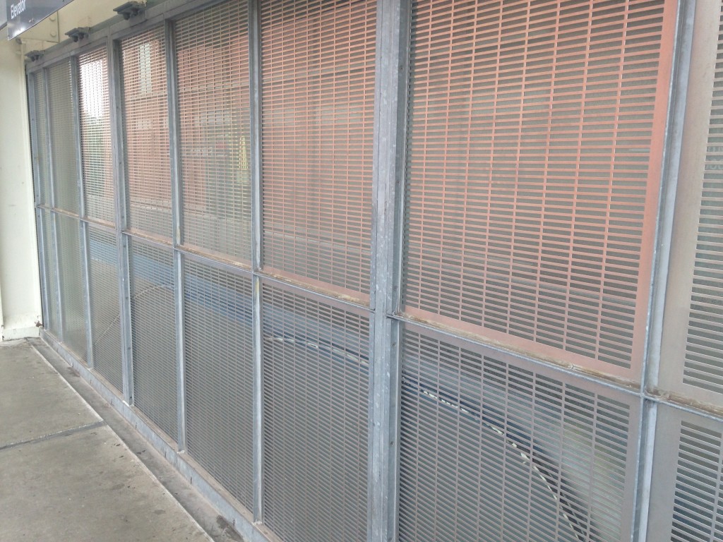
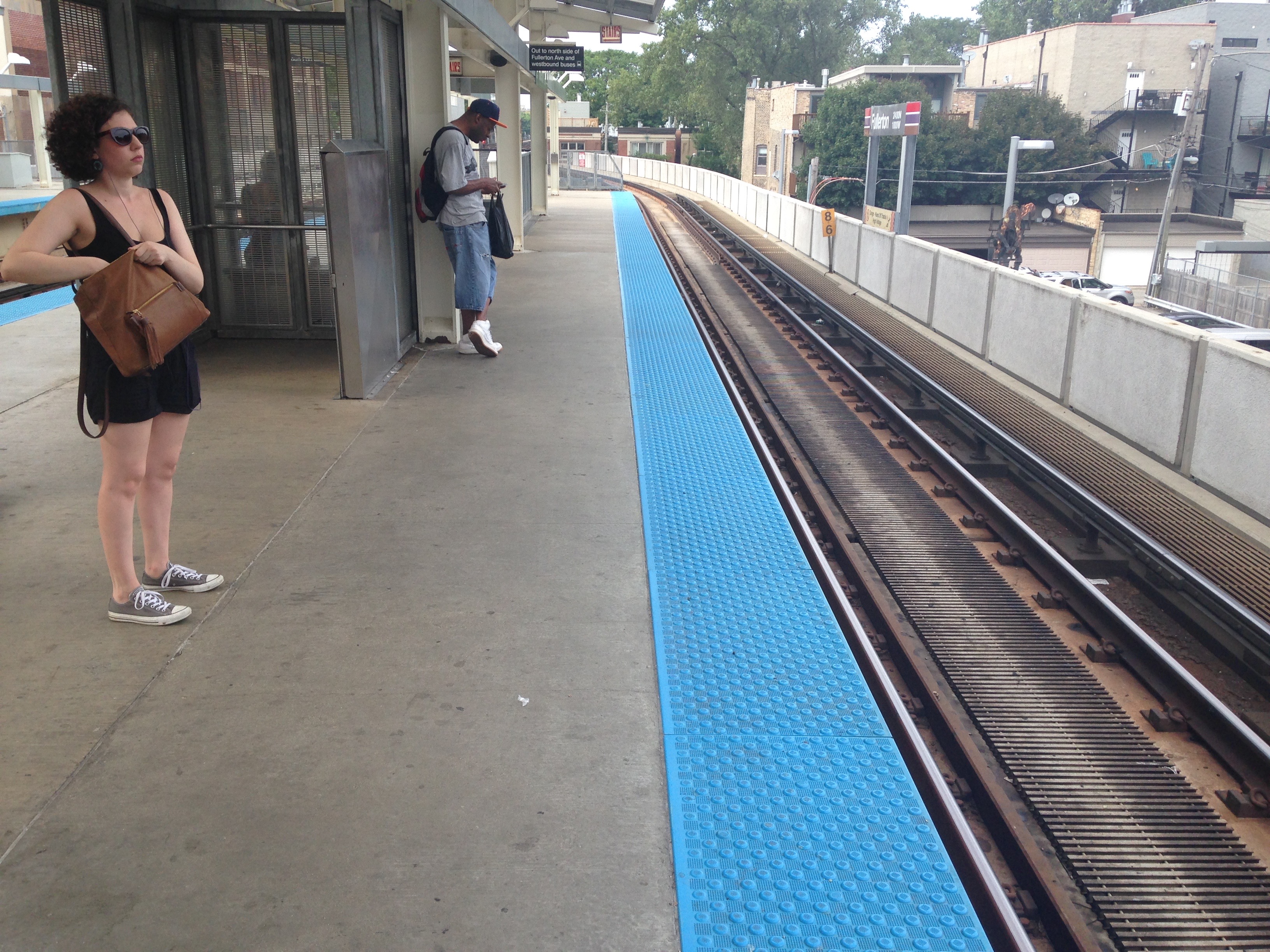
Mesh galvanized metal railing at the CTA Fullerton station.
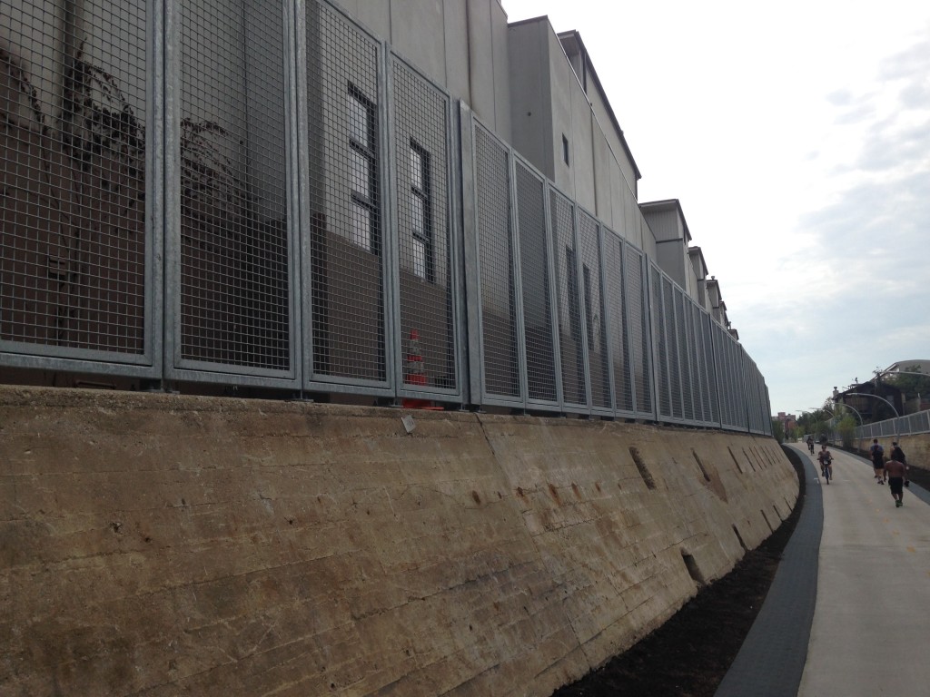
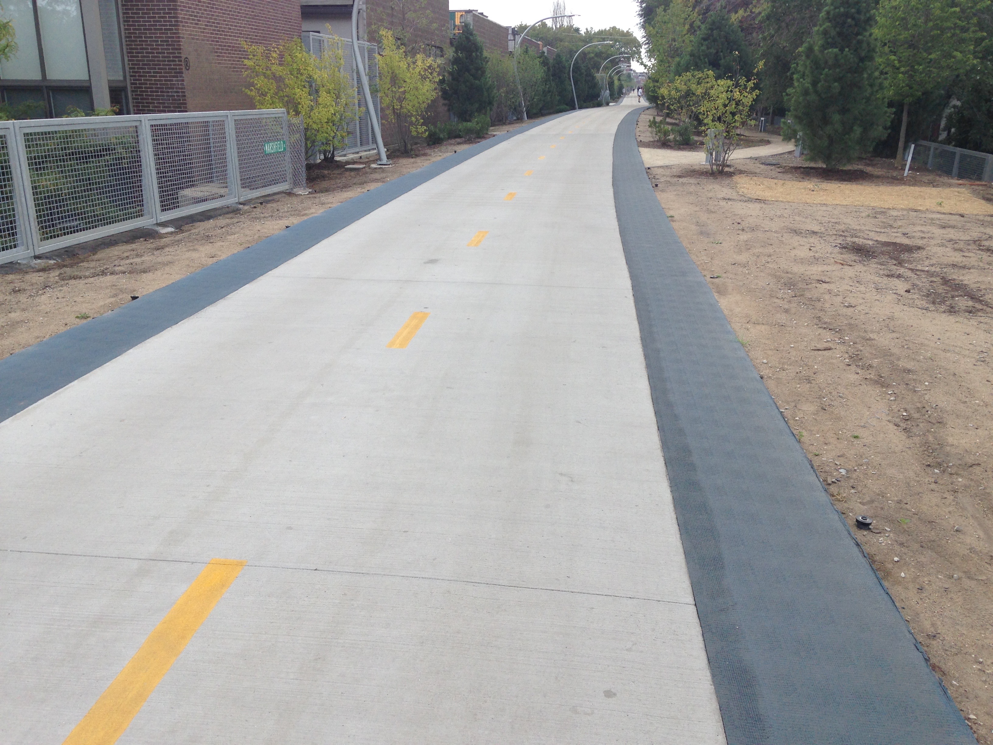
Mesh galvanized railings along the 606.
There’s nothing wrong with using an industrial motif, which is very appropriate in Chicago. And obviously security for adjacent property owners is important. It’s also possible that these had to be over-engineered to meet DOT/federal standards, much like the Brown Line station railings for passengers that could stop a Mack truck. The designers may well have felt these were the best choices. But my gut tells me that, like with the Brown Line, this may have been a money issue.
A lot of people have noted the fact that the landscaping has not yet been fully planted or grown to maturity as a reason for the trail’s feel. That surely plays a role. But the preponderance of galvanized metal through much of it plays a big role in giving the 606 an austere feel.
This also demonstrates how the city’s financial problems have practical consequences. Because the city’s budget is in such bad shape, it had to turn to CMAQ, which imposed strings you’d rather not have in an ideal world. And you may not have the cash to do it right. (The Riverwalk doesn’t suffer from this, possibly because its commercial spaces generate revenues to bond against).
Design Oddities
The 606 also has some odd design misses. For example, here is what the Trail physically looks like. It’s a concrete biking path with a soft blue rubberized running path on either side.
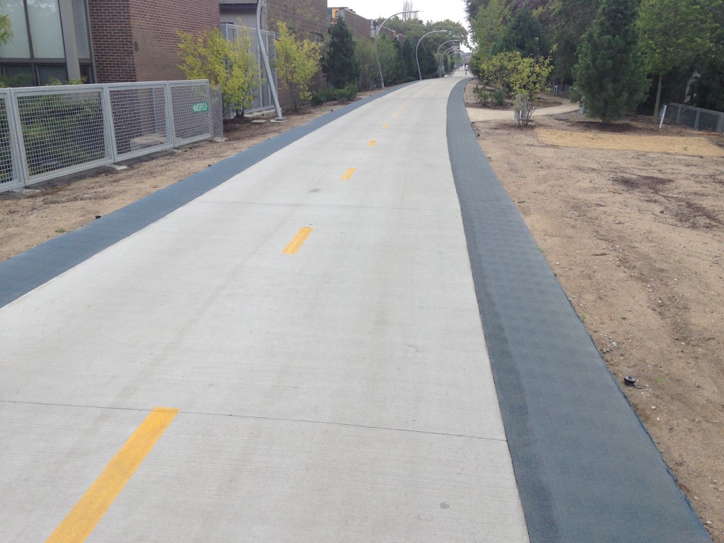
Let’s see, where have I seen this design pattern before?
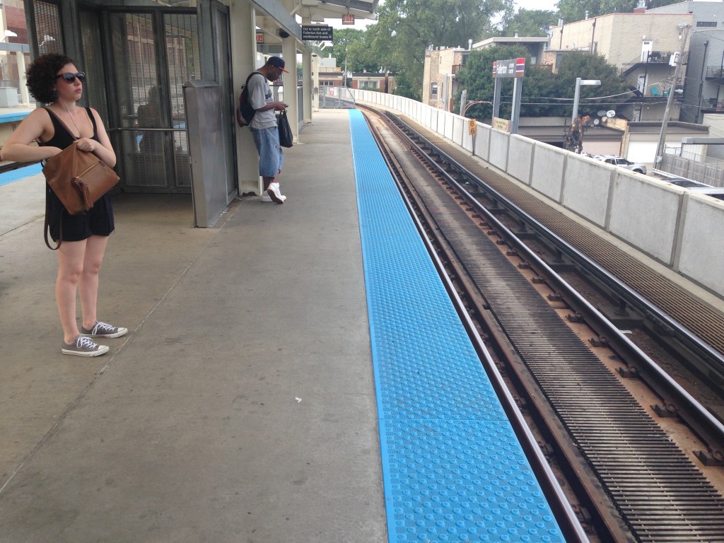
Fullerton L platform.
The CTA uses a similar blue shoulder area on its platforms. But in its case, the design pattern is used to indicate the edge of the platform and thus an unsafe area to stand. You are supposed to stand behind the blue line. Using a similar width blue area, even if a different shade, for a jogging path on the 606 violates a local design affordance, like putting a handle on a door and labeling it “Push.”
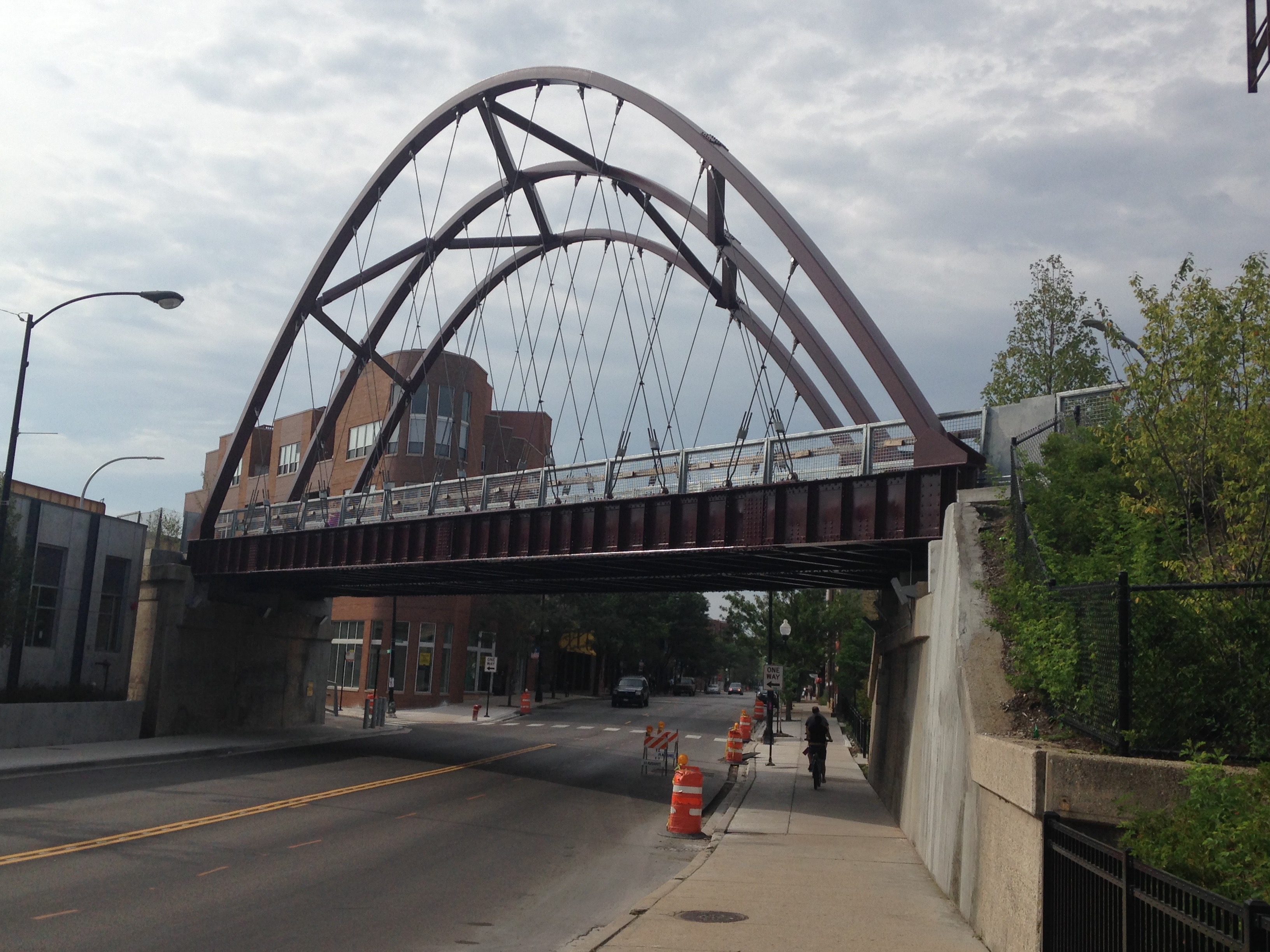
Then there’s this arch bridge:
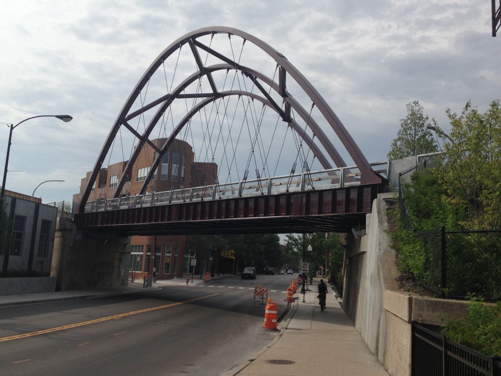
The 606 Trail over Milwaukee Ave.
This design is dimensionally awkward, something Keegan points out too. Given that this is a rail trail, it’s also notable that the designers chose a steel arch pattern that is not idiomatic of rail bridge design, certainly not in Chicago anyway. This also makes me again wonder about the role of CDOT in the project. This arch structure is the same pattern they used for the Halsted St. bridge over the north branch of the Chicago River that Blair Kamin similarly labeled, “less than graceful.” (The Damen Ave arch bridge works much better, probably because the span is longer and higher, lending itself to more elegant design proportions).
The name “606” itself is also a bit off. Inside Chicago the reference may be obvious, but outside of its this name is likely to be parsed as an area code, particularly with the “0” middle digit from the original North American Numbering Plan. Today you frequently see people sporting their city’s main area code on shirts and such as a bit of local pride, particularly as area codes have shrunk down to city scale size in many places. The 606 area code is Appalachian Kentucky, however, not Chicago. Few people without a connection to Chicago will know that its zip codes start with 606.
These aren’t huge items, but cumulatively they add up. The little things separate great design from good, and the 606 missed some opportunities.
On the whole, this trail will be a great amenity for the neighborhoods it passes through, and also be legitimately functional for transportation given its elevated nature and the transportation lines it connects to such as Metra’s Clybourn station. It was fairly well patronized when I was on it, but with no sense of crowding. And this was on a nice Labor Day afternoon, suggesting that that chaos and safety issues of the lakefront path won’t be repeated here.
If only it had originally been sold for what it was instead of a High Line beater, had raised that last $20 million (plus a bit more, perhaps), and had a little more attention to detail in some design elements, the 606 would be probably be seen as something that significantly exceeded expectations instead of something that did not live up to the hype.
Aaron M. Renn is a senior fellow at the Manhattan Institute and a Contributing Editor at City Journal. He writes at The Urbanophile, where this piece originally appeared.

