Author: Daniel Hertz

  • Urban Residents Aren’t Abandoning Buses; Buses Are Abandoning Them

    “Pity the poor city bus,” writes Jacob Anbinder in an interesting essay at The Century Foundation’s website. Anbinder brings some of his own data to a finding that’s been bouncing around the web for a while: that even as American subways and light rail systems experience a renaissance across the country, bus ridership has been falling nationally since the start of the Great Recession.

    But it’s not buses that are being abandoned. It’s bus riders.

    The drop in bus ridership over the last several years has been mirrored by a decline in bus service, even as transit agencies have managed to resume increasing frequency and hours on all types of rail lines – heavy, light, and commuter.* (In this post, “service” means vehicle revenue miles – literally, multiplying a city’s bus or rail vehicles by the number of miles they run on their routes.) After a post-recession low in 2011, by 2013 rail service had increased by over 4% nationally in urban areas of at least one million people. Light rail in particular has continued its decade-plus boom, with a service increase of more than 12% in just two years. By contrast, bus service – which already took a heavier hit in the first years of the recession – was cut an additional 5.8%.


    And it turns out that when you disaggregate the national data by urban area, there’s a very tight relationship between places that cut bus service between 2000 and 2013 and those that saw the largest drops in ridership. If you live in a city where bus service has been increased, it’s likely that your city has actually grown its bus ridership, despite the national trends. In other words, the problem doesn’t seem to be that bus riders are deciding they’d rather just walk, bike, or take their city’s new light rail line. It’s that too many cities are cutting bus service to the point that people are giving up on it.


    Admittedly, this is a crude way to demonstrate a very complicated relationship. To rigorously test the impact of bus service on ridership, you’d want to take into account all sorts of other things: the presence of other transit services; population density; gas prices; demographics; and so on.

    Fortunately, we don’t have to do that, because researchers at San Jose State University’s Mineta Transportation Institute just did it for us. And they found that even if you control for those other factors, service levels are still the number one predictor of bus ridership.

    Still, I can imagine two big objections to the idea that cuts to bus operations are behind ridership declines. First, a lot of cities have opened new rail lines since 2000 – many of which, if not most, replaced heavily-trafficked bus routes. In those cases, cities are adding rail service and reducing bus service, but it obviously wouldn’t be right to say that those bus riders are being abandoned.

    But while that has surely happened in some places, it just doesn’t match the overall data. Rail service, including new lines, has been booming since long before the recession – but up until about 2009, bus service was growing, too, or at least holding steady. If rail expansions were driving bus cuts, you’d expect to see those cuts all the way back to the beginning of the data. But you don’t. Instead, cuts to bus routes appear right as transit funding was hit hard by the recession.

    Second, you might argue that service and ridership are linked, but the other way around: as ridership declines, agencies cut back on hours and frequency to match demand. Teasing out which way the causation runs would be difficult – and the answer would almost certainly include at least some examples in both directions. One quick-and-dirty way to get an idea, though, is to compare ridership changes from one year to service changes in the next year. If agencies cut service because of earlier ridership declines, then you’d expect to see that places with larger drops in ridership in “Year One” tend to be the places with larger cuts to service in “Year Two.”


    But, again, they don’t. In fact, just 3% of the variation in service cuts is explained by ridership changes from the year before.

    So while that’s hardly ironclad – and I look forward to further research that sheds more light on this problem – it does appear that a major part of the divergence in bus and rail ridership is a result of a divergence in bus and rail service: since the recession, transit agencies have cut bus service year after year, while returning service to rail relatively quickly.

    Why did they do that? I don’t know. But I can speculate that it has something to do with the fact that bus transit supporters are not always the same kinds of people as rail transit supporters. Even though more people take buses than trains in nearly every metropolitan area in the country, train riders, on average, tend to bewealthier and whiter. Not only that, but many civic and business leaders who don’t use transit at all are heavily invested in rail service as an economic development catalyst for central city neighborhoods. In other words, rail tends to have a more politically powerful constituency behind it than buses.

    As a result, when the recession blew a hole in transit budgets around the country, it may have been politically easier for local governments to fill those holes by sustaining cuts to bus lines, rather than rail.

    To be clear, the problem here has nothing to do with whether transit agencies are running more services that are rubber-on-asphalt or steel-on-tracks. As Jarrett Walker has eloquently argued, the technology used by a particular line matters far less than the quality of service: how often it runs, how quickly, for how much of the day.

    But there are at least two problems here. First, because of the spread-out nature of even relatively dense American cities, it will be a very, very long time before rail transit can connect truly large numbers of people to large numbers of jobs and amenities. When Minneapolis opened the 12-mile Blue Line light rail in 2004, for example, it was a major step forward for Twin Cities transit – but still, only 2% of the region’s population lived close enough to walk to one of the stations. For everyone else, transit still meant taking the bus, even if they were taking the bus to a train station.

    And even in places with well-developed rail networks, those systems are usually oriented to serve downtown commuters. Especially in outer neighborhoods, crosstown trips in places like Chicago, Boston, or DC are heavily reliant on buses. Abandoning buses means abandoning those trips, and the people who depend on them.


    Boston's T reaches both Dorchester and Jamaica Plain, but a bus is by far the easiest way to get from one to the other on transit. Credit: Google Maps
    Boston’s T reaches both Dorchester and Jamaica Plain, but a bus is by far the easiest way to get from one to the other on transit. Credit: Google Maps


    Second, there are serious equity issues with shifting resources from bus to rail – again, not because of anything inherent to those technologies, but simply because of who happens to use them in modern American cities. In most cases, shifting funding from bus to rail means shifting funding from services disproportionately used by lower-income people to ones with with a stronger middle- and upper-middle-class constituency. And while transit ought to be viewed as much more than just a service for the poor, we can’t ignore the equity impacts of transit policy.

    In light of all this, we have to stop talking about America’s bus woes as a ridership problem. All the evidence suggests that when service is strong, and buses are a reliable way to get to work, school, or the grocery store, people will take them. Instead, the problem is that fewer and fewer people have access to that kind of strong bus line. If we care about ridership, we need to restore and enhance the kind of transit services that people can rely on.

    * “Heavy rail” includes traditional subways and elevated trains found in cities like New York, Washington, and Chicago. “Light rail” includes many newer systems, with smaller train sets that are sometimes designed to run on streets as well as in their own right of way. Rail lines in Seattle, the Twin Cities, and Dallas are typical of light rail. “Commuter rail” services generally reach from central business districts far out into the suburbs, and are meant almost exclusively for peak-hour workers.

    This piece was first published by City Observatory on its CityCommentary blog.

    Daniel Kay Hertz is completing his graduate studies at the University of Chicago Harris School of Public Policy. He has written about urban demographics, neighborhood change, housing policy, and public transit for the Washington Post, CityLab, Next City, and other publications, as well as on his personal blog.

    Image from BigStockPhoto.com: A metro bus in Madison, Wisconsin.
  • How Segregated Is New York City?

    The online reaction to the reports on racial segregation in New York state’s public schools reminded me, yet again, that most people think of New York as an integrated city, and are surprised or incredulous when that impression is contradicted.

    This is somewhat jarring, since virtually every attempt to actually measure racial segregation suggests that New York is one of the most segregated cities in the country. This University of Michigan analysis of 2010 Census data, for example, suggests that New York is the second-most-segregated metropolitan area in the U.S., exceeded only by Milwaukee, and that about 78% of white and black people would have to move in order to achieve perfect integration. (Chicago’s corresponding number is just over 76%, good enough for third place.)

    Why is this so surprising? One obvious reason, I think, is that most people’s conception of New York is limited to about 1/2 of Manhattan and maybe 1/6 of Brooklyn, areas that are among the largest job and tourist centers in the world. As a result, they attract people of all different ethnic backgrounds, especially during the day, even if the people who actually live in those areas tend to be monochromatic. Imagine, in other words, trying to judge racial segregation in Chicago by walking around the Loop and adjacent areas: you would probably conclude that you were in a pretty integrated city.

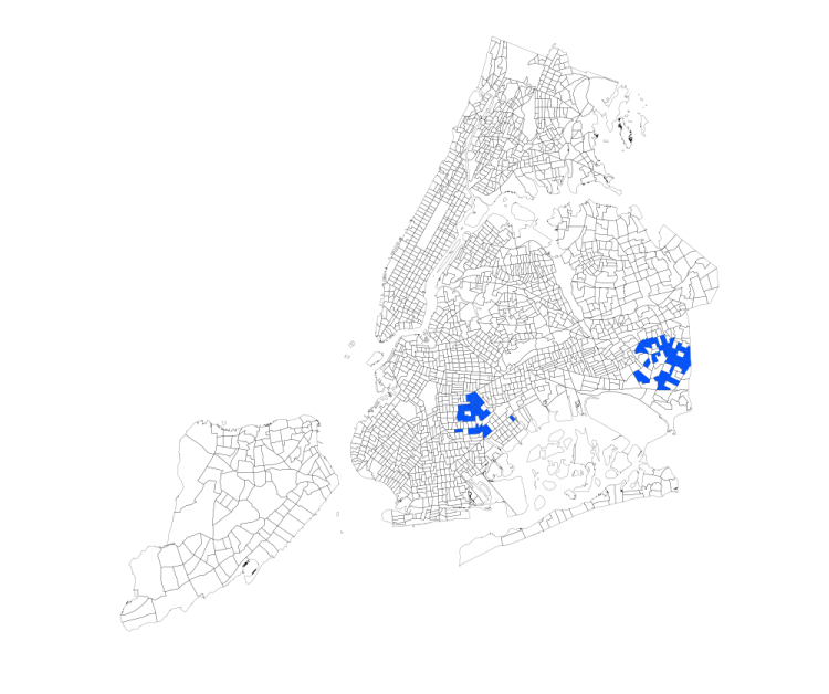
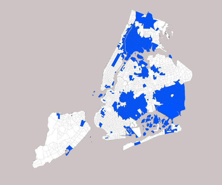
    But it goes beyond that, I think. Segregation in New York doesn’t look like segregation in Chicago, or a lot of smaller Rust Belt cities. For one, there just aren’t very many monolithically black neighborhoods left in New York. Here, for example, I’ve highlighted every neighborhood that’s at least 90% African American (see note on method at the bottom of this piece):


    NYB90

    Were we to do this in Chicago, half the South and West Sides would be lit up. But in New York, black neighborhoods have become significantly mixed, in particular with people of Hispanic descent. This is a phenomenon Chicagoans are used to in formerly all-white communities – places like Jefferson Park or Bridgeport, which as recently as 1980 were overwhelmingly white, now have very large Latino and Asian populations – but in New York, it’s happened in both white and black neighborhoods.

    That said, white folks in New York have still on the whole declined to move to black areas, except for some nibbling along the edges in Harlem and central Brooklyn. That means that instead of measuring segregation the way we might in Chicago – by looking for very high concentrations of a single ethnic group – it makes more sense to look for the absence of either white or black people.

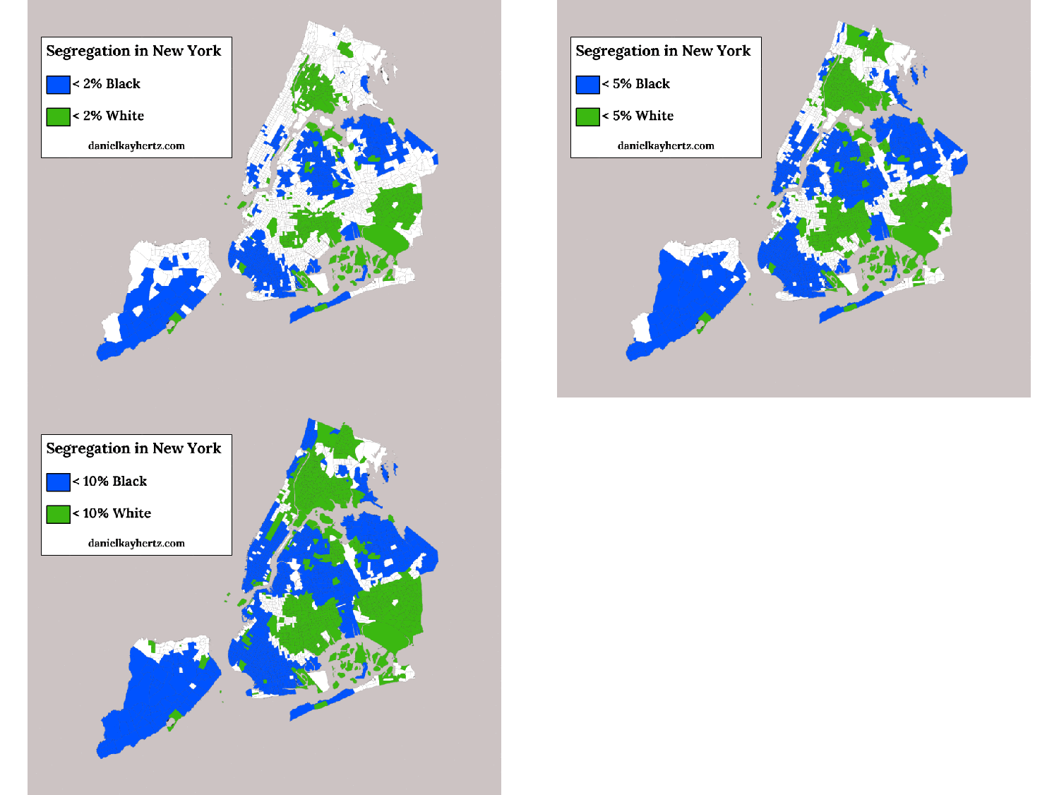
    Here, then, I’ve highlighted all the places where white people make up less than 10% of the population:


    NYW10

    It’s a lot. And, correspondingly, here are all the places where black people make up less than 10% of the population:


    NYB10

    It’s also a lot. And if we put the two maps together, we see that these two categories cover the overwhelming majority of NYC:


    NY10

    The same pattern holds pretty well if we lower the threshold to no more than 5% white or black:


    NY5

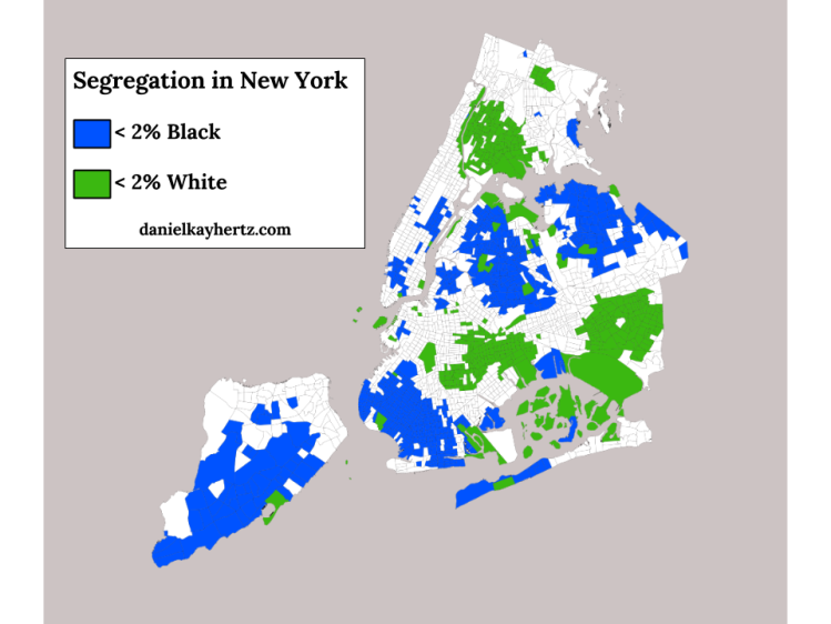
    And there are even a significant number of areas that are truly hypersegregated, with fewer than 2% of residents being either white or black:


    NY2

    Because I now love GIFs, here’s a summary GIF.


    NYSeg

    What does all this tell us? For one, it confirms graphically what the Census numbers suggested, which is that the median black New Yorker lives in a neighborhood with very few white people, and vice versa.

    But it also suggests a racial landscape that looks different from that of Chicago, and lots of other American cities, in important ways. In particular, where Chicago has a relatively simple racial geography – white neighborhoods at various levels of integration with Hispanics and Asians to the north and northwest, black and Hispanic neighborhoods to the south and west, with only a few small islands like Hyde Park and Bridgeport that break the pattern – New York’s segregated neighborhoods form a more complex patchwork across the city. That means that while a North Sider in Chicago might go years without having to even pass through a black neighborhood, lots of white New Yorkers have to get through the non-white parts of Brooklyn or the Bronx to reach job and entertainment districts in Manhattan or northern Brooklyn.

    I imagine that structural-geographic fact, combined with New York’s relatively high level of black-Hispanic integration, goes a long way to explaining my anecdotal experience that white New Yorkers tend to be less ignorant and scared of their city’s non-white neighborhoods than white Chicagoans are of Chicago’s. (There’s some interesting research that suggests white people tend to be more sympathetic to brown people, and their neighborhoods, than black people and theirs.) There’s also, of course, the fact that Chicago’s segregated non-white neighborhoods tend to have much higher violent crime rates, and much more modest business districts, than New York’s, although that’s likely both an effect and cause of their relative isolation.

    All of this is another reason that I’m kind of excited about the growing entertainment and shopping district on 53rd St. in Hyde Park, since the more that the South Side has “neighborhood downtown” strips that draw people from across the city, the more likely North Siders and suburbanites are to travel through the black and Latino neighborhoods that surround them, observe that many of them are actually quite nice, become less committed to shunning them, and thus contribute less to the social and economic dynamics that have created the institution of the ghetto, and the poor job prospects, failing schools, and high crime rates that accompany it.

    In conclusion: New York is super segregated, but the numbers aren’t everything.

    Also, let me have another Talk To Me Like I’m Stupid moment: suggestions for books about the racial history of New York? What’s the equivalent of Making the Second Ghetto or Family Properties? I’ve already read Caro’s Moses book.

    Note:  This piece focuses on white-black segregation because that, for various social and historical reasons, has been by far the most significant geographic separation in American cities, certainly in the Midwest and Northeast. But by far the second most significant separation – white-Latino segregation – is also very extreme in New York. The same Census analysis that found NYC was the second-most-segregated metro area in terms of white and black people found that it was the third-most-segregated metro area in terms of white and Latino people. That’s obviously not the end of the story either, though. If you know about or are curious about some other aspect of segregation, leave a comment.

    Daniel Hertz is a masters student at the Harris School of Public Policy at the University of Chicago. This post originally appeared in City Notes on April 14, 2014.

    Photo by Mike Lee

  • Brooklyn is Getting Poorer

    I’m trying to make more of an effort, whenever I write or talk about gentrification, to point out that the real issue is larger: that gentrification is only one aspect of income segregation – specifically, the part where the borders between rich and poor neighborhoods shift – and that the real problem is that we have such sharply defined rich and poor neighborhoods to begin with.

    I might also throw in that income segregation used to be much less severe.

    Anyway, one problem with our obsession with gentrification as the end-all of urban equity issues is that it discourages us from talking about other important things happening in our cities. In some instances, gentrification has become such a dominating narrative that it has completely erased broader trends that we really ought to be concerned about.

    Case in point: Brooklyn is getting poorer.

    Does that shock you? Were you under the impression that all of Brooklyn was in the process of becoming one giant pickle boutique? That would be forgivable, given that nearly every article filed from Brooklyn for a decade or so has been about gentrification. But no.

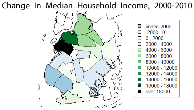
    I recently ran across a post from data-crunching blog extraordinaire Xenocrypt, which noted that from 1999 to 2011, median household income in Brooklyn fell from $42,852 to $42,752. That’s not a huge drop, obviously. The national median income fell from $56,000 to $50,000, so Brooklyn is actually catching up, sort of, to the country as a whole. But it still got poorer in absolute terms.

    Moreover, if you map (as Xenocrypt did) the borough’s neighborhoods by change in median income, you get a really striking picture:


    Credit: Xenocrypt.blogspot.com

    …which is that, indeed, a good three-fifths or so of Brooklyn is actually getting poorer. Have you read any articles about that? No, I will wager that you have not. Neither have I. I strongly suspect that is because they don’t exist – at least not in any outlet that might be considered mainstream.

    And what about housing prices?


    Brooklyn Gentrification Map: Increase, Decrease in Home Values 2004 vs. 2012
    Credit: http://www.citylimits.org/

    So in large parts of Brooklyn, real estate prices are falling.

    I have nothing particularly intelligent to say about this – these maps were news to me – except that it’s maybe the most dramatic example I’ve seen yet of just how limiting our fixation on gentrification is. I mean that both in a sort of journalistic sense, in that we’re being deprived of an accurate sense of what is actually going on in our cities, as well as from an advocate’s perspective: how can we claim to be working for fairer, more equitable, etc., cities, if we’re ignorant of their most basic economic and demographic changes?

    This post originally appeared in City Notes on May 3, 2014. Daniel Hertz is a masters student at the Harris School of Public Policy at the University of Chicago.

    Lead photo: “BK” by Theeditor93Own work. Licensed under CC BY-SA 3.0 via Wikimedia Commons.

  • Why Do We Care About Transportation Mode Share?

    The New York Times ran an op-ed piece that helpfully demonstrated the pitfalls of lifestyle arguments in favor of urbanism, namely that they are annoying to everyone but the people making the argument.

    The boys, like their father, are lean, strong and healthy. Their parents chose to live in New York, where their legs and public transit enable them to go from place to place efficiently, at low cost and with little stress (usually). They own a car but use it almost exclusively for vacations.

    “Green” commuting is a priority in my family. I use a bicycle for most shopping and errands in the neighborhood, and I just bought my grandsons new bicycles for their trips to and from soccer games, accompanied by their cycling father.

    These arguments – whether they’re about physical health, or “diverse” or “vibrant” or “creative” communities, or whatever else – are, at bottom, about telling people that they are lacking, and that in order to improve themselves they should become more like the author. In the 1970s, when city dwellers felt superior mainly because of their supposed cultural capital and were telling middle-class suburbanites to loosen up a little, that might have been obnoxious but harmless. In our current situation – when the city dwellers making these arguments are the economic elite (the author of this particular piece, Jane Brody, lives in gentrified brownstone Brooklyn, I believe) – it’s a lot more sinister. Brody talks about commutes as if their length and form were something that most people could freely choose, rather than something imposed upon them by their wages and the price of housing and form of development of their metropolitan area. She makes this a story about personal morality, rather than the constraints we choose to put on people through public policy.

    This is related, I think, to the study about mode share in U.S. cities that got passed around the urbanist blogosphere recently. In virtually every instance, the study was presented like a sports power ranking, with the winning cities being those with the least travel by car (“city of Chicago ranks sixth among large U.S. cities for percentage of people either biking, walking, or riding transit,” is a typical formulation of the lede).

    But why, exactly, do we care about mode share? The pettiest possible answer is that we doconceive of cars v. transit/biking as a sort of culture war, just like many committed drivers have alleged, and what percentage of people choose to drive or do something else is how we measure whether or not we are winning. This, clearly, is not a particularly edifying possibility. A better answer might be that we really do want everyone else to be more like us – to reap the benefits of non-car commuting, from being healthier (although, contra Brody, I spent my subway commute today scarfing down a pound of spaghetti) to polluting less – and this tells us how many people are enjoying those perks.

    That’s much more reasonable, but still problematic in that, like the Times piece, it strongly implies that the issue is individual choice, rather than the circumstances that constrain that choice. The people who write for places like Streetsblog know that circumstances matter, but for the casual reader, articles about mode share makes those issues a sort of specialists’ background.

    That’s too bad, because mode share does convey some important information about constraints. If we assume that, allowing for some cultural margin of error, most people will choose to get to work via whatever method they find most efficient and comfortable, then we can determine roughly what percentage of people in any given city have decent access to transit – access that’s at least in the same ballpark of convenience as driving – just by looking at what percentage of people actually use it. Obviously there are complications to this: since one major inconvenience of driving is cost, cities with high poverty rates may have mode shares that exaggerate their transit’s effectiveness, for example. And since transportation choice is basically zero-sum on an individual basis – that is, all that matters is the relative efficiency of each mode – you could get a lot of people on transit by making driving truly hellish, without providing decent service. (Although in the American context, I think there are vanishingly few places where that would be an issue.)

    Moreover, if we care about mode share as a proxy for service effectiveness, then beyond a certain point – say, a quarter, a third, whatever, of commuters – you’re kind of done. It doesn’t really matter. If New York City, with one of the most comprehensive transit systems in the world, can only get 50% of its commuters on buses and trains, then surely most of the distinction between it and, say, Asian cities with much higher transit mode shares isn’t the quality of their systems (although they may be of higher quality), but the increased misery of driving in ever-denser places. The issue stops being whether we can get from 40% to 45%, but whether subregions of the metropolitan area have strongly varying mode shares, suggesting that you can only get decent access to transit if you live in the right place. And, of course, that is in fact the case.

    But if what really matters is service levels and access – if what we’re trying to accomplish is giving everyone a level of service where transit is a viable option, for reasons outlined here– then why not just measure that directly? Why not have widely-disseminated statistics about the percentage of people in every metropolitan region who can walk to a transit stop? Or make a bigger deal about the number of people who can reach some given percentage of metro area jobs via transit in a reasonable time frame? I almost never see those numbers in urbanist conversations, and to the extent that I do, they’re sort of ghettoized into the “social justice” urbanist subculture.

    But these seem like relevant numbers for “mainstream” urbanists, too. In fact, they seem a lot better than mode share. Generalized public arguments in favor of transit projects are more likely to benefit from language that suggests they’ll provide options, rather than language that suggests the ultimate goal of the policy is to force people out of their cars. Because, in fact, that’s what public policy should be about: making transportation easier for more people, rather than moralizing about the perfectly legitimate choices that people make, given their circumstances.

    This post originally appeared in City Notes on November 11, 2013. Daniel Hertz is a masters student at the Harris School of Public Policy at the University of Chicago.

    Image from BigStockPhoto.com: A metro bus in Madison, Wisconsin.
  • Watch Chicago’s Middle Class Vanish Before Your Very Eyes

    Note: I owe both the concept for this measurement of income segregation and much of the actual data – all of it, except for 2012 – to Sean Reardon andKendra Bischoff, who wrote a series of wonderful papers on the subject and then were kind enough to send me a spreadsheet of their data from Chicago a while ago. The maps, however, are mine, as is all the data from 2012, and any mistakes in them or in the interpretation of the data is entirely my responsibility.

    I think one reason I’ve felt less than compelled by Chicagoland, CNN’s reasonably well-made documentary series, is that its tale-of-two-cities narrative is so worn, so often repeated, that it’s become a little dull. Not the actual fact of inequality – which only seems to cut deeper over time – but its retelling.

    In fact, I think the point has long passed at which simply repeating the story of Chicago’s stratification is equivalent to fighting it. For a lot of people, in my experience, it’s the opposite: an opportunity for distancing, for washing of hands. It’s a ritual in which we tell each other that this is the way it’s always been – The Gold Coast and the Slum was written about already well-entrenched institutions, after all, over three-quarters of a century ago – that these facts somehow seep out of the ground here, as much a part of the city as the lake, and that as a result there’s really nothing we can do about it.

    But this obscures much more than it clarifies. Inequality has always been a part of Chicago – as it has always been a part of the United States, and a part of humanity – but the forms it has taken, and the severity of those many forms, have changed in truly dramatic ways. Take, for example, today’s monolithic segregation of African Americans: at the turn of the last century, black Chicagoans were less segregated than Italians, and not because Italians were then hyper-segregated.

    Moreover, decisions made by people in the city have played, and continue to play, a huge role in determining what those changes look like. Had Elizabeth Wood received any serious support from white residents or their elected representatives – instead of meeting Klan-like violent resistance – the history of racial integration, economic integration, and public housing in this city would be very, very different. This isn’t to say that national and global factors aren’t important, since they obviously are. But neither do we lack responsibility.

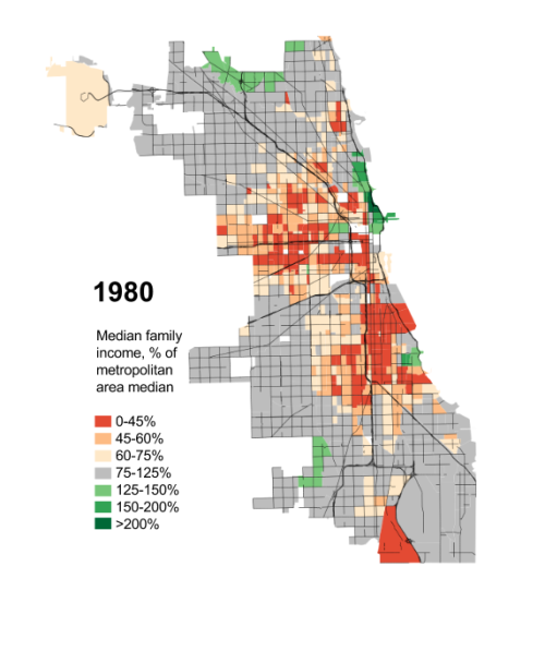
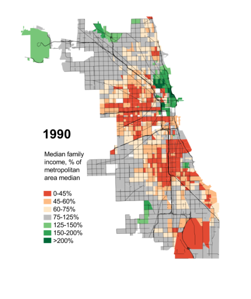
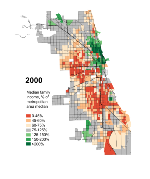
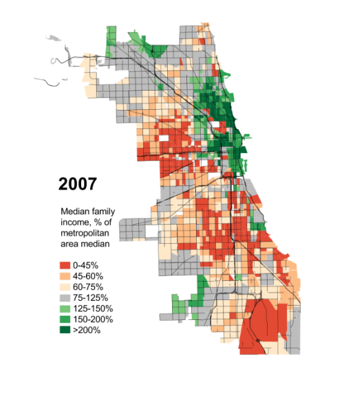
    Anyway, this is all by way of introducing the following maps: their goal is not merely to depress you (you’re welcome!), but to suggest just how dramatically the reality of Chicago’s “two cities” has changed over the last few generations, how non-eternal its present state is, and that a happier alternate reality isn’t just possible, but actually existed relatively recently.

    I feel relatively comfortable telling the story of how Chicago came to be so segregated by race; I’m much humbler about my ability to explain this, except inasmuch as the ever-widening ghetto of the affluent could not exist without, yes, radically exclusionary housing laws, and I will take that up separately in another post. In the meanwhile, I’ll take a page from Ta-Nehisi Coates and ask you all, if you have some background in this, to talk to me like I’m stupid: what does the literature say about growing economic segregation? Who and what should I be reading?

    One last piece: the obvious and immediate reaction to these maps is to see them as a direct consequence of rising income inequality. There is some truth to that, but the researchers from which much of this data came have already discovered that income segregation has actually risen faster than inequality. So that’s not the end of the story.

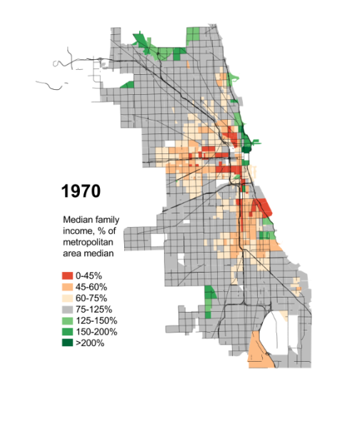
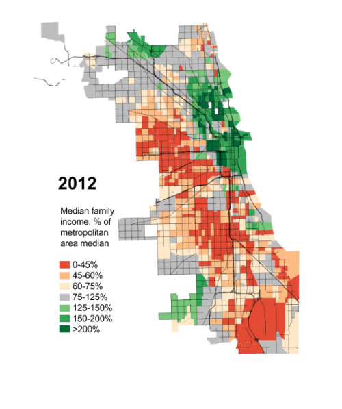
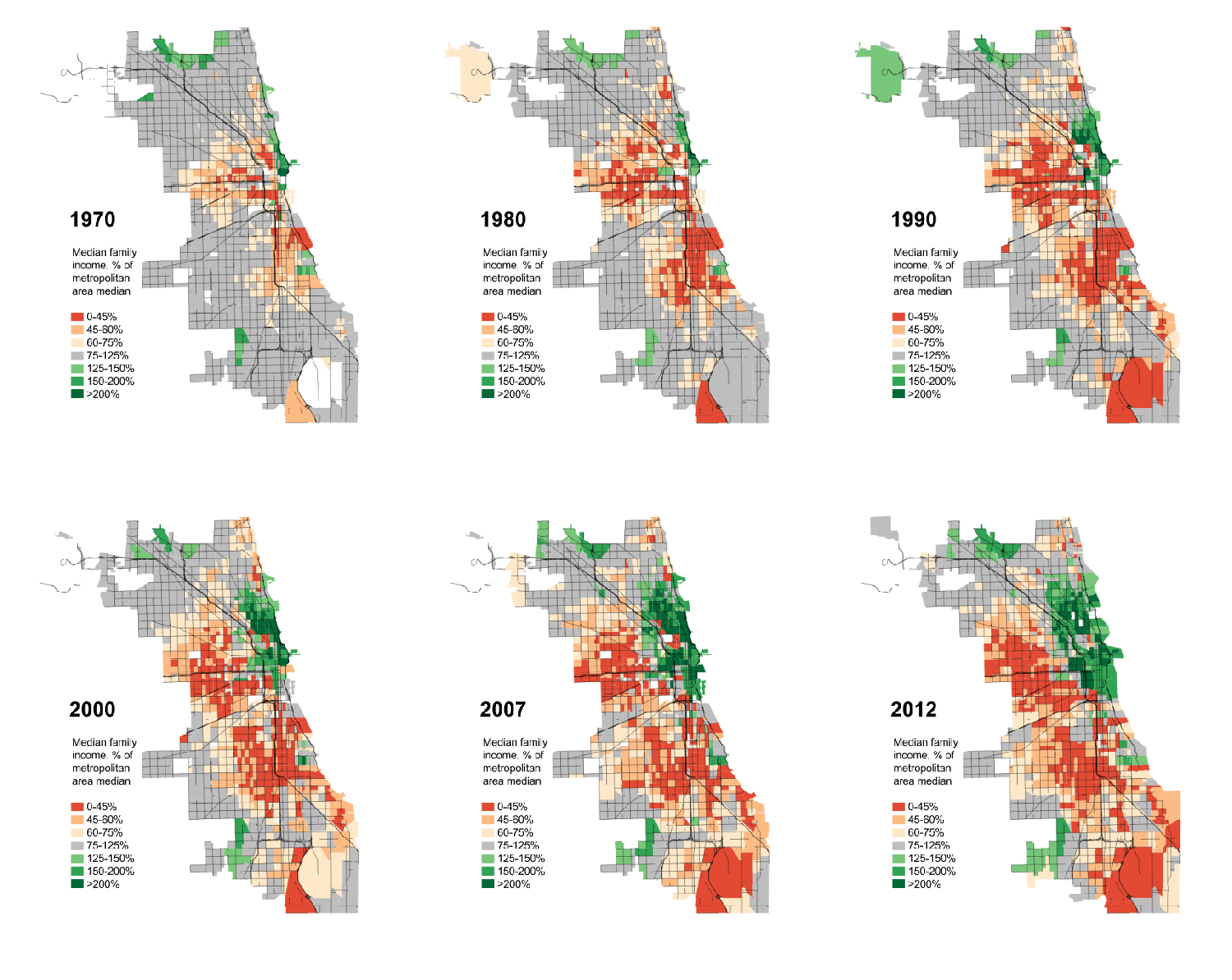
    Anyway, here you go: the disappearance of Chicago’s middle-class and mixed-income neighborhoods since 1970, measured by each Census tract’s median family income as a percentage of the median family income for the Chicago metropolitan region as a whole.

    Seg70aSeg80a


    Seg90aSeg00aSeg07aSeg12a


    IncSegGIF


    This piece first appeared at Daniel’s blog City Notes.

  • The Growing Public Safety Inequality Gap in Chicago

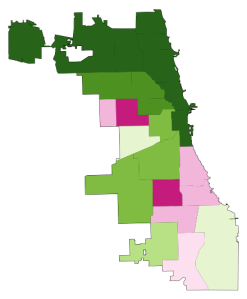
    Take a look at the two maps below. Like the captions say, the one on the left shows homicide rates in Chicago by police district in the early 90s, when crime was at its peak, and the one on the right shows the same thing, but about two decades later.* The areas in dark green are the safest; the ones in dark pink are the most dangerous. The colors are calibrated so that green areas are safer than average for the early 90s, and pink ones are more dangerous than average for the early 90s. The 2008-2011 map keeps the same calibration: green is safe compared to the early 90s, so that you can see change in the levels of violence over time.

    And, indeed, the first thing that jumps out from these maps is that there’s way more green nowadays, and it tends to be darker. The city is way safer! Some areas we might consider a bit dicey today – like, say, the Lawndale/Little Village area – actually register as light green, meaning that by early 90s standards, they would be considered relatively safe.

    HOMICIDE RATE BY POLICE DISTRICT

    Hom90 hom20

    1990-1993 2008-2011

    [For those of you craving numbers, the murder rate averaged 30 per 100k during the first period, and 17 per 100k during the second, a decline of nearly 50%.]

    Of course, the other thing we notice is that there are some very distinct patterns to safety. These maps are breaking exactly no news by indicating that the more dangerous parts of the city are on the West and South Sides, but it is striking, I think, to see that nowadays, basically the entire North Side is the darkest green, which translates to a homicide rate of less than 6 per 100k. In fact, the dark-green part of the city has a murder rate of 3.3 per 100k.

    Three point three. In New York City, which is constantly (and mostly correctly) being held up as proof that urban safety miracles can happen in America, it’s 6.3. Toronto, which as far as North American big cities go occupies a fairy tale land where no one hurts anybody, had a homicide rate of 3.3 per 100k as recently as 2007. The North Side is unbelievably safe, at least as far as murder goes.

    But there are none of the darkest green on the West or South Sides. There’s actually a fair amount of pink, meaning places that are relatively dangerous even by the terrifying standards of the early 90s.

    This raises a question: Has the great Crime Decline benefited the whole city equally? Are the South and West Sides still relatively dangerous because they started from such a bad place, or because they haven’t seen nearly as much of a decline as the North Side has?

    Here is the answer in another map:

    CHANGE IN HOMICIDE RATE, EARLY 90s – LATE 2000s

    Murderchange

    The areas in darkest green saw the greatest decline; red means the murder rate actually increased.

    So: Yes, the great Crime Decline is a fickle thing. The North Side saw huge decreases (in Rogers Park, it was over 80%) pretty much everywhere; the few areas that are lighter green were the safest in the city to begin with. The parts of the South and West Sides closest to downtown – Bronzeville, the West Loop, Pilsen, etc. – got a lot safer. But most of the rest actually got worse, including some neighborhoods that were already among the most dangerous in the city, like Englewood and Garfield Park.

    This is a complicated state of affairs, and probably goes at least part of the way to explaining why, in the face of a 50% decrease in homicides citywide over the last two decades, many people persist in believing that the opposite is true: because in their neighborhoods, it is. It’s a dynamic that defies an easy narrative, and makes me slightly less angry (though only slightly) at all those journalists who have written in the last year or two about murder in Chicago without mentioning that the city is, in fact, safer on the whole than it has been in fifty years.

    Here is one final pair of maps:

    RATIO OF POLICE DISTRICT HOMICIDE RATE TO CITY AVERAGE

    Homicideratios90s homicideratio2

    1990-1993 2008-2011

    This is slightly less intuitive. These maps show the how the homicide rate in any given police district compares to the citywide average, using ratios; for example, if the homicide rate in West Town is 10 per 100k, and citywide it’s 5 per 100k, West Town’s ratio is 2 to 1. If West Town were 2.5 per 100k, its ratio would be 0.5 to 1. (Obviously the numbers in these examples are made up.) Blue areas have ratios below 1, and so are relatively safe; red ones above 1, and are relatively dangerous.

    With the help of these maps, I’m going to ignore what I said about all this defying an easy narrative, and try to supply one: Over the last twenty years, at the same time as overall crime has declined, the inequality of violence in Chicago has skyrocketed. The pattern of what’s blue and what’s red in each map is mostly the same; I count only three out of twenty-five districts that switched from one color to another. But the colors are much darker in the 2000s than they were in the 1990s. There have always been safer and more dangerous areas here, as there are everywhere; but the gap between them is way, way bigger now than it used to be.

    Numbers will help this case. Imagine that for each of these two time periods, we cut the city into equal thirds: one contains the most dangerous neighborhoods; another, the safest; and the last, everything else. In the early 90s, the most dangerous third of the city had about six times as many murders as the safest third. By the late 2000s, the most dangerous part of the city had nearly fifteen times more homicides than the safest third.

    In addition, here are two charts (click to enlarge):

    HomRatio90

    Homratio20

    The divergence is self-evident. The early 90s look very roughly like a normal curve: most neighborhoods are in the middle, and there’s a clear, if slightly bumpy, slope down towards the extremes.

    Today, any semblance of a normal curve has been annihilated. Or, actually, that’s not quite right. Now it looks like there might be two completely separate normal curves, one with a peak at 0.2-0.4, and the other peaking at 3.1-4. Plus a few guys who got lost in the middle.

    I suppose there are many, many things that one might say about what this means, but here’s the bottom line: The disadvantages and tragedies that people in “dangerous” neighborhoods experience are both absolute and relative. The death of an innocent person** is an indescribable loss no matter what. And, on that count, things are somewhat better for Chicago’s most violent areas: the homicide rate for the most dangerous third of the city declined from 51 to 39 per 100k in the time period we’ve looked at here. That is a real accomplishment, and hundreds, if not thousands, of people are still with their families and friends because of it.

    But in other ways, it does matter if other parts of the city are getting safer much, much faster. When people weigh safety in their decisions about where to live, they do so by comparing: How much safety am I gaining by living in one neighborhood versus another? The same is true of entrepreneurs considering where to open their next business. The same is true of tourists looking to explore the city. The same is true of locals looking to travel to another neighborhood to eat out or go shopping.

    On every one of those counts, the disadvantages that are accruing to already-disadvantaged neighborhoods in terms of lost population, investment, and connections to the rest of the city are now much more severe. The hurdles are that much higher.

    That’s bad for those physical neighborhoods. It’s also terrible for the people who have good reasons to live there, like social networks, nearby family, or the affordability of real estate.

    Because I don’t have the data in front of me, but who would doubt that over these same twenty years, there has also been a growing gap between how much it costs to live on the safe North Side compared to the more dangerous parts of the South and West Sides? Who would doubt that, as the North Side reaches Toronto-level peacefulness, the cost of rent has greatly diminished the number of apartments there affordable to the poor and working class?

    In other words, just as the stakes have been tripled as to whether you live in Relatively Safe Chicago or Relatively Dangerous Chicago, it has become much, much harder to establish yourself on the winning side.

    So: Next time you hear someone talking about “record violence” in the city, tell them that actually, murders are down almost 50% from twenty years ago. And then tell them that what’sreally alarming is murder inequality.

    * Why does this data end in 2011? Because I made these maps using data from the Chicago Police Department annual reports, which are available online, and which only broke down crimes by police district in the 1990s. In 2012, the police district boundaries changed, making it not quite an apples-to-apples comparison to prior years. Maybe somewhere data exists by Community Area for the early 90s, and then I could redo all of this.

    ** And I think reporting like that done by This American Life at Harper High in Englewood ought to challenge conventional middle-class ideas about “innocence” in the ghetto. It is very easy for those who don’t live in the neighborhood to talk about “thugs” and “gangsters” getting what they deserve. It is also very cruel, and very naive about what exactly “gangs” are, and what kind of people join one, and how, and why.

    This post originally appeared in City Notes on August 5, 2013. Daniel Hertz is a masters student at the Harris School of Public Policy at the University of Chicago.

    Chicago photo by Bigstock.