Author: Joshua Wright

  • America’s Most Competitive Metros Since 2010

    The San Jose metro is adding jobs at a faster clip than any other large metro area in the U.S. since the recession. Houston, Austin, Detroit — and a handful of other metros — have also been stellar performers the last few years. But how much of the job growth in these and other metros can be explained by unique regional factors rather than national trends?

    To answer that question, EMSI used a standard economic analysis method called shift share, focusing on overall job change from 2010 to 2012. We followed the same methodology that we used to show which states are gaining in competitiveness. However, for this post, we looked at the 100 most populous metropolitan statistical areas (MSAs) in the U.S.

    The goal is to see which metros are becoming more competitive (that is, gaining a larger share of total job creation) and which are losing their share of the jobs being created. We ranked all 100 metros based on the overall competitive effect and what percentage of jobs (from 2010-2012) are based on competitive effects.

    Our Approach

    Shift-share analysis, which can also be referred to as “regional competitiveness analysis,” helps us distinguish between growth that is primarily based on big national forces (the proverbial “rising tide lifts all boats” analogy) vs. local competitive advantages. The primary components of shift share are as follows:

    • Industrial Mix Effect — This represents the share of regional industry growth explained by the growth of the specific industry at the national level.
    • National Growth Effect — This explains how much of the regional industry’s growth is explained by the overall growth of the national economy.
    • Expected Change – This is simply the rate of growth of the particular industry at the national level (equals the sum of the industrial mix and national growth effects).
    • Regional Competitiveness Effect — This explains how much of the change in a given industry is due to some unique competitive advantage that the region possesses, because the growth cannot be explained by national trends in that industry or the economy as whole.

    Read more on shift share in this article: Understanding Shift Share.

    About the Data

    The infographic and table below display aggregate industry data for the 100 most populous MSAs from 2010-2012. To generate our ranking, we summed the overall competitive effect for each broad 2-digit industry sector (e.g., agriculture, manufacturing, health care, construction, etc.) and added them together to yield a single MSA-wide number that indicates the overall competitiveness of the economy as compared to the total economy. We calculate the competitive effect by subtracting the expected jobs (the number of jobs expected for each MSA based on national economic trends) from the total jobs. The difference between the total and expected is the competitive effect. If the competitive effect is positive, then the MSA has exceeded expectations and created more jobs than national trends would have suggested. It is therefore gaining a greater share of the total jobs being created. If the competitive effect is negative, then the MSA is below what we would expect given national trends. In this case the MSA is losing a greater share of the total jobs being created.

    The Results

    Top Five

    The two metros at the top have been economic stalwarts in recent years. After that, our analysis revealed a couple surprises.

    Note: The figure in parentheses is the percentage of total 2012 jobs that are due to growing (or declining) competitiveness from 2010-2012.

    1. San Jose-Sunnyvale-Santa Clara, Calif. (3.5%) – The heart of Silicon Valley has created 35,803 more jobs than expected since 2010, thanks largely to the information sector (most notably, internet publishing and broadcasting and web search portals and software publishers). Electronic computer manufacturing has also seen more-than-expected growth in the San Jose metro area, as has warehouse clubs and supercenters and private elementary/secondary schools.

    In other words, the high-paying jobs generated in the tech sector appear to be leading to more jobs in the retail trade and education sectors than we would expect based on national trends.

    2. Austin-Round Rock-San Marcos, Texas (3.4%) – Save for government and retail trade, every broad sector in the Austin metro area has exceeded expectations. The result is 30,472 more jobs than expected from 2010 and 2012. The strongest sub-sectors in Austin are wired telecommunications carriers; wholesale trade agents and brokers; and corporate, subsidiary, and regional managing offices.

    3. Bakersfield, Calif. (3.1%) – Bakersfield has one of the highest unemployment rates (12%) among all metropolitan areas. But better-than-expected job growth in the construction and agricultural sectors has propelled this San Joaquin Valley metro to third in our ranking. The agriculture boom has been seen most in crop production and farm labor contractors/crew leaders. Meanwhile, much of the surprising construction growth has been in two sub-sectors — oil and gas pipeline and related structures construction and electrical contractors and other wiring installation contractors.

    4. Provo-Orem, Utah (2.8%) – Next is Provo-Orem, which has the fourth-fewest total jobs of any top 100 metro (an estimated 211,639). This metro area just south of Salt Lake City has seen surprisingly large job gains in professional, scientific, and technical services (see here for more); administrative and support services; specialty trade contractors; state/local government; and computer and electronic product manufacturing.

    A note on Utah: Provo-Orem, Salt Lake City (No. 6), and Ogden-Clearfield (No. 29) are all in the upper third of the top 100 metros in competitiveness.

    5. Houston-Sugar Land-Bayton, Texas (2.7%) — No metro in America has added more jobs than expected since 2010 than Houston (79,815). These jobs aren’t coming in oil & gas extraction or support activities for mining — Houston’s actually doing worse than expected in these two booming industries — but rather in health care, accommodation/food service, and manufacturing. In particular, home health care services, offices of physicians, restaurants, employment services, and fabricated metal product manufacturing are far surpassing expected growth.

    The rest of the top 10:

    • Salt Lake City, Utah (2.6%)
    • Grand Rapids-Wyoming, Mich. (2.4%)
    • Omaha-Council Bluffs, Neb.-Iowa (2.4%)
    • Raleigh-Cary, N.C. (2.1%)
    • Detroit-Warren-Livonia, Mich. (2.1%)

    Bottom Five

    The other side of our ranking is dominated by Southern metros, particularly those in Florida. But an even more common thread with the poor performers is the greater-than-expected losses in administrative and support services, a sub-sector that comprises “establishments engaged in activities that support the day-to-day operations of other organizations,” according to the BLS.

    100. Augusta-Richmond County, Ga.-S.C. (-3.9%) — This metro has lost nearly 9,000 more jobs than expected, most in waste treatment and disposal, employment services, and services to buildings and dwellings.

    99. Albuquerque, N.M. (-3.4%) — Albuquerque has fared worse than Augusta in total unexpected jobs lost (13,691), with the losses coming in similar areas — employment services, architectural/engineering services, electrical/electronic goods merchant wholesalers, and services to buildings and dwellings. Construction and government (local and federal) have also taken worse-than-expected hits.

    98. Palm Bay-Melbourne-Titusville, Fla. (-3.3%) — Like Augusta and Albuquerque, the Palm Bay-Melbourne area has done poorly in administrative and support services (particularly facilities support services) and construction (particularly specialty trade contractors).

    97. Lakeland-Winter Haven, Fla. (-2.4%) — Once again, this Florida metro has seen massive (and unexpected) decline in admin and support services, most notably employment services. Government, manufacturing, and construction have also lost more jobs than expected since 2010.

    96. Modesto, Calif. (-2.3%) — This Central Valley metro area has struggled more than expected in manufacturing (especially the making of snack foods and frozen foods). Elementary and secondary schools have also suffered.

    The rest of the bottom 10:

    • Milwaukee-Waukesha-West Allis, Wis. (-2.3%)
    • Providence-New Bedford-Fall River, R.I.-Mass. (-2.2%)
    • Little Rock-North Little Rock-Conway, Ark. (-2.1%)
    • Birmingham-Hoover, Ala. (-2.0%)
    • St. Louis, Mo.-Ill. (-2.0%)

    For the full list of the largest 100 metros, see our accompanying graphic or the table below.

    MSA
    2012 Jobs
    Expected Jobs (2012)
    Competitive Effect
    % of Jobs Due to Comp. Effect
    Source: QCEW Employees, Non-QCEW Employees & Self-Employed – EMSI 2012.3 Class of Worker
    San Jose-Sunnyvale-Santa Clara, CA
    1,014,025
    978,222
    35,803
    3.5%
    Austin-Round Rock-San Marcos, TX
    894,864
    864,392
    30,472
    3.4%
    Bakersfield-Delano, CA
    320,625
    310,730
    9,895
    3.1%
    Provo-Orem, UT
    211,639
    205,722
    5,918
    2.8%
    Houston-Sugar Land-Baytown, TX
    2,952,899
    2,873,083
    79,815
    2.7%
    Salt Lake City, UT
    692,741
    674,849
    17,892
    2.6%
    Grand Rapids-Wyoming, MI
    402,848
    393,138
    9,709
    2.4%
    Omaha-Council Bluffs, NE-IA
    501,309
    518,223
    12,078
    2.4%
    Raleigh-Cary, NC
    563,555
    551,457
    12,098
    2.1%
    Detroit-Warren-Livonia, MI
    1,902,208
    1,861,948
    40,260
    2.1%
    Charleston-North Charleston-Summerville, SC
    323,937
    317,316
    6,621
    2.0%
    Oklahoma City, OK
    649,469
    636,476
    12,992
    2.0%
    Knoxville, TN
    363,742
    356,712
    7,030
    1.9%
    Louisville/Jefferson County, KY-IN
    654,871
    643,365
    11,506
    1.8%
    McAllen-Edinburg-Mission, TX
    268,924
    264,231
    4,693
    1.7%
    Phoenix-Mesa-Glendale, AZ
    1,916,060
    1,883,203
    32,857
    1.7%
    Seattle-Tacoma-Bellevue, WA
    1,929,525
    1,897,882
    31,643
    1.6%
    Stockton, CA
    236,202
    232,430
    3,773
    1.6%
    Columbus, OH
    998,599
    984,248
    14,351
    1.4%
    Dallas-Fort Worth-Arlington, TX
    3,263,838
    3,219,303
    44,535
    1.4%
    El Paso, TX
    336,649
    332,206
    4,443
    1.3%
    San Francisco-Oakland-Fremont, CA
    2,252,514
    2,224,520
    27,993
    1.2%
    Nashville-Davidson–Murfreesboro–Franklin, TN
    853,134
    843,884
    9,250
    1.1%
    Charlotte-Gastonia-Rock Hill, NC-SC
    909,444
    899,769
    9,675
    1.1%
    Denver-Aurora-Broomfield, CO
    1,367,534
    1,354,042
    13,492
    1.0%
    Boise City-Nampa, ID
    294,333
    291,569
    2,764
    0.9%
    Portland-Vancouver-Hillsboro, OR-WA
    1,140,720
    1,130,624
    10,096
    0.9%
    San Antonio-New Braunfels, TX
    990,899
    982,408
    8,491
    0.9%
    Ogden-Clearfield, UT
    218,356
    216,733
    1,624
    0.7%
    Rochester, NY
    535,248
    531,540
    3,709
    0.7%
    Fresno, CA
    379,331
    377,181
    2,151
    0.6%
    Washington-Arlington-Alexandria, DC-VA-MD-WV
    3,289,069
    3,271,193
    17,876
    0.5%
    San Diego-Carlsbad-San Marcos, CA
    1,538,488
    1,530,699
    7,789
    0.5%
    Indianapolis-Carmel, IN
    942,512
    938,843
    3,669
    0.4%
    Columbia, SC
    380,167
    378,761
    1,406
    0.4%
    Atlanta-Sandy Springs-Marietta, GA
    2,463,751
    2,455,059
    8,691
    0.4%
    Riverside-San Bernardino-Ontario, CA
    1,390,906
    1,386,822
    4,084
    0.3%
    Chattanooga, TN-GA
    251,933
    251,223
    709
    0.3%
    Minneapolis-St. Paul-Bloomington, MN-WI
    1,892,017
    1,886,761
    5,256
    0.3%
    Tulsa, OK
    460,519
    459,782
    737
    0.2%
    Des Moines-West Des Moines, IA
    354,286
    353,772
    514
    0.1%
    Cincinnati-Middletown, OH-KY-IN
    1,066,016
    1,064,816
    1,201
    0.1%
    Honolulu, HI
    541,273
    540,736
    537
    0.1%
    Allentown-Bethlehem-Easton, PA-NJ
    364,683
    364,345
    338
    0.1%
    Greensboro-High Point, NC
    370,755
    370,532
    223
    0.1%
    Cape Coral-Fort Myers, FL
    219,651
    219,550
    101
    0.0%
    New York-Northern New Jersey-Long Island, NY-NJ-PA
    9,111,820
    9,109,799
    2,021
    0.0%
    Baton Rouge, LA
    403,099
    403,086
    12
    0.0%
    Miami-Fort Lauderdale-Pompano Beach, FL
    2,468,634
    2,468,912
    (279)
    0.0%
    Worcester, MA
    353,710
    353,834
    (124)
    0.0%
    Richmond, VA
    657,018
    657,325
    (306)
    0.0%
    Albany-Schenectady-Troy, NY
    459,754
    460,069
    (316)
    -0.1%
    Tampa-St. Petersburg-Clearwater, FL
    1,218,515
    1,219,507
    (992)
    -0.1%
    Jackson, MS
    267,877
    295,684
    (427)
    -0.2%
    Los Angeles-Long Beach-Santa Ana, CA
    6,143,325
    6,154,926
    (11,601)
    -0.2%
    Baltimore-Towson, MD
    1,400,446
    1,403,859
    (3,413)
    -0.2%
    Orlando-Kissimmee-Sanford, FL
    1,071,935
    1,074,559
    (2,624)
    -0.2%
    Pittsburgh, PA
    1,214,245
    1,218,032
    (3,786)
    -0.3%
    Dayton, OH
    402,031
    403,437
    (1,406)
    -0.3%
    Boston-Cambridge-Quincy, MA-NH
    2,665,828
    2,678,362
    (12,534)
    -0.5%
    Akron, OH
    341,435
    343,042
    (1,607)
    -0.5%
    Scranton–Wilkes-Barre, PA
    272,047
    273,574
    (1,527)
    -0.6%
    Greenville-Mauldin-Easley, SC
    315,824
    317,638
    (1,814)
    -0.6%
    Colorado Springs, CO
    316,090
    318,171
    (2,081)
    -0.7%
    New Orleans-Metairie-Kenner, LA
    582,177
    586,123
    (3,946)
    -0.7%
    Chicago-Joliet-Naperville, IL-IN-WI
    4,549,732
    4,582,384
    (32,652)
    -0.7%
    Youngstown-Warren-Boardman, OH-PA
    240,559
    242,321
    (1,762)
    -0.7%
    Toledo, OH
    317,987
    320,534
    (2,548)
    -0.8%
    Lancaster, PA
    252,253
    254,288
    (2,034)
    -0.8%
    Buffalo-Niagara Falls, NY
    562,953
    567,694
    (4,741)
    -0.8%
    Memphis, TN-MS-AR
    653,464
    659,019
    (5,555)
    -0.9%
    Virginia Beach-Norfolk-Newport News, VA-NC
    867,917
    875,329
    (7,412)
    -0.9%
    Jacksonville, FL
    634,680
    640,178
    (5,498)
    -0.9%
    Springfield, MA
    322,963
    325,801
    (2,838)
    -0.9%
    Hartford-West Hartford-East Hartford, CT
    651,931
    658,182
    (6,251)
    -1.0%
    Syracuse, NY
    324,948
    328,190
    (3,242)
    -1.0%
    Oxnard-Thousand Oaks-Ventura, CA
    348,124
    351,742
    (3,618)
    -1.0%
    Bridgeport-Stamford-Norwalk, CT
    458,643
    463,816
    (5,174)
    -1.1%
    Wichita, KS
    312,394
    315,968
    (3,575)
    -1.1%
    North Port-Bradenton-Sarasota, FL
    265,715
    268,786
    (3,071)
    -1.2%
    Kansas City, MO-KS
    1,053,613
    1,066,414
    (12,802)
    -1.2%
    Tucson, AZ
    401,113
    406,033
    (4,920)
    -1.2%
    Sacramento–Arden-Arcade–Roseville, CA
    957,779
    969,534
    (11,755)
    -1.2%
    Poughkeepsie-Newburgh-Middletown, NY
    271,783
    275,231
    (3,447)
    -1.3%
    New Haven-Milford, CT
    394,666
    400,055
    (5,390)
    -1.4%
    Madison, WI
    361,542
    366,488
    (4,946)
    -1.4%
    Las Vegas-Paradise, NV
    883,649
    896,729
    (13,081)
    -1.5%
    Cleveland-Elyria-Mentor, OH
    1,056,167
    1,075,588
    (19,421)
    -1.8%
    Harrisburg-Carlisle, PA
    334,668
    341,123
    (6,454)
    -1.9%
    Philadelphia-Camden-Wilmington, PA-NJ-DE-MD
    2,866,722
    2,922,956
    (56,235)
    -2.0%
    St. Louis, MO-IL
    1,391,853
    1,419,265
    (27,412)
    -2.0%
    Birmingham-Hoover, AL
    520,572
    531,024
    (10,452)
    -2.0%
    Little Rock-North Little Rock-Conway, AR
    362,670
    370,444
    (7,774)
    -2.1%
    Providence-New Bedford-Fall River, RI-MA
    722,008
    738,127
    (16,119)
    -2.2%
    Milwaukee-Waukesha-West Allis, WI
    849,075
    868,393
    (19,318)
    -2.3%
    Modesto, CA
    180,419
    184,600
    (4,181)
    -2.3%
    Lakeland-Winter Haven, FL
    210,233
    215,306
    (5,073)
    -2.4%
    Palm Bay-Melbourne-Titusville, FL
    207,642
    214,568
    (6,926)
    -3.3%
    Albuquerque, NM
    399,997
    413,688
    (13,691)
    -3.4%
    Augusta-Richmond County, GA-SC
    232,695
    241,661
    (8,966)
    -3.9%

    The data and analysis for this post comes from Analyst, EMSI’s web-based labor market data and analysis tool. For more information, email Josh Wright. Follow us on Twitter @DesktopEcon.

    Austin skyline image by Bigstock.

  • The Growing Number of Freelancers in Entertainment

    When people were preparing eulogies for the entertainment sector, Techdirt’s Mike Masnick popped out with his bold piece, “The Sky is Rising,” and poked holes in the gloomy forecast. His scrutiny of the numbers revealed that the entertainment industry is actually growing. Entertainment consumption per household increased from 2000 to 2008. Employment in the entertainment sector jumped 20% from 1998 to 2008. And the number of independent artists rose 43% over the same period.

    While the outlook for the sector might not be quite as sunny as Masnick indicates in his report (case in point: the share of household income spent on entertainment has declined every year since 2008), it’s true that entertainment employment is on the rise. Over the last decade-plus, the number of entertainment and sports-related jobs — a group of 10 occupations that includes actors, musicians, and dancers, as well as coaches and referees, etc. — has grown 30%.

    But much of this job growth, especially since the recession, is not of the traditional wage-and-salary variety. Instead, EMSI’s new class-of-worker data shows that proprietors account for 242,000-plus, or nearly 80%, of the jobs added since 2001 in the main entertainment and sports-related occupations. This includes workers whose main income comes from self-employment, and even more so those doing side gigs in addition to their day job (what EMSI labels as “extended proprietors” but might better be referred to as freelancers in this case).

    Note: EMSI’s employment estimates are a count of jobs, not a count of workers. One person can hold more than one job, and this is particularly the case with the types of worker activity tracked in our extended proprietor dataset.

    ENTERTAINMENT-RELATED JOBS (2001-2012)
    Source: EMSI 2012.2 Class of Worker
    2001 Jobs 2008 Jobs 2012 Jobs % Growth Since 2001 % Growth Since 2008 Avg. Hourly Wage
    Wage-and-Salary 492,960 549,333 556,765 13% 1% $19.32
    Self-Employed & Extended Proprietors 512,383 685,773 755,137 47% 10% $17.24
    Total 1,005,343 1,235,106 1,311,902 30% 6% $18.15


    Since 2001, employment in entertainment and sports among wage-and-salary workers (those who draw benefits and pay into the unemployment insurance program) has increased 13%. This is a solid gain, but consider that since ’08, the heart of the recession, the job gains have been minimal (1% growth, or 7,432 jobs added).

    But look at the self-employed and extended proprietors row in the above table: this part of the entertainment and sports-related workforce has mushroomed 47% since ’01, and 10% since ’08.

    The growth in proprietors makes sense when you think about the work being done in these fields — moms and dads coaching their kids (or serving as referees) in soccer, office workers moonlighting in a band that does local gigs, men and women working part-time for the local stage company as an actor or director. These are just a few examples. But it’s clear businesses that hire these types of workers require or prefer freelancers or part-timers; it’s just the nature of the work. And as families’ budgets get tighter or single people need extra (or any) income, these jobs are a welcomed option, at least in the short term.

    There are still more than a half million salaried jobs in these fields. But increasingly, freelance workers are becoming the norm in entertainment and sports.

    The Workforce Breakdown

    Overall, 58% of the “entertainers and performers, sports and related” workforce, as it’s classified by the Bureau of Labor Statistics, is made up of proprietors. That’s up from 51% in 2001 and 56% in 2008.

    The largest occupation in this sector, musicians & singers, is predominantly composed of those who do work on the side. Just over 265,000 of 440,000-plus musician jobs in the US fall under EMSI’s extended proprietor category, and there are nearly as many self-employed musicians (73,875) as traditional W-2 musicians (102,628).

    Musicians aren’t alone in this trend, of course. Of the 118,000-plus estimated actors in the US, almost half are extended proprietors and another 18,520 are self-employed. Dancers, coaches & scouts, and others have a similar labor force breakdown.

    The highest percentage growth since 2001 among these 10 occupations has come in coaches and scouts (51%). Second is actors at 42%; of the 34,706 new actors jobs in the last decade-plus, all but 2,230 have come in the self-employed and extended proprietor categories.

    SOC Code Description 2001 Jobs 2012 Jobs Change % Change Median Hourly Wage Education Level
    Source: EMSI 2012.2 Class of Worker – QCEW Employees, Non-QCEW Employees, Self-Employed, Extended Proprietors
    27-2011 Actors 83,451 118,157 34,706 42% $16.54 Long-term on-the-job training
    27-2012 Producers and Directors 126,576 124,670 -1,906 -2% $28.86 Bachelor’s or higher degree, plus work experience
    27-2021 Athletes and Sports Competitors 28,335 38,520 10,185 36% $27.30 Long-term on-the-job training
    27-2022 Coaches and Scouts 198,681 299,509 100,828 51% $13.89 Long-term on-the-job training
    27-2023 Umpires, Referees, and Other Sports Officials 25,547 34,447 8,900 35% $11.31 Long-term on-the-job training
    27-2031 Dancers 29,914 37,496 7,582 25% $14.70 Long-term on-the-job training
    27-2032 Choreographers 17,343 22,628 5,285 30% $18.30 Work experience in a related occupation
    27-2041 Music Directors and Composers 65,593 79,927 14,334 22% $19.31 Bachelor’s or higher degree, plus work experience
    27-2042 Musicians and Singers 324,934 441,882 116,948 36% $18.01 Long-term on-the-job training
    27-2099 Entertainers and Performers, Sports and Related Workers, All Other 104,970 114,665 9,695 9% $18.47 Long-term on-the-job training
    Total 1,005,343 1,311,902 306,559 30% $18.15


    Across the board, the job growth numbers look radically different if we take out proprietors. Looking just at EMSI’s QCEW dataset, which corresponds to published Quarterly Census of Employment and Wages data, only four of these occupations have had double-digit growth since ’01: coaches and scouts (39%); choreographers (32%); entertainers and performers, sports and related workers, all other (15%); and music directors and composers (13%).

    Top Metros for Entertainment

    We all know New York City and Los Angeles are major entertainment hubs. But EMSI’s data is still startling: The nation’s two largest cities account for nearly 1 out of every 5 entertainment and sports-related jobs in America. The New York City metro area has the most jobs in entertainment and sports-related fields of any MSA (with more than 116,000 estimated in 2012), followed by L.A. (112,528). These two have nearly four times the number of jobs as Chicago, which has the third-most in the US at nearly 37,000.

    Of the 50 most populous metros in the U.S., Los Angeles is also the most concentrated in entertainment and sports-related workers. With a location quotient of 2.06, L.A. is more than twice as concentrated as the national average of 1.0. Nashville, with an LQ of 2.02, is close behind, followed by San Francisco, New York, Las Vegas, and Austin, Texas.

    Since 2008, Austin has blown away every other big metro in terms of its job growth in entertainment and sports jobs (18.4%). Second is Richmond, VA (13.4%).

    ENTERTAINMENT-RELATED JOBS IN 50 LARGEST METRO AREAS
    Source: EMSI 2012.2
    MSA Name 2012 Jobs 2008-2012 Percentage Growth Median Hourly Earnings 2012 National Location Quotient
    Los Angeles-Long Beach-Santa Ana, CA 112,528 1.3% $26.22 2.06
    Nashville-Davidson–Murfreesboro–Franklin, TN 15,442 7.8% $22.12 2.02
    San Francisco-Oakland-Fremont, CA 30,667 5.6% $23.80 1.51
    New York-Northern New Jersey-Long Island, NY-NJ-PA 116,234 7.9% $23.81 1.43
    Las Vegas-Paradise, NV 10,242 5.0% $21.14 1.29
    Austin-Round Rock-San Marcos, TX 10,421 18.4% $16.51 1.27
    Orlando-Kissimmee-Sanford, FL 11,380 5.4% $17.42 1.22
    Portland-Vancouver-Hillsboro, OR-WA 11,953 6.2% $16.01 1.21
    Salt Lake City, UT 7,480 9.1% $18.46 1.20
    Boston-Cambridge-Quincy, MA-NH 26,143 5.1% $20.53 1.14
    New Orleans-Metairie-Kenner, LA 5,906 6.5% $15.85 1.13
    Seattle-Tacoma-Bellevue, WA 18,608 6.1% $19.06 1.13
    Minneapolis-St. Paul-Bloomington, MN-WI 17,912 4.0% $18.94 1.11
    Atlanta-Sandy Springs-Marietta, GA 24,329 12.9% $19.39 1.06
    Washington-Arlington-Alexandria, DC-VA-MD-WV 30,413 7.5% $19.64 1.06
    Milwaukee-Waukesha-West Allis, WI 7,385 -0.2% $16.21 1.05
    Denver-Aurora-Broomfield, CO 12,975 0.4% $18.08 1.04
    Hartford-West Hartford-East Hartford, CT 5,842 8.5% $19.33 1.02
    Indianapolis-Carmel, IN 8,184 11.3% $16.60 1.02
    Kansas City, MO-KS 9,226 10.7% $16.17 1.01
    Providence-New Bedford-Fall River, RI-MA 6,235 3.0% $16.47 1.00
    Raleigh-Cary, NC 4,897 8.7% $15.55 1.00
    Birmingham-Hoover, AL 4,713 5.6% $14.64 0.99
    Dallas-Fort Worth-Arlington, TX 28,900 13.2% $18.42 0.96
    Richmond, VA 5,363 13.4% $15.50 0.95
    Tampa-St. Petersburg-Clearwater, FL 10,409 9.5% $17.60 0.95
    St. Louis, MO-IL 11,182 2.7% $18.81 0.94
    Cleveland-Elyria-Mentor, OH 8,465 4.4% $14.95 0.93
    Sacramento–Arden-Arcade–Roseville, CA 7,844 1.2% $17.26 0.93
    San Diego-Carlsbad-San Marcos, CA 12,478 1.4% $21.90 0.93
    San Jose-Sunnyvale-Santa Clara, CA 7,991 8.2% $19.51 0.92
    Baltimore-Towson, MD 11,283 2.7% $18.28 0.91
    Jacksonville, FL 5,305 12.2% $17.98 0.91
    Charlotte-Gastonia-Rock Hill, NC-SC 7,130 5.4% $18.80 0.90
    Chicago-Joliet-Naperville, IL-IN-WI 35,828 4.8% $16.91 0.89
    Philadelphia-Camden-Wilmington, PA-NJ-DE-MD 21,974 7.3% $18.29 0.89
    Cincinnati-Middletown, OH-KY-IN 8,041 5.8% $17.61 0.88
    Columbus, OH 7,586 8.0% $16.84 0.88
    Miami-Fort Lauderdale-Pompano Beach, FL 20,187 5.4% $22.13 0.86
    Pittsburgh, PA 8,991 10.8% $17.61 0.86
    Louisville/Jefferson County, KY-IN 4,743 5.6% $15.98 0.85
    Detroit-Warren-Livonia, MI 13,422 0.0% $16.29 0.81
    Buffalo-Niagara Falls, NY 3,768 -0.2% $15.66 0.80
    Memphis, TN-MS-AR 4,531 7.0% $16.74 0.80
    Oklahoma City, OK 4,534 11.9% $15.62 0.79
    Virginia Beach-Norfolk-Newport News, VA-NC 5,814 4.8% $14.31 0.79
    Phoenix-Mesa-Glendale, AZ 13,194 6.7% $18.27 0.78
    Riverside-San Bernardino-Ontario, CA 9,203 1.6% $18.51 0.76
    San Antonio-New Braunfels, TX 6,732 11.2% $16.98 0.76
    Houston-Sugar Land-Baytown, TX 18,270 11.8% $18.87 0.69


    What About All MSAs?

    Among all MSAs in the US with at least 500 jobs in these fields, the highest concentration in the entertainment and sports-related sector belongs to Edwards, Colorado, which is just west of the resort community of Vail (home to the Vail Jazz Festival). The Edwards MSA has just 1,100 estimated entertainment and sports-related jobs. But with a location quotient of 8.42, it is more than eight times as concentrated as the national average in these fields.

    Next is an MSA that you’d probably expect to see this high on the list: Santa Fe, New Mexico (with an LQ of 4.01). Sante Fe is known for its art galleries, museums, and other tourist-friendly sites, and it has more than 2,000 entertainment and sports-related jobs.

    Joshua Wright is an editor at EMSI, an Idaho-based economics firm that provides data and analysis to workforce boards, economic development agencies, higher education institutions, and the private sector. He manages the EMSI blog and is a freelance journalist. Contact him here.

    Film crew photo by Bigstock.

  • Characteristics of the Self-Employed

    With EMSI’s new data categories, we can now more closely parse data on the major classes of workers in the labor market. This is a significant shift in how we present employment data, and one of the valuable applications is being able to track and analyze self-employed workers — those whose primary job, their chief source of income, is working on their own.

    In this piece, we’ll use EMSI’s self-employment data to dig into a segment of the workforce that has previously been hard (or impossible) to get at for local researchers and planners. But first, it’s important to distinguish between EMSI’s two proprietors datasets and why we’re only focusing here on the self-employed, the third of our four class of workers.

    We also track what we call extended proprietors. This is distinct, miscellaneous set of workers/income earners, and the fourth category included for subscribers to our web-based labor market research tool. Extended proprietors do side gigs or earn income through a sole proprietorship or partnership, most often (but not always) in addition to their primary job. If surveyed, they would not list this extra work as their main source of income. On the other hand, our self-employed dataset uses the American Community Survey and other publicly available sources to track proprietors who work for their own unincorporated business, practice, or farm. (People with incorporated businesses are considered wage and salary workers for their own companies, and are thus not considered proprietors).

    In short, EMSI’s self-employment data gives an estimate of the true self-employed in the workforce (i.e., those who are primarily self-employed and consider themselves as such). And it does so at the county, ZIP code, MSA, and state level.

    A Note on Monitoring Entrepreneurial Activity

    EMSI’s two new proprietor datasets offer a window into entrepreneurial activity for any level of geography, but we caution against labeling all workers in the self-employed or extended proprietor classes as entrepreneurs. More accurately, inside the extended proprietors dataset are those who pursue extra work opportunities while maintaining their day job, while the self-employed dataset includes those who have taken the additional step and are primarily on their own. Once start-up owners incorporate their business, they fall under the traditional wage and salary worker datasets.

    Another thing to keep in mind: As you compare EMSI’s self-employment numbers at the national level with other sources, you might find higher estimates of the self-employed workforce than EMSI’s. The Current Population Survey, for example, tracks workers’ primary and secondary self-employment, while the ACS — which again is what EMSI uses — keeps tabs on only primary self-employment. A teacher who mows lawns in the summer could fall in the secondary self-employed category in the CPS, but for the purposes of EMSI data, that teacher’s lawn mowing would be found in extended proprietors because if you asked him what he does for a living, he would say teacher.

    Overview

    • There are an estimated 10.6 million self-employed jobs in the US, a 14.4% increase from 2001. From 2006-2008, this group of workers declined nearly 5% before employment mostly leveled off.
    • Self-employed workers make on average $26,921 — more than half the annual average of the total workforce ($56,053).
    • The self-employed population includes a large segment of older workers. Over 30% (3.25 million workers) are 55 or older; this includes more than a million workers who are at least 65. Another 28.2% of self-employed workers are 45-54.
    • Nearly 20% of all self-employed jobs are in the construction industry. Another 15% are classified under “other services (except public administration),” which includes repair & maintenance, personal & laundry services, religious and civic organizations, and private households. The next-largest industry is professional, scientific, and technical services (11% of self-employed jobs).
    • The largest self-employed occupations in the US are child care workers (an estimated 556,523 jobs in 2012), carpenters (459,116 jobs), maids & housekeeping cleaners (441,551), farmers & ranchers (437,999), and construction laborers (380,226).

    Note: The data in this post is from EMSI’s 2012.2 Class of Worker dataset.

    Proportion of All Workers

    Self-employed workers account for 7.1% of all U.S. workers, up from 6.4% in 2001. This percentage is lower that what the Current Population Survey reports, but again, we are looking at those who are primarily self-employed. Note that this proportion does not include peripheral proprietor activity through our extended proprietor dataset.

    Among major sectors, the share of self-employed jobs is greatest in administrative and support services (particularly landscaping and janitorial services); agriculture, forestry, fishing and hunting; construction; and transportation and warehousing. In each of these sectors, 20% or more of the workforce is classified as self-employed.

    As shown in the chart below, agriculture, forestry, fishing and hunting has made the biggest jump in the proportion of self-employed workers since 2001 (from 19.3% to 26%), followed by transportation and warehousing (16.2% to 20.2%).

    While just over 10% of all jobs in the real estate industry are categorized as self-employed, nearly 70% of jobs (more than 5.5 million) in this sector are in the extended proprietors dataset. In this case, extended proprietors include part-time agents or people drawing income in a real estate partnership. The 11% in the self-employed category encompasses those who would list their real estate work as their main source of income.

    Top and Bottom States for Self-Employed

    Driven by a larger-than-average proportion of self-employed jobs in the arts and entertainment sector (as well as in forestry and logging), Vermont has the highest share of self-employment (11.6% of all workers) among all states and the District of Columbia. Maine (10.3%) and Montana (10.1%) are grouped closely together in the second and third spots, followed by California (9.7%), South Dakota (9%), and Idaho (9%).

    By far the smallest share of self-employment is found in Washington, D.C. (2.1%), which is no surprise given that governments workers — regardless of the industry or agency — are considered wage and salary workers. After D.C., Delaware (4.4%), Virginia (5.4%), and New Jersey (5.4%) have the next-smallest shares.

    The following table also shows 2001-2012 self-employment job growth and decline, and no state has expanded its self-employed workforce more than Arizona (36%). The growth of entrepreneurs has also been impressive in Texas (31%), Nevada (31%) and Florida (25%), while Nebraska has lost the largest percentage of self-employed workers (-11%, a loss of almost 9,000 jobs).

    Since the heat of the recession in 2008, Vermont (8%) and Arizona (7%) have led the way in growth among the self-employed.

    State Name 2012 Self-Employed Jobs 2001-2012 % Change 2012 Avg. Annual Wage Proportion of Self-Employed (2012) Rank
    Source: Self-Employed – EMSI 2012.2 Class of Worker BETA
    Vermont 41,529 15% $28,064 11.60% 1
    Maine 69,533 6% $24,717 10.30% 2
    Montana 49,910 -4% $25,834 10.10% 3
    California 1,660,324 21% $28,851 9.70% 4
    South Dakota 42,105 5% $27,093 9.00% 5 (tie)
    Idaho 64,217 13% $24,718 9.00% 5 (tie)
    Oregon 166,412 5% $25,820 8.90% 7
    New Hampshire 59,565 9% $31,172 8.60% 8
    Tennessee 245,723 15% $27,071 8.20% 9
    New Mexico 73,347 9% $23,181 8.10% 10 (tie)
    Colorado 209,822 16% $25,616 8.10% 10 (tie)
    Alaska 30,459 1% $29,248 7.90% 12 (tie)
    Arizona 215,044 36% $24,549 7.90% 12 (tie)
    Texas 934,704 31% $27,079 7.70% 14
    Wyoming 24,575 9% $28,311 7.60% 15 (tie)
    Oklahoma 134,732 0% $24,850 7.60% 15 (tie)
    Washington 251,891 18% $26,057 7.60% 15 (tie)
    Hawaii 55,097 16% $28,896 7.60% 15 (tie)
    Arkansas 97,671 8% $22,687 7.50% 19 (tie)
    Iowa 124,166 5% $24,728 7.50% 19 (tie)
    Florida 589,416 25% $23,508 7.20% 21
    North Dakota 33,105 -4% $27,753 7.10% 22 (tie)
    Kansas 106,887 9% $26,231 7.10% 22 (tie)
    Connecticut 126,400 4% $32,882 7.00% 24
    Nebraska 71,650 -11% $26,269 6.90% 25 (tie)
    Rhode Island 34,567 18% $31,344 6.90% 25 (tie)
    North Carolina 305,895 18% $24,667 6.80% 27 (tie)
    Mississippi 84,600 5% $25,426 6.80% 27 (tie)
    New York 644,061 13% $28,829 6.80% 27 (tie)
    Minnesota 198,691 4% $25,460 6.70% 30 (tie)
    Massachusetts 241,911 13% $31,106 6.70% 30 (tie)
    Louisiana 143,407 17% $26,258 6.70% 30 (tie)
    Missouri 196,695 8% $24,634 6.70% 30 (tie)
    Georgia 288,876 13% $25,189 6.60% 34 (tie)
    Alabama 137,245 14% $26,014 6.60% 34 (tie)
    Michigan 284,673 12% $23,305 6.60% 34 (tie)
    South Carolina 133,602 17% $24,769 6.50% 37
    Kentucky 128,914 -1% $23,896 6.30% 38
    Pennsylvania 378,801 8% $28,930 6.10% 39
    West Virginia 47,775 3% $29,347 6.00% 40 (tie)
    Wisconsin 176,142 -1% $24,811 6.00% 40 (tie)
    Ohio 331,482 5% $25,331 6.00% 40 (tie)
    Maryland 168,572 13% $29,691 5.90% 43
    Indiana 178,485 7% $26,669 5.70% 44 (tie)
    Nevada 70,034 31% $28,109 5.70% 44 (tie)
    Illinois 353,135 12% $26,511 5.70% 44 (tie)
    Utah 75,480 18% $25,027 5.60% 47
    New Jersey 226,039 10% $32,994 5.40% 48 (tie)
    Virginia 223,509 12% $26,574 5.40% 48 (tie)
    Delaware 19,935 4% $28,018 4.40% 50
    District of Columbia 16,680 13% $44,523 2.10% 51
    Total 10,567,489 14% $26,921

    A Look at MSAs

    For the largest metropolitan statistical areas, Riverside, California has the highest percentage of self-employed workers (12.4%), followed by Los Angeles (10.5%). None of the other 30 largest MSAs has a double-digit presence of self-employed workers. Just missing that mark is Miami (9.7%), while San Francisco (9.3%) is also close.

    New York City is right at the national average — 7.1% of its workforce is self-employed. Chicago is at 5.7%.

    For all MSAs regardless of size, Guymon, OK (35.4%) and Rio Grande CIty-Roma, Texas (21.4%) have the largest percentage of self-employed workers. The lowest are Williston, North Dakota (2.6%) and Hinesville-Fort Stewart, Georgia (2.9%).

    Takeaways

    1. Recession’s Toll

    There are almost 400,000 fewer self-employed jobs in the U.S. than in 2006, and the proportion of self-employed workers to the entire workforce is below pre-recession levels.

    2. Highest-Paying Industries are Declining in Self-Employment

    Of the 20 highest-paying industries with at least 100 self-employed jobs at the start of the recession, 17 have fewer self-employed workers in 2012 than in 2008. This includes offices of physicians and offices of dentists, both of which have declined 3%. Almost as pronounced is the drop in self-employment in legal services. In 2008, more than 214,000 self-employed jobs were classified under offices of lawyers; in 2012, it’s estimated to be 209,494, a 2% decline.

    Meanwhile, the largest self-employed occupations tend to be lower-skilled, lower-paying jobs — construction laborers, child care workers, etc.

    3. Older Americans are Working for Themselves

    In 2009, Dane Stangler of the Kauffman Foundation wrote, “Contrary to popularly held assumptions, it turns out that over the past decade or so, the highest rate of entrepreneurial activity belongs to the 55-64 age group.” While our self-employed dataset does not solely contain entrepreneurs (see note above), EMSI data backs up Kauffman’s research. As we showed earlier, over 30% of all self-employed workers are over 55, and another 28% are 45-54.

    4. Majority of Self-Employed are Men

    Of the estimated 10.6 million self-employed jobs in the US, more than 6.6 million (63%) are held by men. This is in contrast to a much more even male/female breakdown (51% male/49% female) when we consider all wage and salary and self-employed jobs.

    Joshua Wright is an editor at EMSI, an Idaho-based economics firm that provides data and analysis to workforce boards, economic development agencies, higher education institutions, and the private sector. He manages the EMSI blog and is a freelance journalist. Contact him here.

  • Data Spotlight: Ranking States by Their Dependence on Manufacturing

    A recent Brookings paper makes a clear case from the start: “Manufacturing matters to the United States …” Other economists and econ bloggers aren’t so sure.

    What’s clear, however, is certain states (think Indiana, Wisconsin, and Arkansas) depend on manufacturing to fuel their economies more than others. One way to measure just how dependent states are on manufacturing – rather than simply looking at total jobs or exports – is by looking at a common concentration measure known as location quotient (LQ).

    Here is an overview of the 10 states most dependent on manufacturing, with the top five subsectors for each based on their concentration compared to the nation. (We also have data on all 50 states and Washington, D.C. below.) A location quotient of 1.00 is the national average, and an LQ of 1.20 and above indicates the industry is specialized in the state.

    Industries with a high LQ are typically (but not always) export-oriented industries, which are important because they bring money into the region, rather than simply circulating money that is already in the region (as most retail stores and restaurants do). Industries that have both high LQ and relatively high total job numbers typically form a region’s economic base. Economic developers and government officials need to pay particular attention to these industries not only for the jobs they provide, but also for their multiplier effect – the jobs they create in other dependent industries like retail trade and food services.

    As you scan through this list, also pay attention to industries with rapidly declining or growing LQs. For example, Michigan’s concentration in auto manufacturing declined 15% from 2001 to 2011 (not a good sign because it’s the second-largest manufacturing industry in the state and employment has plummeted). On the flip side, Alabama’s concentration in auto manufacturing grew more than 466% in the last decade, indicating that the state is now taking up a much larger share of national employment (third most among states, up from 14th in ’01). Keep in mind that growing employment paired with declining LQ indicates that the industry is not growing as fast in the state as it is in the national economy.

    Note: All 2011 jobs and LQ figures are estimates because of lags in federal and state data sources. The numbers cited come from EMSI’s 2011.4 Covered Employment dataset.

    1. Indiana (LQ: 1.86; 2001-11 Job Change: -26%)

    Indiana is 86% more concentrated in manufacturing than average and just nudges Wisconsin for the top spot in our analysis. Auto manufacturing, with an LQ of 10.79 (or almost 11 times more concentrated in the state that nationally), is a big reason why. Iron and steel mills (9.94) and engine, turbine and power transmission equipment manufacturing (5.27) also factor prominently on our list.

    NAICS Code Industry 2011 Jobs 2011 Average Earnings 2001 LQ 2011 LQ LQ % Change
    3362 Motor Vehicle Body and Trailer Manufacturing 25,555 $48,295 8.22 10.79 31.3%
    3311 Iron and Steel Mills and Ferroalloy Manufacturing 18,766 $85,497 9.79 9.94 1.5%
    3336 Engine, Turbine, and Power Transmission Equipment Manufacturing 10,539 $85,387 5.49 5.27 -4.0%
    3363 Motor Vehicle Parts Manufacturing 47,592 $55,973 5.09 5.25 3.1%
    3325 Hardware Manufacturing 2,304 $61,647 3.84 4.50 17.2%

    2. Wisconsin (LQ: 1.85; 2001-11 Job Change: -21%)

    Wisconsin is significantly more concentrated in manufacturing than the next state on the list, Iowa. Leading the way are other transportation equipment manufacturing (7.15) and dairy product manufacturing (6.24), the latter of which is certainly not a surprise to see high on this list. Notice the big increase in foundries (5.83, up 26.5%) compared to the nation, and the substantial decline in pulp and paper mills (5.82, an 17.6% decline).

    NAICS Code Industry 2011 Jobs 2011 Average Earnings 2001 LQ 2011 LQ LQ % Change
    3369 Other Transportation Equipment Manufacturing 4,905 $86,543 7.78 7.15 -8.1%
    3115 Dairy Product Manufacturing 16,749 $45,295 6.02 6.24 3.7%
    3315 Foundries 14,157 $51,783 4.61 5.83 26.5%
    3221 Pulp, Paper, and Paperboard Mills 13,353 $64,630 7.06 5.82 -17.6%
    3353 Electrical Equipment Manufacturing 13,729 $71,270 4.62 4.86 5.2%

    3. Iowa (LQ: 1.55; 2001-11 Job Change: -15%)

    Like the two states above it, Iowa has seen a marked increased in manufacturing concentration over the last decade (see the state-by-state table below). Only a few states, in fact, have grown more in concentration percentage since 2001 than Iowa. The most concentrated manufacturing subsectors are related to agriculture (grain and oilseed milling) and animal food or slaughtering. Household appliance manufacturing, meanwhile, has dropped precipitously in concentration, at least partly because of the loss of Maytag in Newton.

    NAICS Code Industry 2011 Jobs 2011 Average Earnings 2001 LQ 2011 LQ LQ % Change
    3112 Grain and Oilseed Milling 6,664 $68,252 9.58 10.09 5.3%
    3331 Agriculture, Construction, and Mining Machinery Manufacturing 20,157 $66,849 7.80 8.34 6.9%
    3111 Animal Food Manufacturing 3,219 $58,734 5.20 5.52 6.2%
    3116 Animal Slaughtering and Processing 28,599 $37,843 4.95 5.23 5.7%
    3352 Household Appliance Manufacturing 3,388 $36,761 7.07 5.05 -28.6%

    4. Arkansas (LQ: 1.51; 2001-11 Job Change: -30%)

    Arkansas has lost nearly a third of its manufacturing employment base in the last decade, and it’s the top state in the top four of our list to see its concentration retreat during that time. Nearly one in out of every five manufacturing job in Arkansas is classified under animal slaughtering and processing (7.01 LQ), an industry that was more concentrated in the state 10 years ago.

    NAICS Code Industry 2011 Jobs 2011 Average Earnings 2001 LQ 2011 LQ LQ % Change
    3162 Footwear Manufacturing 1,182 $25,910 8.37 9.65 15.3%
    3116 Animal Slaughtering and Processing 30,480 $27,262 7.88 7.01 -11.0%
    3211 Sawmills and Wood Preservation 3,941 $35,606 5.93 5.34 -9.9%
    3112 Grain and Oilseed Milling 2,333 $41,828 4.40 4.44 0.9%
    3212 Veneer, Plywood, and Engineered Wood Product Manufacturing 2,398 $44,969 3.23 4.32 33.7%

    5. Michigan (LQ: 1.46; 2001-11 Job Change: -39%)

    No state in the country has lost the largest a bigger percentage of manufacturing jobs than Michigan since 2001. That’s no surprise. Nor is the fact that the most-concentrated industries in the state (and the ones that have seen the biggest drops in concentration) are related to car manufacturing.

    NAICS Code Industry 2011 Jobs 2011 Average Earnings 2001 LQ 2011 LQ LQ % Change
    3361 Motor Vehicle Manufacturing 37,171 $96,951 9.51 8.06 -15.2%
    3363 Motor Vehicle Parts Manufacturing 90,140 $70,296 7.77 7.10 -8.6%
    3335 Metalworking Machinery Manufacturing 31,170 $61,097 5.80 6.52 12.4%
    3372 Office Furniture (including Fixtures) Manufacturing 14,435 $54,897 4.73 5.14 8.7%
    3328 Coating, Engraving, Heat Treating, and Allied Activities 12,445 $44,369 3.20 3.30 3.1%

    6. Alabama (LQ: 1.45; 2001-11 Job Change: -27%)

    Alabama is in the top 10 of our list largely because apparel/textile manufacturing, a subsector that’s taken a mammoth hit over the past decade but is still heavily concentrated in Alabama and other Southern states. Also notice motor vehicle manufacturing, which had a relatively small presence in 2001 (3,400 jobs) but has since become a big player in the state (10,400 jobs in 2011, 466% increase in LQ).

    NAICS Code Name 2011 Jobs 2011 Average Earnings 2001 LQ 2011 LQ LQ % Change
    3151 Apparel Knitting Mills 2,630 $27,506 13.15 10.32 -21.5%
    3131 Fiber, Yarn, and Thread Mills 3,420 $34,075 6.74 8.15 20.9%
    3346 Manufacturing and Reproducing Magnetic and Optical Media 2,296 $40,704 3.88 6.51 67.8%
    3221 Pulp, Paper, and Paperboard Mills 8,754 $85,485 4.81 5.56 15.6%
    3361 Motor Vehicle Manufacturing 10,404 $73,961 0.83 4.70 466.3%

    7. Ohio (LQ: 1.41; 2001-11 Job Change: -34%)

    Ohio has the third most manufacturing jobs of any state and has actually expanded slightly since 2010. The rest of the previous decade, however, was filled with heavy job loss. Household appliance manufacturing (4.12) is the most concentrated subsector in the state; it grew 3.1% from 2009 to 2011.

    NAICS Code Industry 2011 Jobs 2011 Average Earnings 2001 LQ 2011 LQ LQ % Change
    3352 Household Appliance Manufacturing 9,435 $41,793 3.45 4.12 19.4%
    3312 Steel Product Manufacturing from Purchased Steel 7,852 $56,654 4.31 3.69 -14.4%
    3363 Motor Vehicle Parts Manufacturing 56,185 $58,032 3.27 3.39 3.7%
    3335 Metalworking Machinery Manufacturing 19,972 $52,477 3.04 3.19 4.9%
    3361 Motor Vehicle Manufacturing 19,153 $74,595 3.16 3.18 0.6%

    8 (tie). Kansas (LQ: 1.35; 2001-11 Job Change: -17%)

    In terms of overall jobs and concentration, no manufacturing industry means more to Kansas than aerospace product and parts manufacturing. But the industry’s presence has already started to wane (27% decrease in LQ since 2001), and the decline will escalate with Boeing’s departure from Wichita by 2013.

    NAICS Code Name 2011 Jobs 2011 Average Earnings 2001 LQ 2011 LQ LQ % Change
    3364 Aerospace Product and Parts Manufacturing 32,443 $73,447 9.09 6.58 -27.6%
    3111 Animal Food Manufacturing 3,065 $51,185 4.18 5.79 38.5%
    3159 Apparel Accessories and Other Apparel Manufacturing 597 $45,359 0.22 4.39 1895.5%
    3116 Animal Slaughtering and Processing 17,830 $38,746 3.54 3.59 1.4%
    3342 Communications Equipment Manufacturing 3,768 $63,272 1.03 3.16 206.8%

    8 (tie). Mississippi (LQ: 1.35; 2001-11 Job Change: -33%)

    With a huge ship and boat building presence (13.60 LQ), Mississippi slips into the top 10 of our list. But its overall manufacturing concentration is declining (see large state table below) and the state lost 33% of its manufacturing jobs from 2001 to 2011.

    NAICS Code Industry 2011 Jobs 2011 Average Earnings 2001 LQ 2011 LQ LQ % Change
    3366 Ship and Boat Building 14,444 $62,441 10.11 13.6 34.5%
    3117 Seafood Product Preparation and Packaging 2,593 $22,329 10.59 8.37 -21.0%
    3371 Household and Institutional Furniture and Kitchen Cabinet Manufacturing 15,611 $29,742 6.66 8.35 25.4%
    3211 Sawmills and Wood Preservation 4,001 $36,627 6.06 5.71 -5.8%
    3212 Veneer, Plywood, and Engineered Wood Product Manufacturing 2,227 $41,643 3.76 4.22 12.2%

    10. Kentucky (LQ: 1.33; 2001-11 Job Change: -27%)

    Aluminum production/processing and motor vehicle manufacturing are the top two concentrated manufacturing industries in Kentucky. In terms of jobs, auto parts manufacturing is easily the largest (24,000-plus jobs).

    NAICS Code Industry 2011 Jobs 2011 Average Earnings 2001 LQ 2011 LQ LQ % Change
    3313 Alumina and Aluminum Production and Processing 4,739 $62,568 3.91 6.07 55.2%
    3361 Motor Vehicle Manufacturing 11,997 $77,590 5.32 5.54 4.1%
    3122 Tobacco Manufacturing 1,115 $46,030 3.84 5.07 32.0%
    3352 Household Appliance Manufacturing 4,105 $70,294 3.47 5.00 44.1%
    3363 Motor Vehicle Parts Manufacturing 24,292 $44,799 3.07 4.08 32.9%

    Other Notable States

    We should mention that several other states rely on manufacturing to drive their economy – even if they don’t show up in our top 10. For example, Pennsylvania has a sizable advanced manufacturing presence, and Nebraska is also focusing on light and advanced manufacturing, particularly in producing plastic products.

    Manufacturing numbers for each state and Washington, D.C. are included below. Three Southern states – South Carolina, Tennessee, and North Carolina – didn’t make the above list but sit between 11 and 15 on our list.

    Notice that Alaska is the only state in which manufacturing grew in the last decade. Despite the 7% increase, Alaska still is in the bottom 10 in terms of concentration.

    Ranking (by 2011 LQ) State 2011 Manufacturing Jobs 2001-11 % Job Change 2001 Job Concentration (LQ) 2011 Job Concentration (LQ) 2001-11 LQ % Change
    Source: EMSI Covered Employment (2011.4)
    1 Indiana 454,542 -26% 1.70 1.86 9.4%
    2 Wisconsin 444,824 -21% 1.64 1.85 12.8%
    3 Iowa 204,560 -15% 1.33 1.55 16.5%
    4 Arkansas 157,813 -30% 1.58 1.51 -4.4%
    5 Michigan 499,462 -39% 1.47 1.46 -0.7%
    6 Alabama 238,711 -27% 1.38 1.45 5.1%
    7 Ohio 631,252 -34% 1.40 1.41 0.7%
    8 Kansas 161,122 -17% 1.14 1.35 18.4%
    9 Mississippi 133,634 -33% 1.40 1.35 -3.6%
    10 Kentucky 213,869 -27% 1.31 1.33 1.5%
    11 South Carolina 214,569 -32% 1.37 1.32 -3.6%
    12 Tennessee 299,974 -34% 1.37 1.30 -5.1%
    13 Minnesota 297,278 -21% 1.15 1.28 11.3%
    14 North Carolina 435,580 -38% 1.45 1.24 -14.5%
    15 New Hampshire 66,707 -32% 1.27 1.23 -3.1%
    16 Vermont 31,798 -30% 1.21 1.19 -1.7%
    17 Connecticut 166,861 -26% 1.08 1.16 7.4%
    18 Oregon 167,264 -22% 1.08 1.15 6.5%
    19 Pennsylvania 571,520 -31% 1.18 1.15 -2.5%
    20 Illinois 570,811 -30% 1.10 1.14 3.6%
    21 Nebraska 94,233 -15% 0.98 1.13 15.3%
    22 Utah 114,459 -6% 0.91 1.08 18.7%
    23 Missouri 250,231 -27% 1.02 1.07 4.9%
    24 South Dakota 38,239 -7% 0.87 1.06 21.8%
    25 Georgia 348,258 -30% 1.02 1.02 0.0%
    26 Washington 260,471 -16% 0.91 1.00 9.9%
    27 Rhode Island 41,040 -39% 1.13 1.00 -11.5%
    28 Idaho 54,184 -21% 0.94 0.98 4.3%
    29 Maine 51,449 -31% 0.99 0.98 -1.0%
    30 California 1,253,988 -30% 0.94 0.96 2.1%
    31 Oklahoma 131,477 -23% 0.91 0.95 4.4%
    32 Massachusetts 256,398 -34% 0.95 0.90 -5.3%
    33 Texas 825,002 -20% 0.87 0.88 1.1%
    34 Louisiana 141,356 -18% 0.72 0.84 16.7%
    35 West Virginia 49,544 -31% 0.83 0.78 -6.0%
    36 New Jersey 251,872 -37% 0.82 0.75 -8.5%
    37 Delaware 26,267 -33% 0.75 0.72 -4.0%
    38 Arizona 150,102 -26% 0.71 0.70 -1.4%
    39 Virginia 231,793 -32% 0.76 0.70 -7.9%
    40 North Dakota 23,378 -3% 0.58 0.67 15.5%
    41 Colorado 126,837 -30% 0.65 0.63 -3.1%
    42 New York 453,679 -35% 0.67 0.60 -10.4%
    43 Maryland 113,766 -33% 0.54 0.51 -5.6%
    44 Florida 307,020 -29% 0.48 0.48 0.0%
    45 Alaska 13,303 7% 0.33 0.43 30.3%
    46 Montana 16,114 -25% 0.43 0.42 -2.3%
    47 New Mexico 28,826 -30% 0.43 0.40 -7.0%
    48 Nevada 36,156 -17% 0.33 0.36 9.1%
    49 Wyoming 8,846 -12% 0.33 0.35 6.1%
    50 Hawaii 13,134 -20% 0.22 0.23 4.5%
    51 District of Columbia 1,209 -65% 0.04 0.02 -50.0%

    Joshua Wright is an editor at EMSI, an Idaho-based economics firm that provides data and analysis to workforce boards, economic development agencies, higher education institutions, and the private sector. He manages the EMSI blog and is a freelance journalist. Contact him here.

    Lead illustration by Mark Beauchamp

  • Measuring the Impact of Apple and the App Economy

    We all know about the explosion of Apple tech products, the ever-expanding number of mobile applications in the App Store — and the near $100 billion in cash that Apple is hoarding. Yet one question that has gone mostly unanswered is how many jobs Apple has generated (and supported) with its mind-boggling growth.

    Last week Apple released results of a study done by the Analysis Group of Boston — a firm commissioned by the tech giant — to measure its employment impact in the US. The results:

    • 47,000 current US jobs at Apple
    • 257,000 indirect (or support jobs) in manufacturing of components, transportation, professional services, etc.
    • 210,000 estimated iOS App Economy jobs, a figure derived using the same methodology as a study from Mike Mandel for TechNet.

    The total estimate — 514,000 jobs created or supported by Apple — has already been criticized by at least notable one economist. But the methodology appears to be fairly conservative, if only because the authors did not include an estimated 187,000 additional jobs from induced effects (i.e., those that come increased spending at grocery stores, restaurants, etc.).

    However, it’s the other component of Apple’s total job figure — the 210,000 for iOS developers — that warrants a further look.

    The App Economy

    Mandel’s in-depth study (PDF) on the App Economy was released in early February. Using want ads from The Conference Board Help Wanted OnLine database, Mandel and his colleagues estimated that 466,000 jobs in the US can be attributed to app firms and app-related jobs at companies such as AT&T, Electronic Arts … and of course Apple. Pretty remarkable considering that, as Mandel wrote, there were zero app jobs in the US prior to 2007. Apple looked at the study and:

    Using the same keyword search methodology employed by the study’s authors at the time of its release, we found that 45 percent of job postings in the app economy are specifically tied to iPhone and iOS, indicating that at least 210,000 jobs are driven by the iOS app economy.

    There’s a good reason why Mandel relied on want ads instead of conventional labor market data — app jobs only started cropping up in the last five years, making them hard to track down through the BLS and other sources. Concluded Mandel, “… the App Economy is far too new to show up in the government statistics.”

    Job posting (or real-time labor market) data is constantly updated and allows for full keyword searches. This is valuable to those who want a very recent look at the most in-demand skills needed by employers in a particular industry or field. But, as with all data, there are inherent shortcomings to analyzing want ads. And more to the point, using job postings to estimate employment in a sector can be problematic. Consider Mandel’s approach:

    Our procedure for estimating the number of App Economy jobs has several steps (see Table 1).

    1. We identified a set of keywords that characterize want ads for App Economy computer and mathematical occupations, which for convenience we will call ‘tech jobs’;

    2. We used historical relationships to estimate the ratio between the number of want ads for tech occupations and the actual level of tech employment [emphasis ours];

    3. We examined a sample of third-party app developers to estimate the ratio of tech jobs to non-tech jobs in the App Economy;

    4. We drew from the literature to derive a conservative estimate of the spillover effects to the broader economy;

    5. We used the location data in The Conference Board database to estimate App Economy jobs by metro area and by state.

    Mandel looked at four years of postings data, which suggested “that tech jobs and tech want ads tend to move together, except for anomalous periods such as 2009, at the bottom of the downturn.” So he took the roughly 3.5 million tech jobs (defined as computer and mathematical occupations) in fourth quarter 2011 and the 952,000 tech want ads over the same time to come up with a ratio of roughly 3.5 tech jobs for each non-duplicated tech want ad over a 90-day period.

    During the 90 days’ worth of want ads that Mandel examined, he and his colleagues identified 44,400 non-duplicated postings for tech workers that had at least one of the keywords they chose to look for — a list that included “Android,” “iOs,” “iPhone,” “Facebook API” and others. Using the 3.5 ratio, those 44,400 want ads result in 155,000 tech jobs in App Economy as of December 2011 (not including non-tech jobs in the App Economy).

    Perhaps this is an accurate estimate, but a few things should be mentioned here. If Mandel had used a different 90-day period, he might have gotten a larger or smaller number of tech want ads. And a different — or longer — time period might also have shifted the employment-to-want ad ratio up or down.

    Job posting data is volatile; it can change depending on the time of year, profession, hiring practices of employers, etc. Some employers post want ads to collect resumes for jobs they don’t intend to fill (or perhaps will fill internally). Also, the method of converting the text in want ads into generic job titles or standard occupation codes through keyword searches — a vital step for high-level analysis of real-time data — can cause discrepancies if not thoroughly vetted or fact-checked. A posting for a “team member” at a fast food joint can be misinterpreted as a “team assembler.” Things like this happen.

    Pinning down existing app developer jobs is particularly tricky. A software developer might devote only 30% of the workday to apps or might spend a few months developing an app and move on.

    More could be said here, but it’s clear that Mandel’s study provides insight into a burgeoning and heretofore unanalyzed part of the economy. Nonetheless, it’s helpful to have a lens with which to look through a study like this and real-time data in general.

    See also: Making a Key Distinction: Real-Time LMI & Traditional Labor Market Data

    Joshua Wright is an editor at EMSI, an Idaho-based economics firm that provides data and analysis to workforce boards, economic development agencies, higher education institutions, and the private sector. He manages the EMSI blog and is a freelance journalist. Contact him here.

  • Debating Higher Ed: STEMs, Skills, Humanities, and Hiring

    Forget about all the perceived problems with the American higher education system, and ponder these two numbers: 12.8 million and 3.4 million.
    The first is the estimate of Americans actively looking for work and unemployed. The second is the number of job openings in the U.S. as of the end of December, according to the Labor Department.

    There are jobs to be had, and plenty of people to fill them – if only they had the right skills. But this is not yet another article on the nation’s well-documented skills mismatch (at least not directly). Rather, it’s on the educational component of this debate, which was recently brought to the surface in a new Georgetown study on the unemployment rates analyzed by students’ major field of study in college, and by columnist Virginia Postrel’s response to it for Bloomberg.

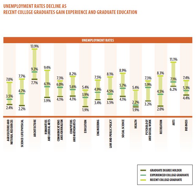
    Georgetown’s Center on Education and the Workforce, analyzing 2009-10 data on graduates from the Census Bureau’s American Community Survey, showed that the worst job prospects are for students coming out of architecture programs (13.9% unemployment), followed by arts (11.1%), humanities and liberal arts (9.4%), social science (8.9%), and law and public policy (8.1).

    Postrel acknowledges some of Georgetown’s findings but goes right at those who think the US needs students to be more career-minded. Looking at national education stats, she argues most Americans are already choosing a college major based on the prospects of landing a job upon graduation. And if the supply of "practical" workers increases, Postrel warns, the quality of the workforce will deteriorate and wages will be lower.

    “Contrary to what critics imagine,” she writes, “most Americans in fact go to college for what they believe to be ‘skill-based education.’ A quarter of them study business, by far the most popular field, and 16 percent major in one of the so-called Stem (science, technology, engineering and math) fields. Throw in economics, and you have nearly half of all graduates studying the only subjects such contemptuous pundits recognize as respectable.” Further, Postrel says those who argue for initiatives to push students in STEM fields – or away from liberal arts – disregard “the diversity and dynamism of the economy, in good times as well as bad.”

    So what’s better? Would the U.S. be better off if more students took a broad-based liberal arts approach to their education, or should more be concerned with learning a specific trade or set of skills?

    Postrel cited the National Center for Education Statistics’ report entitled "2008-09 Baccalaureate and Beyond Longitudinal Study" (PDF here), which looked at graduates from the 2007-08 academic year. Two points should be made on this study: 1) the economy and employment prospects related to certain programs have changed drastically since 2007-08, and 2) the report includes only bachelor’s degree recipients.

    With this in mind, EMSI tapped into the NCES database to get a more recent and thorough picture of the most popular programs areas for recent US grads. We looked at the total number of degrees given out in 2010 (the most recent year available from NCES) at the associate’s, bachelor’s, master’s, and doctorate level among major program categories.

    Our analysis includes degrees at the four main postsecondary levels mentioned above, not certificates or postsecondary awards. We did this to better reflect graduates who have made a more-than-one-year investment in education and have therefore given their decision serious thought.
    A few noteworthy items (see the full data here):

    • Humanities majors account for 12% of graduates in the study Postrel used; according NCES’ latest data, which uses slightly different program classifications, 9.6% of all degrees came in liberal arts and sciences, general studies and humanities. One reason for the lower percentage could be that we included associate’s degrees (as well as bachelor’s, master, and doctorate degrees) in our analysis and the NCES study looked only at bachelor’s degree holders.
    • Business, management, marketing and related programs make up the largest percentage of 2003 and 2010 degree recipients, just under 20% in both years. Postrel said a quarter of all degrees came in business (per the NCES study, it’s 23%).
    • Health professions and related programs made the biggest jump among major program categories — from 9.2% of all degree recipients in 2003 to 12.7% in 2010–and now stands No. 2 overall. The biggest reason for this has been the dramatic increase in registered nursing/LPN and medical assistant degrees (see more on the supply of RNs).
    • As a proportion of all degrees, computer and information sciences took the biggest hit — from 4.6% (127,088) in 2003 to 2.7% (94,730) in 2010.

    These stats point to a few telling short-term shifts. Yes, a significant number of all degree recipients have moved toward skill-based education. But more striking is the decline in students choosing STEM majors as a share of all graduates. In 2003, 21% of degrees awarded in the U.S. were from STEM-related programs. In 2010, that percentage dipped to 19%.

    Postrel would prefer students not be pigeonholed into going the skill-based route, even when it’s STEM-related. Yet it’s hard to ignore the illuminating data from Georgetown’s report: Recent grads in humanities and liberal arts have a 9.4% unemployment rate – lower than architecture, which has taken a beating with the construction downturn, but considerably higher than engineering (7.5%), business (7.4%), and especially health (5.4%).

    So, to go back to the question posed earlier, our economy would seem to be better off – or, to put it another way, unemployment would most improve — if more students earned a skills-based education over a liberal arts degree. At least in the short term, that appears to be the best solution to get people back to work. But outside training for a few fields, there’s no automatic path to a job. Even some new registered nursing grads – with nursing once seen as a lock to find a job – are having a hard time finding employment. And EMSI and others have written about the souring job prospects for lawyers.

    The Great Recession affected every industry in one way or another. Nonetheless, it’s worth repeating: There are 3.4 million jobs openings out there – 39% more than in June 2009. But in a sure sign that something is out of whack, hiring is only up 12% over that same time. 

    Flickr Photo by Jason Morrison: Ann Morrison gets her Masters of Science in Nursing, Pepper Pike, Ohio.

    Joshua Wright is an editor at EMSI, an Idaho-based economics firm that provides data and analysis to workforce boards, economic development agencies, higher education institutions, and the private sector. He manages the EMSI blog and is a freelance journalist. Contact him here.

  • The Hardest Job To Fill In 2012? A Look At The Supply of Web Developers

    Keith Cline at Inc.com has a fresh look at one of the enduring, and perplexing, stories of 2011 — the skills shortage. Even with 13.3 million Americans unemployed, and millions more underemployed, there are industries severely lacking in skilled talent.

    Cline provided five loose job titles/duties that employers will have a hard time filling as 2012 starts. Chief among them: software engineers and web developers.

    Writes Cline, “The demand for top-tier engineering talent sharply outweighs the supply in almost every market especially in San Francisco, New York, and Boston.  This is a major, major pain point and problem that almost every company is facing, regardless of the technology ‘stack’ their engineers are working on.”

    Exacerbating the apparent problem is that the four other job areas that Cline mentions are often related to high-tech industries and web development — creative design/user experience, product management (particularly of the consumer web/e-commerce/mobile variety), web-savvy marketing, and analytics.

    But is there really a skill shortage in these areas across the US, or is it a matter of firms not wanting to budge on wages? As Brian Kelsey recently pointed out, “A talent shortage, and a talent shortage at the wages you are willing to pay, are usually two separate issues.”

    Let’s focus on web developers, and see what job and wage trends show. Working with EMSI’s occupation data, which is based on classifications from the Bureau of Labor Statistics, there are three primary job codes for developers: 1) computer programmers; 2) software developers, applications; and 3) software developers, systems software.

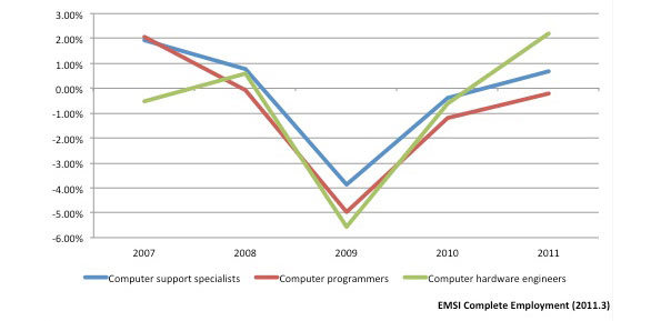
    According to EMSI’s most recent figures, software developers have performed better in the job market than computer programmers. Software developer jobs have been steadily growing nationally in recent years — after a dip in 2008 — while computer programmer jobs (the blue line in the chart below) have been stagnant or in decline since the economic downturn.

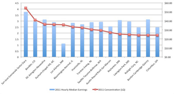
    On average nationally, these jobs pay between $33 per hour (for programmers) and $44 per hour (for systems software developers). The top 10 percent of workers in these fields make on average $51 to $64 per hour. Among the largest 100 metro areas in the US, San Jose ($55.48), Bridgeport, Conn. ($49.48), and Boston ($46.58) pay the highest median earnings for developers.

    These are solid baseline figures. But what about the supply issue?

    One way to determine labor shortages is by analyzing historic wages, coupled with employment trends, for an occupation; if wages are increasing over time, that’s a good sign of unmet demand in the market and hence, a shortage. The reason: demand from employers for additional workers would be so great that it would push up wages.

    We looked at median earnings for programmers and computer software engineers from 2000-2010 using the BLS’ Current Population Survey (CPS) dataset, a monthly survey of US households. Adjusted for inflation, CPS data* shows programmers’ wages have essentially been flat (2% growth) since 2000. It’s a different story for software engineers; their wages increased 13% from 2000 to 2010.

    But for both programmers and software engineers, real wages have declined since 2004. This make sense given the stagnant employment picture for programmers. Yet for software engineers, employment has increased more than 6% since 2009 while wages have held steady in recent years.

    If there is indeed the major undersupply that Cline and others have argued, wages would not be stagnant but continuing to rise (and probably rising sharply). That appeared to happen in the early 2000s — but not recently.

    * Note: Current Population Survey wage estimates are different than the above-mentioned hourly earnings that EMSI reports in its complete employment dataset. EMSI’s figures, which include proprietors, come from the BLS’ Occupational Employment Statistics dataset and the Census’ American Community Survey.

  • States with Largest Presence of STEM-Related Jobs

    Few would argue that STEM-educated workers are vital to advancing innovative ideas and new products. But here’s another fact borne out by labor market data: The regions with the strongest presence of STEM-related employment are heavily dependent on government funding.

    Washington, D.C. has more than two times the concentration of STEM (science, technology, engineering, and math) jobs than the national average, according to EMSI’s latest employment estimates. Fairfax and Arlington counties — whose economies are interconnected to D.C.’s — have helped Virginia expand its presence of STEM-related workers, on a per-capita basis, more than any other state in the last decade.

    Meanwhile, the two counties in the U.S. with the most STEM workers per capita — Los Alamos, N.M., and Butte, Idaho — are home to major Department of Energy national laboratories.

    Defining STEM Employment

    Before we go further, though, we should discuss how we define STEM-related jobs. Just like green jobs or creative workers, there are many definitions of STEM occupations — often different from state to state. Here we used the definition developed by Praxis Strategy Group, an EMSI client and North Dakota growth strategy firm that has co-written the U.S. Chamber of Commerce’s “Enterprising States” report the last two years.

    The definition consists of eight high-level categories (see here for all 93 five-digit occupations):

    • Computer specialists (SOC 15-1)
    • Mathematical science occupations (15-2);
    • Engineers (17-2);
    • Drafters, engineering, and mapping technicians (17-3);
    • Life scientists (19-1);
    • Physical scientists (19-2);
    • Social scientists and related occupations (19-3);
    • Life, physical, and social science technicians (19-4).

    Given this  definition, here are some key facts about STEM-related employment in the US:

    • There are just over eight million estimated jobs in these fields as of 2011. Keep in mind that at this point all 2011 EMSI job figures are estimates.
    • Overall this group has grown by 3.7% since 2001; there were significant dips in the early 2000s and at the onset of the recession. 
    • Men hold nearly three of every four STEM-related jobs (73%). 
    • Nearly 20% of the STEM workforce is 55 years old and above (and 26.6% are between 45-54). This  points a fairly substantial number of potential retirements hitting these fields in the next five to 10 years.

    Praxis includes technicians jobs that typically require two-year degrees because they are often overlooked in the STEM conversation.

    States Gaining/Losing STEM Concentration

    Generally, states that have had the biggest percentage increases in employment in the last decade have also seen modest to healthy gains in their STEM workforces. North Dakota’s STEM employment has soared 31% (compared to 15% across all occupations). Alaska and Utah’s STEM jobs have each grown 18%, while both states have seen double-digit percentage increases in all jobs.

    Results for every state are detailed in the table below. We also included  the change in concentration (measured by location quotient, or LQ) for STEM-related workers from ’01 to ’11 across every state. Using our GIS tool, we were able to compare all 50 states (plus D.C.) by their LQ to see which have gained a comparative advantage.

    Outside D.C., Virginia, Washington State — where more than 70% of STEM workers are located in the Seattle area — Maryland, and North Dakota have seen the biggest increases in STEM concentration in the last decade. Other states who have performed well: Alaska, Rhode Island, Arkansas, and West Virginia.

    California, on the other hand, still has more than 13% of the nation’s overall STEM-related workforce (just over 1 million estimated jobs). But it shed 19,000 STEM jobs in the last decade (a 1.75% decline) and saw its above-average concentration slightly decline.

    Note: A location quotient of 1.00, like Arizona has in 2011, means that state has the same relative concentration of STEM workers as the national average.

    State 2001-2011 STEM Job Change % Change (STEM) 2001-2011 Overall Change % Change (Overall) 2001 STEM LQ 2011 STEM LQ
    District of Columbia (DC) 13,758 20% 78,562 11% 2.00 2.20
    Washington (WA) 36,362 16% 314,900 9% 1.42 1.53
    Virginia (VA) 47,728 17% 348,387 8% 1.35 1.49
    Maryland (MD) 27,826 14% 241,837 8% 1.38 1.48
    Massachusetts (MA) -9,569 -3% 71,653 2% 1.53 1.48
    Colorado (CO) -2,654 -1% 181,752 6% 1.45 1.36
    New Jersey (NJ) -8,979 -3% 174,439 4% 1.23 1.16
    California (CA) -18,996 -2% 471,154 2% 1.18 1.15
    Delaware (DE) -4,459 -14% 25,280 5% 1.38 1.14
    Minnesota (MN) 1,730 1% 84,854 3% 1.12 1.12
    New Hampshire (NH) -955 -2% 41,818 5% 1.18 1.11
    Michigan (MI) -52,084 -17% -369,217 -7% 1.22 1.10
    New Mexico (NM) 6,423 14% 90,068 9% 1.05 1.10
    Alaska (AK) 3,539 18% 51,864 13% 1.02 1.09
    Connecticut (CT) -2,849 -3% 71,855 3% 1.13 1.07
    Texas (TX) 86,347 14% 2,179,616 18% 1.06 1.04
    Utah (UT) 11,969 18% 248,910 18% 1.03 1.04
    Oregon (OR) 4,456 4% 125,822 6% 1.03 1.03
    Idaho (ID) -697 -2% 93,579 12% 1.14 1.02
    Arizona (AZ) 8,975 7% 350,216 13% 1.04 1.00
    Vermont (VT) 623 3% 21,017 5% 0.99 0.99
    Pennsylvania (PA) 11,961 4% 212,861 3% 0.94 0.96
    New York (NY) 974 0% 524,666 5% 0.97 0.94
    Ohio (OH) 515 0% -226,628 -3% 0.88 0.93
    Rhode Island (RI) 1,760 7% 7,036 1% 0.87 0.93
    Illinois (IL) -17,404 -5% -45,841 -1% 0.94 0.91
    Kansas (KS) -2,818 -4% 19,642 1% 0.93 0.90
    North Carolina (NC) 18,377 9% 319,803 7% 0.87 0.90
    Wisconsin (WI) 8,050 6% 65,922 2% 0.82 0.87
    Georgia (GA) 6,447 3% 332,612 7% 0.87 0.85
    Missouri (MO) 1,385 1% 19,824 1% 0.83 0.85
    Florida (FL) 26,341 8% 760,396 9% 0.80 0.81
    Montana (MT) 2,834 14% 62,699 11% 0.78 0.81
    Alabama (AL) 8,153 10% 117,917 5% 0.75 0.80
    Nebraska (NE) 3,326 8% 49,749 4% 0.74 0.78
    Indiana (IN) 1,880 2% -68,167 -2% 0.74 0.77
    Maine (ME) 178 1% 13,400 2% 0.76 0.77
    Wyoming (WY) 2,839 26% 60,177 18% 0.72 0.77
    Iowa (IA) 4,852 8% 46,353 2% 0.69 0.74
    Oklahoma (OK) 6,730 10% 138,146 7% 0.69 0.72
    South Carolina (SC) 8,944 12% 214,997 10% 0.69 0.72
    Hawaii (HI) 4,022 17% 73,132 10% 0.66 0.71
    Kentucky (KY) 6,252 9% 58,998 3% 0.63 0.68
    Arkansas (AR) 5,901 14% 65,655 4% 0.61 0.67
    North Dakota (ND) 3,683 31% 67,224 15% 0.58 0.66
    West Virginia (WV) 3,215 13% 35,869 4% 0.60 0.66
    Louisiana (LA) 5,642 8% 148,018 6% 0.63 0.65
    South Dakota (SD) 1,737 12% 38,620 8% 0.62 0.65
    Tennessee (TN) 5,888 6% 119,340 4% 0.60 0.63
    Nevada (NV) 6,580 19% 214,697 17% 0.59 0.61
    Mississippi (MS) 2,957 8% 41,833 3% 0.52 0.55
    Source: EMSI Complete Employment 2011.3

    STEM-Related Earnings Much Higher In Most States

    STEM-related occupations pay on average between $8 to $18 per hour more than all other jobs looking the nation. This isn’t a surprise, but the disparity in wages is startling in some cases. Consider Virginia, where average hourly earnings in STEM-related employment are almost twice that of all other occupations, according to EMSI’s latest  employment data. The difference is almost as large in California, Colorado, and Maryland. (These are disturbing numbers for California, considering the drop-off of STEM jobs we highlighted earlier. Simply, these high-wage jobs have declined while lower-paying jobs have grown).


    It’s also interesting that most states at the other end of spectrum — those where the difference in STEM-related earnings and all others isn’t as severe –  are sparsely populated. This includes Wyoming, Montana, the Dakotas, and Idaho.

    State 2011 Hourly Earnings (STEM Jobs) 2011 Hourly Earnings (Non-STEM Jobs) Difference
    Wyoming (WY) $26.32 $18.37 $7.95
    Montana (MT) $23.71 $15.74 $7.97
    South Dakota (SD) $23.70 $15.27 $8.43
    North Dakota (ND) $25.25 $16.54 $8.71
    Idaho (ID) $27.07 $16.77 $10.30
    West Virginia (WV) $25.83 $15.44 $10.39
    Mississippi (MS) $25.80 $15.35 $10.45
    Kentucky (KY) $27.39 $16.93 $10.46
    Maine (ME) $28.30 $17.47 $10.83
    Arkansas (AR) $26.46 $15.57 $10.89
    Wisconsin (WI) $29.26 $18.14 $11.12
    Indiana (IN) $28.43 $17.25 $11.18
    Vermont (VT) $29.69 $18.27 $11.42
    New York (NY) $34.02 $22.52 $11.50
    Hawaii (HI) $31.13 $19.60 $11.53

    County-Level Look At Stem Jobs

    Los Angeles County has the largest number of STEM jobs in the U.S. (more than 235,000). But when it comes to job concentration, Santa Clara County overwhelms LA County, largely because of the influence of Silicon Valley. Beyond pockets in California and Washington, however, most of the top counties have some kind of heavy government influence.

    As we mentioned earlier, Los Alamos County, N.M. (with an LQ of 7.10) and Butte County, Idaho (with an LQ of 6.83) have huge STEM presences given their overall workforces. The Idaho National Laboratory is located partially in Butte County — in windswept southeastern Idaho — and employs approximately 4,000 people. The Los Alamos National Lab is the largest employer in northern New Mexico, with an estimated budget of $2.2 billion.

    Virginia has three of the top 10 most concentrated counties in the US (King George, Arlington, and Fairfax). King George County, home to the the U.S. Naval Surface Warfare Center Dahlgren Division, has the fourth-highest earnings for STEM workers of any U.S. county and is five times more concentrated than the national average.

    Martin County, Indiana (pop. 10,334), the fourth-most concentrated county in the nation, is also the site of another Naval Surface Center. And it’s not a surprise that Durham County, N.C., is is also in the top 10 given the Research Triangle.


    Joshua Wright is an editor at EMSI, an Idaho-based economics firm that provides data and analysis to workforce boards, economic development agencies, higher education institutions, and the private sector. He manages the EMSI blog and is a freelance journalist. Contact him here.

    Lead illustration by Mark Beauchamp

  • Supply of Tech Workers Greater Than Estimated Demand

    CNBC reports the information technology (IT) sector is “where the jobs are.” And the Los Angeles Times writes that tech jobs in San Francisco are a “rare bright spot in the nation’s troubled economy.”

    EMSI’s most current data, however, paints a slightly less rosy picture.

    It’s clear that IT and tech jobs have mostly bounced back since the recession (or barely saw employment dips in the first place). But not every tech-related profession is faring well; jobs in computer programming, for example, have failed to reach pre-2008 levels.

    And in almost all cases, the supply of IT and tech grads far outweighs the estimated annual openings in those areas over the next five years.

    Overall Trends

    IT jobs are spread across nearly every sector, making labor market analysis at the industry level a bit tricky. Tech jobs too are varied and can incorporate many different activities. For this data spotlight, we focused on 11 occupations — mainly in the computer specialist and database/network administrator realm.

    SOC Code Description
    2006 Jobs
    2011 Jobs
    Change
    % Change
    15-1011 Computer and information scientists, research
    28,349
    30,648
    2,299
    8%
    15-1021 Computer programmers
    452,953
    433,188
    (19,765)
    (4%)
    15-1031 Computer software engineers, applications
    511,199
    555,917
    44,718
    9%
    15-1032 Computer software engineers, systems software
    404,764
    430,792
    26,028
    6%
    15-1041 Computer support specialists
    572,327
    567,082
    (5,245)
    (1%)
    15-1051 Computer systems analysts
    584,711
    606,473
    21,762
    4%
    15-1061 Database administrators
    111,008
    113,975
    2,967
    3%
    15-1071 Network and computer systems administrators
    347,629
    358,743
    11,114
    3%
    15-1081 Network systems and data communications analysts
    355,264
    407,983
    52,719
    15%
    15-1099 Computer specialists, all other
    212,981
    221,861
    8,880
    4%
    17-2061 Computer hardware engineers
    70,797
    68,040
    (2,757)
    (4%)
    SOURCE: EMSI Complete Employment (2011.3)

    In total, these 11 tech-related jobs have grown by 3.9% since 2006 in the US (nearly 143,000 new jobs). The only professions on this list to see a net loss in jobs over the last five years are computer support specialists, computer hardware engineers, and computer programmers.

    Computer support specialists account for the second-most jobs of any occupation in this tech group, and they’ve started to make their way back up with growth from 2010-2011. But hardware engineers and programmers continued to shed jobs in the last year — after seeing drops of 5.6% and 5%, respectively, from ’08 to ’09.

    Key Industries for Tech Jobs

    With EMSI’s research tool, Analyst, we’re able to quickly shift from examining occupations to the top industries that staff those occupations (via inverse staffing patterns). This is a particularly useful analysis for tech jobs.

    Consider the case of programmers: the industry breakdown shows this profession is becoming more specialized. In the last five years, there are more programmers in the computer systems design services and custom computer programming services industries, but fewer in generalized industries such as temporary help services, corporate offices, and state and local government.

    FASTEST-CHANGING INDUSTRIES FOR COMPUTER PROGRAMMERS
    NAICS Code
    Description
    2006-11 Change
    541512 Computer Systems Design Services
    6,865
    541511 Custom Computer Programming Services
    5,225
    561320 Temporary Help Services
    -2,400
    541519 Other Computer Related Services
    -2,335
    518210 Data Processing, Hosting, and Related Services
    -1,076
    920000 State government
    -1,020
    930000 Local government
    -726
    541513 Computer Facilities Management Services
    -721
    551114 Corporate, Subsidiary, and Regional Managing Offices
    -590
    511210 Software Publishers
    -376

    This data also suggests that some tech industries — like data processing/hosting services and other computer related services — are either getting by with fewer programmers and other assorted tech workers, or a good number of these positions have been offshored.

    That doesn’t seem to be the case as much with software engineers. More of these workers have been added to IT-related industries and general industries since 2006. The biggest exceptions are wired telecommunication carriers and data processing, hosting, and related services.

    FASTEST-CHANGING INDUSTRIES FOR SOFTWARE ENGINEERS (15-1031 and 15-1032)
    NAICS Code
    Description
    2006-2011 Change
    541512 Computer Systems Design Services
    35,339
    541511 Custom Computer Programming Services
    24,660
    511210 Software Publishers
    5,727
    551114 Corporate, Subsidiary, and Regional Managing Offices
    3,260
    541712 Research and Development in the Physical, Engineering, and Life Sciences (except Biotechnology)
    2,971
    517110 Wired Telecommunications Carriers
    -2,310
    541330 Engineering Services
    1,310
    518210 Data Processing, Hosting, and Related Services
    -1,080
    334111 Electronic Computer Manufacturing
    -1,048

    Metros with Highest Concentration of Tech Workers

    The area with the largest share of tech workers, on a per capita basis, probably won’t come as a huge shock. The San Jose metro, home to Silicon Valley, is more than 4 times more concentrated in tech workers than the nation, and it has the highest median earnings. With a median wage of $50.14 per hour, San Jose has 7% higher wages than the second best-paying metro, Bridgeport, Conn., ($46.59), and 17% higher wages than the third metro on the list, Boston-Cambridge ($41.69).

    Boulder, Colo., is the second-most concentrated metro, at more than 3 times the national average, followed by DC (with a location quotient of 2.73) and Durham-Chapel Hill, NC (2.7).

    Meanwhile, DC and Seattle-Tacoma have seen the most new tech jobs since 2006. DC has added 18,205 jobs (9%), Seattle has added 14,762 (16%), while San Jose is third with 11,102 new jobs (12%).

    Supply/Demand Imbalance

    The job market for tech workers in San Jose, San Francisco, and other pockets of the country seems to be thriving. But there also appears to be a considerable excess of new graduates in these fields compared to the annual demand over the next five years. According to EMSI estimates, there are more than 3 times as many graduates as annual job openings through 2016.

    We gauged the supply of 2009 grads from programs associated with the 11 tech professions using the US Department of Education’s IPEDS database, and looked at the completions in comparison to estimated annual openings (new and replacement jobs) for the same jobs. Note: Not all graduates from tech-related programs will work in tech-related fields (though in higher-skilled areas such as these, the chances are higher) and IPEDS data is subject to misreporting/error on a college-by-college basis.

    Looking at the supply/demand numbers for the individual tech occupations, computer and information scientists have the largest glut (56,865 too many grads per year). Two other occupations have graduate oversupplies that exceed 50,000: network and computer systems administrators and computer specialists, all other.

    There’s only one occupation, meanwhile, with a shortage of associated graduates: computer support specialists (not to be confused with computer support specialists, all other).

    SOC Code
    Description
    Annual Openings
    2009 Completions
    Surplus/Shortage
    2011 Median Hourly Earnings
    15-1011 Computer and information scientists, research
    1,239
    58,104
    56,865
    $44.90
    15-1071 Network and computer systems administrators
    13,234
    66,273
    53,039
    $31.75
    15-1099 Computer specialists, all other
    7,342
    59,726
    52,384
    $35.04
    15-1061 Database administrators
    3,866
    46,498
    42,632
    $33.48
    15-1081 Network systems and data communications analysts
    21,081
    56,792
    35,711
    $28.07
    15-1032 Computer software engineers, systems software
    13,664
    42,621
    28,957
    $42.80
    15-1021 Computer programmers
    9,670
    29,847
    20,177
    $31.38
    15-1031 Computer software engineers, applications
    18,951
    34,105
    15,154
    $40.15
    15-1051 Computer systems analysts
    23,023
    38,104
    15,081
    $34.23
    17-2061 Computer hardware engineers
    2,420
    5,804
    3,384
    $46.17
    15-1041 Computer support specialists
    22,449
    3,424
    -19,025
    $21.10
    Total
    136,939
    441,298
    304,359

    Joshua Wright is an editor at EMSI, an Idaho-based economics firm that provides data and analysis to workforce boards, economic development agencies, higher education institutions, and the private sector. He manages the EMSI blog and is a freelance journalist. Contact him here.

    Illustration by Mark Beauchamp

  • Sizing Up Texas’ Job Growth Under Rick Perry

    Now that Texas Gov. Rick Perry is officially in the running for the Republican presidential nomination, journalists and econ bloggers from almost every national news outlet have examined the Texas’ economy in excruciating detail. The fact that Texas has produced nearly 40% of all new jobs in the US since 2009 has been regurgitated over and over again, and the state’s remarkable population spike has repeatedly been cited as a reason for the big employment growth.

    But more than those shared story lines, writers have offered another strikingly similar theme in their Texas critiques: many have pointed to the wave of oil and gas jobs as the key driver of the state’s economic boom.

    To be sure, energy employment is part of Texas’ growth, as EMSI highlighted in June. But it’s far from the biggest part. CNNMoney did a nice job laying out the super-sectors that have done well in the Lone Star State, and we’re going to drill down even further using EMSI’s detailed data to see which specific industries are fueling the state’s growth.

    How Texas Stacks Up

    It’s true that Texas has accounted for a large share of new jobs in the US, and that’s not just the case since 2009. Going back to 2001, Texas has added more than 2.1 million jobs, according to EMSI’s latest complete dataset, while the rest of the nation has combined for 6.2 million new jobs.

    But Texas is a massive state, of course, with a population of more than 24 million. So to even the playing field, let’s look at percentage job growth.

    As it turns out, there are only four states that have grown from 2001 to 2011 and from 2009 to 2011.

    Like Texas, Wyoming and Utah have also had 18% growth since 2001, but no state has performed better since 2009 than North Dakota. Its employment base has grown 5% in the last two years, compared to 2% for Texas. But because North Dakota has a much smaller population — and workforce — than Texas, its growth typically doesn’t get mentioned in discussions like these.

    Energy is a Big Player — But Not the Biggest One

    Oil and gas extraction employment in Texas has more than doubled in the last 10 years, and support industries for drilling have also boomed. Altogether, the mining, quarrying, and oil and gas extraction sector has jumped from over 230,000 jobs in 2001 to just under 490,000 in 2011.

    But that’s only a fraction of the 14.2 million jobs in the state, and the oil and gas growth accounts for slightly more than 10% of all new jobs in the state since 2001.

    What have been the biggest job gainers? Health care and social assistance (421,000-plus) and government (nearly 282,000) have made the largest additions to their payrolls in the last decade. It should be noted, however, that government jobs have declined in the last year — and were growing stagnant before then.

    Yet once you extract federal government jobs, it’s clear that state and local government employment is doing considerably better in Texas than other states. Texas is one of 10 states that have seen increases in state and local government jobs since 2009, and its growth (29,287) is nearly nine times that of the state with the second-most growth, Kentucky (3,327).

    These numbers don’t exactly bolster Perry’s small-government agenda claims.

    State and Local Government Job Change (2009-11)

    In terms of detailed sub-sectors, temporary health services, crude petroleum/natural gas extraction, and home health services have been the strongest performers in Texas since 2009. Overall, 19 industries have added at least 5,000 jobs since ’09, of which electric power distribution has had by far the largest percent growth (111%).

    NAICS Code Description 2009 Jobs 2011 Jobs Change % Change
    561320 Temporary Help Services 171,096 204,456 33,360 19%
    211111 Crude Petroleum and Natural Gas Extraction 290,638 317,388 26,750 9%
    621610 Home Health Care Services 240,018 263,099 23,081 10%
    930000 Local government 1,240,713 1,261,970 21,257 2%
    213112 Support Activities for Oil and Gas Operations 89,179 108,765 19,586 22%
    221122 Electric Power Distribution 11,840 25,038 13,198 111%
    722110 Full-Service Restaurants 371,893 385,081 13,188 4%
    814110 Private Households 113,106 125,148 12,042 11%
    621111 Offices of Physicians (except Mental Health Specialists) 198,795 210,077 11,282 6%
    622110 General Medical and Surgical Hospitals 265,013 274,810 9,797 4%
    920000 State government 354,190 362,219 8,029 2%
    551114 Corporate, Subsidiary, and Regional Managing Offices 90,157 98,159 8,002 9%
    213111 Drilling Oil and Gas Wells 34,826 42,562 7,736 22%
    425120 Wholesale Trade Agents and Brokers 58,575 64,461 5,886 10%
    452112 Discount Department Stores 63,272 69,137 5,865 9%
    561720 Janitorial Services 152,316 157,919 5,603 4%
    623110 Nursing Care Facilities 99,246 104,651 5,405 5%
    561110 Office Administrative Services 88,376 93,599 5,223 6%
    522110 Commercial Banking 112,482 117,698 5,216 5%

    Key Regional Industries

    We also looked at the most concentrated industries in Texas, as compared to national employment concentration, to see which industries are unique to the state and tend to be export-oriented. Oil and gas extraction — and the production of equipment for extraction — figure prominently among this group of industries.

    Crude petroleum/natural gas extraction is more than 4.5 times more concentrated in Texas than the nation, and it accounts for more than 300,000 jobs. Other industries with high LQs and large employment bases: support activities for oil and gas operations; engineering services; and office administrative services.


    For more on Texas’ economy, be sure to read Tyler Cowen’s post at Marginal Revolution. And for more on Texas’ growth, check out this piece on the top cities in the US.

    Illustration by Mark Beauchamp