Author: Mark Schill

  • A Look at the Information Sector

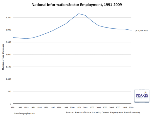
    Between economic development strategies targeting software firms, the deflation of the tech bubble, talk of “broadband,” and recent consternation about failing publishing business models, we seem to hear a lot about the information sector. Recognizing that, it’s interesting that the information sector only comprises about 2.2% of total employment in the US.

    On top of that, after a big decline since the tech bubble peak in 2001, in February the sector has receded to just more than 2.9 million jobs, a level not seen since April 1996.

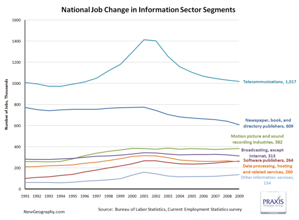
    The telecommunications subsector accounts for just more than 1/3 of information employment, and saw the biggest boom and bust. Publishing has declined since 2000, and motion picture and sound recording industries are larger than either software publishing or data processing.

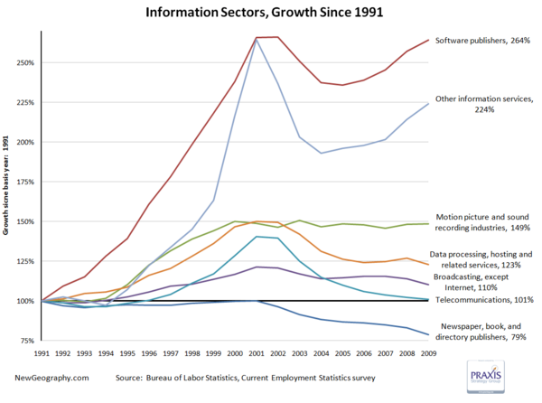
    Looking at percent change, software has recovered from the tech bust, while the movie business has remained steady since topping off in 2000. Worse off are telecom and data processing, which continue the post bust slide.

    One fifth of the jobs in the publishing industry have vanished since 2001.

    This is not to say technology occupations are not a key part of the nation’s economy and productivity gains over the past decade, but the importance of the information sector itself is overstated. High-tech industries that produce products generally fall into manufacturing sectors while things like systems design, web design, or even custom programming are business services.

    The next post will look at regional shifts in information employment, but until then check out Ross Devol’s more comprehensive study on regional tech poles.

    Other Information services includes: news syndicates, libraries, archives, exclusive Internet publishing and/or broadcasting, and Web Search Portals.

  • Mapping Urban Income Dispersion

    Here’s some cool maps from radicalcartography.net looking at income dispersion in the country’s 25 largest metropolitan areas by population. From the page:

    These maps show the distribution of income (per capita) around the 25 largest metropolitan areas in the US (all those with population greater than 2,000,000). The goal was to test the “donut” hypothesis — the idea that a city will create concentric rings of wealth and poverty, with the rich both in the suburbs and in the “revitalized” downtown, and the poor stuck in between.

    This does seem to have some validity in older cities like Boston, New York, Philadelphia, or Chicago, but in newer cities it is not the case. Instead of donuts, one finds “wedges” of wealth occupying a continuous pie-slice from the center to the periphery.

    Just from visual inspection, it also seems that poverty donuts all tend to have about a five-mile radius, regardless of the size of the city. Perhaps this is the practical limit for commuting without a car?

    All maps are at the same scale, and all use the same color values for income.

  • Visualizing our 2009 Best Cities for Job Growth Rankings

    Here’s some great maps of our annual Best Cities Rankings created by Robert Morton at Tableau Software. Robert used their software tool to plot a color coded point for each city in the rankings by size group, and immediate geographic patterns emerge:

    Check out Robert’s post for a map of the biggest gainers and losers from last year, and a rank change by size scatter plot of each place.

  • U-Haul Prices as Migration Indicator

    Austin fared very well on this year’s Best Cities Rankings, and here’s another interesting indicator of the difference in migration between Austin and San Francisco:

    “When comparing California with Texas, U-Haul says it all. To rent a 26-foot truck oneway from San Francisco to Austin, the charge is $3,236, and yet the one-way charge for that same truck from Austin to San Francisco is just $399. Clearly what is happening is that far more people want to move from San Francisco to Austin than vice versa, so U-Haul has to pay its own employees to drive the empty trucks back from Texas.”

    This anecdote comes from a report comparing business environments in Texas to California.

    Here’s a table of the latest domestic migration numbers from US Census for all metropolitan areas of more than 1.5 million total population (rate numbers are per 1,000 population):

    NAME
    Population, 2008
    Net Domesitc Migration Rate, 2008
    Ave. Net Domesic Mig Rate, 2001-2008
    New York-Northern New Jersey-Long Island, NY-NJ-PA 19,006,798 -7.6 -12.0
    Los Angeles-Long Beach-Santa Ana, CA 12,872,808 -9.0 -12.2
    Chicago-Naperville-Joliet, IL-IN-WI 9,569,624 -4.4 -6.8
    Dallas-Fort Worth-Arlington, TX 6,300,006 7.0 5.7
    Philadelphia-Camden-Wilmington, PA-NJ-DE-MD 5,838,471 -3.8 -2.3
    Houston-Sugar Land-Baytown, TX 5,728,143 6.6 4.5
    Miami-Fort Lauderdale-Pompano Beach, FL 5,414,772 -8.7 -5.1
    Atlanta-Sandy Springs-Marietta, GA 5,376,285 8.2 10.2
    Washington-Arlington-Alexandria, DC-VA-MD-WV 5,358,130 -3.4 -2.9
    Boston-Cambridge-Quincy, MA-NH 4,522,858 -1.8 -7.1
    Detroit-Warren-Livonia, MI 4,425,110 -13.9 -9.1
    Phoenix-Mesa-Scottsdale, AZ 4,281,899 12.3 17.9
    San Francisco-Oakland-Fremont, CA 4,274,531 1.3 -10.5
    Riverside-San Bernardino-Ontario, CA 4,115,871 -1.9 16.1
    Seattle-Tacoma-Bellevue, WA 3,344,813 3.6 0.9
    Minneapolis-St. Paul-Bloomington, MN-WI 3,229,878 -1.1 -1.0
    San Diego-Carlsbad-San Marcos, CA 3,001,072 0.1 -4.8
    St. Louis, MO-IL 2,816,710 -2.0 -1.8
    Tampa-St. Petersburg-Clearwater, FL 2,733,761 2.4 12.9
    Baltimore-Towson, MD 2,667,117 -4.6 -1.6
    Denver-Aurora, CO /1 2,506,626 7.3 1.8
    Pittsburgh, PA 2,351,192 -1.0 -2.9
    Portland-Vancouver-Beaverton, OR-WA 2,207,462 8.3 6.2
    Cincinnati-Middletown, OH-KY-IN 2,155,137 -1.7 -1.2
    Sacramento–Arden-Arcade–Roseville, CA 2,109,832 2.2 8.7
    Cleveland-Elyria-Mentor, OH 2,088,291 -7.1 -7.5
    Orlando-Kissimmee, FL 2,054,574 1.6 15.9
    San Antonio, TX 2,031,445 11.5 10.4
    Kansas City, MO-KS 2,002,047 0.7 1.5
    Las Vegas-Paradise, NV 1,865,746 7.9 23.7
    San Jose-Sunnyvale-Santa Clara, CA 1,819,198 -1.5 -16.4
    Columbus, OH 1,773,120 1.4 1.8
    Indianapolis-Carmel, IN 1,715,459 4.0 4.8
    Charlotte-Gastonia-Concord, NC-SC 1,701,799 20.9 18.2
    Virginia Beach-Norfolk-Newport News, VA-NC 1,658,292 -9.4 -0.6
    Austin-Round Rock, TX 1,652,602 22.0 17.2
    Providence-New Bedford-Fall River, RI-MA 1,596,611 -6.6 -3.7
    Nashville-Davidson–Murfreesboro–Franklin, TN 1,550,733 10.9 9.6
    Milwaukee-Waukesha-West Allis, WI 1,549,308 -4.2 -5.9
  • Mapping Farmers Markets

    New Geography contributor Richard Reep has written lately on the increasing activity of farmer’s markets and how the financial crisis may boost local markets.

    Here’s a great interactive map at FortiusOne GeoCommons of a USDA database of national farmers markets.

  • World Urban Areas and Population Projections

    Our colleague and frequent NewGeography contributor Wendell Cox of Demographia.com recently released the latest edition of his World Urban Areas and Population Projections publication.

    This 5th comprehensive edition includes:

    • Ranking of the largest world urban areas (over 2,000,000 population).
    • Population, urban land area and density estimates for all 763 identified urban areas with more than 500,000 population, comprising 49 percent of the world urban population.
    • Population, urban land area and density estimates for 1,370 urban areas of all sizes, comprising 53 percent of the world urban population.
    • Population projections for the world’s largest urban areas in 2025 & 2030 (over 2,000,000 population).
    • Summary of United Nations world population projections and summary by gross domestic product, purchasing power parity (from 4th Edition)
    • Charts on urban density and prosperity (from 2nd Edition)
    • Documentation

    Check it out.