Author: Mark Schill

  • Fargo Flooding: One more night, one more foot

    Late this afternoon the National Weather Service River Forecast Center came out with the announcement that no one in Fargo wanted to hear: the expected crest has risen a foot to 42, and possibly 43 feet. The NWS included the following eerie passage in their official statement:

    “The relative uncertainty in forecast models has increased significantly. Record flows upstream of Fargo have produced unprecedented conditions on the Red River. Given these factors, the river is expected to behave in ways never previously observed.”

    Fargo city commissioners assured the public that dikes were now steady at the 43 foot level, and plans are underway to increase dikes in south Fargo one foot overnight.

    Because of massive traffic gridlock after street closures, sand and clay trucks have been greatly slowed this afternoon. Tonight, the city is asking residents to stay in their homes, leaving it up to individual neighborhoods to band together overnight in the south end to try to add the last foot to save their homes.

    One neighborhood in Fargo and one in Moorhead are under mandatory evacuation, the largest hospital chain is now evacuating patients, and the city has had to make tough choices in placing secondary clay dikes, cutting off a number of neighborhoods should the water rise.

    This battle is not over, and if Fargo and Moorhead can add the last foot and keep the sanitary and storm sewer systems intact they could save the majority of the city. After that, it becomes a problem of maintaining a series of sandbag and temporary dikes over the expected 3 to 5 day high water period.

    Check out local photographer Dave Arntson’s excellent ongoing photo documentary of the flood fight. One thing I learned working for FEMA during our 1997 flood is that photos matter. Inspired photography helps people process and better understand these tense situations, especially since there is no time to think about what is happening while it is happening.
  • Red River Valley Flooding: In Our Backyard

    You may have seen the national media coverage of the flooding in North Dakota and Minnesota. Some of us here at NewGeography.com live right in the middle of it. I parked my car this morning at the base of an earthen dike holding back the Red Red River in Grand Forks, ND. Here in Grand Forks we were wiped out by a similar flood and fire in 1997. We evacuated more than 50,000 people at that time and virtually every property in the area was affected.

    Since 1997, hundreds of homes have been bought out and $400 million was spent on a dike and diversion protection system creating 2,200 acres of green space and more than 20 miles of trails in our little urbanized area of about 70,000.

    This has created a strange feeling – feeling a little useless sitting back and watching the herculean efforts in Fargo while we assemble pieces in the invisible flood wall and listen to officials reassure the public. Many from this area have boarded buses to head down to the Fargo area and help out. Meanwhile, you won’t find a drain plug or generator at a store in town.

    Here’s what’s happened so far:

    In the western part of the state, Bismarck’s situation was alleviated by taking explosives to an ice dam on the Missouri River.

    In western North Dakota, parts of small towns including Linton, Hazen, Zap, and Mott have had problems with overland floods.

    The most concern now is the rising Red River, making up the North Dakota and Minnesota Border. Thousands of volunteers from around the area have converged on Fargo to help, but the situation is now getting serious. Sandbagging takes a lot of effort and sandbag dikes are subject to failure.

    Right now the cities of Fargo and Moorhead are holding strong, but the rural surrounding areas are in trouble.

    Here’s a video report of the Coast Guard rescuing people from their homes in Oxbow, south of Fargo on Wednesday:

    Here’s a time lapse video put together by Minnesota Public Radio of the sandbagging efforts at the Fargodome. What’s interesting is that this is actually a secodary sandbag filling operation, started up after the huge volunteer turnouts:

    And, here’s the direct link to the Fargo river guage, updated about every hour. Fargo successfully defended against a flood just under 40 feet in 1997. 41 feet would be a new record, and the region is scrambling to get the protection systems up to 43 feet.

    Fargo Flood Gauge

    The problem is — it just keeps on snowing and raining and the projected crests keep rising. The Red River flows north. Our colleague Doug just headed down to Fargo to help protect his sister’s house wearing his only possession he has remaining after the Grand Forks floods and fire in 1997: his belt.

    We’ll keep you posted.

  • Not All Retail is Tanking in this Recession

    A reader forwarded along this video of a bustling recent weekend at La Gran Plaza, a shopping center serving the Latino market in Fort Worth, TX. Just a few years ago, La Gran Plaza was a failing conventional shopping center before developers purchased it and completely redesigned and repurposed the mall to cater to Latinos. Partly because it serves a more insular, cash based clientele and largely because of brilliant design and programming choices, this mall seems to be thriving during a very tough period for retailers.

  • Case-Shiller Housing Price Index Chart, December 2008 – The Free Fall Continues

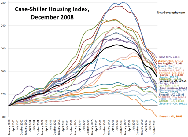
    S&P released the December Case-Shiller Housing Price Index data this morning: no market has been spared from the free fall. Steep price declines continue in ultra-bubble regions Las Vegas, Miami, San Diego, Phoenix, and Las Vegas. Even the relatively healthy markets of Charlotte, Dallas, and Atlanta have been sliding since mid-2008. Here’s the line chart:

    Cleveland is seeing the slowest decline, but that isn’t saying much. My pick for healthiest markets? Denver, where prices are still up 25% from the 2000 baseline but still down 5.2% from the most recent upswing in July 2008. And Dallas, down 6.1% from the July 2008 peak and down 8.6% from June 2007. Dallas is up 22.9% since the Jan 2000 baseline.

    Follow this link for a bigger version of the chart.

  • Deconstructing the Meltdown, National Job Losses by Sector

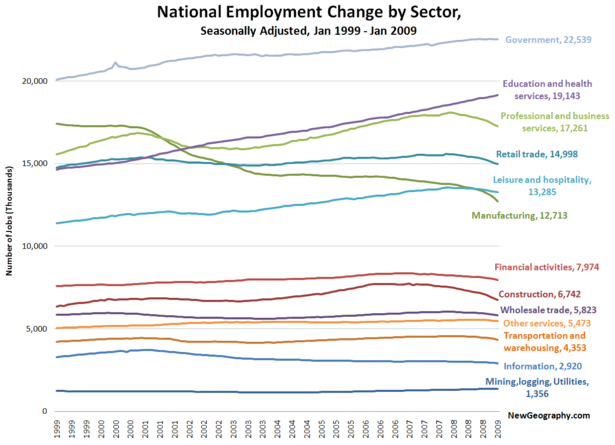
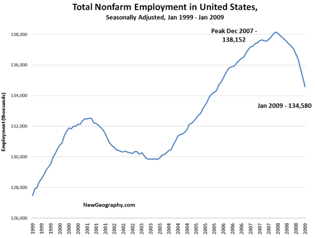
    Here’s a look at national employment change in the United States over the past 10 years. Nonfarm employment peaked in the US in December of 2007 at 138.1 million jobs. After a record loss of 598,000 jobs in the last month, we’re now at 134.5 million. Thats a loss of more than 3.5 million jobs over the past year. Conveniently, 3.5 million jobs is exactly what Obama administration economists plan to create or save with the stimulus package.

    If we cut it by sector, recent job losses in manufacturing, construction, and professional and business services are striking. Over this same time period, we’ve added roughly 4.5 million jobs in education and health and another 2.5 million in government jobs. Perhaps the president is planning to hire those 3.5 million new employees directly?

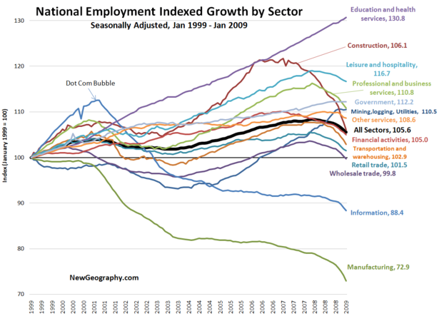
    If we index each sector back to January 1999, we can begin to see the trajectory of each industry over time. For this chart, the height of each line at a given point of time indicates percent growth over the January 1999 level. The heavy black line shows growth for all sectors.

    From here, the dot-com bust is obvious, as is the fact that the information sector has not recovered to pre-2000 levels. Information may be even more trouble in the short term, as that sector includes media and publishing.

    The construction employment boom began in mid 2003 and eventually reached more that a 20% premium over 1999 before falling back to mid 2003 levels last month.

    Manufacturing has fallen precipitously with this bust, we are now seeing marked declines in other goods-supporting industries: wholesale trade and transportation and warehousing.

    Again, institutional sectors of Government (up 12%) and eds and meds (up 30%) lead the way. The other fastest growing sector since 1999? Leisure and hospitality. Staycation, anyone?

  • Does a low number of home staters mean everyone has left?

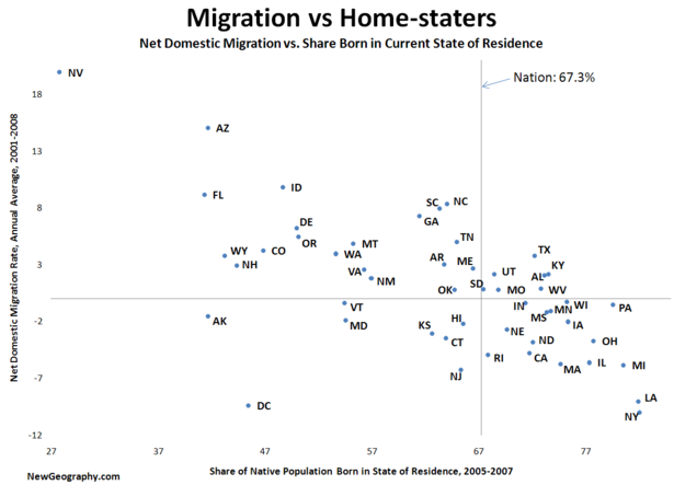
    Last week I took a look at the share of US born residents in each state born in their current state of residence. Some on other blogs wondered if a low share of native born in a state meant that everyone has left or if instead that state is a big lure to out-of-staters. Aside from a few outliers, it seems to be the latter. Take a look at this quick analysis: states with a low share of native born tend to have high net inmigration and states with many born in state tend to have high outmigration.

    It makes sense that in tougher times (evidenced by net outmigration) those with deeper roots find a reason to stick around – or maybe they are just tied down.

    High net inmigration, low native born states tend to be high in natural amenities (read: mountains) or recent boom states in the west – many of which may have capitalized on the exodus from California. Note that North and South Carolina, Georgia, and Tennessee have similar numbers.

    Most interesting is the grouping towards the upper right: states with both above average number of those born in state and positive or near positive migration. Could this signal a return of the diaspora to states like Texas, Kentucky, Alabama, Utah, or even Wisconsin and Pennsylvania?