Author: Mark Schill

  • More than Two-thirds of the Nation Still Lives in Their Home State

    In which states do folks tend to stay home? Here’s a look at Americans still living in their birth states. New York and Louisiana top the list. Upwards of 82% of the US-born residents living in New York and Louisiana were born there. Looking at the map, you can see that the highest numbers reside in the rust belt and northeast. The most transplants tend to live in natural amenity rich western states, except for California.

    More than 72% of US born Californians were born in the state. That number is over 74% in LA county, but only about 60% in San Diego. Other high transplant areas include New Hampshire and Vermont in the northeast, and not surprisingly the Washington DC area, Florida, and Nevada.

    Only 41.7% of US born Alaskans were born there. I suppose if you are living in Alaska, you’ve come there for good reason.

    Take a look at an extension of this analysis: Does a low number of home staters mean everyone has left?
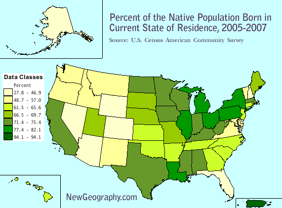
    Percent of Native Population Born in their Current State of Residence
    Geographic area Percent Margin of Error
    New York 82.1 +/-0.1
    Louisiana 82 +/-0.2
    Michigan 80.6 +/-0.1
    Pennsylvania 79.6 +/-0.1
    Ohio 77.8 +/-0.1
    Illinois 77.4 +/-0.1
    Iowa 75.4 +/-0.3
    Wisconsin 75.3 +/-0.2
    Massachusetts 74.7 +/-0.2
    Minnesota 73.8 +/-0.2
    Kentucky 73.6 +/-0.2
    Mississippi 73.4 +/-0.3
    Alabama 73.2 +/-0.3
    West Virginia 72.9 +/-0.3
    Texas 72.3 +/-0.1
    North Dakota 72.1 +/-0.4
    California 71.8 +/-0.1
    Indiana 71.4 +/-0.2
    Nebraska 69.7 +/-0.3
    Missouri 68.9 +/-0.2
    Utah 68.5 +/-0.3
    Rhode Island 67.9 +/-0.6
    South Dakota 67.5 +/-0.5
    United States 67.3 +/-0.1
    Maine 66.5 +/-0.5
    Hawaii 65.6 +/-0.5
    New Jersey 65.4 +/-0.2
    Tennessee 65 +/-0.2
    Oklahoma 64.8 +/-0.2
    North Carolina 64.1 +/-0.2
    Connecticut 64 +/-0.3
    Arkansas 63.8 +/-0.3
    South Carolina 63.4 +/-0.3
    Kansas 62.7 +/-0.3
    Georgia 61.5 +/-0.2
    New Mexico 57 +/-0.4
    Virginia 56.3 +/-0.2
    Montana 55.3 +/-0.5
    Maryland 54.6 +/-0.3
    Vermont 54.5 +/-0.5
    Washington 53.7 +/-0.2
    Oregon 50.2 +/-0.3
    Delaware 50 +/-0.6
    Idaho 48.7 +/-0.4
    Colorado 46.9 +/-0.3
    District of Columbia 45.5 +/-0.7
    New Hampshire 44.4 +/-0.4
    Wyoming 43.3 +/-0.8
    Alaska 41.7 +/-0.6
    Arizona 41.7 +/-0.3
    Florida 41.4 +/-0.1
    Nevada 27.8 +/-0.4

    Source: U.S. Census Bureau, 2005-2007 American Community Survey

  • MC Bailout

    Thanks to Steve Bartin for pointing out this hilarious bailout video, which then led me to The Daily Bail, a new site looking at the lighter side of the financial crisis. Stockbroker thuglife? Good stuff.

  • Housing Price Shifts Vary by US Region

    Here’s a look at the monthly Office of Federal Housing Enterprise Oversight monthly housing price index by US Census Region. The OFHEO index gives us a little different geographic cut than the popular S&P Case-Shiller Housing Index. We can see the extreme fluctuations in the western US, especially in the Pacific states. These are seasonally adjusted numbers current as of October 2008. The black line, depicting the national composite, finishes at 204 – indicating a doubling of housing prices since 1991, but a fall of 8.8% since its peak in April 2007.

    The 8.8% national decline is interesting considering the larger declines depicted by the metropolitan focused Case-shiller index.

    Judging by these numbers, the housing prices in the 8 states of the West South Central and East South Central Regions appear to be most stable. The Great Plains states fare remarkably well, and the east coast states are falling in line with the national average. Interestingly, end-to-end growth in the Pacific region ends up about the same as the stable south, yet it took a much more turbulent path to reach that point.

    According to OFHEO, the data “is obtained by reviewing repeat mortgage transactions on single-family properties whose mortgages have been purchased or securitized by Fannie Mae or Freddie Mac since January 1975.” Here’s more on the OFHEO housing price index methodology.

  • How Much do they Really Drive in Houston?

    Our friend Tory Gattis pointed out yesterday at Houston Strategies that conventional wisdom (and the US DoT Federal Highway Administration) are wrong. Quoting a recent report by New Geography contributor Wendell Cox:

    In fact, this data is incorrect. The FHWA 2006 data indicates that the Houston urban area has a population of 2,801,000. According to the United States Bureau of the Census, the population of the Houston urban area was 4,353,000 in 2006…. Actually Houston’s driving is about average: If the urban area population is corrected to agree with the Bureau of the Census data, per capita driving in the Houston area is slightly below the national average for large urban areas. Houston would rank 19th out of 38 urban areas, with daily per capita driving of 23.2 miles, compared to the national average of 23.9 miles.

    Even if you’re not interested in Houston or that potential gaffe, check out Wendell’s report for a table of per capita vehicle miles driven for 38 urbanized areas over 1,000,000 population.

  • Case-Shiller Index, Housing Price Correction Continues

    Today’s latest release of the Standard and Poor’s Case-Shiller Housing Price Index indicates a continued price free fall across the board. Hyper-inflated markets such as Miami, Los Angeles, Washington, DC, San Diego, and Las Vegas continue to come back to earth. Check out the chart.

    Even Charlotte, Denver, Dallas, and Atlanta, which seemed to be holding their own after never seeing a huge price escalation, seem to be sliding again since July. Cleveland seems to have stabilized, but Detroit continues its drop into a black hole. Home prices in Detroit have fallen to almost 14% below levels in early 2000.

    Follow this link for a bigger version of the chart.