Author: Richard Morrill

  • Population Change, 2015: Not Very Good News for Those Angry White Men

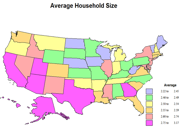
    Data on population growth from 2010 to 2015 show a continuing concentration of people in metropolitan areas, especially in the large areas with over a million people, where presumably traditional values are most challenged.  I show an amazing table, in which I have disaggregated population change by type of settlement, from the million-metro areas to the purely rural counties, comparing growth amounts and rates, plus noting how these areas actually voted in 2012. From the title, the news that growth is greatest in the biggest places seems bad for Republican prospects, but the accompanying maps also show that the greatest growth may well be in more Republican parts of metropolitan America – a story of geography vs. demographics.

    The data from the table are dramatic. Note that 275 million, or 86%, live in census-defined metropolitan areas (with urban agglomerations over 50,000), and 55.5% in just the 58 metro areas of over 1,000,000.  The biggest metro areas (but not the super large New York, Los Angeles, and Chicago) grew by 9.4 million, or 5.5%, the smaller metro areas by 3.4 million, or at 3.3 %, while non-metropolitan America dropped from 46.3 million to 46.1 million, down to 14% of the total population. 

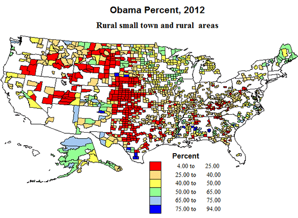
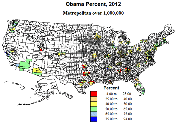
    The final column of the table shows how these areas voted in the 2012 presidential election. Obama won the big metro areas of over one million by taking 57.6 percent of the 2 person vote, which enabled him to get almost 52% of the total US vote while winning the three megacities – New York, Los Angeles and Chicago – by an even wider margin. This meant that despite LOSING all other settlement categories – 48% in smaller metro areas, only 41% in micropolitan areas, and a pathetic 40 percent in rural small town America, the President still won handily.

    Population Change by Settlement Type, 2010 2015
      # Counties 2010 Pop 2015 Pop Change % Chg % of Pop 2015 % Obama, 2012
    Million Metro Center Counties          255   156,143    164,749      8,606 5.5% 51.3%
    Million Metro Outlying Counties          179     13,661      14,416         749 5.5% 4.5%
    Total Million Metros          434   169,804    179,165     9,355 5.5% 55.7% 57.6
    Other Metro Center Counties          473     85,634      89,005      3,371 3.9% 27.7%
    Other Metro Outlying Counties          259       7,025         7,086           61 0.9% 2.2%
    Total Other Metros          732     92,659      96,091     3,432 3.7% 29.9% 48.3
    Micro Center Counties          559     26,422      26,533         111 0.4% 8.3%
    Micro outly            92       1,080         1,070          (10) -0.9% 0.3%
    Total Micropolitan Areas          651     27,502      27,603         101 0.4% 8.6% 41.4
    Rural Sm Town          727     14,058      13,899       (159) -1.1% 4.3%
    Rural Sm Town          598       4,731         4,663          (68) -1.4% 1.5%
    Total Non-metro Counties      1,325     18,789      18,462       (327) -1.7% 5.7% 40
    ALL      3,142   308,774    321,435   12,664 4.1% 100.0% 52


    So the good news for the Democrats is that the greatest population growth occurred in larger cities where Obama did best in and fell in areas he did poorest in.

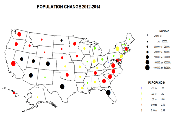
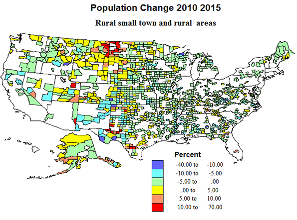
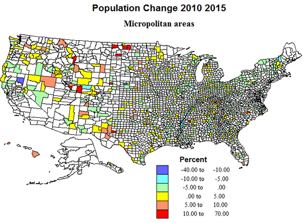
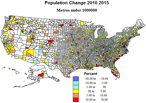
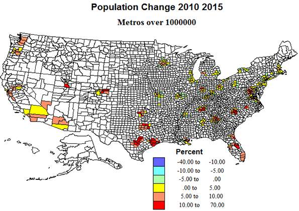
    But the story gets complicated once you get beyond the metro level. I now show maps, first of the pattern of population change by type of settlement, and then show how well Obama did in 2012 by these same settlement types. First we have a general map of population change for all US counties, in which I can display both the absolute change by symbol size and the percent change by color. Most apparent are the dominance of growth in metropolitan areas, especially in suburbs, and notably in the South and West. Note that quite a few of the growing counties appear to be in areas where Obama was not that strong (in maps to follow).

    Population Change by Settlement Type

    Rural and rural-small town areas include about 40% of counties and of the territory, but now hold under 6 percent of the population. Modest population loss is most common, especially across the eastern half of the country, while the pattern of change is more complex in the western half, with pockets of gain in areas of energy development, as in ND-MT, and TX-OK, undoubtedly temporary, and scattered areas of growth in environmental amenity areas farther west. The greatest extent of rurality is still from west Texas, north through Oklahoma, Kansas, Nebraska, South and North Dakota  and Montana.

    Politically, Republican Romney swept most rural, small town territory over sizeable contiguous areas in the high plains, as well as the Mormon realm, but Democrats did win in majority Black counties in the south, Latino counties in Texas, and in Native American Indian counties in the far west. In sum, not a story to comfort Republican hopes.

    Micropolitan areas now include about 20 percent of counties and of territory, and house almost nine percent of the population. They experienced only modest population growth from, 2010 to 2015. They are quite widely dispersed across the country, with the exception of most of California.  Just as with rural small-town territory, a pattern of modest loss prevails over the eastern half of the country and a more mixed pattern in the west, echoing the higher growth in areas of energy development, and in parts of the Mountain states and far west, including some environmentally attractive areas.

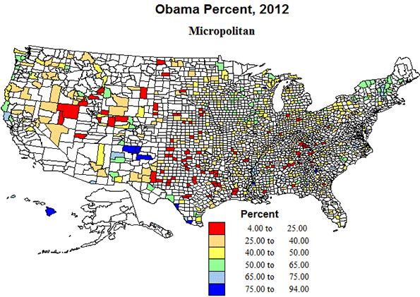
    Politically, the micropolitan areas, with urban agglomerations between 10 and 50 thousand were almost as supportive of Republican Romney as the more rural areas, and in essentially the same geographic areas, in southern Appalachia, the high plains from Texas to North Dakota and in the Mormon realm, and with the same Democratic outliers in majority minority areas. Again, a pattern not too comforting for Republican prospects.

    Metropolitan areas under 1 million  represent what could be called middle, compromise America, with about one-fourth of US counties, and with 30% of the population. Their geographic pattern is one of broad distribution in the interior of the country, but with a marked coastal concentration in the Gulf and South Atlantic.  Similarly, growth was modest or losses occurred in most of the interior eastern US,  but big gains in southeastern coastal areas, and across most of the far west.

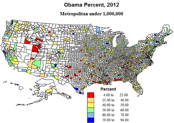
    Politically, too, these areas are intermediate, with Obama receiving 48% of the vote in 2012.  The outlying smaller metropolitan counties are indeed often quite rural.  Some of the growing areas were tilted  more  Republican, as on the Gulf coast and especially in the Mormon west, but in the Atlantic coastal states, and Pacific coast states, Obama did much better.  

    Metro areas over 1 million.  Okay, these are the behemoths, one-seventh of counties with over half the population, and three-quarters of the growth.  But the fastest growth was across the south and in the west, with moderate growth and even modest losses in the north. The biggest metros – NY, Chicago and LA — grew well below national averages. Also, contrary to the perception of the death of suburbia, the outlying counties of this set experienced very high growth. 

    Politically, these suburban areas around the big metros may prove decisive, with the voting eligibility and inclinations of a diverse population critical to outcomes of the presidency and of Congress. Those suburban counties in the South appear to vote Republican, while those in the north and west became modestly Democratic. Size may benefit Democrats, but growth tilts Republican. Ultimately whichever proves most decisive may determine the election.

    Richard Morrill is Professor Emeritus of Geography and Environmental Studies, University of Washington. His research interests include: political geography (voting behavior, redistricting, local governance), population/demography/settlement/migration, urban geography and planning, urban transportation (i.e., old fashioned generalist).

  • Race, Ancestry, and Genetic Composition of the U.S.

    Race and ancestry, or countries/peoples of origin, are popular topics, with large amounts of data attempting to help us understand the ethnic nature of the country. In this paper I attempt a summary description of the intersections of race, ancestry, and genome, at the state level, but I hasten to emphasize that the “findings” are tentative, highly uncertain, and based on astoundingly unreliable data. I hope some readers may point the way to better data or safer interpretations.

    Table 1 presents a summary of numbers of people by ”race” by broad ancestral/ethnic or countries of origin together with the main Y-DNA (male) genetic haplogroups associated with the racial and ancestral groups. The haplogroups are male individuals who share a particular mutation or common male ancestor up to 50,000 years ago. All this is uncertain and speculative, for these reasons. The race and ancestral identifications are self-reported, and subject to lying as well as ignorance. But we still can make beautiful detailed maps, down to the county level! The numbers of persons with good DNA analyses are too few to permit highly confident estimates at useful levels of geography. But let’s see what we have.

    Table 1 Race, Ancestry, Haplogroups
    Group Number (millions) Ancestry group Number (millions) Haplogroups
    White
    215
    White,nonihisp
    192
    Eng,Scot,Ire
    87
    R1b
    I
    Germany-Scaand
    50
    R1b
    I
     SCAndin
    10
    I
    R1b
    France Belg
    12
    R1b
    Italy
    16
    R1b
    J
    E Europe
    16
    R1a
    I,J,N
    Balkans,Near east
    2
    J, G
    WhiteHispan
    23
    Mexico
    16
    R1b
    CentAmer,Carib
    7
    R1b
    African
    40
    E
    Asian
    14
    Mod white admix
    O
    NatAmerican
    34
    US, AK
    5
    Q
    R1b
    LatAmericca
    29
    Pacific Islan
    0.4
    Hi white admix
    up to 50%
    Mixed compl
    9
    M


    Race

    Well, some 215 million people are probably mainly white (69%), of which 192 million (61%) are self-identified non-Hispanic white. The difference of 23 million are people who identify as white and Hispanic. About 40 million identify as Black or African-American, although there is probably an admixture of 20 percent or more of “whiteness”.  Up to 14 million identify as of Asian origin, but as many as 1 million may be white in genetics and appearance, e.g. people from Afghanistan, NW India or West Pakistan.  Finally less than 1 million identify as Pacific Islanders.

    This leaves a large number of 34 million who identify as all or partly Native American, including about 5 million Alaskan or US Native American, about half of whom are clearly Native American, but about half of whom appear to be and are probably genetically mostly white. Then 29 million are “Mexican” or Caribbean, etc., not a race, but a perceived or actual combination of Spanish (some Portuguese) and Native Americans, from the US southwest, central America, the Caribbean, and South America. Even though these people legitimately identify as a mix of Native and Spanish, most are genetically “white” (see below).

    Ancestry, country of origin, or ethnicity are even harder categories. The complexity is incredible. Not only have the “countries” changed again and again over the last few centuries, but persons’ stated identities,  which can be multiple, are often bewildering, because of centuries of mixing, often with people who may not know their heritage. For example, some 20 million identify as “American” which is perfectly reasonable, if they are descended from early immigrants (1620 to 1820). People also do reasonably identify with more than one county/people, but these combinations are not tabulated, and it is difficult to claim accuracy from the data on ancestry. Finally, most of our ancestries are European countries, but we know from both history and genetic analysis that people have mingled and moved within “Europe” for thousands of years.

    Given these warnings, what do we almost know? The largest groupings of non-Hispanic whites first the English-Scottish-Irish at some 87 million, 28% of the population, followed by Germans (including Dutch, Austrian, Swiss) at about 50 million, and Scandinavians at 10 million. Others from Western Europe include 16 million from Italy and probably 12 million from France. Eastern Europe is the origin of about 16 million, including 9 million from Poland, 3.5 million from Russia, and 1.5 million from both Hungary and Czechoslovakia, and over 1 million from Greece. About 2 million are from the eastern Balkans and the Middle East.

    As discussed above, self-identified Hispanic whites number some 23 million, people with an African origin perhaps 40 million, of an Asian origin, 13 million, then up to 34 million as from Native American or Native-American-Spanish admixture.

    Genetic composition

    Much has been learned about the genetic evolution of humans and of their complex migration out of Africa, then across the globe. Since the majority of Americans are of European ancestry, the genome story of Europe translates to the genetic structure of the United States.  Table 2 summarizes the numbers of persons by haplogroup estimated for the US population. In Table 1 I added an estimate of the haplogroups associated with the racial-ancestral combinations. These are tentative and will be worked on further.  

    Table 2 Major haplogroups
    Group Population % of population Areas
    R1b
    156
    50
    W Europe
    E
    43
    14
    Africa
    I
    44
    13
    Mid Europe
    R1a
    16
    6
    E Europe
    J
    14
    5
    SE Europe, Near East
    G
    12
    4
    SW Asia
    O
    10
    3
    Asia
    Q
    9
    3
    NatAmerican
    N
    2
    0.7
    Baltic, Siberia
    M
    0.5
    0.2
    Pacific Island


    The relevant haplogroups are:

    • E, over 50,000 years old, still dominant in Africa, and the many descendant groups of equally old
    • F, which developed in south Asia (India-Pakistan), from the earliest migration out of Africa (Europe was still ice-bound). All F subgroups seem to have differentiated in the same hearth area (India to the Caucasus), gradually moving northwest.
    • G occurs in modest numbers in Italy, Turkey and the Balkans,
    • N in the Baltic countries and Siberia,
    • I divided into I1, still strongly Scandinavian and I2 in south Italy and the west Balkans
    • J in Greece and the Middle East (includes most Jews).
    • R1b swept into Europe, dominant from Italy through France, Spain, Portugal, Belgium on through England and Ireland (plus North Africa).
    • R1a is strongest in Eastern Europe (Poland, Czechoslovakia, and Russia)
    • O, Asian
    • Q, Native American

    Evidently groups G, I and J were in Europe by 25,000 years ago, N 20,000 years ago, but the now dominant groups R (R1a, R1b) not until 15 to 20,000 years ago. 

    Sequencing of haplogroups
    Yrs BP
    50-52,000
    E F
    45,000
    G HIJK
    40,000
    IJ K
    30,000
    I J K2
    25,000
    E G I1,I2 J NO K2
    20,000
    N O P
    17,000
    E G I1,I2 j N O Q R
    R1a,R1b


    In the tables and maps I distinguish between the R1B peoples dominantly English, German or French-Italian, and an R1bh population, which is the self-reported American Hispanic population, but which is not genetically different, from the male Y-dana point of view.

    How does this translate to US states (besides with difficulty)? The estimates are based on the self-reported ancestry of people by states and related to the haplogroups of those ancestries. Please see Table 3 and three maps of states the classification is based on the top 2 or 3 relevant haplogroups. HI is unique as the only state with a dominant O, Asian, group, and the District of Columbia as the only area dominated by E (African origin).

    Four states, KS, ME, NH, and WV are most strongly just R1b (West European – English, German and Italian-French). The largest number of states, 12, the historic south, plus MO, are primarily R1b and secondarily E. Six states are also strong in R1b and E, but also in R1a, eastern Europe, IN, MD,MI, OH, NY (also has Hispanic and Jewish), and PA. Somewhat similar are IL and NJ (notice that many of these are contiguous), with R1b, E, and R1bh.

    Estimated Haplogroups for US states
    State Dominant group Share 2nd (share) 3rd (share) 4th (share) Rb1Eng Rb1erm Rb1FRIT
    AL R1b 50 E 25 38 8 4
    AK R1b 56 Q 13 I 7 R1a 6 28 21 7
    AZ R1b 53 R1bh 25 E 7 R1a 6 28 17 8
    AR R1b 70 E 13 38 28 4
    CA R1b 37 R1bh 30 O 14 E 7 R1a5 19 11 7
    CO R1b 68 R1bh 16 R1a 6 I 6 33 25 10
    CT R1b 76 R1a 15 34 13 29
    DE R1b 69 E 14 38 18 13
    DC E 43 R1b 31 17 8 6
    FL R1b 52 R1bh 20 E 15 R1a8 J 5 30 12 10
    GA R1b 50 E 30 37 9 4
    HI O 40 R1b  22 M 16 13 1 8
    ID R1b 70 I 8   41 22 7
    IL R1b 56 E 15 R1bh 12 R1a 6 27 22 9
    IN R1b 69 E 7 R1a 6 37 27 5
    IA R1b 81 I>10 33 43 5
    KS R1b 70 35 32 3
    KY R1b 71 E 7 50 17 4
    LA R1b 55 E 25 24 9 22
    ME R1b 97 56 10 31
    MD R1b 53 E 24 R1a 8 29 16 8
    MA R1b 80 R1a 8 42 8 30
    MI R1b 69 E 14 R1a 11 J 5 30 27 12
    MN R1b 68 I 16 + R1a 8 23 38 7
    MS R1b 44 E 28 32 7 5
    MO R1b 74 E 12 38 29 7
    MT R1b 78 I 11 Q 7 40 30 8
    NE R1b 79 R1a 11 I 9 32 41 6
    NV R1b 51 R1bh 20 27 14 10
    NH R1b 96 50 10 37
    NJ R1b 58 E 17 R1bh 13 R1a >12 J 8 26 13 19
    NM R1b 55 R1bh 35 Q >10 33 17 5
    NY R1b 56 E 15 R1a 10 R1bh 9 J 7 26 13 17
    NC R1b 55 E 20 36 12 7
    ND R1b 72 I>10 R1a 9 19 46 7
    OH R1b 66 E 12 R1a >10 28 29 9
    OK R1b 55 Q 10 E 7 34 17 4
    OR R1b 67 I 9 36 23 8
    PA R1b 77 R1a 11 E 10 34 29 14
    RI R1b 89 R1a 7 38 6 45
    SC R1b 53 E 28 37 11 5
    SD R1b 70 I 20? Q 9 R1a6 25 40 5
    TN R1b 59 E 17 43 12 4
    TX R1b 49 R1bh 30 E 13 22 12 15
    UT R1b 65 I 13 R1bh 12 44 15 6
    VT R1b 93 R1a 5 50 12 31
    VA R1b 56 E 20 37 13 6
    WA R1b 63 I >10 O 7 R1bh 6 33 22 8
    WV R1b 73 45 21 7
    WV R1b 77 I >10 R1a >10 24 45 8
    WY R1b 80 Q 5 I >5 43 29 8

    The second map includes a set with the R1b and I1 combination (high in Scandinavian also), ID, IA, and OR, a related pair with a significant R1bh presence, UT and WA, which also has a sizeable O population.  Also related are MT and SD, with R1b, I but also Q (Native American). States with R1b, I and also R1a (Eastern Europe) include MN, NE, ND and WI. Three states have R1b, then Q or Q and I:  OK<WY and AK (the highest Q share at 13%).  

    The third map shows first four states with R1b and R1a, all in New England: CT, MA, RI and VT. CO and NV have the combination of R1b and R1bh. CA is quite complex, with only a modest R1b share, a very large r1bh share, and also a sizeable O and then E share. AZ and NM also have R1b, R1bh, but also Q (Native American).  FL is also complex, with R1b, R1bh, but also E, R1a and J.

    Ancestry

    I also present a few maps of ancestry combinations (most published maps show the single strongest). The shares of English (plus Scot and Irish), German (plus Austria, Netherlands and Switzerland) and French-Italian (plus Belgium) – all part of the R1b group, are also shown in Table 3.

    English and German (19 states) and German and English (7) are the most common ancestries of Americans (Map 4). English and German by themselves dominate most in KS and WV. Scandinavian is added to English-German for ID, OR and WA (which also adds Asian), and to German-English, for IA, MN, ND, SD, then together with East European for NE and WI. These 11 states are the most “northern European”. Native Americans are added most for MT, OK, WY and especially AK (now 15 states) and then a Hispanic component to CO and UT.

    The English-German and German-English sets include 8 more states with a sizeable Black population, AR, DE, IL, IN, KY, MI and MO, and OH, then PA with a sizeable French-Italian and East European population as well. The full set is also a contiguous bloc across much of the north, and crossing into the south central.

    Not surprising (Map 5) is the English Hispanic (AZ, NV) and Hispanic-English, (NM, plus CA and TX, with additional Asian and German, and Black and French-Italian, respectively), covering the southwest, plus FL, adding a Black population). An English-Black combination coves the rest of the southern portion of the country – LA (Black English, French), then AL. GA, MS, NC, SC, TN and even MD.

    This leaves, (Map 6) besides HI and DC, a northeastern set of 8 states with a distinctive combination of English and French-Italian, CT, ME, NH, RI, VT, plus MA, adding E European) and complex NY, adding Black and East European. The entire mosaic reveals the fascinating stories of immigration and subsequent migration, still ongoing and becoming ever more complex.

    Richard Morrill is Professor Emeritus of Geography and Environmental Studies, University of Washington. His research interests include: political geography (voting behavior, redistricting, local governance), population/demography/settlement/migration, urban geography and planning, urban transportation (i.e., old fashioned generalist).

  • Goodbye, Single Family Home? But wait…..

    New urbanist utopians love to decry Americans’ love of the single family home, and to extol the virtues of a higher-rising denser city as more efficient and environmentally responsible. Without expounding on the immensely destructiveness of such a utopian viewpoint to physical and psychological well-being of a large majority of people, nor of the scientific absurdity of the claim of efficiency and  environmental goodness, I will for now present only some maps and data of what the real world is like.

    People vary in needs and preferences over the life course. It is indeed the case that young adults, usually unmarried (and yes increasingly for a longer time), and perhaps a fair share of elderly widows or widower, or even empty-nesters, together as many as one-third of persons, may prefer and enjoy an urban lifestyle, and apartment living. These are the people, for example that are flocking into a growing Seattle, bidding up the price of housing, to take up jobs at Amazon and similar businesses, and even supporting planning calls for replacing a sizeable share of single family homes, with higher density housing.

    But this phenomenon ignores the further housing reality that the other two-thirds of people are in families, with children or other relatives, or even unrelated people who rent rooms, who much prefer homes on lots, with some private space. Even those young singles jumping into downtown Seattle may marry, have children, and as they have done generation after generation, and look, yes, for homes with yards and space for a car, so they can go and explore the environs beyond the city.

    What’s out there?

    Table 1 summarizes the national data on population living in different kinds of housing. For whatever reasons you will not find this information in any census publication or city or state reports! They are quite difficult to find and require gleaning from PUMS (Public Use Micro Sample) data.

    Table 1 Shares of population by Type of Housing, 2010
    Type # Units % of Units  Population % of population     Ave HH Size
    Single family 76.5 67.4 216.6 72.2 2.83
    Small apartments 15 13.3 37.7 12.6 2.51
    Large apartments 15.9 14 28.3 9.4 1.78
    Mobile Homes 7.4 6.5 17.2 5.7 2.2
    ALL  114 100 299.5 100 2.6
    Units and population in millions


    The key information is that single family homes. Including duplexes for which each unit a separate address account for 67.4 % of occupied housing units in 2010 (61.6 % in totally separate structures), and housed a convincing 217 million, 72.2 % of the population (not including those in group quarters), at an average household size of 2.83. Note well: that’s almost 3 out of 4!

    Mobile homes are mostly banned from big cities, but in the real world of providing shelter for the less affluent in many areas, they are 6.5% of units, housing over 17 million, another 5.7% of the population, at an average household size of 2.2.

    About 31% of units, 13.3% in structures with 2 to 9 units, and 14% in structures with 10 or more units, are in apartments, and house 22% of the population (12.6 in the smaller structures, 9.4 in the larger) at an average household size of 2.5 and 1.8 respectively, or 2.2 for all apartments. 

    The relative importance of single family homes and of apartments varies significantly across states (and cities or counties if we had the data), but this is best seen with the help of the included maps.

    It is interesting to start with mobile homes, to find out where they are most common. In 11 states over 10% of people live in mobile homes. The highest is 15.5% in SC, followed by NM at 13.9, WY, 13.2, WV, 12.9, MS, 12.6, then AL and NC, 12.1, states with high shares of less affluent people.  Most higher shares are across the warmer south, but are also high in the northern Rockies. Indeed the lowest shares are across the middle of the country from CA to New England. The lowest share is DC at 0.0, then HI, .2, but are also quite low in MA, .7, CT, .9, RI, and NJ at 1.0, mostly small and very metropolitan states. Typical states close to the average of 5.7% are AK and NH at 5.7, MO, 5.5., and NV, 5.2.    

    Apartment living is quite a bit higher in selected states. The District of Columbia is by far the highest at 56%, as it is the central city of a giant metropolitan region. Next highest is New York at 46%, actually a consequence of New York City. These are followed by MA, 35, RI, 34, HI, 34 and NJ, 30.  HI may be expected to have higher apartment shares, due to the high value of desirable land, MA, RI and NJ, because of very high metropolitan shares, including New York City suburbs. Moderate apartment shares occur in CA, 24, IL, 27, FL, 24, and NV, 25.  Average shares of 22% occur in TX, VT, NH, and MD. At the other extreme, apartment living is amazingly low (under 14%) in WV, 10.5, ID 11.9, NM, 12.9, MT, 13.5, OK, 13.8, and MN, 14—mostly less metropolitan.

    Single family homes dominate most of the country. The highest shares, over 80, are for IA, KS, MN and NE, a contiguous sub region of the north central US, and somewhat surprising, PA. Actually not surprising: PA, 18, MD, 21, DE, 15, and VA, 10, have unusually high shares of “attached” 1 unit row houses with separate numbers and yards – not the image of single family home in most of the country. Shares are almost 80 in Mormon UT and ID, and in MI. In general, with the exceptions of NY and most of New England, shares are higher across the northern and central US than across the south, perhaps because of the greater shares of mobile homes to the south. The lowest shares are in the states with the highest shares of apartments, DC, NY, but still 52%, MA, 64, RI, 65, HI, 66, and  FL, 67, but already over 2/3! Right at the US average of 72% are AK, AZ, CA, NC, NH, TX and WY, a not geographically obvious or coherent set!

    The story for metropolitan areas

    Data are available for large “millionaire” metropolitan areas. These offer few surprises, reinforcing the story from the data for states. Table 2 distinguishes the information for 52 large metro areas, and the rest of the US. The large metro areas contain a little over half of the US population (51%).

    Table 2 Population by housing types, large metropolitan areas and the rest of the US
          Metro Rest of US
    Type      Units Population  % of Pop Ave HH Size Units Population % of Pop Ave HH Size
    Sing Family          40.2 112 73 2.78 36.3 104 71 2.89
    Apartments 17.7 37 24 2.1 11.8 29 20 2.4
    Mobile 1.7 4 2.6 2.2 5.8 13 9 2.2
    All  59.6 153 100 2.57 53.9 146 100 2.71

    The share of population in single family homes differs only slightly between the large metro areas and the rest of the country, but the share of people in apartments is much higher in  the big metro areas (24 to 20), while the share of people in mobile homes  is much higher outside of the large metro areas (9 versus 2.6). The slightly higher single family share for the metro areas is a little misleading, however, because the metro set has a much higher share of an intermediate category of housing, “1 unit attached”, meaning row houses, separate addresses and yards, but of higher density than the detached single family home.

    Mobile home shares are especially lower in the biggest metro areas, most notably megalopolis, as Boston, .2 and Washington DC, .3. The highest metro share are in the south, e.g., Birmingham, 8, Tampa, 7, Riverside, 6, Jacksonville, and San Antonio, 6.

    The share of the population in single family homes  is not surprising for the most part, that is, lowest (under 70%) in most of the older and largest metro areas, NY, Boston, Chicago, San Francisco, Los Angeles, and Miami, and highest in intermediate sized across most of the country. The highest shares ae for Kansas City, 84, Pittsburgh, Oklahoma City and Richmond, 83, and Atlanta, Columbus, Detroit and St. Louis, 82. The cases of Philadelphia, Baltimore, Washington, and Richmond are special, as the high single family shares are actually a result of high shares of row housing, e.g., 32% in Philadelphia, 24 in Baltimore, 20 in Washington, 10 in Richmond.

    The population shares in apartments also reflect the size and importance of the metro area, with the addition of Miami, highest in New York Metropolitan Area, 41, (52% in the NYC part), San Francisco-Oakland, 33, Chicago, 32, Providence,33, Boston, 41, LA-Anaheim, 31.5 (33 in the LA part), and Miami, 30. The lowest shares tend to be in the interior eastern US, plus Richmond in the east and Riverside in the west: Birmingham and Oklahoma City, 12, Riverside and Pittsburgh, 13, and Jacksonville, Kansas City, Richmond and St. Louis, 14. Metro areas in a middle range (23 to 25%) include Seattle, Hartford, New Orleans, Baltimore, Buffalo, Las Vegas, and San Jose, middle sized and scattered across the country.

    Average household size

    Average household size in part reflects the kind of housing, but equally the age and ethnic composition of the population, not part of this data set. The average US number is 2.63, but 2.57 in the metro areas, and 2.71 for the rest of the US. It is highest for single family homes, 2.83 for the US, 2.78 in the metro set, 2.89 for the rest of the country, 2.2 for apartment dwellers and 2.2 for mobile home folks. As expected average values for smaller apartment structures (2 to 9) is higher in the smaller buildings than in larger ones, 2.5 compared to 1.8.

    Average values for states vary from 2.22 in ND (due to a combination of an influx of energy workers, high share of college students, and remaining seniors), 2.26 in the District of Columbia (large share of single persons), 2.35 in ME, 2.36 in IA, and 2.237 in WV (older populations) to the very highest in UT (well..) at 3.17, then CA at 2.95, AK 2.86, AZ and TX, 2.84, reflecting ethnic composition. Right in the middle are NY and DE, 2.63. Metro area average household size varies from a high of 3.1 for Riverside, then 3 for Anaheim, 2.91 for San Jose, 2.83 for Los Angeles and Dallas, all with high Hispanic populations  and levels of young immigrants.  At the low size end are NY at 1.98, the only area under 2, reflecting the high share of apartments and of singles, particularly in New York City, then Jacksonville, 2.23, Tampa, 2.28, Richmond, 2.35, and Orlando, 2.36, — in Florida a result of in-migration of older households without children.   The middle areas at 2.57 are Las Vegas, Miami, and Minneapolis.

    Conclusion

    There is no likelihood of the demise of the single family home, or even of significant attrition, simply because the large majority of people demand them. But there will be some reduction in a few areas where demand for housing is high but the land supply constrained, geographically or by growth management, as in Seattle, coastal California, New York, and Boston, with high shares of non-families. On the other hand, continuing concentration of population in giant metropolitan areas is not inevitable, as a costs drive people elsewhere. In the end, barring a national clampdown on suburbs, the balance of housing types may not change greatly.  

    Richard Morrill is Professor Emeritus of Geography and Environmental Studies, University of Washington. His research interests include: political geography (voting behavior, redistricting, local governance), population/demography/settlement/migration, urban geography and planning, urban transportation (i.e., old fashioned generalist).

  • The Geography of Ideology Ultra R, Ultra D and 50 to 50

    Recently I grouped all US counties into several categories, from True Believers R and D, R and D leaning groups, and also those areas that are more equally divided. In anticipating the 2016 election, I take here a brief look at a small number of counties (2012 data) that are extreme cases of R voting (over 90%, 28 counties), of D voting (over 80%, 26 counties), and of 50:50 voting (39 counties from 49.7 to 50.3 D vote). These are also shown on the maps. Note that the D counties in blue don’t look impressive, as they are small in area, but big in votes. How do these three sets differ in geography and in character?

    Set 1: Ultra Republican

    The extreme R counties are an amazing set. Ten of the 28 (8 in Utah, 2 in Idaho) are dominantly Mormon. The non-Mormon counties include 17 scattered across the high plains from Montana, 1, Nebraska, 3, Kansas, 1, Oklahoma 1, and 11 in Texas, with one outlier in eastern Kentucky. Only one is east of the 100th Meridian, famous for dividing east and west in the US. All these counties are basically conservative on social issues.

    Overall densities are far lower and rural shares far higher than for the other sets. They are overwhelmingly white (92%) and less than 1% black on average. They have the highest shares of husband-wife families, with and without children, and the lowest shares of single parent families, roommates and singles. For example the black population is essentially 0 in half the counties. Husband-wife and children households ae exceptionally high in 5 counties: Franklin, ID; and Duchesne, Morgan, Sevier, and Uintah Utah—all Mormon. The roommate share is under 2 percent in 7 counties, compared to a national average of almost 5.

    Male labor force participation averages a high 73% and unemployment a low 3.8%. As expected for these locations, farming is a frequent occupation in these counties, exceeding 10% in 8 counties, as in MT, NE, and TX. Finally church attendance is far higher than in the other sets, averaging 71% compared to 48% in the set 2 counties.  

    The Mormon counties exhibit some variation in size and settlement. Five are all rural, four are rural and small town (micropolitan), but one is a small metropolis, Utah county (Provo, with Brigham Young University), perhaps the heart of Mormon orthodoxy. The 18 non-Mormon counties include 13 small rural counties and 5 counties (all in Texas) with small cities.

    Since the total vote in these counties was only 234,000 (76,000 without Utah county!) and 92% R, it is probably not worth a Democrat candidate spending much effort in these locales. Yet it is possible that without the “negativity” of race, an Anglo woman at the top of Democratic ticket should do better in conservative white settings. 

    Set 2: Ultra Democratic   

    The extreme D counties are similarly an amazing set, just in different dimensions. The dominant characteristic is the very high minority share – in all 26 counties – and correlated with that high shares of single parent families, unemployment, and general and especially child poverty. The minority share averages 81%, with 43% black. Thirteen have high black shares: mostly southern and rural, in AL, GA, MS, but also Washington, DC, Baltimore, and Prince George, MD. Four have high Hispanic shares: TX, NM, three Native American (ND, SD, WI), and six are more racially mixed: San Francisco and Alameda, CA, Philadelphia, and 4 New York city boroughs.

    The second distinguishing feature is dense urban character and sheer size, but only for a subset of 12 counties, as 9 are rural or small town minority counties. The large urban counties include San Francisco, Alameda, Washington DC, Orleans, Prince George, Baltimore, St. Louis, Bronx, Kings, New York, Queens, and Philadelphia. These set 2 metropolitan counties are mainly coastal (plus St. Louis and Orleans),   while rural minority counties are mainly in the northern plains, (Native American) or the southern “Black belt”.

    The small city minority counties are Macon, AL (Tuskegee), Hancock, GA, Taos, NM, Starr and  Zavala, TX,  Claiborne, Holmes and Jefferson, MS, and Shannon, SD, leaving only 3 totally rural counties, Greene, AL, Sioux, ND and Menominee, WI. 

    These highest D counties also have the highest share of people 18-44, of singles and of roommate households, and the lowest in families, as well as being lowest in labor force participation and church attendance but highest in poverty and unemployment.

    Even though highly Democratic, with a 2012 D vote of 4,000,000 to 700,000 R, the total vote is so large that it may be worth a fair Republican campaign effort simply to reduce the giant D margin, which was key to the 2008 and 2012 D wins. Without the dominance of race, Republicans might do better, if voter turnout of minorities falls.

    Set 3: Balanced 50-50 counties

    The set 3 counties with a 50:50 D and R split, are far more diverse and complex, as we might expect, and suggest how difficult they can be for candidates to create convincing messages!  These counties are intermediate in density and are quite high in shares of micropolitan territory, that is, independent small city counties.

    Of the 39 counties, 6 are entirely rural (GA, IA, MS and WI (3)), while one (Harris-Houston) is a giant metropolitan core county with almost half the total vote of these set 3  counties. Five are suburban to large metro areas – in GA, MD, NJ, PA, and WA.  Five are small metropolitan areas, Lincoln, NE (Lancaster), Florence, SC, State College (Centre), PA, Montgomery, VA (Blacksburg), and Canton (Stark), OH. Thus 23 are small city micropolitan, with counties in AR, CA, CO, IL, IA, MD, MI, MN, MS, NC, OH, OR, SC, WA, and WI.

    While the set 1 counties are all but one in the western half of the country, and the set 2 counties, coastal urban or southern rural-small town, the set 3 counties are most prevalent in the upper Midwest: IL 2, IA 5, MN 3, WI 5, MI 1, OH 1, and NE 1, almost half the counties, with another ten in the south, AR 1, MS 2, GA 2, SC 2, FL 1, NC 1, and VA, 1. The single largest cluster of these 50:50 counties is in northwestern Wisconsin, with an additional county across the state line in Minnesota.

    In social and economic characteristics these counties tend to be intermediate between the set 1 and set 2 counties, for example averaging 22% minority (closer to set 1 than to set 2), but fairly high in a few counties in the south. They tend to be a little closer to the set 2 D set on the social dimension: shares of roommates, singles, and in religiosity, but closer to the set 1 R set in economic, income and job variables, as in higher labor force participation and lower poverty rates. 

    Clearly these set 3 counties represent the impressive diversity of the more balanced areas of American electorate, where campaigning will be especially critical.

    Table  1 Differences between D, R and 50:50 Sets
    Averages
    Variable Set 1 R Set 2 D Set 3 50:50  
    Age 18-44 30 39 33  
    White 92 33 82  
    Black 0.7 43 11  
    Minority 16 81 22  
    HW w children 28 11 20  
    Single parent 10 29 16  
    Singles 22 30 28  
    Urbanized area 3 54 21  
    UC (small city) 18 11 26  
    Rural 82 32 53  
    Male Labor Force Participation 73 62 69  
    Unemploy 3.8 12.2 7.3  
    Services 15 22 17  
    Farm 7 1 1.7  
    Churches/100 4 1.5 1.8  
    Poor 13 26 14.5  
    Child Poor 17 36 18  


    Conclusion

    These counties are but a small sample of the 3,180 counties. Yet they represent the extreme drivers of a well-publicized American polarization, but also where we see a non-polarized America. The regional concentrations of the three helps illuminate the amazing differences in American cultural and political geography.

    Richard Morrill is Professor Emeritus of Geography and Environmental Studies, University of Washington. His research interests include: political geography (voting behavior, redistricting, local governance), population/demography/settlement/migration, urban geography and planning, urban transportation (i.e., old fashioned generalist).

  • Where Do We Still Make Stuff in America?

    The deindustrialization of the United States has been widely considered to be a major force in shaping the economy. It’s one thing to measure where decline has been greatest but where has manufacturing survived or even grown? I use Bureau of Labor Statistics data on manufacturing jobs by county for 1967 and 2014. The results were so surprising that I at first could not believe it.

    In 1967 the US had 19,423,000 manufacturing jobs, 25% of an employed labor force of 76 million, while in 2014 there were 11,900,000 such jobs, constituting only 8.3 % (that is one-third of the 1967 share). Almost 12 million is still a lot of jobs, and higher productivity probably means that the sheer amount of stuff produced may not have fallen, but the role of manufacturing in employment has certainly shrunk and as we shall see, greatly relocated.

    I reproduce a large table, because it is so interesting, indeed so astounding. There are three sections, first counties  with over 25,000 manufacturing jobs in 2014 ( there were far more in 1967), then counties with over 50,000 jobs in 1967, but under 25,000 in 2014,  and third, a few counties with over 4000 manufacturing jobs in 2014, and where these were a high share (over 40%) of the local labor force. These were the some of the winners from geographic relocation.  I also map these changes. The maps include three additional sets of counties: counties with between 10 and 25,000 jobs in 2014, counties with between 25 and 50,000 jobs in 1967, and counties from 33 to 40% in manufacturing in 2014.  These groups are summarized in Table 1.

    Table 1: Manufacturing Change 1967-2014 (Measured in 1,000s)
    Set # of Counties Character 2014 jobs % 1967 jobs % Change % % Change
    1A
    19
    > 25k in 2014, gain 1,102 718 385 54
    1B
    50
    > 25k in 2014 loss 2,616 6,698 -4,082 -61
    2
    26
    > 50k in 1967 435 2,828 -2,403 -85
    3 & 6
    58
    > 33% manuf in 2014 343 232 111 48
    4A
    65
    10 to 25K in 2014, gain 1,164 682 482 71
    4B
    71
    10 to 25k in 2014, loss 1,018 1,909 -841 -44
    5
    26
    25 to 50k, 1967 355 1,029 -674 -66
    Mapped
    315
    7,083 60 13,555 70 -6,472 87 -48
    Unmapped
    2,835
    4,822 40 5,758 30 -976 13 -17
    US
    3,170
    ALL 11,900 19,323 -7,423 -38


    The 315 mapped counties include 60% of the 2014 manufacturing jobs and some 70% of the jobs in 1967. It is evident that the counties with high numbers of manufacturing jobs in 1967 bore the brunt of losses from 1967 to 2014. In contrast,   the smaller, mostly unmapped counties lost only modestly as a set. Many larger counties did gain or hold steady, largely outside the traditional manufacturing belt of the north, or from older core counties into new growing suburbs, as we shall see.  Since the losses in the larger mapped counties are so much higher a share of the total jobs in 1967 than in 2014, we have a yet stronger indication of de-concentration.

    I’ll begin with the biggest losers, who are on table 2.  Now New York City may be thriving in 2014, but it has utterly transformed from an industrial dominance to a minor backwater — the four boroughs dropping their industrial employment from almost 900,000 to a paltry 67,000 jobs, a drop of 92.5%.  In New York County (Manhattan) the fall was even more precipitous: 96%. This is not a misprint. Do not turn off your computer! These are joined by an 84% decline for the New Jersey suburbs: 416,000 to 65,000.  Philadelphia, greater Boston, St. Louis, and, yes, especially Baltimore, city and county, experienced the same kind of precipitous decline. Can we begin to understand the basis for riot and unrest in these core cities, whose manufacturing departed as soon as integration opened manufacturing jobs to black workers! As a set, these counties lost 2.83 million manufacturing jobs, a drop of 85%.

    Table 2
    Set 1:  More than 25,000 Manufacturing Jobs in 1967
    County   Manuf Jobs 1967 Manuf Jobs 2014 Change % Change
    United States 19,323,000 11,900,000 -7,423,000 -38.2
    Snohomish County, Washington 16,000 60,156 44,156 276.0
    Harris County, Texas 123,000 164,479 41,479 33.7
    San Diego County, California 64,000 97,346 33,346 52.1
    Maricopa County, Arizona 59,300 91,348 32,048 54.0
    DuPage County, Illinois 24,500 53,913 29,413 120.1
    Riverside County, California 17,000 41,519 24,519 144.2
    Orange County, California 126,000 150,020 24,020 19.1
    Waukesha County, Wisconsin 20,000 43,232 23,232 116.2
    Elkhart County, Indiana 31,300 53,705 22,405 71.6
    Salt Lake County, Utah 26,000 46,402 20,402 78.5
    San Bernardino County, California 30,000 46,822 16,822 56.1
    Washington County, Oregon 12,000 27,919 15,919 132.7
    Ottawa County, Michigan 16,000 31,831 15,831 98.9
    El Paso County, Texas 19,000 31,000 12,000 63.2
    Pinellas County, Florida 18,000 28,305 10,305 57.3
    Fresno County, California 15,500 25,269 9,769 63.0
    Bexar County, Texas 26,000 30,474 4,474 17.2
    Suffolk County, New York 49,000 51,967 2,967 6.1
    Newport News city, Virginia 25,000 26,503 1,503 6.0
    Sum of gaining counties 717,600 1,102,210 384,610 54.0
    Tulsa County, Oklahoma 39,000 37,197 -1,803 -4.6
    Kent County, Michigan 60,000 57,371 -2,629 -4.4
    Tarrant County, Texas 76,000 70,421 -5,579 -7.3
    Lake County, Illinois 41,000 35,174 -5,826 -14.2
    Kane County, Illinois 39,000 30,327 -8,673 -22.2
    Bucks County, Pennsylvania 40,000 27,061 -12,939 -32.3
    Greenville County, South Carolina 41,000 26,782 -14,218 -34.7
    Hillsborough County, New Hampshire 40,000 25,287 -14,713 -36.8
    Sedgwick County, Kansas 56,000 40,629 -15,371 -27.4
    Alameda County, California 80,000 63,679 -16,321 -20.4
    Multnomah County, Oregon 49,000 32,206 -16,794 -34.3
    Santa Clara County, California 120,000 100,981 -19,019 -15.8
    York County, Pennsylvania 51,000 31,890 -19,110 -37.5
    Lancaster County, Pennsylvania 54,000 33,212 -20,788 -38.5
    Guilford County, North Carolina 54,000 32,428 -21,572 -39.9
    Winnebago County, Illinois 49,000 25,024 -23,976 -48.9
    Berks County, Pennsylvania 56,000 29,439 -26,561 -47.4
    Miami-Dade County, Florida 58,000 30,387 -27,613 -47.6
    Macomb County, Michigan 94,000 59,114 -34,886 -37.1
    Hennepin County, Minnesota 109,000 72,307 -36,693 -33.7
    Dallas County, Texas 138,000 94,078 -43,922 -31.8
    Oakland County, Michigan 94,000 47,243 -46,757 -49.7
    Franklin County, Ohio 76,000 28,991 -47,009 -61.9
    Jefferson County, Kentucky 90,000 40,666 -49,334 -54.8
    Bristol County, Massachusetts 78,000 26,935 -51,065 -65.5
    Middlesex County, New Jersey 82,000 28,277 -53,723 -65.5
    Essex County, Massachusetts 94,000 38,451 -55,549 -59.1
    Jackson County, Missouri 85,000 25,870 -59,130 -69.6
    St. Louis County, Missouri 97,000 35,884 -61,116 -63.0
    Summit County, Ohio 93,000 27,965 -65,035 -69.9
    King County, Washington 146,000 79,631 -66,369 -45.5
    Montgomery County, Pennsylvania 106,000 39,566 -66,434 -62.7
    Hamilton County, Tennessee 95,000 25,092 -69,908 -73.6
    Bergen County, New Jersey 107,000 33,434 -73,566 -68.8
    Marion County, Indiana 120,000 42,808 -77,192 -64.3
    New Haven County, Connecticut 115,000 31,792 -83,208 -72.4
    Montgomery County, Ohio 110,000 26,188 -83,812 -76.2
    Erie County, New York 134,000 42,606 -91,394 -68.2
    Hartford County, Connecticut 151,000 57,332 -93,668 -62.0
    Monroe County, New York 133,000 38,958 -94,042 -70.7
    Fairfield County, Connecticut 130,000 35,507 -94,493 -72.7
    Hamilton County, Ohio 152,000 45,901 -106,099 -69.8
    Middlesex County, Massachusetts 166,000 59,454 -106,546 -64.2
    Worcester County, Massachusetts 165,000 34,677 -130,323 -79.0
    Milwaukee County, Wisconsin 181,000 48,963 -132,037 -72.9
    Allegheny County, Pennsylvania 195,000 36,428 -158,572 -81.3
    Cuyahoga County, Ohio 277,000 69,606 -207,394 -74.9
    Wayne County, Michigan 396,000 71,526 -324,474 -81.9
    Los Angeles County, California 855,000 359,532 -495,468 -57.9
    Cook County, Illinois 831,000 181,315 -649,685 -78.2
    Sum of losing counties 6,698,000 2,615,592 -4,082,408 -61.0
    Table 2, set 2: Over 50,000 in 1967 and Under 25,000 in 2014
        Manuf Jobs 1967 Manuf Jobs 2014 Change % Change
    Bronx NY 59,000 6,000 -53,000 -89.8
    Kings NY 220,000 18,000 -202,000 -91.8
    Onondaga NY 59,000 19,000 -40,000 -67.8
    Queens NY 132,000 22,000 -110,000 -83.3
    Westcheste NY 73,000 12,000 -61,000 -83.6
    New York,  NY NY 482,000 21,000 -461,000 -95.6
    Lucas OH 62,000 16,000 -46,000 -74.2
    Stark OH 63,000 23,000 -40,000 -63.5
    Philadelphia PA 264,000 23,000 -241,000 -91.3
    Providence RI 93,000 22,000 -71,000 -76.3
    Fulton GA 65,000 18,000 -47,000 -72.3
    Nwcastle DE 53,000 13,000 -40,000 -75.5
    Lake IN 98,000 23,000 -75,000 -76.5
    Baltimore MD 68,000 11,000 -57,000 -83.8
    Baltimoecity MD 107,000 12,000 -95,000 -88.8
    Hampden MA 65,000 21,000 -44,000 -67.7
    Norfolk MA 58,000 21,000 -37,000 -63.8
    Suffolkk MA 85,000 8,000 -77,000 -90.6
    Ramsey MN 72,000 23,000 -49,000 -68.1
    Essex NJ 124,000 18,000 -106,000 -85.5
    Hudson NJ 107,000 8,000 -99,000 -92.5
    Passaic NJ 83,000 18,000 -65,000 -78.3
    Union NJ 102,000 21,000 -81,000 -79.4
    StLouis city MO 132,000 17,000 -115,000 -87.1
    San Francisco CA 52,100 7,500 -44,600 -85.6
    Delaware PA 59,600 13,000 -46,600 -78.2
    2,837,700 434,500 -2,403,200 -85
    Table 2, set 3: High Manufacturing Share, Over 4,000 Jobs
    Manuf Jobs 1967 Manuf Jobs 2014 Change % Change
    Jackson County, Alabama 3,200 5,196 1,996 62.4
    Boone County, Illinois 8,300 7,619 -681 -8.2
    DeKalb County, Indiana 4,200 8,128 3,928 93.5
    LaGrange County, Indiana 1,200 5,141 3,941 328.4
    Noble County, Indiana 4,700 8,351 3,651 77.7
    Whitley County, Indiana 2,000 4,541 2,541 127.1
    Marion County, Iowa 1,400 6,128 4,728 337.7
    Ford County, Kansas 1,000 6,272 5,272 527.2
    Pontotoc County, Mississippi 1,100 6,199 5,099 463.5
    Scott County, Mississippi 2,000 4,883 2,883 144.2
    Alexander County, North Carolina 2,600 3,284 684 26.3
    Bladen County, North Carolina 1,000 5,565 4,565 456.5
    Auglaize County, Ohio 5,300 7,339 2,039 38.5
    Shelby County, Ohio 7,900 10,052 2,152 27.2
    Williams County, Ohio 5,900 6,337 437 7.4
    Elk County, Pennsylvania 9,400 6,587 -2,813 -29.9
    Newberry County, South Carolina 3,700 4,831 1,131 30.6
    Titus County, Texas 800 5,865 5,065 633.1
    Box Elder County, Utah 2,300 6,206 3,906 169.8
    Trempealeau County, Wisconsin 1,200 6,418 5,218 434.8
    69,200 124,942 55,742 80.0


    The first set of counties include some winner and more losers.   The winners grew from 718,000 to 1,102,000 jobs, or up 54%, but this is dwarfed by the colossal loss of 4.1 million out of 6.7 million jobs, a loss of 61% in manufacturing jobs.  The losers are somewhat like set 2, just not quite so extreme. Included are the two counties which lost the most—Cook (Chicago) and Los Angeles-  650,000 and 500,000!  Other big losses include Wayne (Detroit), 324,000, Cuyahoga (Cleveland), 207,000, Milwaukee, 132,000, Hamilton (Cincinnati), 106,000, Allegheny (Pittsburgh), 159,000, and Worcester, MA, 136,000.  

    The gaining larger counties are the beneficiaries of two forms of de-concentration – from the north to the south and west, and from older core counties to their suburbs.  Growing industrial centers in the south and west include Harris (Houston), San Diego, Maricopa (Phoenix), Fresno, Bexar (San Antonio),  Salt Lake, and Pinellas, FL (St. Petersburg), but as or more important is the growth of suburbs, notably Orange, CA, Suffolk, NY (way out there), San Bernardino-Riverside, Waukesha, WI, Washington, OR, and the biggest winner of all, Snohomish, WA, where Boeing builds big jets, and the home of the late Senator Henry Jackson. This leaves two growing smaller metro areas of the north: Ottawa, MI, and Elkhart, IN, one of the fastest growing and most successful examples of manufacturing and income growth.

    Sets 1 and 2 represent the larger manufacturing cores of 1967, 2014 or both. But in 1967 they held 57% of all manufacturing jobs, while in 2014, their share dropped to 35% (10.3 million versus 4.2 million), again illustrating the basic geography of de-concentration.

    Sets 3 and set 6 counties, with high manufacturing shares in 2014, include many successful micropolitan or suburban counties in all regions. A few counties with high manufacturing shares in 2014 are suburban, often to smaller metropolitan areas, e.g. Scott, KY, (Lexington). Many more are exurban to medium sized metro areas, as to Springfield, MO, Raleigh, NC, Des Moines, IA or Jackson, MS, and especially 3 counties in northeastern IN, in exurban territory beyond Ft. Wayne and Elkhart.

    Some success stories are in more remote small town areas, as AL, AR, TN, MO, OH, SD, NC, SD, TX, and KS, for example, Ford County (Dodge City) and McPherson (Hutchinson Space Center).   

    Set 4 counties, with 10,000 to 25,000 manufacturing jobs in 2014, again include both losers (71 counties, losing 841,000 jobs, or 44%) and winners, gaining 682,000 jobs, or 71%.  Losses are not so severe as for the sets 1, 2, and 5 counties, but are still significant, as in PA, 6 more counties, OH, 3 more, NJ, 3 more, MI, 3 more, and 1 each in MN, CT, IN, KS, CO (Denver), and also several in the south, as in AL (Jefferson-Birmingham), TN, (Shelby-Memphis) and Knox, and NC, 2 counties.

    Counties gaining the most include 6 TX counties, Travis (Austin), 2 Houston suburbs, 2 Dallas suburbs, and Potter (Amarillo), 5 CA counties, Kern and Merced in the central valley, and suburban Sonoma, Ventura and Napa, 3 Atlanta suburban counties, 3 UT counties, suburban or exurban to Salt Lake, 2 in CO, Weld (Greeley) and Larimer (Ft. Collins), 2 in LA, and in OH (exurban and small town in the west of the  state). Thus almost all are large metro suburbs or smaller independent metro counties. From the list it is clear that these counties well represent the twin trends of suburban-exurban spillover or relocation, as well as the broader de-concentration from the north to the south and west.        

    Several set 5 counties, 25,000 to 50,000 jobs in 1967, are also in the set 4 list (10,000 to 25,000 job in 2014), often with significant losses. Some with even higher losses, to under 10,000 manufacturing jobs in 2014, include counties in IL, IN, LA (Orleans), MI, NJ, NY (4 more), and PA (4 more).

    What do the maps tell us?

    The preceding discussion has probably induced the curious reader to peruse the maps to find places of decline versus growth. The maps show data for only 10 percent of US counties, 315 of 3170.  Yet these contained 70% of manufacturing jobs in 1967, and 60% in 2014.

    The 1967 and 2014 maps of jobs in manufacturing depict the broad distribution of loss. Although the sheer density and size of places in the traditional industrial belt of the north stand out, a few big losses in the west, notably Los Angeles and San Francisco, appear. But the rests of the south, the plains and the west suggest a widespread if modest expansion, often in proximity to larger declining counties.

    The pattern of change from 1967 to 2014 displays the patterns of change in numbers and rates of growth versus decline.  Losses are largest and almost continuous from Detroit east to Boston, while in the south, the Midwest and west, the big losers are in older, long standing large centers, Like, LA, SF, New Orleans, St. Louis, Minneapolis, Chicago, Cincinnati, and Indianapolis. These are interspersed with growing centers of manufacturing in TX, across the west, but also quite prominent in suburban and exurban and new industrial places in the south and Midwest, e.g. MS, AL, GA, TN, LA and AR,  but in substantial numbers in different areas of OH, IN, MI, WI, IL and MN, KS and MO. While the growth in the burgeoning west and TX might be an expected product of sheer population, and located both in suburbs, as around LA, SF, Portland and Seattle, much was in new independent place such as Boise, Phoenix, Tucson, Salt Lake, Greeley and Ft. Collins, Reno and Las Vegas. In contrast, a pattern of core decline but impressive suburban-exurban growth occurred in parts of the Midwest, in MI, IN, OH, WI, MN, and MO.

    Conclusion

    Yes, the decline of manufacturing as a dominant part of the labor force is large and rea. But America still makes a lot of stuff, much in quite different places, so that there is no longer a distinctive industrial belt, but in a more dispersed pattern. Many of the older centers of manufacturing, like NY, Boston, Philadelphia, and Chicago and Los Angeles, have long since transformed into world centers of services, while others, like Pittsburgh, Detroit and Cleveland appear to be in a process of transformation.

    Some may view this transformation and the huge decline in manufacturing jobs as a benign market effect in which the US specializes in services while much of making things is out-sourced to lower cost countries. But in much of the real America far too few equivalent middle class jobs have replaced the lost jobs.  Perhaps what the US needs now is serious innovation in making new kinds of things, and bring manufacturing up to 19 million and beyond! Instead I suspect the ever-wise market will innovate with robots, presaging a time when the country will complete its transformation to an owner and servant society.

    Richard Morrill is Professor Emeritus of Geography and Environmental Studies, University of Washington. His research interests include: political geography (voting behavior, redistricting, local governance), population/demography/settlement/migration, urban geography and planning, urban transportation (i.e., old fashioned generalist).

  • Not so Unequal America?

    The extreme and rising inequality of income and wealth in the United States has been exhaustively reported and analyzed, including by me. Incomes are strikingly unequal just about everywhere, but not to the same degree. To discover a more egalitarian America, I used US Census American Community Survey data (2007-2011) estimates of the Gini coefficients of all US counties and equivalents. The Gini coefficient is a measure of the percent departure of a line of accumulated population versus accumulated income, from the lowest to the highest and the straight line if everyone had the same equal income. 

    The index would be 0 if all were equal, 1.0 if only 1 person had all the income. The median US counties, dozens of them, have a Gini of .43, which is in fact pretty extreme, far higher than in 1974, when it was .37. But the overall US figure is .47 (.41 in 1975), because larger counties tend to be more unequal than smaller, skewing the average. Examples of a median .43 county are Winnebago, WI (Oshkosh!), Klamath, OR, and Arlington, VA, and a good example of the average US county is Jackson, MO (Kansas City!). The lowest Gini for the US is .33 (Yakutat, AK and Power, ID) and the highest is no surprise at .59, New York county (Manhattan). It is revealing and horrific that our lowest value of .33 is that of Sweden (and most of Scandinavia), Germany is only .35 and the lowest in the world is evidently Switzerland, despite those rich bankers, at .31.  

    Is this a Great Country or What?

    I mapped only the 208 counties with the lowest Gini indices, those under .39, in two ways, first by the Gini values and then by groups of these counties sorted by median incomes.  Only 10 have values below .35. In 1975, 11 counties had Ginis bellow .27.  States with the highest number or share of less unequal counties include Alaska, 10, Idaho, 11, Indiana, 15, Iowa, 10, Kansas, 18, Minnesota, 11, Nebraska, 17, Utah, 7, Virginia, 13 and Wyoming, 8. Except for Alaska, there is an evident north central bias: band of less unequal counties from Virginia to Idaho-Nevada, with epicenter at the junctions of Utah, Idaho and Wyoming. 

    States without any qualifying as less unequal counties (with Ginis under .39)  are Alabama, Connecticut, Delaware, Hawaii, Louisiana, Maine, Massachusetts, New Hampshire, New Jersey, Rhode Island  and South Carolina. Large California has only one, as does New York, and large Texas only 7.    

    Size of Counties

    A problem with the data is that small population size of many of the counties render the ACS estimates somewhat uncertain.  Thirteen have fewer than 500 households, 25 have fewer than 1000. It is reasonable that smaller rural counties, e.g., in the Plains states, might have less inequality because of the homestead settlement history and the absence of slavery, but there is still uncertainty due to small sample size. Of the counties with under 1000 households, 8 are in NE, 5 in AK, 3 in KS, 2 in CO, MT and TX, and 1 in ID, N and WA.  

    At the other end, 28 counties have more than 25,000 households, and 5 have over 100,000. The largest are an interesting set. All are suburban, or even exurban, and most are fairly high income, essentially homogeneously middle class. The six largest are Williamson, TX, King William, VA, St. Charles, MO, Anoka, MN, Loudoun, VA and Davis, UT. These are also among the richest counties on the list. 

    It might be meaningful that some of these counties, as around Washington, DC, Baltimore and Austin, TX, have high levels of government employees, while their minority levels are quite low.

    Lower inequality, but High in Minorities

    This unlikely combination does occur, although only 7 of the 208 counties have minority shares (percentages) above .5: TX, 3, Kenedy, Moore and Reagan;  KS, 2, Ford and Seward; AZ 1, Greenlee, and AK, Aleutians 1. The TX, KS and AZ counties are all Hispanic, and high in energy development for TX and KS.  The AK county is Asian. No county has a black population majority. Surry county, VA, at 47% black, is highest share of black population, located and exurban between Richmond and Norfolk.  

    The Lowest Ginis, Under .36

    Thirty-one counties have Gini levels under .36 (Still high of course!) Only 10 are under .35. These vary in size from tiny Kenedy, TX (147 households) to Loudon, VA  with 105,000. The distribution by state is
    VA 7:  King William, Prince George, Surry, Craig, Greene, Loudon, King and Queen
    KS 4:   Meade, Wabaunsee, Wichita, Kearny
    AK 3:  Yakutat, Bristol Bay, North Slope
    UT 3: Morgan, Emery, Juab
    NE 3:   Blaine, Stanton, Grant
    TX 2: Kenedy and Carson.
    Several states with one county: CA, Mono,  GA, Chattahoochee,  ID, Power,  IL, Kendall,  IN, Jasper,  IA,  Cedar, KY, Spencer, OH, Putnam, and WY, Lincoln.

    These are distributed in a similar way to the 208 lower Gini counties, with the exception of the much larger number in VA, and not just in the WDC area!  UT and AK stand out, as do neighbor states of KS and NE.  The AK set is high in minorities (Native Americans, Asians), as is Kenedy, TX (Hispanic).  The VA set includes suburban Richmond and Washington DC counties, exurban to rural Chesapeake Bay counties, a tiny Allegheny mountain county and suburban Charlottesville. ID, UT, KY, KS, IL, IN and GA have suburban counties, KS and TX energy growth counties, and NE, WY, UT and CA fairly remote rural counties, the latter three recreational.

    Less unequal counties by income level

    Lower income counties: 27 counties have median household incomes below $40,000. By state these are
    NE 5: Garfield, Hooker, Blaine, Grant. Hayes
    ID 5: Idaho, Lewis, Power, Benewah, Clark
    KS 4: Cloud, Norton, Trego, Rush
    MI 2: Oscoda, Ontonagon        
    WV 2: Grant, Monroe
    WI 2: Adams, Florence
    Several states with one county, including PA, Forest: TX, Kenedy: MT, Golden Valley:  IN, Jay;
    IA, Osceola,;  ND, Griggs; and MO, Monroe,

    The dominance of neighboring KS and NE is noteworthy, as is the large number and share in Idaho. Eight of the counties are small, with under 1000 households, and only 4 have over 40,000. Thus most of the counties are rural and small town, resource oriented, and often with small manufactures. The counties in upper Michigan and Wisconsin are similar in character.

    Higher income counties at the other end comprise 28, with median household incomes above $67,000. By state these are:
    VA 7: Loudoun, Stafford, Prince William, Spotsylvania, Manassas Park, New Kent, King George
    AK 4: Juneau, Denali, Skagway, North Slope
    MN 4: Scott, Sherburne, Anoka, Wright
    MD 3: Calvert, Charles, Carroll 
    WY 3; Campbell, Sublette, Sweetwater
    TX 2; Rockwall,  Williamson
    Several with one county: NM, Los Alamos: UT, Morgan; MO, St Charles; MI, Livingston; IL, Kendall

    The 9 richest counties include 6 suburban or exurban around Washington DC and Baltimore, suggesting the importance of federal employment, and federal oriented Los Alamos, NM, Rockwall is suburban Dallas, Scott suburban Minneapolis.   Other suburban and exurban counties are in UT, MO, and MN (3 more!), VA (4 more), MI, IL, and TX. Higher income rural small town areas are in AK (4) and WY (3).

    Middle Income Less Unequal Counties

    The middle group of 52 counties with median household incomes between $49,000 and $57,000 are more varied and complex.  By state
    IN 6: Jasper, Ohio, Putnam, Spencer, Tipton and Whitley
    IA 5: Iowa, Lyon, Cedar, Mills, Benton                    
    KS 3: Jackson, Wabaunsee, Jefferson
    UT 3: Juab, Duchesne, Box Elder    
    OH 4: Mercer, Henry, Auglaize, Putnam
    WI 2: Kewaunee, Dodge, Columbia     
    MN 2: Le Sueur, Nicollet
    ID 2: Jefferson, Teton
    MO, 2, Clinton, Lincoln
    WY 2: Weston, Carbon,
    KY, 2, Anderson, Bullitt
    TX,  Reagan
    GA 2: Pike, Effingham
    VA 2: Surry, Greene  
    NE 2: Hamilton, Kearny
    AK, Aleutians, AR, Saline, CA, Mono, IL, Washington, MI, Lapeer
    MT Lewis and Clark. OR, Hood River, PA, Perry, TN, Cheatham, NC Currituck
    None have under 1000 households, and 21 have 10,000 or more. The largest, Saline, AR, has 41,000 (suburban Little Rock).

    These tend to prevail across the north central states from OH west to UT, and include many small town and small city regional centers. Several are free-standing small town counties, a few are suburban to larger cities, such as Nashville and Little Rock, but the most are far suburban or exurban to smaller metro areas. 

    The small map inset centered on Indiana illustrates these patterns.

    Conclusions                 

    The geography of these less unequal counties is unusual. Not one is a metropolitan core county, large or small. Not one is a majority black county. While there are many suburban counties, almost all are in a few clusters, VA-MD, ID-UT, or in the upper Midwest, especially MN. A large number are exurban, just beyond the official metro areas, mostly across the north, but with a few in the  south. And, most old-fashioned and reassuring, quite a number are freestanding small city and small town, micropolitan or smaller counties, most notably in the Northern Plains and Rocky Mountain states, and apparently doing well with a resource and small industrial economy.   

    Contrasting the  Most Unequal Counties

    OK, how different is the geography of the most unequal counties?  The US has 30 counties with Gini indices over .53, culminating in New York (Manhattan) at almost .6. These are indeed quite different, as race plays a dominant role, but not a universal one.

    23 of the 30 are in the south, and 17 of these have high black population shares, including core metropolitan counties, the District of Columbia, Fulton (Atlanta). Orleans (New Orleans), and Richmond, VA. Outside the south, 6 of the 8 counties also have a high minority share, New York (Manhattan), Westchester, Essex, NJ (Newark), Sioux, SD (reservation), and Harding, NM (Latino), leaving only tiny Mineral CO (recreation), and  Fairfield CT (super rich suburban-exurban NY).

    Six counties in the south do not have high minority shares,  Decatur, TN (west central on the Tennessee river), Baylor, TX , exurban Wichita Falls, Llano, TX , exurban Austin and tiny Borden, TX, Galax city, VA, far southwest, and Watauga, NC, home of Appalachian State University.

    Race clearly is the most common basis for extreme inequality, but exurban counties close to rich metropolitan centers may also have high class differentials, as do some recreation dependent areas.    

    Richard Morrill is Professor Emeritus of Geography and Environmental Studies, University of Washington. His research interests include: political geography (voting behavior, redistricting, local governance), population/demography/settlement/migration, urban geography and planning, urban transportation (i.e., old fashioned generalist).

  • Shades of Red and Blue Across Counties Show Surprising Balance

    We cannot escape the reality of a polarized America, given the current level of rhetorical and real political gridlock. And maps are frequently invoked to illustrate that this polarization is also geographic, with clear-cut Red and Blue territories.

    Clearly there are large areas of extreme polarization, and we will show them. But there are also more balanced kinds of counties which vote not consistently with one side. These contested areas are more extensive than people likely believe or the media proclaim. This is healthy for the nation.

    I employed a cluster analysis of US counties with selected variables that do best at distinguish voting Democratic or Republican.  This produced a useful 10 cluster solution, based most critically on voting Red or Blue, but also taking into account kinds of settlement, i.e metropolitan, small city, and rural, and a cultural gradation from traditional religious conservative to socially progressive. The historic scale on economic distinctions between Democrat and Republican is virtually extinct.    

    Five clusters exhibit extreme spatial polarization—three highly Republican, two strongly Democratic. Two are solid Republican but not extreme. Three are balanced, so much so that counties in each voted Republican and Democratic, so we divided each of these into Democratic and Republican sub-groups.

    Category Republican Democrat
    True Believers R1, R2, R3 D1, D2
    Moderate Republican R4, R5
    Balanced RD, DRD D3, D3R, D4, RD4

    We locate these groups on four maps, one for True Believer counties of extreme polarization, two not extreme  but Republican leaning counties, two (with 4 sub-groups) that are majority Democratic, and one (with two subgroups) that is majority Republican. 

    Population, votes for Obama and Romney, and values for political character are summarized in Table 1.  The table numbers should surprise many readers. True believer America is hugely important to the parties, especially the Democrats, (and symbolically for Republicans?), but contain just 103 million people and 41 million voters, about one-third of the total.

    Clusters of US Counties on Presidential Politics, 2008-2012
    Group # of Counties % Obama 2012 Settlement Pattern Culture Race Obama vote Romney D Margin Population (Thousands)
    D1 104 72 Lg met Prog + 47           19,600           7,077          12,523                68,307
    D2 112 70 non-met moderate 56                 820               353                467                   2,776
    D extreme 216 70 mixed high min           20,420           7,430          12,990                71,083
    R3 506 32 rural Cons+ 13             1,342           2,791          (1,449)                10,034
    R2 454 25 non-met Cons  21             1,737           5,297          (3,560)                17,920
    R1 340 18 rural Cons + 25                 323           1,587          (1,264)                   4,164
    R extreme 1300 26 rural, non-met Cons  low             3,402           9,675          (6,273)                32,118
    All True Bel 1516 58 all           23,827         17,105            6,722              103,201
    R5 528 40 Non-met moderate 19             3,944           5,777          (1,833)                23,231
    R4 278 36 Larg met moderate 21             6,774         11,581          (4,867)                44,727
    R not extreme 806 37 mix moderate 20           10,718         17,358          (6,640)                67,958
    D3 194 56.5 non-metro mod to pro 21             2,227           1,727                500                   8,723
    RD3 38 49 non-metro mod to pro 28                 415               435                (20)                   2,033
    D3 total 232 55 non-metro 22             2,642           2,162                480                10,756
    D4 194 56 large  met Prog+ 30           22,573         17,792            4,780                95,835
    RD4 68 47.3 Prog+ 24             4,677           5,358             (681)                24,865
    RD total 262 54 Prog+ 29           27,250         23,150            4,100              120,700
    R>D 244 45.2 rural Mod to cons 19                 946           1,486             (540)                   4,574
    DR>D 92 53.6 rural Mod to cons 21                 454               396                  58                   1,814
    R>D total 344 rural Mod to cons 19             1,400           1,882             (482)                   6,388
    All balanced 830 54           31,262         26,194            5,068              137,844
    All D 62.5 metro dominated           45,674         27,335          18,379              177,455
    All R 37 nonmet dominated           20,155         34,312       (14,157)              131,548
    All groups 51.6           65,832         61,647            4,185              309,003


    Another 68 million people and 28 million voters are in strong Republican areas, which, together with the true believer Republican areas, give the GOP dominance in counties with 100 million people and 41 million voters—about one-third of the total. This is higher than the strongly Democratic core areas with 71 million people and 28 million voters.

    But the really interesting story is about the remainder of the country, which we argue is somewhat balanced, with 137 million people (44%) and 57 million voters (45%). These are significant and meaningful battleground territories, and a warning to both parties to be more careful in proclaiming long term dominance. But it is true that the total population in Democratic majority groups totals 177 million, compared to 132 million for the Republican clusters, and thus the basis for a Democratic net margin in 2012.   

    We will discuss the variable settlement and cultural characteristics of the clusters through an analysis of the four maps.

    True Believers

    OK here is the quintessential polarization! Between areas of concentrated blue. Group D1 is mainly in large metropolitan cores, especially on the two coasts – the northeastern Megalopolis, and Los Angeles, San Francisco, Portland and Seattle, but also Chicago, Detroit, Minneapolis, plus a few ethnic minority areas, as along the border with Mexico, and noted in the table as metropolitan, high in minorities, and culturally progressive. Cluster D2 is smaller, non-metropolitan, majority minority, culturally moderate, and primarily with black, Hispanic or Native American settlement, but with a different sub-set of counties in Vermont, upstate New York, and in environmental recreation areas in the west. These tilt more progressive.

    The contrast with the true believer Republican clusters is profound. R1 and R2 are the most conservative, mainly rural and non-metropolitan respectively, and tend to occupy the same areas, dominating huge portions of two realms: the western high plains from Texas to North Dakota, and the extended Mormon region, centered on Utah but stretching to neighboring states. In addition, there are  some added counties in Appalachia and into the south.  R3 counties are as conservative and also rural, and are found mainly in Appalachia, Missouri (Ozarks) and in a far north belt from the Dakotas to eastern Washington. These true believer red counties constitute over half of US counties, and almost half the territory, but have only 11 percent of the population.

    The strongly Republican , yet less extreme counties have a very different geography. They do tend to occur together, embracing many smaller metropolitan areas, together with adjoining non-metro counties. They tend to be culturally moderate, and much more populous than the extreme R1 to R3 groups, with 68 million people, and as important to Republican margins. They are most prevalent across the west and “the north of Appalachian north —  OH, IL, MI, IN, WI, MO, and MN — than in metropolitan and suburban areas in the south, notably FL, NC, SC, LA, and TX, and then in the less or smaller metropolitan west.

    The more balanced counties have 138 million people, and provided a small but critical margin for Obama in 2012, with 106 million in the D majority groups, and 32 million in the R majority groups.

    The Republican majority balance group RD is rural and moderately conservative. They are most prevalent across the northern edge of the country from Maine to MI, WI, MN, and IA  to the Dakotas, a historically moderate area, with scattered exurban and rural areas in the west (mainly R carried) and scattered across the south from LA to VA (also mainly R carried)

    The Democratic majority balanced groups D4 and D3 are quite varied, almost a prototype of the US average! The D3 counties are mainly non-metropolitan, and moderate to progressive. The D and R carried counties tend to be intermingled. These counties are most prevalent in the “old” north from MN and IA to northern New England, but also fairly common in the Rockies and along the Pacific coast. Many of these counties were and even still are resource-oriented, and many have become exurban professional and/or environmental amenity dependent (CO, CA, WA, ID, NM, ME, NH).  

    The D4 group is larger and less dominantly Democrat carried. It is mainly larger metropolitan and culturally progressive, but not as strongly Democratic as the D1 counties. The difference is that many are smaller, often “satellite” metropolitan areas, or suburban-exurban counties, as along the Pacific coast, in Florida and Megalapolis. Many were counties that were historically Republican but have become increasingly socially liberal,   experiencing declines in the Republican margins. Notable are big areas like San Diego, Riverside-San Bernardino, Phoenix, Dallas, Houston, suburban Denver, and suburban-exurban NJ, NY, and CT.

    The balanced counties would seem difficult for a very conservative “Tea party” candidate, and good for Hilary Clinton, but could possibly revert to Republican with a more mainstream candidate. Thus it is premature to write off the long term Republican prospects. Both parties have a long history of decline and resurgence.  If mainstream Republican leaders can restrain the extreme conservatives, then there is at least some prospect of a serious realignment, with perhaps four parties for a transition period, the Tea Party, a Business party, a Green party (progressive environmentalists), historically liberal Republican, and dare I hope, a (social) Democratic party? Bring back economics and this could happen.

    Richard Morrill is Professor Emeritus of Geography and Environmental Studies, University of Washington. His research interests include: political geography (voting behavior, redistricting, local governance), population/demography/settlement/migration, urban geography and planning, urban transportation (i.e., old fashioned generalist).

  • 50 Years of US Poverty: 1960 to 2010

    Although inequality is the current focus of concern with income, it is in the end a story of the rich, the middle and the poor, who of course have not gone away.  It is valuable to remind ourselves, particularly the young, about how pervasive poverty was 50 years ago, how poverty declined markedly between 1960 and 1980, after which it has risen again. Most important is to understand what led to the poverty reduction between 1960 and 1980, in order to further understand the power and lure of forces which would return us to the good old days of 1960, or before!. This piece is inspired by the pioneering book from 1970 on the Geography of Poverty, with Ernest Wohlenberg, based on 1960 data.  The data updates come mainly from US Census Bureau. 

    I start with the basic data, the numbers of the poor and the percent below the poverty level for 1960, for 1980 and for 2010, plus a summary table.  These are supplemented by some maps of the poverty rates for whites and for blacks (or non-whites), and for the elderly (only available for 1980).

    Overall for the nation the poverty rate fell from 22% in 1960 steeply down to 12% in 1980 then moved up moderately to 15% during the current era of rising inequality.  I look first at broad patterns of relative poverty for the three times, and then turn to the more interesting or surprising story of the differences in the reduction of poverty across the states, and then the story for whites, blacks and the elderly.

    Broad Patterns 

    The United States was so different in 1960, with a poor rural south and southwest, and a fairly poor Great Plains. (Figure 1). While the west coast was better off and metropolitan, the main area of lower poverty was the historic urban-industrial core from IL and WI to southern New England, where unionized industry prevailed. CT was richest with less than 10 percent poverty; this compared to MS with a poverty rate of 55! The deep south was amazingly poor and not just for Blacks. 

    Changes by 1979 were indeed revolutionary (Figure 2).  Areas of lower poverty extended from the old industrial core to the rest of New England and down Megalapolis to Virginia, and to the “old northwest”, MN, WI, IA, and to most of the US West. Most improved were the corners of the south, TX, OK, and FL, NC, due to energy development, new industries moving to the south and poor blacks escaping to the north.  Only a small lower Mississippi region (AR, LA, MS, and AL) remained fairly poor.

    2010 saw a rather general resurgence of poverty – related certainly to globalization and industrial off shoring, deindustrialization in the old northeastern core, and greater poverty across the southern tier from CA to FL, in part related to heavy immigration from Latin America.  Some of this shift could, in my opinion, be pegged as well to the shift to more conservative Republican Party rule.


    Numbers of States
    White Black Over 65
    Rate 1960 1980 2010   1980 1980 1980
    <12% 2 27 14 41 0 11
    12-18% 19 19 30 10 7 21
    18-24% 11 5 7 8 8
    24-40% 14 36 11
    >40% 5

    Poverty rates fell broadly between 1960 and 1980, especially for the half of states with 1960 rates above the 22% average level, while the number of states with rates below the 1980 average of 12% rose from 2 to 27 states. Rates increased modestly in the ensuing years in the then states with the lowest rates.

    The Relative Fates of States    

    Several states fared relatively best, with poverty rates falling at least in half or more in 2010 than in 1980. These are in two disparate sets: first southern states with very high poverty in 1960: AL, AR, KY, MS, NC, and VA, and another northern set  in ME, NE, NH, ND, SD, UT, and VT.  Other states in which poverty rates fell at least in half, but were lower in 1980 than in 2010 include GA, IA, SC, and TN. FL and TX poverty rates fell to less than half the 1960 rates in 1980, but poverty growth by 2010 showed some back-tracking. At the other extreme three states actually had higher rates of poverty in 2010 than way back in 1960: CA, NV, and NY.

    The particular gains for the south reflect two dominant forces, the out-migration of large numbers of black people to the north and west, slowing the reduction in poverty rates for the north and west, as well as the successful shift of industry from the north to the south, both forces including millions of families and of jobs.  TX and FL stand out because of high migration from Latin America. The exceptional story of CA and NY is similarly one of massive migration of minorities from the rest of the country but of even larger immigration from Latin America. The opposite story of very low poverty in NH, VT, and ME is one of overflow of opportunities and wealth from Massachusetts. The reason for ND, SD, NE, and UT is pre-oil development, and reflects broader forces for poverty reduction.

    Poverty in White and Black

    White poverty rates fell from 17 to 9.4 in 1979 but then edged up to 10% in 2010. At the same time, black poverty rates fell from a horrendous 55% in 1959 to just under 30% in 1979 and appears to have remained at 30 in 2010. Note that black poverty rates remain three times that of whites, and are comparatively as high as they were in 1959.  The gap remains worse (Figure 6) in the south and extreme generally across the north, but much lower in places like the Dakotas and upper New England in 1979 in part because of small numbers, and also due to the fact that the 1959 rates included Native Americans while the 1979 numbers did not.  The only good estimates for white poverty were for 1979, and reveal a remarkable uniformity across much of the country, lagging slightly in Appalachia-Ozarkia. (Figure 5) 

    Meanwhile, rates for blacks fell more in the parts of the South SC,  VA, NC, FL, and TX, but even more so  in the historic ”black belt” of AL, LA, MS, AR, and SC where the poverty rate dropped from 77 to 33 %. Less improvement is evident for early northern destinations of blacks from the south: NY, IL, MI, OH, and NJ, or in CA and OR.

    Please refer back to the table. While whites had rates below 12% in 46 states, for blacks the number is 0.   While 0 states had white rates above 18%, 44 states had black rates above 18%. This is shameful.  I am unable to find any positive spin for this story. The racial gap remains deeply entrenched.

    I close with a variant of the 2010 poverty map, showing the absolute numbers as well as the rates (Figure 8). Poverty remains serious across the southern tier, especially on CA, TX and GA, but also in the north, especially in NY and the eastern Great Lakes states.  While direct causality is unlikely, one can understand the worry of the increased numbers and shares of the poor clear across the southern tier of the country- CA to FL.     

    Poverty of the Elderly

    Compared to the generally poor picture of black poverty, the story  for the elderly is much  more positive. If anyone won the “war on poverty”, it was the elderly. Is this because of their political clout? Not just that, but it obviously matters. The data for 1959 and 2010 are not fully comparable, so the only map is for 1979.  But the elderly poverty rate in 1959 was a striking 46 percent, not that much below the outcast blacks, so the fall in the rate to under 15% in 1979 is quite astonishing. The reasons for this are discussed below. Here we can compare the pattern for elderly with that for all persons.
    Actually the correlation between age and poverty is quite high; elderly rates average about 5% above those for all people.  CA, AZ, FL, and NY achieved lower senior poverty rates in 1979 than for all persons, probably a result of selective migration, perhaps a role of political influence in AZ and FL.

    Why did poverty fall so much from 1960 to 1980, and then increase again? This is no big mystery! The two powerful and complementary forces reducing poverty were America’s robust economic expansion, in the 1960s especially, combined with social programs, starting with the New Deal (especially Social Security and the minimum wage), and the era of union growth, followed by the 60s Civil Rights revolution, including women’s rights, and the Great Society’s War on Poverty, above all Medicare and Medicaid. Of course these programs had to be paid for, but this was accomplished by vast economic investment and gains in productivity of the economy.

    The elderly were a huge part of poverty in 1960 but a relatively low part by 1980.  And despite the nation’s ongoing inability to overcome racial discrimination and unrest, the social programs have greatly helped the emergence  of a black middle class, as much in the south as in the north.

    Factoring in the Cost of Living

    But wait! Isn’t the cost of living higher in New York and San Francisco than in West Virginia and Nebraska?  Should this affect the estimates of poverty across the state?  The answer is yes, and fortunately, the Census Bureau has just completed a new series of poverty estimates for 2010-2012 adjusting for variations in the cost of living, and compared these to their official figures.  The effects are not trivial.

    Essentially, the cost of living is significantly higher in the biggest, densest and richest metropolitan cores, and correspondingly lower is most of the rest of the country. The higher costs in these few giant but populous places is sufficient to raise the number in poverty nationally, by 2.6 million, raising the US rate from 15.1 to 16 percent.

    The critical states for underestimating poverty are actually few: CA, 2,750,000 more, up 7.3%: NJ, 415,000 more, up 4.8%; FL, 771,000 more, 4.1%; MD, up 195,000, up 3.3%; NV, 102,000, 3.8%; and NY, up 308,000, 1.6%. California dominates the rise in poverty, by itself adding more poor than the country as a whole.  But some other states with big metropolitan areas do not suffer this cost of living adjustment: TX, -338,000. -1.3%; OH, -252,000, -2.2%; MI, -130,000, -1.3%; IN -106,000, -1.7%; and NC, -249,000, 2.6%. I do not know that these states have in common, perhaps less stringent growth management and lower tax rates.  

    There are seven states with a drop in the number of poor of 3% or more after adjusting for cost of living,  including MS, -136,000, -4.6%; NM, -86,000, -4.2%; WV, -75,000, -4.3%; and KY, -165,000, -3.8%.  As a consequence, we end up with a US pattern that is counter-intuitive, and contrary to conventional long-term wisdom about poverty. Big, rich mega-urban California earns the nation’s highest poverty rate as well as in total numbers (24%), followed by DC with 22.7; NV, 19.8; and FL, 19.5.  Long maligned poor states like MS has the same rate as the country, at 16%, AR, 16.5; SC, 15.8; and especially extreme, WV, 12.9 and KY, 13.6. Rather than having the lowest poverty rate at 9.6, CT moves up to 12.5, while IA, 8.6; ND, 9.2; WY, 9.2; and MN, 9.7, fall below 10% poor.  Counter-argument can be made that the story is not so different as first appears, if the richest states with higher cost of living also tend to  have higher levels of services to those in poverty. But this has not been measured. 

    Perusing the  two new maps of the percent poor in 2010,cost of living  adjusted, and the change in rates and numbers, highlights the key role of California-Nevada and of Megalapolis-Florida, historic cores of urban wealth, are also incubators of higher poverty. This also supports the idea that that immigration from Latin America must play a role in the heightened poverty along most of the southern border, and especially California.  The curse of poverty remains everywhere, but it’s clearly become more severe in some places, and less so in others.

    Richard Morrill is Professor Emeritus of Geography and Environmental Studies, University of Washington. His research interests include: political geography (voting behavior, redistricting, local governance), population/demography/settlement/migration, urban geography and planning, urban transportation (i.e., old fashioned generalist).

  • Recent Population Change in US States, 2012-2014

    How are states faring in these two years of modest recovery? Change is never simple. States vary in their rates of births and deaths, “natural increase” (or decrease, possibly), rates of immigration from abroad, and especially in domestic, internal migration. I present four maps, for population change, natural increase, immigration, and domestic migration.

    Population change

    In sheer numbers Texas beats out California, followed by Florida. Well, these are the 3 most populous states. These are followed by North Carolina, Georgia, Arizona, and Washington.  But for the highest rate of growth, the winner is oil boom region North Dakota which easily wins at 5.4%, followed by Washington DC, Texas, Colorado, Utah, and Nevada, all  gaining over 3%. Florida is close at 2.8 and Arizona at 2.7. Growth tends to be high in the west, except Alaska and New Mexico, in the South Atlantic states, plus Tennessee, and in the far northern Plains states.

    States with the lowest absolute change are paced by the only state to lose population, West Virginia, followed by five New England states, plus New Mexico.  States with the lowest rates of growth are broadly similar, West Virginia, New Mexico, and some in New England, but also joined by larger Illinois, Pennsylvania, Michigan, and Ohio. Broadly, the swath of slow growth extends from the Gulf, Lousiana, Mississippi, Alabama, through Arkansas and Missouri, then north and east across the Great Lakes states, Kentucky and West Virginia to much of the northeast, with Massachusetts an outlier of modest growth. What components account for these patterns?

    Natural increase

    Starting this time with fertility rates, Mormon Utah and wild Alaska win, but non-Mormon Texas is third, then strongly Mormon Idaho, Washington DC, North Dakota (all those young workers), and California. The west stands out with higher rates, along with Georgia and DC. The entire east, from Oklahoma to Florida and Maine, suffer low rates, again except for Georgia and DC. Minnesota joins the northern Plains with higher rates of births than was typical from the immediate past decades. 

    In numbers, giant California and Texas and New York dominate, followed by Georgia, Illinois, and Virginia. Natural decrease beset West Virginia and Maine, and numbers are low in much of New England and among the smallest states, e.g., Vermont, Delaware, Montana and Wyoming. Note that natural increase is the major component of growth for the most states (25) as expected: AL, AK, AR, CA, DE, GA, ID, IN, IA, KS, KY, LA, MN, Mo, MS, NE, OH, OK, SD, TN,  UT, VA, WA, WI, WY. 

    Immigration

    Immigration remains a major component of US population change, but its geography is changing.  The highest rate is for Hawaii, but essentially the list is dominated by east coast Megalapolis plus Florida, with amazing rates for New York, New Jersey, Massachusetts, Washington DC, Maryland, and Connecticut. California and Texas, traditional winners, are far down the list as immigration from overseas has boomed while flows from Mexico have been markedly reduced.  Washington is moderately high in rate and numbers (migrants, especially Asians, to high tech jobs). In absolute numbers California is still number 1, but New York is second, Florida third, and Texas down to fourth. Overall rates and numbers are low in the inner portions of the east, except for Minnesota and low in most of the interior west. Note that immigration is the main component of growth for HI, ME, MD, MA, NC, RI, NJ- mostly states located in the eastern megalopolis.

    Domestic migration

    Internal migration is the major force for redistribution of population across states. In numbers, the big gaining states are to Texas and Florida, as has been the case for quite a while, but there are strong gains in Colorado and Arizona as well. In terms of migration gains, increasingly prominent are North and South Carolina and Tennessee, and even Washington.  The biggest losing states are again as they have been for some time:  New York, Illinois, New Jersey, California (to other states in the west), Pennsylvania, and Michigan.

    Highest rates of gain from domestic migration are, not surprisingly, North Dakota, then popular Colorado, South Carolina, Nevada, Florida and Washington, DC, while the higher rates of net out-migration are for Alaska, New York, Illinois, Connecticut, New Mexico and New Jersey. Basically the west wins, except for California, Alaska, and New Mexico, the far southeast gains, while virtually all of the huge quadrant from Kansas to Massachusetts loses. Domestic migration is the main component of growth for CO, DC, FL, MT, NC, ND, NV, OR, SC, and TN  (AZ is about equally high in natural increase and in-migration),  and is the dominant negative component of change for CT, IL, MI, NM, NY, PA, WV and WI.

    Immigration offsets internal out-migration in many states: CA, HI, KY, LA, MA, MD, ME, MN, MO, NE, NH, NJ, NY, PA, RI and VA.  The states most balanced in all 3 components of  growth – immigration, domestic migration and natural increase – are DE, DC, NC, and WA.

    Summary: what does this all tell us?   

    From studying US population for over 50 years, the essential conclusion is that the story is complex and changeable. Therefore, one shouldn’t make long term forecasts based on two years of experience. It is true that broadly the West and the South Atlantic states have experienced vigorous growth for some time, and that the states from Louisiana and Mississippi to Missouri and then extending east to the Middle Atlantic states grew more slowly, without any obvious signs of a turnaround. But there have   been surprises along the edges, perhaps of longer duration, as with ND, SD, and MT developments, while other areas of improved growth, as in MN, MA, and TN, are less sure, as is slower growth in the rest of New England or Alaska. But see below!

    Natural increase is normally the least volatile, but even so, note the change from longer term slow-to-greater natural increase for the northern Plains and Minnesota, Georgia stands out in the East.

    Immigration is probably the most changeable, as is evident from recent experience, the higher rates of immigrants into Megalapolis, and lower rates in the southwest: TX, NM, AZ. Immigration responds to demand for more technical and professional jobs, as well as for agriculture and construction. But these sectors can be volatile and the effects temporary.   

    While internal migration has slowed somewhat in the recession, it remains a potent force. Except for the ND, SD, MT phenomenon, the shift from the northeast and lower Mississippi to the west and the southeast, plus redistribution out of California, seems perhaps surprising, rather stable. Nevertheless, the second lesson is that the patterns for the next two years, 2014-2016 could be different! Already in 2015 are news reports of a marked slowdown in North Dakota, due to the plunging price of oil! Sic transit Gloria! 

    Richard Morrill is Professor Emeritus of Geography and Environmental Studies, University of Washington. His research interests include: political geography (voting behavior, redistricting, local governance), population/demography/settlement/migration, urban geography and planning, urban transportation (i.e., old fashioned generalist).

  • The Geography of Lower, Middle and Higher Income Households in the United States

    Data on incomes of households for US counties allow us to see the geographic patterns of poorer, average and richer households. Covering the numbers of households and shares of households that are relatively poor to rich, we get a fascinating picture of American economic diversity. 

    Four maps are used, one each for numbers and shares of lower income: under $40,000, middle income: $40,000 to $100,000, and higher income: over $100,000. These three are the main focus, but I also show a map of mean incomes (aggregate income of the county divided by the number of households), instead of the familiar map of median or typical income, which provides us with some interesting insight into the impact of ultra-affluent households.

    In addition, I present a few tables listing the more “extreme” counties: those highest and lowest in mean income, those with the highest share of rich, middle class and poorer households, and counties with the greatest inequality. These numbers, it should be add, do not factor in the cost of living, nor distinguish between families and non-families, which might produce very different results.

    Lower income households

    Areas with highest shares of lower income households (< $40,000), shown in orange, red and almost black, are quite distinct. Poorest America is concentrated within a massive contiguous zone, punctuated by less poor urban islands, spreading over much of the South and border states, and also encompassing Appalachia and Ozarkia. The northern portion, MO, northern AR, KY, TN, WV, into OH, and western VA and NC, are mainly white and  rural, small town. And there are some mainly white rural low income counties in TX, LA, MS, AL, GA, SC, and NC. But lower income black households dominate in AR, MS, AL, GA, SC, NC into VA, and some American Indian areas in OK.

    Outside the southern core region, there are several  distinct areas of poorer households, (1), core metropolitan counties in Megalopolis (Baltimore, Philadelphia, NJ-NY), (2), heavily Hispanic areas in Texas, along the border with Mexico, (3), Indian reservation areas across the West, (4) and most interesting, several clusters of declining resource dependent counties in ME, northern MI, and a relatively unknown stretch of resource dependent communities in the Pacific Northwest and CA. . 

    In contrast areas with the lowest shares of low income households include suburban Megalopolis, Minneapolis and Chicago, and the Pacific coastal metropolitan areas in general.

    Table 1 lists the very highest share of poorer households for the lower income, < $40,000. The map shows the 30 counties from Table 1 with a higher than 70% share of lower income. These include 11 from Appalachia. Even more counties, 19, are minority dominated. Two are Hispanic and one American Indian. Of the 44 counties with highest share of the poorest category, < $25,000, 14 are in Appalachia, 8 are Hispanic, mostly in TX, 19 are black majority counties in the south,  1 is Indian and 2 are characterized by many poor whites as well as blacks.

    Table 1: Highest shares of low income households
    Counties Poor % Mean Income
    Owsley County, Kentucky 64.4%  $         30,654
    Brooks County, Texas 58.0%  $         38,721
    Allendale County, South Carolina 57.5%  $         37,662
    Breathitt County, Kentucky 57.0%  $         36,737
    Holmes County, Mississippi 57.0%  $         31,294
    Zavala County, Texas 56.7%  $         30,994
    Hancock County, Georgia 56.2%  $         30,209
    Wolfe County, Kentucky 56.2%  $         28,594
    Clay County, Kentucky 55.7%  $         33,904
    Chicot County, Arkansas 55.5%  $         37,631
    McDowell County, West Virginia 55.1%  $         31,002
    McCreary County, Kentucky 55.1%  $         31,517
    Knox County, Kentucky 54.6%  $         35,052
    Leflore County, Mississippi 54.6%  $         35,095
    Noxubee County, Mississippi 54.5%  $         34,046
    Wilcox County, Alabama 54.4%  $         34,585
    Issaquena County, Mississippi 54.3%  $         33,698
    Willacy County, Texas 53.6%  $         36,137
    Magoffin County, Kentucky 53.3%  $         36,653
    Clinton County, Kentucky 53.0%  $         33,799
    Jackson County, Kentucky 53.0%  $         32,884
    Greene County, Alabama 52.7%  $         36,678
    Lee County, South Carolina 52.6%  $         36,284
    Hancock County, Tennessee 52.6%  $         31,170
    Taliaferro County, Georgia 52.4%  $         35,122
    Galax city, Virginia 52.2%  $         39,006
    East Carroll Parish, Louisiana 51.9%  $         51,241
    Quitman County, Mississippi 51.7%  $         33,462
    Hudspeth County, Texas 51.5%  $         34,453
    Telfair County, Georgia 51.4%  $         34,131
    Shannon County, South Dakota 51.3%  $         31,875
    Kinney County, Texas 51.0%  $         36,953
    Claiborne County, Mississippi 51.0%  $         33,386
    Elliott County, Kentucky 51.0%  $         34,786
    Zapata County, Texas 51.0%  $         42,526
    Williamsburg County, South Carolina 51.0%  $         36,065
    Jefferson County, Mississippi 50.9%  $         33,777
    Starr County, Texas 50.9%  $         39,871
    Costilla County, Colorado 50.8%  $         38,967
    Tallahatchie County, Mississippi 50.8%  $         34,418
    Lake County, Tennessee 50.7%  $         37,016
    Coahoma County, Mississippi 50.6%  $         42,045
    Bell County, Kentucky 50.4%  $         36,482
    Sunflower County, Mississippi 50.0%  $         37,361

    It is fascinating that while the poor black, Hispanic and Indian poorer areas tend to vote Democratic, the northern poor white areas, especially in Appalachia, now generally support Republicans.

    Middle income households:  $40,000-$100,000

    While it could be argued that my $40 to $100k range is too narrow for middle classes, I don’t think so, at least for most areas, and I feel that the data reveal the income polarization of American society, with middle classes getting squeezed by the rising shares of the poorer and richer.

    From the map the most telling feature is how sparse are counties with the highest shares of middle incomes. There is a polarization, reflecting a processes of deindustrialization, and the increasing income disparities between professional and the new service workers.  Shares over 40% are predominantly suburban and exurban in the eastern half of the country. They are well represented across the South, most prominently in TX, OK, TN, and VA, but far more pervasive in the Midwest, most notably in MN (greater Minneapolis), WI, IA, MO, IL, IN, and to some degree around cities that still have an industrial base and/or a productive hinterland. A secondary set of counties with high middle income shares are spread across the Mountain West, but different in character, often rural to small city, and notably in UT, CO, and WY. Note their total absence in mighty CA, where the middle class, as we define it, is clearly shrinking.

    In table 2 I list the 45 counties with 46 to 64% middle income shares. Many are quite small and none is very populous. The state with the most such counties is UT, then MN, CO, VA, NE, and IA. It may be significant that Utah has by far the highest share of these high middle income counties. Generally counties with high shares of middle class households have the lowest income inequality.

    Table 2: Highest shares of middle income households
    Counties Mid-Income Households Low Income % Mid-Income % High Income %
    Skagway Municipality, Alaska              206 16.8% 53.4% 27.2%
    Craig County, Virginia           1,045 32.9% 52.5% 10.0%
    McPherson County, Nebraska              104 27.5% 51.0% 5.9%
    Reagan County, Texas              581 27.7% 50.9% 14.2%
    Bath County, Virginia           1,029 36.6% 50.8% 5.6%
    Rich County, Utah              386 24.7% 50.7% 12.1%
    Tooele County, Utah           8,937 27.5% 50.4% 18.0%
    Storey County, Nevada              912 28.4% 49.9% 18.0%
    Moody County, South Dakota           1,281 33.5% 49.4% 9.6%
    Manassas Park city, Virginia           2,071 17.9% 49.2% 28.5%
    Iowa County, Iowa           3,230 35.0% 48.5% 12.9%
    Grundy County, Iowa           2,442 32.9% 48.4% 13.5%
    Lyon County, Iowa           2,095 38.4% 48.0% 8.4%
    Grand County, Colorado           2,557 28.8% 48.0% 18.9%
    Chisago County, Minnesota           9,267 26.6% 47.9% 20.8%
    Lincoln County, Wyoming           3,094 32.5% 47.8% 15.7%
    Greenlee County, Arizona           1,586 38.5% 47.7% 6.3%
    Box Elder County, Utah           7,436 32.8% 47.6% 13.9%
    King William County, Virginia           2,814 26.7% 47.6% 20.7%
    Lincoln County, South Dakota           7,494 25.2% 47.5% 23.4%
    Teton County, Idaho           1,791 32.8% 47.3% 14.1%
    Routt County, Colorado           4,766 22.6% 47.0% 21.9%
    Paulding County, Georgia        21,807 28.7% 47.0% 18.9%
    Sherburne County, Minnesota        13,684 22.2% 46.8% 26.7%
    Juab County, Utah           1,422 34.8% 46.7% 13.8%
    Calumet County, Wisconsin           8,505 27.7% 46.6% 20.6%
    Wayne County, Utah              418 37.5% 46.5% 13.3%
    Dodge County, Minnesota           3,392 27.3% 46.5% 21.7%
    Sioux County, Iowa           5,351 37.3% 46.4% 10.0%
    Stanton County, Kansas              339 34.6% 46.4% 8.9%
    Iowa County, Wisconsin           4,498 35.3% 46.3% 14.1%
    Cameron Parish, Louisiana           1,233 35.1% 46.3% 16.4%
    Nicollet County, Minnesota           5,624 31.7% 46.3% 16.1%
    Wabaunsee County, Kansas           1,272 39.3% 46.3% 11.1%
    Wasatch County, Utah           3,308 24.5% 46.2% 23.9%
    Pershing County, Nevada              914 37.6% 46.2% 11.2%
    Ouray County, Colorado              783 30.0% 46.0% 19.0%
    Morgan County, Utah           1,247 21.0% 45.9% 27.0%
    Park County, Colorado           3,248 24.1% 45.9% 24.0%
    Logan County, Nebraska              147 42.8% 45.9% 4.4%
    Carson County, Texas           1,109 34.9% 45.9% 16.1%
    Emery County, Utah           1,735 38.4% 45.9% 9.6%
    Cass County, Nebraska           4,408 27.5% 45.9% 21.2%
    Jasper County, Indiana           5,602 33.7% 45.8% 15.0%
    Polk County, Nebraska           1,019 40.1% 45.7% 8.6%


    High Income counties

    The geography of higher income counties is again completely different – and rather amazing. Higher shares of richer households are located overwhelmingly in large metropolitan areas in all regions of the country, predictably but most dominant around greater New York City. The few rural small town counties are generally the resort playgrounds of the rich, as found in CO. 

    Table 3A lists the counties with the highest shares of higher incomes (>$100,000). Of the 32 higher income counties, 23 are in Megalopolis, including the 3 richest areas, from 53% to 59% high income. Of the 32 richest counties, 11.1% to 19% of the households are above $200,000, again 22 counties are in Megalopolis, then 4 in CA (Bay Area). 

    Table 3A: Highest share of rich households
    Counties Rich % $100-200,000 Rich % Above $200,000 Mean Income
    Falls Church city, Virginia 35.4% 19.6%  $  134,264
    Hunterdon County, New Jersey 33.0% 17.5%  $  130,723
    Fairfax County, Virginia 35.8% 17.4%  $  132,662
    Loudoun County, Virginia 41.7% 17.4%  $  134,098
    Marin County, California 28.2% 16.8%  $  128,544
    Somerset County, New Jersey 32.6% 16.0%  $  129,222
    Fairfield County, Connecticut 25.0% 16.0%  $  130,074
    Westchester County, New York 24.7% 15.8%  $  128,127
    New York County, New York 19.5% 15.8%  $  122,620
    Morris County, New Jersey 32.7% 15.6%  $  128,371
    Howard County, Maryland 36.3% 15.4%  $  123,234
    Montgomery County, Maryland 31.6% 15.3%  $  125,557
    Pitkin County, Colorado 20.0% 15.1%  $  134,267
    Arlington County, Virginia 32.4% 15.1%  $  121,315
    Nantucket County, Massachusetts 26.3% 14.4%  $  137,811
    Nassau County, New York 33.0% 13.9%  $  121,567
    San Mateo County, California 29.1% 13.8%  $  118,774
    Santa Clara County, California 30.3% 13.5%  $  113,161
    Skagway Municipality, Alaska 14.2% 13.0%  $    93,822
    Fairfax city, Virginia 35.4% 12.6%  $  114,007
    Goochland County, Virginia 27.9% 12.5%  $  118,743
    Los Alamos County, New Mexico 40.3% 12.3%  $  117,400
    Williamson County, Tennessee 31.1% 12.3%  $  114,801
    Bergen County, New Jersey 28.4% 12.1%  $  111,219
    Borden County, Texas 16.4% 11.9%  $    93,417
    Chester County, Pennsylvania 29.6% 11.8%  $  110,798
    San Francisco County, California 24.9% 11.7%  $  102,267
    Monmouth County, New Jersey 29.3% 11.7%  $  109,042
    Alexandria city, Virginia 28.4% 11.2%  $  110,671
    Norfolk County, Massachusetts 28.7% 11.2%  $  108,887
    Douglas County, Colorado 38.4% 11.1%  $  117,692
    Rockland County, New York 30.1% 11.1%  $  105,450

    Table 3B which lists the 37 counties with the highest MEAN incomes, including 9 around Washington DC, 8 around New York, and 3 around San Francisco, reinforcing the fact of the concentration of wealth.   

    Table 3B: Mean Income (highest)
    County Rich % $100-200,000 Rich % Above $200,000 Mean Income
    Nantucket County, Massachusetts 26.3% 14.4%  $  137,811
    Pitkin County, Colorado 20.0% 15.1%  $  134,267
    Falls Church city, Virginia 35.4% 19.6%  $  134,264
    Loudoun County, Virginia 41.7% 17.4%  $  134,098
    Fairfax County, Virginia 35.8% 17.4%  $  132,662
    Hunterdon County, New Jersey 33.0% 17.5%  $  130,723
    Fairfield County, Connecticut 25.0% 16.0%  $  130,074
    Somerset County, New Jersey 32.6% 16.0%  $  129,222
    Marin County, California 28.2% 16.8%  $  128,544
    Morris County, New Jersey 32.7% 15.6%  $  128,371
    Westchester County, New York 24.7% 15.8%  $  128,127
    Montgomery County, Maryland 31.6% 15.3%  $  125,557
    Howard County, Maryland 36.3% 15.4%  $  123,234
    New York County, New York 19.5% 15.8%  $  122,620
    Nassau County, New York 33.0% 13.9%  $  121,567
    Arlington County, Virginia 32.4% 15.1%  $  121,315
    San Mateo County, California 29.1% 13.8%  $  118,774
    Goochland County, Virginia 27.9% 12.5%  $  118,743
    Douglas County, Colorado 38.4% 11.1%  $  117,692
    Los Alamos County, New Mexico 40.3% 12.3%  $  117,400
    Williamson County, Tennessee 31.1% 12.3%  $  114,801
    Fairfax city, Virginia 35.4% 12.6%  $  114,007
    Santa Clara County, California 30.3% 13.5%  $  113,161
    Bergen County, New Jersey 28.4% 12.1%  $  111,219
    Delaware County, Ohio 32.3% 10.6%  $  110,917
    Chester County, Pennsylvania 29.6% 11.8%  $  110,798
    Alexandria city, Virginia 28.4% 11.2%  $  110,671


    Table 3C lists the counties with the most extreme income inequality, characterized by high shares of the poorer and the richer, with lower shares of the middle classes. The list includes both inequality based on high shares of lower income (<$4,000) and higher income (>$100,000), and as estimated from highest shares of the poorest (<$25,000) and richest (>$200,000) households. Many counties are on both lists. New York (Manhattan) and San Francisco top both lists. Other counties prominent on both include Fairfield, CT; Westchester, NY; Norfolk, MA; Monmouth, NY; Contra Costa, CA; Rockland NY; and Goochland, VA – all suburban or exurban. Summit, UT and Pitkin, CO are rural resort areas in the west.  Many of the core counties on the lists are high in minority populations, e.g., New York; Fulton, GA; Washington, DC; and Alameda, Contra Costa, Orange, and Ventura, CA.

    Table 3C: Most Unequal Counties
    Counties <$40k $40-$100k >$100k
    New York County, New York 35.0% 26.5% 35.2%
    San Francisco County, California 30.9% 28.8% 36.5%
    Pitkin County, Colorado 30.0% 29.8% 35.1%
    Fulton County, Georgia 36.7% 29.9% 28.7%
    Westchester County, New York 25.7% 30.1% 40.6%
    District of Columbia, District of Columbia 35.8% 30.1% 29.6%
    Fairfield County, Connecticut 25.1% 30.5% 41.0%
    Rappahannock County, Virginia 35.3% 30.5% 31.3%
    Goochland County, Virginia 25.2% 30.8% 40.4%
    Rockland County, New York 24.6% 31.2% 41.2%
    Monmouth County, New Jersey 24.2% 31.4% 41.0%
    Kendall County, Texas 31.4% 32.0% 33.2%
    Boulder County, Colorado 32.4% 32.1% 31.3%
    Alameda County, California 29.6% 32.5% 34.1%
    Norfolk County, Massachusetts 24.1% 32.6% 39.9%
    Mercer County, New Jersey 28.7% 32.9% 35.0%
    Middlesex County, Massachusetts 25.6% 33.0% 37.7%
    Contra Costa County, California 24.9% 33.0% 38.4%
    Essex County, Massachusetts 32.6% 33.1% 30.6%
    Summit County, Utah 23.5% 33.5% 38.9%
    Union County, New Jersey 30.2% 33.7% 32.0%
    Bristol County, Rhode Island 30.7% 33.9% 31.6%
    Santa Cruz County, California 31.2% 33.9% 30.8%
    Napa County, California 29.4% 33.9% 32.4%
    Richmond County, New York 29.1% 34.2% 33.0%
    Ventura County, California 25.1% 34.6% 36.1%
    Orange County, California 25.3% 34.6% 36.0%
    St. Johns County, Florida 30.8% 34.9% 29.0%
    Montgomery County, Pennsylvania 24.5% 35.2% 36.3%
    Oakland County, Michigan 29.9% 35.2% 30.8%
    Newport County, Rhode Island 29.4% 35.5% 30.3%
    King County, Washington 28.4% 35.6% 31.8%
    Placer County, California 25.6% 35.6% 34.6%
    San Diego County, California 31.4% 35.6% 28.5%
    Counties <$25k >$200k
    New York County, New York 24.5% 15.8%
    San Francisco County, California 20.9% 11.7%
    Borden County, Texas 18.9% 11.9%
    Fairfield County, Connecticut 15.3% 16.0%
    Westchester County, New York 15.2% 15.8%
    Norfolk County, Massachusetts 15.0% 11.2%
    Pitkin County, Colorado 14.6% 15.1%
    Monmouth County, New Jersey 14.4% 11.7%
    Contra Costa County, California 14.3% 10.7%
    Rockland County, New York 14.2% 11.1%
    Bergen County, New Jersey 13.9% 12.1%
    Santa Clara County, California 13.5% 13.5%
    Nantucket County, Massachusetts 13.5% 14.4%
    Goochland County, Virginia 13.3% 12.5%
    Summit County, Utah 13.2% 10.8%
    Marin County, California 13.1% 16.8%
    Lake County, Illinois 12.6% 10.9%
    Chester County, Pennsylvania 12.0% 11.8%
    Alexandria city, Virginia 11.6% 11.2%
    San Mateo County, California 11.6% 13.8%
    Nassau County, New York 11.4% 13.9%
    Williamson County, Tennessee 10.8% 12.3%
    Delaware County, Ohio 10.7% 10.6%
    Fauquier County, Virginia 10.5% 10.1%
    Arlington County, Virginia 10.3% 15.1%
    Putnam County, New York 10.0% 10.4%

    It doesn’t take much of a cynic to conclude that the way to get rich is to be around Wall Street (the pinnacle of capital) or around the U.S. Congress, the pinnacle of government largess (including lobbyists for Wall Street). Do you doubt? Please see the final map of mean income. Yes, Seattle, Denver, Chicago, Minneapolis, and Atlanta are represented at the table, as is the San Diego to San Francisco corridor, but Megalopolis dwarfs them all.

    As if this were not scary enough, consider the relation between these income figures and how Americans voted in for president in 2012. Without showing a map, I can simply state that the areas that provided the extra millions of votes for Obama are precisely the giant metropolitan areas, suburbs and exurbs as well as core counties, with the highest mean income and shares of the rich. While it is also true that Obama carried poorer minority areas, rural as well as metropolitan, he LOST most areas of poor to middle income whites, urban and rural. Weirdly, both the rich (professionals) and the poor (minorities) in the most unequal counties are cores of Democratic strength. The traditional economic basis for Democrat versus Republican partisan difference has essentially disappeared, replaced by distinctions of culture and race, leading to the current screwed up state of not only our political party system, but of governance more widely, and yes, of society itself.

    Richard Morrill is Professor Emeritus of Geography and Environmental Studies, University of Washington. His research interests include: political geography (voting behavior, redistricting, local governance), population/demography/settlement/migration, urban geography and planning, urban transportation (i.e., old fashioned generalist).