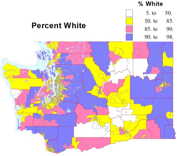
The urban population of the United States is now 249 million, according to the 2010 Census, 81 percent of the total. This is impressive, and not all surprising for a large developed economy. Yet the urban population — meaning cities, suburbs and exurbs — is not everything. And in many ways for everything from food, resources and recreation, the urban areas still depend on the nearly sixty million who live in rural America
It is fascinating to review how American demography has changed over the last decade. So I will briefly look at some obvious points, such as the largest, most important, places, those that grew the most absolutely and relatively, and those that, on the contrary, declined.
Our Giant Metropolises
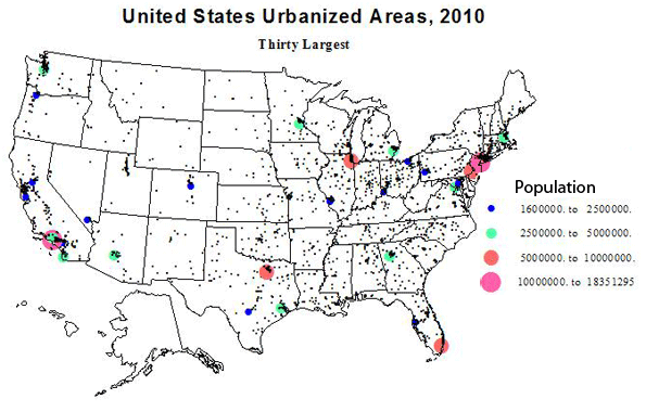
The Census is very generous, probably way too generous, in their defining the outer limits of our urbanized areas (agglomerations with over 50,000 people). They tend to respect the independence of historically separate places, which from a satellite view would appear to be part of a united larger agglomeration. For example, New York, as defined, is huge enough but dense settlement goes far beyond its census limits. (I’ll take a look at conurbations, like Megalopolis, in a separate discussion). The 30 giants are shown in Table 1. The top three, New York, Los Angeles and Chicago have kept their positions for decades, but story of more recent times has been the upsurge of Southern giants of Houston, Dallas, Miami, Atlanta, and of course, Washington, DC. Detroit is still in the top 15, but its position has fallen to 11th, while other historic places like Cleveland, St. Louis and Pittsburgh have dropped into the second set of 15.
| Table 1: Largest US Urbanized Areas | |||||
| Urbanized Area Name | 2010 Population | 2000 Population | Change | % Change | |
| 1 | New York–Newark, NY–NJ–CT | 18,351,295 | 17,799,861 | 551,434 | 3.10 |
| 2 | Los Angeles–Long Beach–Anaheim, CA | 12,150,996 | 11,789,487 | 361,509 | 3.07 |
| 3 | Chicago, IL–IN | 8,608,208 | 8,307,904 | 300,304 | 3.61 |
| 4 | Miami, FL | 5,502,379 | 4,919,036 | 583,343 | 11.86 |
| 5 | Philadelphia, PA–NJ–DE–MD | 5,441,567 | 5,149,079 | 292,488 | 5.68 |
| 6 | Dallas–Fort Worth–Arlington, TX | 5,121,892 | 4,145,659 | 976,233 | 23.55 |
| 7 | Houston, TX | 4,944,332 | 3,822,509 | 1,121,823 | 29.35 |
| 8 | Washington, DC–VA–MD | 4,586,770 | 3,933,920 | 652,850 | 16.60 |
| 9 | Atlanta, GA | 4,515,419 | 3,499,840 | 1,015,579 | 29.02 |
| 10 | Boston, MA–NH–RI | 4,181,019 | 4,032,484 | 148,535 | 3.68 |
| 11 | Detroit, MI | 3,734,090 | 3,903,377 | -169,287 | -4.34 |
| 12 | Phoenix–Mesa, AZ | 3,629,114 | 2,907,049 | 722,065 | 24.84 |
| 13 | San Francisco–Oakland, CA | 3,281,212 | 3,228,605 | 52,607 | 1.63 |
| 14 | Seattle, WA | 3,059,393 | 2,712,205 | 347,188 | 12.80 |
| 15 | San Diego, CA | 2,956,746 | 2,674,436 | 282,310 | 10.56 |
| 90,064,432 | 82,825,451 | ||||
| 16 | Minneapolis–St. Paul, MN–WI | 2,650,890 | 2,388,593 | 262,297 | 10.98 |
| 17 | Tampa–St. Petersburg, FL | 2,441,770 | 2,062,339 | 379,431 | 18.40 |
| 18 | Denver–Aurora, CO | 2,374,203 | 1,984,889 | 389,314 | 19.61 |
| 19 | Baltimore, MD | 2,203,663 | 2,076,354 | 127,309 | 6.13 |
| 20 | St. Louis, MO–IL | 2,150,706 | 2,077,662 | 73,044 | 3.52 |
| 21 | San Juan, PR | 2,148,346 | 2,216,616 | -68,270 | -3.08 |
| 22 | Riverside–San Bernardino, CA | 1,932,666 | 1,506,816 | 425,850 | 28.26 |
| 23 | Las Vegas–Henderson, NV | 1,886,011 | 1,314,357 | 571,654 | 43.49 |
| 24 | Portland, OR–WA | 1,849,898 | 1,583,138 | 266,760 | 16.85 |
| 25 | Cleveland, OH | 1,780,673 | 1,786,647 | -5,974 | -0.33 |
| 26 | San Antonio, TX | 1,758,210 | 1,327,554 | 430,656 | 32.44 |
| 27 | Pittsburgh, PA | 1,733,853 | 1,753,136 | -19,283 | -1.10 |
| 28 | Sacramento, CA | 1,723,634 | 1,393,498 | 330,136 | 23.69 |
| 29 | San Jose, CA | 1,664,496 | 1,538,312 | 126,184 | 8.20 |
| 30 | Cincinnati, OH–KY–IN | 1,624,827 | 1,503,262 | 121,565 | 8.09 |
| 29,923,846 | 26,513,173 | ||||
Cities with the Largest Gains
Urbanized areas which gained the most population over the last decade are listed in Table 2. These numbers are truly large; these are clear leaders in “population power”. I’ll first draw our attention to the five cities which are in the top 35 in both absolute growth and in percent growth. These include Temecula-Murrieta, CA (most folks will never have even heard of it: think inland sunshine of Riverside county); Charlotte and Raleigh, NC; Cape Coral, FL (again, huh?); and Austin, TX (you were thinking Dallas or Houston? See below).
Temecula-Murietta : 25th absolute growth, 6th % growth
Charlotte : 9th and 19th
Raleigh : 18th and 21st
Cape Coral : 30th and 27th
Austin : 10th and 34th
North Carolina wins the race for the fastest growing areas. But in sheer growth in people, the winners are (Table 2) Houston, Atlanta, Dallas, Phoenix, Washington, Miami, Las Vegas (despite the recession), New York, Charlotte and Austin. Giant New York is the only non-sunbelt place in the elite, and it had a quite slow rate of growth (3%). The next places outside the southern tier are Denver (13th) and Seattle (18th). The total absolute growth in these top 15 cities was a phenomenal 7.24 million, a rate of growth of 8.7 %. For the top 30 urbanized areas, the growth was 10.3 million, with a percent growth of 9.7 – the same as the rate of growth of the nation. This includes slow growing but still very big places like Los Angeles (growth displaced to its satellites), Philadelphia, Chicago, Indianapolis, Portland and Minneapolis.
| Table 2: Largest Absolute Change in US Urbanized Areas | |||||
| Urbanized Area Name | 2010 Population | 2000 Population | Change | % Change | |
| 1 | Houston, TX | 4,944,332 | 3,822,509 | 1,121,823 | 29.35 |
| 2 | Atlanta, GA | 4,515,419 | 3,499,840 | 1,015,579 | 29.02 |
| 3 | Dallas–Fort Worth–Arlington, TX | 5,121,892 | 4,145,659 | 976,233 | 23.55 |
| 4 | Phoenix–Mesa, AZ | 3,629,114 | 2,907,049 | 722,065 | 24.84 |
| 5 | Washington, DC–VA–MD | 4,586,770 | 3,933,920 | 652,850 | 16.60 |
| 6 | Miami, FL | 5,502,379 | 4,919,036 | 583,343 | 11.86 |
| 7 | Las Vegas–Henderson, NV | 1,886,011 | 1,314,357 | 571,654 | 43.49 |
| 8 | New York–Newark, NY–NJ–CT | 18,351,295 | 17,799,861 | 551,434 | 3.10 |
| 9 | Charlotte, NC–SC | 1,249,442 | 758,927 | 490,515 | 64.63 |
| 10 | Austin, TX | 1,362,416 | 901,920 | 460,496 | 51.06 |
| 11 | San Antonio, TX | 1,758,210 | 1,327,554 | 430,656 | 32.44 |
| 12 | Riverside–San Bernardino, CA | 1,932,666 | 1,506,816 | 425,850 | 28.26 |
| 13 | Denver–Aurora, CO | 2,374,203 | 1,984,889 | 389,314 | 19.61 |
| 14 | Tampa–St. Petersburg, FL | 2,441,770 | 2,062,339 | 379,431 | 18.40 |
| 15 | Los Angeles–Long Beach–Anaheim, CA | 12,150,996 | 11,789,487 | 361,509 | 3.07 |
| 16 | Orlando, FL | 1,510,516 | 1,157,431 | 353,085 | 30.51 |
| 17 | Seattle, WA | 3,059,393 | 2,712,205 | 347,188 | 12.80 |
| 18 | Raleigh, NC | 884,891 | 541,527 | 343,364 | 63.41 |
| 19 | Sacramento, CA | 1,723,634 | 1,393,498 | 330,136 | 23.69 |
| 20 | Chicago, IL–IN | 8,608,208 | 8,307,904 | 300,304 | 3.61 |
| 21 | Philadelphia, PA–NJ–DE–MD | 5,441,567 | 5,149,079 | 292,488 | 5.68 |
| 22 | San Diego, CA | 2,956,746 | 2,674,436 | 282,310 | 10.56 |
| 23 | Indianapolis, IN | 1,487,483 | 1,218,919 | 268,564 | 22.03 |
| 24 | Portland, OR–WA | 1,849,898 | 1,583,138 | 266,760 | 16.85 |
| 25 | Minneapolis–St. Paul, MN–WI | 2,650,890 | 2,388,593 | 262,297 | 10.98 |
| 26 | Columbus, OH | 1,368,035 | 1,133,193 | 234,842 | 20.72 |
| 27 | Nashville-Davidson, TN | 969,587 | 749,935 | 219,652 | 29.29 |
| 28 | Murrieta–Temecula–Menifee, CA | 441,546 | 229,810 | 211,736 | 92.14 |
| 29 | McAllen, TX | 728,825 | 523,144 | 205,681 | 39.32 |
| 30 | Cape Coral, FL | 530,290 | 329,757 | 200,533 | 60.81 |
Rate of Population Growth
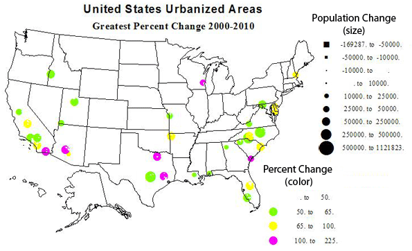
Thirty six cities had a growth rate of more than 50 percent between 2000 and 2010, a decade not that fabulous in economic growth! Only three of these are independent metropolises of over a half-million: Charlotte and Raleigh, NC, and Austin, TX. With growth numbers and rates of 491000 (65%), 343000 (63%), and 460000 (51%)—clearly places on the move up. The others fall more or less into these categories: (please see table 3 for a list of all 35).
Satellite places to larger urban areas: 21 places
Smaller regional capitals or centers: 10 place
The superstars in rate of growth were McKinney, TX (Dallas satellite), 212% growth; Avondale, AZ (Phoenix suburb), 190%; The Woodlands, TX (Houston satellite), 168%; Lady Lake, FL (Orlando satellite), 123%; West Bend, WI (Milwaukee satellite, 106%); El Centro , CA (Imperial Valley center), 103%; and Hilton Head, SC (retirement, etc.), 101%.
| Table 3: Greatest Percent Gains | |||||
| Urbanized Area Name | 2010 Population | 2000 Population | Change | % Change | |
| 1 | McKinney, TX | 170,030 | 54,525 | 115,505 | 211.84 |
| 2 | Avondale, AZ | 197,041 | 67,875 | 129,166 | 190.30 |
| 3 | The Woodlands, TX | 239,938 | 89,445 | 150,493 | 168.25 |
| 4 | Lady Lake, FL | 112,991 | 50,721 | 62,270 | 122.77 |
| 5 | West Bend, WI | 68,444 | 33,288 | 35,156 | 105.61 |
| 6 | El Centro, CA | 107,672 | 52,954 | 54,718 | 103.33 |
| 7 | Hilton Head Island, SC | 68,998 | 34,400 | 34,598 | 100.58 |
| 8 | Temecula–Murrieta, CA | 441,546 | 229,810 | 211,736 | 92.14 |
| 9 | Concord, NC | 214,881 | 115,057 | 99,824 | 86.76 |
| 10 | Visalia, CA | 219,454 | 120,044 | 99,410 | 82.81 |
| 11 | Los Lunas, NM | 63,758 | 36,101 | 27,657 | 76.61 |
| 12 | Myrtle Beach, SC | 215,304 | 122,984 | 92,320 | 75.07 |
| 13 | Portsmouth, NH–ME | 88,200 | 50,912 | 37,288 | 73.24 |
| 14 | Casa Grande, AZ | 51,331 | 29,815 | 21,516 | 72.17 |
| 15 | Fayetteville–Springdale, AR | 295,083 | 172,585 | 122,498 | 70.98 |
| 16 | Dover, DE | 110,769 | 65,044 | 45,725 | 70.30 |
| 17 | Kissimmee, FL | 314,071 | 186,667 | 127,404 | 68.25 |
| 18 | Salisbury, MD–DE | 98,081 | 59,426 | 38,655 | 65.05 |
| 19 | Charlotte, NC–SC | 1,249,442 | 758,927 | 490,515 | 64.63 |
| 20 | Victorville–Hesperia–Apple Valley, CA | 328,454 | 200,436 | 128,018 | 63.87 |
| 21 | Raleigh, NC | 884,891 | 541,527 | 343,364 | 63.41 |
| 22 | Manteca, CA | 83,578 | 51,176 | 32,402 | 63.31 |
| 23 | Cape Coral, FL | 530,290 | 329,757 | 200,533 | 60.81 |
| 24 | Provo–Orem, UT | 482,819 | 303,680 | 179,139 | 58.99 |
| 25 | Nampa, ID | 151,499 | 95,909 | 55,590 | 57.96 |
| 26 | St. George, UT | 98,370 | 62,630 | 35,740 | 57.07 |
| 27 | Cartersville, GA | 52,477 | 33,685 | 18,792 | 55.79 |
| 28 | Hammond, LA | 67,629 | 43,458 | 24,171 | 55.62 |
| 29 | Mauldin–Simpsonville, SC | 120,577 | 77,831 | 42,746 | 54.92 |
| 30 | Blacksburg, VA | 88,542 | 57,236 | 31,306 | 54.70 |
| 31 | Lee’s Summit, MO | 85,081 | 55,285 | 29,796 | 53.90 |
| 32 | Hagerstown, MD–WV–PA | 182,696 | 120,326 | 62,370 | 51.83 |
| 33 | Santa Clarita, CA | 258,653 | 170,481 | 88,172 | 51.72 |
| 34 | Austin, TX | 1,362,416 | 901,920 | 460,496 | 51.06 |
| 35 | Daphne–Fairhope, AL | 57,383 | 38,110 | 19,273 | 50.57 |
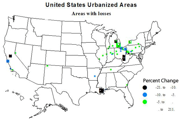
Losers
Urban growth is the expected norm, but not all areas of the country prospered 2000-2010. What kinds of place lost population and why? See Table 4 for a list of larger absolute and percent losses. Despite the comeback of the automobile industry, Detroit experienced the greatest loss, arguably because much of the industry has moved to the non-union and lower wage South. New Orleans had the second biggest loss, with almost an 11 percent loss, recovering only gradually from hurricane Katrina. Partly race or perhaps more a legacy of poverty and inept governance? Other large numerical losses were in rust belt industrial and mining cities, such as Buffalo, Youngstown and Pittsburgh and Charleston, WV. At least one was quite different: Seaside-Monterey CA, with losses due to reduced military operations as well as a generally weak California economy.
High rates of losses were mostly in the same places, but included several smaller industrial towns in Ohio, Indiana and Pennsylvania.
| Table 4: Greatest Percent Losses and Greatest Absolute Losses | |||||
| Relative posses | |||||
| Urbanized Area Name | 2010 Population | 2000 Population | Change | % Change | |
| 1 | Mansfield, OH | 75,250 | 79,698 | -4,448 | -5.58 |
| 2 | Lorain–Elyria, OH | 180,956 | 193,586 | -12,630 | -6.52 |
| 3 | Pascagoula, MS | 50,428 | 54,190 | -3,762 | -6.94 |
| 4 | Youngstown, OH–PA | 387,550 | 417,437 | -29,887 | -7.16 |
| 5 | Wheeling, WV–OH | 81,249 | 87,613 | -6,364 | -7.26 |
| 6 | Lompoc, CA | 51,509 | 55,667 | -4,158 | -7.47 |
| 7 | Mayagüez, PR | 109,572 | 119,350 | -9,778 | -8.19 |
| 8 | Hightstown, NJ | 64,037 | 69,977 | -5,940 | -8.49 |
| 9 | Pine Bluff, AR | 53,495 | 58,584 | -5,089 | -8.69 |
| 10 | Seaside–Monterey–Marina, CA | 114,237 | 125,503 | -11,266 | -8.98 |
| 11 | Anderson, IN | 88,133 | 97,038 | -8,905 | -9.18 |
| 12 | Johnstown, PA | 69,014 | 76,113 | -7,099 | -9.33 |
| 13 | Saginaw, MI | 126,265 | 140,985 | -14,720 | -10.44 |
| 14 | New Orleans, LA | 899,703 | 1,009,283 | -109,580 | -10.86 |
| 15 | Uniontown–Connellsville, PA | 51,370 | 58,442 | -7,072 | -12.10 |
| 16 | Yauco, PR | 90,899 | 108,024 | -17,125 | -15.85 |
| 17 | Charleston, WV | 153,199 | 182,991 | -29,792 | -16.28 |
| 18 | Lodi, CA | 68,738 | 83,735 | -14,997 | -17.91 |
| 19 | Parkersburg, WV–OH | 67,229 | 85,605 | -18,376 | -21.47 |
| 20 | Ponce, PR | 149,539 | 195,037 | -45,498 | -23.33 |
| Absolute Losses | |||||
| Urbanized Area Name | 2010 Population | 2000 Population | Change | % Change | |
| 1 | Seaside–Monterey–Marina, CA | 114,237 | 125,503 | -11,266 | -8.98 |
| 2 | Lorain–Elyria, OH | 180,956 | 193,586 | -12,630 | -6.52 |
| 3 | Saginaw, MI | 126,265 | 140,985 | -14,720 | -10.44 |
| 4 | Lodi, CA | 68,738 | 83,735 | -14,997 | -17.91 |
| 5 | Yauco, PR | 90,899 | 108,024 | -17,125 | -15.85 |
| 6 | Parkersburg, WV–OH | 67,229 | 85,605 | -18,376 | -21.47 |
| 7 | Pittsburgh, PA | 1,733,853 | 1,753,136 | -19,283 | -1.10 |
| 8 | Charleston, WV | 153,199 | 182,991 | -29,792 | -16.28 |
| 9 | Youngstown, OH–PA | 387,550 | 417,437 | -29,887 | -7.16 |
| 10 | Buffalo, NY | 935,906 | 976,703 | -40,797 | -4.18 |
| 11 | Ponce, PR | 149,539 | 195,037 | -45,498 | -23.33 |
| 12 | San Juan, PR | 2,148,346 | 2,216,616 | -68,270 | -3.08 |
| 13 | New Orleans, LA | 899,703 | 1,009,283 | -109,580 | -10.86 |
| 14 | Detroit, MI | 3,734,090 | 3,903,377 | -169,287 | -4.34 |
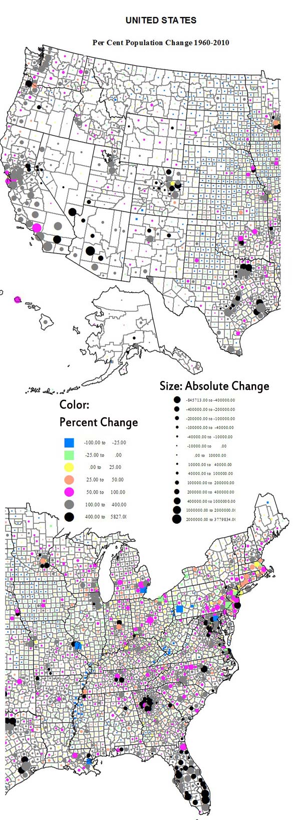
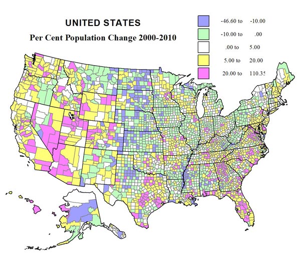
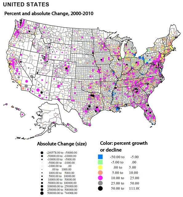
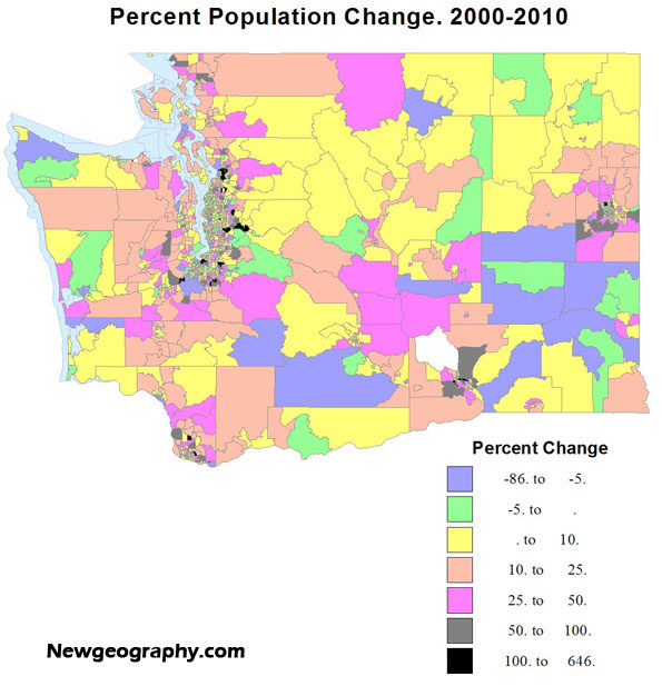
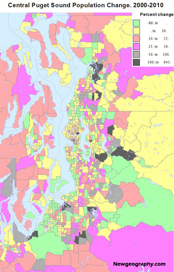
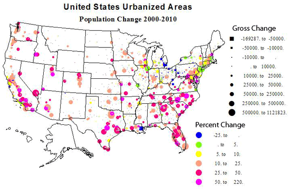
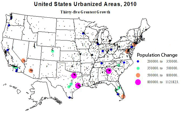
These statistics are also summarized in 5 maps – one showing the size and rate of growth of all urbanized areas, followed by maps of the largest 30 places, the 35 places with the highest absolute and highest relative growth, then a map of the largest absolute and percent losses.
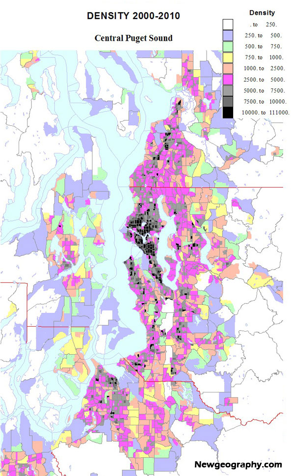
Density, Size and Location
People are often surprised by the fact that the highest urban densities are not in the historic eastern cities but in newer western cities. Los Angeles, often called the epitome of sprawl, is in fact the densest urbanized area in the US, for the third straight census! Table 5 lists the densest urbanized areas and the densities of the largest areas.
| Table 5: Highest and lowest urban densisties | |||
| Highest urbanzed area densities | |||
| Place | State | Population (Thousands) | Density |
| Los Angeles | CA | 12,151 | 6,999 |
| San Francisco | CA | 3,281 | 6,266 |
| San Jose | CA | 1,664 | 5,820 |
| Delano | CA | 54 | 5,483 |
| New York | NY | 18,351 | 5,319 |
| Davis | CA | 73 | 5,157 |
| Lompoc | CA | 52 | 4,816 |
| Honolulu | HI | 802 | 4,716 |
| Woodland | CA | 56 | 4,551 |
| L:as Vegas | NV | 1,886 | 4,525 |
| Densities of largest places (not on above list) | |||
| Chicago | IL | 8,608 | 3,524 |
| Miami | FL | 5,502 | 4,442 |
| Philladelphia | PA | 5,442 | 2,746 |
| Dallas | TX | 5,122 | 2,879 |
| Houston | TX | 4,944 | 2,979 |
| Washington DC | DC | 4,586 | 3,470 |
| Atlanta | GA | 4,515 | 1,707 |
| Boston | MA | 4,182 | 2,232 |
| Detroit | MI | 3,734 | 2,793 |
| Phoenix | AZ | 3,629 | 3,165 |
| Seattle | WA | 3,059 | 3,028 |
| Lowest density places | |||
| Hickory | NC | 212 | 811 |
| Hammond | LA | 68 | 883 |
| Barnstable | MA | 247 | 890 |
| Gadsden | AL | 64 | 892 |
| Homosassa Spgs | FL | 81 | 895 |
| Anniston | AL | 80 | 920 |
| Los Lunas | NM | 64 | 921 |
| Spartanburg | SC | 181 | 952 |
| Hilton Head | SC | 69 | 1,020 |
| Anderson | SC | 76 | 1,022 |
The remarkable story is that of the 10 densest areas, 9 are in the west, and 7 in the Golden State. Four of these are fairly small, another surprise. The only eastern city in the top 10 is New York, which is fairly sharply limited by the census. Los Angeles, San Francisco and San Jose are the three most densely settled areas. The main underlying reason is not just planning regulations, although these probably play a role, but the issue of providing water to developable land. Both are restricted. This is one reason why growth in the southwest tends to be relatively dense. These drier areas lack the local water supplies that enable the kind of low density sprawl typical of the historic eastern cities like, yes, Boston with a density of only 2231, less than one-third that of Los Angeles!! Other large urban areas with lower densities include Chicago, Philadelphia, Detroit, Houston, Dallas and Atlanta, a mere 1707!
The winners for low density are an interesting mix of satellite places, such as Hammond, Barnstable, Los Lunas, and independent places like Hickory, Gadsden and Anniston, AL, and Spartanburg and Anderson, SC, many in hilly Appalachian environments, with settlement limited to valley floors. This is why the density could be below 1000 per square mile, the usual demarcation point of urban densities. Several are rather resort-like, e.g., Barnstable, Hilton Head and Homosassa Springs.
Even if our urban definition is a little generous, 80 percent of the population or 250 million persons is an impressive total. Most of us cannot escape the city, where most jobs and opportunities are. We need to live in cities and perhaps most of us love the city. So the settlement issue in our lives becomes what city to live in and where to live within that place.
Richard Morrill is Professor Emeritus of Geography and Environmental Studies, University of Washington. His research interests include: political geography (voting behavior, redistricting, local governance), population/demography/settlement/migration, urban geography and planning, urban transportation (i.e., old fashioned generalist).
Next: Megalopolis and its rivals.
Los Angeles skyline photo by Bigstockphoto.com.

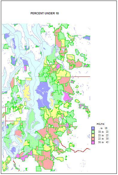 Higher shares of persons under 5 reveal areas of young families. The highest shares are in military bases and Latino towns in eastern Washington, but are quite high, over 12 percent, in the farthest suburban and exurban places around Seattle such as Duvall and Snoqualmie. They are lowest in retirement towns, on islands such as Vashon and Bainbridge, and in some college towns such as Pullman.
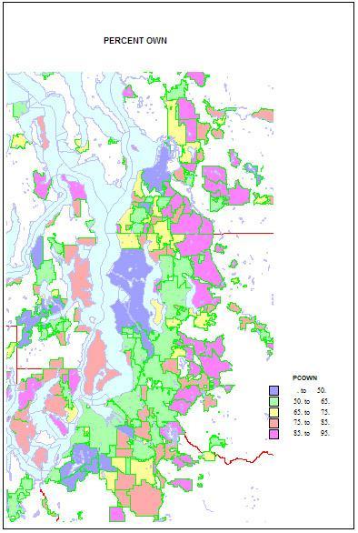 Home ownership is related to both age and household types. Rates of home ownership are extremely high, in the 90s in newer and more affluent suburbs, with mainly single family homes; the rates are lowest on military bases, college towns, and in a few less affluent suburbs, such as Tukwila. As for the city of Seattle — which has indeed changed its character in a fundamental way — home ownership has dropped to a low of 48 percent. This shift helps us understand the cleavages in Seattle’s body politic, as a formerly very middle class city adjusts to an influx of singles, renters, and young people.
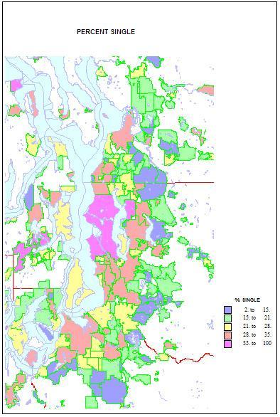 Conversely, singles are highest in two island towns, Friday Harbor and Langley, but Seattle is an extremely high 41 percent. Shares are lowest in the same new suburbs rich in families, as in Sammamish, at 11 percent. Shares of unmarried partners are a high 10 percent of households in Seattle, but are higher on Indian reservations and the cities of Hoquiam and Aberdeen. The share of single-parent households is also high on Indian reservations, in less affluent and more ethnic suburbs like Parkland and Bryn Mawr and Tukwila. It is lowest in the newer, family-filled far suburbs.