Author: Wendell Cox

  • America’s Subway: America’s Embarrassment?

    Washington’s Metro (subway), often called "America’s subway," may well be America’s embarrassment. As a feature article by Robert McCartney and Paul Duggan in the Washington Post put it: “’America’s subway,’ which opened in 1976 to great acclaim — promoted as a marvel of modern transit technology and design — has been reduced to an embarrassment, scorned and ridiculed from station platforms to the halls of Congress. Balky and unreliable on its best days, and hazardous, even deadly, on its worst, Metrorail is in crisis, losing riders and revenue and exhausting public confidence." (emphasis by author.)

    The Post article started out by saying: "Metro’s failure-prone subway — once considered a transportation jewel — is mired in disrepair because the transit agency neglected to heed warnings that its aging equipment and poor safety culture would someday lead to chronic breakdowns and calamities." Moreover, according to the Post, there had been plenty of warnings over the nearly half-century the trains have been operated that maintenance and safety were not receiving sufficient attention. The article notes that the transit agency has lacked a robust safety culture and "it is maintenance regime was close to negligent."

    Indeed, things have gotten so bad that the new general manager Paul J. Wiedefeld ordered a one day system shutdown to make emergency repairs out of fear that a fault that killed one passenger a year ago might have recurred. The problem was considered so serious by Mr. Weidefeld that little more than 12 hours notice was provided: "Scores of passengers were sickened, one fatally, in a smoke-filled tunnel; a fire in a Metro power plant slowed and canceled trains for weeks; major stretches of the system were paralyzed for hours by a derailment stemming from a track defect that should have been fixed long before; and, on March 16, in an unprecedented workday aggravation for every Metro straphanger, the entire subway was shut down for 24 hours for urgent safety repairs."

    Things are so bad that Metro officials have warned it may be necessary to shut entire subway lines for up to six months to perform necessary maintenance.

    The feature length article, at nearly 5000 words, could well add to the Washington Post’s impressive list of Pulitzer Prizes.

    If there were an anti-Pulitzer Prize, it might well go to James Surowiecki of The New Yorkerwho opined: "Today, the Metro is in such a state that fixing it may require shutting whole lines for months at a time. It’s yet again an example for the nation, but now it’s an example of how underinvestment and political dysfunction have left America with infrastructure that’s failing and often downright dangerous."

    It is hard to imagine a more inappropriate characterization. Metro’s problem has nothing to do with any national infrastructure crisis. It is a crisis of competence — the failure of its governance system to competently manage the system.

    When is the last time that the entire New York subway was closed with 12 hours notice to make repairs critical to the safety of the system? Or when was the last such shutdown of the London Underground, the Paris Metro, or for that matter the Kolkata Metro or the Caracas Metro, much less the threat of closing lines for months at a time?

    How many of America’s many light rail systems have shut down as a result of their having failed to sufficiently maintain their safety? There is plenty to criticize about the many new urban rail systems in the United States. They may not carry the number of passengers projected, and often have cost far more than taxpayers were told and they may not have reduced traffic congestion. But they have managed to provide safe transportation to their riders. Only one of America’s rail systems has failed so abjectly in the most fundamental of its responsibilities: America’s subway in Washington.

    My one criticism of the Washington Post story is its preoccupation with finding new sources of funding. Funding levels do not excuse this failure. No one was forcing the powers that be in the Washington area to continue to expand a subway well into the hinterlands while the core was deteriorating. It was the responsibility of the governance structure of the Washington Metropolitan Area Transportation Authority (WMATA), which owns and operates Metro to put the safety of its customers first. If the priorities had been right and the system had not been built out faster than the funding would have prudently permitted, we would not be having this discussion.

    Perhaps the most important lesson to be learned from the Washington Metro failure is that we need to learn the lessons. As the Post article indicates, there are multiple reasons that have contributed to Metro’s failure over decades and a number of WMATA administrations. Certainly no single board of directors or manager bears principal responsibility. It is important to learn exactly what went wrong, and examinations by organizations such as the Government Accountability Office, the Congressional Research Service, the Department of Transportation Inspector General and others would be appropriate. It is important to recognize that Metro is not the typical transit agency that has fallen into financial difficulties. This is a very special case and needs to be treated as the serious governance and management failure that it is. Answers are needed before any new money should be allowed to flow for Metro. For its part, WMATA needs to figure out what it can competently do with the money that is available.

    Wendell Cox is principal of Demographia, an international pubilc policy and demographics firm. He is a Senior Fellow of the Center for Opportunity Urbanism (US), Senior Fellow for Housing Affordability and Municipal Policy for the Frontier Centre for Public Policy (Canada), and a member of the Board of Advisors of the Center for Demographics and Policy at Chapman University (California). He is co-author of the “Demographia International Housing Affordability Survey” and author of “Demographia World Urban Areas” and “War on the Dream: How Anti-Sprawl Policy Threatens the Quality of Life.” He was appointed to three terms on the Los Angeles County Transportation Commission, where he served with the leading city and county leadership as the only non-elected member. He served as a visiting professor at the Conservatoire National des Arts et Metiers, a national university in Paris.

    Washington Metro photo by Ben Schumin. SchuminWeb assumed (based on copyright claims). Own work assumed (based on copyright claims)., April 28, 2016
  • Heart Attack Death Risk Greater on Higher Floors

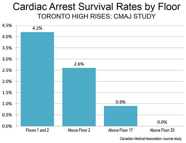
    A study in the Canadian Medical Association Journal (CMAJ) indicates that the survival rates of cardiac arrest (heart attack) is considerably worse at higher floors. Survival rates were compared by residential floor in Toronto. The article implied that the longer time necessary to reach patients after having arrived on the scene was likely a factor. Further, it was suggested that the longer time required to reach the hospital from the higher floors could be a factor, since cardiopulmonary resuscitation (CPR) is suboptimal until the patient is in the hospital.

    The study examined “911” response calls to high rise residential buildings in Toronto and found that the best survival rates were on the first and second floors (4.2 percent). Above the second floor, the survival rate was 40 percent less, at 2.6 percent. Above the 16th floor, the survival rate dropped 80 percent from the first and second floor (0.9 percent). There were no survivors above the 25th floor (Figure).

    The study concluded: “With continuing construction of high-rise buildings, it is important to understand the potential effect of vertical height on patient outcomes after out-of-hospital cardiac arrest.”

  • Millennial Home Ownership: Disappointment Ahead in Some Places?

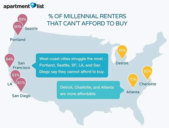
    Millennial renters overwhelmingly plan on buying their own homes, though affording them could be far more challenging than they think. This is an important conclusion from a renters’ survey by apartmentlist.com, an apartment search website (See: The Affordability Crisis: Are Millennials Destined to be Renters?). Apartmentlist.com matched results from its own survey of prospective renters that visit its site with housing market data from more than 90 metropolitan areas around the country, The most revealing finding:  Millennials intend to purchase their own homes, but that housing affordability is the greatest barrier. According to apartmentlist.com, the problem is the greatest on the West Coast, New York and Miami (See Figure “% of Millennial Renters that Can’t Afford to Buy”, from apartmentlist.com):

    In nearly all the metros we looked at, affordability was the #1 reason for delaying homeownership, but millennials on the west coast struggled the most: Portland, San Diego, Seattle, Los Angeles, and San Francisco all had more than 80% of renters listing affordability as a concern. Miami and New York, expensive metros with many cost-burdened renters, were #6 and #7 on the list.

    Perhaps surprisingly, two metropolitan areas that have been among the greatest beneficiaries of the housing affordability driven net domestic migration from coastal California, Portland and Seattle, scored the worst on affordability as a barrier to purchasing homes (90 percent and 89 percent respectively). These areas were once much less expensive in the past, but are rapidly catching up with California in terms of unaffordability.

    The Preference for Home Ownership

    The apartmentlist.com survey found that 79 percent of Millennials eventually plan to become home or apartment owners, while only six percent expect to rent for their whole lives. The balance (15 percent) are not sure. This 79 percent preference for home ownership is well above the current homeownership rate of approximately 64 percent.

    The preference for home ownership was pervasive in the apartmentlist.com data. Among the 50 metropolitan areas with more than 1,000,000 population, none scored below two thirds (67 percent) in Millennial home ownership preference. This is, again, above the national home ownership rate. The lowest home ownership preference among these was in Las Vegas. The highest preference for home ownership was in Rochester, at 94 percent. Charlotte and Salt Lake City also scored a 90 percent home ownership preference.

    Millennials indicated a strong preference for home ownership even in metropolitan areas that have depressed home ownership rates. In 2015, Los Angeles had the lowest home ownership rate of any major metropolitan area, at 49 percent, yet 76 percent of the area’s Millennials intend to own their own homes. In New York, with only a 50 percent homeownership rate, 74 percent of Millennials plan on buying their own homes. In San Jose, with only a 51 percent home ownership rate, 74 percent of Millennials aspire to buy their own homes. In San Diego, the home ownership rate was 52 percent, yet the interest in home ownership was half-again higher (78 percent). In San Francisco, where the home ownership rate is 56 percent, 76 percent expressed an interest in owning their own homes (home ownership rates calculated from Census Bureau quarterly data from 2015).

    The story is the same in the metropolitan areas often characterized as magnets for Millennial migration. In Portland and Denver, 81 percent of Millennials anticipate owning their own homes. Boston (78 percent), Seattle (77 percent) and Minneapolis-St. Paul (77 percent) are not far behind.

    Saving for Decades

    This data suggests that many Millennials could need to relocate to afford their own homes. The really innovative contribution of the apartmentlist.com research is as estimate of how long it will take the average Millennial to save enough money for a down payment on a starter home, which according to Trulia, is generally defined as the lower third of the market.

    Apartmentlist.com develops an estimate for each metropolitan area, using monthly savings rates, existing savings and the potential for financial assistance (for example from relatives) in obtaining enough for the down payment. In the most costly market, San Francisco, the average Millennial will need more than 28 years to build up enough funding for a down payment in San Francisco. This means that older Millennials would be old enough (62) to qualify for early retirement benefits from Social Security by the time they have enough to pay the down payment on a starter home. Sacramento is nearly as challenging, where it would take another 27 years to accumulate a down payment. Things are not that much better in Los Angeles (20 years), San Diego (19 years) and Denver (18 years).

    Optimistic Expectations and Disappointment

    But the most important bottom line conclusion of the research is what apartmentlist.com calls the “affordability gap.” This is the difference between the actual time required to accumulate a down payment and the time expected by survey respondents. The biggest affordability gap is in San Francisco, where respondents expected down payment requirements that would take only 11 years more to save. The reality, according to the study, is 28 years, more than 2.5 times that figure. In Sacramento, respondents expected that it would take 16 years, still far short of the more realistic 27 years. In Los Angeles, San Diego and Denver, it is likely to take from eight to ten years more to save enough for a down payment than survey respondents estimate.

    Setting up for More Domestic Migration

    In contrast, in a number of other metropolitan areas, such as Houston, Dallas-Fort Worth, Atlanta, Philadelphia and Kansas City, Millennials have over-estimated the size of down payments necessary to enter the housing market.

    For some time, domestic migration trends in the United States has been principally about moving from more expensive metropolitan areas to less expensive metropolitan areas. The apartmentlist.com data suggests that this trend could continue. To achieve their dreams of home ownership and to avoid a life of renting, many Millennials may move to places where housing is priced more for livability.

    Wendell Cox is principal of Demographia, an international pubilc policy and demographics firm. He is a Senior Fellow of the Center for Opportunity Urbanism (US), Senior Fellow for Housing Affordability and Municipal Policy for the Frontier Centre for Public Policy (Canada), and a member of the Board of Advisors of the Center for Demographics and Policy at Chapman University (California). He is co-author of the “Demographia International Housing Affordability Survey” and author of “Demographia World Urban Areas” and “War on the Dream: How Anti-Sprawl Policy Threatens the Quality of Life.” He was appointed to three terms on the Los Angeles County Transportation Commission, where he served with the leading city and county leadership as the only non-elected member. He served as a visiting professor at the Conservatoire National des Arts et Metiers, a national university in Paris.

    Photo by Bigstockphoto.com.

  • Largest Cities in the World: 2016

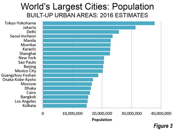
    Tokyo-Yokohama continues to be the largest city in the world, with nearly 38 million residents, according to the just released Demographia World Urban Areas (12th Annual Edition). Demographia World Urban Areas (Built-Up Urban Areas or Urban Agglomerations) provides annual estimates of the population, urban land area and urban population density of all identified built-up urban areas in the world. This year’s edition includes 1,022 large urban areas (with 500,000 or more residents), with a total population of 2.12 billion, representing 53 percent of the world urban population.

    Demographia World Urban Areas uses base population figures, derived from official census and estimates data, to develop basic year population estimates within the confines of built-up urban areas. These figures are then adjusted to account for population change forecasts, principally from the United Nations or national statistics bureaus for a 2016 estimate.

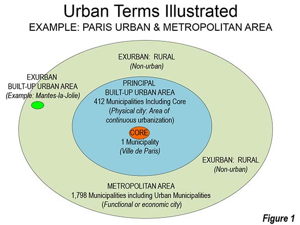
    Built-up urban areas are continuously built-up development that excludes rural lands. Built-Up urban areas are the city in its physical form, as opposed to metropolitan areas, which are the city in its economic or functional form. Metropolitan areas include rural areas and secondary built-up urban areas that are outside the primary built-up urban area. These concepts are illustrated in Figure 1, which uses the Paris built-up urban area (unité urbaine) and metropolitan area ("aire urbaine") as an example.

    The Largest Cities

    The world’s eight largest cities are located in Asia. Tokyo-Yokohama became the largest urban area, according to the United Nations, in 1955, more than 60 years ago. However, Japan’s capital may not old onto the top position for long. With Japan now losing population, it seems likely that Tokyo-Yokohama — which has been about the only place in Japan gaining population — will begin shrinking in the next decade, while facing a strong challenge from Jakarta.

    Jakarta has closed the gap to about 6.4 million. This may seem like a lot, but this is the closest a number two urban area has been since 1965, when New York trailed Tokyo-Yokohama by 5.1 million. The gap between number one and number two New York amounted to 16.5 million in 1995.

    Jakarta has grown very quickly, and now stands at a population of 31.3 million. Between 2000 and 2010, Jakarta added more than 7,000,000 residents, one of the largest population gains of any city in history. Should this growth continue, and the population of Tokyo-Yokohama begin to decline, the largest city in the world could be Jakarta by 2030. Jakarta is also the largest city in size in the southern hemisphere, stretching beyond its city limits, into the regencies of Tangerang, Bogor, Bekasi and Karawang to  the large independent cities of Tangerang, South Tangerang, Depok, Bekasi and Bogor.

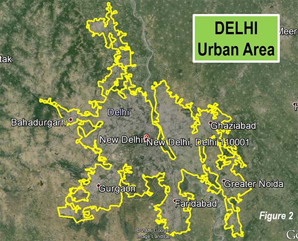
    Delhi, India’s capital, is not only the third largest city in the world, but is also the largest in India (25.7 million). That may be surprising, since Mumbai (Bombay) was the largest in India for decades and had been widely touted to become the world’s largest city. Delhi spreads from the National Capital Territory of Delhi into the states of Haryana and Uttar Pradesh. These areas include the modern edge city technology hubs of Gargaon and Noida (Figure 2).

    Seoul-Incheon is the fourth largest city in the world, with 23.6 million residents, Seoul-Incheon spreads from the core municipality of Seoul into suburban Gyeonggi and the independent municipality of Incheon. The core city of Seoul has stopped growing, and approximately 60 percent of the population is in the suburbs.

    Manila is the fifth largest city, with 22.9 million residents. Manila slipped from the fourth position according to recently obtained Philippine national statistics authority population projections. However, Manila continues to be one of the world’s fastest growing megacities and can be expected to pass Seoul-Incheon in the next few years. Manila spreads from the National Capital Territory into the adjoining provinces of Cavite, Laguna, Rizal and Bulacan.

    Sixth ranked Mumbai is a new entry to the top 10, with 22.9 million residents. The Mumbai urban area has been redefined to incorporate adjacent urban areas, which explains its larger population relative to last year. Mumbai extends from the municipality of Mumbai into the districts of Thane and Raighar.

    The sixth largest city is Karachi in Pakistan’s with 22.8 million residents. This population estimate is the least reliable among the largest cities. Pakistan’s last population census was nearly 20 years ago, and had been scheduled for March 2016. As of publication, the census has been postponed and no new date set.

    Shanghai dropped to the number eight position from sixth place last year. Shanghai’s population is estimated at 22.7 million residents. Like many cities across China, population growth has dropped substantially during this decade. Recently, the Shanghai city government announced that the population had fallen slightly over the last year, ending three decades of dramatic population growth in the last three decades. The Shanghai urban area is almost completely confined to the municipality of Shanghai, but has minor extensions into the provinces of Jiangsu and Zhenjiang.

    New York is the ninth largest city, with a population of 20.7 million. New York is the largest built-up urban area outside Asia and covers the largest land area of any urban area. New York extends into Long Island and the Hudson Valley in the state of New York, Connecticut and New Jersey. New York had been the world’s largest city before Tokyo, a distinction that it had held since 1925, when it surpassed London (now 33rd largest).

    The 10th largest city of Sao Paulo, with a population of 20.6 million. Sao Paulo is a new addition to the top 10, Latin America’s largest city and the core municipality. Sao Paulo stretches from its large core city in all directions, with approximately half of the population in the suburbs.

    Two cities fell out of the top 10, Beijing and Guangzhou-Foshan. Like Shanghai and some other cities of China, newer population estimates indicated a substantial decline in growth rates. Beijing is now the 11th largest city in the world, while Guangzhou-Foshan is 13th largest.

    Mexico City is ranked 12th largest in the world. Mexico’s capital has experienced a roller coaster ride in urban area rankings since the middle of the last century. In 1950, Mexico City ranked 17th in the world, according to United Nations estimates. By 2000, Mexico City was second in the world to only Tokyo Yokohama. During the period of its greatest growth, in the late 20th century, it was common to hear that Mexico City would eventually be the largest in the world (as was the case with Mumbai, above) but its once frenetic growth has cooled considerably.

    Los Angeles has also had its ups and downs. It is substantial growth in the first half of the 20th century brought Los Angeles from virtually nowhere to 12th largest in the world by 1950. As in Mumbai and Mexico City, there were those who expected Los Angeles to become the largest city in the world. By 1965, Los Angeles was the sixth largest city, trailing only Tokyo Yokohama, New York, Paris, London and Osaka Kobe Kyoto. Now, Los Angeles has fallen to 19th position and not only is unlikely to ever be the largest city in the world or even in the United States.` The 5 million population gap compared to New York in 2016 is little different from 1990.

    Distribution of Population

    Much has been made of the fact that the world now has more than one half of its population living in urban areas. More than one analyst has misunderstood this as meaning that the norm for world residents looks like Fifth Avenue in New York, central London or Paris or the huge shantytowns of Mumbai or Dhaka. In fact, however, most urban residents live in nothing like such environments (See: What is a Half Urban World?).

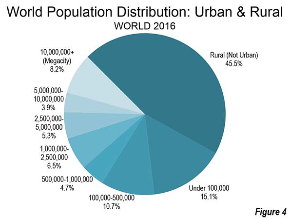
    Only 8.2 percent of the world population lives in megacities (built-up urban areas with more than 10 million population. In contrast nearly a quarter lives in cities of more than 1 million population, including the megacities. A larger 30 percent of the world population lives in urban areas under 1 million population, which includes the smallest towns. Rural areas still have nearly 46 percent of the world population (Figure 3).

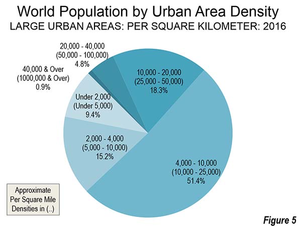
    Most of the large built-up urban area population lives at densities between 4,000 and 10,000 per square kilometer, or approximately 10,000 to 25,000 per square mile. These population densities are typical in parts of Asia, Africa and South America. Another one quarter of the population lives at densities of below 4,000 per square kilometer or approximately 10,000 per square mile. These densities are principally found in Europe, North America and Oceania (principally Australia and New Zealand). Slightly less than one quarter of the population lives at higher densities, above 10,000 per square kilometer or 25,000 per square mile. These densities are largely limited to certain Asian and African nations, such as Bangladesh, the Democratic Republic of the Congo and Pakistan (Figure 4).

    The Future

    As has been noted before, much of the population growth in the world will be in Africa over the next century. However, in the next few decades the greatest urban population growth seems likely to be in Asia, where 57 percent of the large urban area population lives. Even with declining growth rates, such as in China, many millions more  rural residents are expected to continue moving into China’s  cities .

    Note on Availability

    The full Demographia World Urban Areas and its components can be downloaded as follows:

    Full Report:

    Demographia World Urban Areas

    By Component:

    Demographia World Urban Areas- Index

    Photograph: Cover of Demographia World Urban Areas: 12th Annual Edition

    Wendell Cox is principal of Demographia, an international pubilc policy and demographics firm. He is a Senior Fellow of the Center for Opportunity Urbanism (US), Senior Fellow for Housing Affordability and Municipal Policy for the Frontier Centre for Public Policy (Canada), and a member of the Board of Advisors of the Center for Demographics and Policy at Chapman University (California). He is co-author of the “Demographia International Housing Affordability Survey” and author of “Demographia World Urban Areas” and “War on the Dream: How Anti-Sprawl Policy Threatens the Quality of Life.” He was appointed to three terms on the Los Angeles County Transportation Commission, where he served with the leading city and county leadership as the only non-elected member. He served as a visiting professor at the Conservatoire National des Arts et Metiers, a national university in Paris.

  • LSE/Netherlands Research Documents Price Effects of Tight Housing Regulation

    New research by London school of economics Professor Christian Hilber and Wouter Vermeulen of the Netherlands Bureau for Economic Policy Analysis provides strength and evidence of the connection between high housing prices and strong regulatory constraints. The paper advances the science by estimating the share of house price increases attributable to regulatory constraints. Hilbur and Vermeulen show that supply constraints are considerably more important in driving up house prices than the physical constraints (such as lack of land or topography) and lending conditions or interest rates:

    "In a nutshell, in our paper we use this unique data to test our prediction that house prices respond more strongly to changes in local demand in places with tight supply constraints. In doing so, we carefully disentangle the causal effect of regulatory constraints from the effects of physical constraints (degree of development and topography) on local house prices, holding other local factors constant and accounting for macroeconomic fluctuations induced, for example, by changing lending conditions or interest rates."

    Their conclusions are based on analysis of housing markets in the United Kingdom since 1979. Unlike the United States, Canada, Australia or New Zealand, the United Kingdom was fully engulfed by urban containment regulatory policy by that time.

    Perhaps the most important advance of the research was the author’s quantification of developable land. This is a relatively new direction in research, with perhaps the most important early contribution from Alberto Saiz of Harvard University, whose estimates relied on the assumption of a 50 mile radius of land from the cores of US metropolitan areas. My response  doubted the usefulness of measuring housing markets with a fixed radius, not least because since some metropolitan areas (and even built-up urban areas) extend beyond that distance. Hilbur and Vermuelen avoid this problem by estimating developed land by local authority area, which allows for analysis at the housing market level (which is usually larger than the local authority area).

    The authors also note recent research on the consequences of land use regulation to economic growth and stability. These include Hseih and Moretti, who found that without tight housing regulation, the gross product in the median city might be nearly 10 percent higher, and Glaeser et al research showing the greater volatility of prices in a tightly regulated environment.

    The authors summarize the problem:

    "Absent regulation, house prices would be lower by over a third and considerably less volatile. Young households are the obvious losers, yet macroeconomic stability is also impaired and productivity may suffer from constrained labour supply to the thriving cities where demand is highest."

    This is important research in a world struggling to restart healthy economic growth and reverse the decline of the middle-income standard of living.

  • “Rising Rail Chaos” in Honolulu

    That’s what the Honolulu Star Advertiser calls it in an April 8 editorial entitled "Rising Rail Chaos Bodes Ill for Us All." Honolulu’s urban rail project has experienced a host of problems, which were described by University of Hawaii professor Panos Prevedoros in January, who called the project “the nation’s largest infrastructure fiasco by far” on a per capita basis.

    Things continue to deteriorate, as the Star-Advertiser editorial indicates. The Star Advertiser reported that city Council chairman Ernie Martin called for both Honolulu Authority for Rapid Transportation (HART) Board Chairman Don Horner and chief executive officer Dan Grabauskas.

    In a letter, Martin expressed concern that: “With mounting evidence of mismanagement and out of control costs … it is clear that we need a leadership team capable of moving this multibillion (dollar) project forward.”

    In its editorial, the Star Advertiser noted: “HART officials acknowledged new misgivings that the recently approved extension of the funding mechanism — Oahu’s 0.5 percent general excise tax surcharge — would cover the bills.”

    Martin called it a “stunning about face” that Horner could not promise Council members that there would be enough cash to finish the project. Previously, according to Martin, Horner had said that the tax extension would be sufficient to finish the 20 mile line.

    Martin went on to say that “we need to go in a different direction” to help “stop the bleeding.” He added: “We’re at the tourniquet stage right now,”  “If we don’t apply more intense scrutiny, then we’re likely to lose limbs.”

    Meanwhile, Honolulu is not alone. There has been plenty of bleeding with respect to expensive urban rail projects. In Los Angeles, $16 billion has been spent to build a massive new urban rail system and yet, transit ridership languishes below the levels of three decades ago, despite population growth. In Toronto, the new airport express train has been such a failure in ridership that it is routinely called a “fiasco” by the media.

    Of course, all of this is predictable. Often, urban rail costs more and carries fewer riders than projected. are higher than projected ridership lower than projected, and virtually never high enough to reduce traffic congestion can be characterized as routine, as the international research led by Oxford professor Bent Flyvbjerg has indicated.

    But Honolulu is a special case as well. There may have never been so intense a volunteer campaign to stop what was perceived as a boondoggle is in Honolulu. The Star-Advertiser, usually a cheerleader for the project, concluded by saying: “Reports of this dysfunction just adds to the strain taxpayers feel right now, and it’s the last thing they need. The price tag on the state’s largest public works project is past the $6 billion mark and rising, with the most complicated part of the work still looming.”

  • Moving to the Middle: Domestic Migration by Metropolitan Area Size

    Americans are moving to middle-sized metropolitan areas, according to the latest Census Bureau population estimates. Between 2010 and 2015, all of the domestic migration gain was in a broadly defined middle of metropolitan areas between 250,000 and 5,000,000. Both above and below that range there were huge domestic migration losses.

    Middle Sized Metropolitan Areas (250,000 to 5,000,000 Population)

    Between 2010 and 2015, more than 1.4 million people moved to the metropolitan areas that had between 250,000 and 5,000,000 population in 2010. These movers came from larger metropolitan areas, as well as smaller metropolitan areas, micropolitan areas and areas that are not within these core-based statistical areas (Note). The larger metropolitan areas lost nearly 800,000 domestic migrants, while the smaller areas lost more than 600,000.

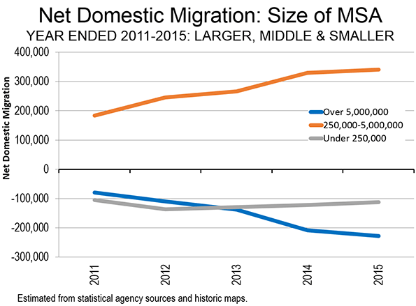
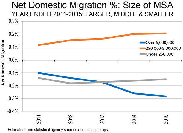
    Moreover, the trend is getting stronger. In each year since 2010, the middle sized metropolitan areas have increased their net domestic migration. In 2011, the middle sized metropolitan areas gained 184,000 net domestic migrants. This has gradually moved up to the 2015 figure of 341,000 net domestic migrants (Figure 1). In percentage terms, the middle sized metropolitan areas strongly increased their net domestic migration growth as a percentage of their population, from 0.12 percent to 0.21 percent (Figure 2).

    Larger Metropolitan Areas (5,000,000 Population and Over)

    At the same time, the nine larger metropolitan areas with over 5,000,000 residents and more have lost net domestic migrants in every year. In 2011, the loss was 80,000. It has increased every year since, to 228,000 in 2015. The percentage losses have grown dramatically. In 2011, the larger metropolitan areas lost 0.10 percent of their population to net domestic migration. By 2015, this had nearly tripled, to a loss of 0.28 percent.

    Over time, the position of our largest metropolitan regions has deteriorated, even in comparison with smaller areas. In 2011, the largest metropolitan areas, though losing, did better than the smaller areas (those with under 250,000 residents). The smaller areas lost 105,000 net domestic migrants in 2011, compared to the smaller loss of 80,000 net domestic migrants in the larger metropolitan areas.

    The largest metropolitan areas continued to do better than the smaller areas in 2012, as the gap was about the same. All of that changed in 2013, as the larger metropolitan areas began to sustain larger domestic migration losses than the smaller areas. By 2014, the losses in the smaller areas were less than one-half that of the metropolitan areas with more than 5 million residents. The smaller areas, including those outside the metropolitan areas, lost 113,000 net domestic migrants in 2015, while the larger metropolitan areas lost 228,000.

    These losses are all the more remarkable given that some large metros, notably   Houston and Dallas-Fort Worth have been gaining net migrants, up 255,000 and 241,000 respectively. Two other metropolitan areas in the above 5,000,000 category also gained. Atlanta added 116,000 domestic migrants, albeit at a much slower rate than during the 2000s. Miami also gained, but only modestly (3,000).

    The shift away from the largest metropolitan area group was driven by huge losses in the largest of the metropolitan areas in that category.  New York  lost 701,000 domestic migrants during the decade. Chicago lost 319,000 and Los Angeles was close behind at 280,000. Philadelphia lost 100,000, while Washington lost 13,000.

    Smaller Areas (Under 250,000 Population)

    Among the smaller areas, the peak loss was reached in 2012, at 136,000 net domestic migrants. Since that time, the smaller areas have improved on their net domestic migration losses modestly each year, dropping to the 113,000 in 2015. The annual domestic migration rates have been more constant in the smaller areas, starting at a loss of 0.14 percent in 2011 and fluctuating up and down to a maximum of 0.18 percent and a minimum of 0.15 percent in 2015.

    More Detailed Analysis

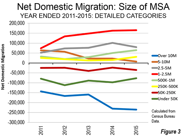
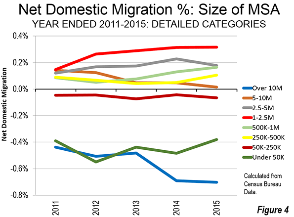
    Figures 3 and 4 show the domestic migration trends in more detailed population categories. By far the largest losses have been sustained by the megacities, New York and Los Angeles, with more than 10,000,000 residents. The metropolitan areas with between 5,000,000 and 10,000,000 population had done relatively well in the early part of the decade, but have dropped substantially. If the same trend continues to next year, net domestic migration losses would occur across this category.

    By far the strongest gains were in the 1,000,000 to 2,500,000 category, where net domestic migration more than doubled from 2011 to 2015. There was also strong growth in the 500,000 to 1,000,000 category and in the 250,000 to 500,000 category. There was a more mixed record among the metropolitan areas with between 2,500,000 and 5,000,000 population, with a rise to 2014, but a reduction in 2015.

    The smallest categories, from 50,000 to 250,000 population and under 50,000 population lost in each year, though there were not large fluctuations.

    A Trend?

    The trend that favors the migration from the largest and smallest areas to the broad middle of metropolitan areas may be an aberration. But we may see an even larger share of future domestic migration to middle-sized metropolitan areas, together with two or three larger areas (Houston, Dallas-Fort Worth and maybe Atlanta).

    Note: Core based statistical area is a term that includes metropolitan areas and micropolitan areas, which are larger and smaller labor market areas, with slightly different definitions. Additional information can be obtained from the Office of Management and Budget.

    Wendell Cox is principal of Demographia, an international pubilc policy and demographics firm. He is a Senior Fellow of the Center for Opportunity Urbanism (US), Senior Fellow for Housing Affordability and Municipal Policy for the Frontier Centre for Public Policy (Canada), and a member of the Board of Advisors of the Center for Demographics and Policy at Chapman University (California). He is co-author of the "Demographia International Housing Affordability Survey" and author of "Demographia World Urban Areas" and "War on the Dream: How Anti-Sprawl Policy Threatens the Quality of Life." He was appointed to three terms on the Los Angeles County Transportation Commission, where he served with the leading city and county leadership as the only non-elected member. He served as a visiting professor at the Conservatoire National des Arts et Metiers, a national university in Paris.

  • Population Growth in the Largest Counties: Texas, Florida and the South

    As last week’s US Census Bureau population estimates indicated, the story of population growth between 2014 and 2015 was largely about Texas, as it has been for the decade starting 2010 (See: “Texas Keeps Getting Bigger” The New Metropolitan Area Estimates).  The same is largely true with respect to population trends in the nation’s largest counties, with The Lone Star state dominating both in the population growth and domestic migration among 135 counties with more than 500,000 population. Florida also did very well, especially in view of the population and migration reversals that occurred around the Great Recession. Strong showings in other Southern states ensured that 80 percent of the fastest-growing large counties and those with the fastest domestic migration rates were in the South. The few remaining positions were taken up by metropolitan areas in the West (Table).

    Large County Growth in Texas

    Houston, which is the fastest growing major metropolitan area (over 1 million population) in the nation includes the two fastest growing large counties. Fort Bend County added 4.29 percent to its population between 2014 and 2015 and now has 716,000 residents. Montgomery County grew 3.57 percent to 538,000. In addition to these two suburban Houston counties, Harris County, the core County ranked 16th in growth, adding 2.03 percent to its population and exceeding 4.5 million population.

    Dallas-Fort Worth, the second fastest-growing major metropolitan area has two counties among the top 20. The third fastest-growing county is Denton (located north of Dallas-Fort Worth International Airport), which added 3.42 percent to its population over the past year and now has 781,000 residents. Collin County, to the north of Dallas County, grew 3.17 percent and now stands at 914,000 residents. Its current growth rate would put Collin County over 1 million population by the 2020 census.

    Travis County, with its county seat of Austin, grew 2.22 percent to 1,177,000 and ranked 12th. Bexar County, centered on San Antonio grew 2.01 percent and ranks 17th.

    The I-4 & Middle Florida Corridor

    But there is another impressive growth story in the "I-4 & Middle Florida" corridor (the term “Central Florida“ is not used, because that usually just denotes the Orlando area).  This includes counties along the Interstate 4 corridor, which runs from Tampa-St. Petersburg through Orlando to Daytona Beach as well as one county along Interstate 95 just south of Daytona Beach and adjacent to the Orlando metropolitan area.

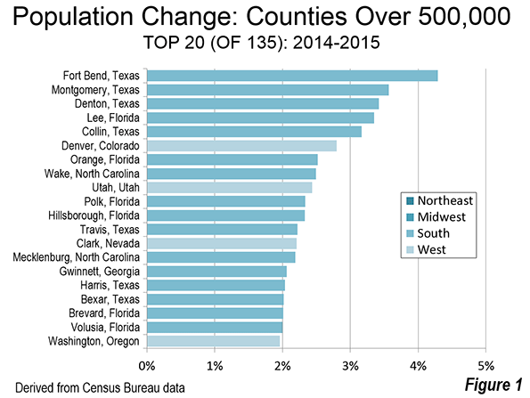
    Five of the fastest growing 20 counties with more than 500,000 population are located in this corridor. Orange County, the core of highly suburban Orlando grew at a rate of 2.49 percent between 2014 and 2015 and ranked seventh. Polk County (Lakeland metropolitan area), located midway between Orlando and Tampa-St. Petersburg grew 2.33 percent and ranked 10th. The south western terminus of Interstate 4 in   Hillsborough County, which includes Tampa, Hillsborough County, grew 2.33 percent, though slightly slower than adjacent Polk County and ranked 11th. The other, north eastern terminus of Interstate 4 is located in Daytona Beach, in Volusia County. Volusia County grew at a rate of 2.00 percent and ranks 19th in population growth. Just to the south of is Brevard County, straddling Interstate 95. Brevard County (Palm Bay-Melbourne metropolitan area) grew 2.01 percent and ranked 18th in growth.

    But Florida’s fastest-growing large county was Lee, centered on Cape Coral and Fort Myers. Lee County added 3.35 percent to its population and now has 702,000 residents.

    Other Fast Growing Counties

    Denver County continued its strong growth (2.80 percent) and ranked sixth. Wake County, core of the Raleigh metropolitan area, grew at 2.49 percent and ranked eighth. Utah County, in the Provo metropolitan area grew 2.43 percent and ranked ninth.

    Other counties in the top 20 included Clark (Las Vegas) in Nevada, Mecklenburg (Charlotte) in North Carolina, Gwinnett, a suburban county of Atlanta and Washington, a suburban county of Portland.

    Overall, sixteen of the 20 fastest growing large counties were in the South and four in the West (Figure 1).

    Largest Domestic Migration

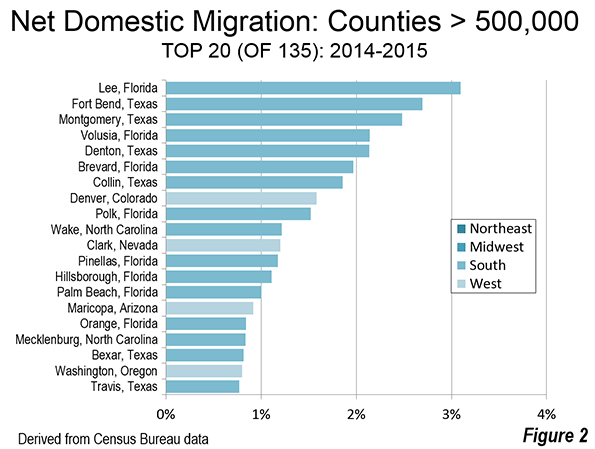
    As with population growth, the top 20 in domestic migration was dominated by the South with 16 entries. Four of the migration magnets were located in  metropolitan areas from the West (Figure 2).

    Not surprisingly, the counties with the largest net domestic migration were often near the top of the list in population growth. Lee County, Florida (Cape Coral and Fort Myers) had the greatest net domestic migration between 2014 and 2015, at 3.10 percent. This is a particularly important reversal for Lee County, which experienced some of the most catastrophic house price declines during the housing bust.

    Houston’s Fort Bend and Montgomery counties (Texas), the fastest growing large counties had the second and third largest domestic migration respectively. Denton County and Collin County, in the Dallas-Fort Worth metropolitan area ranked 5th and 7th respectively. Bexar County (San Antonio) ranked 18th, while Travis County (Austin) ranked 20th.

    The I-4 & Middle Florida corridor also did well. Volusia County (Daytona Beach) ranked 4th in domestic migration, followed by its neighbor to the south, Brevard County. Polk County (Lakeland) ranked 9th, Hillsborough County (Tampa) ranked 13th and Orange County (Orlando) ranked 16th. In addition, Pinellas County (St. Petersburg), just across the bridge from Tampa ranked 12th. Palm Beach County, which is outside the I-4 & Middle Florida corridor ranked 14th.

    Denver County, at 8th, was the highest ranking in domestic migration outside Texas and Florida. Other high ranking counties included #10 Wake County (Raleigh), #11 Clark County (Las Vegas), #15 Maricopa County (Phoenix), Mecklenburg County (Charlotte) and #19 Washington County (suburban Portland).

    Slowest Growing Counties

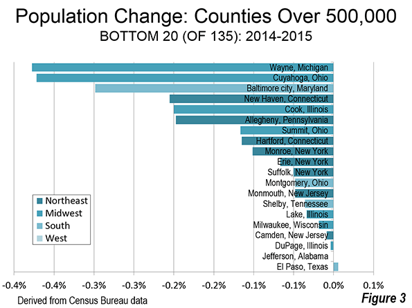
    Seventeen of the 135 largest counties lost population. The 20 large counties with the least percentage population growth (or loss) were fairly evenly distributed outside the West. Eight were in the Northeast, seven in the Midwest and five in the South (Figure 3). The largest losses occurred in the counties containing core cities with some of the largest population losses in the last seven decades. These include Wayne County (Detroit), Cuyahoga County (Cleveland) Baltimore city, Cook County (Chicago) and Allegheny County (Pittsburgh), Hartford County, Monroe County (Rochester) and Erie County (Buffalo). The bottom 10 also included New Haven County, Connecticut and Summit County, Ohio (Akron).

    Largest Domestic Migration Losses: A New York Story

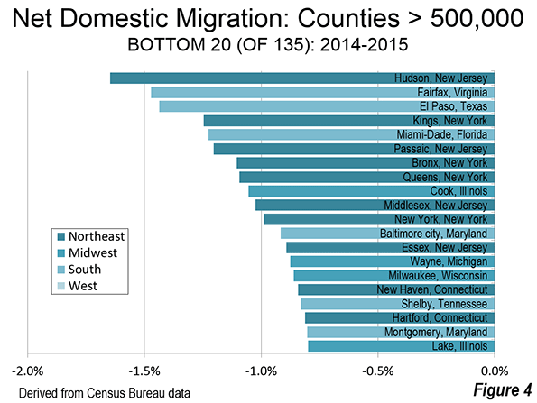
    Among the 20 largest domestic migration losses, 10 were in the Northeast, four in the Midwest, and six in the South (Figure 4)

    The largest domestic migration losses are taking place  in the New York metropolitan area, which accounted for eight of the 13 largest counties in terms of domestic migration losses. This includes Hudson County New Jersey, which had the largest loss. It also included Kings County (Brooklyn), which had the fourth largest domestic migration loss. Bronx County had the seventh largest loss, Queens County the eighth largest loss and Manhattan County the 11th largest loss. In addition, other New Jersey suburban counties had substantial domestic migration losses, including Passaic County, Middlesex County and Essex County (Newark).

    The South rated best in population growth and net domestic migration, but some large southern counties had among the largest domestic migration losses. These include Fairfax County (Washington suburb), El Paso County in Texas, Miami-Dade County in Florida and Baltimore city. Cook County (Chicago) was also among the top 10 domestic migration losers.

    Moreover, the 13 large counties with the greatest losses excluded   Wayne County, with its core city (Detroit) that has lost more of its population (percentagewise) than any other large municipality in the world. Yet, all of the counties listed above, including the eight in the New York metropolitan area lost a greater share of their population by domestic migrants than Wayne County.

    Dominance by the South and the West

    Overall, the largest counties added approximately 1.53 million residents over the past year. More than one half of that net domestic migration was in 19 counties of the South, 11 in the West, none in the Midwest and none in the Northeast. Three quarters of the net domestic migration was in just 52 of the 135 counties, with the South accounting for 30 counties. There were also 20 counties in the West, two in the Midwest and none in the Northeast. The two Midwestern counties were Franklin, Ohio (Columbus) and Dane, Wisconsin (Madison).

    US Counties Over 500,000 Population: Ranked By Population Growth 2014-2015 %
    2014-2015 & 2010-2015
    Population Change Dom. Migra.
    Rank County, State 4/2010 7/2014 7/2015 Fr2010 Fr2014 Fr2010 Fr2014 Fr2010 Fr2014
    1 Fort Bend, Texas      585        687        716      131        29 22.4% 4.29% 13.1% 2.69%
    2 Montgomery, Texas      456        519        538        82        19 17.9% 3.57% 11.8% 2.48%
    3 Denton, Texas      663        755        781      118        26 17.8% 3.42% 10.4% 2.14%
    4 Lee, Florida      619        679        702        83        23 13.5% 3.35% 10.8% 3.10%
    5 Collin, Texas      782        886        914      132        28 16.8% 3.17% 9.3% 1.86%
    6 Denver, Colorado      600        664        683        83        19 13.8% 2.80% 7.2% 1.59%
    7 Orange, Florida   1,146     1,256     1,288      142        32 12.4% 2.52% 3.6% 0.84%
    8 Wake, North Carolina      901        999     1,024      123        25 13.7% 2.49% 6.6% 1.22%
    9 Utah, Utah      517        562        575        59        14 11.3% 2.43% 0.3% 0.45%
    10 Polk, Florida      602        635        650        48        15 8.0% 2.33% 4.2% 1.53%
    11 Hillsborough, Florida   1,229     1,318     1,349      120        31 9.7% 2.33% 3.4% 1.11%
    12 Travis, Texas   1,024     1,151     1,177      152        26 14.9% 2.22% 6.5% 0.77%
    13 Clark, Nevada   1,951     2,069     2,115      164        46 8.4% 2.21% 3.1% 1.20%
    14 Mecklenburg, North Carolina      920     1,012     1,034      114        22 12.4% 2.19% 4.9% 0.84%
    15 Gwinnett, Georgia      805        878        896        90        18 11.2% 2.06% 3.6% 0.69%
    16 Harris, Texas   4,093     4,448     4,538      445        90 10.9% 2.03% 2.0% 0.38%
    17 Bexar, Texas   1,715     1,860     1,898      183        37 10.7% 2.01% 4.4% 0.82%
    18 Brevard, Florida      543        557        568        25        11 4.5% 2.01% 4.5% 1.97%
    19 Volusia, Florida      495        508        518        23        10 4.7% 2.00% 5.3% 2.14%
    20 Washington, Oregon      530        563        574        44        11 8.4% 1.96% 2.3% 0.80%
    21 Maricopa, Arizona   3,817     4,090     4,168      351        78 9.2% 1.91% 3.9% 0.92%
    22 Washington, District of Columbia      602        660        672        70        12 11.7% 1.88% 4.3% 0.57%
    23 Tarrant, Texas   1,810     1,946     1,982      173        36 9.6% 1.86% 3.0% 0.61%
    24 Arapahoe, Colorado      572        620        631        59        11 10.3% 1.85% 4.0% 0.72%
    25 El Paso, Colorado      622        663        674        52        12 8.4% 1.75% 2.2% 0.55%
    26 Palm Beach, Florida   1,320     1,399     1,423      103        24 7.8% 1.74% 4.2% 1.00%
    27 Snohomish, Washington      713        759        773        59        13 8.3% 1.72% 3.0% 0.67%
    28 King, Washington   1,931     2,082     2,117      186        35 9.6% 1.67% 2.4% 0.29%
    29 Multnomah, Oregon      735        778        790        55        12 7.5% 1.60% 2.8% 0.68%
    30 Alameda, California   1,510     1,613     1,638      128        25 8.5% 1.57% 1.2% 0.22%
    31 Pierce, Washington      795        831        844        49        13 6.1% 1.54% 1.1% 0.58%
    32 San Joaquin, California      685        715        726        41        11 6.0% 1.54% 0.6% 0.52%
    33 Duval, Florida      864        899        913        49        14 5.6% 1.52% 0.5% 0.47%
    34 DeKalb, Georgia      692        724        735        43        11 6.2% 1.47% -2.5% -0.10%
    35 Davidson, Tennessee      627        669        679        52        10 8.3% 1.46% 2.0% 0.30%
    36 San Francisco, California      805        853        865        60        12 7.4% 1.44% 0.6% 0.20%
    37 Broward, Florida   1,748     1,870     1,896      148        27 8.5% 1.43% 1.7% 0.11%
    38 Franklin, Ohio   1,164     1,234     1,252        88        18 7.6% 1.43% 1.0% 0.17%
    39 Fulton, Georgia      921        996     1,011        90        14 9.8% 1.41% 3.4% 0.28%
    40 Cobb, Georgia      688        731        741        53        10 7.7% 1.41% 1.4% 0.24%
    41 Riverside, California   2,190     2,328     2,361      171        33 7.8% 1.40% 3.0% 0.51%
    42 Tulsa, Oklahoma      603        630        639        36          9 5.9% 1.40% 1.5% 0.53%
    43 Contra Costa, California   1,049     1,112     1,127        78        15 7.4% 1.35% 2.8% 0.49%
    44 Sacramento, California   1,419     1,481     1,501        83        20 5.8% 1.34% 0.4% 0.28%
    45 Dallas, Texas   2,368     2,520     2,553      186        34 7.8% 1.34% 0.0% -0.10%
    46 Salt Lake, Utah   1,030     1,093     1,107        78        14 7.5% 1.32% -0.1% -0.09%
    47 Oklahoma, Oklahoma      719        767        777        58        10 8.1% 1.31% 2.5% 0.23%
    48 Dane, Wisconsin      488        517        524        36          7 7.3% 1.30% 1.9% 0.25%
    49 Hidalgo, Texas      775        832        842        68        11 8.7% 1.29% -1.1% -0.52%
    50 Pinellas, Florida      917        938        950        33        12 3.6% 1.25% 3.7% 1.18%
    51 Stanislaus, California      514        532        538        24          6 4.7% 1.21% -0.7% 0.12%
    52 Santa Clara, California   1,782     1,896     1,918      136        22 7.7% 1.16% -1.5% -0.53%
    53 Jefferson, Colorado      535        559        566        31          6 5.8% 1.16% 3.4% 0.69%
    54 Douglas, Nebraska      517        544        550        33          6 6.4% 1.12% 0.2% -0.07%
    55 Suffolk, Massachusetts      722        770        778        56          8 7.8% 1.08% -2.1% -0.75%
    56 Johnson, Kansas      544        574        580        36          6 6.6% 1.08% 1.6% 0.12%
    57 San Diego, California   3,095     3,266     3,300      204        34 6.6% 1.04% -0.2% -0.29%
    58 Fresno, California      930        965        975        44        10 4.8% 1.02% -1.7% -0.21%
    59 Kent, Michigan      603        630        636        34          6 5.6% 0.97% 0.6% 0.02%
    60 Bronx, New York   1,385     1,442     1,455        70        14 5.1% 0.95% -6.0% -1.10%
    61 Montgomery, Maryland      972     1,030     1,040        68        10 7.0% 0.94% -2.2% -0.80%
    62 Kern, California      840        874        882        43          8 5.1% 0.91% -1.5% -0.31%
    63 Hennepin, Minnesota   1,152     1,212     1,223        71        11 6.1% 0.91% -0.1% -0.29%
    64 Miami-Dade, Florida   2,498     2,669     2,693      195        24 7.8% 0.91% -3.3% -1.23%
    65 Guilford, North Carolina      488        513        518        29          5 6.0% 0.90% 1.9% 0.15%
    66 San Mateo, California      718        758        765        47          7 6.5% 0.90% 0.2% -0.21%
    67 Ramsey, Minnesota      509        534        538        29          4 5.8% 0.84% -1.5% -0.60%
    68 San Bernardino, California   2,035     2,110     2,128        93        18 4.6% 0.84% -1.1% -0.23%
    69 Middlesex, Massachusetts   1,503     1,573     1,585        82        13 5.5% 0.80% -0.8% -0.42%
    70 Hudson, New Jersey      634        670        675        41          5 6.4% 0.80% -6.6% -1.65%
    71 Orange, California   3,010     3,145     3,170      160        25 5.3% 0.79% -0.4% -0.32%
    72 Essex, Massachusetts      743        770        776        33          6 4.4% 0.72% 0.1% -0.18%
    73 Queens, New York   2,231     2,322     2,339      109        17 4.9% 0.72% -5.1% -1.09%
    74 Anne Arundel, Maryland      538        560        564        27          4 4.9% 0.70% 1.0% -0.04%
    75 Prince George’s, Maryland      864        903        910        46          6 5.3% 0.68% -2.4% -0.72%
    76 Honolulu, Hawaii      953        992        999        46          7 4.8% 0.67% -2.4% -0.75%
    77 Plymouth, Massachusetts      495        507        510        15          3 3.1% 0.66% 0.7% 0.14%
    78 Kane, Illinois      515        528        531        16          3 3.0% 0.63% -1.8% -0.23%
    79 New Castle, Delaware      538        553        557        18          3 3.4% 0.62% -0.6% -0.18%
    80 Kings, New York   2,505     2,621     2,637      132        16 5.3% 0.61% -5.0% -1.25%
    81 Bergen, New Jersey      905        933        939        33          6 3.7% 0.61% -0.8% -0.28%
    82 Los Angeles, California   9,819   10,109   10,170      352        61 3.6% 0.60% -2.7% -0.60%
    83 Jackson, Missouri      674        684        688        13          4 2.0% 0.58% -1.4% -0.06%
    84 Pima, Arizona      980     1,004     1,010        30          6 3.0% 0.58% 0.1% 0.02%
    85 Lancaster, Pennsylvania      519        534        537        17          3 3.3% 0.56% -0.6% -0.28%
    86 Ventura, California      823        846        851        27          4 3.3% 0.52% -1.3% -0.34%
    87 Chester, Pennsylvania      499        513        516        17          3 3.4% 0.52% 0.1% -0.16%
    88 Union, New Jersey      536        553        556        19          3 3.6% 0.49% -3.0% -0.70%
    89 Worcester, Massachusetts      799        815        819        20          4 2.6% 0.49% -1.1% -0.27%
    90 Norfolk, Massachusetts      671        693        696        25          3 3.8% 0.48% 0.0% -0.29%
    91 Marion, Indiana      903        935        939        36          4 3.9% 0.48% -1.6% -0.55%
    92 Ocean, New Jersey      577        586        589        12          3 2.1% 0.48% 0.6% 0.07%
    93 New York, New York   1,586     1,637     1,645        59          8 3.7% 0.46% -4.4% -0.99%
    94 Sedgwick, Kansas      498        509        512        13          2 2.7% 0.45% -2.3% -0.48%
    95 Middlesex, New Jersey      810        837        841        31          4 3.8% 0.43% -3.8% -1.02%
    96 Baltimore, Maryland      805        828        831        26          3 3.3% 0.40% -0.4% -0.31%
    97 Westchester, New York      949        973        976        27          4 2.9% 0.40% -1.9% -0.46%
    98 Jefferson, Kentucky      741        761        764        23          3 3.0% 0.39% -0.3% -0.27%
    99 Bristol, Massachusetts      548        555        557          8          2 1.5% 0.39% 0.0% 0.04%
    100 Philadelphia, Pennsylvania   1,526     1,562     1,567        41          6 2.7% 0.38% -3.1% -0.68%
    101 Macomb, Michigan      841        862        865        24          3 2.8% 0.37% 0.6% -0.12%
    102 Montgomery, Pennsylvania      800        817        819        19          3 2.4% 0.33% -0.2% -0.24%
    103 Essex, New Jersey      784        795        797        13          2 1.7% 0.31% -4.9% -0.89%
    104 Fairfax, Virginia   1,082     1,139     1,142        61          3 5.6% 0.28% -4.3% -1.47%
    105 Will, Illinois      678        686        687        10          2 1.4% 0.24% -2.4% -0.47%
    106 Fairfield, Connecticut      917        946        948        31          2 3.4% 0.24% -1.9% -0.74%
    107 Providence, Rhode Island      627        632        633          7          1 1.1% 0.23% -3.4% -0.67%
    108 Nassau, New York   1,340     1,359     1,361        22          3 1.6% 0.20% -1.2% -0.33%
    109 Passaic, New Jersey      502        510        511          9          1 1.9% 0.20% -5.6% -1.20%
    110 Oakland, Michigan   1,202     1,240     1,242        40          2 3.3% 0.19% -0.3% -0.53%
    111 Delaware, Pennsylvania      559        563        564          5          1 0.9% 0.17% -1.8% -0.43%
    112 Hamilton, Ohio      802        806        808          5          1 0.7% 0.16% -2.4% -0.40%
    113 Bernalillo, New Mexico      663        676        677        14          1 2.1% 0.15% -1.2% -0.47%
    114 Bucks, Pennsylvania      625        627        627          2          1 0.3% 0.12% -0.8% -0.14%
    115 St. Louis, Missouri      999     1,002     1,003          4          1 0.4% 0.12% -1.8% -0.35%
    116 El Paso, Texas      801        836        836        35          0 4.4% 0.01% -3.3% -1.44%
    117 Jefferson, Alabama      658        660        660          2        (0) 0.3% 0.00% -1.6% -0.33%
    118 DuPage, Illinois      917        934        934        17        (0) 1.8% 0.00% -2.5% -0.80%
    119 Camden, New Jersey      514        511        511        (3)        (0) -0.5% -0.01% -4.0% -0.68%
    120 Milwaukee, Wisconsin      948        958        958        10        (0) 1.1% -0.02% -3.4% -0.86%
    121 Lake, Illinois      703        704        704          1        (0) 0.1% -0.03% -4.1% -0.80%
    122 Shelby, Tennessee      928        938        938        10        (0) 1.1% -0.04% -3.2% -0.83%
    123 Monmouth, New Jersey      630        629        629        (2)        (0) -0.3% -0.05% -2.0% -0.37%
    124 Montgomery, Ohio      535        533        532        (3)        (0) -0.5% -0.05% -2.4% -0.45%
    125 Suffolk, New York   1,493     1,502     1,502          8        (1) 0.6% -0.05% -2.5% -0.63%
    126 Erie, New York      919        923        923          4        (1) 0.4% -0.07% -1.4% -0.47%
    127 Monroe, New York      744        750        750          5        (1) 0.7% -0.10% -2.6% -0.80%
    128 Hartford, Connecticut      894        897        896          2        (1) 0.2% -0.11% -3.4% -0.81%
    129 Summit, Ohio      542        543        542          0        (1) 0.0% -0.12% -1.4% -0.41%
    130 Allegheny, Pennsylvania   1,223     1,233     1,230          7        (2) 0.6% -0.20% -0.4% -0.46%
    131 Cook, Illinois   5,195     5,249     5,238        43      (10) 0.8% -0.20% -4.0% -1.06%
    132 New Haven, Connecticut      862        861        859        (3)        (2) -0.3% -0.21% -3.4% -0.84%
    133 Baltimore city, Maryland      621        624        622          1        (2) 0.1% -0.30% -3.8% -0.92%
    134 Cuyahoga, Ohio   1,280     1,261     1,256      (24)        (5) -1.9% -0.37% -3.7% -0.76%
    135 Wayne, Michigan   1,821     1,766     1,759      (61)        (7) -3.4% -0.38% -6.2% -0.87%
    In 000s
    Data from Census Bureau


    Wendell Cox is principal of Demographia, an international pubilc policy and demographics firm. He is a Senior Fellow of the Center for Opportunity Urbanism (US), Senior Fellow for Housing Affordability and Municipal Policy for the Frontier Centre for Public Policy (Canada), and a member of the Board of Advisors of the Center for Demographics and Policy at Chapman University (California). He is co-author of the “Demographia International Housing Affordability Survey” and author of “Demographia World Urban Areas” and “War on the Dream: How Anti-Sprawl Policy Threatens the Quality of Life.” He was appointed to three terms on the Los Angeles County Transportation Commission, where he served with the leading city and county leadership as the only non-elected member. He served as a visiting professor at the Conservatoire National des Arts et Metiers, a national university in Paris.

    Photograph: Lee County, Florida (Cape Coral-Fort Myers), Top domestic migration gainer (by author)

  • “Texas Keeps Getting Bigger” The New Metropolitan Area Estimates

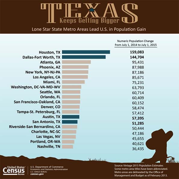
    The United States Census Bureau has just released its 2015 population estimates for metropolitan areas and counties. Again, the story is Texas, with the Bureau’s news release headline reading: Four Texas Metro Areas Collectively Add More Than 400,000 People in the Last Year. The Census Bureau heralded the accomplishment with a ”Texas Keeps Getting Bigger” poster, which is shown below. The detailed data is in the table at the bottom of the article.

    Fastest Growing

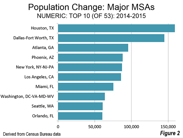
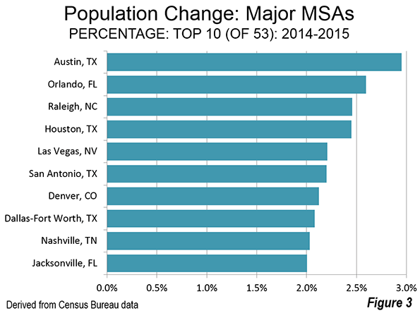
    Texas has four of the nation’s major metropolitan areas (over 1,000,000 population), and all of them ranked in the top 20 (out of 53) in population gain between 2014 and 2015. Houston again was number one, with a gain of 159,000, Dallas-Fort Worth followed in second place, gaining 145,000. The gap between Dallas-Fort Worth and Houston was small, only 10 percent. However, the gap between the third largest city (Atlanta) and Dallas-Fort Worth was more than 50 percent

    Austin and San Antonio were also in the top 20. Austin gained 57,000 residents, and again was the fastest growing major metropolitan area in the nation (3.0 percent). San Antonio added 51,000.

    This represents something of a return to pre-Great Recession normalcy, with Atlanta adding the third most population (95,000) and Phoenix adding 88,000. These two metropolitan areas were hard hit in the housing bust, but are seeing a return of substantial growth. New York, which is far larger than any of the top four, took fifth place, adding 87,000 (Figure 2).

    On a percentage gain basis, all four Texas metropolitan areas were in the top 10. Austin was again the fastest growing. Houston was 4th, San Antonio 6th and Dallas-Fort Worth 8th. Two other of the national best performers in percentage population growth were also high on the list, including #3 Raleigh and #5 Las Vegas. Las Vegas was the fastest growing major metropolitan area through most of the 2000s. When Las Vegas stumbled late in the 2000s, Raleigh assumed the top position. Denver ranked 7th, the only non-southern metropolitan area in the top 10 (Figure 3).

    Slowest Growing (or Losing)

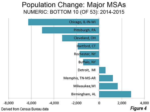
    The Chicago metropolitan area had the largest population loss, at 6,000. This was the second straight year of losses for Chicago, though last year’s was much smaller. Chicago, at 9.55 million residents will need to reverse this performance if it is ever to add the 450,000 people necessary to make it a megacity of over 10 million. Chicago’s weather is not the most inviting and the state of Illinois’ dismal fiscal position (rated by one source as the second worst run in the nation) is not likely to attract the job creating investment necessary to population growth.

    Five other metropolitan areas experienced losses, including Pittsburgh, Cleveland, Hartford, Rochester and Buffalo. Not all of the South is growing either with both Memphis and Birmingham residing in the bottom 10 (Figure 4).

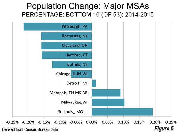
    Pittsburgh lost the largest percentage of its population, followed by Rochester, Cleveland, Hartford, Buffalo and Chicago (Figure 5).

    Domestic Migration: Top 10

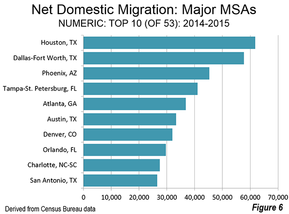
    The four Texas cities all showed up on the top 10 in numeric net domestic migration gain as well. Houston added 62,000 net domestic migrants, followed by Dallas-Fort Worth and 58,000. Phoenix ranked third, Tampa St. Petersburg ranked fourth and Atlanta ranked fifth. Austin was sixth in net domestic migration and the other Texas City, San Antonio, ranked 10th (Figure 6).

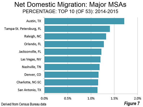
    Austin led the nation in the percentage of population growth from net domestic migration, at approximately 1.7 percent. Tampa St. Petersburg ranked second, followed by Raleigh, Orlando and Jacksonville (Figure 7).

    Domestic Migration: Bottom 10

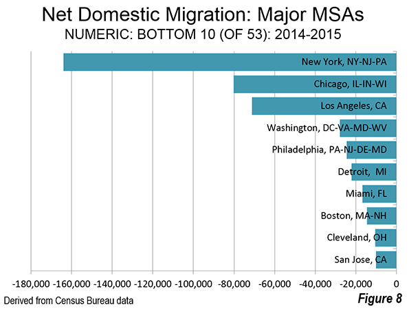
    By far the largest net domestic migration loser was New York, which lost 164,000. Chicago lost 80,000, and Los Angeles lost 71,000. It was a substantial drop to the fourth largest loser, Washington at 28,000,   closely followed by Philadelphia at 24,000 and Detroit at 22,000 (Figure 8).

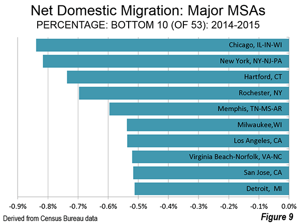
    Chicago had the largest percentage loss of any major metropolitan area from net domestic migration, at 0.83 percent, slightly more than New York’s 0.82 percent. Hartford, Rochester and Memphis ranks from 3rd to 5th, all losing 0.6 percent from net domestic migration or more. Milwaukee, Los Angeles, Virginia Beach, San Jose, Detroit and Cleveland all lost between 0.5 percent and 0.6 percent to net domestic migration (Figure 9).

    Ranking Changes

    There were a few changes in the rankings this year. Washington passed Philadelphia to assume the sixth largest position. Philadelphia, which was the fourth largest metropolitan area in the nation in the early 2000’s has fallen to seventh, having also been passed by both Dallas-Fort Worth and Houston. Denver overtook St. Louis, to assume the 19th position. Orlando passed both San Antonio and Pittsburgh to become the 24th largest metropolitan area. Even while falling behind Orlando, San Antonio past Pittsburgh. Las Vegas overtook Kansas City and became the 29th largest metropolitan area. Austin passed both Indianapolis and San Jose.

    Milestones were also set by Miami, which rose to above 6 million population, while Columbus and Austin grew to more than 2 million. Perhaps the bigger surprise was a milestone not reached. Had recent trends continued, Honolulu would have become the 54th metropolitan area to reach 1 million population. However, Honolulu fell short by 1300 residents.

    Return to the City: The Elusive Illusion

    Despite the popular lore one hears at a Starbucks in Manhattan or reads in some ever-hopeful core city-centric news outlets, people are still moving to the suburbs. There is no doubt that urban cores, especially close to downtown areas (central business districts) are doing better than before, in no small measure because crime rates have fallen so much (Thank you, Rudi Giuliani).

    In all, 22 core counties out of 53 added net domestic migrants. But only y seven added more domestic migrants than the corresponding suburbs. Of these, only one is dominated by high density urbanization, the District of Columbia (Washington). Another, New Orleans, continues its recovery from the huge hurricane population losses. The other five core counties are functionally more suburban than urban (Phoenix, Raleigh, Richmond, Sacramento and San Antonio).

    But, overall, domestic migration continues from the core cities to the suburbs. That has been the case even in the worst year for suburban growth (2010-2011) and continued in 2014-2015. Core counties last year lost a net 185,000 domestic migrants, while the suburban counties gained 187,000.

    Conclusion

    With the release of 2015 population estimate data, halfway between the 2010 and 2010 census, the nation is settling back into a pattern of suburban southern and western growth.

    Major Metropolitan Area Population Estimates: 2015
    Population 2014-2015
    Rank Metropolitan Area 2010 2014 2015 % Change 2014-2015 Net Domestic Migration Rank: Domestic Migration
    1 New York, NY-NJ-PA     19,601     20,095     20,182 0.43% -0.82%           52
    2 Los Angeles, CA     12,844     13,254     13,340 0.65% -0.54%           47
    3 Chicago, IL-IN-WI       9,471       9,557       9,551 -0.07% -0.84%           53
    4 Dallas-Fort Worth, TX       6,453       6,958       7,103 2.08% 0.83%           14
    5 Houston, TX       5,948       6,498       6,657 2.45% 0.95%           12
    6 Washington, DC-VA-MD-WV       5,667       6,034       6,098 1.06% -0.46%           42
    7 Philadelphia, PA-NJ-DE-MD       5,971       6,054       6,070 0.27% -0.40%           40
    8 Miami, FL       5,586       5,937       6,012 1.27% -0.28%           36
    9 Atlanta, GA       5,304       5,615       5,711 1.70% 0.66%           16
    10 Boston, MA-NH       4,565       4,739       4,774 0.74% -0.31%           38
    11 San Francisco-Oakland, CA       4,345       4,596       4,656 1.31% 0.19%           22
    12 Phoenix, AZ       4,205       4,487       4,575 1.96% 1.01%           11
    13 Riverside-San Bernardino, CA       4,244       4,439       4,489 1.14% 0.16%           23
    14 Detroit,  MI       4,291       4,301       4,302 0.01% -0.51%           44
    15 Seattle, WA       3,449       3,673       3,734 1.65% 0.43%           17
    16 Minneapolis-St. Paul, MN-WI       3,356       3,496       3,525 0.83% -0.23%           32
    17 San Diego, CA       3,104       3,266       3,300 1.04% -0.29%           37
    18 Tampa-St. Petersburg, FL       2,789       2,918       2,975 1.97% 1.41%             2
    19 Denver, CO       2,554       2,756       2,814 2.12% 1.16%             8
    20 St. Louis,, MO-IL       2,790       2,806       2,812 0.19% -0.27%           33
    21 Baltimore, MD       2,716       2,787       2,797 0.38% -0.31%           39
    22 Charlotte, NC-SC       2,224       2,379       2,426 1.98% 1.15%             9
    23 Portland, OR-WA       2,232       2,349       2,389 1.73% 0.91%           13
    24 Orlando, FL       2,140       2,327       2,387 2.60% 1.28%             4
    25 San Antonio, TX       2,153       2,333       2,384 2.20% 1.14%           10
    26 Pittsburgh, PA       2,357       2,358       2,353 -0.21% -0.28%           35
    27 Sacramento, CA       2,155       2,245       2,274 1.31% 0.41%           18
    28 Cincinnati, OH-KY-IN       2,118       2,148       2,158 0.43% -0.12%           31
    29 Las Vegas, NV       1,953       2,069       2,115 2.21% 1.20%             6
    30 Kansas City, MO-KS       2,014       2,071       2,087 0.78% 0.04%           26
    31 Cleveland, OH       2,076       2,064       2,061 -0.16% -0.51%           43
    32 Columbus, OH       1,906       1,997       2,022 1.22% 0.26%           19
    33 Austin, TX       1,728       1,943       2,001 2.95% 1.71%             1
    34 Indianapolis. IN       1,893       1,972       1,989 0.86% 0.05%           25
    35 San Jose, CA       1,842       1,954       1,977 1.15% -0.52%           45
    36 Nashville, TN       1,676       1,794       1,830 2.03% 1.18%             7
    37 Virginia Beach-Norfolk, VA-NC       1,680       1,718       1,725 0.41% -0.52%           46
    38 Providence, RI-MA       1,602       1,610       1,613 0.22% -0.28%           34
    39 Milwaukee,WI       1,557       1,574       1,576 0.10% -0.54%           48
    40 Jacksonville, FL       1,349       1,421       1,449 2.00% 1.22%             5
    41 Oklahoma City, OK       1,258       1,338       1,358 1.56% 0.66%           15
    42 Memphis, TN-MS-AR       1,326       1,343       1,344 0.09% -0.60%           49
    43 Louisville, KY-IN       1,238       1,271       1,278 0.57% 0.02%           28
    44 Raleigh, NC       1,137       1,243       1,274 2.46% 1.32%             3
    45 Richmond, VA       1,210       1,260       1,271 0.92% 0.19%           21
    46 New Orleans. LA       1,196       1,252       1,263 0.87% 0.19%           20
    47 Hartford, CT       1,214       1,213       1,211 -0.16% -0.74%           51
    48 Salt Lake City, UT       1,092       1,155       1,170 1.36% -0.04%           29
    49 Birmingham, AL       1,129       1,143       1,146 0.25% -0.09%           30
    50 Buffalo, NY       1,136       1,137       1,135 -0.12% -0.46%           41
    51 Rochester, NY       1,080       1,084       1,082 -0.16% -0.70%           50
    52 Grand Rapids, MI          990       1,029       1,039 0.94% 0.09%           24
    53 Tucson, AZ          982       1,004       1,010 0.58% 0.02%           27
    Total   170,895   178,063   179,875 1.02% -0.52%
    In 000s
    Data from Census Bureau


    Wendell Cox is principal of Demographia, an international pubilc policy and demographics firm. He is a Senior Fellow of the Center for Opportunity Urbanism (US), Senior Fellow for Housing Affordability and Municipal Policy for the Frontier Centre for Public Policy (Canada), and a member of the Board of Advisors of the Center for Demographics and Policy at Chapman University (California). He is co-author of the "Demographia International Housing Affordability Survey" and author of "Demographia World Urban Areas" and "War on the Dream: How Anti-Sprawl Policy Threatens the Quality of Life." He was appointed to three terms on the Los Angeles County Transportation Commission, where he served with the leading city and county leadership as the only non-elected member. He served as a visiting professor at the Conservatoire National des Arts et Metiers, a national university in Paris.

    Cover picture: Census Bureau ”Texas Keeps Getting Bigger” poster (poster is used at the top and also as the first figure)

  • Japan Census 2015: Decline Less than Projected

    Headlines were recently made recently as Japan finally experienced a long predicted official decline in population. This is widely expected to be the beginning of a long decline in population, which the National Institute of Population and Social Security Research has projected will drop Japan’s population from its present 127 million to 43 million by 2100 (Chart). This loss equals or exceeds the population of all but 15 of the world’s nearly 200 nations, including Germany, the United Kingdom and France.

    Population projections are, of course, not an exact science. They can be accurate, or they can “miss by a mile.” The preliminary 2015 census figures indicate that the population loss since 2010 has been considerably less than predicted. Japan lost 950,000 residents since between 2010 and 2015,The previous 5-year census period had shown a gain of 280,000. Losing nearly a million population is a big deal. But losing 1.5 million would have been an even bigger deal, as had been projected by Japan’s National Institute of Population and Social Security Research. Over the past five years, Japan’s population loss was more than one-third less than expected (35 percent).

    The big question is “why?” The most obvious answer is a combination of factors, such as   more births than projected or a falling death rate. The Japanese enjoy long lives. In 2013, there were more people aged 100 or above than in the United States, despite, Japan’s 60 percent lower population. More than one in eight of the world’s centenarians live in Japan, while only one in sixty of the world’s people is Japanese.

    No analysis has been identified, nor is the detailed age data for such an analysis readily available. This is to be expected this soon after publication of the first census results. However, recent media reports indicate a continuing annual decline in births. The difference could also be the result of problems in the projection methodology.

    Actual and Projected Population by Area

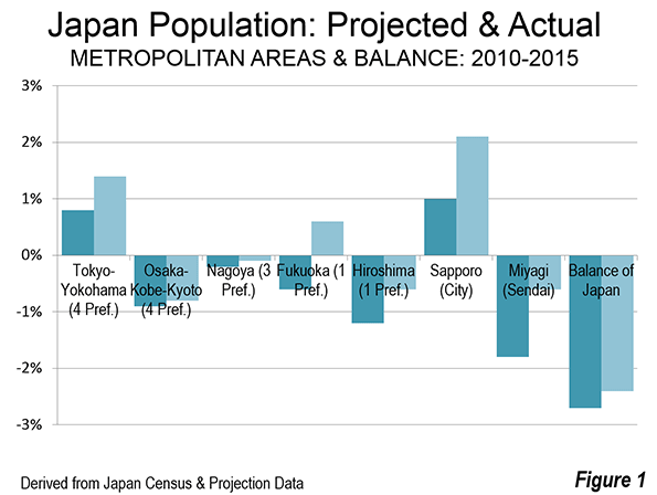
    As had been the case in the last census period (2005-2010) Tokyo was the big winner. Tokyo prefecture (note), which contains the 23 ku (cities) that constituted the city of Tokyo until its mid-1940s dissolution as well as suburbs, was expected to gain 190,000 residents, but added 355,000. Overall, the four-prefecture area of Tokyo-Yokohama, which includes Tokyo, Kanagawa, Saitama and Chiba prefectures added more than 500,000 residents, compared to the expected 275,000. The gain in Tokyo-Yokohama was 1.4 percent, nearly double the 0.8 percent expected.

    The other two megacities (over 10 million population) did not do so well. Osaka-Kobe-Kyoto (Osaka, Hyogo, Kyoto and Nara prefectures), which is larger than the Los Angeles-Riverside combined statistical area, lost 140,000 residents, nearly as many as the 164,000 projected. Osaka-Kobe-Kyoto was expected to lose 0.9 percent of its population, and nearly equaled that, at minus 0.8 percent.

    Nagoya, including the prefectures of Aichi, Mie and Gifu, lost 13,000 residents, two-thirds the 19,000 projected. Nagoya lost 0.1 percent of its population, slightly better than the minus 0.2 percent projected.

    The middle-sized metropolitan areas did better. The prefecture of Fukuoka, which includes the nation’s fourth largest metropolitan area, Fukuoka-Kitakyushu was expected to lose 0.5 percent of its population, Instead it managed a 0.5 percent gain. Hiroshima was expected to lose 1.2 percent of its population and lost only one-half that much (minus 0.6 percent).

    The city of Sapporo, in Hokkaido prefecture, was a big winner more than doubling its projected 1.0 percent increase (Note 2). Sapporo had a population gain of 2.1 percent. Most of the Sapporo metropolitan area is in the city of Sapporo, and unlike many core municipalities, there is still room for greenfield development.

    Sendai, in Miyagi prefecture was particularly hard hit by the great earthquake and tsunami of 2011. That makes Sendai’s population performance all the more impressive. Sendai was projected to suffer a population loss of 1.8 percent. Yet, its population loss was two thirds less, at 0.6 percent.

    The balance of the nation even did better than expected. Outside the metropolitan areas listed above (and the city of Sapporo), Japan was expected to lose 2.7 percent of its population. The loss was somewhat more modest, at 2.4 percent.

    Government Concern

    Despite the better news out of the census, the government is taking the longer term population loss very seriously. Its Committee for the Future indicates that the prospect could be: “…impose a great burden on people that offsets economic growth, threatening to decrease the actual per-capita consumption level, or the metric for the actual quality and level of people’s lives.”

    Even Tokyo, which has escaped the effects of population decline will be at risk, according to the Committee: The Tokyo Metropolitan area, while unable to avoid the effects of hyper-aging, will lose the vitality of a global city…”

    The changing demographics are already evident in a near majority single person household population in the core Tokyo prefecture. In 2010, 46 percent of Tokyo prefecture households are single person, compared to just 32 percent at the national level, and 36 percent in Osaka prefecture, which has the second highest percentage, according to National Institute of Population and Social Security Research data. Moreover, Tokyo prefecture’s average household size, at 2.03 in 2010, was the lowest, by far in the nation, and well below the national average of 2.42. Like many core areas in the largest metropolitan areas around the world, Tokyo prefecture, less than the normal proportion of children is to be found.

    The government has established a goal of increasing the fertility rate from the present 1.4 (children per woman of child-bearing age) to 1.80 by 2030 and 2.07 by 2040. This would mean a population of 102 million in 2060, compared to the 87 million that current trends suggest. This would also eventually stabilize at around 90 million, more than double the presently projected figure of 43 million.

    Proposed government strategies have involved an array from expanding the use of paternity leave, making it easier for women to retain their jobs after childbirth, supporting better job security for younger people and extending to “support for matchmaking efforts by municipalities and local chambers of commerce.”

    More recently, the government has even hinted at encouraging immigration, which is a radical proposal for a nation that has generally not been welcoming of a large influx of foreigners: “In February 2014, the Cabinet Office revealed that Japan will likely only be able to maintain a population of more than 100 million if it accepts 200,000 immigrants annually from 2015 and the total fertility rate recovers to 2.07 by 2030.”

    There is much riding on Japan’s effort to halt or at least slow the decline of its  population. Other  nations, especially across East Asia and Europe, face similar difficulties, so Japan’s success or failure (and the latter seems more likely) could materially impact policies elsewhere in the decades to come.

    Note 1: Tokyo prefecture is officially called the Tokyo metropolis, which has led many, including some researchers to imagine it to be the metropolitan area. It is simply a jurisdiction within a metropolitan area more than three times as large.

    Note 2: The city of Sapporo is used, because Hokkaido prefecture is far too large to be a metropolitan area (labor market).

    Wendell Cox is principal of Demographia, an international pubilc policy and demographics firm. He is a Senior Fellow of the Center for Opportunity Urbanism (US), Senior Fellow for Housing Affordability and Municipal Policy for the Frontier Centre for Public Policy (Canada), and a member of the Board of Advisors of the Center for Demographics and Policy at Chapman University (California). He is co-author of the “Demographia International Housing Affordability Survey” and author of “Demographia World Urban Areas” and “War on the Dream: How Anti-Sprawl Policy Threatens the Quality of Life.” He was appointed to three terms on the Los Angeles County Transportation Commission, where he served with the leading city and county leadership as the only non-elected member. He served as a visiting professor at the Conservatoire National des Arts et Metiers, a national university in Paris.

    Photo: Sapporo (by author)