Author: Wendell Cox

  • America’s Most Urban States

    To the untrained eye, looking at a map of metropolitan America can lead one to the conclusion that at least half the nation’s land area is covered by urbanization. This is illustrated by Figure 1 below, which is a Census Bureau map of metropolitan areas as defined in 2013. These areas cover approximately 1.675 million square miles, which represents 47 percent of the US land area.


    Metropolitan Land: More Rural than Urban

    However, someone well informed in urban geography would quickly retort that most  metropolitan areas are more rural than  are urban and, in total,  the only 3% of the nation’s land area is in urban development. This shown by data in the 2010 census, which counts as urban all settlements with at least 2,500 population (a complete list of the 3,600 urban areas is at http://demographia.com/db-uza2010.pdf).

    The difference is between two very different definitions of the city. The physical city, called the urban area in the United States, the built-up urban area in the United Kingdom, the unité urbaine in France and population center in Canada is the area of continuous urbanization (or development). The metropolitan area is a much larger geography that includes areas from which a substantial portion of the working population is employed in a core area that is, in the United States it is central counties, an area typically far larger than what was formerly called the “central city” or the “core city.” Figure 2 is a map of urban areas, which indicates the best approximation of the extent of urbanization in the United States.

    Within metropolitan areas, the area between the principal urban area and metropolitan area boundaries is largely rural, but may also include urban areas. For example, in Los Angeles, Santa Clarita, Palmdale and Lancaster are secondary urban areas located between the principal urban area and the metropolitan boundary.

    In the Riverside-San Bernardino metropolitan area, the Needles urban area also lies between the principal urban area and the metropolitan area boundary. However, Needles is more than 200 miles away from the city halls of either Riverside or San Bernardino and it would take a commuter at least three hours to reach either place, assuming no traffic congestion. In the United States, metropolitan areas are composed of entire counties and where there are larger counties, as in Riverside-San Bernardino, the metropolitan area contains much more area than represents a reasonable commuting distance. This also makes any urban research based on metropolitan area densities nonsensical, because they are driven by rural rather than urban densities.

    Urban research needs to be performed using urban densities. That can be at the metropolitan area level or even the state level.

    Highest Urban Density in California

    It may be surprising that California, which largely defined the suburbanized urban form that developed after World War II has the highest urban population density in the nation (Figure 3). California’s urban areas have an average density of 4300 per square mile. California has the three most densely populated large urban areas in the country: Los Angeles at approximately 7000 residents per square mile, San Francisco at approximately 6300 residents per square mile and San Jose with approximately 5800 residents per square mile. Indeed, San Jose, which does not even have a pre-World War II urban core (because it had too small a population at the time) is approximately 10% denser than the urban area with the nation’s largest pre-World War II urban core, New York (5300 residents per square mile).

    Even before the radical densification policies of Senate Bill 375 were implemented, California’s high density credentials were impeccable. Among all urban areas in the nation, 21 of the densest 25 are in California, including Richgrove, an urban area of less than 3000 residents in a population density of over 10,000 per square mile. Richgrove is located in Tulare County, in the San Joaquin Valley, 10 miles east of State Highway 99, in the Delano area. Not only is Los Angeles nearly twice as dense as international densification model Portland, but San Francisco, San Jose, Sacramento, Riverside – San Bernardino and San Diego are also more dense than Portland, not to mention Fresno, Oxnard, Stockton, Los Banos, Simi Valley and Modesto and, of course Richgrove (as well as others).

    New York has the second highest state urban population density at 4200 residents per square mile. Again, perhaps surprisingly, Nevada has the third highest population urban density, though well below New York at 3300 residents per square mile. Las Vegas is the fifth highest density urban area over 1,000,00 residents, at 4500 residents per square mile Only one other state, Hawaii, has an urban population density above 3000 residents per square mile (3200). Honolulu, with fewer than 1,000,000 residents, has an urban density of 4800 per square mile.

    Rather than being dominated by the states with the urban areas perceived to be the densest, in the East and Midwest, seven are in the West, which has, like California, a reputation for urban sprawl. Only New Jersey, much of which is suburban New York or Philadelphia, as well as Illinois, home of the nation’s third largest urban area, Chicago, rank in the 10 densest states for urbanization.

    Lowest Urban Densities in New Hampshire and the South

    Eight of the 10 least dense states are in the South. Two are in the East, one of which should be no surprise, Maine, where all of the urban areas are somewhat small. (Figure 4) New Hampshire, however, may be surprising, since so much of the population is located in suburban Boston. One of the least accurate urban myths is about Boston as a dense urban area. Yes, it is dense inside Route 128 (Interstate 95), but beyond that it exhibits densities about the same as Atlanta, which is the least dense urban area in the world that has more than 2 million residents.

    There were also some surprises outside the top and bottom 10. Nebraska ranked 11th in urban density, well above its Great Plains peers. Texas ranked 13th, at 2400 per square mile, nearly equaling number 12 Maryland. Connecticut, which is in the New York commuting zone ranked 38th.

    Highest Urban Land Percentages in the Northeast Corridor

    While California has the densest urbanization, it is by no means the most urbanized in terms of its amount of urban land area. Only 5 percent of California’s land area is urban, somewhat more than the national average, but 22 states have larger urbanization percentages. Four states are bunched up near the top, with between 37 percent and nearly 40 percent of their land area under urban development, New Jersey, Rhode Island, Massachusetts and Connecticut (Table).  Each of these states is in the Northeast Corridor,  home to nearly 50 million residents, that stretches from the suburbs south of Washington, through parts of 10 states and the District of Columbia, to the Boston suburbs of New Hampshire.

    However, most states are far less urbanized. The fifth and sixth most urbanized states, Delaware and Maryland, are also in the northeast megalopolis, barely have as much urban land as the top four, at approximately 20 percent urbanized. It is another big drop to number seven Florida, at 14 percent.

    Most States Have Little Urbanization

    As would be expected, Alaska has the least urbanization, covering less than 0.1 percent of its land area. Wyoming is the second least urbanized, at 0.2 percent, closely followed by Montana (also 0.2 percent), North Dakota and South Dakota (both at 0.3 percent). The tenth least urbanized state, Utah, has only 1.1 percent of its land occupied by urbanization.

    All of this indicates that the urbanization that houses more than 250 million residents in the United States covers only a much more modest share of its land than often thought (3.0 percent ). This is even truer outside the Northeast Corridor.

    Built-Up Urban Areas in the United States
    State & DC Totals: 2010
    State/District Urban Population Urban Land Area (Square Miles) Urban Density (Square Miles) Urban Density (Square KM) Urban Density Rank Urban Popu-
    lation %
    Urban Popu-
    lation % Rank
    Urban Land/ Total Land Urban Land % Rank
    Alabama      2,821,804       2,207     1,278        494         49 59.0%           42 4.3%        23
    Alaska         468,893          260     1,803        696         36 66.0%           37 0.0%        50
    Arizona      5,740,659       2,187     2,625     1,014         10 89.8%             9 1.9%        33
    Arkansas      1,637,589       1,097     1,493        576         42 56.2%           45 2.1%        32
    California    35,373,606       8,219     4,304     1,662           1 95.0%             1 5.3%        21
    Colorado      4,332,761       1,528     2,836     1,095           7 86.2%           14 1.5%        37
    Connecticut      3,144,942       1,826     1,722        665         38 88.0%           11 37.7%          4
    Delaware         747,949          407     1,838        710         35 83.3%           17 20.8%          5
    District of Columbia         601,723            61     9,857     3,806 100.0% 100.0%
    Florida    17,139,844       7,403     2,315        894         16 91.2%             6 13.7%          7
    Georgia      7,272,151       4,797     1,516        585         41 75.1%           23 8.3%        12
    Hawaii      1,250,489          393     3,181     1,228           4 91.9%             5 6.1%        20
    Idaho      1,106,370          499     2,217        856         19 70.6%           30 0.6%        45
    Illinois    11,353,553       3,946     2,878     1,111           5 88.5%           10 7.1%        15
    Indiana      4,697,100       2,525     1,860        718         34 72.4%           29 7.0%        17
    Iowa      1,950,256          953     2,046        790         25 64.0%           39 1.7%        35
    Kansas      2,116,961          973     2,176        840         21 74.2%           25 1.2%        38
    Kentucky      2,533,343       1,411     1,796        693         37 58.4%           43 3.6%        25
    Louisiana      3,317,805       1,968     1,686        651         39 73.2%           27 4.5%        22
    Maine         513,542          360     1,428        551         44 38.7%           50 1.2%        39
    Maryland      5,034,331       2,005     2,511        970         12 87.2%           13 20.5%          6
    Massachusetts      6,021,989       2,987     2,016        778         29 92.0%             4 38.1%          3
    Michigan      7,369,957       3,623     2,034        785         27 74.6%           24 6.4%        19
    Minnesota      3,886,311       1,705     2,279        880         17 73.3%           26 2.1%        31
    Mississippi      1,464,224       1,106     1,324        511         47 49.3%           47 2.4%        30
    Missouri      4,218,371       2,054     2,053        793         24 70.4%           31 3.0%        28
    Montana         553,014          297     1,861        718         33 55.9%           46 0.2%        48
    Nebraska      1,335,686          524     2,549        984         11 73.1%           28 0.7%        43
    Nevada      2,543,797          767     3,315     1,280           3 94.2%             3 0.7%        42
    New Hampshire         793,872          644     1,233        476         50 60.3%           40 7.2%        14
    New Jersey      8,324,126       2,920     2,851     1,101           6 94.7%             2 39.4%          1
    New Mexico      1,594,361          827     1,929        745         30 77.4%           21 0.7%        44
    New York    17,028,105       4,092     4,161     1,607           2 87.9%           12 8.7%        11
    North Carolina      6,301,756       4,609     1,367        528         46 66.1%           36 9.5%        10
    North Dakota         402,872          184     2,192        846         20 59.9%           41 0.3%        47
    Ohio      8,989,694       4,420     2,034        785         28 77.9%           20 10.8%          8
    Oklahoma      2,485,029       1,307     1,902        734         31 66.2%           35 1.9%        34
    Oregon      3,104,382       1,107     2,805     1,083           8 81.0%           18 1.2%        40
    Pennsylvania      9,991,287       4,705     2,123        820         22 78.7%           19 10.5%          9
    Rhode Island         955,043          401     2,384        920         14 90.7%             7 38.3%          2
    South Carolina      3,067,809       2,382     1,288        497         48 66.3%           34 7.9%        13
    South Dakota         461,247          226     2,038        787         26 56.7%           44 0.3%        46
    Tennessee      4,213,245       2,905     1,450        560         43 66.4%           33 7.0%        16
    Texas    21,298,039       8,746     2,435        940         13 84.7%           15 3.3%        27
    Utah      2,503,595          915     2,737     1,057           9 90.6%             8 1.1%        41
    Vermont         243,385          156     1,559        602         40 38.9%           49 1.7%        36
    Virginia      6,037,094       2,665     2,265        875         18 75.5%           22 6.7%        18
    Washington      5,651,869       2,375     2,380        919         15 84.0%           16 3.6%        24
    West Virginia         902,810          640     1,410        544         45 48.7%           48 2.7%        29
    Wisconsin      3,989,638       1,879     2,123        820         23 70.2%           32 3.5%        26
    Wyoming         364,993          195     1,876        724         32 64.8%           38 0.2%        49
    United States  249,253,271   106,386     2,343        905 80.7% 3.0%
    Data source: US Census Bureau.


    Wendell Cox is principal of Demographia, an international pubilc policy and demographics firm. He is a Senior Fellow of the Center for Opportunity Urbanism (US), Senior Fellow for Housing Affordability and Municipal Policy for the Frontier Centre for Public Policy (Canada), and a member of the Board of Advisors of the Center for Demographics and Policy at Chapman University (California). He is co-author of the "Demographia International Housing Affordability Survey" and author of "Demographia World Urban Areas" and "War on the Dream: How Anti-Sprawl Policy Threatens the Quality of Life." He was appointed to three terms on the Los Angeles County Transportation Commission, where he served with the leading city and county leadership as the only non-elected member. He served as a visiting professor at the Conservatoire National des Arts et Metiers, a national university in Paris.

    Photograph: Downtown Chicago from the Air (by author)

  • Levittowns of the Future

    This essay is part of a new report from the Center for Opportunity Urbanism called "America’s Housing Crisis." The report contains several essays about the future of housing from various perspectives. Follow this link to download the full report (pdf).

    “…a social revolution was being made, not by storming barricades, but by leaping over them.”

    Seven decades ago, the great post- war American suburbanization began. The seminal development was Levittown, built on potato fields in Nassau County, outside New York City. This archetypical development, with its small houses and modest lots, helped launch a suburbanizing trend that has accounted for virtually all of the population growth in the nation’s largest metropolitan areas. Today’s new houses are at least three times the size of the early Levittown houses, but they reflect the continued preference for suburban communities over the last half century.

    This essay examines the great Post-War suburbanization, incubated in Levittown and its revolutionary impact on American civilization. At the same time, there is no doubt that racial exclusion was part of the formula, abetted not only by people, communities and developers, but worst of all by governments themselves, especially the federal government. These regrettable exclusionary policies at the time also characterized virtually every walk of American life.

    Yet, for the most part, millions— now including millions of minority households—are better off than they would have been without the great suburbanization. As Professional Builder magazine put it:

    At a time when few working people could afford a home, Levitt helped them realize their dream, starting with servicemen and women returning from the war.

    Levitt brought mass production techniques to home building, following in the mold of Henry Ford, who made automobiles inexpensive enough for middle-income households. The higher quality detached housing with yards could not have been built at low enough prices without such techniques, nor could it have been offered at such prices without the additional advantage of less expensive urban fringe land.

    As home ownership expanded, perhaps the most important result was class mobility. In this period the
    American middle class expanded as never before and home ownership skyrocketed.

    This might seem cause for celebration, but an influential group of planners and intellectuals damned it from the very start. These, whom this essay will refer to as the retro-urbanists, tend to idealize the pre- automobile city, which has largely been replaced not only in the United States but in virtually all high income countries. German academic Thomas Sieverts called these views “criticism rooted in an ideological concept of the city.”

    As retro-urbanists have sought to stop or even reverse suburbanization, people stubbornly have continued to choose the suburbs overwhelmingly,
    not materially moved by the nostalgia so often keenly evident among pundits and planners. So far these efforts have achieved only modest gains, mostly in a handful of states, where the retro-urbanists have had sway, but at great cost to the middle class. \

    In the meantime, however, the housing affordability represented by Levittown and most of the suburban development since World War II has  had its reward in a “property owning democracy,” which legendary urban planner Peter Hall of University College, London described as a principal objective of public policy.

    THE SITUATION IN 1946

    The America of 1946 was much different than today. The United States had just emerged from the world’s most destructive war, emerging as the dominant world power and producer (the latter principally because other competitors had experienced massive destruction). Yet, despite this position, Americans in 1946 experienced a far lower standard of living and greater level of poverty than today.

    World War II had made it possible, finally, for the nation to emerge from  the Great Depression, which had been characterized by unprecedented levels of unemployment and economic stagnation.

    Housing was overcrowded, especially in the cities and living standards were far below present standards.

    Michael J. Bennett describes the situation:

    “Home was usually a three or four story tenement or apartment house, a two, three or four-decker for as many families or a single-family shotgun house with tiny rooms off
    a single corridor, so-called because the shotgun could be fired down the corridor without hitting anyone. Only the better-off live in fairly spacious houses on the outskirts of town. Even those houses, however, had small tiny front lawns and were separated from each other by little more than a hedge between gravel or partially paved driveway.”

    Bennett goes on to indicate that only the very rich took showers in the morning, “because they were the only ones with showers” and that “Many families had to share toilets and sinks as well as tubs with people living on the same floor.”

    The nation’s returning soldiers, in unprecedented numbers, would experience a better America, with better lives. There was also a concern among policymakers that the failure to facilitate opportunities for returning soldiers could result in social upheaval or even revolution in the worst case. Some noted the social disruptions that occurred following World War I, in countries like Russia and Germany. There was great interest in trying to ensure that this did not happen in America.

    Just before the end of the war, Congress passed and President Roosevelt signed the Servicemen’s Readjustment Act of 1944, called the “GI Bill of Rights,” which provided assistance to veterans, especially improving access to housing and access to higher education. At the same time, the Federal Housing Administration was aiding home purchases for households not eligible for the “GI Bill.”

    LEVITTOWN AND THE GREAT POST-WAR SUBURBANIZATION

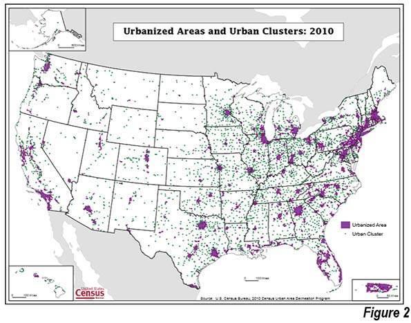
    America’s status as an urban nation was still relatively new as it headed into World War II. The US urban population had not exceeded that of rural areas until the 1920 census. By 1940, the urban population was approximately 57 percent, according to Census Bureau data, well below the 81 percent of 2010. In the following seven decades almost all of the nation’s population growth would occur in America’s urban areas.

    Following the legacy of the New Deal, it was expected that new housing would be largely provided by government. The home ownership rate had dropped to 44 percent from its peak of 48 percent in 1930.ix It was assumed that the new
    housing would be for renters rather than for homeowners. The reality turned out much different.

    One entrepreneur is widely heralded as having blazed the trail for the suburbanization that emerged following World War II, William Levitt, and his company Levitt and Sons. A home builder before the war, in 1947 he established the legendary Long Island, New York, community of Levittown. Levitt revolutionized homebuilding in the United States after having applied factory building techniques to the provision of wartime (defense) housing.

    Levitt began to build rental housing on the suburban fringe of New York City, but switched to owned housing as federal programs and his house production techniques together create auspicious conditions for selling single family houses.

    In 1947, Levitt marketed four different models. Eventually the seven square mile development would contain more than 17,000 new houses. The houses were small, at 750 square feet. There were
    four rooms, the kitchen, the living room and two bedrooms, all on a single floor. The houses, however could be expanded, which many households did. There were no garages. The houses were sold for approximately twice the average wage earner’s annual pay.

    Little more than a decade after the first house was occupied, Levittown achieved a population of 65,000 (1960 census). This was near the peak of Levittown’s population, since with virtually all of the land occupied and a future of declining household size, reductions in population were inevitable. By 2010, the population had dropped to 52,000. However Levittown remained a vibrant community from the beginning and remains so today.

    Levitt took the concept to other metropolitan areas as well. A Levittown featuring somewhat larger houses was developed in the Philadelphia suburbs of Willingboro township in Burlington County, New Jersey and in Pennsylvania’s Bucks County.

    In an essay entitled “Levittown: The Archetype for Suburban Development,” historian Joshua Ruff said that: “… Levittown was about more than just the houses,” adding that it was the “…largest and most influential housing development of its time..”

    Lakewood: Another important suburban community was Lakewood, located near Long Beach in the Los Angeles metropolitan area.xi The Lakewood development included 17,500 houses built between 1950 and 1953.
    The houses were between 825 square feet and 1,050 square feet.xii Lakewood, which claimed to be the largest planned housing development ever, included a regional shopping center.

    However, despite such important early developments, most of the new suburban housing around the nation was built by smaller home builders in the decades to come.

    THE CONSUMER RESPONSE

    The new suburban communities were exactly what returning soldiers and other Americans wanted. As historian Joshua Ruff put it:

    Patience had been killed by 15 years of economic depression, war and an epidemic housing shortage. People wanted the full package—the affordable house, the new appliances, the suburban lifestyle—and they wanted it right away.

    Kenneth Fox, of Yale University, wrote that: “The suburban development that began in the 1940s was revolutionary in two ways: it changed the type of community millions of Americans live in, and it transformed the national social class structure.”

    The American middle class was about to undergo an unprecedented expansion. Before, as author Studs Terkel put it:
    “The suburb, until [about 1946], had been the exclusive domain of the ‘upper class.’ It was where the rich lived. The rest of us were neighborhood folk. At war’s end, a new kind of suburb came into being.”

    According to Fox: “Eventually, suburban cultural changes and white- collar status aspirations fused and produced a shift in the basis of social class differentiation. Income and style of living supplanted occupation and economic status as the parameters defining the major social classes. A broad middle class emerged, encompassing more than one half the metropolitan population in the 1970s.”

    Indeed, according to Fox, middle- class became defined more as lifestyle,
    rather than origins: “Increasingly, and the family that chose to buy a home in a reputedly middle-class community, behave in a middle-class matter, and maintain all appearances of the middle class, could gain acceptance in the middle class, regardless of the parents occupations.”

    Levittown chronicler Barbara Kelly noted a connection between home ownership and upward mobility, indicating that it conveyed “defacto membership in middle class.” She added: “…during the years in which  the government was most active in promoting home ownership, there was a marked expansion of the American middle class, which consisted largely of the definition of its parameters.”

    Harvard historian Robert Fishman noted the rising affluence: “For the first time in any society, the single-family detached house was brought within  the economic grasp of the majority of households.” The US may have been first, but it is not alone in having democratized prosperity.

    Bennett characterized the advances, noting that “…a social revolution was being made, not by storming barricades, but by leaping over them.”

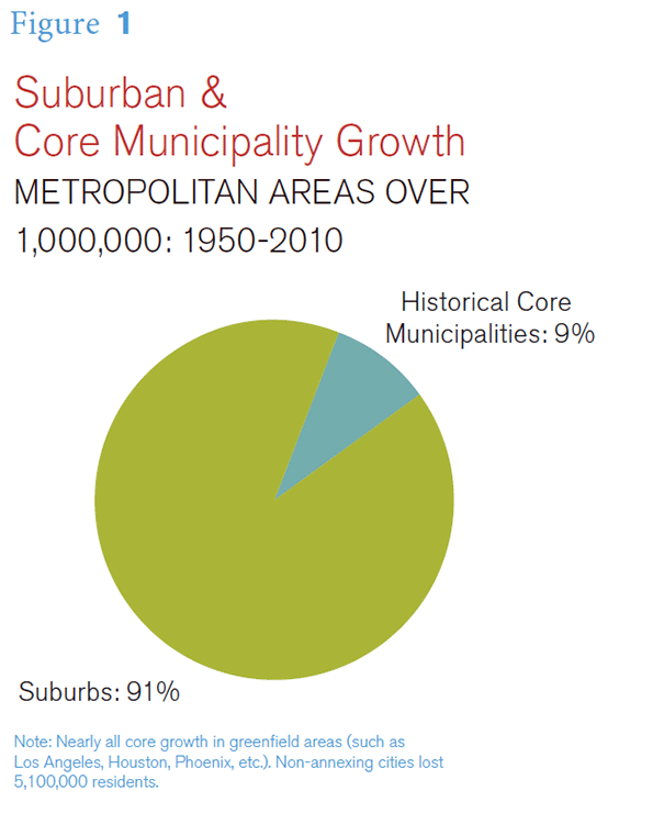
    And despite claims to the contrary, most of the new suburban residents came from migration to the large metropolitan areas, not from core cities. The new suburbanites were as likely to be from a small town or the countryside as a big city.

    HOUSING AFFORDABILITY: WHAT MADE IT POSSIBLE

    It was the affordability of such housing that made these improvements possible. Housing remained affordable across the nation in the decades to come, with some important exceptions.

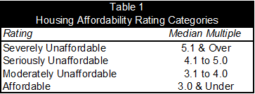
    According to the US censuses of 1950 through 1970 median house values in the largest metropolitan areas were generally 3.0 or less times the median household income (the “median multiple”), with only two having a higher average (both 3.1).

    At the same time, there were differences in housing affordability. As would be expected, some parts of the country were more attractive than others. Therefore, it is not surprising that house prices in the coastal California metropolitan centers of Los Angeles, the San Francisco Bay Area and San Diego were less affordable, but still remained at or below the 3.0 median multiple standard, in part due to higher incomes.

    The housing bubble and bust were to come later, during which the losses in housing affordability were even greater.

    Home Ownership

    The government role here was crucial. By 1960, homeownership had reached 62 percent, well above the 44 percent  of 1940. In the following three and half decades, the home ownership rate varied up and down in a range of from 62 percent to 66 percent (Figure).

    Then, as mortgage eligibility was relaxed during the housing bubble, the home ownership rate rose to nearly
    69 percent. Following the housing bust, it had fallen to below 64 percent by 2015.

    Some retro-urbanists have characterized the comparatively recent experience of the housing bubble and bust as indicative of an overall failure of postwar US housing programs. Nothing could be further from the truth.

    In fact, US housing programs had been instrumental in producing a significant increase in homeownership and the creation of a much broader middle-class. The evidence remains “the 60 to 65 percent level of home ownership of the 35 years preceding 1995 was sustained. Meanwhile, even after the housing bust, home ownership remains a priority among American households,xxvi including younger people. Even after the Great Recession, the aspiration for home ownership remains strong. Polling by the Demand Institute (operated by The Conference Board and Nielson) found that 77% of respondents considered home ownership “an excellent investment” (Figure).

    THE RETRO-URBANIST RESPONSE

    It might be expected that there would be popular and widespread acclamation of this success. Surely, the results were consistent with the principal priorities of a progressive society, at least in the historic sense, to improve the standard of living and reduce poverty.

    Yet, this was not to be. Retro-urbanists, including many planners, architects and other thought leaders were nothing less than appalled. In reaction to this, the very first words in the preface of Herbert J. Gans’ The Levittowners: Ways of Life and Politics in a New Suburban Community, read: “This book is about a much-maligned part of America, suburbia…”xxix he continues to indicate that these observers of suburbia are similar to literary writing, “which often boils down to cataloguing … Shortcomings from the author’s perspective.”

    Kelly characterizes the criticisms as “…a form of pseudo-intellectual disdain for suburban life in general, with Levittown serving as its archetype.”

    For example, in 1964, architect Peter Blake declared in God’sOwn Junkyardthat the suburban pattern developing in the United States is “making life there only slightly less tolerable than on tenement streets.”

    He continued: “The results are palpable: children play in the street; parents spend most of their time maintaining a front garden they can’t use; the community has to maintain long roads and long utility lines to service its strung-out houses; and the suburbs go broke.” Blake also says that “America’s suburbia is now functionally, aesthetically and economically bankrupt.”

    Dr. Charles Winslow, professor of public health at Yale University said that the “inferior type of small house being provided by speculative builders to meet the veterans demands [were] dollhouses that out slum the slumming is of our prewar slums…” He also said that “families living in these houses might suffer serious mental and physical ills.” 

    Social commentator Paul Barker describes the intensity of the criticisms, noting that “suburban” is a “sneer- word” to architects and planners.xxxvi He also says: “Those who oppose suburbia usually have highly doctrinaire views about how other people should live.” While Sieverts refers to an ideological concept of cities, Barker characterizes it as theological: “Almost all architectural and planning commentaries, in the press or in government publications, still speak of the suburban as an evil that must somehow  be cast out.”

    These kinds of criticisms have often been supported in the press.

    Historian Joshua Ruff dismisses Lewis Mumford’s complaint that Levittown
    was a “uniform environment from which escape is impossible” as “ignoring the architectural sameness (block after
    block of overcrowded apartments) many new suburbanites were fleeing from in Manhattan, Brooklyn and Queens.”

    But, despite their influence and access to the press, the retro-urbanists have been consistently ignored by households making home purchase decisions. As Barker put it, “…such critics are outnumbered many, many times by the millions for whom suburbia is a land of pleasantness, friendship and hope.”xl Moreover, the retro-urbanists did not understand the desires of suburbanizing households. As Gans put it, they came “…for a house and not a social environment.”

    In the final analysis, as Journalist Edward Humes wrote: “But the veterans who snapped up these new houses were coming from a different outlook, a different place—from boarding houses and cramped apartments and lives that just a few years earlier had offered little hope of college or homeownership or lasting financial security.”

    Households continued to move to the suburbs and suburbanization continued to attract nearly all population growth in the major metropolitan areas.

    The Right and Wrong of Suburbanization

    Ruff provides a short summary of the positive and negative perceptions with respect to Levittown (which also apply
    to the great post-war suburbanization): “But Levittown was about more than just the houses. As the largest and
    most influential housing development  of its time, it became a postwar poster child for everything right (affordability, better standard of living) and wrong (architectural monotony, poor planning, racism) with suburbia.”

    As for the “right” that Ruff refers to, it is hard to imagine more important benefits than a dispersion of wealth, affordability and a better standard of living. These are fundamental domestic public policy objectives long held by much of the nation’s leadership, including liberals. A nation of homeowners, “President Franklin D. Roosevelt believed, “of people ho own a real share in their land, is unconquerable.”

    The case for the “wrong” is less clear. Architectural monotony does not negate the imperative to improve the standard of living and reduce poverty. Moreover, architectural monotony is in the eye of the beholder and clearly was of no more than secondary interest to the millions who overwhelmingly chose the suburbs. The very rowhouses that are now so widely celebrated by retro-urbanists were themselves originally stretches of identical structures with little differentiation. Planning that results in better affordability (and an improved standard of living) is good and effective, not “poor.” Finally, as noted above, the racism concern is valid, but is a more general indictment of the nation at the time and has now been moderated by a flood of minority residents to suburbia.

    According to Kelly: “For all the faults attributed to them by their critics, the houses of the postwar subdivisions had widespread appeal. They may have been small and repetitious to their observers, but to their owners they represented something more than basic shelter—they were an opportunity to build a better life, a first step on the road to success. It is at that level that the housing programs of the 1940s made their greatest achievement.”

    THE NEW CITY

    The postwar suburbs developed because they could. History had made it possible and thus virtually inevitable.

    Throughout history, people have routinely adopted new techniques and technologies that made their lives better. Nostalgia did not prevent people from abandoning outhouses for indoor plumbing or iceboxes for refrigerators. People prefer better lives and greater comfort and accept technological  advance as soon as it is affordable. It is  not surprising that people found better lives and comfort preferable to nostalgia and an “ideological concept of the city.”

    Indeed, the city was revolutionized.

    Levittown chronicler Barbara Kelly added that the postwar subdivision suburbs had “evolved into a new form  of city,” while Thomas Sieverts characterized the “strange urban—rural landscape as a new form of city.”

    The suburbs gradually became more independent of the core city, as employment was dispersed throughout the metropolitan area. They were no longer subordinate to the core cities, the legacy cites of the pre-war era. Jon
    C. Teaford of Purdue University wrote that the term: “…‘suburb’ had become a misnomer. Economically and socially periphery is no longer a subordinate dependent of the center and thus no longer a candidate for the prefix sub[emphasis in original]” Similarly, J. John Palen of Virginia Commonwealth University wrote: “Whatever everyone thinks about suburbs, it is now indisputable that they no longer sub [emphasis in original].”

    More than three decades ago, Robert Fishman of the University of Michigan suggested:

    “In my view, the most important feature of the postwar American development has been the almost simultaneous decentralization of housing, industry, specialized services and office jobs; the consequent breakaway of the urban periphery from the center it no longer needs; and the creation of the decentralized environment…”

    He went on to propose a new conception of the city (metropolitan area):

    “The true center of this new city is not some downtown business district
    but in each residential unit. From that central starting point, the members of the household create their own city from the multitude of destinations that are within suitable driving distance.”

    Even “suitable commuting distance” became less of a concern for many, as Alvin Tofler’s”electronic cottage” became a reality for many as working at home expanded, facilitated by improved telecommunications. Today, in the majority of American metropolitan areas, more people work at home than take transit.

    THE PLANNING RESPONSE

    Long before Levittown, there were strong criticisms of the suburbs reaching back into the 19th century and even to the 17th and 18th.

    However, it took the interwar building boom to marshal political  forces to implement planning restrictions intended to stop the growth of the suburbs. Under the Town and Country Planning Act of 1947, Britain’s liberal land-use policies were replaced by urban containment policies that have only become stronger over the years. Greenbelts (urban growth boundaries) were imposed around the cities of England, leaving little land for new residential development.

    The result has been a severe and on- going housing crisis, with house prices having doubled or tripled compared to their pre-urban containment relationship to incomes.lv This is to be expected, since prices tend to rise where the supply
    of a desired good or service (in this case land) is restricted, while demand continues unabated. Not even depressed metropolitan areas like Liverpool and Glasgow have escaped the cost escalation.

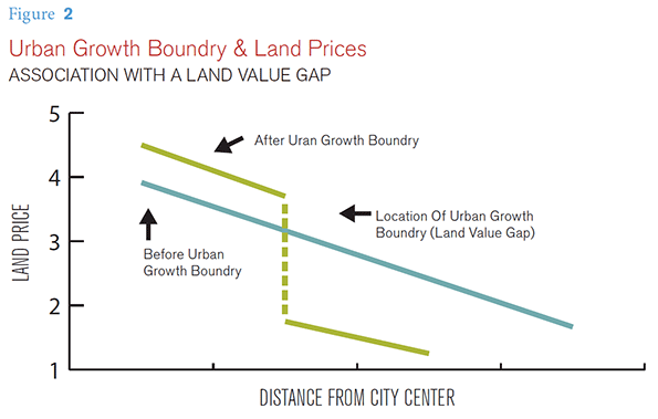
    There is broad agreement among economists and even planning advocates that higher land prices occur within urban containment boundaries. lvi Planners expected that construction of higher density housing would negate the higher land price impact on house prices. Moreover, urban containment planning regimes have routinely included periodic reviews to expand land supply housing affordability. As the discussion below indicates, these approaches have failed as losses
    in housing affordability have been pervasive in more restrictively regulated metropolitan areas.

    It took longer, but similar planning strategies have been adopted in many parts of the US. Their spread, however, has been slowed by America’s federal structure,lvii which did not lend itself to overnight imposition of urban containment policy. Even 70 years after World War II, the radical land use regulatory regime of the United Kingdom has been implemented in only parts of the United States.

    Nonetheless, there were important adoptions of Great Britain style urban containment policy. Things began to change, especially in California and Oregon in the 1970s.

    In California, restrictions were placed on the incorporation of new suburban municipalities that made it more difficult for development to extend from existing municipalities into unincorporated areas.lviii At the same time there were various environmental and land-use regulatory changes that made it more difficult to develop new housing. The net impact of this was fairly immediate house price increases relative to incomes. These housing affordability losses were recognized early some urban planning experts, such as David Dowell  at University of California, Berkeleylix and Bernard Friedan at MIT.lx California’s housing affordability, which had been similar to that of the rest of the nation, began to deteriorate markedly, and by 1980 had reached unprecedented severity.

    Urban containment policies were also enacted in states such as Washington, Florida, Tennessee, New Jersey and Maryland. Local initiatives significantly strengthened land use regulations, such as in the Virginia and Maryland counties of the Washington, DC-VA-MD-WV metropolitan area and the New York metropolitan area.

    By 2000, house prices in some markets had reached five times incomes, nearly double their 1970s ratios. This is consistent with the economic principle that restricting supply tends to result in higher prices, all else equal.

    The tragedy of the housing bust was to follow. Households were lured by
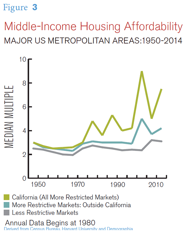
    mortgage products that back-loaded costs so that the greatly inflated prices could seem affordable. The more restrictive  land use regimes could not respond with sufficient supply to meet the increased demand. By the middle 2000’s the highest median multiples reached over 10 in the coastal California metropolitan areas, with some other metropolitan areas exceeding 5.0.

    These price factors led to mortgage defaults, corporate bankruptcies, and a recession so severed that it is called the Great Recesion. It was by far the worst economic reversal since the 1930s. Through the Great Recession, the
    US housing market sent ripples of economic disruption throughout the international economy.

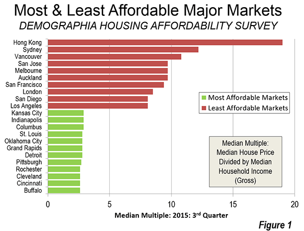
    There were massive house price losses across the nation, with the largest losses where house prices had risen the most. Yet, the house price increases relative to incomes quickly resumed. By 2014, median multiples had reached 8.0 or above in the San Francisco, San Jose, San Diego and Los Angeles metropolitan areas. Housing was also severely unaffordable in the New York, Boston, Miami, Riverside-San Bernardino, and Seattle metropolitan areas and was approaching similar severity in the Denver and the Portland metropolitan areas (Figure).

    The housing distortion was so great that California’s cost adjusted poverty rate became the highest in the nation, 50 percent above that of Mississippi. Despite a California Legislative Analyst’s report documenting the association between regulation and housing affordability losses, the state has continued to strengthen regulation.

    Tomas Rivera Institute raised concerns about the impact of compact development on minority housing affordability:

    Whether the Latino homeownership gap can be closed, or projected demand for homeownership in 2020 be met, will depend not only on the growth of incomes and availability of mortgage money, but also on
    how decisively California moves to dismantle regulatory barriers that hinder the production of affordable housing. Far from helping, they are making it particularly difficult for Latino and African American households to own a home.

    At the same time, throughout most of the country the historic housing affordability was preserved. Even through the housing bubble many major markets remained at or below the 3.0 housing affordability standard. There were also significant house price increases in some liberally regulated markets, but most remained at or below a 3.0 median multiple (such as Atlanta and other Less Restrictive Markets in the Figure above “Middle-Income Housing Affordability”).

    Finally, even in metropolitan areas with strong policies discouraging suburban development and favoring urban core development, most growth continues the periphery. For example, in Portland more than 95 percent of that growth between 2000 and 2010 was in suburbs and exurbs. In San Francisco, 88 percent of the growth was in the suburbs and exurbs.

    TOWARD A MORE ELITIST AMERICA?

    The present preference in planning for urban containment policy threatens to reverse 70 years of social progress. As house prices rise relative to incomes — a phenomenon clearly associated with of urban containment policy — home ownership will be increasingly limited to the more affluent. Paul Barker asks why the strong land use regulations  have survived. Answering his own question, he says that: “The short answer is that it protects the haves against the have-nots.” Robert Bruegmann of the University of Illinois, Chicago provides similar commentary, in chronicling the conversion of suburbs to abodes of the middle class:

    “… Cities have sprawled from time immemorial and for a wide variety of reasons. As long as only a small number of the wealthiest and most powerful families occupied the most
    land in the most attractive locations, there was very little sustained organized protest. Whenever a newly affluent or empowered part of the population started to enjoy this privilege, there was a backlash.”

    Matthew Rognlie at the Mass- achusetts Institute of Technology has suggested that virtually all of the increased inequality identified by French economist Thomas Picketty has been in the housing sector. He suggests that:

    “… the literature studying markets with high housing costs finds that these costs are driven in large part by artificial scarcity through land use regulation …. A natural first step to combat the increasing role of housing wealth would be to re-examine these regulations and expand the housing supply.

    Jason Furman, Chairman of the White House Council of Economic Advisers called for regulatory relief in a recent address on housing affordability and the consequences of high prices on the economy.

    With high house prices and further hedges against property value depreciation in local regulations, some individuals are priced out of the market entirely, and homes in highly zoned areas also become even more attractive to wealthy buyers.
    Thus, in addition to constraining supply, zoning shifts demand outward, exerting further upward pressure on prices…

    Worse of all, these restrictions are largely unnecessary. Better policies can secure a future for the next generation every bit as promising as the generations since World War II came to expect. The words of Presidential candidate Adlai Stevenson in 1952 are as relevant today as then: “Who shall say that the American dream is ended?”

    LEVITTOWNS FOR THE FUTURE

    But there is a solution. Levitowns can still be built. For example, a review of four metropolitan areas shows that new, entry level detached housing can be purchased for from 2.0 to 2.5 times median household incomes in Atlanta, Columbus, Houston and Indianapolis. This is only slightly above the two times average earnings typical in Levittown, when few families had more than one wage earner. Moreover, today’s prices include a garage, and the houses are at least 50 percent larger. Implementation of recommendations in Section 9 could increase the number of new houses that replicate Levittown affordability today.

    A number of policy proposals could improve the potential for improving housing affordability, particularly in the starter home market following the “trail” blazed by Levittown and other early postwar suburbs. These could restore, in the short term, the promise of Levittown for today’s threatened middle-class.

    The first two relate to the stringency of metropolitan land use planning systems, since experience has demonstrated that the administration of urban containment policies not succeeded in maintaining housing affordability. Until these policies are reformed, new Levittowns are simply not likely to be built.

    Recommendation #1

    To retain housing affordability, liberally regulated metropolitan areas should not adopt restrictive housing
    regulations, such as urban containment.

    As is indicated above, urban containment policies have been virtually inextricably linked to the loss of housing affordability. The theory that the higher land prices inside an urban containment boundary will be offset by lower construction prices has proven to be entirely elusive in practice.

    Recommendation #2

    Wherever there is urban containment policy, it can be expected that housing affordability will further deteriorate. This approach needs to be reformed.

    A road map has been provided by the Productivity Commission of New Zealand. In seeking to address the
    severe housing affordability in Auckland, the Productivity Commission has recommended that greenfield land for development be opened up in greater volume once prices have become unduly distorted. As the Commission indicated: “”Where large discontinuities emerge between the price of land that can be developed for housing and land that cannot be developed, this is indicative of the inadequacy of development capacity being supplied…”

    The Productivity Commission’s recommendation for an “event- driven trigger” to open more land for development also could be adopted at the state or metropolitan area level in the United States. This would require establishment of annual housing affordability targets.

    Recommendation #3

    Metropolitan areas with urban containment policies should consider establishing “special housing areas” outside their urban containment boundaries in order to facilitate housing that is affordable to middle income households.

    These new developments could be authorized by governments to allow development of land and housing at prices similar to those, relative to incomes, that prevailed in the early suburban developments, such as Levittown. These districts should be within metropolitan areas (labor markets) and would provide advantages not only to aspiring families, but also to land owners whose land has been rendered worthless from a development perspective by urban containment policy. Limits on land prices should be set, with development proceeding only when land owners are willing to sell for prices within such limits. Generally similar proposals have been made by the New Zealand government (special housing areas), and by United Kingdom government housing researcher Kate Barker. This approach would also be similar in some respects to the successful municipal utility districts in Texas.

    Recommendation #4

    Governments, land developers and homebuilders should examine approaches for liberalizing regulation on starter homes, toward the end of implementing less costly delivery of housing.

    Cost increasing factors such as delays in permitting, more expensive materials requirements and designs (such as favored architectural styles, including “new urbanist” designs) and other requirements that increase costs for starter homes should be reviewed. This would be appropriate in all markets and should be conducted consistent with appropriate health and safety standards. Wherever feasible, reforms should be implemented.

    CONCLUSION

    The legitimate purpose of planning is not so much better cities, but better lives for their inhabitants. This requires housing that is affordable and maximizes discretionary incomes and a reduction in poverty.

    Planning can only be justified by the extent to which it improves people’s lives. Suburbanization, through entrepreneurship and liberal planning accomplished this, and created the Great American Middle Class after the Second World War.

    As Herbert Gans suggested a half century ago:

    “… whatever its imperfections, Levittown is a good place to live. Consequently, it is much less important to plan for new or improved suburban community and to make sure that more people are able to live in suburbs like those now being built. Specifically, the most urgent priority is to make the benefits of suburban living available to the poor and nonwhite families, now condemned to slum ghettos, who want to give their children
    and themselves a better life beyond the city limits."

    Gans further expressed concern that there needed to be a place in the suburbs for lower middle income households: lxxvi

    …The ideal solution is more, better and more variegated new towns in suburbs, but the first priority in the years to come is more communities for the less affluent.”

    Wendell Cox is Chair, Housing Affordability and Municipal Policy for the Frontier Centre for Public Policy (Canada), is a Senior Fellow of the Center for Opportunity Urbanism (US), a member of the Board of Advisors of the Center for Demographics and Policy at Chapman University (California) and principal of Demographia, an international public policy and demographics firm. He is co-author of the “Demographia International Housing Affordability Survey” and author of “Demographia World Urban Areas” and “War on the Dream: How Anti-Sprawl Policy Threatens the Quality of Life.” He was appointed to three terms on the Los Angeles County Transportation Commission, where he served with the leading city and county leadership as the only non-elected member. He served as a visiting professor at the Conservatoire National des Arts et Metiers, a national university in Paris.

  • Just How Much has Los Angeles Transit Ridership Fallen?

    Los Angeles transit ridership has fallen even more than a recent Los Angeles Times front page story indicated, according to Thomas A. Rubin, who served as Chief Financial Officer (auditor/controller) of the Southern California Rapid Transit District (SCRTD) from 1989 until 1993, SCRTD merged with the Los Angeles County Transportation Commission (LACTC) after the first new rail line was opened in the early 1990s (I served as a city of Los Angeles appointee to the board of LACTC).

    It is not that the Times misreported the story, but rather that the official data it used does not fully account for important underlying ridership data.

    Rubin’s analysis, (available here), responds to a commentary by Ethan Elkind who criticized the Los Angeles Times article for providing a misleadingly pessimistic ridership picture. Rubin shows that, in fact, a closer look at the data suggests things are even worse that suggested by the Times.

    Rubin provides compelling evidence refuting the Elkind commentary (discussed below), as well as more detailed ridership issues that require deeper analysis. Tom Rubin is among the nation’s most knowledgeable transit advocates) and his commentary provides far more information than is summarized in this article. Rubin’s commentary is necessary reading for anyone seriously interested in the history of transit in the new rail era (since 1980).

    Passenger Journeys v. Linked Trips

    Transit ridership statistics in the United States nearly exclusively rely on the concept of unlinked trips. An unlinked trip occurs every time a passenger enters a transit vehicle. Thus, if a rider takes one bus and then transfers to another bus to complete a trip, this single passenger journey counts as two unlink trips. Or, if a passenger starts the journey on the bus, transfers to a rail line, then transfers to another rail line and finally to a bus, this single passenger journey will count as four unlinked trips. So, when comparing transit ridership in the United States, it is important to keep in mind that unlinked trips, rather than passenger journeys are being counted.

    It is worth noting, that in some other countries, officials have found it relatively easy to count passenger journeys. For example, most large European transit systems count passenger journeys and thus do not report the inflated ridership figures that occur as a result of countingtransfers on a single trip.

    As Rubin points out, transfer ratios vary significantly between systems. Further, transfer ratios tend to increase as transit agencies open rail systems. As new rail lines are opened, bus routes are often truncated as agencies attempt to force more ridership on to the rail system. This means that the number of transfers increases. Data that Rubin provides indicates that the linked trip to passenger journey ratio on the former SCRTD/MTA transit system has risen from 1.66 linked trips per passenger journey in the early 1990s to 2.25 in the most recent surveys . Rubin also notes that some surveys have shown even higher transfer ratios in recent years. He uses the 2.25 transfer ratio to obtain the most conservative possible estimate of 2015 passenger journeys.

    According to the unlinked trips data reported by the Los Angeles Times, transit ridership on the SCRTD/MTA transit system declined nearly 10 percent from 1985 to 2015, despite the addition of billions of dollars worth of new rail lines. Taking Rubin’s estimate of passenger journeys based on the change in transfer rate (from 1.66 to 2.25 unlinked trips per passenger journey), the drop would be even greater, at a loss of more than 30 percent. Passenger journeys, using these ratios, would have been approximately 290 million in 1985 and 200 million in 2015 (Figure 1).

    Billions for What?
    Rubin has provided important research in his analysis of rail construction costs. Over the past 30 years. Rubin estimates that approximately $16.4 billion dollars (2016$) has been spent to build the routes that are already in service (including the Orange Line busway, but not the Silver Line busway, which he does not include) Elkind implies that this is not enough to see a “true return” on investment.

    With all the huzzahs about the rail system having made transit “the next great mass-transit city,” and the near universal praise for the rail system among the “powers that be” in Los Angeles, the Times is to be commended for courageously revealing the billions that have been spent while millions have abandoned transit, as SCRTD/MTA have placed a priority on expanding the rail services. Rubin also shows that another $9.0 billion is expected to be spent on new lines that will be opened by 2023.

    How Much is a Rail Rider Worth?

    Rubin was a principal actor in a civil rights lawsuit that forced MTA to reduce its rail spending and increase in spending on buses and lower fares after ridership had fallen about 120 million from its 1985 peak. During the period that the court oversaw MTA, was forced to add more bus service and lower bus pass prices. Rubin shows that during the period of rising ridership, from 1994 to 2007, unlinked trips nearly recovered to the 1985 peak. The ridership increase required a subsidy of $1.40 to add each new bus rider and $25.82 for each new rail rider (Figure 2). This suggests that a new rail rider is valued at nearly 20 times that of a new bus rider. This illustrates that it is far less expensive to increase ridership in Los Angeles with lower bus fares than with rail lines. It is also far more helpful to, Los Angeles transit riders, whose median income is well below that of transit riders nationally, and who need better access to jobs for the higher standard of living they seek (Figure 3).

    What About the Base Year

    Elkind suggests that the Los Angeles Times was unfair in comparing 2015 ridership to the peak year of 1985. Rubin does not accept this argument and for good reason. The principal purpose of the rail system was to increase ridership and any other outcome was, frankly, beyond the pale. The opening of 10 new rail and busway corridors is more than sufficient to have a significant increased ridership, which, as both Rubin and the Times shows, they have not (Note).

    As author of the rail funding amendment to Proposition A in 1980 that provided virtually all of the local funding for the rail system for a decade, these results fall far short of expectations. If I had doubted the ability of a large rail system to significantly increase transit ridership, I would not have offered the amendment (the only other similar amendment offered that day had already been rejected).

    Further, never in my succeeding five years on LACTC including the two years I served on the Rail Transit Committee did I ever hear another member of the Commission or a member of staff imply that there was any possibility that lower ridership could be the result. Had such a view become dominant, the “plug would probably have been pulled,” and the bus system maintained and improved. If so,  transit would be carrying many more people today, while delivering value for taxpayers.

    Photograph: John Ferraro Building, which hosted LACTC board meetings during my tenure. Los Angeles City Council President John Ferraro was the first chair of LACTC.

    Note: Each downtown oriented corridor counts as one (so that, for example, the Gold Line, which enters downtown from two directions is counted as two). Lines that do not reach downtown are counted as one.

    Wendell Cox was appointed to three terms on the Los Angeles County Transportation Commission by Los Angeles Mayor Tom Bradley. The LACTC board consisted of the Mayors of Los Angeles and Long Beach, two smaller city majors, the five county supervisors (county commissioners) and two other appointees of the Mayor of Los Angeles. Mayor Bradley routinely appointed the City Council President to fill one of these two seats as well as a private citizen (Wendell Cox). Wendell Cox chaired the Service Coordination Committee and also served on the Rail Transit and Finance Review Committees.

  • Best Baseball Towns

    Indulge me please as I tried to write my first sports column. No, I have no intention of applying for the job of newgeography.com’s sports editor and others have been far more prolific on this issue. I have been falling out of love with sports for decades now.  

    That does not mean, however, that I ignore the sporting world. I may be withdrawing from spectator sports    but I am interested in statistics they produce. Attendance figures have always intrigued me. It is impressive that more than 100,000 fans routinely fill stadiums in Ann Arbor, Columbus, Tuscaloosa, Baton Rouge, College Station, State College, Austin, and Knoxville.  Even so the largest crowds no longer occur, such as Notre Dame, Navy and USC, which drew the largest college football crows in history, at Chicago’s Soldier Field when its capacity was 165,000 (capacity source: 1929 World Almanac). Baseball’s record was more than 115,000 at a Los Angeles Coliseum exhibition game in 2008, celebrating 50 years since the Dodgers moved from Brooklyn.

    Recently, major league baseball announced its annual attendance figures. Living in St. Louis, a middle-sized market that has usually drawn large market crowds, it struck me that it might be interesting to compare attendance figures to the population in the commuting sheds of the major league markets. By commuting sheds, I mean the combined statistical areas or where they do not exist, the metropolitan statistical areas.

    So I did a simple calculation of the major league attendance in each market compared to the population. The attendance data is readily available on the ESPN website for any wanting a more in-depth look.  Obviously, the market with the highest annual fans per capita would be the best baseball town. I frankly expected that it would be St. Louis. It was not .  The figure below shows the results.

    The Top 5

    The five best baseball towns are all on inland waters, on the Great Lakes and the other four on the Mississippi River and its tributaries. .

    #1: Milwaukee

    Milwaukee, the Great Lakes (Lake Michigan) entry, is number one. In 2015, the Brewers attracted the equivalent of 1.24 trips to the stadium per capita. This may be surprising, because the Brewers are nowhere near the top in terms of their capacity used during games (approximately 75%) or in their average attendance of 31,000, one-third short of the major league baseball leading Los Angeles Dodgers (46,000).

    #2: St. Louis

    The expected leader, river-city St. Louis came in second, attracting 1.21 visits per capita. However St. Louis drew many more people than Milwaukee, with an average crowd of more than 44,000. Even if I had wanted to go to a game (I have been to at least one in three decades), it could have been hard to find a seat. The Cardinals filled 98.8% of their seats in 2015. However, they had to settle for second place on this indicator as well, as the San Francisco Giants were number one with 99.4% of their seats filled each game (The timing of this article is purely coincidental with the announced move of the National Football League Rams from St. Louis to Los Angeles: See Note 1)..

    #3: Kansas City

    The state of Missouri’s other team — also on a river — ranked third. Kansas City drew 1.12 fans per capita in 2015. The Royals had an average crowd of 33,000 and filled a creditable 89% of the stadium on average.

    #4: Cincinnati

    The Cincinnati Reds placed fourth, with an average of 1.09 fans per capita. The Reds, however, had an average crowd of 30,000 and filled only 70% of their seats each game on the banks of the Ohio River.

    #5: Pittsburgh

    Pittsburgh, also a river city, was in fifth place, with 0.94 fans annual per capita. Pittsburgh’s average attendance was 31,000 and did a bit better in filling its capacity, at 80%.

    The Bottom Five

    The average fans per capita falls off dramatically among 2015’s bottom five baseball towns.

    Last: New York

    New York, of course, has two teams, the Yankees in the Mets. The New York fans per capita figure is calculated by adding the attendance figure for its two teams, as is also the case in Los Angeles and Chicago with their two teams. But with a commuting shed of 24 million residents, even filling every seat would not have been enough to grant New York an exit pass from the bottom 5. The Yankees attracted 80% capacity crowds, while the Mets averaged 75%. Overall, New York averaged 0.24 fans per capita, approximately one-fifth that of baseball’s best town in 2015, Milwaukee.

    2nd to Last: Philadelphia

    Philadelphia ranked second to last, with approximately 0.26 fans per capita. Philadelphia average 23,000 per game, which is only 53% of capacity.

    Third to Last: Miami

    Miami was third to last, averaging 0.27 fans per capita, with an average crowd of 22,000, which took up 57% of capacity.

    Fourth to Last: Atlanta

    Atlanta ranked fourth to last, averaging 0.32 trips to the ballpark per capita. The average crowd was 25,000, which represented only 50% of capacity.

    Fifth to Last: Houston

    Houston ranked fifth to last, slightly above Atlanta at 0.32 fans per capita. The Astros drew 27,000 per game and filled 65% of capacity.

    Honorable Mentions and others

    As the figure indicates, attendance per capita falls off significantly after fifth ranking Pittsburgh. San Diego and Denver attract approximately 0.75 fans per capita. The Denver is particularly significant, since the Rockies averaged 55,000 per game in 1993, before moving to their specially built stadium. Last year, the best the Rockies could muster was an average crowd of 31,000, filling only 62% of their capacity. The Rockies holds the record of 4.5 million annual attendees in a season, though the New York Yankees have drawn more than 4 million fans in four years. Their best attendance was 4.3 million.

    The Toronto Blue Jays (Note 2) are another team that drew more than 4 million fans twice in its heyday and averaged 50,000 fans in 1992. Toronto had been the first team to draw more than 4 million fans, in 1991. The New York Mets also drew more than 4 million fans in 2008, the same year the Yankees drew their largest figure.

    As is indicated above, the Los Angeles Dodgers led major league baseball in attendance in 2015. However, just down the road, the Los Angeles Angels— who play in Anaheim (Orange County) —  ranked fifth in total attendance, giving Los Angeles a combined total of 84,000 between the two teams. The New York Yankees and Mets had a total combined attendance of 70,000. The Chicago Cubs and White Sox drew a combined attendance of 58,000.

    Tampa-St. Petersburg put the “if you build it they will come” slogan to the test, in building a domed baseball stadium that opened in 1990. It took major league baseball eight years to come (that is not a record, San Antonio’s Alamo Dome has been waiting for nearly a quarter century for an NFL team). And, at least in 2015, not that many fans came. The Tampa Bay Devil Rays drew the smallest average crowd in the major leagues (15,000) and filled only 45 percent of its seats. Tampa-St. Petersburg did much better in fans per capita, at 0.43, for a ranking of 15th.

    My Career as a Baseball Spectator

    As may be obvious, I have not been to many baseball games. My first game was on a cross-country Trailways bus trip after high school when I spent my only night in New York at Yankee Stadium. But my most memorable game was in 1978, on the night the Dodgers set the then all-time attendance record (at least then) of 3,000,000 fans in a season. I don’t remember who they played or if the Dodgers won.

    Note 1: The off and on again musical chairs game of franchise moves continues with the Cleveland/Los Angeles/St. Louis Rams, which have now become the Cleveland/Los Angeles/St. Louis/Los Angeles Rams. Soon perhaps the Los Angeles/San Diego Chargers will become the Los Angeles/San Diego/Los Angeles Chargers or perhaps the Oakland/Los Angeles/Oakland Raiders will become the Oakland/Los Angeles/Oakland/Los Angeles Raiders?

    Note 2: The Toronto commuting shed includes the Toronto, Hamilton and Oshawa metropolitan areas, which Statistics Canada has indicated would be the combined statistical area if they were to designate one.

    Wendell Cox is Chair, Housing Affordability and Municipal Policy for the Frontier Centre for Public Policy (Canada), is a Senior Fellow of the Center for Opportunity Urbanism (US), a member of the Board of Advisors of the Center for Demographics and Policy at Chapman University (California) and principal of Demographia, an international public policy and demographics firm. He is co-author of the “Demographia International Housing Affordability Survey” and author of “Demographia World Urban Areas” and “War on the Dream: How Anti-Sprawl Policy Threatens the Quality of Life.” He was appointed to three terms on the Los Angeles County Transportation Commission, where he served with the leading city and county leadership as the only non-elected member. He served as a visiting professor at the Conservatoire National des Arts et Metiers, a national university in Paris.

    Photo:  Best Baseball Town: Milwaukee (2015)

    by Greg Hume (Own work) [CC BY-SA 3.0], via Wikimedia Commons

  • Best and Worst: 2015 International Housing Affordability

    Housing affordability and its impact on   middle income households around the world is emerging as a major concern throughout the developed world. The largest element in household budgets is housing, and house prices have skyrocketed relative to incomes in many metropolitan areas, especially those that have adopted strict land use regulation (particularly urban containment, as described below).

    The 12th Annual Demographia International Housing Affordability Survey reports that, as of the third quarter of 2015, Hong Kong has the least affordable housing among major markets in 9 nations, followed by Sydney, Vancouver, with Auckland, Melbourne, San Jose, San Francisco, London, Los Angeles and San Diego. In each of these markets, housing costs are now triple or more their  levels before restrictive land use regulation (house prices have tripled compared to incomes).

    Ranking Similarities: Demographia and the UBS Real Estate Bubble Index

    The Demographia list of least affordable metropolitan areas is largely echoed by UBS, the international financial services company headquartered in Switzerland. The UBS Global Real Estate Bubble Index ranks London, Hong Kong, Sydney and Vancouver as most vulnerable to risk from a real estate bubble. Demographia rates Hong Kong, Sydney and Vancouver as having the least affordable housing. London is ranked 8th in the Demographia Survey. Overall, the five cities rated by UBS as the most vulnerable are included among the eight least affordable in the Demographia Survey. The three other cities ranked in the least affordable eight by Demographia are not considered in the UBS report.

    Background on Middle-Income Housing Affordability

    In his introduction to the Survey, Senator Bob Day (Australian federal Senate) recalls that: “For more than 100 years the average Australian family was able to buy its first home on one wage. The median house price was around three times the median income allowing young home buyers easy entry into the housing market.”

    Senator Day’s description of the experience in Australia tracks with that of other nations. Following World War II and until the early 1970s, virtually all metropolitan areas in Australia, Canada, Ireland, New Zealand, the United Kingdom and the United States had median multiples around 3.0 or below.

    Since then far more restrictive land use policies have spread beyond the metropolitan areas to many others in other nations. This has often included urban containment policies (called “urban consolidation in Australia”), which severely limit or even prohibit new housing construction on or beyond the urban fringe. The result, as basic economics predicts, is higher land prices and skyrocketing housing costs, (despite expectations to the contrary by planners).

    Rating Housing Affordability

    The Demographia International Housing Affordability Survey uses the "median multiple" price-to-income ratio. The median multiple is calculated by dividing the median house price by the median household income.  Housing affordability ratings are indicated in Table 1.

    Virtually all of the severely unaffordable major markets in this year’s Survey exercise urban containment policy. Meanwhile, no market without strong land use regulation has ever been rated as severely unaffordable in the 12 years of the Survey.

    The Bottom 10: Least Affordable Major Metropolitan Markets

    The kinds of restrictions on development that Senator Day outlines are evident in the most unaffordable metropolitan areas.

    For the fifth straight year, Hong Kong had the least affordable housing.  Its median multiple was 19.0. Sydney became the second least affordable, at 12.2, leaping by 3.2 points, the largest annual increase ever recorded among major markets in the Survey. Sydney displaced Vancouver, which had the third least affordable housing among the major markets, with a median multiple of 10.8. This is up from 10.6 last year. Each of these is the highest median multiple recorded in these markets in the history of the Survey.

    Three metropolitan markets tied in fourth position with a median multiple of 9.7, San Jose, Melbourne and Auckland. San Francisco was the 7th least affordable market, with a median multiple of 9.4, followed by London (8.5). San Diego and Los Angeles, which both had a median multiple of 8.1 (Figure 1).

    Urban containment markets clearly and nearly perennially suffer declines in housing affordability. In 2013, the same ten metropolitan markets were the least affordable and had an average median multiple of 9.1. By 2015, their average median multiple had risen to 10.5. Housing affordability deteriorated in all 10 markets (house prices rose faster than incomes). This loss in housing affordability was at least 14 times the loss in the 10 most affordable markets (below).

    The Top 10: Most Affordable Major Metropolitan Markets

    Again, the United States, with its multiple regulatory variations accounted for all of the top 10 in housing affordability (actually the top 12, because of a four way tie for ninth position). Buffalo, Cincinnati, Cleveland and Rochester had the most affordable housing, with a median multiple of 2.6. Pittsburgh ranked 5th, at 2.7. Detroit, Grand Rapids and St. Louis tied for 6th, at 2.8. The tenth place tie was between Columbus, Indianapolis, Oklahoma City and Kansas City, with a median multiple of 2.9.

    By contrast, the top ten markets experienced relatively little deterioration in housing affordability over the past two years. In 2013, their median multiple averaged 2.6, and rose to 2.7 in 2015 (Figure 1). The housing affordability deterioration in the bottom 10 markets (all urban containment markets) was 14 times as high, as noted above.

    Among the five megacities (over 10 million population) in the Survey, Osaka-Kobe-Kyoto had the best housing affordability, with a moderately unaffordable median multiple of 3.4.

    All Markets

    Overall, the Survey included 368 markets. The most favorable housing affordability was in Ireland, with a median multiple among the markets of 2.8. This was the third year in a row that Ireland had the best housing affordability. In the nine prior years of the Survey, the most affordable housing had always been in either Canada or the United States (Figure 2).

    The United States was the second most affordable in 2015, with a median multiple of 3.5. Canada and Japan tied for third, with median multiples of 3.9. Four geographies with virtually universal urban containment policy were the least affordable, the United Kingdom (5.1), New Zealand (5.2), Australia (5.6) and Hong Kong (19.0).

    Singapore, though seriously unaffordable at 5.0, is far more affordable than its long-time rival,  Hong Kong (19.0). Each has virtually no suburban or rural hinterland and high population density. Yet there is a serious difference in housing policy. In contrast to Hong Kong, Singapore’s e Housing and Development Board, which accounts for approximately 90 percent of housing (which after sale is privately owned) has increased production and reduced new house prices which has led to a lowering of resale house prices as well.

    A Wholly Contrived Crisis

    Senator Day characterizes the housing affordability crisis “wholly contrived,” and “a matter of political choice… the product of restrictions imposed through planning regulation and zoning.” Senator Day calls the economic consequences of present land use policies “devastating.” He argues that governments and central banks have been too hasty to blame unprecedented housing affordability losses on demand factors, while missing the “real culprit,” which is the “refusal of … governments … to provide an adequate and affordable supply of land for new housing stock to meet demand (typically urban containment policy).

    Without reform, prospects for middle income households are grim in the metropolitan areas with urban containment policy. Housing affordability can be expected to deteriorate more, with dire economic and social consequences. According to London School of Economics and Political Science economists Paul C. Cheshire, Max Nathan and Henry G. Overman (see: People Rather than Places, Ends Rather than Means: LSE Economists on Urban Containment).

    "The problem is it is utterly unviable in the long term. With every passing decade the problems would get worse, the wider economic costs would become more penalising, the economy and monetary policy more unmanageable and the outcomes – the divide between the property haves and the property have-nots – more unacceptable."

    Wendell Cox is Chair, Housing Affordability and Municipal Policy for the Frontier Centre for Public Policy (Canada), is a Senior Fellow of the Center for Opportunity Urbanism (US), a member of the Board of Advisors of the Center for Demographics and Policy at Chapman University (California) and principal of Demographia, an international public policy and demographics firm. He is co-author of the “Demographia International Housing Affordability Survey” and author of “Demographia World Urban Areas” and “War on the Dream: How Anti-Sprawl Policy Threatens the Quality of Life.” He was appointed to three terms on the Los Angeles County Transportation Commission, where he served with the leading city and county leadership as the only non-elected member. He served as a visiting professor at the Conservatoire National des Arts et Metiers, a national university in Paris.

    Photo: Sign advertising new house and land packages starting in the $170,000s. Suburban St. Louis, third quarter 2015 (photo by author).

  • Migration is Back

    The 2015 state population estimates, recently released by the Census Bureau, indicate that interstate annual migration has begun to surge again. Between July 1, 2014 to June 30, 2015, up to 0.24% of US residents have migrated, returning to levels not experienced since the early 2000s. Interstate migration was just below the 2004 level of 0.25%, but trailed the much higher 2005 and 2006 levels (0.31% and 0.42%). By 2011, after the devastation of the housing bust and the Great Financial Crisis, interstate migration fell to 0.13% (Figure 1). In 2015, 763,000 US residents made interstate moves, the fifth highest figure since 2000. This was well below the peak of 1,251,000 in 2007 and well above the trough of 412,000 in 2011.

    Regional and Divisional Trends

    As opposed to those who claimed the Recession changed migration patterns, it turns out that domestic migrants are moving to just about the same places they did before. They continue to move principally to the South and, to a secondary degree, to the West (2000-2009 and 2010-2015, no data for 2010). The South has gained 5.6 million domestic migrants, followed by 0.8 million in the West. The Northeast has lost 3.7 million domestic migrants, while the Midwest has lost 2.7 million (Figures 2 & 3).

    However, these regional trends mask important differences that have occurred at the division level within the regions (Figure 4). By far the most net domestic migration has been to the South Atlantic division, which stretches along the Atlantic coast from Delaware to Florida and includes West Virginia (Figure 4). The South Atlantic has added 3.8 million net domestic migrants since 2000. This is approximately double the 1.9 million gain of the Mountain division, which includes Western states that do not have a Pacific coast. The West South Central division, which includes Texas, added 1.4 million net domestic migrants, while the East South Central division, stretching from Alabama and Mississippi to Kentucky added 400,000 net domestic migrants. There were net domestic migration losses in the other divisions, including the Middle-Atlantic (New York, Pennsylvania and New Jersey), the East North Central (Ohio to Wisconsin), the Pacific (including California) and the West North Central (the Great Plains).

    With its smaller population, the largest percentage gain in population from net domestic migration occurred in the Mountain division at nearly 15%. There were lesser gains in the three divisions of the South. The largest net domestic migration percentage losses were in the Middle-Atlantic, New England and East North Central divisions. The net domestic migration percentage losses were less in the Pacific division and least in the West North Central division (Figure 5).

    In 2014, Northeast and the Midwest had only one state that added domestic migrants: North Dakota. Of course, with the present difficulties in the oil industry, it would not be surprising for North Dakota to fall back into its more familiar pattern of domestic migration decline in 2016. In every year since 2000, the East and Midwest have lost net domestic migrants in the aggregate. The South has gained in every year and the West in all years but one.

    Out of the four divisions in the North East and Midwest, only the West North Central division has had a (single) positive year in net domestic migration in the 2000s. Similarly, the Pacific division has had only one positive net domestic migration year in the 2000s. The situation is virtually the opposite in the remaining divisions. The South Atlantic division and the Mountain division have both added net domestic migrants every year since 2000. The Texas anchored West South Central division and the East South Central division have both added net domestic migrants in 12 of the 14 years.

    Early and Later Millennium

    Breaking the period in two, the inflation, of the Housing Bubble (2000-2007) and the aftermath (2008-2015, except for 2010), the movement to the South recently has become somewhat stronger, while the movement to the West a bit weaker (Figure 6). The two regions captured 97 percent of net interstate migrants from 2008 to 2015. The Midwest appears to have done better in the later period, with 1.8 percent of the interstate migrants, up from 0.2 percent between 2000 and 2007. However, North Dakota alone accounts for two-thirds of the net interstate migration to the Midwest. Without North Dakota, interstate migration to the Midwest would have made up only 0.6 percent of the total.

    State Highlights: 2014

    The bulk of the 763,000 net interstate migrants — 91 percent (694,000) — moved to the top ten states. Florida regained its lead for the first time since 2005, followed by Texas. All of the other top ten states attracted less than one-third the net domestic migrants that arrived in either Florida or Texas (Figure 7). A large majority of 763,000 net interstate migrants left the bottom ten states — 78 percent (594,000). New York, Illinois, New Jersey and Illinois lost the most domestic migrants. Each of these states has routinely appeared at or near the bottom during since the beginning of the millennium (Figure 8).

    Longer Term State Trends

    Overall, eight states gained net domestic migrants in all 14 of the years since 2000 (Table). Of these, Arizona had the largest percentage gain, at 16.5%. However the greatest percentage gain was in Nevada, at 21.5%. However, Nevada had net domestic migration gains only in 12 years, having experienced declines in the years immediately following the housing bust.  

    Florida had the largest net domestic migration numeric gain at 1,793,000, but like Nevada suffered two years of net domestic migration losses following the housing bust. Overall, 20 states have experienced net domestic migration gains over the period since 2000.

    Two states, Minnesota and Massachusetts, have had 13 years of net domestic migration losses out of the last 14 years. Another nine states have had 14 years of net domestic migration losses out of 14. New York has suffered the largest loss, at 2,278,000 and the largest loss in percentage terms, 12.0%. California, also losing each of 14 years lost 1,739,000 net domestic migrants while Illinois lost 1,027,000 net domestic migrants in 14 years of losses. Others among the largest Northeastern states and Midwestern had 14 years of losses, including Ohio, Michigan and New Jersey. The exception was Pennsylvania, which had four years of net domestic migration gains.

    NET DOMESTIC MIGRATION: 2000-2015
    State/District Years with Net Domestic Migration Gains: (Out of 14) Rank Net Domestic Migration: % of 2000 Population Rank Net Domestic Migration: Number Rank
    Arizona 14 1 16.5% 2       853,000 3
    South Carolina 14 1 11.5% 3       461,000 6
    North Carolina 14 1 10.4% 5       837,000 4
    Delaware 14 1 8.0% 8         63,000 19
    Oregon 14 1 7.8% 9       269,000 11
    Texas 14 1 7.4% 11    1,545,000 2
    Tennessee 14 1 6.3% 13       361,000 9
    Washington 14 1 6.1% 14       360,000 10
    Idaho 13 9 10.0% 6       130,000 13
    Georgia 13 9 7.6% 10       629,000 5
    Montana 13 9 6.9% 12         62,000 20
    Nevada 12 12 21.5% 1       433,000 7
    Florida 12 12 11.2% 4    1,793,000 1
    Colorado 12 12 9.0% 7       388,000 8
    South Dakota 11 15 2.2% 21         17,000 25
    Virginia 11 15 2.0% 23       142,000 12
    Wyoming 10 17 5.3% 16         26,000 23
    Oklahoma 10 17 2.4% 19         84,000 15
    Alabama 10 17 2.0% 24         89,000 14
    West Virginia 10 17 0.5% 26           8,000 26
    Arkansas 9 21 2.7% 18         72,000 16
    Maine 9 21 2.1% 22         26,000 23
    Kentucky 9 21 1.6% 25         65,000 18
    New Mexico 8 24 -1.0% 28        (19,000) 30
    North Dakota 7 25 5.3% 15         34,000 21
    Utah 7 25 3.0% 17         67,000 17
    New Hampshire 7 25 2.3% 20         28,000 22
    Missouri 7 25 -0.2% 27        (10,000) 28
    District of Columbia 6 29 -2.7% 36        (16,000) 29
    Wisconsin 4 30 -1.1% 30        (60,000) 35
    Vermont 4 30 -1.3% 31          (8,000) 27
    Pennsylvania 4 30 -1.3% 32      (164,000) 42
    Iowa 4 30 -1.9% 34        (57,000) 34
    Maryland 4 30 -2.9% 38      (153,000) 41
    Alaska 4 30 -4.9% 42        (31,000) 31
    Louisiana 4 30 -7.3% 48      (326,000) 45
    Indiana 3 37 -1.1% 29        (66,000) 36
    Mississippi 3 37 -2.6% 35        (74,000) 38
    Rhode Island 3 37 -6.6% 46        (70,000) 37
    Hawaii 2 40 -3.9% 39        (47,000) 32
    Minnesota 1 41 -1.6% 33        (79,000) 39
    Massachusetts 1 41 -5.1% 43      (325,000) 44
    Nebraska 0 43 -2.8% 37        (47,000) 32
    Ohio 0 43 -4.5% 40      (507,000) 46
    Kansas 0 43 -4.5% 41      (121,000) 40
    California 0 43 -5.1% 44   (1,739,000) 50
    Connecticut 0 43 -5.8% 45      (199,000) 43
    Michigan 0 43 -7.1% 47      (711,000) 47
    Illinois 0 43 -8.3% 49   (1,027,000) 49
    New Jersey 0 43 -8.4% 50      (712,000) 48
    New York 0 43 -12.0% 51   (2,278,000) 51
    Derived from annual Census Bureau population estimates (No data for 2010)


    Restoration and then Some

    Clearly the migration trends predominant in the years prior to the housing bubble and bust have reasserted themselves. It took more than a decade, and a World War to drag the United States out of the Great Depression and eventually to far greater prosperity. It has taken almost that long to accomplish the same thing following the Great Recession, though thankfully without a world war.  If a mild recovery has sparked a reversion to the historic norm, it would be fascinating to see what would happen under boom conditions.

    Wendell Cox is Chair, Housing Affordability and Municipal Policy for the Frontier Centre for Public Policy (Canada), is a Senior Fellow of the Center for Opportunity Urbanism (US), a member of the Board of Advisors of the Center for Demographics and Policy at Chapman University (California) and principal of Demographia, an international public policy and demographics firm. He is co-author of the “Demographia International Housing Affordability Survey” and author of “Demographia World Urban Areas” and “War on the Dream: How Anti-Sprawl Policy Threatens the Quality of Life.” He was appointed to three terms on the Los Angeles County Transportation Commission, where he served with the leading city and county leadership as the only non-elected member. He served as a visiting professor at the Conservatoire National des Arts et Metiers, a national university in Paris.

    Photo: Florida Oranges by University of Florida IFAS

  • Land Regulation Making Us Poorer: Emerging Left-Right Consensus

    There is an emerging consensus about the destructiveness of excessive land use regulation, both with respect to its impact on housing affordability but also its overall impacts on economies. This is most evident in a recent New Zealand commentary.

    New Zealand

    Both the center-Left and center-Right have come together in agreement on the depth of New Zealand’s housing affordability and its principal cause, overly restrictive urban planning regulations. Labour Party housing spokesperson (shadow minister) Phil Twyford and Oliver Hartwich, executive director of the New Zealand Initiative, wrote in a co-authored New Zealand Herald commentary:“Our own research leaves no doubt that planning rules are a root cause of the housing crisis, particularly in Auckland…” (See: “Planning Rules the Cause of Housing Crisis.”).

    The Labour Party is the largest opposition party in Parliament, and has traded governing with the currently ruling National Party more than eight decades. The New Zealand Initiative is "an association of business leaders that is also a research institute."

    Planning and the New Zealand Housing Crisis

    New Zealand’s housing crisis has been building for more than two decades. New house construction has fallen dramatically. According to Twyford and Hartwich, house construction has declined nearly 40 percent from 1973. At the same time the demand for housing has increased. The authors note that New Zealand’s population has increased 50 percent since that time. The housing shortage is further exacerbated by the falling average size of households, which means more new dwellings are required than  indicated by the increase in population

    Across the Pacific nation, far more restrictive land use regulations have been adopted, including urban containment boundaries (urban growth boundaries), which have been associated with higher house prices relative to incomes. Before the imposition of strict land use regulation, houses typically cost three times or less that of household incomes. Since then, house prices have double or tripled relative to household incomes. Twyford and Hartich note that houses now cost a “severely unaffordable” 9 times household incomes in Auckland: They say that “A big part of the problem in Auckland is escalating land costs. Linked to this, too few houses are being built. The houses that are being built are too expensive.”

    Twyford and Hartwich indicated an even broader general agreement, endorsing comments by the ruling National Party government’s as indicated by Deputy Prime Minister Bill English: “It costs too much and takes too long to build a house in New Zealand. Land has been made artificially scarce by regulation that locks up land for development. This regulation has made land supply on responsive to demand” (also see: "Planning has Become the Externality")

    Broad Consequences

    Twyford and Hartwich starkly described the consequences of New Zealand’s urban planning regime.

    “Rising house prices are making us poorer as a nation. They force people to spend an ever larger proportion of their incomes on housing, and it ties up vast amounts of the nation’s wealth in housing instead of investing it in businesses that create jobs and exports.”

    Twyford and Hartwich also agreed that there is more than enough blame to go around for the mess that has arisen in New Zealand (a criticism that would be appropriate across Australia, the United Kingdom, some markets in the Unites States and the largest markets in Canada):

    "Because this is a national housing crisis that has grown over decades and under governments of different hues, playing political blame games is pointless. You cannot solve problems in retrospect. We need to face the facts and work together for real reform."

    The authors identified three issues for reform: “First, urban growth boundaries driving up section costs. Second, anti-density restrictions stopping affordable housing. Third, the expensive and inefficient way we fund infrastructure.” They also indicated a familiarity with the economics of development fees (also called impact fees”), often missed by planners in Australia, Canada, the United States and elsewhere. “Even though developers nominally pay for all these costs,” “they note, these costs “are immediately passed on to the new home-buyer.”

    Twyford and Hartwich propose what they refer to as "modest" reforms:

    “• Instead of using urban growth boundaries, empower communities to protect places that are of special character and value to them.

    • Free up density and height controls and rely more on high urban design standards including requirements for open and green space, to allow more affordable housing in the city. Let the market discover where and how people want to live.

    • Take developers out of the business of financing new infrastructure. Instead, spread the cost over the assets’ lifetime, either by issuing local government bonds or establishing Community Development Districts” (These could be similar to the Municipal Utility Districts of Texas).

    Importantly, in their second proposal, Twyford and Hartwich exhibit the appropriateness of consumer choice in housing. As in other goods and services, consumers should be free to make their own housing choices, rather than being limited to those permitted by urban planning  decrees. Yet, urban planning, in recent years, has attempted to reduce house sizes and force higher densities, attempting to drive many households into smaller houses and into condominiums who prefer larger detached houses. 

    The concluded that:

    "It is an issue of national importance and concerns all of us – all councils and political parties, developers and the wider business community – and of course the people of this country who would benefit the most from restored housing affordability.

    The time for reform is now."

    The Twyford-Hartwich commentary follows other significant developments in New Zealand.

    Indicating the depth of concern about the impact of planning policies on housing prices, the city of Auckland’s Chief Economist has proposed setting a target to nearly halve house prices relative to incomes over the next 15 years (to a price-to-income ratio of 5.0, compared to its now reported near 10). This represents an important turnaround in thinking in the city.

    Moreover, economic research produced recently for the  Productivity Commission of New Zealand indicated that the housing market distortion has become so bad that “After controlling for a range of other influences, the gradient in land prices (per hectare) from Auckland’s CBD to the rural land adjacent to the city undergoes a step change at the point of the MUL [metropolitan urban limit or urban containment boundary].” The differential was identified at approximately 10 times and the Commission noted that the land value gap has “increasingly binding as housing demand pressures have intensified” (Note 1).

    The Emerging International Consensus

    Consistent with the Productivity Commission recommendation, London School of Economics professors Paul Cheshire, Max Nathan and Henry Overman, in their recent book, Urban Economics and Urban Policy: Challenging Conventional Policy Wisdom, that (see: “People Rather than Places, Ends Rather than Means”):

    “…observed price discontinuities – the difference in market prices across boundaries categories – should become a ‘material consideration’ leading to a presumption in favour of any proposed development unless (a very important ‘unless’) it could be shown that the observed monetary value of the discontinuity reflected wider environmental, amenity or social values of the land in its current use.”

    Shortly after the Twyford-Hartwich article, George Mason University professor Ilya Somin wrote of an “emerging cross-ideological consensus” in his Washington Post column. Somin mentions economists perceived as representative of right of center and left of center positions, such as Harvard’s Edward Glaeser and Nobel Laureate and New York Times columnist Paul Krugman, as well as Jason Furman, Chair of the White House Council of Economic Advisors. He quotes Krugman: “this is an issue on which you don’t have to be a conservative to believe that we have too much regulation.”

    If there is any issue that the Left and Right should be able to unite around, it is policies that keep cities affordable (a prerequisite to livability) not only for both the threatened middle-class and for lower income citizens. More than 40 years ago, legendary urbanist Sir Peter Hall’s raised these as principal points in his critique of urban containment policy. Twyford, Krugman, Cheshire and Harwich are right. This is not an ideological issue but one about the human future in our cities.

    Wendell Cox is Chair, Housing Affordability and Municipal Policy for the Frontier Centre for Public Policy (Canada), is a Senior Fellow of the Center for Opportunity Urbanism (US), a member of the Board of Advisors of the Center for Demographics and Policy at Chapman University (California) and principal of Demographia, an international public policy and demographics firm. He is co-author of the “Demographia International Housing Affordability Survey” and author of “Demographia World Urban Areas” and “War on the Dream: How Anti-Sprawl Policy Threatens the Quality of Life.” He was appointed to three terms on the Los Angeles County Transportation Commission, where he served with the leading city and county leadership as the only non-elected member. He served as a visiting professor at the Conservatoire National des Arts et Metiers, a national university in Paris.

    —-

    Photograph: Phil Twyford, Labour Party housing spokesperson (shadow minister)

  • Declining Population Growth in China’s Largest Municipalities: 2010-2014

    After three decades of breakneck urban growth, there are indications of a significant slowdown in the largest cities of China. This is indicated by a review of 2014 population estimates in the annual statistical reports filed individually by municipalities with the National Bureau of Statistics.

    For context, municipalities in China, which are also translated as “cities” in English are nothing like cities as is commonly understood in English. In China, municipalities are large geographic areas that have their own governments, but also control rural lands often far beyond the urban area. Indeed, in China, counties are subdivisions of cities, while in Anglo heritage nations, cities are within counties, with the notable exception of the city of New York or in a few, like San Francisco, are identical with counties. Some cities, like Kansas City and Atlanta stretch into adjacent counties, though occupy only part of their main county.

    This article examines municipality population growth trends, from 2010 to 2014 and comparing to the 2000 to 2010 period. The analysis focuses on 21 municipalities, which include 20 of the 25 largest built-up urban areas in the nation areas of continuous development. The 21st municipality is Foshan, which shares its built-up urban area with Guangzhou. The statistical reports the other five municipalities did not provide sufficient data to be included in this analysis (Table).

    Back in 1980, as Deng Xiaoping’s reforms were beginning to take effect, China was approximately 20 percent urban. By 2010, 55 percent of Chinese citizens lived in urban areas, a near tripling of the urban share. A large share of this growth was the so-called “floating population,” which was made up largely of rural residents who moved to the urban areas to take jobs in the export oriented factories and the massive building and infrastructure construction sites.

    The Roaring 2000s

    In the 2000s, the largest Chinese municipalities experienced some of the most rapid growth in world history. Shanghai and Beijing added between 6 and 7 million residents. Both had annual growth rates of between 3% and 4%. During the same period, the U.S. annual growth rate was about 1.0 percent.

    But even these growth rates were not the highest in the country. Xiamen, in Fujian grow at an annual rate of 5.6%, while Suzhou (in Jiangsu, adjacent to Shanghai on the west) and Shenzhen (in Guangdong, just north of Hong Kong) expanded their population at rates between 4% and 5%.

    The Slowing 2010s

    The last four years have been very different. Overall, these 21 municipalities added population at a rate of 2.2% annually between 2000 and 2010. Between 2010 and 2014, the annual growth has been reduced by nearly half, to 1.2%. This is a far greater rate than that of the national population increase, which is gradually moving from modest growth to eventual decline. The 2010 to 2014 annual national population growth rate was 0.50 percent, a 12 percent reduction from the 0.57 percent 2000 to 2010 annual rate, according to the National Bureau of Statistics. The cause of the larger decline in these municipalities thus seems likely to be the result of reduced domestic migration from more rural areas.

    Nearly all — 19 of the 21 municipalities — are experiencing slower growth in this decade than in the last. Only one, Tianjin, is experiencing the growth similar to the fast-growing municipalities of the last decade. Between 2010 and 2014, Tianjin grew 4.1%, annually, a considerable increase over its 2.8% rate from between 2000 and 2010. During this decade, Tianjin added approximately 560,000 residents annually, the largest increase among the 21 municipalities. This fits well with national priorities, since the high densities of Beijing and related consequences have led to a plan to decentralize the population of nearby Beijing (100 miles or 160 kilometers away), encouraging the movement of residents, businesses and government agencies to Tianjin as well as to the municipalities of Tangshan (location of the great 1976 earthquake), and Langfang (midway between Beijing and Tianjin) and Baoding in the province of Hubei. The newly integrated area would be called Jin-Jing-Ji.

    Chongqing has begun to grow, after having lost 1.7 million residents in the last decade. . But Chongqing itself is uncharacteristic and the most “uncitied” of Chinese municipalities. Chongqing is a largely rural province, governed directly from Beijing (like Beijing, Shanghai and Tianjin). The principal built-up urban area, Chongqing, has a population of less than 7.5 million, or one-quarter of the municipality population. Chongqing has grown 0.9 percent annually since 2010 and is adding 267,000 residents per year. The population losses of the last decade occurred principally in the rural areas, as the Chongqing metropolitan area added more than three million residents, according to United Nations data.

    Strong growth continues in Beijing, but at a much reduced rate. The annual population growth rate in Beijing has dropped 38%, to 2.3% annually. Beijing is adding 475,000 residents annually, second only to nearby Tianjin.

    Shanghai’s growth has fallen even further, to 60% below the 2000 (1.3%). Shanghai is adding 310,000 residents annually. Other municipalities in the Yangtze Delta region are not doing as well. Suzhou’s annual growth has dropped more than 90% to 0.3%. Hangzhou and Nanjing have seen their growth drop more than 70 percent, with Hangzhou growing 0.5 percent annually and Nanjing 0.7 percent.

    The Pearl River Delta, in Guangdong, was at the heart of China’s three decade economic miracle, with its export driven growth. All four of the Pearl River Delta’s largest municipalities have seen their population growth rates dropped by 70% or more. Shenzhen grew 4.0% in the 2000’s and grows barely 1.0% today. Guangzhou has fallen from 2.5% in the 2000 to 0.7%. Foshan, which grew 3.0% in the 2000’s, now grows only 0.5%. Dongguan has fallen from a growth rate of 2.5% in the 2002 0.4% over the past four years, the slowest among the Pearl River Delta giants.

    Some other municipalities have grown nearly as quickly as before. Zhengzhou, the capital of Henan, grew rapidly during the 2000’s, at 2.6%, and has maintained a growth rate of 2.1%. With the third fastest growth rate, after Tianjin and Beijing, Zhengzhou is adding 186,000 residents annually, Quanzhou (Fujian), one of the best world examples of “in situ” urbanization is growing at 85% of its previous rate, though only 0.9% annually. Wuhan (Hubei), a long-time central China manufacturing center has been similarly successful in retaining its growth, and now has an annual growth rate of 1.4%.

    Without complete information on all of China’s largest municipalities, it is difficult to assess the extent to which (if any) urban growth has slowed. Certainly, the national government remains committed to strong urban growth. On the other hand, with China’s slowing economic growth rates, there may be less reason to leave the countryside for the city.

    2014 Population & Comparison of 2000-10 and 2010-4 Growth Rates
    Municipalities of China Corresponding to Largest Built-Up Urban Areas
    Annual Population Growth % Annual Population Growth
    Municipality Population: 2014 2000-2010 2010-2014 2000-2010 2010-2014
    Beijing            21,516,000 3.8% 2.3%      604,300      476,000
    Chengdu            14,428,000 2.4% 0.7%      293,900        95,000
    Chongqing            29,914,000 -0.6% 0.9%     (166,700)      267,000
    Dongguan              8,343,000 2.5% 0.4%      177,400        30,750
    Foshan              7,351,000 3.0% 0.5%      185,600        39,250
    Guangzhou            13,081,000 2.5% 0.7%      275,900        95,000
    Hangzhou              8,892,000 2.4% 0.5%      182,100        48,000
    Jinan              7,067,000 1.4% 0.9%        89,200        63,250
    Nanjing              8,216,000 2.7% 0.7%      187,900        52,750
    Qingdao              9,046,000 1.5% 0.9%      122,100        82,750
    Quanzhou              8,440,000 1.1% 0.9%        84,600        77,750
    Shanghai            24,257,000 3.4% 1.3%      661,100      309,500
    Shenyang              8,287,000 1.2% 0.6%        90,200        45,250
    Shenzhen            10,790,000 4.0% 1.0%      334,900      108,000
    Suzhou            10,604,000 4.4% 0.3%      366,800        36,000
    Taiyuan              4,299,000 2.3% 0.6%        85,800        24,250
    Tianjin            15,168,000 2.8% 4.1%      308,900      557,500
    Wuhan            10,338,000 1.6% 1.4%      147,200      138,250
    Xiamen              3,810,000 5.6% 1.9%      147,800        69,750
    Xi’an              8,628,000 1.5% 0.5%      119,300        40,000
    Zhenghou              9,371,000 2.6% 2.1%      197,000      186,000
    Total          241,846,000 2.2% 1.2%   4,495,300   2,842,000
    Calculated from annual municipality reports to the National Bureau of Statistics and NBS data
    Comparable data not available for 5 municipalities corresponding to the 25 largest built-up urban areas
    Built-up urban areas from Demographia World Urban Areas


    Photograph: Still fast growing Zhengzhou (by author)

    Wendell Cox is Chair, Housing Affordability and Municipal Policy for the Frontier Centre for Public Policy (Canada), is a Senior Fellow of the Center for Opportunity Urbanism (US), a member of the Board of Advisors of the Center for Demographics and Policy at Chapman University (California) and principal of Demographia, an international public policy and demographics firm. He is co-author of the "Demographia International Housing Affordability Survey" and author of "Demographia World Urban Areas" and "War on the Dream: How Anti-Sprawl Policy Threatens the Quality of Life." He was appointed to three terms on the Los Angeles County Transportation Commission, where he served with the leading city and county leadership as the only non-elected member. He served as a visiting professor at the Conservatoire National des Arts et Metiers, a national university in Paris.

  • People Rather than Places, Ends Rather than Means: LSE Economists on Urban Containment

    “People rather than places” should be the focus of urban policy, according to Urban Economics and Urban Policy: Challenging Conventional Policy Wisdom. (paperback, Edward Elgar Publishing, 2015 $39.95). The book is among the most effective critiques of contemporary urban planning thought,  characterized by such approaches as urban containment, compact city, and densification. The authors are Paul C. Cheshire, Max and Nathan and Henry G. Overman, all economists at the London School of Economics and Political Science. Cheshire has a long list of publications analyzing urban planning policy. The authors characterize the central thesis of urban planning’s misdirected priorities stating that:

    "… that the ultimate objective of urban policy is to improve outcomes for people rather than places; for individuals and families rather than buildings."

    They argue that there is a place for urban planning, but that it must be in the appropriate context.

    "This is not to say that we should stop caring about what is happening in different cities and neighbourhoods but serves to remind us that improving places is a means to an end, rather than an end in itself." (emphasis added)

    This theme is applauded and characterized as “revolutionary” in the Foreword by Harvard University economist Edward Glaeser, who posits:

    "All policies need to be judged by the impact on people, not places."

    Basic Economics

    It has long been known that urban containment policy is fundamentally flawed, principally by its inconsistency with the fundamentals of economics, which leads to destructive housing affordability losses.

    Cheshire et al begin with the basics:

    “…there are some things on which nearly all mainstream economists would agree. Perhaps the nearest to unanimity one could find would be the proposition that if the supply of a good does not vary much as its price changes, and if the demand for that good rises proportionally more than incomes as incomes rise but is subject to cyclical fluctuations, then the price of that good will rise over the long run relative to other prices and its price will be volatile over the cycle.”

    They remind us that this is: “…one of the fundamental elements of economic analysis with a history of research and application going back at least 200 years.”

    The Problem

    This denial of economic realities, rooted in human nature itself, sets urban containment policy up to inflict major consequences, when evaluated based on outcomes for people.

    Urban containment’s forbidding or severely limiting house construction on the urban fringe has been associated with huge house price increases. This is particularly evident across the United Kingdom, which receives the principal attention from the authors. There house prices have doubled and even tripled compared to incomes. Obviously, being forced to spend more money on housing, people have less discretionary income to spend on other goods and services (and discretionary income virtually defines the standard of living and poverty).

    Rather than improving the standard of living and reducing poverty, which are fundamental domestic policy objectives, urban containment leaves in its wake “rising real house prices, falling affordability and increasing price volatility.” The authors note that price fluctuations are significantly greater where restrictions on development do not allow the supply of new housing to sufficiently respond to increases in consumer demand. To this they add concerns that all of this is leading to greater inequality.

    The problems with urban containment policy have long been known, not only to economists, but also to urban planners dispassionately examining the outcomes. On this score, the authors give well-deserved credit to a team of researchers led by the late Sir Peter Hall, one of history’s pre-eminent urban scholars. Hall led a team that was “…seriously sympathetic to the ideals of planning but who saw that the rigid policy of urban containment and the specific way in which the boundaries of the Greenbelts had been determined during the 1950s was perverting what they saw as the underlying purpose of town planning.” (See The Costs of Smart Growth Revisited: A 40 Year Perspective.)

    According to the authors, Hall et al had become convinced that “Far from providing people with greener environments and garden cities, the planning system had developed in a way which produced higher densities and made housing space more difficult to acquire.”

    Glaeser expands on this in the Foreword:

    “…we must never forget that any time we say ‘no’ to new building, whether in the city centre or on the edge, we are saying ‘no’ to families that want to experience the magic of urban life. We also ensure that every other family that lives in the city is paying more for their own homes.”

    Ignoring the Consequences

    The authors suggest that the planning objective of a compact city may “be a planner’s dream but for ordinary people it is more like a nightmare." They further imply that urban planning establishment has been “tone deaf” on the consequences of urban containment policy, noting that it is well and good to:

    “…argue that the costs imposed by the planning system are prices worth paying to ‘protect the countryside’ or achieve other policy objectives. However, it is not helpful for public debate to pretend that the costs we have documented do not exist; or even that they are negligible. Existing research shows that this is simply not the case; indeed research shows the costs are very substantial even if some are difficult to measure exactly."

    Cheshire et al express concern that the planning system is spreading beyond Great Britain. They continue: “…the British experience also provides some idea of what the future might hold for other countries as planning systems become increasingly restrictive.” Indeed that prediction is already being fulfilled with a vengeance.

    This can be seen across Australia and New Zealand, where the housing affordability losses have been at least as severe as in Britain. In the United States the predicament is highly regionalized. We can see its impacts in Portland, as well as huge losses in housing affordability in California, Seattle, Denver and elsewhere. And in Canada there is Vancouver, with the second worst housing affordability among the major markets in the 11th Annual Demographia International Housing Affordability Survey, and Toronto, where house prices have nearly doubled relative to incomes since 2000, under the Places to Grow Greenbelt initiative.

    They add a sobering assessment:

    "The problem is it is utterly unviable in the long term. With every passing decade the problems would get worse, the wider economic costs would become more penalising, the economy and monetary policy more unmanageable and the outcomes – the divide between the property haves and the property have-nots – more unacceptable."

    They add a perspective that should be appreciated by both students of history and politics:

    "In our judgment there is no doubt that if things go on as they are then at some point there will be a system breakdown and perhaps serious social unrest."

    Towards Resolution

    Cheshire and his colleagues suggest that: “any useful and rational debate should attempt to rigorously quantify the benefits conferred by the system rather than just assert them as ‘fact’.”

    More importantly, they offer workable solutions that can put urban policy back “on track” by seeking ends rather than means. Generally, they say that land use restrictions should be relaxed except where “there are amenity reasons not to do so.”

    This would start with an understanding that the large urban containment policy land price discontinuities be recognized for what they are — price signals that the demand for housing in an area is far greater than the supply.

    According to the authors,

    “…observed price discontinuities – the difference in market prices across boundaries of use categories – should become a ‘material consideration’ leading to a presumption in favour of any proposed development unless (a very important ‘unless’) it could be shown that the observed monetary value of the discontinuity reflected wider environmental, amenity or social values of the land in its current use.” (emphasis added)

    This would make sufficient land for development available to serve the economic well-being of households: “there is a very large amount of land where the ‘wider’ values are negligible.”

    A similar proposal was offered by the Productivity Commission of New Zealand in its recent report, which suggested setting a discontinuity maximum standard. When the standard is violated, land would be released.

    Getting Urban Policy Back on Track

    The authors say that “the economic and welfare – even environmental – damage done by Britain’s current planning system is overwhelming.” Moreover “the impact will get progressively more damaging over time.” The same damage can be expected beyond Britain, to the United States, Canada and wherever else urban containment policy is implemented, because of its fatal aversion to the realities of economics.

    Cheshire et al describe the dilemma that the policy detour urban containment has created.

    “The question is not will we reform it but when will we reform it and will that be before a catastrophic collapse? … The problem is that any radical reforms are politically unpalatable, but no alternative strategy will work.”

    Forty years ago, Hall and his colleagues lamented the disinterest of economists in urban planning. Cheshire et al similarly noted that economists have “contributed very little to the development and evaluation of real-world urban policy.” That needs to change and Urban Economics and Urban Policy: Challenging Conventional Policy Wisdom could be an important first step.

    Wendell Cox is Chair, Housing Affordability and Municipal Policy for the Frontier Centre for Public Policy (Canada), is a Senior Fellow of the Center for Opportunity Urbanism (US), a member of the Board of Advisors of the Center for Demographics and Policy at Chapman University (California) and principal of Demographia, an international public policy and demographics firm.He is co-author of the “Demographia International Housing Affordability Survey” and author of “Demographia World Urban Areas” and “War on the Dream: How Anti-Sprawl Policy Threatens the Quality of Life.” He was appointed to three terms on the Los Angeles County Transportation Commission, where he served with the leading city and county leadership as the only non-elected member. He served as a visiting professor at the Conservatoire National des Arts et Metiers, a national university in Paris.

    Photograph: The Shard, London © User:Colin / Wikimedia Commons, via Wikimedia Commons

  • 2010-2012: More Modest Dispersion Within Metropolitan Areas

    American cities seemed to be re-centralizing in the years immediately following the Great Recession, but new American Community Survey data indicates that, contrary to conventional wisdom, Americans continue to disperse though at a much reduced rate. The Census Bureau has just released the five year American Community Survey (2010-2014) small area data used by the City Sector Model to report on population trends within functional sectors of metropolitan areas. The City Sector Model classifies small areas as the urban core, suburban or ex-urban without reference to the more traditional analysis method that relied on core cities and suburbs (Note 1). The principal purpose is to compare finer-grained data and trends in parts of the metropolitan area that are more reflective of pre-World War II urban forms and lifestyles (the Urban Core: CBD and the Urban Core Ring) and the balance of the metropolitan area, which is automobile oriented (the Earlier Suburbs, Later Suburbs and Exurbs).

    These data were collected over a five year period, with the middle year being 2012. General trends can be examined in comparison to the 2008-2012 American Community Survey, with a middle year of 2010. At the same time, caution is warranted since the American Community Survey is not a count, such as is collected in the decennial censuses. For simplicity, this article refers to the 2010 to 2014 data as 2012 and the 2008 to 2012 data as 2010.

    More Modest Dispersion

    The continuing dispersion was most evident in the rising 0.4 percentage point share (from 26.9% to 27.3%) in the Later Suburbs – with mid-point construction dates of 1980 or later. Two of the other four functional city sectors experienced declines in their shares, with the higher density, transit-, walking- and cycling-oriented Urban Core Ring dropping from 13.5% to 13.4% and the Earlier Suburbs dropping from 41.9% to 41.6% of the major metropolitan population. The earlier suburbs are automobile oriented and have houses with median construction dates of 1946 through 1979. The Urban Core CBD sector and the exurbs have retained their previous share of the population since 2010 (Figure: Growth Share by City Sector: 2010-2012 and Population Share by City Sector).

    Overall the Urban Core, which consists of the CBD and Ring dropped from 14.8% of the population to 14.7%. If this rate were to continue through the 2020 census, the Urban Core share of the major metropolitan area population would drop by 0.5 percentage points, considerably less than the 1.7 percentage point loss between 2000 and 2010. Nonetheless, the suburbs and exurbs accounted for nearly 90% of the growth between 2010 and 2012 (Figure: Population by City Sector). Suburbia, even exurbia, is where the growth is

    The new data also suggests that much of that growth was in the suburban areas of the historical core municipalities (newer and automobile oriented). For example, large areas of core cities are functionally suburban, such as in Phoenix, Dallas, Los Angeles, Portland, Atlanta, Charlotte, and elsewhere.

    The bottom line , as we have indicated in previous articles, is this: the data shows virtually no “return to the city.” Between 2010 and 2012 the suburbs and exurbs gained 3.5 million residents, while the Urban Cores gained 400,000. The Exurbs alone gained more population than the Urban Core (CBD and Ring combined). This has also been evident in each year of this decade by the continuing domestic migration to suburban and exurban counties, which has exceeded that of counties that contain the urban cores.

    New York, Other Legacy Cities and the Balance

    There is considerable variation in the size and growth of Urban Cores among the major metropolitan areas. The Urban Cores in the “legacy cities” are far larger and are capturing a far higher share of their metropolitan area growth. The legacy cities are the six metropolitan areas that have downtowns (central business districts or CBD’s) with more than 200,000 jobs (New York, Chicago, Philadelphia, San Francisco, Boston and Washington), These are generally older cities and the strength of their Urban Cores is illustrated by the fact that, combined, the core cities of these metropolitan areas account for 55% of the destinations of transit committing trips in the nation.

    Even among the legacy cities, strong distinctions exist. New York, with central business district employment of nearly 2 million, has nearly 4 times the jobs that of its Chicago counterpart. Indeed, New York’s central business district employment exceeds that of the combined employment in the downtowns other five legacy cities. Thus, as in other indicators of intense urbanism (such as transit ridership and the share of the national transit ridership increase), New York is in a “league” of its own.

    As of 2012, New York’s Urban Core included approximately 53% of the metropolitan area population. This is more than double the 26% share of the metropolitan population in the urban cores of Chicago, Philadelphia, San Francisco, Boston and Washington (Figure Legacy Cities and Others: Population).

    The difference between the legacy cities and the other 46 metropolitan areas is even more stark. On average, other metropolitan areas have on average only approximately seven percent of their populations in their urban cores, compared to 53 percent in New York and 26 percent in the other five.

    There are even greater disparities in population growth. Between 2010 and 2012, 73% of the population growth in the New York metropolitan area was in the Urban Core. This is 2.7 times the average 27% of metropolitan growth in the urban cores of the other five legacy cities. Thus, by two measures, population concentration and population growth in the urban cores, Chicago, Boston and the other legacy cities cannot even present themselves as “little New York’s”.

    Most other cities are not even in the same league as Chicago or Boston. None achieved a 20 percent Urban Core growth percentage, though St. Louis was close (19.8 percent), and Seattle was next (15.0 percent). The urban core growth in the other 46 cities was less than 6% (Figure Legacy Cities and Others: Growth). Even in Portland, with its strong densification policies biased toward urban core development and discouraging towards suburban development, no more than average 10% of its growth took place in its Urban Core. Nearly 90 percent of Portland’s growth was in the suburbs and exurbs.

    Back to Normalcy?

    The 2010-2012 data does not indicate a return to the near monopoly on growth enjoyed by the suburbs and exurbs in the 1990s and 2000s. But more recent data suggests stronger suburban performance, as chronicled by William Frey at the Brookings Institution and Jed Kolko at Trulia. At the same time, it is good to see the upward trends in the in the urban cores, which as metropolitan areas as diverse as St. Louis and Seattle show, do not depend on suburban misfortune to prosper. The cores are an important part of a healthy metropolitan system, although in most places they are far smaller in population, and growth, than the suburban rings.

    Note: The “City Sector Model” provides data for areas (Zip Code Analysis Zones) within metropolitan areas, as opposed to data based on jurisdictional boundaries, such as city limits. The data is based on small areas, Zip Code Tabulation Areas (ZCTA’s). The criteria for classification is indicated in the Figure: City Sector Model Criteria.

    Wendell Cox is Chair, Housing Affordability and Municipal Policy for the Frontier Centre for Public Policy (Canada), is a Senior Fellow of the Center for Opportunity Urbanism (US), a member of the Board of Advisors of the Center for Demographics and Policy at Chapman University (California) and principal of Demographia, an international public policy and demographics firm.He is co-author of the "Demographia International Housing Affordability Survey" and author of "Demographia World Urban Areas" and "War on the Dream: How Anti-Sprawl Policy Threatens the Quality of Life." He was appointed to three terms on the Los Angeles County Transportation Commission, where he served with the leading city and county leadership as the only non-elected member. He served as a visiting professor at the Conservatoire National des Arts et Metiers, a national university in Paris.

    Photo: New York’s Growing Skyline by Citizen59 (Own work) [CC BY 3.0], via Wikimedia Commons