Author: Wendell Cox

  • White House Economist Links Land Use Regulations: Housing Affordability and Inequality

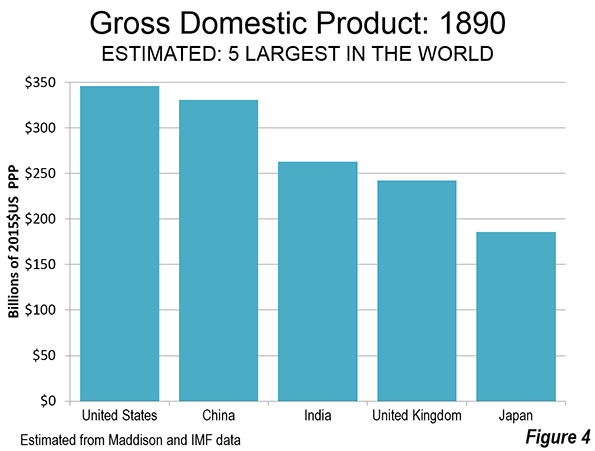
    There is a growing body of research on the consequences of excessive land use regulation. The connection between excessive land use regulation and losses in housing affordability, has been linked to  the doubling or tripling of house prices relative to incomes in places as diverse as Hong Kong, the United States, Canada, Australia, New Zealand and the United Kingdom.

    More recently, research has identified serious consequences to national economies, beyond the fact that many households cannot afford to live, much less buy a home in the metropolitan areas with excessive land use regulation. Because residents such area have less income to spend due to the higher house costs, job creation and economic growth are hobbled. Rising inequality is also being cited as a consequence of excessive land use regulation.

    The White House Economic Chairman’s Address

    The issue has caught the attention of the White House (See: “Why White House Economists Worry about Land Use Regulations”). The Chairman of the White House Council of Economic Advisers, Jason Furman delivered an address on the subject to a conference hosted by the Urban Institute and Core Logic in Washington on November 20 (See: Barriers to Shared Growth: The Case of Land Use Regulation and Economic Rents).

    Furman starts with the fundamentals: “Basic economic theory predicts—and many empirical studies confirm—that housing markets in which supply cannot keep up with demand will see housing prices rise.”

    Furman cites research by Christopher Mayer of the University of Pennsylvania and C. Tsuriel Somerville of the University of British Columbia who “conclude that land use regulation and levels of new housing construction are inversely correlated, with the ability of housing supply to expand to meet greater demand being much lower in the most heavily regulated metro areas.” (see Note 1.)

    The Association with Deteriorating Housing Affordability

    Furman told the conference that: “While land use regulations sometimes serve reasonable and legitimate purposes, they can also give extranormal returns to entrenched interests at the expense of everyone else.” He suggested that: “There can be compelling environmental reasons in some localities to limit high-density or multi-use development. Similarly, health and safety concerns—such as an area’s air traffic patterns, viability of its water supply, or its geologic stability—may merit height and lot size restrictions.”

    But, according to Furman, excessive land use regulation can severely impact the housing market:

    "…zoning regulations and other local barriers to housing development allow a small number of individuals to capture the economic benefits of living in a community, thus limiting diversity and mobility. The artificial upward pressure that zoning places on house prices—primarily by functioning as a supply constraint—also may undermine the market forces that would otherwise determine how much housing to build, where to build, and what type to build, leading to a mismatch between the types of housing that households want, what they can afford, and what is available to buy or rent."

    In effect, excessive land use restrictions feed upon themselves to exacerbate the losses in housing affordability (Note 2):

    "… some individuals are priced out of the market entirely, and homes in highly zoned areas also become even more attractive to wealthy buyers. Thus, in addition to constraining supply, zoning shifts demand outward, exerting further upward pressure on prices…"

    Broader Consequences: Rising Inequality and Labor Mobility Stagnation

    But the impacts go well beyond housing affordability losses. Furman expresses concern that the housing affordability losses in some cities make it difficult for households to move from elsewhere to take advantage of higher paying positions. He notes the impact of artificial constraints on housing supply as hindering mobility and suggesting that:

    "Zoning and other land use regulations, by restricting the supply of housing and so increasing its cost, may make it difficult for individuals to move to areas with better-paying jobs and higher-quality schools. Barriers to geographic mobility reduce the productive use of our resources and entrench economic inequality."

    He elaborated on this point:

    "Reduced labor mobility may be a contributing factor to both increased inequality and lower productivity growth in the United States. This reduction in mobility has manifested itself in a wide variety of ways, including the fact that individuals are less likely to change jobs, to switch occupations or industries, or to move within States or across State lines. Businesses are creating and destroying jobs at a lower rate and fewer new businesses are being formed, both of which could be causes or consequences of a decline in labor mobility."

    Part of the key to improving economic growth is greater job mobility.

    "…increasing mobility ‘is going to be an important part of the solution of increasing incomes and increasing incomes across generations,’"

    The greater restrictions imposed on mobility by excessive land use regulation particularly injures middle income and lower income households.

    "But when zoning restricts the supply of housing and renders housing more expensive—even relative to the higher wages in the high productivity cities—then workers are less able to move, particularly those who are low income to begin with and who would benefit most from moving. As a result, existing income inequality across cities remains entrenched and may even be exacerbated, while productivity does not grow as fast it normally would."

    Economic Growth and Distributional Consequences of Excessive Regulation

    Mr. Furman cited ground-breaking research on the economic and distributional effects of excessive land use regulation. This includes:

    Research by Raven Saks of the Federal Reserve Board, which “shows that an increase in labor demand in high regulation cities leads to a smaller increase in the housing stock, greater house price appreciation, and lower employment growth than in low regulation cities.”

    Research by Peter Ganong and Daniel Shoag of Harvard University finding that the historic convergence of incomes between higher and lower income areas of the US has declined substantially. Furman said “One story for this lack of any convergence is that only high-income workers can afford to relocate to the high-productivity cities that have tight land use regulations, which reinforces existing inequality.”

    Research by Chang-Tai Hseih of the University of Illinois, Chicago and Enrico Moretti of the University of California, Berkeley estimating a nearly 10 percent loss in national output from the reduced job mobility (Furman characterizes this modeled estimate as “tentative.”) Furman reported that the researchers attributed most of this loss to restrictions on housing supply.

    Furman also expresses concern about intergenerational equity losses and the fact that over the past four decades land use regulations, along with larger income gains for the more affluent: “have worked toward pricing middle- and lower-income families out of the communities with the best schools.” In fact, in the major metropolitan areas, excessive land use regulations started four decades ago in California and Oregon, but with effects generally similar to what Furman suggests.

    Toward Relief for Future Generations

    The answer, according to Furman is better policies:

    "Thus, within the broader context of declining migration rates, divergence across labor markets, and worsening housing affordability, pursuing more prudent zoning policies could also reduce inequality that is entrenched across generations."

    Furman also notes the importance of studying restrictions, such as excessive land regulation because such an effort can: “…make the economy more competitive by artificial barriers, thus improving both the distribution of income and the productive capacity of the economy.”

    Such improvements are genuine concerns. A year ago, the G-20 group of nations, meeting in Brisbane, adopted a communiqué declaring “better living standards” as their highest priority. They also committed to eradicating poverty. However, since last year, economic growth has been disappointing, as the post-Great Recession recovery appears stalled in second gear, at best. Yet despite the weak economy, housing affordability has deteriorated even more sharply in G-20 member states Australia, Canada, China and the United Kingdom.

    As the US research indicates, real household income growth can be severely hobbled if much or all of the modestly rising incomes is consumed by extraordinarily rising housing costs. This also does nothing to reduce, much less eradicate poverty. Governments from Sacramento and Olympia to Sydney and London should strive to improve the situation by reforming counterproductive and economically destructive land use regulations.

    Note 1: The academic references in this article are detailed in longer discussions in our new reports, A Question of Values: Middle-Income Housing Affordability and Urban Containment Policy, and Putting People First: An Alternative Perspective with an Evaluation of the NCE Cities “Trillion Dollar” Report.

    Note 2: In a footnote to the speech transcript, Furman notes that housing housing affordability requires comparison to incomes rather than simple house price comparisons: “Yet, affordability measures are relative to wages in an area not levels of house prices across cities.” This required nexus to income is not always evident in research on housing affordability.

    Wendell Cox is Chair, Housing Affordability and Municipal Policy for the Frontier Centre for Public Policy (Canada), is a Senior Fellow of the Center for Opportunity Urbanism (US), a member of the Board of Advisors of the Center for Demographics and Policy at Chapman University (California) and principal of Demographia, an international public policy and demographics firm.He is co-author of the "Demographia International Housing Affordability Survey" and author of "Demographia World Urban Areas" and "War on the Dream: How Anti-Sprawl Policy Threatens the Quality of Life." He was appointed to three terms on the Los Angeles County Transportation Commission, where he served with the leading city and county leadership as the only non-elected member. He served as a visiting professor at the Conservatoire National des Arts et Metiers, a national university in Paris.

    Photo: Entering Oregon sign

  • 2014 Journey to Work Data: More of the Same

    The major metropolitan area journey to work data is out, reported in the American Community Survey ‘s 2014 one year edition. The news is that there is not much news. Little has changed since 2010 despite all the talk about “peak car” and a supposed massive shift towards transit. Single occupant driving remains by far the largest mode of transport to work in the 53 major metropolitan areas (with over 1,000,000 population), having moved from 73.5 percent of commutes to 73.6 percent. Little upward change in single occupant commuting can be expected, since it is probably already a virtual saturation rate.

    The only significant change is the most important trend that is occurred for decades in US commuting: the reduction in carpooling. Between 2010 and 2014, carpooling dropped from 9.8 percent to 8.8 percent in the major metropolitan areas.

    Transit continued to hold on to third place, with an increase from 7.9 percent to 8.1 percent in the major metropolitan areas. Working at home, including telecommuting, continued its more dramatic rise, from 4.4 percent in 2010 to 4.7 percent in 2014. Walking remained constant at 2.8 percent, while cycling continued its increase but from a small 0.5 percent to 0.7 percent. Other modes of transport, such as taxis and motorcycles remained constant at 1.2 percent (Figure 1).

    In the major metropolitan areas, transit continued to lead over working at home (8.1 percent compared to 4.7 percent), though at the national level the margin was much smaller (5.2 percent compared to 4.5 percent). Transit strength was far more concentrated principally in a few metropolitan areas with “legacy” cities and, as a result, working at home exceeded transit’s market share in 39 of the 53 markets.

    Should carpooling continue its downward trend, it would fall below transit before the end of the decade among the major metropolitan areas (now at 8.8 percent compared to transit 8.1 percent), though the carpooling lead is sufficient to retain second-place far longer at the national level (9.2 percent compared to 5.2 percent). As in working at home, however, transit’s strength is highly concentrated relative to carpooling. Transit leads carpooling only in the six metropolitan areas with transit legacy cities (New York, Chicago, Philadelphia, San Francisco, Boston, and Washington), while carpooling leads in 47 metropolitan areas.

    Commuting market share data for the major metropolitan areas is shown in Tables 1 and 2.

    Transit Gains and Losses

    With by far the most attractive urban environment for transit use in the United States and far and away the largest system, New York dominated the transit share of the  journey to work data, adding 240,000 daily transit commuters between 2010 and 2014 (out of a national total of 576,000). Six other metropolitan areas with the strongest transit gains were San Francisco at 66,000, Chicago with 41,000, Boston with 38,000, Seattle with 34,000 and Washington with 32,000. All of these were above the next highest, Philadelphia, with 16,000. Each of these metropolitan areas, with the exception of Seattle, has a transit legacy city at its core. Overall the other 45 metropolitan areas, with nearly 70 percent of the population, accounted for less than 20 percent of the transit increase.

    Los Angeles, which has been hailed as the becoming "next transit city," seems long on intentions and construction, but wanting in results.  The laggard transit performance of Los Angeles, despite one of the world’s most aggressive rail construction programs has been described in a recent Orange County Register commentary. In 2014-2015, ridership on the legacy MTA (former SCRTD) bus and rail system was almost 10 percent below the bus only system of 1985, despite an increase in the Los Angeles County population of approximately one-quarter (see: Los Angeles; Rail for Others).

    Thirteen metropolitan areas experienced modest transit commuting losses (less than 3,000). In addition to Los Angeles, these included rail metropolitan areas Virginia Beach-Norfolk, San Diego, Buffalo, Cleveland, and Pittsburgh.

    Working at Home Gains and Losses

    The largest working at home gain was also in New York, at 40,000 (out of 499,000 in the major metropolitan areas). The second largest gain was in Los Angeles at 32,000. San Diego added 27,000 people accessing work from home. Four metropolitan areas lost commuters who work at home, though the losses were modest (less than 1,000) in all but Virginia Beach-Norfolk, where the decline was more than 11,000.

    Driving Alone Gains, No Losses

    New York also led in the number of additional commuters driving alone to work, adding more than 420,000. The other largest gainers were in Los Angeles at 325,000 and Houston at 309,000. All of the 53 major metropolitan areas added single occupant commuters and in each single occupant commuting added more than any other mode, including transit. Rochester had the smallest increase, at 7,000.

    Carpool Gains and Losses

    Despite its continuing overall losses, carpooling made gains in some metropolitan areas. Detroit led with nearly 14,000 new carpoolers, followed closely by Orlando, Portland, and Dallas-Fort Worth both added more than 10,000 new carpoolers, adding more commuters than their rail oriented transit systems.

    However, the car pool losses were generally more severe. Chicago lost nearly 36,000 carpooling commuters. Los Angeles lost 30,000, New York lost 29,000 and Tampa-St. Petersburg lost 19,000. Losses of more than 10,000 were also sustained in Washington, St. Louis, San Diego, Pittsburgh, Phoenix, Memphis, Baltimore, and Boston.

    Cycling Gains and Losses

    New York also gained the most cycling commuters, at nearly 14,000, followed by San Francisco at 13,000, Los Angeles at 10,000. Eight metropolitan areas lost cycling commuters, but only two exceeded 250, Grand Rapids (800 loss) and Riverside-San Bernardino (700 loss).

    More of the Same

    U.S. commuters continue to travel to work using the modes that have dominated for decades, with the exceptions of substantial increases in working at home and big losses in car pooling. Though even in these modes, the changes are slight in view of the dominance of single-occupant commuting, as Figure 1 indicates. This is not surprising, commuters who drive alone reach virtually anywhere in the metropolitan area and nearly always at a faster speed than any other method of commuting, save working at home.

    Table 1
    Transit Work Trip Market Share: 2014
    Major Metropolitan Areas (53 over 1,000,000 Population)
    MARKET SHARE              
    MSA Drive Alone Car Pool Transit Bicycle Walk Other Work at Home
    Atlanta, GA 77.6% 10.3% 3.1% 0.2% 1.4% 1.4% 6.2%
    Austin, TX 76.6% 10.1% 2.5% 0.7% 1.7% 1.5% 6.9%
    Baltimore, MD 77.2% 8.2% 6.6% 0.3% 2.6% 1.1% 4.0%
    Birmingham, AL 85.2% 9.1% 0.5% 0.2% 1.1% 1.1% 2.9%
    Boston, MA-NH 67.6% 6.8% 12.9% 1.0% 5.3% 1.2% 5.1%
    Buffalo, NY 82.3% 7.7% 3.0% 0.4% 2.9% 0.9% 2.9%
    Charlotte, NC-SC 81.0% 9.4% 1.9% 0.2% 1.4% 1.1% 5.1%
    Chicago, IL-IN-WI 70.9% 7.7% 11.9% 0.7% 3.2% 1.2% 4.5%
    Cincinnati, OH-KY-IN 82.8% 7.9% 2.1% 0.3% 2.0% 0.8% 4.1%
    Cleveland, OH 82.3% 6.8% 3.2% 0.3% 2.6% 0.9% 3.9%
    Columbus, OH 83.0% 7.7% 1.8% 0.5% 2.1% 0.7% 4.4%
    Dallas-Fort Worth, TX 80.8% 9.9% 1.6% 0.2% 1.2% 1.7% 4.6%
    Denver, CO 76.3% 8.8% 4.5% 0.9% 2.0% 0.8% 6.6%
    Detroit,  MI 84.0% 9.0% 1.6% 0.3% 1.3% 0.8% 3.1%
    Grand Rapids, MI 81.6% 8.9% 1.7% 0.3% 2.2% 1.4% 4.0%
    Hartford, CT 81.4% 7.8% 2.7% 0.2% 2.6% 1.1% 4.2%
    Houston, TX 80.3% 10.7% 2.4% 0.3% 1.3% 1.6% 3.4%
    Indianapolis. IN 84.2% 8.5% 1.2% 0.3% 1.3% 0.7% 3.8%
    Jacksonville, FL 80.4% 9.7% 1.2% 0.6% 1.2% 1.7% 5.2%
    Kansas City, MO-KS 83.4% 8.5% 1.0% 0.2% 1.2% 1.0% 4.7%
    Las Vegas, NV 77.6% 10.2% 4.8% 0.5% 1.6% 2.3% 3.1%
    Los Angeles, CA 74.6% 9.7% 5.8% 1.0% 2.5% 1.3% 5.1%
    Louisville, KY-IN 81.8% 9.5% 2.0% 0.3% 1.7% 1.0% 3.7%
    Memphis, TN-MS-AR 84.9% 8.6% 1.0% 0.1% 1.1% 1.7% 2.6%
    Miami, FL 78.7% 8.9% 3.7% 0.6% 1.7% 1.4% 5.0%
    Milwaukee,WI 80.6% 8.4% 3.5% 0.5% 2.6% 0.8% 3.6%
    Minneapolis-St. Paul, MN-WI 77.3% 8.6% 4.8% 1.0% 2.4% 0.9% 4.9%
    Nashville, TN 81.7% 9.8% 1.3% 0.2% 1.6% 0.8% 4.6%
    New Orleans. LA 79.2% 9.7% 3.1% 1.3% 2.3% 1.5% 2.9%
    New York, NY-NJ-PA 50.2% 6.4% 31.1% 0.6% 6.0% 1.5% 4.2%
    Oklahoma City, OK 82.8% 10.1% 0.4% 0.4% 1.5% 1.1% 3.7%
    Orlando, FL 79.8% 9.9% 2.0% 0.6% 0.9% 1.2% 5.6%
    Philadelphia, PA-NJ-DE-MD 73.0% 7.8% 9.7% 0.6% 3.7% 0.8% 4.3%
    Phoenix, AZ 77.0% 10.5% 2.1% 0.9% 1.5% 1.9% 6.1%
    Pittsburgh, PA 77.5% 8.1% 5.6% 0.4% 3.4% 0.8% 4.1%
    Portland, OR-WA 70.0% 10.2% 6.5% 2.6% 3.3% 1.0% 6.4%
    Providence, RI-MA 81.1% 7.9% 2.8% 0.5% 3.4% 0.9% 3.5%
    Raleigh, NC 80.0% 9.0% 1.0% 0.2% 1.3% 1.1% 7.3%
    Richmond, VA 81.8% 9.1% 1.7% 0.4% 1.6% 1.2% 4.2%
    Riverside-San Bernardino, CA 77.4% 13.3% 1.6% 0.3% 1.7% 1.0% 4.7%
    Rochester, NY 82.5% 6.9% 2.5% 0.7% 3.1% 0.7% 3.7%
    Sacramento, CA 76.4% 10.2% 2.7% 1.8% 2.0% 1.3% 5.5%
    Salt Lake City, UT 74.9% 12.2% 3.8% 0.8% 2.1% 0.8% 5.3%
    San Antonio, TX 80.0% 10.8% 2.1% 0.2% 1.7% 0.9% 4.3%
    San Diego, CA 76.0% 8.6% 2.7% 0.8% 2.9% 1.4% 7.5%
    San Francisco-Oakland, CA 59.2% 9.4% 16.7% 2.2% 4.7% 1.6% 6.2%
    San Jose, CA 76.2% 10.4% 4.0% 1.6% 1.7% 1.2% 4.8%
    Seattle, WA 69.0% 9.8% 9.6% 1.2% 3.6% 1.1% 5.7%
    St. Louis,, MO-IL 82.7% 7.3% 2.9% 0.3% 1.8% 0.8% 4.1%
    Tampa-St. Petersburg, FL 81.1% 7.4% 1.5% 0.9% 1.5% 1.7% 5.9%
    Virginia Beach-Norfolk, VA-NC 82.4% 8.2% 1.6% 0.5% 3.0% 1.2% 3.1%
    Tucson, AZ 77.0% 9.1% 2.9% 2.1% 2.5% 2.0% 4.5%
    Washington, DC-VA-MD-WV 66.1% 9.7% 14.3% 0.8% 3.1% 1.0% 5.1%
    Major Metropolitan Areas 73.6% 8.8% 8.1% 0.7% 2.8% 1.2% 4.7%
    Outside Major Metropolitan Areas 80.4% 9.8% 1.2% 0.5% 2.7% 1.2% 4.1%
    United States 76.5% 9.2% 5.2% 0.6% 2.7% 1.2% 4.5%
    From American Community Survey: 2014 (1 Year)


    Table 2
    Transit Work Trip Market Share: 2010 (2008-2012 ACS)
    Major Metropolitan Areas (53 over 1,000,000 Population)
    MARKET SHARE              
    MSA Drive Alone Car Pool Transit Bicycle Walk Other Work at Home
    Atlanta, GA 77.6% 10.7% 3.2% 0.2% 1.3% 1.4% 5.6%
    Austin, TX 75.0% 11.3% 2.6% 0.8% 1.8% 1.9% 6.6%
    Baltimore, MD 76.3% 9.7% 6.3% 0.3% 2.7% 0.9% 3.9%
    Birmingham, AL 84.0% 10.6% 0.7% 0.1% 1.1% 0.6% 3.0%
    Boston, MA-NH 68.8% 7.9% 11.9% 0.9% 5.3% 0.9% 4.4%
    Buffalo, NY 81.8% 8.1% 3.5% 0.4% 3.0% 0.9% 2.4%
    Charlotte, NC-SC 80.5% 10.4% 1.8% 0.1% 1.4% 0.9% 4.9%
    Chicago, IL-IN-WI 70.9% 8.8% 11.3% 0.6% 3.1% 1.1% 4.2%
    Cincinnati, OH-KY-IN 82.6% 8.7% 2.2% 0.2% 2.1% 0.7% 3.6%
    Cleveland, OH 82.1% 7.8% 3.5% 0.3% 2.1% 0.8% 3.4%
    Columbus, OH 82.6% 8.2% 1.6% 0.4% 2.1% 0.8% 4.2%
    Dallas-Fort Worth, TX 80.9% 10.5% 1.5% 0.2% 1.2% 1.3% 4.5%
    Denver, CO 75.7% 9.5% 4.5% 0.9% 2.1% 1.2% 6.0%
    Detroit,  MI 84.2% 8.7% 1.6% 0.2% 1.4% 0.8% 3.1%
    Grand Rapids, MI 82.8% 8.9% 1.2% 0.5% 1.9% 0.7% 3.9%
    Hartford, CT 81.0% 8.2% 3.1% 0.2% 2.7% 1.0% 3.8%
    Houston, TX 79.2% 11.7% 2.4% 0.3% 1.4% 1.6% 3.4%
    Indianapolis. IN 83.6% 9.0% 1.1% 0.3% 1.7% 0.8% 3.6%
    Jacksonville, FL 81.1% 9.9% 1.3% 0.6% 1.4% 1.3% 4.4%
    Kansas City, MO-KS 82.9% 9.2% 1.2% 0.2% 1.3% 1.0% 4.1%
    Las Vegas, NV 78.5% 11.1% 3.7% 0.4% 1.8% 1.5% 3.0%
    Los Angeles, CA 73.6% 10.8% 6.1% 0.9% 2.7% 1.2% 4.9%
    Louisville, KY-IN 82.9% 9.3% 2.1% 0.3% 1.7% 0.8% 2.9%
    Memphis, TN-MS-AR 82.8% 10.7% 1.3% 0.1% 1.3% 1.0% 2.8%
    Miami, FL 78.2% 9.8% 3.7% 0.6% 1.8% 1.4% 4.5%
    Milwaukee,WI 79.9% 9.2% 3.6% 0.5% 2.8% 0.7% 3.2%
    Minneapolis-St. Paul, MN-WI 78.1% 8.6% 4.6% 0.9% 2.3% 0.8% 4.7%
    Nashville, TN 81.5% 10.4% 1.1% 0.2% 1.2% 0.9% 4.6%
    New Orleans. LA 79.0% 10.9% 2.6% 0.8% 2.4% 1.6% 2.6%
    New York, NY-NJ-PA 51.0% 7.1% 29.9% 0.5% 6.1% 1.6% 3.9%
    Oklahoma City, OK 82.9% 10.4% 0.5% 0.3% 1.6% 1.1% 3.3%
    Orlando, FL 81.1% 9.3% 1.9% 0.5% 1.1% 1.7% 4.5%
    Philadelphia, PA-NJ-DE-MD 73.4% 8.2% 9.4% 0.6% 3.7% 0.8% 3.8%
    Phoenix, AZ 76.4% 11.9% 2.1% 0.8% 1.6% 1.6% 5.6%
    Pittsburgh, PA 76.9% 9.3% 5.7% 0.2% 3.6% 0.9% 3.5%
    Portland, OR-WA 71.2% 9.7% 6.1% 2.2% 3.5% 1.0% 6.3%
    Providence, RI-MA 80.8% 8.8% 2.7% 0.3% 3.2% 0.9% 3.3%
    Raleigh, NC 80.6% 9.6% 1.0% 0.3% 1.4% 1.2% 5.9%
    Richmond, VA 81.3% 9.6% 2.0% 0.4% 1.4% 0.8% 4.5%
    Riverside-San Bernardino, CA 76.2% 14.4% 1.6% 0.4% 1.8% 1.1% 4.4%
    Rochester, NY 81.4% 8.4% 1.9% 0.5% 3.6% 0.7% 3.5%
    Sacramento, CA 75.1% 11.6% 2.7% 1.8% 2.0% 1.2% 5.6%
    Salt Lake City, UT 75.9% 12.0% 3.5% 0.8% 2.3% 1.2% 4.3%
    San Antonio, TX 79.1% 11.5% 2.2% 0.1% 1.9% 1.2% 3.9%
    San Diego, CA 75.9% 10.2% 3.1% 0.7% 2.7% 1.1% 6.3%
    San Francisco-Oakland, CA 61.5% 10.3% 14.7% 1.7% 4.3% 1.4% 6.0%
    San Jose, CA 76.5% 10.4% 3.2% 1.7% 2.1% 1.4% 4.7%
    Seattle, WA 69.7% 11.0% 8.3% 1.0% 3.6% 1.1% 5.3%
    St. Louis,, MO-IL 82.6% 8.4% 2.5% 0.3% 1.7% 0.8% 3.7%
    Tampa-St. Petersburg, FL 80.3% 9.5% 1.4% 0.7% 1.6% 1.4% 5.2%
    Virginia Beach-Norfolk, VA-NC 80.6% 9.0% 1.8% 0.4% 2.6% 1.1% 4.4%
    Tucson, AZ 76.5% 10.3% 2.4% 1.5% 2.5% 2.0% 4.8%
    Washington, DC-VA-MD-WV 66.0% 10.6% 14.0% 0.6% 3.2% 0.9% 4.7%
    Major Metropolitan Areas 73.5% 9.6% 7.9% 0.6% 2.8% 1.2% 4.4%
    Outside Major Metropolitan Areas 80.8% 9.8% 0.9% 0.5% 2.7% 1.2% 4.2%
    United States 76.6% 9.7% 4.9% 0.5% 2.8% 1.2% 4.3%
    From American Community Survey:2008-2012


    Wendell Cox is Chair, Housing Affordability and Municipal Policy for the Frontier Centre for Public Policy (Canada), is a Senior Fellow of the Center for Opportunity Urbanism (US), a member of the Board of Advisors of the Center for Demographics and Policy at Chapman University (California) and principal of Demographia, an international public policy and demographics firm.He is co-author of the “Demographia International Housing Affordability Survey” and author of “Demographia World Urban Areas” and “War on the Dream: How Anti-Sprawl Policy Threatens the Quality of Life.” He was appointed to three terms on the Los Angeles County Transportation Commission, where he served with the leading city and county leadership as the only non-elected member. He served as a visiting professor at the Conservatoire National des Arts et Metiers, a national university in Paris.

    Photo: Harbor Freeway (I-110), Los Angeles (by author)

  • A Question of Values: Middle-Income Housing Affordability

    This is the Executive Summary from a new report “A Question of Values: Middle-Income Housing Affordability and Urban Containment Policy" authored by Wendell Cox and published by the Frontier Centre for Public Policy. Ailin He, a PhD doctoral candidate in economics at McGill University served as research assistant.

    The "report is a public policy narrative on the relationships between urban containment policy, housing affordability and national economies. It is a synthesis of economic and urban planning analysis that is offered as a policy evaluation of urban containment. The analysis is presented in the context of higher-order objectives of domestic policy: improving the standard of living and eradicating poverty" (Page 9). The research focuses on the international experience, especially in Canada, Australia, New Zealand, the United Kingdom and the United States. Download the full report (pdf) here.

    Middle-income housing affordability is important to people and the economy: Canada’s house prices have risen more than house prices in most other high-income nations. This is of concern, because higher house prices reduce discretionary incomes, which defines the standard of living and poverty. If discretionary incomes are reduced, households will have less to spend on other goods and services, which can retard job creation and economic growth. Improving the standard of living and eradicating poverty are among the highest-order domestic priorities.

    Urban containment policy can lead to higher house prices: Urban land-use regulation has become stronger in many metropolitan areas and often includes urban containment policy. Urban containment severely restricts or bans development in urban fringe areas. Consistent with basic economics, this increases land values and house prices (all else equal). The planning intention and expectation is that higher housing densities will offset the land-price increases and that housing affordability will be maintained.

    Severe losses in housing affordability have been experienced in urban containment markets: Top housing and economic experts attribute much of the loss in housing affordability to stronger land-use policy.

    Housing affordability losses have been sustained in the five nations this report focuses upon: Across the United Kingdom, Australia, New Zealand and some markets in Canada and the United States, house prices have nearly doubled or tripled compared with household incomes as measured by price to income ratios. Much of this has been associated with urban containment policy.

    Demand and supply: Some research suggests that the huge house-price increases have occurred due to higher demand and the greater attractiveness of metropolitan areas that have urban containment policy. However, the interaction of supply and demand sets house prices. Claims that metropolitan areas with urban containment policy are more attractive are countered by their net internal out-migration and diminished amenities for some households.

    An intrinsic urban containment amenity seems doubtful: Some urban containment advocates claim that urban containment policy intrinsically improves amenities (such as a dense urban lifestyle). However, whether a feature is an amenity depends on individual preferences. Moreover, the strong net internal migration away from many metropolitan areas with urban containment policy is an indication that there is no urban containment amenity for most households.

    Higher densities have not prevented huge losses in housing affordability: In contrast with planning expectations, the land-value increases expected from urban containment have not been nullified by higher densities within urban containment boundaries.

    Intervening urban containment boundaries are more influential than topographic barriers: It has been suggested that topographic barriers such as mountains and the ocean cause higher house prices. However, in urban containment metropolitan areas, urban containment boundaries are usually placed between the built-up urban areas and the topographic barriers. As a result, house-price increase associated with the land shortage will be principally associated with the urban containment boundary, not the topographic barrier.

    A competitive land supply is required for housing affordability: A risk with urban containment policy is that by limiting the land for sale, large landholders will seek to buy up virtually all of the land for future gain. Without urban containment, there will not be a land shortage, and there will not be an incentive to monopolize the land supply. A sufficient land supply can be judged to exist only if prices relative to incomes are not higher than before the urban containment policy came into effect.

    Urban containment policy has been associated with reduced economic growth: Evidence suggests that urban containment policy reduces job creation and economic growth. The increased inequality noted by French economist Thomas Piketty is largely attributed to the housing sector and is likely related to strong regulation. Other research estimated a US$2-trillion loss to the U.S. economy, much of it related to strong land-use regulation, and called this “a large negative externality.”

    Urban containment policy has important social consequences: There are also important social consequences such as wealth transfers from younger to older generations and from the less-affluent to the more-affluent households.

    Urban containment policy has failed to preserve housing affordability: Some have expressed concern that urban containment policy might not have been implemented if there had been the expectation of losses in housing affordability. In fact, the administration of urban containment policy has been deficient, with corrective actions largely not taken despite the considerable evidence of losses in housing affordability. In urban containment markets, programs should be undertaken to stop the further loss of housing affordability and transition toward restoring housing affordability. Further, urban containment should not be implemented where it has not already been adopted.

    Canada could be at risk: Canada could be at greater risk in the future. Already, huge losses in housing affordability have been sustained in Vancouver and Toronto. Other metropolitan areas are strengthening land-use regulations. This could lead to severe consequences such as lowering middle-income standards of living and greater poverty with less job creation and less economic growth.

    The urban containment debate is fundamentally a question of values: Ultimately, the choice is between the planning values of urban design or urban form and the domestic policy values of improving the standard of living and reducing poverty. Urban containment policy appears to be irreconcilable with housing affordability. Proper prioritization requires that the higher-order values of a better standard of living and less poverty take precedence.

    Download the full report (pdf) here.

    Wendell Cox is Chair, Housing Affordability and Municipal Policy for the Frontier Centre for Public Policy (Canada), is a Senior Fellow of the Center for Opportunity Urbanism (US), a member of the Board of Advisors of the Center for Demographics and Policy at Chapman University (California) and principal of Demographia, an international public policy and demographics firm.He is co-author of the “Demographia International Housing Affordability Survey” and author of “Demographia World Urban Areas” and “War on the Dream: How Anti-Sprawl Policy Threatens the Quality of Life.” He was appointed to three terms on the Los Angeles County Transportation Commission, where he served with the leading city and county leadership as the only non-elected member. He served as a visiting professor at the Conservatoire National des Arts et Metiers, a national university in Paris.

  • Auckland Tackles Housing Affordability Crisis

    City of Auckland Chief Economist Chris Parker has called for establishment of a house price to income ratio objective of 5.0, to be achieved by 2030. The recommendation was included in a report commissioned by Auckland Mayor Len Brown and Deputy Mayor Penny Hulse.

    Housing Affordability and Urban Containment Policy

    The recommendation has been brought about in response to Auckland’s severely unaffordable housing. Recent reports indicate a price to income ratio over 9.0, at least triple that of New Zealand to the early 1990s.

    Like a number of metropolitan areas, Auckland has had urban containment land-use policy for some time. Auckland has drawn an urban growth boundary around development, largely banning new greenfield housing outside the boundary. As economics would predict, with a continuation of strong housing demand and the significant supply reduction, house prices have been shot skyward. The latest Demographia International Housing Affordability Survey showed Auckland to have a median multiple of 8.2 (the median multiple is the median house price divided by the median household income), though later data indicates a further deterioration (above).

    Avoiding the Consequences of Urban Containment

    House price volatility has been a growing concern in urban containment markets where house prices have escalated so strongly relative to incomes and economic productivity. The bursting of the US housing bubble in the last decade indicates the damage that can be inflicted on people and their finances when exorbitantly high house prices collapse. This is a fate governments seek to avoid not only in Auckland, but at the national level.

    According to Parker’s report, the city of Auckland is expected to add 1 million additional residents over the next 30 years. Parker indicated that: "If high house prices are sustained or continue to rise relative to incomes then … consequences and risks will become more significant:" He cited:

    "-loss of social cohesion — an increasingly socially divided city with a line drawn between those in the housing market and those outside

    -macroeconomic instability via rapid house price deflation.

    -Increased unemployment as businesses relocate activities to other more competitive cites locally (e.g. Christchurch, Hamilton, Tauranga) and internationally (e.g. Melbourne and Sydney)

    -Increased household crowding and related social ills."

    City Councilor Dick Quad echoed similar concerns in an email: "It’s staggering that Auckland’s homeownership is now down to 50% from 64% just 9 years ago. The social chaos we are creating can be seen on a daily basis with overcrowding, third world diseases (resulting from overcrowding) poor educational outcomes, and a city in which the landed gentry have grabbed all the wealth. We are engaged in a social experiment which is destined to end in disaster.”

    Councilor Quax applauded Parker’s work, but had concerns about implementation, indicating that the policy "flies in the face of what many of our politicians believe."

    According to Parker, reaching that the objective will include a number of both supply and demand side strategies. Most, importantly, Parker’s list includes opening greenfield land for development. Even urban containment (smart growth) theorists agree that the imposition of urban containment boundaries, such as in Auckland, is associated with higher land prices within the urban area. Their hopes that higher density housing would cancel out the housing affordability losses have been dashed, due to the massive increase in land costs. For example, comparable land on either side of Auckland’s urban containment boundary varies by a minimum of 8 times. Without the boundary, the expected difference would be virtually nil. In addition, high density housing is considerably more expensive to build than the detached housing people prefer.

    Yet, only in a few places have policymakers taken the important step from failed intentions to the reforms necessary to reverse the housing affordability losses. Among the major metropolitan areas with the most severe urban containment policies, house prices have risen to two to three times the rate of household incomes.

    The "Good:" Better than an Unattainable "Perfect"

    Even if the 5.0 price to income multiple were achieved by 2030, housing would remain seriously unaffordable in Auckland. Parker argues that a lower target (such as the 3.0 Demographia International Housing Affordability Survey standard) would not likely be achievable:

    "It is doubtful that a 5.0 median price multiple could be achieved considerably earlier than 2030. (Unless there was a substantial bust, which should be avoided, given that so much is now at stake with existing high prices and the macroeconomic risks that would result.) The types of changes needed are structural (and change at a glacial pace), and will take many years to compound."

    His point is well taken. The "perfect" strategy of a 3.0 objective could well be the enemy of the good.
    Reaching a 5.0 price to income multiple by 2030 would be a great improvement. Two decades of housing market distortion cannot be erased overnight.

    The alternative could be continued house price increases in a policy environment that continues to outlaw building the new housing that people prefer.

    As the city continues to examine options for improving housing affordability, it will be important to set interim objectives, such as annual improvements or perhaps improvements on a three year basis. Further, it will be important for the city to continually review its policies and liberalize regulation even further if the targets are not reached.

    Setting an Example

    Auckland could be taking a significant step by seeking to reverse the damage done by out-of-control house prices. Certainly, the prodding it has received from the New Zealand government has helped. Just a couple of weeks ago, Deputy Prime Minister Bill English told a university audience: "… while the justification for planning is to deal with externalities, what has actually happened is that planning in New Zealand has become the externality." Research commissioned by the Productivity Commission of New Zealand may have also been influential.

    The city’s Auckland Development Committee recently endorsed Parker’s proposal and agreed "in principle" to include the objective in the next update of Auckland’s metropolitan plan. By lowering  housing costs, the city  would improve standards of living and reduce poverty. Auckland could also become an example for metropolitan areas as diverse as Vancouver, San Francisco, Portland, and London, where all of the talk about improving housing affordability has remained just that, while prices continue to soar beyond the means of the middle class, particularly young families

    Wendell Cox is Chair, Housing Affordability and Municipal Policy for the Frontier Centre for Public Policy (Canada), is a Senior Fellow of the Center for Opportunity Urbanism (US), a member of the Board of Advisors of the Center for Demographics and Policy at Chapman University (California) and principal of Demographia, an international public policy and demographics firm.He is co-author of the “Demographia International Housing Affordability Survey” and author of “Demographia World Urban Areas” and “War on the Dream: How Anti-Sprawl Policy Threatens the Quality of Life.” He was appointed to three terms on the Los Angeles County Transportation Commission, where he served with the leading city and county leadership as the only non-elected member. He served as a visiting professor at the Conservatoire National des Arts et Metiers, a national university in Paris.

    Lead photo: City of Auckland Coat of Arms by Jayswipe (Heraldry photos) [Public domain], via Wikimedia Commons

  • The Houses Americans Choose to Buy

    The US preference for detached housing remains strong, according to the newest data just released in the 2014 American Community Survey, by the United States Census Bureau. In 2014, detached house and represented 82.4 percent of owned housing in the United States. This is   up 1.8 percentage points from the 80.6 percent registered in the 2000 census. The increase may be surprising, given the efforts of planners to steer people into higher density housing, especially apartments.

    The US Situation in 2014

    Among owned housing, mobile homes ranks second only to detached housing. Attached houses, which are ground oriented units with common walls, such as townhomes and semi detached homes (also called duplexes) are the third most popular form of owned housing, accounting for 5.7 percent of units in 2014. Perhaps surprisingly, the apartments planners prefer ranked fourth preference among households buying their own homes. Apartments, which include lower rise, midrise and high-rise condominiums account for 5.5 percent of owned housing. (Figure 1). The fifth, and by far the smallest category of owned housing is "Boats, RVs, Vans, Etc., which represented 0.1 percent of owned housing.

    Trend Since 2000

    There were approximately 4.7 million more detached houses in 2014 than in 2000. This means that 114 percent of the new owned housing stock was detached housing. Despite their second ranking among housing types, there were substantial losses in the number of mobile homes. In 2014 there were approximately 1.1 million fewer mobile homes and continuing losses could drop mobile homes below attached homes and apartments over the next decade. Mobile homes are often transitional for households aspiring to afford detached or even attached housing. Attached homes enjoyed a strong increase of approximately 410,000 units. The strong detached and attached housing increase could reflect, in part, the realization of those aspirations.

    Apartments, which were within 15,000 of attached houses in 2000, dropped to approximately 270,000 behind, while adding only 160,000 owned units. In view of the strong condominium construction rates in some cities, this may be surprising. On the other hand, it could be indicative of the "dark and empty" thesis that many of the new units have been purchased for only occasional use and not as primary residences, some rented out by owners (Figure 2).

    There was an 18,000 unit loss in "Boats, RVs, Vans, Etc."

    Owned Housing by Metropolitan Classification

    The preference for detached housing was pervasive, even in the metropolitan areas with the largest pre-World War II urban cores (identified using the City Sector Model). Nearly 71 percent of owned housing is detached in these metropolitan areas, which include New York, Los Angeles, Chicago, Philadelphia, Washington, Boston and San Francisco. The detached housing percentage rises to 85 percent in the other 46 metropolitan areas with more than 1 million population and is similar for the 53 metropolitan areas between 500,000 and 1 million population. Among the 106 metropolitan areas with more than 500,000 population, the percentage of detached housing increased in 86.

    The detached housing share is a smaller 80 percent outside these largest metropolitan areas.

    The defining difference between the metropolitan areas with the largest cores is in owned apartments, which represent 15 percent of owned housing. This is more than three times the rate of owned apartments in the other 46 major metropolitan areas and the 53 metropolitan areas with between 500,000 and 1,000,000 population (Figure 3).

    Housing Types by Metropolitan Areas

    Among the 106 metropolitan areas, 86 have detached percentages of owned housing of 80 percent or more. The highest detached housing percentage is in Omaha, at 94.8 percent. Modesto trails closely at 94.4 percent. This may not be surprising, since so many households have been driven away from close enough-for-a-long-commute San Francisco Bay Area by its exorbitant house prices and severely constrained housing choices. Detached housing is now a luxury in the Bay Area well beyond the resources of middle income households who did not buy their homes in the past, when prices were lower.

    The gap between second and third is much larger, with Dayton having a detached housing percentage of 92.8 percent, followed closely by Kansas City (92.7 percent), Memphis (92.6 percent) and Wichita (92.4 percent). Stockton, at 92.3 percent has attracted so many San Francisco Bay Area residents that it is now a part of the San Francisco Bay combined statistical area ranks eighth, (Figure 4).

    The lowest rates of detached owned housing are in Miami (63.8 percent), Philadelphia (63.9 percent), New York (65.4 percent), Baltimore (65.4 percent), and Honolulu (66.0 percent).

    Philadelphia and Baltimore compensate substantially for their low detached housing percentage by leading in attached housing, which is widely dispersed in both the core municipalities and the suburbs. More than 30 percent of Philadelphia’s owned housing is attached, and 27 percent of Baltimore’s. In Washington and Allentown more than 20 percent of owned housing is also attached (Figure 5).

    Honolulu has the largest percentage of owned apartment housing, at 26.6 percent. New York (24.1 percent) and Miami (23.6 percent) follow. Only two other metropolitan areas, have more than 15 percent of their owned housing in apartments, Boston and Chicago (Figure 6).

    All of the metropolitan areas with the 10 highest percentages of mobile homes are in the South, with the exception of Tucson. Lakeland, Florida has by far the largest mobile on percentage, and over 20 percent. McAllen, Sarasota, Baton Rouge and Tucson complete the top five, ranging from 12.6 percent to 14.5 percent (Figure 7).

    As noted above, the percentages of owned housing in the "Boats, RVs, Vans, Etc." category are much smaller. McAllen has the largest share at 1.2 percent. The top 5 is rounded out by Bakersfield, Phoenix, Portland (OR-WA) and Tucson (Figure 8).

    The Detached House: Still King

    Three decades ago, historian Robert Fishman wrote: "For the first time in any society, the single-family detached house was brought within the economic grasp of the majority of households" (Note). The US may have been first, but it is not alone. The same observation can be made for other nations, such as Japan, Canada, Australia, New Zealand and Norway. The detached house is alive and well in the United States and may even be increasing its domination.

    Note: This quotation is from Fishman’s "Bourgeois Utopias: The Rise and Fall of Suburbia" (page 183). The subtitle should not be interpreted to suggest that this is another superficial anti-suburban screed. In fact, Fishman’s point can be interpreted as indicating that suburbia has been replaced by a new type of city, even less connected with the former dominant (monocentric) core.

    Photo: Minneapolis-St. Paul suburbs (author)

    Wendell Cox is Chair, Housing Affordability and Municipal Policy for the Frontier Centre for Public Policy (Canada), is a Senior Fellow of the Center for Opportunity Urbanism (US), a member of the Board of Advisors of the Center for Demographics and Policy at Chapman University (California) and principal of Demographia, an international public policy and demographics firm.He is co-author of the "Demographia International Housing Affordability Survey" and author of "Demographia World Urban Areas" and "War on the Dream: How Anti-Sprawl Policy Threatens the Quality of Life." He was appointed to three terms on the Los Angeles County Transportation Commission, where he served with the leading city and county leadership as the only non-elected member. He served as a visiting professor at the Conservatoire National des Arts et Metiers, a national university in Paris.

  • Planning has Become the Externality: New Zealand Deputy Prime Minister

    One of the frequently cited justifications for urban planning is to mitigate negative externalities — detrimental impacts that people or organizations impose on others in society. While acknowledging this, New Zealand Deputy Prime Minister Bill English charged that urban planning itself has become the externality, by virtue of its impact on house prices, equality and the economy in New Zealand.

    In a speech to the Victoria University Business and Investment Club in Wellington, the Deputy Prime described the government’s program to reverse the decline in housing affordability  that have seen national prices relative to incomes (the median multiple) nearly triple, to 8.0, in Auckland, the largest metropolitan area. He outlined three motivations for the government’s policy:

    Consequences of Planning: The Economy

    English said: "The first is that a housing market that is not properly functioning can have a significant effect on the macro-economy."

    "Over the last five years, the Auckland housing market has been the single biggest imbalance in our macro-economic system.

    The point is that when the supply of housing is relatively fixed, shocks to demand – like migration flows increasing sharply as they have recently – are absorbed through higher prices rather than the supply of more houses."

    He noted the destabilizing effect of strong land use regulation:

    "What they’ve [economic researchers] found is that, across different markets subject to rules which vary by state, more-intense regulation of urban development is associated with higher house price volatility.

    The effects of planning rules can extend to the macro-economy.

    Research indicates that when planning rules prevent workers shifting to higher-productivity locations, then there is a cost in terms of foregone GDP."

    It’s only relatively recently that economists and politicians have understood the scale of those effects.

    So when we’re talking about something as apparently dry as the Auckland Unitary Plan [metropolitan land use plan], we’re talking about a set of rules that will have a major impact on the city, on current and future residents – but also on the wider economy."

    Consequences of Planning: Increased Inequality

    English went on to say: The second reason we focus on planning and its consequences is that poor planning drives inequality.

    "Poor regulation of housing has the largest proportionate effect on the lowest quartile of housing costs and rents.

    So when we’re having the debate about whether there is sufficient land available, we have to recognise that the people who lose the most from getting that decision wrong – and who stand the most to gain from fixing those decisions – are those on the lowest incomes."

    Housing costs are becoming a larger proportion of incomes – and that matters the most at the bottom end of incomes among people who have few choices.

    The new supply of lower-priced, affordable housing has dried up.

    There are parts of Auckland where no new houses are entering the market priced at the affordable end of the market.

    It is not surprising to see prices and rents rising disproportionately at the bottom end given this lack of supply."

    The Deputy Prime Minister also said: "Planning is often seen a public good activity that must address the needs of those who are most-vulnerable and have the lowest income," and noted:

    In fact there is a strong argument to say it does exactly the opposite.

    Poor planning favours "insiders" – homeowners – on high incomes and who have relatively high wealth.

    In particular he mentioned strategies that drive up prices:

    Those rules include urban limits [urban growth boundaries], minimum lot sizes which prevent subdivision below a certain size, and maximum site coverage rules which prevent a house covering more than a certain proportion of the lot.

    Working in combination, these rules reduce opportunities to develop affordable homes.

    He has particular criticism for Auckland’s urban growth boundary and its impact on house prices:

    "Another indicator relates to Auckland’s former Metropolitan Urban Limit, now called the Rural-Urban Boundary.

    A study found that the value of land just inside the urban boundary was ten times higher than the value of land just outside it.

    That huge price difference around an arbitrarily-selected line on a map indicates that there are housing opportunities outside that boundary that cannot be taken because of planning restrictions.

    Consequently, first home buyers trying to access the housing market are being prevented by land prices inflated by an urban boundary."

    English also cited the paradox that the higher house prices driven by excessive regulation lead to additional, more expensive requirements (called "inclusive zoning" in the United States).

    Now that planners are recognising these consequences, they are now creating even more rules to offset these effects; for example by requiring some developments to include up to 20 per cent affordable housing.

    That is implicit recognition that planning rules have driven the costs up so much that another rule is required to offset it.

    Consequences of Planning: Higher Government Costs

    English said that the third motivation is the fiscal cost to Government: "The impact of these rules on inequality, and on household incomes, leads to a third reason for why the Government is focused on the housing market."

    "Today we spend $2 billion each year on accommodation subsidies. 60 per cent of all rentals in New Zealand are subsidised by the Government.

    The state owns around $21 billion worth of houses.

    One house in every 16 in Auckland is a Housing New Zealand property."

    Planning as the Externality

    The Deputy Prime Minister says that planning has, in effect, abandoned its public purpose:

    "For those among you who are economists, I would go so far as to say that while the justification for planning is to deal with externalities, what has actually happened is that planning in New Zealand has become the externality.

    It has become a welfare-reducing activity.

    And as with other externalities, such as pollution, the Government has a role to intervene, working with councils to manage the externality.

    We’re starting to get analysis that shows planning’s costs."

    The Costs of Planning

    It is not only in New Zealand that urban planning has become a negative externality. From London to Vancouver, San Francisco, Sydney and elsewhere (God forbid, even Liverpool) the land rationing strategies of urban planning policies have been associated with the losses in housing affordability, with an up to tripling of house prices relative to household incomes. These policies have lead to significant economic losses, including expanded inequality and labor market distortions. Important domestic goals shared by nations around the world, such as improving the standard of living and reducing poverty cannot be addressed efficiently or effectively in such an environment.

    Wendell Cox is Chair, Housing Affordability and Municipal Policy for the Frontier Centre for Public Policy (Canada), is a Senior Fellow of the Center for Opportunity Urbanism (US), a member of the Board of Advisors of the Center for Demographics and Policy at Chapman University (California) and principal of Demographia, an international public policy and demographics firm.He is co-author of the “Demographia International Housing Affordability Survey” and author of “Demographia World Urban Areas” and “War on the Dream: How Anti-Sprawl Policy Threatens the Quality of Life.” He was appointed to three terms on the Los Angeles County Transportation Commission, where he served with the leading city and county leadership as the only non-elected member. He served as a visiting professor at the Conservatoire National des Arts et Metiers, a national university in Paris.

    Photo: Auckland Harbour Bridge (by author)

  • New Report: Putting People First

    This is the abstract from a new report “Putting People First: An Alternative Perspective with an Evaluation of the NCE Cities ‘Trillion Dollar’ Report,” authored by Wendell Cox and published by the Center for Opportunity Urbanism. Download the full report (pdf) here.

    A fundamental function of domestic policy is to facilitate better standards of living and minimize poverty. Yet favored urban planning policies, called "urban containment" or "smart growth," have been shown to drive the price of housing up, significantly reducing discretionary incomes, which necessarily reduces the standard of living and increases poverty.

    This makes the alleviation of poverty, the opportunity for better living standards and aspirations for upward mobility secondary to contemporary urban planning prescriptions. Despite this, calls to intensify land use regulations are becoming stronger and more insistent.

    A New Climate Economy report (NCE Cities report), by Todd Litman, "Analysis of Public Policies that Unintentionally Encourage and Subsidize Urban Sprawl," contends that the failure to implement urban containment policy (smart growth) costs more than $1.1 trillion annually in the United States. The urban containment policies favored by the NCE Cities report seek substantially increase urban population densities and transfer urban travel from cars to transit, walking and cycling.

    There are serious consequences to such policies, which lead to lower standards of living and greater poverty. This report evaluates the NCE Cities report which places urban containment policy as its most important priority. This Evaluation report offers an alternate vision, focused on improving living standards for all, while seeking to eradicate poverty.

    The NCE Cities report relies heavily on social costing and externality analysis of lower density development. While these are useful tools, they are ultimately subjective and should be used with great caution.

    This Evaluation identifies a number of issues with respect to the NCE Cities report cost analysis.

    1. Nearly 90% of the cost is attributable to personal vehicle use, and is based on a fixed cost per mile differential between the Most Compact (densest) quintile of US urban areas and the four quintiles that are less dense. This Evaluation finds a range of differences in per capita mileage among the quintiles that is far smaller than the NCE Cities report estimates. Adjustment for this and other issues would reduce the NCE Cities report cost estimate by nearly 85 percent, to a maximum that is under $200 billion. Other, unquantified issues are identified that could reduce the reduced estimate even further.

    2. The NCE Cities report largely dismisses the housing affordability consequences of urban containment policy. By rationing land, urban containment policy drives up the price of housing and has been associated with an unprecedented loss of housing affordability in a number of metropolitan areas in the United States and elsewhere. Urban containment policy has also been associated with greater housing market volatility. This is a particular concern given the role of the 2000s US housing bubble and bust in precipitating the Great Financial Crisis that resulted in a reduction of international economic output.

    3. Urban containment policy has significant negative externalities. A recent economic analysis associates an annual loss of nearly $2 trillion in gross domestic product in the United States with more stringent housing regulation. This estimate would nullify the NCE Cities report cost of dispersion estimate by more than 1.5 times. More significantly, it would dwarf the NCES Report cost estimate as adjusted in this Evaluation.

    The purpose of public policy in cities is not to focus a particular urban form, planning philosophy, type of housing, population density, or mode of transport. The purpose is rather to seek better lives for people. The most appropriate form of urban planning policy is that which facilitates better living standards and less poverty. There is increasing evidence that urban containment policy is not only irreconcilable with housing affordability and price stability but also with better standards of living and reduced poverty.

    Download the full report (pdf) here.

    Wendell Cox is Chair, Housing Affordability and Municipal Policy for the Frontier Centre for Public Policy (Canada), is a Senior Fellow of the Center for Opportunity Urbanism (US), a member of the Board of Advisors of the Center for Demographics and Policy at Chapman University (California) and principal of Demographia, an international public policy and demographics firm.He is co-author of the "Demographia International Housing Affordability Survey" and author of "Demographia World Urban Areas" and "War on the Dream: How Anti-Sprawl Policy Threatens the Quality of Life." He was appointed to three terms on the Los Angeles County Transportation Commission, where he served with the leading city and county leadership as the only non-elected member. He served as a visiting professor at the Conservatoire National des Arts et Metiers, a national university in Paris.

  • 500 Years of GDP: A Tale of Two Countries

    Last year (2014), China overtook the United States in gross domestic product adjusted for purchasing power (GDP-PPP, see point 4 for explanation), according to both the International Monetary Fund (IMF) and the World Bank (Note 1). It may come as a surprise, but this is really a matter of China simply reasserting its position as the world’s largest economy, which it had lost around 1890 to the United States. This is based on estimates developed by the late legendary economist Angus Maddison of the Organization for Economic Cooperation and Development (OECD).

    Over the 515 years from 1500 to 2015, the available data seems to suggest that the largest economy in the world almost always been either China or the United States. The one exception indicated was in 1700, when India had the highest GDP (for most years there is only incomplete data). This article provides highlights of GDP PPP data in US$2015 (Note 2), beginning less than a decade after Columbus "discovered America" and less than 70 years after the last great pre-Columbian Chinese sailing expedition, led by Admiral Zheng He. Maddison’s data is used and adjusted to 2015$ through 1970, with IMF data used for 1980 to 2015.

    Further, in the earlier years, virtually all nations had very low GDPs per capita. This was to begin changing with the industrial revolution. Thus, the early data can be characterized as being strongly related to population, because there was much less difference in GDP per capita based on level of development.

    1500: In 1500, China was the largest economy in the world, followed closely by India, both with estimated GDP’s of approximately $100 billion. France was a distant third at approximately 18 billion, followed closely by Italy and Germany. What is now the United Kingdom ranked 10th, at barely one quarter the output of France (Figure 1).

    1700: This was the only reported year between 1500 and 2015 that China or the United States did not lead the world. India had the strongest economy in 1700, closely followed by China. Throughout the entire period to the middle of the 20th century, China’s economy was larger than India’s by a relatively small margin. At the same time “the great powers” of the West were still well behind China and India, with France retaining third-place with a GDP less than one fourth that of China and 1/6 that of India. The United Kingdom was yet to break into the top five, ranking eighth (Figure 2).

    1820: By 1820, the next year for which full data is available, China resumed its lead and by a larger margin. India was second, slightly more than one half that of China. The United Kingdom finally appears, in third-place with a GDP one sixth that of China and only slightly ahead of France (Figure 3). The available data shows China to have retained the top position through 1870.

    1890: By 1890, the United States had emerged as the world’s largest economy, opening up an approximately five percent lead over China. India ranked third, followed by the United Kingdom and Japan (Figure 4).

    1930: By 1930, the ascendancy of the United States was clear. China, then reeling from social disorder and civil strife, still remained the second largest economy, but trailed the United States by approximately two thirds. There was little difference between China and the next three largest economies, Germany, the United Kingdom and India (Figure 5).

    1980: Half a century later, in 1980, the United States retained a similar lead, but now over second-ranked Japan. Germany was a close third, followed by Italy and France. India ranked ninth, approximately 30 percent ahead of 10th ranked China. Then the Deng Xiaoping era was getting underway (Figure 6), leading to China’s resurgence back towards the top.

    2010: China’s ascendancy was obvious by 2010, reaching within 20 percent of the United States, which remained number one. This had been a dramatic reversal, since China’s GDP had been little more than one tenth that of the United States only 30 years earlier (1980). India was also restored to a leadership position, ranking third. Japan was fourth and Germany was fifth (Figure 7).

    2015: The 2015 IMF projections show China to have recovered first-place after at least a 125 year hiatus. The United States was second, approximately four percent behind China. India, Japan and Germany remained in third, fourth and fifth place (Figure 8). The BRIIC developing nations are in the top 10, with Russia, Brazil and Indonesia ranking sixth through eighth (in addition to China and India in first and third place). Two other powers of Europe round out the top 10, the United Kingdom and France.

    Observations

    The impact of China’s difficult 19th century is indicated by a 10% GDP decline, despite an increasing population. It seems likely that this is at least partially attributable to the Opium Wars, treaty ports and related extraterritorial jurisdiction by external powers. China’s GDP in 1900 had fallen 10 percent from its 1820 level.

    It is notable that through much of their empire-colonial relationship between the United Kingdom and India, the colony had the larger GDP. This was the case from 1820 through 1900. This is principally due to the larger population of India. For example, in 1870, India’s GDP was one-third larger than that of the United Kingdom. In the same year, however, the UK GDP per capita was six times that of India.

    Similarly, while China’s GDP is larger than that of the United States in GDP, its GDP per capita is about one-fourth that of the US.

    Projections

    GDP projections produced for 2050, by PWC (Price Waterhouse Coopers) indicate that even more significant changes could be ahead. PWC expects China to have GDP of $61 trillion (US$2014). India is projected to be restored to its previous second place, at $42 trillion, just ahead of the United States ($41 trillion). BRIICs members Indonesia and Brazil would be 4th and 5th, while BRIICs Russia would be 8th. Mexico and Japan would follow Brazil, with Nigeria and Germany rounding out the top ten.

    If PWC is right, the dominance of China and the United States might be supplanted by the historically dominant duo of China and India. Of course, no one knows for sure. Forecasting economics is even harder than forecasting population.

    ——————–

    Note: All data is converted into 2015 international dollars using the US GDP implicit price deflator. US
    dollars are the basis of international dollars.

    Photo: Zheng He Park, Nanjing (by author)

    ——————–

    Wendell Cox is Chair, Housing Affordability and Municipal Policy for the Frontier Centre for Public Policy (Canada), is a Senior Fellow of the Center for Opportunity Urbanism (US), a member of the Board of Advisors of the Center for Demographics and Policy at Chapman University (California) and principal of Demographia, an international public policy and demographics firm.

    He is co-author of the "Demographia International Housing Affordability Survey" and author of "Demographia World Urban Areas" and "War on the Dream: How Anti-Sprawl Policy Threatens the Quality of Life." He was appointed to three terms on the Los Angeles County Transportation Commission, where he served with the leading city and county leadership as the only non-elected member. He served as a visiting professor at the Conservatoire National des Arts et Metiers, a national university in Paris.

  • Peak People in Japan

    Japan reached "peak people" in 2011, when its population reached 127.4 million residents. From that point, all trends point to significant population losses. But, there is by no means unanimity on the extent of those population losses. Population projection is anything but an exact science, and Japan provides perhaps the ultimate example.

    Dueling National Population Projections

    Japan’s agency responsible for projecting population, the National Institute of Population and Social Security Research forecasts a stunning reduction of population to only 42.9 million residents in 2110. For every three Japanese residents today, there will be one in 2110 according to the National Institute of Population. If this projection is realized, Japan’s population would drop to a level not seen since the middle 1890s.

    The National Institute of Population projects a population loss to 97.0 million residents by 2050, for an annual population loss rate of 0.7 percent from 2015. By 2100, the population would fall to 49.6 million, for an annual loss rate of 1.3 percent. Over the 95 years from 2015, the annual population loss rate would accelerate from 0.4 percent annually to nearly 1.5 percent.

    The United Nations is considerably more optimistic about Japan’s future population than the National Institute of Population. The UN forecasts a population of 108.3 million residents by 2050, or 11 million more residents than expected by the National Institute of Population. The annual loss rate is 0.4 percent, one half the rate projected by the National Institute of Population. By 2100, the last year of the UN series, the population would be 84.5 million, 35 million more than the National Institute of Population figure. The UN’s annual population loss rate would be 0.8 percent (Figure 1).

    Major Metropolitan Areas

    Much of Japan’s urban population is in the dense corridor from Tokyo-Yokohama to Osaka-Kobe-Kyoto, a distance of approximately 300 miles (500 kilometers). The four metropolitan areas of this corridor (Tokyo-Yokohama, Shizuoka-Hamamatsu, Nagoya, and Osaka-Kobe-Kyoto) contain approximately 75 million residents. By comparison, the US Northeast Corridor is about 1.5 times as long and has under 50 million residents.

    According to National Institute of Population data, each of the 10 largest metropolitan has reached its population peak. The most populous, Tokyo-Yokohama is the only major metropolitan area to have gained population between 2010 and 2015. Each of the others had already reached their population peaks, according to the forecasts that end in 2040 (Figure 2).

    Tokyo-Yokohama:Tokyo-Yokohama is the world’s largest metropolitan area (labor market area). Much of it is located on the Kanto plain that stretches in three directions from Tokyo Bay. Between 2010 and 2015, Tokyo-Yokohama grew from a population of 42.6 million to 42.8 million. However a strong turnaround is anticipated. By 2020, the population is expected to fall to 42.4 million. Tokyo-Yokohama is expected to decline to 38.0 million residents in 2040, a reduction approximately equal to the population of metropolitan areas such as Phoenix, Montréal, and Melbourne. The 2040 population would represent a loss of approximately 11 percent from 2015.

    Osaka-Kobe-Kyoto: Osaka-Kobe-Kyoto has been Japan’s second largest metropolitan area for decades. Osaka-Kobe-Kyoto is a true conurbation, with three separate core cities and their suburbs that have grown together to form a single urban area, which now also encompasses smaller Nara, the country’s ancient capital. Some of Japan’s most important historical sites are in Kyoto and Nara. Despite having less than one half the population of Tokyo-Yokohama, Osaka-Kobe-Kyoto has been one of the world’s largest metropolitan areas for at least the last half of the century. Osaka-Kobe-Kyoto’s population fell from 20.9 million in 2010 to 20.7 million in 2015. By 2040, this large urban agglomeration is forecast to have a population of 17.5 million, down 16 percent from its 2015 level.

    Nagoya: Nagoya is Japan’s third largest metropolitan area and is located about two thirds of the way between Tokyo-Yokohama and Osaka-Kobe-Kyoto. Nagoya is renowned as the headquarters of Toyota. Nagoya is expected to fall from its 11.3 million residents in 2015 to 11.2 million in 2020 and 10.0 million in 2040. This population loss rate would be similar to that of Tokyo-Yokohama, at approximately 11 percent.

    Fukuoka-Kitakyushu: The Fukuoka-Kitakyushu metropolitan area is comprised of two large and separate urban areas. It is the only metropolitan area of the largest five that is not in the Tokyo to Osaka corridor. Further, Fukuoka-Kitakyushu is on the island of Kyushu, to the south of the main island of   Honshu. Fukuoka-Kitakyushu had a population of 5.0 million in 2015 and is expected to fall to 4.4 million in 2040. This is an approximately 12 percent population loss rate, somewhat worse than Tokyo-Yokohama and Nagoya.

    Shizuoka-Hamamatsu:The Shizuoka-Hamamatsu metropolitan area is located between the Tokyo-Yokohama and Nagoya metropolitan areas. In 2015, the population was 3.7 million, which is expected to drop to 3.0 million in 2040. This area, long a critical part of Japan’s industrial complex, would suffer the largest loss among the five largest metropolitan areas, at 18 percent.

    The Rest of Japan: The balance of Japan would experience an even greater loss, dropping from 43 million in 2015 to 34 million in 2040. This would represent a decline of 20 percent.

    Japan: Leading the Way?

    Japan is just the first of a wave of nations that are expected to experience population declines. The challenges are likely to be great as the nation is forced to downsize its considerable infrastructure to accommodate a smaller population. With a growing imbalance of senior citizens relative to working age adults, there are likely to be significant difficulties in financing social services. Japan’s strategies and successes or failures will be watched closely by national leaders from Berlin to Beijing and Brasilia whose nations  are likely to experience reductions in population and demographic imbalances starting mid-century or sooner.

    Wendell Cox is Chair, Housing Affordability and Municipal Policy for the Frontier Centre for Public Policy (Canada), is a Senior Fellow of the Center for Opportunity Urbanism (US), a member of the Board of Advisors of the Center for Demographics and Policy at Chapman University (California) and principal of Demographia, an international public policy and demographics firm.
    He is co-author of the "Demographia International Housing Affordability Survey" and author of "Demographia World Urban Areas" and "War on the Dream: How Anti-Sprawl Policy Threatens the Quality of Life." He was appointed to three terms on the Los Angeles County Transportation Commission, where he served with the leading city and county leadership as the only non-elected member. He served as a visiting professor at the Conservatoire National des Arts et Metiers, a national university in Paris.

    Photo: Fukuoka (by author)

  • Traffic Congestion: The Latest Urban Mobility Report Ratings

    In recent years there has been a proliferation of traffic congestion rating reports. Tom Tom and Inrix are now making it possible to compare traffic congestion in Louisville or even Lexington to Moscow or Paris. The Castrol Magnatic Start-Stop Index adds places like Jakarta and Bangkok. But the granddaddy of them all is the Texas A&M Transportation Institute Urban Mobility Report, which has just been released with 2014 data.

    Los Angeles

    Los Angeles remains the most congested major urban area in the nation with an average 43 percent added to travel times during peak hours. This article discusses the largest urban areas in the 53 US metropolitan areas with more than 1 million population.

    Los Angeles is long been the champion of traffic congestion in the United States. Since Texas A&M began publishing a traffic congestion scorecard in 1982, Los Angeles has usually had the worst traffic congestion, though Houston was reported to have the worst congestion for a few years in the mid-1980s.

    It should not be surprising that Los Angeles has the worst traffic congestion. Los Angeles is the nation’s most densely populated larger urban area, with 7000 residents per square mile. This high density means that the demand for both car and truck travel is higher than it would be in a lower density city. The Los Angeles freeway system is extensive and its roadways tend to be very wide. Part of the problem is that much of the planned freeway system was not built, such as the Slauson Freeway, the Reseda Freeway, the Topanga Canyon Freeway, the Laurel Canyon Freeway, the Beverly Hills Freeway and the missing link northern extension of the Long Beach Freeway through South Pasadena. None of these freeway cancellations drove people to transit, as some might suggest, as traffic volumes just continued to increase. Despite billions that were spent on rail and busway systems, Southern California’s largest transit system continues to draw fewer riders than when there were only buses in 1985.

    Congested in Other Urban Areas

    The top 10 congested urban areas include two that share commuting sheds with larger urban areas. These are third-ranked San Jose and 10th ranked Riverside-San Bernardino, which can blame part of their traffic congestion on their larger neighbors, Los Angeles and San Francisco (Figure 1).

    San Francisco is the second most congested urban area in the nation. The three most congested urban areas are also the three densest urban areas, Los Angeles, San Francisco and San Jose. Seattle ranks fourth and Portland ranks fifth, despite their much lower densities. Seattle’s intense traffic congestion is understandable, given its long, narrow geographical shape and the fact that there are only two north to south freeway routes through the urban area. Moreover, things are likely to get worse, as Seattle seeks to implement urban containment (densification) policies that are likely to worsen traffic congestion (Greater  traffic congestion is associated with higher densities).

    Portland has obtained the worldwide praise of urban planners who like its densification and anti-automobile policies. Portland, however is paying the price for that with traffic congestion 80 percent as bad as Los Angeles, even with a population density barely half that of Los Angeles.

    Austin may also be surprising, because it has a relatively small population (about 2 million) compared to most of the 10 worst congested urban areas. Austin was not large enough to justify more than a single route when the interstate system was designed in the 1950s and was very slow to develop its freeway system. At the same time, in recent years Austin has been the fastest-growing major metropolitan area in the United States, which has also added to traffic pressures.

    The least traffic congestion is in Richmond, which has also been estimated to have the best composite traffic congestion among international scorecards. Most of the least congested urban areas have metropolitan population between 1 million and 2 million residents and are located in the East, South or Midwest (Figure 2).

    Wasted Fuel

    Driving in congested traffic reduces fuel economy and results in wasted fuel (each gallon of gasoline consumed produces the same amount in greenhouse gas emissions). New York and Washington have the largest amount of wasted fuel per commuter, followed by San Francisco, Boston and Portland (Figure 3). The least wasted fuel per peak period commuter is in San Diego, Raleigh, Richmond, Jacksonville and Birmingham (Figure 4).

    Changes Since 1982

    There have been major changes in traffic congestion indexes among the 53 urban areas since 1982. San Jose has experienced the worst percentage point increase in excess travel time, adding 27 percentage points to its excess peak period travel time. Riverside-San Bernardino, Austin, Portland and New Orleans round out the five urban areas with the greatest increases in traffic congestion (Figure 5). With less growth in recent decades, however, traffic congestion has not increased enough to place in the worst ten in trend.

    The urban areas best at controlling their traffic congestion include some surprises. Dallas-Fort Worth has been one of the three fastest growing metropolitan areas in the high income world over the period, but has managed to keep up with its traffic congestion as well as any other urban area (Figure 6).

    Similarly, Phoenix has been very rapidly growing and has tied Dallas-Fort Worth for first place in best traffic congestion trend. Phoenix undertook a substantial Freeway building program in the 1980s. Detroit also ties Dallas-Fort Worth and Phoenix, though this reflects its long term economic difficulties and shows that better traffic congestion that results from less growth and job creation is not a positive. Five urban areas tied for fourth best traffic congestion trend, Richmond, Tampa St. Petersburg, St. Louis, Indianapolis and Houston. Like Dallas-Fort Worth, Houston was among the three fastest growing metropolitan areas of more than 5 million people over the period. Like Phoenix, Houston began a major freeway and arterial street improvement program in the late 1980s (perhaps partially in response to the publicity about having the worst congestion).

    Four Other Cities

    Four urban areas rank in the worst ten in each of the categories of traffic congestion, wasted fuel and congestion trend. San Jose abuts San Francisco which has the second worst congestion in the nation. Among the four, Portland is the most consistent, ranking 5th worst in traffic congestion, tied for 5th worst in wasted fuel and ranked fourth worst in congestion trend. Portland also seems the most out of place, being smaller and not having a more congested, larger urban area abutting it. New York is not a surprise, being the nation’s largest urban area, and having many bridges and tunnels, which concentrates traffic. Seattle has long been one of the most congested urban areas and also has geographical challenges, with a number of water crossings, as well as its limited north-south freeway capacity.

    The Texas A&M Annual Mobility Report pioneered the way for important urban competitiveness information that allows comparisons by public official and companies that were not possible before. The latest edition advances that purpose.

    Wendell Cox is Chair, Housing Affordability and Municipal Policy for the Frontier Centre for Public Policy (Canada), is a Senior Fellow of the Center for Opportunity Urbanism (US), a member of the Board of Advisors of the Center for Demographics and Policy at Chapman University (California) and principal of Demographia, an international public policy and demographics firm.

    He is co-author of the "Demographia International Housing Affordability Survey" and author of "Demographia World Urban Areas" and "War on the Dream: How Anti-Sprawl Policy Threatens the Quality of Life." He was appointed to three terms on the Los Angeles County Transportation Commission, where he served with the leading city and county leadership as the only non-elected member. He served as a visiting professor at the Conservatoire National des Arts et Metiers, a national university in Paris.

    Top Image: Los Angeles Traffic Congestion: AM Peak, September 2, 2015 From: Google Traffic