Author: Wendell Cox

  • Poorer Nations Set for 99% of Population Growth

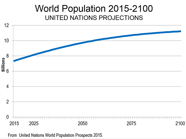
    According to the new United Nations World Population Prospects: The 2015 Revision, the population of the world is projected to rise from 7.3 billion in 2015 to 11.2 billion in 2100. This represents a 53 percent increase. However, over the period, population growth will moderate substantially. This is indicated by the annual growth rate the first year (2015 to 2016), at 1.1 percent, compared to the last year (2099 to 2100) at 0.1 percent. Annual population growth is projected to decline 90 percent from the beginning of the period to the end (Figure 1).

    Growth by Continent

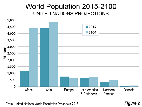
    The distribution of growth among the continents will be anything but even. Approximately 83 percent of the growth is projected to be in Africa, which is to grow approximately 270 percent. Asia is expected to account for 13 percent of the world’s growth and add 11 percent to its population. Northern America (Note), while growing 40 percent is expected to account for four percent of the world’s population growth. Latin America and the Caribbean are expected to account for 2.2 percent of the world’s growth, and add 14 percent to their population. Europe (including all of Russia) is expected to decline in population by 13 percent (Figure 2).

    Population Growth by Income Status

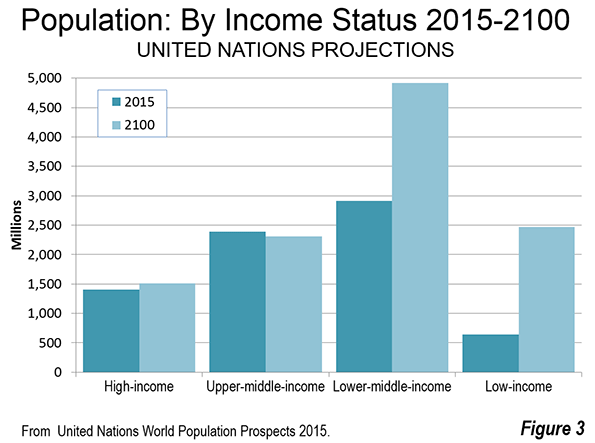
    World population growth is expected to vary widely by current income status (Figure 3). Income status is indicated on page 137 of this United Nations publication.

    The world’s high income nations are expected to add only eight percent (111 million) to their population and will represent only three percent of the population growth. These nations are principally in North America and Europe, but also include Japan, South Korea, Saudi Arabia and others.

    The world’s upper middle income nations are expected to experience a population decline of three percent, which amounts to a loss of 82 million residents. China, Russia, Mexico, South Africa, Iran and Brazil are examples of upper-middle income nations. When combined with the high income gain noted above the more affluent half of the world’s nations would add 29 million residents, or just 0.7 percent of the world’s growth. This is fewer people than live in the Tokyo metropolitan area.

    This means that more than 99 percent of world growth from 2015 to 2100 is expected to be among the lower income nations. The lower middle income nations would gain 2 billion people, representing 52 percent of the population growth.  The lower-middle income nations include India, Indonesia, Nigeria, the Philippines, Vietnam, Guatemala and others.

    The lower income nations would gain 1.8 billion people, capturing 47 percent of the world’s growth. The lower income nations include Bangladesh, Tanzania, Myanmar, the Democratic Republic of the Congo and others.

    In the high income and upper middle income regions, population growth will be also anything but consistent. Nations such as the United States, the United Kingdom, France, Canada and Australia are expected to grow far faster. The United States is expected to add 40 percent to its population and more than four times the population growth of all of the upper half of nations. Canada (up 39 percent) and Australia (up 77 percent), combined, are expected to add more population than the total upper income half of nations.  These gains will be largely offset by losses in Japan, Germany, South Korea, Italy and others.

    Largest Population by Nation

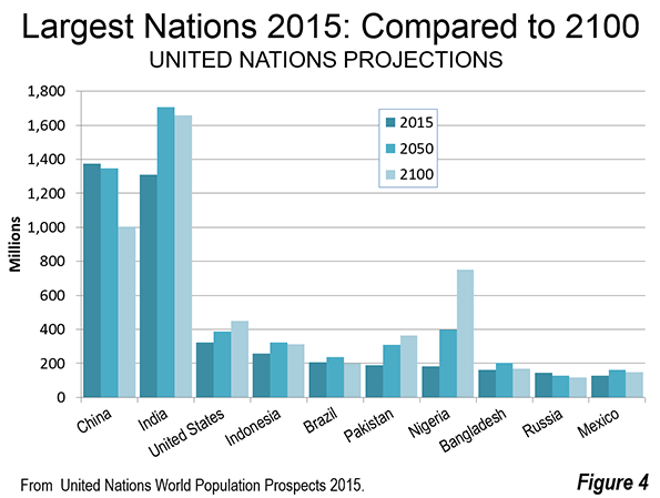
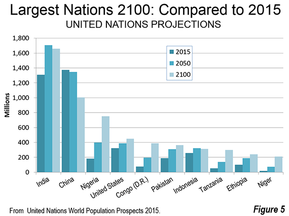
    China, with the largest population in 2015, is expected to fall behind India in 2050 and remain in second place by 2100. India is expected to be the largest nation in both 2050 and 2100. However, India’s population will be less in 2100 than it was in 2050.

    Eight of the 10 most populated nations, including India and China are expected to have a lower population in 2100 than in 2050 (Figure 4). Pakistan is expected to reach its population peak in 2095 and start declining in 2096. This leaves only the United States among today’s today’s 10 largest nations that is expected to be adding population in 2100. The growth rate between 2099 and 2100 (0.2 percent) is expected to be considerably below the growth rate at the beginning of the period (2015-2016), which was 0.7 percent.

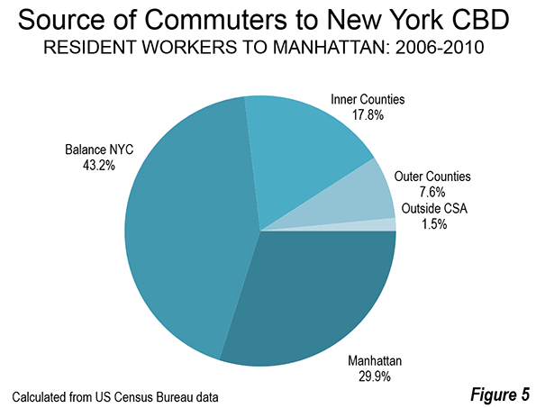
    By 2100, there are expected to be substantial changes to the top 10 nations in population. Five of the 10 largest nations in the world are expected to be in Africa. This is an increase from one in 2015 (Figure 5). Nigeria will have replaced the United States as the third largest nation, with approximately 750 million people, having more than quadrupled in size. The Democratic Republic of the Congo (Congo – Kinshasa) would rank fifth, and is expected to reach 390 million people, quintupling in size. Tanzania would rank eighth, reaching 300 million residents, nearly 6 times its 2015 population. Ethiopia would have more than 240 million residents, 2.5 times its current population and would rank ninth. The 10th largest nation would be Niger, with 210 million residents, a figure 10 times its 2015 level. Among the African nations in the top 10, only Ethiopia would be declining by 2100, having reached its population peak in 2097.

    Pakistan would retain its current sixth position, while Indonesia would fall from 4th to 7th. As noted above, India would be the largest nation in China would be second largest in 2100. By that date India would have an overall gain of approximately 350 million people from 2015, while China would lose 370 million people. The United States would add more than 125 million people. Brazil, which is currently ranked 5th, would lose approximately 10 million people and fall to 13th position. Eighth ranked Bangladesh, which was long among the fastest growing nations in the world, would gain only 10 million people and fall to 14th position. Russia, ranked 9th, would fall to 23rd, losing 25 million residents. Mexico, ranked 10th, would gain 20 million residents, and would be ranked 18th in 2100.

    The Uncertainty of Projections

    Of course projections of any kind are subject to wide error ranges. Economic growth, the extent of poverty, wars, social trends, medical advances and other factors can interfere. The simple fact is that none of us and no organization knows the future for sure. One study of UN population trends in six Southeast Asian nations found that 1980 projections from 1950 were 13.9 percent off by nation, with a range from minus 20 percent to plus 27 percent. There had been some improvement in comparing 1975 projections to 2000 actual populations, with an average error of 8.2 percent. The range was little improved, from minus 23 percent to plus 25 percent. Obviously projections are likely to be much more accurate in early years and the chances for greater accuracy are improved in larger nations or regions.

    A World of Challenges

    Regardless of the extent of accuracy, which cannot be known at this point, the projections indicate a continuation of trends that cause concern. A world that is experiencing virtually 100 percent of its growth in its poorest areas cannot help but face a tougher future. This makes it clear that the principal priority of governments around the world should be to improve affluence and reduce poverty. The challenges are gargantuan, but focusing on these issues is likely to result in a better, though less than ideal, world.

    Note:  Northern America includes Canada, the United States, Greenland, Bermuda and the French territory of Saint Pierre and Miquelon.

    Photograph: Western Railway Headquarters (Churchgate), Mumbai, India (by author)

    Wendell Cox is Chair, Housing Affordability and Municipal Policy for the Frontier Centre for Public Policy (Canada), is a Senior Fellow of the Center for Opportunity Urbanism (US), a member of the Board of Advisors of the Center for Demographics and Policy at Chapman University (California) and principal of Demographia, an international public policy and demographics firm.

    He is co-author of the "Demographia International Housing Affordability Survey" and author of "Demographia World Urban Areas" and "War on the Dream: How Anti-Sprawl Policy Threatens the Quality of Life." He was appointed to three terms on the Los Angeles County Transportation Commission, where he served with the leading city and county leadership as the only non-elected member. He served as a visiting professor at the Conservatoire National des Arts et Metiers, a national university in Paris.

  • California: “Land of Poverty”

    For decades, California’s housing costs have been racing ahead of incomes, as counties and local governments have imposed restrictive land-use regulations that drove up the price of land and dwellings. This has been documented by both Dartmouth economist William A Fischel and the state Legislative Analyst’s Office.

    Middle income households have been forced to accept lower standards of living while less fortunate have been driven into poverty by the high cost of housing.Housing costs have risen in some markets compared to others that the federal government now publishes alternative poverty estimates (the Supplemental Poverty Measure), because the official poverty measure used for decades does not capture the resulting differentials. The latest figures, for 2013, show California’s housing cost adjusted poverty rate to be 23.4 percent, nearly half again as high as the national average of 15.9 percent.

    Back in the years when the nation had a "California Dream," it would have been inconceivable for things to have gotten so bad — particularly amidst what is widely hailed as a spectacular recovery. The 2013 data shows California to have the worst housing cost adjusted poverty rate among the 50 states and the District of Columbia. But it gets worse. California’s poverty rate is now more than 50 percent higher than Mississippi, which long has set the standard for extreme poverty in the United States (Figure 1).

    The size of the geographic samples used to estimate the housing adjusted poverty rates are not sufficient for the Supplemental Poverty Measure to produce local, county level or metropolitan area estimates. However, a new similar measure makes that possible.

    The California Poverty Measure                           

    The Public Policy Institute of California and the Stanford Center on Poverty and Inequality have collaborated to establish the "California Poverty Measure," which is similar to the Supplemental Poverty Measure adjusted for housing costs.

    The press release announcing release of the first edition (for 2011) said that: "California, often thought of as the land of plenty" in the words Center on Poverty and Inequality director Professor David Grusky, is "in fact the land of poverty."

    The latest California Poverty Measure estimate, for 2012, shows a statewide poverty rate of 21.8 percent, somewhat below the Supplemental Poverty Measure and well above the Official Poverty Measure that does not adjust for housing costs (16.5 percent).

    The California Poverty Measure also provides data for most of California’s 58 counties, with some smaller counties combined due to statistical limitations. This makes it possible to estimate the California Poverty Measure for metropolitan areas, using American Community Survey data.

    Metropolitan Area Estimates

    By far the worst metropolitan area poverty rate was in Los Angeles, at 25.3 percent. The Los Angeles County poverty rate was the highest in the state at 26.1 percent, well above that of Orange County (22.4 percent), which constitutes the balance of the Los Angeles metropolitan area. However, the Orange County rate was higher than that of any other metropolitan area or region in the state (Figure 2). San Diego’s poverty rate was 21.7 percent. Perhaps surprisingly, Riverside-San Bernardino (the Inland Empire), which is generally perceived to have greater poverty, but with lower housing costs, had a rate of 20.9 percent. The two counties, Riverside and San Bernardino had lower poverty rates than all Southern California counties except for Ventura (Oxnard) and Imperial.

    The San Francisco metropolitan area had a poverty rate of 19.4 percent, more than one-fifth below that of Los Angeles. San Jose has a somewhat lower poverty rated 18.3 percent (Note 1). The metropolitan areas making constituting the exurbs of the San Francisco Bay Area had a poverty rate of 18.7 percent. This includes Santa Cruz, Santa Rosa, Stockton and Vallejo. Sacramento had the lowest poverty rate of any major metropolitan area, at 18.2 percent.

    The San Joaquin Valley, stretching from Bakersfield through Fresno to Modesto (Stockton is excluded because it is now a San Francisco Bay Area exurb) had a poverty rate of 21.3 percent, slightly below the state wide average of 21.8 percent. The balance of the state, not included in the metropolitan areas and regions described above had a poverty rate of 21.2 percent.

    County Poverty Rates

    As was noted above, Los Angeles County had the highest 2012 poverty rate in the state (Note 2), according to the California Poverty Measure (26.1 percent). Tulare County, in the San Joaquin Valley had the second-highest rate at 25.2 percent. Somewhat surprisingly, San Francisco County with its reputation for high income had the third worst poverty rate in the state at 23.4 percent. This is driven, at least in part, by San Francisco’s extraordinarily high median house price to household income ratio (median multiple). In this grisly statistic, it trails only Hong Kong, Vancouver and Sydney in the latest Demographia International Housing Affordability Survey. Wealthy Santa Barbara County has the fourth worst poverty rate in the state, at 23.8 percent. The fifth highest poverty rate is in Stanislaus County, in the San Joaquin Valley (county seat Modesto), which is already receiving housing refugees from the San Francisco Bay Area, unable to pay the high prices (Figure 3).

    The two lowest poverty rates were in suburban Sacramento counties (Note 2). Placer County’s rate was 13.2 percent and El Dorado County’s rate was 13.3 percent. Another surprise is Imperial County, which borders Mexico and has generally lower income. Nonetheless, Imperial County has the third lowest poverty rate at 13.4 percent. Shasta County (county seat Redding), located at the north end of the Sacramento Valley is ranked fourth at 14.8 percent. Two counties are tied for the fifth lowest poverty rate (16.0 percent), Marin County in suburban San Francisco and Napa County, in the exurban San Francisco Bay Area (Figure 4).

    Weak Labor Market and Notoriously Expensive Housing

    The original Stanford Center on Poverty and Inequality press release cited California’s dismal poverty rate as resulting from "a weak labor market and California’s notoriously expensive housing." These are problems that can be moderated starting at the top, with the Governor and legislature. The notoriously expensive housing could be addressed by loosening regulations that allow more supply to be built at lower cost. True, the new supply would not be built in Santa Monica or Palo Alto. But additional, lower cost housing on the periphery, whether in Riverside County, the High Desert exurbs of Los Angeles and San Bernardino Counties, the San Francisco Bay Area exurbs or the San Joaquin Valley could begin to remedy the situation.

    The improvement in housing affordability could help to strengthen the weak job market, by attracting both new business investment and households moving from other states.

    Regrettably, Sacramento does not seem to be paying attention. Liberalizing land use regulations is not only absent from the public agenda, but restrictions are being strengthened (especially under the requirements of Senate Bill 375). In this environment, metropolitan areas like Los Angeles, San Francisco, San Jose and San Diego could become even more grotesquely unaffordable, and the already high price to income ratios in the Inland Empire and San Joaquin Valley could worsen. All of this could lead to slower economic growth and to even greater poverty, as more lower-middle-income households fall into poverty.

    Note 1: San Benito County is excluded from the San Jose metropolitan area data. The California Poverty Measure does not report a separate poverty rate for San Benito County.

    Note 2: Among the counties for which specific poverty rates are provided.

    Wendell Cox is Chair, Housing Affordability and Municipal Policy for the Frontier Centre for Public Policy (Canada), is a Senior Fellow of the Center for Opportunity Urbanism (US), a member of the Board of Advisors of the Center for Demographics and Policy at Chapman University (California) and principal of Demographia, an international public policy and demographics firm.

    He is co-author of the "Demographia International Housing Affordability Survey" and author of "Demographia World Urban Areas" and "War on the Dream: How Anti-Sprawl Policy Threatens the Quality of Life." He was appointed to three terms on the Los Angeles County Transportation Commission, where he served with the leading city and county leadership as the only non-elected member. He served as a visiting professor at the Conservatoire National des Arts et Metiers, a national university in Paris.

    Photograph: Great Seal of the State of California by Zscout370 at en.wikipedia [CC BY-SA 3.0], from Wikimedia Commons

  • Moving to the London Exurbs and Beyond

    A review of the most recent internal migration (domestic migration) in England and Wales reveals some surprises. The latest data covers the one year ended June 30, 2014. It was published by the Office of National Statistics (ONS) and provides estimates at least down to the local authority area (municipality). In this regard, is positioned along with a number of European nations and the Australian Bureau of statistics well ahead of the US Census Bureau, which provides estimates only to the county level.

    The Regions

    On a regional level, there was little movement outside the southern half of England. England is divided into nine regions. Three of the northern and middle regions lost modest numbers of internal migrants, ranging from a minus 0.05% (minus 3,000 people) in the West Midlands, which contains England’s second largest city, Birmingham. There was loss of 0.06% (minus 7,100 people) in the North West, where Manchester and Liverpool are located. There was a 0.09% loss (minus 4,700 people) in Yorkshire and the Humber, where Leeds and Sheffield are located (Figure 1).

    The North East, which contains the city of Newcastle, has long been an area of economic hardship and is of danger of becoming "Britains Detroit" according to  The Guardian. Yet the North East experienced a small gain of 0.01% in internal migrants (500 people). The largest gain outside southern England was in the East Midlands, which includes Leicester and Nottingham, attracted a net 0.13 percent in new migrants (6,200 people). Wales (largest city Cardiff) also had a 0.1% gain in internal migrants (200 peopled).

    London (the Greater London Authority) lost by far the largest percentage of its population to internal migration, at minus 0.82 percent, or 68,600 people. This may be particularly surprising because London has recently reached its all-time population peak, having exceeded its pre-World War II 1939 estimated level. Yet virtually all of London’s huge population gain has been from natural growth (births minus deaths) and international migration. In recent years, this growth stems from strong gains in migration from a European Union countries, between which there is virtually unrestricted immigration.

    But Londoners, whether born in Great Britain or those who arrived before 2013, have been moving in large numbers to the exurbs beyond the greenbelt for some time and even farther away. The two large exurban regions have attracted many migrants. The East, which includes such well-known localities as Cambridge, Luton, Milton Keynes and St. Albans added the 0.33 percent to its population through internal migration. The South East, which includes localities like Oxford, Windsor, Dover and the entrance to the Euro tunnel to France added a somewhat smaller 0.23 percent.

    But some Londoners appear to be moving even farther away. The largest growth was in the South West region, which lies at least 70 miles (125 kilometers) from Trafalgar Square in London. The South West is home to such places as Bristol, Bath, Salisbury and Cornwall. The South West added 0.48 percent to its population through.

    London and Environs

    During 2013-2014, the dominant trend was movement away from London to the exurbs and regions just beyond the exurbs, with a less dominant trend away from the balance of England and Wales. Virtually all the internal migration growth was in the London Exurbs (East and South East) and the adjacent areas, the South West, East Midlands and West Midlands (Figure 2). Nearly all the loss was in London. Inner London, suffered the largest domestic migration loss, at 1.05 percent of its population (minus 35,000). Inner London, at 3.3 million remains well below its population peak of 4.5 million, reached nearly 115 years ago (1901). Outer London, consisting of the large tracts of semidetached and detached housing built in the inter-war years lost a smaller 0.66 percent of its population to internal migration (minus 33,700). Outer London now has a population of approximately 5.1 million, one-half larger than Inner London.

    The Office for National Statistics (ONS) explains that London attracts internal migrants up to age 29. But, the internal outmigration of people 30 and above more than cancels this out. ONS explains:

    "A key factor for people in their 30s and 40s who move out of London could be the cost of housing. Young couples wishing to buy their first house, or a larger one for a growing family, may find prices in London prohibitively expensive and therefore choose to live outside of London."

    ONS adds:

    "Another important reason may be that people with children are more likely to move out of London because of environmental or social factors. For example, they may be seeking somewhere greener and quieter, and may also perceive that a less urban neighbourhood offers a better social and educational environment for children. Moves of adults with children also explains why there is a net outflow of children from London."

    ONS further indicates that there is net migration from London of older citizens, including those over 90 (the highest age category reported upon). These are trends similar to those we have identified in the United States some of which were opposite the conventional wisdom (See: Driving Farther to Qualify in Portland, Urban Core Millennials? A Matter of Perspective, Exodus of the School Children, and Seniors Dispersing Away from the Urban Cores)

    Greatest Gains and Losses

    Even so, London had one local authority area with the greatest internal migration gain: the historic City of London. However, this area, which is the core of the central business district, has few residents. Even after the internal migration gain (1.80 percent), the city still has fewer than 8,000 residents. The other largest gainers in numbers were found in the London exurbs or the South West, with the exception of Fylde, which is located in Lancashire (the North West), adjacent to the resort of Blackpool.

    London had nine of the 10 local authority areas with the greatest internal migration losses (out of 348). The largest loss was in the inner London borough of Newham (minus 2.68%). The one non-London local authority area in the bottom 10 was Pendle, in Lancashire (the North West).

    Metropolitan Areas

    Only one of the larger metropolitan areas experienced a net internal migration gain. The Bristol – Bath area (ceremonial Avon County), located in the South West gained 0.25 percent (Figure 3).

    Two metropolitan areas that have long experienced serious economic declines suffered only modest losses. Newcastle (Tyne and Wear Metropolitan County) lost only 0.2 percent of its population to internal migration. Liverpool, with a central municipality that dropped from a population of 856,000 in 1931 to 439,000 in 2001 (after which modest growth returned), had an internal migration loss of 0.03 percent. Sheffield (South Yorkshire Metropolitan County) lost 0.08% of its population to net internal migration.

    In view of the relative fortunes of London and Liverpool over the last century, it is especially surprising that the London region, including the exurbs, lost internal migration at a rate four times that of Liverpool (0.13%).

    Manchester (Greater Manchester Metropolitan County) experienced a net internal migration loss of 0.17 percent, and Leeds-Bradford (West Yorkshire Metropolitan County). Birmingham (West Midlands Metropolitan County) have the greatest loss at -0.22 percent.

    More Dispersion

    By far the largest net internal migration numbers are in the south of England, reflecting strong trends of decentralization away from London, to the East and the South East. But, by far the largest recipient of internal migration is the South West, beyond even the exurbs. This is another confirmation of the dispersing pattern of development, as has been observed in virtually all of the world’s megacities.

    ————–

    Note: The United Kingdom does not formally designate metropolitan areas. This article uses metropolitan and former (ceremonial) counties to approximate metropolitan areas.

    Photograph: Local authority of Milton Keynes, Buckinghamshire (South East of England), by author

    Wendell Cox is Chair, Housing Affordability and Municipal Policy for the Frontier Centre for Public Policy (Canada), is a Senior Fellow of the Center for Opportunity Urbanism (US), a member of the Board of Advisors of the Center for Demographics and Policy at Chapman University (California) and principal of Demographia, an international public policy and demographics firm.

    He is co-author of the "Demographia International Housing Affordability Survey" and author of "Demographia World Urban Areas" and "War on the Dream: How Anti-Sprawl Policy Threatens the Quality of Life." He was appointed to three terms on the Los Angeles County Transportation Commission, where he served with the leading city and county leadership as the only non-elected member. He served as a visiting professor at the Conservatoire National des Arts et Metiers, a national university in Paris. 

  • Congratulations Boston!

    Congratulations Boston! Your rejection of the "honor" of representing the US as its candidate for the 2024 Summer Olympics is an inspiring example of government performing its obligation to taxpayers and their hard earned money. Those of us who think that government has a responsibility to wisely use taxpayer money sometimes forget that Massachusetts enacted Proposition 2 1/2 not long after California’s fabled Proposition 13.

    In an era of routinely wasteful government spending, Boston’s decision stands out as unusual. It rivals the courage of New Jersey Governor Chris Christie who cancelled a new Hudson River rail tunnel, mid-project, because of the consultants and builders seemed sure to take advantage of the blank check that New Jersey taxpayers were required to pledge. This, of course has been the record of major infrastructure projects all over the world and most recently one of the most grotesque examples was Boston’s own "Central Artery." But unlike “the Big Dig”. This time Boston didn’t have speaker Tip O’Neill to bring home the bacon. Then, the federal government capped its share and Boston had to pay it all. Unsurprisingly, the bill was much higher and had to be paid by Massachusetts, along with the interest on extra debt that had to be issued.

    Oxford University Professor Bent Flyvbjerg, who has become famous for his quality analysis of large infrastructure projects, especially urban rail projects, produced a report with Allison Stewart on the history of Olympics cost overruns between 1960 and 2012. The two worked under the auspices of the Said Business school of England’s at Oxford. They concluded:

    The data thus show that for a city and nation to decide to host the Olympic Games is to take on one of the most financially risky type of megaproject that exists, something that many cities and nations have learned to their peril.

    They found that every Olympic Games, summer or winter, for which complete data is available experienced cost overruns. The most recent, in London, experienced a cost overrun of 100 percent. Flyvbjerg and Steward used a very simple model that has been applied to the previous infrastructure work. They just looked at the final bill that included all the expenses.This was compared to the amount the sponsors and their funders, the taxpayers, were it was going to cost when the application was approved by the local political process.

    The principal problem was the Olympic Committee requirement that sponsors must ensure the financing of all major capital investment required and are "on the hook" for any cost overruns.

    Montréal’s legendary Mayor Jean Drupeau sold his city on an Olympics bid saying that "the Montréal Olympics and no more have a deficit that a man can have a baby." Well, men are not yet having babies, but Montréal gave birth to a world-class cost overrun in its 1976 summer Olympics.  According to Flyvbjerg and Stewart, the 1976 Montréal Olympics had a cost overrun of nearly 800 percent, nearly double the 1992 420 percent cost overrun of Barcelona. Montréal may have set a record for much more than the Olympics with its cost overrun.

    Things have been virtually as bad in Greece. The researchers reported that "Olympic cost overruns and debt have exacerbated" the Greek economic crisis.

    There has been one exception to this sorry record. Los Angeles, host of the 1984 summer Olympic Games, actually turned a profit, sending more than $300 million to the international Olympic Committee and using the local profits for the LA84 Foundation, which funds youth sports and related activities, even 30 years after the event.

    I coordinated the information program for employees at the Southern California headquarters of Crocker Bank (subsequently sold to Wells Fargo), assisting employees in getting to work during what was expected to be the high traffic from the 1984 Olympics. It turns out that the advice of local officials to encourage and vacations and working at home paid off handsomely. People who commuted during the Olympic Games had unusually light traffic.

    In addition, I was a member of the Los Angeles County Transportation Commission (LACTC), having been appointed by Mayor Bradley and confirmed by the Los Angeles City Council. Both the Mayor and the Council were committed to putting on the show without burdening the taxpayers – no public money. And Olympic Committee was established under the direction of Peter Ueberroth, who became a legend for his skillful management of the games.

    But there was some public money lost on the Olympics. The Southern California Rapid Transit district (SCRTD), the large regional transit operator announced its intention to provide bus service to Olympic venues from all over the Los Angeles area. SCRTD claimed that it would be able to do the job without public subsidy. I believed otherwise and predicted that the service would fall far short of its ridership projections and lose about $5 million. LACTC had the authority to ban the expenditure, which I tried to do. Unfortunately I was unable to obtain the necessary votes to make that happen. In the end, the ridership fell far short of projection (the kind of thing Professor Flybvjerg usually reports on urban rail projects).

    Meanwhile, the Olympics were a one-off to Los Angeles. Most infrastructure projects of this nature are financially ruinous. Maybe Massachusetts learned a lesson from the Central Artery. Boston proved itself to be a world-class city in having the courage to say "no."

    Wendell Cox is Chair, Housing Affordability and Municipal Policy for the Frontier Centre for Public Policy (Canada), is a Senior Fellow of the Center for Opportunity Urbanism (US), a member of the Board of Advisors of the Center for Demographics and Policy at Chapman University (California) and principal of Demographia, an international public policy and demographics firm.

    He is co-author of the "Demographia International Housing Affordability Survey" and author of "Demographia World Urban Areas" and "War on the Dream: How Anti-Sprawl Policy Threatens the Quality of Life." He was appointed to three terms on the Los Angeles County Transportation Commission, where he served with the leading city and county leadership as the only non-elected member. He served as a visiting professor at the Conservatoire National des Arts et Metiers, a national university in Paris. 

    Photograph: Boston, by author

  • The Evolving Urban Form: Jing-Jin-Ji (Dispersing Beijing)

    China’s cities continue to add population at a rapid rate, despite a significant slowdown in population growth. Although overall population is expected to peak around 2030, the urban population will continue growing until after 2050. China’s cities will be adding more than 250 million new residents in the next quarter century, according to United Nations projections. China’s cities will add nearly as many people as live in Indonesia, the world’s fourth largest country, more than live in Brazil and 10 times as many as live in Australia.

    Two of China’s six megacities (urban areas with more than 10 million population) are nearly adjacent, within 90 miles (150 kilometers) of one another. The urban areas of Beijing and Tianjin have a combined population of 35 million and are among the fastest growing in the world. This is an increase of nearly 60% from the 2000 population of 21 million.

    The Jing-Jin-Ji Megalopolis

    The faster growing of the two, Beijing, is the national capital. Beijing is encircled by five freeway standard ring roads or beltways. These are numbered 2 through 6, with the first ring road being surrounding the Forbidden City. Its population is served by a number of additional expressways and the world’s longest subway. For some time there has been discussion of integrating the metropolitan areas of a much larger region. A principal purpose is dispersion — to redistribute activities, such as government administration and manufacturing away from Beijing’s congested core to peripheral locations.

    Over the past year, there have been various announcements describing the process. The  megalopolis would be called Jing-Jin-Ji, and would be composed of Beijing, Tianjin and Hebei province. An alternative name would be the "Capital Economic Circle." The name, Jing-Jin-Ji is constructed of the last syllables of "Beijing" and "Tianjin," along with "ji," which is the pronunciation of the one character Mandarin abbreviation for Hebei.

    The Need for Dispersal

    Beijing has just become too dense and too crowded. Traffic congestion already is among the worst in the world. According to The Sydney Morning Herald, the situation has become so bad that officials intended to limit the population of the Beijing municipality (province) to 23 million, only slightly above the population that is nearing 22 million. They also intend to reduce the population of central districts by 15%.

    Important steps are already being taken. Construction has begun on a new facility to house Beijing municipality functions in the suburban district ("qu") of Tongzhou. This subsidiary center is a 40 minute drive from the city center. Tongzhou borders the municipality of Tianjin and, according to the Beijing Municipality government is itself growing about one-quarter faster than the Beijing municipality itself.

    There are also plans to move many of the manufacturing facilities that have located in Beijing to the other jurisdictions. The extent of the manufacturing dominance of Beijing is illustrated by the much larger "floating population," of Beijing, which consists of migrants from other parts of the country who lack local residence permission (hukou). According to data in the China Yearbook 2014, Beijing has more than double the ratio to its population of migrant workers as Tianjin and nearly 10 times the ratio of Hebei, which has more than two-thirds of the megalopolis population.

    One large automobile manufacturer has already completed moving out of Beijing to Huanghua, a county level city in the Hebei municipality of Cangzhou, which borders Tianjin to the south.

    Geography of Jing-Jin-Ji

    The jurisdictions comprising Jing-Jin-Ji have approximately 110 million residents. The gross land area is approximately 216,000 square kilometers (83,000 square miles), approximately the land area of Romania or the US state of Idaho. No one, however, should imagine a Phoenix or Portland type sprawl of such a magnitude. As is indicated the Table, the overall population density of Jing-Jin-Ji is only 500 residents per square kilometer (1,300 per square mile).  The largest urban areas comprise only 3.5% of the land area, yet contain approximately 40% of the population. Despite the massive urbanization of Beijing and Tianjin, and the other large urban areas, Jing-Jin-Ji has a population that is 40% rural.

    Components of Jing-Jin-Ji
    Jurisdiction Total Population (2013) Density (per KM2) Principal Urban Area Population (2015) Urban Density (per KM2)
    Beijing 21.2      1,300 20.2      5,100
    Tianjin 14.7      1,200 10.9      5,400
    Jing-Jin-Ji Core 35.9      1,300 31.1      5,200
    Baoding 10.2         500 1.3      5,900
    Langfang 4.4         700 0.5      3,800
    Canzhou 7.2         500 0.5      3,800
    Tangshan 7.5         600 2.4      8,700
    Zhangzhiakow 4.6         100 1.2      9,200
    Qinhuangdao 2.9         400 1.0      6,500
    Chengde 3.7         100 0.1      4,300
    Inner Jing-Jin-Ji 40.5         300 7.0      6,600
    Shijiazhuang 10.4         700 3.4    17,000
    Handan 9.2         800 2.0    11,900
    Xingtai 7.1         600 0.7      6,000
    Henshui 4.3         500 0.4    11,800
    Outer Jing-Jin-Ji 31.0         600 6.5    12,500
    Jng-Jin-Ji 109.2         500 44.6      5,900
    Population in millions.
    Jurisdition population from government sources
    Urban area population from Demographia World Urban Areas


    The Nearby Urban Areas

    In addition to Tianjin, other urban areas are expected to gain functions, jobs and residents from Beijing. Baoding, an urban area to the southwest of Beijing is expected to gain hospitals, educational institutions and government offices. Baoding has a population of 1.3 million and is a former capital Hebei, but was displaced by Shijiazhuang in 1967. Shijiazhuang, with a population of 3,4 million, is located  in the outer ring of Jing-Jin-Ji.

    Langfang is unusual in being a discontinuous municipality, part of which is an enclave surrounded by Beijing and Tianjin (as is Hebei province), and the other part located to the south of both jurisdictions. Langfang is in the path of growth of both Beijing and Tianjin. The urban area of Langfang is still relatively small, with 500,000 residents. The urbanization along the Jingtang Expressway through Langfang nearly reaches the development of Beijing to the northwest and Tianjin to the southeast.

    Tangshan is directly north of Tianjin and east of Beijing. Tangshan seems likely to benefit from the dispersion of functions, jobs and residences by virtue of its proximity to both of the megacities. A new high speed rail line has just been announced that would connect Tangshan with Beijing in 30 minutes. Tangshan gained international notoriety in 1976 when it was struck by a devastating earthquake (photo here) that virtually flattened the city and killed at least 240,000 people (estimates of the earthquake death toll reach 800,000). Tangshan has been completely rebuilt, with impressive modern architecture (photograph above, taken from an earthquake memorial), but not appreciated by all. One architectural critic has insensitively bloviated that the new architecture "has been more destructive to Tangshan’s urban history than the great earthquake." Today, Tangshan is an urban area of 2.4 million.

    Qinhuangdao, an urban area of 1 million, lies just beyond (northeast of) Tangshan on the way to Shenyang and China’s Dongbei (Manchuria). Qinhuangdao could profit from its well placed seaport.

    Transportation Improvements

    Important transportation improvements have been announced. There are plans to expand Beijing’s subway, which already has the highest ridership in the world and is second longest (after Shanghai). New suburban train lines will be built and new high speed rail lines will connect the cities within Jing-Jin-Ji that are farther apart. There will be considerable expansion of the already comprehensive expressway system, including Beijing’s seventh ring road, which is to be fully completed by 2017. Already, approximately 400 kilometers have been completed, much of it through the mountains to the west of Beijing.

    Decentralizing Beijing

    Jing-Jin-Ji would be China’s third megalopolis, joining with the Yangtze Delta (centered on Shanghai) and Pearl River Delta (centered on an axis from Guangzhou to Shenzhen). But Jing-Jin-Ji is substantially different and not so obvious a candidate for integration. Jing-jin-ji’s urban areas are located farther apart than in the Pearl or the Yangtze. Yet its concentration of development is greater, especially in the Beijing core, which provides much of the justification for decentralization.

    Wendell Cox is Chair, Housing Affordability and Municipal Policy for the Frontier Centre for Public Policy (Canada), is a Senior Fellow of the Center for Opportunity Urbanism (US), a member of the Board of Advisors of the Center for Demographics and Policy at Chapman University (California) and principal of Demographia, an international public policy and demographics firm.

    He is co-author of the "Demographia International Housing Affordability Survey" and author of "Demographia World Urban Areas" and "War on the Dream: How Anti-Sprawl Policy Threatens the Quality of Life." He was appointed to three terms on the Los Angeles County Transportation Commission, where he served with the leading city and county leadership as the only non-elected member. He served as a visiting professor at the Conservatoire National des Arts et Metiers, a national university in Paris. 

    Photograph: Tangshan’s modern architecture, from an earthquake memorial (by author)

  • Blaming Foreigners for Unaffordable Housing

    In a number of Western world cities, there is rising concern about foreign housing purchases which may be driving up prices for local residents. Much of the attention is aimed at mainland Chinese buyers in metropolitan areas where housing is already pricier than elsewhere. The concern about housing affordability is legitimate. However, blaming foreigners misses the point, which is that the rising prices are to a large degree the result of urban containment policies implemented by governments.

    London and the United Kingdom              

    The Daily Mail reports that London being deluged with foreign house buyers, who are buying not only expensive properties but also "starter homes," driving prices up. The Mail singles out Russian and Chinese buyers, many of whom pay cash for their purchases. Paula Higgins of the Home Owners Alliance lamented the fact that many foreign buyers are paying cash.  She questions the appropriateness of foreign investment in "family homes." David King, of Priced Out, said: "Foreign investment is driving up prices, making it even harder for ordinary people to get a decent place to live."

    Real estate firms headquartered in Russia are steering their clients to less expensive locations, outside London, such as to the north of England and Wales. A London real estate firm said that only 15% of its sales were to buyers from the UK. There is pressure for the government to protect local home buyers

    Certainly these investors are stepping into an already pricey market. The 11th Annual Demographia International Housing Affordability Survey found London house prices to be a severely unaffordable 8.5 times household incomes in 2014. London has the seventh worst housing affordability out of the 86 major markets rated in nine nations. The outside-the-greenbelt exurbs of London have house prices 6.9 times incomes.

    Vancouver

    Vancouver is a city of immigrants. According to data compiled by University of British Columbia (UBC) Geography Professor David Ley, nearly 90 percent of metropolitan Vancouver’s growth over the past two decades has been from foreign immigration (this article contains a graph with the numbers). Yet, there is significant concern about home purchases in the Vancouver area by mainland Chinese. UBC Professor Henry Yu’s history class described the issue in a video (Blaming the Mainlander).

    The Demographia International Housing Affordability Survey found Vancouver house prices to be a severely unaffordable 10.6 times household incomes in 2014. Vancouver has the second worst housing affordability out of the 86 major metropolitan areas rated in nine nations. Hong Kong has the worst housing affordability, with a median multiple of 17.0.

    California and New York

    Ilya Marritz of Public Broadcasting Systems (PBS) radio station WNYC remarked on how foreign investment is driving up prices in the New York and San Francisco bay areas: "There’s this relatively new trend of people buying properties in the city and not actually spending a lot of time living here." The Demographia International Housing Affordability Survey found New York metropolitan area housing to cost 6.1 times incomes, a 65% increase since before the housing bubble.

    The Diplomat, which specializes in Asia-Pacific affairs, commented that “there’s no doubt that China’s presence in the Bay Area market is driving up prices. The Diplomat quoted real estate executive Mark McLaughlin; “it’s added a demographic of buyers who, generally, take a long-term view. They’re not sellers in the next five to seven years.” Chinese buyers are sitting on much of this property as housing in the Bay Area becomes increasingly scarce, causing its value to skyrocket."

    The Demographia International Housing Affordability Survey places both San Francisco and San Jose metropolitan area house prices at 9.2 times incomes, tied for fourth least affordable in the 9 nations.

    The Los Angeles Times reports strong mainland Chinese purchasing activity in the suburbs of Los Angeles, from the San Gabriel Valley to Orange County, particularly Irvine as well as in Riverside-San Bernardino (the Inland Empire).

    The Demographia International Housing Affordability Survey found house prices to be 8.0 times incomes in Los Angeles, the 10th least affordable major metropolitan area in the Survey. Nearby San Diego prices are even higher, at 8.3 times incomes, earning it the 8th least affordable major metropolitan area in the 9 nation Survey.

    New Zealand

    Things have become more heated in New Zealand. The Labour Party opposition housing spokesperson Phil Twyford blamed foreign investors for driving up house prices in Auckland, New Zealand’s only metropolitan area with more than 1,000,000 population.

    "Kiwi families who are struggling to buy their own home want to know the impact offshore speculators are having on skyrocketing Auckland house prices. They are sick and tired of losing homes at auction to higher bidders down the end of a telephone line in another country."

    This evoked considerable criticism for ethnic insensitivity not only among New Zealand’s large Chinese minority, but also ordinary citizens. Radio New Zealand opined: "For a party that has diligently and deliberately courted the ethnic vote, including the Chinese community in Auckland, this was a risky strategy." The Economics Minister accused Labour of playing "the race card." There was predictable reaction in China, which is New Zealand’s largest goods export partner. The Shanghai Daily headlined: "New Zealand housing market debate descends into race row. "Meanwhile, the National Party government continues its difficult task of trying to reverse the consequences of urban containment policy in Auckland.

    The Demographia International Housing Affordability Survey found Auckland house prices to be a severely unaffordable at 8.2 times household incomes in 2014. Auckland has the ninth worst housing affordability out of the 86 major metropolitan areas rated in nine nations.

    Australia

    In Sydney, the Party for Freedom produced a brochure "blaming Chinese property buyers for pushing up home prices, ‘ethnically cleansing’ Australian families from their suburbs and creating a new ‘stolen generation,’" according to The Sydney Morning Herald (" Race hate flyer distributed in Sydney’s north shore and inner city"). The brochure also referred to foreign purchasers as "greedy foreign invaders," and charged them with "pricing locals out of the market." A You-Tube video was posted in which the party chairman burns the flags of China, the Australian ruling Liberal Party, the Labor Party and the Greens and images of Australia’s Prime Minister and the New South Wales Premier.

    Predictably, this brought a sharp reaction from public officials, such as Lane Cove mayor David Brooks-Horn, whose affluent North Shore community was targeted for distribution of the brochures.

    Despite this "vile attack," as New South Wales Multiculturalism Minister characterized it, there remains serious concern in Australia about rising house prices, which many blame on foreign investors aalthough avoiding the extremes indicated above.

    The Demographia International Housing Affordability Survey found Sydney house prices to be a severely unaffordable 9.8 times household incomes in 2014. This is the third most unaffordable market among the 86 major metropolitan areas rated in nine nations.  Today, The Australian Financial Review reported that the median house price in Sydney has reached $1,000,000 for the first time. This is a 23% increase in just one year.

    Melbourne, with prices 8.7 times incomes is sixth least affordable.

    "Supply, Supply, Supply"

    There is a common theme among those who are blaming foreigners for the escalation in their local house prices: foreign buyers have driven up demand, thus increasing prices and driving local purchasers out of the market. That might be a plausible theory if demand by itself raised prices. But, all else equal, demand results in higher prices only when there is a shortage of supply. And a shortage of supply is exactly what has been produced by government policies in each of the metropolitan areas described above.

    The problem lies largely with the blunt policy instrument of urban containment, which makes it virtually impossible to build on wide swaths of suburban greenfield land. Urban containment policy’s most destructive strategies are urban growth boundaries or greenbelts, which often prohibit development on virtually all greenfield sites and other regulations that deny planning permission on the majority of parcels suitable for housing on and beyond the urban fringe. The shortage of supply so important to the price increases has been produced by government policies in each of the metropolitan areas described above (Figure).

    The problem is that urban containment policy "creates its own weather." Investors are disproportionately drawn to markets where there are shortages. Sir Peter Hall and his colleagues pointed out that development plans provide a guide for developers of where to buy within the metropolitan area (in The Containment of Urban England).

    A Canary Wharf buyer in London told The Wall Street Journal: “If I could afford it I’d buy as many as I could”… “Flats [in London] are a great investment. I can’t see that changing." Nor will it so long as the "sure thing" of extraordinary house price increases supported by planning policy continues. San Francisco Bay Area public officials may as well have hung a "Welcome Speculators" banner from the Golden Gate Bridge.

    James Laurenceson, Deputy Director of the Australia-China Relations Institute at the University of Technology in Sydney, told The Sydney Morning Herald.:

    "Housing affordability is a real problem. The real reasons are right in front of our eyes – limited land releases, zoning regulations, development charges, record low interest rates and tax breaks to property investors. There’s not a Chinese buyer amongst them."

    Indeed, most of the cities above became severely unaffordable well before an affluent middle-class was enabled by China’s economic reforms.

    New South Wales Premier Mike Baird characterized the solution as "supply, supply, supply," which he sees as "the principal lever" for improving housing affordability. Housing affordability proposals that do not start with the supply shortage are little more than empty rhetoric. Attempts to blame the prices primarily on foreigners are not only misleading, but also diverts the public from the more important role played by limiting supply.

    Wendell Cox is Chair, Housing Affordability and Municipal Policy for the Frontier Centre for Public Policy (Canada), is a Senior Fellow of the Center for Opportunity Urbanism (US), a member of the Board of Advisors of the Center for Demographics and Policy at Chapman University (California) and principal of Demographia, an international public policy and demographics firm.

    He is co-author of the "Demographia International Housing Affordability Survey" and author of "Demographia World Urban Areas" and "War on the Dream: How Anti-Sprawl Policy Threatens the Quality of Life." He was appointed to three terms on the Los Angeles County Transportation Commission, where he served with the leading city and county leadership as the only non-elected member. He served as a visiting professor at the Conservatoire National des Arts et Metiers, a national university in Paris. 

    Photograph: Opera House, Sydney (by author).

  • The Evolving Urban Form: Sprawling Boston

    Few terms are more misunderstood than "urban sprawl." Generally, it refers to the spatial expansion (dispersion) of cities and has been use to describe urbanization from the most dense (least sprawling) in the world (Dhaka, Bangladesh), the most dense in the United States (Los Angeles) and also the least dense in the world (such as Atlanta and Charlotte, low density world champions in their population categories).

    The discussion of density and dispersion is often confused, a prisoner of pre-conceived notions about various urban areas.  Boston is in a class by itself in this regard. Boston certainly deserves its reputation for a high density urban core and a strong CBD. Yet, Boston itself represents only a small part of the urbanization in its commute shed, which is a combined statistical area (CSA) or stand-alone metropolitan area (Note 2). The CSA is the largest labor market definition and combines adjacent metropolitan areas with strong commuting ties. The city of Boston had only 8% of the Boston-Worcester-Providence CSA population in 2010.

    Much of the Boston CSA is made up of extensive, low density suburbanization more akin to Atlanta or Charlotte than to Los Angeles, which has the densest suburbs.

    The Boston Combined Statistical Area

    In contrast to its reputation for compactness, the Boston CSA is massive in its geography, covering more than 9,700 square miles (25,000 square kilometers). It is larger than Slovenia or Israel. The CSA stretches across parts of four states, including the eastern half of Massachusetts, all of Rhode Island, a large southeastern corner of New Hampshire and the northeastern corner of Connecticut. It includes the Boston, Providence, Worcester, Manchester and Barnstable Town metropolitan areas and the Concord (NH) and Laconia (NH) micropolitan areas.

    Boston is the only CSA in the nation that includes three state capitals, Boston (Massachusetts), Providence (Rhode Island) and Concord (New Hampshire). It is the only CSA in the nation that contains the largest municipalities in three states, Boston, Providence and Manchester (New Hampshire).

    The Boston CSA also includes multiple CBDs, from the fifth largest in the nation, Boston, to much smaller, but historically significant Providence, Worcester, and Manchester.

    Consider this: The Boston CSA is more than 200 miles (320 kilometers) from the southernmost point, Westerly, Rhode Island to the northernmost point, on the shores of Lake Winnipesaukee, north of Laconia, New Hampshire and more than a third the way to Montréal. Westerly itself is less than 50 miles (80 kilometers) from the New York combined statistical area, which begins at Madison, Connecticut across the New Haven County line. From Boston’s easternmost point near Provincetown, at the end of Cape Cod, it is more than 225 miles (360 kilometers) to Lake Winnipesaukee. From Provincetown to Athol, Massachusetts, to the west is more than 180 miles (290 kilometers).

    Urbanization in the Boston CSA

    But perhaps the most remarkable feature of this "Greater Greater Boston" is the extent of its urbanization (Note 3). The urban areas within the Boston CSA cover 3,640 square miles (9,400 square kilometers). This includes the dominant urban area of Boston (4.2 million), Providence (1.1 million), Worcester (0.5 million), which have largely grown together and a number of other urban areas. The urbanization is illustrated in the photograph above, which superimposes a Census Bureau maps of Boston’s urbanization and the Boston CSA, both on a Google Earth image. The CSA is a "reddish" color, while the urban areas are more "pinkish," and completely enclosed in the CSA.

    If all of Boston’s urbanization were a single urban area, it would be the third most expansive in the world (Figure 1), following the combined urban area of New York-Bridgeport-New Haven (4,500 square miles or 11,600 square kilometers) and Tokyo-Yokohama (3,300 square miles or 8,500 square kilometers).

    There is a big difference, however, in the intensity of development between the urbanization in these labor markets. The urban population of the Boston CSA is 7.1 million (Figure 2). The urbanization of the New York CSA has more than three times as many people (23 million), but covers only about 1.5 times the land area. Tokyo, with a tenth less land area, has more than five times the population (38 million). With a density of 1,941 per square mile (750 per square kilometer), the urbanization of Boston is 60% less dense (Figure 3) than the urbanization of the Los Angeles CSA (5,020 per square mile or 1,940 per square kilometer), which includes the Inland Empire urban area of Riverside-San Bernardino.

    Pre-World War II Boston is largely confined within the Route 128 semi-circumferential highway (most of it now called Interstate 95), had a 2010 population of approximately 1.9 million, with a population density of 6,300 per square mile (2,400 per square kilometer). The core city of Boston is among the most dense in the United States, with a 2014 density of 13,300 per square mile (5,200 per square kilometer). It is also very successful, having experienced a strong population turnaround, after falling from 801,000 residents in 1950 to 562,000 in 1980 (a 30% loss). By 2014, the city had recovered nearly 40% of its former population, rising to 656,000.

    Suburban Densities

    But once you get outside of 128, Boston’s urban population density fall steeply. If the denser urbanization inside Route 128 and the historic, dense municipalities of Providence, Worcester and Manchester are excluded, the remainder of Boston’s urbanization has a population density of 1,435 per square mile (550 per square kilometer). This is less dense than Atlanta’s urbanization outside the city of Atlanta. Overall, the Atlanta urban area is the least dense in the world with more than 2.5 million population. Approximately two-thirds of the Boston CSA urban population lives in these sparsely settled suburbs (Figure 4).

    If the Boston CSA were as dense as  the Los Angeles urban form, the population would be 18.3 million, not 7.1 million, more than 2.5 times as -people as now reside there. 

    In many ways, Boston is the epitome of the dispersed urban development that followed World War II. Once one of the nation’s densest urban areas, it has evolved into one of the least. What distinguishes Boston from other low density urban areas, like Atlanta, Charlotte or Birmingham (Alabama) is that is core well reflects the urban form built for the pre-automobile age.

    Employment Dispersion

    As would be expected, Boston’s highly dispersed urbanization has been accompanied by highly dispersed employment. Despite having the fifth largest CBD in the nation, Boston’s "hub" accounts for only 6% of the CSA employment. In the 1950s and 1960s, Route 128 became the nation’s first high-tech corridor and has been referred to as the birthplace of the modern industrial park. But most people work outside 128.

    Despite Boston’s huge urban expanse the average trip travel time is only 29 minutes. This is slightly above the US average of 26 minutes and 18 minutes shorter than Hong Kong, the high-income world’s densest urban area. Hong Kong’s urban density is more than 30 times that of Boston’s urbanization.

    One of the World’s Most Prosperous Metropolitan Areas

    Highly dispersed Boston has emerged as one of the world’s most affluent areas. According to the Brookings Global Metro Monitor, the Boston metropolitan area has the fourth largest GDP per capita, purchasing power parity, in the world. Boston trailed only Macau, nearby Hartford and San Jose, the world’s leading technology hub. Two other Boston CSA metropolitan areas were successful enough to be included in the top 100 in the Brookings data. The Providence and Worcester metropolitan areas ranked in the top 100 (like 65 other US metropolitan areas), at about the same level as Vienna, while leading Brussels and Tokyo. Overall, Boston has to rank as one of the country’s – and the world’s most successful labor markets. It has done so while not being denser but while combining the virtues of both a successful core city and a large, expansive periphery.

    Note 1: Cites have two generic forms, physical and economic (or functional). The physical form is the continuously built-up area, called the urban area or the urban agglomerations. This is the area that would be outlined by the lights of the city from a high flying airplane at night. The economic form is the labor market (metropolitan area or combined statistical area), which includes the urban area but stretches to include rural areas and other areas from which commuters are drawn. There is considerable confusion about urban terms, especially when applied to municipalities when called "cities," Municipalities are not themselves generic cities, but are usually parts of generic cities. Some municipalities may be larger than their corresponding generic cities (principally in China).

    Note 2: "Commute sheds" encompass core based statistical areas, as defined by the Office of Management and Budget. including combined statistical areas, as well as metropolitan and micropolitan areas that are not a part of combined statistical areas), Combined statistical areas themselves are formed by strong commuting patterns between adjacent metropolitan and micropolitan areas. A table of all 569 commuter sheds is posted to demographia.com.

    Note 3: Combined statistical areas (and metropolitan areas) often have more than one urban area. This article combines all of the urban areas in the Boston CSA, rather than focusing only on the principal urban area, Boston. Comparisons are made to the total urbanization (not the principal urban areas) of other CSAs in the United States.

    Wendell Cox is Chair, Housing Affordability and Municipal Policy for the Frontier Centre for Public Policy (Canada), is a Senior Fellow of the Center for Opportunity Urbanism (US), a member of the Board of Advisors of the Center for Demographics and Policy at Chapman University (California) and principal of Demographia, an international public policy and demographics firm.

    He is co-author of the "Demographia International Housing Affordability Survey" and author of "Demographia World Urban Areas" and "War on the Dream: How Anti-Sprawl Policy Threatens the Quality of Life." He was appointed to three terms on the Los Angeles County Transportation Commission, where he served with the leading city and county leadership as the only non-elected member. He served as a visiting professor at theConservatoire National des Arts et Metiers,a national university in Paris. 

    Photo:  Second largest geographical expanse of labor market urbanization in the world (Boston). US Census Bureau maps superimposed on Google Earth.

  • Comparisons: Commuting in London and New York

    The world’s two leading Global Cities, London and New York are, according to most indicators, remarkably similar in their patterns of regional commuting. This is the conclusion from our recent review of commuting in London and commuting in New York. This analysis contrasts the results between the London Area (Greater London Authority, East and Southeast regions) and the New York combined statistical area, which stretches from New York state, to New Jersey, Connecticut and Pennsylvania. (A unique animated graphic illustrates the London commuting pattern, at "undertheraeder.com." The map is here and illustrates the size of the greenbelt in the London area).

    Population and Area

    The London and New York areas had almost identical populations in 2014. New York had 23.663 million residents and London had 23.431 million residents, just one percent less. London, however, is growing more rapidly, adding 1.1 percent per year since the 2011 census, while New York’s increase has been 0.8 percent annually since the 2010 census (Figure 1).

    The land areas are also similar (Figure 2). The London commute shed covers 15,400 square miles (39,800 square kilometers). The New York area is about 10 percent smaller, covering 13,900 square miles (36,000 square kilometers).

    Broadly, the two cities can be divided into similar sectors. Both have among the largest central business districts (downtowns or CBDs) in the world. The two central municipalities, the Greater London Authority and the city of New York both have somewhat over 8 million population. There is a first ring of counties located outside the Greater London Authority and the city of New York. Finally there are outer counties in both areas. The geographic areas are described in the "Geographical Note" below.

    Distribution of Employment

    In the distribution of employment between the two cities is remarkably similar (Figure 3). In each case, the suburban counties account for 60% of employment. In both London and New York, the outer counties have slightly more employment than the inner counties, though in both cases the inner counties and outer counties have approximately 30% of employment.

    This leaves approximately 40% of the employment for the central cities. In New York, 22% of the employment is in Manhattan, which contains the central business district. In London, a somewhat smaller 16% of the employment is in the five local authority areas that include the central business district (Camden, Lambeth, city of London, Southwark and the city of Westminster). The balance of the city of New York — the outer boroughs of the Bronx, Brooklyn, Queens and Staten Island, has just 18% of the area’s employment, while the balance of the Greater London Authority — outer London and the balance of inner London — has 25% of the area’s employment.

    Where People Live and Work

    The distribution of the jobs are relative to resident workers is also similar between London and New York. In both cities, the inner counties and the outer counties have nearly the same number of jobs as resident workers. In the case of London, there are 99 jobs per 100 resident workers in the inner counties and a somewhat smaller 92 in the outer counties. In New York, there are 97 jobs per resident worker in the inner counties and 87 in the outer counties. The largest imbalances in both areas occur in the core municipalities. There are approximately 330 jobs per 100 resident workers in the local authority areas containing London’s central business district. Manhattan, with New York’s central business district has a somewhat smaller 280 jobs per 100 resident workers. Indicating the draw of the central business district for workers living in the balance of both core municipalities, there are only 83 jobs for each 100 workers in the balance of the Greater London Authority and 68 in the balance of the city of New York (Figure 4).

    In the two cities, most resident workers are employed in their home sector, 68% in New York and 67% in London. This is also the case in each of the sectors of the two cities. In New York, the largest percentage of resident workers (85%) is employed in Manhattan, with the central business district. The number is considerably smaller (64%) in the jurisdictions containing London’s central business district. In London, the largest share of resident workers employed in their own sector is 88% in the outer counties. In both cities, the inner counties also have a relatively strong balance of local residents, with 71% working in their home sector in New York and 75% in London. In both cities, the smallest number of resident workers employed in their home sectors are in the balance of the core municipality, 62% in London and 55% in New York (Figure 5).

    Commuting to the Central Business Districts

    The data indicates a surprisingly limited draw for the two central business districts. Often media articles and even academics presume that cities are monocentric — that most employees work in the central business district. This isn’t even close to being the case. In fact, the analysis of commuting in the New York and London areas shows that only in the sectors containing the central business districts does the central business district attract most of the resident workers. Even in the relatively jobs-poor balance of the two core municipalities, only 36% in New York and 30% in London work in the jurisdictions containing the CBDs. In the inner counties, the numbers are much smaller. Only 14% of New York inner county resident workers have employment in Manhattan, with an even smaller number, 8% of London’s inner county resident workers commuting to CBD jurisdictions. The numbers are even smaller in the outer counties, where only 4.6% of New Yorkers commute to Manhattan and 2.4% of Londoners commute to the CBD jurisdictions (Figure 6). 

    In both cases, approximately 75% of CBD employees are drawn from the core municipality. In New York, approximately 30% of the central business district employees are from Manhattan, while 43% are from the outer boroughs. In London, 19% of the central business district employees are from the five CBD jurisdictions and 57% are from the balance of the Greater London Authority.

    Manhattan is a somewhat stronger draw to the suburban counties, with 18% of employees from the inner counties and 8% from the outer counties. The London CBD draws 17% of its workers from the inner counties and 5% from the outer counties. Despite the comprehensive suburban rail system in New York and both suburban and national rail system in London, comparatively few workers commute from beyond the outer counties — 2.6% in London in 1.5% and New York (Figure 7).

    How Commuters Travel

    There are also similarities between the commuting methods in the London and New York areas. In both cases, cars, vans and other light vehicles carry the majority of commuters, 53% in London and 62% in New York (Figure 8). Mass transit carries virtually the same share of commuters in both cities, at 26%. Many more Londoners walk to work the New Yorkers, at 10%, compared to less than 6%. Approximately 5.8% of London workers report working at home, somewhat more than New York’s 4.1% (Since the two nations use different census survey instruments, the data may not be completely comparable).

    Widely Dispersed Global Cities

    Ultimately the key finding is that the world’s two greatest Global Cities are widely dispersed. Despite the strength of their cores, the overwhelming majority of employment is in the suburbs. Only a small percentage of resident employees in the suburban areas work in the central business districts. A majority of resident workers is attracted to the CBDs only from the jurisdictions containing the CBDs themselves.

    —–

    Geographical Note: The geographical sectors are as follows:

    London (Greater London Authority, Southeast England and East England): The central business district is situated in a wide corridor on both sides of the Thames River. It is contained in local authority areas, including the city of London, the city of Westminster and the boroughs of Camden, Southwark and Lambeth. The inner counties border on the metropolitan greenbelt, which surrounds the Greater London Authority. They are Berkshire Buckinghamshire, Essex, Hertfordshire, Kent and Surrey. The outer counties are Cambridgeshire, East Sussex, Hampshire, Isle of Wight, Norfolk, Oxfordshire, Suffolk and West Sussex.

    New York (New York Combined Statistical Area): The area includes 35 counties, in eight metropolitan areas, including New York (NY-NJ-PA), Allentown-Bethlehem (PA-NJ),  Bridgeport-Stamford (CT), East Stroudsburg (PA), Kingston (NY), New Haven (CT), Torrington (CT) and Trenton (NJ). 

    —–

    Wendell Cox is Chair, Housing Affordability and Municipal Policy for the Frontier Centre for Public Policy (Canada), is a Senior Fellow of the Center for Opportunity Urbanism (US), a member of the Board of Advisors of the Center for Demographics and Policy at Chapman University (California) and principal of Demographia, an international public policy and demographics firm.

    He is co-author of the “Demographia International Housing Affordability Survey” and author of “Demographia World Urban Areas” and “War on the Dream: How Anti-Sprawl Policy Threatens the Quality of Life.” He was appointed to three terms on the Los Angeles County Transportation Commission, where he served with the leading city and county leadership as the only non-elected member. He served as a visiting professor at theConservatoire National des Arts et Metiers,a national university in Paris. 

    Photograph: Traffic in Bergen County, New Jersey (a  New York inner suburban county), by author.

  • Commuting in London

    According to the 2011 census, the London commuter shed — defined here as the of London (the Greater London Authority, or GLA) and the East and Southeast regions of England — had a 2013 population of 23.2 million, spread over an area of 15,400 square miles (39,800 square kilometers).

    For this analysis, the area is divided into five parts, including the central business district (CBD), the balance of Inner London, Outer London, the inner counties, which are largely adjacent to London and the outer counties. Counties are largely only ceremonial at this point and used for geographical convenience. In many counties, unitary local authorities have been established that replace part or all of the previous county geographic authority.

    The central business district is situated in a wide corridor on both sides of the Thames River. It is contained in five local authority areas, including the city of London, the city of Westminster and the boroughs of Camden, Southwark and Lambeth. All of central London’s eight largest rail stations are in these five areas, and central business district commuters rely to a substantial degree on its suburban rail system.

    Inner London roughly corresponds to the London County Council area as it existed before creation of the Greater London Council (GLC) in 1965. Outer London includes the boroughs that were added in the establishment of the GLC which was abolished in 1986. A new, London authority (the GLC) was created  in 2000, with a considerably scaled back portfolio of responsibilities, principally transport, police, fire, emergency services and planning. GLA has 33 local authorities, 32 of which are popularly referred to as boroughs, plus the City of London (the one square mile historic core). The local authorities which are responsible for a many local public services, and constituted London’s only local government between 1986 and 2000.

    The inner counties border on the metropolitan greenbelt, which surrounds London (Note). They are Berkshire Buckinghamshire, Essex, Hertfordshire, Kent and Surrey. The outer counties are Cambridgeshire, East Sussex, Hampshire, Isle of Wight, Norfolk, Oxfordshire, Suffolk and West Sussex.

    Distribution of Employment

    As of the 2011 census, the local authority areas containing the central business district had approximately 1.4 million jobs, or approximately 15 percent of the jobs in the London area. The rest of GLA, including the balance of inner London and Outer London has 25 percent of the employment. The outer counties have the largest number of jobs, at 2.7 million, comprising 30 percent of London area employment. The inner counties have nearly as many jobs, at 2.6 million, or 29 percent of employment. Thus, the suburban areas outside the Greenbelt have nearly 60 percent of the London area employment (Figure 1).

    Where People Live and Work

    The local authority areas containing the CBD have the greatest imbalance between resident workers and jobs. There are 3.35 jobs for each resident worker in these areas. The ratio of jobs to resident workers is much closer in the balance of Inner London, with a ratio of 1.04 jobs per employee. The least balanced is Outer London, with only 0.73 jobs per employee. The inner counties have the second highest ratio, at 0.93 jobs per employee. Surprisingly, the outer counties have the ratio closest to 1.00, at 0.99 jobs per employee (Figure 2). This parallels our findings of America’s only city with anything like London’s pedigree, New York.

    Most employees work in the sector of their residence. About 65 percent of CBD local authority area residents work in the CBD area (Figure 3). Outside-the-greenbelt commuters work in their own sector to a greater degree. In the outer counties 88 percent work in their home sectors, while 75 percent of inner counties commuters work in their own sectors. The balance of Inner London has the lowest percentage of employees working in their own sectors (41 percent), while Outer London is somewhat higher, at 50 percent.

    Commuting to Central London

    Despite its strong CBD, the London area is anything but monocentric. Approximately 85 percent of London area jobs are outside the central business district. Yet London comparative data from nearly two decades ago placed London’s CBD at fourth largest in the world, trailing Tokyo, New York and slightly behind Osaka. With London’s strong economic growth since that time, London has probably passed Osaka, which has faced more difficult economic times.

    The overwhelming majority of jobs in the London CBD are filled by GLA residents, with more than 75 percent of commuters living in the balance of Inner London or Outer London (Figure 4). This leaves only a quarter living in the exurban areas beyond the greenbelt. Approximately 17 percent of CBD commuters travel from the inner counties, adjacent to the Greenbelt. Only 5 percent travel from the outer counties. Less than three percent of CBD commuters travel from beyond the London area, which may be surprising given the plentiful higher speed (as opposed to genuine high speed) rail services.

    How Commuters Travel

    More than half of Londoners commute to work by car or other light vehicles (including car pools). Transit accounts for about a quarter of commuting, while about 10 percent of commuters walk to work. Approximately six percent usually labor mainly at or from home (Figure 5).

    Among mass transit commuters, suburban rail systems account for the largest share, at 37 percent, underground (metro) and light rail 33 percent and buses 30 percent. Over the past three decades there has been a substantial increase in bus ridership, principally from expanded services financed with savings from competitive tendering (also called competitive contracting) and additional services added later in conjunction with London’s inner congestion pricing zone. Competitive contracting involves use of competitively selected private companies to operate services. London’s "red bus" system — which is fully integrated in its fare, route structure and vehicle livery with its many double deck buses is virtually all operated by the private sector through competitive tendering.

    Minicentric London?

    In some ways, London is one of the world’s most dispersed cities, largely due to the discontinuous development encouraged by the greenbelt. The greenbelt imposes a substantial distance penalty for commuters from the inner and outer counties to the CBD, whether by car or train. This is in considerable contrast to Western Europe’s other megacity, Paris, which is far more compact in its metropolitan development, despite having a considerably weaker CBD. London also demonstrates that the age of the monocentric metropolitan area is largely a thing of the past in high income world cities. With less than one-sixth of metropolitan employment in the CBD, "minicentric" might be a more accurate characterization.

    Note: Housing development is prohibited on the metropolitan greenbelt, which surrounds London (GLA). The metropolitan greenbelt covers three times the land area of the GLA. Virtually all population growth over the past 85 years in the London area has occurred outside the greenbelt. The inner and outer counties have added more than 7 million residents over the since the 1931 census, while London itself has added approximately 500,000 residents.

    The metropolitan is a cornerstone of London’s urban containment policy, which also applies throughout the United Kingdom. Housing development is banned on the greenbelt and the U.K.’s urban containment policy has been associated with a substantial rise in house prices relative to incomes (see: The Barker Review of Housing Supply, the Barker Review of Land Use Planning and The Costs of Smart Growth: A 40 Year Perspective).

    Wendell Cox is Chair, Housing Affordability and Municipal Policy for the Frontier Centre for Public Policy (Canada), is a Senior Fellow of the Center for Opportunity Urbanism (US), a member of the Board of Advisors of the Center for Demographics and Policy at Chapman University (California) and principal of Demographia, an international public policy and demographics firm.

    He is co-author of the "Demographia International Housing Affordability Survey" and author of "Demographia World Urban Areas" and "War on the Dream: How Anti-Sprawl Policy Threatens the Quality of Life." He was appointed to three terms on the Los Angeles County Transportation Commission, where he served with the leading city and county leadership as the only non-elected member. He served as a visiting professor at the Conservatoire National des Arts et Metiers, a national university in Paris. 

    Photo: Traffic in London (by author)

  • Commuting in New York

    The New York commuter shed (combined statistical area) is the largest in the United States, with 23.6 million residents spread across 13,900 square miles in New York, New Jersey, Connecticut and Pennsylvania. It includes 35 counties, in eight metropolitan areas, including New York (NY-NJ-PA), Allentown-Bethlehem (PA-NJ), Bridgeport-Stamford (CT), East Stroudsburg (PA), Kingston (NY), New Haven (CT), Torrington (CT) and Trenton (NJ). The criteria for designation of combined statistical areas is here and Figure 1 is a map of the New York CSA.

    This article examines employment and commuting in the New York area by broad geographic sector. The core sector, of course, is Manhattan (New York County). The second sector is the balance of the city of New York, the outer boroughs of the Bronx, Brooklyn, Queens and Staten Island. The inner counties are Westchester and Nassau in New York as well as Bergen, Essex, Hudson, Middlesex, Passaic and Union in New Jersey. The balance of the CSA is in the outer counties.

    Distribution of Employment

    The New York CSA is home to the world’s second largest central business district (CBD). Only Tokyo’s Yamanote Loop has more employment. Overall, Manhattan (New York County) has 2.4 million jobs, with approximately 2.0 million jobs in the CBD, which covers virtually all of the area to the south of 59th Street. Yet, despite this impressive statistic, unmatched anywhere in the country, Manhattan contains only 22 percent of the employment in the New York area. The largest portion of employment is in the outer counties, with 32 percent (Figure 2). Combined, the inner and outer county suburbs represent 60 percent of the jobs in the New York commuting shed.

    Where People Live and Work

    The distribution of employee residences contrasts sharply with that of employment. Manhattan displays the most extreme imbalance between jobs and where people live. (Figure 3). There are nearly three times as many jobs as resident employees in Manhattan (2.8 jobs per resident employee). The most evenly balanced sector is the outer counties, which are at near parity, with 0.97 jobs for every resident employee. The outer counties are relatively balanced, with 0.87 jobs per resident employee. The balance of New York City has 2.7 million resident workers and only 1.9 million jobs. There are only 0.68 jobs per resident employee. When the entire city is considered, including Manhattan, there is a much closer balance, with 1.16 jobs per resident worker.

    Most employees work in their sector of residence. About 85 percent of Manhattan residents work in Manhattan. Nearly 79 percent of outer county residents work in the outer counties, while 71 percent of inner county residents work in the inner counties. Perhaps surprisingly, nearly two-thirds as many inner county residents work in the outer counties as work in Manhattan. Only 55 percent of resident workers in the four outer boroughs of New York City work in the outer boroughs (Figure 4)

    Commuting to Manhattan

    One of the most enduring urban myths is built around the idea of the monocentric city. This is the conception that most people work downtown (the CBD). This has been an inaccurate characterization for decades, even in New York. In New York, as noted above, the CBD accounts for little more than 20 percent of employment. By comparison, however, this is a substantial number compared to other large North American commuter sheds. The Chicago CSA, for example (the Loop) has about 11 percent of its employment downtown (the Loop), Toronto has less than 15 percent and Los Angeles is under two percent.

    The overwhelming majority of jobs in Manhattan are filled by local residents or nearby commuters. According to American Community Survey "flow" data for 2006-2010, 73 percent of Manhattan commuters live in Manhattan or in the balance of New York City. Another 18 percent of commuters travel from the inner counties. This leaves less than eight percent of commuters traveling from the outer counties. Less than two percent of commuters travel to Manhattan from outside the CSA (Figure 5).

    How Commuters Travel

    New York relies on transit far more than any other US commuter shed. Overall approximately 27 percent of work trip travel is on transit. However, the extent of transit use varies widely by sector. Transit accounts for 75 percent of work trip travel to Manhattan employment. Transit also has a significant market share to jobs in the outer boroughs (38 percent). Jobs in the city of New York account for 88 percent of the transit commuting in the CSA. Outside the city, transit carries a much smaller share. In the inner counties, transit captures nine percent of commuters, while accounting for a much smaller 2.6 percent in the outer counties. In the outer counties, transit’s market share is slightly more than one-half the national average (Table).

    Cars have the largest work trip market share in every commuter shed in the nation, including the New York area, where they provide 61 percent of trips. Again, however, there is a very wide variation between the sectors. Cars provide less than 15 percent of commute trips to jobs in Manhattan. They provide a larger 44 percent share in the outer boroughs. In the inner counties and outer counties, cars are strongly dominant, providing for 80 percent and 88 percent of the commutes respectively.

    The walking commuter share is lower than might be expected in famously pedestrian oriented Manhattan. Manhattan has by far the densest urbanization in the United States. With more than 70,000 residents per square mile (28,000 per square kilometer), Manhattan is nearly four times as dense as San Francisco, which has the highest density of any large municipality in the US outside New York. With such a high density, and a job density of more than 100,000 per square mile (nearly 40,000 per square kilometer), it may be surprising that workers in the outer boroughs rely on walking to work to a greater extent. Walking has a 7.4 percent commuting share in Manhattan, and a 9.6 percent share in the outer boroughs, despite their much lower population and employment densities.

    Table
    New York CSA Means of Transportation: Work Location: 2013
    Area Drive Alone Car Pool Transit Bicycle Walk Other Work at Home
    Manhattan 10.0% 2.7% 74.7% 1.0% 7.4% 1.8% 2.4%
    Balance: NYC 37.0% 7.3% 38.7% 1.1% 9.6% 1.4% 4.8%
    Inner Counties 71.6% 8.6% 9.4% 0.3% 4.2% 1.7% 4.2%
    Outer Counties 79.6% 8.6% 2.6% 0.3% 2.8% 1.1% 5.0%
    New York CSA 54.3% 7.1% 26.9% 0.6% 5.4% 1.5% 4.2%
    Exhibit: United States 76.4% 9.4% 5.2% 0.6% 2.8% 1.3% 4.4%
    Calculated from American Community Survey


    The faster work commute trips of cars is illustrated in the sectoral analysis. Automobile commuting is most dominant in the outer county suburbs, which have the largest number of resident workers and jobs. The average one-way work trip travel time is 24.7 minutes in the outer counties, little more than one half the 49.7 minute one way trip to jobs in Manhattan. The inner counties have the second shortest travel time, at 28.5 minutes. Jobs in the outer boroughs of New York City have an average work trip travel time of 36.4 minutes (Figure 7).

    A Dispersed Commuter Shed

    Despite its reputation for monocentricity, and its primacy in terms of the sheer numbers of core area employees, the New York combined statistical area remains surprisingly dispersed when it comes to jobs, contrary to popular accounts, although less so than others.

    —–

    Wendell Cox is Chair, Housing Affordability and Municipal Policy for the Frontier Centre for Public Policy (Canada), is a Senior Fellow of the Center for Opportunity Urbanism (US), a member of the Board of Advisors of the Center for Demographics and Policy at Chapman University (California) and principal of Demographia, an international public policy and demographics firm.
    He is co-author of the "Demographia International Housing Affordability Survey" and author of "Demographia World Urban Areas" and "War on the Dream: How Anti-Sprawl Policy Threatens the Quality of Life." He was appointed to three terms on the Los Angeles County Transportation Commission, where he served with the leading city and county leadership as the only non-elected member. He served as a visiting professor at the Conservatoire National des Arts et Metiers, a national university in Paris. 

    Photograph: Inner County New York CSA: City of Elizabeth, seat of Union County, New Jersey (by author)