Author: Wendell Cox

  • America’s Largest Commuter Sheds (CBSAs)

    Core Based Statistical Area (CBSA) is the Office of Management and Budget’s (OMB) way of defining metropolitan regions.  The OMB (not the Census Bureau) defines criteria for delineating its three metropolitan concepts, combined statistical areas, metropolitan statistical areas, and micropolitan statistical areas. The CBSA has obtained little use since this adoption for the 2000 census. According to OMB:

    "A CBSA is a geographic entity associated with at least one core of 10,000 or more population, plus adjacent territory that has a high degree of social and economic integration with the core as measured by commuting ties."

    In this context, core means urban area. If an urban area has 50,000 or more population, OMB defines a metropolitan area around it. If an urban area has 10,000 or more population but fewer than 50,000 residents, OMB defines a micropolitan area around it.

    It is also important to understand that CBSAs, whether CSAs, metropolitan areas, or micropolitan areas are not urban areas. In fact, 94% of the area in CBSAs is rural — only 6% is urban (built-up urban cores and suburbs).

    Combined statistical areas (CSAs) are made up of adjacent CBSAs that have a significant amount of commuting between them, but less than required for a metropolitan area or a micropolitan area. In some cases the CSAs seem so obvious as to make the smaller metropolitan area definitions seem ludicrous. One keen observer, Michael Barone of the Washington Examiner, put San Francisco and San Jose, as well as Los Angeles and Riverside-San Bernardino together in his recent analysis of population growth, because, as he rightly pointed out, they seem to "flow together."

    Some CSAs are very large. For example the New York CSA is composed of 8 metropolitan areas (New York (NY-NJ-PA), Bridgeport (CT), New Haven (CT), Trenton (NJ), Allentown (PA-NJ), Kingston (NY). Torrington (CT) and East Stroudsburg (PA). On the other hand, many major metropolitan areas are not a part of a CSA, such as Phoenix and San Diego.

    Since the term CBSA seems unlikely to achieve popular usage, this article uses the term "commuter shed" to denote the highest local level of metropolitan definition.  The highest level for the largest regions are is the combined statistical area (CSA). In others they are defined as a metropolitan area or micropolitan area. The result is a consistent standard of economic geography defined by commuting. Yet such lists are rare or non-existent. A table of all 569 commuter sheds (over 1,000,000 population) is posted to demographia.com.

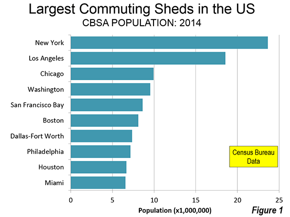
    10 Largest Commuter Sheds

    As a 2014, there were 60 commuter sheds in the United States with more than 1 million population (Table).

    Not surprisingly, the nation’s largest commuter shed is New York. New York stretches from New Haven and Bridgeport, and Connecticut which are separate metropolitan areas out to Allentown which is principally in Pennsylvania and Trenton in New Jersey. The New York commuter shed has a population of 23.6 million. In fact, given the extensive suburban rail transit service between Southwestern Connecticut and New York City, it may be surprising that New Haven and Bridgeport are separate metropolitan areas, both with nearly 1,000,000 population. Moreover, there is virtually no break in the continuously built-up area between New York and southwestern Connecticut (Fairfield and New Haven counties) — they "flow together" to use Barone’s term. Since 2010, the Allentown metropolitan area, with nearly 1,000,000 population, was added to the New York CSA.

    The second largest commuter shed is Los Angeles-Inland Empire, with 18.6 million residents. This includes the Los Angeles metropolitan area (Los Angeles and Orange Counties, Ventura County and the Riverside San Bernardino metropolitan area (Inland Empire, including Riverside and San Bernardino County), which is one of the largest in the nation, with more than 4 million population. Here, as in New York, there is virtually no break in the built-up urbanization between the two urban areas, Los Angeles and Riverside-San Bernardino.

    Chicago is the third largest commuter shed, though its adjacent metropolitan areas are far smaller than in New York and Los Angeles. Chicago is also growing very slowly, with its population increase over the last year so small that it will take nearly to 2020 to reach 10 million, even though it only has 72,000 to go.

    Just below Chicago, Washington and Baltimore combine to form nation’s fourth largest commuter shed. Already with more than 9.5 million residents and strong growth this decade, Washington-Baltimore could pass 10 million population and Chicago by 2020. Washington-Baltimore is unique in combining two of the nation’s historically largest and most intensely developed core municipalities along with the much more extensive suburbs (which contain 85% of the population). Washington-Baltimore now extends to Franklin County, Pennsylvania.

    The fifth largest metropolitan complex is the San Francisco Bay Area with a population of 8.6 million. This includes the San Francisco, San Jose, Vallejo, Santa Rosa, Santa Cruz metropolitan areas and the recently added Stockton metropolitan area.. There is no break in the urbanization between San Francisco and San Jose.  

    The Boston CBSA was enlarged during the last decade to include Providence, a major metropolitan area in its own right. Boston also includes the Worcester metropolitan area, which is nearing 1,000,000 population. Boston-Providence has a population of 8.1 million.

    The top 10 is rounded out by Dallas-Fort Worth (7.4 million), Philadelphia (7.2 million), Houston (6.7 million), and Miami (6.6 million).

    The largest metropolitan complex in the nation that is not a part of a CSA is Phoenix, which is ranked 14th. Only one other commuter sheds in the top 20 is not a CSA (San Diego) and only six of the 60 commuter sheds with more than 1,000,000 population is not a CSA.

    Fastest Growing Commuter Sheds

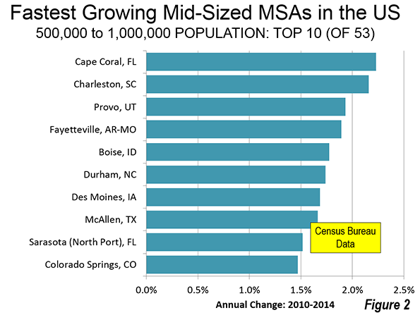
    The fastest commuter shed growth rates are in the South, which accounts for eight of the ten fastest growing commuter shed’s. Austin ranks number one in annual percentage growth between 2010 and 2014, a position it also holds among major metropolitan areas. Cape Coral (Florida) ranks second. Cape Coral also ranks as the fastest growing among the midsized metropolitan areas (from 500,000 to 1,000,000 population). Houston ranks third in growth rate. Houston and Dallas-Fort Worth are the only commuter sheds with more than 5 million population that are among the top 10 in growth. The two non-Southern top 10 entries are from the West: Denver and Phoenix (Figure 2).

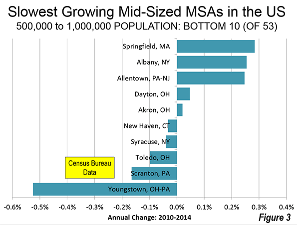
    Slowest Growing Commuter Sheds

    All of the 10 slowest growing major commuter sheds are in the old industrial heartland of the Northeast and Midwest. Cleveland-Akron is the slowest growing, having lost approximately 0.1 percent of its population annually. Pittsburgh, Dayton, Buffalo and Detroit have also lost population.

    Continuing Dispersion

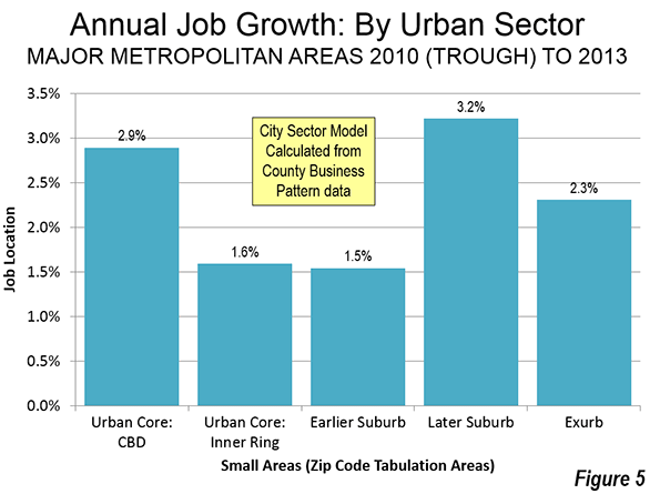
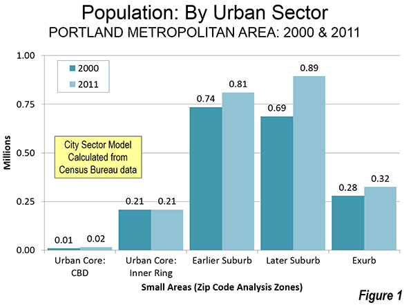
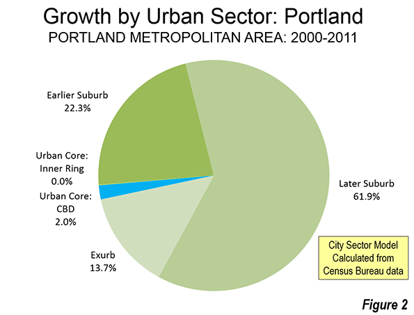
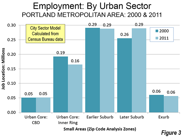
    The dispersion of US metropolitan areas continues, with perhaps the ultimate example of Portland (Oregon), which was recently combined with four other metropolitan areas (see: Driving Farther to Quality in Portland). The "flowing together" suggest that the combined statistical area may be an increasingly important in assessing regional trends.

    Core Based Statistical Areas (Commuter Sheds): United States
    Over 1,000,000 Population in 2014
    2014 Population Rank Metropolitan Area 2010 2014 Annual % Change: 2010-2014 Growth Rank
    1 New York-New Haven, NY-NJ-CT-PA CSA 23.077 23.633 0.56% 41
    2 Los Angeles-Inland Empire, CA CSA 17.877 18.550 0.87% 30
    3 Chicago, IL-IN-WI CSA 9.841 9.928 0.21% 50
    4 Washington-Baltimore, DC-MD-VA-WV-PA CSA 9.052 9.547 1.26% 18
    5 San Fransicsco-San Jose, CA CSA 8.154 8.607 1.28% 17
    6 Boston-Providence, MA-RI-NH-CT CSA 7.894 8.100 0.61% 38
    7 Dallas-Fort Worth, TX-OK CSA 6.818 7.353 1.79% 8
    8 Philadelphia, PA-NJ-DE-MD CSA 7.068 7.165 0.32% 47
    9 Houston, TX CSA 6.115 6.686 2.13% 3
    10 Miami-West Palm Beach, FL CSA 6.168 6.558 1.46% 14
    11 Atlanta, GA CSA 5.910 6.259 1.36% 16
    12 Detroit, MI CSA 5.319 5.315 -0.02% 56
    13 Seattle, WA CSA 4.275 4.527 1.36% 15
    14 Phoenix, AZ MSA 4.193 4.489 1.62% 9
    15 Minneapolis-St. Paul, MN-WI CSA 3.685 3.835 0.94% 26
    16 Cleveland-Akron, OH CSA 3.516 3.498 -0.12% 60
    17 Denver, CO CSA 3.091 3.345 1.88% 6
    18 San Diego, CA MSA 3.095 3.263 1.25% 20
    19 Portland-Salem, OR-WA CSA 2.921 3.060 1.10% 23
    20 Orlando-Daytona Beach, FL CSA 2.818 3.046 1.84% 7
    21 Tampa-St. Petersburg, FL MSA 2.784 2.916 1.10% 22
    22 St. Louis, MO-IL CSA 2.893 2.911 0.15% 52
    23 Pittsburgh, PA-OH-WV CSA 2.661 2.654 -0.06% 59
    24 Charlotte, NC-SC CSA 2.376 2.538 1.57% 11
    25 Sacramento, CA CSA 2.415 2.513 0.94% 27
    26 Salt Lake City-Ogden, UT CSA 2.272 2.424 1.54% 12
    27 Kansas City, MO-KS CSA 2.343 2.412 0.68% 36
    28 Columbus, OH CSA 2.309 2.398 0.90% 28
    29 Indianapolis, IN CSA 2.267 2.354 0.89% 29
    30 San Antonio, TX MSA 2.143 2.329 1.98% 4
    31 Las Vegas, NV-AZ CSA 2.195 2.315 1.26% 19
    32 Cincinnati, OH-KY-IN CSA 2.174 2.208 0.37% 46
    33 Raleigh-Durham, NC CSA 1.913 2.075 1.94% 5
    34 Milwaukee, WI CSA 2.026 2.044 0.21% 51
    35 Austin, TX MSA 1.716 1.943 2.97% 1
    36 Nashville, TN CSA 1.788 1.913 1.59% 10
    37 Norfolk-Virginia Beach, VA-NC CSA 1.779 1.819 0.53% 43
    38 Greensboro-Winston-Salem, NC CSA 1.589 1.630 0.60% 39
    39 Jacksonville, FL-GA CSA 1.470 1.543 1.14% 21
    40 Louisville, KY-IN CSA 1.460 1.499 0.62% 37
    41 Hartford, CT CSA 1.486 1.488 0.02% 55
    42 New Orleans, LA-MS CSA 1.414 1.480 1.09% 24
    43 Grand Rapids, MI CSA 1.379 1.421 0.71% 34
    44 Greenville, SC CSA 1.362 1.410 0.81% 33
    45 Oklahoma City, OK CSA 1.322 1.409 1.50% 13
    46 Memphis, TN-MS-AR CSA 1.353 1.370 0.29% 48
    47 Birmingham, AL CSA 1.303 1.317 0.27% 49
    48 Richmond, VA MSA 1.208 1.260 1.00% 25
    49 Harrisburg, PA CSA 1.219 1.240 0.39% 45
    50 Buffalo, NY CSA 1.216 1.215 -0.02% 57
    51 Rochester, NY CSA 1.175 1.177 0.05% 54
    52 Albany, NY CSA 1.169 1.174 0.10% 53
    53 Albuquerque, NM CSA 1.146 1.166 0.40% 44
    54 Tulsa, OK CSA 1.106 1.139 0.69% 35
    55 Fresno, CA CSA 1.081 1.121 0.84% 32
    56 Knoxville, TN CSA 1.077 1.104 0.58% 40
    57 Dayton, OH CSA 1.080 1.078 -0.05% 58
    58 Tucson, AZ CSA 1.028 1.051 0.53% 42
    59 El Paso, TX-NM CSA 1.013 1.050 0.85% 31
    60 Cape Coral, FL CSA 0.940 1.028 2.13% 2
    In millions
    Data from US Census Bureau
    Metropolitan Statistical Areas shown only if not in a Combined Statistical Area.


    Wendell Cox is Chair, Housing Affordability and Municipal Policy for the Frontier Centre for Public Policy (Canada), is a Senior Fellow of the Center for Opportunity Urbanism (US), a member of the Board of Advisors of the Center for Demographics and Policy at Chapman University (California) and principal of Demographia, an international public policy and demographics firm.

    He is co-author of the "Demographia International Housing Affordability Survey" and author of "Demographia World Urban Areas" and "War on the Dream: How Anti-Sprawl Policy Threatens the Quality of Life." He was appointed to three terms on the Los Angeles County Transportation Commission, where he served with the leading city and county leadership as the only non-elected member. He served as a visiting professor at the Conservatoire National des Arts et Metiers, a national university in Paris. 

    Photo: Albany (NY) City Hall (by author)

  • The California Dream has Moved Away

    Southern California faces a serious middle income housing affordability crisis. I refer to middle income housing, because this nation has become so successful in democratizing property ownership that the overwhelming majority of middle income households own their own homes in most of the country.

    Recently I had the privilege of participating in a forum on this subject sponsored by the Urban Land Institute, Los Angeles Housing Chapter in Century City. The forum also included a presentation from USC Professor Dowell Myers and was chaired by Ehud Mouchly, who chairs the Housing Chapter. This article is adapted from my presentation.

    I am a native Angeleno, having been born near Temple and Alvarado, less than two miles from City Hall. I was appointed to three terms on the Los Angeles County Transportation Commission (LACTC) by Mayor Tom Bradley, where I played a pivotal role in the establishment of the Los Angeles rail system. LACTC and SCRTD were the two predecessors to the current Los Angeles County Metropolitan Transportation Authority (MTA).

    In addition, for 11 years, Hugh Pavletich of Christchurch, New Zealand and I have published the Demographia International Housing Affordability Survey. The latest edition was released in January and included median multiple data for 86 major metropolitan areas and nearly 300 smaller metropolitan areas in nine nations. Finally, I publish the most comprehensive annual review of world urbanization, providing population, land area and density for world urban areas with over 500,000 population (See World’s 1,000 Largest Cities: World Urban Areas 2015 Edition).

    All of this makes housing in Southern California and urban development particularly interesting to me.

    The Imperative: A Rising Standard of Living and Less Poverty

    The title of the forum was "The Changing Demographics of Southern California and Their Impact on Housing," however I think that the reverse is more significant — the impact housing is likely to have on Southern California.

    My perspective is neither ideological nor tied to any political party. It is a fundamentally pragmatic view that domestic policy should principally seek to better people’s lives, by facilitating a rising standard of living and reducing poverty. These objectives were also referenced in the G20 nations communiqué in Brisbane and adopted a announcing a dedication to improving standards of living and eradicating poverty.

    The issue is particularly ripe in California, where public policies relating to housing are having virtually the opposite effect. Housing costs have already increased poverty and reduced the discretionary income of middle-income households.

    This is not an issue of suburbs versus the urban core. I could not be more pleased by the long overdue resurgence of downtown areas as residential locations, something made possible by the huge crime reductions that began with Mayor Rudy Giuliani’s policies in New York City and similar efforts in cities like Los Angeles. It is important to recognize that a vibrant core no more needs dying suburbs then vibrant suburbs need a dying core. Both urban cores and suburbs can prosper, creating a stronger urban area.

    The Housing Crisis

    Southern California’s biggest crisis relates to housing. Housing is important to the standard of living and alleviating poverty. It is the largest element of household budgets. When housing more expensive, it leaves households with less discretionary income to purchase other goods and services. This will, other things being equal, reduce economic output from levels that would be otherwise attained.

    This has been developing for more than four decades as house price to income ratios (such as the median multiple, the median house price divided by the median household income) have doubled and tripled above historical levels and well above those of other metropolitan areas. Attention is often focused on lower income affordable housing, a problem virtually everywhere, but most parts of the country do not suffer so severe a middle-income housing affordability problem. Low-income housing affordability is important and one of the best ways to minimize it is to ensure that there is middle-income housing affordability.

    A bit of historical perspective is appropriate. For centuries nations had little or no property-owning middle class. Huge progress has been made in the last century and particularly since World War II. Following the war, housing development innovation, combined with transportation advances, led to the development of owned middle income housing in the suburbs. It started with Levittown on Long Island and spread across the nation. The most fabled Southern California example is Lakewood (see D. J. Waldie’s Holy Land: A Suburban Memoir on this). The result was a massive increase in home ownership, rising from percentages from the low 40s to 65% in the final decades of the 20th century.

    Similar progress was made in other countries, especially in Canada, Australia and New Zealand, where middle-income households purchased homes with sufficient space. In each of these nations, the median multiples were around or below 3.0 as late as 1995.

    All of this represented progress toward what the late and renown British urbanist Peter Hall called the "ideal of a property owning democracy" (See: The Costs of Smart Growth Revisited: A 40 Year Perspective).

    Sadly, affordability has diminished greatly in many metropolitan areas around the world.  House prices relative to incomes have doubled or tripled in virtually all of the metropolitan areas of Australia and New Zealand, some metropolitan areas in Canada as well as in some key metropolitan areas in the United States, with the worst in California. In each of these places, this house price escalation occurred after implementation of urban containment policies (also called smart growth or growth management), which seriously reduce the amount of land that can be used for new housing.

    The Roots of Urban Containment Policy

    Urban containment has its roots in the British 1947 Town and Country Planning Act. This act created green belts around British cities and is a proximate cause of the present housing shortage and crisis. The general philosophy of the 1947 Act is evident throughout urban planning in the United States and has been implemented in Oregon, part of Washington and California. Urban containment policy was also enacted in Florida. There, house prices had escalated at rates — if not the price levels — to near that of California during the housing bubble. However, legislators took the opportunity to repeal Florida’s urban containment policies when housing prices dropped to historical median multiple levels.

    A recent California Legislative Analyst’s report indicated that much of the problem is California’s strict land-use laws and regulations (See:  How the California Dream Became a Nightmare). A dense mesh of "urban containment" and "smart growth"  regulations have severely limited the land available for new housing, especially on the periphery, where cities grow organically. This destroys the competitive market for land, driving up its cost. This makes house prices escalate in relation to incomes.

    California: 50% More Poverty Than Mississippi

    Today, California house prices are far higher than in the rest of the nation. This is taking a toll on the standard of living and increasing poverty. The Census Bureau’s supplemental poverty measure, which adjusts for housing costs shows California’s poverty rate to be the highest in the nation. It should be of concern that California’s poverty rate is 50% above that of perennial poverty leader Mississippi (Figure).

    Because so much poverty is concentrated among minority ethnic populations, California’s urban containment policy is particularly disadvantaging Hispanics and African-Americans. The Thomas Rivera Institute at USC published a detailed examination of California’s land-use regulations and found that "Far from helping, they are making it particularly difficult for Latino and African American households to own a home."

    The Need for Reform

    The bad news is that things are likely to get much worse. Under the Sustainable Communities Strategies required under Senate Bill 375 (2008), it is likely to become nearly impossible to build traditional suburban single-family housing in California’s metropolitan areas (See: California Declares War on Suburbia). Already, median multiples in San Francisco, San Jose, Los Angeles and San Diego are approaching the highs reached at the peak of the housing bubble. House prices are likely to continue rising relative to incomes, other things being equal.

    Allowing Supply to Meet Demand

    It is often asserted that diminishing land supply in California reflects not so much regulation, but physical limits. The state is sometimes seen as ‘built out’. Yet, in fact, there is plenty of land available for development. Despite its reputation for urban sprawl, the Los Angeles urban area is the most densely populated in the United States. It covers a bit more than one half the land area of the New York urban area. Like any urban area, the greenfield land that is available for development is on the periphery, which  includes areas like the northern Antelope Valley, the Victor Valley, and Southwestern California (Temecula to Hemet) and in some closer areas. Each of these areas is closer to the urban core than some parts of the New York commuter shed.

    These areas could easily accommodate the additional population expected in the area by 2060, including the single family housing generally preferred among middle-income households. Households are not likely to raise children on high rise balconies.

    Even so, the urban footprint would continue to be much smaller than that of New York. If sufficient land were opened to development, the city would expand geographically, but people would also have better access to middle class standards of living, and there would likely be a lot less poverty. The obvious choice would be to let the city expand, while improving real incomes and reducing poverty.

    The California Dream is Now in Denver?

    During the discussion period after my talk, perhaps the most prescient comment was made by an unidentified audience member said that the California dream is now in Denver. California’s unjustifiably and artificially high housing prices are the cause. Between 1993 and 2010, there was net out-migration from California to 42 of the 50 states and the District of Columbia. Immigration to Los Angeles and Orange from abroad has also declined, as immigrants too look for more affordable alternatives. People seeking sun, glamour or a good time will continue to flourish in southern California, but it seems likely that more families, and middle class households, will continue to ebb out, seeking somewhere else the dream that was once so closely identified with Southern California.

    Wendell Cox is principal of Demographia, an international public policy and demographics firm. He is co-author of the "Demographia International Housing Affordability Survey" and author of "Demographia World Urban Areas" and "War on the Dream: How Anti-Sprawl Policy Threatens the Quality of Life." He was appointed to three terms on the Los Angeles County Transportation Commission, where he served with the leading city and county leadership as the only non-elected member. He served as a visiting professor at the Conservatoire National des Arts et Metiers, a national university in Paris. Wendell Cox is Chair, Housing Affordability and Municipal Policy for the Frontier Centre for Public Policy (Canada), is a Senior Fellow of the Center for Opportunity Urbanism and is a member of the Board of Advisors of the Center for Demographics and Policy at Chapman University.

    Photo: Central Los Angeles and the San Fernando Valley (by author)

  • Australian Treasurer Given Primer on Housing Economics

    Wodonga (Victoria) mother of two Mel Wilson has made headlines across Australia with an open letter to Federal Treasurer Joe Hockey on housing affordability. In commenting on Australia’s housing affordability crisis, the Treasurer has told a press conference "The starting point for a first home buyer is to get a good job that pays good money."

    Australia has a severe housing affordability problem. As the Demographia International Housing Affordability Survey showed in January, Sydney median house prices had reached 9.8 times median household incomes of by the third quarter of 2014. In the intervening months house prices have escalated so much that some say the median price will soon pass $1 million.

    It was not that long ago that house prices were far more reasonable in Australia. Nationally, in the early 1990s, house prices averaged around three times incomes. Since that time, house prices have more than doubled relative to incomes. This is placed a considerable burden on purchasing households, especially first home buyers.

    Ms. Wilson incredulously took Treasurer Hockey through the economics of buying a first house in Sydney. She reminded him that it would take all of the average wage earner’s take home pay for four years to save the down-payment on the median house, now priced at A$915,000 (approximately US$700,000.  The entire letter is published below.

    In a later statement, the Treasurer, to his credit, indicated the need for strong lobbying of the states to make more land available to increase supply. The problem in Sydney and Australia is not unique. Similar house cost crises have developed from London to Toronto and San Francisco, where governments have severely limited the land that can be used for new residences, with the wholly predictable result that prices escalate out of control.

    Ms. Wilson, and other concerned (or baffled, as Ms. Wilson puts it) Australians should hope that Treasurer Hockey’s "strong lobbying" is successful. The economic reality is that until there is liberalization of the land use restrictions responsible for much of the housing cost escalation, there will be no relief, other things being equal. Indeed, house prices are likely to just keep going skyward. This requires a mid-course correction toward policies that place improving the standards of living and reducing poverty at a higher priority than urban design.

    Letter from Ms. Mel Wilson to Treasurer Joe Hockey:

    Dear Joe,

    I just wanted to touch base with you regarding your comment that young people are able to enter the property market if they just “get a good job that pays good money.”

    I just wanted to ask you how one might go about this?

    Are you going to be reviewing all the current Awards that are in place to ensure that most jobs pay “good money”?

    Are you going to be creating hundreds of thousands of new jobs that, under your Awards, pay over $100,000 per year?

    Apologies if I have missed this fantastic news, but as someone working in 2 senior HR roles, I believe I would have known about this so that I could pass the message on to some very tired, over qualified employees who currently fall under various Federal and State awards and are being paid between $18 to $25 per hour.

    Are you aware of what the average Australian wage is?

    Are you aware of what the average Australian mortgage in Sydney is?

    Are you aware of the first-home buying process?

    Just in case these facts and figures aren’t available to you, I thought you might be interested.
    The average weekly wage according to the Australian Bureau of Statistics on 1st January 2015 was $1,128.70, or $58,692.40 before tax. This means a take home amount of about $904.00 per week.
    The median house price in Sydney, according to the Domain Group Housing Price Report, as of March 2015, was $914,056.

    Not sure if you know how first home buying works at the moment, but you normally need a deposit of about 20%. This is to pay for the Stamp Duty (which is a State Tax you must pay every time you buy a property), and also to assist in the approval process so that you don’t need to pay Lenders Mortgage Insurance.

    So in this instance, the first home buyer would need about $182,811.00 saved to purchase a house that is the average price in Sydney.

    So to go out and get one of these “good jobs that pay good money” I assume these young people you speak of would need to go to university first.

    On average, it takes about 3 -4 years to get a degree, so if a young person goes to University straight out of school, they can expect to finish their course and be ready for the workforce at about 21, with a HECS-HELP debt of over $20,000. To make this a bit easier for you to understand, let’s say there is a young person named Joe Junior who has done just this.

    If Joe Junior is extremely lucky, and is up there with the best of the graduates from that course and that year, he will get a job straight out of University paying usually under the average wage.
    However, lets just be extremely generous here and say that Joe Junior got a job and was on the national weekly take home wage of $904 per week.

    Joe Junior needs to only save every single dollar worked for about 4 years to save his $182,811 deposit for their first home. Thank you, Mr Hockey, for throwing in that $7,000 first home owner grant too – that meant Joe Junior could get into his first home 8 weeks earlier!

    Just a quick side note, this example does not take into consideration the rising house prices, or Joe Junior’s HECS-HELP debt that he obtained from getting his degree to get one of your so-called “good jobs”.

    Joe Junior is now 25 (not so junior anymore), has been living at home with his parents this entire time and has not been able to spend a single dollar on any bills, board or holidays or public transportation. He also can’t afford a car or petrol for a car but then again “poor people don’t drive cars”. Oh wait, Joe Junior isn’t a poor person – he has a “good job that pays good money.”

    Luckily Joe Junior’s parents have been happy to drive their little Joe Junior to and from work every day and provide free housing, clothing, medical expenses and also provide the food for his breakfast, lunch and dinner each day.

    So finally Joe Junior has saved his $182,811 deposit (of which only about half will go towards his mortgage due to the stamp duty cost), and can now purchase his first home, with a mortgage of about $822,650.00.

    According to the Commonwealth Bank’s online mortgage estimator, the repayments for a mortgage of this amount are $1,073.00 per week over 30 years.

    So hopefully Joe Junior’s average weekly wage of $904.00 has gone up enough to cover the cost of the mortgage.

    Joe Junior has been applying for these “good jobs hat pay good money" that you speak of (I assume by "good money" you mean more than the average wage as you have just seen it is not even enough to cover the cost of the average house prices’ mortgage in Sydney), but hasn’t had any luck as yet. He needed to stay in the same job post university to demonstrate to the bank job stability so that he could purchase his first home. So he only has a degree, and experience in the one job, one industry, and there are just not that many jobs out there paying “good money.”

    Joe Junior now also can’t wash his clothes, eat food, or get to and from work as he no longer lives with his parents, so getting one of these “good jobs” is even more difficult.

    So Joe Senior, are you really aware of all the facts and figures when you says things like buying your first home is “readily affordable” to young people?

    Just slightly confused as to what you were thinking when you said these words at the media conference in Sydney.

    Looking forward to another one of your politically correct, direct and well thought out responses.

    Regards,
    Another baffled Australian

  • Growth Concentrated in Most Suburbanized Core Cities

    An analysis of the just-released municipal population trends shows that core city growth is centered in the municipalities that have the largest percentage of their population living in suburban (or exurban) neighborhoods.

    Improved Urban Core Analysis

    There is considerable interest in urban core population trends, both because of recent increases in the interest of urban planning orthodoxy to restore living patterns more akin to the pre-World War II era. At that time, urban areas were considerably more densely populated, commuting travel was much more focused on downtowns (central business districts or CBDs) and automobile use accounted for far less of urban travel than today.

    Most previous analysis has equated historical core municipality (core city) data with the urban core. The core cities are generally the original settlements, as they have evolved by expanding their city limits. Around these core cities, suburbs and exurbs have developed, which combined with the core cities make up the metropolitan area. Metropolitan areas are the "economic" dimension of contemporary cities.

    However, even the most cursory analysis demonstrates that equating core cities with the urban core is far from ideal. Historical core municipalities vary greatly in their percent of their population living in traditional high density neighborhoods. For example, in core cities like New York, Boston and San Francisco, nearly all people live in neighborhoods that can be classified as urban core. In others of the largest core cities, virtually all of the population lives in neighborhoods that are suburban or exurban, in view of their low densities and overwhelming automobile orientation. These include examples like San Antonio, Phoenix and San Jose. Even core cities perceived to have a strong urban core, such as Portland and Miami, have considerably less than 50% of their population in urban core neighborhoods.

    Overall, historical core municipalities have little more than 40% of their population living in urban core neighborhoods. When non-core principal cities or primary cities are equated with core cities, there is even less association with the urban core. Overall, non-core principal cities have less than 10% of their population living in urban core neighborhoods.

    This has changed in recent years, with the introduction of the annual American Community Survey and its small area data, such as for ZIP Code analysis zones (ZCTAs). Even so, the comprehensive publication of small area data tends to lag approximately three years behind population estimates. Thus, the small area data that would make it possible to compare population trends to 2014 by functional urban sector within core cities will not be released until 2017.

    This article classifies 2010 to 2014 core city population growth by the percentage of urban core population according to the 2010 census. The classification was developed using my City Sector Model, which classifies every zip code in metropolitan areas as pre-War urban core (CBD and inner ring) or post-War suburban or exurban (Figure 1). Simplified, the City Sector Model classifies as urban core any small area with an employment density of 20,000 per square mile or more or a population density of 7,500 per square mile or more, with a transit, cycling and walking work trip market share of 20% or more (Note).

    Growth by Extent of Urban Core Population

    More than 50% of the growth between 2010 and 2014 has been in core municipalities that are more than 90% post World War II suburban or exurban (0 to 10% urban core). This growth share is nearly one-half higher than their population share of 35%.

    These findings are based on the City Sector Model (Figure 1 and Note), which classifies small areas (zip code tabulation areas) principally using population density and commuting market share data that attempts to replicate urban areas as they functioned before World War II.

    These most suburban of core cities grew the fastest, up 6.8% from 2010 to 2014. These municipalities had less than 10% of their population in urban core neighborhods, and include core cities that annexed substantial suburban or rural territory, such as Phoenix, San Jose, Charlotte, Tampa, Orlando and San Antonio. Those that were most heavily urban core in form grew 4,0 percent, which was slightly behind the national average of 4.7 percent. The core cities had less than 10% of their population living in urban core neighborhoods, and include New York, Buffalo, Providence, San Francisco and Boston (Figure 2)  

    The functionally suburban and exurban areas accounted for approximately 58% of the population in the core cities. This leaves approximately 42% of the population living in areas that are similar to the urban areas as they functioned in 1940.

    Approximately 70% of the growth was in the 33 historical core municipalities that are more than 60% suburban or exurban.

    At the same time, the five core cities with the largest urban core percentages accounted for nearly 20% of the growth, compared to their 22 percent of the population. Approximately 80% of this growth was in New York, which is estimated to have added the largest population (316,000) among the core cities.

    Ten Fastest Growing Core Municipalities

    Six of the ten fastest growing core cities had urban core shares of less than 10%, including Austin, Orlando, Charlotte, Raleigh, Atlanta and San Antonio. A seventh, Denver was less than 15% urban by function. Two more had more than 50% in urban core population, Washington and Seattle (Table). Eight of the 10 fastest growing core cities were in the South, including Washington.

    Table
    Population Growth: 2010-2014
    Core Municipalities in Major Metropolitan Areas
    Population Population in Pre-War Functional Urban Core
    Rank Historical Core Municipality Metropolitan Area 2010 2014 % Change Historical Core Municipality Metropolitan Area
    1 Austin Austin, TX     790,637      912,791 15.5% 4.8% 2.2%
    2 New Orleans New Orleans. LA     343,829      384,320 11.8% 37.9% 10.9%
    3 Denver Denver, CO     600,024      663,862 10.6% 13.1% 3.1%
    4 Orlando Orlando, FL     238,304      262,372 10.1% 0.0% 0.0%
    5 Charlotte Charlotte, NC-SC     735,780      809,958 10.1% 0.0% 0.0%
    6 Seattle Seattle, WA     608,660      668,342 9.8% 52.6% 10.5%
    7 Washington Washington, DC-VA-MD-WV     601,723      658,893 9.5% 83.7% 16.5%
    8 Raleigh Raleigh, NC     403,947      439,896 8.9% 0.0% 0.0%
    9 Atlanta Atlanta, GA     420,279      456,002 8.5% 9.2% 0.7%
    10 San Antonio San Antonio, TX  1,327,605   1,436,697 8.2% 0.1% 0.1%
    11 Miami Miami, FL     399,508      430,332 7.7% 23.0% 3.0%
    12 Oklahoma City Oklahoma City, OK     580,003      620,602 7.0% 6.1% 2.8%
    13 Dallas Dallas-Fort Worth, TX  1,197,833   1,281,047 6.9% 1.1% 0.5%
    14 Tampa Tampa-St. Petersburg, FL     335,709      358,699 6.8% 0.0% 0.0%
    15 Houston Houston, TX  2,097,217   2,239,558 6.8% 1.4% 0.5%
    16 Nashville Nashville, TN     603,527      644,014 6.7% 0.7% 0.2%
    17 Richmond Richmond, VA     204,237      217,853 6.7% 26.0% 4.5%
    18 San Jose San Jose, CA     952,562   1,015,785 6.6% 0.1% 0.2%
    19 Minneapolis Minneapolis-St. Paul, MN-WI     382,578      407,207 6.4% 86.0% 0.0%
    20 Boston Boston, MA-NH     617,594      655,884 6.2% 90.4% 35.5%
    21 Phoenix Phoenix, AZ  1,447,552   1,537,058 6.2% 0.0% 0.0%
    22 San Diego San Diego, CA  1,301,621   1,381,069 6.1% 2.8% 1.2%
    23 Portland Portland, OR-WA     583,778      619,360 6.1% 37.9% 10.0%
    24 Columbus Columbus, OH     788,577      835,957 6.0% 12.0% 5.0%
    25 Oakland San Francisco-Oakland, CA     390,719      413,775 5.9% 54.7% 0.0%
    26 San Francisco San Francisco-Oakland, CA     805,235      852,469 5.9% 94.4% 0.0%
    27 Las Vegas Las Vegas, NV     583,787      613,599 5.1% 7.8% 2.8%
    28 Stl Paul Minneapolis-St. Paul, MN-WI     285,068      297,640 4.4% 38.7% 0.0%
    29 Sacramento Sacramento, CA     466,488      485,199 4.0% 7.6% 1.6%
    30 New York New York, NY-NJ-PA  8,175,136   8,491,079 3.9% 97.3% 52.8%
    31 Jacksonville Jacksonville, FL     821,784      853,382 3.8% 0.0% 0.0%
    32 Los Angeles Los Angeles, CA  3,792,627   3,928,864 3.6% 30.1% 10.6%
    33 Indianapolis Indianapolis. IN     820,442      848,788 3.5% 11.0% 4.8%
    34 Grand Rapids Grand Rapids, MI     188,040      193,792 3.1% 19.1% 3.8%
    35 Louisville Louisville, KY-IN     597,336      612,780 2.6% 17.8% 8.7%
    36 San Bernardino Riverside-San Bernardino, CA     209,952      215,213 2.5% 0.0% 0.0%
    37 Kansas City Kansas City, MO-KS     459,787      470,800 2.4% 19.8% 5.4%
    38 Salt Lake City Salt Lake City, UT     186,443      190,884 2.4% 21.4% 3.7%
    39 Philadelphia Philadelphia, PA-NJ-DE-MD  1,526,006   1,560,297 2.2% 86.1% 25.8%
    40 Memphis Memphis, TN-MS-AR     646,889      656,861 1.5% 3.7% 1.8%
    41 Norfolk Virginia Beach-Norfolk, VA-NC     242,803      245,428 1.1% 2.8% 0.4%
    42 Chicago Chicago, IL-IN-WI  2,695,598   2,722,389 1.0% 76.6% 25.8%
    43 Milwaukee Milwaukee,WI     594,740      599,642 0.8% 55.4% 23.6%
    44 Providence Providence, RI-MA     178,036      179,154 0.6% 92.6% 26.2%
    45 Cincinnati Cincinnati, OH-KY-IN     296,950      298,165 0.4% 54.2% 10.1%
    46 Baltimore Baltimore, MD     620,961      622,793 0.3% 67.7% 16.2%
    47 Birmingham Birmingham, AL     212,288      212,247 0.0% 0.0% 0.0%
    48 Hartford Hartford, CT     124,775      124,705 -0.1% 88.5% 11.3%
    49 Pittsburgh Pittsburgh, PA     305,702      305,412 -0.1% 78.0% 15.9%
    50 Rochester Rochester, NY     210,512      209,983 -0.3% 51.7% 11.4%
    51 St. Louis St. Louis,, MO-IL     319,294      317,419 -0.6% 84.1% 11.7%
    52 Buffalo Buffalo, NY     261,310      258,703 -1.0% 96.0% 29.2%
    53 Cleveland Cleveland, OH     396,814      389,521 -1.8% 80.1% 22.2%
    54 Detroit Detroit,  MI     713,777      680,250 -4.7% 32.1% 6.5%
    Data from:
    US Census Bureau
    City Sector Model (2015)


    Austin has been the fastest growing historical core municipality over the four years. In 2010, Austin had 790,000 residents, and has increased 15.5% to 913,000.

    New Orleans was the second fastest growing, adding 11.8%, continuing its recovery from the huge population loss after Hurricanes Katrina and the related flood control failures, which the Independent Levee Investigation Team concluded was the "single most costly catastrophic failure of an engineered system in history." New Orleans has now recovered more than 70% of its population loss between 2005 and 2006. In 2005, the population was 455,000, which fell to 209,000 in 2006, before recovering to the 2014 figure of 384,000.

    The balance of the top five, Denver, Orlando and Charlotte also grew more than 10% between 2010 and 2014. The second five in population growth were Seattle, Washington (DC), Raleigh, Atlanta and San Antonio.

    Slowest Growing Core Municipalities

    Eight of the 10 slowest growing municipalities were in the Northeast and Midwest, including Detroit, Cleveland, Buffalo, St. Louis, Rochester, Pittsburgh, Hartford and Cincinnati. Two were in the South, Birmingham and Baltimore.

    Eight core municipalities lost population. The largest loss was in Detroit, which fell 4.7% to 680,000. This is a continuation of the catastrophic losses from 1950, when Detroit had 1,850,000 residents. It may be surprising, however, that Detroit has become the core municipality with the greatest loss only this year. Until 2013, St. Louis had lost the largest share of its population from 1950 (when its population was 857,000). By 2014, Detroit had lost 63.2% of its 1950 population, compared to the 63.0% loss in St. Louis). St. Louis also continued its losses, dropping 0.6% between 2010 and 2014.

    Cleveland and Buffalo had greater losses than St. Louis. Cleveland slipped 1.8% to 390,000, while Buffalo dropped 1.0% to 259,000. Losses of less than 0.5% were posted in Pittsburgh, Hartford and Birmingham.

    More-than-a-Million Municipalities

    The United States added its 10th municipality with more than 1,000,000 in the 2014 estimates. San Jose joins Los Angeles and San Diego as California’s third more-than-a-million city. As a result, California now equals Texas, which had led the nation, with three cities with more than 1,000,000 residents in previous years (Houston, San Antonio and Dallas).

    Texas, however, should soon reclaim the exclusive title. The city of Austin forecasts that its population will reach 1,000,000 population early in the 2020s, which would give Texas four more-than-a-million municipalities. This forecast, however, could be too conservative. If the Texas city continues to grow at its current rate, a population of more than 1,000,000 could be reached before the 2020 census.

    Yet, the core municipalities with more than 1,000,000 – particularly the new entrants – are not particularly dense, but are virtually suburban in form, that is, auto-oriented and generally low density.  Three have less than one percent of their population in urban core neighborhoods, including Phoenix, San Antonio and San Jose, Dallas and Houston have less than two percent of their population in urban core neighborhoods, while San Diego has less than three percent. Even in Los Angeles only 30% of residents live in urban core neighborhoods. Only three of the largest municipalities have most of their population in urban core neighborhoods, New York, (97%), Philadelphia (86%) and Chicago (77%).  

    Lower Density Growth Could be Dominant in Core Cities

    The new population estimates provide little indication how much core city growth since 2010 is urban intensification versus low density suburban development. However, the concentration of growth where urban cores are smaller implies that growth has been stronger at lower in the suburban portions of core municipalities. To know for sure will require waiting for later small area data.

    Related article: U.S. Population Estimate Accuracy: 2010

    Note: The analysis is based on the City Sector Model (Figure 1), which classifies small areas (ZIP codes, more formally, ZIP Code Tabulation Areas, or ZCTAs) in major metropolitan areas based upon their behavioral functions as urban cores, suburbs or exurbs. The criteria used are generally employment and population densities and modes of work trip travel. The purpose of the urban core sectors is to replicate, to the best extent possible, the urban form as it existed before World War II, when urban densities were much higher and when a far larger percentage of urban travel was on transit or by walking. The suburban and exurban sectors replicate automobile oriented suburbanization that began in the 1920s and escalated strongly following World War II.

    Wendell Cox is principal of Demographia, an international public policy and demographics firm. He is co-author of the "Demographia International Housing Affordability Survey" and author of "Demographia World Urban Areas" and "War on the Dream: How Anti-Sprawl Policy Threatens the Quality of Life." He was appointed to three terms on the Los Angeles County Transportation Commission, where he served with the leading city and county leadership as the only non-elected member. He served as a visiting professor at the Conservatoire National des Arts et Metiers, a national university in Paris. Wendell Cox is Chair, Housing Affordability and Municipal Policy for the Frontier Centre for Public Policy (Canada), is a Senior Fellow of the Center for Opportunity Urbanism and is a member of the Board of Advisors of the Center for Demographics and Policy at Chapman University.

    Photo: Newest more-than-a-million US core city, virtually all-suburban San Jose by Robert Campbell [GFDL or CC BY-SA 3.0], via Wikimedia Commons

  • US Population Estimate Accuracy: 2010

    Intercensal population estimates, while generally reliable, are prone to substantial variation in some cases. This is especially so with municipal population estimates.

    Between 2000 and 2010, the average discrepancy between the US Census Bureau 2010 estimates and the 2010 census counts at the county level was 3.1% (absolute value). By comparison, among the 50 largest municipalities and census designated places, the average discrepancy was more than one-half higher, at 4.7 using the 2000 to 2009 estimates (there were no 2010 sub-county population estimates). The variations, however, can be substantial in sub-county population estimates. Between 2000 and 2010, the Census Bureau estimated that New York had added more than 410,000 residents. However, the 2010 census count showed a much smaller gain, at approximately 165,000 (2010 estimates are available for New York because it is composed of whole counties).

    There were even more substantial variations. The 2009 population estimates for Atlanta and Detroit were more than 25% higher than the 2010 census count. In the case of Atlanta, the 2000 to 2009 population growth estimate was more than 120,000, more than 100 times the actual increase of approximately 1,000. The discrepancies in Atlanta and Detroit were greater than in all but a three of the nation’s more than 3,000 counties and each of the counties with larger discrepancies had populations of less than 1,000 in 2010.

  • Working at Home: In Most Places, the Big Alternative to Cars

    Working at home, much of it telecommuting, has replaced transit as the principal commuting alternative to the automobile in the United States outside New York. In the balance of the nation, there are more than 1.25 commuters who work at home for each commuter using transit to travel to work, according to data in the American Community Survey for 2013 (one year). When the other six largest transit metropolitan areas are included (Los Angeles, Chicago, Philadelphia, Washington, Boston and San Francisco), twice as many people commute by working at home than by transit.

    Overall, working at home leads transit in 37 of the 52 major metropolitan areas (over 1 million population in 2013).

    The Top Ten

    Not surprisingly, most of the strongest work at home markets are technology hubs. However, the strength of working at home, and particularly its growth in these metropolitan areas may seem at odds with the huge expenditures on urban rail. Nine of the top 10 working at home metropolitan areas have built or expanded rail systems, yet working at home has grown far faster than transit. The exception is Seattle, where transit has grown faster, but nearly all the increase has been on buses and ferries. Only two of the top ten metropolitan areas have larger transit shares than work at home shares.

    Here are the top 10 working at home major metropolitan areas (Figure). Market shares are shown to the second digit to eliminate ties.

    • Denver has the highest working at home commute share, at 7.14%. Like nine of the other top 10 major metropolitan areas, Denver has an urban rail system. Even so, Denver’s transit work trip market share is a full third lower, at 4.41%. In 2000, working at home had only a lead over transit (4.58% v. 4.45%).
    • Technology hub Austin places a close second, at 6.87%. Austin’s working at home commute share is nearly 3 times its 2.37% transit share. Working at home increased from 3.60% in 2000, while transit dropped from 2.51%, despite the addition of a rail line.
    • Portland, also a technology hub, and a decorated model among urban planners, ranks third in working at home commute share, at 6.40%. Transit share slightly smaller, at 6.37%. In 1980, however, transit’s market share was nearly a third again its present level (8.4%), before the first of its six rail lines opened. In contrast, working at home has nearly tripled its share from 2.2% in 1980. In 2000, working at home attracted 4.60% of commuters in Portland, well below the 6.27% transit share.
    • San Diego ranks fourth in working at home, with a 6.38% market share. The California city built the first of the modern light rail lines in the early 1980s. San Diego’s transit market share is approximately one half its working at home share (3.17 percent). In 2000, working at home had a commute share of 4.40%, while transit’s share was 3.31%.
    • Raleigh, another technology hub, ranks fifth in working at home with a 6.16% market share. Raleigh is the only metropolitan area among the top 10 that does not have an urban rail system. Raleigh’s transit work trip market share is 1.03%. In 2000, working at home had a commute share of 3.46%, while transit’s share was 0.86%, modestly below the 2013 figure.
    • Atlanta ranks sixth in working at home, with a 5.96% market share. Atlanta has built more miles of high quality Metro (grade separated subway and elevated rail) than anywhere outside Washington and San Francisco in the last half century. Even so, Atlanta has experienced a more than 50% decline in its transit market share and now that share is barely half that of working alone (3.08%). In 2000, working at home had a commute share of 3.47%, while transit’s share was 3.46%.
    • San Francisco, another technology hub, ranks seventh in working at home, with a 5.94% market share. San Francisco is unique in having a substantially higher transit than work at home market share (16.13%). San Francisco is the second strongest transit market in the United States, trailing only New York (30.86%). In 2000, working at home had a commute share of 4.27%, while transit’s share was 13.77%.
    • Phoenix nearly equals San Francisco, with a 5.85% working at home market share. This is more than double the 2.61% transit market share. In 2000, working at home had a commute share of 3.66%, while transit’s share was 1.93%.
    • Sacramento ranks 9th in working at home market share, at 5.56%, more than double its 2.65% transit work trip share. In 2000, working at home had a commute share of 4.03%, while transit’s share was 2.67%.
    • Seattle, also a technology hub, has a working at home market share of 5.38%, for a ranking of 10th. Like San Francisco has a higher transit work trip market share (9.31%). In 2000, working at home had a commute share of 4.17%, while transit’s share was 6.97%.

    The work at home and transit market shares are indicted for each major metropolitan area in the table.

    Where Working at Home is the Weakest

    In most of the strongest transit metropolitan areas, as opposed to cities that have systems that simply are not so widely used, working at home doesn’t usually achieve second place to cars.  As noted above, San Francisco has a considerably stronger transit share than virtually any major metropolitan area outside New York.

    New York, by far the largest transit market in the United States, is also the largest work at home market in raw numbers (386,000). Yet, New York’s transit market share (30.86%) is seven times its work at home share (4.17%).

    Chicago, Washington and Boston have transit market shares approximately three times that of working at home, while Philadelphia’s transit share is 2.5 times as high.

    This is not to say that working at home is in decline. Strong working at home gains — nearly 50% to over 100% from 2000 to 2013 — were made in each of these six metropolitan areas. Yet, with its smaller base, working at home is not likely to exceed transit in the near future.

    Los Angeles is a possible exception. Since 2013, working at home has closed approximately 60% of the gap with transit. Continuation of present trends would have working at home becoming the most popular alternative to cars in Los Angeles before 2020.

    The Future?

    Working at home has grown despite having received little attention in urban planning, compared to that of expensive rail projects. Its success has eliminated millions of daily work trips, reduced greenhouse gases and responded to the desire for better lifestyles by many. With continuing improvements in technology, and higher acceptance among companies and government agencies, working at home seems likely to continue its growth in the coming decades.

    Work at Home to Transit Commuting Ratio
    Major Metropolitan Areas: 2013
    Metropolitan Area Work at Home Work Trip Share Transit Work Trip Share Work at Home Commuters per Transit Commuter
    Atlanta, GA 5.96% 3.08% 1.93
    Austin, TX 6.87% 2.37% 2.89
    Baltimore, MD 4.10% 6.79% 0.60
    Birmingham, AL 2.79% 0.78% 3.57
    Boston, MA-NH 4.46% 12.76% 0.35
    Buffalo, NY 2.62% 2.92% 0.90
    Charlotte, NC-SC 5.19% 1.74% 2.98
    Chicago, IL-IN-WI 4.32% 11.75% 0.37
    Cincinnati, OH-KY-IN 3.85% 2.17% 1.78
    Cleveland, OH 3.80% 3.25% 1.17
    Columbus, OH 4.14% 1.69% 2.44
    Dallas-Fort Worth, TX 4.98% 1.39% 3.58
    Denver, CO 7.14% 4.41% 1.62
    Detroit,  MI 3.52% 1.68% 2.09
    Grand Rapids, MI 4.22% 1.62% 2.61
    Hartford, CT 3.50% 3.07% 1.14
    Houston, TX 3.69% 2.37% 1.56
    Indianapolis. IN 3.93% 1.12% 3.51
    Jacksonville, FL 4.99% 1.07% 4.66
    Kansas City, MO-KS 4.08% 1.22% 3.35
    Las Vegas, NV 3.18% 3.47% 0.92
    Los Angeles, CA 5.13% 5.84% 0.88
    Louisville, KY-IN 2.77% 1.71% 1.63
    Memphis, TN-MS-AR 2.37% 1.15% 2.07
    Miami, FL 4.76% 4.07% 1.17
    Milwaukee,WI 3.52% 3.65% 0.96
    Minneapolis-St. Paul, MN-WI 4.88% 4.64% 1.05
    Nashville, TN 4.50% 1.02% 4.43
    New Orleans. LA 2.67% 2.70% 0.99
    New York, NY-NJ-PA 4.17% 30.86% 0.13
    Oklahoma City, OK 3.07% 0.54% 5.74
    Orlando, FL 5.05% 1.73% 2.92
    Philadelphia, PA-NJ-DE-MD 3.99% 10.00% 0.40
    Phoenix, AZ 5.85% 2.61% 2.25
    Pittsburgh, PA 3.71% 4.89% 0.76
    Portland, OR-WA 6.40% 6.37% 1.01
    Providence, RI-MA 3.23% 2.68% 1.21
    Raleigh, NC 6.16% 1.03% 5.96
    Richmond, VA 4.25% 1.34% 3.18
    Riverside-San Bernardino, CA 5.00% 1.46% 3.42
    Rochester, NY 3.39% 2.53% 1.34
    Sacramento, CA 5.56% 2.65% 2.10
    Salt Lake City, UT 5.13% 3.25% 1.58
    San Antonio, TX 4.33% 2.51% 1.72
    San Diego, CA 6.38% 3.17% 2.01
    San Francisco-Oakland, CA 5.94% 16.13% 0.37
    San Jose, CA 4.05% 4.24% 0.96
    Seattle, WA 5.38% 9.31% 0.58
    St. Louis,, MO-IL 4.09% 2.91% 1.40
    Tampa-St. Petersburg, FL 5.11% 1.38% 3.70
    Virginia Beach-Norfolk, VA-NC 3.38% 1.71% 1.98
    Washington, DC-VA-MD-WV 5.02% 14.16% 0.35
    From: American Community Survey, 2013 (One Year)


    Wendell Cox is principal of Demographia, an international public policy and demographics firm. He is co-author of the "Demographia International Housing Affordability Survey" and author of "Demographia World Urban Areas" and "War on the Dream: How Anti-Sprawl Policy Threatens the Quality of Life." He was appointed to three terms on the Los Angeles County Transportation Commission, where he served with the leading city and county leadership as the only non-elected member. He served as a visiting professor at the Conservatoire National des Arts et Metiers, a national university in Paris. Wendell Cox is Chair, Housing Affordability and Municipal Policy for the Frontier Centre for Public Policy (Canada), is a Senior Fellow of the Center for Opportunity Urbanism and is a member of the Board of Advisors of the Center for Demographics and Policy at Chapman University.

    Photo by By Rae Allen, “My portable home office on the back deck”

  • California in 2060?

    The California Department of Finance (DOF) has issued population projections for the state’s counties to 2060.  Forecasts are provided for every decade, from a 2010 base. The DOF projects that the the state will grow from 37.3 million residents in 2010 to 51.7 million in 2060. This is a 0.7 percent annual growth rate over the next 50 years. By contrast, California’s growth rate was 1.7 percent annually over the last 50 years (1960-2010), and a much higher 3.0 percent in the growth heyday of 1940 to 1990. However, even with this slower rate, California is expected to grow slightly more quickly than the nation (0.6 percent annually).

    The current projections are considerably more conservative than those made by DOF less than a decade ago. In 2007, DOF forecast that California would have 60 million residents in 2050. The current population project for 2050 is substantially smaller, at 49.8 million.

    Metropolitan Complexes

    To understand where this growth is projected to take place — and not — we look at CSA’s (consolidated statistical areas).  CSA’s are economically connected, adjacent metropolitan areas. CSA’s require a 15 percent employment interchange between the metropolitan areas. Metropolitan areas themselves are defined by a 25 percent commuting interchange between outlying counties and central counties, each of which must have at least one-half of its population in the core urban area.

    As Michael Barone pointed out in his analysis of the 2014 population estimates, sometimes it is not obvious when one metropolitan area changes into another, as in the cases of San Francisco/San Jose and Los Angeles/Riverside-San Bernardino, which are CSA’s. Another example is New York and the southwestern Connecticut suburbs in Fairfield and New Haven counties. This is because there is no break in the continuous urbanization.

    Metropolitan Complexes in 2060

    If the DOF has it right, in a half century, California will be home to eight major metropolitan complexes. which I am defining as combined statistical areas (CSA’s) or  "stand alone" metropolitan areas with more than 1,000,000 population (Figure 1).

    The Los Angeles metropolitan complex (Los Angeles-Riverside, including Los Angeles, Orange, Riverside, San Bernardino and Ventura counties) would remain by far the largest, growing from 17.9 million to 22.8 million. One-third of the growth would be in Los Angeles County, and two-thirds outside. Riverside and San Bernardino counties would receive most of the growth (53 percent). Riverside County would grow the fastest, adding 68 percent to its population (Figure 2). Overall, the Los Angeles metropolitan complex would grow 27.3 percent, well below the projected state rate of 38.4 percent. This is quite a turnaround for a metropolitan complex that was once among the fastest growing in human history.

    The San Francisco Bay metropolitan complex, including the San Francisco, San Jose, Santa Cruz, Vallejo, Santa Rosa and Stockton metropolitan areas would grow a much faster 45.6 percent, from 8.1 million in 2010 to 11.9 million in 2060. The core city of San Francisco would add nearly 300,000, growing 36.3 percent to 1.1 million, (nearly the state rate). However, only 8 percent of the Bay Area growth would be in San Francisco, and 92 percent outside (Figure 3).  Four counties would add more than 500,000 residents, including Santa Clara (800,000), Alameda (680,000), Contra Costa (519,000), and newly added San Joaquin county, which is defined as the Stockton metropolitan area (620,000). San Joaquin County would also grow the fastest, at 90 percent, reaching 1.3 million. This growth is to be expected, since San Joaquin is one of the more peripheral counties, and where the metropolitan fringe (which includes the commuting shed) has been expanding the most.

    The San Diego metropolitan complex, a "stand alone" metropolitan area, would grow nearly as slowly as Los Angeles. San Diego’s population of 3.1 million in 2010 would rise to 4.1 million in 2060, an increase of 30.8 percent.

    Sacramento’s metropolitan complex includes the Sacramento, Truckee-Grass Valley and Yuba City metropolitan areas. Sacramento is projected to grow 52.8 percent, from 2.4 million in 2010 to 3.7 million in 2060.

    Four additional metropolitan complexes with more than 1 million population are projected, all in the San Joaquin Valley.

    Fresno, which includes Fresno County and Madera County, would grow from 1.1 million to 1.9 million, for a nearly 75 percent growth rate.

    Bakersfield (Kern County) would be the fastest growing among major metropolitan complexes. Bakersfield would grow from 840,000 in 2010 to 1.8 million in 2060, for a growth rate of 111 percent.

    Modesto (Stanislaus and Merced counties) would be the seventh largest metropolitan complex. From a 2010 population of 770,000, Modesto would grow 74 percent to 1,340,000. However, it is possible that by 2060 the commuting shed will reach the San Francisco Bay metropolitan complex, causing it to consume Modesto, as it already has Stockton.

    In 2060, California would get its eighth major metropolitan area, with Visalia-Hanford reaching 1,040,000, up 74 percent from 2010 (Tulare and Kings Counties).

    Outside of these areas, the largest metropolitan complex would be Salinas, which is projected to have 530,000 residents by 2060. However, Salinas is close enough to the San Francisco Bay Area that it could be added to that area’s commuting shed by 2040. The next largest metropolitan area would be El Centro (Imperial County), with a population projected to reach 340,000 by 2060. El Centro, however, could be included in the San Diego commuter shed by that time, making it a part of the San Diego metropolitan complex. The next largest metropolitan complexes would be in the northern Sacramento Valley, Redding and Chico, both approximately 300,000.

    Only 2.4 million Californians lived outside the 8 major metropolitan complexes, or 7 percent of the population. Growth in these areas is expected to be slow, with only a 27 percent increase to 2060.

    The Difficulty of Projections

    Of course, it is virtually impossible to accurately predict demographic trends 50 years into the future. California’s slower than expected growth in recent decades reflected general economic weakness since 1990, and the impact of ultra-high housing prices, particularly on the coast. However, the 2060 California projections provide an interesting view of the future from today’s perspective.

    Photo: Bakersfield: Fastest Growth Projected 2010 to 2060. “Bakersfield CA – sign” by nickchapman – originally posted to Flickr as P1000493. Licensed under CC BY 2.0 via Wikimedia Commons.

    Wendell Cox is principal of Demographia, an international public policy and demographics firm. He is co-author of the "Demographia International Housing Affordability Survey" and author of "Demographia World Urban Areas" and "War on the Dream: How Anti-Sprawl Policy Threatens the Quality of Life." He was appointed to three terms on the Los Angeles County Transportation Commission, where he served with the leading city and county leadership as the only non-elected member. He served as a visiting professor at the Conservatoire National des Arts et Metiers, a national university in Paris. Wendell Cox is Chair, Housing Affordability and Municipal Policy for the Frontier Centre for Public Policy (Canada), is a Senior Fellow of the Center for Opportunity Urbanism and is a member of the Board of Advisors of the Center for Demographics and Policy at Chapman University.

  • Dispersion and Concentration in Metropolitan Employment

    The just released County Business Patterns indicates a general trend of continued employment dispersion to the newer suburbs (principally the outer suburbs) and exurbs but also greater concentration in the central business districts of the 52 major metropolitan areas in the United States (over 1 million population in 2013). County Business Patterns is a Census Bureau program that provides largely private-sector employment data by geography throughout the nation.

    This article examines the most recent data, for 2013, with comparisons to 2007, which was the peak employment year and preceded the Great Recession, the most substantial economic decline in the United States since the Great Depression. There are also comparisons to 2010, the year in which national employment reached its lowest level (trough) before beginning what is, so far, a long and fairly arduous recovery. The analysis uses the City Sector Model (Note)

    2007-2013 Trend

    Job losses were registered in each of the five urban sectors between the employment peak of 2007 and the trough of 2010. Three of the urban sectors have recovered to above their 2007 employment levels. However, overall major metropolitan area employment remains lower by approximately 800,000. Since the 2010 trough, the largest numeric gains have been in the newer suburbs. The Central Business Districts (CBDs) of the Urban Core have recovered more than double their 2007 to 2010 numeric loss. In contrast, the balance of the Urban Core, the Inner Ring experienced a modest increase over its 2007 employment peak. The exurbs have not yet fully recovered. By far the largest losses between 2007 and 2010 were in the earlier suburbs (principally inner suburbs), where employment dropped 2.8 million and has recovered less than one half of that loss (Figure 1).

    Dispersion and Concentration

    The dispersion and concentration is most evident in the shares of employment by urban sector (Figure 3). Three of the urban sectors increased their share of metropolitan employment between 2007 and 2013. The largest increase was in the newer suburban areas, which rose from 24.7 percent to 25.6 percent of metropolitan employment. The central business districts also increased their share of employment, from 8.4 percent in 2007 to 9.0 percent in 2013. This trend is similar to the City Observatory (Joe Courtright) findings that urban cores outperformed suburbs in job growth between 2007 and 2011. The Courtright findings were for areas within three miles of the largest city center, while the findings here relate to the generally smaller CBDs (Figure 2).The gains in other sectors were at the expense of the earlier suburbs, which experienced a loss from 45.9 percent to 44.4 percent of metropolitan employment between 2007 and 2013.


    From the 2010 Trough to 2013

    Since the trough of 2010, there were numeric gains in all of the urban sectors. The gains were concentrated in the suburbs and exurbs, which accounted for 80.9 percent of the employment growth from 2010 to 2013. This nearly equals the 81.9 percent share of employment in these areas in 2007. The urban core, including the CBD and inner ring, captured 19.1 percent of the 2010 to 2013 employment growth, better than their combined 18.1 percent share in 2007 (Figure 3).

    There was also geographic concentration in the CBD gains between the 2010 trough and 2013. Approximately two-thirds of the CBD employment gain between 2007 and 2013 was in four metropolitan areas: New York, Chicago, Boston and San Francisco. Along with Seattle and Houston, these metropolitan areas account for 75 percent of the CBD growth. All of the 46 other major metropolitan areas contributed 25 percent of the gain (Figure 4).

    Between 2010 and 2013, the largest annual percentage employment gain was in the later suburbs, at 3.2 percent. The CBDs, experienced the second strongest growth at 2.9 percent. However, numeric gain in the later suburbs was more than three times that of the CBDs, due to their already much larger employment base (Figure 5).

    Returning to Normalcy?

    For decades, most employment growth has been outside the urban cores of the major metropolitan areas, as had been the case with residential population gains. The Great Recession interfered with these patterns, but normalcy may be returning. Brookings Institution Demographer William Frey recently commented on later population trends (through 2014), suggesting "renewed growth in suburban and exurban counties." The new data indicates renewed employment growth in suburban and exurban areas. At the same time, it would not be surprising for the revival in the CBDs to continue, even if the numbers are relatively small in the metropolitan area context, where the dominance of suburban and exurban job growth seems likely to continue.

    Note: The analysis is based on the City Sector Model (Figure 6), which classifies small areas (ZIP codes, more formally, ZIP Code Tabulation Areas, or ZCTAs) in metropolitan area in the nation based upon their behavioral functions as urban cores, suburbs or exurbs. The criteria used are generally employment and population densities and modes of work trip travel. The purpose of the urban core sectors is to replicate, to the best extent possible, the urban form as it existed before World War II, when urban densities were much higher and when a far larger percentage of urban travel was on transit or by walking. The suburban and exurban sectors replicate automobile oriented suburbanization that began in the 1920s and escalated strongly following World War II.

    Photo: New York: Columbus Circle (by author)

    Wendell Cox is principal of Demographia, an international public policy and demographics firm. He is co-author of the "Demographia International Housing Affordability Survey" and author of "Demographia World Urban Areas" and "War on the Dream: How Anti-Sprawl Policy Threatens the Quality of Life." He was appointed to three terms on the Los Angeles County Transportation Commission, where he served with the leading city and county leadership as the only non-elected member. He served as a visiting professor at the Conservatoire National des Arts et Metiers, a national university in Paris. Wendell Cox is Chair, Housing Affordability and Municipal Policy for the Frontier Centre for Public Policy (Canada), is a Senior Fellow of the Center for Opportunity Urbanism and is a member of the Board of Advisors of the Center for Demographics and Policy at Chapman University.

  • Driving Farther to Qualify in Portland

    Portland has been among the world leaders in urban containment policy. And, as would be predicted by basic economics, Portland has also suffered from serious housing cost escalation, as its median multiple (median house price divided by median household income) has risen from a normal 3.0 in 1995 to 4.8 in 2014.

    One of the all too predictable effects of urban containment policy is at least some households will drive even farther to "qualify" for mortgages than before. Single-family detached houses have been the national preference in housing in the United States (and a number of other nations) for decades. Significant "leakage" can occur as people skip over the urban growth boundaries, inside of which housing has become unaffordable. For example, after the 2010 census, San Joaquin County, with its seat of Stockton, was added to the San Francisco Bay combined statistical area (CSA). Combined statistical areas are combinations of metropolitan areas have a somewhat weaker economic connection, as defined by commuting patterns than within metropolitan areas (Note 1).

    As in the San Francisco Bay Area, more Portlanders are now commuting from outside the metropolitan area in large enough numbers that four additional, metropolitan areas are now included in the Portland CSA.

    Driving to Qualify from Corvallis and Albany

    Perhaps most notable addition is Corvallis, seat of Benton County and home of Oregon State University. Corvallis is rather exurban to Portland, even though it is now officially in Portland’s commuting belt. At least 15 percent of resident workers in Benton County travel to one of the central counties of the Portland metropolitan area (Clackamas, Multnomah and Washington in Oregon and Clark in Washington) or vice versa. This is no 30 minute commute. Corvallis is 85 miles from downtown Portland. It is 65 miles from the nearest potential Portland MSA employment in southern Clackamas County. Further, the Corvallis metropolitan area is not adjacent to the Portland metropolitan area. To get to the Portland metropolitan area by the most direct route, a Benton County commuter passes through two other metropolitan areas Albany and Salem.

    This would be a very long commute, even by comparison to the nation’s largest metropolitan regions. Take New York, for example. The New York CSA extends from outside of New Haven, Connecticut, to beyond Allentown, Pennsylvania, to beyond Toms River, New Jersey and includes all of Long Island. Yet some of the farthest reaches of New York are no closer to Manhattan than Corvallis to Portland. These include Bethlehem, Pennsylvania, New Haven, Connecticut, and Port Jervis, New York. Philadelphia, beyond the New York CSA, is only slightly farther away (90 miles).

    Or, consider Los Angeles, which its undeserved reputation for sprawl. The Los Angeles CSA is the second largest in the nation. Yet, Banning, which sits on the mountain pass leading to Palm Springs is 85 miles from Los Angeles. San Clemente, the southernmost point in the CSA is only 60 miles from downtown. The expansive Portland commuter shed suggests that, in some ways, Portland, already far less dense, is also more sprawling.

    Expansions for Linn, Marion, Polk and Cowlitz Counties

    The Portland CSA added two more metropolitan areas in the Willamette Valley. Albany (Linn County), only about 15 miles closer than Corvallis is one. Salem, the state capital, was also added. Salem includes Marion and Polk counties and is 45 miles from Portland. To the north, Longview, Washington (Cowlitz County) was also added. By comparison with Corvallis, Longview seems close, at less than 50 miles from Portland.

    The Portland CSA now stretches 175 miles from the southern Linn County border to the northern Cowlitz County border. There it has collided with the southerly expanding Seattle CSA, which now includes Lewis County (Centralia-Chehalis), 85 miles from downtown Seattle.

    However, this does not imply 175 miles of continuous urbanization. Like all metropolitan areas, combined statistical areas, including Portland, have far more rural land than urban land.

    Dispersing in the Metropolitan Area

    Perhaps the greatest irony is that an “urban containment” policy designed to prevent sprawl could well be accelerating it. Higher prices, in part due to this policy, have forced more people to look ever further for housing that is affordable.

    Approximately 98 percent of Portland’s population growth between 2000 and 2011 occurred in the suburbs (Note). There was a small, but significant percentage growth around the central business district, but its addition of fewer than 7,000 residents paled by comparison to the more than 325,000 added to the suburbs and exurbs. The balance of the urban core, (the inner ring) grew by little more than 100, which is glacial for an urban sector with more than 200,000 residents (less than 0.1 percent).

    None of this should be surprising. The attractive inner city developments, especially the Pearl District, do not provide for the economic needs or wants of most people, as the population trend data indicates. Few households are drawn to buy less than one-half the space they want at nearly three times the price per square foot they would pay in outer suburbs like Forest Grove, Wilsonville or Hazel Dell.

    Job Dispersion

    Fortunately for both the suburbanites and an exurbanites, Portland’s job market also dispersed between 2000 and 2011, meaning that a smaller percentage of commuting was to downtown or the balance of the urban core (Figure 3). That makes it easier to drive to qualify. It turns out that while planners plan, people usually make choices that suit their basic needs rather than those of a particular urban ideology.

    Note 1: Metropolitan areas are defined by commuting patterns. Oversimplifying, metropolitan areas are organized around central counties that contain all or part of large urban areas ("built-up" urban areas). All such counties are included in the metropolitan area as well as any counties that have a strong commuting interchange with the central counties. For example, in the case of Portland, the central counties are Multnomah, Washington and Clackamas in Oregon and Clark in Washington. Columbia and Yamhill in Oregon are outlying counties as well as Skamania in Washington. Combined statistical areas are created from combinations of metropolitan areas that meet a weaker commuting interchange threshold. A complete description of the commuting thresholds that apply to metropolitan areas and combined statistical areas is found here.

    Note 2: Based on the City Sector Model (Figure 4), which classifies small areas (ZIP codes, more formally, ZIP Code Tabulation Areas, or ZCTAs) in metropolitan area in the nation based upon their behavioral functions as urban cores, suburbs or exurbs. The criteria used are generally employment and population densities and the extent of transit, versus car use. The purpose of the urban core sectors is to replicate, to the best extent possible, the urban form as it existed before World War II, when urban densities were much higher and when a far larger percentage of urban travel was on transit. The suburban and exurban sectors replicate automobile oriented suburbanization that began in the 1920s and escalated strongly following World War II. The data from 2000 is from the 2000 census. The 2011 data is from the 2009-2013 American Community Survey (mid-year 2011).

    Photo: Benton County Courthouse, Corvallis (in the Portland commuter shed) by Gregkeene (Own work) [CC BY 3.0 us or CC BY-SA 3.0], via Wikimedia Commons

    Wendell Cox is principal of Demographia, an international public policy and demographics firm. He is co-author of the "Demographia International Housing Affordability Survey" and author of "Demographia World Urban Areas" and "War on the Dream: How Anti-Sprawl Policy Threatens the Quality of Life." He was appointed to three terms on the Los Angeles County Transportation Commission, where he served with the leading city and county leadership as the only non-elected member. He served as a visiting professor at the Conservatoire National des Arts et Metiers, a national university in Paris. Wendell Cox is Chair, Housing Affordability and Municipal Policy for the Frontier Centre for Public Policy (Canada), is a Senior Fellow of the Center for Opportunity Urbanism and is a member of the Board of Advisors of the Center for Demographics and Policy at Chapman University.

  • America’s Mid-Sized Metropolitan Areas

    The United States has 53 mid-sized metropolitan areas, with populations from 500,000 to 1 million. These metropolitan areas together had a population of nearly 38 million in 2014, according to the most recent Census Bureau population estimates (Table). In number, they match the 53 major metropolitan areas (over 1 million population), though they have only one fifth of the population (178 million). The mid-sized metropolitan areas are growing somewhat slower than the major metropolitan areas, at an annual rate of 0.81% between 2010 and 2014, compared to 1.00% in the major metropolitan areas. Combined, the major metropolitan areas and the mid-sized metropolitan areas have two-thirds of the US population.

    Largest Mid-Sized Metropolitan Areas

    Honolulu is the largest, with a population of 991,000. Honolulu seems destined to graduate into the major metropolitan category, though its growth rate over the last year could indicate this will occur in 2016 or later, rather than 2015 which appeared to be likely from earlier data. Tulsa, Oklahoma’s second largest metropolitan area, is growing somewhat more slowly, but seems likely to pass the million mark by the 2020 census. Third-ranked Fresno is growing somewhat faster and should also reach 1 million population by 2020. Bridgeport, which is a part of the New York Combined Statistical Area (Note) has grown almost as fast as the other three since 2010, though like Honolulu, its growth rate in the past year has been halved. Bridgeport has an outside chance of reaching 1 million by the 2020 census.

    The next three fastest-growing metropolitan areas, (Worcester, Albuquerque, and Omaha) all have populations exceeding 900,000. Worcester is experiencing the slow growth that would be expected for the Northeastern metropolitan area and is unlikely to reach 1 million this decade. Surprisingly, Albuquerque is growing almost as slowly and its 2014 growth was well below its previous three-year rate. Albuquerque has typically been a fast-growing metropolitan area. Omaha, which ranks seventh is the fastest growing of this group, sustaining a growth rate of about 1.0%, which is above the national average. Omaha should reach 1 million before 2030.

    The ninth and 10th largest mid-sized metropolitan areas are growing more strongly than average. This includes Bakersfield and Greenville (SC), both of which should reach 1 million before 2030 (Figure 1). Greenville is the only other metropolitan area in the top 10 growing at a rate above 1.0 percent (1.08 percent). By contrast five of the top 10 major metropolitan areas are growing at above 1.0 percent (Dallas-Fort Worth, Houston, Washington, Miami, and Atlanta).

    Among the top 10, all but Albany, Albuquerque and Omaha are single county metropolitan areas. Metropolitan areas are made up of complete counties, only three are single counties (San Diego, Las Vegas, and Tucson). Among the mid-sized metropolitan areas, their smaller size means that many more are composed of single counties.

    Smallest Mid-Sized Metropolitan Areas

    There were two new entries to the list of mid-sized metropolitan areas in 2014. One was Fayetteville (AR-MO), home of both the Wal-Mart world headquarters (Bentonville, AR) and the University of Arkansas. Santa Rosa, which is an exurban metropolitan area in the San Francisco Combined Statistical Area was also added.

    Fastest Growing Mid-Sized Metropolitan Areas

    The 10 fastest growing mid-sized metropolitan areas are from every major region of the country except for the Northeast. Cape Coral, FL was the fastest growing between 2010 and 2014. Its growth rate picked up substantially in 2013 to 2014. Cape Coral (formerly called Fort Myers) was hit particularly hard by the real estate bust of the late 2000s. The core municipality itself has not only the usual street system, but an extensive canal system (photo above). It is hard to imagine a metropolitan area that feels less urban.

    Charleston, SC was second ranked, nearly equaling the growth rate of Cape Coral. Four other Southern metropolitan areas were among the fastest growing, including Fayetteville, AR-MO (4th), academic and research center Durham, NC (6th), which is a part of the Raleigh Combined Statistical Area. The other Southern entries were Rio Grande Valley and border metropolitan area McAllen, TX and Sarasota (North Port), FL. Current growth rates indicate that Charleston and McAllen should exceed 1,000,000 by 2030, while chances for Sarasota and Cape Coral are somewhat less (Figure 2).

    Three of the fastest growing mid-sized metropolitan areas were in the West, including Provo, UT, Boise, ID and Colorado Springs. Des Moines, was the only Midwestern metropolitan area among the fastest growing.

    Slowest Growing Mid-Sized Metropolitan Areas

    Virtually all of the slowest growing mid-sized metropolitan areas are former industrial behemoths that lost out in the competition for survival in the Northeast and Midwest. A visit to any of these cities will reveal either a relatively strong pre-World War II central business district or the remains of one. Each of these has a built form that looks more like Louisville or Cincinnati than the dominant pattern for new metropolitan areas that developed with a far more modest density gradient and with much weaker cores.

    Five of the slowest growing are actually losing population. Since 2010, Youngstown has lost an average of 0.5% of its population annually. Scranton (Wilkes-Barre), PA continues its eight decade decline. The list also includes Toledo; Syracuse; Akron; Dayton; and Springfield, MA; which once had been strong manufacturing centers. The list also includes New Haven, which also lost population despite being home to Yale University. Allentown is also an old manufacturing center, but has recently been added to the New York Combined Statistical Area, indicating the expansion of the nation’s largest labor market. Perhaps the most unusual of the bottom 10 in growth is Albany, NY, which is one of the largest state government centers in the United States. Certainly, the Albany area has lost much of its industrial base, but a large government presence often can compensate for such losses.

    Prospects

    The list of mid-sized metropolitan areas is fluid. As noted above, a number of mid-sized metropolitan areas could move into the major metropolitan category before 2020 or 2030. On the other hand, there will be new mid-sized metropolitan areas. Three seem likely to be added by the 2020 census (Lexington, KY, Lafayette, LA and Pensacola, FL). There should be a rush of new mid-sized metropolitan areas between 2020 and 2030, at current growth rates. This could include Visalia, CA; Springfield, MO; Corpus Christi, TX; Port St. Lucci, FL; Reno, NV; Asheville, NC; Huntsville, AL; Santa Barbara, CA; and Myrtle Beach, SC.

    Note: Combined Statistical Areas are larger labor markets that are combinations of metropolitan areas. The commuting exchange between these metropolitan areas is less than that required to be included in a metropolitan area. Perhaps the most notable examples of combined statistical areas are New York, Los Angeles and San Francisco. The New York CSA which extends from the metropolitan area to include New Haven and Bridgeport in Connecticut and Allentown in Pennsylvania and New Jersey. The Los Angeles CSA includes the Riverside-San Bernardino and Oxnard metropolitan areas. The San Francisco CSA includes the San Francisco metropolitan area, the San Jose metropolitan area and the smaller metropolitan areas of Santa Rosa, Santa Cruz, Vallejo and Stockton (added since 2010).

    Mid-Sized Metropolitan Areas (US)
    Population: 500,000 to 1,000,000: 2010-2014
    Population 2013-2014
    Rank Metropolitan Area 2010 2013 2014 Annual % Change: 2010-2014 Rank % Change: 2010-2014
    1 Honolulu, HI 953 987 992 0.94%        21 0.48%
    2 Tulsa, OK 937 962 969 0.79%        25 0.71%
    3 Fresno, CA 930 956 966 0.89%        22 1.03%
    4 Bridgeport, CT 917 942 945 0.73%        29 0.35%
    5 Worcester, MA-CT 917 928 930 0.34%        43 0.26%
    6 Albuquerque, NM 887 903 905 0.46%        39 0.14%
    7 Omaha, NE-IA 865 896 904 1.04%        15 0.99%
    8 Albany, NY 871 878 880 0.25%        45 0.19%
    9 Bakersfield, CA 840 866 875 0.96%        19 1.00%
    10 Greenville, SC 824 850 862 1.08%        14 1.42%
    11 New Haven, CT 862 863 861 -0.03%        49 -0.20%
    12 Knoxville, TN 838 852 858 0.56%        36 0.66%
    13 Oxnard, CA 823 841 846 0.65%        32 0.62%
    14 El Paso, TX 804 835 837 0.94%        20 0.25%
    15 McAllen, TX 775 819 831 1.66%          8 1.48%
    16 Allentown, PA-NJ 821 827 830 0.25%        46 0.34%
    17 Baton Rouge, LA 802 820 825 0.67%        31 0.62%
    18 Dayton, OH 799 802 801 0.05%        47 -0.10%
    19 Columbia, SC 768 792 800 0.99%        17 1.02%
    20 Sarasota (North Port), FL 702 733 749 1.52%          9 2.19%
    21 Greensboro, NC 724 741 747 0.73%        28 0.71%
    22 Little Rock, AR 700 724 729 0.97%        18 0.66%
    23 Charleston, SC 665 712 728 2.16%          2 2.19%
    24 Stockton, CA 685 705 716 1.02%        16 1.50%
    25 Akron, OH 703 703 704 0.02%        48 0.09%
    26 Colorado Springs, CO 646 679 687 1.47%        10 1.21%
    27 Cape Coral, FL 619 661 680 2.23%          1 2.75%
    28 Boise, ID 617 650 664 1.77%          5 2.15%
    29 Syracuse, NY 663 663 661 -0.04%        50 -0.21%
    30 Winston-Salem, NC 641 652 655 0.53%        37 0.54%
    31 Wichita, KS 631 638 641 0.38%        42 0.44%
    32 Lakeland, FL 602 623 635 1.25%        12 1.84%
    33 Madison, WI 605 627 634 1.08%        13 1.01%
    34 Ogden, UT 597 622 632 1.35%        11 1.62%
    35 Springfield, MA 622 628 629 0.28%        44 0.11%
    36 Des Moines, IA 570 600 612 1.68%          7 1.91%
    37 Daytona Beach (Deltona), FL 590 601 610 0.77%        26 1.46%
    38 Toledo, OH 610 608 607 -0.10%        51 -0.16%
    39 Augusta, GA-SC 565 580 584 0.77%        27 0.59%
    40 Jackson, MS 567 577 578 0.43%        40 0.06%
    41 Provo, UT 527 562 571 1.93%          3 1.64%
    42 Harrisburg, PA 549 558 561 0.48%        38 0.53%
    43 Scranton, PA 564 562 560 -0.17%        52 -0.38%
    44 Melbourne (Palm Bay), FL 543 551 557 0.58%        35 0.99%
    45 Youngstown, OH-PA 566 556 553 -0.52%        53 -0.52%
    46 Chattanooga, TN-GA 528 542 545 0.72%        30 0.44%
    47 Durham, NC 504 534 543 1.74%          6 1.70%
    48 Spokane, WA 528 536 541 0.58%        34 0.98%
    49 Lancaster, PA 519 530 533 0.62%        33 0.60%
    50 Modesto, CA 514 526 532 0.79%        23 1.09%
    51 Portland, ME 514 520 524 0.43%        41 0.61%
    52 Fayetteville, AR-MO 463 492 502 1.89%          4 1.88%
    53 Santa Rosa, CA 484 495 500 0.79%        24 0.98%
    Total   36,361     37,316     37,620 0.81%
    In 000s
    Data from Census Bureau
    More familiar names substituted in some cases (Census names in parentheses)


    Photo: Cape Coral, Florida (fastest growing mid-sized metropolitan area)

    Wendell Cox is principal of Demographia, an international public policy and demographics firm. He is co-author of the "Demographia International Housing Affordability Survey" and author of "Demographia World Urban Areas" and "War on the Dream: How Anti-Sprawl Policy Threatens the Quality of Life." He was appointed to three terms on the Los Angeles County Transportation Commission, where he served with the leading city and county leadership as the only non-elected member. He served as a visiting professor at the Conservatoire National des Arts et Metiers, a national university in Paris. He is a Senior Fellow at the Center for Opportunity Urbanism and a member of the Board of Advisors at the Center for Demographics and Policy at Chapman University.