Author: Wendell Cox

  • China’s Shifting Population Growth Patterns

    As demographers have projected for some time, China’s population growth is slowing. The nation gained population at a rate of 0.49% between 2010 and 2013, according to data from the National Bureau of Statistics. This is a reduction from the rate of 0.57% between 2000 and 2010. Further growth rate declines are expected until the 2030s when the total population, according to United Nations projections, will actually begin to decline.

    Right now the biggest slowdown is taking place in regions with the greatest and densest urbanization such as in the province of Guangdong, home of the Pearl River Delta and the Yangtze Delta, anchored by Shanghai. At the same time, the northern plains economic region of Beijing-Tianjin continues its growth, but following a more decentralized pattern that sees more growth away from Beijing.

    Guangdong and the Pearl River Delta

    Guangdong is unique in being home to two of the world’s megacities (urban areas over 10 million population), Guangzhou-Foshan and Shenzhen. No other sub-national jurisdiction (province or state) in the world has more than one. The province, anchored along the Pearl River Delta, has been the heart of China’s three decade long economic advance. Between Guangzhou-Foshan and Shenzhen, the Dongguan urban area has 8 million residents. Across the Pearl River, Jiangmen, Zhongshan and Zhuhai all have more than one million residents. If the China’s adjacent special economic regions of Hong Kong and Macau are included, the area’s population reaches 55 million, nearly one-half more than Tokyo, with nearly the same land area. However, with little day-to-day work trip commuting between, they do not, at least as of yet, represent a single labor market (metropolitan area).

    This slowdown comes after years of spectacular growth. Between 1990 and 2000, the province added more than 40 million new residents, more people than live in California. On average, the the population rose 2.1 million every year, an annual rate of 2.6 percent. Just between 2009 and 2010 the increase was 3.1 million. However, over the three years between 2010 and 2013 Guangdong added only 700,000 each year, for an annual growth rate of 0.66 percent., 

    Shanghai and the Yangtze Delta

    Shanghai, a city province that contains nearly all of the Shanghai mega-city, also experienced a huge drop in its population growth rate (Parts of Shanghai’s continuously built-up area are now stretching into neighboring Jiangsu and Zhejiang provinces). Between 2000 and 2010, Shanghai grew at an annual rate of 3.65% and added nearly 7 million new residents. Over the last three years, the annual rate of population growth has dropped by more than half, to 1.67% as only 1.1 million new residents have been added. Shanghai was estimated to have a population of 24,150,000 at the end of 2013.

    Shanghai is at the core of the larger Yangtze River Delta, home to nearly 160 million residents crowded into an area the size of Oregon. The Yangtze Delta includes the provinces of Zhejiang, Shanghai and Jiangsu and stretches from Ningbo, through Hangzhou, Shanghai, Suzhou, Changzhou, and Zhenjiang to Nanjing. Like Guangdong, the Yangtze Delta experienced a substantial drop in its rate of population growth. Between 2000 and 2010, the Yangtze Delta added approximately 20 million new residents, or 1.4 percent annually. This dropped to only 2 million between 2010 and 2013, dropping the annual growth rate  to 0.5%.

    Beijing, Tianjin and the Northern China Plain

    All the population of the Beijing mega-city is contained within the municipal province of Beijing. With its adjacent megacity of Tianjin (also a municipal province) the two provinces combined have a population of 35 million. When combined with the surrounding province of Hebei (capital Shijiazhuang), the population of this Northern China Plain megalopolis is nearing 110 million. Unlike China’s other two major economic regions, the North China Plain is sustaining its population growth. Between 2000 and 2010, the annual population growth rate was 1.47 percent. Over the past three years, it was 1.46 percent.

    Beijing was estimated to have a population of 21,150,000 at the end of 2013.Yet, there has been a substantial slowdown in growth but not as marked as that of Shanghai. Between 2000 and 2010, Beijing added more than 6 million residents, growing at an annual rate of 3.70 percent. Another 1.5 million residents were added between 2010 and 2013, but the growth rate dropped to 2.67 percent.

    The trajectory of growth has now shifted to Tianjin. Tianjin is by far the fastest growing provincial level jurisdiction in China. Between 2010 and 2013, Tianjin grew at an annual rate of 4.49 percent, and added 1.7 million new residents. This is more in total numbers than either Beijing or Shanghai, which are both larger. Among the provincial level jurisdictions, only Guangdong, seven times as large, added more residents. Tianjin is estimated to have a population of 14,720,000.

    Tianjin appears to be an opportunity corridor for growth. Tianjin is located approximately 90 miles (145 kilometers) from Beijing and is the principal seaport in the area. High speed trains between Tianjin and Beijing operate about 100 times each way daily, completing the trip in 35 minutes. Tianjin is a natural safety valve for the continuing growth of the North China Plain megalopolis.

    Hebei continued its stronger than national growth. In the 2000s, Hebei added 5.2 million residents, and added another 1.4 million over the past three years.

    This shift of growth from Beijing to surrounding areas could indicate some success in the policy initiatives of the national and Beijing governments to control Beijing’s rapid population growth and shift it to more peripheral areas. More decentralization initiatives are due, such as the planned seventh ring road, which will traverse most of its distance in surrounding Tianjin and Hebei.

    The Dongbei Rust Belt

    Population growth continues to elude China’s historic Rust Belt, the Dongbei ("East North," also called Manchuria). This area, consisting of Lioaning, Jilin and Heliongjiang provinces, with major cities Shenyang, Harbin and Dalian grew by only 200,000 residents, an annual rate of 0.06 percent. This is down from 0.26 percent in the 2000s, which was less than one-half the national growth rate. The Dongbei has nearly 110 million residents.

    Other Areas

    At the same time, population in the interior province of Hubei (capital Wuhan) has been propelled from 0.14 percent annually between 2000 and 2010 to a near national rate of 0.41 percent since 2010. Adjacent interior province Hunan (capital Changsha) recovered from a 0.01 percent annual growth rate in the 2000s to 0.62 in the last three years. Next to Hunan, city province Chongqing recovered from a lethargic 0.12 percent growth rate between 2000 and 2010, to an impressive 0.99 percent over the last three years. These cases may also be another indication of the success of government policies to encourage growth away from the East Coast.

    Outside of Tianjin, only four regions of China are growing at a greater than one percent annual rate. Three are to the west, including Tibet (1.31 percent), Xinjiang (1.21 percent) and Ningxia (1.12 percent). All are experiencing slower growth than before. To the south, Hainan, the island province, is also growing at just above one percent), about the same rate as in the 2000s.

    Floating Population: Slower Growth

    China’s large floating population, — internal migrants who have moved to the cities to provide the work force for much of the manufacturing and construction boom — continued to grow, but at a somewhat slower rate. The floating population grew 8 million annually between 2010 and 2013, down from 15 million annually between 2005 and 2010. Of course, that is still a big number. With reform of the internal passport system ("hukou" system) promised, there may be an important incentive for many to remain in the cities, where economic aspirations may be more likely to be met.

    China’s Changing Growth Patterns

    China is going through an important transition from nearly speed-of-light economic expansion to much slower growth that is, nonetheless the envy of just about every other major economy. Nonetheless, these changes are already bringing spatial changes.

    Photo: Dalian (Liaoning), in the Dongbei (by author)

    Wendell Cox is principal of Demographia, an international public policy and demographics firm. He is co-author of the "Demographia International Housing Affordability Survey" and author of "Demographia World Urban Areas" and "War on the Dream: How Anti-Sprawl Policy Threatens the Quality of Life." He was appointed to three terms on the Los Angeles County Transportation Commission, where he served with the leading city and county leadership as the only non-elected member. He served as a visiting professor at the Conservatoire National des Arts etMetiers, a national university in Paris and is a Senior Fellow at the Center for Opportunity Urbanism.

  • Dispersion in Europe’s Cities

    For any who had been following demographic trends closely in Western Europe, it is long been obvious that suburbanization was following generally the same track as in Canada (more than 75 percent suburban), Australia and the United States (85 percent suburban). Nearly all growth in the major cities has been in the suburbs for the last four decades.

    The massive postwar automobile oriented suburbanization of Europe started a bit later than in the Western offshoots of the British Empire as the fabled economic historian Angus Maddison called them. It took a while for Western Europe to recover from World War II, but by 1970 much had been restored.

    This article reviews citywide population trends, divided into their core and suburban (or exurban) components from 1971 to 2011. This is a far more complicated exercise than reviewing the urban trends of Canada, Australia, and the United States. Ten years ago I published an examination of European trends relying principally on using data from the Ranally Metropolitan Areas, which had been established by my friend Richard Forstall, then at Rand McNally. Metropolitan areas are particularly difficult to compare across international lines because the few nations that designate them use different criteria and most nations do not designate them at all.

    Regretfully, the internet and perhaps other commercial considerations made the Ranally Metropolitan Areas a thing of the past.

    Data Difficulty in Western Europe

    The only source that approaches consistency is the United Nations Urban Agglomerations (urban areas) list. In its latest iteration the list includes data from 1950 through projections to 2030 in five year increments for approximately 1700 cities around the world. But, the United Nations must rely on member states to provide the information, which is often not urban agglomeration data at all.

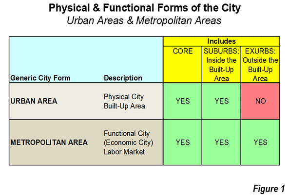
    Some nations report urban area data. Others report metropolitan area data. Urban areas and metropolitan areas are not the same thing. Urban areas are built up areas defined by the extent of the urban form, rather than by jurisdictional boundaries (see Demographia World Urban Areas). Metropolitan areas encompass both the urban area and the economically connected areas to the outside (exurbs). The difference is that urban areas do not include exurbs and metropolitan areas do (Figure 1).

    Some nations report only core municipality data, which is incomplete. Characterizing cities as only the core is rather like declaring a leg or a lung to be the same thing as a human body. These nations include Germany and Austria. Data for Valencia, Spain is also for the core municipality only.

    Perhaps the best source for citywide trends over the last 40 years in Western Europe is the United Nations data. The results are reported for urban areas and metropolitan areas, ignoring the irrelevant reported core data. Cities are included that had a population of 750,000 or more in any year from 1970 to 2010 on the UN World Agglomerations list. As of 2011, there are 24 urban areas and 16 metropolitan areas with comparable United Nations data (Table).

    How the Cities have Dispersed

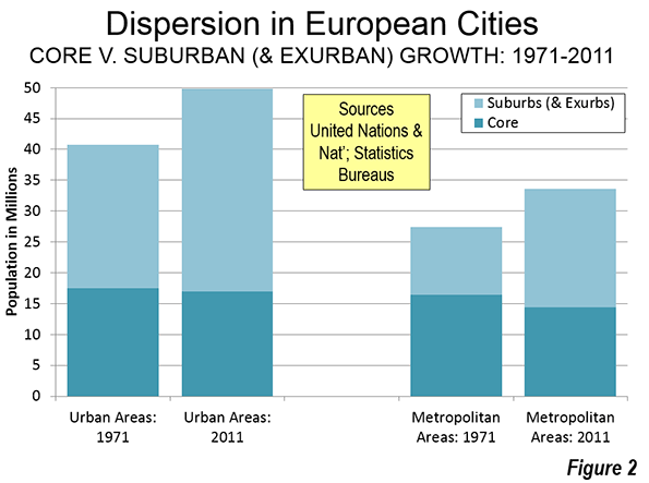
    Among the urban areas, the suburbs monopolized population growth over the period (1971 to 2011). Overall, the 24 urban areas increased their population by 9.1 million residents. This was the combination of a 9.7 million increase in the suburbs and a 600,000 loss in the cores. With the core losses, the suburbs accounted for 107% of the urban area growth.

    The monopolization of suburban and exurban growth was even greater in the 16 metropolitan areas. The overall citywide population increase was 6.2 million. This included 8.2 million in the suburbs and exurbs and the loss of 2.1 million in the cores.

    Combining these two different urban conceptions for statistical purposes shows how dominant suburban and exurban growth has been. In 1971, the cores and suburbs had about the same population. By 2011, the suburbs had grown to have 60% more residents than the cores (Figure 2).

    Some of the disparities were large. In Madrid, the suburbs grew 450 percent between 1971 and 2011, compared to only 5 percent in the core. In Toulouse, the suburbs grew 327 percent, while the core edged up only 20 percent, while in Zurich, the suburbs grew 186 percent compared to the core decline of 12 percent.

    Overall, core population performance exceeded that of the suburbs in only three of the 40 cases. The most significant is slow-growing Birmingham, which is closing in on its 1951 peak. Then there is Liverpool, which is managed to drop from the population peak of more than 850,000 in 1931 to under 475,000 in 2011. Liverpool’s loss over the 40 years was even less percentage wise than that of the suburbs. The core of Southampton also grew faster than the suburbs.

    Core Resurgence

    At the same time, it notable cores have reversed their previous loss patterns in recent years. Some resurgent cores remain well below their much earlier peaks. The ville de Paris has regained little more than 100,000 of its 800,000 loss since 1921. Inner London (Note) has regained much more (800,000), but still needs another 1.3 million to restore its 1901 peak (Outer London is so suburban that it provided much of the ammunition for the British anti-suburban movement). Others cores, like Stockholm and Madrid have risen above previous peaks.

    As in the United States, this urban resurgence should not lead to a perception that suburbanites are "flocking" to the urban cores. Domestic migration data continues to show net population movements from the cores to the suburbs and exurbs. Much of the resurgence has been propelled by international migration since enlargement of the European Union (such as from the growing London core), which has virtually eliminated westward barriers to immigration from the less affluent former Soviet satellites. Even the core of Stockholm, now at its population peak, has lost domestic migration to the suburbs in Stockholm County in each of the last five years according to Statistics Sweden data.

    Earlier Core Troughs

    The forty-year perspective masks some huge core population losses that occurred earlier. Perhaps the most spectacular is Copenhagen, which dropped from 768,000 in 1950 to 464,000 in 1992, for a percentage loss near that of Detroit from 1950 to 1990. Copenhagen’s population loss was 40 percent, compared to Detroit’s 44 percent (See: Shrinking Cities, Chapter 2). Since 1992, the core of Copenhagen has made up only a quarter of its loss since 1950.

    The core of Glasgow also suffered earlier losses. In 1931, the core municipality had a population nearing 1.1 million. By 1971, Glasgow became the first core municipality in the world to fall below 1,000,000 population after having achieved that status. Glasgow has since been followed by Naples, Turin and Detroit. Glasgow increased its population modestly after 2001, to just under 600,000.

    The Missing Cities

    What can be said about Germany and Austria, which do not provide data for either urban areas or metropolitan areas? If such data were available, it would likely show the same general trends. By the early 2000s, cores such as Berlin, Dresden, Frankfurt, Hamburg, Leipzig, Munich and Stuttgart had lost population from their peaks. Between 1987 and 2001, all growth in the Rhine-Ruhr, Western Europe’s third largest city, was in the suburbs and exurbs. This area, which defines the very term conurbation, may have been the first truly polycentric metropolitan area in the world, with its historic municipalities like Essen, Dusseldorf, Bochum, Gelsenkirchen, Oberhausen, Dortmund, Duisburg, Dusseldorf and Wuppertal.  Vienna reached its population peak in 1910,when  capital of the Austro-Hungarian under Emperor Franz Josef.

    Better Data Ahead

    Meanwhile, the state of urban statistics is improving significantly in Europe. It is to be expected that historical data would be non-comparable and cumbersome with Europe’s multiple nations. However, Eurostat now publishes its own, consistent metropolitan area data. Generally data is available back to the early or mid 2000s, which will make the lives of interested statisticians better in the future.

    The suburbanization of Europe may be surprising to New World tourists, who rarely venture beyond the historical cores. I called this the Louvre Syndrome, which describes New World tourists who jealousy wonder why their cites cannot look like attractive European cores, but never experience, predictably,  their extensive and   less historically appealing  suburbs. And why should they? Americans and Canadians go to Europe to see what’s different, not what’s similar.

    What is similar is that the cities of Europe, like those in Japan and the New World have dispersed as they have become more affluent, a dynamic pointed out by Robert Bruegmann in Sprawl: A Short History. There is also considerable dispersion going on in developing world cities. There is also an imperative to disperse the inhuman densities and living conditions in many parts of African, Asia and South America. These include shantytowns like Dharavi in Mumbai, Kibera in Nairobi, Rio’s notorious favelas and in Manila, with its all too frequent fires that destroy thousands of homes at once.

    Core & Suburban Growth in Cities
    Western Europe: 1971-2011
    Urban Areas (Urban Agglomerations) and Metropolitan Areas
    Population in 000s 1971 Population 2011 Population
      UA/MA Core Suburbs UA/MA Core Suburbs
    URBAN AREAS (URBAN AGGLOMERATIONS)      
    Amsterdam 938 820 118 1,064 780 284
    Athens 2,535 862 1,673 3,089 664 2,425
    Birmingham 2,369 1,013 1,356 2,446 1,086 1,360
    Bordeaux 590 254 336 853 239 614
    Dublin 783 569 214 1,114 528 586
    Glasgow 1,732 897 835 1,210 593 617
    Helsinki 522 529 -7 1,134 588 546
    Lille 912 233 679 1,020 228 792
    Liverpool 1,253 607 646 865 466 399
    London 7,787 2,959 4,828 10,297 3,232 7,065
    Lyon 1,128 507 621 1,563 491 1,072
    Manchester 2,391 542 1,849 2,559 503 2,056
    Marseille 1,197 894 303 1,569 851 718
    Newcastle 876 222 654 776 149 627
    Nice 649 328 321 947 344 603
    Oslo 643 488 155 916 599 317
    Paris 8,278 2,504 5,774 10,537 2,250 8,287
    Rotterdam 959 687 272 995 606 389
    Stockholm 1,031 747 284 1,385 847 538
    Southampton 740 213 527 857 254 603
    Thessaloniki 557 340 217 754 325 429
    Toulouse 476 372 104 891 447 444
    West Yorkshire 1,705 506 1,199 1,787 475 1,312
    Zurich 711 423 288 1,198 373 825
    Urban Areas 40,763 17,516 23,247 49,824 16,918 32,906
    METROPOLITAN AREAS (LABOR MARKETS)      
    Antwerp 858 227 631 976 185 791
    Barcelona 3,521 1,828 1,693 4,999 1,621 3,378
    Bergamo 561 126 435 799 115 684
    Bologna 746 488 258 766 371 395
    Brussels 1,576 143 1,433 1,975 170 1,805
    Copenhagen 1,338 626 712 1,207 540 667
    Florence 725 460 265 694 358 336
    Genoa 918 832 86 701 586 115
    Lisbon 1,874 782 1,092 2,826 553 2,273
    Madrid 3,595 3,121 474 5,870 3,265 2,605
    Milan 3,040 1,732 1,308 3,065 1,242 1,823
    Naples 2,019 1,267 752 2,213 962 1,251
    Palermo 757 653 104 855 658 197
    Porto 941 326 615 1,288 238 1,050
    Rome 3,168 2,656 512 3,617 2,617 1,000
    Turin 1,775 1,142 633 1,742 872 870
    Metropolitan Areas 27,413 16,409 11,004 33,594 14,353 19,241
    All 68,177 33,925 34,252 83,418 31,271 52,148
    Populaton Change 1971 Population 2011 Population
      UA/MA Core Suburbs UA/MA Core Suburbs
    URBAN AREAS (URBAN AGGLOMERATIONS)      
    Amsterdam 126 -40 166 13% -5% 141%
    Athens 553 -198 751 22% -23% 45%
    Birmingham 77 73 4 3% 7% 0%
    Bordeaux 263 -15 278 45% -6% 83%
    Dublin 331 -41 372 42% -7% 173%
    Glasgow -522 -304 -218 -30% -34% -26%
    Helsinki 611 59 552 117% 11%
    Lille 108 -5 113 12% -2% 17%
    Liverpool -389 -141 -248 -31% -23% -38%
    London 2,510 273 2,237 32% 9% 46%
    Lyon 435 -16 450 39% -3% 72%
    Manchester 169 -39 208 7% -7% 11%
    Marseille 372 -43 415 31% -5% 137%
    Newcastle -101 -73 -28 -11% -33% -4%
    Nice 298 16 282 46% 5% 88%
    Oslo 272 111 161 42% 23% 104%
    Paris 2,259 -254 2,513 27% -10% 44%
    Rotterdam 36 -81 117 4% -12% 43%
    Stockholm 354 100 254 34% 13% 90%
    Southampton 118 41 77 16% 19% 15%
    Thessaloniki 197 -15 212 35% -4% 97%
    Toulouse 415 75 340 87% 20% 327%
    West Yorkshire 82 -31 113 5% -6% 9%
    Zurich 487 -50 537 69% -12% 186%
    Urban Areas 9,061 -598 9,659 22% -3% 42%
    METROPOLITAN AREAS (LABOR MARKETS)      
    Antwerp 118 -42 160 14% -19% 25%
    Barcelona 1,477 -207 1,684 42% -11% 99%
    Bergamo 238 -11 249 43% -9% 57%
    Bologna 21 -117 138 3% -24% 54%
    Brussels 399 27 372 25% 19% 26%
    Copenhagen -131 -86 -45 -10% -14% -6%
    Florence -31 -102 71 -4% -22% 27%
    Genoa -217 -246 29 -24% -30% 34%
    Lisbon 952 -229 1,181 51% -29% 108%
    Madrid 2,275 144 2,131 63% 5% 450%
    Milan 24 -490 514 1% -28% 39%
    Naples 194 -305 499 10% -24% 66%
    Palermo 97 5 92 13% 1% 88%
    Porto 347 -88 435 37% -27% 71%
    Rome 449 -39 488 14% -1% 95%
    Turin -33 -270 237 -2% -24% 37%
    Metropolitan Areas 6,181 -2,056 8,237 23% -13% 75%
    All 15,242 -2,654 17,896 22% -8% 52%
    Population in 000s
    Sources:
       Urban Area/Metropolitan Area data estimated from UN
       Core data from national statistics bureaus
    Core: Core municipality or previous core municipality where data available
    Urban Areas/Metropolitan Areas over 750,000 in 1971 or 2001
    No data for Germany, Austria or Valencia (Spain)
       Do not report data in urban area or metropolitan area format
    Some cores may have added land area during the period


    Wendell Cox is principal of Demographia, an international public policy and demographics firm. He is co-author of the "Demographia International Housing Affordability Survey" and author of "Demographia World Urban Areas" and "War on the Dream: How Anti-Sprawl Policy Threatens the Quality of Life." He was appointed to three terms on the Los Angeles County Transportation Commission, where he served with the leading city and county leadership as the only non-elected member. He served as a visiting professor at the Conservatoire National des Arts et Metiers, a national university in Paris and is a Senior Fellow at the Center for Opportunity Urbanism.
    Photograph: Paris: Eifel Tower & La Defense from Tour Montparnasse (by author)

  • Transit Ridership Increases: No Escape from New York

    Transit ridership is increasing in the United States. The American Public Transportation Association (APTA) has reported that 10.8 billion trips were taken on transit in 2014, the largest number since 1956. With a more than 80% increase in gasoline prices since 2004, higher transit ridership was to be expected. However, it would be wrong to suggest the transit ridership is anywhere near its historic peak, nor that the increases have been broadly spread around the nation.

    Highest Ridership Since 1956 (Which was the Lowest Since 1912)

    Total transit ridership in 2014 was the highest since 1956. That’s just the beginning. The 2014 modern record ridership was lower than every year from 1956 all the way back to at least 1912, the last year of William Howard Taft’s presidency, when transit carried 13.2 billion riders.

    Transit ridership has virtually collapsed since that time in relative terms. In 1912, the average man, woman and child rode transit at least 170 times a year. Today, the figure is about 35, down 80% from 1912. During the intervening century, non-farm employment increased by more than five times and the urban population, transit’s principal market, also increased more than five times. Ridership was elevated to its peak by gasoline rationing during World War II. Before that, transit ridership had peaked in 1926, as car ownership and suburbs rose before the Great Depression.

    The Continuing Dominance of New York

    Further, contrary to some media accounts, recent transit increases have not really been national in scope. Nearly all of it was on transit systems that serve local mobility in the City of New York as well as the rail systems serving the City from the suburbs. In the City, most of the service is provided by the Transit Authority. Additional services are provided by the New York City Department of Transportation and the Staten Island Railway. The suburban rail systems are the Long Island Railroad, the Metro North Railroad, New Jersey Transit Rail and PATH Rail. On these systems, nearly 90% of national work trip travel was to the city of New York and nearly three-quarters of those were to Manhattan.

    Transit and New York: The Last Decade

    Overall, the enormous system of buses and subways of New York City alone accounted for 88 percent of the national ridership increase from 2013 to 2014. If the ridership on the four large suburban rail systems that serve New York City (the Long Island Railroad, the Metro-North Railroad, New Jersey transit commuter rail, and the PATH trains) is added, City related transit accounts for 94 percent of the increase. A great achievement for the City, but not one that is being repeated in the rest of the nation.

    This is nothing new. National transit ridership has increased about 10 percent over the decade since 2004. Much of the increase — 79 percent — has been on New York City’s buses and subways. The suburban rail systems raise that total to 84 percent. This does not include the many commuter buses that enter the city especially from New Jersey and other suburbs, which cannot extracted from the data because it is not separately reported (Figure).

    New York’s transit turnaround has been nothing short of impressive. Nearly all of the nation’s progress in transit has been on a bus and subway system that carries one third of the national rides.

    The results have not been nearly so positive in the rest of urban America, where 30 times as many people live. While New York City related transit services experienced a ridership increase of 33% in the last decade, in the rest of the nation, the increase was less than three percent. Even huge ridership increases in New York City cannot make much of a difference nationally. In 2004, transit accounted for approximately 1.6% of urban travel. By 2014, it had risen to only 1.7%. Without taking anything from New York City’s impressive transit record, these results are not likely to be replicated elsewhere. New York City is a very unique place. It is home to the world’s second largest business district, after Tokyo, the area south of Central Park in Manhattan. Approximately 2 million peoplework in this small area, a number approximately four times the next largest central business districts, in Chicago and Washington.

    Approximately three quarters of Manhattan employees reach work by transit. This is 15 times the national average, New York City’s population density (excluding Staten Island, with its postwar suburbanization) is by far the highest and most extensive in the nation. The city of San Francisco comes the closest to New York City, with little more than half the population density and only 1/10 the total population.

    Transit is often suggested as a substitute for the car. The reality is that transit can compete with the car only to the largest downtowns. Destinations within the six transit "legacy cities," (not metropolitan areas) of New York, Chicago, Philadelphia, San Francisco, Boston, and Washington account for most of the nation’s transit work trips. And, 60% of these trips are to downtown.

    Transit cannot compete elsewhere, because travel times tend to be double those of the automobile (according to the American Community Survey) and it provides little practical access to most jobs.  University of Minnesota research indicates the average employee can reach fewer than 10 percent of jobs in less than one hour by transit in 46 major metropolitan areas. By contrast, approximately 65% of people who drive reach their jobs in less than 30 minutesby car in the major metropolitan areas. Building new rail systems doesn’t change the equation. At least 20 new urban rail systems have been built in the last four decades, though transit’s percentage of work trips has generally not improved, despite representations about reducing traffic congestion to the contrary. For example, in Portland, Washington, Los Angeles, Dallas-Fort Worth, and Atlanta, which have among the most extensive new rail systems, a smaller percentage of commuters use transit than before rail opened, when there were only buses.

    Even low income workers, who are often portrayed as "transit dependent," use cars much more than transit, and at a rate nearly equal to that of others in the labor force.

    Yet, transit funding advocates continue to seek even more money, claiming that transit can attract drivers from their cars and reduce traffic congestion. That may be true in New York City’s uniquely transit-friendly environment, but not elsewhere.

    Wendell Cox was a three-term member of the Los Angeles County Transportation Commission and chaired two APTA national committees. He is a public policy consultant in St. Louis and is a senior fellow at the Center for Opportunity Urbanism.
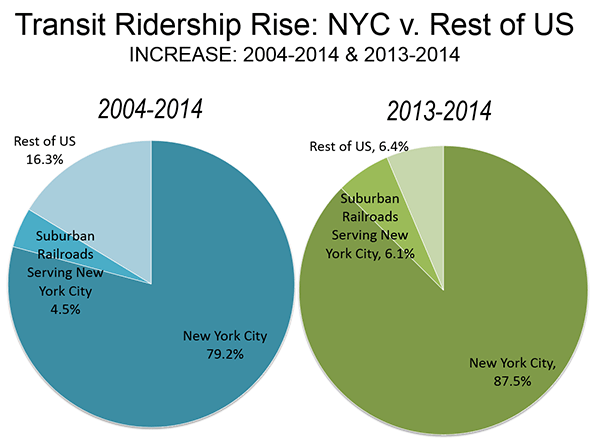
    Photo: Bart A car Oakland Coliseum Station

  • Piketty’s Wealth Driven Inequality: Virtually All in Housing?

    The Economist headline reads: "Through the roof: Rising house prices may be chiefly responsible for rising inequality"

    This is no surprise to those of us who have been chronicling the loss of destruction of middle income housing affordability where urban containment policy has been implemented from Australia to Canada, Ireland, New Zealand, the United Kingdom and the United States.

    Matthew Rognlie, a graduate student at the Massachusetts Institute of Technology, has critiqued the highly publicized work of Thomas Piketty (Capital in the 21st Century) to suggest that rising inequality is largely due to the accumulation of wealth in housing.

    House prices have doubled, tripled or more relative to incomes, as regulators have banned or seriously limited new housing on the urban periphery. Younger households have been unable to afford houses as older households have watched their wealth increase.

    The "writing" has long been on the wall. Legendary urbanist Sir Peter Hall lamented the potential abandonment of the "ideal of a property owning democracy" (see The Costs of Smart Growth Revisited: A 40 Year Perspective) under urban containment policy.

    Rognlie suggests that a better title for Piketty’s book would have been Housing in the Twenty-First Century. According to Rognlie: "the literature studying markets with high housing costs finds that these costs are driven in large part by artificial scarcity through land use regulation …. A natural first step to combat the increasing role of housing wealth would be to reexamine these regulations and expand the housing supply."

  • Still Moving to Texas: The 2014 Metropolitan Population Estimates

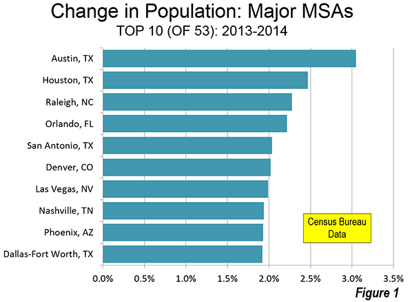
    Texas continues to dominate major metropolitan area growth. Among the 53 major metropolitan areas (with more than 1 million population), Texas cities occupied three of five top positions in population growth, and four of the top 10 (Figure 1).

    Other parts of the nation are adding population in large numbers as well. The six top 10 cities not in Texas were split evenly between the South and the Mountain West. In the South, Raleigh ranked third, Orlando ranked fourth and Nashville was eighth. Out West, sixth-ranked Denver is maintaining its quick  growth rate as the middle of the decade approaches. Two cities that were especially hard hit by the housing bust now seem to be making progress. Las Vegas, has recovered to become the seventh fastest growing city, largely on the strength of substantially improved domestic migration numbers. In 2013-2014, the rate of net domestic migration quadrupled in Las Vegas. Phoenix (9th) is also recovering, and is now established as the nation’s 12th largest metropolitan area, having passed Riverside-San Bernardino.

    Texas

    But the biggest gains were in Texas.

    Houston gained the most population between 2013 and 2014, adding 166,000 new residents. This is nearly as much as the gain in the entire Midwest states (177,000) which is home to 10 times as many people. Since 2000, Houston has risen from the nation’s eighth largest metropolitan area to its fifth, passing Washington, Miami, and earlier in this decade, Philadelphia.

    For the first time in US history, two of the five largest cities in the nation are in Texas. Just ahead of Houston is fourth-ranked Dallas-Fort Worth, which had the second largest population gain at 127,000. This is a larger increase than occurred in the Northeast, which stretches from Pennsylvania, New Jersey, and New York through New England and has more than eight times as many people as Dallas-Fort Worth. While Dallas-Fort Worth’s population increase has been slower than Houston’s in recent years (10th in 2013-2014), it has risen from a position of ninth in 1992 fourth today (present metropolitan boundaries).

    Other Texas cities are also performing well. Austin, as has often been the case since the moderation of growth in Las Vegas during the last decade, has by far the largest population growth rate, at 3.0%, compared to the Houston’s 2.5%.

    San Antonio, so often overlooked in a state with Houston, Dallas-Fort Worth, and Austin ranked fifth in population growth rate between 2013 and 2014.

    Net Domestic Migration

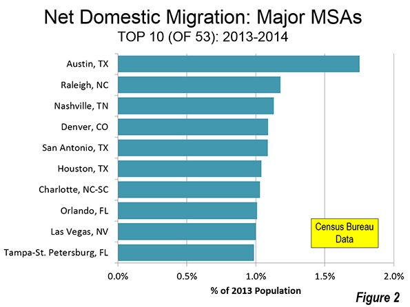
    The top cities in net domestic migration almost duplicate the top 10 in population growth. Charlotte and Tampa-St. Petersburg replace Phoenix and Dallas-Fort Worth among the top 10 in net domestic migration (Figure 2).

    A number of cities suffered substantial net domestic migration losses (Figure 3). The largest loss was in New York, which lost nearly one percent of its residents to other parts of the country. New York’s net domestic migration loss increased more than a third from that of 2011 through 2013, rising to 163,000 in 2014. Almost a net 100,000 left New York City, up from 69,000 in 2012-2013. The suburbs experienced a smaller loss, 64,000, up from 44,000.

    The other two largest cities, Los Angeles and Chicago also had larger domestic migration losses (61,000 66,000 respectively) than the other cities.  Washington had by far the largest reversal, experiencing a domestic migration loss of 25,000, down from a plus 43,000 between 2012 and 2013.

    Additional Developments

    There’s also a new member of the million person metropolitan club, Tucson, the 53rd major metropolitan area.

    Chicago’s growth has virtually stalled. Over the last year, the metropolitan area added only 0.1% to its population. This is less than one quarter the longer-term rate that had previously been projected. At that rate, Chicago would have reached 10 million residents within a decade. At the most recent growth rate, it would take nearly a half century. In light of the expected slower growth rates in the future, Chicago may never reach megacity status, unless its commuting shed expands enough to add new counties along its metropolitan fringe.

    However, even without Chicago, the United States could add two new megacities within the next two decades. Both Houston and Dallas-Fort Worth would exceed 10 million by 2040 population if their current growth rates were to be maintained.

    Despite being passed by Houston and Dallas-Fort Worth in the last two decades, Washington appears sure to emerge larger than Philadelphia by next year’s population estimates. This year, Washington exceeded 6 million population for the first time.

    Domestic Migration: Core and Suburban Counties

    This is indicated by domestic migration trends, which are reported by the Census Bureau only at the county level. Suburban counties continue to increase their net domestic migration and over the last year attracted nearly 420,000 more new residents from other parts of the nation than the core counties. The suburban counties gained 230,000 net domestic migrants, while the core counties lost 190,000. The low point of suburban net domestic migration occurred in 2012 when the gap relative to core counties was approximately 155,000. In each of the years of this decade, core counties have lost domestic migration, while suburban counties have gained more new residents from elsewhere (Figure 4).

    As the nation continues its tepid recovery from the Great Recession, the largest number of people are moving to the suburbs and away from the core counties. This suggests that, normalcy may be gradually returning, with strong growth both in the suburbs and throughout the Sunbelt.

    Major Metropolitan Area Population Estimates
    Population 2013-2014
    Rank Metropolitan Area 2010 2013 2014 % Change Net Domestic Migration Rank: Domestic Migration
    1 New York, NY-NJ-PA  19,567  20,002  20,093 0.45% -0.81%          53
    2 Los Angeles, CA  12,829  13,176  13,262 0.66% -0.47%          47
    3 Chicago, IL-IN-WI    9,461    9,545    9,555 0.10% -0.69%          51
    4 Dallas-Fort Worth, TX    6,426    6,823    6,954 1.92% 0.72%          13
    5 Houston, TX    5,920    6,334    6,490 2.47% 1.04%            6
    6 Philadelphia, PA-NJ-DE-MD    5,965    6,036    6,051 0.25% -0.34%          42
    7 Washington, DC-VA-MD-WV    5,636    5,967    6,034 1.12% -0.41%          45
    8 Miami, FL    5,565    5,863    5,930 1.13% -0.21%          35
    9 Atlanta, GA    5,287    5,525    5,614 1.61% 0.58%          15
    10 Boston, MA-NH    4,552    4,698    4,732 0.73% -0.22%          37
    11 San Francisco-Oakland, CA    4,335    4,530    4,594 1.42% 0.32%          21
    12 Phoenix, AZ    4,193    4,404    4,489 1.93% 0.93%          11
    13 Riverside-San Bernardino, CA    4,225    4,390    4,442 1.18% 0.24%          23
    14 Detroit,  MI    4,296    4,295    4,297 0.03% -0.47%          48
    15 Seattle, WA    3,440    3,614    3,671 1.60% 0.48%          16
    16 Minneapolis-St. Paul, MN-WI    3,349    3,461    3,495 0.97% -0.02%          31
    17 San Diego, CA    3,095    3,223    3,263 1.27% 0.08%          28
    18 Tampa-St. Petersburg, FL    2,783    2,874    2,916 1.44% 0.99%          10
    19 St. Louis,, MO-IL    2,788    2,802    2,806 0.16% -0.28%          39
    20 Baltimore, MD    2,710    2,774    2,786 0.43% -0.23%          38
    21 Denver, CO    2,543    2,700    2,754 2.02% 1.09%            4
    22 Charlotte, NC-SC    2,217    2,337    2,380 1.84% 1.03%            7
    23 Pittsburgh, PA    2,356    2,361    2,356 -0.19% -0.12%          33
    24 Portland, OR-WA    2,226    2,315    2,348 1.45% 0.71%          14
    25 San Antonio, TX    2,143    2,282    2,329 2.04% 1.09%            5
    26 Orlando, FL    2,134    2,271    2,321 2.22% 1.01%            8
    27 Sacramento, CA    2,149    2,218    2,244 1.21% 0.37%          19
    28 Cincinnati, OH-KY-IN    2,115    2,139    2,149 0.51% -0.04%          32
    29 Kansas City, MO-KS    2,009    2,055    2,071 0.77% 0.05%          29
    30 Las Vegas, NV    1,951    2,029    2,070 1.99% 1.00%            9
    31 Cleveland, OH    2,077    2,065    2,064 -0.08% -0.38%          44
    32 Columbus, OH    1,902    1,969    1,995 1.30% 0.44%          17
    33 Indianapolis. IN    1,888    1,953    1,971 0.93% 0.11%          26
    34 San Jose, CA    1,837    1,929    1,953 1.25% -0.37%          43
    35 Austin, TX    1,716    1,886    1,943 3.05% 1.75%            1
    36 Nashville, TN    1,671    1,759    1,793 1.94% 1.13%            3
    37 Virginia Beach-Norfolk, VA-NC    1,677    1,707    1,717 0.54% -0.30%          40
    38 Providence, RI-MA    1,601    1,606    1,609 0.24% -0.16%          34
    39 Milwaukee,WI    1,556    1,570    1,572 0.13% -0.45%          46
    40 Jacksonville, FL    1,346    1,396    1,419 1.65% 0.92%          12
    41 Memphis, TN-MS-AR    1,325    1,342    1,343 0.11% -0.55%          50
    42 Oklahoma City, OK    1,253    1,321    1,337 1.23% 0.43%          18
    43 Louisville, KY-IN    1,236    1,262    1,270 0.59% 0.12%          25
    44 Richmond, VA    1,208    1,247    1,260 1.06% 0.36%          20
    45 New Orleans. LA    1,190    1,242    1,252 0.80% 0.16%          24
    46 Raleigh, NC    1,130    1,215    1,243 2.28% 1.18%            2
    47 Hartford, CT    1,212    1,216    1,214 -0.14% -0.71%          52
    48 Salt Lake City, UT    1,088    1,142    1,153 1.03% -0.32%          41
    49 Birmingham, AL    1,128    1,140    1,144 0.37% 0.02%          30
    50 Buffalo, NY    1,136    1,136    1,136 0.02% -0.22%          36
    51 Rochester, NY    1,080    1,084    1,083 -0.06% -0.52%          49
    52 Grand Rapids, MI       989    1,017    1,028 1.03% 0.25%          22
    53 Tucson, AZ       980       998    1,005 0.65% 0.09%          27
    In 000s
    Data from Census Bureau


    ——–

    Note: Core counties are the counties with the largest historical core municipalities as well as the five counties that make up the core city of New York.

    Photograph: Houston Suburbs by author


    Wendell Cox is principal of Demographia, an international public policy firm located in the St. Louis metropolitan area. He has served as a visiting professor at the Conservatoire National des Arts et Metiers in Paris since 2002. His principal interests are economics, poverty alleviation, demographics, urban policy and transport. He is co-author of the annual Demographia International Housing Affordability Survey and Demographia World Urban Areas.

  • How the California Dream Became a Nightmare

    Important attention has been drawn to the shameful condition of middle income housing affordability in California. The state that had earlier earned its own "California Dream" label now limits the dream of homeownership principally to people either fortunate enough to have purchased their homes years ago and to the more affluent. Many middle income residents may have to face the choice of renting permanently or moving away.

    However, finally, an important organ of the state has now called attention to the housing affordability problem. The Legislative Analyst’s Office (LAO) has published "California’s High Housing Costs: Causes and Consequences," which provides a compelling overview of how California’s housing costs have risen to be by far the most unaffordable in the nation. It also sets out the serious consequences.

    The LAO says that:

    Today, an average California home costs $440,000, about two-and-a-half times the average national home price ($180,000). Also, California’s average monthly rent is about $1,240, 50 percent higher than the rest of the country ($840 per month).

    LAO describes the evolution:

    Beginning in about 1970, however, the gap between California’s home prices and those in the rest country started to widen. Between 1970 and 1980, California home prices went from 30 percent above U.S. levels to more than 80 percent higher. This trend has continued.

    Much of the LAO focus is on California’s coastal counties, where:

    ….community resistance to housing, environmental policies, lack of fiscal incentives for local governments to approve housing, and limited land constrains new housing construction.

    These causes result from conscious political decisions. While California’s coastal counties do not have the vast stretches of flat, appropriately developable land that existed 50 years ago, building is increasingly  prohibited on that which remains (for example, Ventura County, northern Los Angeles county and the southern San Jose metropolitan area).

    Demonstrating an understanding of economic basics not generally shared by California policymakers or the urban planning community, LAO squarely places the blame on the public policy limits to new housing construction:

    This competition bids up home prices and rents.

    In other words, where the supply of a demanded good is limited, prices can be expected to rise, other things being equal. LAO describes the impact of so-called "growth control" policies, which are also called "urban containment" or "smart growth:"

    Many Coastal Communities Have Growth Controls. Over two-thirds of cities and counties in California’s coastal metros have adopted policies (known as growth controls) explicitly aimed at limiting housing growth. Many policies directly limit growth—for example, by capping the number of new homes that may be built in a given year or limiting building heights and densities. Other policies indirectly limit growth—for example, by requiring a supermajority of local boards to approve housing projects. Research has found that these policies have been effective at limiting growth and consequently increasing housing costs.

    According to LAO, the problem is exacerbated by voter initiatives: "More often than not, voters in California’s coastal communities vote to limit housing development when given the option." It is hard to imagine a more sinister disincentive to aspiration, under which voters can deny equality of opportunity in housing to others by artificially driving up the price.  Because new housing further from coast is also limited, options for a middle income living standard are also diminished.

    These public policies have consequences.

    Notable and widespread trade-offs include (1) spending a greater share of their income on housing, (2) postponing or foregoing homeownership, (3) living in more crowded housing, (4) commuting further to work each day, and (5) in some cases, choosing to work and live elsewhere

    Each of these consequences is described below.

    LAO Consequence #1: Spending a Greater Share of Income on Housing

    LAO models the market situation from 1980 to 2010 to estimate the prices that would have prevailed if the regulatory environment had permitted building sufficient to satisfy customer demand at previous lower price levels. In both years, LAO estimates that the median priced house would have cost 80% more than in the rest of the nation (actual data in 1980, modeled data in 2010). This would have kept California house price increases at the national level. I think it would have been better to have modeled from 1970, before the huge house prices before 1980 described by Dartmouth economist William Fischel.

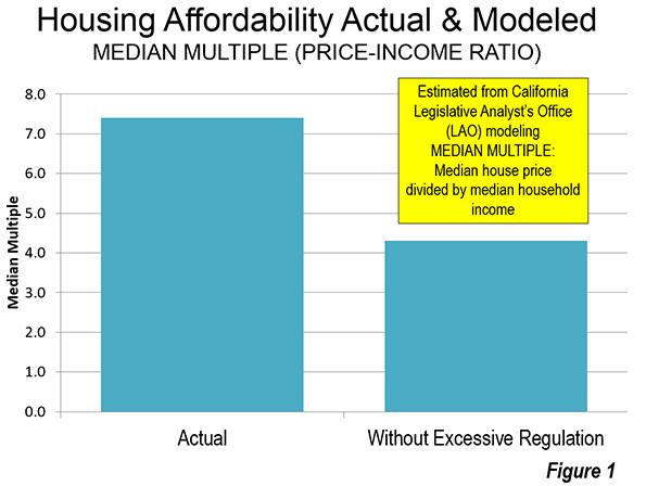
    I have applied this LAO model estimate to the median multiple for California’s six major metropolitan areas (Los Angeles, San Francisco-Oakland, Riverside-San Bernardino, San Diego, Sacramento, and San Jose) to identify how much better middle income housing affordability would be without California’s excessive regulation. Using the LAO estimates the median multiple (median house price divided by median household income) in 2014 would have been at least 40% lower than the actual level in each of the metropolitan areas (Figure 1).

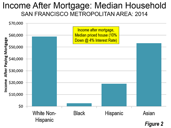
    Many California households already have been priced out of the market. In the worst case, it is estimated that in the San Francisco metropolitan area, a median income White Non-Hispanic household will have nearly $60,000 annually left over after paying the mortgage on the median priced house. This is less than they would have if house prices had remained reasonable, but it’s enough to live on. The median income Asian household would do almost as well, with about $50,000 left over. The median income Hispanic household would have less than $20,000 left, which is considerably less than is likely to be needed for other essentials. The median income Black household would have less than $3,000 left over (Figure 2). If the price ratios of 1980 were controlling, that amount would rise by $16,000.

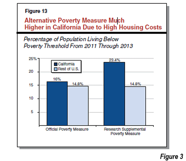
    LAO also points out that the Golden State has the highest housing cost adjusted poverty rate in the nation. The latest data shows housing-adjusted poverty rate is far higher even than that in states with a reputation for grinding poverty. California’s housing adjusted poverty rate is more than 50% higher than that of Mississippi and approaches double that of West Virginia (Figure 3, LAO Figure 13)

    LAO Consequence #2:  Postponing or Forgoing Homeownership

    LAO indicates that California ranks 48th in homeownership percentage, behind only New York and Nevada. LAO emphasizes the value of home ownership:

    Homeownership helps households build wealth, requiring them to amass assets over time. Among homeowners, saving is automatic: every month, part of the mortgage payment reduces the total amount owed and thus becomes the homeowner’s equity. For renters, savings requires voluntarily foregoing near-term spending. Due to this and other economic factors, renter median net worth totaled $5,400 in 2013, a small fraction of the $195,400 median homeowner’s net worth.

    Californians are buying their first houses later. LAO indicates that the average first home buyer in California is three years older than the national average.

    LAO Consequence #3:  Living in More Crowded Housing

    The nation’s worst overcrowding is an unfortunate result of California’s housing policies.

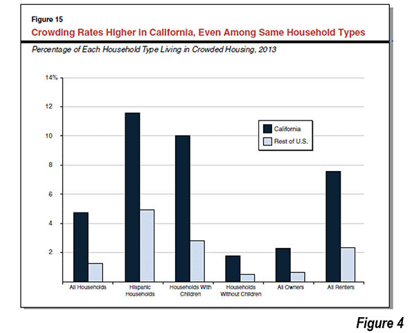
    LAO indicates that California’s overcrowding rate is well above that of the rest of the nation’s rate. Among Hispanics, which were expected to exceed the White-Non-Hispanic population in 2014, to become the state’s largest ethnic group, California overcrowding is more than 2.5 times the Hispanic rate elsewhere. Among households with children, overcrowding in California is four times the national households with children rate. Among renters, overcrowding in California is more than three times the national renter rate (Figure 4, LAO Figure 15).

    This has important negative social consequences. According to LAO, research indicates that overcrowding retards well-being and educational achievement:

    Individuals who live in crowded housing generally have worse educational and behavioral health outcomes than people that do not live in crowded housing. Among adults, crowding has been shown to increase stress and aggression, lead to social isolation, and weaken relationships between parents and their children. Crowding also has particularly notable effects on children. Researchers have found that children in crowded housing score lower on standardized math and reading exams. A lack of available and distraction-free studying space appears to affect educational achievement. Crowding may also result in sleep interruptions that affect mood and behavior. As a result, children in crowded housing also displayed more behavioral problems at school.

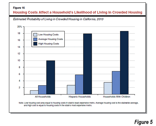
    Overcrowding is particularly acute in the higher cost coastal metropolitan areas of Los Angeles, San Francisco, San Diego, and San Jose. There, overcrowding among households with children reaches 10%, and among Hispanic households, overcrowding reaches 18%. Among households with children the figure is slightly higher (Figure 5, LAO Figure 16). Overcrowded housing is generally worse, according to LAO, in areas with higher house prices.

    In a state with a political establishment that prides itself in watching out for low income citizens and ethnic minorities, the need to reform the responsible policies could not be clearer.

    LAO Consequence #4: Commuting Farther to Work

    LAO finds that California’s average work trip commuting times are only moderately above the national average. However, LAO suggests that the commute lengthening impact of higher house prices may be reduced by California’s widespread (I call it dispersed) development pattern, its freeway system and the "above-average share of commuters who drive to work. (Driving commutes are generally fast, and therefore metros with higher shares of driving commuters tend to have shorter commute times.)"

    Nonetheless, according to LAO:

    …our analysis suggests that California’s high housing costs cause workers to live further from where they work, likely because reasonably priced housing options are unavailable in locations nearer to where they work.

    LAO Consequence #5:  Choosing to Work and Live Elsewhere

    LAO also indicates that California’s high housing prices are likely to have reduced its population (and economic) growth. LAO sites the strong net outmigration of California households to other states. LAO also finds in its national metropolitan area analysis that counties with higher growth rates tend to have better housing affordability than counties with lower growth rates.

    There has also been strong net outmigration from the coastal counties to inland counties. This is most evident in the growth of the Riverside-San Bernardino metropolitan area (the Inland Empire) between 2000 and 2010. The Inland Empire captured more than two thirds of the population growth of the Los Angeles Combined Statistical Area (Los Angeles, Orange, Riverside, San Bernardino and Ventura counties). LAO notes the impact of the excess of demand in the coastal counties, again recognizing the nexus between overzealous regulation and the loss of housing affordability:

    This competition bids up home prices and rents. Some people who find California’s coast unaffordable turn instead to California’s inland communities, causing prices there to rise as well.

    LAO also refers to the difficulty that employers have in retaining and recruiting staff. LAO cited survey data from the Silicon Valley, which has for years been California’s economic "Golden Goose" in recent years:

    In a 2014 survey of more than 200 business executives conducted by the Silicon Valley Leadership Group, 72 percent of them cited “housing costs for employees” as the most important challenge facing Silicon Valley businesses.

    In addition, there has been a strong movement of California companies to other parts of the nation, where more liberal regulations foster a better business climate.

    Restoring Housing Affordability

    LAO indicates the importance of fundamental reform and calls for putting "all policy options on the table."

    Major changes to local government land use authority, local finance, CEQA (California Environmental Quality Act), and other major polices would be necessary to address California’s high housing costs.

    In addition:

    The greatest need for additional housing is in California’s coastal urban areas. We therefore recommend the Legislature focus on what changes are necessary to promote additional housing construction in these areas.

    Perhaps the only weakness of the report deals with densification, particularly in coastal counties. For example, LAO suggests that without the housing restrictions the city of San Francisco is population would be 1.7 million, rather than the approximately 800,000 who live there today. In fact that would be unprecedented beyond belief. No core city that had become fully developed and reached 500,000 people by 1950 has achieved growth of this magnitude. The greatest growth was less than 10%, in this category of 60 core cities (which includes the city of San Francisco). Even less likely would be public support for such huge population growth in the second densest major municipality in the nation.

    While LAO does not indicate the additional population that its estimates would have placed in the core of Los Angeles, given the scale of the San Francisco increase, this could be a number of up to 3 million. This area, the broadest expanse of over 10,000 population per square mile density in the nation outside New York City is in the middle of the urban area with the nation’s worst traffic congestion, according to the Texas A&M Transportation Institute. It is doubtful that residents would have the "stomach" to expand roadway capacity to keep the traffic moving. Transit could not have made much difference. Even with its now extensive rail network that has opened since the early 1990s, driving alone accounted for 85% of the additional travel to work from 2000 to 2013 in the city of Los Angeles. Yet, the city of Los Angeles has the most extensive transit in the metropolitan area, including service by all rail lines.

    In reality, core densification is likely to be modest. Keeping housing affordability from getting worse requires regulatory liberalization throughout California, including coastal and inland areas
    The reality is that if California had permitted growth, it would naturally occurred mostly on the periphery. Even with the restrictions on building, the preference for suburban living (largely in detached housing) could not be repressed between 2000 and 2010. Less than 10% of the population growth in the Los Angeles and San Francisco Bay areas occurred in the cores.

    The Challenge

    Should the state of California begin to seriously discuss housing affordability, it will be important to ease restrictions throughout the state, not just in the coastal counties. There are serious barriers to placing the appropriate priority on improving the standard of living and minimizing poverty rates among California’s diverse population. Perhaps the biggest impediment is Senate Bill 375, which is being interpreted by the state and its regional planning agencies to require even more stringent land-use regulation.

    In this environment, LAO rightly raises this concern:

    If California continues on its current path, the state’s housing costs will remain high and likely will continue to grow faster than the nation’s. This, in turn, will place substantial burdens on Californians—requiring them to spend more on housing, take on more debt, commute further to work, and live in crowded conditions. Growing housing costs also will place a drag on the state’s economy.

    It is to be hoped that California’s distorted policy priorities will be righted to restore the California Dream.

    Photograph: Dense suburban development: Inland Empire (San Bernardino Freeway with Uplard toward the top and Ontario toward the bottom) – By author

    Wendell Cox is an international public policy consultant and principal of Demographia in St. Louis. He is a native Los Angelino, having been born within two miles of City Hall. He was appointed to three terms on the Los Angeles County Transportation Commission by Mayor Tom Bradley. Full biography is here.

  • Behind the Driving Increase

    The Federal Highway Administration reported that driving increased 1.7 percent between 2013 and 2014 in the United States. This compares to virtually no increase over the period from 2004 to 2013. The 2014 increase will come as a disappointment to those who have perceived that the flat driving volumes of recent years signaled a shift in preferences away from driving. It had even been suggested that America had reached "peak car."

    Despite the congruity of such sentiments with urban planning orthodoxy, it’s somewhat risky to divine future economic trends from the perspective of a weak economy. It is rather like predicting future employment trends from realities of the late 1930s, when the world had still not climbed out of the Great Depression

    The problem for those who seek to replace the car is that the current form of cities, from Phoenix to Paris, requires cars to support the millions with middle-class standard of living. Of course, with a sufficient decline in the standard of living, cars could become less essential. After all, you don’t need a car to not go to work when you are unemployed.

    Nor is “peak oil” coming to rescue; we now live in something more like an oil glut. Even when prices were soaring, the amount of driving barely changed. People may have shifted to more efficient cars, they didn’t give up their cars, they just drove a little bit less.  

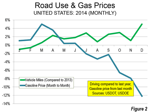
    The latest driving data may indicate that even the somewhat tepid recovery is speeding up in the United States. This combined with falling gasoline prices is likely to be why driving is increasing again.

    Employment Exceeds 2008 Level

    Employment is probably the most important factor in the recent recovery of car use

    According to data at the St. Louis Federal Reserve Bank "FRED" website, national employment peaked at 138.3 million in January 2008. By early 2010, employment had dropped to under 130 million. It took until April 2014 to restore the employment level that had been previously achieved more than six years earlier. This was the longest employment trough since before World War I, except for the period of 1929 to 1936, during the Great Depression.

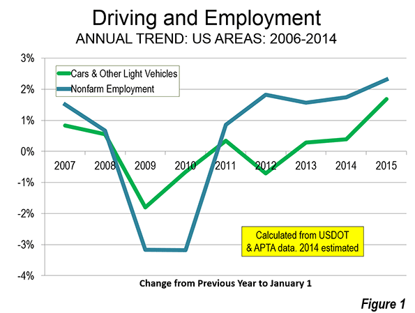
    As more people return to employment and incomes rise, driving can be expected to increase. During 2014, the nation’s nonfarm employment rose to the highest level in history. As the year progressed and employment increased, so did driving (Figure 1).

    But there is still a long way to go for the economy. The civilian labor force participation rate continues depressed. If early 2008 levels of labor participation were restored, there would be at least 10 million additional jobs.

    Falling Gasoline Prices

    US Department of Energy data indicates that the average price per gallon of gasoline rose by more than one half between 2005 and 2011. Until the middle for 2014, gasoline prices fluctuated around this level until early summer of 2014. Then the gas price reductions began. By the end of 2014, gasoline prices had dropped to near 2005 levels, which they actually reached in early 2015. Much of the 2014 increase in driving was concentrated since the decline in gasoline prices started in the last half of the year (Figure 2).

    Driving and Transit

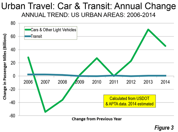
    Ridership and road travel data also shows that there has been little relationship between the annual changes in driving and transit use over the period of the gas price increases and the subsequent decrease. Advocates of greater transit funding have claimed for decades that transit can be effective in attracting drivers from their cars. This was transit’s time.

    However, the highly publicized transit ridership increases have been small in context and have shown virtually no relationship to the changes in automobile use in urban areas. This is illustrated in Figure 3. Driving volumes have risen and fallen, with little response in transit ridership. If there were a significant relationship between transit ridership and travel by car, the two lines on the chart would nearly follow one another. However, the lines show virtually no relationship. In relation to the actual changes in travel by car and light vehicle, the changes in transit are imperceivable. Transit ridership remains relatively small, at approximately two percent of all trips and five percent of work trips. An American Public Transportation Association (APTA) press release confirms the weak nexus between driving trends and transit for the most recent period. APTA notes that transit ridership late in the year increased despite the significant reduction in gasoline prices.

    Transit does not provide rapid mobility for most urban trips, which is why it has so little potential to attract people from cars. As higher prices force people to cut back on driving, they simply travel less, rather than getting on transit that cannot take them where they need to go in a reasonable time. That would be different if transit provided mobility competitive throughout the metropolitan area. Indeed, transit’s percentage of urban travel would be far above its current two percent. But to build out a system that reaches most jobs, of course, that would be financially prohibitive.

    Transit’s strength is downtown (the central business district, or CBD). The largest CBDs have employment densities are 100 times the urban average, and are well served by rapid, radial transit routes. In four of the nation’s largest CBDs — New York, Chicago, Boston and San Francisco — transit carries more than half of workers to their job, 77 percent in Manhattan alone. Americans use transit where it is competitive or superior to travel by car, which should dispel any notion that there is a national aversion to transit.

    But the city is much more than downtown. According to research by Lee and Gordon only eight percent of employment in the 48 largest metropolitan areas was in CBDs. This is despite the presence of impressive office towers that convey a sense of CBD dominance.

    Lee and Gordon also show that about 13 percent of jobs are in employment centers centers outside the CBDs, which are often called "edge cities." Because these centers do not have the radial networks of direct transit, even their high densities produce little in transit ridership.  My analysis of more than 80 post-World War II form suburban employment centers (mainly edge cities) indicated a transit work trip percentage of only 4.9 percent, which is approximately the national average for all areas. Transit’s share to the remaining nearly 80 percent of jobs dispersed throughout the metropolitan areas is just 4.6 percent.

    The basic problem is access. Outside of downtowns, few jobs can be conveniently reached by transit. This means transit takes about twice as long as driving alone and often is either not within walking distance of home or does not drop the passenger off within walking distance of work. This is illustrated by research at the University of Minnesota Accessibility Laboratory, which has shown that in 45 large metropolitan areas, only 10 percent of jobs can be reached by the average employee in 60 minutes by transit. By comparison, American Community Survey data indicates that nearly 65 percent of employees who drive alone in the same metropolitan areas actually reach work — and in half the time (30 minutes).

    Even low income workers, whose constrained budgets should make transit more attractive largely use cars to get to work.

    Driving and a Middle-Income Lifestyles

    I have referred before to the research that equates better economic performance with better mobility for people throughout the labor market (metropolitan area).

    Driving is not based on the shallow, arbitrary preference expressed in the threadbare cliché of a "love affair with the automobile." Cars are essential to realizing the aspirations of a majority of people, not only in the United States but in Europe and beyond.

    Wendell Cox is an international public policy consultant. He was appointed to three terms on the Los Angeles County Transportation Commission and chaired two American Public Transit Association (APTA) national committees (Policy & Planning and Governing Boards). Full biography is here.

  • Life is Good in St. Louis

    The headline line in the Sunday St. Louis Post-Dispatch asked "Are St. Louis Area’s Home Prices too Low?” This is could not possibly have appeared describing any major metropolitan area of Australia, New Zealand, or the United Kingdom. Nor will newspapers in Vancouver, Toronto, Calgary, Portland, Seattle, Boston, New York or in any of the overpriced markets of California decry low prices any time soon.

    The March 8, 2015 article by Jim Gallagher rightly noted that house prices tended to be higher in cities outside St. Louis, there are "restrictions on building, either geographical or political." Gallagher quotes William Rogers, an economist at the University of Missouri- St. Louis says that "Developers have really serious problems putting up houses in Los Angeles or San Francisco."

    The 11th Annual Demographia International Housing Affordability Survey, produced with Hugh Pavletich of Performance Urban Planning in Christchurch New Zealand,  confirms the low house prices in St. Louis. In 2014, the median multiple, a price to income ratio calculated by dividing the median house price by the median household income, was 2.7 in the St. Louis metropolitan area. St. Louis is tied for fifth most affordable middle-income housing market among the 86 major metropolitan area markets (over 1,000,000 population) in nine nations.

    No one should imagine that the low prices of St. Louis are the result of a depressed economy. Yes, St. Louis is on the periphery of the rustbelt. And yes, the city (core municipality) of St. Louis has lost a larger share of its population than any other large municipality in modern history. Since 1950, the city of St. Louis – a mere 11 percent of the metropolitan area – has lost 63.2 percent of its population, slightly more than the city of Detroit, at 61.4 percent.

    Yet, somehow the city of St. Louis has avoided the financial train wreck of Detroit, nor do planners suggest the next industry should be urban agriculture. At a minimum, the difference suggests that St. Louis, even as it has lost population, has been much better led than the Motor City. Further, the much larger St. Louis metropolitan area (which is the area described in the Gallagher article and rated in the Demographia Survey) is anything but depressed.

    Gallagher indicates that "lots of people here could pay more for houses, but they don’t have to." That is correct. However, households in St. Louis pay approximately the same percentage of their income to buy houses today that most people have since World War II. That is also the same amount that Angelos and San Franciscans paid until the coming of excessive regulation (see Fischel) in the 1970s; since then  house prices there have increased between 2.5 and 3 times.

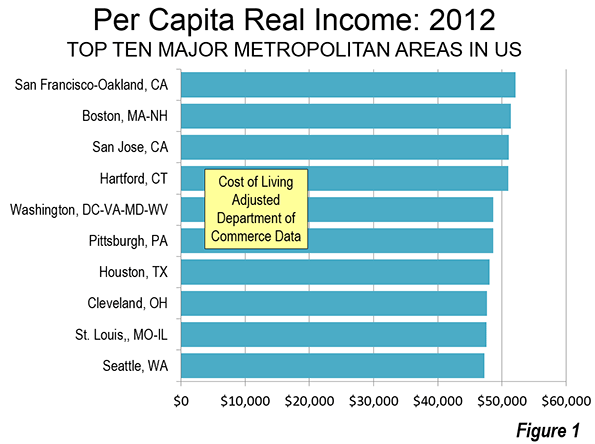
    On the surface, St. Louis appears about average in income. St. Louis ranks 25th, slightly above the middle of the 52 major metropolitan areas in per capita income. But that’s just the beginning of the story. As anyone looking for employment in other metropolitan areas quickly finds out, housing cost differences can be huge and make up most, if not all the difference in cost of living. When the cost of living is considered, real personal incomes in St. Louis rank ninth among the 52 major metropolitan areas. It may be surprising, but St. Louis ranks above number 10 Seattle. While nominal incomes in Seattle are nearly 20% above that of St. Louis, when the cost of living is considered, St. Louisans had nearly 1% more income than Seattleites in 2012 (Figure).

    The metropolitan areas ranked above St. Louis are the usual suspects of nominal affluence. No one would be surprised that San Francisco has the highest incomes, both nominal and adjusted for cost-of-living. San Francisco’s nearly 50% advantage in nominal personal income over St. Louis drops to less than 10% when the cost of living is considered. Given the graduated nature of the federal income tax, the difference could be less. The other most affluent cities are Boston, San Jose, Hartford, and Washington. The cost of living conversion factor (regional price parity) is more than 25% in San Francisco, San Jose and Washington and 18% in Boston. Only in Hartford, among the leaders, has anything similar to a normal cost of living (6% above the national average)

    There are other surprises in the top 10. Both Pittsburgh and Cleveland have higher cost of living adjusted incomes than St. Louis. Less surprising is that Houston is in the top 10, given its robust economy, at least before oil prices dropped.

    There are some interesting omissions from the top 10. Global city New York ranks 17th, just behind "Music City" Nashville. Portland, America’s incubator of house price increasing planning policies, finds itself ranked 39th. Even in Jackson, Mississippi, not large enough to make the over 1,000,000 list, has higher real per capita income than Portland.. Perhaps the biggest surprise is Los Angeles. Like New York, often considered a Global City, the city of my birth is anything but Global City real per capita incomes. Even depressed Detroit (though the suburbs of Detroit are anything but depressed) is ranked 10 positions above Los Angeles and has real per capita income 10% higher.

    All of this should be regarded as good news for St. Louis. Once, to be sure, St. Louis was far more important. As late as 1910, St. Louis was the fourth largest municipality in the United States, trailing only New York, Chicago and Philadelphia. While St. Louis is not depressed, it has grown much more slowly than most metropolitan areas. But the decline has been more in the urban core city than the surrounding areas. Over the past the past 60 years the city of St. Louis lost more than 500,000 residents, while between 1950 and 2010, while the suburbs added 1,400,000.

    Gallagher indicates that construction prices are reasonable in St. Louis. In fact they are not much less than in the stratospheric housing markets of San Francisco and Los Angeles. For example, a 2,500 square foot starter house in the East Bay of San Francisco would cost less than 10 percent more to build than in St. Louis, according to data at building-cost.net.The difference between housing costs in St. Louis and high-cost market is in the land, which is where the cost of excess regulation shows up

    As a metropolitan area, St. Louis has competitive difficulties (see: Shrinking City, Flourishing Region: St. Louis Region). The weather is not as nice as in California. The winters are tougher than in Texas or Florida. But the one great advantage St. Louis possesses is reasonable middle income housing affordability. This is an important competitive advantage that led to only modest domestic migration losses during the 2000, when high priced Los Angeles and New York were bleeding more than 1.3 million net domestic out migrants.

    Also, with the money they don’t have to pay for over-priced housing, St. Louisans can buy more "stuff" or take longer vacations. Nor do St. Louisans get less for their less money. The median sized detached house is the same in St. Louis (1,800 square feet) as in  San Francisco and slightly larger than in Los Angeles (1,744 square feet), according to the American Housing Survey in 2012, yet St. Louisans pay much less.

    The bottom line is that for all of the competitive difficulties, life is good in St. Louis. And, one big reason is housing prices middle-income households can afford.

    Wendell Cox is principal of Demographia, an international public policy and demographics firm. He is co-author of the “Demographia International Housing Affordability Survey” and author of “Demographia World Urban Areas” and “War on the Dream: How Anti-Sprawl Policy Threatens the Quality of Life.” He was appointed to three terms on the Los Angeles County Transportation Commission, where he served with the leading city and county leadership as the only non-elected member. He was appointed to the Amtrak Reform Council to fill the unexpired term of Governor Christine Todd Whitman and has served as a visiting professor at the Conservatoire National des Arts et Metiers, a national university in Paris.

    Photo: St. Louis Skyline (by author)

  • Urban Core Millennials? A Matter of Perspective

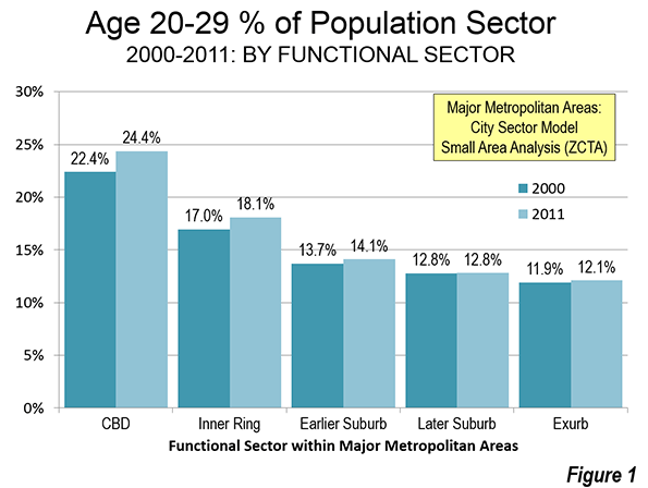
    Yes, millennials are moving to the urban cores but not in significant numbers when view from the context of larger city (metropolitan area) trends. That’s the updated story, based on new small area data that approximates the year 2011 (Note: ACS 5-Year Data).

    Small area trends are important to understanding developments in metropolitan areas, because conventional municipal jurisdiction based analysis obscures the extent of large suburban areas within the boundaries of most core municipalities. In 2010, approximately 58% of the population in core municipalities lived in small areas that were essentially suburban, with much lower population densities than areas that developed before World War II, and where nearly all motorized travel is by car.

    Even worse, "principal cities," have been equated to core municipalities in some analyses, despite their overwhelming suburban, single family nature, such as Staten Island in New York to the broad expanses of Phoenix, Denver, and Portland. Excepting the core municipalities, the principal cities designated since 2000 are polycentric business centers, the metropolitan area criteria adopted by the Office of Management and Budget (OMB). Marking the transition of American cities from being monocentric to polycentric, principal cities are 92% suburban and exurban.

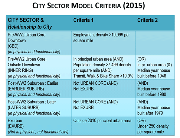
    This analysis uses my City Sector Model, which classifies small areas (ZIP codes, more formally, ZIP Code Tabulation Areas, or ZCTAs) in metropolitan areas in the nation based upon their function as urban cores, suburbs, or exurbs. The criteria used are generally employment and population densities and the extent of transit use versus car use. The purpose of the urban core sectors is to replicate, to the best extent possible, the urban form as it existed before World War II, when urban densities were much higher and a far larger percentage of urban travel was on transit. The suburban and exurban sectors replicate automobile-oriented suburbanization that began in the 1920s and escalated strongly following World War II.

    A recent revision to the model divided the urban core into two classifications, the downtown or central business district ("CBD") and the "inner ring." The CBD is the locus of the most important urban revitalization in the core municipalities, while the inner ring includes the remaining part of the urban core that resembles the outlying parts of the pre-World War II city in its travel patterns and population densities (the City Sector Model criteria are described in the note below).

    The Anecdotal Evidence

    Seemingly endless stories are covered in both the print and electronic media describing how younger adults have been attracted to the urban core. Press organs like The New York Times and the Los Angeles Times can readily send their reporters to nearby cafes, bars, and restaurants. Much rarer are the anecdotes from the suburban strip malls and even a "Starbucks" on Long Island, Sugarland, outside Houston, or in the San Fernando Valley. But data, not anecdotes, are the most reliable indicators of actual trends.  

    From Anecdotes to Data

    The new data reinforces the reality that the story of millennials in the urban core is more nuanced than often suggested. This analysis compares population data for younger adults in the age range of 20 to 29 years old.

    Data: The Urban Core

    The "good news" relates to part of the city, the urban core. Millennials are concentrating to a greater degree than before in the urban core. Millennials have a larger share of the total population in the CBD then in any of the other for city sectors. In 2011, millennials represented 24.4% of the CBD population. By comparison, millennials are a much smaller 14.1% of the overall metropolitan population and the share in the exurbs is only 12.1%, less than one half that in the CBD. The associated inner ring has the second highest millennial component, at 18.1%, well above the shares in the outer sectors. Further, the millennial composition of the CBD increased between 2000 and 2011 from 22.4% to 24.4%. The inner ring millennial composition also increased, from 17.0% to 18.1% (Figure 1).

    So there is no question that the urban core millennial population is increasing beyond the general population increase.

    Data: City-Wide

    The other, often neglected, reality is that the gains in the urban cores are small compared to overall city (urban area or metropolitan area) trends. And millennial urban core gains may well have reached a peak, as has been suggested by Trulia’s Jed Kolko. Over the last year the millennial population in the CBDs has dropped a modest 25,000 (an amount that is probably within the margin of error, since all of these data are from surveys).

    Only 2.3% of millennials lived in the CBDs in the most recent year for which there is data (2011). This is up, but only from 2.2% in 2000. That gain was offset by a troubling loss in the inner core from 18.6% to 17.5%. The millennial share increases were all in the suburbs and exurbs (Figure 2).

    In numbers, the population aged 20 to 29 increased in the suburbs 20 times that of the CBD and the increase in the exurbs was nearly 9 times as high. Altogether, more than 90% of this cohort’s growth took place outside the urban core in the major metropolitan areas (Figure 3). Overall, the millennial gains in the CBD were approximately 80,000, while the gains in the inner ring were approximately 240,000. By contrast, the millennial gains in the suburbs and exurbs amounted to more than 2.75 million (Figure 4).  

    A Matter of Perspective

    The story on millennials is simply a matter of perspective. Those most interested in the small but influential urban core, depict a rising tide of millennials, with some justification. Those most interested in all the entire metropolitan area, are compelled by the overwhelming numbers to recognize that the story of millennials in the urban core is less significant in the larger context. But we are far from, and may well never achieve, a return to the imminent "Nirvana" of restoring pre-World War II cities or even a substantially smaller role for cars, which continue to drive the urban form in much of the world.

    Continued progress in the urban cores does not depend upon the "death" or decline of the suburbs. If cities are to best perform their crucial role of providing better standards of living and enabling lower poverty rates, they could boost prosperity throughout the city from the urban core through the suburbs to the exurbs.

    Note: ACS 5 Year Data: The data were collected by the American Community Survey of the US Census Bureau from 2009 to 2013. One fifth of the survey is completed each year, and therefore the data most closely approximates the middle of the period,  2011.

    Note: City Sector Model Criteria: This article continues a series examining the 52 major metropolitan areas (those with more than 1,000,000 residents) using the City Sector Model, which allows a more representative functional analysis of urban core, suburban, and exurban areas, by using smaller areas, rather than using municipal boundaries. The City Sector Model thus eliminates the over-statement of urban core data that occurs in conventional analyses, which rely on historical core municipalities, most of which encompass considerable suburbanization.

    The City Sector Model classifies 9,000 major metropolitan area zip code tabulation areas using urban form, density, and travel behavior characteristics. There are five functional classifications: the CBD, the inner ring, all will earlier suburbs, later suburbs, and exurban areas.

    The general criteria is as follows: The CBDs include any small area with an employment density of 20,000 or more per square mile. The inner ring has lower employment density, with high residential densities, older housing and substantially greater reliance on transit. The CBD and inner ring together form the urban core, which resembles the population density and travel patterns of the pre-World War II city. The suburbs constitute the balance of the built-up urban areas and the exurbs are beyond the built-up urban areas.

    The revised City Sector Model criteria are illustrated in the Figure: "City Sector Model Criteria: 2015," below.

    Wendell Cox is principal of Demographia, an international public policy and demographics firm. He is co-author of the "Demographia International Housing Affordability Survey" and author of "Demographia World Urban Areas" and "War on the Dream: How Anti-Sprawl Policy Threatens the Quality of Life." He was appointed to three terms on the Los Angeles County Transportation Commission, where he served with the leading city and county leadership as the only non-elected member. He was appointed to the Amtrak Reform Council to fill the unexpired term of Governor Christine Todd Whitman and has served as a visiting professor at the Conservatoire National des Arts et Metiers, a national university in Paris.

    Photo:  The revitalizing CBD of St. Louis (by author)

  • Prairie Metropolitan Areas Drive Canada’s Growth

    In Canada, growth is moving west, but not all the way. The big growth now is in the Prairies between central Canada and British Columbia, the Canadian part of the Great Plains.

    Yet you can’t talk about metropolitan Canada without first mentioning the Toronto region.

    The Greater Golden Horseshoe continues to dominate Canada’s population, according to the latest census metropolitan area estimates from Statistics Canada. Anchored by Toronto, the metropolitan areas of the Greater Golden Horseshoe (Hamilton, Kitchener, Oshawa, Brantford, Barrie, Peterborough St. Catherine’s – Niagara and Guelph) now have a population of 8.7 million residents, 23.4% of the national total of 35.5 million.

    The Major Metropolitan Areas

    Canada has six major metropolitan areas (populations over 1 million) and a total of 33 (Table 1).

    Table 1
    Canada: Census Metropolitan Areas
    Population: 2001-2011-2014
            Annual Change
    Metropolitan Area 2001 2011 2014 2001-2011 2011-2014
    Toronto                       4,883     5,770     6,056 1.68% 1.63%
    Montréal                      3,533     3,886     4,027 0.96% 1.20%
    Vancouver                     2,075     2,373     2,470 1.35% 1.35%
    Calgary                          978     1,264     1,407 2.60% 3.62%
    Edmonton                         962     1,206     1,328 2.28% 3.27%
    Ottawa           1,110     1,270     1,318 1.35% 1.24%
    Québec                           704        777        800 0.99% 0.97%
    Winnipeg                         696        746        783 0.70% 1.61%
    Hamilton                         689        742        765 0.75% 1.01%
    Kitchener-Waterloo        432        493        507 1.34% 0.93%
    London                           453        489        502 0.78% 0.87%
    Halifax                          369        402        414 0.86% 0.98%
    St. Catharines-Niagara        392        403        406 0.27% 0.28%
    Oshawa                           309        367        384 1.76% 1.51%
    Victoria                         326        352        359 0.78% 0.62%
    Windsor                          321        328        334 0.23% 0.57%
    Saskatoon                        231        270        301 1.58% 3.62%
    Regina                           197        218        238 1.00% 2.98%
    Sherbrooke                       184        205        212 1.07% 1.18%
    St. John’s                       176        203        212 1.39% 1.49%
    Barrie                           155        193        200 2.18% 1.30%
    Kelowna                          154        184        191 1.76% 1.38%
    Abbotsford        154        174        179 1.25% 0.88%
    Kingston                         153        164        168 0.74% 0.78%
    Sudbury                  161        165        166 0.23% 0.09%
    Saguenay                         162        159        160 -0.18% 0.16%
    Trois-Rivières                   143        153        156 0.67% 0.56%
    Guelph                           129        146        151 1.20% 1.20%
    Moncton                          122        140        146 1.38% 1.37%
    Brantford                        129        139        143 0.82% 0.87%
    Saint John                       126        129        127 0.20% -0.34%
    Thunder Bay                      127        125        125 -0.14% 0.04%
    Peterborough                     115        122        123 0.58% 0.29%
    Metropolitan Areas   20,851   23,759   24,859 1.31% 1.52%
    Outside Metropolitan Areas   10,172   10,586   10,684 0.40% 0.31%
    Canada   31,023   34,345   35,542 1.02% 1.15%
    In thousands
    Source: Statistics Canada


    Toronto remains the largest metropolitan area in the nation, at 6.1 million residents. The population has increased nearly 1.2 million since 2001, 300,000 of it in since the census year of 2011. In the past half-century, Toronto has steadily increased its share of Canada’s population. In 1961, 11 percent of the nation’s residents were in the Toronto metropolitan area. By 2014, 17 percent of the population was in Toronto. Toronto’s has built a margin of 2.0 million over second-ranked Montréal, an expansion of more than one half just since 2001. Montréal had been the largest metropolitan area in Canada until 1976.

    Montréal continues to be Canada’s second largest metropolitan area, at 4.1 million. Montréal’s annual growth rate was higher between 2011 and 2014 than in the previous 10 years, though is still growing at less than the national average. 

    Vancouver is Canada’s third largest metropolitan area. In the second half of the 20th century, Vancouver grew at a rate considerably greater than that of the nation as a whole. However over the last three years, Vancouver’s has grown at a rate less than that of Canada as a whole. Vancouver is nearing a population of 2.5 million, which it should achieve in 2015.

    Among Canada’s major metropolitan areas (over 1 million residents), Calgary is the fastest-growing. Calgary has reached a population of 1.4 million and is growing at 2.5 times the national rate (3.62 percent annually).Since 2001, Calgary has added more than 400,000 residents. Calgary’s growth rate has been spectacular. In 1951, Calgary had fewer than 150,000 residents, but has since grown into a major center specializing in energy. Calgary has the distinction of having built by far the largest post-World War II downtown area in either Canada or the United States (see photograph at the top of the article).

    Edmonton has grown almost as quickly. From a population of under 200,000 in 1951, Edmonton has grown to more than 1.3 million. Edmonton’s annual growth rate since 2011 has been 3.27% and has added more than 360,000 residents since 2001.

    Ottawa, the national capital (see photo below), stretches across the Ontario-Québec border, with Gatineau the largest municipality on the Quebec side. In 2011, Ottawa had been the fourth largest metropolitan area since 1941, but has been passed by both Calgary and Edmonton since 2011.


    Photo: Centre Block, Parliament Hill, Ottawa

    Moving to the Prairies?

    The population estimates of the last three years indicate considerable growth in the Prairie metropolitan areas relative to the rest of the nation. The Prairies provinces are include Alberta, Manitoba and Saskatchewan (Table 2).

    Table 2
    Canada: Census Metropolitan Areas by Region
    Population: 2001-2011-2014
            Annual Change
    Region 2001 2011 2014 2001-2011 2011-2014
    Atlantic Provinces        794        874        900 0.96% 0.97%
    Québec                        4,997     5,498     5,683 0.96% 1.11%
    Ontario     8,587     9,830   10,231 1.36% 1.34%
    Prairie Provinces     3,765     4,474     4,846 1.74% 2.70%
    British Columbia     2,708     3,083     3,199 1.30% 1.24%
    Metropolitan Areas   20,851   23,759   24,859 1.31% 1.52%
    In thousands
    Source: Statistics Canada


    Calgary and Edmonton have experienced strong growth for decades. The same was not true of Saskatchewan’s two largest cities, Saskatoon and Regina. After years of near population stagnation, both metropolitan areas, and the province added population at an accelerated rate. Saskatchewan’s growth pattern has paralleled that of North Dakota, which has shared the energy boom and experienced unprecedented growth after decades of stagnation.

    Saskatoon’s annual growth rate tied with that of Calgary, at 3.62%. This is more than double the 2001 to 2011 growth rate. Regina nearly tripled its annual growth rate from 1.00% between 2001 and 2011 to 2.98% between 2011 and 2014.

    But perhaps the biggest surprise was Winnipeg. Winnipeg was for many years Canada’s fourth largest metropolitan area, a title it relinquished to Ottawa in the 1960s. By 2001, Winnipeg had fallen to eighth place, its population exceeded by not only Calgary and Edmonton, but also Quebec City. However, in a major turnaround, Winnipeg’s annual growth rate has more than doubled since 2011.

    The strength of the Prairies is evident in the regional data (Table 2). The metropolitan areas in the Prairie Provinces grew at more than double the rate achieved by the metropolitan areas in the other regions of Canada between 2011 and 2014.

    The metropolitan areas in all of the four other regions of Canada grew at rates below that of the nation as a whole between 2011 and 2014. The slowest growth was in the Atlantic Provinces (New Brunswick, Newfoundland, Nova Scotia and Prince Edward Island). The annual growth rate of Québec’s metropolitan areas was the second lowest. However growth edged up in Québec’s metropolitan areas. Ontario and British Columbia had grown an approximately the national metropolitan area rate between 2001 and 2011. However, both provinces saw their metropolitan growth fall below the national rate in the last three years.

    The Prairies are likely to experience a reduction in their population growth rate as a result of lower oil and commodity prices. It is an open question how long the lower prices will prevail. The proximate cause of the lower prices is OPEC’s relaxed rationing of its supply to the world. That could change by political whim at virtually any time, or due to disruptions in the Middle East or West Africa, sending prices higher.

    Meanwhile, non-metropolitan Canada continues its very slow growth, which now stands at one-third that of the nation and one-fifth that of the metropolitan areas.

    Wendell Cox is principal of Demographia, an international public policy and demographics firm. He is co-author of the "Demographia International Housing Affordability Survey" and author of "Demographia World Urban Areas" and "War on the Dream: How Anti-Sprawl Policy Threatens the Quality of Life." He was appointed to three terms on the Los Angeles County Transportation Commission, where he served with the leading city and county leadership as the only non-elected member. He was appointed to the Amtrak Reform Council to fill the unexpired term of Governor Christine Todd Whitman and has served as a visiting professor at the Conservatoire National des Arts et Metiers, a national university in Paris.

    Top Photo: Downtown Calgary (by author)