Author: Wendell Cox

  • 10 Most Affluent Cities in the World: Macau and Hartford Top the List

    The United States and Europe continue to dominate the list of strongest metropolitan areas (city) economies in the world, according to the Brookings Institution’s recently released Global Metro Monitor 2014. This is measured by gross domestic product per capita, adjusted for purchasing power parity (GDP-PPP). Brookings points out that this does not indicate personal income, but "proxies the average standard of living in an area."

    The Global Metro Monitor 2014 provides detailed ratings for the 300 largest metropolitan economies in the world, measured by gross domestic product adjusted for purchasing power parity. The list is defined by total size of the economy, with some cities with very high GDP-PPPs per capita, but small populations are excluded. For example, Midland, Texas, with the highest GDP-PPP per capita metropolitan area according to the United States by the Department of Commerce Bureau of Economic Analysis, is excluded.  Other cities, with large populations and low GDP-PPP s per capita were included, such as megacity Kolkata, with a GDP-PPP of $4,000, a fraction of the top 10 average of $77,000. Megacities such as Lagos, Dhaka and Kinshasa were excluded from the top 300, owing to their low GDP-PPPs per capita

    According to data in the Global Metro Monitor website and report, 90 of the top 100 cities were in the United States or Europe in 2014, 68 in the United States and 20 in Europe. The US figure matches that of the previous Global Metro Monitor (2012), while Europe has fallen from 22 to 20 cities.

    Macau: The Most Affluent City

    Last year’s most affluent city, Hartford, was replaced by Macau, which, with Hong Kong is one of China’s two special economic regions. Brookings estimates Macau’s GDP-PPP per capita at $93,849, opening a substantial lead on Hartford of more than $10,000.

    Macau’s economy has expanded rapidly the last decade, principally due to legalized gaming industry and related tourism. Macau displaced Las Vegas as the largest gaming center in 2006. According to the Las Vegas Review Journal, Macau’s gaming revenues had exploded to nearly seven times that of the Las Vegas Strip ($44.1 billion compared to $6.4 billion). Revenue declined, however, in 2014, partly due to China’s anti-corruption drive and competition from other growing East Asian centers, such as Singapore and the Philippines.

    Macau is the one of the smallest cities in the Brookings 300, with a population of only 575,000. Only three other richest cities have populations less than 600,000 including Durham, North Carolina the smallest, ranked 12th, Pennsylvania’s capital, Harrisburg (with a core city that filed for bankruptcy), ranked 25th and Scotland’s capital, Edinburgh, at ranked 37th.

    Balance of the Top 10 Cities

    As was the case last year, nine of the 10 largest GDP-PPP’s per capita were in the United States (Figure). Like Macau, the second and third ranking cities were also smaller than the average, a population of 4.7 million. Second ranked Hartford, with a GDP-PPP per capita of $83,100 has 1.1 million residents. Hartford’s economy strong in finance, especially insurance and benefits and is an important government center, as the capital of Connecticut.

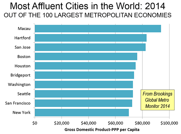
    San Jose, with 1.9 million residents, ranked third, with a GDP-PPP per capita of $82,400. San Jose is home to the larger part of the world’s leading technology center, suburban Silicon Valley. Tech and University hub Boston ranked fourth.

    Leading energy hub Houston ranked as the fifth most affluent city, with a GDP-PPP per capita of nearly $75,000 (Note 1). With 6.4 million residents, Houston is the largest city among the top five. Among the top ten, only New York is larger.

    Bridgeport, Connecticut, a metropolitan area adjacent to New York that includes suburban business centers such as Stamford, Westport and Greenwich is ranked 6th.

    The balance of the top 10 also includes cities specializing in technology, finance and government. Number seven Washington has probably the world’s largest government complex   and has nurtured a huge technology center centered in the Virginia and Maryland suburbs. Seattle ranks eighth, continuing its historic leadership in the technology driven aerospace industry besides its emergence as one of leading information technology centers in the world.

    San Francisco which includes part of the Silicon Valley in its suburbs (sharing with San Jose) and has a strong social media industry in its urban core, ranks 9th. The top 10 was rounded out by New York, perennially ranked as one of the two top global cities, along with London (see: Size is not the Answer: The Changing Face of the Global City, referred to as the Global Cities Report, described further in Note 2)

    Additional Highlights

    Europe:Unlike the United States, which placed 37 of its most affluent cities in the top 50 and 31 in the second 50, Europe’s 20 most affluent economies were concentrated in the second 50, with only six in the top 50. Comparatively small Edinburgh, cited above, was the most affluent, at 37th. Paris was ranked 40th most affluent by Brookings and 3rd in the Global Cites report, just ahead of London at 42nd, the perennial global city co-leader (which was ranked number one in the Global Cities Report).

    Hong Kong:Along with Macau, China’s other special economic region, Hong Kong continued to be among the world’s most affluent, at 39th. The Global Cities Report ranked Hong Kong as the sixth Global City, with a GDP-PPP PPP higher than that of former its former imperial capital   London.

    China: Perhaps most significantly, mainland China has begun to enter the top 100. Suzhou, partly exurban to Shanghai (Kunshan), now ranks 68th. Suzhou has been the recipient of considerable business park investment, including cooperative ventures with Singapore. China’s economic prosperity may be shifting toward the Yangtze Delta (which extends from Ningbo and Hangzhou, through Shanghai to Nanjing). Along with Suzhou, Wuxi, Changzhou and Nanjing now have GDP-PPP’s per capita exceeding $30,000. By contrast, among the large manufacturing centers of the Pearl River Delta, only Shenzhen exceeds a GDP-PPP of $30,000, while Guangzhou, Dongguan and Foshan are below that level (Note 2). According to a new Economist Intelligence Unit report, Jiangsu (which includes the urban corridor from Suzhou to Nanjing) now accounts for more manufacturing employment than any other province.

    Surprisingly Low Rankings: Some cities that might have been expected to be among the world’s most affluent, ranked comparatively low. For example Tokyo, the world’s largest city, ranked fourth in the Global Cities Report, made it only to the third 50 in affluence. Seoul-Incheon, a burgeoning corporate and tech center, remained outside the top 100.

    Canada’s largest city, Toronto managed only a ranking of 100, well below the Prairie behemoths of Calgary (11th) and Edmonton (23rd). Australia’s largest city, Sydney also barely made the top 100, at 95th, far below energy and commodities capital Perth (17th).

    European cities with reputations for unusual prosperity also ranked lower than expected. Financial center Zurich was ranked 45th. Scandinavia’s most affluent city  was Stockholm (48th), followed by energy leader Oslo (62nd), Helsinki (87th) and Copenhagen, which failed to make the top 100 and ranked in the third 50. Singapore,which the Global Cities Report ranks fourth, is ranked 14th most affluent.  

    Evaluating City Performance

    Cities grow as migrants are attracted by hope for better lives. This is as true in Africa and India as it is in Europe or the United States. Cities achieve their primary purpose when they produce a higher standard of living for their residents. Some cities do very well at this, as the Brookings data indicates, and some do less well. The Global Metro Monitor provides crucial information that can be used by national, regional and local officials to measure how well their policies are performing in improving living conditions in relation to both their own past and other cities.

    Note 1: Purchasing power can vary greatly even within nations. Because of this, the United States Department of Commerce, Bureau of Economic Analysis has developed a regional price parities (RPP) program to adjust for metropolitan area costs of living. For example, in 2012, the unadjusted per capita income in San Jose was 30 percent above that of Houston. In the same year, the per capita income-RPP (or in international terms, the per capita income-PPP) in San Jose was just six percent above that of Houston, indicating cost of living at least 20 percent higher in San Jose. 

    Note 2:  Joel Kotkin was principal author of Size is not the Answer: The Changing Face of the Global City, which included contributing authors Ali Modarres, Aaron M. Renn and me. The report was jointly published by the Civil Service College of Singapore and Chapman University. The report is available here.

    Note 3: The 2012 Global Metro Monitor ranked some cities of China higher, though Note 19 expressed concerns about population data for some cities, which might have excluded migrant populations (the "floating population"). There are no such difficulties in the 2014 Global Metro Monitor.

    Wendell Cox is principal of Demographia, an international public policy and demographics firm. He is co-author of the "Demographia International Housing Affordability Survey" and author of "Demographia World Urban Areas" and "War on the Dream: How Anti-Sprawl Policy Threatens the Quality of Life." He was appointed to three terms on the Los Angeles County Transportation Commission, where he served with the leading city and county leadership as the only non-elected member. He was appointed to the Amtrak Reform Council to fill the unexpired term of Governor Christine Todd Whitman and has served as a visiting professor at the Conservatoire National des Arts et Metiers, a national university in Paris.

    Photo: St. Paul’s Church (Facade), Macau, photo by authors

  • Is Jakarta the World’s Most Congested City?

    The world’s second-largest city, Jakarta, is its most congested according to the Castrol Magnatec Stop-Start Index. The Start-Stop Index estimates the average number of starts and stops per vehicle in 78 cities around the world. Jakarta drivers had 33,240 starts and stops annually according to the survey. A higher number of starts and stops is associated with more intense traffic congestion and more intense greenhouse gas emissions per mile traveled. This is an indication of a roadway system that provides insufficient capacity for the travel demand (including commercial truck traffic). The Start-Stop Index did not include the world’s largest city, Tokyo–Yokohama.

    Measuring Traffic Congestion

    The Castrol Magnatic is one of three international traffic congestion measures that provide information over broad geographical areas. The other two indexes, the Tom Tom Traffic Congestion Index and the INRIX Traffic Scorecard provide measures of traffic congestion by travel time losses. These indexes generally follow the method pioneered by the Texas A&M Transportation Institute, the results of which are reported annually in its Urban Mobility Report.

    The Castrol Magnatic Start-Stop Index measures congestion by the number of starts and stops experienced by drivers. The three traffic congestion indexes also measure different geographies. The Tom Tom Traffic Congestion Index provides scores for cities in the United States, Canada, China, Australia, New Zealand, Europe, South Africa and Latin America. The INRIX Traffic Scorecard provides information on cities in the United States, Canada and Europe. The Castrol Magnatic Start-Stop Index provides by far the greatest geographical coverage, with data from the United States, Canada, China, Australia, New Zealand, Europe, South Africa, Latin America and Southeast Asia. However, over its larger geography, fewer cities are evaluated in this survey than in the Tom Tom and INRIX indexes.

    The state of traffic congestion reporting is has improved and it seems likely that the remaining portions of the world not yet reported upon will soon be added.

    Rating Starts and Stops

    The Castrol Magnatic Start-Stop Index relies on data automatically collected from its subscribers by traffic index publisher and vehicle navigation company, Tom Tom. Castrol Magnatic rates each city on a "three color" matrix. Cities with an average of more than 18,000 starts and stops annually are rated "red." This indicates a "severe" level of start-stop driving. The second level is "amber," with annual starts and stops between 8000 and 18,000. This is considered "heavy" level of start-stop driving. The least critical level is "green," which indicates a "moderate" level of start-stop driving.

    Megacities and Start-Stop Driving

    Fourteen of the worlds 34 megacities were included in the Start-Stop Index. The Start-Stop Index provides the first information for Jakarta, which has often been cited anecdotally for the worst traffic congestion, a title is now bestowed by Castrol Magntic. Some, but not all of the megacities have been previously rated with high levels of traffic congestion in the other indexes.

    Istanbul ranked second among the megacities with 32,520 starts and stops annually. This Istanbul was also second worst in the Tom Tom Congestion Index in 2013. Mexico City had 30,840 starts and stops annually. Mexico City was also among the most congested cities in the 2013 Tom Tom Congestion Index, ranking fifth.

    Moscow was the fourth most congested megacity in the Start-Stop Index, with nearly 29,000. Last year, Tom Tom ranked Moscow as having the worst traffic congestion.

    Like Jakarta, Bangkok has often been anecdotally cited for having the worst traffic congestion in the world. Traffic is bad in Bangkok, but ranks only fourth worst in the world in according to the Start-Stop Index, with approximately 27,500 stops and starts annually.

    Buenos Aires had the six the worst traffic congestion at nearly 24,000 stops and starts annually. Shanghai was rated seventh among the megacities with approximately 23,000 starts and stops, but did not make Tom Tom’s most congested 10.

    São Paulo was the eighth ranked megacity in nearly a tie with Shanghai. Sao Paulo was ranked seventh by Tom Tom.

    Beijing, London and Paris rounded out the 11 cities with severe start-stop driving levels ("red"), with at least 18,000. Beijing ranked as the ninth most congested megacity, the same as its Tom Tom ranking. London’s was ranked 10th among the megacities, compared to its the current "London Commute Zone" ranking of third worst in the INRIX Traffic Scorecard. Paris was not ranked in the worst 10 by either INRIX or Tom Tom.

    Three of the megacities had heavy start-stop driving levels ("amber"). Megacity Rio de Janeiro ranked 12th, compared to its third worst ranking by Tom Tom.

    It may come as a surprise to harried commuters, but the two American megacities were ranked least congested. New York ranked 13th. By far the lowest number of annual starts and stops registered for a megacity were in Los Angeles, at approximately 9,400. This is more than 40% better than for New York and is less than one third of the annual starts and stops in Jakarta (Figure 1). Los Angeles is currently rated as having the fourth worst congestion by INRIX, following Honolulu, Milan and the London Commute Zone, though is not ranked in the worst 10 by Tom Tom. The least congested ranking among the megacities for Los Angeles is at considerable odds with the near domination worst rankings for the three decades of the Texas A&M Transportation Center Urban Mobility Report  (which includes only US cities).

    The Developing World and the New World

    The developing world dominated the most congested rankings among all cities. Among the 10 most congested cities, only one high income city was included, Rome.

    Most of the other cities of the New World (Canada, Australia and New Zealand) had fewer than 10,000 starts and stops per year. This included Toronto, Melbourne, Sydney, Auckland and Wellington. The exceptions were Vancouver and Sydney, both with approximately 13,000 starts and stops per year. A number of smaller cities (below 500,000 population) also had fewer than 10,000 starts and stops per year, such as Tampere, Finland and Brno in the Czech Republic.

    Environmental and Economic Costs of High Density

    Generally, the worst start-stop congestion ratings are associated with cities that have higher urban population densities (Figure 2). This is consistent with the association of greater traffic congestion analysis with higher urban population densities,   also found in the Tom Tom Traffic Congestion Index and the INRIX Traffic Scorecard.

    More starts and stops impairs fuel economy, which also materially increases greenhouse gas emissions. Moreover, greater traffic congestion lengthens travel times. Economic growth is greater in where there is rapid mobility throughout the entire metropolitan area (labor market). Yet, urban plans often seek higher densities in their quest for reduced greenhouse gas emissions. The Castrol Magnatic Start-Stop Index results underscore the need for rational urban planning that takes into full account both the economic and environmental consequences of strategies that lead to greater traffic congestion.

    Wendell Cox is principal of Demographia, an international public policy and demographics firm. He is co-author of the “Demographia International Housing Affordability Survey” and author of “Demographia World Urban Areas” and “War on the Dream: How Anti-Sprawl Policy Threatens the Quality of Life.” He was appointed to three terms on the Los Angeles County Transportation Commission, where he served with the leading city and county leadership as the only non-elected member. He was appointed to the Amtrak Reform Council to fill the unexpired term of Governor Christine Todd Whitman and has served as a visiting professor at the Conservatoire National des Arts et Metiers, a national university in Paris.

    Photo: Jakarta: low capacity main artery from busway station (by author)

  • Largest 1,000 Cities on Earth: World Urban Areas: 2015 Edition

    According to the just released 11th edition of Demographia World Urban Areas (Built-Up Urban Areas or World Agglomerations), there are now 34 urban areas in the world with more than 10 million residents, the minimum qualification for megacity status. Tokyo-Yokohama continues its 60 year leads the world’s largest urban area. Before Tokyo-Yokohama, New York had been the world’s largest urban area for 30 years. London‘s run, preceding that of New York, was much longer, at more than 100 years. Beijing, which was the first of today’s megacities to reach 1,000,000 population, held the title for 75 years before London, according to census and urban historian Tertius Chandler.

    Demographia World Urban Areas is the only regularly published compendium of urban population, land area and density data of urban areas with 500,000 or more population (defined in the Note below). The 2015 edition provides coordinated population, urban land area and density data for all 1,009 identified urban areas with at least 500,000 population. These urban areas account for approximately 52 percent of the world urban population.

    Largest Cities in 2015

    Tokyo-Yokohama grew to 37.8 million residents, the largest urban area population ever recorded (Figure 1). But second ranking Jakarta is moving up quickly, becoming the second urban area in history to exceed 30 million residents (30.6 million). Regrettably, Jakarta (Figure 2) is often left off world city top ten lists, because the continuous urbanization extending into the regencies (Figure 2) of Tangerang, Bogor, Bekasi and Karawang usually excluded (see The Evolving Urban Form: Jakarta). Regencies are national second level jurisdictions, within the provinces that make up Indonesia.

    Fast growing Delhi retained third position, rising to just under 25 million. Later this year, Delhi will be only the third urban area in history to exceed a population of 25 million. Surprisingly, Delhi is nearly 50 percent larger than Mumbai, which is commonly considered to be India’s largest urban area. The Census of India does not allow its urban areas to cross state boundaries, which has continued to result in an under-reporting of Delhi’s population. Demographia, and the United Nations, have been reporting a higher population level as a result of Delhi’s interstate urban extensions. Many urban areas extend across state, provincial or prefectural boundaries, such as New York, Ottawa, Tokyo-Yokohama, Mexico CityBuenos Aires, Manila, Seoul-Incheon, Cairo, Shanghai among  others.

    The developing world continued its increasing domination of world’s largest cities. This year, Manila passed Seoul-Incheon to become the world’s fourth largest urban area. Like Jakarta, Manila is often left off top ten lists of the world’s cities, because the continuous urbanization extending into the provinces of Cavite, Laguna, Bulacan and Rizal and are excluded (see The Evolving Urban Form: Manila).

    Seoul-Incheon is at risk to falling another position by 2016. At 24.9 million, Seoul-Incheon’s leads sixth ranked Shanghai by less than 70,000. The last four positions in the top ten are occupied by Karachi, Beijing, New York and Guangzhou-Foshan. Karachi’s position, however, is hard to quantify, because it has been nearly two decades since the last census and the current estimates could be unreliable. New York, along with Tokyo-Yokohama and Seoul-Incheon is only one of three high-income world cities in the top 10.

    Beijing and Guangzhou-Foshan are new entries to the top ten, having displaced Mexico City and Sao Paulo. These two Latin American cities have long been among the fastest growing in the world and were headed toward much higher rankings. However, their growth has slowed materially, and they are now ranked in the second 10. Nearby Campinas is now growing faster than Sao Paulo and Toluca is exceeding the percentage growth of Mexico City. There was a time that demographers expected Mexico City to become the largest city in the world. In 2000 and 2005, the United Nations ranked Mexico City as second only to Tokyo-Yokohama.

    As indicated in a recent article (World Megacities: Densities Fall as they Become Larger), the number of megacities rose from 29 to 34 (megacities are urban areas with more than 10 million residents). These include Tianjin and Chengdu in China, Lahore (Pakistan), Kinshasa (Democratic Republic of the Congo) and Lima (Peru). China now leads the world with six (Shanghai, Beijing, Guangzhou-Foshan, Shenzhen, Tianjin and Chengdu). The ten largest urban areas are shown in Figure 3 and detailed population data is in Table 1 of World Urban Areas.

    Urban Footprints and Urban Density

    The title of the world’s largest urban footprint — what some may call “sprawl” —- is held by the New York urban area. Often seen as the epitome of successful dense development (a characterization that applies only in its geographically much smaller core area), the New York urban area itself constitutes the least dense megacity in the world. New York covers nearly 4,500 square miles (11,600 square kilometers) and has a population density of 4,500 per square mile (1,800 per square kilometer). It is a surprise to many that even Los Angeles is more dense, the result of its much denser suburbs.

    Tokyo-Yokohama covers the second largest land area, at 3,300 square miles (8,500 square kilometers). There are now 29 urban areas covering 1,000 square miles or more (2,590 square kilometers). Not surprisingly, approximately one-half (15) of these are in the United States. Another five are elsewhere in the high income world, such as Paris. There are also eight developing world cities of 1,000 or more square miles, such as Jakarta, Bangkok and Sao Paulo. Urban land area data for all 1,009 cities is in Table 3 of World Urban Areas.

    Dhaka, the capital of Bangladesh, remained the most densely populated city, at 113,000 per square mile (4,500 per square kilometer). Detailed population density for the 1,009 cities is in Table 4 of World Urban Areas

    Where Urban Population is Growing

    Asia’s has more than half (57 percent) of the population in cities of 500,000 and more (Figure 4). This is more than four times the population of such cities in North America, five times that of Africa and Europe and approximately six times that of South America. With stagnant population growth in the high income world and declines in some nations, there is every reason to believe that urbanization in North America and Europe will continue to decline relative to that of Asia, Africa and South America.

    ——-

    Note: There are two generic definitions of cities: urban areas and metropolitan areas. Urban areas define the physical expanse of cities, which is the area of continuous urban development. The second definition for cities is economic. The economic city is the metropolitan area, which includes the urban area and economically connected territory outside the urban area. The economic relationship is usually determined by work trip data, the extent of commuting from outside to inside the urban area. Because metropolitan areas are always geographically larger than urban areas, they also always have more residents. The difference in geographical sizes can be substantial. The Paris urban area covers only 20 percent of the Paris metropolitan area, a figure close to that of US major metropolitan areas, where urban areas cover only 19 percent of the land in metropolitan areas. The paradox is that metropolitan areas virtually always have more rural land than urban land.

    Ideally, urban areas are not defined by local or regional government jurisdictional boundaries, since rural areas are often included in such jurisdictions, especially suburban jurisdictions. Urban development is not constrained by jurisdictional boundaries, nor are urban areas. This causes substantial confusion, because of a general lack of familiarity with urban area concepts, even among experts.

    Urban areas are called also called "population centres" (Canada), "built-up urban areas" (United Kingdom, "urbanized areas’ (United States), "unités urbaines" (France) and "urban centres" (Australia). The "urban areas" of New Zealand include rural areas, as do many of the areas designated "urban" in the People’s Republic of China, and, as a result, do not meet the definition of urban areas above.

    Whatever they are called, urban areas are simply the extent of development, which in most cases extends well beyond the boundaries of core municipalities. Demographia World Urban Areas uses the following definition for urban areas.

    An urban area is a continuously built up land mass of urban development that is within a labor market (metropolitan area or metropolitan region). As a part of a labor market, an urban area cannot cross customs controlled boundaries unless the virtually free movement of labor is permitted. An urban area contains no rural land (all land in the world that is not urban is considered rural).

    Photograph: Lujiazui business district (Pudong), Shanghai, with the nearly complete Shanghai Tower, second tallest building in the world (by author).

    Wendell Cox is principal of Demographia, an international public policy and demographics firm. He is co-author of the "Demographia International Housing Affordability Survey" and author of "Demographia World Urban Areas" and "War on the Dream: How Anti-Sprawl Policy Threatens the Quality of Life." He was appointed to three terms on the Los Angeles County Transportation Commission, where he served with the leading city and county leadership as the only non-elected member. He was appointed to the Amtrak Reform Council to fill the unexpired term of Governor Christine Todd Whitman and has served as a visiting professor at the Conservatoire National des Arts et Metiers, a national university in Paris.

  • World Megacities: Densities Fall as they Become Larger

    There is an impression, both in the press and among some urban analysts that as cities become larger they become more densely populated. In fact, the opposite is overwhelmingly true, as Professor Shlomo Angel has shown in his groundbreaking work, A Planet of Cities. This conclusion arises from the fact that, virtually everywhere, cities grow organically so that they add nearly all of their population on the urban fringe, which has considerably less expensive land. As their physical form of cities (the urban area) expands, the residents per unit of developed area generally falls.

    Previous Analysis

    Two years ago, we analyzed growth patterns among the 23 world megacities that had been described in the Evolving Urban Form series. Megacities are urban areas with more than 10 million residents. This article extends the analysis to the other 11 megacities that will be included in the soon to be published 11th edition of Demographia World Urban Areas.

    Sadly, historical data is simply not available for the most urban areas. Urban areas are designated in some countries, such as the United States, Canada, the United Kingdom, France, India, and the Scandinavian countries. The census authorities in only a few countries, such as the United States and France have produced reliable information over a number of decades.

    Perhaps the most notable historical international effort was that of Kenworthy and Laube, whose global project produced estimates from 1960 through 1990 for a number of urban areas. In some cases, academic efforts have produced consistent urban land area and urban population data for specific cities, such as Lahore, one of the new megacities described below.

    Estimating the Density Dynamics of Cities

    Where historic urban area data is not available, an effective alternative is to compare core area population growth to areas outside the core in the corresponding metropolitan areas. Areas outside the core typically have lower population densities and the addition of more people outside the cores will normally indicate that the urban density is falling. In some cases, this can be indicated by huge core area losses, such as has occurred for decades in London and Paris, as well as Osaka and Mexico City, described in the previous article (see Table).

    Table
    SUMMARY OF MEGACITY URBAN POPULATION TRENDS
    MEGACITY General Growth Pattern
    Bangkok 10 Years: 55% of growth outside core municipality
    Beijing 10 Years: 99% of growth outside core districts
    Buenos Aires 60 Years: 100%+ of growth outside core municipality
    Cairo 16 Years: 2/3 of growth outside core governate
    Chengdu 10 Years: 55% of growth outside core districts
    Delhi 10 Years: 90% of growth outside core districts
    Dhaka 10 Years: 50% of growth outside core municipalities
    Guangzhou-Foshan 10 Years: 75%+ of growth outside core districts
    Istanbul 25 Years: 100%+ growth outside core districts
    Jakarta 20 Years: 85% of growth outside core jurisdiction
    Karachi 20 Years: Estimated density decline 15%
    Kinshasa 20 Years 65% of growth outside core districts
    Kolkata 20 Years: 95% of growth outside core municipality
    Lagos 15 Years: 90% of growth outside core districts
    Lahore 40 Years: 70% urban density decline
    Lima 15 Years: 100%+ of growth outside core districts
    London 110 Years: core districts decline 30% (Inner London)
    Los Angeles 60 Years: 95% growth outside core municipality
    Manila 60 Years: 95% growth outside core districts
    Mexico City 60 Years: 100%+ of growth outside core districts
    Moscow 8 Years: 95% of growth outside core districts
    Mumbai 50 Years: 98% of growth outside core districts
    Nagoya 40 Years 90% of growth outside core municipality
    New York 56 Years: 45% urban area density decline
    Osaka-Kobe-Kyoto 50 Years: 95% of growth outside core municipalities
    Paris 50 Years: 25% urban area density decline
    Rio de Janeiro 10 Years: 95% of growth outside core districts
    Sao Paulo 20 Years: 2/3 of growth outside core municipality
    Seoul 20 Years: 115%+ of growth outside core municipality
    Shanghai 10 Years: 99% of growth outside core districts
    Shenzhen 10 Years: 70%+ of growth outside core districts
    Tehran 15 Years >95% of growth outside core districts
    Tianjin 10 Years: 85%+ of growth outside core districts
    Tokyo 50 Years: 95% of growth outside core municipalities


    Many core municipalities have been expanded to include areas that are functionally suburban, rather than the intense urbanization that was more usual in pre-automobile sectors of the city. This is not just an American phenomenon. In Canada, there are large areas of functional suburbanization (lower residential densities and majority automobile use for motorized transport) in core municipalities, such as Toronto, Ottawa, and Calgary. There are other examples elsewhere in the world, such as Auckland, London, and Rome.

    As a result, functional urban core and suburban characteristics are poorly defined by analyses using municipal jurisdiction boundaries (such as core municipalities versus suburban municipalities).
    Urban core populations and densities are best analyzed using functional urban core and suburban characteristics, such as higher residential densities and unusually high reliance on transit, walking and cycling, as opposed to automobiles.

    The use of census tracts for this finer grained analysis has been undertaken for the metropolitan areas of Canada by Gordon and Janzen. Following their general model, I have applied functional urban core and suburban characteristics at the Zip Code Tabulation Area (ZCTA) level in the United States, see From Jurisdictional to Functional Analysis of Urban Cores & Suburbs). A number of issues have been covered in articles (City Sector Model index). One article shows that, among the core municipalities of the major metropolitan areas, those with more than 1,000,000 population, only 42 percent of residents live in functionally urban core districts. Virtually the entire core municipality is functionally urban core in New York, Buffalo, and San Francisco. A number of core municipalities simply have no functional urban core (such as Phoenix and San Jose).

    Megacity Density Trends

    The previous article indicated that population densities were falling in each of the 23 megacities analyzed. A similar conclusion applies to the 11 additional megacities analyzed in this article. All of these trends are indicated in the table.

    Paris: It may come as a surprise that the ville de Paris (the core municipality) accounts for little more than one-fifth of the urban area population and less than 1/20th of the continuously built up land area. Further, the ville de Paris has experienced a population decline as significant as many American core municipalities, dropping from over 2.9 million in 1921 to 2.3 million today. The population density of the Paris urban has dropped by more than one-half since 1954 and by nearly 85 percent since 1900. The inner four districts (arrondissements) have lost nearly three-quarters of their population since 1861. The losses may have started earlier, but comparable earlier data is not available.

    London: The London urban area has just achieved megacity status. London forced much of its post-World War II population growth outside its newly created greenbelt following World War II. Between World War II and the 1990s, the London urban area lost population. Most, but not all of the London urban area is composed by the Greater London Authority (GLA), over which Ken Livingstone and Boris Johnson have famously presided.

    However there has been a significant population increase since the 1990s. The Greater London Authority recently celebrated a "peak population" day to note having exceeded its 1939 population peak.  Virtually all of London’s metropolitan area (Note 1) growth has occurred outside the greenbelt, in the exurban areas. Approximately 3.3 million residents have been added to the first ring counties abutting the greenbelt between 1951 and 2011. Inner London, which roughly corresponds to the pre-1964 London County Council area, lost more than 450,000 residents in the same period, while Outer London (also in the GLA and inside the green belt) gained more than 400,000.

    However, even with the greenbelt, today’s London urban area covers more land area. At the 2011 census, the London urban area had fallen to nearly 15 percent below the Kenworthy and Laube estimate for 1961. Since 1900, London’s density is estimated to have dropped by two-thirds. Inner London, which roughly corresponds to the pre-1964 London County Council area, remains approximately one-quarter below its 1901 population, even with recent growth. All of the GLA growth has been in outer London.

    Other Megacities: Pakistan’s two largest urban areas, Karachi and Lahore are growing at among the fastest rates in the world, averaging approximately three percent annually. Interpolation of data from academic papers indicates declining population densities in both cities.

    Lagos continues to grow rapidly. More than 90 percent of its recent growth has been in suburban districts, with their lower, but still high, densities. Kinshasa, one of the new megacities, has the fastest growth rate according to United Nations data. Kinshasa is growing over four percent per year, with nearly two-thirds of its recently reported growth outside the densest areas in the core districts.

    Tehran’s core districts are now experiencing only modestly increasing population. Nearly all growth (98 percent) has been outside the core districts.

    China has recently added two cities to the megacity list, Tianjin and Chengdu. Approximately 85 percent of Tianjin’s recent growth has been outside the core districts. In Chengdu, the areas outside the core districts have captured 55 percent of the growth.

    Over the past 40 years, 90 percent of Nagoya’s growth has been outside the core municipality.

    Lima is another new megacity. In Lima, core district population is declining and all growth has occurred in suburban districts over the latest 15 years for which there is data.

    The Limits to Urban Density Declines

    There are limits to urban density declines. As people become more affluent and car use increases, city densities decline toward those of automobile orientation. Once that has occurred, there may be modest density increases, but not sufficient to restore the much higher urban area densities from the past and now found only in pre-automobile urban cores.

    However, as lower and middle income cities, from Lagos to Sao Paulo grow and achieve greater affluence, urban growth is likely to continue to be on the lower density periphery.

    Note: The metropolitan area is the economic form of the city. The metropolitan area includes rural and urban territory from which commuters are drawn to employment in the principal urban area.

    Wendell Cox is principal of Demographia, an international public policy and demographics firm. He is co-author of the "Demographia International Housing Affordability Survey" and author of "Demographia World Urban Areas" and "War on the Dream: How Anti-Sprawl Policy Threatens the Quality of Life." He was appointed to three terms on the Los Angeles County Transportation Commission, where he served with the leading city and county leadership as the only non-elected member. He was appointed to the Amtrak Reform Council to fill the unexpired term of Governor Christine Todd Whitman and has served as a visiting professor at the Conservatoire National des Arts et Metiers, a national university in Paris.

    Photo: Depiction of Lagos built-up urban area

  • International Housing Affordability in 2014

    The just released 11th Annual Demographia International Housing Affordability Survey shows the least affordable major housing markets to be internationally to be Hong Kong, Vancouver, Sydney, along with San Francisco and San Jose in the United States. Honolulu, which should reach 1,000,000 population this year (and thus become a major metropolitan market) was nearly as unaffordable as San Francisco and San Jose. An interactive map in The New Zealand Herald illustrates the results.

    Rating Housing Affordability

    The Demographia International Housing Affordability Survey uses the "median multiple" price-to-income ratio. The median multiple is calculated by dividing the median house price by the median household income. Following World War II, virtually all metropolitan areas in Australia, Canada, Ireland, New Zealand, the United Kingdom and the United States had median multiples of 3.0 or below. Since that time, housing affordability has been seriously retarded in metropolitan areas that have been subjected to urban containment policies. This includes virtually metropolitan areas of the United Kingdom, Australia, New Zealand and some markets in the United States and Canada.

    Housing affordability ratings are indicated in Table 1.

    Table 1
    Demographia International Housing Affordability Survey 
    Housing Affordability Rating Categories
    Rating Median Multiple
    Severely Unaffordable 5.1 & Over
    Seriously Unaffordable 4.1 to 5.0
    Moderately Unaffordable 3.1 to 4.0
    Affordable 3.0 & Under


    Table 2 summarizes housing affordability ratings for the 86 major metropolitan areas in the nine nations covered. Apart from China (Hong Kong), the least affordable nation among the major markets is New Zealand, at 8.2, followed by Australia at 6.4. Both nations (and Hong Kong) are rated severely unaffordable. 

    Table 2
    Housing Affordability Ratings by Nation: Major Markets (Over 1,000,000 Population)
     Nation     Seriously Unaffordable (4.1-5.0) Severely Unaffordable (5.1 & Over)    
           
    Affordable (3.0 & Under)  Moderately Unaffordable (3.1-4.0) Total Median Market
     Australia 0 0 0 5 5 6.4
     Canada 0 2 2 2 6 4.3
     China (Hong Kong) 0 0 0 1 1 17
     Ireland 0 0 1 0 1 4.3
     Japan 0 1 1 0 2 4.4
     New Zealand 0 0 0 1 1 8.2
     Singapore 0 0 1 0 1 5
     United Kingdom 0 1 10 6 17 4.7
     United States 14 23 6 9 52 3.6
     TOTAL 14 27 21 24 86 4.2


    Least Affordable Major Markets

    Hong Kong registered the highest median multiple out of the 86 major markets and also in the history of the Survey, at 17.0. Vancouver reached 10.6. Sydney had its worst recorded housing affordability, with a median multiple of 9.8. Adjacent metropolitan areas San Francisco and San Jose had median multiples of 9.2, while Honolulu’s median multiple was 9.0. The ten least affordable major metropolitan areas are shown in Figure 1. In nine of these markets, housing was affordable before adoption of urban containment policy (Hong Kong data is not available).

    Affordable Major Markets

    All of the affordable major markets are in the United States. This includes perhaps the most depressed market, Detroit as well as Atlanta, which has spent most of the last three decades as the fastest growing larger metropolitan area in the high income world. At the same time, Atlanta has consistently been among the most affordable. Detroit’s median multiple is 2.0, while Atlanta’s is 2.9.

    Comparing Demographia Results to The Economist and Kookmin Bank

    This year’s edition includes a comparison of housing affordability multiple data from The Economist’s survey of 40 metropolitan areas in China and Kookmin Bank’s survey of major metropolitan areas in South Korea. The least affordable major markets are in China, New Zealand and Australia, all with severely unaffordable median multiples. The most affordable major markets are in the United States and Korea, both rated as moderately unaffordable (Figure 2).

    Perspective

    Hugh Pavletich, of performanceurbanplanning.com and I have published each of the annual editions, which began in 2005. The perspective of the Demographia International Housing Affordability Survey is that domestic public policy should, first and foremost be focused on improving the standard of living and reducing poverty. This requires policies that facilitate both higher household incomes and lower household expenditures (other things being equal). Housing costs are usually the largest component of household expenditure and it is therefore important that public policy both encourage and preserve housing affordability.

    Housing Affordability and Urban Containment Policy

    However, in recent years, land use policy has not been focused on this concern. Conventional urban theory sees urban containment as a necessity. Yet, urban containment policies are associated with the loss of housing affordability, due principally to their rationing of land for development. This effect is consistent with basic economics – restricting supply of a desired good tends to drive up prices – that has been long established.

    Some of the most important contributions have come from Sir Peter Hall, et al (see The Costs of Smart Growth Revisited), Paul Cheshire at the London School of Economics (New Zealand Seeks to Avoid "Generation Rent") and William Fischel at Dartmouth University (The Consequences of Smart Growth). Donald Brash, former governor of the Reserve Bank of New Zealand attributed the housing affordability losses to "the extent to which governments place artificial restrictions on the supply of residential land" in his introduction to the 4th Annual Edition.

    The Importance of Urban Expansion

    This year’s introduction is provided by Dr. Shlomo Angel, leader of the New York University Urban Expansion Program. Dr. Angel reminds us that "where expansion is effectively contained by draconian laws, it typically results in land supply bottlenecks that render housing unaffordable to the great majority of residents."

    He describes the Urban Expansion Program is "dedicated to assisting municipalities of rapidly growing cities in preparing for their coming expansion, so that it is orderly and so that residential land on the urban fringe remains plentiful and affordable." Urban Expansion Program teams are already working with local officials in Ethiopia and Colombia to achieve this goal. Angel’s previous work documented the association between urban containment policy in Seoul and large house price increases relative to incomes (see Planet of Cities).

    Policies seeking the same goals of plentiful and affordable land on the urban fringe are just as necessary in high income world metropolitan areas.

    As time goes on, the negative consequences of urban containment policy on housing affordability and the standard of living have been increasingly acknowledged. Christine Legarde, managing director of the International Monetary Fund said that "supply-side constraints will require further measures to increase the availability of land for development and to remove unnecessary constraints on land use." in a recent statement on housing affordability in the United Kingdom.

    Similarly a recent feature article in The Economist (see PLACES APART: The world is becoming ever more suburban, and the better for it) noted that the only reliable way to stop urban expansion was to stop them forcefully (such as through urban containment policy). Yet, The Economist continued, "But the consequences of doing that are severe" and cites the higher property prices that have been the result:"

    The Economist continued to note the effect of the policy on households: "It has also forced many people into undignified homes, widened the wealth gap between property owners and everyone else…"

    Wendell Cox is principal of Demographia, an international public policy and demographics firm. He is co-author of the "Demographia International Housing Affordability Survey" and author of "Demographia World Urban Areas" and "War on the Dream: How Anti-Sprawl Policy Threatens the Quality of Life." He was appointed to three terms on the Los Angeles County Transportation Commission, where he served with the leading city and county leadership as the only non-elected member. He was appointed to the Amtrak Reform Council to fill the unexpired term of Governor Christine Todd Whitman and has served as a visiting professor at the Conservatoire National des Arts et Metiers, a national university in Paris.

    Photo: Exurban London

  • Asians: America’s Fastest Growing Minority

    Asians have emerged as the fastest growing of the three major ethnic and minority populations in the United States. According to Census Bureau data, the number of US native and foreign-born Asian residents rose 56 percent from the 2000 Census to the 2013 American Community Survey (one year release). This is calculated by comparing estimates based on interviews with residents who have classified themselves as a single race and Asian. In the last two censuses, respondents have been asked to designate their race, with the option of selecting more than one ("combinations"). For simplicity, this analysis uses "one race" rather than "combination" data for Asians and African-Americans as well as all data for Hispanics or Latinos. In 2010, 4.8 percent of the nation’s population was "Asian alone" (not in combination with another race or ethnicity).

    Overall Population Growth Rates: 2000 to 2013

    The 56 percent growth in the Asian population was slightly higher than the 53 percent growth among Hispanics between 2000 and 2013. Asian population growth was also more than three times that of African-Americans, at 15 percent.

    Due largely to the greater size of  population of Hispanics and African Americans, the larger Asian percentage increase represented the second smallest numeric increase among the three groups over the past decade. The growth in Hispanics was 19 million, from a 2000 population of 35 million to 2013 population of 54 million. The Asian population grew 5.8 million, from a 2000 population of 10.2 million to a 2013 population of 16.0 million. The African-American population increased somewhat less slowly, at 5.3 million, despite a 2000 population that was nearly 3.5 times the Asian population.

    The Census Bureau projects a continuation of similar trends. Between 2013 and 2050, the Asian population (one-race) is expected to increase 115 percent to 34.3 million. This is more than four times the projected national growth rate over the period. The Hispanic population is projected to grow at a slightly lower rate, at 88 percent with a 2050 population of 101 million. The African-American population would continue with the slowest growth of ethnic minorities, adding 40 percent and reaching 16 million by 2050 (Figures 1 and 2), although they will grow faster than the Non-Hispanic White population, which is expected to decline by five percent.


    Census Bureau Definition of Asian

    Asia is by far the largest continent both in the land area and population. It includes three of the four most populous nations in the world, China, India, and Indonesia (the United States is the third most populous). The Census Bureau classifies people within South Asia (the Indian subcontinent), Southeast Asia and East Asia as Asian, based on their responses to surveys.

    As a result, the census definition covers a broad area from the western border of Pakistan, through India, and Bangladesh along with Southeast Asia, China, the Philippines, Japan and Korea.

    Distribution of Asian Origins

    China, According to the American community survey for 2013, was the origin to the highest number of Asians in the United States, at approximately 24 percent. The Indian subcontinent has the second largest number at approximately 20 percent (including India, Pakistan, Bangladesh and Sri Lanka). The Philippines represents approximately 17 percent of the Asian population, while Vietnam has approximately 11 percent, Korea nine percent, and Japan five percent. Another 15 percent are classified as "other Asian," indicating origins in one of the other areas of Asia, such as Indonesia or Thailand (Figure 3). Some of these might also be Chinese by ethnicity.

    Between 2000 and 2013, the largest numeric growth was among Indian subcontinent and "other Asian" origins, both at 90 percent. Chinese origins increased 56 percent, while the Japanese population fell slightly (minus 0.3 percent).

    Population Concentrations

    The Asian population is unusually concentrated. The 10 states with the largest Asian population account for nearly three-quarters of the total (Figure 4). California had the largest Asian population, with approximately one-third of the Asian population in the United States. Approximately 5.2 million Asians lived in California. This is more than three times the Asian population living in second-ranked New York, with 1.6 million. Texas ranks third in Asian population, with 1.1 million. Five other states have more than one half million Asians, including New Jersey, Illinois, Washington, Hawaii, and Florida.

    Who Lives Where?

    California’s concentration of Asian population extends to all seven census categories. California has more Indian subcontinent, Chinese, Filipino, Japanese, Korean, Vietnamese, and other Asian residents than any other state. New York follows California in the number of Asians with origins in China, the Korea and "other Asian" areas. Hawaii has the second most people with Japanese and Philippine origins. Texas is second in Vietnamese origins and New Jersey ranks second in Indian subcontinental origins. In each of the 10 most Asian states, the group trails Hispanics

    Comparisons

    In some states, Asians are already the second largest racial minority, behind Latinos. Perhaps most significantly, California’s 5.2 million Asians constitute more than double the 2.3 million African-American citizens. In three nearby states, Asians are approximately double or more the African-American population, including Washington, Oregon, Utah, Idaho, and Montana.

    In one state, Hawaii, Asians represent the largest minority. Hawaii has 530,000 Asian residents, which is nearly 4 times the Hispanic population and more than 17 times the African-American population. Asians represent the second largest minority in 10 states.

    Wendell Cox is principal of Demographia, an international public policy and demographics firm. He is co-author of the “Demographia International Housing Affordability Survey” and author of “Demographia World Urban Areas” and “War on the Dream: How Anti-Sprawl Policy Threatens the Quality of Life.” He was appointed to three terms on the Los Angeles County Transportation Commission, where he served with the leading city and county leadership as the only non-elected member. He was appointed to the Amtrak Reform Council to fill the unexpired term of Governor Christine Todd Whitman and has served as a visiting professor at the Conservatoire National des Arts et Metiers, a national university in Paris.

    Photo: Hsi Lai Temple (Buddhist), Los Angeles By Aaron Logan [CC BY 1.0], via Wikimedia Commons.

  • 2014 State Population: Rise of South and West Continues

    The new Census Bureau state and District of Columbia population estimates indicate that North Dakota grew at the fastest rate from the 2010 census, displacing the District of Columbia, which had grown the fastest from 2010 to 2013. Seven of the 10 fastest growing areas were in the South and West between 2010 and 2014. Only one state, West Virginia, suffered a population loss between 2010 and 2014 (-0.1 percent).

    Over the year ended July 1, 2014, North Dakota, Nevada, Texas, Colorado, and the District of Columbia had the fastest growth rates (Figure 2), with eight of the fastest growing areas in the South and West (Figure 2). Five states lost population between 2013 and 2014, with the greatest loss in West Virginia (-0.2 percent). Illinois, Alaska, Connecticut and New Mexico also had losses (Table).

    Overall, the US population reached 318.9 million in 2014, an increase of 10.1 million since the 2010 census. The annual growth rate in this decade of 0.81 percent is below the 0.90 percent rate from between 2000 and 2010.

    State & DC Population:2010, 2013 & 2014
      2010 Census 2013: July 1 2014: July 1 % 2000-14 Change
    Alabama 4,779,736 4,833,996 4,849,377 1.5% 69,641
    Alaska 710,231 737,259 736,732 3.7% 26,501
    Arizona 6,392,017 6,634,997 6,731,484 5.3% 339,467
    Arkansas 2,915,918 2,958,765 2,966,369 1.7% 50,451
    California 37,253,956 38,431,393 38,802,500 4.2% 1,548,544
    Colorado 5,029,196 5,272,086 5,355,866 6.5% 326,670
    Connecticut 3,574,097 3,599,341 3,596,677 0.6% 22,580
    Delaware 897,934 925,240 935,614 4.2% 37,680
    District of Columbia 601,723 649,111 658,893 9.5% 57,170
    Florida 18,801,310 19,600,311 19,893,297 5.8% 1,091,987
    Georgia 9,687,653 9,994,759 10,097,343 4.2% 409,690
    Hawaii 1,360,301 1,408,987 1,419,561 4.4% 59,260
    Idaho 1,567,582 1,612,843 1,634,464 4.3% 66,882
    Illinois 12,830,632 12,890,552 12,880,580 0.4% 49,948
    Indiana 6,483,802 6,570,713 6,596,855 1.7% 113,053
    Iowa 3,046,355 3,092,341 3,107,126 2.0% 60,771
    Kansas 2,853,118 2,895,801 2,904,021 1.8% 50,903
    Kentucky 4,339,367 4,399,583 4,413,457 1.7% 74,090
    Louisiana 4,533,372 4,629,284 4,649,676 2.6% 116,304
    Maine 1,328,361 1,328,702 1,330,089 0.1% 1,728
    Maryland 5,773,552 5,938,737 5,976,407 3.5% 202,855
    Massachusetts 6,547,629 6,708,874 6,745,408 3.0% 197,779
    Michigan 9,883,640 9,898,193 9,909,877 0.3% 26,237
    Minnesota 5,303,925 5,422,060 5,457,173 2.9% 153,248
    Mississippi 2,967,297 2,992,206 2,994,079 0.9% 26,782
    Missouri 5,988,927 6,044,917 6,063,589 1.2% 74,662
    Montana 989,415 1,014,864 1,023,579 3.5% 34,164
    Nebraska 1,826,341 1,868,969 1,881,503 3.0% 55,162
    Nevada 2,700,551 2,791,494 2,839,099 5.1% 138,548
    New Hampshire 1,316,470 1,322,616 1,326,813 0.8% 10,343
    New Jersey 8,791,894 8,911,502 8,938,175 1.7% 146,281
    New Mexico 2,059,179 2,086,895 2,085,572 1.3% 26,393
    New York 19,378,102 19,695,680 19,746,227 1.9% 368,125
    North Carolina 9,535,483 9,848,917 9,943,964 4.3% 408,481
    North Dakota 672,591 723,857 739,482 9.9% 66,891
    Ohio 11,536,504 11,572,005 11,594,163 0.5% 57,659
    Oklahoma 3,751,351 3,853,118 3,878,051 3.4% 126,700
    Oregon 3,831,074 3,928,068 3,970,239 3.6% 139,165
    Pennsylvania 12,702,379 12,781,296 12,787,209 0.7% 84,830
    Rhode Island 1,052,567 1,053,354 1,055,173 0.2% 2,606
    South Carolina 4,625,364 4,771,929 4,832,482 4.5% 207,118
    South Dakota 814,180 845,510 853,175 4.8% 38,995
    Tennessee 6,346,105 6,497,269 6,549,352 3.2% 203,247
    Texas 25,145,561 26,505,637 26,956,958 7.2% 1,811,397
    Utah 2,763,885 2,902,787 2,942,902 6.5% 179,017
    Vermont 625,741 626,855 626,562 0.1% 821
    Virginia 8,001,024 8,270,345 8,326,289 4.1% 325,265
    Washington 6,724,540 6,973,742 7,061,530 5.0% 336,990
    West Virginia 1,852,994 1,853,595 1,850,326 -0.1% -2,668
    Wisconsin 5,686,986 5,742,953 5,757,564 1.2% 70,578
    Wyoming 563,626 583,223 584,153 3.6% 20,527
    United States  308,745,538  316,497,531  318,857,056 3.3% 10,111,518
       
    Data from Census Bureau


    Domestic Migration by State

    Texas and Florida dominated net domestic migration between 2010 and 2014. Texas added a net 563,000 interstate migrants and Florida added 450,000. Third place North Carolina (143,000) attracted less than one-third of Florida’s total. Colorado added 140,000 interstate migrants and Arizona 116,000. One other state added more than 100,000 interstate migrants, South Carolina, at 112,000 (Figure 3). All of the top 10 interstate migration states were either in the South (six) and the West (four).

    The largest interstate migration losses were in New York (-487,000), Illinois (-319,000), New Jersey (-204,000), California (-189,000) and Michigan (-153,000). The balance of the bottom ten included Ohio, Pennsylvania, Connecticut, Missouri, and Kansas (Figure 4). All of the largest interstate migration losers were in the East (four) or Midwest (five), except for California (which trailed only New York in this category between 2000 and 2010).

    Migration by Region

    Much of the net domestic migration was to the South, with a net gain of more than 1.4 million from 2010 to 2014. There was a gain of more than 200,000 domestic migrants in the West. All of these domestic migrants were taken from the East and the Midwest, which loss more than 900,000 and 700,000 respectively.

    Perhaps more surprising, the largest international migration gains were also in the South, which gained nearly 1,500,000. More than 54 percent of these gains occurred in Florida or Texas. International migration to the East was nearly 1,100,000 and to the West nearly 1,000,000. The lowest international migration was to the Midwest, at over 500,000 (Figure 5). The largest international migration gains were in California, New York, Florida and Texas, all with gains over 300,000.

    North Dakota’s Fast Growth

    Fastest growing North Dakota added 9.9 percent to its population between 2010 and 2014. North Dakota also grew the fastest between 2013 and 2014, with an increase of 2.2 percent. This rate of increase, however, may be challenging to sustain because of North Dakota’s reliance on the oil industry for its strong job creation. Sustained low oil prices could reduce growth in the years to come.

    Slower Growth in the District of Columbia

    The District of Columbia (the city of Washington), which had the fastest growth rate compared to any state between 2010 and 2013, fell to an annual growth rate of 1.5 percent, dropping to 5th position in growth over the last year. Even with the strong population increases early in this decade, Washington remains 240,000 below its population peak (estimated at 900,000 in the middle 1940s by the Census Bureau).

    Elsewhere, the early part of the decade has seen important changes in state rankings and population growth rates.

    Recovery in Nevada

    Nevada regained its position as one of the nation’s fastest growing states. Between 1950 and 2010, Nevada experienced by far greatest growth, expanding its population by nearly 16 times. No other state grew remotely as quickly as Nevada. Arizona, which was second fastest growing, had a rate less than half that of Nevada. In 1950, Nevada had only 160,000 residents, fewer people than live in smaller metropolitan areas such as Joplin, Missouri; El Centro, California; and Warner Robbins, Georgia. By 2014, Nevada had grown to 2,839,000 residents.

    Nevada also had the fastest growth between 2000 and 2010. However, its growth slowed substantially from the effects of the housing bust induced Great Recession. By the end of the decade was at a near standstill. Between 2009 and 2011, Nevada’s growth fell to a ranking of 32nd.

    Over the past year, despite claims that the sunbelt boom was over, Nevada has regained its strong growth track, ranking second in growth North Dakota, at 1.7 percent (in a near tie with third ranked Texas). Nevada could recover its leadership in the years to come.

    The past year also witnessed an increase in Arizona’s population growth, perhaps indicating the end of more restrained growth that resulted from the Great Recession.

    Florida Passes New York

    Florida passed New York to become the nation’s third largest state in 2014 on July 1. Florida added 293,000 residents in 2014, compared to New York’s 51,000.

    Florida reflects the massive population shifts that have occurred in the United States since World War II. Since that time, the South and West have grown far faster than the East and East, which had dominated population statistics. In more recent decades, the South has grown considerably faster that the West, as California’s breakneck growth has slowed considerably.

    In the first post-war census, 1950, Florida had a population of 2.8 million. The nation’s largest state at that time was New York, with a population of 14.8 million, more than five times that of Florida. In 1950, Florida had a population only 33,000 more than Brooklyn, the largest of the New York City boroughs. Since that time Florida has added a population more than double that of New York City. While Florida was increasing its population by more than six times, New York’s population increase in the last 64 years was less than one-third of the national rate (Figure 6).

    New York assumed the top population position in the 1810 census and had maintained its preeminence for more than 150 years. In 1962, New York lost the top position to California in 1963, when both states had approximately 17.5 million residents. New York retained second position for another three decades, until 1994, when Texas assumed the second position; both states had approximately 18.5 million residents. New York’s next drop in rank happened two decades later. There seems to be little prospect of New York dropping another notch in near future. A theoretical exercise applying the 2010-2014 annual growth rates to the future indicates that New York would still hold a 7 million advantage over the next largest state in 2050 (North Carolina). Pennsylvania, Illinois, and Ohio, currently the closest in population to New York, have grown even more slowly than the Empire state since 2010.

    Former Megastate Michigan Tumbles

    Michigan, the only state to reach 10 million residents and then fall back below (2002 through 2007) managed to grow 0.3 percent since 2010. This was insufficient to restore its 10 million status (with megacities defined as 10 million or more population, it seems reasonable to suggest a megastate requires the same population). In 2010, Michigan was the 8th largest state. Georgia passed Michigan in 2012. North Carolina jumped ahead of Michigan in 2012. The growth differences are not as great as in the New York and Florida comparisons. However, Michigan had a much larger 1950 population (6.4 million) in 1950 than North Carolina (4.1 million) and Georgia (3.9 million).

    Southern and Western Rise Continues

    The first four years of the decade show the partial restoration of patterns of growth similar to the 2000s. In both periods, the South has captured 52 percent of national growth and the West, 32 percent. Some states hard hit by the Great Recession seem to be reasserting their growth (Nevada and Arizona), while Southern states are slowly but surely displacing the states in the East and Midwest that formerly dominated the top 10 population rankings.

    Wendell Cox is principal of Demographia, an international public policy and demographics firm. He is co-author of the "Demographia International Housing Affordability Survey" and author of "Demographia World Urban Areas" and "War on the Dream: How Anti-Sprawl Policy Threatens the Quality of Life." He was appointed to three terms on the Los Angeles County Transportation Commission, where he served with the leading city and county leadership as the only non-elected member. He was appointed to the Amtrak Reform Council to fill the unexpired term of Governor Christine Todd Whitman and has served as a visiting professor at the Conservatoire National des Arts et Metiers, a national university in Paris.

    Photo: Florida state capital buildings (Tallahasse) by Jenn Greiving

  • Exodus of the School Children

    The urban cores of the nation’s 52 major metropolitan areas (over 1 million population) lost nearly one-fifth of their school age population between 2000 and 2010. This is according an analysis of small area age group data for children aged 5 to 14 from Census Bureau data, using the City Sector Model. Over the period, the share of 5 to 14 age residents living in the functional urban cores declined from 15.0 percent to 12.0 percent (Figure 1).

    The City Sector Model

    The City Sector Model analysis avoids the exaggeration of urban core data that necessarily occurs from reliance on the municipal boundaries of core cities (which are themselves nearly 60 percent suburban or exurban, ranging from as little as three percent to virtually 100 percent). It also avoids the use of the newer "principal cities" designation of larger employment centers within metropolitan areas, nearly all of which are suburbs, but are inappropriately joined with core municipalities in some analyses. The City Sector Model" small area analysis method is described in greater detail in Note 1 below (previous articles are listed in Note 2). The approach is similar to the groundbreaking work of David Gordon, et al at Queen’s University for Canadian metropolitan areas.

    School Age Losses

    The urban core school-age population dropped from approximately 3.40 million in 2000 to 2.73 million in 2010, for a loss of 670,000 (Figure 2). Much has been made about the affinity of the Millennial generation for the urban cores. Despite this, our small area analysis indicated that the percentage of 20 to 29 year olds living in the functional urban cores declined between 2000 and 2010, with 88 percent of the growth in suburbs and exurbs (see Dispersing Millennials). Coincidentally, over the period, there was a reduction of two school age children in the urban cores for every additional resident aged 20 to 29 (Figure 3).

    A loss was also sustained in the earlier suburbs (with median house construction dates between 1946 and 1979). The school-age population declined slightly more than 1 million in the earlier suburban areas. In 2000, 45.3 percent of school age children lived in the earlier suburbs, a figure that declined to 40.5 percent in 2010.

    Virtually all of the gain in 5 to 14 age residents was in the later suburban areas (a median house construction dates of 1980 or later) and exurban areas. Overall, these two city sectors added 1.9 million school-age children, while the urban cores and the earlier suburban areas experienced a reduction of 1.7 million, for a reduction of approximately 10 percent.

    The largest increase was in the newer suburban areas (median house construction dates of 1980 or later), where 1.47 more school-age children lived in 2010 than in 2000. This represented an increase of approximately 30 percent. Exurban areas have a more modest increase of 310,000 school-age children, up 8.3 percent from 2000.

    Losses in the Largest Urban Cores

    All of the large urban cores in the metropolitan areas experienced losses in school aged children from 2000 to 2010. Among the 24 urban cores with more than 100,000 residents, Washington (-5.5 percent) and Seattle (-8.4 percent) came the closest to retaining their 2000 school age numbers in 2010.  Seven large urban cores experienced losses of at least 30 percent. Baltimore’s loss was approximately 30 percent. Los Angeles joined rust belt cities St. Louis, Rochester and Cleveland at 33 percent to 34 percent and Detroit at 38 percent. New Orleans had the largest loss (-70.2 percent), owing in part to population loss from the disastrous hurricanes (Figure 4).

    Finally, in all of the 52 metropolitan areas, the later suburban and exurban areas (combined) retained more of their school age children than the urban cores and earlier suburbs. There were gains in 45 of the later suburban and exurban areas.

    Better Schools: The Necessary (But Maybe Not Sufficient) Condition

    One of the issues of most interest among urban analysts has been whether urban cores will be able to retain the share of Millennials that they have attracted. The functional urban cores seem likely to maintain their attraction for younger adults, so long as the cores sustain their improved living environment (such as much lower crime rates than before and continued investment by retailers and other commercial business to support the new populations).

    However, the continuing exodus of people with school-age children described seems to indicate that young adults tend to move to the suburbs and exurbs around the time their children enroll in school. Suburban and exurban schools often provide better educations than urban core schools. The Editorial Projects in Education found that high school graduation rates were 77.3 percent in suburban school districts, compared to 59.3 percent in "urban" school districts (Note 3). There are other difficulties as well, such as having sufficient defensible outdoor space for children to play and for parents to feel secure. But education seems likely to be the most important consideration.

    Of course, in urban areas the highly affluent can enroll their children in private schools. The alternative of private schools can be overly expensive, inducing households to relocate to school districts with higher quality education. According to research by Chief Economist Jed Kolko of Trulia: “Private school enrollment in the lowest-rated school districts is more than four times as high as private school enrollment in the highest-rated school districts after adjusting for neighborhood demographic differences."

    A balanced broad age distribution of households, including those with children of school age, is not likely to be achieved in urban cores unless Millennials are retained in substantial numbers. Once having moved, the chances of their returning are slim, because households move less frequently as they move up the age scale.

    Note 1: The City Sector Model allows a more representative functional analysis of urban core, suburban and exurban areas, by the use of smaller areas, rather than municipal boundaries. The more than 30,000 zip code tabulation areas (ZCTA) of major metropolitan areas and the rest of the nation are categorized by functional characteristics, including urban form, density and travel behavior. There are four functional classifications, the urban core, earlier suburban areas, later suburban areas and exurban areas. The urban cores have higher densities, older housing and substantially greater reliance on transit, similar to the urban cores that preceded the great automobile oriented suburbanization that followed World War II. Exurban areas are beyond the built up urban areas. The suburban areas constitute the balance of the major metropolitan areas. Earlier suburbs include areas with a median house construction date before 1980. Later suburban areas have later median house construction dates. 

    Urban cores are defined as areas (ZCTAs) that have high population densities (7,500 or more per square mile or 2,900 per square kilometer or more) and high transit, walking and cycling work trip market shares (20 percent or more). Urban cores also include non-exurban sectors with median house construction dates of 1945 or before. All of these areas are defined at the zip code tabulation area (ZCTA) level.

    Note 2: The City Sector Model articles are:
    From Jurisdictional to Functional Analyses of Urban Cores & Suburbs
    The Long Term: Metro American Goes from 82 percent to 86 percent Suburban Since 1990
    Beyond Polycentricity: 2000s Job Growth (Continues to) Follow Population
    Urban Cores, Core Cities and Principal Cities
    Large Urban Cores: Products of History
    New York, Legacy Cities Dominate Transit Urban Core Gains
    Boomers: Moving Farther Out and Away
    Seniors Dispersing Away from Urban Cores
    Metropolitan Housing: More Space, Large Lots
    City Sector Model Small Area Criteria

    Note 3: This report (which was prepared with support from the America’s Promise Alliance and the Bill and Melinda Gates Foundation) provides graduation rates using the US Department of Education "local codes." This typology generally defines "urban" school districts as those in core cities as well as other principal cities (such as Arlington, Texas and Mesa, Arizona). Most of the population of core cities and principal cities is classified as functionally suburban (see: Urban Cores, Core Cities and Principal Cities). Further, the typology classifies some districts as suburban that have large urban components (such as Las Vegas, Miami, Louisville and Honolulu), which is necessary because of county level school districts that include both urban cores and suburban areas. As a result the functionally suburban component of urban districts is overstated and the functionally suburban component of suburban districts is understated. Because urban graduation rates tend to be less than suburban rates, both of these factors seem likely to overstate the "urban" graduation rates and understate the "suburban" graduation rates.

    Wendell Cox is principal of Demographia, an international public policy and demographics firm. He is co-author of the "Demographia International Housing Affordability Survey" and author of "Demographia World Urban Areas" and "War on the Dream: How Anti-Sprawl Policy Threatens the Quality of Life." He was appointed to three terms on the Los Angeles County Transportation Commission, where he served with the leading city and county leadership as the only non-elected member. He was appointed to the Amtrak Reform Council to fill the unexpired term of Governor Christine Todd Whitman and has served as a visiting professor at the Conservatoire National des Arts et Metiers, a national university in Paris.

    Photo: School buses in suburban Atlanta (by author)

  • School Buses: America’s Largest Transit System

    Reminiscent of the late Rodney Dangerfield’s lament, America’s network of school buses get "no respect." The thousands "yellow buses" are buried without a mention in the most important tables of the US Department of Transportation’s National Transportation Statistics. Neither the terms "school" nor "school bus" appear in tables summarizing the number of vehicles (Table 1-11), vehicle travel (Table 1-35), passenger travel (Table 1-40) and others. At the same time, there is far more complete information on virtually every other transportation mode.

    School Buses: A Large Transportation System

    This would not be surprising if the school bus system was small or insignificant. It is anything but.  This point was made in a National Association for Pupil Transportation (NAPT) white paper:

    "School bus carriers operate the largest mass transportation fleet in the country. Each day, 480,000 yellow school buses travel the nation’s roads. Compare that to transit, with 140,000 total vehicles, 96,000 of which are buses; to the motor coach industry, with 35,000 buses; to commercial airlines, with 7,400 airplanes; and to rail, with 1,200 passenger cars. In fact, our school bus fleet is 2.5 times the size of all other forms of mass transportation combined."

    By at least that measure, the school bus system is the largest mass transportation system in the nation.

    Comparing School Bus and Transit

    The NAPT white paper (above) indicates that there are many more school buses than transit vehicles. School buses compare favorably to transit in other measures as well.

    According to the American School Bus Council (ASBC), school buses transported an average of 26 million elementary and secondary students daily in 2010 (see the ASBC summary of environmental benefits). This is 52 million one way trips. Approximately 55 percent of the nation’s enrollment travels to and from school on school buses.

    By comparison, our analysis of Federal Transit Administration data for 2010 indicates that all transit services (subway, commuter rail, light rail, bus, paratransit, etc.) carried approximately 25 million one-way trips on the average weekday in 2010 (adjusted to eliminate transfers between vehicles on the same passenger trip, using an American Public Transportation Association estimate). On school days, it turns out that school buses carry more than twice as many passengers as transit passengers (Figure 1).

    ASBC estimates the average one-way school bus trip at five miles. This means that every day, pupils travel approximately 260 million miles. The school bus advantage over transit is somewhat less in passenger miles than passengers, because transit trips are longer. School bus passengers travel approximately 50 percent more miles than transit weekday passengers travel (approximately 170 million miles).

    The annual differences in school bus and transit use are much less. This is because school bus service is provided only an average of 180 days annually, approximately one-half the 365 days that transit service operates. Based on the American School Bus Council estimate, the annual number of one-way school bus trips by students is estimated at 9.4 billion in 2010. By comparison, annual transit passenger journeys (excluding transfers) were an estimated at under eight billion in 2010.

    Transit, however, carries passengers farther than school buses each year. With its 365 day per year operation, transit carried 52 billion transit passenger miles in 2010, approximately 10 percent more than the 47 billion passenger miles traveled on school buses.

    School Bus Data

    Without a centralized digital data collection system, there is no readily available school bus data below the state level. Thus, unlike transit (with its National Transit Database), development of school bus information on a metropolitan area level would be time consuming and expensive and is not regularly done. Industry publications, such as School Bus Fleet and School Transportation Newsprovide detailed information but only at the state level.

    State and Local School Bus Ridership

    School bus services are provided nearly everywhere in the United States, in both urban and rural areas. Most school bus service is provided by local school authorities (school districts). According to NAPT, about two-thirds of the service is provided directly by school transportation departments, while the other one-third is provided by private contractors ("outsourced").

    Based on information in School Bus Fleet, all the top 10 states have school bus ridership of more than 1,000,000 one-way pupils every school day. New York has the highest ridership, at nearly 4,000,000. Texas has more than 3,000,000 daily riders, followed by Pennsylvania, Indiana, Illinois, Georgia and Florida, all with more than 2 million daily riders (Figure 2).

    The school districts with the highest pupil ridership are concentrated in the Northeast and South, which include nine of the 10 most patronized systems. The strong southern representation is largely due to the county level school districts, which are larger than the more local school districts typical in the rest of the nation.

    Based on School Bus Fleet data, the New York City school district carries more passengers than any other, with nearly 310,000 daily trips. Fairfax County (Virginia), Gwinnett County (Georgia), Charlotte Mecklenburg (North Carolina), Clark County (Nevada) and Montgomery County (Maryland) also carry more than 200,000 daily passengers (Figure 3).

    The Largest Transit System

    With the national school bus fleet nearing 500,000 vehicles, the state of New York has the largest number, at nearly 45,000, according to School Bus Fleet. Texas ranks second with 40,000 school buses, while Illinois, California and Pennsylvania have between 20,000 and 30,000 buses. The combination of just a few states can exceed the national total of transit buses (60,000).

    On any given school day, school buses are the largest transit system in the nation.

    Wendell Cox is principal of Demographia, an international public policy and demographics firm. He is co-author of the "Demographia International Housing Affordability Survey" and author of "Demographia World Urban Areas" and "War on the Dream: How Anti-Sprawl Policy Threatens the Quality of Life." He was appointed to three terms on the Los Angeles County Transportation Commission, where he served with the leading city and county leadership as the only non-elected member. He was appointed to the Amtrak Reform Council to fill the unexpired term of Governor Christine Todd Whitman and has served as a visiting professor at the Conservatoire National des Arts et Metiers, a national university in Paris.

    Photo: School buses in suburban Atlanta (by author)

  • Cities: Better for the Great Suburbanization

    Where Cities Grow: The Suburbs

    The massive exodus of people from rural areas to urban areas over the past 200 years has been called the "great urbanization." For more than two centuries, people have been leaving rural areas to live in cities (urban areas). The principal incentive has been economic. But most of this growth has not taken place close to city centers, but rather on or beyond the urban fringe in the suburbs (and exurbs). Appropriately, The Economist magazine refers to the urbanization trend as the "great suburbanization," in its December 6, 2014 issue (PLACES APART: The world is becoming ever more suburban, and the better for it).

    The preponderance of suburban growth is evident in high income world metropolitan areas. For decades, nearly all growth in nearly all cities has been in the suburbs. Some notable examples are London, Toronto, San Francisco, Portland, Tokyo, Zürich, and Seoul. The dominance of suburban growth is also evident in the major cities of the less developed world, from Sao Paulo and Mexico City, to Cairo, Manila, Jakarta, Beijing, and Kolkata (see the Evolving Urban Form series). The Economist describes the substantial spatial expansion of residences and jobs in Chennai (formerly Madras), a soon-to-be megacity in India.

    Growing Cities Become Less Dense

    The Economist quotes New York University geographer Shlomo Angel, whose groundbreaking work (such as in Planet of Cities) indicates that "almost every city is becoming  less dense." Angel also shows that, contrary to the popular perception of increasing densities, cities become less dense as they add more population. This extends even to the lowest income cities, such as Addis Abeba (Ethiopia), where the population has increased more than 250 percent since the middle 1970s, while the urban population density has declined more than 70 percent. The rapidly growing cities of China exhibit the same tendency, where, according to The Economist: "Mr. Angel finds that population densities tend to drop when Chinese cities knock down cheaply built walk-up apartments and replace them with high towers."

    Suburbs in the United States

    In the United States, The Economist says that more than half of Americans live in suburbs. In fact, this is an understatement, owing to the common error of classifying "principal cities" as urban core, when many are, in fact, suburban. The Office of Management and Budget established the "principal cities" designation to replace the former "central city" versus suburb classification. This was in recognition of the fact that employment patterns in US metropolitan areas had become polycentric, with suburban employment centers, which along with central cities were designated as "principal cities."

    The absurdity of using "principal cities" as a synonym for central cities is illustrated by the broad expanses of post-1950 suburbanization now classified, with genuine core cities like New York or Chicago, as principal cities such like Lakewood, New Jersey (New York metropolitan area), Hoffman Estates (Chicago), Mesa (Phoenix), Arlington (Dallas-Fort Worth), Reston (Washington) and Hillsboro (Portland). In fact more than 85 percent of major metropolitan area (over 1 million population) residents live areas that are functionally suburban or exurban according to our small area analysis ("City Sector Model").

    Urban core growth rates have improved since 2010, which is an encouraging sign. Yet, core city jurisdictions account for less than 30 percent of metropolitan area growth, as Richard Morrill has shown. The Economist points out factors that could prevent this long overdue improvement from being sustained in the future.

    • Schools are "still often dire in the middles of cities," according to The Economist. Any hope of keeping most young families as they raise children seems impossible until core cities take on the politically challenging task of school reform.
    • The Economist also notes the huge government employee pension obligations of some large core cities, suggesting the necessity of cutting services or raising taxes. "Both answers were likely to drive residents to nearby suburbs, making the problem worse. No number of trams, coffee shops or urban hipsters will save cities that slip into this whirlpool." The Economist specifically cites Chicago and New York, but could have added many more examples both in this country and outside.

    Limiting Sprawl and Limiting Opportunity

    The Economist is refreshingly direct in its characterization of attempts to stop urban spatial expansion ("urban sprawl"). "Suburbs rarely cease growing of their own accord. The only reliable way to stop them, it turns out, is to stop them forcefully. But the consequences of doing that are severe."  The Economist: chronicles the experience of London, with its "greenbelt" ("urban growth boundary"): "Because of the green belt London has almost no modern suburban houses and very high property prices."

    The social consequences have been massive. "The freezing of London’s suburbs has probably aided the revival of inner-London neighbourhoods like Brixton. It has also forced many people into undignified homes, widened the wealth gap between property owners and everyone else, and enriched rentiers." Housing is typically the largest share of household expenditures and raising its price reduces discretionary incomes, while increasing poverty. In London, The Economist says that "To provide desperately needed cheap housing, garages and sheds there are being converted into tiny houses," quoting historian John Hickman who calls them “shanty towns”.

    Higher house prices and lower discretionary incomes are not limited to London. Among the 85 major metropolitan areas covered in the 10th Annual Demographia International Housing Affordability Survey, all 24 of those with "severely unaffordable" housing have London-style land-use regulation or similar land use restrictions. These financial reverses are not limited to suburban households, since urban containment policies are associated with substantial house price increases in urban cores as much as in suburbs.

    "Doom Mongering" About the Suburbs

    Oblivious to this revealed preference for residential and often commercial suburban location, many retro – urbanists, including many well placed, have viewed the suburbs with "concern and disdain," according to The Economist. Since the Great Financial Crisis, The Economist notes that this has turned to "doom-mongering."

    The Economist summarily dismisses suburban doom doctrine: "Those who argue that suburbia is dying are wrong on the facts; those who say it is doomed by the superiority of higher-density life make a far from convincing case."

    The Future

    In the editorial leader, The Economist, suggests: A wiser policy would be to plan for huge expansion. Acquire strips of land for roads and railways, and chunks for parks, before the city sprawls into them.

    The Economist adds: This is not the dirigisme (government planning) of the new-town planner—that confident soul who believes he knows where people will want to live and work, and how they will get from one to the other. It is the realism needed to manage the inevitable.

    The Economist continues that the suburbs have worked well in the West and are spreading, concluding that: We should all look forward to the time when Chinese and Indian teenagers write sulky songs about the appalling dullness of suburbia.

    Wendell Cox is principal of Demographia, an international public policy and demographics firm. He is co-author of the "Demographia International Housing Affordability Survey" and author of "Demographia World Urban Areas" and "War on the Dream: How Anti-Sprawl Policy Threatens the Quality of Life." He was appointed to three terms on the Los Angeles County Transportation Commission, where he served with the leading city and county leadership as the only non-elected member. He was appointed to the Amtrak Reform Council to fill the unexpired term of Governor Christine Todd Whitman and has served as a visiting professor at the Conservatoire National des Arts et Metiers, a national university in Paris.

    Photo: Suburban Ho Chi Minh (Saigon), by author