Author: Wendell Cox

  • Sources for Our “Southern California Stuck in Drive” Story

    Joel Kotkin and I wrote in the Orange County Register that transit work trip market shares in the Los Angeles area had changed little, from 5.9 percent in 1980 to 5.8 percent in 2013. In a response, the Los Angeles Metropolitan Transportation Authority (LACTMTA) noted that we did not cite sources. Fair enough. Our source was the 1980 US Census and the 2013 American Community Survey, a product of the United States Census Bureau. This data shows Los Angeles to rank 10th in transit market share among the 52 major metropolitan areas (over 1,000,000 population), well below its population rank of 2nd.

    Then LACMTA goes on to note "the percentage of daily transit commuters in the Los Angeles region … has stayed steady over the last several decades." That is exactly our point — that transit is not growing as a percentage of travel in the Los Angeles metropolitan area. This, despite expenditures of $15 billion to build rail over the period in constant 2013 dollars (estimated from data on the Thoreau Institute website).

  • Evaluating Urban Rail

    For more than 40 years, US cities have rushed to build new rail systems (indeed I was part of such an effort, see Los Angeles: Rail for Others). This article examines the trend in transit and driving alone work trip market share in 23 cities (metropolitan areas) that have built new rail systems that have represented material expansions of regional transit systems. These new rail systems include Metros ("heavy rail"), light rail (not streetcars) and commuter rail (suburban rail). The capital costs of these systems have been at least $90 billion (2013$), based on Thoreau Institute website information.

    A Policy Perspective

    The perspective is that of a policy board member (which I was) and a belief that more transit (generally a good thing) is better than less. Thus, from the beginning of my career on the Los Angeles County Transportation Commission (LACTC), I was interested in obtaining the highest ridership possible within the constraints of available funding. As the LACTC considered building rail, a foremost objective was the hope for reduced traffic congestion, as we were assured by consultants that rail would attract drivers out of cars and reduce traffic congestion. To do this the rail system would need to reduce automobile travel.

    Methodology

    The work trip market shares of 2013 (from the American Community Survey) are compared to those of the US Census immediately preceding the opening of the rail system, except where otherwise noted. This latest data is compared to work trip market shares for the Censuses preceding rail system openings, using current (2013) metropolitan area boundaries. This method favors transit, since metropolitan areas have grown spatially, and the more recently added areas (counties) would have had lower transit market shares in earlier censuses. The method also favors transit because in a growing metropolitan area (which excludes only Buffalo among the 23 cities) merely retaining transit work trip market share will generally not reduce traffic congestion, because highway traffic volumes tend to rise with population.

    Transit Work Trip Market Shares

    Overall, the average transit work trip market share in the 23 cities declined from 5.0 percent to 4.6 percent from the Census year preceding opening to 2013 (Figure 1).

    • The cities with rail systems opening after the 2000 Census did by far the best. In 2000, these cities had an average transit work trip market share of 3.0 percent. By 2013, this had risen to an average of 3.4 percent. The cities in this category include Austin, Charlotte, Houston, Minneapolis-St. Paul, Nashville, Phoenix, and Seattle.
    • The cities with rail systems opening after the 1990 Census experienced a modest decline in transit work trip market share, from 3.8 percent in 1990 to 3.7 percent in 2013. The cities in this category include Baltimore, Denver, Dallas-Fort Worth, Los Angeles, Riverside-San Bernardino, Salt Lake City, and St. Louis.
    • The cities with rail systems opening after the 1980 census saw their transit work trip market shares decline more significantly, from 4.8 percent in 198to 3.9 percent in 2013. This category includes Buffalo, Miami, Portland, Sacramento, San Diego, and San Jose.
    • The largest average transit work trip market share losses occurred in the cities with new rail systems that opened following the 1970 census. These metropolitan areas experienced a decline from 12.9 percent in 1970 to 11.1 percent in 2013. The new rail systems in this category were San Francisco’s Bay Area Rapid Transit (BART), Washington’s Metrorail and Atlanta’s MARTA.

    Driving Alone Work Trip Market Shares

    Overall, the driving alone work trip market share rose from 72.3 percent to 76.0 percent (though complete data is not available for 1970), an increase of 3.7 percentage points (Figure 2). The driving alone work trip market share declined in only 4 of the 23 cities. In each of the decadal categories, the change in work trip market share was greater in driving alone than in transit (Figure 3).

    • The cities opening new rail systems after the 2000 census did the best in curbing the drive alone market share, but still experienced a loss. On average, the drive alone work trip market share increased the least in the cities, from 77.1 percent in 2000 to 77.7 percent in 2013, a rise of 0.6 percent.
    • The cities opening new rail systems after the 1990 census experienced an increase in the drive alone work trip market share from 75.2 percent in 1990 to 77.4 percent in 2013m for a loss of 2.2 percentage points.
    • The cities opening a new rail systems after the 1980 census experienced an increase in the drive alone work trip market share from 69.3 percent in 1980 76.3 percent in 2013, for a loss of 7.0 percentage points.
    • Comparable driving alone data was not obtained in the 1970 Census, which makes it impossible to directly compare the "before and after" Census work trip market share data for new rail systems opening during. However, each of the three new rail systems opened after the 1970 census added substantially to their ridership following the 1980 census (Note). Even so, the drive alone market share from 1980 was substantial, from 60.2 percent to 67.9 percent in 2013, an increase of 7.7 percentage points. The biggest drive alone gains were in Atlanta, which built MARTA and Washington, which built Metrorail. San Francisco, with its Bay Area Rapid Transit system (BART) experienced a smaller drive alone market share gain from 1980 to 2013 (Table).

    Transit & Drive Alone Work Trip Market Share: Before and After
    23 New Rail Cities
    City (Metropolitan Area) Last Census before Rail  Opening Last Census Transit Share 2013 Transit Work Trip Market Share Last Census Drive Alone Share 2013 Drive Alone Share
    Atlanta: Note 1970 7.3% 3.1% 68.3% 77.7%
    Austin 2000 2.5% 2.4% 76.5% 77.1%
    Baltimore 1990 7.7% 6.8% 70.9% 77.1%
    Buffalo 1980 6.6% 2.9% 66.6% 82.4%
    Charlotte 2000 1.2% 1.7% 80.9% 80.2%
    Denver 1990 4.3% 4.4% 75.4% 75.4%
    Dallas-Fort Worth 1990 2.3% 1.4% 78.6% 80.5%
    Houston 2000 3.2% 2.4% 77.0% 79.7%
    Los Angeles 1990 5.6% 5.8% 71.7% 74.1%
    Miami 1980 4.4% 4.1% 72.6% 77.8%
    Minneapolis-St. Paul 2000 4.2% 4.6% 78.3% 78.4%
    Nashville 2000 0.8% 1.0% 80.6% 82.8%
    Phoenix 2000 1.9% 2.6% 74.6% 76.5%
    Portland 1980 7.9% 6.4% 65.3% 70.7%
    Riverside-San Bernardino 1990 0.8% 1.5% 74.6% 76.8%
    Sacramento 1980 3.4% 2.6% 75.3% 75.1%
    San Diego 1980 3.3% 3.2% 63.8% 75.8%
    Seattle 2000 7.0% 9.3% 71.6% 69.7%
    San Francisco: Note 1970 15.9% 16.1% 57.9% 59.9%
    San Jose 1980 3.1% 4.2% 72.4% 75.9%
    Salt Lake City 1990 3.3% 3.2% 75.5% 75.0%
    St. Louis 1990 2.9% 2.9% 79.4% 83.2%
    Washington: Note 1970 15.5% 14.2% 54.2% 66.1%
    Average 5.0% 4.6% 72.3% 76.0%
    Derived from Census Bureau data
    Note: 1970 Census data not comparable for Drive Alone. 1980 data used  

    Transit Alone Metropolitan Area Gains and Losses

    Overall, the transit work trip market share declined in 13 of the 23 cities. Among the 10 cities with an increase, the change was less than one percentage point in all but two, Seattle and San Jose.

    The strongest transit market share gain was in Seattle, at 2.3 percentage points (from 7.0 percent to 9.3 percent). However, most of Seattle’s transit market share gain was related to bus and ferry service, which accounted 80 percent of the transit gain. San Jose had the second largest gain, at 1.1 percentage points (from 3.1 percent to 4.2 percent). Riverside-San Bernardino (0.8 percent to 1.5 percent) and Phoenix (1.9 percent to 2.6 percent) tied for third best transit market share increase, with 0.7 percentage point increases. Charlotte had the fifth strongest increase, rising 0.5 percentage points, from 1.2 percent to 1.7 percent.

    The largest transit market share loss was in Atlanta, which fell from 7.3 percent in 1970 to 3.1 percent in 2013, a loss of more than one-half. Buffalo suffered the second largest loss, from 6.6 percent to 2.9 percent, a decline of 3.7 percentage points. Highly touted Portland experienced the third greatest transit market share loss out of the 23 cities, falling from 7.9 percent to 6.4 percent, a 1.5 percentage point loss. Washington had the fourth largest decline, falling from a 15.5 percent transit work trip market share to 14.2 percent, a loss of 1.3 percentage points. In Washington, much of the Metrorail ridership was diverted from bus services and car pools.

    Baltimore (from 7.7 percent to 7.0 percent) and Dallas-Fort Worth (from 2.3 percent to 1.4 percent) tied for 5th largest decline, with a loss of 0.9 percentage points.

    Drive Alone Metropolitan Area Gains and Losses

    The largest drive alone gains were in Buffalo (15.3 percentage point gain from 1980) San Diego (12.0 percentage point gain from 1980), Washington (11.9 percentage point gain from 1980, due to the lack of 1970 data), Atlanta (9.4 percentage point gain  from 1980, due to the lack of 1970 data), and Baltimore (6.2 percentage point gain from 1990).

    The largest drive alone market share losses were in Seattle (1.9 percentage point loss), Charlotte (0.7 percentage point loss), Salt Lake City (0.5 percentage point loss), and Sacramento (0.2 percentage point loss) while Denver remained constant.

    New Rail Systems: Successful Simply in Being Built

    The overall transit work trip market shares in the 23 cities declined 0.4 percentage points. By comparison, in the same cities, driving alone increased by an average of 3.7 percentage points (Figure 4). These results are considerably more modest than the claims made by rail proponents. It is fair to say that the new rail systems have not changed how people travel in cities, despite costing at least $90 billion.

    It might be expected that this laggard performance would dampen the ardor for rail. Yet, many public officials and civic boosters consider virtually any system that opens a success. Tom Rubin, former Chief Financial Officer of the Southern California Rapid Transit District (a predecessor to the Los Angeles County Metropolitan Transportation Authority) wryly suggests that for many political interests, the success of urban rail is demonstrated by its getting built.

    Despite the unfortunate politics of transit, success requires carrying more passengers, as many as the available funding will permit. The test of urban rail is not how many people are on the trains, but how many drivers leave their cars at home to ride it.

    Note: BART’s ridership has more than tripled since 1980, while Washington Metrorail’s ridership is up approximately 40 percent. MARTA’s ridership has increased substantially since 1980, with the first line having opened only in mid 1979.

    This commentary is adapted from a presentation in November at an international transit conference in Shanghai.

    Wendell Cox is principal of Demographia, an international public policy and demographics firm. He is co-author of the “Demographia International Housing Affordability Survey” and author of “Demographia World Urban Areas” and “War on the Dream: How Anti-Sprawl Policy Threatens the Quality of Life.” He was appointed to three terms on the Los Angeles County Transportation Commission, where he served with the leading city and county leadership as the only non-elected member. He was appointed to the Amtrak Reform Council to fill the unexpired term of Governor Christine Todd Whitman and has served as a visiting professor at the Conservatoire National des Arts et Metiers, a national university in Paris.

    Photo: Atlanta MARTA train by RTABus (Own work) [CC-BY-SA-3.0], via Wikimedia Commons

  • Planning a Trip to China

    Recently concluded agreements between the United States and China have led to easing of visa restrictions, which is expected to lead to tourist volume increases in both directions. As a frequent traveler to China, I have found that organized groups – the simplest way to travel in China – far too confining and have avoided their use with the exception of travel to a Great Wall site in the Beijing area.

    It is easy to obtain a visa by mail or express to visit China by applying through a Chinese consulate or visa service. These are readily found on the internet. It may be surprising that obtaining a visa to visit China is easier than obtaining a visa for a US visit by Chinese citizens, which requires a face-to-face interview with a US consular official.

    Purpose of My Travel

    My principal professional interest is cities. I have toured all of the urban areas with more than 1,000,000 residents in Western Europe, Japan, Australia, New Zealand, Canada, and the United States and nearly all of the world’s megacities (over 10 million people). My purpose has been to examine the geography, urban form and transport system of world cities

    China has become a particular interest, not only because of its unprecedented economic trajectory and its poverty reduction, but also because of its strong rate of urbanization. According to the United Nations, in 1975, China was 17 percent urban, and will reach 56 percent in 2015, three times the level of 40 years ago. I have traveled extensively in China over the past 15 years and toured each of the 27 largest urban areas and a number of smaller urban areas.

    Getting There

    Chances are that the individual tourist will enter China through one of its two largest international airports in Beijing and Shanghai.

    Beijing’s Capital International Airport was rebuilt for the Olympics and is an architectural masterpiece. Capital International Airport now trails only Atlanta’s Hartsfield-Jackson International Airport in passenger volume. As late as 2002, Capital International did not rank among the world’s top 25 airports. There is a limited stop Metro line to the core of Beijing, costing about $4.

    Shanghai’s Pudong International Airport has been substantially expanded in recent years, and unlike many airports, has maintained a consistent architectural design, despite its additions. Pudong International is unique is being served by the world’s only Magnetic Levitation train ("maglev") which takes passengers part way to central Shanghai, at speeds up to 270 miles per hour (430 kilometers per hour). The Mag Lev is the fastest train in the world in commercial operation. The one-way fare is approximately $8 (Note 1). The core of Shanghai can be reached from Pudong by Metro for slightly more than $1.00 (29 miles or 47 kilometers).

    One option the tourist will not find at Chinese airports is the self-drive rental car counter. Generally, rental cars are available only to drivers with a Chinese driving license.

    Not Getting Lost

    Some in China speak English, but the vast majority do not. As is noted below, the principal means of travel within the cities is by taxi and most taxi drivers do not speak English. Therefore it is very important to always take an "address card," which will have the hotel name and address printed in both Chinese characters and English, so the taxi driver can return you to the hotel. Hotel personnel will also write destinations in Chinese characters to give to taxi drivers for trips from the hotel.

    Getting Around in Urban Areas

    Even so, the urban transportation system meets the needs of most tourists. China’s cities are by no means walkable, though some attractions will be available on foot. For example, many central Beijing hotels are within walking distance of Forbidden City. In Shanghai, the Bund and the Nanjing Road shopping district (Note 2) are also near central area hotels.

    Generally you can get around on plentiful and inexpensive taxis or transit systems. China is building metros (subways) in many cities. Shanghai has the longest Metro system in the world, while Beijing ranks second. Distances between stations are often quite great and it is advisable to use taxis from the station for destinations that are beyond comfortable walking distance.

    Getting Around Between Cities

    Airlines: China also has an effective intercity transportation network. China’s domestic airline passenger volume is nearly equal to that of the European Union and trails the United States by 40 percent. Generally, the Chinese airline system is very "English friendly," with onboard staff generally bilingual and English speakers easily found within airports. Meals are provided on most flights.

    Air tickets may be readily purchased using credit cards through Internet sites such as Orbitz.com, Expedia.com, Travelocity.com, and C–Trip.com. My favorite is C-Trip, a Chinese travel agency which has an English language toll free number in China.

    Trains: China has the longest high-speed rail system in the world, with similar quality to those of Japanese and Europe or Amtrak’s Acela Express. The high-speed trains have train number prefixes of "C", "D" or "G" (such as G-1234). Other trains could be less comfortable for Westerner. They can be much slower and often do not have Western style toilets.

    Announcements and electronic signs in carriages are in English and Mandarin. Staff is generally less English proficient than on the airlines, however. There is limited food service (as on the French trains) and travelers may want to take along snacks. Drinks are readily available.

    Tickets may be purchased online from sites such as Travel China and C-Trip with credit cards. However, credit cards cannot be used for tickets at railway stations. I purchase tickets in China, at major stations, where there are special English windows.

    Buses: Buses, which operate on the world’s largest motorway (freeway) network, go many places that cannot be reached by the higher quality train services. Often hotels will be able to obtain bus tickets. My most notable bus trip was from Ningbo to Shanghai, to cross the Hangzhou Bay Bridge, one of the longest in the world.

    Hotels

    China has its share of five star and other "high- end" hotels. I tend to avoid these hotels, because I am interested in stretching my dollar to see more, and stay longer. There are good options for lower cost hotels in China. My own favorite is Ibis, part of the French owned Accor chain. While the guest can expect to pay €100 or more in Europe, Ibis hotels tend to cost between $25 and $50 per night for double occupancy. The advantage, is that Ibis provides a consistent standard that is little different between Paris and Shanghai or Qingdao. Generally, Ibis staff communicates adequately in English. Ibis also has restaurants with limited fare, though I prefer the small entrepreneurial neighborhood establishments.

    A good second choice is the locally owned Jin Jiang Inns, which have similar costs, but where staff English proficiency is less predictable. Even so, Jin Jiang Inn staff will often provide assistance using "on-call" English speakers by mobile phone.

    The travel site Kayak.com aggregates hotel rates (including Ibis and Jin Jiang) and is a good shortcut for finding the best deals.

    Eating

    There is significant variation in the cuisine between the provinces and regions of China. Eating is one of the great pleasures of China. This too can be inexpensive. There are small independently owned restaurants throughout Chinese cities. Meals can be purchased at from $1 to $3 in these establishments. Of course, you can pay much more.

    My favorite is Lanzhou noodles, which are served in a large bowl with beef, vegetables and hot Sichuan pepper sauce. Servers will routinely ask Westerners whether they want the hot sauce (and it is hot), but I order it. The noodle dish is named after the city of Lanzhou, capital of Gansu province.

    However, some tourists may prefer Western food, which can be found at some higher cost restaurants and the many fast food restaurants such as McDonald’s, Burger King, Kentucky Fried Chicken, and Pizza Hut.

    Convenience Stores

    Chinese cities are dotted with many small entrepreneurial as well as franchised convenience stores (or small grocery stores). Usually within walking distance, these stores carry a good selection of soft drinks, including both western and Chinese.

    Currency

    The Chinese currency is the "Yuan" or "RMB." The current exchange rate is about six to the dollar or 600 per $100. Money may be exchanged on entry at the airports and generally at the large national banks, such as the Bank of China, the Agricultural Bank of China, the China Construction Bank, the China Merchants Bank, the Bank of Communications, China CITIC Bank, and ICBC (Industrial and Commercial Bank of China). Usually, there will be English proficient staff available. These banks have branches throughout the nation. Further, these banks usually have Automatic Teller Machines linked to international networks, such as Visa.

    Other Cautions

    Water: As in many developing countries, tap water may be insufficiently safe for drinking. Hotels routinely provide bottled water.

    Food: I recommend eating only hot food. It is advisable take along an antibiotic prescription in case of serious stomach upset. On 11 trips, I have had only one occurrence and have seen the problem cleared up overnight.

    Taxis: The great majority of Chinese taxis operate legitimately, charging metered fares (with drop charges ranging from near $1 to just over $2). My fare from Pudong International Airport to the Jing’an District of Shanghai (beyond the core) was $32 in terrible traffic.

    However, there can be difficulties with taxis, especially at train stations and airports. It is always best to obtain a taxi from the organized taxi rank, where metered fares will be available. Often western travelers are approached by drivers at terminal exits offering absurdly high rates. For example, this trip, at Longyang Road Station in Shanghai (terminus of the Mag Lev), I was offered fares ranging from more than three to 15 times the meter fare to nearby hotels.

    The First Trip

    A good way for the novice traveler to China to start is a trip to the Shanghai or Beijing areas.

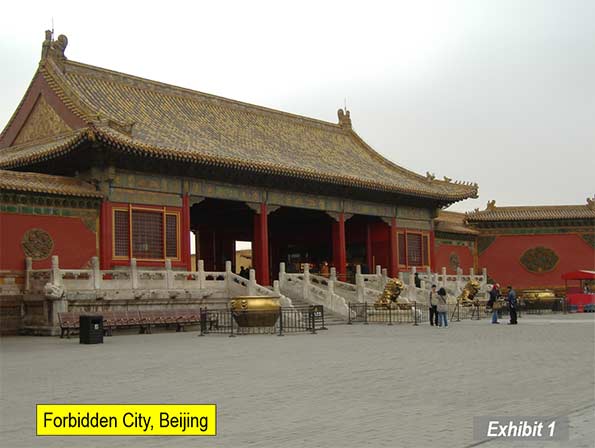
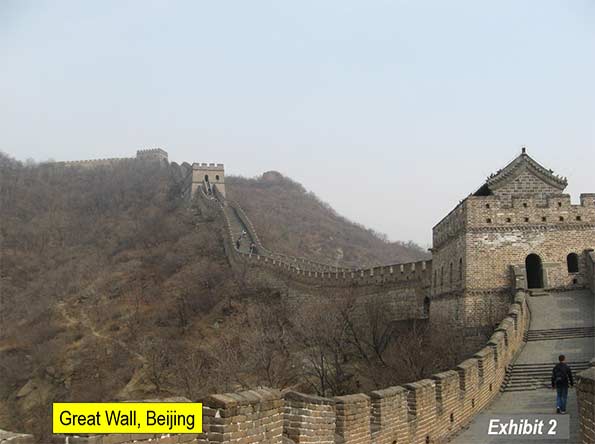
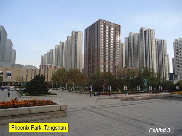
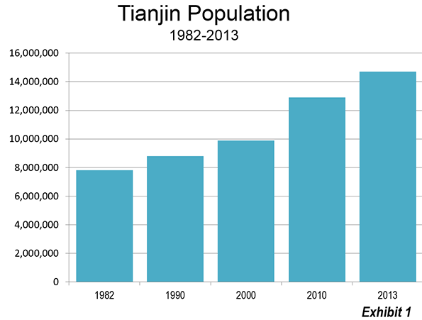
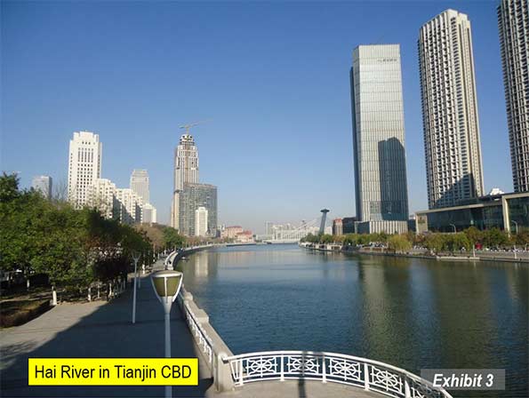
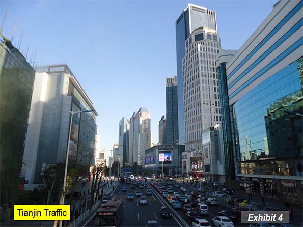
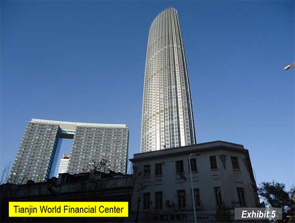
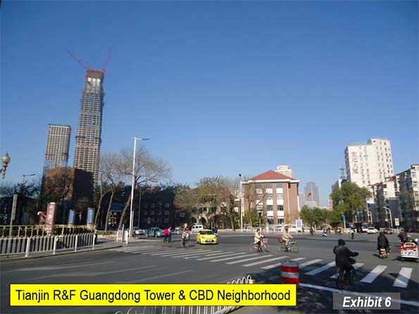
    In Beijing, there are sites such as the Great Wall of China (Exhibit 1), the Forbidden City (Exhibit 2), the Ming Tombs. The Lama Buddhist Temple and the Confucius Temple (only a 3 minute walk away) and the Summer Palace. The former treaty port of Tianjin, with its extensive pre-War western housing and spectacular new architecture is little more than a half hour away by train. Tangshan, site of one of the world’s most deadly earthquakes (1976), is another 45 minutes away (Exhibit 3).

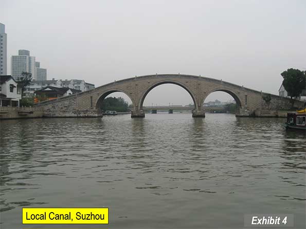
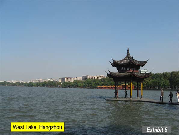
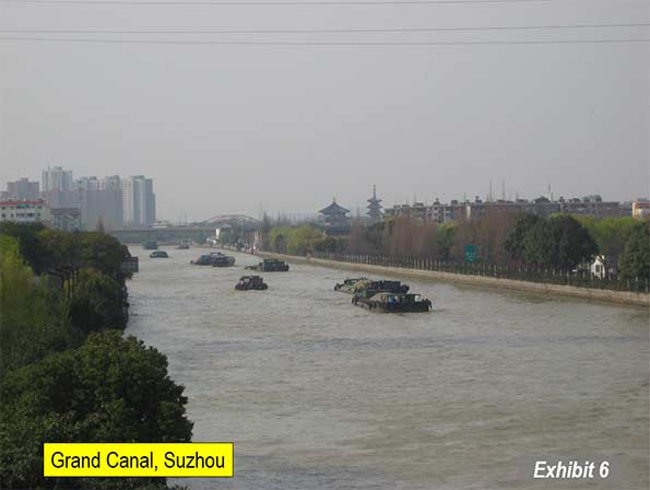
    Shanghai has the "Bund," along the Huang Pu (river), with its Western style commercial buildings from the pre-World War II era. From the walkway on the Bund, there is a stunning view of the new Lujiazui business district in Pudong, which includes the second tallest building in the world (top picture). Only 30 minutes away by train is Suzhou, the "Venice of China," with its canals (Exhibit 4) and the leaning pagoda on Tiger Hill. Hangzhou, with its scenic West Lake is just an hour’s train ride away (Exhibit 5). The historic Grand Canal, which provided access between the Yangtze Delta and the Beijing area, can be seen at both Suzhou (Exhibit 6) and Hangzhou.

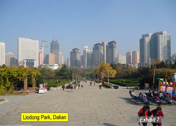
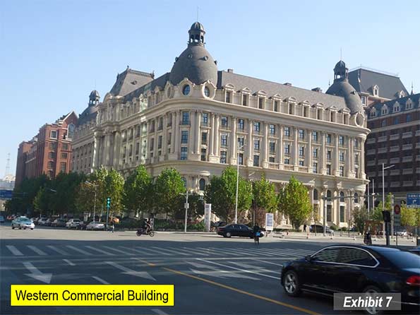
    There are many other cities of great interest for subsequent trips, especially Chongqing, Qingdao, Xi’an, Dalian (Exhibit 7), Harbin, Chengdu, Shenzhen and Wuhan.

    The bottom line is that traveling in China is more complicated than traveling in Wisconsin or Ontario. But it is not that difficult and getting better.

    Note 1: The Mag Lev line was intended as a demonstration line that would encourage China to use that technology for its high speed rail network. Further, the line was to be expanded through central Shanghai and then southwest to Hangzhou (180 miles or 110 kilometers). Citizen opposition led to cancellation of the extension and China opted to use conventional technology, rather than Mag Lev for its high speed rail network.

    Note 2: On Nanjing Road, Western tourists are often solicited by students to attend a tea drinking ceremony. This experience should be avoided. The tourist will have to pay the bill and the costs will likely be far above expectation.

    Top photo: Lujiazui business center in Pudong, across the Huang Pu from the Bund (November 3 by author)

    Wendell Cox is principal of Demographia, an international public policy and demographics firm. He is co-author of the “Demographia International Housing Affordability Survey” and author of “Demographia World Urban Areas” and “War on the Dream: How Anti-Sprawl Policy Threatens the Quality of Life.” He was appointed to three terms on the Los Angeles County Transportation Commission, where he served with the leading city and county leadership as the only non-elected member. He was appointed to the Amtrak Reform Council to fill the unexpired term of Governor Christine Todd Whitman and has served as a visiting professor at the Conservatoire National des Arts et Metiers, a national university in Paris.

  • The Evolving Urban Form: Tianjin

    Tianjin is located on Bohai Gulf, approximately 75 miles (120 kilometers) from Beijing. It was the imperial port of China, by virtue of that proximity. Tianjin also served as one of the most important "treaty ports" occupied and/or controlled by western nations and Japan for various years before 1950.

    Tianjin is pivotally located along the East coast corridor between "Dongbei" – the northeast (the provinces of Heilongjiang, Jilin and Liaoning, which are also referred to as Manchuria) and Jinan, Nanjing, Shanghai and points south. Both the most direct expressway route (interstate standard) and high speed rail line from Shanghai to Dongbei cross through Tianjin rather than larger Beijing.

    Tianjin is one of four centrally administered provincial level municipalities, along with Shanghai, Beijing, and Chongqing. While Tianjin has grown strongly in recent years, it has been one of China’s largest cities for decades. According to the United Nations, the 1950 Tianjin urban area was the second largest in China, with 2.5 million residents, trailing only Shanghai which had 4.3 million. Beijing trailed Tianjin by a third, at 1.7 million.

    Population and Growth

    Since 1982, the total population of Tianjin has expanded by nearly 90 percent, from 7.9 million to 14.7 million in 2013 (Exhibit 1).  Population growth has accelerated over that time. Between 2000 and 2010, the population rose 2.7 percent annually, more than double 1.2 percent rate of the 1990s. The rate of increase was even higher between 2010 and 2013, at 4.5 percent.

    Between the 2000 and 2010 censuses, the inner core district (Heping qu), experienced a population loss of 12 percent. But the rest of the municipality increased, accounting for 101 percent of the growth. The balance of the core captured 18 percent of the growth, while the suburban ring attracted 27 percent. By far the greatest growth was in the outer districts, which accounted for a solid majority of the growth (Exhibit 2). This peripheral domination of growth mirrors the experience of other large Chinese cities, such as Shanghai, Beijing, and Chongqing, which have seen their core areas decline in population, with most growth occurring in the outer sectors.

    A New Megacity

    Tianjin is one of the world’s newest megacities (urban area over 10 million population). This has occurred because of the strong post-2010 population growth. In the next Demographia World Urban Areas (early 2015), Tianjin will have an estimated built up urban area population of 10.9 million. With an urban expanse covering 775 square miles (2,007 square kilometers), Tianjin has an urban population density of 14,100 per square mile (5,400 per square kilometer).

    With the urban area expanding geographically, Tianjin fits the international trend of cities, in growing strongly, yet experiencing declining overall urban densities. Chinese urban planners have told me that it has been an intended objective of policy to reduce population densities, to give people more living space. This is despite the preachments of US and European urban planners for whom higher densities often are embraced as an "Article of Faith."

    Tianjin’s Urban Form

    Despite their comparatively high density, Chinese cities are anything but compact. Most are polycentric in urban form, with central districts have widely spaced commercial buildings (the most notable exceptions may be Shanghai, Chongqing, and Dalian, but even these are somewhat polycentric). Tianjin, along with "in situ" urbanization Quanzhou, may be the least compact of the major cities.

    Tianjin has a broad central business district (CBD), populated with tall, commercial buildings and residential structures (Exhibits 3 & 4). As is the case in many Asian cities (such as Bangkok, Guanzhou-Foshan, Xi’an and Beijing, the tall commercial buildings tend to be highly dispersed, rather than close together as is the custom in Canadian and American cities. In between the dispersed tall buildings are lower rise buildings, both commercial and residential.

    Currently the tallest building in the CBD is the Tianjin World Financial Center (Exhibit 5), at 76 stories (1,105 feet or 337 meters). This is somewhat taller than New York’s Chrysler Building, which was the second tallest in Gotham for years. However, another taller building is near completion, the Tianjin R&F Guangdong Tower (Exhibit 6), which is well on the way to its 91 floors (1,535 feet or 468 meters). However,even this building is not as tall as three others under construction in other Tianjin centers.

    A second central business district is developing in the Binhai new area, near the port and 30 miles (50 kilometers) south of the Tianjin CBD. The Rose Rock International Financial Center will reach 100 floors (1,929 feet or 538 meters). This, however, is only the second tallest under construction. The CTF Tower is also under construction and will reach 96 floors (1,740 feet or 530 meters), nearly as tall as the new World Trade Center in New York (1,776 feet or 541 meters).

    Finally, the tallest building in Tianjin, Goldin Finance 117 is under construction approximately 9 miles (15 kilometers) west of the Tianjin CBD in a virtually new business center. This building will exceed the heights of all but three of the completed skyscrapers in the world (Lead Photo).

    Altogether, Tianjin will soon have five buildings of more than 90 floors, a record few if any cities will soon equal.

    Architecture

    Tianjin has more than its share of modern Chinese high rise commercial structures and residential buildings. But, perhaps to a greater extent than any other Chinese city, Tianjin exhibits the architecture of the foreign powers to a greater degree than some other treaty ports (such as Fuzhou, Dalian, and Wuhan). The city of Tianjin has meticulously preserved many of these structures, not only commercial and residential buildings, but also churches.

    The Tianjin CBD has a number of low rise streets with European architecture. Some of the most impressive are across the Hai River from the Tianjin Railway Station. There is also a long pedestrian street beyond with considerable western architecture. Virtually throughout the urban core there are examples of classic western architecture, some as ornate as in central Buenos Aires (Exhibit 7).

    Perhaps the most unique feature is a large area of western residences just to the south of the Tianjin CBD (Exhibits 8 & 9).

    In the Beijing Orbit: An Advantage

    Tianjin is clearly in the orbit of larger Beijing, which has recently announced plans for a 7th ring road and other infrastructure to tie not only the city but adjacent provincial level jurisdictions together (Tianjin and Hebei). With a strong policy interest in limiting Beijing’s population growth, and with plenty of rural land available, Tianjin could receive a substantial share of growth that otherwise would go to Beijing.

    Top photo: Goldin 117 Financial Building under construction at November 6, 2014 (by author).

    Wendell Cox is principal of Demographia, an international public policy and demographics firm. He is co-author of the "Demographia International Housing Affordability Survey" and author of "Demographia World Urban Areas" and "War on the Dream: How Anti-Sprawl Policy Threatens the Quality of Life." He was appointed to three terms on the Los Angeles County Transportation Commission, where he served with the leading city and county leadership as the only non-elected member. He was appointed to the Amtrak Reform Council to fill the unexpired term of Governor Christine Todd Whitman and has served as a visiting professor at the Conservatoire National des Arts et Metiers, a national university in Paris.

  • Measuring Current Metropolitan Area Growth from 1900

    Growth in the current land areas of the 52 major metropolitan areas (over 1 million) provides an effective overview of changes in how the population has been redistributed United States since 1900. These metropolitan areas are composed of nearly 440 counties, as defined by the Office of Management and Budget for 2013. There have been such substantial changes in metropolitan area concepts and definitions that reliable comparisons extending beyond a decade from Census Bureau are impossible. (See Caution: Note 1).

    In 1900, the land areas which hold today’s major metropolitan areas had a population of 27.6 million. This was only 36 percent of the national population, which stood at 76.2 million. By 2010, these 52 areas had reached 169.5 million population, approximately 55 percent of the nation’s 308.7 million population (Figure 1). Over the period of 1900 to 2010, the 52 areas captured 61 percent of the nation’s growth, while the balance of the nation accounted for the other 39 percent.

    From 1900

    The growth was anything but equal among the nation’s four Census Bureau regions (metropolitan areas were allocated using the Census Bureau region of the historical core municipality). In 1900, the East was dominant, with 45 percent of the population of the 52 areas. The Midwest was a strong second with 28 percent, while the South had 21 percent of the population. The West accounted for only six percent of the population of the 52 areas.

    By comparison, growth since 1900 has been in the parts of the country least populated in 1900. The South alone obtained 35 percent of the population increase, followed by the West with 30 percent of the increase. The East gained only 18 percent of the increase, while the Midwest gained only 17 percent.

    From 1950

    Things had already begun to change significantly by 1950, when the East’s share had fallen to 37 percent. The Midwest experienced a slight and dropped to 26 percent, while the South remained at 21 percent. The biggest change was in the West, which nearly tripled its percentage of the population, to 16 percent.

    The changes were much more significant to 2010. The formerly dominant East has now been displaced by the South, with 33 percent of the population. The West also passed the East, with 26 percent of the population. The East’s share had fallen to 22 percent, while the Midwest had fallen substantially, to 19 percent (Figure 2).

    Between 1950 and 1970 the highest growth was in the South, which added 11 million residents and the lowest growth was in the East, which added 7 million residents. However, after 1970 there was a sea– change in regional population growth. Since that time, the East and Midwest have fallen strongly behind. From 1970 to 2010, the East added only 3.2 million residents, less than one half the 7.3 million residents added between 1950 and 1970. The Midwest did modestly better, adding 5.6 million residents between 1970 and 2010, but well below the 7.7 million residents added between 1950 and 1970.

    The big gains were made in the South and West. Between 1950 and 1970, the West added nearly as many new residents (10.4 million) as the South (11.0 million), despite starting from a smaller base. However, since 1970, the momentum has shifted to the South which added nearly 30 million new residents from 1970 to 2010. The West also grew strongly, but fell behind the South in growth, with an increase of 22 million. The South accounted for 49 percent of the growth over the period. The substantial deceleration of population growth in California’s coastal metropolitan areas (Los Angeles, San Francisco, San Diego and San Jose) was a major factor in slowing the West’s growth rate (Figure 3).

    Metropolitan Highlights

    A review of the individual metropolitan areas indicates the pervasiveness of growth in the South and West and the more lackluster growth of the East and Midwest. The five fastest growing current metropolitan areas from 1900, 1950, and 1980 to 2010 were all in the South and West. The five slowest growing were all in the East and Midwest (Table).

    2010 Metropolitan Area Population Compared to 1900
    2013 Geographical Definitions
    TOP 10    
    FROM 1900 TO 2010 Times 1900
    1 Miami 1113
    2 Phoenix 150
    3 Orlando 97
    4 Riverside-San Bernardino 92
    5 San Diego 88
    FROM 1950 TO 2010 Times 1950
    1 Las Vegas 40.7
    2 Orlando 11.2
    3 Phoenix 11.2
    4 Riverside-San Bernardino 9.4
    5 Miami 8.0
    FROM 1980 TO 2010 Times 1980
    1 Las Vegas 4.21
    2 Austin 2.93
    3 Raleigh 2.81
    4 Riverside-San Bernardino 2.71
    5 Orlando 2.71
    TOP 10    
    FROM 1900 TO 2010 Times 1900
    1 Pittsburgh 1
    2 Buffalo 1
    3 Providence 1
    4 Boston 1
    5 Rochester 1
    FROM 1950 TO 2010 Times 1950
    1 Pittsburgh 0.91
    2 Buffalo 1.04
    3 Cleveland 1.24
    4 Detroit 1.36
    5 Providence 1.36
    FROM 1980 TO 2010 Times 1980
    1 Pittsburgh 0.89
    2 New Orleans 0.91
    3 Buffalo 0.91
    4 Cleveland 0.96
    5 Detroit 0.99


    No city can compare to the growth registered by Miami since 1900. At that time, the three counties of the 2013 metropolitan area had only 5,000 residents. By 2010, Miami had reached 5.6 million and was more than 1,100 times its size in 1900. Next was fast growing Phoenix, which at 150 times its 1900 size (28,000), grew at only a fraction of Miami’s growth. Orlando is 97 times its 1900 size, Riverside-San Bernardino is 92 times, and San Diego is 88 times its 1900 population.

    The slowest growing were all in the East, although each grew over the past century. Pittsburgh grew the slowest and was 1.81 times its 1900 size in 2010. Buffalo, Providence, Boston and Rochester rounded out the slowest growing five from 1900.

    From 1950, Las Vegas was the fastest growing, with a 2010 population 40.7 times that of 60 years before (complete data is not available for Las Vegas in 1900). Orlando, Phoenix, Riverside-San Bernardino, and Miami were also in the top five.

    The bottom five from 1950 was led by Pittsburgh, which lost population to 2010. The other four, Buffalo, Cleveland, Detroit, and Providence all gained, but only modestly.

    Las Vegas was also the fastest growing since 1980, with a 2010 population was 4.21 times its 1980 level. The other top five cities were Austin, Raleigh, Riverside-San Bernardino, and Orlando.

    The bottom five between 1980 and 2010 followed the pattern since 1950, with the exception of New Orleans, which ranked second slowest growing. This reflects largely the impact of Hurricane Katrina. Other than New Orleans, the four slowest growing were Pittsburgh, Buffalo, Cleveland, and Detroit. All five of these cities lost population from 1980.

    The data for all 52 metropolitan areas for each census year (and 2013) is on this webpage.

    The United States: Moving South and Increasingly

    The population shifts in the United States have been substantial over the past 110 years. In 1900, nearly three quarters of the population of these cities was located in the East and Midwest. By 2010, the balance had shifted substantially, with 59 percent of the population in the major metropolitan areas of the South and West. However, in the West, coastal California growth rates are beginning to look more like those of the East and Midwest. Current projections suggest that this shift will continue, though nothing about the future is a certainty.

    Wendell Cox is principal of Demographia, an international public policy and demographics firm. He is co-author of the "Demographia International Housing Affordability Survey" and author of "Demographia World Urban Areas" and "War on the Dream: How Anti-Sprawl Policy Threatens the Quality of Life." He was appointed to three terms on the Los Angeles County Transportation Commission, where he served with the leading city and county leadership as the only non-elected member. He was appointed to the Amtrak Reform Council to fill the unexpired term of Governor Christine Todd Whitman and has served as a visiting professor at the Conservatoire National des Arts et Metiers, a national university in Paris.

    —-

    Note 1: Caution: This article compares 2013 geographical boundaries of metropolitan areas to census years between 1900 and 2010. In years before 2010, metropolitan area geographical definitions were different from 2010 and before 2000 metropolitan area conceptual definitions were different. As a result, this article does not compare 2013 metropolitan areas with metropolitan areas as defined in any year before 2013.

    Note 2: The population data referred to is for the current county composition of metropolitan areas. These data are not adjusted for county boundary changes that may have occurred. For example, no data is available for Las Vegas in 1900, because its one metropolitan county, Clark, did not exist until the 1910 census.

    Top photo: Miami’s Elser’s Pier in the 1920s.

  • Los Angeles: Rail for Others

    A few years ago, the satirical publication, The Onion ran an article under the headline "98 Percent of US Commuters Favor Public Transit for Others." The spoof cited a mythical press release by the American Public Transit Association (APTA), in which Lance Holland of Anaheim, California said "Expanding mass transit isn’t just a good idea, it’s a necessity," Holland said. "My drive to work is unbelievable. I spend more than two hours stuck in 12 lanes of traffic. It’s about time somebody did something to get some of these other cars off the road." The Onion spoof said that APTA would be kicking off a new promotional campaign using the slogan "Take the Bus… I’ll be Glad You Did." The Onion spoof singled out Los Angeles County Metropolitan Transportation Authority (MTA) officials as saying that public support for mass transit will lead to its expansion and improvement."

    "Transit for Others" characterizes three decades of transit in Los Angeles County. Despite its massive $10 billion plus rail program, MTA bus and rail services carried fewer riders in 2012 (latest Federal Transit Administration data) than were carried by the buses in 1985 (MTA was formed in the early 1990s from a merger between the Los Angeles County Transportation Commission and the Southern California Rapid Transit District).

    The Birth of Modern Rail

    The history of the modern Los Angeles rail revival began with a special meeting of the Los Angeles County Transportation Commission on August 20, 1980. I was to play a principal role.

    I had the honor of being appointed to LACTC by Mayor Tom Bradley to three terms and was the only principal commissioner who was not an elected official. The other members, under state law, were the Mayor of Los Angeles, a Los Angeles City Council Member, the Mayor of Long Beach, two city council members from other cities, the five county supervisors and an additional member appointed by the Mayor of Los Angeles (which was me).

    The special meeting had been requested by legendary county Supervisor Kenneth Hahn, who proposed a 5-year reduction of the bus fare to $0.50 to be financed by a sales tax increase, which would be submitted to the voters at the November election. Any money not needed for the bus fare reduction would be used for unspecified transit  purposes.

    The original motion by Supervisor Hahn was amended by Gardena Mayor Edmund Russ, who proposed a "local return program," which would dedicate 25 percent of the funding to municipalities (and Los Angeles County for unincorporated areas) on a population basis, to be used for transit services. At that time, local operators provided less than 20% of the bus service, with the overwhelming majority of services provided by the Southern California Rapid Transit District (SCRTD). 

    I was concerned that the proposal by Supervisor Hahn failed to provide funding for a rail system. I believed at the time that a rail system would reduce the intractable traffic congestion in Los Angeles. I was also concerned at the rapidly rising unit costs of bus operations and was convinced that unless there was a "firewall," no money would be available for rail.

    As a result, on the spur of the moment, I introduced an amendment to direct 35 percent of the proceeds to rail. This motion was seconded by Supervisor Baxter Ward and was incorporated into the final package Supervisor Hahn accepted a shortening of the reduced fare period to three years. The measure, Proposition A was placed on the ballot and was passed by the voters in November.

    Transit Since Proposition A

    The impacts of the three programs approved in 1980 had varying results on transit in Los Angeles.

    Three Year Fare Reduction (1982-1985): Between 1982 and 1985, there was a flat $0.50 fare for transit services in the county. SCRTD experienced an increase from 354 million to 497 million annual passengers. At 40%, this may be the largest three year relative increase in any large transit agency’s ridership in decades. Ridership fell after subsequent fare increases.

    Further, the fare reduction was cost effective. The cost per new rider was less than $1.00 (2012$), a small fraction of typical projected costs per new riders on proposed rail transit systems around the country. By comparison, the cost per new rider on the east extension of the Gold light rail line was projected at more than $30 (2012$, $24.19 in 2003). This is more than 30 times the cost per new rider of the low fare program.

    The strong ridership increase in response to the low fare program is consistent with the relatively low incomes of Los Angeles transit commuters. In 2013, the median income of Los Angeles County transit commuters was approximately one-half that of the national, 60 percent below that of the six metropolitan areas with transit legacy cities (New York, Chicago, Philadelphia, San Francisco, Boston and Washington) and even lower than the other 45 metropolitan areas over 1,000,000 population (Figure 1)

    Local Return Program: Since 1985, when the bus fare reduction program ended, by far the greatest impact on ridership was from the Local Return program. In 1985, the existing local bus operators carried approximately 55 million annual passengers, a figure that rose to more than 130 million in 2012 (a nearly 140 percent increase). This ridership increase is more passengers that were carried on all the bus and rail systems of Dallas (DART), Salt Lake City and St. Louis in 2012, according to Federal Transit Administration data.

    Urban Rail Program: Many miles of urban rail have been built in Los Angeles County, including two subways and five light rail lines (determined by route termini from downtown). But the hope that others would leave their cars for transit, as expressed in The Onion has not occurred. By 2012, Federal Transit Administration data indicates that MTA (formed by a merger of LACTC and the Southern California Rapid Transit District, which operated the system before) bus and rail system was carrying 475 million annual riders, down from the 497 million carried on buses alone in 1985.

    This is despite constructing billions  in subway lines, light rail lines, and rapid busways and the addition of approximately 2 million residents to Los Angeles County.

    The "Return" on Local Return: The big surprise was the "return" on the local return program. A number of new systems were established, such as Foothill Transit and the Antelope Valley Transportation Authority. Many cities established new bus and paratransit systems. The city of Los Angeles now operates a number of commuter express bus services and local circulation bus services throughout the city. Many of the new systems used competitive tendering, under which services are awarded to competing private companies, with fares, routes, and schedules dictated by the public agencies. One important advantage of competitive tendering is lower costs, which makes it possible to provide more service. This service approach has been used extensively in Denver and San Diego. Further, virtually all of London’s largest public bus system in the high income world is competitively tendered as are  all of the bus, subway, commuter rail and light rail services in Stockholm.

    Overall, the Los Angeles County transit system, including MTA and the local operators experienced a ridership increase of 55 million between 1985 and 2012 (This excludes Metrolink, the five county commuter rail system established in the 1990s). Virtually all of the ridership increase is attributable to the local bus services operated by cities and by new sub-regional agencies (Figure 2).

    Overall Transit Work Trip Share

    Census Bureau data indicates that the employment access share of transit in Los Angeles County has declined modestly, from 7.0 percent in 1980 to 6.9 percent in 2013 (including Metrolink). Driving alone increased from 68.7 percent to 72.7 percent, while car pool commuting dropped from 16.8 percent to 10.0 percent. Outside of driving alone, the largest increase occurred in working at home rising from 1.5 percent to 5.2 percent (Figure 3). Unlike transit, working at home requires virtually no expenditures of public funds. Transit one-way work trips increased 77,000 daily, while driving along increased 947,000 and working at home increased 182,000. Car pools suffered a large loss (Figure 4).     

    Thus, despite rave reviews about its rail system, Los Angeles relies on cars to an even greater extent than before. Los Angeles qualifies as the next great transit city only if the standard is spending and construction, rather than ridership.

    Wendell Cox is principal of Demographia, an international public policy and demographics firm. He is co-author of the "Demographia International Housing Affordability Survey" and author of "Demographia World Urban Areas" and "War on the Dream: How Anti-Sprawl Policy Threatens the Quality of Life." He was appointed to three terms on the Los Angeles County Transportation Commission, where he served with the leading city and county leadership as the only non-elected member. He was appointed to the Amtrak Reform Council to fill the unexpired term of Governor Christine Todd Whitman and has served as a visiting professor at the Conservatoire National des Arts et Metiers, a national university in Paris.

    —-

    Note: Part of the MTA/SCRTD ridership loss was due to the transfer of services to Foothill Transit and the city of Los Angeles in the late 1980s.

    Photo: Los Angeles County Transportation Commission logo from 1980s

  • New Zealand Seeks to Avoid “Generation Rent”

    The political leadership and others in New Zealand are talking about the consequences of its land use policies. Under the "urban containment" land use policy (also called by terms like "smart growth," "growth management," and "livability") in effect in every urban area, house prices have doubled relative to incomes over the last 25 years. The principal causes have been the restrictions inherent in urban containment policy, such as making most suburban land off limits for housing development, (which raises its price, like rationing oil raises the price of gasoline), and requirements for upfront payment of large development impact fees (which can also be higher than they need to be). The association between urban containment policy and unaffordable housing is consistent with both with both economic theory and also considerable economic research. The title of a report by Paul Cheshire, Professor of Economic Geography at the London School of Economics best indicates the reality: "Urban Containment, Housing Affordability, Price Stability – Irreconcilable Goals." 

    New Zealand Housing Unaffordability and Consequences

    According to the 10th Annual Demographia Housing Affordability Survey, Auckland, the nation’s largest city is now the 7th least affordable out of 85 major metropolitan markets rated. Auckland’s median multiple (median house price divided by median household income) is 8.0, approaching triple the level that prevailed before the adoption of urban containment policy. The other largest cities, Christchurch and Wellington have seen house prices relative to incomes double since they have adopted urban containment policy (which were 3.0 or less). Obviously, when houses cost more than necessary, households have less discretionary income. This leads directly to two consequences with respect to affluence and poverty.

    The first consequence of these policies is that households have less discretionary income (income after paying taxes and for necessities) to spend on other goods and services. Obviously this means a lower standard of living. This generally leads to a weaker economy, other things being equal, because households with less money are not able to purchase as much in goods and services as they would be able to afford if house prices had not been distorted.

    The second consequence is greater poverty. When the price of housing rises, discretionary incomes can fall enough to force lower income households into poverty.

    Land Use Policies Blamed for Poverty and Greater Inequality

    Recently, Deputy Prime Minister and Finance Minister Bill English said in an October 7 press conference that New Zealand’s land use policies have led to higher levels of poverty and increased inequality: "Inequality in New Zealand would have been improving had it not been for growing housing costs. So our planning processes have probably done more to increase income inequality and poverty in New Zealand than most other policies." Finally, the Deputy Prime Minister noted that house price increases have impacted the lowest income households most.

    Minister English had previously expressed concern about the extent to which land use policy had driven up house prices, in his preface to the 9th Annual Demographia Housing Affordability Survey: "It costs too much and takes too long to build a house in New Zealand. Land has been made artificially scarce by regulation that locks up land for development. This regulation has made land supply unresponsive to demand (see: "Unblocking Constipated Planning" in New Zealand").

    There was "pushback" on the Deputy Prime Ministers comments from the city of Auckland and the Green Party. Others saw it differently the well-read national blog, Whale Oil, however, opined that the Deputy Prime Minister "is onto something." Whale Oil continued "The squealing in unison means English is putting the pressure in the right places."  

    Housing Minister Nick Smith has decried the situation in Auckland:  "We’ve got a rigid Metropolitan Urban Limit (urban growth boundary) prohibiting any new housing developments beyond the artificial line drawn 15 years ago." At the same time, he said that resulting land cost increases had been more responsible for higher house prices than any other factor. Auckland accounts for approximately one-third of the nation’s population and has been growing rapidly, accounting for more than one-half of the nation’s population growth between the 2006 and 2013 censuses.

    On the government’s website, the Housing Minister expressed the government’s interest in reforming the Resource Management Act, which governs land-use planning. “It is the price of land and sections that has gone up so rapidly in unaffordable housing markets like Auckland, and it is the Resource Management Act and how it is implemented that is largely responsible for this cost escalation. The new law allowing Special Housing Areas is a short-term fix but we must address the fundamental problem with the Resource Management Act if we are serious about long-term housing affordability."

    Business Concerns

    Business interests are also raising concerns.

    The Property Council (similar in its advocacy function to the Urban Land Institute in the United States) has indicated support for the reforms.

    Other business support comes from ANZ Bank New Zealand Chief Executive Officer David Hisco. In expressing concern noting that" "The elevator of economic progress in New Zealand has always been home ownership for everyone – right across the socioeconomic spectrum. But at the current pace of house price rises we risk creating a generation of disenfranchised, second class citizens – ‘Generation Rent.’" He continues: "The housing affordability issue is a housing supply issue, pure and simple. In 1974 there were 34,400 new homes built. Last year there were 15,000 – less than half. It’s no wonder houses doubled in price in under a decade in Auckland. The solution is simple – urgently build more houses. To do that in places like Auckland we need to build more suburbs and allow intensification in existing areas."

    In noting that the poor are the "biggest victims" of Auckland’s land use policies, Eric Crampton (on Kiwiblog) says that Auckland should be allowed "to build both upwards and outwards: which would be a great step in reducing child poverty." Moreover, the Prime Minister, John Key, has expressed a particular interest in reducing child poverty.

    Building upwards and outwards is not an option  under the urban containment dictum favoring intensification and prohibiting greenfield suburban development.

    A similar connection between housing costs and high rates of poverty is indicated by California, which has the highest poverty rate, adjusted for housing costs, of all states as well as  the District of Columbia. California’s major metropolitan markets have severely unaffordable housing costs, with a median multiple of 7.1. This is lower than Auckland (8.0), New Zealand’s one major metropolitan market, but higher than Australia’s (6.3). Dartmouth economist William Fischel and others have associated California’s high housing costs with its land use policies. Fischel further noted that before these policies were implemented, house prices were about the same in California as in the rest of the nation, which have since more than doubled relative to incomes.

    New Zealand: Land Use Policy Leader

    There is virtual consensus among the world’s governments that the standard of living should be improved and poverty eradicated. Yet, many governments have adopted land use policies that raise the price of housing, which has the inevitable effect of lowering standard of living and more poverty. New Zealand’s government is seeking to restore an appropriate policy balance.

    Wendell Cox is principal of Demographia, an international public policy and demographics firm. He is co-author of the "Demographia International Housing Affordability Survey" and author of "Demographia World Urban Areas" and "War on the Dream: How Anti-Sprawl Policy Threatens the Quality of Life." He was appointed to three terms on the Los Angeles County Transportation Commission, where he served with the leading city and county leadership as the only non-elected member. He was appointed to the Amtrak Reform Council to fill the unexpired term of Governor Christine Todd Whitman and has served as a visiting professor at the Conservatoire National des Arts et Metiers, a national university in Paris.

    Photograph: Downtown Auckland (by author)

  • Housing Affordability in China

    Finally, there is credible housing affordability data from China. For years, analysts have produced "back of the envelope" anecdotal calculations that have been often as inconsistent as they have been wrong. The Economist has compiled an index of housing affordability in 40 cities, which uses an "average multiple" (average house price divided by average household income) (China Index of Housing Affordability). This is in contrast to the "median multiple," which is the median house price divided by the median household income (used in the Demographia International Housing Affordability Survey and other affordability indexes). The Demographia Survey rates affordability in 9 geographies, including Hong Kong (a special administrative region of China). The average multiple for a metropolitan market is generally similar to the median multiple.

    The Economist Data and Methodology

    The Economist develops its ratio from central government data on house sales and incomes in individual cities. Like the Demographia Survey, The Economist provides estimates for housing affordability from the perspective of the average urban household, as opposed to the "ex-pat" or "luxury" markets that are typically reported by real estate commentators. The Economist also estimates its price to income ratio using an average house size of 100 square meters (approximately 1,075 square feet). This is larger than the average new house size in the United Kingdom, but smaller than those in the United States, Australia, Canada and New Zealand.

    With an overall average multiple of 8.8, China’s housing is less affordable (Figure 1) than all of the nine geographies rated in the Demographia Survey, except for Hong Kong (14.9). Even so, China’s housing affordability has improved from a national average multiple of 11.7 in April of 2010.

    Affordability by City

    It appears that if The Economist had included Hong Kong in its China ranking, it would have been ranked the most unaffordable in the country. Hong Kong houses are much smaller than the Chinese average, at 45 square meters (480 square feet). This would have given Hong Kong, with an unadjusted multiple of 14.9, a house size adjusted multiple of more than 30.

    For years, there have been press reports of astronomic price to income multiples in China. The Economist data indicates that in some cities (Shenzhen, Beijing, Hanghzou and Wenzhou) this has indeed been true. But incomes have risen faster than house prices in recent years, and average multiples above 20 are, for now, a thing of the past.

    Shenzhen, the "instant" megacity next to Hong Kong, is ranked as the least affordable with an average multiple of 19.6. The Economist indicates that this may be the result of demand from Hong Kong residents. Shenzhen had reached an average multiple of nearly 25 in 2010. An even higher average multiple was recorded in Beijing, which reached 27 in 2010. Beijing house prices have fallen substantially, however, dropping to 16.6 in 2014, the second most unaffordable in China.

    China’s other megacities (over 10 million population) have lower average multiples than Shenzhen and Beijing. Shanghai has an average multiple of 12.8 and Guangzhou has an average multiple of 11.4. Tianjin, approximately 100 miles (140 kilometers) from Beijing and China’s newest megacity has an average multiple of 11.2.

    China’s most affordable city is Hohhot, capital of Inner Mongolia (Nei Mongol), with an average multiple of 4.9. Generally, interior cities had better housing affordability than those along the east coast. For example, Changsha (capital of Hunan) has an average multiple of 5.9, Kunming 6.6, while the two leading cities of China’s Red Basin, Chongqing and Chengdu, were somewhat higher (7.1 and 7.4).

    Comparison to Other Demographia Cities

    Yet the multiples for many Chinese cities are no worse than highly unaffordable cities in Australia, New Zealand, Canada, the United States, and the United Kingdom.

    Outside Hong Kong, the other most expensive cities in the Demographia Survey would rank in the second 10 of Chinese cities. Vancouver, with a median multiple of 10.3, is more expensive than all but 12 of the 40 cities rated in China. San Francisco, with a median multiple of 9.3, would rank 15th. Sydney, with a median multiple of 9.0, would rank in a 16th tie with Dalian. San Jose, at 8.7, would rank in a 19th place tie for unaffordability with Wuhan and Ningbo.

    A sampling of cities from China and the Demographia Survey is illustrated in Figure 2.

    Toward an Affordable China

    One of rapidly urbanizing China’s biggest challenges is to improve housing affordability. This is an imperative, with easing of the hukou internal resident permit system and the one-child policy. United Nations projections indicate that China’s urban areas will add another third to their population in the next 25 years, an increase of more than 250 million. China is better housed today than perhaps at any time in its history. But it needs to be still better housed, as internal migrants become permanent urban residents and as rural citizens move to the cities for better lives.

    Wendell Cox is principal of Demographia, an international public policy and demographics firm. He is co-author of the “Demographia International Housing Affordability Survey” and author of “Demographia World Urban Areas” and “War on the Dream: How Anti-Sprawl Policy Threatens the Quality of Life.” He was appointed to three terms on the Los Angeles County Transportation Commission, where he served with the leading city and county leadership as the only non-elected member. He was appointed to the Amtrak Reform Council to fill the unexpired term of Governor Christine Todd Whitman and has served as a visiting professor at the Conservatoire National des Arts et Metiers, a national university in Paris.

    Photo: Jinan

  • Metropolitan Populations from 1900 Posted (Current Geographies)

    We have posted population data for the nation’s major metropolitan areas for censuses from 1900 to 2010 and as estimated in 2013. These data are use the current (2013) boundaries to define metropolitan areas. There is no consistent list historical listing of metropolitan area populations using the commuting criteria that define the 2010 and 2013 metropolitan areas. Thus, in using the data in this new report, caution should be employed.

  • Metropolitan Housing: More Space, Large Lots

    Americans continue to favor large houses on large lots. The vast majority of new occupied housing in the major metropolitan areas of the United States was detached between 2000 and 2010 and was located in geographical sectors associated with larger lot sizes. Moreover, houses became bigger, as the median number of rooms increased (both detached and multi-family), and the median new detached house size increased.

    These conclusions are based on an analysis of small area data for major metropolitan areas using the City Sector Model. City Sector Model analysis avoids the exaggeration of urban core data that necessarily occurs from reliance on the municipal boundaries of core cities (which are themselves nearly 60 percent suburban or exurban, ranging from as little as three percent to virtually 100 percent). It also avoids the use of the newer "principal cities" designation of larger employment centers within metropolitan areas, nearly all of which are suburbs, but are inappropriately joined with core municipalities in some analyses. The City Sector Model" small area analysis method is described in greater detail in the Note below.

    Increase in Detached Housing

    America’s preference for detached housing was evident across the spectrum of functional city sectors between 2000 and 2010. Overall, there was a 14% increase in detached housing in the major metropolitan areas. Among the major metropolitan areas (over 1 million population), the number of occupied detached houses rose the most (35%) in the later or generally outer suburbs and exurban areas (24%). Detached houses increased 2.8 million in the later suburbs and 2.5 million in the exurban areas. A smaller 50,000 increase was registered in the earlier or generally inner suburban areas. Most surprisingly, there was also a small increase (20,000) in the number of detached houses in the functional urban cores (Figure 1).

    Smaller Increase in Multi-Family Housing

    The increase in detached housing dwarfed that of new multi-family housing (owned and rented apartments). The increase in detached housing in the major metropolitan areas was six times that of multi-family housing. Overall, there was a four percent increase in multi-family housing in the major metropolitan areas, less than one-third the increase in detached housing.  There were slight decreases in the number of multi-family houses in both the urban cores and the earlier (generally inner) suburbs. At the same time, there has been a healthy increases in the number of multi-family houses in the later suburbs and exurbs, where the growth rates exceeded the increase in major metropolitan population (11%). In the later suburbs, multi-family housing increased 29% and in the exurbs the increase was 14% (Figure 2).

    Larger Houses, Larger Lots

    Yet overall, houses were getting bigger. The median number of rooms per house rose from 5.3 in 2000 to 5.6 in 2010. Increases in median rooms were registered in each of the city sectors (Figure 3). Nationally, the median size of new detached housing edged up five percent between 2000 and 2010. (By 2013, median new house size had increased another 17 percent to a record 2,384 square feet).

    Lots also were getting bigger. Nearly all of the population growth (99 %) was in the later suburbs and exurbs between 2000 and 2010, where population densities are much lower and lots are larger than in the earlier suburbs and the urban core (Figure 4).

    The preponderance of  urban planning theory over the past decade has been based on the notion that people would increasingly seek houses on smaller lots. For example, Arthur C. Nelson of the University of Utah predicted that the demand for housing on conventional-sized lots (which Professor Nelson defines as more than 1/8 acre, which is smaller than the smallest lot size reported by the Census Bureau) would be only 16% in the major metropolitan areas of California by 2010, relying in part on stated preference survey data. In fact the revealed preferences — in other words what people actually did — was four times the predicted demand (64%) in the conventional-lot-dominated later suburbs and exurbs of California’s largest metropolitan areas between 2000 and 2010. This is despite California’s regulatory and legal bias against detached housing on conventional lots (See: California’s War Against the Suburbs). Outside California, later suburban and exurban detached housing represented 77% of new housing demand over the period.

    Planning and Preferences

    Urban cores and multi-family housing are favored by urban planning policy. Yet, large functional urban cores (high density and high transit market share, as defined in the City Sector Model, Note below) are few and far between, with only seven exceeding 500,000 population, a modest number equaled or exceeded by approximately 100 metropolitan areas. Overall, the functional urban cores of major metropolitan areas lost more than 100,000 residents between 2000 and 2010, while suburban and exurban areas gained more than 16.5 million. Predictably, the housing forms typical of the later suburbs and exurbs made strong gains. The preferences of planning are not those of people and households.

    ————-

    Note: The City Sector Model allows a more representative functional analysis of urban core, suburban and exurban areas, by the use of smaller areas, rather than municipal boundaries. The more than 30,000 zip code tabulation areas (ZCTA) of major metropolitan areas and the rest of the nation are categorized by functional characteristics, including urban form, density and travel behavior. There are four functional classifications, the urban core, earlier suburban areas, later suburban areas and exurban areas. The urban cores have higher densities, older housing and substantially greater reliance on transit, similar to the urban cores that preceded the great automobile oriented suburbanization that followed World War II. Exurban areas are beyond the built up urban areas. The suburban areas constitute the balance of the major metropolitan areas. Earlier suburbs include areas with a median house construction date before 1980. Later suburban areas have later median house construction dates.

    Urban cores are defined as areas (ZCTAs) that have high population densities (7,500 or more per square mile or 2,900 per square kilometer or more) and high transit, walking and cycling work trip market shares (20 percent or more). Urban cores also include non-exurban sectors with median house construction dates of 1945 or before.

    ————-

    Wendell Cox is principal of Demographia, an international public policy and demographics firm. He is co-author of the “Demographia International Housing Affordability Survey” and author of “Demographia World Urban Areas” and “War on the Dream: How Anti-Sprawl Policy Threatens the Quality of Life.” He was appointed to three terms on the Los Angeles County Transportation Commission, where he served with the leading city and county leadership as the only non-elected member. He was appointed to the Amtrak Reform Council to fill the unexpired term of Governor Christine Todd Whitman and has served as a visiting professor at the Conservatoire National des Arts et Metiers, a national university in Paris.

    Photo: Northern Suburbs of Minneapolis-St. Paul (by author)