Author: Wendell Cox

  • Taiwan High Speed Rail Near Bankruptcy

    Efforts are underway by the Taiwan government for a government led restructuring to avoid bankruptcy (Plan to stop Taiwan’s high-speed rail going bust set for review). Since opening in 2007, this privately financed and operated system has been plagued with ridership well below projections. The Taiwan experience is consistent with the research showing that ridership on high-speed rail lines has been frequently over-projected.

    Minister of Transportation and Communications (MOTC) Yeh Kuang-shih offered this sobering assessment:

    “This is not the best time to address the financial problems, but it is the last window of opportunity. The Taiwan High Speed Rail Corp will definitely go bankrupt if the problems are not addressed by the end of the year. The only other solution would be a government takeover. If the company files for bankruptcy and the government is forced to take over operation of the system, the banks will probably collect on their loans, but neither large nor small investors will get anything back.”

    Kuomintang Party legislator Lin Kuo-cheng said that the "debt" and "accumulated losses" mean that the Taiwan high speed rail line is "broke."

  • Seniors Dispersing Away from Urban Cores

    Senior citizens (age 65 and over) are dispersing throughout major metropolitan areas, and specifically away from the urban cores. This is the opposite of the trend suggested by some planners and media sources who claim than seniors are moving to the urban cores. For example, one headline, "Millions of Seniors Moving Back to Big Cities" is at the top of a story with no data and anecdotes ranging that are at least as much suburban (Auburn Hills, in the Detroit area) and college towns (Oxford, Mississippi and Lawrence, Kansas), as they are big city. Another article, "Why Seniors are Moving to the Urban Core and Why It’s Good for Everyone," is also anecdote based, and gave prominence to a solitary housing development in downtown Phoenix (more about Phoenix below).

    Senior Metropolitan Growth Trails National

    Between 2000 and 2010, the nation’s senior population increased approximately 5.4 million, an increase of 15 percent. Major metropolitan areas accounted for approximately 50 percent of the increase (2.7 million) and also saw their senior population increase 15 percent. By contrast, these same metropolitan areas accounted for 60 percent of overall growth between 2000 and 2010, indicating that most senior growth is in smaller metropolitan areas and rural areas.

    Senior Metropolitan Population Dispersing

    The number of senior citizens living in suburbs and exurbs of major metropolitan areas (over 1,000,000 population) increased between 2000 and 2010, according to census data. The senior increases were strongly skewed away from the urban cores. Suburbs and exurbs gained 2.82 million senior residents over the period, while functional urban cores lost 112,000. The later suburbs added 1.64 million seniors. The second largest increase was in exurban areas, with a gain of 0.88 million seniors. The earlier suburbs (generally inner suburbs) added just under 300,000 seniors (Figure 1).

    During that period, the share of senior citizens living in the later suburbs increased 35 percent. The senior citizen population share in the exurbs rose nearly 15 percent. By contrast, the share of seniors living in the functional urban cores declined 17 percent. Their share in the earlier suburbs declined 11 percent.

    This is based on an analysis of small area data for major metropolitan areas using the City Sector Model.
    City Sector Model analysis avoids the exaggeration of urban core data that necessarily occurs from reliance on the municipal boundaries of core cities (which are themselves nearly 60 percent suburban or exurban, ranging from as little as three percent to virtually 100 percent). It also avoids the use of the newer "principal cities" designation of larger employment centers within metropolitan areas, nearly all of which are suburbs, but are inappropriately joined with core municipalities in some analyses. The City Sector Model" small area analysis method is described in greater detail in the Note below.

    Pervasive Suburban and Exurban Senior Gains

    The gains in functional suburban and exurban senior population were pervasive. Among the 52 major metropolitan areas, there were gains in 50. In two areas (New Orleans and Pittsburgh), there were losses. However, in each of these cases there was an even greater senior loss in the functional urban cores. In no case did urban cores gain more or lose fewer seniors than the suburbs and exurbs. Eight of the functional urban cores experienced gains in senior population, while 44 experienced losses (Figure 2)

    Largest Urban Cores

    The major metropolitan areas with the largest urban cores (more than 20 percent of the population in the functional urban cores),  would tend to be the most attractive to seniors seeking an urban core lifestyle. But they  still saw their seniors heading  to the suburbs and exurbs (Figure 3). Senior populations declined in the functional urban cores of all but two of these nine areas, New York and San Francisco. However, in both of these metropolitan areas, the increases in suburban and exurban senior populations overwhelmed the increases in the urban cores. All of these nine major metropolitan areas experienced increases in their suburban and exurban senior populations.

    Moreover, the Phoenix anecdote cited above is at odds with the reality that the later suburbs and exurbs gained 165,000 seniors between 2000 and 2010. The earlier suburbs lost 7,000 seniors (No part of Phoenix has sufficient density or transit market share to be classified as functional urban core).

    Consistency of Seniors Trend with Other Metropolitan Indicators

    As has been indicated in previous articles, there continues to be a trend toward dispersal and decentralization in US major metropolitan areas. There was an overall population dispersion from 1990 to 2000 and 2000 to 2010, which continued trends that have been evident since World War II and even before, as pre-automobile era urban cores have lost their dominance. Jobs continued to follow the suburbanization and exurbanization of the population over the past decade away as cities became less monocentric, less polycentric and more "non-centric." As a result, work trip travel times are generally shorter for residents where population densities are lower. Baby boomers and Millennials have been shown to be dispersing as well, despite anecdotes to the contrary (Figure 4). The same applies to seniors.

    Note: The City Sector Model allows a more representative functional analysis of urban core, suburban and exurban areas, by the use of smaller areas, rather than municipal boundaries. The more than 30,000 zip code tabulation areas (ZCTA) of major metropolitan areas and the rest of the nation are categorized by functional characteristics, including urban form, density and travel behavior. There are four functional classifications, the urban core, earlier suburban areas, later suburban areas and exurban areas. The urban cores have higher densities, older housing and substantially greater reliance on transit, similar to the urban cores that preceded the great automobile oriented suburbanization that followed World War II. Exurban areas are beyond the built up urban areas. The suburban areas constitute the balance of the major metropolitan areas. Earlier suburbs include areas with a median house construction date before 1980. Later suburban areas have later median house construction dates.

    Urban cores are defined as areas (ZCTAs) that have high population densities (7,500 or more per square mile or 2,900 per square kilometer or more) and high transit, walking and cycling work trip market shares (20 percent or more). Urban cores also include non-exurban sectors with median house construction dates of 1945 or before. All of these areas are defined at the zip code tabulation area (ZCTA) level.

    —-

    Wendell Cox is principal of Demographia, an international public policy and demographics firm. He is co-author of the "Demographia International Housing Affordability Survey" and author of "Demographia World Urban Areas" and "War on the Dream: How Anti-Sprawl Policy Threatens the Quality of Life." He was appointed to three terms on the Los Angeles County Transportation Commission, where he served with the leading city and county leadership as the only non-elected member. He was appointed to the Amtrak Reform Council to fill the unexpired term of Governor Christine Todd Whitman and has served as a visiting professor at the Conservatoire National des Arts et Metiers, a national university in Paris.

    Photo: Later Suburbs of Cincinnati (where most senior growth occurred from 2000 to 2010). By Author

  • New Commuting Data Shows Gain by Individual Modes

    The newly released American Community Survey data for 2013 indicates little change in commuting patterns since 2010, a result that is to be expected in a period as short as three years. Among the 52 major metropolitan areas (over 1 million population), driving alone increased to 73.6% of commuting (including all travel modes and working at home). The one mode that experienced the largest drop was carpools, where the share of commuting dropped from 9.6% in 2010 to 9.0% in 2013. Doubtless most of the carpool losses represented gains in driving alone and transit. Transit grew, increasing from a market share of 7.9% in 2010 to 8.1% in 2013 in major metropolitan areas; similarly working at home increased from 4.4% to 4.6%, an increase similar to that of transit (Figure 1). Bicycles increased from 0.6% to 0.7%, while walking remained constant at 2.8%.

    Transit: Historical Context

    Transit has always received considerable media attention in commuting analyses. Part of this is because of the comparative labor efficiency (not necessarily cost efficiency) of transit in high-volume corridors leading to the nation’s largest downtown areas. Part of the attention is also due to the "positive spin" that has accompanied transit ridership press releases. An American Public Transportation Association press release earlier in the year, which claimed record ridership, have evoked a surprisingly strong response from some quarters: For example, academics David King, Michael Manville and Michael Smart wrote in the Washington Post:"We are strong supporters of public transportation, but misguided optimism about transit’s resurgence helps neither transit users nor the larger traveling public." They concluded that transit trips per capita had actually declined in the past 5 years. 

    Nonetheless, transit remains well below its historic norms. The first commute data was in the 1960 census and indicated a 12.6% national market share for transit for the entire U.S. population. By 1990, transit’s national market share had dropped to 5.1%. After dropping to 4.6% in 2000, transit recovered to 5.2% in 2012. But clearly the historical decline of transit’s market share has at least been halted (Figure 2).

    Even so, in a rapidly expanding market, many more people have begun driving alone than using transit. More than 47 million more commuters drive alone today than in 1980, while the transit increased about 1.4 million commuters over the same time period.

    The largest decline occurred before 1960. Transit’s work trip market share was probably much higher in 1940, but the necessary data was not collected in the census, just before World War II and the great automobile-oriented suburbanization. In 1940, overall urban transit travel (passenger miles all day, not just commutes) is estimated to have been twice that of 1960 and nearly 10 times that of today.

    Transit’s 2010-2013 Trend

    To a remarkable extent, transit continues to be a "New York story." Approximately 40% of all transit commuting is in the New York metropolitan area. New York’s 2.9 million transit commuters near six times that of second place Chicago. Transit accounts for 30.9% of commuting in New York. San Francisco ranks second at 16.1% and Washington third at 14.2%. Only three other cities, Boston (12.8%), Chicago (11.8), and Philadelphia (10.0%) have transit commute shares of 10% or more. 

    From 2010 to 2013, transit added approximately 375,000 new commuters. Approximately 40% of the entire nation’s transit commuting increase occurred in the New York metropolitan area. This was included in the predictable concentration (80%) of ridership gains in the transit legacy metropolitan areas, which are the six with transit market shares of 10% or more. Combined, these cities added 300,000 commuters, 89%, on the large rail systems that feed the nation’s largest downtown areas.

    Perhaps surprisingly, Seattle broke into the top five, edging out legacy metropolitan areas (Figure 3) Philadelphia and Washington. Seattle has a newer light rail and commuter rail system. Even so, the bulk of the gain in Seattle was not on the rail system. Approximately 80% of its transit commuter growth was on non-rail modes. Seattle has three major public bus systems, a ferry system and the newer Microsoft private bus system that serves its employment centers throughout the metropolitan area. All of the new transit commuters in eighth ranked Miami were on non-rail modes, despite its large and relatively new rail system. New rail city Phoenix (10th) also experienced the bulk of its new commuting on non-rail modes (93%). Rail accounted for most of the gain in San Jose (9th), with a 58% of the total  The transit market shares in Miami, San Jose and Phoenix are all below the national average of 5.2%.

    Outside the six transit legacy metropolitan areas, gains were far more modest, at approximately 75,000. Seattle, Miami, San Jose, and Phoenix accounted for nearly 60,000 of this gain, leaving only 15,000 for the other 42 major metropolitan areas, including Los Angeles, which had a 5,000 loss. Los Angeles now has a transit work trip market share of 5.8%, below the 5.9% in 1980 when the Los Angeles County Transportation Commission approved the funding for its rail system (the result of my amendment, see "Transit in Los Angeles"). Los Angeles is falling far short of its Matt Yglesias characterization as the "next great mass-transit city."

    Since 2000, the national trend has been similar. Nearly 80% of the increase in transit commuting has been in the transit legacy metropolitan areas, where transit’s share has risen from 17% to 20%. These areas accounted for only 23% of the major metropolitan area growth since 2000. By contrast, 77% of the major metropolitan area growth has been in the 46 other metropolitan areas, where transit’s share of commuting has remained at 3.2% since 2000. There are limits to how far the legacy metropolitan areas can drive up transit’s national market share.

    Prospects for Commuting

    At a broader level, the new data shows the continuing trend toward individual mode commuting, as opposed to shared modes. Between 2010 and 2013, personal modes (driving alone, bicycles, walking and working at home) increased from 82.3% to 82.7% of all commuting. Shared modes (carpools and transit) declined from 17.7% of commuting to 17.3%. These data exclude the "other modes" category (1.2% of commuting) because it includes both personal and shared commuting. None of this should be surprising, since one of the best ways to improve productivity, both personal and in the economy, is to minimize travel time for necessary activities throughout the metropolitan area (labor market).

    Wendell Cox is principal of Demographia, an international public policy and demographics firm. He is co-author of the "Demographia International Housing Affordability Survey" and author of "Demographia World Urban Areas" and "War on the Dream: How Anti-Sprawl Policy Threatens the Quality of Life." He was appointed to three terms on the Los Angeles County Transportation Commission, where he served with the leading city and county leadership as the only non-elected member. He was appointed to the Amtrak Reform Council to fill the unexpired term of Governor Christine Todd Whitman and has served as a visiting professor at the Conservatoire National des Arts et Metiers, a national university in Paris.

    Photograph: DART light rail train in downtown Dallas (by author)

  • New Climate Report Misses Point on US Cities

    The doubtful claim that low density US cities impose a cost to the economy of $400 billion is countered by their being the most affluent in the world. Nine of the top 10 cities in GDP per capita are in the US and more than 70% of the top 50. The highest GDP per capita city in the world is one of the least compact, Hartford, with an urban population density among the bottom 10 out of more the than 900 urban areas larger than 500,000 (See here and here).

    Mobility is an important driver of economic performance. US cities have less traffic congestion, and shorter work trip travel times than their international peers (Los Angeles has the shortest work trip travel times of any megacity for which there is data). The key to this productivity is more dispersed residential and employment locations (less than 10% of jobs are downtown) and the less intense traffic congestion that is associated with such development. In the US, just as in Western Europe, commuting by car is much faster than by transit. The coming fuel efficiency improvements will narrow or eliminate the gap between personal vehicle and transit GHG emissions per passenger kilometer. US fuel efficiency standards are projected to reduce gross car GHG emissions by more than a quarter by 2040, according to the US Department of Energy. That’s before any de-carbonization.

    The US has some of the best housing affordability in the world (excluding cities like San Francisco and Portland, where politically correct policies raise prices, lowering the standard of living and increasing poverty). The miniscule reductions from favored urban policies are exceedingly expensive per tonne and incapable of making a serious contribution to GHG emission reduction.

    Maintaining the standard of living and reducing poverty requires cities that are mobile and affordable. It is important that GHG emissions reductions be chosen for their cost effectiveness, rather than consistency with expensive academic theories that long predate GHG emissions reduction concerns.

    This piece was posted to comments at The Economist.

  • Paving Over Hunan? The Portland Model for China

    For two centuries, people have crowded into urban areas, seeking higher standards of living than prevail in the rural areas they abandoned. Nowhere is this truer than in China. In just four decades, it has risen from 17.4 percent to 55.6 percent urban, adding nearly 600 million city residents. This has been accomplished while lifting an unprecedented number of people out of poverty.  

    Yet in the future, China faces tough urbanization challenges. The United Nations forecasts that another 200 million residents will be added to the cities by 2035, increasing the urban population by nearly another one-third.

    Los Angeles Style Suburbs in China?

    For years, western planners have sought to impose their visions of the future on China’s cities (see: China Should Send the Western Planners Home). There are more recent rumblings from Britain. Writing in The Guardian, Bianca Bosker finds considerable fault with Chinese cities. In criticizing China’s perceived copying of US and European models, her article conveys an impression that detached housing (called "villas in China) makes up a large part of China’s suburbs, as in the United States ("Why Haven’t China’s Cities Learned from America’s Mistakes?" with an intriguing subtitle "Faceless estates. Sprawling suburbs. Soulless financial districts … are in vogue in China").

    Having traveled widely within all but two of China’s 25 largest cities, I would have to disagree. You have to look hard to find detached housing in China. This is quite unlike the case in US suburbs, as well as those of Japan, Britain, France, Germany, Canada, Australia and elsewhere.

    In fact, the suburban areas of Chinese cities are largely high-rise and mid-rise multi-family buildings, with their attendant high densities. Detached housing has accounted for between 4 and 6 percent of new housing floor space. The actual percentage of detached units is probably smaller, since their average floor space of detached housing is greater. The type of housing in the photographs at the bottom of the article (Figures 2 through 6) is typical of China’s suburbs.

    Bosker also criticizes about China’s "towers in the park" high-rise development, noting that "The desire to escape sardine conditions in these superblocks, where greenery often consists of sickly shrubs gasping between six-lane roads, has in turn multiplied the number of land-devouring compounds like Rancho Santa Fe." In fact, villa developments like Rancho Santa Fe, nearby Shanghai’s Honquiao Airport, are very high income enclaves, and small. Rancho Santa Fe itself occupies less than 90 acres and the gross average lot size is approximately one-quarter acre (1/10 hectare), smaller than the average middle income suburban lot in the United States. No ordinary “tower in the park" resident can afford to move to the pricey villa developments.

    California’s High Urban Densities

    The article also condemns the "urban sprawl" of Los Angeles and California (this is nothing new).  However, the reality is that Los Angeles is the most dense major urban area in the United States (and thus the least sprawling) and nearly as dense as Toronto. Further, California has the highest urban density of any state, leading even New York. The average urban density of the state and even that of smaller California cities, such as Fresno, Stockton, Modesto and Salinas, is more than that of urban planning Nirvana Portland (below).

    Los Angeles: Land of Gridlock?

    The article calls Los Angeles the "land of gridlock," and there is no doubt that its traffic is intense. Yet, Los Angeles ranks only in a 20th place tie with Paris out of 125 cities in the latest Tom Tom Traffic Index. Traffic is worse in Brussels and Rome, almost as bad in London and far worse in places like Moscow, Istanbul, Rio de Janeiro, Mexico City and Sao Paulo. In spite of the traffic congestion, Los Angeles has the shortest work trip travel times of any world megacity for which there is data, the result of its dispersed residential and employment pattern (call it "sprawl" if you like).

    In Los Angeles, suburban residents have shorter work travel times than people living in the urban cores, which is the general situation among US major metropolitan areas (more than 1,000,000 population). This is to be expected, since lower densities are associated with less traffic congestion and shorter travel times.

    Paving Over Hunan?

    Ms. Bosker suggests that China may be poised to follow the "Portland model." A planner is quoted: “Portland is a really great model.” That, I would suggest, depends on your perspective.

    The Portland model has its philosophical roots in the British Town and Country Planning Act of 1947. As early as 1973, Sir Peter Hall and his colleagues characterized the Act having had the "reverse effect" an important policy goal, to benefit less affluent households, by virtue of the house price escalation that ensued.

    Portland has drawn an urban growth boundary around the city beyond which development is generally prohibited, and within which there is insufficient space to maintain competitive land prices. Portland has also has sought to attract people out of their cars by both building an extensive light rail system and   loath to provide new highway capacity to meet demand.

    After more than 30 years of its urban containment ("smart growth") policy, Portland’s urban density remains at only 1,350 per square kilometer (3,500 per square mile), less than one-quarter that of China’s cities with more than 500,000 population (5,750 per square kilometer/14,900 per square mile). Los Angeles is twice as dense as Portland. Portland’s urban density is closer to that of the world’s most sprawling large urban area, Atlanta, than it is to that of Los Angeles. Planning whipping boy Houston is only 15 percent less dense than Portland.

    To equal Portland’s density, Chinese cities would need to expand their footprints by 210,000 square kilometers (80,000 square miles). This would require the equivalent of paving over Hunan province (Figure 1), the state of Minnesota or the combination of England and Scotland.

    Portland is no model to copy, unless all you care about is inputs (like light rail and not building freeways and suburban housing). The outputs tell a completely different story. In 1980 (the last data before the first light rail line was opened) 65.1 percent of commuters drove alone to work. By 2012, that figure had increased to 70.8 percent. Transit was down from 8.4 percent to 6.0 percent. Approximately one-quarter as many people worked at home as commuted by transit in 1980 (2.2 percent). By 2012, more people in the Portland metropolitan area worked at home than rode transit (6.4 percent).

    This is not surprising. Portland’s "model" transit system (now with five light rail lines) can get the average commuter to only 8 percent of the jobs in 45 minutes. This is not very attractive in contrast to travel by automobiles, which provides access to virtually 100 percent of the jobs in less time (30 minutes).

    Meanwhile, Portland’s anti-highway policies have been rewarded with some of the most rapidly increasing traffic congestion in the United States. In the early 1980s, Portland ranked 47th worst out of the 101 US urban areas ranked by the Texas A&M Transportation Institute. By 2011, Portland’s traffic congestion had deteriorated to sixth worst, a stunning failure for a city with a population that doesn’t even rank the top 20. Meanwhile, Houston, castigated for its wide freeways, has improved from the worst traffic congestion in the middle 1980s to four positions better than Portland (10th), despite adding having added three times as many new residents as Portland.

    American Cities

    If outputs are more important than inputs (which I suggest is true), then US cities do very well. They have the highest incomes in the world, occupying 36 of the top 50 positions in gross domestic product per capita. They have some of the most affordable housing in the world, if cities following the Portland model are excluded. They have shorter work trip commutes and less traffic congestion than their peers in other high income world nations. And, they are poised for huge progress in environmental protection. The US Department of Energy forecasts large reductions in gross greenhouse gas emission from the national automobile fleet in the coming decades.

    Overwhelmingly, the growth of cities happened because rural residents sought higher standards of living and an escape from lower incomes and poverty, in rural areas. Few, if any moved to cities for wise urban planning, for "soulful financial districts" or to commute by light rail. Overall, US city outputs correspond very well with the purpose of cities — which is why they attracted residents.

    China: Setting its Own Course

    No one could have predicted China’s urban progress that was to follow in the decades following Deng Xiao Ping’s assumption of power. China’s cities have provided for their growing number of citizens. By that standard, both Chinese and American cities have done very well. China has charted its own urbanization course and seems likely to do so in the future. It is unlikely to seek to follow the advice of western critics whose plans fail the needs of their own citizens, much those in a complex, rapidly changing place like China.

    Top photograph: Suburban development, Changsha, Hunan. (All photographs by author).

    Wendell Cox is principal of Demographia, an international public policy and demographics firm. He is co-author of the “Demographia International Housing Affordability Survey” and author of “Demographia World Urban Areas” and “War on the Dream: How Anti-Sprawl Policy Threatens the Quality of Life.” He was appointed to three terms on the Los Angeles County Transportation Commission, where he served with the leading city and county leadership as the only non-elected member. He was appointed to the Amtrak Reform Council to fill the unexpired term of Governor Christine Todd Whitman and has served as a visiting professor at the Conservatoire National des Arts et Metiers, a national university in Paris.

  • Wrong Way Cities

    In a New York Times column entitled "Wrong Way America," Nobel laureate Paul Krugman again reminds us of the high cost of overzealous land-use regulations. Krugman cites the work of Harvard economist Ed Glaeser and others in noting that "high housing prices in slow-growing states also owe a lot to policies that sharply limit construction." He observes that "looser regulation in the South has kept the supply of housing elastic and the cost of living low" (Note 1).

    Supply is the Issue

    Krugman specifically cites Houston, Atlanta and the Sunbelt for their lower house prices and less restrictive housing regulation. In contrast, he points to New York and California as having high house prices and greater housing regulation. Krugman further observes that the secret of growth is "not getting in the way of middle- and working-class housing supply." 

    This concern about housing supply is echoed by former World Bank principal planner Alain Bertaud who notes that the solution to the housing affordability problem "is to increase the supply of land" (Note 2). Bertaud further points out that "Restricting land supply and imposing too many controls also stifles business growth."

    Wrong Way Cities

    However, the real problem is not a "Wrong Way America" that "gets in the way of middle- and working-class housing supply, but "Wrong Way Cities" (metropolitan areas) that have adopted land use regulations severely restrict the supply of land for urban development. The price increasing policies are often referred to as "smart growth" or "urban containment" and routinely involve restricting the supply of land for development through urban growth boundaries, large lot suburban, and exurban zoning and other strategies.

    This destroys what Brookings Institution economist Anthony Downs (p. 36) calls the "competitive supply of land." The result is higher house prices, because, all things being equal, the price of a good or service is likely to increase if its supply is severely limited. Otherwise, OPEC oil supply restrictions would never have raised concern.

    Where more traditional, liberal land use policies remain, housing remains affordable. For example, during the housing bubble, an analysis by the Federal Reserve Bank of Dallas attributed the lower, and still affordable house prices in Atlanta, Dallas-Fort Worth, and Houston to avoiding more restrictive land use polices: "… these markets have weathered the increased demand largely with new construction rather than price appreciation because of the ease of building new homes."

    Housing and the Standard of Living

    Housing is the largest category of household expenditure. Moreover, housing costs vary far more between metropolitan areas than other expenditure categories, such as transportation, food and apparel. As a result, housing is the most important driver of the standard of living, especially for middle and lower income households. Where house prices are higher compared to incomes, households have less in discretionary income — the amount left over after taxes and necessities. With less left over, a lower standard of living and greater poverty is inevitable.

    The differences are even greater for young households moving to metropolitan areas with restrictive land use policies. These households must pay elevated house prices, not having benefited from the lower housing costs that longer-term residents were able to lock in by purchasing years ago.

    The higher housing costs prices can more than offset higher wages. Thus, a prospective domestic migrant may choose to move to Houston rather than New York, because Houston’s wages, although lower, translate into higher discretionary incomes and a higher standard of living.

    These price increases create a "double hit" to the standard of living. Not only do households have to pay higher house prices, but they usually get less, as house size and lots are reduced in size as a result of the more restrictive regulations. Indeed, regulations in California are being interpreted to make it difficult, if not impossible to build the detached housing most Americans prefer (See: California Declares War on Suburbia). The irony is that smart growth advocates claim this increases "housing choice," an Orwellian turn of phrase if there ever was one.

    It is no wonder that young and aspiring households are drawn to metropolitan areas where housing is more affordable. Meanwhile, house prices have escalated strongly in the restrictively regulated metropolitan areas of California and the Northeast despite low demand. This has much to do with the significant domestic migration loss, as Paul Ganong and Daniel Shoag of Harvard have indicated. Between 2000 and 2013, more than 4,000,000 loss in net domestic migrants between 2000 and 2013, according to Census Bureau data.

    The problem is acute for lower income households, which are disproportionately minority. The Thomas Rivera Institute, a Latino oriented research organization, found that California’s land regulations "are making it particularly difficult for Latino and African American households to own a home."

    The Consensus

    There is virtual agreement that more restrictive policies are associated with higher house prices. The only issue in dispute is the extent of the impact. But even seemingly small differences can be important. Downs (p. 36) characterizes a modest 10 percent differential to be socially significant, because of the number of households that the higher prices made ineligible for home purchase.

    In fact, the differences in house prices relative to incomes are substantial, ranging up to a nearly 250 percent difference between Atlanta and San Francisco. The differences are so significant as to attract the attention of economists like Krugman, Glaeser and others for their influence on domestic migration.  This is socially significant.

    The Risks

    No city in the United States can expect immunity from low housing affordability due to overly restrictive land use regulation, even in more depressed areas with lower housing demand. This is illustrated by Liverpool, in the United Kingdom, where smart growth policies are well entrenched. Liverpool has lost a larger percentage of its population since 1950 than any of the other 1,700 urban areas in the world with more than 300,000 population. Yet Liverpool has seen its housing affordability deteriorate to among the worst in the UK, US, Canada, Australia or New Zealand.

    The smart growth planning philosophy now pervades virtually all of the urban planning community, which seeks its spread to virtually everywhere (Note 3). Current targets include Minneapolis-St. Paul (see Thrive 2040: Toward a Less Competitive Minneapolis-St. Paul), and San Antonio and the rest are on the list. The research is clear, where there is more restrictive land use policy, house prices can be expected to rise relative to incomes.

    Cities for People

    Current urban policy is misdirected and needs correction. Fundamentally, urban policies should be aligned with the purpose of cities. Cities are for people. People have moved to cities principally for economic reasons, as they aspire to better standards of living. Public policies that raise the price of housing substantially interfere with the reason that cities exist.

    There is a need for a paradigm shift. Currently in-vogue urban policy focuses on tactics, such as urban form, legally mandated higher densities, mode of transport and urban design ("place-making"). Economist Glaeser writes that "Bad policy puts place-making above helping people…" Bad policy should be discarded. The focus should instead be on the fundamental objectives of improving the standard of living and reducing poverty. At a minimum, this requires housing that is affordable (See Toward More Prosperous Cities).

    —–

    Note 1: In the column, Krugman suggests that differences in housing regulation are more important than business regulation and taxation in explaining the migration patterns that have people generally moving from higher cost areas with higher housing costs to lower cost areas. There is strong research on both issues, and both issues are important.

    Note 2: Housing affordability refers to the price of houses across the entire spectrum of income, not just low income housing.

    Note 3: Perhaps the most frequently cited justification for restrictive land use policies is greenhouse gas (GHG) emission reduction. A growing body of research indicates that urban land use policies are a generally minor and expensive means to that objective and that technological improvements are far more effective. Smaller scale strategies are also better than "one-size-fits-all" land use regulation. It is notable that the most comprehensive US review (Jones and Kammen at the University of California, Berkeley) of GHG emissions at the local level (zip codes) found: "Generally … no evidence for net GHG benefits of population density in urban cores or suburbs when considering effects on entire metropolitan areas." They suggest "an entirely new approach of highly tailored community strategies."

    —-

    Wendell Cox is principal of Demographia, an international public policy and demographics firm. He is co-author of the "Demographia International Housing Affordability Survey" and author of "Demographia World Urban Areas" and "War on the Dream: How Anti-Sprawl Policy Threatens the Quality of Life." He was appointed to three terms on the Los Angeles County Transportation Commission, where he served with the leading city and county leadership as the only non-elected member. He was appointed to the Amtrak Reform Council to fill the unexpired term of Governor Christine Todd Whitman and has served as a visiting professor at the Conservatoire National des Arts et Metiers, a national university in Paris.

    Photo: Minneapolis-St. Paul, by author

  • Traffic Congestion in the World: 10 Worst and Best Cities

    The continuing improvement in international traffic congestion data makes comparisons between different cities globally far easier. Annual reports (2013) by Tom Tom have been expanded to include China, adding the world’s second largest economy to previously produced array of reports on the Americas, Europe, South Africa and Australia/New Zealand. A total of 160 cities are now rated in these Tom Tom Traffic Index Reports. This provides an opportunity to provide world 10 most congested and 10 least congested cities lists among the rated cities.

    Tom Tom provides all day congestion indexes and indexes for peak hours (heaviest traffic peak morning and evening hour). The traffic indexes rate congestion based on the additional time necessary to make the trip compared to those under free flow conditions. For example, an index of 10 indicates that a 30 minute trip would take 10 percent longer, or 33 minutes. An index of 50 means that a 30 minute trip will, on average, take 45 minutes.

    Congestion in Peak Hours: 10 Most Congested Cities

    This article constructs an average peak hour index, using the morning and evening peak period Tom Tom Traffic Indexes for the 125 rated metropolitan areas with principal urban areas of more than 1,000,000 residents. The peak hour index is used because peak hour congestion is generally of more public policy concern than all day congestion. This congestion occurs because of the concentration of work trips in relatively short periods of time. Work trips are by no means the majority of trips, but it can be argued that they cause the most congestion. Many cities have relatively little off-peak traffic congestion.

    The two most congested cities are in Eastern Europe, Moscow and Istanbul (which stretches across the Bosporus into Asia). Four of the most congested cities are in China, three in Latin America (including all that are rated) and one is in Western Europe (Figure 1).

    Moscow is the most congested city, with a peak hour index of 126. This means that the average 30 minute trip in free flow conditions will take 68 minutes during peak hours. Moscow has a limited freeway system, but its ambitious plans could relieve congestion. The city has undertaken a huge geographical expansion program, with the intention of relocating many jobs to outside the primary ring road. This dispersion of employment, if supported by sufficient road infrastructure could lead to improved traffic conditions.

    Istanbul is the second most congested city with a peak hour traffic index of 108. The average free flow 30 minute trip would take 62 minutes during peak hours.

    Rio de Janeiro is the third most congested city him with a peak hour traffic index of 99.5. The average free flow 30 minute trip takes 60 minutes due to congestion during peak hours.

    Tianjin, which will achieve megacity status in 2015, and which is adjacent to Beijing, is the fourth most congested city, with an index of 91. In Tianjin, the peak hour congestion extends a free flow 30 minute trip to 57 minutes.

    Mexico City is the fifth most congested city, with a peak hour traffic index of 88.5. The average free flow 30 minute trip takes 57 minutes due to congestion.

    Hangzhou (capital of Zhejiang, China), which is adjacent to Shanghai, has the sixth worst traffic congestion, with a peak period traffic index of 87. The average 30 minute trip in free flow takes 56 minutes during peak hours.

    Sao Paulo  has the seventh worst traffic congestion, with a peak hour index of 80.5. The average 30 minute trip in free flow takes 54 minutes during peak periods. Sao Paulo’s intense traffic congestion has long been exacerbated by truck traffic routed along the "Marginale" near the center of the city. A ring road now is mostly complete, but the section most critical to relieving traffic congestion from trucks is yet to be opened.

    Chongqing has the eighth worst traffic congestion, with a peak hour index of 78.5. As a result, a trip that would take 30 minutes in free flow conditions takes 54 minutes during peak hours.

    Beijing has the ninth worst traffic congestion, with a peak hour index of 76.5. As a result a trip that should take 30 minutes in free flow is likely to take 53 minutes during peak hour. In spite of recent reports of its intense traffic congestion, Beijing rates better than some other cities. There are likely two causes for this. With its seventh ring road now planned, Beijing has a top-flight freeway system. Its traffic is also aided by its dispersion of employment The lower density government oriented employment core , is flanked on both side by major business centers ("edge cities") on the Second and Third Ring Roads. This disperses traffic.

    Brussels has the 10th worst peak hour traffic congestion, with an index of 75. A trip that would take 30 minutes at free flow takes 53 minutes in peak hour congestion.

    Seven of the 10 most congested cities are megacities (urban areas with populations over 10 million). The exceptions are Hangzhou, Chongqing and Brussels. Brussels has by far the smallest population, at only 2.1 million residents, little more than one-third the size of second smallest city, Hangzhou.

    Most Congested Cities in the US and Canada

    The most congested US and Canadian cities rank far down the list. Los Angeles ranks in a tie with Paris, Marseille and Ningbo (China), at a peak hour congestion index of 65. It may be surprising that Los Angeles does rank much higher. Los Angeles has   been the most congested city in the United States, displacing Houston in the 1980s. The intensity of the Los Angeles traffic congestion is driven by its highest urban area density in the United States and important gaps in the planned freeway system that were canceled. Nonetheless, Los Angeles is aided by a strong dispersion of employment, which helps to make makes its overall work trip travel times the lowest among world megacities for which data is available). Part of the Los Angeles advantages is its high automobile usage, which shortens travel times relative to megacities with much larger transit market shares (such as Tokyo, New York, London and Paris).

    Vancouver is Canada’s most congested city, with a pea period index of 62.5 and has the 27th worst traffic congestion, in a tie with Stockholm. Vancouver had exceeded Los Angeles in traffic congestion in the 2013 mid-year Tom Tom Traffic Index report.

    Least Congested Cities

    All but one of the 10 least congested large cities in the Tom Tom report are in the United States. The least congested is Kansas City, with a peak period index of 19.5, indicating that a 30 minute trip in free flow is likely to take 36 minutes due to congestion. Kansas City has one of the most comprehensive freeway systems in the United States and has a highly dispersed employment base. US cities also occupy the second through the sixth least congested positions (Cleveland, Indianapolis, Memphis, Louisville and St. Louis). Spain’s Valencia is the seventh least congested city, while the eighth through 10th positions are taken by Salt Lake City, Las Vegas and Detroit.

    Cities Not Rated

    There are a number of other highly congested cities that are not yet included in international traffic congestion ratings. Data in the 1999 publication Cities and Automobile Dependence: A Sourcebook indicated that the greatest density of traffic among rated cities was in Seoul, Bangkok and Hong Kong. Singapore, Kuala Lumpur, Jakarta, Tokyo, Surabaya (Indonesia), while Zürich and Munich also had intense traffic congestion. Later data would doubtless add Manila to the list. The cities of the Indian subcontinent also experience extreme, but as yet unrated traffic congestion. It is hoped that traffic indexes will soon be available for these and other international cities.

    Determinants of Traffic Congestion

    An examination (regression analysis) of the peak period traffic indexes indicates an association between higher urban area population densities and greater traffic congestion, with a coefficient of determination (R2) of 0.48, which is significant at the one percent level of confidence (Figure 2). This is consistent with other research equating lower densities with faster travel times and an increasing automobile use in response to higher densities.

    At the regional level, a similar association is apparent. The United States, with the lowest urban population densities, has the least traffic congestion. Latin America, Eastern Europe and China, with higher urban densities, have worse traffic congestion. Density does not explain all the differences, however, especially among geographies outside the United States. Despite its high density, China’s traffic congestion is less intense than that of Eastern European and Latin American cities. It seems likely that this is, at least in part due to the better matching of roadway supply with demand in China, with its extensive urban freeway systems. Further, the cities of China often have a more polycentric employment distribution (Table).

    Traffic Congestion & Urban Population Density
    Urban Poulation Density
    Peak Hour Congestion Per Square Mile Per KM2
    Australia & New Zealand 49.2                4,600              1,800
    Canada 49.4                5,000              1,900
    China 64.9              15,700              6,100
    Eastern Europe 80.8              11,800              4,500
    Latin America 89.5              19,600              7,600
    United States 37.1                3,100              1,200
    Western Europe 47.4                8,700              3,400
    South Africa 52.4                8,300              3,200
    Peak Hour Congestion: Average of Tom Tom Peak Hour Congestion Indexes 2013
    Population Densities: Demographia World Urban Areas


    Both of these factors, high capacity roadways and dispersion of population as well as jobs are also important contributors to the lower congestion levels in the United States.

    Wendell Cox is principal of Demographia, an international public policy and demographics firm. He is co-author of the “Demographia International Housing Affordability Survey” and author of “Demographia World Urban Areas” and “War on the Dream: How Anti-Sprawl Policy Threatens the Quality of Life.” He was appointed to three terms on the Los Angeles County Transportation Commission, where he served with the leading city and county leadership as the only non-elected member. He was appointed to the Amtrak Reform Council to fill the unexpired term of Governor Christine Todd Whitman and has served as a visiting professor at the Conservatoire National des Arts et Metiers, a national university in Paris.

    Photo: On the Moscow MKAD Ring Road

  • Beyond Polycentricity: 2000s Job Growth (Continues to) Follow Population

    The United States lost jobs between 2000 and 2010, the first loss between census years that has been recorded in the nation’s history. The decline was attributable to two economic shocks, the contraction following the 9/11 attacks and the Great Recession, the worst financial crisis since the Great Depression. Yet, even in this moribund job market, employment continued to disperse in the nation’s major metropolitan areas.

    This is the conclusion of a small area analysis (zip code tabulation areas) of data from County Business Patterns, from the Census Bureau, which captures nearly all private sector employment and between 85 and 90 percent of all employment (Note 1). 

    The small area analysis avoids the exaggeration of urban core data that necessarily occurs from reliance on the municipal boundaries of core cities (which are themselves nearly 60 percent suburban or exurban, ranging from as little as three percent to virtually 100 percent). This "City Sector Model" small area analysis method is described in greater detail in Note 2.

    Distribution of Employment in Major Metropolitan Areas

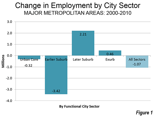
    County Business Pattern data indicates that employment dropped approximately 1,070,000 in the 52 major metropolitan areas (those with more than 1,000,000 population) between 2000 and 2010. The inner city sectors (the functional urban cores and earlier suburbs) were hard-hit. Together the inner sectors, the functional urban cores and the earlier suburbs, lost 3.74 million jobs. The outer sectors, the later suburbs and the exurbs, gained 2.67 million jobs (Figure 1).

    There were job losses of more than 300,000 in the functional urban cores, and even larger losses (3.2 million) in the earlier suburbs. The functional urban cores are defined by the higher population densities that predominated before 1940 and a much higher dependence on transit, walking and cycling for work trips. The earlier suburbs have median house construction dates before 1980.

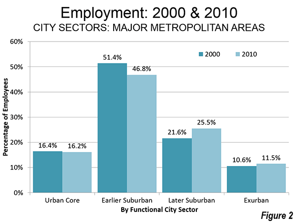
    The share of major metropolitan area employment in the functional urban cores dropped from 16.4 percent in 2000 to 16.2 percent in 2010. This compares to the 8 percent of major metropolitan employment that is downtown (central business district) areas. The notion, however, that metropolitan areas are dominated by their downtowns is challenged by the fact that 84 percent of jobs are outside the functional urban cores.

    The largest percentage of major metropolitan areas is clustered in the earlier suburbs, those with median house construction dates from 1946 to 1979. In 2010, 46.8 percent of the jobs were in the earlier suburbs, a decline from 51.4 percent in 2000.

    These losses in employment shares in the two inner city sectors were balanced somewhat by increases in the outer sectors, the later suburbs (with median house construction dates of 1980 or later) and the exurbs, which are generally outside built-up urban areas. The increase was strongest in the later suburbs, where, where employment increased by 2.6 million. The share of employment in the later suburbs rose to 25.5 percent from 21.6 percent. There was also a 600,000 increase in exurban employment. The exurban share of employment rose to 11.5 percent from 10.6 percent (Figure 2).

    The Balance of Residents and Jobs

    There is a surprisingly strong balance between population and employment within the city sectors, which belies the popular perception by some press outlets and even some urban experts that as people who farther away from the urban core, they have to commute farther. In fact, 92 percent of employees do not commute to downtown, and as distances increase, the share of employees traveling to work downtown falls off substantially. As an example, only three percent of working residents in suburban Hunterdon County, New Jersey (in the New York metropolitan area), work in the central business district, Manhattan, while 80 percent work in relatively nearby areas of the outer combined metropolitan area.

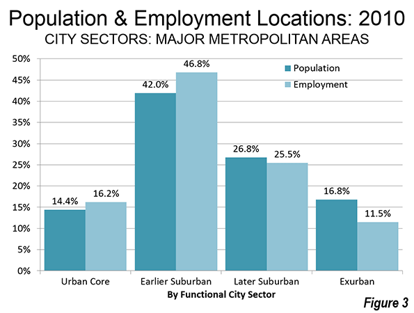
    It is to be expected that the functional urban core would have a larger share of employment than population. However the difference is not great, with 16.2 percent of employment in the functional urban core and 14.4 percent of the population. The earlier suburbs have by far the largest share of the population at 42.0 percent. They also have the largest share of employment, at 46.8 percent. The later suburbs have 26.8 percent of the population, slightly more than their 25.5 percent employment share. The largest difference is, as would be expected, is in the exurbs, with 16.8 percent of major metropolitan area residents and 11.5 percent of employment (Figure 3). It is notable, however, that the difference between the share of population and employment varies less than 15 percent in the three built-up urban area sectors (urban core, earlier suburbs and later suburbs), though the difference was greater in the exurbs.

    How Employment Followed Population in the 2000s

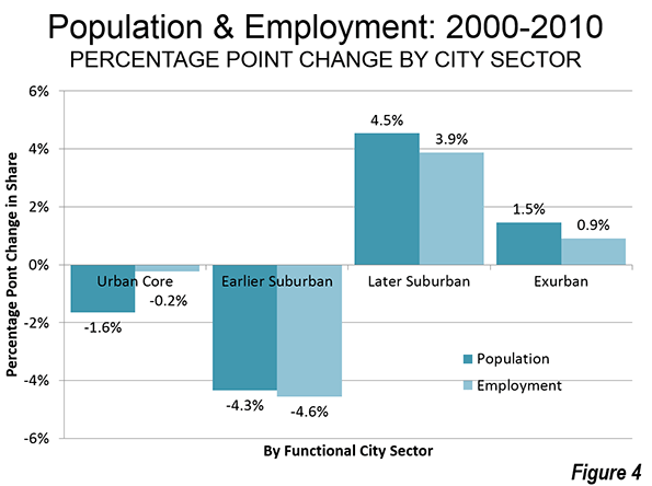
    The outward shifts of population and employment are between in the city sectors. In the earlier suburbs, where the population and employment is the greatest, the population share declined 4.3 percentage points, while the employment share declined a near lockstep 4.6 percentage points. The later suburbs had a 4.5 percentage point increase in population share, followed closely a near lockstep 3.9 percentage point increase in employment share. In the exurbs, a 1.5 percentage point increase in the population share was accompanied by a 0.9 percentage point increase in the employment share. The connection is less clear in the functional urban core, where a 1.6 percentage point drop in the population share was associated with a 0.2 percentage point reduction in the employment share (Figure 4).

    The similarity in population and employment shares between the city sectors is an indication that employment growth has been geographically tracking population growth for decades, as cities have evolved from moncentricity to polycentricity and beyond.

    "Job Following" by Relative Urban Core Size

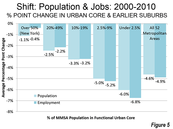
    Similar results are obtained when cities are categorized by the population of their urban cores relative to the total city population. Each category indicates an outward shift from the functional urban cores and earlier suburbs to the later suburbs and exurbs, in both the population share and the employment share. However, the shift is less pronounced in the cities with larger relative urban cores, which tend to be in the older urban regions  (Figure 5). Out of the 18 cities with functional urban cores amounting to more than 10 percent of the metropolitan area, 16 are in the Northeast (including the Northeastern corridor cities of Washington and Baltimore) and the Midwest, where strong population growth ended long ago.

    As usual, New York is in a category by itself, New York, has a functional urban core with more than 50 percent of its population. New York experienced an outward shift of 1.1 percent in its population, and a 0.4 percent outward shift of its employment (the total shift in share, from the urban core and earlier suburbs to the later suburbs and exurbs, expressed in terms of percentage points).

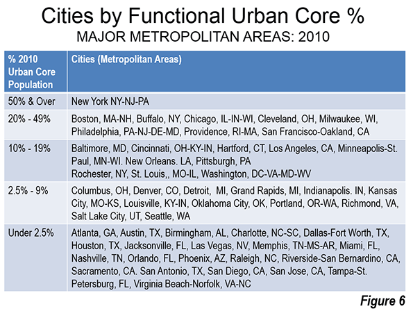
    Generally speaking, the stronger the functional urban core, the less the movement of jobs and people from the center. The actual percentages of functional urban core population by city are shown in From Jurisdictional to Functional Analysis of Urban Cores and Suburbs (Figure 6).

    On average, there was a shift of nearly five percent from the inner sectors (functional urban cores and earlier suburbs) to the outer sectors (later suburbs and exurbs)

    Commute Times: Less Outside the Urban Cores

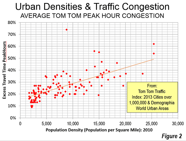
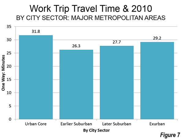
    The earlier suburbs are generally between the functional urban cores and the later suburbs geographically. As a result, jobs are particularly accessible to residents from all over the metropolitan area. A further consequence is that commute times are shortest (26.3 minutes) in the earlier suburbs, where approximately half of the people also live. Commute times are a bit higher in the later suburbs (27.7 minutes). The exurbs have the third longest commutes, at 29.2 minutes. Finally, commute times are longest in the functional urban cores (31.8 percent), both because traffic congestion is greater (to be expected, not least because of their higher densities), and more people take transit, which is slower (Figure 7).

    The dispersed, and well coordinated location of jobs and residences is one reason that United States metropolitan areas have shorter commute times and less traffic congestion than its international competitors in Europe, Australia, and Canada. All this is testimony to the effectiveness with which people and the businesses established to serve them have produced effective labor markets, which are the most affluent in the world, in which the transaction related impacts of work trip travel time are less than elsewhere.

    Beyond Polycentricity

    These are not new concepts, despite the continuing tendency to imagine the city as a monocentric organism where everyone works in downtown skyscrapers and lives in suburban dormitories. The lower density US city has not descended into the illusion of suburban gridlock that some planners have declared so stridently. Indeed, traffic congestion is considerably less intense in US cities than it is in the other parts of the high income world for which there is data.

    A quarter century ago, University of Southern California economists Peter Gordon and Harry Richardson said that "the co-location of firms and households at decentralized locations has reduced, not lengthened commuting times and distances. Decentralization reduces pressures on the CBD, relieves congestion and avoids ‘gridlock.’"  In 1996 they Los Angeles as "beyond polycentricity" Both of these observations fit well as a description of trends in the 2000s. Most US major metropolitan areas are now "beyond polycentricity," not just Los Angeles.

    Wendell Cox is principal of Demographia, an international public policy and demographics firm. He is co-author of the “Demographia International Housing Affordability Survey” and author of “Demographia World Urban Areas” and “War on the Dream: How Anti-Sprawl Policy Threatens the Quality of Life.” He was appointed to three terms on the Los Angeles County Transportation Commission, where he served with the leading city and county leadership as the only non-elected member. He was appointed to the Amtrak Reform Council to fill the unexpired term of Governor Christine Todd Whitman and has served as a visiting professor at the Conservatoire National des Arts et Metiers, a national university in Paris.

    ——

    Note 1: The Census Bureau describes "County Business Pattern" data as follows: "Statistics are available on business establishments at the U.S. level and by State, County, Metropolitan area, and ZIP code levels. Data for Puerto Rico and the Island Areas are available at the State and county equivalent levels. County Business Patterns (CBP) covers most NAICS industries excluding crop and animal production; rail transportation; National Postal Service; pension, health, welfare, and vacation funds; trusts, estates, and agency accounts; private households; and public administration. CBP also excludes most establishments reporting government employees.

    Note 2: The City Sector Model allows a more representative functional analysis of urban core, suburban and exurban areas, by the use of smaller areas, rather than municipal boundaries. The more than 30,000 zip code tabulation areas (ZCTA) of major metropolitan areas and the rest of the nation are categorized by functional characteristics, including urban form, density and travel behavior. There are four functional classifications, the urban core, earlier suburban areas, later suburban areas and exurban areas. The urban cores have higher densities, older housing and substantially greater reliance on transit, similar to the urban cores that preceded the great automobile oriented suburbanization that followed World War II. Exurban areas are beyond the built up urban areas. The suburban areas constitute the balance of the major metropolitan areas. Earlier suburbs include areas with a median house construction date before 1980. Later suburban areas have later median house construction dates.

    Urban cores are defined as areas (ZCTAs) that have high population densities (7,500 or more per square mile or 2,900 per square kilometer or more) and high transit, walking and cycling work trip market shares (20 percent or more). Urban cores also include non-exurban sectors with median house construction dates of 1945 or before. All of these areas are defined at the zip code tabulation area (ZCTA) level.

    —–

    Photo: Beyond Polycentric Houston (by author)

  • Boomers: Moving Further Out and Away

    There have been frequent press reports that baby boomers, those born between 1945 and 1964, are abandoning the suburbs and moving "back" to the urban cores (actually most suburban residents did not move from urban cores). Virtually without exception such stories are based on anecdotes, often gathered by reporters stationed in Manhattan, downtown San Francisco or Washington or elsewhere in urban cores around the nation. Clearly, the anecdotes about boomers who move to suburbs, exurbs, or to outside major metropolitan areas are not readily accessible (and perhaps not as interesting) to the downtown media.

    Yet there is a wide gulf between the perceived reality of the media stories and what is actually occurring on the ground, as is indicated by comprehensive sources. The latest available small area data shows that baby boomers continue to leave the urban cores in large numbers. They have also left the earlier suburbs in such large numbers that their population gains in the later suburbs and exurbs have been insufficient to stem boomer movement out of the major metropolitan areas to smaller cities and rural areas.

    These conclusions are drawn from an analysis of population at the zip code tabulation area (ZCTA) among those 35 to 54 years of age in 2000 and the same cohort in 2010 (then 45 to 64 years of age). This small area analysis avoids the exaggeration of urban core data that necessarily occurs from reliance on the municipal boundaries of core cities (which are themselves nearly 60 percent suburban or exurban, ranging from as little as three percent to virtually 100 percent). This is described in further detail in the "City Sector Model" note below.

    Overall Trend

    The national population of the baby boomer generation declined 1.82 million between 2000 and 2010, a 2.2 percent loss (the result of an inevitably increasing death rate from the aging of cohorts). A small increase of 350,000 (1.0 percent) outside the largest cities was more than offset by a 2.17 million loss in the major metropolitan areas (over 1 million population), where the decline was of 4.7 percent.

    Boomers and the Urban Core

    The largest percentage loss occurred in the functional urban cores, which experienced a decline of 1.15 million baby boomers, a reduction of 16.7 percent. The functional urban cores are defined by the higher population densities that predominated before 1940 and a much higher dependence on transit, walking and cycling for work trips (further details are provided in the "City Sector Model" note below). In 2000, baby boomers accounted for 14.9 percent of the major metropolitan area population, a figure that declined to 13.0 percent by 2010 (Figure 1).

    The losses were pervasive. Among the 24 major metropolitan areas with functional urban core populations above 100,000, all experienced reductions in their baby boomer population shares. The average share reduction was approximately 12 percent.

    Not surprisingly, the leading urban core magnets of New York and San Francisco did the best, losing 4.3 percent and 5.8 percent of their boomer population share between 2000 and 2010. Providence, Los Angeles,and Boston rounded out the best five.

    Among the 24 metropolitan areas with the largest functional urban cores, Detroit experienced the largest proportional boomer loss, at 21.2 percent. Kansas City, Washington, and Minneapolis-St. Paul lost from 17 percent to 19 percent, proportionally, of their boomer urban core populations. Despite its reputation for core renewal, Portland experienced an approximate 15 percent proportional loss of its urban core boomers, along with Milwaukee and Cleveland (Figure 2).

    Boomers and the Earlier Suburbs

    The reduction in baby boomer population was even greater in the earlier suburban areas (those with median house construction dates of 1979 or before). The 2.33 million earlier suburban population loss was double that of the functional urban core loss, but because of this population is much larger than the functional cores, the overall drop was a smaller 11.1 percent. Nonetheless, the earlier suburbs continue to house the largest share of major metropolitan boomers. This fell, however, from 45.3 percent in 2000 to 42.2 percent in 2010.

    Combined, the urban cores and earlier suburbs lost 3.48 million boomers between 2000 and 2010.

    Boomers and the Later Suburbs and Exurbs

    In contrast, the later suburban areas (median house construction date 1980 or later) added approximately 750,000 baby boomers, for an increase of 6.8 percent. The later suburbs also experienced an increase in their share of major metropolitan boomers, rising from 24.0 percent in 2000 to 26.9 percent in 2010.

    The exurban gain was greater than the later suburbs in percentage terms (7.7 percent) but less in population gain (560,000). This was enough to increase the exurban share of boomers from 15.8 percent in 2000 to 17.9 percent in 2010. Indeed, the exurban areas of the 24 major metropolitan areas with urban cores over 100,000 population all did better in attracting or retaining boomer populations than both the urban cores and the earlier suburbs.

    Overall there was a 5.0 percentage point transfer of boomer share from the functional urban cores and earlier suburbs to the later suburbs and exurbs, reflecting their more than 1.3 million gain between 2000 and 2010.

    Boomers and the Nation

    Moreover, the data indicates that boomers are leaving the major metropolitan areas to move to smaller cities or even to rural areas. In contrast with the 2.17 million major metropolitan area loss, areas outside the major metropolitan areas added 350,000 boomers between 2000 and 2010. In 2000, smaller cities and rural areas housed 44.4 percent of the boomer population. By 2010, the smaller city and rural share had risen to 45.8 percent (Figure 3). By contrast, over the same period, the major metropolitan areas increased their proportion of the US population, from 54.5 percent in 2000 to 54.9 percent in 2010.

    America’s downtowns (generally a smaller area than the larger urban cores), have done much better in recent years, as they have become safer and as a "100 year flood" of economic retrenchment has reduced many to renting rather than buying. Yet, overall, urban cores have done less well, with Census Bureau data showing that the population gains within two miles of largest municipality city halls being more than offset by losses in the two to five mile radius between 2000 and 2010. These loses are not limited to the overall population, but extend to share losses among Millennials and population losses among the boomers.

    Wendell Cox is principal of Demographia, an international public policy and demographics firm. He is co-author of the "Demographia International Housing Affordability Survey" and author of "Demographia World Urban Areas" and "War on the Dream: How Anti-Sprawl Policy Threatens the Quality of Life." He was appointed to three terms on the Los Angeles County Transportation Commission, where he served with the leading city and county leadership as the only non-elected member. He was appointed to the Amtrak Reform Council to fill the unexpired term of Governor Christine Todd Whitman and has served as a visiting professor at the Conservatoire National des Arts et Metiers, a national university in Paris.

    ———–

    City Sector Model Note: The City Sector Model allows a more representative functional analysis of urban core, suburban and exurban areas, by the use of smaller areas, rather than municipal boundaries. The more than 30,000 zip code tabulation areas (ZCTA) of major metropolitan areas and the rest of the nation are categorized by functional characteristics, including urban form, density and travel behavior. There are four functional classifications, the urban core, earlier suburban areas, later suburban areas and exurban areas. The urban cores have higher densities, older housing and substantially greater reliance on transit, similar to the urban cores that preceded the great automobile oriented suburbanization that followed World War II. Exurban areas are beyond the built up urban areas. The suburban areas constitute the balance of the major metropolitan areas. Earlier suburbs include areas with a median house construction date before 1980. Later suburban areas have later median house construction dates.

    Urban cores are defined as areas (ZCTAs) that have high population densities (7,500 or more per square mile or 2,900 per square kilometer or more) and high transit, walking and cycling work trip market shares (20 percent or more). Urban cores also include non-exurban sectors with median house construction dates of 1945 or before. All of these areas are defined at the zip code tabulation area (ZCTA) level.

  • UN Projects 2030 US Urban Area Populations

    The United Nations periodically publishes World Urbanization Prospects. One of the highlights is both historic and projected detailed population information for individual cities around the world. The publication provides perhaps the best summary of US urban area population trends since 1950 and also projects their population through 2030. The UN provides data for the 135 urban areas with an estimated population of at least 300,000 residents in 2014. Urban areas are the city in its physical form – the built up area (as opposed to cities in their functional or economic form, the metropolitan area, which includes economically connected territory outside the built up area, from the urban core to the suburbs to the periphery bordering farms and other rural land).

    US Urban Areas Since 1950

    The United States has undergone an urban population revolution since 1950, the first year that urban areas were designated by the US Census Bureau. In 1950, two-thirds of the population of the urban areas in the UN list was located in the urban areas of the Northeast and the Midwest (including Washington & Baltimore). By 1990, the share had dropped to one half. The UN expects this trend to continue, projecting only 40 percent of the urbanized population to be in the Northeast and the Midwest by 2030 (Figure 1).

    Not unexpectedly, this new urban landscape has produced substantial shifts in the rankings of urban areas. The top three cities remain the same, New York, Los Angeles and Chicago; Los Angeles overtook Chicago between 1950 and 1960. This was a stunning achievement, because during the 1950s, Chicago also was experiencing strong growth, adding approximately 1.2 million residents. This is approximately four times the 300,000 added in between 2000 and 2010. Los Angeles passed Chicago by adding 2.5 million residents, the largest 10 year increase of any city since 1950. Los Angeles continued to add more than one million residents per decade through 2000, but has since fallen into the sluggish growth pattern more identified with the Northeast and Midwest, adding less than 400,000 residents between 2000 and 2010.

    From today’s perspective, it may be surprising that New York grew strongly after 1950, adding 1.8 million residents in the 1950s and 2.0 million in the 1960s. After that, however, the population began declining and did not recover until the 1990s. Like Chicago and Los Angeles, despite the clear improvement in many areas, population growth was small in the last decade, at 550,000.

    There has been little stability in the rankings of the rest of the top 10, with only two 1950s entries remaining. Philadelphia, which was ranked 4th in 1950 is now fifth. Boston was ranked 6th, but has fallen to 10th. Detroit was 5th ranked in 1950, and was 12th in 2010. San Francisco has fallen from 7th to 13th. The largest losses in ranking were Pittsburgh which fell 8th to 26th, St. Louis which dropped from 9th to 20th and Cleveland, which fell from 10th to 24th. 

    New entrants Miami, Dallas-Fort Worth, Houston, Washington and Atlanta have replaced these cities in the top 10.

    The Largest Cities in 2030

    The UN’s population projections to 2030 indicate modest rankings changes from the present. The top 10 would remain the same, except that Boston would be replaced by Phoenix. As a result, only four of 1950s top ten remain in 2030 – New York, Los Angeles, Chicago and Philadelphia (Figure 2). The rise of Phoenix is particularly impressive. In 1950, Phoenix had a population little more than 200,000. By 2030, it is projected to have 4.8 million residents.

    Houston is expected to rise from the 7th largest urban area in 2010 to 4th largest in 2030. Houston would thus pass Miami, Philadelphia and in-state rival Dallas-Fort Worth. Miami and Philadelphia would each fall two positions.

    By 2030, there would be 53 urban areas with more than 1,000,000 population, up from 41 in 2010. By comparison, there were only 12 cities with more than 1,000,000 residents in 1950. Seven of the new 1,000,000 cities  are located in major metropolitan areas as of 2010. New Orleans would be restored to the over 1,000,000 list, after having been knocked out by the 2005 Hurricane Katrina and Rita events. Buffalo, however, which is the only other urban area to have fallen below 1,000,000 population (in the 1980s), will not be restored to that level, according to the UN. In addition, Bridgeport, Tucson, Albuquerque, El Paso and McAllen would reach the 1,000,000 level by 2030. The addition of El Paso and McAllen would tie Texas with California, with each having six urban areas with more than 1,000,000 population.

    Greater Growth in Smaller Cities

    The UN anticipates that US growth will be less concentrated in the largest urban areas between 2010 and 2030. Overall, the population of New York, Los Angeles and Chicago is expected to grow less than 9 percent, less than one half their 19 percent 2010 overall share of the urban population reported by the UN. The other cities over 5 million and those between 2.5 million and 5 million would grow slightly less than their overall share of the population, as is indicated in Figure 3

    The smaller population categories would grow faster than their population share. The cities with 1,000,000 to 2.5 million population would grow nearly 15 percent faster than their proportion of the population. Those with from 500,000 to 1,000,000 would grow nearly 20 percent more than their proportion of the population. The cities will fewer than 500,000 residents would capture nearly 50 percent more of their growth than their current population proportion.

    Fastest Growing Cities

    Only four of today’s 50 largest cities would be among the 20 fastest growing from 2010 to 2030. Charlotte and Raleigh would rank 6th and 7th respectively, both growing approximately 72 percent. Austin would rank 11th, growing 59 percent and Las Vegas, at 14th, would grow 51 percent.

    The largest percentage growth would be in smaller urban areas, especially in areas near much larger urban areas. The Woodlands would grow 170 percent, nearly five times that the rate of adjacent Houston, which would itself be the fastest growing urban area of more than 2,000,000 population (35 percent). Murrieta-Temecula and Victorville would grow 100 percent and 75 percent respectively, dwarfing the 36 percent of nearby Riverside San Bernardino. Kissimmee would double adjacent Orlando’s growth rate, at 78 percent. Provo is expected to grow 69 percent, nearly three times the growth rate of nearby Salt Lake City. Santa Clarita and Lancaster would grow 64 percent and 55 percent respectively, much faster than their much larger neighbor, Los Angeles, at 9 percent.

    South Florida cities Cape Coral (80 percent), Bonita Springs-Naples (52 percent) and Port St. Lucie (51 percent) by would grow at three to five times giant Miami.

    The same pattern holds even in the Northeast Corridor. Poughkeepsie, at 32 percent, would grow nearly four times the rate of nearby New York, while Worcester would more than double the growth of Boston.

    Fayetteville, Arkansas, an urban area that includes Bentonville, with the Wal-Mart headquarters, is the only urban area that is far from larger urban areas and projected to be among the fastest growing (80 percent). Fayetteville is more than 200 miles from both Kansas City and Oklahoma City.         

    Continuing Dispersal

    Of course, projections are no more than educated guesses. The emerging reality could be similar or radically different than the projections, as is always the case. Nonetheless, from the present vantage point, UN projections show continuing dispersal, as greater growth occurs in smaller urban areas, and continues to move outside the Northeast and Midwest.

    Wendell Cox is principal of Demographia, an international public policy and demographics firm. He is co-author of the "Demographia International Housing Affordability Survey" and author of "Demographia World Urban Areas" and "War on the Dream: How Anti-Sprawl Policy Threatens the Quality of Life." He was appointed to three terms on the Los Angeles County Transportation Commission, where he served with the leading city and county leadership as the only non-elected member. He was appointed to the Amtrak Reform Council to fill the unexpired term of Governor Christine Todd Whitman and has served as a visiting professor at the Conservatoire National des Arts et Metiers, a national university in Paris.

    Note on additional resources: The United States Conference of Mayors has published metropolitan area projections to 2042. Demographia World Urban Areasprovides urban land area and density estimates for all indentified urban areas of 500,000 population or more, with population data provided by the United Nations, national census authorities and other sources.

    Photo by Mike Lee