Author: Wendell Cox

  • Urban Cores, Core Cities and Principal Cities

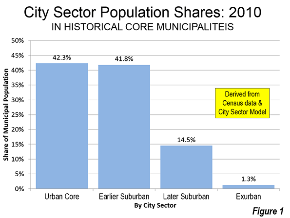
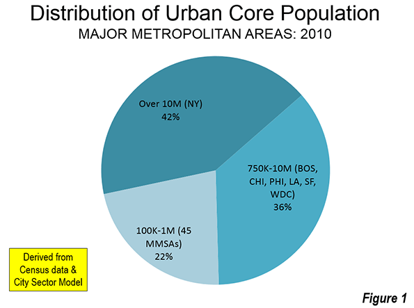
    Many American cities, described commonly as urban cores, are functionally more suburban and exurban, based on urban form, density, and travel behavior characteristics. Data from the 2010 census shows that 42.3 percent of the population of the historical core municipalities was functionally urban core (Figure 1). By comparison, 56.3 of the population lived in functional suburbs and another 1.3 percent in functionally exurban areas (generally outside the urban areas). Urban cores are defined as areas that have high population densities (7,500 or per square mile or 2,900 per square kilometer or more) and high transit, walking and cycling work trip market shares (20 percent or more). Urban cores also include non-exurban sectors with median house construction dates of 1945 or before. All of these areas are defined at the zip code tabulation area (ZCTA) level, rather than by municipal jurisdiction. This is described in further detail in the "City Sector Model" note below.

    The Varieties of Central Cities

    Of course the “urbaneness” of central cities vary greatly. Some, like New York, Boston, Chicago, and San Francisco experienced much of their growth before the 20th century, well before the great automobile oriented suburbanization that occurred after World War II. Others, that experienced early growth, such as Milwaukee and Seattle, annexed substantial areas of suburbanization after World War II, so that their comparatively large functional urban cores have been overwhelmed by suburbs within the city limits. Los Angeles, with a large functional urban core, annexed huge swaths of agricultural land that later became suburban. Finally, a number of other central cities, such as Phoenix and San Jose, have developed since World War II and are virtually all suburban,

    Moreover, central cities comprise very different proportions of their respective metropolitan areas (the functional or economic definition of "city"). For example, the central city of San Antonio comprises 62 percent of the San Antonio metropolitan area population. Conversely, the city of Atlanta comprises only 8 percent of the Atlanta metropolitan area population. Obviously, with such a large differential, the term central city describes jurisdictions that are radically different.

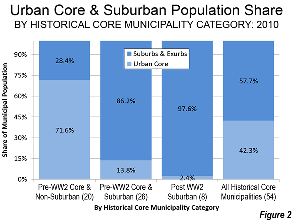
    This difference is caught by examining the functional urban cores by historical core municipality classifications. The Pre-World War II Core & Non-Suburban central cities have functional urban cores comprising 72 percent of their population. The Pre-World War II Core & Suburban central cities have functional urban cores that are only 14 percent of their populations. The Post-World War II Suburban central cities have very small urban cores, representing only 2 percent of their population (Figure 2).

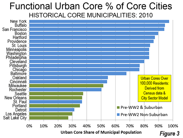
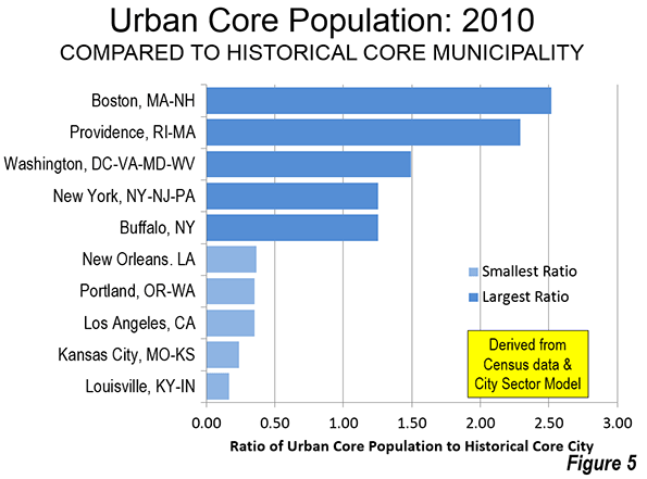
    Among the 54 historical core municipalities, the share of central city population in the functional urban cores varies from a high of more than 97 percent (New York) to virtually zero (Birmingham, Charlotte, Dallas, Jacksonville, Orlando, Phoenix, Raleigh, San Bernardino, San Jose, and Tampa).

    Core Cities with the Strongest Urban Cores

    It is not surprising that the central cities with the largest share of their populations in the functional urban cores are in the older, established are concentrated in the Northeast Corridor (Washington to Boston) and the Midwest. Only one of the 14 central cities with the highest population share in functional urban cores is outside these areas is San Francisco, the first large city to be built on the American West Coast Among the 25 central cities with the highest functional urban core share, only seven are outside the Northeast Corridor or the Midwest (San Francisco, Oakland, Seattle, New Orleans, Portland, Los Angeles and Salt Lake City).

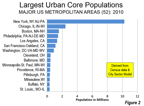
    It is not surprising that the city of New York has the largest function urban core population share, at 97.3 percent. Nearly one-third of the total urban core population in the 52 major metropolitan areas lives in the city of New York (nearly 8,000,000 residents).

    Two other central cities have functional urban core population percentages above 90 percent. Buffalo ranks second, at 94.5 percent. San Francisco is third at 94.0 percent.

    The next three highest ranking cities are in New England. Boston has an 89.7 percent functional urban core population, followed by Hartford (87.4 percent), and Providence (86.5 percent). These are all of the major metropolitan areas in New England.

    Three Midwestern central cities have more than 80 percent of their populations in functional urban cores, including St. Louis (84.1 percent), Minneapolis (83.5 percent), and Cleveland (80.1 percent). Washington (83.4 percent) and Philadelphia (83.4 percent), in the Northeast Corridor also have greater than 80 percent functional urban core shares.

    Pittsburgh (76.9 percent) and Chicago (76.6 percent) have functional urban core population shares between 70 percent and 80 percent. At 67.7 percent, Baltimore (67.7 percent) is the only central city in the Northeast Corridor that with less than 70 percent of its population in the functional urban core.

    Oakland (54.7 percent), at 15th, is the highest ranking central city outside the Northeast Corridor and the Midwest other than San Francisco. Cincinnati, Rochester, and Milwaukee also have more than 50 percent of their population in functional urban cores.

    The top 25 is rounded out by Seattle (37.5 percent), New Orleans (36.8 percent), St. Paul (36.7 percent), Portland (35.2 percent), Detroit (31.3 percent), Los Angeles (29.9 percent) and, somewhat unexpectedly, Salt Lake City (27.1 percent).

    The central cities with the largest functional urban core percentages have overwhelmingly suffered large population losses. Among the 25 with the largest urban core shares, only seven were at their peak populations at the 2010 census, and only two of the top 18 (New York and San Francisco). Overall the cities with large functional cores lost more than 35 percent of their population and 8 million residents.

    "Other" Principal Cities

    Starting in 2003, the Office of Management and Budget (OMB) retired the term "central city" and replaced it with "principal city," which includes the 54 former historical core municipalities and approximately 160 additional cities. The adoption of principal city terminology recognized as OMB described it, that metropolitan areas were no longer monocentric, but had become polycentric. OMB specifically rejected the use of geographical terms other than "principal city" within metropolitan areas, including "suburb." Indeed, the very employment of polycentricity that justified abandonment of the central city designation was the suburbanization of employment. Yet some popular usage (even in some Census Bureau documents), considers any area that is not a principal city as suburban. The more appropriate term would be "not principal city."

    Some principal cities that are not historical core municipalities ("other" principal cities) have strong urban cores, especially in metropolitan areas where the urban core stretches well beyond the core municipality’s city limits, especially in New York and Boston. Four such principal cities have urban cores larger than 100,000 and urban core population shares exceeding 90 percent, including Cambridge in the Boston area (97.0 percent, and the New York area’s Newark (94.7 percent) and Jersey City (100.0 percent), which is higher even than New York City itself. None of these cities was at its population peak in 2010.

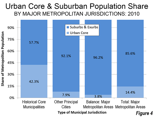
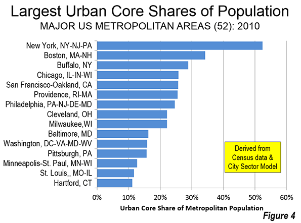
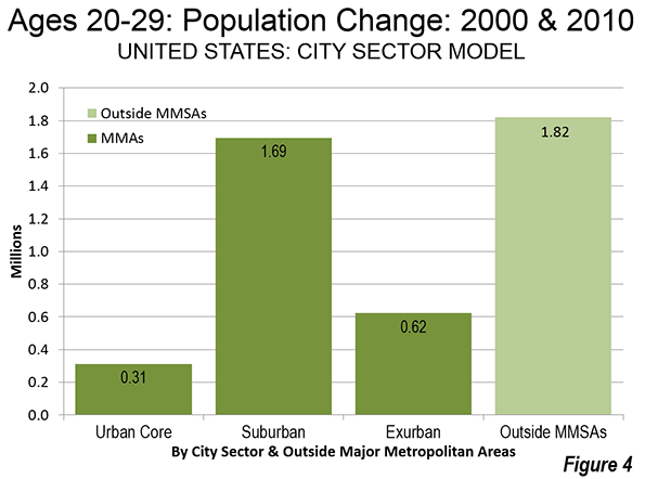
    Even so the vast majority of the "other" principal cities are overwhelmingly suburban, comprising less of the functional urban core population than areas that are not principal cities (1.5 million compared to 4.1 million outside the principal cities). Overall, the other principal cities are 7.9 percent urban core (compared to 42.3 percent for the historical core municipalities). If the 11 municipalities with cores larger than 50,000 are excluded, the share living in functional urban cores for the remaining more than 150 cities is 1.5 percent. (Figure 4).

    Crude Measurement

    The perhaps stunning conclusion is that the average difference between the historical core municipality population and the functional urban core population is 73 percent. Core cities — themselves 57 percent suburban and exurban — are a crude basis for classifying urban cores and suburbs. Principal cities — 92 percent functionally suburban or exurban — are even worse. The bottom line: America is fundamentally more suburban in nature than commonly believed.

    —–

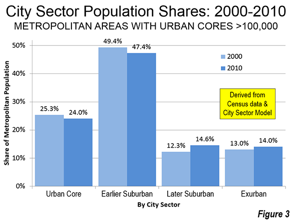
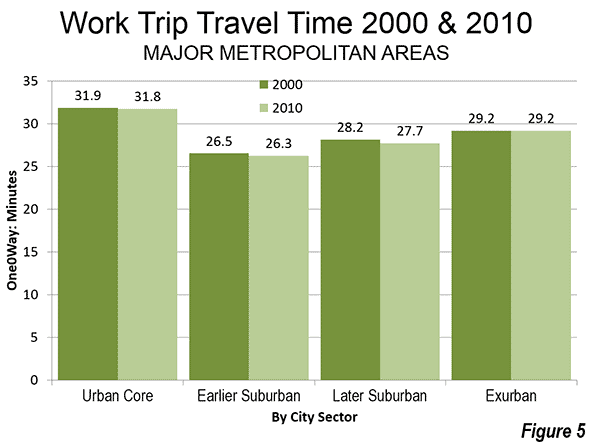
    City Sector Model Note: The City Sector Model allows a more representative functional analysis of urban core, suburban and exurban areas, by the use of smaller areas, rather than municipal boundaries. The nearly 9,000 zip code tabulation areas (ZCTA) of major metropolitan areas are categorized by functional characteristics, including urban form, density and travel behavior. There are four functional classifications, the urban core, earlier suburban areas, later suburban areas and exurban areas. The urban cores have higher densities, older housing and substantially greater reliance on transit, similar to the urban cores that preceded the great automobile oriented suburbanization that followed World War II. Exurban areas are beyond the built up urban areas. The suburban areas constitute the balance of the major metropolitan areas. Earlier suburbs include areas with a median house construction date before 1980. Later suburban areas have later median house construction dates.

    —–

    Wendell Cox is principal of Demographia, an international public policy and demographics firm. He is co-author of the "Demographia International Housing Affordability Survey" and author of "Demographia World Urban Areas" and "War on the Dream: How Anti-Sprawl Policy Threatens the Quality of Life." He was appointed to three terms on the Los Angeles County Transportation Commission, where he served with the leading city and county leadership as the only non-elected member. He was appointed to the Amtrak Reform Council to fill the unexpired term of Governor Christine Todd Whitman and has served as a visiting professor at the Conservatoire National des Arts et Metiers, a national university in Paris.

    Photo: Downtown Houston (by author)

  • Showing the Flag: The Transit Policy Failure

    David King has a point. In an article entitled "Why Public Transit Is Not Living Up to Its Social Contract: Too many agencies favor suburban commuters over inner-city riders," King, an assistant professor of urban planning in the Graduate School of Architecture, Planning and Preservation at Columbia University notes that transit spends an inordinate share of its resources on suburban riders, short changing the core city riders who cost transit agencies far less to serve and are also far more numerous. He rightly attributes this to reliance on regional (metropolitan area) funding initiatives. Many in transit think it is necessary to run near empty buses in the suburbs to justify the use of transit taxes to suburban voters (what I would refer to as "showing the transit flag")

    King asks: "So does public transit serve its social obligations?" He answers: "Increasingly the answer is no." King is rightly concerned about the disproportionate growth in spending on commuter rail lines that carry transit’s most affluent riders from deep in the suburbs to downtown. Transit policy has long been skewed in favor of the more affluent suburban dwellers in the United States.

    My Experience in Los Angeles

    I saw this first-hand as a member of the Los Angeles County Transportation Commission (LACTC). When we placed what was to become the first regional transit tax on the ballot (Proposition A in 1980), the shortage of transit service was critical in the highest demand, largely low-income areas of Los Angeles such as Los Angeles and East Los Angeles. I described the situation in a presentation to the annual conference of the American Public Transportation Association: "Often waiting passengers are passed at bus stops by full buses" Approximately 40 percent of the local bus services between the Santa Monica Mountains, Inglewood, Compton, Montebello and Santa Monica reached peak loads of 70 passengers, well above seating capacity

    At the same time, suburban area buses were usually less than half-full. In connection with this concern, I produced a policy paper, Distribution of Public Transit Subsidies in Los Angeles County, which was published in by the Transportation Research Board. The abstract follows: 

    "Public transit today is faced with the challenge of serving its clientele while subsidies are failing to keep pace with increasing operating costs. In Los Angeles County, there are service distribution inequalities–overcrowding and unmet demand in some areas and, at the same time, surplus capacity in other areas. To use subsidy resources efficiently requires that the effects of present subsidy allocation practices be understood–that is, how subsidies are translated into consumed service, both by type of service and by geographic sector within the urban area. An attempt is made to provide a preliminary understanding of that distribution in Los Angeles County. It is postulated that significantly more passengers are carried per dollar of subsidy in the central Los Angeles area than in other areas and local services require a lower subsidy per passenger than do express services. A number of policy issues are raised, the most important being the very purpose of public transit subsidies."

    Generally, transit operating subsidies per passenger were far higher in the suburbs than in the central area (where incomes are the lowest, and poverty rates the highest), and subsidies were much higher for commuter express services than for local bus services.

    I attempted to address this problem by proposing a "Mobility Policy" that would have reallocated service based on customer needs, giving precedence to areas where mobility was restricted due to limited automobile availability and lower incomes. Some colleagues whose constituents were disadvantaged by this inequity objected,  feeling compelled, it appeared, to rally about the “transit flag”

    On a Siding: Transit Policy in Recent Decades

    Since that time, Los Angeles and other major metropolitan areas have built expensive rail and busway systems. Despite the promises of attracting people out of their cars (routinely invoked during election campaigns for higher taxes), the reality is that single occupant commuting has risen from 64 percent in  1980 to 76 percent in 2012. Over the same period, transit’s share of urban travel has fallen, though stabilized in recent years at very low levels in most metropolitan areas. Indeed, when New York, Chicago, Philadelphia, Washington, Boston, and San Francisco are excluded (with their "transit legacy cities"), the 46 major metropolitan areas have a transit commute share of just three percent. Overall, more people work at home than commute by transit in 38 of these metropolitan areas and more people walk or cycle to work in 27, according to American Community Survey 2012 data.

    Yet the politically driven inequality in transit spending continues. Transit subsidies continue to be far higher for services that are patronized by more affluent riders. For example, subsidies (operating and capital expenditures minus fares) are three times as high for the commuter rail services, with their higher income riders, than for buses, with their lower income riders (Figure).

    The difference can be stark, as an example from the New York area indicates. A Fairfield County, Connecticut commuter rail rider with the median family income of $102,000 would be subsidized to the extent of $4,500 per year (assuming the national subsidy figure). By comparison a worker from the Bronx or Hudson County, New Jersey, with a poverty level family income of $18,500 per year (or less) would be subsidized only $1,500 per year. In fact, the bus subsidy would likely be even lower, because transit in lower income areas is much better patronized and thus less costly for the public. My Los Angeles research found inner city services to be subsidized approximately half below the average of all bus services (Note).

    Where Transit Works

    The functional urban cores contain the nation’s largest downtowns (central business districts). Their population densities are nearly five times that of the older suburbs and nine times that of the newer suburbs. The functional urban cores have transit market shares six times that of the older suburbs and 15 times that of the newer suburbs. Yet, it is in these poorer, denser areas where overcrowding is most acute and the need for more service is most acute. In Los Angeles, for example, the greatest potential for increasing transit ridership is where ridership is already highest.

    The vast majority of suburban drivers are not plausible candidates for transit, simply because it cannot compete well with automobiles, except, for example, for some trips to the downtowns of the six transit legacy cities (which account only one of seven jobs in their respective metropolitan areas).

    Where transit makes sense, people ride. Where it doesn’t, they don’t. Allocating resources inconsistent with this reality impairs the mobility of lower income residents, wastes resources and relegates transit to an inferior role in the city. Charging the affluent fares well below the cost of service compromises opportunities to serve more people in the community.

    Better allocation of transit resources would likely improve core area unemployment rates by increasing the number of jobs that can be accessed by lower income workers. Further, because the better used services would require lower subsidies, there would be funding available for additional service expansions.

    The principal fault is not that of transit management. It’s the politics.

    —–

    Note: These data (expenditures per boarding) are estimated from Federal Transit Administration and American Public Transportation Association data for 2012. Commercial revenues other than fares are excluded (the most important such source is advertising). Debt service is also excluded because it is not reported in the annual reports of either organization. The subsidy ratios between lower income and more affluent riders would be changed by including transfers (though the subsidies would still be considerably higher for the more affluent). Some low income riders use more than one bus or rail vehicle for their trip, while some commuter rail riders transfer to bus or rail services at one or both ends of their trips. No readily available data is available to make such an adjustment. The New York area example assumes 225 round trips per year.

    —–

    Wendell Cox is principal of Demographia, an international public policy and demographics firm. He is co-author of the “Demographia International Housing Affordability Survey” and author of “Demographia World Urban Areas” and “War on the Dream: How Anti-Sprawl Policy Threatens the Quality of Life.” He was appointed to three terms on the Los Angeles County Transportation Commission, where he served with the leading city and county leadership as the only non-elected member. He was appointed to the Amtrak Reform Council to fill the unexpired term of Governor Christine Todd Whitman and has served as a visiting professor at the Conservatoire National des Arts et Metiers, a national university in Paris.

    Photo: Bart A car Oakland Coliseum Station

  • Large Urban Cores: Products of History

    Urban cores are much celebrated but in reality most of the population living in functional urban cores is strongly concentrated in just a handful of major metropolitan areas in the United States. This conclusion is based on an analysis using the City Sector Model, which uses functional characteristics, rather than municipal jurisdictions, to analyze urban core and suburban components of metropolitan areas.

    Functional Classifications of Metropolitan Areas

    The City Sector Model allows a more representative functional analysis of urban core, suburban and exurban areas, by the use of smaller areas, rather than municipal boundaries.

    The nearly 9,000 zip code tabulation areas of major metropolitan areas are categorized by functional characteristics, including urban form, density, and travel behavior. There are four functional classifications, the urban core, earlier suburban areas, later suburban areas and exurban areas. The urban cores have higher densities, older housing and substantially greater reliance on transit, similar to urban cores that existed before the post-World War II automobile oriented suburbanization. Exurban areas are beyond the built up urban areas. The suburban areas constitute the balance of the major metropolitan areas. Earlier suburbs include areas with a median house construction date before 1980. Later suburban areas have later median house construction dates.

    Concentrating in New York and A Few Other Areas

    As is so often the case on dense urbanization, the statistics are dominated by New York urban core which accounts for 42 percent of the total urban core population for the whole country. The New York metropolitan area, with 19.6 million people represents roughly six percent of the country’s population but its urban core –some 10.2 million strong – is larger than the total population of every metropolitan area in the nation other than Los Angeles (12.8 million).

    New York’s dominance is not surprising, reflecting its unique history and development.  Four of the core city’s five boroughs (Brooklyn, Queens, Manhattan, and the Bronx) have higher population densities than any municipality more than one-one hundredth its size in the United States. Significantly, unlike most major metropolitan areas, New York’s functional urban core stretches well beyond the core city, and includes more than 2,000,000 residents outside New York City.

    Another 36 percent of the nation’s urban core population is in six metropolitan areas, though none reaches a population close to that of New York (Figure 1). Chicago is second, with an urban core population of 2.4 million. Four other urban cores exceed 1,000,000 population, including Boston (1.6 million), Philadelphia (1.5 million), Los Angeles (1.3 million) and San Francisco (1.1 million). The seventh largest urban core is in Washington, at 900,000. These seven metropolitan areas include the six transit legacy cities (municipalities), which account for 55 percent of the transit work trip destinations and 99 percent of the increase in urban core transit commuting in the United States over the past 10 years.(Los Angeles is not classified as a transit legacy city).

    After Washington, the size of urban cores drops off markedly with the next 45 largest metropolitan areas accounting for only 22 percent of the urban core population. Cleveland ranks eighth at 460,000, Baltimore is ninth at 440,000, and Minneapolis-St. Paul is 10th with 420,000 urban core residents. Perhaps surprisingly, Providence, which is the nation’s 38th largest metropolitan area, ranks 11th in urban core population, at 410,000 residents. Pittsburgh, Milwaukee, Buffalo, and St. Louis round out the top 15, with between 320,000 and 370,000 urban core residents (Figure 2).

    Another 9 metropolitan areas have urban core populations exceeding 100,000:Detroit, Seattle, Cincinnati, Portland, Hartford, New Orleans, Rochester, Kansas City, and Louisville.

    Urban Cores over 100,000 Population

    Approximately 97 percent of the urban core population lives in the 24 major metropolitan areas with more than 100,000 urban core residents. Between 2000 and 2010, the urban core populations in these areas dropped from 25.3 percent to 24.0 percent of their respective metropolitan populations. The continued decentralization of these metropolitan areas is illustrated by a loss in the earlier suburban areas and gains in the later suburban areas and exurban areas (Figure 3).

    By comparison, only one percent of the population was in the urban cores of the other 28 major metropolitan areas (fewer than 100,000 residents in the urban core).

    New York had by far the largest percentage of its total metropolitan population in the urban core, at 52 percent. Boston ranked second, with 34 percent of its population in the urban core. Buffalo, which was ranked only 47th in metropolitan area population, was third in urban core population share (29 percent). Chicago and San Francisco had 26 percent of their population in the urban cores, followed by Providence and Philadelphia at 25 percent (Figure 4).

    Description of the Largest Urban Cores

    There is substantial variation in the geographical extent of the largest urban cores relative to their corresponding historical core municipalities. This is described below and illustrated in the just published Demographia City Sector Model Metropolitan Area Maps.

    As would be expected, New York’s urban core includes nearly all of the city of New York. Virtually all of Brooklyn, Manhattan, the Bronx, and Queens are in the urban core, though only parts of Staten Island are included. The urban core extends into New Jersey, with nearly all of Hudson County (including Jersey City) included, the core of Essex County (including Newark) and the city of Elizabeth (in Union County). The urban core and extends into Long Island’s Nassau County, including Hempstead, Valley Stream, Rockville Center and other areas. To the north, the urban core extends to parts of Westchester County (such as Yonkers, Pelham, Mount Vernon and New Rochelle). Interestingly, many of these areas, such as in western Nassau County, parts of Essex County and southern Westchester County are also suburban in form, but are classified as urban core because of high transit market shares, higher densities or pre-war development.

    Chicago’s urban core, the second largest, extends beyond but also excludes parts of the city of Chicago. The urban core extends into adjacent areas, such as older “suburban” Evanston, Oak Park and Cicero. There is also a significant urban core in northwestern Indiana, centered on East Chicago and Hammond.

    Boston’s urban core extends far outward from the city of Boston, including much of the area inside Route 128 (Interstate 95). This area also includes cities such as Cambridge, Everett, Somerville, Quincy, Medford, Waltham, and Lynn.

    Philadelphia’s urban core is largely confined to the city of Philadelphia, with extensions into Delaware County, Pennsylvania and Camden County, New Jersey.

    The urban core of Los Angeles is principally in the area extending from Hollywood to parts of East Los Angeles and south to the Interstate 105 freeway. However, much more of the city of Los Angeles is not in the urban core. The urban core also includes parts of Beverly Hills, West Los Angeles, Pasadena and Glendale.

    The urban core of San Francisco includes most of the cities of San Francisco and Oakland, as well as much of Berkeley, Albany, and Emeryville.

    Washington’s urban core includes most of Washington (the District of Columbia) and extends into Arlington and Alexandria in Virginia and has a large extension into Montgomery County, Maryland, including areas such as Bethesda and Silver Spring.

    Urban Cores Compared to Historical Core Municipalities

    A comparison of functional urban core populations to the populations of historical core municipalities indicates the problem of relying on jurisdictional (municipal) boundaries for urban core analysis. Functional urban core and historical core municipality populations vary significantly (Figure 5). The greatest differences are in Boston and Louisville. Boston’s functionalurban core population is 2.52 times that of the historical core municipality (Boston). Louisville’s functional urban core population is only one-sixth that of the historical core municipality (Louisville).

    Providence is second to Boston in its ratio of urban core population to that of historical core municipality at 2.29. The city of Providence had only 178,000 residents in 2010. (Among historical core municipalities, only Hartford was smaller at 125,000). Washington has an urban core population 1.49 times that of the historical core municipality, while New York and Buffalo had urban cores 1.25 times the population of their historical core municipalities.

    Among urban cores with more than 100,000 population Kansas City, Los Angeles, Portland, and New Orleans follow Louisville with the lowest ratios to historical core municipality populations (from 24 percent to 37 percent). In each of these cases, the urban core’s low ratio is the result of substantial annexations or large areas or the settling of large rural territories that had been previously included in the municipal limits (such as Los Angeles and New Orleans).

    Urban Cores: Products of History

    Indeed, nothing distinguishes the major metropolitan areas with larger urban core populations from the rest than history, In1940, just before the great mobility and suburbanization revolution, there were 23 metropolitan areas in the United States with wore than 500,000 population. The major metropolitan areas with the 19 largest urban cores in 1940 were all among the 23 with more than 500,000 population in 1940. Out of the 24 major metropolitan areas with more than 100,000 urban core residents in 2010, 21had more than 500,000 population in 1940 (only Hartford, Rochester and Louisville had smaller populations).

    Conversely, only two of the 28 major metropolitan areas in 2010 with fewer than 100,000 functional urban core residents had more than 500,000 residents in 1940, and they were among the smaller (Houston with 528,000 and Atlanta with 518,000).

    Urban cores were not planned, but rather were the result of consumer trendsin a time of much lower household incomes and much more restricted personal mobility. Many of the very centers of urban cores are reviving, but overall core growth continues to lag behind that of metropolitan areas. Moreover, there are no significant new ones.Urban cores, as much as anything, are a product of history.

    ————

    Wendell Cox is principal of Demographia, an international public policy and demographics firm. He is co-author of the "Demographia International Housing Affordability Survey" and author of "Demographia World Urban Areas" and "War on the Dream: How Anti-Sprawl Policy Threatens the Quality of Life." He was appointed to three terms on the Los Angeles County Transportation Commission, where he served with the leading city and county leadership as the only non-elected member. He was appointed to the Amtrak Reform Council to fill the unexpired term of Governor Christine Todd Whitman and has served as a visiting professor at the Conservatoire National des Arts et Metiers, a national university in Paris.

    ————

    Illustration: Core of the New York metropolitan area (City Sector Model map)

  • Demographia City Sector Maps Available

    Maps have been published illustrating the City Sector Model functional urban classifications for the 52 major metropolitan areas in the United States. The maps are available at Demographia City Sector Model Metropolitan Area Maps.

    Functional Classifications of Metropolitan Areas

    The City Sector Model allows a more representative functional analysis of urban core, suburban and exurban areas, by the use of smaller areas, rather than municipal boundaries.

    The nearly 9,000 zip code tabulation areas of major metropolitan areas are categorized by functional characteristics, including urban form, density and travel behavior. There are four functional classifications, the urban core, earlier suburban areas, later suburban areas and exurban areas. The urban cores have higher densities, older housing and substantially greater reliance on transit, similar to the urban cores that preceded the great automobile oriented suburbanization that followed World War II. Exurban areas are beyond the built up urban areas. The suburban areas constitute the balance of the major metropolitan areas. Earlier suburbs include areas with a median house construction date before 1980. Later suburban areas have later median house construction dates.

  • Dispersing Millennials

    The very centers of urban cores in many major metropolitan areas are experiencing a resurgence of residential development, including new construction in volumes not seen for decades. There is a general impression, put forward by retro–urbanists (Note 1) and various press outlets that the urban core resurgence reflects a change in the living preferences of younger people – today’s Millennials – who they claim are rejecting the suburban and exurban residential choices of their parents and grandparents.

    There is no question that the millennial population has risen in urban cores in recent years. Yet the growth in the younger population in urban cores masks far larger increases in the same population group in other parts of major metropolitan areas and in the nation in general.

    Functional Analysis of Metropolitan Areas

    This article continues a series examining the 52 major metropolitan areas (those with more than 1,000,000 residents) using the City Sector Model, which allows a more representative functional analysis of urban core, suburban, and exurban areas, by using smaller areas, rather than using municipal boundaries. The City Sector Model thus eliminates the over-statement of urban core data that occurs in conventional analyses, which rely on historical core municipalities, most of which encompass considerable suburbanization.

    The City Sector Model classifies 9,000 major metropolitan area zip code tabulation areas using urban form, density, and travel behavior characteristics. There are four functional classifications: the urban core, earlier suburban areas, later suburban areas, and exurban areas. The urban cores have higher densities, older housing and substantially greater reliance on transit, similar to the urban cores that preceded the great automobile oriented post-World War Two suburbanization. Exurban areas are beyond the built up urban areas. The suburban areas constitute the balance of the major metropolitan areas. Earlier suburbs include areas with a median house construction date before 1980. Later suburban areas have later median house construction dates (Note 2).

    20-29s and the Urban Core

    The age band best approximating millennials for the period of 2000 to 2010 is people of from 20 to 29 years of age.

    Between 2000 and 2010, the total population of 20-29’s living in the functional urban cores increased by 300,000, from 4.3 million to 4.6 million from 2000 to 2010. Yet, the share of 20-29s living in the urban cores actually declined over the decade.

    In 2000, 20.2 percent of the major metropolitan area 20- to 29-year-old population was in the urban core. By 2010, it had dropped to 19.3 percent, a 4.4 percent share reduction. This happened because the 300,000 increase in 20-29s in the urban core was dwarfed by the overall 2.6 million increase in the same age group throughout the major metropolitan areas. As a result, only 12 percent of the 20-29 population growth was in the urban core, 40 percent below its 2000 share.

    While 80 percent of the 20-29s lived outside the urban cores in 2000, 88 percent of the 20-29 population growth was outside the urban core between 2000 and 2010 (Figure 1). Overall, the suburban and exurban millennial population grew nearly 8 times than in the urban core.

    The 20-29s and the Balance of Major Metropolitan Areas

    The trend among the 20-29s also tended away from the areas adjacent to the urban cores. These tend to be   earlier suburban areas (generally with median house construction dates before 1980). Between 2000 and 2010, the share of 20-29s living in the earlier suburbs fell from 46.1 percent to 42.0 percent. This was double the urban core loss noted above (4.4 percent), at 8.9 percent.

    At the same time, millennials, long said to hate suburbs, have embraced dispersion. The more recently built suburban areas saw their share of 20-29s rise from 20.6 percent to 24.4, an 18 percent gain. A smaller gain was registered in exurban areas, where the share of 20-29s rose from 13.2 percent to 14.3 percent; an 8 percent share gains (Figure 2).

    The net effect from 2000 and 2010: a full five percent more of all 20-29s in major metropolitan areas lived in the later suburban and exurban areas, while 5 percent fewer lived in the urban cores and earlier suburbs. The later suburbs and exurbs added 1,500,000 more 20-29s than the urban core and earlier suburbs.

    Millennials and the Nation

    The numbers of 20-29s continued to increase in the rest of the nation’s small towns and cities, as well as rural areas. In 2000, approximately 44.6 percent of the 20-29 population lived outside the major metropolitan areas. In the next decade, these areas added 20-29s at a lower rate (40.9 percent of the increase), yet this was enough to keep the share of 20-29s at 44.2 percent. In 2010, more than four times as many 20-29s lived outside the major metropolitan areas as lived in the urban cores. Between 2000 and 2010, the growth in 20-29’s living outside the major metropolitan areas was almost six times the growth in the urban cores (Figure 3).

    Overall, only 7 percent of the growth in the 20-29 age group was in the functional urban cores between 2000 and 2010. That left 93 percent of the growth to be outside the urban core (Figure 4).

    Consistency with Other Research

    The trend among the 20-29s in the urban core may seem surprising. However, it is consistent with an analysis of 2000-2010 data by the US Census Bureau, which indicated that the population gains within two miles of the city halls of the largest cities were more than offset by losses in the ring between two and five miles from City Hall. While the gains in the course of the urban cores are impressive, they are much smaller when considered in the context of the entire urban core and even smaller in the context of the entire metropolitan area.

    More recent data suggests the dispersion of Millennials is continuing. According to Jed Kolko, Chief Economist at Trulia.com Millennials located in larger numbers in suburban areas  than in the urban cores between 2012 and 2013 (more recent data for the city sector analysis is not yet available) 

    Dispersing, But Not Quite as Quickly

    Essentially what we see here is myopic prejudices of contemporary journalism. More than 300,000 new 20-29 residents in the urban cores was more than enough to be noticed by analysts and reporters, since that’s where many of them spend much of their time. Moreover, the share of 20-29s living in urban cores dropped less than one-half the rate for all ages in the urban core.

    Simply put, despite the conventional wisdom, 20-29s are not abandoning the suburbs and exurbs for the urban core. The data indicates that the 20-29s have been more inclined to choose the urban core than other age groups, but not enough to prevent their overwhelming numbers living in suburban and exurban communities. Nor has this inclination been sufficient to counter the continuing relative decline in the urban core among the 20-29s.

    ————-

    Wendell Cox is principal of Demographia, an international public policy and demographics firm. He is co-author of the "Demographia International Housing Affordability Survey" and author of "Demographia World Urban Areas" and "War on the Dream: How Anti-Sprawl Policy Threatens the Quality of Life." He was appointed to three terms on the Los Angeles County Transportation Commission, where he served with the leading city and county leadership as the only non-elected member. He was appointed to the Amtrak Reform Council to fill the unexpired term of Governor Christine Todd Whitman and has served as a visiting professor at the Conservatoire National des Arts et Metiers, a national university in Paris.

    Note 1: The term retro-urbanist is applied to the currently popular strain of urban planning that favors urban cores over the rest of the urban area and metropolitan area (the suburbs and exurbs).

    Note 2:. The previous articles in this series are:
    From Jurisdictional to Functional Analyses of Urban Cores & Suburbs
    The Long Term: Metro American Goes from 82 percent to 86 percent Suburban Since 1990
    New York, Legacy Cities Dominate Transit Urban Core Gains
    Functional v. Jurisdictional Analysis of Metropolitan Areas
    City Sector Model Small Area Criteria

  • New York City Net Domestic Migration Losses Improving

    A New York Times article by Sam Roberts indicates that

    "According to Census Bureau estimates released last week, in the year ending July 1, 2013, the city recorded the third consecutive gain in its non-Hispanic white population.

    During that same period, the city gained more people than it lost through migration. Neither of those gains has probably happened since the 1960s, according to demographers."

    It is true that net migration, domestic and international, was positive between 2012 and 2013. However, net migration was also positive in the years ended 2012 and 2011, according to Census Bureau data.  Among the three recent years, the lowest net migration total was in 2013 (Table).

    New York City Net Migration: 2011-2013
    Year Domestic International Combined
    2011    (55,807)           69,076       13,269
    2012    (64,383)           71,752         7,369
    2013    (67,629)           73,615         5,986
    Total  (187,819)         214,443       26,624
    Data from Census Bureau

    Further, net domestic migration has continued to be negative. The city has lost a net 187,000 domestic migrants in the first three years of the decade. This is an average of more than 60,000 annually. This is, however, an improvement from the 2000s, when net domestic migration averaged a minus 135,000.

  • The Evolving Urban Form: Chongqing

    No city in the world is so misunderstood by analysts and the press. It is commonly asserted Chongqing is the largest city in the world. In reality it barely makes the top 50, ranking 47th.

    Cities (Shi) in China are Regions and Mostly Rural

    It is fundamentally a problem of semantics and a failure to comprehend the nuances of urban geography in China. The country is divided into provinces and their equivalents, which are in turn, divided into prefectures, most of which are "shi," "Shi" translates into English as "city." However, shi are completely different from any English conception of a city as "an inhabited place of greater size, population, or importance than or village" (per Merriam Webster).

    There approximately 300 shis and other prefectures (sub-provincial jurisdictions) in China. In contrast, there are approximately 10 times as many sub-state jurisdictions (counties) in United States, which has a land area slightly larger than that of China. China’s shi and other prefectures are thus very large. They are really more like regions in English. Virtually all shi are predominantly rural, rather than urban in their land use.

    Reporters often marvel at the many cities in China of more than 1,000,000 population. Yet many of these are nothing more than broad expanses of rural areas without large urban settlements. Take, for example, Bazhong, a "shi" of 3.3 million residents in Sichuan province. The largest urban settlement occupies just 5 square miles (13 square kilometers), roughly the same land area as Goodland, Kansas (a city of fewer than 5,000 residents). Bazhong shi’s population is spread across a virtually 100 percent rural landscape of 4,700 square miles (12,300 square kilometers).

    Chongqing in Context

    Chongqing is a shi, and is administered as a province by the national government, as also are Shanghai, Beijing and Tianjin. The province of Chongqing covers 32,000 square miles (82,500 square kilometers). This is nearly equal to the land area of Austria and more than the area of the state of Maine. No city in the world is as large as Austria.. The New York urban area comes the closest to Chongqing’s size at 4,500 square miles (11,600 square kilometers), one-seventh the land area of Chongqing.

    Not a Metropolitan Area

    Nor is it appropriate to consider the province of Chongqing as a metropolitan area (labor market). It is simply too large for that. Commuters from the Chongqing’s "Southeast Wing" would have to travel up to 5 hours, mainly on the China’s 75 mile per hour (120 kilometer per hour) freeway system to reach work in the Chongqing urban area. From the outer reaches of Chongqing’s "Northeast Wing," travel times could exceed 8 hours, again largely by 75 mile per hour freeway.

    A Largely Rural, Not Urban Province

    The province of Chongqing is predominantly rural yet The Guardian persists in telling us that "Chongqing is the fastest-growing urban centre on the planet. Its population is already bigger than that of Peru or Iraq." Not so. The 2010 Census of China placed the province of Chongqing’s population at 28.8 million, smaller than both Peru and Iraq and with fewer people than in 1990. The urban center (genuine city) of Chongqing does not reach a quarter the size of either Peru or Iraq.

    The Guardian is by no means alone. Time magazine cluelessly fawned "Virtually overnight, Chongqing has become the largest city not only in China, but in the world," Wired similarly misfired with indicating in a 2008 article that Chongqing (at 32 million population) was the "fastest-growing urban center on Earth." For all the supposed growth, not a soul was added to Chongqing province during the 2000s, as is described below.

    Not all media outlets, however, have been captured by the same fallacy as The Guardian, Time, Wired and many others. To its credit, the BBC went to considerable lengths to correct this and similar errors about the population of Chongqing. An Atlanticarticle also parsed the issue well.

    Losing Population

    In reality Chongqing lost 1.7 million people between 2000 and 2010, 5.5 percent of its population. This is significant. By contrast, the municipality of Chicago lost 6.9 percent over the same period, a loss that was considered devastating. It is not surprising that Chongqing is losing population, given its principally rural nature. Much of rural China is emptying out, as people migrate to the cities for economic opportunity (which is the very purpose of cities), just as they have done in previous decades and the last two century throughout higher income nations. Every year over the past decade, the province experienced an annual decline of 170,000, not the half-million increase reported by The Guardian. The actual urban center (not the imaginary urban center reported on by The Guardian) is gaining in population, but nothing like "half a million" per year.

    The Genuine City of Chongqing

    There is, however, a genuine city of Chongqing. Surprisingly reminiscent of Pittsburgh, Chongqing is it nestled among elongated folded mountains that are near duplicates of those near the Pennsylvania city. The city is at the confluence to two rivers, the Yangtze and the Jialing. Like the Pittsburgh’s Golden Triangle where the Allegheny and Monongahela Rivers meet, Chongqing’s has an attractive open space at Chaotianmin where the two rivers meet. Finally, as in Pittsburgh, there is an impressive, high rise central business district behind the open space. This is the best example in China of a monocentric central business district typical of many US cities (downtown Shanghai and Nanjing are similar, but more spread out).

    The Chongqing urban area covers little more than 1/100th of the province’s land area (Figure 1) and contains less than one-quarter of the population (Figure 2). Yet the Chongqing urban area is still large. According to the 10th Annual Edition of Demographia Urban Areas, Chongqing has a 2014 population of 6.8 million living in a land area of 340 square miles (890 square kilometers). The urban population density is 19,600 per square mile (7,700 per square kilometer), which is about one third higher than the larger urban area average of 14,900 per square mile (5.700 per square kilometer) found across China. This is more than double the density of the Paris urban area, triple the density of the Los Angeles urban area and six times that of Portland.

    The "One Hour Economic Circle:" The Future Metropolitan Area

    Chongqing’s administration has a vision of a much larger city. The urban plan is concentrated on the "One Hour Economic Circle," defined as within "one hour’s driving distance." This area includes 23 of Chongqing’s 40 divisions (counties and urban districts, or qu’s), with a land area of 11,000 square miles (28,600 square kilometers), more than 1.5 times the size of the Paris metropolitan area (aire urbaine) and slightly larger than New York. The 2010 census counted a population of 17.6 million in the One Hour Economic Circle, but most of it still rural. Outside the One Hour Economic Circle, in what is called the "Northeast Wing" and the "Southeast Wing," the rural influence is even greater.

    The intent of the urban plan is to broaden the economic influence of the urban area. This would involve substantial increases in economic interchange (principally commuting) with the balance of the One Hour Economic Circle, now decidedly rural.

    Within the One Hour Economic Circle, the large rural population suggests the potential for in-situ urbanization could also contribute to economic growth as migration, as rural residents are afforded opportunities to adopt urban lifestyles (as has occurred in Quanzhou and other urban areas, especially in the province of Fuzhou).

    Population Trends 2000-2010

    The divisions (qu) that encompass the urban area are growing, even though the core is losing (Yuzhong qu). In contrast, the metropolitan area had a population of 8.0 million in 2010, up 19 percent from 2000. This is not particularly rapid growth for China. Nearly 20 metropolitan areas grew twice as fast from 2000 to 2010. Nearby Chengdu, the capital of Sichuan, grew 2.5 times as fast as Chongqing.

    Outside the metropolitan area, the One Hour Economic Circle experienced a population loss of 12 percent. As a result of this loss, the One Hour Economic Circle had only a negligible population increase of 0.1 percent between 2000 and 2010 (Figure 3).

    The Future

    At the presently projected United Nations growth rate, the Chongqing urban area would add nearly one quarter to its population by 2025. But under this pattern Chongqing will barely hold its own, but remain in the top 50 world urban areas. Yet, the city has grand plans. There are nationally and locally designated economic zones, and lower business costs encouraging commerce to move west in China. As a province and urban area directly administered by Beijing, Chongqing could be positioned for both strong population and economic growth. Yet, it remains an open question whether Chongqing will emerge as one of China’s major growth centers.

    —————-

    Note: Shi are divided into county level jurisdictions, such as qu (urban districts), counties (rural districts) and count level shi.

    ——-

    Wendell Cox is principal of Demographia, an international public policy and demographics firm. He is co-author of the “Demographia International Housing Affordability Survey” and author of “Demographia World Urban Areas” and “War on the Dream: How Anti-Sprawl Policy Threatens the Quality of Life.” He was appointed to three terms on the Los Angeles County Transportation Commission, where he served with the leading city and county leadership as the only non-elected member. He was appointed to the Amtrak Reform Council to fill the unexpired term of Governor Christine Todd Whitman and has served as a visiting professor at the Conservatoire National des Arts et Metiers, a national university in Paris.

    Photo: Downtown Chongqing (by author)

  • Beijing Gigacity to Cover Area of Cambodia or Oklahoma

    Today, there are about 30 megacities in the world, where more than 10 million residents live. The largest is Tokyo, at about 38 million. Recent announcements by the government of China could lead to the worlds’ first gigacity (for want of a better term, used here to denote a city of more than 100,000,000 population, see note). According to the Nanfang Insider, the economic integration of megacity Beijing, megacity Tianjin and eight cities (prefectures) in the province of Hebei would result in a city of 130 million. China Daily is a bit more circumspect, indicating that the Beijing supercity would have only 85 million.

    The giga/super city would be tied together by new rapid transit lines and highways and surrounded by the 7th Ring Road, adding to the six that have already been built. The 7th Ring Road would consist of two roads, circling most of the area, and extending to a combined 850 miles (2,200 kilometers). By comparison, London’s M-25 is 117 miles long (188 kilometers), the Moscow MKAD 68 miles long (109 kilometers) and the Washington beltway is 64 miles long (103 kilometers)

    The giga or super city is not likely to really be a city, because it would be much larger than a labor market (this is why the near continuous urbanization from Boston to Washington or Tokyo to Osaka-Kobe-Kyoto is not a city). The estimated land area is 67,000 square miles (175,000 square kilometers). This is nearly as large as Cambodia or the state of Oklahoma. Providing the point to point daily commuting in such a large area is well beyond the capability of any affordable transportation system. Star Trek like teleportation could do the trick. Meanwhile, however, there is plenty to be gained from the economic integration of this large area.

    Graphic of the new 7th ring road from nanfang.com:


    Note: Technically, a gigacity would need 1 billion people (10 to the 9th power). However, megacities, with their 10 million minimum are also wrongly named. A city with a mega city would have 1,000,000 people (10 to the 6th power). Artistic license justifies the gigacity term under the circumstances. Besides, with the slowing growth of world population, it seems unlikely than any city will achieve a population of 1 trillion.

  • New York, Legacy Cities Dominate Transit Urban Core Gains

    Much attention has been given the increase in transit use in America. In context, the gains have been small, and very concentrated (see: No Fundamental Shift to Transit, Not Even a Shift). Much of the gain has been in the urban cores, which house only 14 percent of metropolitan area population. Virtually all of the urban core gain (99 percent) has been in the six metropolitan areas with transit legacy cities (New York, Chicago, Philadelphia, San Francisco, Boston, and Washington).

    In recent articles, I have detailed a finer grained, more representative picture of urban cores, suburbs and exurbs than is possible with conventional jurisdictional (core city versus suburban) analysis. The articles published so far are indicated in the "City Sector Articles Note," below.

    Transit Commuting in the Urban Core

    As is so often the case with transit statistics, recent urban cores trends are largely a New York story. New York accounted for nearly 80 percent of the increase in urban core transit commuting. New York and the other five metropolitan areas with "transit legacy cities" represented more than 99 percent of the increase in urban core transit commuting (Figure 1). This is not surprising, because the urban cores of these metropolitan areas developed during the heyday of transit dominance, and before broad automobile availability. Indeed, urban core transit commuting became even more concentrated over the past decade. The 99 percent of new commuting (600,000 one-way trips) by transit in the legacy city metropolitan areas was as well above their 88 percent of urban core transit commuting in 2000.

    New York’s transit commute share was 49.7 percent in 2010, well above the 27.6 percent posted by the other five metropolitan areas with transit legacy cities. The urban cores of the remaining 45 major metropolitan areas (those over 1,000,000 population) had a much lower combined transit work trip market share, at 12.8 percent.

    The suburban and exurban areas, with 86 percent of the major metropolitan area population, had much lower transit commute shares. The Earlier Suburban areas (generally median house construction dates of 1946 to 1979, with significant automobile orientation) had a transit market share of 5.7 percent, the Later Suburban areas 2.3 percent and the Exurban areas 1.4 percent (Figure 2).

    The 2000s were indeed a relatively good decade for transit, after nearly 50 years that saw its ridership (passenger miles) drop by nearly three-quarters to its 1992 nadir. Since that time, transit has recovered 20 percent of its loss. Transit commuting has always been the strongest in urban cores, because the intense concentration of destinations in the larger downtown areas (central business districts) that can be effectively served by transit, unlike the dispersed patterns that exist in the much larger parts of metropolitan areas that are suburban or exurban. Transit’s share of work trips by urban core residents rose a full 10 percent, from 29.7 percent to 32.7 percent (Figure 3).

    There were also transit commuting gains in the suburbs and exurbs. However, similar gains over the next quarter century would leave transit’s share at below 5 percent in the suburbs and exurbs, because of its small base or ridership in these areas.

    Walking and Cycling

    The share of commuters walking and cycling (referred to as "active transportation" in the Queen’s University research on Canada’s metropolitan areas) rose 12 percent in the urban core (from 9.2 percent to 10.3 percent), even more than transit. This is considerably higher than in suburban and exurban areas, where walking and cycling remained at a 1.9 percent market share from 2000 to 2010.

    Working at Home

    Working at home (including telecommuting) continues to grow faster than any work access mode, though like transit, from a small base. Working at home experienced strong increases in each of the four metropolitan sectors, rising a full percentage point or more in each. At the beginning of the decade, working at home accounted for less work commutes than walking and cycling, and by 2010 was nearly 30 percent larger.

    The working at home largest gain was in the Earlier Suburban Areas, with a nearly 500,000 person increase. Unlike transit, working at home does not require concentrated destinations, effectively accessing employment throughout the metropolitan area, the nation and the world. As a result, working at home’s growth is fairly constant across the urban core, suburbs and exurbs (Figure 4). Working at home has a number of advantages. For example, working at home (1) eliminates the work trip, freeing additional leisure or work time for the employee, (2) eliminates greenhouse gas emissions from the work trip, (3) expands the geographical area and the efficiency of the labor market (important because larger labor markets tend to have greater economic growth and job creation, and it does all this without (4) requiring government expenditure.

    Driving Alone

    Despite empty premises about transit’s potential, driving remains the only mode of transport capable of comprehensively serving the modern metropolitan area. Driving alone has continued its domination, rising from 73.4 percent to 73.5 percent of major metropolitan area commuting and accounting for three quarters of new work trips. In the past decade, driving alone added 6.1 million commuters, nearly equal to the total of 6.3 million major metropolitan area transit commuters and more than the working at home figure of 3.5 million. To be sure, driving alone added commuters in the urban core, but lost share to transit, dropping from 45.2 percent to 43.4 percent. In suburban and exurban areas, driving alone continued to increase, from 78.2 percent to 78.5 percent of all commuting.).

    Density of Cars

    The urban cores have by far the highest car densities, despite their strong transit market shares. With a 4,200 household vehicles available per square mile (1,600 per square kilometer), the concentration of cars in urban cores was nearly three times that of the Earlier Suburban areas (1,550 per square mile or  600 per square kilometer) and five times that of the Later Suburban areas (950 per square kilometer). Exurban areas, with their largely rural densities had a car density of 100 per square mile (40 per square kilometer).

    Work Trip Travel Times

    Despite largely anecdotal stories about the super-long commutes of those living in suburbs and exurbs, the longest work trip travel times were in the urban cores, at 31.8 minutes one-way. The shortest travel times were in the Earlier Suburbs (26.3 minutes) and slightly longer in the Later Suburbs (27.7 minutes). Exurban travel times were 29.2 minutes. Work trip travel times declined slightly between 2000 and 2010, except in exurban areas, where they stayed the same. The shorter travel times are to be expected with the continuing evolution from monocentric to polycentric and even "non-centric" employment patterns and a stagnant job market (Figure 5).

    Contrasting Transportation in the City Sectors

    The examination of metropolitan transportation data by city sector highlights the huge differences that exist between urban cores and the much more extensive suburbs and exurbs. Overall the transit market share in the urban core approaches nine times the share in the suburbs and exurbs. The walking and cycling commute share in the urban core is more than five times that of the suburbs and exurbs. Moreover, the trends of the past 10 years indicate virtually no retrenchment in automobile orientation, as major metropolitan areas rose from 84 percent suburban and exurban in 2000 to 86 percent in 2010. This is despite unprecedented increases is gasoline prices and the disruption of the housing market during worst economic downturn since the Great Depression.

    —————————-

    Wendell Cox is principal of Demographia, an international public policy and demographics firm. He is co-author of the "Demographia International Housing Affordability Survey" and author of "Demographia World Urban Areas" and "War on the Dream: How Anti-Sprawl Policy Threatens the Quality of Life." He was appointed to three terms on the Los Angeles County Transportation Commission, where he served with the leading city and county leadership as the only non-elected member. He was appointed to the Amtrak Reform Council to fill the unexpired term of Governor Christine Todd Whitman and has served as a visiting professor at the Conservatoire National des Arts et Metiers, a national university in Paris.

    Photograph: DART light rail train in downtown Dallas (by author)

    —————————-

    City Sector Note: Previous articles in this series are listed below:
    From Jurisdictional to Functional Analyses of Urban Cores & Suburbs
    The Long Term: Metro American Goes from 82 percent to 86 percent Suburban Since 1990
    Functional v. Jurisdictional Analysis of Metropolitan Areas
    City Sector Model Small Area Criteria

  • Composite Traffic Congestion Index Shows Richmond Best

    It is important that traffic congestion be controlled sufficiently to facilitate a more competitive metropolitan economy. Each year, three organizations produce traffic congestion reports, Tom Tom, INRIX and the Texas Transportation Institute of Texas A&M University (TTI). These reports use  different methods to estimate the excess time lost in traffic congestion during peak travel periods (morning and evening week day "rush hours").   

    The excess travel time is estimated relative to the travel time that would be expected if there were no congestion (if all traffic were free flowing). Economists caution that achieving free flow conditions at all times would require excessive investment. Yet, the standard metric used by the three indexes are useful for comparing the intensity of traffic congestion between metropolitan areas even without knowing the level at which economic efficiency is optimized.

    There is generally strong correlation between the three indexes, though there are important differences. For example, the TTI report uses data from INRIX, yet agrees with INRIX on only six of the most congested 11 US major metropolitan areas (over 1 million population). The most substantial difference is in San Francisco, which INRIX (and Tom Tom) ranked as the second most congested major metropolitan area, far worse than the TTI ranking of 20th.

    The findings from the three traffic congestion indexes are synthesized into a composite congestion index in this article. Because the TTI’s latest index is 2011, composite index covers 2011 through 2013 (for methodology, see Note 1).

    Worst Traffic Congestion in 2011-2013

    The "10 worst traffic congestion" list includes some of the largest metropolitan areas, those with the highest urban population densities and a few smaller metropolitan areas with special traffic congestion inducing conditions (Figure 1).

    Los Angeles has the worst traffic congestion in each of the three indexes (44.4% excess travel time). This is consistent with the now 30 year history of TTI, which has typically shown Los Angeles to have the worst traffic congestion. This is not surprising, since Los Angeles is the densest urban area in the nation, ahead of second place San Francisco by 10 percent and New York by 30 percent. Traffic congestion has been made worse by cancellation of planned freeways and freeway segments in the Los Angeles area, such as the Beverly Hills Freeway, the Slauson Freeway, the Reseda Freeway, the La Cienega Route 170 freeway, the South Pasadena "missing link" and others (Note 2).

    Austin ranked second in traffic congestion (34.5%). This may be surprising, since Austin is not among the largest major metropolitan areas, though it is among the fastest growing. In the middle 1950s, when the final plans for the interstate freeway system were completed, Austin was much smaller and only a single interstate route was justified. Later, opposition to freeway development led to increased congestion. In more recent years the Austin freeway system has been augmented by new toll roads, though roadway improvements have not been sufficient to deal with the rapidly rising demand.

    Not surprisingly, San Francisco (34.4%), with the second highest urban density among major metropolitan areas, ranked third in traffic congestion. New York (33.4%), with its higher than average density and dense core area ranked fourth in traffic congestion. Seattle ranked fifth (32.4%), despite its somewhat lower urban density. Seattle’s long and relatively narrow north-south urban form and modest north-south freeway capacity is an important contributor to its intense traffic congestion. As in the case of Los Angeles, some planned freeways were canceled, which has also exacerbated traffic congestion.

    San Jose is a smaller major metropolitan area, yet has the sixth worst traffic congestion in the nation (32.2%). There are two principal contributing factors, its proximity to much larger San Francisco and the third highest urban density of the major metropolitan areas, 10 percent above New York.

    Washington (31.3%) and Boston (29.7%) have the seventh and eighth worst traffic congestion respectively. In each case, core areas have little freeway capacity (in part because of freeway cancellations in both cities).

    Houston, which had the worst traffic congestion the nation during the middle 1980s, now ranks much better, at ninth (28.3%). Houston’s improvement has occurred because of the roadway expansions opened concurrent with some of the fastest population growth in the high income world over the past three decades.

    Portland, like San Jose and Austin is not among the larger major metropolitan areas. Yet Portland ranked 10th in traffic congestion (28.2%). Portland’s policies, such as densification, have contributed to this; these include a cancelled freeway and a preference for light rail over highway capacity expansion. According to the TTI index, Portland has seen its peak period congestion ranking rise from 47th worst (out of 100) in the middle 1980s to 6th worst in 2011.

    Least Traffic Congestion in 2011-2013

    The major metropolitan areas with lower levels of congestion tend generally to be smaller and to have lower urban population densities (Figure 2).

    Richmond is the least congested major metropolitan area in the nation (8.7%), and has experienced growth since 2000 that is greater than average. Kansas City had the second least traffic congestion (10.9%), while nearly stagnant growth Rochester (11.5%) and Cleveland (12.9%) ranked third and fourth. Faster growing Salt Lake City ranked fifth (13.3%). Population losing Buffalo ranked sixth (13.5%) edged out seventh ranked and slow growing St. Louis (13.5%). Faster growing Oklahoma City ranked eighth (13.7%), while slower growing Memphis ranked ninth (14.1%). Indianapolis (14.4%), one of the few Midwestern metropolitan areas growing faster than average, has the 10th lowest traffic congestion level.

    Traffic Congestion and Density

    The connection between higher levels of traffic congestion and higher urban population densities has been documented in various analyses (also here). The traffic congestion index confirms that metropolitan areas with higher urban densities generally have more intense traffic congestion (Figure 3). Obviously, there are other factors that contribute to traffic congestion, not least the insufficient provision of highway capacity. This is evidenced by growing Dallas-Fort Worth and Phoenix, where state and local officials have provided substantial increases in highway capacity. Traffic congestion index shows Dallas-Fort Worth to have only the 16th worst traffic congestion and Phoenix to have the 33rd worst traffic congestion (out of the 52 major metropolitan areas). Greater employment dispersion can also be an important factor. The data for each of the major metropolitan areas is in the Table.

    Composite Traffic Congestion Index: 2011-2013
    Excess Travel Time: Peak Periods
    Rank Metropolitan Areas Index
    1 Los Angeles 44.4
    2 Austin 34.5
    3 San Francisco 34.4
    4 New York 33.4
    5 Seattle 32.4
    6 San Jose 32.2
    7 Washington 31.3
    8 Boston 29.7
    9 Houston 28.3
    10 Portland 28.2
    11 Miami 27.8
    12 Chicago 26.9
    13 Philadelphia 25.8
    14 Atlanta 25.7
    15 Denver 25.3
    16 Dallas-Fort Worth 23.7
    17 San Diego 23.3
    18 Baltimore 23.1
    19 Nashville 22.9
    20 Minneapolis & St. Paul 22.7
    21 Tampa-St. Petersburg 22.6
    22 Charlotte 20.9
    23 New Orleans 20.5
    24 Orlando 20.3
    24 Virginia Beach 20.3
    24 Riverside-San Bernardino 20.3
    27 Pittsburgh 20.2
    28 Sacramento 19.4
    29 San Antonio 19.0
    30 Hartford 18.7
    31 Cincinnati 17.9
    32 Las Vegas 17.7
    33 Phoenix 17.2
    33 Detroit 17.2
    35 Providence 17.1
    36 Columbus 16.8
    37 Milwaukee 16.3
    38 Jacksonville 15.7
    39 Birmingham 15.2
    40 Raleigh 14.9
    41 Louisville 14.6
    42 Indianapolis 14.4
    43 Memphis 14.1
    44 Oklahoma City 13.7
    45 St. Louis 13.5
    45 Buffalo 13.5
    47 Salt Lake City 13.3
    48 Cleveland 12.9
    49 Rochester 11.5
    50 Kansas City 10.9
    51 Richmond 8.7
    Derived from Tom Tom, INRIX and Texas Transportation Institute data


    Traffic Congestion and Economic Growth

    While there are different interpretations of the appropriate standard for traffic congestion, there is no question but that less traffic congestion benefits a metropolitan area’s competitiveness. Because traffic congestion increases travel times, it necessarily reduces the share of a metropolitan area’s (labor market) jobs that can be reached by the average employee. A considerable body of research associates greater access (measured in time) with improved economic performance and job creation.

    —–

    Note 1: The 2011 – 2013 index represents the average excess travel time estimate of the three sources. For each source, each metropolitan area’s excess travel time is converted to a percentage of the metropolitan area with the worst excess travel time. These percentages are then averaged and the final excess travel time estimate is calculated by applying this percentage to the average worst excess travel time for the three sources. But these estimates are based on the TTI travel time index, and the peak hour excess travel time percentages from INRIX and Tom Tom (the Tom Tom figure is obtained by averaging data from the morning and evening peak period).

    Note 2: I have a personal attachment to the Long Beach Freeway "missing link" in South Pasadena. In the early 1960s my great aunt and her husband were forced to sell their home taken to the California Highway Department for the imminent construction of the roadway. This was the beginning of a decades-long fight to keep the freeway from splitting the city of South Pasadena. In the early 1980s, as a member of the Los Angeles County Transportation Commission I was appointed to a special committee chaired by County Supervisor Peter F. Schabarum to make a final route selection between the Caltrans "Meridian" route and the South Pasadena preferred "Westerly Route." Our decision, the result of submittals and hearings, confirmed the Caltrans route, but did nothing to alleviate the South Pasadena opposition. Now, there is the possibility of building a tunnel, which would minimize surface disruption.

    —-

    Wendell Cox is principal of Demographia, an international public policy and demographics firm. He is co-author of the "Demographia International Housing Affordability Survey" and author of "Demographia World Urban Areas" and "War on the Dream: How Anti-Sprawl Policy Threatens the Quality of Life." He was appointed to three terms on the Los Angeles County Transportation Commission, where he served with the leading city and county leadership as the only non-elected member. He was appointed to the Amtrak Reform Council to fill the unexpired term of Governor Christine Todd Whitman and has served as a visiting professor at the Conservatoire National des Arts et Metiers, a national university in Paris.

    Photo: Richmond (major metropolitan area with the least traffic congestion) by CoredestayChiKai