Author: Wendell Cox

  • A Roadmap to Job-Creating Transportation Infrastructure: Doing the Right Things Right

    There is broad public concern about the status of transportation infrastructure in the United States. On election night the future President said, “We are going to fix our inner cities and rebuild our highways, bridges, tunnels, airports, schools, hospitals.” This report (“A Roadmap to Job-Creating Transportation Infrastructure: Doing the Right Things Right”) examines the condition of the nation’s infrastructure and makes recommendations to improve federal efforts in supporting ground transport.

    Infrastructure is important to the accomplishment of such important public goals as increased economic growth, long-term job creation (beyond project employment benefits), a better standard of living, and the reduction of poverty. The United States used to lead the world in infrastructure, but has fallen behind some of its competitors. At the same time, past infrastructure policy in the United States created an inertia that prevented serious prioritization of federal resources.

    All of this is made more arduous by the nation’s strained finances. The national debt is now approximately $20 trillion while budget deficits continue and could increase without significant reforms. This means it will be difficult to commit additional resources to the nation’s highways and rail systems.

    Administration Proposals

    The Administration has proposed approaches that go beyond “business as usual”. They would focus federal resources on national and regional priorities, improving both the effectiveness and efficiency of federal programs.

    Perhaps the most significant federal program is the Highway Trust Fund, which uses highway user fees to support highway and transit. In recent years, general funds have also been added to the program because revenues have risen more slowly than needs, in part because of improved fuel economy and low gas prices. The Administration proposes no highway user fee increases and proposes to phase out general fund support.

    In addition, the Administration proposes to phase out funding for “new starts,” which are usually expensive urban rail transit programs, because these programs are not of sufficient national significance.

    The Administration has proposed increasing funding through programs that attract private infrastructure development and has proposed $200 billion over the next 10 years in infrastructure expenditures, including transportation.

    Because there are sufficient travel alternatives, the Administration proposes ending support for Amtrak’s long-distance trains.

    The Administration has referred to the necessity of regulatory reform and streamlining permitting requirements, both to reduce costs and speed up project delivery.

    Analysis and Recommendations

    It is expected that the Administration will propose further initiatives, consistent with the directions it has outlined. The proposals are analyzed below and additional recommendations are offered.

    Highways and Transit: The Highway Trust Fund provides most of the federal contribution to highways and transit from user fees from drivers and commercial vehicle operators, such as the trucking industry. As expenditures have risen faster than revenues, the Highway Trust Fund has received general fund support as well.

    The highway system is the country’s most comprehensive transportation system. Autos (including light trucks) using the highway and roadway system account for the overwhelming majority of ground passenger travel, both for commuting and other trips. These roads allow people to commute to jobs throughout metropolitan areas more quickly than any other mode. The employment opportunities available by auto dwarf those by any other mode. Perhaps surprisingly, autos provide by far the largest share of commuting by low income populations. Highways provide the infrastructure for much of the freight transport and service vehicles. In the long run, improving access to employment and reducing traffic congestion will be best accomplished by improvements that involve highways.

    By contrast, transit, which has received funding from the Highway Trust Fund for more than three decades, is intensely concentrated in just a few local areas. Only two percent of motorized trips are on transit. Even in the largest metropolitan areas, transit provides far less access to jobs than autos, while new transit rail projects and additional transit funding has failed to reduce traffic congestion.

    By virtually any measure, transit is less effective and efficient than highways for passenger travel. Transit moves no freight or other commercial traffic and does not provide emergency service access. Highway Trust Fund revenues should be used only on highways.

    Private Finance: The programs the Administration has proposed for attracting private infrastructure capital include the Transportation Infrastructure Finance and Innovation Act (TIFIA) program and US Department of Transportation authorized private activity bonds. As currently designed and operated, these programs do sufficiently prioritize transportation infrastructure. Process reforms are needed to ensure the limited funding available is used for the highest priority projects. Evaluation criteria should be adopted, with traffic congestion relief, critical bridge replacement and highway system maintenance being the highest priorities. Express toll lanes, added to existing roadways, are among the most promising approaches because of their additional capacity and ability to reduce traffic congestion.

    Further, the tax exempt financing and interest subsidies of these programs have a federal budgetary impact that increases deficits and the national debt. The Administration should seek to minimize these impacts by ensuring that only the most productive projects are approved.

    Another federal credit instrument, the Railroad Rehabilitation and Investment Financing program, could impose substantial losses on taxpayers. Despite its success to date, there are now indications that privately sponsored high-speed rail projects will seek large taxpayer guaranteed loans from RRIF. Private, at risk investment has not proven profitable in high-speed rail, which suggests a potential for default, such as what occurred with Solyndra. Program reforms are needed.

    Amtrak and High-Speed Rail: It will be important to eliminate unnecessary subsidies. For example, as an Administration document puts it: “communities are served by an expansive aviation, interstate highway and interstate bus network.” In this environment, Amtrak subsidies are unnecessary. Subsidies to high-speed rail are similarly unnecessary.

    Regulatory Reform and Streamlined Permitting: The Administration has also proposed regulatory reform and streamlined permitting. Among the most important opportunities are repeal of the Davis – Bacon labor requirements, prohibition of project labor agreements, and setting up a single point of contact in the federal government for project sponsors.

    Conclusion: Improving Efficiency and Effectiveness

    It will be important to better focus private funding programs on the highest infrastructure priorities, and to minimize serious risks to taxpayers and bond buyers that could emerge from insufficiently vetted projects. The recommendations suggest doing the right things by limiting federal support to genuine needs for programs for which there is no alternative, and doing them right by spending no more than necessary. The sooner the hard choices are made, the better for future generations.

    The above is the Executive Summary to ““A Roadmap to Job-Creating Transportation Infrastructure: Doing the Right Things Right,” published by the Center for Opportunity Urbanism (author, Wendell Cox, Senior Fellow).

    Wendell Cox is principal of Demographia, an international public policy and demographics firm. He is a Senior Fellow of the Center for Opportunity Urbanism (US), Senior Fellow for Housing Affordability and Municipal Policy for the Frontier Centre for Public Policy (Canada), and a member of the Board of Advisors of the Center for Demographics and Policy at Chapman University (California). He is co-author of the “Demographia International Housing Affordability Survey” and author of “Demographia World Urban Areas” and “War on the Dream: How Anti-Sprawl Policy Threatens the Quality of Life.” He was appointed to three terms on the Los Angeles County Transportation Commission, where he served with the leading city and county leadership as the only non-elected member. He served as a visiting professor at the Conservatoire National des Arts et Metiers, a national university in Paris.

    Photograph: Intercounty Connector, Montgomery County Maryland (a TIFIA project). Photograph by Ewillison (Own work) [CC BY-SA 4.0 (http://creativecommons.org/licenses/by-sa/4.0)], via Wikimedia Commons.

  • By Chinatown Bus to New York

    I have long heard of the “Chinatown” buses that ply between Washington and New York. I recently planned a quick trip from Washington, both to try a Chinatown bus and to visit Manhattan. This would be my first intercity bus trip in decades, duplicating my first trip to New York (from Washington), just before college. That time, Trailways delivered me on an overnight schedule to the Port Authority Bus Terminal, just beyond the end of the Lincoln Tunnel. It was very exciting then, as now, just as any visit to Manhattan must be for anyone who enjoys cities.

    From Washington to New York

    Arranging the trip was very easy. An internet search quickly produced Chinatown-Bus.org, which provides links to operators (including non-Chinatown bus services). I chose Eastern Coach, which just a few days before departure had a fare of $22 one-way. Credit card booking was simple on the internet (as it has become for most travel).

    The bus was to leave at 4:00 pm from a point between 7th and 8th on H Street N.W. in Washington. Not knowing what to expect, I arrived more than an hour early, at the same time fearing that it would be necessary to stand outside on the curb for a long time in Washington’s notorious August heat. However, Eastern Coach had a station, or at least an air conditioned waiting room.

    Since I was so early I tried to get on the hour earlier schedule, but was advised that it was already full (I routinely try to get on earlier flights when possible at airports). The personnel were professional and very polite. At about 3:40 pm, we were advised that the bus was waiting for us, approximately 3 blocks away. Eastern Coach personnel directed us to it, where we put our larger luggage under the bus.

    One of the attractions of the service was the advertised electric plugs (for laptops with insufficiently powerful batteries) and free wifi internet service. I couldn’t find any plugs, since they were not at every seat. However, the Eastern Coach people quickly located me a seat with a plug.

    Getting out of Washington was not easy. There was stop and go traffic until Bladensburg Road, after which the driver continued out New York Avenue and entered U.S. 50 toward Annapolis and then Interstate 97 to the Baltimore area. This, of course, is not the conventional route, which would have been on the Baltimore-Washington Parkway (operated by the National Park Service), however that route had serious construction delays. We rejoined the normal route on Interstates 895 and 95 in Baltimore.

    The trip was uneventful, a good thing. The internet worked fine, as I alternated between work and watching the scenery. There are changes along the route that were not evident the last time I drove it. There are the extensive, two-way express toll lanes for a few miles north of Baltimore, which augment the existing free lanes. The Goethals Bridge reconstruction was visible from the New Jersey Turnpike in Elizabeth. In the distance, the deck of the Bayonne Bridge, which is being raised for better ocean port access, could be seen a few miles later. Next comes the historic Pulaski Skyway (photo below), the keystone to “America’s First Superhighway” (page 11), a 13 mile segment from the Holland Tunnel (which leads to Manhattan) opened nearly 90 years ago, reaching to Elizabeth (approximately where it was met by the Goethals Bridge approach).

    Even with the delay out of Washington and the Interstate 97 diversion, we reached the New York terminus by 8:15 p.m., 45 minutes ahead of the very conservative (9:00 p.m.) scheduled arrival. This was made possible by the somewhat unusual lack of delay entering the Lincoln Tunnel as we approached Manhattan. Drop off was on 7th Avenue, just south of 34th Street, in the area of Penn Station. The bus continued to its final stop in Chinatown. The bus cost was so low, that as we neared the end of the trip I decided that using a taxi or ride hailing service was likely to cost more for the final 2 miles of the trip than for the first 240. Thus, I dragged my roller bag and walked to my East 50’s hotel quite comfortably.

    From New York to Washington

    For the return trip, I wanted to use a conventional (non-Chinatown) service to compare the two. In US intercity buses, there is nothing more conventional than Greyhound. I walked to the Port Authority Bus Terminal, which I found to be every bit as uninviting as it was decades ago. The only advantage over flying is that there were no security lines, but the boarding process was similar to that of Southwest Airlines, standing in lines by boarding number. The difference was that the standing was longer, because of the shortage of waiting room seats, apparently designed with an exurban city bus stop in mind rather than the holding area for a bunch of 50-plus seat buses.

    Anyway, that was not Greyhound’s fault. I noticed that another non-Chinatown operator, Megabus, serves from its own location outside the Port Authority Bus Terminal, like the Chinatown buses. Seriously, any future trips of mine will involve carriers that do not use the Port Authority Bus Terminal.

    But Greyhound did just fine. We left mid-morning for a trip Greyhound indicated would take 4 hours and 20 minutes. Immediately outside the Port Authority Bus Terminal we sat in stuck traffic for about 10 minutes.

    Like Eastern Coach, there were not plugs at every seat (row), but it was not hard to find a seat with a plug. The internet, however, was another matter. It was much slower than on Eastern Coach and I stopped using it because it was too painful. I had a good book and there is always the scenery. There are few places more picturesque from a highway than the forests of northern Maryland and the view of the Susquehanna River from the Millard Tydings Bridge.

    As in the case of the northbound trip, detours were necessary. The bus driver wisely diverted to the Commodore Perry Bridge and Interstate 95 from New Jersey to Chester, PA due to serious traffic congestion as the New Jersey Turnpike approaches the Delaware Memorial Bridge. Again, the bus used the Interstate 97-U.S. 50 detour at the south end of the trip, to avoid the Parkway congestion.

    There was a single 15-minute rest/meal stop, which I would have been happy to skip. The bus reached Union Station in Washington about 30 minutes later than advertised. Anyone, however, who understands the traffic difficulties in the Northeast should not be surprised by a five hour trip. Greyhound’s fare of $23 competes nicely with the Chinatown buses.

    Other Alternatives

    There are a number of other alternatives for travel between Washington and New York. There is the private car and airlines. Just gasoline for the car is likely to be more than the bus fare. The train is far more expensive (and subsidized by taxpayers). The best fare I could find was four times that of the buses. Amtrak’s Northeast Direct service is scheduled at 3:20, between 1:00 and 1:40 faster than the bus. On-time performance over the past year has been about 75 percent, though dropped to 62 percent in June.

    Thus, the time advantage of the train may be illusory in many cases and certainly the bus has a considerable cost advantage (for both riders and taxpayers). Some might find the bus a bit too cramped compared to the train. There is now luxury bus service with three-across seating, rather than four and with plugs at every seat. One such operator is Vamoose, which provides service between New York and Washington (Rosslyn or Bethesda) in five hours. Both stations are near Washington Metro stations and are likely more convenient for people arriving by car than Union Station. The fare is higher, at $60 to $75, but there is no public subsidy.

    I look forward to my next New York trip, Chinatown bus one way and luxury bus the other.

    Wendell Cox is principal of Demographia, an international public policy and demographics firm. He is a Senior Fellow of the Center for Opportunity Urbanism (US), Senior Fellow for Housing Affordability and Municipal Policy for the Frontier Centre for Public Policy (Canada), and a member of the Board of Advisors of the Center for Demographics and Policy at Chapman University (California). He is co-author of the “Demographia International Housing Affordability Survey” and author of “Demographia World Urban Areas” and “War on the Dream: How Anti-Sprawl Policy Threatens the Quality of Life.” He was appointed to three terms on the Los Angeles County Transportation Commission, where he served with the leading city and county leadership as the only non-elected member. He served as a visiting professor at the Conservatoire National des Arts et Metiers, a national university in Paris.

    Top photo: Hudson Yards construction (Manhattan), by author

    Second photo: Pulaski Skyway, by Jack Boucher [Public domain], via Wikimedia Commons

  • Increase in Long Commutes Indicates More Residential Dispersion

    A recent New York Times story chronicled the experiences of “extreme commuters,” those who travel two hours or more each way to work. The article focuses on people who commute to New York and notes that there is little or no data on extreme commutes. The Census Bureau, through the American Community Survey (ACS) does not survey two hour commutes. Its maximum classification is 90 minutes or more, though The Times focuses on the 60 minutes and over data, 2013 ACS.

    Regrettably, The Times is not terribly clear in its portrayal of the ACS data, in noting that the 21 percent of residents spend more than 60 minutes getting to work, not mentioning whether it is the New York figure or the national figure. It is New York. The most recent 2015 data shows that only 9.0 percent of US workers spend 60 minutes or more getting to work. The New York metropolitan area figure was 21.4 percent.

    However, The Times picks up on what’s going on in commuting. People are driving farther to qualify to live the lifestyles they prefer. Urban growth continues to be overwhelmingly in the suburbs, approximately 90 percent since 2010.

    Distribution of 90 Minute and Over Commuting

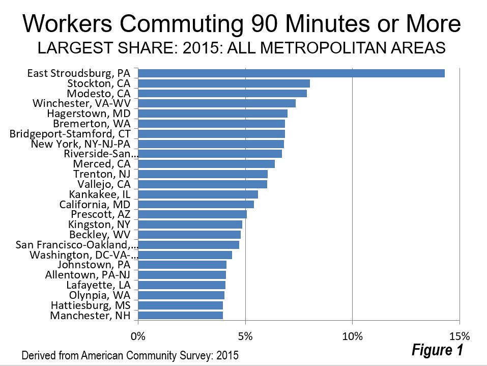
    Despite the frequent portrayal of long commuting as the norm, only 2.2 percent of the nation’s workers travel 90 minutes or more, one way to work. Moreover, that long commuting is concentrated in and near just a few combined statistical areas (CSAs), the larger the larger metropolitan area definition that combines adjacent metropolitan areas like Bridgeport-Stamford with New York, San Jose with San Francisco and Riverside-San Bernardino with Los Angeles. Figure 1 shows that 17 of the 25 metropolitan areas with the largest share of 90-plus minute commuters are in or adjacent to just four combined statistical areas (CSAs).

    Figure 1 shows that 17 of the 25 metropolitan areas with the largest share of 90-plus minute commuters are in or adjacent to just four combined statistical areas (CSAs), the larger metropolitan area region definition that connects places like New Haven County and Fairfield County with New York, San Jose with San Francisco and Riverside-San Bernardino with Los Angeles.

    Seven of the metropolitan areas are in the New York CSA, including New York (NY-NJ-PA), Bridgeport-Stamford (CT), Allentown (PA), Trenton (NJ), Kingston (NY) and East Stroudsburg (PA). The San Francisco CSA has three metropolitan areas among the longest commute metropolitan areas, San Francisco, San Jose and Stockton, as well as adjacent Modesto and Merced. The Washington CSA has four metropolitan areas in the longest 25 commutes, including Washington (DC-VA-MD-WV), California (MD), Hagerstown (MD) and Winchester (VA-WV). Seattle, by far the smallest CSA with more than one metropolitan area in the longest commute CSAs, has two, Bremerton (WA) and Olympia (WA).

    East Stroudsburg (New York CSA) has the largest share of 90 and more minute commuters, at 14.3 percent. Stockton (San Francisco CSA) has the second largest number, a much lower 8.0 percent. Nearby Modesto (adjacent to the San Francisco CSA and a candidate for inclusion after 2020) is at 7.8 percent. Winchester and Hagerstown (Washington CSA) are at 7.3 percent and 7.0 percent respectively.

    None of this is surprising, considering that each of these markets is plagued by urban containment land use policies that force up house prices. Harvard research indicates that domestic migration is being driven by the differential in house prices and people have been leaving the New York, Washington and San Francisco CSAs for other parts of the country. Seattle has done better, simply because its expensive housing is still a bargain compared to the much more onerous house costs in coastal California, from which migrants are being drawn. The trend in long commutes suggests another dimension to the domestic migration story, as households disperse more in the same general area.

    Long Commuting is Expanding

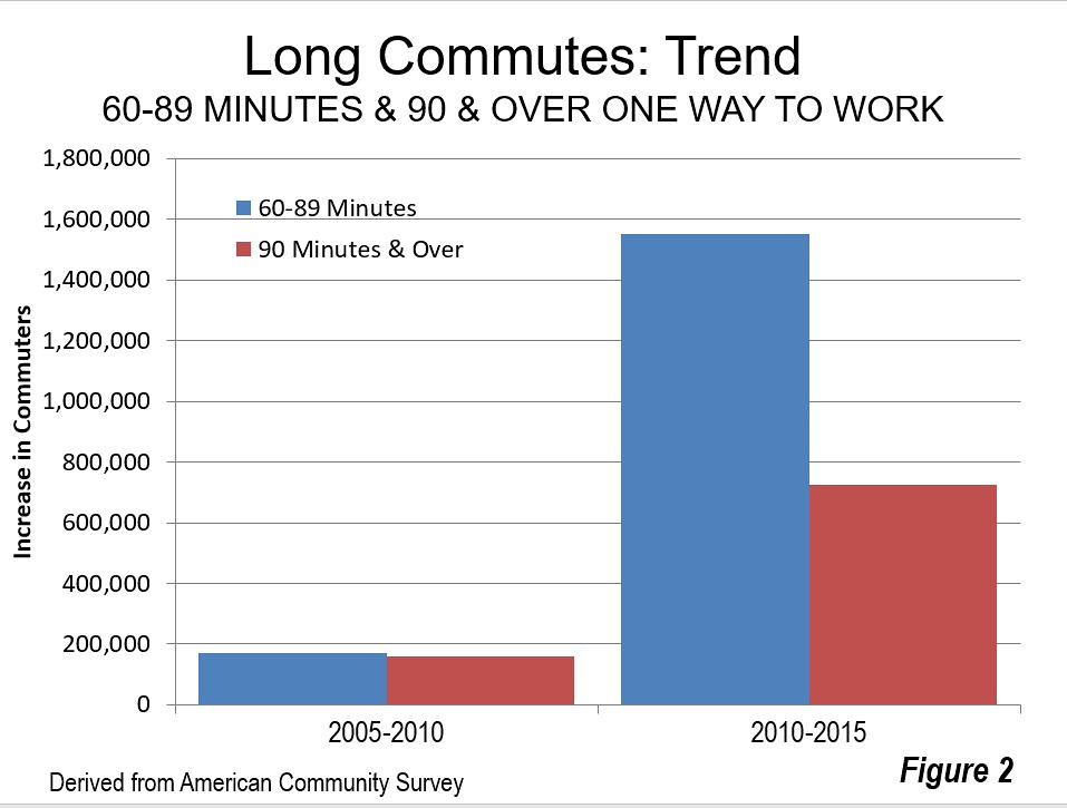
    Further, long commuting is expanding. Between 2005 and 2010, the increases were modest, with a market share rise of 3.0 percent among residents traveling 90 minutes or more to work and 0.3 percent among those traveling from 60 to 89 minutes to work. This is not surprising, given the Great Financial Crisis, which began during that period.

    However, there was a substantial increase in the trend after 2010. Between 2010 and 2015, the share of residents commuting 90 minutes or more increased 725,000, a market share increase of 13.6 percent. There was an increase of 1,550,000 among residents traveling from 60 minutes to 89 minutes, a market share increase of 12.5 percent (Figure 2). This combined increase of nearly 2.3 million 60 minutes plus commuters is substantial. It is more people that commute to work in the San Francisco metropolitan area (not counting those who work at home) and a larger number than the commuters in all but 10 of the nation’s metropolitan areas.

    This continuing dispersion is also indicated in data from the City Sector Model, which shows that suburban and exurban areas continued to attract 80 percent of the new jobs after 2010 (see “America’s Most Suburbanized Cities” and “Suburbs (Continue to) Dominate Jobs and Job Growth”).

    Comparisons by Mode of Travel

    Data by mode of travel is available only at the 60 minutes and over level, and for just 132 of the metropolitan areas. The percentage of those driving alone for 60 or more minutes is lower than the overall 9.0 percent average, at 7.0 percent. Car and van pool commuters are 60 plus commuters 10.7 percent of the time.

    Transit has a far higher level of 60 plus commuting, 38.3 percent at the national level. This is 5.5 times the rate of people driving alone (7.0 percent). While this may be surprising, it is consistent with what is obvious about transit commuting — that it takes about twice as long as commuting by car. And, transit provides scant job access compared to cars, even in the largest, best served metropolitan areas. On average, major metropolitan area resident can reach more than 40 times as many jobs in 30 minutes by car as by transit (the overall one-way work trip travel time is 26 minutes).

    Indeed, among the six metropolitan areas with the “legacy” cores that attract approximately 55 percent of the transit commute destinations in the nation, transit riders much more likely to travel 60 minutes or more to work than those who drive alone. In Philadelphia, the ratio is 3.8, while New York and Chicago transit commuters are 3.6 times as likely to travel 60 minutes or more than those who drive alone. In Boston the figure is 3.1 and San Francisco is 3.0. The smallest difference is in Washington, where transit commuters are only 2.4 times as likely to commute more than one hour than those who drive alone (Figure 3).

    In fact, transit commuters were more likely to travel 60 minutes or more to work than those who drive alone in all of the 53 major metropolitan areas (Table). New York has the largest share of residents commuting 60 minutes or more, at 21.4 percent. Washington is second, at 17.3 percent, San Francisco at 17.0 percent, Riverside-San Bernardino, which is adjacent to Los Angeles, at 16.9 percent and Boston at 14.8 percent. Buffalo, Salt Lake City, Oklahoma City, Kansas City and Milwaukee have the smallest share of their residents traveling 60 minutes or more to work, ranging from 2.5 percent to 2.7 percent.

    More Dispersion?

    The Times article that suggests that the increasing flexibility of companies toward full time working at home could permit people to disperse even more. Despite press reports that working at home is declining, its prospects look good. From 2014 to 2015, working at home experienced the largest increase of any work access mode except driving alone. The increase in work at home was 300,000, while the work at home share rose 5 percent in a single year according to ACS data. Moreover, Global Workplace Analytics reports a 115 percent increase in regular working at home among the non-self employed workforce since 2005, 10 times the increase in the workforce.

    These trends indicate that dispersion is continuing in US metropolitan areas as well as between metropolitan areas, as people seek better standards of living.

    Additional Data

    90 and Over Commute Shares by Metropolitan Area

    60 and Over Commute Shares by Mode by Metropolitan Area

    COMMUTE TIMES 60 & OVER MINUTES BY MODE
    US Major Metropolitan Areas: 2015
    Share by Mode
    All Workers Rank (Longest to Shortest) Drive Alone Transit Transit X Drive Alone
    UNITED STATES 9.0% 7.0% 38.3%          5.46
    Atlanta, GA 13.3%                    7 12.1% 40.5%          3.36
    Austin, TX 7.2%                  24 6.5% 27.9%          4.32
    Baltimore, MD 12.0%                    9 9.5% 46.2%          4.85
    Birmingham, AL 6.5%                  31 5.7% 30.0%          5.31
    Boston, MA-NH 14.8%                    5 11.8% 36.6%          3.11
    Buffalo, NY 3.4%                  53 2.5% 18.0%          7.21
    Charlotte, NC-SC 7.1%                  26 6.3% 33.7%          5.38
    Chicago, IL-IN-WI 14.4%                    6 11.0% 38.7%          3.50
    Cincinnati, OH-KY-IN 4.8%                  42 4.1% 31.7%          7.68
    Cleveland, OH 4.9%                  41 3.7% 33.0%          9.00
    Columbus, OH 4.2%                  46 3.7% 25.1%          6.80
    Dallas-Fort Worth, TX 8.7%                  16 7.7% 43.6%          5.65
    Denver, CO 7.8%                  21 6.2% 38.0%          6.18
    Detroit,  MI 6.8%                  30 6.1% 42.5%          6.95
    Grand Rapids, MI 4.3%                  45 3.6% 25.5%          7.04
    Hartford, CT 5.0%                  38 4.5% 23.0%          5.09
    Houston, TX 11.9%                  10 11.0% 39.0%          3.55
    Indianapolis. IN 5.0%                  39 4.6% 39.4%          8.64
    Jacksonville, FL 5.6%                  34 4.6% 39.6%          8.56
    Kansas City, MO-KS 3.6%                  50 3.2% 21.1%          6.51
    Las Vegas, NV 4.6%                  43 2.5% 45.9%        18.65
    Los Angeles, CA 12.5%                    8 10.8% 40.6%          3.77
    Louisville, KY-IN 4.4%                  44 3.6% 31.3%          8.60
    Memphis, TN-MS-AR 3.8%                  48 3.3% 37.1%        11.25
    Miami, FL 10.0%                  13 8.3% 43.1%          5.23
    Milwaukee,WI 3.8%                  49 2.7% 27.2%          9.89
    Minneapolis-St. Paul, MN-WI 5.5%                  37 4.5% 21.2%          4.68
    Nashville, TN 8.2%                  18 7.7% 29.6%          3.84
    New Orleans. LA 7.9%                  20 6.7% 37.9%          5.64
    New York, NY-NJ-PA 21.4%                    1 11.9% 42.1%          3.54
    Oklahoma City, OK 3.6%                  51 3.1% 7.5%          2.40
    Orlando, FL 6.9%                  28 5.6% 42.8%          7.66
    Philadelphia, PA-NJ-DE-MD 11.4%                  12 9.0% 33.8%          3.78
    Phoenix, AZ 6.8%                  29 5.3% 41.9%          7.95
    Pittsburgh, PA 8.0%                  19 7.3% 20.3%          2.77
    Portland, OR-WA 7.4%                  23 5.2% 28.9%          5.59
    Providence, RI-MA 9.1%                  15 7.3% 54.7%          7.47
    Raleigh, NC 6.0%                  32 5.0% 42.8%          8.61
    Richmond, VA 4.9%                  40 4.0% 33.1%          8.17
    Riverside-San Bernardino, CA 16.9%                    4 15.0% 48.5%          3.25
    Rochester, NY 4.0%                  47 3.1% 32.7%        10.43
    Sacramento, CA 7.6%                  22 6.5% 34.7%          5.37
    St. Louis,, MO-IL 5.8%                  33 4.6% 36.3%          7.85
    Salt Lake City, UT 3.5%                  52 2.1% 23.3%        11.34
    San Antonio, TX 6.9%                  27 5.8% 41.5%          7.17
    San Diego, CA 7.2%                  25 5.6% 37.5%          6.73
    San Francisco-Oakland, CA 17.0%                    3 12.5% 37.2%          2.97
    San Jose, CA 9.4%                  14 7.5% 48.1%          6.43
    Seattle, WA 11.8%                  11 8.9% 33.6%          3.78
    Tampa-St. Petersburg, FL 8.4%                  17 7.9% 33.2%          4.22
    Tucson, AZ 5.5%                  36 3.7% 29.5%          7.99
    Virginia Beach-Norfolk, VA-NC 5.6%                  35 4.8% 40.1%          8.35
    Washington, DC-VA-MD-WV 17.3%                    2 13.9% 35.7%          2.57
    Derived from American Community Survey, 2015

    Wendell Cox is principal of Demographia, an international public policy and demographics firm. He is a Senior Fellow of the Center for Opportunity Urbanism (US), Senior Fellow for Housing Affordability and Municipal Policy for the Frontier Centre for Public Policy (Canada), and a member of the Board of Advisors of the Center for Demographics and Policy at Chapman University (California). He is co-author of the “Demographia International Housing Affordability Survey” and author of “Demographia World Urban Areas” and “War on the Dream: How Anti-Sprawl Policy Threatens the Quality of Life.” He was appointed to three terms on the Los Angeles County Transportation Commission, where he served with the leading city and county leadership as the only non-elected member. He served as a visiting professor at the Conservatoire National des Arts et Metiers, a national university in Paris.

    Photograph: New Jersey Transit Commuter Train (by author)

  • Ontario’s Labor & Housing Policies: US Midwest Opportunities?

    The Globe and Mail, a Canadian national newspaper, reports concerns raised by Magna International, Inc. that proposed provincial labor legislation (the “Fair Workplaces Better Jobs Act”) could result in seriously reduced economic competitiveness for Ontario, Canada’s most populous province (“Magna says new Ontario labour bill threatens jobs, investment”). Ontario accounts for about 40 percent of the Canadian economy and has approximately twice the gross domestic product of second ranking Québec. Magna is Canada’s largest employer in the automotive sector, which The Globe and Mail characterizes as “one of a handful of homegrown Canadian companies that have risen to the status of global giants.”

    Magna told the provincial parliamentary standing committee on finance that “For the first time in our 60 year history, we find ourselves in the very untenable position questioning whether we will be able to operate at historical levels in this province.” Stressing the need to remain competitive, the company added: “This is especially important when our main competitor to the south is working harder than ever to reduce costs, regulatory burdens and promote business efficiency and productivity. From our perspective, the province of Ontario seems to be moving in the opposite direction.”

    The proposed legislation would increase mandatory annual vacation and personal leave requirements and increase the minimum wage. The legislation would also reduce work scheduling flexibility. This would, according to Magna, make the “just in time” production “impossible,” in a North American industry that has used the practice to compete more effectively. According to Automotive News, Magna noted the difficulty of manufacturing where it calls the cost of electricity, payroll and pension costs and the provincial “cap and trade” policy are among the highest in the G-7. Magna said that the “Fair Workplaces Fair Jobs Act” is “extremely one-sided.

    At the same time that Ontario seems poised to make business investment more difficult, some key nearby US states are doing the opposite. Michigan, Indiana and Kentucky, all on the NAFTA Highway (Interstate 69) have enacted voluntary unionism laws (called “right to work”). Ohio has reduced taxes among the most of any state over the past five years. None of these states seems inclined to follow Ontario’s example. Another nearby regulation liberalizing state, Wisconsin (where voluntary unionism was also enacted), has just won the $10 billion first US plant to be built by China’s large electronics contractor Foxconn, edging out Ohio.

    Becoming Less Competitive: Ontario’s Housing Regulation

    Ontario’s competition threatening actions are not limited to business and labor policy. Land-use and housing policies are also making Ontario less competitive, first in the Toronto metropolitan area and now spreading across the province. About a decade ago, the province imposed its “Places to Grow” program that not one, but two urban containment boundaries. The highly publicized Greenbelt designates a huge swath of land on which development is not permitted.

    Then there is the second urban containment boundary, the “settlement boundary,” which largely ensures that new development is limited to a far smaller area around the urbanization, further intensifying the price-escalating impact of the Greenbelt. In this crazy quilt of regulation, land owners operate in a sellers’ market, able to drive prices up for their scarce holdings, to the detriment of home buyers. This environment is particularly welcome to speculators. Consistent with the fundamentals of economics, urban containment boundaries lead to higher land prices where new housing is permitted, and higher house prices.

    The procedures for supplying sufficient new greenfield development land require amendments of official community plans, a slow and cumbersome bureaucratic process. It is not surprising that Mattamy Homes Founder and CEO Peter Gilgin told Bloomberg that despite his largest homebuilding firm in the Toronto area having plenty of land for new houses, the necessary approvals are very difficult to obtain.

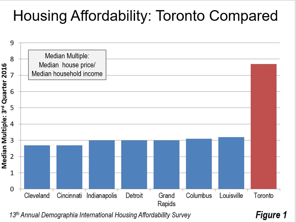
    The effects on house prices have been dramatic. In 2004, Toronto’s median house price was 3.9 times its median household income (median multiple). At that point, it had actually been reduced from 4.3 in 1971 and had hovered around 3.5 in the intervening years. According to the 13th Annual Demographia International Housing Affordability Survey, by 2016 house prices virtually doubled relative to incomes, with a median multiple of 7.7. This means a lower standard of living and greater relative poverty.

    Meanwhile, the house price increases are spreading from Toronto to nearby metropolitan areas. For example, house prices in Kitchener – Waterloo, Canada’s “Silicon Valley” rose 40 percent in the single year ended April 2017. This is nearly double the rate of Toronto that over the same period.

    The most recent domestic migration data indicates that people are moving out of the Toronto metropolitan area in droves. Since the 2011 census, more than 125,000 more people have left the Toronto area for other parts of Ontario that have moved in. This is the same dynamic apparent in the United States, where differentials in housing affordability have been cited as a principal reason for domestic migration gains and losses, as households flee from higher cost to lower-cost areas.

    A recently imposed foreign buyers tax led to somewhat lower prices in the Toronto area last year, but they are still 6.3 percent above a year ago and rising at a rate three times that of average earnings. Without restoring the competitive market for land on the periphery, it is likely that house prices will continue rising relative to incomes, to the detriment, in particular, of younger households.

    Meanwhile, house prices are substantially lower in US states nearby Ontario. As late as the mid-2000’s, there was little difference between the housing affordability across Ontario, including Toronto, and the Michigan, Ohio, Indiana and Kentucky. That is no longer the case.

    Immigration laws, however, do not permit the free movement of labor across the Canadian-US border, so there is no likelihood that Ontarians will move to the United States for lower cost housing. But capital is far more mobile. Companies that develop new business locations, especially manufacturing, often locate where they can maximize returns for their shareholders. Moreover, companies establishing new facilities are also interested in their employees being able to live close enough to commute to the plant.

    Figure 1 shows the metropolitan area housing affordability, measured by the median multiple, for Toronto, as well as major metropolitan areas in the four nearby states. Residents of Cleveland and Cincinnati pay nearly two-thirds less of their income for their houses than do residents of Toronto. In Indianapolis, Detroit, Grand Rapids, Columbus and Louisville, residents pay approximately 60 percent less for their houses than in Toronto. Meanwhile, no one should confuse the sometimes characterized as decrepit city of Detroit, reeling from decades of misgovernance, with its leafy suburbs, where 85 percent of the metropolitan area’s people live.

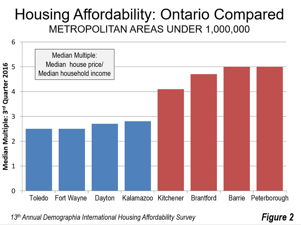
    Figure 2 indicates that things are a bit better among other Greater Golden Horseshoe metropolitan areas. Residents pay from 4.7 to 5.0 times their incomes in Brantford, Barrie and Peterborough. This is still up to double the 2.5 times incomes that residents pay in Toledo (Ohio) and Fort Wayne (Indiana). House prices are slightly higher in Dayton and Kalamazoo, but still at least than 40 percent below the three Ontario metropolitan areas.

    The Need for Competitive Policies

    Maintaining economic growth and the standard of living is important to Ontario’s 14 million people. At the same time, the world is becoming more competitive. Ontario needs to be careful, or economic development departments from across the increasingly competitive states of the Midwest could reap a harvest in business investment and jobs.

    Wendell Cox is principal of Demographia, an international public policy and demographics firm. He is a Senior Fellow of the Center for Opportunity Urbanism (US), Senior Fellow for Housing Affordability and Municipal Policy for the Frontier Centre for Public Policy (Canada), and a member of the Board of Advisors of the Center for Demographics and Policy at Chapman University (California). He is co-author of the “Demographia International Housing Affordability Survey” and author of “Demographia World Urban Areas” and “War on the Dream: How Anti-Sprawl Policy Threatens the Quality of Life.” He was appointed to three terms on the Los Angeles County Transportation Commission, where he served with the leading city and county leadership as the only non-elected member. He served as a visiting professor at the Conservatoire National des Arts et Metiers, a national university in Paris.

    Photograph: Pearson International Airport (Mississauga, Brampton and Toronto), Canada’s Largest employment centre (by author)

  • Still Set to Depopulate, Japan Raises Long Term Population Projection

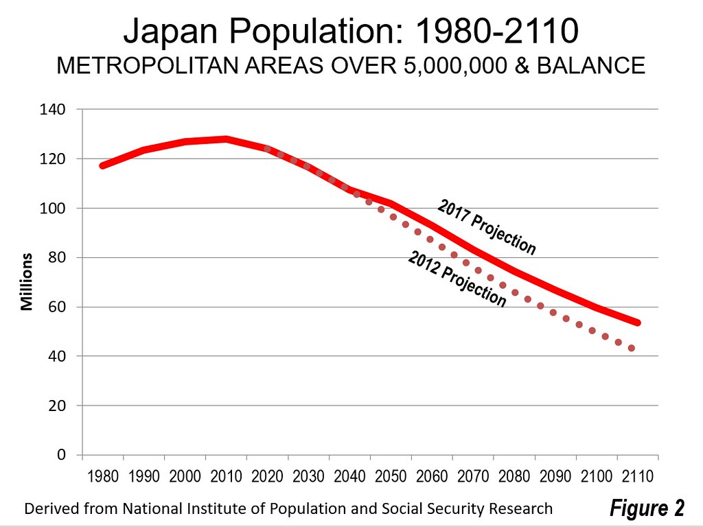
    Japan is well known for its huge expected population loss, likely to be the greatest in the world for a major nation by the end of the century. However, things do not look as bleak as they did just five years ago. The National Institute of Population and Social Security Research (Japan) just released its 100 year population national projections based upon the results of the 2015 census, which is an update of the 2012 projections based on the 2010 census. The projections are virtually identical until 2040, when Japan’s population is expected to be approximately 107 million, down from the 2015 level of 127 million. After that time, however, the population loss is expected to moderate. By 2110, the population under the medium fertility/medium mortality scenario is projected to be 53.4 million, down more than 70 million from the 2010 peak of 128 million (Figure 1). This is more than 10 million higher than projections released in 2012, which anticipated 42.9 million residents in 2110, approximately equal to the population of the Nagoya metropolitan area (prefecture based).

    The Largest Cities

    Projections are not available beyond 2040 below the national level. However, the latest 2040 prefectural population projections, based on the 2010 census, give an idea of how the loss is likely to be distributed in the early years.

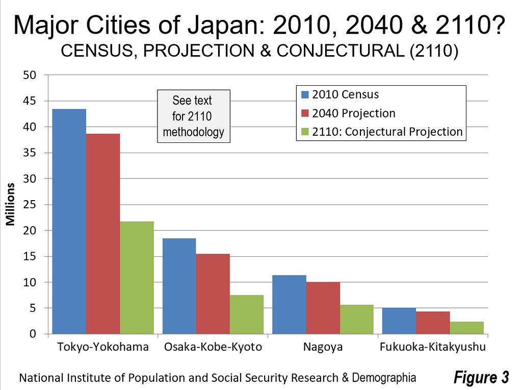
    Japan has four cities (metropolitan areas) with more than 5 million residents that can be roughly delineated by prefectural boundaries, Tokyo – Yokohama, Osaka – Kobe – Kyoto, Nagoya and Fukuoka –Kitakyushu. These areas are expected to do much better in future population trends than the rest of the nation.

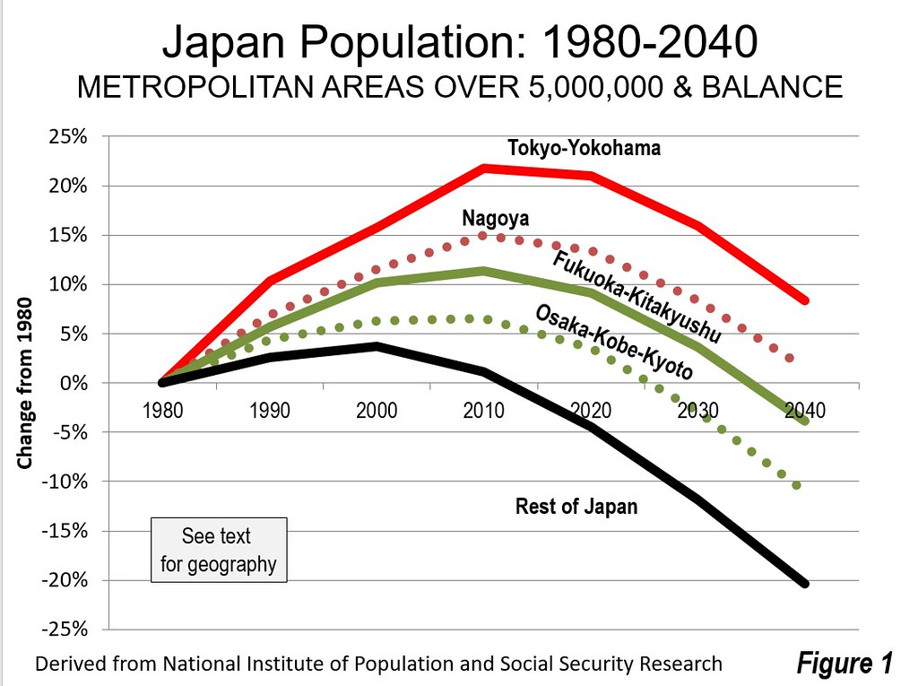
    Figure 2 provides a comparison of the actual populations from 1980 to 2010 for these cities, along with projections to 2040. Tokyo – Yokohama retains the largest share of its population, falling 11.0 percent from its peak. This includes the prefectures of Tokyo, Kanagawa, Saitama, Chiba, Ibaraki, Toshigi, Gunma and Yamanishi. In 1980, Tokyo – Yokohama had a population of 36.7 million, which rose to 43.5 million in 2010 and is expected to fall to 38.7 million by 2040.

    With strong growth continuing in places like Jakarta, Delhi and Manila, it seems unlikely that Tokyo – Yokohama will retain its “largest city in the world” status. Guanghou – Foshan – Shenzhen – Dongguan and the rest of the Pearl River Delta may also emerge as a larger metropolitan area should high levels of commuting develop (metropolitan areas are normally delineated by commuting patterns).

    The second largest city, Osaka – Kobe – Kyoto is expected to do more poorly, with the loss of 16.5 percent. Osaka – Kobe – Kyoto includes the prefectures of Osaka, Hyogo, Kyoto and Nara. In 1980, Osaka – Kobe – Kyoto had a population of 17.4 million, which rose to 18.5 million in 2010 and is expected to fall to 15.4 million by 2040.

    Nagoya, the third largest city, does nearly as well as Tokyo – Yokohama, losing 11.7 percent of its population. This includes the prefectures of Aichi, Gifu and Mie. In 1980, Nagoya had a population of 9.8 million, which rose to 11.3 million in 2010 and is expected to fall to 10.0 million by 2040.

    Fukuoka – Kitakyushu (Fukuoka prefecture) is expected to lose 13.7 percent of its population between 2010 and 2040. In 1980, Fukuoka – Kitakyushu had a population of 4.6 million, which rose to 5.1 million in 2010 and is expected to fall to 4.4 million by 2040.

    The population losses in the rest of the nation are expected to be more severe, at 21.2 percent. Outside the four largest cities, there was a 1980 population of 54.1 million, which rose to 54.8 million in 2010 and is expected to fall to 43.1 million by 2040.

    2040 Prefecture Projections

    Among the country’s 47 prefectures, only two are outside the four largest cities. Okinawa would lose the least population, 2.9 percent (Table). Shiga, which is sandwiched between Osaka – Kobe – Kyoto and Nagoya would have the second lowest population loss at 7.8 percent, just above that of Tokyo Prefecture, which is at the core of Tokyo-Yokohama. Fourth ranked Aichi is the core prefecture of Nagoya. Kanagawa and Saitama are in Tokyo – Yokohama, and Fukuoka includes Fukuoka – Kitakyushu. Chiba is in Tokyo – Yokohama, ninth-ranked Myagi includes the large city of Sendai, with 10th-ranked Kyoto being a part of the Osaka – Kobe – Kyoto metropolitan area. Osaka, the core prefecture of Osaka – Kobe – Kyoto ranks 12th. Generally, the core areas are expected to retain their population better than the more outlying areas.

    The prefectures with the largest losses tend to be more rural. The greatest losses are projected to be in on the northern part of Honshu (the main island), in Akita (31.6 percent), Amore (28.6 percent) and Iwate (25.9 percent). Kochi, on the island of Shikoku would have the third greatest loss, at 26.5 percent (See Japan Prefecture map – Figure 3).

    Conjectural Projections

    A “what if” analysis was performed to conjecture about what Japan might look like below the national level by 2110, when its 53 million population is projected to be nearly 60 percent below the 2010 peak. A population change factor was computed averaging the share of population losses for each prefecture from 2020 to 2040 and the overall share of the population expected to be in each prefecture in 2040.

    The “what if” scenario suggests that population losses in each of the largest cities will be more than 50 percent from 2010, the population losses in Tokyo-Yokohama and Nagoya would be just under 50 percent. Fukuoka – Kitakyushu would lose 54 percent, while Osaka – Kobe – Kyoto would drop nearly 60 percent (Figure 4). Each of these, however, would be far better than the rest of the nation, with a decline of nearly 70 percent.

    However, at the prefectural level, prefectures without larger cities would drop even more (Table). Only Okinawa, Shiga, Tokyo, Aichi and Kanagawa would lose less than half their population. At the other end of the scale, Akita, Amore, Kochi and Iwate would lose 80 to 90 percent of their population.

    However, the population loss is distributed. The Japan of 2110 is likely to be radically different than today. At the same time, population projections are no more than projections and no one can know the future for sure. But Japan seems likely to face serious challenges from population losses in the decades to come, perhaps a harbinger of what can happen in an increasingly post-familial world.

    By Tokyoship (Own work) [Public domain], via Wikimedia Commons

    Japan: Population by Prefecture 2010 to 2040 Projection and 2110
    Rank Prefecture 2010 Census 2040 Projection Change from 2010 2110 Comectural Change from 2010
    1 Okinawa 1.393 1.369 -2.9% 0.950 -31.8%
    2 Shiga 1.411 1.309 -7.8% 0.813 -42.4%
    3 Tokyo 13.159 12.308 -7.8% 7.606 -42.2%
    4 Aichi 7.411 6.856 -8.2% 4.199 -43.3%
    5 Kanagawa 9.048 8.343 -8.8% 5.004 -44.7%
    6 Saitama 7.195 6.305 -12.5% 3.397 -52.8%
    7 Fukuoka 5.072 4.379 -13.2% 2.339 -53.9%
    8 Chiba 6.216 5.358 -13.5% 2.790 -55.1%
    9 Miyagi 2.348 1.973 -14.4% 1.003 -57.3%
    10 Kyoto 2.636 2.224 -15.0% 1.116 -57.7%
    11 Hiroshima 2.861 2.391 -15.4% 1.191 -58.4%
    12 Osaka 8.865 7.454 -15.4% 3.670 -58.6%
    13 Ishikawa 1.170 0.974 -15.5% 0.484 -58.6%
    14 Hyogo 5.588 4.674 -15.5% 2.303 -58.8%
    15 Okayama 1.945 1.611 -15.8% 0.796 -59.1%
    16 Tochigi 2.008 1.643 -16.7% 0.778 -61.2%
    17 Ibaraki 2.970 2.423 -17.1% 1.127 -62.1%
    18 Mie 1.855 1.508 -17.2% 0.704 -62.0%
    19 Gunma 2.008 1.630 -17.3% 0.756 -62.4%
    20 Kumamoto 1.817 1.467 -17.4% 0.687 -62.2%
    21 Saga 0.850 0.680 -17.8% 0.313 -63.1%
    22 Shizuoka 3.765 3.035 -17.9% 1.368 -63.7%
    23 Oita 1.197 0.955 -18.3% 0.429 -64.1%
    24 Gifu 2.081 1.660 -18.5% 0.733 -64.8%
    25 Miyazaki 1.135 0.901 -18.7% 0.398 -64.9%
    26 Fukui 0.806 0.633 -19.3% 0.272 -66.3%
    27 Nara 1.401 1.096 -20.0% 0.447 -68.1%
    28 Nagano 2.152 1.668 -20.2% 0.689 -68.0%
    29 Kagawa 0.996 0.773 -20.2% 0.317 -68.2%
    30 Kagoshima 1.706 1.314 -20.3% 0.546 -68.0%
    31 Yamanashi 0.863 0.666 -20.5% 0.271 -68.6%
    32 Toyama 1.093 0.841 -20.9% 0.331 -69.7%
    33 Hokkaido 5.506 4.190 -21.8% 1.558 -71.7%
    34 Niigata 2.374 1.791 -22.0% 0.671 -71.7%
    35 Tottori 0.589 0.441 -22.2% 0.165 -72.0%
    36 Ehime 1.431 1.075 -22.3% 0.397 -72.3%
    37 Fukushima 2.029 1.485 -22.3% 0.491 -75.8%
    38 Nagasaki 1.427 1.049 -23.5% 0.363 -74.6%
    39 Yamaguchi 1.451 1.070 -23.5% 0.369 -74.6%
    40 Shimane 0.717 0.521 -24.2% 0.174 -75.7%
    41 Tokushima 0.785 0.571 -24.4% 0.185 -76.4%
    42 Yamagata 1.169 0.836 -25.1% 0.263 -77.5%
    43 Wakayama 1.002 0.719 -25.2% 0.222 -77.8%
    44 Iwate 1.330 0.938 -25.9% 0.273 -79.5%
    45 Kochi 0.764 0.537 -26.5% 0.151 -80.3%
    46 Aomori 1.373 0.932 -28.6% 0.211 -84.6%
    47 Akita 1.086 0.700 -31.6% 0.109 -90.0%
    2010 and 2040 data from the National Institute for Population & Social Security Research
    2110 dsta from Demographia. See text.

    Wendell Cox is principal of Demographia, an international public policy and demographics firm. He is a Senior Fellow of the Center for Opportunity Urbanism (US), Senior Fellow for Housing Affordability and Municipal Policy for the Frontier Centre for Public Policy (Canada), and a member of the Board of Advisors of the Center for Demographics and Policy at Chapman University (California). He is co-author of the “Demographia International Housing Affordability Survey” and author of “Demographia World Urban Areas” and “War on the Dream: How Anti-Sprawl Policy Threatens the Quality of Life.” He was appointed to three terms on the Los Angeles County Transportation Commission, where he served with the leading city and county leadership as the only non-elected member. He served as a visiting professor at the Conservatoire National des Arts et Metiers, a national university in Paris.

    Photo: Fukuoka (by author)

  • Moving Away from Toronto and Montréal

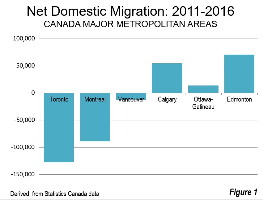
    The latest Statistics Canada data indicates that people are leaving Toronto and Montréal in large numbers since the 2011 census. Even so, both metropolitan areas continued to grow through the 2016 census as a result of net international migration and the natural increase of births over deaths (Figure 1). It turns out that Canada’s urban pattern is much more like that of the US, as well as other high-income countries, than many may suppose.

    Toronto

    Toronto lost 128,000 net domestic migrants, while Montréal lost 89,000 representing 2.3 percent of its total 2011 population.

    At the same time, the migration has been regional rather than national. In the case of Toronto, more than 90 percent of the net migration loss was to other areas of Ontario (118,000), as opposed to other provinces (10,000). The metropolitan area losses were concentrated in the city of Toronto, which lost a net 119,000 domestic migrants, while the suburbs lost 9,000. The city’s loss of 4.5 percent was nearly double that of the metropolitan area and 15 times that of the suburbs.

    Despite the late 1990s municipal amalgamation that increased the population of the city by three times, Toronto has become a majority suburban metropolitan area. The city of Toronto now has fallen to 46 percent of the population from 53 percent in 2001.

    Part of the metropolitan area loss is likely the result of Toronto’s higher house prices and shortage of single family homes that people prefer (see: Ryerson University Research Cites Urban Containment Policy as Major Factor in Toronto House Price Escalation), with nearby metropolitan areas experiencing strong net domestic migration gains. Up to one-half of Toronto’s loss may have been picked up by Oshawa (16,000), Hamilton (12,000), St. Catharine’s-Niagara (8,000), Barrie (7,000), Guelph (4,000), Brantford (4,000) Kitchener-Cambridge-Waterloo (1,000) and Peterborough (1,000), which are served by the commuter rail or bus services of Go Transit (Metrolinx).

    Moreover, with its highly dispersed employment patterns, commuters from exurban metropolitan areas can find employment much closer to home than downtown Toronto, with its less than 15 percent of metropolitan employment. A few years ago, it was reported that the largest employment center in Canada was the sprawling area around Pearson International Airport (Toronto-Missassauga-Brampton), rather than downtown Toronto. Meanwhile, the Kitchener-Cambridge-Waterloo area has emerged as Canada’s answer to Silicon Valley.

    Montréal

    Things were similar in Montréal, which lost 89,000 net domestic migrants, also representing 2.3 percent of its 2011 population. Unlike Toronto, Montréal’s loss was evenly split, with 45,000 moving out of Quebec and 44,000 moving to other parts of Québec.

    The concentration of net domestic migration losses were even more concentrated in the core than in Toronto. The ville de Montréal lost 117,000 net domestic migrants, while the suburbs gained 28,000. The ville’s loss of 7.0 percent was three times the rate of the total metropolitan area.

    Vancouver

    Vancouver, the third largest metropolitan area, also lost domestic migrants (12,000) at a rate of 0.5 percent relative to its 2011 population. Vancouver gained 10,000 net domestic migrants from other provinces, while losing 22,000 to other parts of British Columbia. Kelowna and Victoria appear to have prospered at Vancouver’s expense, both adding a 7,000 net intraprovincial migrants.

    Alberta: Calgary and Edmonton

    As has been the case for years, Alberta’s two largest metropolitan areas have led the national statistics. Calgary, the fourth largest metropolitan area added 55,000 net domestic migrants between 2011 and 2016. Much of this 4.6 percent gain was from other provinces (41,000). With the recent oil bust, which has hit Alberta hard, net interprovincial migration dropped from 7,000 in 2014-2015 to minus 1,000 in 2015-2016.

    Edmonton, Alberta’s second largest metropolitan area and Canada’s sixth largest, added even more net domestic migrants (72,000), for the strongest performance in the country. This 6.2 percent gain was also concentrated in people from outside the province (48,000). As in Calgary, net interprovincial migration fell strongly from 2014-2015 to 2015-2016, from 10,000 to 2,000.

    It remains to be seen how the recovering energy industry will impact the economy and migration trends in Alberta.

    Ottawa-Gatineau

    Ottawa-Gatineau (Ontario- Québec) has Canada’s capital and is the only major metropolitan area that spans two provinces. Ottawa-Gatineau is Canada’s fifth largest metropolitan area although likely to be overtaken almost at any time by faster growing Edmonton. Ottawa-Gatineau gained 14,000 net domestic migrants between 2011 and 2016 (1.1 percent). Most of the net domestic migration was from other parts of Ontario or Québec (10,000).

    Smaller Census Metropolitan Areas

    Among the other 27 census metropolitan areas that had been designated by the 2011 census, the largest percentage gain was in Kelowna, BC, at 8.4 percent. Saint John, New Brunswick had the largest net domestic migration loss at minus 3.5 percent.

    Overall Results

    Approximately two thirds of Canada’s population resides in the census metropolitan areas. Between 2011 and 2016, there was a net domestic migration of only 17,000 from outside the metropolitan areas (Table). Among the six major metropolitan areas, there was a net domestic migration loss of 89,000, probably driven in large measure by the “severely” or “seriously” unaffordability of housing virtually everywhere but Ottawa-Gatineau. While new metropolitan areas are likely to be designated (like Lethbridge, Alberta since 2011), it may be that there will be little additional net domestic migration to the largest metropolitan areas, and what will occur is largely in the suburbs.

    Net Domestic Migration: Canada Metropoltian Areas: 2011-2016
    Census Metropolitan Area 2016 Census Population Net Domestic Migration % of 2011 Population
    Toronto, Ontario      5,928,040         (128,432) -2.3%
    Montréal, Quebec      4,098,927           (88,913) -2.3%
    Vancouver, British Columbia      2,463,431           (11,928) -0.5%
    Calgary, Alberta      1,392,609             55,415 4.6%
    Ottawa-Gatineau, Ontario/Quebec      1,323,783             14,119 1.1%
    Edmonton, Alberta      1,321,426             71,620 6.2%
    Québec, Quebec         800,296               2,683 0.3%
    Winnipeg, Manitoba         778,489           (17,812) -2.4%
    Hamilton, Ontario         747,545             12,208 1.7%
    Kitchener-Cambridge-Waterloo, Ontario         523,894               1,390 0.3%
    London, Ontario         494,069               4,534 1.0%
    St. Catharines-Niagara, Ontario         406,074               8,030 2.0%
    Halifax, Nova Scotia         403,390               2,926 0.7%
    Oshawa, Ontario         379,848             16,028 4.5%
    Victoria, British Columbia         367,770             17,647 5.1%
    Windsor, Ontario         329,144                  (48) 0.0%
    Saskatoon, Saskatchewan         295,095               8,672 3.3%
    Regina, Saskatchewan         236,481               2,004 0.9%
    Sherbrooke, Quebec         212,105               1,792 0.9%
    St. John’s, Newfoundland and Labrador         205,955               7,949 4.0%
    Barrie, Ontario         197,059               6,943 3.7%
    Kelowna, British Columbia         194,882             15,171 8.4%
    Abbotsford-Mission, British Columbia         180,518               2,952 1.7%
    Greater Sudbury, Ontario         164,689             (1,285) -0.8%
    Kingston, Ontario         161,175               5,572 3.5%
    Saguenay, Quebec         160,980                (782) -0.5%
    Trois-Rivières, Quebec         156,042               2,721 1.8%
    Guelph, Ontario         151,984               3,384 2.4%
    Moncton, New Brunswick         144,810               2,425 1.7%
    Brantford, Ontario         134,203               3,603 2.7%
    Saint John, New Brunswick         126,202             (4,512) -3.5%
    Peterborough, Ontario         121,721               1,394 1.2%
    Thunder Bay, Ontario         121,621                (330) -0.3%
    Total    24,724,257             17,140 0.1%
    Derived from Statistics Canada data


    Wendell Cox is principal of Demographia, an international public policy and demographics firm. He is a Senior Fellow of the Center for Opportunity Urbanism (US), Senior Fellow for Housing Affordability and Municipal Policy for the Frontier Centre for Public Policy (Canada), and a member of the Board of Advisors of the Center for Demographics and Policy at Chapman University (California). He is co-author of the “Demographia International Housing Affordability Survey” and author of “Demographia World Urban Areas” and “War on the Dream: How Anti-Sprawl Policy Threatens the Quality of Life.” He was appointed to three terms on the Los Angeles County Transportation Commission, where he served with the leading city and county leadership as the only non-elected member. He served as a visiting professor at the Conservatoire National des Arts et Metiers, a national university in Paris.

    Photo: Photo: Old City Hall, Toronto (by author)

  • Canada at 150: Perspectives

    Canada and the United States have lived together in peace for more than two centuries, since the War of 1812. Yet, it has not always been easy.

    Elephants provided one of the most graphic descriptions of the two nations living together. There are no elephants in Canada, at least not in the wild. But according to Canada’s third longest serving prime minister, Pierre Elliot Trudeau, there is a big one close by. The Prime Minister characterized Canada’s relationship with the United States in his March 25, 1969 speech to the Washington Press Club (at 1:40 in this Canadian Broadcasting Corporation video clip):

    “Living next to you is in some ways like sleeping with an elephant. No matter how friendly and even-tempered is the beast, if I can call it that, one is affected by every twitch and grunt.”

    Trudeau was the late father of Justin Trudeau, who today is Canada’s 23rd Prime Minister.

    I have always had great admiration for Canada. Perhaps that is because I lived there three years in my formative youth. This article contains some perspectives on Canada that may not be familiar to non-Canadians and perhaps to even some Canadians.

    Canada 150

    Canada is celebrating its 150th anniversary. Canada Day is July 1. On that day in 1867, the British North America Act came into effect. The Act created the Dominion of Canada, a union (confederation) between the province of Canada (which was divided into the provinces of Ontario and Québec) and the colonies of Nova Scotia and New Brunswick, which became provinces. All of this could be traced back to a 1864 conference in Charlottetown, now the capital of Prince Edward Island, which itself did not join the confederation until 1873.

    Like the United States, Canada is a former British colonial holding. Yet there are significant differences. For example, the manner of its separation from the “mother country” could not be more different.

    For the United States, the break was complete and relatively quick. After the July 4, 1776 Declaration of Independence and a war that lasted from 1775 to 1783, the separation was complete.

    When Did Canada Become Sovereignty?

    There is no question today of Canada’s sovereignty — it is a sovereign nation like the United States, China or Japan. Yet Canada seems to have evolved into sovereignty, over many years. Just when did Canada become independent? Opinions vary by 115 years.

    A poll by the Ottawa Citizen found considerable disagreement among Canadians. The majority, 74 percent said that it was 150 years ago, the effective date of the British North America Act (1867). The signing of the Canada Act by Prime Minister Pierre Trudeau and Queen Elizabeth in 1982 got the second most mentions, at 14 percent. And, other dates were mentioned.

    But both dates are unconvincing, according to Professor Jack Jebwab, formerly at one of Canada’s most prestigious universities (McGill University in Montréal) and now president of the Association for Canadian Studies, cites a 1967 Supreme Court decision of Canada, which stated that “sovereignty was acquired in the period between its separate signature of the Treaty of Versailles in 1919 and the Statute of Westminster” (1931).

    Jebwab says that Canada became neither independent nor sovereign in 1867, noting that the meaning of “dominion” was a British Empire term for “semi-independent entities.” The British Parliament, he says, could legislate on Canadian affairs and “override” any local legislation.

    He says that “Identifying the precise date when Canada achieved its independence is not easy.” Jebwab cites a leading constitutional expert Frank Scott to the effect that “at no time prior to the Second World War was the full international personality of the Dominion, as distinct from Great Britain, established beyond equivocation.”

    The Statute of Westminster (1931), which was a “British law clarifying the powers of Canada’s Parliament and those of the other Commonwealth Dominions. It granted these former colonies full legal freedom except in those areas where they chose to remain subordinate to Britain,” according to The Canadian Encyclopedia. This certainly seems to suggest that Canada could have been independent in 1931 if it chose to be. The Statute covered not only the Dominion of Canada, but also the Dominions of Australia, New Zealand, the Irish Free State, South Africa and Newfoundland (now Newfoundland and Labrador, one of Canada’s provinces).

    With respect to the 1982 act, Professor Jebwab notes: “Only with that act was a process introduced that permitted the amending of Canada’s basic constitutional laws without action by the British Parliament, and it declared that no British law passed thereafter would apply to Canada.”

    The Expansion of Canada

    From its beginnings with four provinces (Ontario, Quebec, New Brunswick and Nova Scotia), Canada expanded to 10 provinces and three territories. Manitoba joined as a province in 1870. British Columbia, on the Pacific Coast, joined in 1871, with the promise of a transcontinental railway, which was completed in 1885 (the Canadian Pacific). Prince Edward Island, home to the founding Charlottetown conference, did not join until 1873. Saskatchewan and Alberta became provinces in 1905, bringing the count to nine.

    The province of Newfoundland and Labrador is a special case. Never before a part of Canada, Newfoundland became a dominion of the British Empire in 1907, with equal status with Canada and the other dominions. It, like the other dominions, received a substantial push toward sovereignty with the 1931 Statute of Westminster. Yet, by 1933, the Dominion of Newfoundland found itself in considerable financial difficulty and its legislature disbanded. This may have been the only instance of a former colony voluntarily returning to colonial status. Newfoundland was governed for a decade and a half directly from London. After referendums, Newfoundland became a province of Canada in 1949.

    Canada also assumed the huge territories of the North, now the Yukon, Northwest Territories and Nunavut.

    Prince Albert, Saskatchewan

    Then there is the city of Prince Albert, Saskatchewan, which is not among Canada’s largest, with only 36,000 residents. No one from Prince Albert was at Charlottetown in 1864. Yet Prince Albert has been, in some ways, a cradle of Canadian leadership. The House of Commons (lower house of parliament) constituency of Prince Albert has been represented by a disproportionately large three of Canada’s 23 prime ministers. John A. Diefenbaker (1957-1963) grew up in the area and served Prince Albert during his premiership. William Lyon MacKenzie King, Canada’s longest serving prime minister (1921-1926, 1926-1930 and 1935-1948) represented Prince Albert through four of his six governments. Before he became Canada’s seventh prime minister, Wilfred Laurier held its provisional seat before Saskatchewan became a province in 1905 (when it was a part of the Northwest Territories). St. Albert has been represented by Prime Ministers for 30 of Canada’s 150 years, quite an accomplishment for such a small place.

    Celebrating Canada

    On the complex issue of sovereignty, Professor Jebwab concludes: “We’ve evolved enormously since 1867 and there is much to commemorate in the sovereign nation that we’ve become and that is today widely respected in so many parts of the world.”

    Indeed. Canada has emerged as one of the world’s most successful nations. According to the New York Times, Canada now has the richest middle class in the world. There is much in Canada to be celebrated, and enthusiastically.

    Wendell Cox is principal of Demographia, an international public policy and demographics firm. He is a Senior Fellow of the Center for Opportunity Urbanism (US), Senior Fellow for Housing Affordability and Municipal Policy for the Frontier Centre for Public Policy (Canada), and a member of the Board of Advisors of the Center for Demographics and Policy at Chapman University (California). He is co-author of the "Demographia International Housing Affordability Survey" and author of "Demographia World Urban Areas" and "War on the Dream: How Anti-Sprawl Policy Threatens the Quality of Life." He was appointed to three terms on the Los Angeles County Transportation Commission, where he served with the leading city and county leadership as the only non-elected member. He served as a visiting professor at the Conservatoire National des Arts et Metiers, a national university in Paris.

    Photograph: Centre Block, Parliament of Canada (by author)

  • Moving to the More Suburban Metropolitan Areas

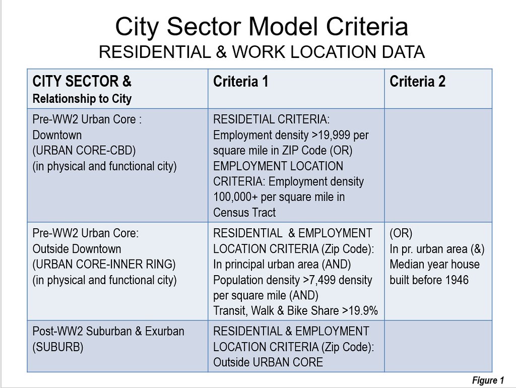
    A review of the most recent US Census Bureau population estimates and components of population change indicates that US residents are overwhelmingly moving to the most suburban cities (metropolitan areas). We previously rated the 53 major metropolitan areas (over 1 million population) using the City Sector Model (see America’s Most Suburbanized Cities), which classifies small areas (zip codes) into five urban core and suburban categories based on factors such as density, transit use, and age of housing stock.(Figure 1). This article examines net domestic migration based on the extent of suburbanization identified in the previous article.

    In this decade to date, the 30 most suburbanized cities gained 2.3 million net domestic migrants. These cities are from 94.8 percent to 100.0 percent suburban. The 23 cities that are less suburban had, overall, loss of 2.1 million net domestic migrants. Overall, the 53 major metropolitan areas gained 200,000 net domestic migrants.

    The First Quintile: 100 Percent Suburban Cities

    A total ten cities are rated 100 percent suburban this means that they have virtually no population densities high enough to qualify for urban cores in any zip code. This indicates that virtually all of their development has occurred during the post-World War II period and that any historical high density zip codes have experienced a decline to below 7500 persons per square mile. The most suburban of these cities is determined by the percentage of exurban population, since there is a 10 way tie for 100 percent suburbanization. This article examines net domestic migration trends in relation to the suburban character of the major metropolitan areas. Net domestic migration counts the number of US residents who move between counties (which are also the building block components of metropolitan areas).

    Charlotte is the most suburban and the other nine cities that are 100 percent suburban all located in the South or West (Table 1).

    Table 1
    Most Suburban Cities: (Metroplitan Areas)
    1 Charlotte, NC-SC
    2 Riverside-San Bernardino, CA
    3 Raleigh, NC
    4 Orlando, FL
    5 Birmingham, AL
    6 Jacksonville, FL
    7 Phoenix, AZ
    8 San Antonio, TX
    9 Tampa-St. Petersburg, FL
    10 Tucson, AZ
    Out of 53 with more than 1,000,000 population


    For the purposes of analyzing domestic migration, these 10 cities are considered to be the top quintile in suburbanization. With 53 cities overall, two quintiles are one city short, the first and the fifth.

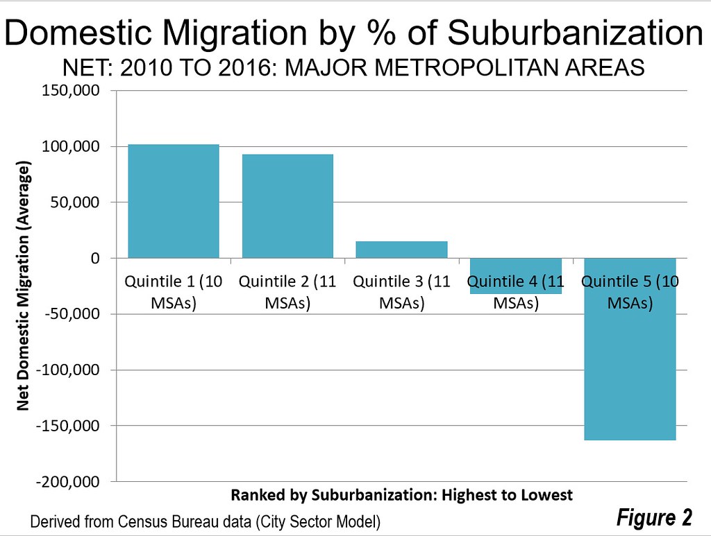
    The all suburban cities had an average positive net domestic migration of 93,000 persons between the 2010 census (April 1) and the 2016 Census Bureau population estimates (Figure 2). Their total net domestic migration was 1,016,000.

    Not all of the most suburbanized cities experienced positive net domestic migration. Birmingham, rated as the fifth most suburbanized city, lost 5000 net domestic migrants. But that’s an exception. Five fully suburban cities gained more than 100,000 net domestic migrants, including Phoenix (215,000), Tampa – St. Petersburg (163,000), San Antonio (146,000), Charlotte (143,000) and Orlando (132,000). Three of the other all suburban cities gaining domestic migrants added more than 50,000 including Raleigh, Jacksonville and Riverside – San Bernardino). Tucson gained only 3000 (Table 2).

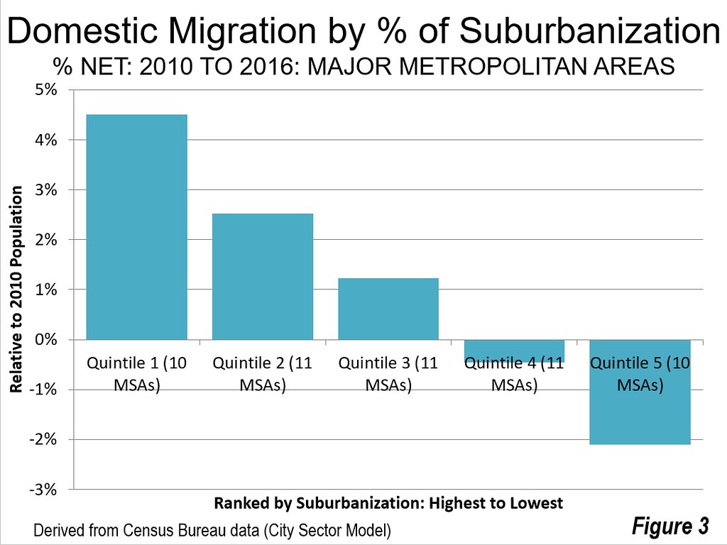
    Overall the net domestic migration averaged 4.5 percent relative to their 2010 Census population (Figure 3). Raleigh had the highest percentage net domestic migration gain at 8.3 percent, followed by San Antonio at 6.9 percent, Charlotte at 6.5 percent and Orlando at 6.1 percent (Figure 3).

    The Second Quintile

    The second quintile includes cities that are from 97.6 percent suburban to 99.8 percent suburban.

    With 11 cities, the second quintile attracted more net domestic migrants than the top quintile (1,023,000), which has only 10 cities. The per city average was somewhat lower than in the first quintile, at 93,000. Five of the cities in the second quintile added more than 100,000 net domestic migrants, including Dallas – Fort Worth at 304,000 (the highest of any city), Houston at 283,000 Austin at 192,000, Atlanta at 153,000 in Nashville at 104,000. Three cities in the quintile lost net domestic migrants, including San Jose, Virginia Beach – Norfolk and Memphis.

    The net domestic migration in second quintile averaged 2.5 percent of the 2010 population. Austin had the highest net domestic migration gain of any city at 11.2 percent. Nashville gained 6.2 percent.

    Like the first quintile, all cities in the second quintile are in the South or West.

    The Third Quintile

    The third quintile includes cities that are from 91.2 percent suburban to 97.2 percent suburban.

    The third quintile had an average net domestic migration of 15,000 per city and an average of 66,000 overall for the 11 cities. The largest gainers were Denver, at 155,000 and Oklahoma City at 52,000. Only two of the city’s lost net domestic migrants, Detroit at 131,000 and Miami at 7000.

    On average, the third quintile added 1.2 percent to their 2010 population through domestic migration. The largest gain was in Denver, at six percent, followed by Oklahoma City at 4.2 percent. The largest loss was in Detroit at 3.0 percent.

    The third quintile has cities from the Midwest as well as from the South and the West.

    The Fourth Quintile

    The fourth quintile includes cities that are from 84.1 percent suburban to 90.0 percent suburban.

    Overall these cities lost 352,000 net domestic migrants, for an average of a 32,000 loss per city. The largest gainers were Seattle, at 106,000 and Portland at 94,000. The growth of these cities is being strengthened by the strong outmigration from California with its horrendously expensive housing costs. The largest loser in the fourth quintile was Los Angeles, at 373,000 which ranks it the third largest losing major metropolitan area.

    Overall, the average city lost 0.5 cent of its population to net domestic migration. The largest gain was in Portland, at 4.3 percent and in Seattle at 3.1 percent. The largest losses were in Hartford, 3.9 percent and Rochester at 3.0 percent.

    The Fifth Quintile

    The fifth quintile includes cities that are from 83.3 percent suburban to New York, at 46.7 percent suburban ; the only city with a dominant urban core. Only one of these cities, San Francisco – Oakland gained net domestic migration, at 43,000 the largest net domestic migration losses were in New York at minus 903,000 and Chicago at minus 409,000.

    San Francisco – Oakland had a net domestic migration gain of 1.0 percent relative to its 2010 population, though in the last year has fallen into decline as house prices continue to rise to the stratosphere. New York had the largest percentage loss of any city due to net domestic migration at minus 4.6 percent. Chicago’s loss was minus 4.3 percent.

    Moving to the Suburbs and to the Most Suburban Cities

    A couple of months ago we and others reported on the resurgence of suburban population growth in net domestic migration compared to that of the urban cores (see “Flight from Urban Cores Accelerates: 2016 Census Metropolitan Area Estimates”). When examined relative to the extent of suburbanization, the trend is even more significant, with strong net domestic migration to the most suburbanized cities. America continues to evolve, often not following the densification and anti-suburban proclivities of many planners and media outlets.

    Table 2
    Domestic Migration in Relation to Suburbanization of Cities
    Major Metropolitan Areas: 2010 Census to 2016 Population Estimates
    Rank Metropolitan Area % Suburban Net Domestic Migration Net Domestic Migration %
    1 Charlotte, NC-SC 100.0%        142,873 6.5%
    2 Riverside-San Bernardino, CA 100.0%          59,453 1.4%
    3 Raleigh, NC 100.0%          90,756 8.3%
    4 Orlando, FL 100.0%        131,588 6.1%
    5 Birmingham, AL 100.0%           (5,122) -0.5%
    6 Jacksonville, FL 100.0%          68,237 5.1%
    7 Phoenix, AZ 100.0%        215,447 5.1%
    8 San Antonio, TX 100.0%        146,511 6.9%
    9 Tampa-St. Petersburg, FL 100.0%        163,157 5.9%
    10 Tucson, AZ 100.0%            3,372 0.4%
    11 Nashville, TN 99.8%        104,331 6.2%
    12 San Jose, CA 99.8%         (47,033) -2.5%
    13 Houston, TX 99.6%        283,239 4.8%
    14 Dallas-Fort Worth, TX 99.5%        304,468 4.7%
    15 Virginia Beach-Norfolk, VA-NC 99.5%         (41,540) -2.5%
    16 Atlanta, GA 99.2%        153,366 2.9%
    17 San Diego, CA 98.9%         (15,477) -0.5%
    18 Sacramento, CA 98.3%          38,745 1.8%
    19 Memphis, TN-MS-AR 98.1%         (36,854) -2.8%
    20 Austin, TX 97.9%        192,375 11.2%
    21 Las Vegas, NV 97.6%          87,856 4.5%
    22 Oklahoma City, OK 97.2%          51,983 4.2%
    23 Miami, FL 97.1%           (6,762) -0.1%
    24 Denver, CO 96.9%        154,847 6.1%
    25 Grand Rapids, MI 96.5%            8,480 0.9%
    26 Salt Lake City, UT 96.5%            2,006 0.2%
    27 Richmond, VA 95.6%          21,389 1.8%
    28 Columbus, OH 95.3%          29,167 1.5%
    29 Indianapolis. IN 95.0%          21,365 1.1%
    30 Kansas City, MO-KS 94.8%            5,866 0.3%
    31 Detroit,  MI 93.7%       (130,532) -3.0%
    32 Louisville, KY-IN 91.2%            8,475 0.7%
    33 Cincinnati, OH-KY-IN 90.0%         (23,149) -1.1%
    34 Portland, OR-WA 90.0%          94,284 4.3%
    35 Los Angeles, CA 89.4%       (372,990) -2.9%
    36 Seattle, WA 89.3%        105,516 3.1%
    37 New Orleans. LA 89.1%          27,417 2.3%
    38 Hartford, CT 88.7%         (46,980) -3.9%
    39 Rochester, NY 88.6%         (32,196) -3.0%
    40 St. Louis,, MO-IL 88.4%         (57,902) -2.1%
    41 Minneapolis-St. Paul, MN-WI 86.8%           (8,015) -0.2%
    42 Baltimore, MD 84.3%         (26,498) -1.0%
    43 Pittsburgh, PA 84.1%         (11,742) -0.5%
    44 Washington, DC-VA-MD-WV 83.3%         (46,264) -0.8%
    45 Cleveland, OH 78.3%         (58,375) -2.8%
    46 Milwaukee,WI 76.6%         (42,639) -2.7%
    47 Chicago, IL-IN-WI 74.2%       (409,167) -4.3%
    48 Philadelphia, PA-NJ-DE-MD 74.1%       (127,868) -2.1%
    49 Providence, RI-MA 73.9%         (28,789) -1.8%
    50 San Francisco-Oakland, CA 73.0%          42,847 1.0%
    51 Buffalo, NY 71.0%         (22,091) -1.9%
    52 Boston, MA-NH 64.3%         (36,483) -0.8%
    53 New York, NY-NJ-PA 46.7%       (902,616) -4.6%
    Derived from 2010 Census and American Community Survey using City Sector Model

    Wendell Cox is principal of Demographia, an international public policy and demographics firm. He is a Senior Fellow of the Center for Opportunity Urbanism (US), Senior Fellow for Housing Affordability and Municipal Policy for the Frontier Centre for Public Policy (Canada), and a member of the Board of Advisors of the Center for Demographics and Policy at Chapman University (California). He is co-author of the "Demographia International Housing Affordability Survey" and author of "Demographia World Urban Areas" and "War on the Dream: How Anti-Sprawl Policy Threatens the Quality of Life." He was appointed to three terms on the Los Angeles County Transportation Commission, where he served with the leading city and county leadership as the only non-elected member. He served as a visiting professor at the Conservatoire National des Arts et Metiers, a national university in Paris.

    Photograph: Downtown Dallas in the metropolitan area with the largest gain in net domestic migrants (by author)

  • Seattle’s Minimum Wage Killing Jobs Per City Funded Study

    A report by University of Washington economists has concluded that the most recent minimum wage increase in the city of Seattle is costing jobs. The Seattle Times reported:

    “The team concluded that the second jump had a far greater impact, boosting pay in low-wage jobs by about 3 percent since 2014 but also resulting in a 9 percent reduction in hours worked in such jobs. That resulted in a 6 percent drop in what employers collectively pay — and what workers earn — for those low-wage jobs.”

    According to the Times, this translates into a pay reduction of $125 per month for a low wage earner. This can be a lot of money, according to a study author, Mark Long, who noted that “It can be the difference between being able to pay your rent and not being able to pay your rent.”

    The study also indicated that there were 5,000 fewer low-wage jobs in the city as a result of the minimum wage increase. This is more than one percent of the approximately 440,000 private sector jobs in the city of Seattle in 2015, according to the American Community Survey. It is likely that most of the job losses occurred in the private sector, as opposed to government.

    The study was partially funded by the City of Seattle, which enacted the minimum wage increase.

  • Grenfell External Fire Erupts After Flat Fire Extinguished?

    The Daily Telegraph reported (June 20) that:

    "Crews believed they had put out the fire at the London high-rise and were astonished to see flames rising up the side of the building, new reports have claimed."

    "But, soon after, the 24-storey building was consumed by flames in one of Britain’s biggest ever tower block fires that left at least 79 people dead."

    The paper continued that: " Those reports will add weight to claims that it was the cladding on the exterior of Grenfell Tower that caused the fire to spread so rapidly."

    The entire Telegraph article can be read at: http://www.telegraph.co.uk/news/2017/06/20/grenfell-tower-firefighters-put-fridge-blaze-just-leaving-flats/

    The fire’s death toll is now at 79. Newgeography.com covered the fire ("The Grenfell Fire: A Litany of Failures?").