Author: Wendell Cox

  • The Long Term: Metro America Goes From 82% to 86% Suburban Since 1990

    The major metropolitan areas of the United States experienced virtually all of their overall growth in suburban and exurban areas between 2000 and 2010. This is the conclusion of an analysis of the functional Pre-Auto Urban Cores and functional suburban and exurban areas using the Demographia City Sector Model.

    The City Sector Model
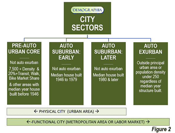
    The City Sector Model classifies zip code areas in the major metropolitan areas based on urban form (Note 1). These include four classifications, one of which replicates the urban form and travel behavior typical of the pre-World War II urban cores. These areas were typically higher density and dependent on transit and walking. The City Sector Model has three other classifications, Pre-Auto Urban Core, Auto-Suburban: Earlier, Auto-Suburban: Later and Auto-Exurban.

    For simplicity the City Sector categories are referred to as urban core, earlier suburban, later suburban and exurban. The City Sector Model is described in a previous article, and illustrated in Figure 1, which is also posted to the internet.
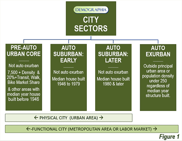
    The model makes it possible to analyze metropolitan areas based on smaller area functional classifications, rather than on jurisdictional (historical core municipality) borders, which among other things, mask as core large areas of suburbanization.

    Suburbanized Core Municipality Examples: San Jose and Charlotte

    This suburbanization in the historical core municipalities is illustrated by examples like San Jose and Charlotte. The City Sector Model indicates that neither of these metropolitan areas has a pre-auto urban core. This is because neither metropolitan area has a large enough concentration of houses with a median construction date of 1945 or before or sufficient area of 7,500 population density per square mile (2,900 per square kilometer) with a transit, walking and cycling work trip market share of at least 20 percent. As a result, virtually all of both metropolitan areas is automobile oriented suburban, including virtually all of the core municipalities.

    This is true in Charlotte despite its development of one of the most impressive new central business districts in the nation, with high employment densities. Yet at the same time the  core city of Charlotte itself is very low density (2010), at 2,500 per square mile (950 per square kilometer), less than the suburban area average for large US urban areas (2,600 per square mile or 1,000 per square kilometer). Charlotte, however, could develop the equivalent of a pre-auto urban core if its central population density rises enough and enough commuters use transit, walking and cycling.

    The core city of San Jose is far more dense than Charlotte, at 5,800 per square mile (2,200 per square kilometer). However, it is less dense than the suburbs of Los Angeles (6,400 per square mile or 2,500 per square mile). Like Charlotte, the core city of San Jose is virtually all automobile oriented suburban and has a transit work trip market share a full third below the major metropolitan area average.

    Overall Population Trend: 2000-2010

    These phenomena reflect national trends, All major metropolitan area growth between 2000 and 2010 (100.9 percent) was in the functional suburbs and exurbs.

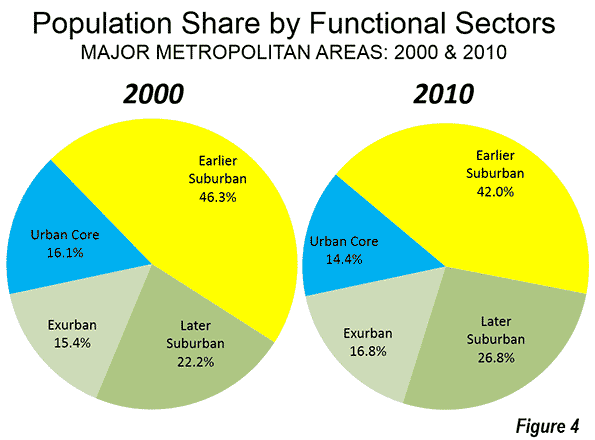
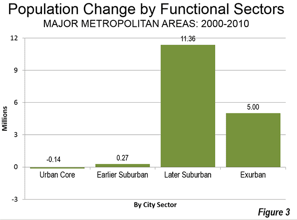
    Between 2000 and 2010, the percentage of major metropolitan area population in the urban cores declined from 16.1 percent to 14.4 percent. The urban cores lost approximately 140,000 residents (a loss of 0.6 percent), despite strong gains very close to the centers of the historical core municipalities. Consistent with these findings, Census Bureau analysis showed that the focused gains in the cores of the urban cores were more than negated by losses in surrounding urban core areas (described in: Flocking Elsewhere: The Downtown Growth Story).

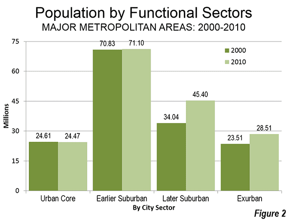
    The earlier suburban areas gained only modestly, adding 280,000 new residents, for a 0.4 percent increase. These areas have median house construction dates between 1946 and 1979. The largest increase was in the later suburban areas, which added the most new residents, 11.4 million, for a gain of 33.4 percent. The later suburban areas have median house constructions of 1980 or later. Exurban areas added 5.0 million residents, for a gain of 21.3 percent. Exurban areas are located outside the principal urban areas (Figure 2).

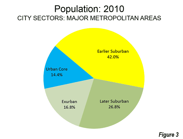
    Overall, the later suburban and exurban areas gained 16.4 million residents, compared to the combined gain of 130,000 in the urban cores and earlier suburban areas. Thus, more than 99 percent of the population growth in the major metropolitan areas was in the later suburban and exurban areas (Figure 3).

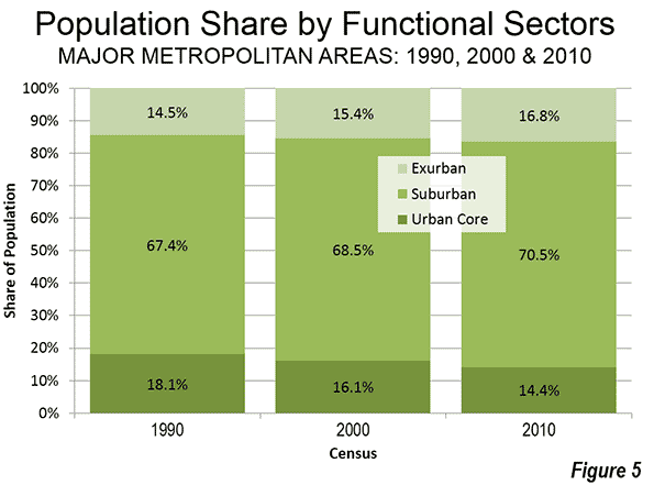
    During the decade, the exurban areas overtook the urban cores in population, rising from 15.4 percent of the major metropolitan area population to 16.8 percent (Figure 4).
    Contrast with 1990-2000 Population Trend

    Despite all of the talk of an urban core renaissance, the 2000 to 2010 decade was less favorable for urban cores than the 1990 to 2000 decade. In the earlier decade, the urban cores (as defined in 2010) added 960,000 residents, for a growth rate of 4.0 percent. This compares to the 140,000 urban core loss between 2000 and 2010 (Note 2).

    Virtually all of the difference was attributable to urban core population trend reversals in New York, Boston and Chicago, which combined experienced a drop in growth of 1.1 million. Between 1990 and 2000, the urban core of New York added 779,000 residents, far more than the 190,000 added between 2000 and 2010. Boston’s 1990-2000 urban core growth was 296,000, but fell to 27,000 in the last decade. Chicago’s urban core dropped from a gain of 139,000 to a loss of 175,000.

    Over the past twenty years, the population of urban cores has diminished relative to that of major metropolitan areas. In 1990, the urban cores represented 18.1 percent of the population, but fell to 14.1 percent in 2010. Auto-oriented areas (suburban and exurban) have increased their combined share from 81.9 percent of the major metropolitan area population in 1990 to 85.6 percent in 2010 (Figure $$$).
    Summary of Individual Metropolitan areas

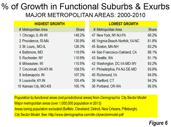
    In 30 of the 52 major metropolitan areas, all or more of the population growth was in suburban and exurban areas between 2000 and 2010. This includes the metropolitan areas that do not have Pre-Auto Urban Cores.

    Chicago had the largest share of suburban and exurban population growth, at 148 percent. This occurred because of the substantial urban core population losses. The suburbs and exurbs of Providence captured 131 percent of its growth, slightly more than the 126 percent suburban and exurban share in St. Louis. Baltimore, Rochester and Milwaukee had more than 110 percent of their growth in the suburbs and exurbs. Cincinnati, Indianapolis, Louisville, and Kansas City rounded out the largest suburban and exurban growth shares, all over 105 percent.

    Despite the substantial decline in its urban core growth in the last decade, New York had the lowest share of population growth in the suburbs and exurbs (meaning that it had the highest share of population growth in the urban core). The suburbs and exurbs of New York captured only 69 percent of the metropolitan area growth, well below second place, Virginia Beach – Norfolk (81 percent). Boston was next at 83 percent, followed by San Francisco – Oakland, at 88 percent. The bottom 10 in suburban and exurban growth share also included Seattle, Washington, Philadelphia, Richmond, Hartford and Portland. Even so, each of these six metropolitan areas had more than 90 percent of their growth in suburban and exurban areas (Figure 6).
    Jurisdictional Analyses: Suburbs Masquerading in Cities

    The functional analysis based on urban form and behavior reveals substantially different trends compared to the conventional jurisdictional analysis that compares historical core municipalities, principal cities or primary cities to the balance of metropolitan areas. For example a jurisdictional analysis shows that core municipalities added 1,290,000 residents between 2000 and 2010. In contrast, the urban cores, as indicated in the functional analysis, lost 140,000 residents. This indicates the extent of to which municipal boundaries can mislead in the analysis of urban form within metropolitan areas. The expansive city limits of most core cities masks the substantial automobile oriented suburbanization within their own borders.

    —-

    Note 1: The City Sector Model is generally similar to the groundbreaking research published by David L. A. Gordon and Mark Janzen at Queen’s University in Kingston Ontario (Suburban Nation: Estimating the Size of Canada’s Suburban Population) with regard to the metropolitan areas of Canada. Gordon and Janzen concluded that the metropolitan areas of Canada are largely suburban. Among the major metropolitan areas of Canada, the Auto Suburbs and Exurbs combined contain 76 percent of the population, somewhat less than the 86 percent found in the United States.

    Note 2: Changes in zip code definitions and boundaries could result in minor differences in comparability between the three censuses.

    —-

    Wendell Cox is principal of Demographia, an international public policy and demographics firm. He is co-author of the "Demographia International Housing Affordability Survey" and author of "Demographia World Urban Areas" and "War on the Dream: How Anti-Sprawl Policy Threatens the Quality of Life." He was appointed to three terms on the Los Angeles County Transportation Commission, where he served with the leading city and county leadership as the only non-elected member. He was appointed to the Amtrak Reform Council to fill the unexpired term of Governor Christine Todd Whitman and has served as a visiting professor at the Conservatoire National des Arts et Metiers, a national university in Paris.

    Photo:  Later Suburbs in New York Urban Area (Morris County, New Jersey), by author
  • IMF’s Lagarde: Build on Greenfield Land

    Christine Lagarde, the Managing Director of the International Monetary Fund cited the need for housing market reform at the conclusion of discussions with the government of the United Kingdom on Friday, June 6.

    The housing market in the United Kingdom has experienced a long and continuing escalation in prices relative to incomes, largely due to the nation’s strict urban containment policies that date from the 1947 Town and Country Planning Act, and significant further restrictions put in place during the Blair government.

    According to Ms. Lagarde:

    "But rising house prices fundamentally reflect demand that greatly exceeds supply. Addressing imbalances in the housing market by alleviating supply-side constraints will require further measures to increase the availability of land for development and to remove unnecessary constraints on land use."

    The Daily Mail further reported that Ms. Lagarde "called for ‘unnecessary’ restrictions on building on greenfield sites to be lifted, so the supply of houses can be increased. This, she said, would help stabilise prices.

    The United Kingdom’s restrictive land use regulations have been a model for restrictive land use regimes from Sydney to Vancouver, Auckland, Portland and California. They have been responsible for driving up house prices relative to incomes, which reduces household discretionary incomes. The result is lower standards of living and higher rates of poverty. London School of Economics professor Paul Cheshire has concluded that urban containment policy is irreconcilable with housing affordability.

  • From Jurisdictional to Functional Analysis of Urban Cores & Suburbs

    The 52 major metropolitan areas of the United States are, in aggregate, approximately 86 percent suburban or exurban in function. This is the conclusion from our new City Sector Model, which divides all major metropolitan zip codes into four functional categories, based on urban form, population density and urban travel behavior. The categories are (1) Pre-Auto Urban Core, (2) Auto Suburban: Earlier, (3) Auto Suburban: Later and (4) Auto Exurban. It is recognized that automobile-oriented suburbanization was underway before World War II, but it was interrupted by the Great Depression during the 1930s and was small compared to the democratization of personal mobility and home ownership that has occurred since that time.

    For decades there has been considerable analysis of urban core versus suburban trends. However, for the most part, analysts have been jurisdictional, comparing historical core municipalities to the expanse that constitutes the rest of the metropolitan area. Most core municipalities are themselves substantially suburban, which can mask (and exaggerate) the size of urban cores.

    The Queen’s University Research

    The City Sector Model is generally similar to the groundbreaking research published by David L. A. Gordon and Mark Janzen at Queen’s University in Kingston Ontario (Suburban Nation: Estimating the Size of Canada’s Suburban Population) with regard to the metropolitan areas of Canada. Researchers used travel behavior (journey to work data from the 2006 census) and density for classifying metropolitan areas into four sectors, (1) Active Core, (2) Transit Suburbs, (3) Auto Suburbs, and (4) Exurbs. The active core was that portion of metropolitan areas with a high share of work trip travel by walking and cycling. I covered the research in a newgeography.com article last autumn.

    Gordon and Janzen concluded that the metropolitan areas of Canada are largely suburban. Among the major metropolitan areas of Canada, the Auto Suburbs and Exurbs combined contain 76 percent of the population, somewhat less than the 86 percent we found in the United States.

    The City Sector Model follows the same general approach as the Queens University research, although there are important differences. For example, the City Sector Model is principally aimed at identifying the Pre-Auto Urban Core component of the modern metropolitan area and does not identify an active core.

    All US Major Metropolitan Area Growth Has Been Suburban and Exurban

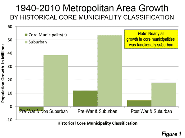
    Virtually all population growth in US metropolitan areas (as currently defined) has been suburban or exurban since before World War II (the 1940 census). The historical core municipalities that have not annexed materially and were largely developed by 1940 have lost population. As a result, approximately 110 percent of their metropolitan area growth has occurred in suburbs and exurbs. Further, among the other core municipalities, virtually all of the population growth that has occurred in annexed areas or greenfield areas that were undeveloped in 1940 (Figure 1).

    Identifying the Pre-Auto Urban Core

    The City Sector Model is not dependent upon municipal boundaries (the term "city" is generic, and refers to cities in their functional sense, metropolitan areas, or in their physical sense, urban areas). Not being constrained by municipal boundaries is important because core municipalities vary substantially. For example, the core municipality represents less than 10 percent of the population of Atlanta, while the core municipality represents more than 60 percent of the population of San Antonio. The City Sector Model applies data available from the US Census Bureau to estimate the population and distribution of Pre-Auto Urban Cores in a consistent manner.

    At the same time, the approach is materially different from the Office of Management and Budget (OMB) classification of "principal cities." It also differs from the Brookings Institution "primary cities," which is based on the OMB approach. The OMB-based classifications classify municipalities using employment data, without regard to urban form, density or other variables that are associated with the urban core. These classifications are useful and acknowledge that the monocentric nature of US metropolitan areas has evolved to polycentricity. However, non-urban-core principal cities and primary cities are themselves, with few exceptions, functionally suburban.

    The City Sector Model Criteria

    Due to media and academic interest in the Pre-Auto Urban Core, a number of data combinations were used to best fit the modeled population to that of the core municipalities that have virtually the same boundaries as in 1940 and that were virtually fully developed by that time (the Pre-War & Non-Suburban classification in historical core municipalities). A number of potential criteria were examined, and the following were accepted (Figure 2).

    The Auto Exurban category includes any area outside a principal urban area.

    The Pre-Auto Urban Core category includes any non-exurban with a median house construction date of 1945 or before and also included areas with a population density of 7,500 per square mile (2,900 per square kilometer) or more and with a transit, walk and cycling journey to work market share of 20 percent or more.

    The Auto Suburban Earlier category included the balance of areas with a median house construction date of 1979 or before.

    The Auto Suburban Later category later included the balance of areas with a median house construction date of 1980 or later.

    Additional details on the criteria are in Note 1

    Results: 2010 Census

    The combined Pre-Auto Urban Core areas represented 14.4 percent of the population of the major metropolitan areas in 2010 (2013 geographical definition). This compares to the 26.4 percent that the core municipalities themselves represented of the metropolitan areas, indicating nearly half of their population was essentially suburban.

    The Auto Suburban: Earlier areas accounted for 42.0 percent of the population, while the Auto Suburban: Later areas had 26.8 percent of the population. The Auto Exurban areas had 16.8 percent of the population (Figure 3).

    The substantial difference between US and Canadian urbanization is illustrated by applying an approximation of the Gordon-Janzen criteria, which yielded an 8.4 percent Pre-Auto Urban Core population. The corresponding figure for the six major metropolitan areas of Canada was 24.0 percent. This difference is not surprising, since major Canadian urban areas have generally higher densities and much more robust transit, walking and cycling market shares. Yet, the Gordon-Janzen research shows Canada still to be overwhelmingly suburban (Note 2).

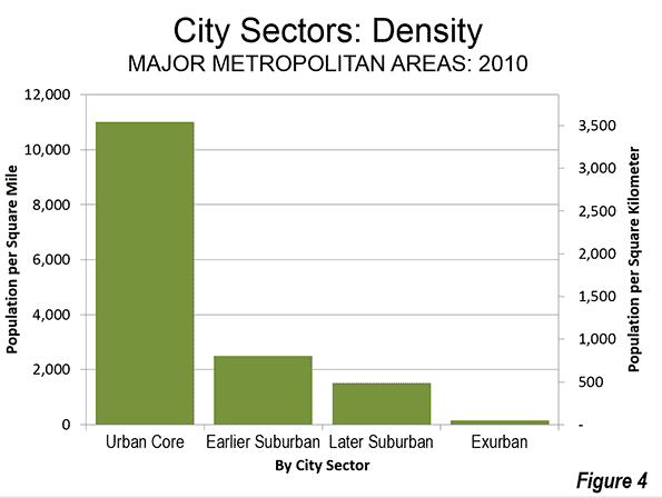
    Population Density: As would be expected, the Pre-Auto Urban Core areas had the highest densities (Figure 4), at 11,000 per square mile (4,250 per square kilometer). The Auto Suburban: Earlier areas had a density of 2,500 per square mile (1,000 per square kilometer), while the Auto Suburban: Later had a population density of 1,300 per square mile (500 per square kilometer), while the Auto Exurban areas had a population density of 150 per square mile (60 per square kilometer)).

    Individual Metropolitan Areas (Cities)

    The metropolitan areas with the highest proportion of Pre-Auto Urban Core population are New York (more than 50 percent), and Boston (nearly 35 percent), followed by Buffalo, Chicago, San Francisco-Oakland, and Providence, all with more than 25 percent (Table).

    Table
    City Sectors: 2010
    Major Metropolitan Areas
    City (Metropolitan Area) Pre-Auto Urban Core Auto Suburban: Earlier Auto Suburban: Later Auto Exurban
    Atlanta, GA 0.5% 14.9% 70.7% 13.8%
    Austin, TX 1.8% 15.7% 62.5% 20.0%
    Baltimore, MD 16.2% 41.8% 19.9% 22.0%
    Birmingham, AL 0.0% 42.1% 24.6% 33.3%
    Boston, MA-NH 34.2% 49.7% 3.2% 12.9%
    Buffalo, NY 28.8% 51.6% 3.1% 16.5%
    Charlotte, NC-SC 0.0% 10.0% 38.4% 51.6%
    Chicago, IL-IN-WI 25.8% 45.0% 18.3% 10.9%
    Cincinnati, OH-KY-IN 10.1% 38.8% 24.3% 26.8%
    Cleveland, OH 22.2% 46.8% 10.5% 20.6%
    Columbus, OH 5.0% 28.7% 37.5% 28.9%
    Dallas-Fort Worth, TX 0.3% 34.4% 43.0% 22.4%
    Denver, CO 3.1% 42.9% 42.4% 11.6%
    Detroit,  MI 6.3% 60.6% 16.1% 16.9%
    Grand Rapids 3.8% 32.9% 15.3% 48.1%
    Hartford, CT 11.1% 58.6% 1.1% 29.2%
    Houston, TX 0.3% 34.2% 48.9% 16.6%
    Indianapolis. IN 4.6% 28.0% 41.8% 25.6%
    Jacksonville, FL 0.0% 26.4% 48.2% 25.4%
    Kansas City, MO-KS 5.4% 37.6% 26.3% 30.6%
    Las Vegas, NV 2.4% 17.5% 76.7% 3.5%
    Los Angeles, CA 10.4% 76.4% 5.2% 8.0%
    Louisville, KY-IN 8.1% 45.4% 25.6% 20.8%
    Memphis, TN-MS-AR 1.8% 40.6% 34.3% 23.3%
    Miami, FL 1.4% 51.4% 44.8% 2.4%
    Milwaukee,WI 22.1% 52.0% 10.4% 15.5%
    Minneapolis-St. Paul, MN-WI 12.7% 31.6% 33.8% 22.0%
    Nashville, TN 0.0% 25.0% 36.1% 38.9%
    New Orleans. LA 10.6% 49.9% 7.0% 32.4%
    New York, NY-NJ-PA 52.4% 35.3% 5.6% 6.7%
    Oklahoma City, OK 2.5% 35.1% 31.6% 30.8%
    Orlando, FL 0.0% 16.1% 50.5% 33.4%
    Philadelphia, PA-NJ-DE-MD 24.6% 51.1% 15.1% 9.2%
    Phoenix, AZ 0.0% 29.4% 51.7% 18.8%
    Pittsburgh, PA 15.7% 56.1% 4.8% 23.4%
    Portland, OR-WA 9.3% 36.7% 39.5% 14.6%
    Providence, RI-MA 25.5% 47.7% 2.8% 24.0%
    Raleigh, NC 0.0% 7.5% 54.4% 38.1%
    Richmond, VA 4.5% 38.8% 38.0% 18.8%
    Riverside-San Bernardino, CA 0.0% 29.1% 29.4% 41.4%
    Rochester, NY 11.1% 46.9% 7.7% 34.3%
    Sacramento, CA 1.6% 38.0% 40.2% 20.1%
    St. Louis,, MO-IL 11.7% 39.9% 25.7% 22.8%
    Salt Lake City, UT 4.6% 47.9% 38.4% 9.1%
    San Antonio, TX 0.1% 39.7% 42.6% 17.6%
    San Diego, CA 1.2% 61.6% 30.3% 6.9%
    San Francisco-Oakland, CA 25.7% 55.5% 7.6% 11.2%
    San Jose, CA 0.1% 77.7% 9.1% 13.1%
    Seattle, WA 7.8% 38.9% 40.2% 13.0%
    Tampa-St. Petersburg, FL 0.0% 44.8% 39.7% 15.5%
    Virginia Beach-Norfolk, VA-NC 1.5% 44.4% 37.7% 16.4%
    Washington, DC-VA-MD-WV 15.9% 29.2% 36.2% 18.7%
    Overall 14.4% 42.0% 26.8% 16.8%


    It may be surprising that many of the major metropolitan areas are shown with little or no Pre-Auto Urban Core population. For example, five metropolitan areas have virtually no Pre-Auto Urban Core population, including Phoenix, Riverside-San Bernardino, Tampa-St. Petersburg, Orlando, Jacksonville, and Birmingham. By the Census Bureau criteria of 1940, two of these areas were not yet metropolitan and only Birmingham (400,000) had more than 250,000 residents.  Many of the newer and fastest growing metropolitan areas were too small, too sparsely settled or insufficiently dense to have strong urban cores before the great automobile suburbanization that followed World War II. Further, many of the Pre-Auto Urban Cores have experienced significant population loss and some of their neighborhoods have become more suburban (automobile oriented). Virtually no urban cores have been developed since World War II meeting the criteria.

    Thus, no part of Phoenix, San Jose, Charlotte and a host of other newer metropolitan areas functionally resembles the Pre-Auto Urban Core areas of metropolitan areas like Chicago, Cincinnati, or Milwaukee. However, new or expanded urban cores are possible, if built at high enough population density and with high enough transit, walking, and cycling use. 

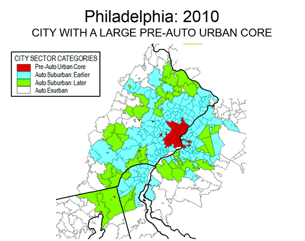
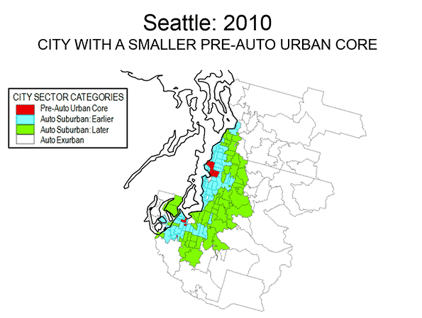
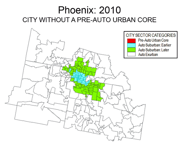
    Examples of three differing metropolitan areas are provided. Philadelphia (Figure 5) is a metropolitan area with a strong Pre-Auto Urban Core, which is indicative of an older metropolitan area that has been among the largest in the nation since its inception, Seattle (Figure 6) is a much newer metropolitan area, yet exhibits a larger Pre-Auto Urban Core than most. Phoenix (Figure 7) may be the best example of a post-War metropolitan area, with virtually no Pre-Auto Urban Core. In 1940, the Phoenix metropolitan area had only 120,000 residents and could be 40 times that large by 2020. Virtually all of Phoenix is automobile-oriented. Even three years after opening its light rail line, 88 percent of Phoenix commuters go to work by car and only two percent by transit, virtually the same as in 2000.

    Despite the comparatively small share of the modern metropolitan area represented by the Pre-Auto Urban Core in the City Core Model, the definition is broad and, if anything over-estimates the size of urban core city sectors. The population density of Pre-Auto Urban Core areas is below that of the historical core municipalities before the great auto oriented urbanization (11,000 compared to 12,100 in 1940) and well above their 2010 density (8,400), even when New York is excluded. The minimum density requirement of 7,500 per square mile (not applied to analysis zones with a median house construction data of 1945 or earlier) is slightly less than the density of Paris suburbs (7,800 per square mile or 3,000 per square kilometer) and only 20 percent more dense than the jurisdictional suburbs (suburbs outside the historical core municipality) of Los Angeles (6,400 per square mile or 2,500 per square kilometer). Some urban containment plans require higher minimum densities, not only in urban cores but also in the suburbs.

    In describing the Canadian results, Professor Gordon noted that there is a tendency to “overestimate the importance of the highly visible downtown cores and underestimate the vast growth happening in the suburban edges.” That is true to an even greater degree in the United States. 

    —–

    Note 1:

    The City Sector Model is applied to the 52 major metropolitan areas in the United States (over 1 million population). The metropolitan areas are broken into principal urban areas, with all other areas considered to be exurban. The principal urban areas also include the Concord urban area and the Mission Viejo urban area, which are adjacent to and included in the San Francisco and Los Angeles urban areas respectively. As a result, some smaller urban areas, such as Palm Springs (Riverside-San Bernardino metropolitan area), Lancaster (Los Angeles metropolitan area) and Poughkeepsie (New York metropolitan area) are considered exurban. Areas with less than 250 residents per square mile (100 per square kilometer) are also considered exurban, principally for classification of large areas on the urban fringe that have a substantial rural element.

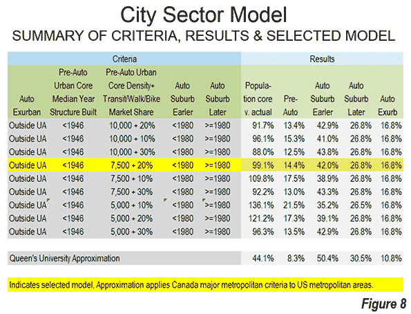
    The Pre-Auto Urban Core includes all non-– exurban areas in which is the median house (single-family or multi-family) was built is 1945 or before. Three density levels were considered, 10,000, 7,500 and 5,000 per square mile (4,000, 2,900 and 2,000 per square kilometer). The lower 5,000 per square mile was examined to test the extent to which such a low density would increase the urban core population. This density, less than the entire urban area (urban core and suburban) of the Los Angeles, San Francisco, San Jose and New York urban areas would have, at the most raised the urban core population to 21.5 percent of the metropolitan population, even with a modest 10 percent transit, walking and cycling market share (Figure 8)

    The pre-auto urban core specification results in a 2010 population for the metropolitan areas with Pre-war and non-suburban historical core municipalities within one percentage point of the actual total, excluding the far higher density case of New York.

    The analysis showed that a lower transit, walking and cycling market share at a 7,500 per square mile floor (2,900 per square kilometer) would substantially increase the Pre-Auto Urban Core category population, while diluting its urban core nature. More than one-half of the increase would be in Los Angeles which has added literally millions of residents in high density suburban areas that are as automobile oriented as suburbs elsewhere.

    The analysis zones (zip codes) have an average population of 19,000, with from as many as 1,000 zones in New York to 50 in Raleigh.

    Note 2:

    An approximation based on the Gordon and Janzen approach would indicate an urban core population of only 8 percent in the major metropolitan areas of the United States. This approximation results in a modeled population for the metropolitan areas with pre-war and non-suburban historical core municipalities of less than one-half the actual 2010 population.

    This Queen’s University research comparison in Figure 8 is referred to as an approximation, since it applies an overall transit, walking, and cycling market share for the six major metropolitan areas, instead of a factor corresponding to each metropolitan area (the Gordon and Janzen approach).

    The differences in transit market share relative to the US are substantial. This may be best shown by considering Calgary, which with a population of 1.2 million in 2011 would have ranked as the 47th largest metropolitan area if it were in the United States. Yet, Calgary would rank second only to the New York metropolitan area in transit market share if it were in the United States. Even so, Calgary is found to be the most suburban of Canada’s major metropolitan areas in the Queen’s University research and Statistics Canada data from 2011 indicates strong domination of urban travel by the automobile.

    Wendell Cox is principal of Demographia, an international public policy and demographics firm. He is co-author of the “Demographia International Housing Affordability Survey” and author of “Demographia World Urban Areas” and “War on the Dream: How Anti-Sprawl Policy Threatens the Quality of Life.” He was appointed to three terms on the Los Angeles County Transportation Commission, where he served with the leading city and county leadership as the only non-elected member. He was appointed to the Amtrak Reform Council to fill the unexpired term of Governor Christine Todd Whitman and has served as a visiting professor at the Conservatoire National des Arts et Metiers, a national university in Paris.

    Photo: Los Angeles

  • From Anecdotes to Data: Core & Suburban Growth Trends 2010-2013

    According to the Wall Street Journal, there are "Signs of a Suburban Comeback." This is a turnaround from the typical media coverage of US population estimates in recent years, which have more often than not heralded a "return to the cities" generally more rooted in anecdote than data.

    There were always at least two problems with the "return to the city" thesis. First of all, most people who live in the suburbs came from areas outside metropolitan areas and they couldn’t return to where they had never lived (see Cities and Suburbs: The Unexpected Truth). More importantly, in every year for which there is data, the net inward migration to suburbs has been far greater than to the core counties, which have nearly always had net outward migration (see Special Report: 2013 Metropolitan Area Population Estimates. Under these conditions, there could not have been net migration from the suburbs to the core municipalities.

    Historical Core Municipalities: The Differences

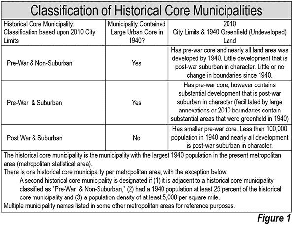
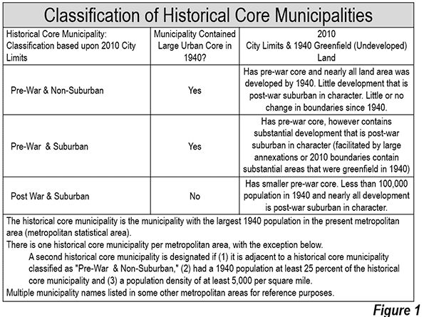
    I have classified historical core municipalities based on their extent of automobile oriented suburbanization (Figure 1). The break point is World War II, after which the great automobile suburbanization occurred in the United States. There had been automobile oriented suburbanization before 1940. During the 1920s, annual rates of suburban growth exceeded five percent in the 14 metropolitan areas with more than 500,000 population. The decade of the Great Depression (1930 to 1940) saw annual growth rates drop three quarters (Note). By the end of World War II, transit had seen its motorized urban travel market share restored to 35 percent, equal to early 1920s levels, a figure that has since fallen to under two percent. 

    Historical Core Municipalities: Improving Trends

    Even so, in recent years, the core municipalities have done better than in the past. The nightmare that occurred between 1970 and 1990 seems to be over in many places. This has made it feasible for an increase in core living by many Millennials and singles. However, even this has been exaggerated by anecdotal research that dominates the media. More than 80 percent of Millennials live outside the core municipalities, where they are less visible to the anecdote-driven media.

    On a percentage basis, the historical core municipalities of the 52 major metropolitan areas (more than 1,000,000 population) managed to grow 3.4 percent between 2010 and 2013, more than the suburban rate of 3.1 percent. This is probably the first time this has occurred in any three year period since the end of World War II.

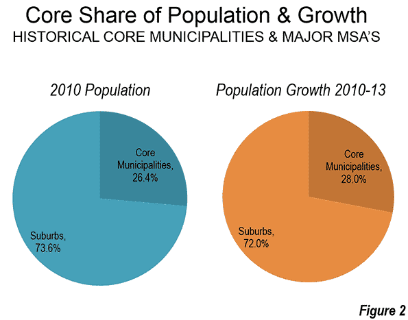
    But the core municipalities now contain such a small share of major metropolitan area population that the suburbs have continued to add population at about three times the numbers of the core municipalities (Figure 2). Indeed, if the respective 2010-2013 annual growth rates were to prevail for the next century,  the core municipalities would house only 28.0 percent of the major metropolitan area population in 2113 (up from 26.4 percent in 2013).

    Despite the publicity to the contrary, only six core municipalities added more population than suburbs in the same metropolitan areas between 2010 and 2013. These were New York, San Antonio, Columbus, San Jose, Austin, and New Orleans, all except New York with substantial suburbanization within their city limits. The core municipalities did better in percentage gains, with 19 gaining faster than the suburbs, compared to 33 suburban areas growing faster than the core municipalities.

    Core Municipality Growth

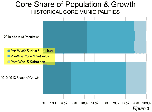
    Most of the 2010 to 2013 core growth occurred in municipalities with a larger suburban component. The core municipalities that have little suburban development ("Pre-War & Non-Suburban") had 43 percent of the core population in 2010. Yet they attracted only 27 percent of the growth (Figure 3). The two other categories, which include large areas of functional suburbanization (low density and strong automobile orientation) attracted 73 percent of the core population (Figure 3). These include suburbanized pre-War core municipalities, such as Los Angeles, Seattle, and Atlanta. They also include cores that are nearly all suburban, with nearly all of their population growth having occurred during the great automobile suburbanization (such as Austin, Sacramento, Phoenix, and San Jose).

    Core Municipalities: Top Gainers

    New York led the core municipalities by adding 230,000 new residents between 2010 and 2013. This was 56 percent of the population growth among the "Pre-War & Non-Suburban” core municipalities. The core municipality accounted for 60 percent of the population growth in the metropolitan area. However, domestic migrants continued to move away from New York City. Core municipality losses were 215,000 from 2010 to 2013, while the suburbs, with more than 55 percent of the population, lost less than a third as many (70,000).

    Houston gained 96,000 new residents between 2010 and 2013, followed by Austin (95,000), Los Angeles (92,000), and San Antonio (82,000).  Houston, Los Angeles, and San Antonio each have large suburban areas within their city limits, while the core municipality of Austin is virtually all automobile-oriented. The sixth through 10th positions were taken by Phoenix, Dallas, San Jose, Denver, and San Diego, all with substantial suburbanization.

    The largest core municipality population gains were in Austin (12.0 percent), still recovering New Orleans (10.1 percent), Denver (8.3 percent), Washington (7.4 percent), and Orlando (6.1 percent). Seattle, Raleigh, Atlanta, San Antonio and San Jose rounded out the top ten. Among the 10 fastest growing core municipalities, all but Washington have large automobile-oriented suburban components.

    There was also bad news. Detroit continued its population slide, now down to 689,000 from its 1950 peak of 1,850,000. This 62.76 percent loss, however, is not the worst among major US core municipalities. St. Louis still holds that title, having fallen from 857,000 in 1950 to 318,000 in 2013, a loss of 62.84 percent. However, one more year of losses at the 2010-2013 rates will transfer this dubious title to Detroit.

    Suburban Areas: Top Gainers

    The largest suburban gains were in Dallas-Fort Worth (325,000), Houston (296,000), Washington (269,000), Miami (245,000) and Los Angeles (211,000). Atlanta, which had virtually set the world standard for suburbanization before the Great Financial Crisis, managed to re-emerge with the sixth fastest largest suburban increase (208,000).

    Measured on a percentage basis, Texas dominated the suburban gains. The suburbs of Houston added 7.8 percent to their population between 2010 and 2013. Austin added 7.7 percent, San Antonio added 6.6 percent, and Dallas-Fort Worth 6.2 percent. The only non-Texas entry in the top five was Raleigh, which, like Austin, posted a 7.7 percent increase.

    The metropolitan area and historical core municipality data is summarized in the Table.

    Table: Metropolitan Area & Historical Core Municipality Population: 2010-2013
    Metropolitan Area Historical Core Municipality
    Rank Metropolitan Area 2010 2013 % Change 2010 2013 % Change
    1 New York, NY-NJ-PA 19.566 19.950 2.0% 8.175 8.406 2.8%
    2 Los Angeles, CA 12.829 13.131 2.4% 3.793 3.884 2.4%
    3 Chicago, IL-IN-WI 9.461 9.537 0.8% 2.696 2.719 0.9%
    4 Dallas-Fort Worth, TX 6.426 6.811 6.0% 1.198 1.258 5.0%
    5 Houston, TX 5.920 6.313 6.6% 2.099 2.196 4.6%
    6 Philadelphia, PA-NJ-DE-MD 5.965 6.035 1.2% 1.526 1.553 1.8%
    7 Washington, DC-VA-MD-WV 5.636 5.950 5.6% 0.602 0.646 7.4%
    8 Miami, FL 5.565 5.828 4.7% 0.399 0.418 4.6%
    9 Atlanta, GA 5.287 5.523 4.5% 0.420 0.448 6.6%
    10 Boston, MA-NH 4.552 4.684 2.9% 0.618 0.646 4.6%
    11 San Francisco-Oakland, CA 4.335 4.516 4.2% 1.196 1.244 4.0%
    12 Phoenix, AZ 4.193 4.399 4.9% 1.446 1.513 4.7%
    13 Riverside-San Bernardino, CA 4.225 4.381 3.7% 0.210 0.214 1.8%
    14 Detroit,  MI 4.296 4.295 0.0% 0.714 0.689 -3.5%
    15 Seattle, WA 3.440 3.610 5.0% 0.609 0.652 7.2%
    16 Minneapolis-St. Paul, MN-WI 3.349 3.459 3.3% 0.668 0.695 4.1%
    17 San Diego, CA 3.095 3.211 3.7% 1.307 1.356 3.7%
    18 Tampa-St. Petersburg, FL 2.783 2.871 3.1% 0.336 0.353 5.1%
    19 St. Louis,, MO-IL 2.788 2.801 0.5% 0.319 0.318 -0.3%
    20 Baltimore, MD 2.711 2.771 2.2% 0.621 0.622 0.2%
    21 Denver, CO 2.543 2.697 6.1% 0.600 0.649 8.2%
    22 Pittsburgh, PA 2.356 2.361 0.2% 0.306 0.306 0.0%
    23 Charlotte, NC-SC 2.217 2.335 5.3% 0.787 0.823 4.5%
    24 Portland, OR-WA 2.226 2.315 4.0% 0.584 0.609 4.4%
    25 San Antonio, TX 2.143 2.278 6.3% 1.327 1.409 6.1%
    26 Orlando, FL 2.134 2.268 6.3% 0.238 0.255 7.2%
    27 Sacramento, CA 2.149 2.216 3.1% 0.466 0.480 2.8%
    28 Cincinnati, OH-KY-IN 2.115 2.137 1.1% 0.297 0.298 0.2%
    29 Cleveland, OH 2.077 2.065 -0.6% 0.397 0.390 -1.7%
    30 Kansas City, MO-KS 2.009 2.054 2.2% 0.460 0.467 1.6%
    31 Las Vegas, NV 1.951 2.028 3.9% 0.584 0.603 3.4%
    32 Columbus, OH 1.902 1.967 3.4% 0.787 0.823 4.5%
    33 Indianapolis. IN 1.888 1.954 3.5% 0.820 0.843 2.8%
    34 San Jose, CA 1.837 1.920 4.5% 0.946 0.999 5.6%
    35 Austin, TX 1.716 1.883 9.7% 0.790 0.885 12.0%
    36 Nashville, TN 1.671 1.758 5.2% 0.601 0.634 5.5%
    37 Virginia Beach-Norfolk, VA-NC 1.677 1.707 1.8% 0.243 0.246 1.4%
    38 Providence, RI-MA 1.601 1.604 0.2% 0.178 0.178 0.0%
    39 Milwaukee,WI 1.556 1.570 0.9% 0.595 0.599 0.7%
    40 Jacksonville, FL 1.346 1.395 3.6% 0.822 0.843 2.5%
    41 Memphis, TN-MS-AR 1.325 1.342 1.3% 0.647 0.653 1.0%
    42 Oklahoma City, OK 1.253 1.320 5.3% 0.580 0.611 5.3%
    43 Louisville, KY-IN 1.236 1.262 2.1% 0.597 0.610 2.1%
    44 Richmond, VA 1.208 1.246 3.1% 0.204 0.214 4.8%
    45 New Orleans. LA 1.190 1.241 4.3% 0.344 0.379 10.1%
    46 Hartford, CT 1.212 1.215 0.2% 0.125 0.125 0.2%
    47 Raleigh, NC 1.130 1.215 7.4% 0.404 0.432 6.9%
    48 Salt Lake City, UT 1.088 1.140 4.8% 0.186 0.191 2.5%
    49 Birmingham, AL 1.128 1.140 1.1% 0.212 0.212 -0.1%
    50 Buffalo, NY 1.136 1.134 -0.1% 0.261 0.259 -0.9%
    51 Rochester, NY 1.080 1.083 0.3% 0.211 0.210 -0.1%
    52 Grand Rapids, MI 0.989 1.017 2.8% 0.188 0.192 2.3%
    Total 169.512 174.942 3.2% 44.739 46.258 3.4%
    In Millions: Data from US Census Bureau


    Normalcy Knocks?

    Ken Johnson, the frequently quoted University of New Hampshire demographer told the Wall Street Journal, "The slowing growth in these urban cores and the increasing gains in the suburbs may be the first indication of a return to more traditional patterns of city-suburban growth." These patterns are of long standing. Nearly all urban population growth since World War II has been suburban, whether within or outside the core municipalities. It should not be surprising that suburban growth dropped during the second greatest economic decline in a century and has been slow to recover during the Great Recession and the Great Malaise that has followed. The one-quarter suburban growth rate drop was more modest than during the Great Depression, but still substantial. Should genuine prosperity return, it will likely be accompanied by a renewal of more robust suburban growth.

    Note: Core municipality growth also dropped in the 1930s, as the high rate of migration from rural to urban areas in the 1920s was interrupted due to the economic reversal.

    Wendell Cox is principal of Demographia, an international public policy and demographics firm. He is co-author of the “Demographia International Housing Affordability Survey” and author of “Demographia World Urban Areas” and “War on the Dream: How Anti-Sprawl Policy Threatens the Quality of Life.” He was appointed to three terms on the Los Angeles County Transportation Commission, where he served with the leading city and county leadership as the only non-elected member. He was appointed to the Amtrak Reform Council to fill the unexpired term of Governor Christine Todd Whitman and has served as a visiting professor at the Conservatoire National des Arts et Metiers, a national university in Paris.

  • China’s Ascent in World Transport

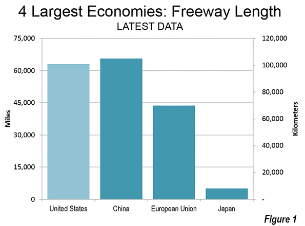
    After years of closing the gap with the United States, China built enough freeways in 2013 to amass the greatest length of freeways in the world. Between 2003 and 2013, China expanded its national expressway system, with interstate (motorway in Europe) standard roadways from 30,000 to 105,000 kilometers (18,000 to 65,000 miles). This compares to the 101,000 kilometers (63,000 miles) in the United States in 2012. China’s freeway system is also longer than that of the European Union, which was 70,000 kilometers in 2010 (43,000 miles) and Japan (8,000 kilometers or 5,000 miles) as is indicated in Figure 1 (Note 1). The ascent of China is evident across the spectrum of transport data, both passenger and freight.

    A review of transport statistics in the four largest world economies (nominal gross domestic product) shows considerable variation in both passenger and freight flows. It also reflects the rapid growth of China. Generally comparable and complete data is available for the European Union, the United States, China and Japan.

    Passenger Travel

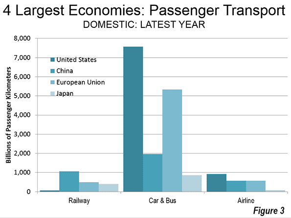
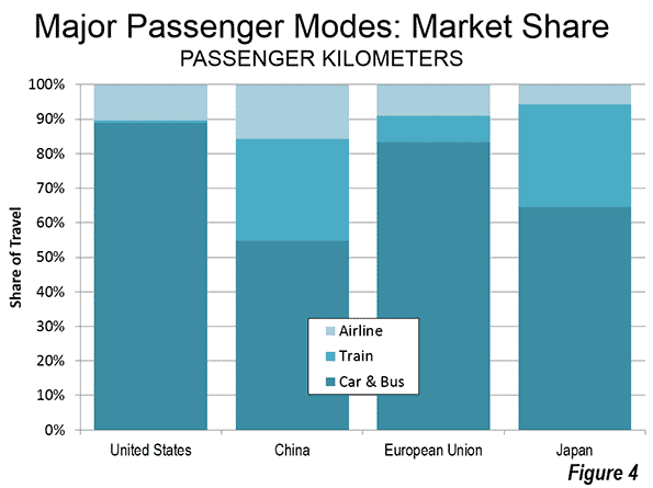
    All four of the world’s largest economies rely principally on roads for their passenger transport. The United States continues to lead in road volume (in passenger kilometers, see Note 2) by a substantial margin, followed by the European Union. In the United States, automobiles account for 83 percent of domestic passenger travel, which compares to 76 percent in the European Union and 58 percent in Japan. China’s combines automobile and bus data, which makes it impossible to obtain automobile comparisons with the other three economies.

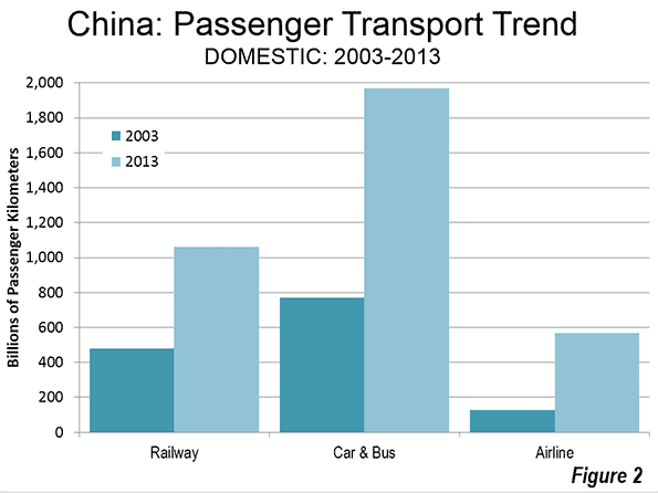
    Road travel increased more than 150 percent between 2003 and 2013 in China. Yet roads have barely held their market share as China has built new world-class airports, such as Capital City in Beijing, Baiyun in Guangzhou and many others. Over the same 10 years air travel has increased 350 percent. Meanwhile, China has built the world’s most extensive high-speed rail system and has experienced healthy rail travel growth. Yet, despite this, passenger rail’s market share has dropped from 35 percent to 29 percent over the period (Figure 2).

    China is dominant among the four economies in passenger rail volumes, with its 1.05 trillion annual passenger kilometers (0.65 trillion passenger miles) accounting for more than 2.5 times the rail travel in both the European Union and Japan. US rail travel is no more than 1/20th that of China (equal to the road travel volume in the state of Arkansas).

    The United States continues to lead in a domestic airline travel, with a volume approximately 60 percent greater than those of the European Union and China. China trails the European Union by only two percent and with its growth rate seems likely to assume the second position before long (Figure 3).

    Passenger travel market shares are indicated in Figure 4.

    Freight Transport

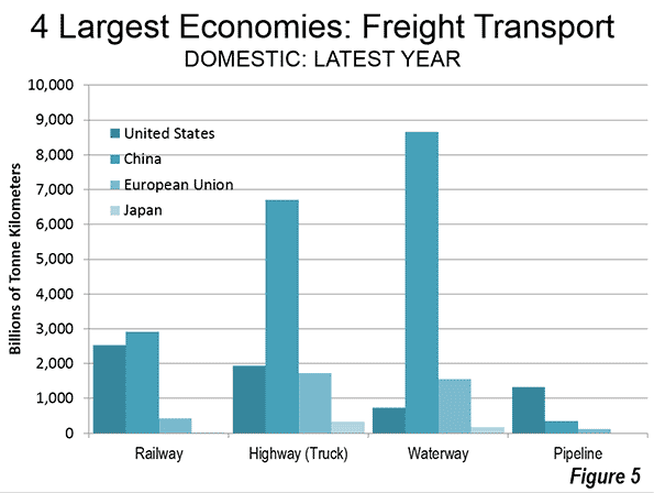
    After having led the world in rail freight volumes in recent decades, the United States has recently yielded the title to China. In 2013, China moved nearly 3 trillion tonne kilometers (Note 3) of freight by rail, compared to the US total of 2.5 trillion (2012). It may be surprising to find out that Europe, with its extensive passenger train system moves so little of its freight by rail. However, the European Union moved approximately 60 percent less of its freight by rail. However, much of the capacity of the EU’s rail system is consumed by passenger trains, leaving little for freight.  This is despite a policy commitment in the EU to substantially increase the rail freight market share relative to trucks. As a result, in Europe, the freight trains are "on the highway" (see Photo below). China has been uniquely successful among the world’s economies in developing both a world class freight rail system and a world class passenger rail system. One of China’s early objectives in developing its high speed rail program was to free space for its large freight train volumes.


    Caption: Trucks on the A7, north of Barcelona (by author)

    Among other nations, only Russia can compete with China and the United States in rail freight, having moved approximately 2.2 trillion tonne kilometers in 2012.

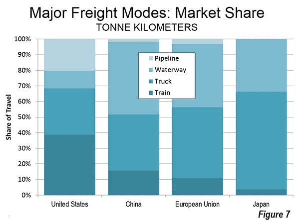
    Rail freight remains by far the most important in the United States compared to the other three largest economies. Rail freight continues to carry more tonne kilometers in the United States than trucks. The situation is much different in Europe, where trucks carried four times the volume of freight rail. Rail freight is even less significant in Japan, where trucks carry more than 15 times the volume of rail freight.

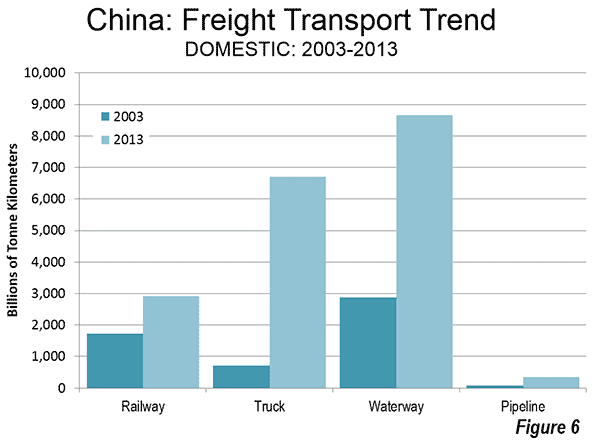
    One possibly surprising fact lies with the substantial increase in China’s truck volumes over the last decade. China now has a volume of truck traffic that is four times that of trucks in either the European Union or the United States.

    In 2003, trucks carried 60 percent less of the nation’s metric tonne mileage than freight rail. By 2013, that had been reversed with tracks carrying 130 percent more volume than freight rail.

    However China’s dominance is even greater in water borne freight, at nearly 6 times the European Union volume and more than 10 times the volume of the United States (Figure 5). Even so, China’s largest freight volumes are carried on waterways, such as the Yangtze River. Over the past 10 years waterway volumes tripled. It is even expected that there will be a significant increase in shipping on the ancient Grand Canal (Figure 6).

    Freight market shares among the major modes are shown in Figure 7.

    India

    Another of the world’s largest economies, India, also relies heavily on roads. According to the World Bank 65 percent of the freight and nearly 90 percent of passengers are carried by roads in India, though late detailed data is not available. Yet India also has the largest passenger rail usage in the world. Only China is close, and the two nations have been near equal, at least over the last decade. In 2003, China trailed India by seven percent in passenger kilometers by train. Complete Indian Railway data for 2013 is not yet available. However, if the average trip length in 2013 was the same as in 2012, China will have moved to within two percent of India’s passenger rail volume. Both nations are far above Japan and the European Union, ranked third and fourth, and almost 90 percent above Russia, which has a reputation for high passenger rail volumes.

    The Future

    With economic growth in China slowing (though still at rates that would satisfy virtually any other nation) its transport growth of the past decade seems likely to moderate. On the other hand, the other large emerging economy, India, which has substantially trailed China, could assume a Chinese trajectory. The newly elected Bharatiya Janata Party (BJP) government is committed to economic advance and infrastructure development. Market facilitating policies like those that have propelled China (see the late Noble Laureate Ronald Coase and Ning Wang, How China Became Capitalist), could lead to a similar story about India in a decade or two.

    ——

    Note 1: The latest data on international transport varies by year, even within nations (such as the United States). This analysis compares the latest data, which is 2012 (Europe and Japan), 2013 (China) and the United States (2011, with some 2009). This latest years available permit comparing the general scale of differences and, particularly in the United States, changes from the earlier data are likely to have been modest, as a result of the Great Financial Crisis and the great economic malaise that has followed. The principal data sources are the Bureau of Transportation Statistics in the United States, the National Bureau of Statistics in China and Eurostat for the European Union and Japan.

    Note 2: A passenger kilometer (or passenger mile) is the distance traveled times the number of passengers. Thus, a car going 5 kilometers with one passenger produces 5 passenger kilometers. With two passengers, there are 10 passenger kilometers.

    Note 3: A tonne kilometer is a metric tonne (2.204 pounds or 1,000 kilograms) of freight times the number of kilometers traveled. The US ton (short ton) has 2,000 pounds or 907 kilograms.

    —-

    Wendell Cox is principal of Demographia, an international public policy and demographics firm. He is co-author of the "Demographia International Housing Affordability Survey" and author of "Demographia World Urban Areas" and "War on the Dream: How Anti-Sprawl Policy Threatens the Quality of Life." He was appointed to three terms on the Los Angeles County Transportation Commission, where he served with the leading city and county leadership as the only non-elected member. He was appointed to the Amtrak Reform Council to fill the unexpired term of Governor Christine Todd Whitman and has served as a visiting professor at the Conservatoire National des Arts et Metiers, a national university in Paris.

    Photograph: Grand Canal in Suzhou (by author)

  • Thrive 2040: Toward a Less Competitive Minneapolis-St. Paul

    In a Wall Street Journal commentary entitled Turning the Twin Cities Into Sim City, Katherine Kersten of the Center of the American Experiment describes how "a handful of unelected bureaucrats are gearing up to impose their vision of the ideal society on the nearly three million residents of the Minneapolis-St. Paul metro region." She notes that the Metropolitan Council (the "handful of unelected bureaucrats") intend for "all future housing and economic development within "easy walking distance" (one-half mile) of major transit stops—primarily in the urban core and inner-ring suburbs.” This would lead to "tax dollars (mostly from people who live elsewhere) will be lavished on high-density housing, bike and pedestrian amenities and subsidized retail shops." She equates the plan with playing the computer game "Sim City with residents’ lives."

    Kersten also notes the all-too predictable distortion of future transportation funding to support transit, rather than highway congestion relief.  The ("Thrive 2040") "plan also will pour public funds into mass transit while virtually ignoring congestion relief on highways. The Twin Cities region is projected to have just $52 million available annually from 2014 to 2022 for highway congestion relief, according to the Minnesota Department of Transportation. Yet the Met Council intends to spend at least $1.7 billion on a single light-rail project, with more rail transit to follow."

    This imbalance of funding is despite the fact that less than two percent of travel in the Twin Cities is by transit. In the longer run, Minneapolis-St. Paul, which has been by far the most successful metropolitan area in the Midwest since World War II, will become less competitive if it fails to take steps to improve traffic congestion (and it is nothing short of folly to expect that transit can substitute for driving in the modern metropolitan area, see The Transit-Density Disconnect).

    Kersten also characterizes as the "most radical element," of the Metropolitan Council plan as its greenhouse gas emission reduction component, and for good reason. The urban containment policies of densification and transit are far more expensive than other strategies for reducing greenhouse gas emissions (see questioning the Messianic Conception of Smart Growth and Enough "Cowboy" Greenhouse Gas Emissions Reduction Policies). At the same time, there are a myriad of strategies that are more cost effective, such as improved fuel economy (see Obama Fuel Economy Rules Trump Smart Growth). Cost-effectiveness is important, because if more than necessary is spent to reach greenhouse gas emission goals, there will be an economic cost in fewer jobs created, a lower standard of living and greater poverty (see Toward More Prosperous Cities).

  • Thomas Sowell Explains the Economics of Urban Containment (Smart Growth)

    Economist Thomas Sowell, who has taught at Cornell University and UCLA and has worked at the Urban Institute and the Hoover Institution at Stanford University summarizes the economics of the housing market in a recent article:

    "Anyone who has taken Economics 1 knows that preventing the supply from rising to meet the demand means that prices are going to rise. Housing is no exception."

    Sowell’s cites the high prices houses for sale in the San Francisco Bay area suburb of Palo Alto. Three catch his eye:

    About the first house, he says: “The house is for sale at $1,498,000. It is a 1,010 square foot (94 square meters, added by author) bungalow with two bedrooms, one bath and a garage. Although the announcement does not mention it, this bungalow is located near a commuter railroad line, with trains passing regularly throughout the day."

    The second house has 1,200 square feet (111 square meters) and was listed for $1.3 million. Intense competition for the house drove the sale price to $1.7 million.

    The third, with 1,292 square feet (120 square meters) and built in 1895 is on the market for $2.3 million.

    Sowell continues: "There are people who claim that astronomical housing prices in places like Palo Alto and San Francisco are due to a scarcity of land. But there is enough vacant land ("open space") on the other side of the 280 Freeway that goes past Palo Alto to build another Palo Alto or two — except for laws and policies that make that impossible. As in San Francisco and other parts of the country where housing prices skyrocketed after building homes was prohibited or severely restricted, this began in Palo Alto in the 1970s."

    As in Palo Alto, outrageous price increases began in the San Francisco Bay Area in the 1970s, and were the predictable outcome of urban containment policies (smart growth policies) that rationed land for development.

    House prices are three times as high relative to incomes in the Bay Area than they were before urban containment regulation began in the early 1970s. Among New World (US, Canada, Australia and New Zealand) major metropolitan areas, only Vancouver has higher house prices relative to incomes.

  • Urban Core Jurisdictions: Similar in Label Only

    The fortunes of U.S. core cities (municipalities) have varied greatly in the period of automobile domination that accelerated strongly at the end of World War II. This is illustrated by examining trends between the three categories of "historical core municipalities" (Figure 1). Since that time, nearly all metropolitan area (the functional or economic definition of the city) growth has been suburban, outside core municipality limits, or in the outer rings of existing, core municipalities.   

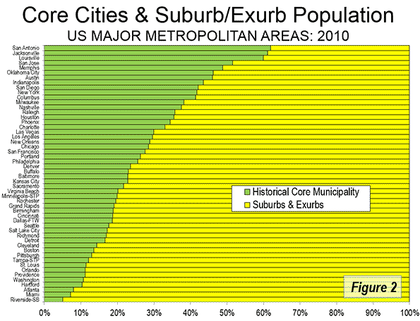
    Approximately 26 percent of major metropolitan area population is located in the core municipalities. Yet, many of these municipalities include large areas of automobile orientation that are anything but urban core in their urban form. Most housing is single-detached, as opposed to the much higher share of multi-family in the urban cores, and transit use is just a fraction of in the urban cores.

    Even counting their essentially suburban populations, today’s core municipalities represent, with a few exceptions, a minority of their metropolitan area population. The exceptions (San Antonio, Jacksonville, Louisville, and San Jose) are all highly suburbanized and have annexed land area at a substantially greater rate than they have increased their population.

    According to the 2010 census, using the 2013 geographic definitions, core cities accounted for from five percent of the metropolitan area population in Riverside-San Bernardino to 62 percent in San Antonio (Figure 2).

    International Parallels

    These kinds of differences are not limited to the United States. For example, the city (municipality) of Melbourne, Australia has little more than two percent of the Melbourne metropolitan area population. Indeed, the city of Melbourne is only the 23rd largest municipality in the Melbourne metropolitan area and has a population smaller than a single city council district in Columbus, Ohio.

    These virtually random variations in core city sizes lead to misleading characterizations. For example, locals sometimes point out that San Antonio is the 6th largest city in the United States. True, San Antonio is the 6th largest municipality in the United States, but the genuine, classically defined city – the broader metropolitan area that is the urban organism – ranked only 26th in size in 2010. The suburbs and exurbs, as defined by municipal jurisdictions, are smaller than average in San Antonio, but the city itself stretches in a suburban landscape up to more than 15 miles (24 kilometers) beyond its 1950 borders.

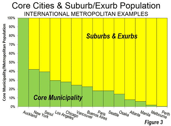
    Core municipality mayors have been known to travel around the as representatives of their metropolitan areas. In some cases core municipality mayors represent constituencies encompassing the entire metropolitan area (such as Auckland or soon to be major metropolitan Honolulu). Others have comparatively small constituencies. For example, the mayor of Paris presides over only 18 percent of the metropolitan area population, the mayor of Atlanta 8 percent, the mayor of Manila 6 percent, Melbourne 2 percent and Perth, Australia just 0.5 percent (Figure 3).

    Core Municipalities in the United States

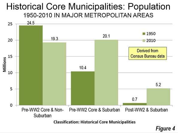
    A remnant of U.S. core urbanization is evident within the city limits of municipalities that were already largely developed in 1940 and have not materially expanded their boundaries. These are the Pre-World War II Core & Non Suburban category of core municipalities. Between 1950 and 2010 these core municipalities lost a quarter of their population, dropping from 24.5 million residents to 19.3 million (Figure 4). All but Miami lost population. Despite improved downtown population fortunes, the last decade saw a small further decline of 0.2 percent overall. Only two legacy cities, New York and San Francisco, now exceed their peak populations of the mid-20th Century.

    Again, this is the typical pattern internationally. Throughout the high-income world, the urban cores that have not expanded their boundaries and had little greenfield space for suburban development have had declining in population for years. My review of 74 high income world core municipalities that were fully developed in the 1950s and have not annexed materially showed that only one had increased in population by 2000 (Vancouver). Since that time, a few that had experienced more modest declines have recovered to record levels, such as Munich and Stockholm. Most others, such as London, Paris, Milan, Copenhagen and Zurich remain below their peak populations.

    In the United States, most of the strong growth has taken place in the "Pre-World War II & Suburban" classification, doubling from 10.1 million residents to 20.4 million since 1950. These include core cities with strong pre-war cores, but which have either annexed large areas or already contained large swaths of rural territory at that time (like Los Angeles, with its San Fernando Valley, which was largely agricultural) that later became heavily populated.

    Many of these core cities experienced population declines within their 1950 boundaries (such as Portland, Seattle and Nashville between 1950 and 1990). Los Angeles, however, has been the exception. The more highly developed central area (as defined by the city Planning Department) within the city limits has increased in population by one-third since 1950. The continuing suburbanization of the city of Los Angeles, however, is indicated by the fact that the central area’s share of city population has fallen from 68 percent to 47 percent.

    The "Post-World War II & Suburban" core cities are much smaller and their metropolitan areas are nearly all suburban. These include metropolitan areas like Phoenix and San Jose. The population of these metropolitan areas has increased more than seven fold, from 700,000 to 5.2 million.

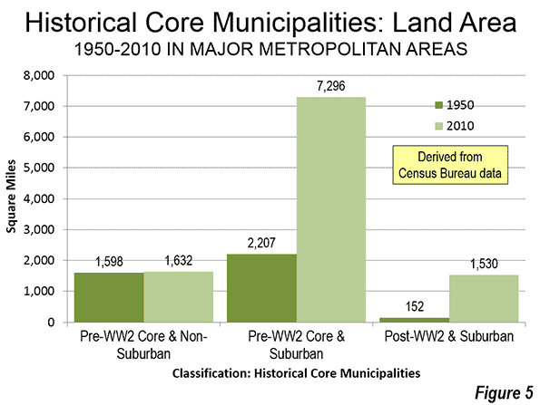
    Land Area: The differences between the three historical core municipality classifications are most evident in land area. Among the "Pre-World War II & Non-Suburban" cores, land areas were almost unchanged from 1950, with much of the difference reflected in Chicago’s O’Hare International Airport annexation. In contrast, the "Pre-World War II & Suburban" cores more than tripled in size, adding an area larger than Connecticut to their city limits. The percentage increase was even larger in the "Post-World War II & Suburban" cores which covered 10 times as much land in 2010 as in 1950 (Figure 5).

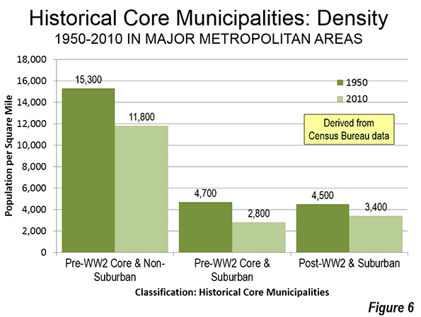
    Population Density: Over the 60 year period, the population density of the "Pre-World War II & Non-Suburban" cores dropped from 15,300 per square mile to 11,400 (5,900 per square kilometer to 4,400). The "Pre-World War II & Suburban" and "post-World War II & Suburban" cores started with much lower densities and then fell farther. The core city densities in these municipalities are approximately one-half the population densities of Los Angeles suburbs (Figure 6).

    The Need for Caution

    All of this indicates the importance of caution with respect to core versus suburban and exurban comparisons. For example, Atlanta, which represents only 8 percent of the urban organism (metropolitan area) in which it is located is not comparable to San Antonio, with its 62 percent of the metropolitan population. These distinctions are important when we talk about different regions.

    Wendell Cox is principal of Demographia, an international public policy and demographics firm. He is co-author of the "Demographia International Housing Affordability Survey" and author of "Demographia World Urban Areas" and "War on the Dream: How Anti-Sprawl Policy Threatens the Quality of Life." He was appointed to three terms on the Los Angeles County Transportation Commission, where he served with the leading city and county leadership as the only non-elected member. He was appointed to the Amtrak Reform Council to fill the unexpired term of Governor Christine Todd Whitman and has served as a visiting professor at the Conservatoire National des Arts et Metiers, a national university in Paris.

    Chicago photo by Bigstock.

  • Tambora vs. Krakatoa: Which was Worse?

    An April 27 Wall Street Journal book review by Simon Winchester descends into a petty squabble about whether the volcanic eruptions on Mount Tambora (1815) and Krakatoa (1883), both located in Indonesia, was more significant. After a few positive paragraphs reviewing Gillen D’Arcy Wood’s Tambora: The Eruption That Changed the World, Winchester takes exception to Wood’s comparison of the Tambora eruption with that of Krakatoa. Winchester writes:

    "I have one argument. Mr. Wood’s intention in writing the story of Tambora, in time for its bicentenary, is to stake the eruption’s claim for global primacy—to knock Krakatoa off its long-held pedestal. The celebrity of [Krakatoa’s] more modest eruption in 1883 seems undeserved,’ he writes. ‘Only the historical accident of the telegraph’s invention allowed news of it to travel instantly across the world.’"

    Which is the More Significant?

    Winchester introduces his defense of Krakatoa, admitting that he has a "dog in the fight," as author ofKrakatoa: The Day the World Exploded: August 27, 1883. He claims that Krakatoa "was the biggest volcanic explosion in what one may call fully recorded human history." He then spends a third of the article seeking to prove that the Krakatoa eruption was the more significant than that of Tambora.

    Winchester describes the Krakatoa eruption and how the rapid communications that had recently become available amplified its significance in  the decades that followed. He points out that there were more than 40,000 fatalities and that Krakatoa generated the most extensive tsunami ever generated by a volcano. Finally, he claims that Krakatoa "contributed to the creation of the Republic of Indonesia."

    I have long asked the same question that Woods poses and concluded that history had slighted Tambora. So, I spent some time the other evening reacquainting myself with the subject, using Internet sources (such as Wikipedia), which do not rise to academic standards, but certainly paint a picture supporting Woods’ position.

    As for the 40,000 fatalities, there appears to be no question but that fatalities from Tambora were nearly twice as great. It is not really surprising that Krakatoa is a more extensive tsunami than Tambora, since Krakatoa was a fairly modest mountain (less than 3,000 feet or 1,000 meters) sitting in the Sunda Strait between Java and Sumatra. Much of the volcano collapsed into the sea, which will obviously produce a larger tsunami than when the mountain is at least 10 miles (16 kilometers) from the sea and principally collapsed upon itself, rather than the sea.

    The claim that the Krakatoa eruption was instrumental in creating the Republic of Indonesia is bizarre. Krakatoa surely did not provide any incentive to the Dutch to rule longer, or for the Indonesians to extend colonial rule. Indonesia was among the first to shake off colonialism following World War II (1945). Nor is it likely that an unexploded Krakatoa would have advanced independence to before the War.

    Fully Recorded History as of 1981: St. Helen’s Exceeds Krakatoa

    Winchester overreaches in noting that Krakatoa was the "biggest volcanic explosion "in fully recorded human history." Fully recorded human history is in the eye of the beholder. Yet, the Krakatoa eruption was not recorded by motion pictures or video, which were not yet invented and did not thus occur in "fully recorded history" as we know it.

    For example, in 1981, a few months after Washington’s Mount St. Helen’s blew its side out, it would have been fair to characterize its 1980 eruption as being more significant than Krakatoa, by virtue of having been captured on video (and thus in "fully recorded history” at them time). Certainly, scientists have learned much from Mount St. Helens. However, its greater significance due to its capture on video was a function of technology, not volcanism.

    Tambora’s Significance

    By any measure, Tambora was a substantially larger volcanic eruption that Krakatoa. Its Volcanic Explosive Index (VEI) was 7, the only confirmed rating of that intensity since the Lake Taupo eruption in New Zealand 1,600 years before. By comparison, Krakatoa earned a VEI of only 6. Further, Tambora spewed a far greater volume, at 38 cubic miles (160 cubic kilometers). By comparison, Krakatoa’s volume was less than one-third that of Tambora, at 11 cubic miles (45 cubic kilometers). Both ejected far greater volumes than the 1980 eruption of Mount Saint Helens (less than one quarter cubic mile or one cubic kilometer), which had a VEI of 5.

    Moreover, Tambora set off the "year without summer" in 1816, when a June snow storm dumped six to twelve inches (15 to 30 centimeters) on northern New England and snow drifts of two feet (60 centimeters) in the ville de Quebec.

    Indonesia’s Disasters

    Interestingly, neither the Tambora nor the Krakatoa eruption ranks as the largest in Indonesian history (or perhaps more properly, pre-history). The Lake Toba eruption on Sumatra occurred 75,000 years ago and is reputed to have been the most intensive in the world in the last 2 million years. Lake Toba ejected approximately 675 cubic miles (2,800 cubic kilometers) of material. This is 17 times the Tambora volume and more than 60 times the Krakatoa volume. But none of the three killed as many people (230,000) as the Boxing Day tsunami (December 26, 2004), which was set off by a 9.0 earthquake off Sumatra. Population had exploded between 1883 and 2004, which drove the Boxing Day tsunami fatalities far above those of the Krakatoa tsunami.

    Tambora v. Krakatoa: Volcanism v. Telecommunications

    Winchester confuses technology with history. Woods is exactly right. But for the historical accident of the telegraph, Krakatoa might have been as largely forgotten, not unlike another VEI-6 event — the 1912 Novarupta volcanic eruption in Alaska. Had the telecommunications of 1815 been equal to those of 1883, no one would remember Krakatoa. Telecommunications explains its prominence, not volcanism.
    —————–
    Wendell Cox is principal of Demographia, an international public policy and demographics firm. He is co-author of the "Demographia International Housing Affordability Survey" and author of "Demographia World Urban Areas" and "War on the Dream: How Anti-Sprawl Policy Threatens the Quality of Life." He was appointed to three terms on the Los Angeles County Transportation Commission, where he served with the leading city and county leadership as the only non-elected member. He was appointed to the Amtrak Reform Council to fill the unexpired term of Governor Christine Todd Whitman and has served as a visiting professor at the Conservatoire National des Arts et Metiers, a national university in Paris.

    Photo: Tambora: Depiction of 1815 Eruption (from http://cdn-2.vivalascuola.it/o/orig/scienze-classificazione-vulcanica_b2a5e9a592a9ff2585850e6b6006f595.jpg

  • The Evolving Urban Form: Philadelphia

    Philadelphia was America’s first large city and served as the nation’s capital for all but nine months between the inauguration of George Washington is the first president in 1789 and the capital transferred to Washington, DC in 1800.

    Before the early 1900s, the United States Census Bureau had not developed a metropolitan area (labor market area) concept. However, the website peakbagger.com has attempted to define earlier metropolitan areas based on concepts similar to those used today. In the case of Philadelphia, this is important, because it was somewhat unique in having virtually adjacent, highly populated suburbs that make comparisons of municipal populations (the only population data available) misleading.

    The Nation’s Largest City

    According to municipal population data, New York had become the largest municipality in the United States by the time of the first census, in 1790. Philadelphia was ranked second. However, a list of the top 24 urban places in 1790 shows two Philadelphia suburbs, Northern Liberties and the Southwark district. When peakbagger.com includes these suburbs, Philadelphia rises as the largest city (metropolitan area) in the nation in the 1790 and 1800 censuses. The New York metropolitan area is shown as rising to number one in 1810, a position it is held for 200 years and may last for much longer in light of the much slower growth rate recently for Los Angeles.

    Soon the Nation’s 9th Largest City?

    Those were the glory days. In the years since 1800, Philadelphia has been falling in population rank. The Philadelphia metropolitan area was displaced first by Chicago in 1900, according to the metropolitan district estimates of the US Census Bureau. In 1940, Philadelphia was demoted to fourth place by Los Angeles. Philadelphia held fourth position until 2006, when Dallas-Fort Worth raced past it. Then just a few years later (2010), Houston knocked Philadelphia down to 6th place. The downward trend could accelerate rather quickly. At current growth rates (2010 to 2013), Philadelphia would be passed by Washington and Miami by the time of the 2020 census. The Atlanta metropolitan area would also pass Philadelphia if its population growth rate is restored to pre-Great Recession rates. Philadelphia should start the next decade as either the 9th or 10th largest metropolitan area in the nation.

    Population Growth in the Philadelphia Metropolitan Area

    The Philadelphia metropolitan area is unusual in being divided between four states. The core city of Philadelphia is located in Pennsylvania. Directly across the Delaware River are the suburban counties of New Jersey. Wilmington, formerly the largest metropolitan area in Delaware has been incorporated into the Philadelphia metropolitan area (New Castle County). Maryland’s Cecil County is also included in the metropolitan area.

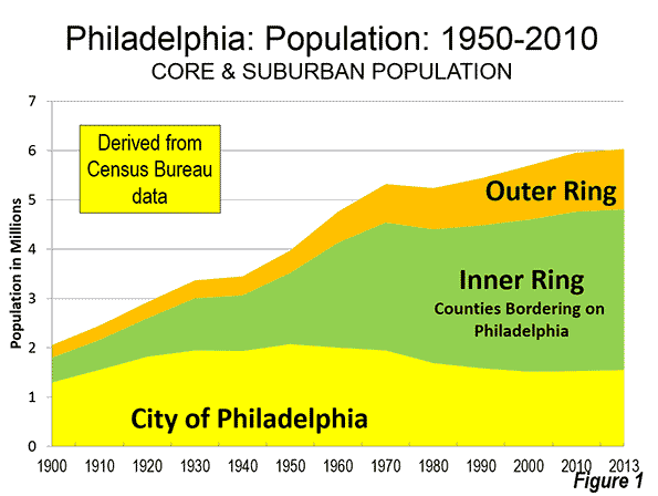
    All of Philadelphia’s population growth since 1950 has been in the suburbs. In that year, the city of Philadelphia peaked at 2,072,000 residents. This was a healthy increase from the 1,930,000 in the 1940 census. However, this represented a decline from 1,951,000 in 1930 and shadowed massive population losses that would follow after 1950 (Cleveland and St. Louis also lost population between 1930 and 1940).

    By 2000, the city’s population had dropped 27 percent to 1,518,000. This could prove its modern low, as the population recovered to 1,526,000 in the 2010 census and was estimated by the Census Bureau at 1,553,000 in 2013.

    The suburbs of the metropolitan area as presently defined added nearly 2.6 million residents between 1950 and 2013. However, the metropolitan area only grew by 2.1 million residents because of the more than 500,000 loss in the city of Philadelphia. The inner ring suburbs, counties abutting Philadelphia County in Pennsylvania and New Jersey gained 1.8 million residents, while the outer suburbs gained nearly 800,000 residents (Figure 1).

    Domestic Migration

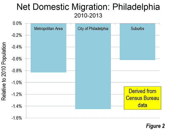
    Philadelphia has continued to lose domestic migrants to other areas of the country. Between 2010 and 2013, approximately 50,000 net domestic migrants left the Philadelphia area. Of this, 22,000 left the city of Philadelphia and 28,000 left the suburbs. The rate of domestic migration loss was 0.8 percent in the metropolitan area, 1.4 percent in the city of Philadelphia and 0.6 percent in the suburbs (Figure 2).

    Employment

    Within the metropolitan area, the commercial primacy of the core city of Philadelphia also has been reduced. Philadelphia has long been known for having one of the largest central business districts in the United States. The most recent census tract data from the CTPP indicates that Philadelphia has the sixth largest business district in the United States, with approximately 240,000 jobs. This represents only 8.7 percent of the metropolitan area employment, a figure slightly above the 8.4 percent average of the 52 major metropolitan areas (those with more than 1 million residents).

    The development of Philadelphia’s "center city" business district may have been stunted by city regulations that prohibited buildings to exceed the height of City Hall, topped off by a statue of city founder William Penn. At nine floors and approximately 550 feet (165 meters), City Hall was briefly the tallest building in the world in the early 1900s. City Hall remained a dominant feature of the skyline until the late 1980s, when One Liberty Place, with its 61 floors rose to 945 feet (290 meters). There are now 8 buildings taller than City Hall. Construction will soon begin on a new office and hotel tower , which at 1,120 foot tall (340 meters), 59 floor building would be the tallest building in the United States outside New York and Chicago (and taller, by 20 feet than Wilshire Grand now under construction in Los Angeles).

    Transportation

    I have described the city of Philadelphia as a "transit legacy city," which along with New York, Chicago, San Francisco, Boston, and Washington account for 55 percent of all the transit commuting destinations in the United States. This is nearly 10 times the share of jobs that are located in these six municipalities (not metropolitan areas).

    Philadelphia, like the other five other transit legacy cities has an extensive urban rail system. Philadelphia has commuter rail lines extending outward to suburban locations in Pennsylvania, New Jersey and Delaware. There are also two Metro lines (subway lines) and electric trolley lines. This transit system delivers 44 percent of commuters to "center city" jobs. This represents more than 40 percent of the transit commuting in the Philadelphia metropolitan area. Transit’s market share to work locations outside downtown is relatively small at 6.0 percent.

    The nation’s first long intercity tollway (the Pennsylvania Turnpike) passes through the Philadelphia metropolitan area. This route, in connection with the New Jersey Turnpike, the Ohio Turnpike, the Indiana Toll Road and the Chicago Skyway provided freeway equivalent access between the New York, Philadelphia, Pittsburgh, Cleveland and Chicago metropolitan areas in the middle 1950s, before the interstate highway system was authorized.

    Philadelphia’s stagnant population growth is typical for the Northeast, which continues to lose domestic migrants to the rest of the nation. It seems likely to continue. In the two decades following 2020, Phoenix and Riverside-San Bernardino are projected by the US Conference of Mayors to pass Philadelphia. This would push Philadelphia down to 12th place, compared to the 4th ranking it had at the beginning of the 21st century. Quite a ride down for the City of Brotherly Love, and its surrounding region.

    Wendell Cox is principal of Demographia, an international public policy and demographics firm. He is co-author of the "Demographia International Housing Affordability Survey" and author of "Demographia World Urban Areas" and "War on the Dream: How Anti-Sprawl Policy Threatens the Quality of Life." He was appointed to three terms on the Los Angeles County Transportation Commission, where he served with the leading city and county leadership as the only non-elected member. He was appointed to the Amtrak Reform Council to fill the unexpired term of Governor Christine Todd Whitman and has served as a visiting professor at the Conservatoire National des Arts et Metiers, a national university in Paris.

    Photo: Philadelphia City Hall by Max Binder