Author: Wendell Cox

  • Commuter tax on Suburbanites Working in Indianapolis?

    According to the Indianapolis Star, Mayor Greg Ballard of Indianapolis is poised to improve the slowing growing city’s competitive position relative to the suburbs.  The Star  noted:

    "Indianapolis may be a bigger draw than surrounding areas in attracting young residents, but it’s got a problem."

    "Right as they begin raising families, many in their 30s split for the suburbs — taking their growing incomes, and the local taxes they pay, to bedroom communities in Hamilton, Johnson, Hendricks and other counties."

    Mayoral Chief of Staff Ryan Vaughn told The Star that initiatives would include a focus on improving schools, and public safety, both of which had much to do with the decades long declines of US central cities. Vaughn told the newspaper that "Ballard wants to focus on strategies to compete more fiercely with suburban counties that draw — and keep — middle- and higher-income residents."

    Certainly, the fact that central cities are far safer today than they were when New York’s Mayor Rudolph Giuliani implemented his much copied policy of intolerance toward crime in the early 1990s. Even so, Mayor Ballard has it right. Long term, sustainable recovery of cities as livable environments within the metropolitan economy requires both good public schools and an environment in which parents feel that they and their children are safe.

    There is a cautionary note however. While the Mayor’s office is on the right track in wanting to solve the endemic problems that have so weakened core cities such as Indianapolis, he has yet to take a position on a proposed commuter tax that would be levied against employees who live in suburban counties and work in the city. This would make the suburbs more attractive for employers who are presently located in the city. Further, it would make the suburbs more competitive to businesses that choose the Indianapolis area for relocation. Trying to attract and keep middle income households, while repelling business makes little sense.

  • Moving South and West? Metropolitan America in 2042

    The United States could have three more megacities (metropolitan areas over 10 million) by 2042, according to population projections released by the United States Conference of Mayors (USCM). Chicago, Dallas-Fort Worth, and Houston  are projected to join megacities New York and Los Angeles as their metropolitan area populations rise above 10 million. At the projected growth rates, Atlanta, Miami, Phoenix, and Riverside-San Bernardino could pass the threshold by 2060. The population projections were prepared for USCM by Global Insight IHS.

    USCM anticipates that the number of major metropolitan areas – those over 1,000,000 population –- will rise from 51 in 2012 to 70 in 2042 (Note). The additional 19 major metropolitan areas range from Honolulu, which should exceed the million threshold next year, to Colorado Springs. California would add four new major metropolitan areas, including Fresno, Bakersfield, and Stockton from the San Joaquin Valley and Oxnard, which is adjacent to Los Angeles. Texas would add two, McAllen and El Paso, as would Florida (Cape Coral and Sarasota) and South Carolina (Columbia and Charleston).

    The Top 10 in 2042

    The top ten rankings would change relatively little. The top five would continue to be (in order), New York, Los Angeles, Chicago, Dallas-Fort Worth, and Houston. But the relationships would change materially. Dallas-Fort Worth would trail Chicago by only 30,000, much reduced from the 2012 gap of 2.9 million. If the annual projected growth rate were to continue another year (to 2043), Dallas-Fort Worth would take third position from Chicago, ending more than eight decades in that position. Houston also is forecast to gain substantially on Chicago, from a deficit of 3.3 million in 2012 to only 900,000 in 2042. If the respective annual growth rates were to continue, Houston would bump Chicago to fifth place by 2050.

    Atlanta would move up three positions to number 6, and could be the nation’s 6th megacity before 2050. Miami would move from 8th to 7th. There would be two new entrants to the top ten: Phoenix and Riverside-San Bernardino, ranked 8th and 9th. These two, along with Miami could become megacities before 2060. The tenth position would be held by fast growing Washington, which would remain the only non megacity in the top ten.

    Seven of the top ten metropolitan areas in 2042 are forecast to grow very rapidly. Phoenix and Riverside-San Bernardino are projected to grow at annual rates of 2.1 percent and 2.0 percent respectively, approximately three times the 2012-2042 national growth rate projected by the US Census Bureau (0.7 percent). Atlanta, Dallas-Fort Worth and Houston would grow at 2.5 times the national rate (1.7 percent), Miami nearly double (1.3 percent) and Washington at 1.5 times the national rate (1.0 percent).

    Washington is technically in the South, which according to the US Census Bureau begins at the Mason-Dixon line, or the Pennsylvania-Maryland border. This means that all of the fast growing top 10 metropolitan areas are in the South or West, a pervasive trend discussed later in this article.

    Meanwhile, the three largest metropolitan areas would have well below average growth. New York would grow the slowest, at 0.3 percent. Chicago would grow at 0.5 percent annually, faster than Los Angeles, a national growth leader for a century, which would grow at only a 0.4 percent annual rate (Figure 1).

    Fastest Growth Major Metropolitan Areas

    Among the 70 major metropolitan areas, the fastest growing would be Cape Coral, Florida, with an annual growth rate of 2.4 percent. Provo, Utah and McAllen, Texas would grow at 2.3 percent. Six of the ten fastest growing metropolitan areas already have more than 1,000,000 population, including Austin, Phoenix, Raleigh, Riverside-San Bernardino, and Atlanta (10th). Boise would be the 9th fastest growing (Figure 2)

    Slowest Growth Major Metropolitan Areas

    Four of 2042’s major metropolitan areas would lose population from 2012, including Buffalo, Cleveland, Detroit, and Pittsburgh. Hartford, Rochester, Milwaukee, and Providence would grow at less than one-third the national population growth rate. New Orleans and New York would round out the bottom ten, growing at an annual rate of approximately 0.25 percent (Figure 3).

    Though Los Angeles is not among the bottom ten (it would #13), it is notable that its growth rate is projected to be slightly less than St. Louis, long a laggard, and only slightly better than Philadelphia. Philadelphia has been losing position regularly since it was the nation’s largest city, before the first US census (1790).

    Regional Distribution of Growth

    According to the USCM projections, the overwhelming majority of major metropolitan area population growth (70 areas) will occur in the South and West. Approximately 51 percent of the major metropolitan growth is expected in the South, which would add 33 million residents. The West would capture 36 percent of the growth, while adding 22 million residents. The Midwest would capture only 9 percent of the growth, adding 8 million residents, while the Northeast would take 4 percent of the growth, while adding only 2 million residents (Figure 4).

    The South would grow at an annual rate double that of the national 0.7 percent rate (1.4 percent). The West would be close behind (1.2 percent). However, if the major metropolitan areas of coastal California were excluded from the West (Los Angeles, San Francisco, San Diego, and San Jose), the West would grow even faster than the South (1.6 percent). Coastal California’s annual growth rate is projected at 0.6 percent, below the national average of 0.7 percent.

    The Northeast and the Midwest would both grow at less than the national growth rate (0.2 percent and 0.5 percent respectively). The fastest growing metropolitan area in the Midwest is projected to be Indianapolis, at a respectable 1.2 percent growth rate (ranking 32 out of 70). Midwestern Omaha, Kansas City, and Columbus would also grow faster than the nation.

    The fastest growing major metropolitan area in the Northeast would be Philadelphia, which would add only 0.3 percent to its population annually (ranking 59th). Philadelphia would add only slightly more residents than Provo, Utah, despite being more than 10 times as large in 2012.

    Projections are Projections

    Projecting anything can be risky. Unforeseen circumstances could result in a materially different future than forecasts suggest. No reputable forecaster, for example would have predicted during the 20th century that North Dakota would become the nation’s fastest growing state in the early 2010s. Upstate New York, for example, could experience an economic turnaround if state allows them to take advantage of hydraulic fracking. The long-suffering Buffalo and Rochester metropolitan areas could rise well above current expectations. It is probably far too much to expect any major material progress in California, with a business climate so colorfully dismissed by The Economist in its current edition (see The Not So Golden State).

    The USCM projections to 2042 indicate a continuation of geographical trends that have been strengthening virtually every decade since the middle of the last century. Barring any sea-changes, they are more likely to be more right than wrong.

    ————————

    Note: The USCM projections were prepared before the revision of metropolitan area boundaries in 2013. This revision added Grand Rapids as the 52nd major metropolitan area. Had the new definitions been available, Grand Rapids would have been the 71st major metropolitan area. Generally, there were only minor changes in the major metropolitan area definitions, the most significant being New York, Charlotte, Grand Rapids, and Indianapolis.

    ————–

    Wendell Cox is a Visiting Professor, Conservatoire National des Arts et Metiers, Paris and the author of “War on the Dream: How Anti-Sprawl Policy Threatens the Quality of Life.

    Photo: Cape Coral, Florida: Projected Fastest Growing Major Metropolitan Area: 2012-2042 (by author)

  • Correcting Priorities: The 10th Annual Demographia Housing Affordability Survey

    Alain Bertaud of the Stern School of Business at New York University and former principal planner of the World Bank introduces the 10th Annual  Demographia International Housing Affordability Survey by urging planners to abandon:

    "…abstract objectives and to focus their efforts on two measurable outcomes that have always mattered since the growth of large cities during the 19th century’s industrial revolution: workers’ spatial mobility and housing affordability".

    This year’s edition has been expanded to nine geographies, including Australia, Canada, Hong Kong, Ireland, Japan, New Zealand, Singapore, the United Kingdom, and the United States. A total of 85 major metropolitan areas (of over 1,000,000 population) are covered, including five of the six largest metropolitan areas in the high income world (Tokyo-Yokohama, New York, Osaka-Kobe-Kyoto, London, and Los Angeles). Overall, 360 metropolitan markets are included.

    View the map with housing data for all markets created by the New Zealand Herald.

    The Affordability Standard

    The Demographia International Housing Affordability Survey uses a price-to-income ratio called the "median multiple," calculated by dividing the median house price by the median household income. Following World War II, virtually all metropolitan areas in Australia, Canada, Ireland, New Zealand, the United Kingdom, and the United States had median multiples of 3.0 or below. However, as urban containment policies have been implemented in some metropolitan areas, house prices have escalated well above the increase in household incomes. This is exactly the effect that economics predicts to occur where the supply of a good or service is rationed, all things being equal.

    Even a decade ago, there was considerable evidence of the rapidly deteriorating housing affordability in markets with urban containment policy. Yet, governments implementing these policies were largely ignoring not only the trends, but also any reference to the extent of the losses in historic context. Co-author Hugh Pavletich of Performance Urban Planning and I established the Demographia International Housing Affordability Survey to draw attention to this policy driven attack on the standard of living.

    The Demographia Survey rates housing affordability as follows:

    Demographia Housing Affordability Rating Categories

    Rating

    Median Multiple

    Severely Unaffordable

    5.1 & Over

    Seriously Unaffordable

    4.1 to 5.0

    Moderately Unaffordable

    3.1 to 4.0

    Affordable

    3.0 & Under

    Affordability in the 9 Geographies

    Among the nine geographies and all 360 markets, Ireland emerges has the most affordable, with a median market multiple of 2.8. The United States follows at 3.4, and Canada at 3.9. Japan’s median market multiple is 4.0, while the United Kingdom is at 4.9 and Singapore at 5.1 The other geographies are all well into the severely unaffordable category, including Australia and New Zealand, at 5.5, and far worse Hong Kong, at 14.9 (Figure 1).

    Costly Hong Kong & Vancouver, Affordable Pittsburgh and Atlanta

    For the fourth year in a row, Hong Kong is the least affordable major metropolitan area, with a median multiple of 14.9, three times its early 2000s ratio. Vancouver is again the second most unaffordable major market, with a median multiple of 10.3, three times its pre-urban containment level. Housing affordability in coastal California is well on the way to the stress of the 2000s. San Francisco ranks third most unaffordable at 9.2 and nearby San Jose is at 8.7, with San Diego (7.9) and Los Angeles (7.7) following closely. Sydney, at 9.0, ranks fourth with Melbourne at 8.4 and Auckland at 8.0.All of these metropolitan areas have had serious deterioration of housing affordability since adopting urban containment policy.

    All of the affordable major metropolitan areas are all in the United States. Pittsburgh is the most affordable, at 2.3. There are 13 additional major affordable housing markets, which include growing and over-5 million Atlanta as well as Indianapolis and Columbus, with their strong economies (Figure 2).

    Japan

    Notably, Japan’s two largest metropolitan areas, Tokyo-Yokohama and Osaka-Kobe-Kyoto have avoided the severely unaffordable territory occupied by the other three megacities (New York, Los Angeles, and London). Osaka-Kobe-Kyoto has the best housing affordability of any megacity, at 3.5 (moderately unaffordable) and Tokyo-Yokohama is at 4.4 (seriously unaffordable).

    House Size

    This year’s Demographia Survey also provides information on average new house size in the nine geographies (Figure 3). The largest houses are in the United States, which is second only to Ireland in affordability. The smallest houses are in Hong Kong, which also has the least affordable housing. In living space those who pay the most get the least, while those who pay the least get the most.

    The Imperative for Reform

    Housing is the largest element of household budgets, and its cost varies the most between metropolitan areas. Where households pay more than necessary for housing, they have less dicsretionary income and lower standards of living and there is more poverty. This is a natural consequence of planning policies that place the urban form above the well-being of people. One of the principal justifications is environmental, but the gains from urban containment policy are scant and exorbitantly expensive.

    Virtually all of the geographies covered in the Demographia Survey are facing more uncertain economic futures than in the past. As is always the case in such situations, lower income households tend to be at greatest risk, while younger households have much less chance of living as well as their parents (except those fortunate enough to inherit their wealth or housing).

    There is no more imperative domestic policy imperative than improving the standard of living and minimizing poverty. Planning must facilitate that, not get in the way. Bertaud is hopeful:

    "But if planners abandoned abstracts and unmeasurable objectives like smart growth, liveability and sustainability to focus on what really matters –  mobility and affordability – we could see a rapidly improving situation in many cities.  I am not implying that planners should not be concerned with urban environmental issues.  To the contrary, those issues are extremely important, but they should be considered a constraint to be solved not an end in itself."

    Download the full report (pdf):  10th Annual  Demographia International Housing Affordability Survey

    Photo: Suburban Tokyo (by author)

  • Britain’s Planning Laws: Of Houses, Chickens and Poverty

    Perhaps for the first time in nearly seven decades a serious debate on housing affordability appears to be developing in the United Kingdom. There is no more appropriate location for such an exchange, given that it was the urban containment policies of the Town and Country Planning Act of 1947 that helped drive Britain’s prices through the roof. Further, massive damage has been done in countries where these polices were adopted, such as in Australia and New Zealand (now scurrying to reverse things) as well as metropolitan areas from Vancouver to San Francisco, Dublin, and Seoul.

    A healthy competition has developed between the Conservative-Liberal Democrat coalition and the Labour Party to finally address the problem of the resulting land and housing shortage that has driven prices up so much relative to incomes.

    It probably helps that public opinion seems to be changing. A recent MORI poll found that 57 percent of respondents considered rising house prices to be a bad thing for Britain, compared to only 20 percent who though it a good thing.

    It has been more than a decade since Kate Barker, then a member of the Monetary Policy Committee of the Bank of England (the central bank) was commissioned by the Blair Labor government to examine the issues. Her conclusions were clear. Britain has a serious housing affordability problem and its restrictive land use policies were the cause. These higher housing costs, the largest element or household expenditure have reduced the standard of living and increased poverty beyond what would have occurred if urban containment regulation had not destabilized house prices. The Economist notes that home ownership is falling and that the number of couples with children who are renting has tripled since the late 1990s.

    Planning and Chickens

    This week, The Economist weighed into the debate (Britain’s planning laws: An Englishman’s home):

    "Now that the economy is at last growing again, the burning issue in Britain is the cost of living. Prices have outstripped wages for the past six years. Politicians have duly harried energy companies to cut their bills, and flirted with raising the minimum wage. But the thing that is really out of control is the cost of housing. In the past year wages have risen by 1%; property prices are up by 8.4%. This is merely the latest in a long surge. If since 1971 the price of groceries had risen as steeply as the cost of housing, a chicken would cost £51 ($83)."

    For those of us unfamiliar with the cost of chicken in British hypermarkets, The Daily Mail says it is about £2 ($3). Indeed, even the chicken industry suffers, as planning restrictions  are getting in the way of adding the chicken farms Britain requires.

    Moreover, the high costs cited by The Economist are after the house prices increases that had already occurred by 1970. Even then, before such inflationary pressures were seen elsewhere, Sir Peter Hall characterized soaring land and house prices as the biggest failure of the 1947 Act. Hall had led a major research effort on the subject, which produced a two-volume work, The  Containment of Urban England (See The Costs of Smart Growth Revisited: A 40 Year Perspective).

    From Affordable to Unaffordable

    While the historic relationship between household incomes and house prices (the "median multiple") was under 3.0 across the United Kingdom as late as the 1990s, it has now deteriorated to more than 7.0 inside the London Greenbelt. Unbelievably it has risen to elevated levels even in the less prosperous the north of England. For example, depressed Liverpool has a median multiple over 5.0, which is 60 percent above the maximum historic range and making the metropolitan area "severely unaffordable." Liverpool is probably best compared to Cleveland in the United States for its economic distress.

    The shortage of housing in Britain has become acute. There are additional concerns that the globalization of housing markets has hit London particularly hard and is driving households out of the housing market.

    More Money, Less House

    Through all of this, Briton’s are getting less for their money. Since 1920, the average size of a new large family house has been reduced 30 percent. Semi-detached houses are 44 percent smaller and townhouses (terrace housing) is 37 percent smaller (Figure 1). Britain now has some of the smallest new housing in the world. The average new house in continental Europe is 50% or more larger than in England and Wales. New houses are two to three times as large in Canada, New Zealand, Australia and the United States (Note 1). In some US cities, residents can build "granny flats" which are larger than new houses in Britain. For example, San Diego’s limit for granny flats of 850 square feet exceeds Britain’s average new house size of 818 square feet.

    Paving Over Ohio?

    Of course, those who see urban expansion (the theological term is "sprawl") as ultimate evil imagine an England and Wales being literally paved over by allowing people to live as they prefer. They need not worry.

    For example, England and Wales is less crowded than spacious Ohio, with its rolling hills and extensive farmland. According to the 2011 census, only 9.6% of the land in England and Wales is urban, the other 90.4% is rural. In Ohio, on the other hand, 10.8% of the land is urban and only 89.2% of the land is rural. Even the state of Georgia, with the least dense large urban area in the world, Atlanta, has roughly as much rural land (91.7 percent) as England and Wales (Figure 3).

    Every Gram is Sacred?

    Originally, urban containment was justified on social and aesthetic grounds. However, curbing greenhouse gases is now used as the raison d’etre for highly restrictive housing policies. Urban policy in England and Wales and elsewhere has been hijacked by a philosophy that any gram of greenhouse gas that can be reduced must be, regardless of its impact on society, the economy, the standard of living or poverty.

    One of the worst conceivable strategies for reducing greenhouse gas emissions is to waste money on costly and ineffective measures. The Intergovernmental Panel on Climate Change (IPCC) has indicated that sufficient reductions in greenhouse gas emissions can be achieved for a range of from $20 to $50 per ton. Urban containment policy cannot deliver for this price. In contrast, improving automobile fuel efficiency is forecast improve greenhouse gas emissions, even as driving continues to rise with a growing population (see Urban Planning for People). In addition, the higher house prices associated with urban containment policy are well beyond the IPCC range.

    No program can produce substantial greenhouse gas emission reductions that does not focus on higher value strategies. Urban containment has no high value strategies.

    Planning, People and Poverty

    Britain’s land policy competition between the political parties is long overdue. Coalition Communities Secretary Eric Pickles, decries "the way families are trapped in ‘rabbit hutch homes’." The Labour Party opposition has promised that, if elected in 2015, steps will be taken to increase land supply and housing affordability, so that "working people and their children" have the "decent homes they deserve."

    The Economist states the issue squarely:

    "Building on fields in a country that is as crowded as England will always rile some people, however well-designed the system. But the alternative is worse: a nation of renters and rentiers, where only the rich own houses."

    —————–

    Note 1: As Figure 2 indicates, Hong Kong housing is considerably smaller than that of England and Wales. Hong Kong really is the ultimate smart growth or urban containment city. It has the highest urban population density in the high income world. It has the highest share of its commuters using mass transit to get to work. Its traffic congestion is intense. And, predictably, it has the highest house prices relative to incomes yet documented in the high income world.

    We need to be spared the "sun rises in the west" economic studies claiming that somehow the laws of economics, that work so relentlessly to drive up prices where supplies are constrained in other industries (such as petroleum, corn, etc.) have no effect on land and housing.

    Wendell Cox is a Visiting Professor, Conservatoire National des Arts et Metiers, Paris and the author of “War on the Dream: How Anti-Sprawl Policy Threatens the Quality of Life.

    Photo: St. Pancras Station (London), by author

  • The Evolving Urban Form: Charlotte

    There may be no better example of the post World War II urban form than Charlotte, North Carolina (a metropolitan area and urban area that stretches into South Carolina). Indeed, among the approximately 470 urban areas with more than 1 million population, Charlotte ranks last in urban population density in the United States (Figure 1) and last in the world. According to the United States Census Bureau, Charlotte’s built-up urban area population density was 1685 per square mile (650 per square kilometer) in 2010. Charlotte is not only less dense than Atlanta, the world’s least dense urban area with more than 4,000,000 residents, but it is only one-quarter the density of the supposed  “sprawl capital” of Los Angeles (Figure 2).

    Over the last seven decades, Charlotte also has been among the fastest growing metropolitan areas in the United States. Charlotte is the county seat of Mecklenburg County, and as recently 1940 as was home to 101,000 residents while with its suburbs in Mecklenburgh County was barely 150,000.

    Declining Densities in the Core City

    Charlotte is also in example of the difficulty of using the core municipality data for comparisons to the suburban balance of metropolitan areas. With North Carolina’s liberal annexation laws, Charlotte has pursued a program of nearly continuous annexation such that in every 10 years since 1940, the city has added substantial new territory.

    In 1940, the city of Charlotte covered a land area of 19 square miles (50 square kilometers) and had a population density of 5200 per square mile (2,000 per square kilometer). For a prewar core municipality, this was not at all dense. For example, Evansville Indiana, which had approximately the same population at the time, had a population density nearly twice that of Charlotte. Other larger core municipalities approached triple or more Charlotte’s population density, such as Trenton, Buffalo, Providence, and Milwaukee.

    Over the last seven decades, the city’s population has risen by 6.2 times, while its land area has increased by 14.4 times (Table $$$). The result is a 53% decline in the city of Charlotte’s population density, to 2456 per square mile (948 per square kilometer). This is only slightly above average density of the US built-up urban area – which includes the smallest towns and suburbs of every size – of 2,343 per square mile (1,455 per square kilometer). Indeed, the average far flung suburbs (30 miles distant) of Los Angeles, such as Pomona and Tustin, are more than 2.5 times as dense.

    City of Charlotte (Municipality)
    Population & Land Area: 1940-2010
    Census Population Area: Square Miles Area: Square KM Density (Sq. Mile) Density (KM)
    1940           100,899 19.3 50.0          5,228          2,019
    1950           134,042 40.0 103.6          3,351          1,294
    1960           201,564 64.8 167.8          3,111          1,201
    1970           241,178 76.0 196.8          3,173          1,225
    1980           314,447 139.7 361.8          2,251             869
    1990           395,934 174.3 451.4          2,272             877
    2000           567,943 242.3 627.6          2,344             905
    2010           731,424 297.8 771.3          2,456             948
    Change 625% 1443% 1443% -53.0% -53.0%


    Growth by Geography

    The core city of Charlotte’s ever-fluctuating boundaries make it necessary to use smaller area measures to estimate the distribution of population growth. This can be accomplished using zip code data from the 2000 and 2010 censuses.

    Inner Charlotte, for the purposes of this analysis (zip codes 28202 through 28208) covers approximately 28 square miles (73 square kilometers) and had a population of approximately 92,000 in 2010 . This is a larger area than the city of Charlotte in 1940, which covered only two thirds as much land area and had more people. Between 2000 and 2010, this inner area population rose by 6,200 residents. All the gain was in the central zip code that comprises the downtown area (central business district), which in Charlotte is called "Uptown." Outside this small 1.8 square mile area (4.7 square kilometers), the inner area actually lost 1,400 residents.

    Overall, the inner area of Charlotte – which has somewhat an obsessive hold on many city leaders – accounted for 1.0% of the metropolitan area growth from 2000 to 2010. This is not unlike other major metropolitan areas, which have experienced slow growth, particularly in areas adjacent to the downtown cores. Among the 51 US metropolitan areas with more than 1,000,000 population in 2010, net gain occurred within two miles of city hall, while this gain was erased by a loss of 272,000 between two and five miles of city hall.

    Another 13% (64,000) of the 2000-2010 growth occurred in the middle Mecklenburg County zip codes (28209 to 28217), virtually all of which is in the city of Charlotte. This 185 square mile area, combined with the inner area, exceeds the land area of the city in 1990.

    Mecklenburg County’s outer zip codes, many of which are in the city, captured 37% of the metropolitan area’s growth (184,000). The remaining 49% (247,000) of growth in the Charlotte metropolitan area was outside Mecklenburg County (Figure 3).

    From 1990 to 2010, Charlotte was the seventh fastest growing metropolitan area out of the 51 with a population exceeding 1 million. Early data for the present decade shows Charlotte to have slipped to ninth fastest growing; however during this period, Charlotte has displaced Portland, Oregon as the nation’s 23rd largest metropolitan area. Between 1990 and 2012, Charlotte added nearly 1,000,000 residents and now has 2.4 million residents.

    Uptown: The Commercial Story

    Unlike other post-World War II metropolitan areas (such as Phoenix, San Jose, and Riverside-San Bernardino), Charlotte has developed a concentrated, high rise downtown area." Part of this is due to the city’s strong financial sector. Charlotte is the home to Bank of America, the nation’s second largest bank and the successor to the San Francisco-based California bank of the same name that was the largest bank in the world for decades. Nation’s Bank, the predecessor to Bank of America, erected a 60 story tower in 1992 that was among the tallest in the United States.

    Charlotte was also home to Wachovia Bank, which built its 42 floor headquarters before, and nearby the Bank of America Tower. Wachovia had intended to move to a larger, 50 story building. However, the time it was completed, Wachovia had been sold to Wells Fargo Bank, a casualty of the US financial crisis. The new building was renamed the Duke Energy Center.

    Thus, Charlotte consumed one San Francisco bank, and lost another to San Francisco. Now Uptown Charlotte has six buildings more than 500 feet in height (152 meters). With six buildings of this height,  Charlotte has developed by far the concentrated central business district among the newer metropolitan areas.

    However, the high employment density has not converted into a transit oriented business district, as some might have predicted. American Community Survey (CTPP) data indicates that approximately 87% of uptown employees use cars to get to work. Further, more than 90% of the jobs in the metropolitan area are outside Uptown.

    Uptown: The High Rise Condominium Story

    Uptown’s commercial progress has not been replicated in the residential market, as overzealous high rise condominium developers apparently may have confused Charlotte for Manhattan or Hong Kong. One of the more recent 500 foot plus towers was The Vue, a 50 story condominium tower. Too few condominiums were sold, and a foreclosure auction followed. The new owner has converted the condominiums to rental units. A 40 story condominium project ("One Charlotte") was to feature units priced from $1.5 million to $10 million, but was cancelled. Another condominium building, the 32 story 300 South Tryon was also cancelled. A tower base was prepared for a 50 plus story condominium monolith, but this was never built, while depositors were claiming they could not find the developer to get their deposits back. It was also reported that legendary developer Donald Trump had plans for the tallest building in town, a 72 story condominium tower, which would have been joined by another tower. These have also been cancelled (for artists renderings, click here).

    Charlotte’s Continuing Dispersion

    While Uptown condominium developers were unable to sell many units, Charlotte’s labor market dispersed so much between 2000 and 2010 that the Office of Management and Budget expanded the metropolitan area by four counties. The net addition to the population of this revision was approximately 460,000.  This is by far the largest percentage increase to a metropolitan area over the period, though much larger New York added counties with 660,000 residents.

    Charlotte seems to say it all with respect to the ill-named "back to the city movement" (ill named, because most suburbanites did not come from the city to begin with). Yes, there is growth downtown and yes, it is important and yes, it is healthy. But, in the overall scheme of things, it is small, and relative to the rest of the thriving region, likely to remain less important in the years ahead.

    Wendell Cox is a Visiting Professor, Conservatoire National des Arts et Metiers, Paris and the author of “War on the Dream: How Anti-Sprawl Policy Threatens the Quality of Life.

    Photo: Uptown Charlotte courtesy of Wiki Commons user Bz3rk

  • Urban Planning For People

    The recent publication of the United States Department of Energy, Energy Information Administration’s (EIA) 2014 Annual Energy Outlook provides a good backdrop for examining the importance of current information in transportation and land-use planning. I have written about two recent cases in which urban plans were fatally flawed due to their reliance on outdated information. In one case, San Francisco’s Plan Bay Area, the planners are ignoring reality, and a court challenge is underway. In the other, a court invalidated the city of Los Angeles Hollywood Plan.

    Progress In Automobile CO2 Emissions

    The new Annual Energy Outlook forecasts continuing and material progress in improving energy efficiency, reducing fossil fuel consumption and reducing carbon dioxide emissions from cars and light trucks (light vehicles). Per capita carbon dioxide emissions from light vehicles are projected by EIA to fall to 51 percent below the peak year of 2003 (Figure 1).

    The gross (not per capita) 2040 carbon dioxide reduction from light vehicles is projected to decline 28 percent in 2040 from 2003. Most significantly, the reduction is to occur as gross driving miles increases 29 percent (Figure 2). The actual 2040 emissions are likely to be even lower, because the 2014 Annual Energy Outlook assumes no vehicle fuel economy improvements after 2025. Improvements in vehicle technologies and cars using alternative fuels, and under government incentives, seem likely.

    The emissions forecast improvements have been stunning, to say the least. The 2002 Annual Energy Outlook had expected a 46 percent increase in carbon dioxide emissions from light vehicles between 2000 and 2020. The revised forecast – which takes into account what actually has occurred – says there will be a 9 percent decrease.

    This is the result of multiple factors. In 2002, EIA predicted a 55 percent increase in driving between 2000 and 2020. The 2014 Annual Energy Outlook revises that figure to 22 percent (Figure 3). Fuel economy is improving, which is being driven by stronger regulations as well as technological advances.  

    Driving is Down

    Driving per capita fell nine percent from the peak year of 2003 to 2012. This decline is not surprising given the sorry state of the economy and high unemployment. Gas prices have risen 85 percent (inflation adjusted) over the same period. The decline in driving is modest compared to the increase in gas prices – a 0.9 percent reduction in driving per capita for each 10 percent increase in gasoline (Figure 4), inflation adjusted. This is half or less the reduction in transit ridership that would be expected if fares were raised by the same percentage.  

    Meanwhile, little of this reduction in driving has been transferred to transit. The increase in transit per passenger miles per capita captured less than one percent of the driving decline. Indeed, the daily increase in per capita transit use is less than the perimeter of a 20-to-the-acre townhouse lot.

    With fewer jobs, higher gas prices and the new reliance on social media, as well as a rise in people working at home, people may have become more efficient and selective in their driving patterns (such as by consolidating shopping trips). Certainly those with jobs use their cars for those trips above as much as before.

    Meanwhile, the EIA forecasts that driving per capita will rise gain, once the economy is released from intensive care. However, with the near universality of automobile ownership, the potential for substantial increases is very limited.

    Hiding Success?

    It might be thought that the planning community, with its emphasis on reducing greenhouse gas emissions, would be rushing to incorporate these into their plans and even to herald the improvements.

    Yet, this is not the case. San Francisco Bay Area planners hid behind over-reaching state directives to "pretend-it-was yesterday" and employed out of date forecasts for vehicle emissions. Data in Plan Bay Area documentation shows that 95 percent of the projected improvement in greenhouse gas emissions would be from energy efficiency improvements. These have nothing whatever to do with its intrusive land use and transport strategies. The additional five percent requires social engineering residents into "pack and stack" high density developments, virtually outlaw detached housing on plentiful urban fringe land and will likely cause even more intense traffic congestion.

    California’s high speed rail planners have made the same kind of mistake, using out-dated fuel economy data in their excessively optimistic greenhouse gas emissions reductions.

    The Illusion of Transit Mobility

    Part of the problem is an illusion that people in the modern metropolitan area can be forced out of their cars into transit, walking, and biking, without serious economic impacts (such as a lower standard of living and greater poverty).

    Transit is structurally incapable of providing automobile competitive mobility throughout the metropolitan area without consuming much or all of its personal income (of course, a practical impossibility). But there is no doubt of transit effectiveness and importance in providing mobility to the largest central business districts (downtowns) with their astronomic employment densities (Note 1). Yet, outside the relatively small dense cores, automobile use is dominant, whether in the United States, Canada, Australia, or Western Europe. The transit legacy cities (municipalities) of New York, Chicago, Philadelphia, San Francisco, Boston, and Washington, with the six largest downtown areas account for 55 percent of all transit commuting in the United States.

    The Delusion of Walking and Cycling as Substitutes for Driving

    Illusion becomes delusion when it comes to cycling and walking. Walking and cycling work well for some people for short single purpose trips, especially in agreeable weather. However, walking and cycling are inherently unable to provide the geographical mobility on which large metropolitan areas rely to produce economic growth. True, cycling does approximate transit commute shares in smaller metropolitan areas, like Amsterdam, Rotterdam, and Bremen, but still accounts for barely a third of commuting by car according to Eurostat data. Prud’homme and Lee at the University of Paris and others have shown in their research that the economic performance of metropolitan areas is better where more of an area’s employment can be reached within a specific period of time (such as 30 minutes). That leaves only a limited role for walking and cycling.

    Toward an A Non-Existent Nirvana?

    The "Nirvana" of a transit-, walking-, and cycling-oriented metropolitan area proves to be no Nirvana at all. We don’t need theory to prove this point. Take Hong Kong, for example, with its urban population density six times that of Paris, nine times that of Toronto, 10 times Los Angeles, 12 times New York nearly 20 times Portland, and nearly 40 times that of Atlanta.

    This vibrant, exciting metropolitan area cannot deliver on a standard of living that competes with Western Europe, much less the United States. Despite the high density, the overwhelming dominance of transit, walking, and cycling, Hong Kongers spend much longer traveling to and from work each day than their counterparts in all large US metropolitan areas, including New York and in most cases the difference is from more than 50 percent (as in Los Angeles) to nearly 100 percent.

    The problem goes beyond the time that could be used for more productive for rewarding activities. Housing costs are the highest among the major metropolitan areas in the eight nations covered by the Demographia International Housing Affordability Survey. Hong Kong’s housing costs relative to incomes are more than 1.5 times as high as in the San Francisco metropolitan area and almost five times as high as Dallas-Fort Worth. Meanwhile, the average new house in Hong Kong is less approximately 485 square feet (45 square meters), less than one-fifth the size of a new single family US American house (2,500 square feet or 230 square meters), though Hong Kong households, are larger (Note 2).

    When households are required to spend more of their income for housing, they have less discretionary income and necessarily a lower standard of living. This loss of discretionary income trickles down to people in poverty, whose numbers are swelled by higher than necessary housing costs.

    Planning is for People

    Contrary to the current conventional wisdom, the prime goal of planning should not be to achieve any particular urban form. What should matter most is the extent to which a metropolitan area facilitates a higher standard of living and less poverty.

    ——————

    Note 1: In 2000, employment densities in the nation’s six largest downtown areas (New York, Chicago, Washington, Boston, San Francisco and Philadelphia) was three times that of the downtowns in the balance of the 50 largest urban areas, and 14 times as dense as outside the downtown areas.

    Note 2: According to the 2011 census, the average household size in Hong Kong was 2.9 persons. This is more than 10 percent larger than the US figure of 2.6 from the 2010 census.

    ——-

    Wendell Cox is a Visiting Professor, Conservatoire National des Arts et Metiers, Paris and the author of “War on the Dream: How Anti-Sprawl Policy Threatens the Quality of Life.

    Photo: Prius photo by Bigstock.

  • North Dakota Leads Population Growth Again

    New US Census Bureau state level estimates have just been released. Repeating the pattern similar to that developing since 2010, North Dakota, the District of Columbia, Texas, Utah and Colorado have posted the strongest percentage gains.  North Dakota added 3.1 percent to its population between 2012 and 2013 and 7.6 percent since the 2010 Census. Close behind was the District of Columbia, which added 7.4 percent since 2010, though its growth over the past year has been at a lower 2.1 percent rate.

    Texas added the most residents of any other state over the last three years (1.3 million), a fifth more than 22nd ranked California, which is nearly 50 percent larger. Texas has added 5.2 percent to its population since 2010, while California has added 2.9 percent.

    Utah grew 5.0 percent, followed closely by Colorado, at 4.8 percent.

    Former perennial growth leader Florida continues to recover, placing 6th, with a three year growth rate of 4.0 percent. At its present growth rate, Florida should pass New York by 2014, to become the fourth largest state. South Dakota, Washington, Arizona and Alaska rounded out the top ten.

    The slowest growing states were Rhode Island (the only state to lose population since 2010), Maine, West Virginia, Michigan and Vermont. A table is attached with the data.

    States Ranked by 2010-2013 Population Change
    Rank   2010 Census 2012 2013 Pop. Change 2010-2013 % Change 2012-2013 % Change 2010-2013
    1  North Dakota           672,591        701,345        723,393         50,802 3.1% 7.6%
    2  District of Columbia           601,723        633,427        646,449         44,726 2.1% 7.4%
    3  Texas      25,145,561   26,060,796   26,448,193    1,302,632 1.5% 5.2%
    4  Utah        2,763,885     2,854,871     2,900,872       136,987 1.6% 5.0%
    5  Colorado        5,029,196     5,189,458     5,268,367       239,171 1.5% 4.8%
    6  Florida      18,801,310   19,320,749   19,552,860       751,550 1.2% 4.0%
    7  South Dakota           814,180        834,047        844,877         30,697 1.3% 3.8%
    8  Washington        6,724,540     6,895,318     6,971,406       246,866 1.1% 3.7%
    9  Arizona        6,392,017     6,551,149     6,626,624       234,607 1.2% 3.7%
    10  Alaska           710,231        730,307        735,132         24,901 0.7% 3.5%
    11  Wyoming           563,626        576,626        582,658         19,032 1.0% 3.4%
    12  Nevada        2,700,551     2,754,354     2,790,136         89,585 1.3% 3.3%
    13  North Carolina        9,535,483     9,748,364     9,848,060       312,577 1.0% 3.3%
    14  Virginia        8,001,024     8,186,628     8,260,405       259,381 0.9% 3.2%
    15  South Carolina        4,625,364     4,723,417     4,774,839       149,475 1.1% 3.2%
    16  Hawaii        1,360,301     1,390,090     1,404,054         43,753 1.0% 3.2%
    17  Georgia        9,687,653     9,915,646     9,992,167       304,514 0.8% 3.1%
    18  Delaware           897,934        917,053        925,749         27,815 0.9% 3.1%
    19  California      37,253,956   37,999,878   38,332,521    1,078,565 0.9% 2.9%
    20  Idaho        1,567,582     1,595,590     1,612,136         44,554 1.0% 2.8%
    21  Maryland        5,773,552     5,884,868     5,928,814       155,262 0.7% 2.7%
    22  Oklahoma        3,751,351     3,815,780     3,850,568         99,217 0.9% 2.6%
    23  Montana           989,415     1,005,494     1,015,165         25,750 1.0% 2.6%
    24  Oregon        3,831,074     3,899,801     3,930,065         98,991 0.8% 2.6%
    25  Tennessee        6,346,105     6,454,914     6,495,978       149,873 0.6% 2.4%
    26  Nebraska        1,826,341     1,855,350     1,868,516         42,175 0.7% 2.3%
    27  Massachusetts        6,547,629     6,645,303     6,692,824       145,195 0.7% 2.2%
    28  Minnesota        5,303,925     5,379,646     5,420,380       116,455 0.8% 2.2%
    29  Louisiana        4,533,372     4,602,134     4,625,470         92,098 0.5% 2.0%
    30  Arkansas        2,915,918     2,949,828     2,959,373         43,455 0.3% 1.5%
    31  Iowa        3,046,355     3,075,039     3,090,416         44,061 0.5% 1.4%
    32  Kansas        2,853,118     2,885,398     2,893,957         40,839 0.3% 1.4%
    33  New York      19,378,102   19,576,125   19,651,127       273,025 0.4% 1.4%
    34  Indiana        6,483,802     6,537,782     6,570,902         87,100 0.5% 1.3%
    35  Kentucky        4,339,367     4,379,730     4,395,295         55,928 0.4% 1.3%
    36  New Mexico        2,059,179     2,083,540     2,085,287         26,108 0.1% 1.3%
    37  New Jersey        8,791,894     8,867,749     8,899,339       107,445 0.4% 1.2%
    38  Alabama        4,779,736     4,817,528     4,833,722         53,986 0.3% 1.1%
    39  Wisconsin        5,686,986     5,724,554     5,742,713         55,727 0.3% 1.0%
    40  Missouri        5,988,927     6,024,522     6,044,171         55,244 0.3% 0.9%
    41  Mississippi        2,967,297     2,986,450     2,991,207         23,910 0.2% 0.8%
    42  Connecticut        3,574,097     3,591,765     3,596,080         21,983 0.1% 0.6%
    43  Pennsylvania      12,702,379   12,764,475   12,773,801         71,422 0.1% 0.6%
    44  New Hampshire        1,316,470     1,321,617     1,323,459           6,989 0.1% 0.5%
    45  Illinois      12,830,632   12,868,192   12,882,135         51,503 0.1% 0.4%
    46  Ohio      11,536,504   11,553,031   11,570,808         34,304 0.2% 0.3%
    47  Vermont           625,741        625,953        626,630              889 0.1% 0.1%
    48  Michigan        9,883,640     9,882,519     9,895,622         11,982 0.1% 0.1%
    49  West Virginia        1,852,994     1,856,680     1,854,304           1,310 -0.1% 0.1%
    50  Maine        1,328,361     1,328,501     1,328,302              (59) 0.0% 0.0%
    51  Rhode Island        1,052,567     1,050,304     1,051,511         (1,056) 0.1% -0.1%
     United States  308,745,538 313,873,685 316,128,839    7,383,301 0.7% 2.4%


  • The Law’s No Ass: Rejecting Hollywood Densification

    The city of Los Angeles received a stunning rebuke, when California Superior Court Judge Alan J. Goodman invalidated the Hollywood Community Plan. The Hollywood district, well known for its entertainment focus, contains approximately 5% of the city of Los Angeles’ population. The Hollywood Plan was the basis of the city’s vision for a far more dense Hollywood, with substantial high rise development in "transit oriented developments" adjacent to transit rail stations (Note 1).

    The Hollywood Plan had been challenged by three community groups (Savehollywood.org, La Mirada Avenue Neighborhood Association of Hollywood, and Fix the City), which argued that the approval process had violated provisions of California law, and most particularly had relied on population projections that were both obsolete and inaccurate.

    Judge Goodman called the Hollywood Plan "fatally flawed," and noted that it relied on errors of both "fact and law." He ordered the City to:

    (1) Rescind, set aside and vacate all actions approving the Hollywood Plan and prepare a replacement that is lawful and consistent with the City’s general plan.

    (2) Grant no permits or entitlements from the Hollywood Plan until it has been replaced with a lawful substitute.

    An "Entirely Discredited" Population Baseline

    The principal issue in the case revolved around out-of-date and erroneous population estimates (Note 2). The city based its densification plan on an assumption that the population of Hollywood would rise from 200,000 in 2000 to 224,000 in
    2005. This estimate was produced by the Southern California Association of Governments (SCAG), which is the metropolitan planning organization for all of Southern California outside San Diego County. SCAG had further projected that Hollywood’s population would rise to 250,000 by 2030.

    To house these additional residents, the city reasoned that higher density development was necessary. In a related matter, the Los Angeles City Council approved Millennium Hollywood, a pair of 35 and 39 story mixed use towers. This was in spite of warnings from the State Geologist that the property was bisected by a dangerous earthquake "rupture" fault (Note 3). Litigation is pending.

    But there’s a fly in this planning ointment, rather than gaining population, Hollywood is losing people.   Before the Hollywood Plan was finally approved, 2010 United States Census data was released that indicated the population had dropped to 198,000. This revealed both the SCAG estimate of the actual population and its 2030 projection to be highly inaccurate. Judge Goodman referred to the SCAG 2005 estimate as "entirely discredited."

    Elementary Questions Raised

    Nonetheless, the city proceeded based upon the incorrect population data. This led the Judge to raise elementary questions about the process (paraphrased below).

    (1) Why was the SCAG population estimate used as a baseline by the city of Los Angeles if the US Census count, readily available before the environmental process was completed, had shown a significantly smaller population?

    (2) Why was the 2030 projection (from SCAG) not adjusted in the Plan based on the new, lower 2010 US Census population count?

    The City defended using the stale and erroneous population data. Judge Goodman commented: "That clearly is a post-hoc rationalization of City’s failure to recognize that the HCPU (Hollywood Plan) was unsupported by anything other than wishful thinking" (parentheses and emphasis by author). The Judge continued that this resulted in a "manifest failure to comply with statutory requirements."

    The Judge set out the burden faced by the City to achieve a legal (and rational outcome):

    …if the population estimate for 2030 were to be adjusted based on what the 2010 Census data had shown, then all of the several  analyses which are based on population would need to be adjusted, such as housing, commercial building, traffic, water demand, waste produced -as well as all other factors analyzed in these key planning documents.

    To its discredit, the city incredibly argued that "it was entitled by law to rely on the SCAG 2005 population estimate." The Judge disagreed. Any other conclusion would have proven "the law to be an ass" (Note 4).

    Abuse of Discretion

    The La Mirada Avenue Neighborhood Association argued that the city of Los Angeles had failed to exercise "good faith effort at full disclosure," contrary to the requirements of California environmental law. Judge Goodman appeared to agree, finding that the city of Los Angeles had abused its discretion, noting "A prejudicial abuse of discretion occurs if the failure to include relevant information precludes informed decision-making and informed public participation, thereby thwarting the goals of" the environmental process.

    Inaccurate Population Estimates and Projections

    This is not the first time that Southern California population projections have been so wrong. With more than a century of explosive population growth, more recent trends may have eluded some of the planning agencies. In 1993, SCAG projected that the city of Los Angeles would reach a population of 4.3 million by 2010. SCAG’s predicted increase of more than 800,000 materialized into little more than 300,000. This is not to suggest that projecting population is an exact science, nor that SCAG has been alone in its inaccuracy.

    In 2007, the state’s official population projection agency, the Department of Finance projected that Los Angeles County would reach 10.5 million residents in just three years. But the 2010 US Census counted only 9.8 million residents (See 60 Million Californians? Don’t Bet on It). In contrast with the previously accustomed growth from other parts of the country, Los Angeles County lost a net 1.2 million residents to other parts of the nation while the rate of immigration fell.  

    Not a Unique Problem

    This instance of overinflated and inaccurate projections is not unique to Los Angeles. The use of out-of-date or erroneous information is increasingly being used in regional planning. Recently, the Association of Bay Area Governments and the Metropolitan Transportation Commission approved the San Francisco Plan Area Plan, which used population projections substantially higher even than those of the Department of Finance (despite that agency’s previous over-optimism).

    As in Los Angeles, Plan Bay Area also used outdated data for automobile greenhouse gas emission factors that have long since been rendered obsolete by technological advancements. Other planning agencies around the nation have engaged in similar practices.

    Planners in the Bay Area, SCAG and elsewhere in California are using similarly flawed projections that presume a substantial change in housing preferences toward multifamily and smaller lots. Yet, years later, the projected trends have not emerged in any significant way (See: A Housing Preference Sea-Change: Not in California).

    Wishful Thinking: No Basis for Action

    Judge Goodman’s decision could have relevance well beyond Los Angeles and the state of California. Regional plans must be based upon current and reliable data, no matter how late received.  To proceed based on faulty data is no different than not changing course when an iceberg appears in the navigation path. Wishful thinking has no place in rational planning.

    ——–

    Note 1: The Hollywood rail stations are on the Red Line subway, which was projected to carry 300,000 daily riders by 2000. The Red Line is carrying approximately 170,000 daily riders and would need three-quarters more to reach the projection for more than a decade ago (see: Report on Funding Levels and Allocations of Funds, Urban Mass Transportation Administration, 1991, page B-49)

    Note 2: The plaintiffs also argued that the Hollywood Plan’s densification would result in additional traffic congestion. This is a serious concern, given Hollywood’s central location in the second most congested metropolitan area in North America (following Vancouver, which recently ended the decades long reign of Los Angeles). Greater traffic congestion is associated with higher population densities.

    Note 3: LA Weekly said that the fault might be capable "of opening the Earth, splitting buildings in half" (See: How the Hollywood Fault Made Millennium’s Future Uncertain, and L.A. a Laughingstock).

    Note 4:  "The law is an ass" (as in a donkey) refers to cases in which the law is at odds with common sense. This phrase was used by Charles Dickens, but appears to have first been used in a play as early as 1620.

    Wendell Cox is a Visiting Professor, Conservatoire National des Arts et Metiers, Paris and the author of “War on the Dream: How Anti-Sprawl Policy Threatens the Quality of Life.

    Photograph: Los Angeles City Hall (by author)

  • The Evolving Urban Form: Greater New York Expands

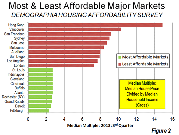
    The term “Greater New York” was applied, unofficially, to the 1898 consolidation that produced the present city of New York, which brought together the present five boroughs (counties). The term “Greater” did not stick, at least for the city. When consolidated, much of the city of New York was agricultural. As time went on, the term "Greater" came to apply to virtually any large city and its environs, not just New York and implied a metropolitan area or an urban area extending beyond city limits. By 2010, Greater New York had expanded to somewhere between 19 million and 23 million residents, depending on the definition.

    Greater New York’s population growth has been impressive. Just after consolidation, in 1900, the city and its environs had 4.2 million residents, according to Census historian Tertius Chandler. Well before all of the city’s farmland had been developed, New York, including its environs, had become the world’s largest urban area by the 1920s, displacing London from its 100 year predominance. Yet, even when Tokyo displaced New York in the early 1960s, there was still farmland on Staten Island. 

    New York became even larger in two dimensions, as a result of geographic redefinitions arising from the 2010 census.

    The Expanding New York Metropolitan Area

    The New York metropolitan area grew by enough land area to add more than 700,000 residents between 2000 and 2010, even after the decentralization reported upon in the metropolitan area as defined in 2000. The expansion of the metropolitan area occurred because the employment interchange between the central counties and counties outside the metropolitan area in 2000 became sufficient to expand the boundaries by more than 1,000 square miles (2,500 square kilometers).

    Summarized, metropolitan areas are developed by identifying the largest urban area (area of continuous urban development with 50,000 or more population) and then designating the counties that contain this urban area as “central counties.” Additional (“outlying”) counties are included in a metropolitan area if 25 percent or more of their resident workers have jobs in the central counties, or if 25 percent or more of the employees in the outlying county live in the central counties (There are additional criteria, which can be reviewed at 2010 Office of Management and Budget metropolitan area standards). In addition, adjacent metropolitan areas can be merged into a combined statistical area at a lower level of employment interchange (see below).

    For example, one of the counties added to the New York metropolitan area in the 2010 redefinition was Dutchess (home of the Franklin Delano Roosevelt Presidential Library). A resident of Dutchess County who works across the county line in Putnam County (a central county) would count toward the 25 percent employment interchange with the central counties of the New York metropolitan area. Contrary to some perceptions, metropolitan areas do not denote an employment interchange between suburban areas and a central city, even as major an employment destination as the city of New York.

    The OMB concept of “central” counties is in contrast to the more popular view that would consider the central counties to be Manhattan (New York County) or the five boroughs of New York City. In fact, out of the New York metropolitan area’s 25 counties, all but three (Dutchess and Orange in New York and Pike in Pennsylvania) are central counties. Sufficient parts of the urban area are in the other 22 counties, which makes them central.

    The Expanding New York Combined Statistical Area

    OMB has a larger metropolitan concept called the "combined statistical area." The combined statistical area is composed of metropolitan and micropolitan areas that have a high degree of economic integration with the larger metropolitan area. Essentially, adjacent areas are merged into a combined statistical area if there is an employment interchange of 15 percent. This occurs where the sum of the following two factors is 15 percent or more: (1) The percentage of resident workers in the smaller area employed in the larger area (not just central counties) and (2) The percentage of workers employed in the smaller area who reside in the larger area.

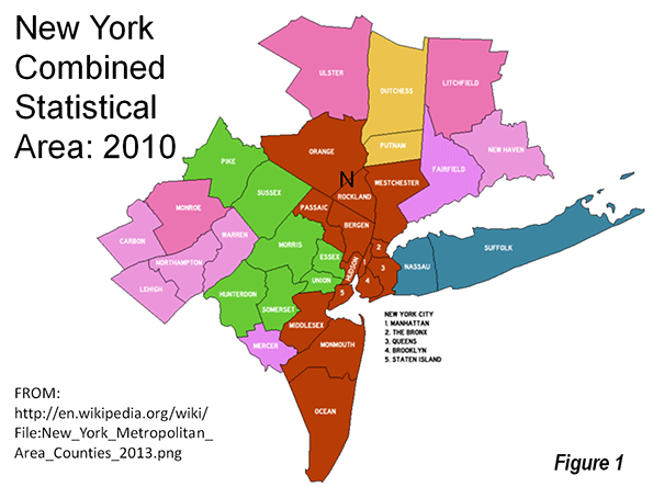
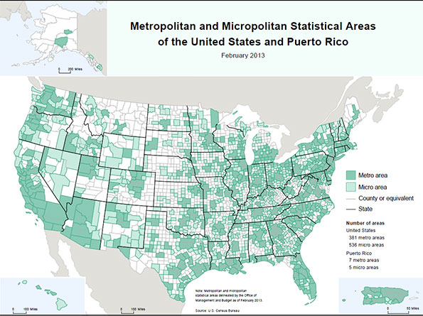
    On this measure, New York became greater by more 1 million residents as a result of the changes in commuting patterns. The addition of Allentown (Pennsylvania – New Jersey) and the East Stroudsburg, Pennsylvania metropolitan areas expanded the New York combined statistical area by another 2,700 square miles (7,000 square miles), bringing the population to 23.1 million. Altogether, the metropolitan area and combined area land area increases added up to 3,700 square miles (9,700 square kilometers). The 35 county New York combined statistical area is illustrated in the map (Figure 1).

    Organized Around the World’s Largest Urban Area (in Land Area)

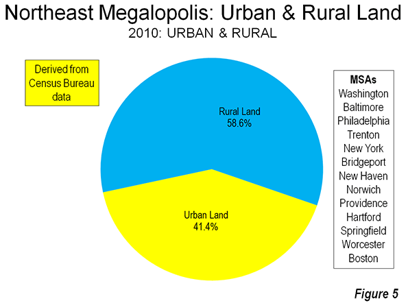
    The New York combined statistical area is very large. It covers approximately 14,500 square miles (37,600 square kilometers). From north to south, it measures 235 miles (375 kilometers) from the Massachusetts border of Litchfield County, Connecticut to Beach Haven, in Ocean County, New Jersey. It is an even further east to west, at more than 250 miles (400 kilometers) from Montauk State Park in Suffolk County, New York to the western border of Carbon County in Pennsylvania (Note 2). Despite containing the largest urban area  in the world, at 4,500 square miles (11,600 square kilometers), more than 60 percent of the combined statistical area is rural (see Rural Character in America’s Metropolitan Areas).

    Dispersion of Jobs and Residences

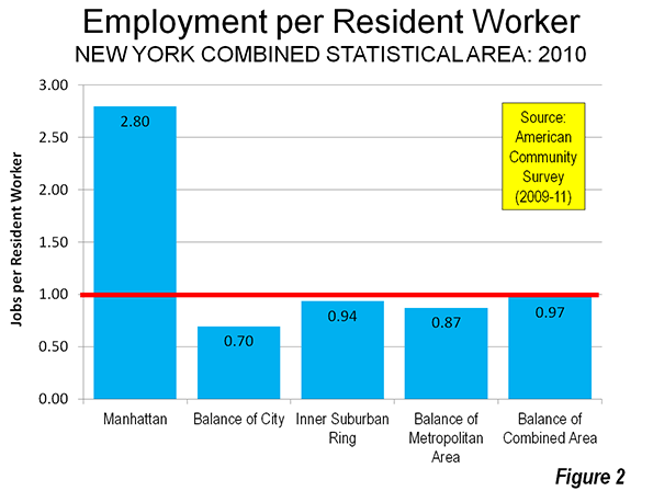
    The dispersion characteristic of modern metropolitan regions is illustrated by the extent to which jobs have followed the population in the New York combined statistical area. In all “rings” outside the city of New York, there is near parity between resident workers and jobs. The greatest employment to worker parity (0.97) is in the metropolitan and micropolitan areas outside the New York metropolitan area (Allentown, PA-NY; Bridgeport, CT; East Stroudsburg, PA; New Haven, CT; Torrington, CT; and Trenton, NJ). There is 0.94 parity in the inner ring suburban counties, which include Nassau and Westchester in New York as well as Bergen, Essex, Hudson, Middlesex, Passaic and Union in New Jersey. The outer balance of the New York metropolitan area has slightly lower employment to worker parity, at 0.87 (Figure 2).

    The lowest employment to worker parity in the New York combined statistical area is in the four boroughs of New York City outside Manhattan, at 0.70. The greatest disparity is in Manhattan, where there are 2.80 jobs for every resident worker. Combining all of New York’s five boroughs yields a much more balanced 1.17 jobs per resident worker.

    Example: Commuting from Hunterdon County

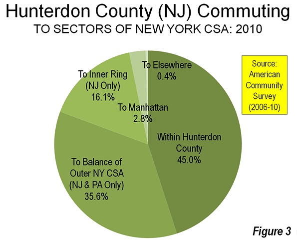
    Hunterdon County, New Jersey provides an example of the dispersion of employment in the New York area. Hunterdon County is located at the edge of the New York metropolitan area. It is well served by the commuter rail services of New Jersey Transit. With a line that reaches Penn Station in New York City, approximately 55 miles (35 kilometers) away. Yet, the world’s second largest employment center (after Tokyo’s Yamanote Loop), Manhattan south of 59th Street, draws relatively few from Hunterdon County to fill its jobs.

    Among resident workers, 45 percent have jobs in Hunterdon County. Another 36 percent work in other outer counties of the combined statistical area. This leaves only 19 percent of workers who commute to the rest of the combined statistical area. The New Jersey inner suburban counties attract 16 percent of Hunterdon’s commuters and Manhattan employs just three percent of Hunterdon’s resident workers (Figure 3). Fewer than 0.5 percent of Hunterdon’s commuters work in the balance of the CSA, including the outer boroughs of New York, the other New York counties and Connecticut). The detailed area definitions are included in the Table.

    DISTRIBUTION OF COMMUTING FROM HUNTERDON COUNTY, NEW JERSEY
    To Locations in the New York Combined Statistical Area (2006-2010)
    NY CSA Sector Commuting from Hunterdon County Areas Included
    Hunterdon County 45.0% Hunterdon County, NJ
    Outer Combined Statistical Area 35.6% Monmouth County, NJ
    Morris County, NJ
    Ocean County, NJ
    Pike County, PA
    Somerset County, NJ
    Sussex County, NJ
    Allentown metropolitan area, PA-NJ
    East Stroundsburg metropolitan area, PA
    Trenton metropolitan area, NJ
    Inner Ring (New Jersey only) 16.1% Bergen County, NJ
    Essex County, NJ
    Hudson County, NJ
    Middlesex County, NJ
    Passaic County, NJ
    Union County, NJ
    Manhattan 2.8% New York County, NY
    Elsewhere 0.4% Bronx
    Brooklyn
    Queens
    Staten Island
    Dutchess County, NY
    Nassua County, NY
    Orange County, NY
    Putnam County, NY
    Rockland County, NY
    Suffolk County, NY
    Westchester County, NY
    Bridgeport metropolitan area, CT
    Kingston metropolitan area, NY
    New Haven metropolitan area, CT
    Torrington metropolitan area, CT


    From Commuter Belts and Concentricity to Dispersion

    Metropolitan areas are labor markets, as OMB reminds in its 2010 metropolitan standards, which refer to metropolitan areas, micropolitan areas, and combined statistical areas as geographic entities associated with at least one core plus “adjacent territory that has a high degree of social and economic integration with the core as measured by commuting ties. ”

    Yet metropolitan areas have changed a great deal. Through the middle of the last century, metropolitan areas were perceived as monocentric with core cities and a surrounding “commuter belt” from which the city drew workers to fill its jobs. However, metropolitan areas have become more polycentric, as Joel Garreau showed in his book Edge City: Life on the New Frontier. In more recent years, metropolitan areas have become even more dispersed, with most employment located in areas that are hardly centers at all. Of course, some people still commute to downtown and edge cities. Others work even further away, but most find their employment much closer to home. That is the story of New York and, which has just become greater, and other metropolitan areas as well.

    ——

    Note 1: OMB revised its metropolitan terms in 2000. The term “core based statistical area” (CBSA) is used to denote metropolitan areas (organized about urban areas of 50,000 population or more) and micropolitan areas (organized around urban areas of 10,000 to 50,000 population). The former “consolidated metropolitan statistical area,” was replaced by the combined statistical area, which is a combination of core based statistical areas. OMB also notes that the term “urban area” includes “urbanized areas” (50,000 population or more) and “urban clusters (10,000 to 50,000 population).

    Note 2: Part of the reason for this large geographic expanse is the use of counties as building blocks of core based statistical areas. If the smaller geographic units were used (such as census blocks, as in the delineation of urban areas), the geographies would be smaller, though populations would be similar.

    ——-

    Wendell Cox is a Visiting Professor, Conservatoire National des Arts et Metiers, Paris and the author of “War on the Dream: How Anti-Sprawl Policy Threatens the Quality of Life.

    Photograph: 59th Street, Manhattan (by author).

  • Rural Character in America’s Metropolitan Areas

    Looking at a map of the metropolitan areas of the United States, it would be easy to get the impression that “urban sprawl” had consumed most of the nation. Indeed, as Figure 1 indicates, one could drive from Santa Rosa, north of San Francisco to the Arizona-New Mexico border without ever leaving a metropolitan area. This more than 1,000 mile trip (1,600 kilometers) would take nearly 15 hours, according to Google Maps. New Jersey is shown as all-metropolitan, as well as Delaware. But looks can be deceiving. According to US Census data from 2010, the land area of New Jersey is 60 percent rural, while Delaware is 80 percent rural.

    Given the multiple terms used to describe urban and rural geography, confusion is not uncommon. It begins with the fundamental matter of terms. For starters, “metropolitan” is not the same thing as “urban,” and “rural” does not mean non-metropolitan. In fact, most rural residents in the United States live in metropolitan areas. 

    Urban Areas

    All land within the United States is either urban or rural, without respect to whether it is in metropolitan areas. The Census Bureau defines urban areas using “census blocks” to which minimum population density criteria are applied. Census blocks are very small neighborhood units, which are far smaller than virtually all municipalities. This approach produces an urban area defined by land use characteristics, without regard to jurisdictional (city or county) boundaries. Urban areas contain no rural land.

    In 2010, 19.3 percent of the US population was in rural areas, which covered 97.0 percent of all land. The other 80.7 percent of the population was urban and lived in only 3.0 percent of land area (Figure 2)

    Rural Population of Metropolitan Areas

    Metropolitan areas always have large areas of rural land. This is due to the very nature of metropolitan areas, which are designated by the US Office of Management and Budget (OMB). Metropolitan areas are labor markets, defined by commuting patterns. People commute to jobs in metropolitan areas both from within the core urban area (such as the New York urban area) and from areas outside the core urban area that remain in the metropolitan area, such as the non-urban parts of the New York metropolitan area (examples are much of Orange and Dutchess counties in New York as well as Sussex and Hunterdon counties in New Jersey).  

    Each metropolitan area is organized around “central counties” that include a core urban area (area of continuous urban development). The core urban area must have at least 50,000 residents for an area to qualify as metropolitan. “Outlying counties” are also included in metropolitan areas if 25 percent or more of their resident workers commute to the central counties. This central counties and core urban area approach reflects the evolution of US metropolitan areas to the more dispersed employment and residential patters that have materially reduced the influence of the historical core municipalities (sometimes called “central cities”). On average, only about 10 percent of employment in the 50 largest urban areas was in the formerly more dominant downtowns in 2000 (central business districts).

    The land area in America’s metropolitan areas is much more rural than urban. More than 90 percent of metropolitan area land is rural. In 2010, 28 percent of the nation’s land area was metropolitan, but the urbanization in metropolitan areas accounted for only 2.6 percent of US land area. In 2010, 32 million of the nation’s 60 million rural residents lived in metropolitan areas (Figure 3).

    Major Metropolitan Areas

    On average, 81 percent of the land area in major metropolitan areas (0ver 1,000,000 population) is rural, not urban (Figure 4). There is a wide variation among the major metropolitan areas. All but one of the major metropolitan areas has more rural land than urban land. Boston has smallest rural land area share at 43 percent. The New York metropolitan area clocks in at 52 percent rural, Philadelphia at 54 percent rural and Tampa-St. Petersburg stands at 55 percent rural. At the other end of the scale, the Salt Lake City metropolitan area is 96 percent rural, followed by Riverside-San Bernardino at 95 percent, Las Vegas 94 percent and Denver 92 percent (Table).

    Table
    Rural Population & Land Area in Metropolitan Areas
      2010 Rural Population 2010 Rural Land Area # of Counties
    Atlanta, GA 11.1% 67.4% 29
    Austin, TX 12.8% 85.6% 5
    Baltimore, MD 9.0% 64.8% 7
    Birmingham, AL 28.8% 88.7% 7
    Boston, MA-NH 5.5% 42.6% 7
    Buffalo, NY 11.9% 73.0% 2
    Charlotte, NC-SC 18.5% 75.8% 10
    Chicago, IL-IN-WI 2.6% 61.9% 14
    Cincinnati, OH-KY-IN 14.1% 78.2% 15
    Cleveland, OH 8.1% 58.7% 5
    Columbus, OH 16.5% 86.9% 10
    Dallas-Fort Worth, TX 7.4% 76.1% 13
    Denver, CO 5.7% 91.8% 10
    Detroit,  MI 6.8% 60.0% 6
    Grand Rapids, MI 25.0% 85.4% 4
    Hartford, CT 12.2% 56.8% 3
    Houston, TX 6.5% 75.5% 9
    Indianapolis. IN 12.4% 81.2% 11
    Jacksonville, FL 11.2% 80.1% 5
    Kansas City, MO-KS 12.3% 88.9% 14
    Las Vegas, NV 1.3% 94.4% 1
    Los Angeles, CA 0.5% 59.8% 2
    Louisville, KY-IN 17.1% 85.8% 12
    Memphis, TN-MS-AR 15.3% 89.0% 9
    Miami, FL 0.4% 75.2% 3
    Milwaukee,WI 6.6% 59.2% 4
    Minneapolis-St. Paul, MN-WI 12.4% 84.4% 16
    Nashville, TN 24.1% 87.6% 14
    New Orleans. LA 7.2% 87.3% 8
    New York, NY-NJ-PA 2.7% 52.4% 25
    Oklahoma City, OK 18.3% 91.0% 7
    Orlando, FL 5.4% 74.4% 4
    Philadelphia, PA-NJ-DE-MD 5.1% 53.7% 11
    Phoenix, AZ 4.1% 91.0% 2
    Pittsburgh, PA 17.8% 80.1% 7
    Portland, OR-WA 9.9% 91.1% 7
    Providence, RI-MA 9.5% 56.9% 6
    Raleigh, NC 17.2% 73.1% 3
    Richmond, VA 20.3% 89.1% 17
    Riverside-San Bernardino, CA 4.7% 95.1% 2
    Rochester, NY 21.9% 87.8% 6
    Sacramento, CA 7.2% 88.3% 4
    St. Louis,, MO-IL 13.2% 86.0% 15
    Salt Lake City, UT 1.8% 96.1% 2
    San Antonio, TX 13.8% 91.0% 8
    San Diego, CA 3.3% 81.9% 1
    San Francisco-Oakland, CA 1.0% 65.8% 5
    San Jose, CA 1.8% 87.2% 2
    Seattle, WA 5.6% 81.0% 3
    Tampa-St. Petersburg, FL 4.4% 55.5% 4
    Virginia Beach-Norfolk, VA-NC 8.7% 78.2% 16
    Washington, DC-VA-MD-WV 7.8% 73.1% 24
    Major Metropolitan Areas 7.1% 81.0% 436


    The most important reason for the difference in rural area size within the major metropolitan areas is the differing sizes of counties. In the East, Midwest and South, counties tend to be much smaller than in the West. For example, the New York metropolitan area has nearly 20 million residents, distributed among 25 counties. In contrast, the Los Angeles metropolitan area, with 13 million residents, is composed of only two counties.

    The metropolitan areas with the most rural area are largely desert and mountains (see top illustration of the Riverside-San Bernardino metropolitan area). Large counties in Utah extend the Salt Lake City metropolitan area 100 miles westward to the Nevada border. Riverside-San Bernardino’s two large counties include a land area nearly equal to that of Ireland, stretching more than 200 miles to the Nevada and Arizona borders and including part of Death Valley National Park. In both cases (and a number of others), large counties require metropolitan areas to be far larger than any reasonable commuting shed. This size variation renders population density figures for metropolitan areas nonsensical (building blocks would need to be small, such as the census blocks used by the Census Bureau to define urban areas).

    The major metropolitan areas of over 1 million contain nearly 12 million rural residents, or 20 percent of the nation’s rural population. While this is a large number, their urban populations are much greater, at 158 million, or 63 percent of the US urban population of nearly 250 million. These urban residents live in a smaller proportional area, constituting of only one-half of all urban land area (and 1.5 percent of all US land area).

    Other Metropolitan Areas

    The rural portions of metropolitan areas with fewer than 1,000,000 residents cover 94 percent of their land areas. These areas include approximately 20 million residents, or 34 percent of the nation’s rural population. Only six percent of the land area in these metropolitan areas is urban.

    Outside Metropolitan Areas

    This leaves a minority of 27.5 million rural residents living outside the metropolitan areas.

    Micropolitan areas are defined by OMB as labor markets with core urban areas between 10,000 and 50,000, and are not considered metropolitan. Approximately 98.5 percent of the land in micropolitan areas is rural. The rural population of micropolitan areas is 13 million.

    The other 14 million rural residents live outside the micropolitan areas. However, there are still 4.7 million urban residents outside both metropolitan and micropolitan areas, with each of these urban areas having fewer than 10,000 residents.

    Rural Land in Metropolitan America

    Even where America is most urban, a strong rural element remains. This is illustrated in the Northeast Corridor, the “megalopolis” defined by Jean Gottman more than a half-century ago. The urbanization he identified is still short of continuous along the corridor. Rural areas interfere with urbanization in parts of Maryland, New Jersey, Connecticut and Massachusetts. Nearly 60 percent of the land area in these adjacent metropolitan areas remains rural (Figure 5). The numbers are even smaller elsewhere. Between Dallas-Fort Worth and Houston, 80 percent of the corridor is rural. Between Seattle and Portland nearly 90 percent of the corridor is rural. These are among the busiest corridors in the United States, and many more are far more rural. Up close and in context, the spatial urbanization of America, including its metropolitan areas is not pervasive.

    Wendell Cox is a Visiting Professor, Conservatoire National des Arts et Metiers, Paris and the author of “War on the Dream: How Anti-Sprawl Policy Threatens the Quality of Life.

    Illustration: San Bernardino Mountains and Mojave Desert in the Riverside-San Bernardino metropolitan area (by author)