Author: Wendell Cox

  • High Speed Rail Decision: Victory for Rule of Law

    California Judge Michael Kenny has barred state bond funding for the California high speed rail system, finding that “the state’s High-Speed Rail Authority failed to follow voter-approved requirements designed to prevent reckless spending on the $68 billion project.” These protections had been an important in securing voter approval of a $10 billion bond issue in 2008. Sacramento Bee columnist Dan Walters suggested that without the protections in Proposition 1A, the measure “probably would have failed” to obtain voter approval.

    According to the court decision, the California High Speed Rail Authority (CHSRA) had failed to identify $25 billion of the funding that would be necessary to complete the first 300 mile segment. This was required by the terms of Proposition 1A as enacted by the legislature and approved by the voters. Yet, without a legally valid business plan, CHSRA was steaming ahead, at least until the court decision.

    The principal longer-term significance of the ruling is that “rule of law” remains in effect in California. Elizabeth Alexis, co-founder of Californians for Responsible Rail Design (CARRD), a group opposed to the project,  told the Los Angeles Times that CHSRA had been conducting itself as if it were “above the law” (Note 1).

    Judge Kenny’s decision means that the state of California cannot ignore its laws, even when its leadership finds them politically inexpedient. Just like the businesses from the largest companies to the smallest used car lot, the law forbids the state from making legally binding promises and then casting them aside arbitrarily.

    The Court Decision

    The San Diego Union-Tribune summarized the court decision as follows:

    Superior Court Judge Michael Kenny ruled that the California High-Speed Rail Authority could not proceed with using billions of dollars in bond funds to begin construction because it had not credibly identified funding sources for the entire $31 billion it will take to finish the 300-mile initial segment, nor had it completed necessary environmental reviews for the segment. These requirements were among the taxpayer protections written into law by California voters in November 2008, when they voted narrowly for Proposition 1A to allow the state to issue $9.95 billion in bonds as seed money for the project. Kenny said the state must develop a plan that comports with these requirements.

    The Union Tribune further reported that Judge Kenny rejected arguments by the state Attorney General that state the legislature, rather than Proposition 1A (now state law which has not been repealed) was the final authority on how the bonds are used.

    The Los Angeles Daily Newsindicated that the decision left the high speed rail project without either a funding plan or the ability to borrow money. The only remaining source of construction funding is a federal grant, which requires a match of state funding.

    Background

    Proposition 1A and the high speed rail project have had a difficult history.

    A $10 billion high speed rail bond issue to support the project (then called Proposition 1) was scheduled for 2008, after having been postponed twice. There was concern, however, in the state legislature that Proposition 1 had insufficient fiscal, environmental and management guarantees to attract a majority vote of the electorate. As a result, legislature enacted and Gov. Arnold Schwarzenegger signed Assembly Bill 3034, which added substantial protections and recast the ballot measure as Proposition 1A. Assemblywoman Catherine Gagliani, the author, said that the legislation “establishes additional fiscal controls on the expenditure of state bond funds to ensure that they are directed to construction activities in the most cost-effective and efficient way.”

    Leading high speed rail proponent and then CHSRA Chairman Quentin Kopp (Note 2), applauded Assembly Bill 3034 indicating that “Californians will now be able to vote on a high-speed train system grounded in public-private financing and guided by fiscal accountability with the guarantee of no new taxes to fund the system,"

    The Promised System

    In the voter ballot pamphlet, proponents told voters that the proposed system would operate from San Francisco to Los Angeles and Anaheim, as well as through the Inland Empire (Riverside-San Bernardino) to San Diego and to Sacramento. This complete system was to cost $45 billion, according to the proponents (a figure that had already risen substantially).

    Like many other large infrastructure projects, costs were soon to explode. By 2011, the cost had escalated to a range of almost $100 billion to more than $115 billion. Further, the promised extensions to Sacramento and the Inland Empire and San Diego were not included in that price (Note 3).

    From High Speed Rail to “Blended” System

    The political reaction to the cost escalation was negative, leading the CHSRA to radically revise the remaining San Francisco to Los Angeles and Anaheim line. CHSRA removed exclusive high-speed rail tracks in the San Francisco-San Jose and Los Angeles metropolitan areas. The cost of this "blended" system was estimated at $68 billion. CHSRA maintained its claim that the legislatively required travel time of 2:40 could be achieved without the genuine high speed rail configurations in the two metropolitan areas. Sacramento Beecolumnist Walters characterized this expectation as based on “assumptions that defy common sense.”

    Former CHSRA Chair Quentin Kopp withdrew his support at this point, referring to the “blended system” as “the great train robbery.” Kopp also raised the possibility that the new plan could violate Proposition 1A, a judgment that Judge Kenny’s decision confirmed.

    Kevin Drum, of Mother Jones may have provided the best summary of situation as it stands today:

    Its numbers never added up, its projections were woefully rose-colored, and it was fanciful to think it would ever provide the performance necessary to compete against air and highway travel. Since then, things have only gotten worse as cost projections have gone up, ridership projections have gone down, and travel time estimates have struggled to stay under three hours.

    Drum had previously characterized CHSRA claims as “jaw-droppingly shameless,”adding that “A high school sophomore who turned in work like this would get an F.”

    Where From Here?

    Proponents have not given up. As The Economistreported, proponents took comfort in the fact that “Judge Kenny did not cancel the project altogether.” The Economist continued “But if that is a victory, it is not clear how many more wins California high-speed rail can handle.”

    The stalwart supporter San Francisco Chronicle editorialized that the court decision was a “bump” in the path for the project. Yet even the Chronicle conceded that: “The court results are a serious warning sign that the financial fundamentals need work.” 

    Too Big to Fail?

    Columnist Columnist Dan Walters fears that to make the financial fundamentals work would require making the project “too big to fail:”

    As near as I can tell, the HSR authority’s plan all along has been to simply ignore the law and spend the bond money on a few initial miles of track. Once that was done, no one would ever have the guts to halt the project because it would already have $9 billion sunk into it. So one way or another, the legislature would keep it on a funding drip.

    Such a strategy would force California taxpayers to fill the gargantuan funding gap, which for the entire Los Angeles to San Francisco line now stands at approximately $65 billion. With the federal funding of approximately $3 billion, the state is 95 percent short of the $68 billion it needs.

    California taxpayers may not be so accommodating. Even before Judge Kenny’s decision, LA Weekly reports that a USC/Los Angeles Times poll shows statewide opposition now to have risen to 53 percent of voters, while 70 percent would like to have a new vote on Proposition 1A (see “Californians Turn Against LA to SF Bullet Train”).

    Even the federal funding is being questioned.  California Congressman Jeff  Denham, also a former supporter of the project, joined with Congressman Tom Latham to ask (link to letter) the United States Government Accountability Office if  further federal disbursements could be illegal, given the uncertainty of the state funding needed to “match” the federal grant.

    Congressman Kevin McCarthy, the majority whip in the US House of Representatives has indicated that he will work with others in Congress to deny further federal funding to the project.

    The San Jose Mercury-News, which like the Chronicle had been a strong supporter of Proposition 1A in 2008 has long since climbed off the train. In an editorial following Judge Kenny’s decision, the Mercury-News decried the project’s “bait and switch,” tactics and called for “an end to this fraud.”

    The Winners: California Citizens

    At this point, the words of legendary New York Yankees catcher Yogi Berra seem appropriate: “It ain’t over till it’s over.” However, Judge Kenny has rewarded California citizens with something that never should have been taken away from them – a government that follows its laws.

    —-

    Note 1: This is not the first time that the state has run afoul of the law on the high speed rail project. According to the Sacramento Bee:

    The Howard Jarvis Taxpayers Association had challenged the ballot language for Proposition 1A, arguing the Legislature used its pen to “lavish praise on its measure in language that virtually mirrored the argument in favor of the proposition.” The appeals court sided with HJTA [stating], “the Legislature cannot dictate the ballot label, title and official summary for a statewide measure unless the Legislature obtains approval of the electorate to do so prior to placement of the measure on the ballot.”

    Unlike the present decision, the state suffered no consequences for its violation and Proposition 1A was not invalidated.

    Note 2: Chairman Kopp is a retired judge, former state Senator and former member of the San Francisco Board of Supervisors.

    Note 3: Joseph Vranich and I have authored two reports questioning the ability of the California high speed rail system to meet its objectives (financial, environmental, ridership, and operations). The first, The California High Speed Rail Proposal: A Due Diligence Report, was published by the Reason Foundation, Citizens Against Government Waste and the Howard Jarvis Taxpayers Association in 2008. The second, California High Speed Rail: An Updated Due Diligence Report, was published by the Reason Foundation in 2012.

    —-

    Wendell Cox is a Visiting Professor, Conservatoire National des Arts et Metiers, Paris and the author of “War on the Dream: How Anti-Sprawl Policy Threatens the Quality of Life.

    Photo: US Constitution (from National Archives)
  • Moving to the Heart of Europe

    Europe’s demographic dilemma is well known. Like East Asia and to a lesser degree most of the Western Hemisphere, Europe’s birth rates have fallen so far that the population is becoming unable to replenish itself. At the same time, longer  life spans have undermined the poulation’s ability to withstand a growing  old age dependency ratio, challenging the financial ability (and perhaps even willingness) of a smaller relative workforce in the decades to come. The EU-27 (excluding Croatia) over 65 population is projected by Eurostat to increase 75 percent relative to its working age population (15-64) between 2015 and 2050, more than either the 60 percent increase the UN projects in the United States and Japan (though Japan’s current ratio is much higher than the EU or the US).

    This problem could be partially addressed by international migration, which could increase the size of labor force required to support expensive social welfare commitments. Our analysis of available Eurostat data (European Commission) data indicates that international migration to the European Union (EU) is strong. Further, migration has been shifting with the changing economic fortunes of EU nations, led by strong growth in the “heart of Europe” but slowing growth along much of the periphery of the former EU-15.This suggests that strong economic growth may be the key to solving, or at least ameliorating,  Europe’s looming demographic crisis.

    All EU-15 Nations have Attracted Migrants

    Since the 2004 enlargement of the European Union, now at 28, with the recent addition of Croatia, the former EU-15 has attracted millions of international migrants, including many from the newer entrants to the original fifteen memnbers. Eurostat data indicates that nearly 11 million people more people moved to these nations between 2005 and 2012 than moved away.

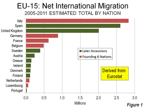
    The changes are stunning. All 15 nations have had net international migration gains since 2005. The leader is Italy, which has added a net 2.8 million international migrants, the equivalent of 4.7 percent of its population. This is more than Italy’s total population gain between 1975 and 2000. Spain has added 2.6 million net international migrants, the equivalent of 5.6 percent of its population. The United Kingdom added 2.0 million international migrants, the equivalent of 3.2 percent of its population.  

    Deep in the Heart of Europe

    Perhaps most surprising are that gains the heart of Europe, six nations that established the European Coal and Steel Community in the early 1950s, which was to become today’s European Union (Belgium, France, Germany, Luxembourg, Italy, and the Netherlands) (Figure 1).

    Germany and France had net international migration of 885,000 and 625,000 respectively. In both countries this was equal to one percent of the population. However, Belgium had the largest relative addition of international migrants. Its 490,000 net increase was equal to four percent of its population.

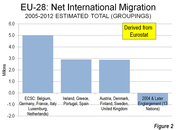
    Overall, the six founding nations of the European Union attracted a net 5.0 million international migrants 2005 to 2012. This is more than the population of all urban areas in the six nations except for Paris, Milan and the Rhine-Ruhr.

    Five additional economies, the United Kingdom, Austria, Sweden, Denmark and Finland added a net 2.8 million international migrants. Even Portugal, Ireland, Greece and Spain, despite their fragile economies, posted substantial gains, adding 2.8 net international migrants (Figure 2).

    The PIIGS Minus Italy

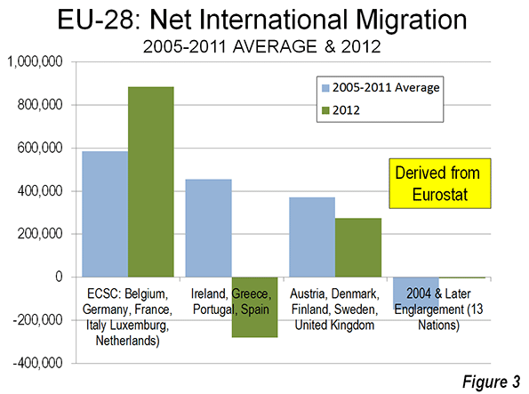
    Five nations have been designated the PIIGS by the international financial community, due to their financial reverses. These include Portugal, Ireland, Italy, Greece and Spain. All, except Italy, have seen their international migration rates fall precipitously. Between 2005 and 2011, these four nations combined added an average of 450,000 net international migrants. By 2012, they lost more than 275,000 net international migrants. In contrast, Italy, one of the EU founders, continued its strong trend, adding approximately 365,000 net international migrants in 2012, up from its 2005 to 2011 average of 350,000.

    The six founding members picked up some of the “PIIGS minus Italy” losses. In 2012, these nations added nearly 885,000 net international migrants, which is well above their 585,000 average for 2005 to 2011. The other five nations (United Kingdom, Austria, Sweden, Denmark and Finland) fell to a 275,000 net international migration gain in 2012, compared to their 2005-2011 average of 370,000.

    The new 13 members did much better than before, losing only 5,000 net international migrants in 2012. Their average from 2005 to 2011 was a 150,000 loss (Figure 3).

    Ireland and Spain

    Spain and Ireland illustrate the connection between declining economies and declining international migration.

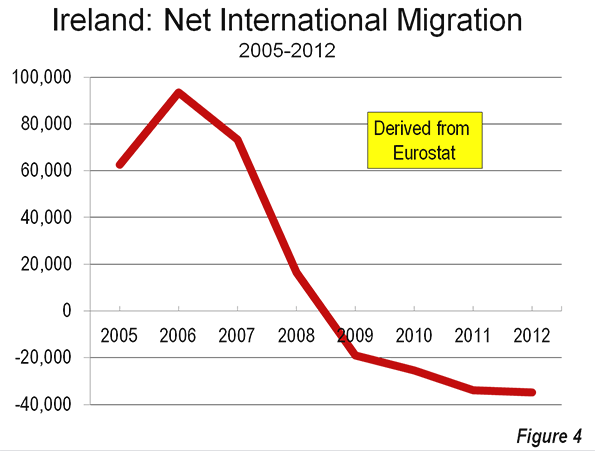
    The Irish Times noted in a recent article that the latest data from the European commission indicates that Ireland now has the worst net international outmigration rate in the European Union. Just six years ago, the Times reports, Ireland’s net international in migration rate was the highest in Europe. Over the past four years (Figure 4), Ireland has lost approximately 35,000 net international migrants annually (Ireland’s housing bubble and the resulting national financial crisis are described in Urban Containment and the Housing Bubble in Ireland).

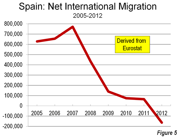
    Spain’s decline in net international migration has been every bit as spectacular. At its peak, Spain was attracting a net international migration approaching 800,000. Last year, Spain lost 165,000 international migrants (Figure 5).

    The 13 New Members

    The net international migration gains in Europe’s heart have not been good news for Eastern Europe, where the newer European Union members are located. Overall, these nations lost approximately 1,050,000 international migrants between 2005 and 2012, though as noted above, the loss was minimal in 2012. This more recent improvement may be the result of weak economic conditions in many western and southern European countries.

    Romania and Lithuania were the biggest losers. Romania lost nearly a net 1,000,000 international migrants, equal to nearly five percent of its population. Lithuania did even more poorly, losing 300,000 international migrants, nearly 10 percent of its population. Both nations lost overall population.

    Migration and Economic Growth

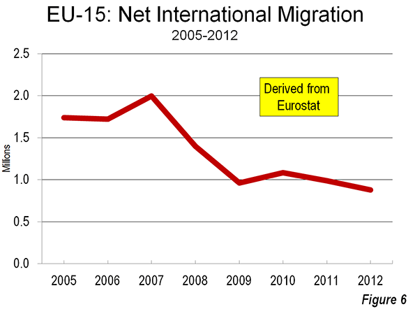
    Despite the resurgence of growth in the heart of Europe, the financial crisis has taken a toll. As in the United States, migration has fallen significantly, as many of the economic opportunities have dried up. By 2012, the net international migration to the EU-15 had been reduced to 900,000 from approximately 2 million in 2007. As throughout history, the demand for international migration is driven principally by the aspirations for a better quality of life. As a result, migration will tend to be greater where there is a wider gulf between the employment and economic opportunities in receiving countries than in countries that lose migrants.

    Wendell Cox is a Visiting Professor, Conservatoire National des Arts et Metiers, Paris and the author of “War on the Dream: How Anti-Sprawl Policy Threatens the Quality of Life.

    Photo: Genoa, Italy (by author)

  • Court Rules Against California High Speed Rail

    California Superior Court Judge Michael Kenny ruled against the California High Speed Rail Authority in two decisions announced on November 25. In the first, Judge Kenny ruled that the Business Plan failed to meet the requirements of the voter approved referendum under California Assembly Bill 3034 (2008), in not identifying sufficient capital funding for the first segment. As a result, the Business Plan needs to be redrafted. In the second decision, Judge Kenny declined to issue a conformity ruling that would have paved the way for $8 billion in bonds that had been approved by voters, which were also subject to same Assembly Bill 3034.

    Judge Kenny declined to stop construction of the project, which is scheduled to start in the Spring. However, the Authority only has federal funds for that segment, and which would require, in the longer run, matching state funds (which were to have been from the bonds).

    According to the San Francisco Chronicle , Kenny’s found that the California High Speed Rail Authority "abused its discretion by approving a funding plan that did not comply with the requirements of law."

  • Urban Containment and the Housing Bubble in Ireland

    Economist Colm McCarthy says that urban containment policy played a major role in the formation of the housing bubble. In a commentary in the Sunday Independent, Ireland’s leading weekend newspaper, McCarthy relates how urban planning regulations led to higher house prices in the Dublin area (Note 1).

    “Ireland passed its first major piece of land-use planning legislation in 1963, modelled on the UK’s Town and Country Planning Act of 1947. The intentions were laudable, to restrict the construction of unwelcome developments and to empower local authorities to take a more active role in shaping the built environment. There was no desire to screw up the residential housing market, but that is eventually what happened.”

    The Great Financial Crisis in Ireland

    The bursting of the housing bubble led to an economic decline in Ireland that was among the most devastating of any nation during the Great Financial Crisis. Household incomes dropped, unemployment rose to above 15 percent and Ireland was eventually forced into a bailout loan of €67.5 billion (approximately $90 billion) from the European Union and the International Monetary Fund. Ireland’s economy (gross domestic product) declined nine percent, nearly four times the decline suffered by the United States, according to World Bank data.

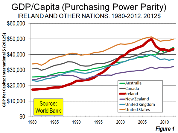
    This is a sharp contrast to Ireland’s image as the “Celtic tiger”. In 1980, Ireland’s gross domestic product per capita (purchasing power adjusted) trailed those of the United Kingdom and the four strong new world economies (United States, Canada, Australia and New Zealand) by approximately 25 percent to 50 percent. By its 2007 peak, Ireland had passed all but the United States, which it nearly caught. By 2012, however, Ireland’s GDP per capita had fallen behind that of Australia (Figure 1).

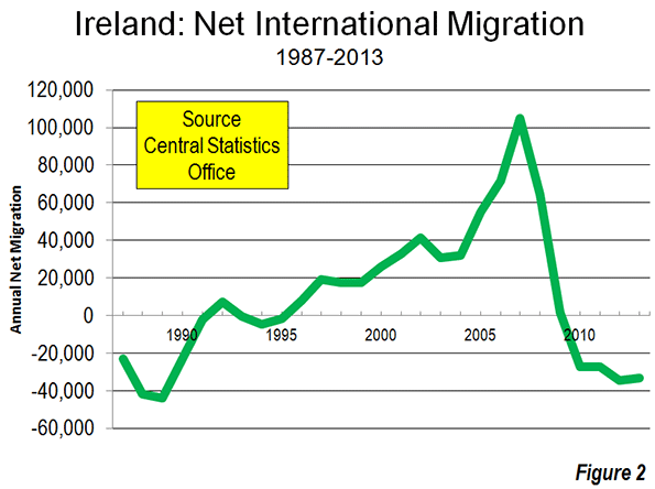
    Migration trends reflect the result of this decline. Net in-migration reached 105,000 in 2007, when the economy peaked when, a notable number for a nation with only 4.5 million residents with a long history of sending its denizens out to the rest of the world (Note 2). In the less robust economy of the last four years, a net 125,000 migrants have left Ireland (Figure 2).

    McCarthy, of University College, Dublin and one of the nation’s most respected economists was called in by the government to lead the “Special Group on Public Service Numbers and Expenditure Programs,” which published the McCarthy Report, detailing recommendations for public expenditure reductions to help Ireland “weather” the financial storm.

    The Housing Bubble in the Dublin Area

    As in the United States, a housing price bubble (centered in the Dublin area) precipitated an economic downturn, which was the greatest since the Great Depression. Our annual Demographia International Housing Affordability Surveys had shown house prices in the Dublin area to peak at a “severely unaffordable” median multiple (median house price divided by median household income) of 6.0, well above the normal 3.0 relationship between prices and incomes. Paying more for housing reduces household discretionary incomes and lowers the standard of living.

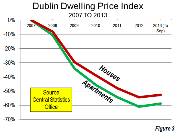
    After peaking in 2007, Dublin house prices plummeted. Single family house prices fell 53 percent from 2007 to 2012, while apartment prices dropped 61 percent, according to the Central Statistics Office property price index (Figure 3). This year, finally, prices have begun to trend upward.

    Decoupling from the Fundamentals

    Like in Dublin, this decoupling of housing from the fundamentals occurred not only in Dublin, but also in both vibrant other markets   such as Sydney, Vancouver, and the San Francisco Bay area, as well as severely depressed markets like Liverpool, Glasgow. In each case, the decoupling has been accompanied by strictly enforced enforcement urban containment policies that prohibit development on considerable suburban and exurban land, through the use of such devices as urban growth boundaries and the priority growth areas (a euphemism for the only places that development is permitted).  As is commonly the case, with these strategies upset the balance between the demand and supply for land, forcing house costs up substantially, just as oil embargoes lead to higher prices at the gas pump.

    McCarthy places the blame squarely on urban containment policies.

    “…there was and still is no shortage of land in the greater Dublin area, one of the lowest-density urban areas in Europe. There is, however, a shortage of planning permission – an entirely man-made creature of the planning legislation and its restrictive implementation by the Dublin-area councillors and planning officials.”

    He describes how artificial scarcity raises prices (other things being equal), a process anyone who listened in Economics 101 would understand. McCarthy says:

    “Before land-use zoning came along, house-builders extended the city by buying up farms on the city’s edge and building at whatever densities the market would support. But as more and more lands were withdrawn from the buildable stock by the planners, prices began to rise and the house-builders moved further away from the city proper.”

    With new house building consents so rigidly controlled, a Dublin area house prices escalated well beyond incomes and prices in the rest of the nation. As McCarthy puts it:

    “In the principal residential suburbs of Dublin an artificial scarcity (of planning permission, not of buildable land) was allowed to develop and prices rose, from the mid-Seventies onwards, to a 50 per cent or 60 per cent premium over comparable homes outside Dublin.”

    In addition to the houses for commuters that were further from Dublin, a government encouraged rural building boom led to over-building in more remote areas (Note 3).

    Economics and Urban Containment

    The consequences of urban containment policy have been known for a long time. More than four decades ago, Sir Peter Hall and his colleagues documented the extent to which house prices have been driven upward in England as a result of the land-use policies that have been copied in Ireland and elsewhere (See: The Costs of Smart Growth: A 40-Year Perspective).

    More recently, Brian N. Jansen and urban economist Edwin S. Mills (Northwestern University) took the argument further (See: The Consequences of Urban Containment) and tied the Great Recession directly at the foot of smart growth policies. They noted that “…. it is difficult to imagine another plausible cause of the 2008–2009 financial crisis,” and concluded:  “In the absence of excessive controls, housing construction would quickly deflate a speculative housing price bubble.”

    My analysis of metropolitan markets for the National Center for Policy Analysis showed that 73 percent of the house price value losses from the peak of the US housing bubble to the housing bust precipitated Lehman Brothers bankruptcy occurred in just 11 markets in California, Florida, Arizona and Nevada, all of them with severe land restrictions (see The Housing Crash and Smart Growth). Had those losses been smaller (as they would have been if prices had not risen so high), the Great Financial Crisis might have been less severe or even avoided.

    Ireland’s Challenge

    More recently, there is good news out of Ireland. The government has announced that it will no longer need the EU/IMF line of credit and will exit the bailout program. The 2012 gross domestic product nudged above the 2007 peak. But that does not mean that those who suffered economic losses during the downturn were made whole. Economic downturns massively redistribute wealth, and there is good reason to not repeat history on this score.

    McCarthy comments that: “It is quite remarkable that the contribution of restrictive zoning to the house price bubble has been so little acknowledged.” He stresses the importance of avoiding “Bubble Mark II,” and urges planning system reform:

    “The key policy measure required is the zoning for residential development of the very large volume of derelict and undeveloped land in the Dublin area.”

    Failing that, a another shock to the standard of living could face the Irish, who have already suffered one, at least partly due to urban containment policy. It could be time, again, for the government to follow Colm McCarthy’s advice. The only housing bubble that cannot burst is one that never forms.

    Wendell Cox is a Visiting Professor, Conservatoire National des Arts et Metiers, Paris and the author of “War on the Dream: How Anti-Sprawl Policy Threatens the Quality of Life.

    Dublin Bay photo by Colm MacCárthaigh.

    —-

    Note 1: Leith van Onselen of Macrobusinessprovides additional analysis on the Irish housing bubble in How Planning Exacerbated Ireland’s Housing Bust.

    Note 2: President John F. Kennedy referred to people as Ireland’s only export as people, on an Irish visit in 1963. The 1961 census had shown a population of 2.8 million, down from an 1841 6.5 million in the present area of the Republic of Ireland (before the pre-potato famine). This loss of 57 percent may be unprecedented in recent world history.

    Note 3: This was due to the combination of “easy money” for building from the financial sector and generous central government tax credits for building in remote Ireland (since repealed). Nearly all of this vacant housing is beyond commuting distance from Dublin, according to the 2011 census (much of it in the northwest and in the counties the west coast). This also fed into the Irish financial reversals.

  • The Undead Suburban Office Market

    The restoration of central city living and working environments has been one of the more important developments in the nation’s metropolitan areas over the past two decades. Regrettably, a good story has been exaggerated out of all proportion in the print, electronic and online media.  

    Exaggerating Core Population Increases: The rise of population in urban cores has been important, but it has too often been used to suggest the apparent, but fallacious opposite, suburban decline. In fact, the suburbs are hardly in decline, with 93.5 percent of major metropolitan area growth outside a 10 mile radius from city hall between the 2000 and 2010 censuses (See: Flocking Elsewhere: The Downtown Growth Story).

    Exaggerating CBD Office Space Gains: Similar misinformation had been circulating about office space outside the nation’s CBDs (central business districts, or “downtowns”). Commercial real estate information company Costar’s Randyl Drummer recently described suburbia’s improving fortunes (See: Once Left for Dead, Suburban Office Making a Comeback).

    “Some analysts wrote the obituary of the suburban office campus as downsizing companies shed millions of square feet, in many cases consolidating into buildings closer to public transit in urban centers.” 

    It’s just not happening, according to Costar research:

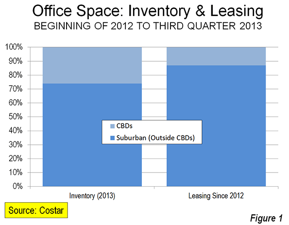
    “Overall, the suburbs have garnered more than their usual share of leasing demand over the past two years, according to an analysis by CoStar real estate economists. Since the beginning of 2012, suburban markets have accounted for a whopping 87% of office demand — which is 13% more than their ‘fair share’ based on the total market size compared with CBD office markets, according to data presented at CoStar’s recent third-quarter office review and forecast.” 

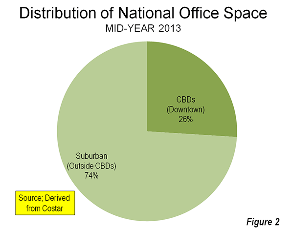
    Indeed, CBD leasing, at 13 percent of the total, is a full 50 percent below their current share of inventory (Figure 1). As of mid-2013, the suburbs accounted for nearly three quarters of the nation’s office inventory (Figure 2).

    Costar cites strong suburban development in Raleigh’s Research Triangle, and further notes that:

    A diverse set of markets that include Sacramento, San Jose, Austin, Kansas City and Charlotte have posted some of the strongest net office absorption among suburban markets.

    This is despite the glowing publicity being given to core area development, especially in places like Charlotte and Austin.

    The reality is that the monumental CBD towers dominating metropolitan skylines do not indicate downtown dominance. In fact, throughout the high income world, most metropolitan employment is outside CBDs. In the United States, typically 90 percent of employment is outside the CBDs. The suburban employment (outside the CBD) share is a bit smaller in Western Europe, Canada and Australia, but still averages approximately 80 percent or more.

    The good news is that neither suburbia nor downtown is dead.

  • New Zealand Has Worst Traffic: International Data

    Three decades ago, the Texas Transportation Institute (TTI) at Texas A&M University began a ground-breaking project to quantify traffic congestion levels in the larger urban areas of the United States. The Urban Mobility Report project was begun under Tim Lomax and David Shrank, who have led the project over the first 30 annual editions. Perhaps the most important contribution of this work to the state of transportation knowledge is TTI’s "travel time index," which measures the extent to which peak period traffic congestion as to travel times.

    Of Highway Expansion and Maternity Wards

    The TTI data has been invaluable. One important contribution has exposed a fallacious interpretation of the “induced traffic” effect, which holds that there is no point in expanding roadways because they will only be filled up by new traffic. As if more maternity wards would increase the birth rate, the argument goes that we “can’t build our way out of congestion.” In fact the TTI data, which measures at the comprehensive urban area level (and the only reliable level), says we can.

    I recall a 1980s City Hall meeting with a Portland Commissioner, who admiringly cited Phoenix for not having built a Los Angeles style freeway system. I remarked that if there was anything worse than Los Angeles with its freeways, it would be Los Angeles without its freeways. Then, Phoenix was the 35th largest urban area in the nation, yet had the 10th worst traffic congestion. The situation soon was improved, after Phoenix voters authorized funding for the largest recent freeway expansion program and now Phoenix ranks 37th in traffic congestion, despite having more than doubled in population (now the 12th largest urban area).

    The lesson repeated itself in traffic clogged Houston, which led Los Angeles in traffic congestion in three of the first four years of the Annual Mobility Report. Under the leadership of visionary Mayor Robert Lanier, freeway and arterial expansions were built, and Houston dropped to rank 10th in traffic congestion despite having since added more residents than live in Portland. Meanwhile, Portland, with its densification and anti-automobile policies has been vaulted from the 47th worst traffic congestion in 1985 to 6th worst in 2012, which is notable for the an urban area ranking on only 23rd in population.

    Houston’s roadway expansions cleared the way for a Los Angeles run of 26 straight years as the nation’s most congested urban area, with little prospect of improvement.

    The Travel Time Index Goes International

    TTI’s traffic congestion ratings were adopted internationally. INRIX, a Seattle based automobile navigation services company was first, providing virtually the same measure for urban areas in North America and Western Europe. More recently, Tom Tom, an Amsterdam based automobile navigation services company issued its own Tom Tom Traffic Index, providing by far the most comprehensive international coverage, adding Australia, South Africa and New Zealand.

    Tom Tom has just produced its results for the second quarter of 2013. Looking globally, Los Angeles does not look so bad; it didn’t even make the top 10 most congested, outpaced (or perhaps better underpaced) by urban areas in Western Europe and Canada.  

    Higher Income World Urban Areas

    Tom Tom produced data for 122 urban areas in the higher income United States, Western Europe, Canada, Australia and New Zealand. This included nearly all urban areas with more than 1,000,000 population, and some smaller. It might be expected that the “sprawl” of US urban areas, and their virtual universality of automobile ownership, as well as the paucity of transit ridership in most metropolitan areas would set the US to to the nether world of worst traffic congestion. This is not so, and not by a long shot.  

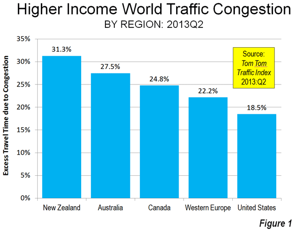
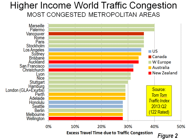
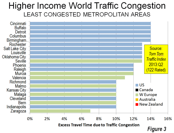
    1. New Zealand: The trophy goes to, of all places, New Zealand (Figure 1).  The average excess time spent in traffic in the three urban areas of New Zealand rated by Tom Tom was 31.3%. This means that the average trip that would take 30 minutes without congestion would take, on average, approximately 40 minutes in the three urban areas of New Zealand. This is stunning. New Zealand’s urban areas are very small. The largest, Auckland, has a population of approximately 1.3 million, which would rank it no higher than 25th in Western Europe, 35th in the United States and 4th in Canada and Australia. Christchurch and Wellington are among the smallest urban areas (less than 500,000 population) covered in the Tom Tom Traffic Index, but manage to rank among the 20 most congested (Figure 2). Christchurch and Wellington have little in freeway lengths.

    2. Australia: Second place is claimed by Australia. The average trip takes 27.5 percent longer in Australia because of traffic congestion. All five of Australia’s metropolitan areas with more than 1,000,000 population are among the 20 most congested urban areas in the higher income world. In the case of four urban areas (Sydney, Brisbane, Perth and Adelaide), every larger US urban area has less traffic congestion. Melbourne is the exception, but is still “punching well above its weight,” with worse traffic congestion than larger Chicago, Dallas-Fort Worth, Houston, Toronto, Philadelphia, Miami, Atlanta, Washington, Riverside-San Bernardino and Boston.

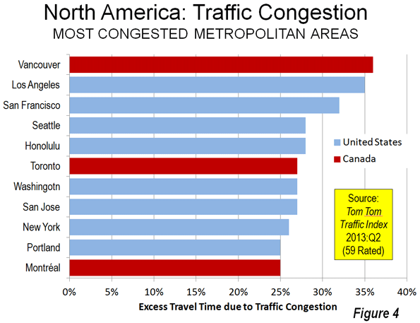
    3. Canada: Canada is the third most congested, with an excess travel time of 24.8 percent. Vancouver ranks as the third most congested urban area (36 percent excess travel time) in the higher income world, and has displaced Los Angeles as suffering the worst traffic congestion in North America. This is a notable accomplishment, since Los Angeles has more than five times the population, is more dense and only one-third as many of its commuters use transit to get to work. None of the other five largest urban areas in Canada (Toronto, Montréal, Ottawa, Edmonton and Calgary) is rated among the 20 most congested in the higher income world (Figure 3). Toronto is tied for 6th worst in North America with Washington (DC-VA-MD) and San Jose (Figure 4).

    4. Western Europe: Fourth position in the congestion sweepstakes is occupied by Western Europe, where the excess travel time averages 22.2 percent. Marseille (France) and Palermo (Italy) are tied with the worst traffic congestion in the higher income world, with excess travel times of 40 percent. Excluding Christchurch and Wellington, Marseille and Palermo are among the smallest urban areas among the most congested 20, though their large and dense historic cores complicate travel patterns. Rome, Paris, Stockholm and Rome, all with strong transit commute shares, are tied with Vancouver for the third worst traffic congestion (36 percent excess travel time). Other Western European entries to the most congested 20 rankings are London, Nice and Lyon in France and Stuttgart, Hamburg and Berlin in Germany. Western Europe contributes only 11 of its 54 rated urban areas to the most congested 20 list (the most 20 most congested list includes 24 urban areas because of a five way tie for 19th).

    Unlike New Zealand, Australia and Canada, Western Europe has representation in the 20 least congested urban areas (Figure 5), taking seven of the 22 positions (A three way tie at the top places increases the total to 22). The least congested urban area in Zaragoza in Spain (seven percent excess travel time), itself a small urban area of approximately 700,000, while similarly small Bern in Switzerland, Malaga in Spain and Malmo in Sweden are tied with four US urban areas in the second least congested position (10 percent excess travel time).

    5. United States: The United States is the least congested in these rankings with an excess travel time of 18.3 percent. Even after losing its top North American ranking to Vancouver, Los Angeles continues to be the most congested urban area in the United States, with an excess travel time of 35 percent. San Francisco (32 percent), Seattle, and much smaller Honolulu (tied at 28 percent) are also in the most congested 20. Only four of the 53 rated US urban areas is in the most congested 20.

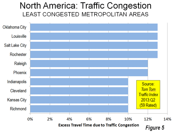
    The US dominates the least congested 20 list, with 15 urban areas. Richmond, Kansas City, Cleveland and Indianapolis share the second least congested position with three Western European urban areas (10 percent excess travel time). Phoenix, which was formerly one of the most congested in the US, is also on the list, ranking as the 12th least congested in the higher income world and the 5th least congested urban area in North America.

    Less Traffic Congestion: Lower Densities and Less Employment Concentration

    The Tom Tom traffic congestion rankings are further indication of the association between higher population densities and more intense traffic congestion. But there is more to the story. Residents of the United States also benefit because employment is more dispersed, which tends to result in less urban core related traffic congestion. Lower density and employment dispersion are instrumental in the more modest traffic congestion of the United States, including such large urban areas as Dallas-Fort Worth (the fastest growing high income world metropolitan area with more than 5,000,000 population), Houston, Miami and even roadway deficient Atlanta.


    Wendell Cox is a Visiting Professor, Conservatoire National des Arts et Metiers, Paris and the author of “War on the Dream: How Anti-Sprawl Policy Threatens the Quality of Life.

    Photo: Freeway in Marseille (by author)

  • Playing Musical Chairs with World Economies

    The world’s largest economies seem engaged in something like the children’s game of “musical chairs.” For years, the United States has been the world’s largest national economy, though in recent decades the integrated economy of the European Union has challenged that claim given that the region   includes four of the ten top national economies, Germany, the United Kingdom, France and Italy. The most recent data, reflecting the deep European recession, indicates that the top position has been retaken by the United States.

    The International Monetary Fund (IMF) has released its semi-annual World Economic Outlook Database for October 2013. Information is provided for 189 country-level geographies, from 1980 to the present, with projections to 2018. Despite the economic malaise, the IMF data shows the US gross domestic product, adjusted for purchasing power parity (GDP-PPP), to be greater than that of the combined 28 member European Union (EU). This development, however, is at least partially due to accounting revisions, which are described below.

    2012 Gross Domestic Product (Purchasing Power Parity)

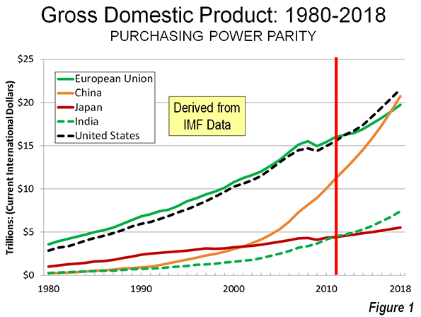
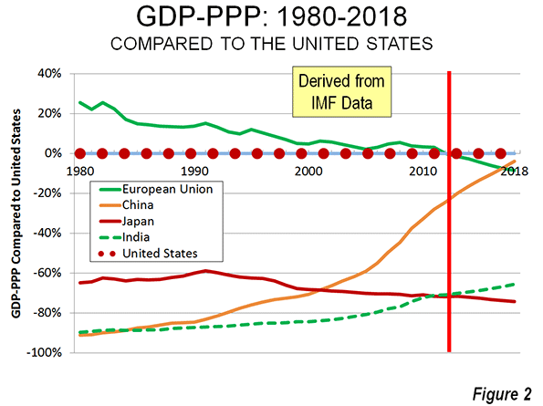
    The new data shows the United States to have a 2012 GDP-PPP of $16.245 trillion (current international dollars), two percent above the EU’s $15.933. This difference is relatively minor – the equivalent of Maryland’s GDP. In 2011, the EU led the US by a small margin, before the accounting methodology change. The IMF expects the US lead to be lengthened to approximately 10 percent by 2018. For comparison, in 1980, the same 28 EU economies had a GDP nearly one-quarter larger than that of the United States (Figures 1 and 2). However, it must be noted that in 1980, the European Union had only nine members and had an economy 8 percent smaller than that of the US.           

    China’s reduced, but still strong economic growth has propelled it to a GDP-PPP of $12.3 trillion, reaching 75 percent of the US figure. By 2018, the IMF expects China to reach 96 percent of the US GDP. If the IMF projected GDP increase rates of China and the US were to continue, China would be a larger economy than the United States by 2020. While this may be seem to be occurring sooner than expected, it is consistent with the expectation of former IMF economist Arvind Subramanian, in his book Eclipse: Living in the Shadow of China’s Economic Dominance. The scale of Chinese economic miracle that started under Deng Xiaoping can be seen by the fact that in 1980 its GDP was barely 10 percent of the US economy (See Ronald Coase and Ning Wang, How China Became Capitalist).

    India’s economy also continues to progress. Now the world’s fifth largest economy, India’s GDP-PPP is estimated at $4.7 trillion. By 2012, India’s economy had reached 29 percent of that of the United States, nearly triple the 1980 figure. IMF expects India to close the gap by another five percentage points by 2018.

    Japan has fallen to the fifth largest economy, at approximately $4.58 trillion. Japan had grown strongly after World War II, having reached 35 percent of the US economy by 1980. A number of experts, such as Harvard’s Ezra Vogel, expected that Japan would continue to close the gap with the United States. But Japan’s ascendency stopped by 1991, when it reached a size 41 percent of the US economy. In the subsequent economic slide, Japan’s economy fell to 28 percent of the US by 2012. IMF expects another two point drop by 2018.

    Gross Domestic Product per Capita (Purchasing Power Parity)

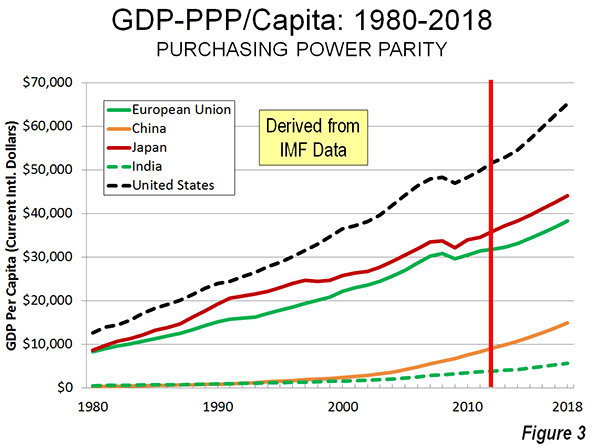
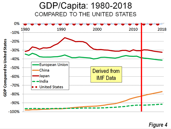
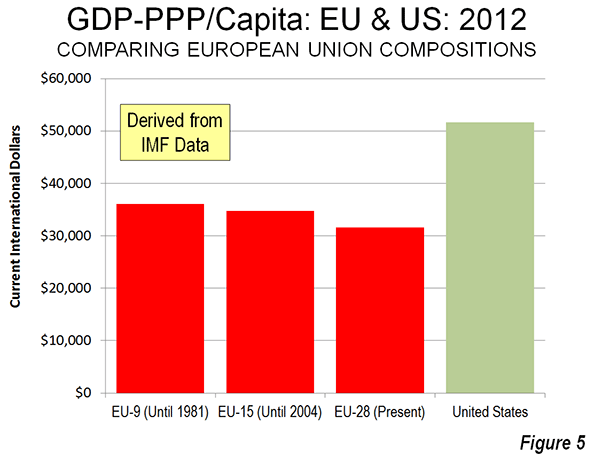
    The United States remains dominant in personal affluence among the world’s largest economies. In 2012, the US GDP-PPP per capita was $51,700. The European Union had a GDP-PPP of $31,600 in 2012, but is declining relative to the United States. In 2012, the EU GDP per capita was 61 percent of the US figure. This is down from a peak of 66 percent in 1982. IMF projects a further three percentage point loss by 2018 (Figures 3 and 4). The GDP-PPP per capita of the nations in the 9 nation European Union of 1980 was higher, at $36,100 in 2012 (Figure 5).

    Despite China’s potential for becoming the world’s leading economy by the beginning of the next decade, its huge population makes the GDP per capita much lower. In 2012 China’s GDP per capita was $9,100, about 18 percent of the US figure. This is, however, far higher than the 1980 figure of 2 percent. IMF expects China’s GDP per capita to rise to $14,900 by 2018, 23 percent of the US figure. 

    India’s GDP per capita was $3,800 in 2012, or seven percent of the US GDP per capita. India’s progress has been rapid, though   strongly overshadowed by China. India’s GDP per capita was 70 percent higher than China’s in 1980, but now China’s is now 60 percent higher. However, India has gained five percentage points on the US since 1980.

    Japan’s GDP per capita stood at 69 percent of the US figure in 2012 ($35,900), down significantly from 1991, when Japan’s GDP per capita reached 84 percent of the US level. IMF projects about a 1.5 percentage point further decline by 2018.

    Accounting Revision

    As is noted above, the accounting changes implemented by the United States have changed the world rankings and their prospects

    Data in the IMF’s last release (March 2013) placed the European Union slightly ahead of the United States in GDP-PPP. The United States is the first country to fully implement internationally agreed upon changes to national accounts (United Nations’ System of National Accounts 2008).  The IMF summarizes the revisions and its impact on the US economy as follows:

    “…expenditures on research and development activities and for the creation of entertainment, literary, and artistic originals are now treated as capital expenditures. Furthermore, the treatment of defined-benefit pension plans is switched from a cash basis to an accrual basis. The revisions increase the level of GDP by 3.4 percent and boost the personal savings rate.”

    The US Department of Commerce, Bureau of Economic Analysis indicates that Europe will convert to the new methodology in 2013 and it is to be expected that other nations will quickly follow.

    Before the accounting revision IMF data predicted that US would not pass the EU until 2015. Further, the previously lower GDP figures predicted that China would pass the United States just two years later (2017). China may have to wait to assume the top chair, but perhaps not. It all depends on how fast China converts to the new accounting and the impact of the revision on GDP figures.

    An Uncertain World

    Of course, economic projections cannot be “taken to the bank.” The world economy is volatile and uncertain and more so now that in more stable times.

    The US economy continues to sputter along with lagging growth. The European economy is doing even more poorly. Mixed signals continue to be heard from China, where astronomic growth rates are being replaced, at least for the moment, by more modest ones. President Xi Jinping says that China can create sufficient employment for its growing urban workforce with a 7.2 percent growth rate (See: “China Needs 7.2% Growth to Ensure Employment” in The Wall Street Journal) – a rate that would be the envy of each of the world’s strongest economies.

    The big high income world nations also have reason to envy India. According to the Organization for Economic Cooperation and Development (OECD), the economy of India “clocked a low growth rate of 4.4 percent” in the April to June quarter. The OECD characterized India’s immediate economic prospects as “weak,” yet India’s growth rate is far above those of the US, EU and Japan.

    The Bank of Japan (BOJ), the nation’s reserve bank, is optimistic about the nation’s new growth-seeking policies under “Abenomics” (named after Prime Minister Shinzo Abe). But the BOJ predictions of economic growth at 1.5 percent in 2014 and 2015 are favorable only in the light of Japan’s anemic recent growth.

    All of these predictions, combined with accounting changes, paint a blurred picture. This is the nature of a world economy that the IMF refers to as being stuck in “low gear.”

    Wendell Cox is a Visiting Professor, Conservatoire National des Arts et Metiers, Paris and the author of “War on the Dream: How Anti-Sprawl Policy Threatens the Quality of Life.

    —-

    Photo: Bank of China (right) and Peace Hotel, Shanghai (by author)

  • Underemployment in America

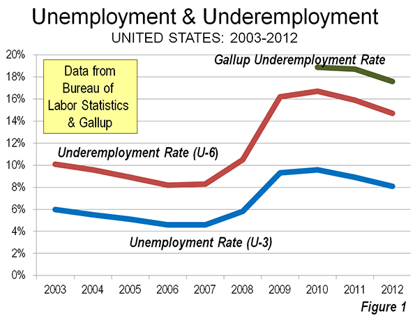
    The nation’s lackluster economic performance continues to be a concern. This is evident in stubbornly high unemployment rates (See: Suburban and Urban Core Poverty: 2012 Special Report),which continue to be well above historic norms. There is another indicator, which may be even more important – underemployment. This figure, 80 percent above the unemployment rate, can be used as a measure of the “output gap,” which a Congressional Research Service (CRS) report refers to as “the rate of actual output (economic) growth compared with the rate of potential output growth.” CRS continues: “Potential output is a measure of the economy’s capacity to produce goods and services when resources (e.g., labor) are fully utilized” (Note 1).

    Both rates are reported by the Department of Labor, Bureau of Labor Statistics (BLS). The national underemployment rate (BLS “U-6” labor underutilization measure) is far higher than the unemployment rate (BLS “U-3” labor underutilization measure). The 2012 underemployment rate was 14.7 percent, compared to the unemployment rate of 8.1 percent. The total unemployed population was 12.5 million in 2012, while the total underemployed population was 23.1 million.

    The difference between underemployment and unemployment comes by adding two groups: marginally attached workers and workers on part-time schedules for economic reasons. According to BLS, marginally attached workers are not counted as unemployed because they have not looked for work within the last four weeks, but they have sought work within the last year and are available for employment. Marginally attached workers include “discouraged” workers, who are not looking for work “because they believe there are no jobs available or there are none for which they would qualify.” In 2012, there were approximately 2.5 million marginally attached workers, including 900,000 “discouraged” workers.

    However, there was a much larger number of involuntary part time workers, at 8.1 million in 2012. This is nearly two-thirds of the 12.5 million workers unemployed in 2012.

    The number of underemployed may be higher. Gallup estimated the nation’s underemployment rate at 17.4 percent in August, well above the BLS August figure of 14.7 percent. The Gallup estimate would place underemployed workers at more than 27 million. This is approximately equal to all of the combined employment in the first and second largest states, California and Texas, as well as Colorado (Figure 1).

    Indeed, the number of underemployed could be higher yet. Economists Richard Vedder, Christopher Denhart, and Jonathan Robe at the Center for College Affordability and Productivity have estimated that 48 percent of employed college graduates hold jobs that do not require college degrees, using BLS data. None of these, as long as they are full time employees, would be included in the underemployment figures.

    Underemployment by State

    In addition to its monthly national estimates, BLS provides quarterly, year-on-year estimates by state, but only for Los Angeles County and New York City below the state level. Data is shown for 2006, the year of the best underemployment rate in the last decade, 2010, with the worst underemployment rate and the most recent year for which data is available, ending June 30, 2013 (Table).

    Underemployment Rates 
    by State, Los Angeles County & New York City
      2006 2010 2013q2* Rank
    United States 8.2% 16.7% 14.3%  
    Alabama 7.3% 17.3% 13.0% 22
    Alaska 11.8% 14.3% 12.4% 16
    Arizona 7.6% 18.4% 15.7% 42
    Arkansas 9.1% 14.5% 13.6% 25
    California 9.1% 22.1% 18.3% 50
    Colorado 7.9% 15.4% 13.8% 28
    Connecticut 7.8% 15.7% 14.6% 37
    Delaware 6.4% 14.3% 14.1% 30
    District of Columbia 9.8% 14.0% 14.1% 30
    Florida 6.2% 19.3% 15.1% 39
    Georgia 8.1% 17.9% 15.6% 40
    Hawaii 6.2% 16.9% 11.4% 12
    Idaho 6.9% 16.3% 13.6% 25
    Illinois 8.1% 17.5% 16.1% 47
    Indiana 8.1% 17.4% 14.5% 36
    Iowa 6.7% 11.6% 9.5% 5
    Kansas 7.4% 12.4% 10.9% 9
    Kentucky 9.3% 16.4% 14.3% 34
    Louisiana 8.1% 12.9% 12.5% 18
    Maine 8.2% 15.2% 14.2% 32
    Maryland 6.5% 13.0% 12.0% 15
    Massachusetts 8.2% 14.3% 13.3% 23
    Michigan 12.2% 21.0% 16.1% 47
    Minnesota 7.9% 13.8% 11.2% 11
    Mississippi 10.2% 17.6% 15.8% 45
    Missouri 8.0% 15.8% 12.4% 16
    Montana 6.9% 14.9% 12.7% 20
    Nebraska 6.1% 8.6% 8.7% 3
    Nevada 6.8% 23.6% 19.0% 51
    New Hampshire 6.1% 11.8% 11.1% 10
    New Jersey 7.8% 15.7% 15.7% 42
    New Mexico 7.5% 15.6% 13.7% 27
    New York 7.7% 14.8% 14.2% 32
    North Carolina 8.6% 17.4% 15.6% 40
    North Dakota 6.2% 7.4% 6.2% 1
    Ohio 9.7% 16.9% 13.5% 24
    Oklahoma 7.3% 11.4% 10.0% 6
    Oregon 10.4% 20.0% 16.9% 49
    Pennsylvania 8.0% 14.7% 13.8% 28
    Rhode Island 8.9% 19.2% 15.9% 46
    South Carolina 10.8% 18.1% 15.0% 38
    South Dakota 6.2% 9.7% 7.8% 2
    Tennessee 8.7% 16.6% 14.3% 34
    Texas 8.6% 14.4% 11.6% 13
    Utah 5.8% 15.1% 10.5% 7
    Vermont 6.4% 12.5% 10.5% 7
    Virginia 6.0% 12.9% 11.6% 13
    Washington 9.4% 18.4% 15.7% 42
    West Virginia 8.8% 14.0% 12.5% 18
    Wisconsin 8.1% 14.8% 12.9% 21
    Wyoming 5.8% 11.5% 9.0% 4
    Los Angeles County 9.1% 24.3% 20.5%
    New York City 8.7% 15.6% 15.1%
    Source: Bureau of Labor Statistics
    *2013q3: Year ended June 30, 2013


    Worst Performing States

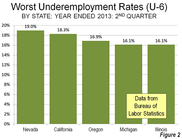
    Underemployment in the states is highest in some Western and Midwestern states. For the 12 months ended June 30, Nevada had the highest underemployment rate, at 20.3 percent. California was second, at 19.3 percent, while Oregon had the third highest underemployment rate, at 16.9 percent. Michigan and Illinois were tied for fourth highest, at 16.1 percent (Figure 2).

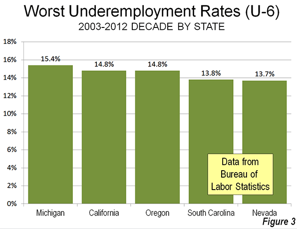
    Over the past decade (2003 through 2012), four of these states were among the five with the highest underemployment rates. Michigan, hard hit by manufacturing losses, had the highest average underemployment rate (15.6 percent), followed by California and Oregon (both at 14.8 percent), South Carolina (13.8 percent) and Nevada (13.7 percent). For the most part, underemployment has become intractable in these states. Only Nevada, with its precipitous decline from the housing crisis ranked better than 40th worst in underemployment in any year between 2003 and 2012 (Figure 3).

    Best Performing States

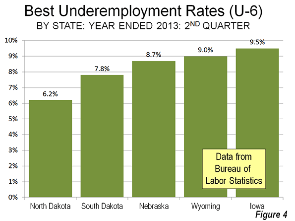
    The best underemployment rates were literally concentrated in five adjacent states with strong energy sector states, principally in the Great Plains. North Dakota led the nation for the year ended June 30, 2013, with an underemployment rate of 6.2 percent, less than one-half the national rate (14.7 percent) and less than one-third the rates of Nevada and California. North Dakota’s neighbor to the south, South Dakota had the second best rate, at 7.8 percent, while   Nebraska ranked third at 8.7 percent. On Nebraska’s western border, Wyoming, the only non-Plains state in the top five, ranked fourth with an underemployment rate of 9.0 percent. Nebraska’s eastern neighbor, Iowa, ranked fifth, at 9.5 percent (Figure 4).

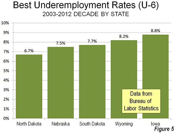
    As with the states with the worst underemployment rates over the last decade, those with the lowest  current figure also did best from 2003 and 2012. North Dakota is again number one, with an underemployment rate of 6.7 percent. Nebraska (7.5 percent), South Dakota (7.7 percent) and Wyoming (8.2 percent) follow, with New Hampshire ranking fifth best, at 8.8 percent (Figure 5).

    Underemployment in New York City and Los Angeles County

    For the year ended June 30, 2013, the city of New York had an underemployment rate of 15.1 percent, somewhat above the national rate of 14.3 percent. Over the past decade, the state of New York’s underemployment rate has been lower than that of the city in every year.  

    Los Angeles County is the largest county in the United States and if it were a state would rank eighth in population, between Ohio and Georgia. Further, it Los Angeles County were a state, it would have had the worst underemployment rate in every year from the 2008 to the present. For the year ended June 30 2013, Los Angeles County had an underemployment rate of 20.8 percent, nearly 1/2 higher than the national underemployment rate 14.7 percent and above the highest state rate of 20.3 percent in Nevada.

    Closing the Productivity Gap

    The productivity gap that results from underemployment constrains the US economy at a time of unusually severe financial challenges. College graduates face not only a grim employment market, but have student loan repayments that require good jobs. The nation continues to spend more than it collects in taxes. The inability of state and local governments to fund their government employee pension programs could lead, in the worst case, to much higher taxes or severe service cutbacks.

    Yet things could get worse. The soon to be implemented “Patient Protection and Affordable Care Act” (“Obamacare”) has a built-in incentives for employers to shift workers to part time status (weekly schedule of fewer than 30 hours of work per week). The law exempts them from providing health insurance for employees who work part time and so some establishments are shifting full time employees to part time status. Others establishments may substitute hiring part time employees instead of full time to reduce their expenses. This incentive is not just being executed by private companies seeking to maintain profitability. It extends to state and local government agencies, which unlike the federal government, must balance their books each year. According to a running of enterprises announcing shifts to part-time by Investors Business Daily, more than 75 percent are government agencies.

    All of this points to two important policy implications. The first is the necessity of focusing on the underemployment measure, the improvement of which is so crucial to maintaining and improving the standard of living and reducing poverty (by reducing the productivity gap). The second is that, with such a focus, policy makers from Washington to Sacramento, Lansing, and Carson City must pursue policies that encourage investment and employment.

    Wendell Cox is a Visiting Professor, Conservatoire National des Arts et Metiers, Paris and the author of “War on the Dream: How Anti-Sprawl Policy Threatens the Quality of Life.

    Note 1: A detailed comparison of the unemployment (U-3) and underemployment (U-6) rates is provided by economist Ed Dolan. A useful chart comparing the two indicators, with numbers from June 2012 will be found on qz.com.

    Note 2: Vedder, Denhart and Robe also suggest the possibility of “over-investment,” as more students may have been encouraged to higher education levels than there are likely to be correspondingly appropriate jobs. The extent of such over-investment is not known.

    Unemployed woman photo by BigStockPhoto.com.

  • Suburban & Urban Core Poverty: 2012: Special Report

    The US Census Bureau recently released poverty rate data by state, county and metropolitan area for 2012. As has been the case for decades, urban core poverty rates dwarf those of suburban areas in the nation’s 52 major metropolitan areas (those with more than 1 million population).

    Urban Core & Suburban Poverty Rates

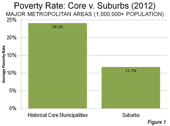
    The average poverty rate in the 52 urban cores – the historical core municipalities – was 24.1 percent, more than double the 11.7 percent rate in suburban areas (Figure 1). These high poverty rates have continued despite the best decade in more than one-half century for the urban cores which have experienced net population increases in the neighborhoods within two miles of downtown. The heavy urban core losses of the 1960s through the 1980s are generally no longer occurring. Yet, between 2000 and 2010, more than 80 percent of the population growth in the urban cores was below the poverty line (See City Growth Mainly Below Poverty Line). By contrast, less than one third of the suburban population increase was below the poverty line.

    Table 1
    Major Metropolitan Areas: Summary of Poverty Status: 2012
      Historical Core Municipalities (HCM) Suburbs Metropolitan Area
    Population (Poverty Status Determined)     44,730,920    123,763,495   168,494,415
    Above Poverty Level     34,613,515    108,917,367   143,530,882
    Below Poverty Level     10,117,405      14,846,128     24,963,533
    Major Metropolitan Areas 22.6% 12.0% 14.8%
    Data from American Community Survey, 2012


    Detailed Metropolitan Data

    The lowest historical core municipality poverty rate was in San Jose, at 13.0 percent. Seattle, San Diego, Raleigh and San Francisco rounded out the five urban cores with the lowest poverty rates. The highest urban core poverty rate was in Detroit, at 42.8 percent, followed by Hartford, Cleveland, Cincinnati and Miami.

    The lowest suburban poverty rate was in the Washington metropolitan area at 7.2 percent. Milwaukee, Baltimore, Indianapolis and Minneapolis-St. Paul followed. The highest suburban poverty rate was in the Riverside San Bernardino, 18.4 percent, followed by Orlando, Miami, Las Vegas and Atlanta. Only 15 of the major metropolitan areas had suburban poverty rates that were higher than the best historical core municipality rate of 13.0 percent (San Jose).

    Taking a look over the regions of the country, the five lowest major metropolitan poverty rates were in Washington (8.4 percent), Boston, Minneapolis-St. Paul, San Jose, and Hartford. The highest major metropolitan area poverty rates were in Memphis (19.9 percent), New Orleans, Riverside San Bernardino, Los Angeles, and Miami (Table 2).

    A caveat is in order, however. The official poverty rate does not take into consideration the cost of living differences between states and metropolitan areas. These differences can be large. According to the latest Bureau of Economic Analysis (US Department of Commerce) data, there can be an up to 35 percent difference in the cost of living between major metropolitan areas (the high being San Francisco and the lowest being St. Louis). The new Census Bureau supplemental poverty measure takes housing costs into consideration, but provides only state data. The differences can be substantial. For example, California’s supplemental poverty rate is the highest in the nation, and nearly one-half higher than its unadjusted poverty rate. California’s housing adjusted poverty rate is approximately double that of West Virginia, which is normally considered to be one of the nation’s highest poverty states.

    Table 2
    Major Metropolitan Areas: Poverty Status: 2012
    Metropolitan Area Historical Core Municipalities (HCM) Rank Suburbs Rank Metropolitan Area Rank Core Rate/ Suburban Ratio Rank
    Atlanta, GA 25.8%          35 15.8%        48 16.6%        41 1.63         14
    Austin, TX 20.3%          14 11.5%        28 15.5%        31 1.77         19
    Baltimore, MD 24.8%          34 7.4%          3 11.3%          6 3.34         49
    Birmingham, AL 31.2%          46 13.5%        41 16.8%        42 2.31         34
    Boston, MA-NH 21.6%          21 9.0%          9 10.7%          2 2.40         38
    Buffalo, NY 30.9%          44 9.4%        11 14.2%        19 3.30         47
    Charlotte, NC-SC 21.8%          23 9.9%        14 15.1%        30 2.22         33
    Chicago, IL-IN-WI 23.9%          30 10.8%        22 14.5%        24 2.20         32
    Cincinnati, OH-KY-IN 34.1%          49 11.9%        32 14.9%        26 2.86         41
    Cleveland, OH 36.1%          50 10.8%        21 15.6%        32 3.33         48
    Columbus, OH 21.8%          23 9.9%        15 15.1%        29 2.20         31
    Dallas-Fort Worth, TX 23.9%          31 13.0%        38 15.0%        27 1.85         22
    Denver, CO 19.2%          10 10.7%        19 12.7%        12 1.80         21
    Detroit,  MI 42.3%          52 12.6%        35 17.4%        47 3.36         50
    Grand Rapids 29.4%          42 12.4%        34 16.5%        40 2.37         36
    Hartford, CT 38.0%          51 7.9%          6 10.9%          5 4.83         52
    Houston, TX 23.5%          29 12.6%        36 16.4%        39 1.87         24
    Indianapolis. IN 22.2%          25 7.6%          4 14.4%        22 2.92         43
    Jacksonville, FL 18.5%            9 11.4%        27 15.7%        33 1.61         13
    Kansas City, MO-KS 20.7%          15 10.6%        18 12.9%        14 1.94         28
    Las Vegas, NV 17.6%            6 15.8%        49 16.4%        37 1.11           2
    Los Angeles, CA 23.3%          27 15.3%        45 17.6%        49 1.53           9
    Louisville, KY-IN 19.5%          12 13.1%        40 16.1%        35 1.49           6
    Memphis, TN-MS-AR 28.3%          38 11.8%        31 19.9%        52 2.39         37
    Miami, FL 31.7%          48 16.4%        50 17.5%        48 1.94         27
    Milwaukee,WI 29.9%          43 7.3%          2 15.9%        34 4.08         51
    Minneapolis-St. Paul, MN-WI 22.6%          26 7.7%          5 10.7%          3 2.94         44
    Nashville, TN 19.4%          11 11.2%        25 14.3%        20 1.73         16
    New Orleans. LA 28.7%          40 15.4%        47 19.4%        51 1.87         23
    New York, NY-NJ-PA 21.2%          19 9.8%        12 14.8%        25 2.17         30
    Oklahoma City, OK 19.7%          13 13.1%        39 16.2%        36 1.50           7
    Orlando, FL 21.2%          20 16.4%        51 16.9%        44 1.30           4
    Philadelphia, PA-NJ-DE-MD 26.9%          37 8.7%          8 13.4%        16 3.08         45
    Phoenix, AZ 24.1%          32 13.9%        42 17.4%        46 1.74         17
    Pittsburgh, PA 21.1%          16 10.9%        23 12.1%        10 1.94         26
    Portland, OR-WA 17.7%            7 12.7%        37 14.0%        18 1.39           5
    Providence, RI-MA 28.7%          39 11.7%        29 13.6%        17 2.44         39
    Raleigh, NC 16.4%            4 10.7%        20 12.7%        11 1.53         10
    Richmond, VA 26.3%          36 9.1%        10 11.9%          9 2.88         42
    Riverside-San Bernardino, CA 31.1%          45 18.4%        52 19.0%        50 1.68         15
    Rochester, NY 31.6%          47 10.2%        17 14.4%        23 3.10         46
    Sacramento, CA 23.4%          28 15.1%        44 16.9%        43 1.55         11
    St. Louis,, MO-IL 29.2%          41 12.4%        33 14.3%        21 2.35         35
    Salt Lake City, UT 21.2%          17 11.1%        24 12.7%        13 1.91         25
    San Antonio, TX 21.7%          22 10.0%        16 17.3%        45 2.17         29
    San Diego, CA 15.5%            3 14.7%        43 15.0%        28 1.05           1
    San Francisco-Oakland, CA 17.3%            5 9.8%        13 11.9%          8 1.75         18
    San Jose, CA 13.0%            1 8.5%          7 10.8%          4 1.52           8
    Seattle, WA 13.6%            2 11.3%        26 11.7%          7 1.20           3
    Tampa-St. Petersburg, FL 24.5%          33 15.3%        46 16.4%        38 1.61         12
    Virginia Beach-Norfolk, VA-NC 21.2%          18 11.8%        30 13.1%        15 1.80         20
    Washington, DC-VA-MD-WV 18.2%            8 7.2%          1 8.4%          1 2.52         40
    Average of Metropolitan Areas 24.1% 11.7% 14.7% 2.07


    Suburban Poverty

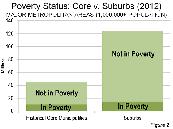
    The majority of the major metropolitan area poverty population now lives in the suburbs, by virtue of their population dominance; overall suburban populations are now 2.7 times as large as those of all core cities. In fact, rather than being a new phenomenon, suburban areas passed the urban cores in poverty population before 2000. The 2000 Census indicated that approximately 53 percent of the poverty population was in suburban areas of the 52 metropolitan areas. The share of poverty rose to 59 percent in the suburbs, largely as a consequence of their having dominated growth between 2000 and 2012. While there were nearly 5 million more people below the poverty line in the suburbs than in the historical core municipalities, the suburbs contained more than three times the above-poverty line population – some 109 million – as the urban cores (Figure 2).

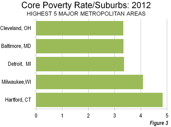
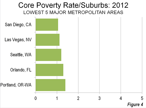
    In 2012, suburban poverty rates were below those of the urban cores in all 52 major metropolitan areas (Table 2). The urban core poverty rates ranged from 5 percent above the suburban rates, in San Diego to nearly 5 times the suburban rate in Hartford. San Diego, Las Vegas, Seattle, Orlando and Portland had the lowest urban poverty rates relative to the suburbs of the same metropolitan areas (Figure 3). The urban cores of Hartford, Milwaukee, Detroit, Baltimore and Cleveland had the highest poverty rates relative to the suburbs of the same metropolitan areas (Figure 4).

    Poverty by Historical Core Municipality Category

    When the new poverty data was announced, Milwaukee Mayor Tom Barrett bemoaned the fact that the city’s poverty rate was the highest in the nation relative to that of the suburbs. The Milwaukee Journal-Sentinel’s “Politifact” pointed out that the mayors’ contention was based on 2010 data rather than the new 2012 data. As is noted above, Hartford had displaced Milwaukee with the highest urban core poverty rate relative to the suburbs by 2012.

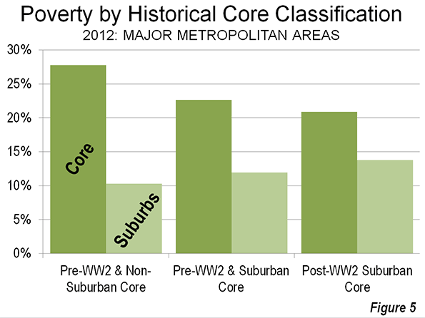
    However, Mayor Barrett’s concern is well founded. The city of Milwaukee’s high poverty rate relative to the suburbs is surprising. Among the five urban cores with the highest poverty rates relative to the corresponding suburbs, only Milwaukee includes substantial areas of suburban land use development. The city of Milwaukee is categorized as a Pre-World War II core with substantial suburbanization, by virtue of having more than doubled its land area by annexing lower density (suburban) areas. Each of the four other urban cores with the highest ratios relative to suburban poverty rates are classified as pre-World War II cores with little suburbanization. None of these municipalities (Hartford, Detroit, Baltimore, and Cleveland) has annexed significant suburban territory since before World War II.

    Since poverty tends to be more concentrated in urban cores in the United States, it is to be expected that pre-World War II historical core municipalities would have higher poverty rates relative to the suburbs.

    The smallest differences between urban core and suburban poverty rates are found in the metropolitan areas with heavily suburban core cities and lack major pre-World War II cores (Figure 5). San Jose, Phoenix, Orlando, and Las Vegas are examples of metropolitan areas in this category.

    From Poverty to Prosperity

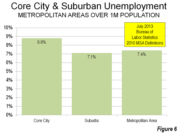
    The continuing high rates of poverty in the urban cores and the higher than previous poverty rates in suburban areas is cause for primary concern. At the heart of the problem is the lingering high unemployment rate, which averages nearly a quarter higher in the urban cores than in the suburbs (Figure 6).

    The principal purpose of cities (from the urban core to the exurban periphery) is to facilitate a better standard of living for all income segments. This has, of course, been made difficult by the Great Recession and could be lengthened should grudging growth nurture a long-term Great Malaise. Obviously, the answer is stronger economic growth, which will require a better investment climate

    Wendell Cox is a Visiting Professor, Conservatoire National des Arts et Metiers, Paris and the author of “War on the Dream: How Anti-Sprawl Policy Threatens the Quality of Life.

    —–

    Note: These data vary from those reported by the Brookings Institution, which classifies “cities” and “suburbs” differently. For example, the Brookings Institution classifies suburbs such as Arlington, Texas in the Dallas-Fort Worth metropolitan area, Aurora, Colorado in Denver (see photo above),  Mesa, Arizona in Phoenix, Bellevue , Washington in Seattle and  Paradise, Nevada in Las Vegas as “cities.” The net effect is generally higher suburban poverty rate in the Brookings Institution analysis than in this “urban core” versus suburban analysis.

    —–

    Photo: Suburban Denver (Aurora), by author

  • Shenzhen II?: The New Shanghai Financial Free Trade Zone

    Less than 35 years ago, China established its first special economic zone in Shenzhen, a prefecture (Note) bordering Hong Kong. This model is about to be expanded with the establishment of a new financially oriented free-trade zone in Shanghai, which could prove a major breakthrough in that city’s quest to become East Asia’s financial capital. The “China (Shanghai) Pilot Free Trade Zone (FTZ)” is located in eastern Pudong, the Shanghai’s suburban district (qu) that includes the huge new Pudong business district, across the river from the central business district in Puxi. 

    The potential here for rapid growth can be seen by reviewing the success of the Shenzen special economic zone (SEZ), When founded, the SEZ contained little more than a fishing village, but soon was transformed into a manufacturing and trading center, propelled by a less constrained regulatory environment. Foreign investment soared. The success of the Shenzhen model led to expansion of the zone and other special economic zones were established around the country. Shenzhen’s prosperity extended into neighboring Pearl River Delta prefectures such as Guangzhou, Dongguan, Foshan, Zhuhai and Zhongshan. Investment friendly policies were applied virtually across the nation in the years that followed. Today, for example, Apple makes many of its tablets in Chengdu, the capital of Sichuan, 1200 miles (2000 kilometers) inland via China’s larger equivalent of the US interstate highway system.

    Yet the economic advances of the special economic zones were anything but inevitable. Chinese leader Deng Xiaoping faced strong opposition from some high government officials, who were intent on limiting the scope of the Shenzhen experiment. Some even hoped to shut it down altogether (see Ezra Vogel’s Deng Xiaoping and the Transformation of China). Moreover, the economic advance of China involved, as the late Nobel Laureate Ronald Coase and Ning Wang relate in How China Became Capitalist  much more than conscious economic policy. Coase and Wang characterize the government’s light handed policies as permitting the “marginal revolutions” in individual entrepreneurship, township and village enterprises (locally owned enterprises) and private farming. These, and the special economic zones, were the driving forces in the Chinese economic miracle.

    And, as is predictable, not everyone is happy with the results of China’s transformation. There is persistent criticism of the inequality of income that has developed in China over the period. Yet, sitting on the sidelines, it is easy to second-guess the results of national economic policies, which do not always produce the intended outcomes. Suffice it to say that since 1980, China, one of the poorest nations in the world, has pursued policies, both of commission and omission, that have together lifted more people from poverty than ever before in history (See: Alleviating Poverty: A Progress Report). There is probably not a more important domestic objective for governments.

    Shanghai’s New Financially Oriented Free Trade Zone

    In the past the free trade zones focused principally on manufacturing. The new Shanghai free trade zone is the first to specialize in finance. The zone stretches along the Pacific Coast from north of Pudong International Airport, south through the large new town of Nanhui and across the Donghai Bridge to the new deep water port, which is an important component of the Port of Shanghai, now the largest in the world, and is designed to focus on finance. Initially, it will cover 11 square miles (29 square kilometers), but Hong Kong’s South China Morning Postsuggests that it might eventually be expanded to cover all of the Pudong New Area. This would expand the area to 467 square miles (1,210 square kilometers), an area nearly as large as the San Francisco-Oakland built up urban area.

    According to The Wall Street Journal “China’s government said it would turn a new free-trade zone here into a laboratory for remaking the country’s financial sector…” The Journal continues: “Financial-sector changes are at the heart of the experimentation in the zone: letting the market, rather than regulators, set interest rates and allowing firms to convert money more freely from yuan to foreign currencies and move the money overseas.”

    The Chinese based Global Times characterized the new free trade zone as an important step in China’s economic reform and the internationalization of the yuan. 

    As in the case of Shenzhen, government officials are characterizing the establishment of the new “Pilot Free Trade Zone” as an experiment. The Journal reports that the project is championed by new Premier Premier Li Keqiang, just as Shenzhen was championed by Deng Xiaoping. Should the zone be successful, it would not be surprising to see other such zones established. Perhaps, it will lead to an eventual liberalization of financial regulation across the nation, which is critical for China’s future development.

    Shanghai American Chamber of Commerce president Kenneth Jarrett responded positively to the announcement, telling China Daily: "One thing significant about the zone is its relationship to China’s economic reform agenda. Because there are a lot of talks about the need to rebalance the economy and make it more market-oriented, the FTZ (free trade zone) is a signature piece for the whole process."

    Yet, this will be far from a total free-market paradise. The government has announced a list of restrictions, including industries in which foreign investment will not be permitted and industries in which investment will be limited to joint ventures with Chinese companies.

    Chinese sources emphasize the evolutionary nature of the restrictions. According to Shanghai Daily, “The list is a temporary version for 2013 and the zone regulators will update the list every one or two years to better facilitate liberalization policies testing in the free trade zone.”

    Differing Views

    The new free trade zone move comes as analysts increasingly suggest the need to liberalize its financial sector. The Pilot FTZ could lead China’s financial sector toward greater integration into the globalized economy. This would strengthen China’s integration with the world, and could pose a major challenge to established financial centers, such as New York, London, Hong Kong and Singapore, In an editorial, The South China Morning Post (SCMP) speculates that the reforms begun with the Pilot FTZ could eventually undermine Hong Kong’s position as Asia’s financial center. The SCMP further notes that “The ultimate effect” of the Pilot FTZ “could be to help speed up economic reform nationwide. And that might be the bigger threat to Hong Kong.”

    If the skeptics are right, the restrictions and slowness of reform could limit the effectiveness of the zone and the challenge it poses to Hong Kong and other global financial capitals.  Such a view may be naïve. Other views are that reforms could lead to far more important consequences both in Asia and the World,.

    The most significant impacts could be on the United States, at least if former International Monetary Fund economist Arvind Subramanian is right. In his controversial book, Eclipse: Living in the Shadow of China’s Economic Dominance, Subramanian predicts that China will replace the United States as the world’s dominant economy by 2030 and that the yuan could replace the dollar as the principal reserve currency by that time. This could become more plausible if the financial liberalization apparently at the heart of the Pilot FTZ effort proceeds with dispatch.

    History: Repeating Itself?

    The signs from China are not completely clear. Bob Davis and Lingling Wei have just published an analytical The Wall Street Journal article that notes that President Xi Jinping has “veered left on some political issues.” Yet, indications on the economic front could be the opposite. The article focuses on Lie He, Xi Jinping’s leading economic advisor, Liu He, who Harvard’s 2001 Nobel laureate Michael Spence calls “an example of Chinese pragmatism," Spence adds that  Liu "…thinks markets are important mechanisms for getting things done efficiently," but "they’re not religion to him."

    Deng Xiaoping famously talked of crossing the river by “following the stones.” This cautious approach uses seemingly glacial policy changes that gradually initiate major change.This is how China has evolved over the past 35 years. Again, the Chinese appear to be choosing caution. This is not fast enough for some analysts, but this may also be a development that could augur many changes, not only for China, but for all its primary competitors in Asia and elsewhere.

    —–

    Note: The alternate term “prefecture” is used to denote the local jurisdictions into which all of China’s land area is divided. These go by various terms, with “municipality” or “city” used most frequently. In each case, municipalities are more akin to metropolitan areas (or even larger areas), which include the built-up urban areas and substantial expanses of surrounding rural territory.

    Photo: Pudong, Century Avenue toward the China (Shanghai) Pilot Free Trade Zone (by author)