Author: Wendell Cox

  • Driving Alone Dominates 2007-2012 Commuting Trend

    New data from the American Community Survey makes it possible to review the trend in mode of access to employment in the United States over the past five years. This year, 2012, represents the fifth annual installment of complete American Community Survey data. This is also a significant period, because the 2007 was a year before the Lehman Brothers collapse that triggered the Great Financial crisis, while gasoline prices increased about a third between 2007 and 2012.

    National Trends

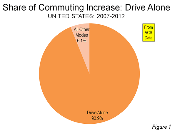
    The work trip access data is shown in Tables 1 and 2. Driving alone continued to dominate commuting, as it has since data was first reported in the 1960 census. In 2007, 76.1 percent of employment access was by driving alone, a figure that rose to 76.3 percent in 2012. Between 2007 and 2012, driving alone accounted for 94 percent of the employment access increase, capturing 1.55 million out of the additional 1.60 million daily one-way trips (Figure 1). The other 50,000 new transit commutes were the final result of increases in working at home, transit and bicycles, minus losses in car pooling and other modes.

    Carpools continued to their long decline, losing share in 43 of the 52 major metropolitan areas. Approximately 810,000 fewer people travel to work by carpools in 2012, which reduced its share from 10.7 percent to 9.7 percent.

    Transit did better, rising from 4.9 percent of work access in 2007 to 5.0 percent in 2012. There was an overall increase of approximately 250,000 transit riders. This increase, however, may be less than might have anticipated in view of the much higher gasoline prices and the imperative for commuters to save money in a more difficult economy.

    Bicycling also did well, rising from a 0.5 percent share in 2007 to a 0.6 percent share in 2012. Approximately 200,000 more people commuted by bicycle by 2012.

    Walking retained its 2.8 percent share, with only a modest 15,000 increase over the period. The largest increase in employment access outside single occupant driving was working at home, which rose from 4.1 percent to 4.4 percent. This translated into an increase of approximately 470,000.

    Metropolitan Area Highlights

    Among the 52 metropolitan areas with more than 1 million population (major metropolitan areas), 47 had drive alone market shares of 70 percent or more. Birmingham was the highest, at 85.6 percent. Surprisingly, this grouping included metropolitan areas with reputations for strong transit ridership, such as Chicago, Philadelphia, and Portland. Four metropolitan areas had drive alone shares of between 60 percent and 70 percent: Seattle, Washington, Boston, and San Francisco, which had the second lowest in the nation at 60.8 percent. As would be expected, New York had by far the lowest drive alone market share at 50.0 percent.

    Consistent with its low drive alone market share, New York led by a large margin the other metropolitan areas in its transit work trip market share. Transit carried 31.1 percent of New York commuters, up nearly a full percentage point from the 30.2 percent in 2007. New York alone accounted for nearly one-half of the growth in transit commuting over the period.

    San Francisco continued to hold onto second place, with a 15.1 percent transit market share, up a full percentage point from 2007. Washington rose to 14.0 percent, up from 13.2 percent in 2007. Boston (11.9 percent) and Chicago (11.0 percent) were the only other major metropolitan areas to achieve a transit work trip market share of more than 10 percent, and were little changed from 2007.

    Working at home continued to increase at a larger percentage rate than any other mode of work access. Four metropolitan areas were tied for the top position in 2012, at 6.4 percent. These included Raleigh, Austin, San Diego, and Portland, all metropolitan areas with a strong high-tech orientation. In San Diego and Portland, where large light rail systems have been developed, working at home is now more popular as a mode of access to work than transit.

    According to 2012 US Census Bureau estimates, the major metropolitan areas comprised 55.2 percent of the national population. These metropolitan areas represented a slightly larger share of total employment, at 57.3 percent. The combined major metropolitan areas also had similar shares to their national population share in each of the employment access modes, ranging from a low of 55.3 percent of communters driving alone to 59.9 percent of walkers. The one exception was transit, where the major metropolitan areas constituted nearly all of commuters, at 90.7 percent, well above their 55.2 percent share of US population (Table 1).

    Table 1
    Distribution of Employment Access (Commuting) by Employment Location: 2012
    SHARE OF WORK ACCESS BY MODE (2012)
      All Employment Drive Alone Car Pool Transit Bike Walk Other Work at Home
    MAJOR METROPOLITAN AREAS 57.3% 55.3% 55.4% 90.7% 59.9% 56.0% 55.6% 59.3%
    Metropolitan Areas with Legacy Cities 17.1% 13.8% 14.4% 65.4% 21.5% 27.8% 18.3% 17.1%
      6 Legacy Cities (see below) 6.0% 2.7% 4.1% 55.1% 12.7% 16.3% 7.8% 4.6%
      Suburban 11.1% 11.1% 10.3% 10.3% 8.8% 11.5% 10.5% 12.6%
      New York Metropolitan Area 6.4% 4.2% 4.5% 39.6% 5.8% 13.6% 8.5% 5.9%
        Legacy City: New York 3.1% 1.0% 1.5% 35.4% 4.2% 9.5% 4.2% 2.5%
        Suburban 3.3% 3.2% 3.0% 4.2% 1.7% 4.1% 4.3% 3.5%
      5 Other Metropolitan Areas with Legacy Cities 10.7% 9.6% 9.9% 25.8% 15.7% 14.2% 9.8% 11.2%
        5 Legacy Cities (CHI, PHI, SF, BOS, WDC) 2.9% 1.7% 2.6% 19.7% 8.5% 6.8% 3.6% 2.1%
        Suburban 7.8% 7.9% 7.3% 6.1% 7.1% 7.5% 6.2% 9.1%
    46 Other Major Metropolitan Areas 40.2% 41.5% 41.0% 25.3% 38.4% 28.2% 37.3% 42.2%
    OUTSIDE MAJOR METROPOLITAN AREAS 42.7% 44.7% 44.6% 9.3% 40.1% 44.0% 44.4% 40.7%
    United States 100% 100% 100% 100% 100% 100% 100% 100%
    Calculated from American Community Survey: 2012 (one year)

    Follow this link to a table containing data for the nation’s major metropolitan areas.

    Commuting Becomes More Concentrated in Legacy Cities

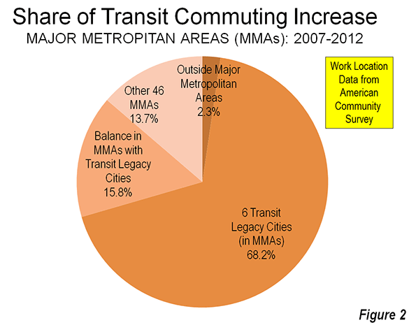
    This concentration of transit commuting was most evident to the six large "transit legacy cities," (the core cities of New York, Chicago, Philadelphia, San Francisco, Boston, and Washington), which still exhibit sufficient remnants of their pre-automobile urban cores that support extraordinarily high transit market shares. The transit legacy cities accounted for 55 percent of all transit commuting destinations in the United States, yet have only six percent of the nation’s jobs. Between 2007 and 2012, the concentration increased, with transit legacy cities accounting 68 percent of the additional transit commutes were between 2007 and 2012. Outside the legacy cities, there was relatively little difference in the share of transit commutes within metropolitan areas with legacy cities and in the other major metropolitan areas (Figure 2)

    The key to the intensive use of transit in the legacy cities is the small pockets of development that are particularly amenable to high transit market shares – the six largest downtown areas (central business districts) in the United States. Most of the commuting to transit legacy cities is to these downtown areas, Yet, the geographical areas of these downtowns is very small. Combined, the six downtown areas are only one-half larger than the land area of Chicago’s O’Hare International Airport. This yields employment per square mile densities of from 40 to 150 times densities of employee residences throughout their respective urban areas.  

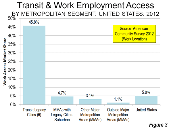
    Not surprisingly, transit has very strong market shares to work locations in the transit legacy cities, at 45.8 percent. At the same time, transit commuting to locations outside the transit legacy cities is generally well below the national average. The exception is New York, where transit commuting to suburban locations is 6.4 percent, above the overall national average of 5.0 percent. In the five other metropolitan areas with transit legacy cities, transit commuting to suburban locations is 3.9 percent. This drops to 3.1 percent, overall, in the 46 other major metropolitan areas and 1.1 percent in the rest of the nation (Table 2 and Figure).

    Table 2
    Employment Access (Commuting) by Employment Location: 2012
      Drive Alone Car Pool Transit Bike Walk Other Work at Home
    MAJOR METROPOLITAN AREAS 73.6% 9.4% 7.9% 0.6% 2.8% 1.2% 4.5%
    Metropolitan Areas with Legacy Cities 61.7% 8.2% 19.2% 0.8% 4.6% 1.3% 4.4%
      6 Legacy Cities (see below) 33.9% 6.5% 45.8% 1.3% 7.6% 1.6% 3.3%
      Suburban 76.8% 9.1% 4.7% 0.5% 2.9% 1.1% 5.0%
      New York Metropolitan Area 50.0% 6.8% 31.1% 0.6% 6.0% 1.6% 4.1%
        Legacy City: New York 23.7% 4.6% 57.1% 0.8% 8.6% 1.6% 3.5%
        Suburban 74.8% 8.9% 6.4% 0.3% 3.5% 1.6% 4.6%
      5 Other Metropolitan Areas with Legacy Cities 68.6% 9.0% 12.1% 0.9% 3.7% 1.1% 4.6%
        5 Legacy Cities (CHI, PHI, SF, BOS, WDC) 44.8% 8.6% 33.7% 1.8% 6.5% 1.5% 3.1%
        Suburban 77.6% 9.1% 3.9% 0.6% 2.7% 1.0% 5.1%
    46 Other Major Metropolitan Areas 78.7% 9.9% 3.1% 0.6% 2.0% 1.1% 4.6%
    OUTSIDE MAJOR METROPOLITAN AREAS 79.9% 10.1% 1.1% 0.6% 2.9% 1.3% 4.2%
    United States 76.3% 9.7% 5.0% 0.6% 2.8% 1.2% 4.4%
    Transit legacy cities include the municipalities of New York, Chicago, Philadelphia, San Francisco, Boston & Washington

    Staying the Same

    The big news in the last five years of commuting data is that virtually nothing has changed. This is remarkable, given the greatest economic reversal in 75 years and continuing gasoline price increases that might have been expected to discourage driving alone. Yet, driving alone continues to increase, while the most cost effective mode of car pooling continued to suffer huge losses, while working at home continued to increase strongly.

    Wendell Cox is a Visiting Professor, Conservatoire National des Arts et Metiers, Paris and the author of “War on the Dream: How Anti-Sprawl Policy Threatens the Quality of Life.

    Photograph: DART light rail train in downtown Dallas (by author)

  • Congratulations Senator Bob Day

    Congratulations to Bob Day, who was elected as a federal Senator from South Australia. Day was one of six Senators elected from the state in the September 7 election. While most of the seats in the lower house of Parliament were quickly decided, the Senate seats too considerably longer under Australia’s preferential voting system. According to the Australian Broadcasting Company, Day’s election and that of the other five Senators was confirmed on October 2.

    Day is an ultimate entrepreneur, having founded Home Australia and related companies that has emerged as a leading home builder across the nation. He served a term as President of the Housing Industry Association. Day has also been a newgeography.com author, writing a piece on one of his passions, the importance of restoring housing affordability in Australia (see The Land Premium that’s Punishing Property).

  • Canada: Suburban, Automobile Oriented Nation

    Canada is even more a suburban nation than generally thought, according to new research that digs deeper than the usual core city versus suburbs distinctions. Researchers at Queen’s University in Kingston, Ontario have announced groundbreaking research that disaggregates 33 census metropolitan areas into four classifications: (1) urban core, (2) transit oriented suburban, (3) automobile oriented suburban and (4) exurban lifestyles, which are also automobile oriented. The findings were made available to canada.com and will be published during the autumn in an academic journal.

    Suburbs and Urban Cores: The Complexities

    Professor David Gordon, director of the School of Urban and Regional Planning at Queen’s University summarized the research as indicating that “Canada is a suburban nation.” This may be surprising, the core cities of Canada represent a larger share of their metropolitan area population than is common in the United States. However, the core city versus suburban (outside the core city) classification substantially understates the suburban and automobile oriented nature of Canada’s metropolitan areas. This definition has long since become obsolete with the substantial annexations of suburban areas by Calgary and Edmonton and the forced consolidations of Toronto, Montréal (parts of which were reversed) and Ottawa.

    Even the core city of Vancouver, which has had essentially the same boundaries for at least 60 years, contains considerable expanses of suburbanization beyond its urban core. The core city of Toronto contains large areas of suburban development, such as in Scarborough, North York and Etobikote. The same is true of the core cities of Calgary, Edmonton and Ottawa and the ville de Montréal.

    To get around this difficulty, we used federal electoral district data to do an early analysis of urban core versus suburban growth when the 2011 census data was released. Our findings were that the greatest share of growth had been in suburban areas (See: Special Report: Census 2011: Urban Dispersion in Canada). The Queens University researchers went considerably deeper, and showed that 95 percent of metropolitan area growth had been in suburban areas between 2006 and 2011, a somewhat higher figure than the 93 percent suburban growth derived from the federal electoral district data (federal electoral districts are smaller than the large core cities).

    The Queen’s University Approach

    Gordon and the research team divided metropolitan areas into the four classifications at the census tract level. The census tract level is ideal for this type of analysis, because it is the closest approximation to the neighborhood. The Gordon et al analysis is thus finely grained, and may be virtually unprecedented in the world.

    The research uses criteria developed from journey to work mode data (such as transit, walking, cycling and automobile) and residential densities. Gordon et al called their urban core classification "active core," to note the greater dependence of residents on walking and cycling for commuting to work. They divided suburban areas into transit and auto suburban areas, and designated the rural areas of metropolitan areas as exurban (Note).

    The findings may be surprising to those retro-urbanists who hold Canada up as a planning model. When urbanization is examined at the neighborhood level, little of the metropolitan population actually follows    the urban core model. Overall, the average urban core constitutes approximately 12% of the metropolitan area. This varies little by population category.

    In describing the results, Gordon noted that there is a tendency to “overestimate the importance of the highly visible downtown cores and underestimate the vast growth happening in the suburban edges.” This is especially evident in the largest metropolitan areas.

    Major Metropolitan Areas

    Among the six major metropolitan areas (those with more than 1 million population), the urban cores also average 12 percent of the population (Figure).


    In relative terms, Vancouver has the largest urban core, at 16% of its population, followed by Calgary with 13% of its population. Toronto, Montréal and Edmonton all have urban cores with approximately 11% of their population, while Ottawa, which is both in Ontario and Quebec, stands at 12%. This means that the major metropolitan areas are, on average, 88% suburban or exurban.

    There is also relative consistency with respect to the populations of the transit oriented suburban areas. The largest are in Toronto and Montréal, at 14%. Vancouver and Edmonton have 12% of their populations in transit oriented suburban areas and Ottawa 11%. However, transit’s reach is much less in Calgary, where the transit suburbs have only 3% of the population.

    Calgary was the most automobile oriented of the major metropolitan areas, with 85 percent of residents living in automobile suburbs and exurbs. But other major metropolitan areas were not far behind, ranging from 73 percent in Vancouver to 78 percent in Ottawa, with Toronto Montréal and Edmonton in between.

    Smaller Metropolitan Areas

    Generally, the level of suburbanization was similar even in the smaller metropolitan areas. Interestingly, Gordon’s method did not require an urban core. This is illustrated by the Abbotsford (BC), where there no urban core is reported. Abbotsford is located in the Fraser River Valley, east of the Vancouver metropolitan area. Abbotsford developed in recent decades and, as a result, is so automobile oriented that the Queen’s University researchers do not even find a transit oriented suburb.

    Further, there were two instances of transit suburban areas being oriented toward urban cores outside their own metropolitan areas. In Oshawa, to the east of Toronto, a transit suburban area is west of Oshawa’s core, along the GO Transit commuter rail line to Toronto’s Union Station. Similarly, in Hamilton, a transit suburban area is located east of Hamilton’s core, on the GO Transit commuter rail line to Toronto.

    Maps

    The media site canada.com has also published A Country of Suburbs  with detailed census tract level maps for each of the metropolitan areas. There are also articles on each of the major metropolitan areas.

    Professor Gordon and his associates have pioneered a new, far more detailed method of analyzing the lifestyle components of the modern metropolitan area. They deserve credit for their objectiveness and attention to detail. Similar analysis is needed in other high income world nations.

    ——

    Note: Metropolitan areas always include rural areas – areas that are not urban. This is because metropolitan areas are employment market areas and people invariably commute from outside the population center (formerly called the urban area by Statistics Canada). The rural areas of metropolitan areas are far larger in geography than population centers or urban areas.

    Photograph: Centre Block, Parliament Hill: Ottawa (by author)

    This has been adapted from an article published at Frontier Centre for Public Policy Notes.

  • “Unblocking Constipated Planning” in New Zealand

    One of the National Party’s principal objectives since coming to power in New Zealand has been to address that nation’s terribly deteriorated housing affordability problem.  Deputy Prime Minister Bill English explained the problem in his Introduction to the 9th Annual Demographia International Housing Affordability Survey:

    “It costs too much and takes too long to build a house in New Zealand. Land has been made artificially scarce by regulation that locks up land for development. This regulation has made land supply unresponsive to demand. When demand shocks occur, as they did in the mid-2000s in New Zealand and around the world, much of that shock translates to higher prices rather than more houses.”

    In the largest markets (Auckland, Christchurch and Wellington), house prices had doubled relative to incomes over the past two decades, as land prices were driven up by urban containment land-use policies (Note), that severely restrict the supply of land available for new housing. Across New Zealand, this rationing of land has led to the destruction of the competitive supply of land the Brookings Institution economist Anthony Downs says is essential to maintaining housing affordability. The relationship between urban containment policy and higher house prices is documented in a large body of international research. Economists Richard Green and Stephen Malpezzi succinctly summarized the issue:

    “When the supply of any commodity is restricted, the commodity’s price rises. To the extent that land – use, building codes, housing finance, or any other type of regulation is binding, it will worsen housing affordability.”

    On September 5, the government took an important step toward improving housing affordability, with the enactment of ground-breaking land use regulation reform. In the Parliamentary debate, Housing Minister Dr. Nick Smith expressed the imperative for passage by describing the regulatory situation in Auckland, the nation’s largest city (metropolitan area):

    Auckland has just 1,300 sections (lots) currently available for housing. That’s a third of what it had 10 years ago.

    We need 13,000 each year just to keep up with population growth.

    We’ve got a rigid Metropolitan Urban Limit (urban growth boundary) prohibiting any new housing developments beyond the artificial line drawn 15 years ago.

    We’ve got a few lucky land owners sitting on the last few parcels of developable residential land holding prospective homebuyers to ransom.

    Section (lot) prices have trebled and gone up by more than any other part of the housing cost equation.

    We’ve got a convoluted RMA (Resource Management Act) planning system where it takes an average of seven years to get a plan changed by the time you get through all the consultation and appeal processes.

    And even when you get a plan change, it takes an average of another three years to get a consent for a greenfields development and a year for a brownfields development.

    We’ve got a constipated planning system blocking new residential construction and this bill is a laxative to get new houses flowing.

    The passage represents an important step in the campaign by Dr. Smith and the National Party government to improve New Zealand’s housing affordability.

    According to Dr. Smith: “The increased land supply will help take the pressure off the over-heated Auckland housing market and help the economic recovery. It will enable tens of thousands of kiwi families to realise the dream of owning their own home.”

    Housing Accords and Special Housing Areas Act

    The new Housing Accords and Special Housing Areas Act permits the government to establish special housing districts that permit bypassing expensive planning regulations. Initially, the Act will be applied in Auckland, where an urban growth boundary (the “Metropolitan Urban Limit”) has been blamed for driving house prices to more than double their historic relationship to household incomes. Smith indicated that the Act would “over-ride Auckland’s Metropolitan Urban Limit” and that  ”…it would enable low-rise greenfield developments to be consented in six months, when they previously took three years, and low-rise brownfield developments to be consented in three months, when they previously took a year.”

    Smith also noted that support for the act was based on advice from the New Zealand Productivity Commission, the Reserve Bank of New Zealand (the central bank), the Organization for Economic Cooperation and Development (OECD) and the International Monetary Fund (IMF), which have indicated that “increasing supply is crucial to addressing housing affordability.”

    The government intends to move quickly, according to Minister Smith:

    “The main initial focus of the new law would be to enact the Auckland Housing Accord through which it is planned to build 39,000 new houses in a three year period in the Auckland region. Housing Minister Nick Smith says he expects the Auckland Council to approve the accord next Tuesday and is talking about having special housing areas approved by Christmas that would be able to cater for 5000 houses.”

    Housing Affordability in New Zealand

    The housing affordability crisis problem is the most severe in Auckland. The most recent Demographia International Housing Affordability Survey reported that median house prices were 6.7 times median household incomes in 2012 (this is the “median multiple”). This price to income ratio has more than doubled since the early 1990s. This is a particular problem because housing cost is by far the largest element of household budgets in New Zealand (as well as in Australia, Canada and the United States).

    The extent of the problem in Auckland is illustrated by the fact that across the urban growth boundary, values are one-tenth per acre for comparable land, according to research by Dr. Arthur Grimes, Chairman of the Board of Reserve Bank of New Zealand. In a competently governed market, there would be little difference.

    The higher land prices of urban containment also encourages builder “up-market,” to achieve competitive returns on the required larger investments. This is illustrated in New Zealand Productivity Commission research by Guanyu Zheng for the New Zealand Productivity Commission found that the higher prices generated by Auckland’s urban growth boundary were more severe for lower cost housing: “…when the supply of land on the urban periphery is restricted, the price of available residential land rises and new builds tend to be larger and more expensive houses.”

    High house prices are not limited to Auckland. Like in the United Kingdom, where exorbitant house prices occur from depressed Glasgow and Liverpool to dynamic London, house prices are high from the top of North Island to Invercargill in the South, irrespective of the economy.

    The provisions of the Act will also be applied in other more expensive markets in New Zealand. The Minister said: “The Government is also having discussions with other councils in high cost housing areas on how the tools in this law can assist in addressing the housing supply and affordability issues in their communities.”

    The Campaign

    The extent of New Zealand’s housing affordability problem has been known for some time and has been cause for serious concern.

    The long-time Governor of the Reserve Bank, Donald Brash wrote in 2008 that “the one clear factor that separates all of the” affordable and unaffordable housing markets “is the severity of the artificial restraints on the availability of land for residential building.” Later, Brash zeroed in on the cause., which he characterized as the extent to which urban containment policy “has pushed the price of residential land well beyond the reach of far too many New Zealanders.”

    For the last decade, Christchurch’s Hugh Pavletich (co-author of the Demographia International Housing Affordability Surveys) has been drawing attention to the problem: “We are currently paying near double per square metre build costs because of this…”

    More recently, Governor Graeme Wheeler of the Reserve Bank of New Zealand raised concerns about house price increases and implemented stronger loan qualification requirements to cool the market. Similar action was taken by the Bank of Canada last year, though monetary policy is severely limited in reigning in bubbles in the face of regional policies that drive up land prices.

    Moreover, urban containment is a poor strategy for reducing greenhouse gas emissions, because of its exorbitant costs per ton and its meager results.

    Getting Priorities Right

    By these reforms, the New Zealand government has given priority to the quality of life of its households over the more peripheral issues of city form and how people travel. In an increasingly globalized and competitive world, this sends an important signal.

    Wendell Cox is a Visiting Professor, Conservatoire National des Arts et Metiers, Paris and the author of “War on the Dream: How Anti-Sprawl Policy Threatens the Quality of Life.

    —–

    Note: Urban containment is also referred to as “smart growth,” growth management,” “compact cities” and other terms.

    —-

    Photograph: Downtown Auckland (by author)

  • The Consequences of Urban Containment

    Recently published research by Brian N. Jansen and Edwin S. Mills represents notable addition to the already rich academic literature that associates more stringent land use regulation with higher house prices. The analysis is unusually comprehensive and its conclusions indicate greater consequences than is usually cited. Mills is Professor Emeritus of Real Estate and Finance at Northwestern University and is renowned for his contributions to urban economics over more than five decades.

    The Research

    The comprehensiveness of the research is indicated by the fact that it covers all of the 268 metropolitan areas in the United States for which complete data was available. The focus was on the trend of house prices leading up to 2006, the peak of the housing bubble. Their econometric analysis showed that "stringent land use controls raise house prices."

    They also found that more stringent land use controls were associated with greater house price losses following the peak.

    “The strong conclusion of this paper is that stringent residential land use controls were a primary cause of the massive house price inflation from about 1992 two 2006 and possibly of the deflation that started in 2007.”

    Overall, this finding is consistent with the work of others (such as in Glaeser and Gyourko) who have associated more stringent land use controls with greater house price instability.

    Consistency with Economic Principle & Previous Research

    The Jansen and Mills findings reiterate those of a large body of research. Economists Richard Green and Stephen Malpezzi summarized the issue a decade ago:

    “When the supply of any commodity is restricted, the commodity’s price rises. To the extent that land – use, building codes, housing finance, or any other type of regulation is binding, it will worsen housing affordability.”

    This relationship is even acknowledged by proponents of more stringent land use policies. A Brookings Institution team led by University of Utah Professor Arthur C. Nelson indicated that “If … policies serve to restrict land supplies, then housing price increases are expected.”

    Needless to say, any other effect would be the equivalent of “sun rising in the West” economics.”

    The more stringent land use regulations include blunt tools like the urban growth boundaries of Vancouver, Sydney, Portland or the San Francisco Bay Area but also the large-lot suburban lots that have rendered Boston’s urban densities nearly as low as Atlanta. Artificial limits on development lead to higher house prices, other things being equal.

    This will come as no surprise to those familiar with the work of Dartmouth economist William Fischel who attributed California’s high house prices to stringent land use regulation. He noted that until around 1970, California house prices had been nearly the same, relative to incomes as the rest of the nation, before more stringent land use regulation began. Now house prices in coastal California markets are double those in liberally regulated markets, measured by the median multiple (median house price divided by median household income).

    Unintended Consequences: Portland and California

    The Jansen and Mills findings will disappoint urban containment (smart growth or growth management) advocates who have often denied the economic reality of its influence on house prices. Some had hoped that the house price increasing effects of stringent land use regulation would be neutralized by more affordable housing costs in the cores of metropolitan areas, where more dense housing would be permitted. A principle source of this view is an analysis of early 1990s Portland (Oregon) house prices by Justin Phillips and Eban Goodstein, who said that such an effect “should” occur.

    Yet in the 15 years since the period covered by this research, Portland house prices have risen with a vengeance (see The Evolving Urban Form: Portland), with the median multiple rising more than 40 percent, from 3.0 in 1995 to 4.3 in 2012. Obviously, with such an increase, the price increasing impacts of Portland’s urban growth boundary have not been negated.

    Further, housing costs rose in Portland’s densifying areas at virtually the same rate as in the rest of the metropolitan area over the period from 1999 to 2009. Census and American Community Survey data indicates that densifying zip code areas (housing unit density increases of 5 percent or more) experienced median multiple increases of 37 percent, compared to 36 percent for the balance of the metropolitan area (Note). Rents in the densifying areas rose 9 percent, compared to 8 percent in the rest of the area.

    The impact on Portland’s low income population, however, was less than equitable. The cost of owned housing rose 75 percent more in areas of higher poverty (areas with poverty rates 50 percent or more than the average rate) than in the balance of the metropolitan area. The median multiple (value) rose 61 percent in the high poverty areas and only 35 percent elsewhere (Figure 1).

    The difference was even starker in rentals, where low income households are concentrated. Income adjusted median gross rents in the high poverty areas rose more than 2.5 times the increase in the rest of the metropolitan area. In the high poverty areas, the increase was 21 percent and only 8 percent elsewhere (Figure 2).

    The housing cost increases in the higher poverty areas appears to be at least partially from gentrification as well as Portland’s efforts to improve neighborhoods through urban renewal. In assessing the results of the 2010 census, The Oregonian noted that the core city of Portland had become less diverse and that many African-American households were driven out of their neighborhoods by “gentrification.”

    This greater housing cost burden on lower income households belies the noble intentions expressed in much of the urban containment and smart growth literature. Results are more important than intentions.

    Portland is not alone. Nelson, et al, were uncritical of Portland a decade ago (before the evidence of house price increases was so clear), but did not mince words in characterizing the already evident higher prices from stringent land use policies in California, saying: “This is arguably what happened in parts of California where growth boundaries were drawn so tightly without accommodating other housing needs that housing supply fell relative to demand.”

    The Broader Consequences of Stringent Land Use Regulation

    Jansen and Mills took the research farther than most others. In their econometrics, they found more stringent land use regulation negatively impacted metropolitan area population, employment and per capita real income.

    They also considered the role of stringent land use controls in the Great Financial Crisis. This issue had also been a subject of inquiry of the congressionally established United States Financial Crisis Inquiry Commission, which documented much larger than national housing bubbles in the so-called “sand states” of California, Florida, Arizona and Nevada. Three of the
    10 members issued a minority opinion citing land use controls as one of the causes of the housing bubble (which is widely considered to have sparked the Great Financial Crisis). The major metropolitan areas in the “sand states” all had strong land use restrictions.

    “Land use restrictions. In some areas, local zoning rules and other land use restrictions, as well as natural barriers to building, made it hard to build new houses to meet increased demand resulting from population growth. When supply is constrained and demand increases, prices go up.”

    My analysis of metropolitan markets for the National Center for Policy Analysis suggested a similar relationship (see The Housing Crash and Smart Growth).

    Jansen and Mills squarely place blame for the Great Financial Crisis on stringent land use controls.

    “Indeed, it is difficult to imagine another plausible cause of the 2008–2009 financial crisis. Popular accounts simply refer to a speculative housing price bubble. But productivity growth in housing construction is faster than in the economy as a whole and the US has an aggressive and competitive housing construction sector. In the absence of excessive controls, housing construction would quickly deflate a speculative housing price bubble.”

    The absence of excessive controls would have defused the housing bubble, they suggested. This notion is supported by the experience of metropolitan areas with liberal land use regulation (Figure 3) where median multiple remained near or below 3.0 in liberally regulated markets. This standard has typified affordable markets since World War II, as well as California markets to the early 1970s and Portland until 1995. The retention of housing affordability is especially significant in Atlanta, Dallas-Fort Worth and Houston, which experienced some of the largest rates of domestic in-migration during the bubble. This is in contrast to the more stringently regulated high cost markets of coastal California, which experienced huge out-migration during the same period.

    The Imperative for Job Creation and Economic Growth

    All of this is particularly important because housing is the most expensive element of household budgets, and unlike transportation and most consumer goods, is extremely sensitive to varying local and regional public policies. Where households have to pay more for housing, they have less discretionary income and necessarily have a lower standard of living. This is deleterious to virtually all households and is especially burdensome on lower income households.

    Many young adults are “doubling up” with their parents, deferring their own independence, facing huge student loan debts and inadequate employment prospects in what may become the Great Malaise. Taxpayers in many jurisdictions face unprecedented burdens in funding unsustainable government employee pension benefits. Only job creation and economic growth can solve these problems. The last thing the economy needs is stringent land use policies that reduce employment, economic growth and per capita real incomes.

    Wendell Cox is a Visiting Professor, Conservatoire National des Arts et Metiers, Paris and the author of “War on the Dream: How Anti-Sprawl Policy Threatens the Quality of Life.

    —–

    Note: Median multiple data from the Census Bureau (and the American Community Survey) are reported using median house values, instead of the more common median house price.

    —–

    Photo: 1,700 square foot house in exurban Los Angeles priced at $575,000 at the peak of the housing bubble (by author).

    CORRECTION

    Land use regulation as a cause of the housing bubble should have been should have been attributed to a dissenting opinion in the United States Financial Crisis Inquiry Commission, rather to the Commission itself.

  • Canada’s Changing Income Patterns

    Statistics Canada’s newly released National Household Survey indicates changes in the distribution of median household incomes among the provinces and territories. The new data is for 2010, and indicates that an increase of 13.9 percent per household at the national level from the 2005 data collected in the 2006 census.

    The big story, however, is the progress in parts of Canada that have grown used to laggard economic performance. In 2005, few would have expected the progress made in the provinces of Saskatchewan and Newfoundland & Labrador. In both cases, the resource boom had much to do with the turnaround.

    Gains in Saskatchewan and the Prairies

    Saskatchewan’s median household income grew 32.1 percent, out-distancing perennial champion Alberta and emerging Newfoundland & Labrador by nearly a third (Figure). Alberta’s income was up 22.9 percent, while Newfoundland & Labrador experienced a nearly as great 22.7 percent increase. Saskatchewan had trailed British Columbia by more than 10 percent five years before, but had edged ahead by 2010. Saskatchewan’s income level now leads all of the provinces except Alberta and Ontario.

    All three of the Prairie Provinces did well. In addition to Saskatchewan and Alberta, household income in Manitoba grew at a 20 percent, stronger than all provinces outside the prairies except for Newfoundland & Labrador.

    A New Day in Newfoundland and Labrador

    While Saskatchewan has experienced prosperity from time to time in its history, the same is not so true in Newfoundland and Labrador. In fact, in 1933, the government of Newfoundland (as it was then known) voted itself out of existence as a Dominion of the British Empire because of its serious financial difficulties. Effectively, the Dominion was relegated to the status of a British crown colony (like former Hong Kong). Newfoundland joined Canada as the 10th province in 1949. With that, representative government was restored, but Newfoundland always lagged behind (generally along with the Maritime provinces of New Brunswick, Nova Scotia and Prince Edward Island). In 2005, Newfoundland and Labrador ranked 10th out of the 10 provinces in median household income. By 2010, the ranking had improved to 7th.

    The Prosperous Territories

    The greatest income growth (35 percent) was in the territory of Nunavut, which was created by carving out the eastern portion of the Northwest Territories in 1999. Nunavut covers a land area about 1.3 times that of Alaska, but has only 30,000 residents (about the same as live in a square kilometer of Manhattan or Paris). The Yukon experienced a 26 percent increase, while the Northwest Territories had a 24 percent increase. The Yukon and the Northwest Territories had stronger income growth than all of the provinces, except Saskatchewan.

    The Old Dynamos Trail

    Meanwhile, the economic dynamo of the nation, Ontario experienced household income growth of less than 10 percent, nearly a third less than the national average, and less than one-third of Saskatchewan. Ontario is home to more than one-third of the national population. British Columbia, which has historically experienced strong economic growth, could muster only slightly above average household income growth (14.4 percent compared to the national 13.9 percent).

  • Urban Core Boomer Populations Drop 1 Million 2000-2010

    This may be a surprising headline to readers of The Wall Street Journal and the Washington Post, which reported virtually the opposite result in their August 19 editions. The stories, “Hip, Urban, Middle-Aged: Baby boomers are moving into trendy urban neighborhoods, but young residents aren’t always thrilled,” by Nancy Keates in The Wall Street Journal and “With the kids gone, aging Baby Boomers opt for city life,” by Tara Barampour in the Washington Post reported on information from the real estate firm, Redfin (a link to the corrected Wall Street Journal story is below). Both stories reported virtually the same thing: that 1,000,000 baby boomers moved to within five miles of the city centers of the 50 largest cities between 2000 and 2010. Because these results appeared to be virtually the opposite of census results, I contacted both papers seeking corrections.

    When pressed for more information, Redfin.com responded with a tweet indicating that: “We don’t have a link to share or published study; Redfin did a special analysis of Census data at reporters’ requests.”

    In fact, the census data shows virtually opposite. Redfin’s method was not clear, so I queried the five mile radius within the main downtown areas of the 51 metropolitan areas with more than 1,000,000 population in 2010, shown below in this table and figure.

    Within the five mile radius of downtown, there was a net loss of 1,000,000 baby boomers, or 2 percent of the 2000 population (ages 35 to 55 in 2000). There was also a loss of 800,000 in the suburbs, or 17 percent of the 2000 population. The continuing dispersion of the nation is indicated by the fact that there was a gain of nearly 450,000 in this cohort outside the major metropolitan areas. Overall, there was a net loss of 1.3 million, principally due to deaths.

    To its credit, The Wall Street Journal issued a correction, as I would have expected. The incorrect reference to an increase of baby boomers in the urban cores was removed. To my surprise, not only did the Washington Post fail to make a correction, but they also ignored multiple requests to deal with the issue (though my emails received courteous computer generated acknowledgements).

    With the ongoing repetition of the “return to the city from the suburbs” myth, it is important to draw conclusions from the data, not from impressions.

  • Plan Bay Area: Telling People What to Do

    The San Francisco area’s recently adopted Plan Bay Area may set a new standard for urban planning excess. Plan Bay Area, which covers nearly all of the San Francisco, San Jose, Santa Rosa, Vallejo and Napa metropolitan areas, was recently adopted by the Metropolitan Transportation Commission (MTC) and the Association of Bay Area Governments (ABAG). This article summarizes the difficulties with Plan Bay Area, which are described more fully in my policy report prepared for the Pacific Research Institute (Evaluation of Plan Bay Area).

    Plan Bay Area would produce only modest greenhouse gas emissions reductions, while imposing substantial economic costs and intruding in an unprecedented manner into the lives of residents. The Plan would require more than three quarters of new residences and one third of net additional employment to be located in confined "priority development areas." These measures have been referred to as “pack and stack” by critics. The net effect would be to virtually ban development on the urban fringe, where the organic expansion of cities has occurred since the beginning of time.

    Irrational Planning

    Violating perhaps the most fundamental requirement of a rational plan, Plan Bay Area begins with a situation that no longer exists. Further, it is based on exaggeration, systematic disregard of official federal government projections and overly optimistic planning assumptions.

    Exaggerated Population Projection: The Plan assumes that the Bay Area will grow 55 percent more rapidly between 2010 and 2040 than official California state Department of Finance population projections indicate. These state-produced estimates have tended themselves to be on the high side (Figure 1). The planners scurried about to resolve these differences, but there is no indication that the state will be revising its projections. Plan Bay Area’s population projection would require growth in the Bay Area to increase by more than one-half from the 2000-2010 annual rate. The exaggeration of population growth has its uses: it leads to a higher greenhouse gas emissions projection for 2040, providing a rationale for stronger policy interventions.

    Ignoring Current Greenhouse Gas Emissions Projections: The Plan also ignores the new, more favorable DOE fuel economy projections (Figure 2). These projections were issued in December, well before the publication of the draft plan in April and the adoption of the final plan in July. Indeed, if the new DOE projections had been published the day before, Plan Bay Area should have been placed on hold and revised. In short, Plan Bay Area was out of date when adopted.

    Overly Optimistic Planning Assumptions: The Plan assumes that travel by light vehicle (automobiles, sport utility vehicles and pickups) would be reduced by substantial increases in transit ridership. Plan Bay Area presumes that expanding transit service 27 percent over the next 30 years will lead to a near doubling of transit ridership. This is stupefying, since over the last 30 years, transit ridership remained virtually the same, while service was expanded nearly twice as much as would be planned from 2010 to 2040.

    The plan also assumes that residents forced into the priority development areas will use transit and walking much more, materially reducing their use of light vehicles. This research behind this assumption is skewed toward transit oriented developments located on rail lines with good access to downtown. But nearly nine out of 10 employees in the Bay Area work outside the downtowns of San Francisco and Oakland, and that number is increasing (according to Plan Bay Area).

    Given recent history, it seems wishful thinking to believe that small transit service expansions and downtown oriented transit development can do much to attract drivers from cars. The modest gains greenhouse gas emissions reductions projected in Plan Bay Area are likely exaggerations.

    Plan Bay Area’s “pack and stack” densification is likely to produce even less than the modest substitution of transit and walking for driving (see The Transit-Density Disconnect). Traffic congestion, in this already highly congested area, is likely to be worsened, which could nullify part or all of the greenhouse gas emission reductions expected from reduced vehicle use.

    Correcting Plan Bay Area Forecasts

    Plan Bay Area would only modestly reduce light vehicle travel and greenhouse gas emissions. This is illustrated in Figure 3, which shows that the “pack and stack” strategies that would force most new residents and jobs into priority development areas, Plan Bay Area would reduce greenhouse gas emissions by 2 percent (“Plan Bay Area” line compared to the “Trend” or “doing nothing” line).

    By contrast, correcting the Plan Bay Area 2040 population estimates to reflect the state population projections would reduce greenhouse gas emissions more than eight times as much (17 percent), without the “pack and stack” strategies. A further correction of the Plan Bay Area 2040 estimates to reflect the latest DOE fuel economy projections, would reduce greenhouse gas emissions 22 percent, 11 times as much as the “pack and stack” strategies.

    Heavy Costs for Households and Businesses

    The Plan’s “pack and stack” strategies seem likely to exacerbate the Bay Area’s already high cost of living. Currently, the San Francisco and San Jose metropolitan areas have the worst housing affordability among the nation’s 52 metropolitan areas with more than 1 million residents. San Jose’s median house price relative to its median household income was 7.9 last year, according to the Demographia International Housing Affordability Survey. San Francisco’s median multiple was 7.8. This severely unaffordable housing results from recent decades of urban containment or smart growth policies, which have severely restricted the land on which development can occur. This drives up prices (other things being equal), consistent with economic principle. This has been made worse by house and apartment impact fees imposed on developers that are far above the national average.

    By comparison, in major metropolitan areas that have not implemented strong urban containment policies, the median multiple has typically been 3.0 or less since World War II, including the Bay Area before its adoption (Figure 4). The “pack and stack” strategies would largely limit new development to small parts of the Bay Area, an even more draconian prohibition than the long standing restrictions on urban fringe development. This further rationing of land could be expected to drive land prices even higher, making it even more difficult for households and businesses to live within their means.

    The problem is already acute. The new US Census Bureau housing cost adjusted data shows California to have the highest poverty rate among the states and the District of Columbia (metropolitan area data is not available). An early 2000s Public Policy Institute of California report showed Bay Area poverty to be nearly double the official rate, adjusted for the cost of living. Ultra pricey San Francisco had among the ten highest poverty rates – over twenty percent – of any urban county in the country.

    Unaffordable housing has also fueled an exodus to the San Joaquin Valley (Central Valley). Now more than 15 percent of the workers in the Stockton metropolitan area commute to the Bay Area, which led the Federal Office of Management and Budget adding Stockton to the San Jose-San Francisco combined metropolitan area (combined statistical area). In addition, the greater traffic congestion is likely to lengthen work trip travel times. This is likely to further increase emission while also burdening job creation and economic growth (see Traffic Congestion, Time and Money).

    Ignoring the Economy and Poverty

    Plan Bay Area effectively ignores these costs (despite rhetoric to the contrary), by failing to subject its strategies to a cost per ton metric. According to the United Nation’s Intergovernment Panel on Climate Change (IPCC), sufficient greenhouse gas emissions reductions can be achieved at a cost between a range of $20 to $50 per ton. The previous regional plan (through 2035) included such estimates. Only highway strategies achieved the IPCC range. Transit and land use strategies cost from four to more than 100 times the top of the IPCC range. Even those estimates did not include the prohibitively higher housing costs that result from urban containment policies. The cost metric is crucial, because spending more than necessary to reduce greenhouse gas emissions limits job creation and economic growth, which leads to reduced household affluence and greater poverty. This is the very opposite of the economic objectives of public policy. Virtually all political jurisdictions around the world seek greater prosperity for their residents and less poverty. A legitimate regional plan requires subjecting its strategies to economic metrics.

    Opposition

    There is opposition to Plan Bay Area. A citizen movement worked for rejection and has now filed suit claiming that the Plan violates the California Environmental Quality Act. The suit also alleges that MTC and ABAG used a questionable interpretation of state law and regulation to justify the irrational Plan outcomes.

    Recorded Votes

    Opponents were also successful in obtaining a rare recorded vote at ABAG. The governing board (General Assembly) is composed of selected elected officials from cities and counties who are not elected to their ABAG positions. ABAG adopts virtually all of its actions by consensus, rather by recorded votes, as occurs in many of the nation’s regional planning boards.

    Consensus decision making seem especially odd in California, where inability to obtain sufficient votes in the legislature for the state budget required a constitutional amendment. Neither do city councils and county commissions operate on a consensus basis on controversial issues.

    There is no shortage of controversial issues, at ABAG or other regional planning agencies. A good first reform would be for recorded votes to be the rule, rather than the exception. Consensus decision making may be appropriate for clubs, but it is not for representative bodies in a democracy.

    Impeding the Quality of Life

    Plan Bay Area was outdated when approved and reflects a world that no longer exists. Drafters have insisted on extravagantly expensive and intrusive policies that produce only minimal greenhouse gas reductions, and at great cost, using, among other things, unreasonably bloated population forecasts to bolster their approach. Unless changed, the Plan will likely be more successful in driving up housing prices, limiting options for households, and further congesting traffic than meeting its stated goal of reducing   greenhouse gas emissions.

    Wendell Cox is a Visiting Professor, Conservatoire National des Arts et Metiers, Paris and the author of “War on the Dream: How Anti-Sprawl Policy Threatens the Quality of Life.

    Photo: San Francisco (by author)

  • 125 Years of Skyscrapers

    Skyscrapers have always intrigued me. Perhaps it began with selling almanacs to subscribers on my Oregon Journalpaper route in Corvallis. I have continued to purchase almanacs each year and until recently, the first thing I would do is look in the index for "Buildings, tall” in the old Pulitzer The World Almanac, the best source until the Internet.

    My 1940 edition is the first in which “Buildings, tall” appears. The world of skyscrapers has changed radically through the years. This article provides a historical perspective on the world’s tallest buildings, using information from almanacs and the Internet (See Table Below). Extensive hyperlinking is also used, principally to articles on particular buildings.

    The Rise of Commercial and Residential Buildings

    Throughout most of history, the tallest habitable buildings have been religious edifices, or mausoleums, such as the great pyramids of Egypt. But in the middle to late 19th century, taller commercial and residential buildings were erected in the United States. For four years, from 1890 to 1894, the New York World Building, itself was the tallest in the world, at 309 feet (95 meters) and 20 floors. But it was not until the turn of the 20th century that a commercial or residential building exceeded the tallest religious building, Ulm Cathedral in Germany. This was Philadelphia’s City Hall. In its wisdom, however, Philadelphia outlawed any building higher than William Penn’s head at the top of City Hall. It was not until the late 1980s that a taller building appeared in Philadelphia (One Liberty Place).

    Tallest Buildings in 1940

    Despite Chicago’s claim as birthplace of the skyscraper, by 1940, nine of the 10 tallest buildings in the world were in New York. Manhattan was so dominant that the World Almanac listed the city at the top of the list, out of alphabetical order. The five tallest buildings, the Empire State Building, the Chrysler Building, 60 Wall Tower (now 70 Pine), 40 Wall Tower (now the Trump Building) and the RCA Building (now the GE Building) all  opened in the 1930s and represent Art Deco at its zenith. The sixth tallest, the Woolworth Building, had been the world’s tallest from 1913 to 1930 and is neo-Gothic.

    Cleveland’s Terminal Tower was 7th tallest, and the tallest building in the world outside New York. Cleveland’s Union Terminal was in the building and served the legendary New York Central Railroad’spremier New York to Chicago 20th Century Limited.

    Tallest Buildings in 1962

    Things changed little by 1962. The five Art Deco skyscrapers that where the tallest in 1940 remained so in 1962. There were two newcomers to the top 10 list, both modernist monoliths, the Chase Manhattan Bank Building in lower Manhattan and the Pan Am Building (later the Met-Life Building). The Pan Am Building is despised by many New Yorkers as Parisians despise the Tour Montparnasse. This led to banning similar behemoths in the ville de Paris (most of the skyscrapers in the Paris urban area are in La Defense, a nearby suburban “edge city”). But all of the 10 tallest buildings in the world were in the United States.

    Tallest Buildings in 1981

    Just two decades later, New York’s dominance eroded. By now, The World Almanac listed New York in alphabetical order, between New Orleans and Oakland. For the first time since before 1908 when the Singer Building opened, New York was not the home of the world’s tallest building. That title had gone to Chicago’s, Sears Tower (later Willis Tower), which opened in 1974. Chicago gained even more respect with two other buildings appearing in the top 10, the Standard Oil Building (nowAon Center) and the John Hancock Center, which was the tallest mixed use (residential and commercial) building in the world. The twin towers of the former New York World Trade Center were tied for second tallest in the world.

    For the first time, a non-American skyscraper was in the top 10. Toronto’s First Canadian Place was the eighth tallest in the world. Only three of the former five New York Art Deco buildings remained in the top 10, with 40 Wall Tower and the RCA Building no longer on the list.

    Tallest Building in 2000

    By 2000,   Kuala Lumpur, which is not among the largest cities in the world, emerged with both of the tallest buildings, in the Petronas Towers. The Petronas Towers ended America’s long history of having the tallest building. These distinctive postmodern towers were just two of six Asian entries in the top 10, including another postmodern structure, the Jin Mao Tower in Shanghai’s Pudong, which is probably the world’s largest edge city.

    I recall my surprise at exiting the Guangzhou East Railway station in 1999 to see the CITIC Tower, the 7th tallest building in the world. There could have been no better indication of that nation’s modernization. The Pearl River Delta had two other of the tallest buildings, one in Shenzhen (Shun Hing Square), the special economic zone that became the economic model for the rest of China, and the second in Hong Kong (Central Plaza).

    Tallest Building in 2013

    By 2013, the world of skyscrapers had nearly completely overturned. Dubai, with a population little more than Minneapolis-St. Paul, is now home to the world’s tallest building, the Burj Khalifa. The Burj Khalifa is not just another building. Never in history has a new tallest building exceeded the height of the previous tallest building by so much. Even the long dominant Empire State Building had exceeded the Chrysler building by only 200 feet (64 meters). The Burj Khalifa was nearly 1050 feet higher (320 meters) than the then tallest building, Taipei 101, and reaches to more than 1/2 mile (0.8 kilometers) into the sky. The world’s second tallest building (the Mecca Royal Hotel Clock Tower) is also on the Arabian Peninsula.

    The Shanghai World Financial Center is now the fourth tallest in the world, and when it opened had the highest habitable floor and the highest observation deck in the world. Its unusual design has earned it the nickname "bottle opener" among residents (Photo 1). Hong Kong has a new entry in the list, the International Commerce Center, across the harbor in Kowloon. Nanjing’s Greenland Financial Complex (Photo 2) ranks 8th, and Shenzhen’s Kinkey 100 ranks 10th.


    Nine of the 10 tallest buildings in the world are now in Asia. The last American entry is the Sears Tower (Willis Tower), in Chicago, which ranks 9th. Skyscraperpage.com maintains a graphic of the world’s tallest buildings (Note 1).

    Under Construction: A number of super-tall buildings (Note 2) will soon open. Earlier this month, the Shanghai Tower was “topped out.” This structure is across the street from the Jin Mao Tower and the Shanghai World Financial Center, forming by far the greatest concentration of super-tall skyscrapers in the world (Photo 1). The Ping An Finance Center in Shenzhen and the Wuhan Greenland Center in Wuhan are also under construction, and will rank, at least temporarily, second and third tallest in the world when completed. The Goldin Finance Building in Tianjin and the Lotte World Tower in Seoul will be somewhat shorter. One World Trade Center in New York will be completed before most of these, which will allow it brief entry into the top ten.

    Another entry, Sky City in Changsha (Hunan) could be on the list, slightly taller than the Burj Khalifa. This building is to be constructed in 210 days, following site preparation and work began last month. It was, however, halted by municipal officials and there are conflicting reports as to the building’s status.

    Skyscraperpage.com also maintains a graphic of the world’s tallest under-construction buildings.

    Tallest Buildings in 2020?

    None of the tallest buildings in the world are predicted to be in the United States by 2020, according to a graphic of current plans posted on the Council on Tall Buildings and Urban Habitat website. The Burj Khalifa is expected to be replaced as tallest by another Arabian Peninsula entry, the Kingdom Tower in Jeddah, which will be 0.6 miles high (3.3 kilometers). The torch has been passed to Asia.

    WORLD’S TALLEST COMPLETED BUILDINGS: 1940-2013
    1940 Building City Feet Meters Stories
    1 Empire State New York 1,250 381 102
    2 Chrysler New York 1,046 319 77
    3 60 Wall Tower (70 Pine Street) New York 950 290 66
    4 40 Wall Tower (Trump) New York 927 283 90
    5 RCA New York 850 259 70
    6 Woolworth New York 792 241 60
    7 Terminal Tower Cleveland 708 216 52
    8 Metropolitan Life New York 700 213 50
    9 500 5th Avenue New York 697 212 60
    10 20 Exchange Place New York 685 209 54
    1962 Building City Feet Meters Stories
    1 Empire State New York 1,250 381 102
    2 Chrysler New York 1,046 319 77
    3 60 Wall Tower (70 Pine Street) New York 950 290 66
    4 40 Wall Tower (Trump) New York 927 283 71
    5 RCA New York 850 259 70
    6 Pan Am (Met-Life) New York 830 253 59
    7 Chase Manhattan New York 813 248 60
    8 Woolworth New York 792 241 60
    9 20 Exchange Place New York 741 226 57
    10 Terminal Tower Cleveland 708 216 52
    1981 Building City Feet Meters Stories
    1 Sears Tower (Willis Tower) Chicago 1,454 443 110
    2 World Trade Center-North Tower New York 1,350 411 110
    2 World Trade Center-South Tower New York 1,350 411 110
    4 Empire State New York 1,250 381 102
    5 Standard Oil (Amoco) Chicago 1,136 346 80
    6 John Hancock Center Chicago 1,127 344 100
    7 Chrysler New York 1,046 319 77
    8 Texas Commerce Tower Houston 1,002 305 75
    9 First Canadian Place Toronto 952 290 72
    10 60 Wall Tower (70 Pine Street) New York 950 290 66
    2000 Building City Feet Meters Stories
    1 Petronas Tower 1 Kuala Lumpur 1,483 452 88
    1 Petronas Tower 2 Kuala Lumpur 1,483 452 88
    3 Sears Tower (Willis Tower) Chicago 1,454 443 110
    4 Jin Mao Tower Shanghai 1,381 421 88
    5 World Trade Center-North Tower New York 1,350 411 110
    5 World Trade Center-South Tower New York 1,350 411 110
    7 Citic Plaza Guangzhou 1,283 391 80
    8 Shun Hing Center Shenzhen 1,260 384 69
    9 Empire State New York 1,250 381 102
    10 Central Plaza Hong Kong 1,227 374 78
    2013 Building City Feet Meters Stories
    1 Burj Khalifa Dubai 2,717 828 163
    1 Mecca Royal Hotel Clock Tower Mecca 1,971 601 120
    3 Taipei Taipei 101 1,670 508 101
    4 Shanghai World Financial Center Shanghai 1,614 592 101
    5 International Commerce Center Hong Kong 1,588 484 118
    6 Petronas Tower 1 Kuala Lumpur 1,483 452 88
    6 Petronas Tower 2 Kuala Lumpur 1,483 452 88
    8 Greenland Financial Complex Nanjing 1,476 450 89
    9 Sears Tower (Willis Tower) Chicago 1,454 443 110
    10 Kinkey 100 Shenzhen 1,450 442 100
      Outside United States
      United States, Outside New York
      New York


    Wendell Cox is a Visiting Professor, Conservatoire National des Arts et Metiers, Paris and the author of “War on the Dream: How Anti-Sprawl Policy Threatens the Quality of Life.

    ———————

    Note 1: There are a number of sources for information on tall buildings, such as the Council on Tall Buildings and Urban Habitat, Skyscraperpage.com, Emporis.comand Wikipedia.com. Of course, my favorite will always be The World Almanac, even if the Internet provides faster access. Wikipedia also has fascinating articles on individual buildings (Wikipedia’sutility is limited to recreational research for identifying original sources, and should never be used in serious research, or God forbid, used in a footnote).

    Note 2: The Council on Tall Buildings and Urban Habitats defines a super-tall building as being over 980 feet (300 meters) high.

    ——————————

    Photo 1: Jin Mao Tower (left) and Shanghai World Financial Center (right), Shanghai. Construction began later on the recently topped out Shanghai Tower to the right of the Shanghai World Financial Center.

    Photo 2: Greenland Financial Center, Nanjing

    —————————-

    Photograph: The New York World Building (1890-1955).

  • Major Metropolitan Areas in Europe

    Eurostat, the statistical agency of the European Commission (European Union) now designates metropolitan areas (Note) for the European Union (EU) and the European Three Trade Association (EFTA). The EU has 28 members, having just added Croatia, while the EFTA has 4 members. According to the latest data, there are 99 major metropolitan areas in Europe (those more than 1,000,000 residents).  Overall, Eurostat designates 305 metropolitan areas with more than 200,000 population.

    Europe’s Largest Metropolitan Areas

    London and Paris are by far the largest metropolitan areas in Europe. London’s population is approximately 13.6 million, of which approximately 24 percent live in the historical core of Inner London (the pre-1965 London County Council area). Paris has approximately 11.9 million residents, with 19 percent living in the historical core of the ville de Paris.

    The third and fourth largest major metropolitan areas are both in Spain. Madrid has a population of 6.4 million, more than half of which is in the historic core municipality. Barcelona ranks fourth largest, with a population of 5.4 million, with 30 percent living in the historical urban core municipality. In recent decades there has been substantial suburbanization in the valleys to the north of the city of Barcelona. Moreover, the Eurostat Milan metropolitan area definition could be too tight. The urbanization stretches into Como, Lecco and Varese and an argument could be made for inclusion of exurban Lodi and Pavia. These would raise Milan’s population to nearly that of Madrid.

    Germany has the other two metropolitan areas with more than 5 million residents, Essen (Ruhrgebiet or Rhine area) and Berlin. Both metropolitan areas have a population of 5.1 million. By some definitions, a Rhine-Ruhr metropolitan area would include Dusseldorf and even Cologne (Köln) and Bonn to the south. This wider area has a population of more than 11 million and would rank among the top three in Europe. Eurostat breaks this area into four metropolitan areas.

    Overall, approximately 1/3 of the metropolitan population lives in the historical urban cores of Europe’s 99 major metropolitan areas, with approximately 2/3 of living in the suburbs and exurbs (Figure 1). This percentage is somewhat smaller among the metropolitan areas with more than 5,000,000 population (30 percent). The 25 largest metropolitan areas are shown in the table, and all 99 metropolitan areas are listed in Europe: Major Metropolitan Areas & Historic Core Populations: 2010 to 2012.

    European Metropolitan Areas as Designated by Eurostat: Largest 25
    European Union (EU) and European Free Trade Association (EFTA)
    2010-2012 Estimates, with Historical Core Estimates
    Rank Metropolitan Area Nation Metropolitan Area (Millions) Year: Metropolitan Area Estimate Historical Core: Recent Year (Millions) Approximate % in Historical Core
    1  London   UK        13.614    2012             3.231    23.7%
    2  Paris   France        11.915    2012             2.204    18.5%
    3  Madrid   Spain          6.388    2012             3.284    51.4%
    4  Barcelona   Spain          5.357    2012             1.623    30.3%
    5  Ruhrgebiet (Essen)   Germany          5.135    2012             0.573    11.2%
    6  Berlin   Germany          5.098    2012             3.375    66.2%
    7  Milano   Italy          4.275    2012             1.242    29.1%
    8  Roma   Italy          4.234    2012             2.638    62.3%
    9  Athina   Greece          4.109    2012             0.664    16.2%
    10  Warszawa   Poland          3.272    2012             1.708    52.2%
    11  Hamburg   Germany          3.228    2012             1.734    53.7%
    12  Napoli   Italy          3.078    2012             0.959    31.2%
    13  Budapest   Hungary          2.985    2012             1.741    58.3%
    14  Brussels   Belgium          2.923    2012             0.166    5.7%
    15  Lisboa   Portugal          2.824    2012             0.548    19.4%
    16  Katowice   Poland          2.795    2012             0.308    11.0%
    17  München   Germany          2.727    2012             1.388    50.9%
    18  Stuttgart   Germany          2.692    2012             0.613    22.8%
    19  Manchester   UK          2.683    2012             0.503    18.8%
    20  Wien   Austria          2.636    2012             1.731    65.7%
    21  Lille – Dunkerque   France-Belgium          2.584    2012             0.227    8.8%
    22  Frankfurt am Main   Germany          2.575    2012             0.692    26.9%
    23  Praha   Czech Republic          2.521    2012             1.291    51.2%
    24  Valencia   Spain          2.513    2012             0.809    32.2%
    BY SIZE CATEGORY          
    Over 5,000,000 (6)       47.507              14.290    30.1%
    2,500,000 to 5,000,000 (18)       54.653              18.962    34.7%
    1,000,000 to 2,500,000 (75)     104.376              35.176    33.7%
    Total     206.536              68.428    33.1%
    Notes:            
    Metropolitan area estimates from Eurostat        
    Core estimates from multiple sources and is for 2008 or later      
    Historical Core: The smallest area corresponding or including the pre-automobile core for which data is readily available. In each case the historical core is the first named municipality (commune), except in London (where Inner London is used) and Antwerp (where the pre-1983 consolidation municipality is used).


    Enlargement Nations Compared to the EU-15 and EFTA

    The share of the population living in the historical urban cores is much higher in the generally less affluent nations that have been added to the European Union over the last decade. In the 13 enlargement nations, approximately 52 percent of the metropolitan area population lives in the historical urban core. By contrast, in the more affluent nations of the EU – 15 and the EFTA only 29 percent of the major metropolitan area population lives in the historical urban cores (Figure 2).

    To some degree, this difference is explained by the stronger central planning in metropolitan areas that developed in the more controlled economies in the enlargement nations before the fall of the Soviet Union. Planners were usually given larger geographical areas to control than has typically been the case in Western Europe, North America and Japan. The metropolitan areas of the enlargement nations also have substantially more dense principal urban areas, averaging 11,300 per square mile (4,300 per square kilometer), compared to 8,400 per square mile (3,200 per square kilometer) in the EU-15 and the EFTA.   

    Resurgence of the Historical Cores

    Western Europe’s historical cores experienced substantial population losses in the decades leading to 2000. This trend, similar to that in the United States, saw the population of Inner London drop 55 percent from its 1911 peak to its 1991 low. The ville de Paris lost more than one quarter of its population from 1921, a rate slightly greater than in the city of Chicago over the same years. Copenhagen lost 35 percent of its population. In the decades from the mid 20th century to 2000, virtually every major urban core municipality in Western Europe declined from its peak population, except for those that expanded their boundaries, combined with another municipality or had substantial greenfield space for suburban development within their city limits (such as Rome).

    Since 2000, as we see in the United States, many of the historical cores have begun adding population. Much of the increase has resulted from the international migration that has been spurred by the open borders of the EU’s enlargement (See: Examining Sprawl in Europe and America: Europeans are Moving to the Suburbs Too). Inner London has been a particular beneficiary of this trend, adding nearly 900,000 residents over the last two decades. Much of this gain is from international migration, as Inner London suffered a minus 1.5 percent annual domestic migration rate in the 2000s, less than that of New York City (1.8 percent), but more than that of Los Angeles County (1.4 percent). Inner London’s population remains 36 percent below its peak level of more than a century ago.

    Comparisons to the United States

    Europe has nearly twice as many major metropolitan areas as the United States. The total major metropolitan area population is also higher, at 207 million compared to 173 million in the United States. Yet the major metropolitan areas of the United States constitute a larger share of the urban population. Approximately 55 percent of the US population lives in a major metropolitan area, compared to only 40 percent in Europe. The share of major metropolitan areas in the historical urban cores is slightly higher in Europe, at 33 percent, compared to 27 percent in the United States.

    Growing Metropolitan Areas

    International migration, particularly from the enlarged EU, as well as the continuing shift from rural to urban areas has driven stronger growth throughout some metropolitan areas. Eurostat metropolitan area data is available from as early as 2003 and shows Madrid to be the fastest growing, at a 1.5 percent annual rate. Rome is not far behind, with a 1.4 percent annual rate. Brussels is growing at a 1.1 percent rate, while London, Prague and Valencia are adding 1.0 percent to their populations each year. While detailed Eurostat data is not available for earlier years in Milan, strong growth has been indicated. Even formerly moribund Vienna, which reached its population peak early in the 20th century, is growing at an unprecedented 0.8 percent annual rate.

    Other major metropolitan areas continue with slow growth or are even declining. Europe’s two largest conurbations, Essen and Katowice (the Upper Silesian metropolitan area of Poland) are losing population. Naples is simply not growing.

    Before beginning its metropolitan area estimation system, Eurostat designated similar areas as “larger urban zones.” This system continues, with considerable comparative information between areas. However, data is issued less frequently. Eurostat’s metropolitan area system, with its annual estimates and more consistent definitions is an important step forward.

    Wendell Cox is a Visiting Professor, Conservatoire National des Arts et Metiers, Paris and the author of “War on the Dream: How Anti-Sprawl Policy Threatens the Quality of Life.


    Note: Metropolitan areas are labor markets and always include both a principal urban area (contiguously built up area) and connected rural territory. Smaller urban areas may also be included. See: Definition of Terms used in The Evolving Urban Formseries.

    Photo: Belgravia, London (by author)