Author: Wendell Cox

  • Wall Street Journal Reports Reverse of Boomer Moving Trend

    An article by Nancy Keates in today’s The Wall Street Journal indicates that more than 1,000,000 baby boomers moved to within the downtowns of the 50 largest cities between 2000 and 2010. The article quoted Redfin.com as the source for the claim.

    In fact, the authoritative source for such information is the United States Census. The Journal’s claim is at significant variance with Census data.

    First of all, according to US Census Bureau data, the areas within 5 miles of the urban cores of the 51 metropolitan areas with more than 1,000,000  population lost 66,000 residents between 2000 and 2010 (See Flocking Elsewhere: The Downtown Growth Story). It is implausible for 1,000,000 boomers to have moved into areas that lost 66,000 residents (Figure).

    Secondly rather than flock to the city, as the Journal insists, baby boomers continued to disperse away from core cities between 2000 and 2010, as is indicated by data from the two censuses. The share of boomers living in core cities declined 10 percent. This is the equivalent of a reduction of 1.2 million at the 2010 population level (Note). The share of the baby boomer population rose 0.5 percent in the suburbs, the equivalent of 175,000. Outside these major metropolitan areas, the share of baby boomers rose three percent, which is the equivalent of 1,050,000. All of the net increase in boomers , then, was in the suburbs or outside the major metropolitan areas, while all of the loss was in the core cities.

    Among the 51 major metropolitan areas, only seven core cities gained baby boomers (See table at Demographia.). Among these seven, only two had larger percentage gains than the suburbs in the same metropolitan areas. One of these was Louisville, which accomplished the feat by a merger with Jefferson County. Louisville’s gain appears to have been simply the result of moving boundaries, not moving people.

    Note: The age groups used are 35 to 55 in 2000 and 45 to 65 in 2010, which approximate the baby boomers. There was a decline in the number of baby boomers between 2000 and 2010 (largely due to deaths). The figures quoted in this article allocate the same percentage loss from this reduction to the 2000 baby boomer population for each core city and metropolitan area (the national rate).

  • Distortions and Reality about Income Mobility

    A ground-breaking study of intergenerational income mobility has the enemies of suburbia falling all over themselves to distort the findings. The study, The Spatial Impacts of Tax Expenditures: Evidence from Spatial Variation Across the U.S. (by economists Raj Chetty and Nathaniel Hendren of Harvard University and Patrick Kline and Emmanuel Saez of the University of California, Berkeley). Chetty, et al. examined income mobility by comparing the income quintiles (20 percent) of households with children (between 1996 and 2000) compared to their own household income quintiles as adults in 2010/1. The children were all born in 1980 or 1981. The authors summarize their research as follows:

    “We measure intergenerational mobility at the local (census commuting zone) level based on the correlation between parents’ and children’s earnings. We show that the level of local tax expenditures (as a percentage of AGI) is positively correlated with intergenerational mobility.”

    The Over-Reach

    One of their findings was that children born in the Atlanta area had less upward income mobility than in most other metropolitan areas (Note 1). This provided all that was needed for a spin by others that distorted the findings into a completely different story than supported by the data.

    New York Times reporter David Leonhart started it, sprucing up the conclusions to produce anti-sprawl tome. He accomplishes this by unearthing anecdotes about the difficulty low income workers face getting to work in Atlanta, and blaming that urban area’s lower density suburbanization. However, the same anecdotes could have been woven from every metropolitan area in the nation (Note 2), regardless of their extent of suburbanization. More importantly, the research is not about sprawl.

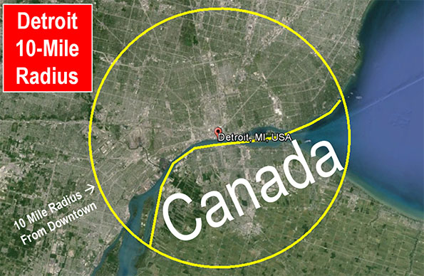
    Nonetheless, Nobel Laureate Paul Krugman then piled on, writing in The New York Times that Leonhart’s article had shown “how sprawl seems to hurt social mobility.” Krugman continued the next day with his “sprawl-caused-Detroit’s bankruptcy” thesis, which relied on an apples-to-oranges comparison (See: Detroit Bankruptcy: Missing the Point). Then on July 28, Krugman wrote: “…in one important respect booming Atlanta looks just like Detroit gone bust: both are places where the American dream seems to be dying” (Note 3).  Krugman calls Atlanta the “Sultan of Sprawl.”

    Professor Steven Conn of Ohio State University took it a bit further in the Huffington Post, saying that: “One of their findings is that mobility is more restricted in places defined by suburban sprawl — like Atlanta and Columbus, Ohio — than in denser, more urban places like San Francisco and Boston. Far from being good for the nation, our love affair with the car, and the sprawl it has produced, keeps people from moving up the economic ladder.”

    The Research

    The authors of the report reached their conclusions using regression analyses and controlling for demographic factors, with the objective of identifying associations between upward income mobility and tax expenditures, not suburbanization. In fact, the very issue of transportation and density was simply not a factor.

    The authors provided additional information with 25 separate, simple correlation analyses between 25 individual variables and economic mobility (demographic factors were not controlled). Co-Author Raj Chetty described this supplemental research in a PBS interview, citing income segregation, school quality, two-parent families and measures, civic engagement, religiosity and community cohesiveness. The authors urged caution in interpreting these correlations: “For instance, areas with high rates of segregation may also have other differences that could be the root cause driving the differences in children’s outcomes.”

    Rational Responses

    The overreach was challenged by Columbia University urban planning professor David King, who pointed out that the best ranked cities in the upward mobility analysis were all “sprawling,” including Salt Lake City, Santa Barbara and Bakersfield, which he referred to as a “poster child for sprawl.” He further noted that: “…snapshot correlations really don’t mean anything and will provide evidence for whatever point of view is desired.”

    Randal O’Toole of the Cato Institute similarly questions the unfounded interpretations of the study and notes that Atlanta has invested billions in new transit systems over recent decades, but with no appreciable impact on how the poorest citizens did there.

    University of Southern California economics professor Peter Gordon suggested that: “In the fast-and-loose manner that some have digested the Chetty et al. study, we could conclude that sprawl causes upward mobility.”

    Pinnacles of Prosperity

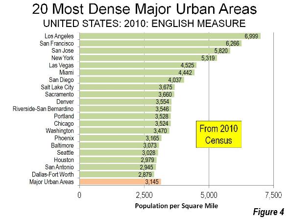
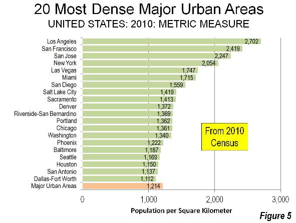
    Interestingly, if, as Krugman alleges, Atlanta is the Sultan of Sprawl, then similarly sprawling Hartford is the “Pinnacle of Prosperity.” Hartford has the highest per capita gross domestic product of any metropolitan area in the world. Yet, the urban area density of Hartford is 1,791 per square mile (692 per square kilometer), little above Atlanta (1,707 and 659), but two-thirds less than less affluent New York (5,319 and 2,054) and three-quarters less than less affluent Los Angeles (6,999 and 2,702), according to the 2010 census (Note 4).

    The reality is that the US has the world’s most sprawling cities, yet the 50 most affluent metropolitan areas per capita in the world include 38 in the United States. This includes the top eight, such as lower density Bridgeport (urban density 1,660 per square mile/641 per square kilometer), Boston (2,232/862) and Durham (1,913/739), as well as metropolitan areas with higher urban densities, San Francisco (6,266/2,419) and San Jose (5,820/2,247). Neither high-density New York nor Los Angeles makes the top 10. America’s greater dispersal is associated with the shortest commute times in the high income world, the least intense traffic congestion and some of the most affordable housing, if metropolitan areas subject to urban containment (smart growth) policies are excluded.

    Moreover, the Chetty, et al data gives little comfort to any whose conception of good and evil depends on sprawl. The research aggregates upward mobility data for all counties within each commuting zone. Among major metropolitan areas, that includes counties from the most dense (New York County at 71,000 per square mile or 27,000 per square kilometer) to Skamania County in the Portland area, with a density of 7 per square mile or 3 per square kilometer. County level analysis could make a difference.

    This is illustrated by the New York metropolitan area, which Chetty, et al divide into multiple commuting zones. The Tom’s River commuting zone, made up of outer suburban Monmouth and Ocean counties in New Jersey showed better upward income mobility (10.4 percent) than the New York commuting zone (9.7 percent) which included the city of New York, Nassau, Suffolk and Westchester counties. It might be interesting, for example, to compare the data, say for highly urban The Bronx to suburban Suffolk County, but the data does not permit that. This is not to criticize the Chetty, et al work; it is rather to suggest caution in inventing conclusions.

    Smaller May be Better

    Further, commuting zones with smaller populations have generally better upward income mobility.  Rather than an ode to bigness, the study found that commuting zones with less than 100,000 population average have higher than average upward income mobility. Virtually all of the smaller areas are low density and have little or no transit. Indeed, the best performers were in the Great Plains, in a swath from West Texas, through Oklahoma, Kansas, Nebraska and reaching a zenith in South Dakota and North Dakota, which is about as far from dense urbanization as it is possible to get. Further, a large majority of the highest scoring commuting zones with larger populations, like Bakersfield and Des Moines, are highly dispersed (Table below). This could be an area for further research.

    Geographical Income Mobility
    Population of Commuting Zone Upward Mobility Cases
    Over 1,000,000 7.5% 62
    500,000 to 1,000,000 7.6% 60
    250,000 – 500,000 8.6% 89
    100,000-250,000 9.0% 167
    50,000-100,000 10.4% 129
    25,000-50,000 13.0% 88
    Under 25,000 13.9% 146
    Average/Total 9.5% 741
    Upward mobility: 30/31 year olds reaching top income quintile by 2010/1, from households in the bottom quintile in 1996-2000
    Commuting zones are similar to metropolitan areas


    Additional Caveats

    There is no question but that this is ground-breaking research. The authors deserve considerable credit for the unprecedented scale of their analysis, which included over 6.2 million observations. However, the available data had an important limitation. The IRS data set they used does not go back far enough to make similarly robust findings about peak adult earnings. Age 30 or 31 may premature for predicting longer run income mobility. At that age, many who will eventually earn much more are not far into their careers. This would include people who have spent longer in higher education, such as those who have earned professional degrees. Finally, the median income of households in the 30 to 31 age category is barely 1/2 of their parents in the same, which, again, is not likely to be representative of their eventual income and quintile ranking over their adult lives.

    The findings would be appropriately characterized as relating to young adult income upward mobility. Conclusions about lifetime upward mobility or peak earnings upward mobility will need to wait a decade or more.

    The Second Half of the Story: Where People Moved

    The authors use the childhood residence in the study, both for the child and the adult. This means, for example, that if a child lived in the New York metropolitan area and moved to Atlanta by 2010 or 2011, he or she would be counted in the New York data. Where people lived as children is the first half of the story. The second half is where they moved.

    This is important, because so many people moved away from places like New York, San Francisco, Los Angeles, Boston, and San Jose during the period the study covers. Approximately 10 percent of the residents of New York and Los Angeles moved elsewhere between 2000 and 2010. Approximately 8 percent left San Francisco, 13 percent left San Jose and 5 percent left Boston. These are not small numbers and indicate that more people left than moved in. A net 1.9 million left New York, 1.3 million left Los Angeles, 340,000 left San Francisco, while 230,000 left San Jose and Boston.

    Some of the metropolitan areas that have gained the most domestic migrants scored below average on upward income mobility. For example, migration from other parts of the nation added 24 percent to Raleigh’s population in the 2000s, 17 percent to Charlotte, 11 percent to Tampa-St. Petersburg, and 10 percent to Atlanta (Note 5).

    None of this contradicts the Chetty, et al findings, which did not address the question of why some many people have moved. It can be assumed that people who are doing well economically will probably stay where they are. On the other hand, most who leave might be thought of as seeking better opportunities that might elude them in the richer, slower growing, far more expensive metropolitan areas of their childhood. The idea that people left New York, Boston or Los Angeles for a less rewarding life in Atlanta, Charlotte, or Raleigh violates everything we know about human nature.

    Seeking Prosperity

    Throughout history, and especially over the last 200 years, cities have drawn people from elsewhere by facilitating opportunity. It is no different today. People move to satisfy their aspirations. This was the point of our recent "Aspirational Cities" report in The Daily Beast.

    Chetty et al conclude: “What is clear from this research is that there is substantial variation in the United States in the prospects for escaping poverty.” True. It is also clear from actual behavior that, for many, the best prospect for escaping poverty may be the better opportunities that attract them to an aspirational city.

    Wendell Cox is a Visiting Professor, Conservatoire National des Arts et Metiers, Paris and the author of “War on the Dream: How Anti-Sprawl Policy Threatens the Quality of Life.

    —-

    Note 1: Chetty, et al use “commuting zone” as their unit of geographical analysis. These areas are generally similar to metropolitan areas, but there are some important differences. For example, the New York metropolitan area is divided into three parts (New York Newark and Tom’s River). The Dallas-Fort Worth metropolitan area is divided into two. Los Angeles, Riverside-San Bernardino and Oxnard are combined as are Rochester and Buffalo. All of Connecticut, which has four metropolitan areas, is a single commuting zone. Areas outside metropolitan areas are also divided into commuting zones.

    Note 2: The overwhelming share of low income workers drive to work (see How Lower Income Citizens Commute). Even, in metropolitan Boston, with its better than average transit system, few of the city’s low income residents can reach suburban job locations in less than one hour (the average commute time for all residents is less than one-half that). Despite popular impressions to the contrary, most jobs cannot be reached in a reasonable period of time by transit in any metropolitan area, nor is there any practical (affordable) way to change that.  

    Note 3: To the contrary, the American Dream is alive and well in Atlanta. Atlanta’s housing affordability is unrivaled by nearly all major metropolitan areas. Housing is four times as expensive relative to incomes in San Francisco and San Jose as in Atlanta (measured by the “median multiple”) three times as high in New York and Los Angeles and twice as costly in Portland. This makes housing more affordable for low income households. Not surprisingly, Atlanta households with less than $20,000 in annual income (approximately the lowest quintile) have a higher home ownership rate than in New York, Los Angeles, San Francisco, San Jose, Boston and Portland. Further, the gap with respect to African-American home-ownership is substantial. Atlanta’s African-American home ownership rate is approximately 40 percent above those of San Jose and Los Angeles, approximately 50 percent higher than Boston, San Francisco and Portland and nearly 60 percent higher than New York (American Community Survey, 2011).

    Note 4: These are US Bureau of the Census urban area density figures, based upon continuous urban areas (“built-up” areas). Urban area densities are calculated using census blocks, and contain no rural land. As a result, their population densities are not distorted by jurisdictional borders. This is to be distinguished from any metropolitan area based measure. All metropolitan areas include urban areas as well as rural areas that are economically connected to the urban area. The extent of rural areas within a metropolitan area is driven by the geographical size of counties and thus varies widely. The largest major metropolitan area county, San Bernardino (California) is nearly 1,000 times as large as the smallest, New York County. If metropolitan area criteria were applied at the census block level, as is the case in urban areas, large swaths rural swaths would be removed from metropolitan areas, changing the density distribution. However, even if metropolitan areas were more appropriately defined, any measure of metropolitan density would remain a mixed urban-rural metric, not a measure of urban density. Here are the 2010 criteria for defining urban areas and metropolitan areas.

    Note 5: There is less black-white racial segregation in Atlanta than in New York, Los Angeles, San Francisco, Boston, and most other major metropolitan areas, according to 2010 data compiled by William Frey of the Brookings Institution.

  • The Evolving Urban Form: Portland

    Among urban planners, there is probably not a more revered urban area in the world than Portland (Oregon). The Portland metropolitan area and its core urban area , principally located in Oregon, stretches across the Columbia River into the state of Washington (Figure 1). Nearly four decades ago, the state of Oregon adopted strong urban planning requirements, including the requirement of an urban growth boundary. Two principal purposes of the resulting policies (referred to as “smart growth,” “urban containment, “compact cities,” etc.) were densification and transferring travel demand from cars to transit.

    Portland’s progress toward these objectives has been modest, at best. Most growth has continued to be in the suburbs. There has been only modest densification, and employment has continued to disperse from the core. At the metropolitan area level, travel by car remains virtually as dominant as before and traffic congestion has intensified materially. Finally, house prices have been driven up relative to incomes (Note 1).

    Portland: A Dispersing Metropolitan Area

    Like virtually all major metropolitan areas in the world, Portland has experienced substantial dispersion. The core county of Multnomah peaked at more than two thirds of the metropolitan area population in 1930, as defined in 2000 (Note 2). By 2010, Multnomah County had dropped to one third of the metropolitan area population (Figure 2).

    The dispersion has continued in recent years, though there has been core growth (as has been the case in many metropolitan areas). Between 2000 and 2010, the area within two miles (three kilometers) of Portland City Hall grew more than 20 percent. However, this was only five percent of the metropolitan area’s growth. In the inner ring extending to five miles (eight kilometers) from City Hall, the growth was only three percent, well below the metropolitan area’s overall 15 percent growth rate. More than 90 percent of the metropolitan area’s population growth was outside a five mile radius (Figure 3).

    Portland: A Low Density Urban Area

    Despite its international reputation as an exemplar of compactness , Portland is a low density urban area. Among the 875 urban areas in the world with more than 500,000 population, 797 are denser than Portland.

    In the low density United States, Portland ranked 12th among major urban areas (over 1 million population), at approximately 3,500 residents per square mile (1,350 per square kilometer) in 2010. This is approximately 10% higher than the major urban area average density but barely half that of the densest, Los Angeles, with its undeserved reputation for low-density, “sprawling” development (Figures 4 and 5).

    Portland is less dense than all major urban areas in the 13 western states, with the exception of Seattle. Notably, Riverside San Bernardino is denser, despite consisting almost exclusively of post-World War II automobile-oriented development. Even much smaller California urban areas, such as Stockton, Bakersfield, Lodi and Delano are denser than Portland.

    Portland and Houston: Density Cousins

    The Portland metropolitan area’s density profile nearly duplicates that of Houston, which is just as famous for its liberal land use and transportation policies nearly the opposite of Portland’s (Note 3). Both metropolitan areas have nearly the same percentage of their populations living at densities below 7,500 per square mile (2,865 per square kilometer). A 40 percent larger share lives at densities of from 7,500 to 10,000 per square mile (3,860 per square kilometer) in Portland, while Houston’s share of its population living at densities above 10,000 per square mile is three times that of Portland (Figure 6).

    Among the nation’s 51 major metropolitan areas, Portland ranks 25th in the share of population living in zip codes with more than 10,000 people per square mile in 2010 (Figure 7).

    Portland’s Job Dispersion

    As in other metropolitan areas, jobs have dispersed substantially around Portland. Today, fewer than 10% of the jobs are located in downtown Portland (the central business district). The city of Portland itself has approximately 1.41 jobs per resident worker. Suburban Hillsboro, with the third largest employment base in the metropolitan area, has slightly more jobs per resident workers (a higher “jobs-housing balance”) according to American Community Survey data.

    Transit in Portland

    Portland has developed an extensive rail system, intended to attract drivers from their cars. Today, six light rail lines (five light rail) radiate toward the urban periphery, focusing on downtown (the central business district, or CBD).

    Yet the share of commuters using transit has fallen by a quarter since 1980, the last data available before the first light rail line opened. In short, rail has not changed the calculus of travel in Portland. Working at home, which is a less expensive and more environmentally friendly work access mode, has caught up with and now exceeds transit, as has occurred in most US major metropolitan areas. (Figure 8)

    Worse, transit may have already experienced its “best of times.” The future could be grim. Opposition to rail expansion has grown, and longer term transit service cuts of up to 70 percent have been threatened. (See Portland’s Transit Halcyon Days?)

    As elsewhere, transit in Portland is “about downtown.” The Portland Business Alliance estimates that 36% of downtown workers commute by transit. This is nearly one-half of all transit commuting in the Portland metropolitan area. Even in the job rich suburbs of Hillsboro and Beaverton, the share of people using transit for the work trip is less than the 5.0 percent national average.

    Portland: Intensifying Traffic Congestion

    Clinging to the fantasy transit can materially reduce automobile travel, Oregon officials have blocked substantial roadway expansions. Residents have been rewarded with much intensified traffic congestion.

    The Texas A&M Texas Transportation Institute Annual Mobility Report (Note 4) reveals Portland to have the 6th worst traffic congestion in the nation among major metropolitan areas. This compares to a before-rail ranking of 39th in 1982. Now Houston, Atlanta, Dallas-Fort Worth and Phoenix all have lower levels of traffic congestion than Portland (Figure 9). Without decades of urban containment and anti-mobility policies, these metropolitan areas have improved traffic congestion relative to Portland. This is despite far larger increases in travel demand. Since the early 1980s, each of these metropolitan areas has added more residents than live in the entire Portland metropolitan area. Portland also ranks among the worst (5th) in commuter stress (a measure of peak direction traffic congestion), according to the Annual Mobility Report

    Portland: Congestion and Higher Greenhouse Gas Emissions

    Reflecting the reality that greater traffic congestion increases greenhouse gas emissions, Portland’s carbon dioxide (CO2) emissions per automobile commuter have increased substantially and transit has made only the scantest difference. Between 1982 and 2011, Portland’s increase in CO2 emissions was greater than Houston, Atlanta and Phoenix, though less than Dallas- Fort Worth (Figure 10).

    Deteriorating Housing Affordability in Portland

    In Portland, consistent with both economic principle and considerable research, urban containment policy drives house prices up relative to incomes higher by rationing the supply of land and housing. In 2010, values of comparable land on either side of the urban growth boundary varied by more than 10 times in value per acre (a phenomenon also identified in Auckland, New Zealand by Chairman of the Reserve Bank of New Zealand, Arthur Grimes).

    The most recent Demographia International Housing Affordability Survey indicated that Portland’s median multiple (median house price divided by median household income) was 4.3. In normally functioning housing markets, the median multiple is typically 3.0 or less, a ratio last achieved in Portland in 1995. This higher median house price means than approximately 125,000 fewer Portland households —or 15% of households — are able to afford the median priced house. (Note 5).

    Higher housing costs retard the standard of living by reducing discretionary incomes (gross income minus taxes and necessities). This, in turn, leads to less demand for other goods and services (in the “discretionary economy”), less job creation and less economic growth.

    Even so, Portland’s rising house prices have been moderated by the nearby availability of less expensive houses on larger lots in the Vancouver area (Clark County, Washington). There, more liberal land use regulation permits consumer-driven housing choice, rather forcing households to choose from the limited offerings planning authorities prefer.

    In part due to rising prices, Portland is becoming less diverse . Indeed, Aaron Renn has called Portland the penultimate example in his searing critique, The White City. After the results of the 2010 census were announced. The Oregonian quoted then Mayor Sam Adams’ concern about the exodus of African-Americans from the city (municipality), saying that Portlanders should care about the fact that we offer ¬such limited access to equal opportunities. Local policymakers are largely oblivious to the role that urban containment policy may have played in diminishing those opportunities.

    Misplaced Priorities

    Despite all of this, Portland has its advantages.

    As in Houston, Seattle, Atlanta and virtually all other major metropolitan areas regardless of land use regulations, a core renaissance is underway that is making a dense urban lifestyle more practical for the relatively few who both prefer it and can afford it. The suburban lifestyle, dominant virtually everywhere in the United States, remains alive and well in Portland (Note 6). Portland’s physical location remains the envy of most metropolitan areas. There is little better scenery than the nearby Columbia Gorge or majestic Mt. Hood, which crowns the area on clear days.

    However, Portland has been sidetracked by a pre-occupation with urban design, at least partially driven by concerns about reducing greenhouse gas emissions. The good news is that technological advances are poised to do far more to reduce greenhouse gas emissions than could ever be achieved by urban containment policy.

    But scenery aside, cities are primarily economic organisms. Cities have grown by serving the aspirations of people for a better standard of living. The very purpose of cities is to facilitate affluence and minimize poverty among residents (see Toward More Prosperous Cities). Yet policies, such as urban containment, that inherently reduce household discretionary incomes and impose greater congestion costs reduce discretionary incomes. Despite intentions to the contrary, the results show this to be the real Portland story.

    —————————————–

    Note 1: Some other metropolitan areas that have embraced urban containment policy have produced even worse results. For example, traffic congestion is worse in Vancouver, Sydney, Melbourne and far smaller Auckland, according to the “Tom Tom Congestion Index,” a real-time traffic reporting competitor to INRIX. Portland has seriously unaffordable housing, though has not retarded the standard of living nearly so much as in Vancouver, Sydney, Melbourne or Auckland, where housing is severely unaffordable. Attention is drawn to Portland’s negative outcomes because of the extent to which its policies are revered in the urban planning community around the world.

    Note 2: Multnomah County is used in this analysis, instead of the historical core city of Portland, which has grown in large measure by annexation. Since 1950, the city added 108 percent to its land area and little more than half (56 percent) to its population.

    Note 3: Houston is sometimes referred to as having deregulated land use. This is not strictly correct, though Houston is closer to a deregulated model than any other US metropolitan area. The city of Houston does not have zoning, though some municipalities in the suburbs are zoned. Many neighborhoods in the city of Houston have private land use covenants.

    Note 4: The Annual Mobility Report has been the authoritative measure of traffic congestion in US urban areas for three decades. More recently, the report’s traffic congestion measures have been significantly strengthened by the use of actual global positioning data from INRIX, which also produces its own Traffic Scorecard both for US and international urban areas, using satellite based real-time traffic data.

    Note 5: Estimated from income qualifying income requirements as reported by the National Association of Realtors for the third quarter of 2012 and the metropolitan income distribution modeled based on the 2011 American Community Survey.

    Note 6: In 1999, new urbanist architect Andres Duany evaluated Portland in a commentary for The Oregonian: “To my surprise, as soon as I left the prewar urbanism (to which my previous visits had been confined), I found all the new areas on the way to the urban boundary were chock full of the usual sprawl one finds in any U.S. city, no better than in Miami. The outcome wasn’t that different after all.”

    ————————-

    Wendell Cox is a Visiting Professor, Conservatoire National des Arts et Metiers, Paris and the author of “War on the Dream: How Anti-Sprawl Policy Threatens the Quality of Life.

    Photo: Mount Hood (by author)

  • Portland’s Transit Halcyon Days?

    For more than a quarter century, the leaders in the Oregon portion of the Portland metropolitan area have sought to transfer demand for urban travel from automobiles to transit. Six rail lines have been built, five of which are light rail and bus service has been expanded. If their vision were legitimate, transit’s market share should have risen substantially and automobile travel should have declined. Neither happened.

    The results have been modest, to say the least. Since 1980, before the first rail line was opened, transit’s share of work trip travel in the metropolitan area has declined by one-quarter, from 8.4 percent to 6.3 percent. Overall, the share of travel by car remains about the same as before the first light rail line opened (based upon data from the Texas Transportation Institute and the Federal Transit Administration).

    Transit access to destinations outside downtown Portland remains scant. Despite the huge expenditures on transit, only 8 percent of the jobs in the metropolitan area can be reached by the average employee in 45 minutes, despite the fact that nearly 85 percent of workers are within walking distance of the transit stops or stations. Portland’s transit access is better than the national major metropolitan average of six percent. But Portland trails a number of other metropolitan areas and is well behind the best, Milwaukee, Wisconsin, which has a transit access figure of only 14 percent. This makes a mockery of the “transit access” measure used by many planning agencies. Being close to a transit stop or station is of little help if service to the desired destination is not available or takes too much time.

    According to the latest American Community Survey data, the average work trip by people driving alone in Portland is 23.6 minutes, while the average transit commute trip is 43.8 minutes.

    Further, Portland transit users could face draconian service reductions. Tri-Met, which operates light rail and most Oregon services, has warned that it may be required eventually to cut 70 percent of its service. This results from the failure to control labor costs, particularly pension costs, which is detailed in an Oregonian article. John Charles, president of the Cascade Policy Institute found that $1.63 all the benefits were being paid out for every dollar of wages, a claim confirmed by PolitiFact. The concern extends to the state capital, where the legislature has overwhelmingly approved a bill requiring an audit of Tri-Met by the Secretary of State.

    Tri-Met continues to expand light rail, but with some “pushback.” An under-construction line to Milwaukie evoked such controversy in Clackamas County, that voters elected an anti-light rail majority to the county commission. Voters have banned light rail expenditures without a public vote in the suburban municipalities of Tigard and King City. Clark County (Washington), voters rejected funding for a light rail connection to the Portland system. This opposition was at the heart of defunding a replacement Interstate 5 bridge over the Columbia River. The project recently closed after spending $175 million (see Project Closing Notice).

    With the investment and expansions, these should have been the halcyon days of transit in Portland. The future could be even more challenging.

  • Detroit Bankruptcy: Missing the Point

    Nobel Laureate Paul Krugman tells us that “sprawl killed Detroit” in his The New York Times column.
    The evidence is characterized as “job sprawl” – that a smaller share of metropolitan area jobs are located within 10 miles of downtown Detroit than in the same radius from downtown Pittsburgh (see Note on Decentralization and “Job Sprawl”). It is suggested that this kept the city of Pittsburgh out of bankruptcy.

    Not so. The subject is not urban form; it is rather financial management that was not up to par. State intervention may have been the only thing that saved the city of Pittsburgh from sharing Detroit’s fate.

    Detroit and Pittsburgh: Birds of a Financial Feather

    The city of Pittsburgh had been teetering on bankruptcy for some time. In 2004, the city’s financial affairs were placed under Act 47 administration (the Financially Distressed Municipalities Act“) by the state of Pennsylvania. One of Act 47’s purposes is to assist municipalities in avoiding bankruptcy. A 2004 state ordered recovery plan summarized the situation:

    The City of Pittsburgh, already in fiscal distress, now stands on the precipice of full-blown crisis. In August 2003, the City laid off 446 employees, including nearly 100 police officers. City recreation centers and public swimming pools were closed, and services from police mounted patrol to salt boxes were eliminated. In October and November 2003, the City’s credit ratings were downgraded repeatedly, leaving Pittsburgh as the nation’s only major city to hold below-investment-grade “junk bond” ratings. With the City’s most recent independent audit questioning the City’s ability to continue as a going concern, a looming cash shortfall now threatens pension payments and payroll later this year. (emphasis added)

    The good news is that Act 47 has worked so well that the city could soon be released from state control. It may have helped that all of this was overseen by former Democratic Governor Ed Rendell, whose tough administration saved another abysmally-managed municipality when he was mayor of Philadelphia more than a decade before.

    Not everyone, however, is willing to grant that Pittsburgh has solved all its problems. Democratic candidate for mayor of Pittsburgh, Bill Peduto, recently urged Harrisburg to not release the city from Act 47 control. According to Peduto, “the city is not out of the financial woods,” and “we’re still in the middle of it, and in fact we have an opportunity in the next five years to build a sustainable budget for at least a decade.” Given the strong Democratic majority in the city, Peduto will probably be the next mayor.

    The Key: Strong Management

    In Detroit’s case, the state dithered for years, jumping in only when it was too late. Maybe the “tough love” of a Michigan-style Act 47 could have saved Detroit.

    Meanwhile, best of luck to the Detroit bankruptcy court and Pittsburgh’s next mayor. Both were dealt a bad hand by predecessors who said yes to spending interests too often, to the detriment of residents and taxpayers.

    ——–

    Note on Decentralization and “Job Sprawl”

    The dispersed American metropolitan area has performed better than its mono-centric (downtown oriented) urban form of the past. American metropolitan areas are the most affluent in the world, and they are also the most decentralized. Decentralization of employment facilitates mobility, as economists Peter Gordon and Harry W. Richardson found 15 years ago. Work trip travel times are shorter and traffic congestion is less intense in US metropolitan areas than in similar sized metropolitan areas in Western Europe, Japan, Canada and Australia. At the same time, metropolitan areas around the world are themselves becoming more decentralized. The bottom line is that better mobility facilitates greater economic growth, which also reduces poverty.

    Comparing the “job sprawl” of Detroit and Pittsburgh not only misses the point; it also glosses over differences that render any comparison virtually meaningless.

    Detroit is Larger: The Detroit metropolitan area has nearly 60 percent more jobs than the Pittsburgh metropolitan area. Other things being equal, this would mean that Detroit would cover more area than Pittsburgh. As a result, even if the employment densities were equal, a smaller percentage of the jobs would be within 10 miles of downtown Detroit and within 10 miles of downtown Pittsburgh.

    Nearly Half of Detroit’s 10 Mile Radius is in Canada and a Lake:But other things are not equal. Approximately 40 percent of the area within 10 miles of downtown Detroit is in Canada or in Lake St. Clair. Canadian jobs are appropriately excluded from the Detroit “job sprawl” numbers developed by the Brookings Institution (Figure), and no 10 mile radius comparison can thus be made to Pittsburgh.  None of the 10 mile radius from downtown Pittsburgh is in Canada and none of it is in a large lake.

    See Also: Peter Gordon’s Blog: Detroit

  • XpressWest Las Vegas Train: Where are the Venture Capitalists?

    Recently, the US Department of Transportation indefinitely suspended a federal loan application for the XpressWest high-speed rail train from Victorville California to Las Vegas. The only public rationale for the decision was contained in a letter from former Secretary of Transportation Ray LaHood, who cited “buy-America provisions.” Important contents of the letter were not made public (presumably to protect confidential commercial information), but Secretary LaHood indicated that “serious issues” and “significant uncertainties” surrounding the project forced him to suspend “further consideration” of the loan request.

    US Senate Majority Leader Harry Reid of Nevada hopes to resurrect the loan application. However even he is reported to have noted that the White House is “worried about XpressWest obtaining the remaining $1.5-billion in private financing needed to get the train running.”

    That’s just the beginning of the private investment concern. Current reports indicate that the Victorville to Las Vegas line will cost $7 billion to construct, $5.5 billion of which would be provided through a low interest 35 year loan from federal taxpayers, the initial payment on which would be deferred for six years.

    Based upon the experience of high-speed rail programs around the world, it seems virtually inevitable that the Victorville to Las Vegas high-speed rail line would cost much more than $7 billion. All of those additional funds would be the responsibility of private investors, not federal taxpayers.

    International Record of Cost Escalation

    The problem is amply illustrated by   European research on world infrastructure costs.  Oxford professor Bent Flyvbjerg, along with Nils Bruzelius (a Swedish transport consultant) and Werner Rottenberg (University of Karlsruhe and former president of the prestigious World Conference on Transport Research) reviewed 80 years of infrastructure projects and found initial cost estimates to routinely be low (Megaprojects and Risk: An Anatomy of Ambition). They estimated that rail project costs escalation an average 40 percent and that 80 percent cost overruns are not unusual in passenger only rail (Note 1).

    If the Victorville to Los Angeles high-speed rail train would escalate in costs at the average indicated by the research, the cost would rise to $9.8 billion, increasing the private investment share required from $1.5 billion to $4.3 billion. If the cost escalation were to be at the 80% level, the Victorville to Los Angeles high-speed rail train would cost $12.6 billion to build, raising the private investment requirement to $7.1 billion.

    Britain’s Escalating Costs

    The British, who continue to debate building a high speed rail line from London to just north of Birmingham already seen costs rise by nearly 1/3, while experts are predicting the cost will eventually escalate 120 percent or more.

    Obviously, cost escalation at these levels would require additional private capital.

    Nearby California’s Unprecedented High Speed Rail Cost Escalation

    The actual experience of the nearby California high-speed rail line indicates that the results could be substantially worse than indicated in the academic research. Before the California High Speed Rail Authority abandoned plans to build a genuine high-speed rail line from Los Angeles to San Francisco, costs approximately tripled from the original estimates (Note 2).

    A similar tripling of cost escalation on the Victorville to Las Vegas line would take the cost to $21 billion. This would require private capital of $22.5 billion – 15 times as much money as the current $1.5 billion that is apparently difficult to raise.

    Serious Issues and Significant Uncertainties

    Meanwhile, editorialists are raising “serious issues” and “significant uncertainties” about the project.

    The Washington Post: The editorial board of the Washington Post said in a July 18 editorial (entitled “Good riddance to XpressWest, the high-speed boondoogle”) of the XpressWest project: “We’ve seen some bad policy ideas but not many more awful …” The Post continued “What XpressWest struggled to explain was why taxpayers should bet on a proposition that private investors apparently found too risky: hordes of travelers driving to Victorville, parking their cars and then boarding the train for an 80-minute ride to Vegas — as opposed to driving the whole way, flying or taking “My Party Ride,” a limo-like bus trip for up to 30 passengers at $99 each, including food and drinks.” The Post expressed relief that “common sense has prevailed,” though bemoaned the fact that “multiple federal and state agencies had given environmental and regulatory approvals.”

    Las Vegas Review-Journal: The hometown metropolitan daily expressed similar concerns. In a July 18 editorial, the Review-Journal said: “Like most recent rail projects, XpressWest ridership projections were overly optimistic. The train certainly appeared capable of meeting its operational costs, but the idea that it could make good on repaying $5.5 billion in debt on top of that was a stretch. Las Vegas Monorail, anyone?” (Note 3).

    The editorial continued: “The prospect of default on a train loan is too much to ask from a federal government already $17 trillion in debt,” adding, if the federal government “ is serious about “investing” those billions, spend them on improvements to the nation’s interstate system, which carries both passenger and commercial traffic and is in constant use, 24-7. Interstate 15, which runs between Los Angeles and Las Vegas and is heavily congested, could use the money. So could the planned Interstate 11 between Las Vegas and Phoenix.”

    In addition, echoing my, “taxpayer risk assessment,” published by the Reason Foundation, had shown that the cost of expanding Interstate 15 to six lanes between Victorville and the California border would have been a fraction of the high speed rail costs, and would have been largely paid by highway user fees paid by drivers and truckers, and would reduce both traffic congestion, greenhouse gas emissions and energy consumption.

    The editorial concluded: “Improved interstates would speed commerce, create permanent jobs and have billions upon billions of dollars in long-term economic impact across many states. That would be a return on investment. A tourist train on a high-speed trip to bankruptcy? No so much.”

    Where are the Venture Capitalists?

    There is no shortage of venture capital in the United States.The apparently difficulty being encountered in raising sufficient private capital for the project demonstrates that it is even more risky than the standard venture capital projects. The risks for private investors are huge at the $1.5 billion. The risks are even greater at double that number, which has to be considered among the more optimistic potential outcomes.

    Wendell Cox is a Visiting Professor, Conservatoire National des Arts et Metiers, Paris and the author of “War on the Dream: How Anti-Sprawl Policy Threatens the Quality of Life.

    ——

    Note 1: Flyvbjerg et al reviewed 80 years of infrastructure projects found consistent low-balling of cost estimates. They characterize the process as "strategic misrepresentation," which they shorten to "lying," in unusually frank language.

    Note 2: In response to the public outcry, the California High Speed Rail Authority substituted a somewhat less expensive plan that requires high-speed rail to mix with conventional commuter rail trains in San Francisco and Los Angeles operations.

    Note 3: The Las Vegas Monorail was similarly promoted as sufficiently viable to pay its operating and capital costs in the early 2000s. My 2000 analysis projected that ridership would be well below forecast and that the Las Vegas Monorail would eventually default on its debt. That occurred.

  • Suicide: Sprawl Not Guilty

    Atlantic Cities reports on research indicating an association between suicide and lower density, in an article entitled “The Unsettling Link Between Sprawl and Suicide.” Actually, there’s no reason to be unsettled, at least with respect to urban areas and their densities. The conclusions apply to rural areas, not urban areas.

    Above the 300 persons per square kilometer, or 780 persons per square mile, the authors found no association. The authors of the study note, “above this threshold … the suicide rate remains fairly constant."

    The US Census Bureau standard for urbanization is 1000 people per square mile or more, which is similar to the international standard of 400 persons per square kilometer. Even the suburbs of extremely low-density Atlanta and Charlotte have to reach the 1,000 persons per square mile threshold to be in the urban areas.

    This research, while interesting, has nothing whatever to do with the urban form.

  • Moving from Travis County (Austin) to Williamson County

    In an article entitled, “The People Moving to Austin and ‘Ruining It’ are from Texas,” the Austinist notes that more people are moving to Austin from neighboring Williamson County than from Los Angeles County.

    The article has the potential to mislead in two ways.

    The lesser of the problems is that it confuses Austin with Travis County. The cited data is for Travis County, not the city of Austin. The source of the data, the American Community Survey does not report on municipal migration. (Austin is most of Travis County’s population, but itself has sections in Williamson and Hayes counties).

    The bigger problem is that the article tells only half the story. Yes, 10,500 people moved from Williamson to Travis over the 2006-2010 period, but 14,200 moved from Travis to Williamson. Thus, there was a net outflow of 3,700 people from Travis to Williamson. Meanwhile, there was a net gain of residents in Travis County from Los Angeles County of approximately 800.

    Thus, while there is net migration from Los Angeles County to Travis County, the net migration from Travis County to Williamson County is 4.5 times as large.

  • Metropolitan Dispersion: 1950-2012

    America has become much more metropolitan since 1950, when the Office of Management and Budget released the first modern criteria for determining the boundaries of metropolitan areas. Metropolitan areas are the economic or functional definition of the "city." They are otherwise known as labor markets and include the physical "urban area" (the area of continuous development) as well as economically connected rural territory from which people commute into the urban area. A previous article examined the development of the “physical” form of the city (urban areas) in the United States, from 1920 to 2010 (See Observations on Urbanization: 1920-2010).

    Major Metropolitan Areas in 1950

    In 1950, there were 14 major metropolitan areas in the United States (over 1,000,000 population). Their combined population was 44.5 million. By 2010, there were 52 major metropolitan areas, with a total population of 169.5 million. This increase, 124 million, is approximately equal to the population of France and the United Kingdom combined. While major metropolitan areas were increasing their population by 281 percent, the rest of the nation grew only 106 percent (Note 1).

    Dispersion to Smaller Metropolitan Areas

    As the nation was moving to major metropolitan areas, much of the growth was in the 38 smaller metropolitan areas that passed the 1,000,000 mark after 1950. These areas had 17.7 million residents in 1950. By 2010 they had added more than 70 million new residents, for a total population of 88.5 million. In contrast, the 14 metropolitan areas that had more than 1,000,000 population in 1950 grew only 36.5 million, to 81.1 million (Figure 1).

    Among the metropolitan areas that had reached 1,000,000 population by 2010, the fastest growing were all in the Sun Belt. Las Vegas, which was too small to be a metropolitan area in 1950, grew 39 times (3,941 percent) compared to the 1950 population for the area constituting the 2010 metropolitan definition (Clark County). Orlando grew 17.6 times (1,757 percent), while Riverside-San Bernardino grew 14 times (1,400 percent). Three other metropolitan areas grew 10 times or more, including Phoenix at 11.6 times (1,164 percent), Charlotte at 10.3 times (1,025 percent) and Miami at 10.2 times (1,017 percent).

    Los Angeles added the most to its population, at 8.7 million residents from 1950 to 2010. Perhaps surprisingly, however, New York also grew strongly, adding 6.9 million residents. Los Angeles, which grew quickly until recently, managed to reduce New York’s 8.5 million 1950 lead by only one-fifth by 2010. Dallas-Fort Worth added the third greatest number of new residents (6.1 million), partially by absorbing the former (and smaller) Fort Worth metropolitan area during the period. Houston added 5.4 million residents. Miami added 5.4 million residents, also incorporating smaller metropolitan areas, Fort Lauderdale and West Palm Beach. Chicago ranked surprisingly high, adding 4.0 million residents, the result of comparatively strong growth in the early decades (Figure 2). The strong population growth evident in New York and Chicago is largely attributable to much faster growth rates between 1950 and 1970 period.

    The ascendancy of Texas is illustrated by the fact that its two largest metropolitan areas, Dallas-Fort Worth and Houston added more residents (Note 2) than the two largest metropolitan areas in California, Los Angeles, and San Francisco (11.5 million compared to 10.9 million). However, stronger long term California growth was indicated by the 4.1 million addition to the Riverside-San Bernardino metropolitan area (the “Inland Empire”), which is adjacent to the Los Angeles metropolitan area and has emerged as the dominant growth center of the state in recent decades.

    Similar Regions, Big Differences

    There were substantial contrasts in growth between similarly sized metropolitan areas in 1950 over the period.

    Atlanta and nearby Birmingham were similar in population in 1950. Atlanta had a population of 672,000 (ranked 23) and Birmingham had 559,000 (ranked 27). By 2010, Atlanta had risen to a population of 5.3 million and a rank of 9th, compared to Birmingham’s 1.1 million and a rank of 49th.

    A somewhat smaller, but significant difference is evident between Seattle and nearby Portland, which were nearly the same size in 1950 (733,000 and 705,000 respectively) ranking 20th and 21st respectively. Over the next 60 years, Seattle grew 2.8 million (some of it from absorbing the former Tacoma metropolitan area). By 2010, Seattle was the 15th largest metropolitan area in the nation, while Portland had fallen to 23rd, adding a smaller 1.5 million residents. Portland and San Francisco were the only major metropolitan areas in the West to fall in the national rankings between 1950 and 2010.

    Slower Growth Major Metropolitan Areas

    The slowest growing major metropolitan areas were Buffalo (4 percent), Pittsburgh (6 percent), Cleveland (41.7 percent), Detroit 42.4 percent and New York (52 percent (Table 1).

    Table 1
    Major Metropolitan Areas: 2010, Change from 1950
    Population Rank
    Metropolitan Area 1950 2010 Change 2012 1950 2010
    Atlanta, GA         671,797     5,286,732 687%     5,457,831 23 9
    Austin, TX         160,980     1,716,286 966%     1,834,303 107 35
    Baltimore, MD     1,337,373     2,710,489 103%     2,753,149 12 20
    Birmingham, AL         558,928     1,128,050 102%     1,136,650 27 49
    Boston, MA-NH     2,389,986     4,552,402 90%     4,640,802 6 10
    Buffalo, NY     1,089,230     1,135,511 4%     1,134,210 14 47
    Charlotte, NC-SC         197,052     2,217,035 1025%     2,296,569 91 24
    Chicago, IL-IN-WI     5,495,364     9,461,105 72%     9,522,434 2 3
    Cincinnati, OH-KY-IN         904,402     2,114,580 134%     2,128,603 15 28
    Cleveland, OH     1,465,511     2,077,240 42%     2,063,535 10 29
    Columbus, OH         503,410     1,901,965 278%     1,944,002 32 32
    Dallas-Fort Worth, TX         614,799     6,426,210 945%     6,700,991 24 4
    Denver, CO         563,832     2,543,478 351%     2,645,209 26 21
    Detroit,  MI     3,016,197     4,296,247 42%     4,292,060 5 12
    Grand Rapids, MI         288,292         988,938 243%     1,005,648 60 52
    Hartford, CT         358,081     1,212,384 239%     1,214,400 47 44
    Houston, TX         806,701     5,920,456 634%     6,177,035 18 6
    Indianapolis. IN         551,777     1,887,877 242%     1,928,982 29 33
    Jacksonville, FL         304,029     1,345,596 343%     1,377,850 56 40
    Kansas City, MO-KS         814,357     2,009,338 147%     2,038,724 17 30
    Las Vegas, NV           48,289     1,951,269 3941%     2,000,759 NA 31
    Los Angeles, CA     4,367,911   12,828,842 194%   13,052,921 3 2
    Louisville, KY-IN         576,900     1,235,708 114%     1,251,351 25 43
    Memphis, TN-MS-AR         482,393     1,324,829 175%     1,341,690 36 41
    Miami, FL         498,084     5,564,657 1017%     5,762,717 34 8
    Milwaukee,WI         871,047     1,555,908 79%     1,566,981 16 39
    Minneapolis-St. Paul, MN-WI     1,116,509     3,348,859 200%     3,422,264 13 16
    Nashville, TN         321,758     1,670,890 419%     1,726,693 55 37
    New Orleans. LA         685,405     1,189,863 74%     1,227,096 22 46
    New York, NY-NJ-PA   12,911,944   19,567,407 52%   19,831,858 1 1
    Oklahoma City, OK         325,352     1,252,992 285%     1,296,565 53 42
    Orlando, FL         114,950     2,134,411 1757%     2,223,674 138 27
    Philadelphia, PA-NJ-DE-MD     3,671,048     5,965,341 62%     6,018,800 4 5
    Phoenix, AZ         331,770     4,192,887 1164%     4,329,534 51 14
    Pittsburgh, PA     2,213,236     2,356,285 6%     2,360,733 8 22
    Portland, OR-WA         704,829     2,226,009 216%     2,289,800 21 23
    Providence, RI-MA         737,203     1,600,852 117%     1,601,374 19 38
    Raleigh, NC         136,450     1,130,490 729%     1,188,564 125 48
    Richmond, VA         328,050     1,208,101 268%     1,231,980 52 45
    Riverside-San Bernardino, CA         281,642     4,224,851 1400%     4,350,096 63 13
    Rochester, NY         487,632     1,079,671 121%     1,082,284 35 51
    Sacramento, CA         277,140     2,149,127 675%     2,196,482 64 25
    Salt Lake City, UT         274,895     1,087,873 296%     1,123,712 68 50
    San Antonio, TX         500,450     2,142,508 328%     2,234,003 33 26
    San Diego, CA         556,808     3,095,308 456%     3,177,063 28 17
    San Francisco-Oakland, CA     2,240,767     4,335,391 93%     4,455,560 7 11
    San Jose, CA         290,457     1,836,911 532%     1,894,388 59 34
    Seattle, WA         732,992     3,439,809 369%     3,552,157 20 15
    St. Louis,, MO-IL     1,681,281     2,787,695 66%     2,795,794 9 18
    Tampa-St. Petersburg, FL         409,143     2,783,243 580%     2,842,878 41 19
    Virginia Beach-Norfolk, VA-NC         446,200     1,676,820 276%     1,699,925 38 36
    Washington, DC-VA-MD-WV     1,464,089     5,636,232 285%     5,860,342 11 7
    Notes on changes from 1950
    All first named municipalities were the central cites per OMB in 1950 except:
    Norfolk was the central city of Virginia Beach
    San Bernardino was the central city of Riverside-San Bernardino
    Jersey City and Newark were also central cities of New York
    Las Vegas 1950 is for Clark County (was not a metropolitan area)


    Meanwhile, 11 metropolitan areas fell from the top 50 in 1950. All were in the Northeast or Midwest, except for Knoxville, TN. Youngstown has been beset by economic difficulties throughout most of the period. In 1950, Youngstown was the nation’s 30th largest metropolitan area, larger than Atlanta, Phoenix and Las Vegas. However, Youngstown added only seven percent to its population over the 60 years, and fell to 93rd place. Wheeling-Steubenville (WV-OH) is one of the nation’s few genuine “shrinking cities,” that is a metropolitan area or an urban area that is losing population. Wheeling-Steubenville was ranked 48th in 1950. Since that time, the economic influence of Wheeling has deteriorated so much that OMB has split the metropolitan area into two parts, removing Weirton, WV (which includes Steubenville, OH). The Wheeling metropolitan area is approximately 60 percent smaller than in 1950 (Table 2).

    Table 2
    Metropolitan Areas No Longer in Top 50
    Population Rank
      1950 2010 Change 1950 2010
    Youngstown, OH-PA   528,498   565,773 7% 30 93
    Albany, NY   514,490   870,718 69% 31 60
    Dayton, OH   457,333   799,232 75% 37 70
    Allentown, PA   437,824   821,173 88% 39 67
    Akron, OH   410,022   703,205 72% 40 74
    Springfield, MA   407,255   621,570 53% 42 83
    Toledo, OH   395,551   610,001 54% 43 86
    Wilkes-Barre, PA   392,241   563,630 44% 44 95
    Omaha, NE-IA   368,395   868,116 136% 45 61
    Wheeling, WV-OH   354,092   147,950 -58% 48 273
    Syracuse, NY   341,719   662,578 94% 49 79
    Knoxville, TN   337,105   837,571 148% 50 64


    Cities: From Monocentric to Polycentric to Edgeless

    The changes that occurred in cities of the United States and elsewhere around the world have extended well beyond the population increases. The former monocentric model of the city, organized around a dense core has been recent placed by the polycentric city (with the new suburban employment centers documented by Joel Garreau as “edge cities”). In its revisions of the metropolitan area criteria for the 2000 census (Note 2), the Office of Management and Budget began defining core (as used in the encompassing metropolitan area term “Core Based Statistical Area”) as the urban area (urbanized area), rather than the former “central cities.” OMB has designated many suburban employment centers as "principal cities," and in consequence no longer has any suburban designation.

    Robert Lang of the University of Nevada Las Vegas has shown that the evolution of metropolitan areas has been extending beyond the “edge cities” and has heralded the “edgeless city.” The dispersion continues.

    Wendell Cox is a Visiting Professor, Conservatoire National des Arts et Metiers, Paris and the author of “War on the Dream: How Anti-Sprawl Policy Threatens the Quality of Life.

    —————-

    Note 1: Some of the metropolitan growth occurred as residents in counties that were not metropolitan in 1950 were added to metropolitan areas as their borders were defined outward. The current boundaries of the major metropolitan areas would have increased their 1950 population by 17 percent.

    Note 2: The OMB final notice for 2010 defines “core” as “A densely settled concentration of population, comprising either an urbanized area (of 50,000 or more population) or an urban cluster (of 10,000 to 49,999 population) delineated by the Census Bureau, around which a Core Based Statistical Area is delineated. According to the OMB definition, the core is now an entire urban area, not a central city. The “building blocks” of urban areas are census blocks (smaller than census tracts), rather than municipalities, as had been the case before 2000.

    Photo: Crystal City Employment Center: Virginia suburbs of Washington (by author)

  • New Data on Commuting in Canada

    New data from the National Household Survey indicates that driving to work continues to surge in Canada. In addition to providing work access market shares, the National Household Survey provides one-way work trip travel time estimates for all metropolitan areas.

    The National Data

    Between the 2006 census and the 2011 National Household Survey indicates an increase of nearly 750,000 additional work-bound cars on the road. The increase in driving exceeded the overall increase of 585,000 in employment (Figure 1). Transit also experienced a strong increase, adding nearly 230,000 one-way work trip riders. At the same time, there were declines in car pool passengers (266,100), walking and cycling (52,200), and working at home (87,700).

    Driving (whether alone or in a car pool) reached a share of 68.9%, up 2.1 percentage points over the 66.8% registered in the 2006 census. Transit also increased, with its share rising from 10.2% in 2006 to 11.2% in 2011. The big loss was in carpool passengers which dropped from 7.1% to 5.9%. This declining carpool share mirrors the experience in the United States. There were also losses in the combined walking and cycling share, from 7.1% to 6.5% and in the work at home share from 7.7% to 6.9%.

    Overall, the average one-way work trip travel time was 25.4 minutes, not much different than the US average of 25.5 minutes. However, among the major metropolitan areas, travel times generally exceeded those of similarly sized US metropolitan areas (below).

    Major Metropolitan Areas

    The story was similar among the major metropolitan areas (over 1,000,000 population).

    Toronto: In Toronto, now Canada’s dominant metropolitan area, driving (alone or in car pools) increased from 59.4% to 60.2% between 2006 and 2011. Transit also experienced a full one percentage point increase to 21.7%. This transit work trip market share is higher than any other metropolitan area in Canada or the United States, with the exception of New York, at 31.1%). Toronto’s transit market share trails that of Sydney slightly (22.2%), though is much higher than that in Melbourne. Driving and transit took virtually all of their increase from a 1.9 percentage point loss in carpool passengers.

    Toronto’s one way work trip travel time was 32.8 minutes, which is longer than all other major metropolitan areas and exceeded in the New World only by Melbourne (36 minutes), New York (34.9 minutes), Washington (34.5 minutes), and Sydney (34 minutes). Toronto’s work trip travel time is longer than that of larger Los Angeles (28.6 minutes), as well as similarly-sized Dallas-Fort Worth (26.6 minutes) and Houston (27.7 minutes).

    Montréal: Montréal, the nation’s second-largest metropolitan area experienced a 1.2 percentage point increase in driving, while transit rose 0.7 percentage points. Montréal had the largest decline in carpool passengers among major metropolitan areas, falling from 4.7% in 2006 to 3.2% in 2011.

    Montréal’s average one-way work trip travel time was 29.7 minutes, also longer than the Los Angeles metropolitan area, which has more than three times as many residents. Among the 12 US metropolitan areas between 2,500,000 and 5,000,000 population, only Baltimore (30.3) and Riverside-San Bernardino (31.0) have longer work trip travel times than Montréal.

    Vancouver:Vancouver was the only major metropolitan area with the decline in driving, from 61.7% to 60.9%. Vancouver also had the highest transit market share increase, from 15.1% to 18.2%. Vancouver experienced a huge (1.9 percentage point) loss in carpool passengers and a strong loss in working at home (0.8 percentage points).

    The average work trip travel time in Vancouver was 28.4 minutes. This is nearly equal to that of Los Angeles (28.6 minutes), despite the fact that Los Angeles is nearly five times as large. Vancouver, with a population of 2.3 million has a longer work trip travel time than any US major metropolitan area under 2,500,000 population.

    Ottawa:Ottawa, which includes suburbs in Quebec (across the Ottawa River), experienced the 1.4 percentage point increase in driving and a 0.7% increase in transit use. Ottawa’s transit market share ranks third in the nation. The driving and transit gains were also largely at the expense of carpool passenger and working at home losses. The one-way work trip travel time was 26.3 minutes.

    Calgary:Among the major metropolitan areas, Calgary experienced the largest increase in driving, a 2.7 percentage point increase, from 64.2% to 66.9%. This is the second largest driver market share among the major metropolitan areas. Transit was up a modest 0.4 percentage points, while the share of carpool passengers dropped 1.9 percentage points. Working at home declined by 0.9 percentage points. The one-way work trip travel time was 27.0 minutes, longer than any US metropolitan area in the 1,000,000 to 2,500,000 population category.

    Edmonton:Driving increased 2.1 percentage points from 2006 to 2011 in Edmonton, from 70.5% to 72.6%. Edmonton had the highest driver market share in the nation. Transit was up 1.6 percentage points. Car pool passengers declined 2.2 percentage points and working at home declined 0.7 percentage points. Edmonton’s one-way work trip travel time was 25.6 minutes, the shortest among the major metropolitan areas. Work trip travel in Edmonton takes somewhat longer than the average of 24.5 minutes for US metropolitan areas with from 1,000,000 to 2,500,000 million residents

    Medium Sized Metropolitan Areas

    Five of Canada’s metropolitan areas have between 400,000 and 1,000,000 residents (Quebec, Winnipeg, Hamilton, Kitchener and London). Overall, these areas experienced a 1.9 percentage point increase in driver market share, to 72.4%. Transit was up 0.6%age points to 9.3%. Driving and transit experienced market share gains in each of the five metropolitan areas. As among the major metropolitan areas, the driver and transit gains were principally from losses in car pool passengers. Work trip travel times were below the national average in all but Hamilton.

    Travel Time by Mode

    At the national level, automobile drivers had an average work trip of 23.2 minutes, while transit commuters spent nearly 20 minutes more (42.2 minutes). Transit’s relative travel times were better in the major metropolitan areas, all of which have rapid transit or light rail lines to downtown (25.6 minutes for solo drivers and 41.6 minutes for transit). Even so, the average transit commuter spends nearly two-thirds more time on the way to work than solo automobile commuters (Figure 2)

    Transit’s Market Share

    Among the six major metropolitan areas, five (Toronto, Montréal, Vancouver, Ottawa, and Calgary) have transit market shares greater than all other New World (Australia, Canada, New Zealand, and the United States) major metropolitan areas with the exception of New York and Sydney (Figure 3).

    Policy Implications

    Major metropolitan areas in Canada have made substantial transit investments (see: Improving the Competitiveness of Metropolitan Areas) in recent years and have seen a strong escalation of operating subsidies (Figure 4). These expenditures did not prevent the substantial increase in driving. Transit’s increase was less than the decrease in car pool passengers. It is possible that many car pool passengers switched to transit, however any such diversion would not have had any impact on the number of cars on the road, but would have only reduced the number of passengers. Driving was up in all the major metropolitan areas, even Vancouver. This seems likely to have increased traffic congestion, which is already substantially worse in Canada than in the United States, though better than in Australia and New Zealand (Note).

    A principal reason for the increased transit investment has been to reduce greenhouse gas emissions (GHG emissions). However, that impetus is weakening. Canada is adopting strong vehicle emissions standards, virtually identical to the US regulations projected to lead to a huge GHG emissions reduction, even as driving volumes continue to increase (Figure 5). Similar progress seems likely in Canada (projections for Canada are not yet available).

    Table
    Canada: Commuting Market Share: 2006-2011
    2011: National Household Survey Driver Car Pool Passenger Transit Bike Or Walk Other Work at Home
    Major Metropolitan Areas
    Toronto, ON 60.2% 5.1% 21.7% 5.3% 1.0% 6.7%
    Montréal, QC 62.5% 3.2% 20.9% 6.7% 0.8% 6.0%
    Vancouver, BC 60.9% 4.6% 18.2% 7.5% 1.3% 7.6%
    Ottawa, ON-QC 60.0% 6.3% 18.9% 8.0% 0.9% 5.8%
    Calgary, AB 66.9% 5.1% 14.9% 5.7% 1.3% 6.2%
    Edmonton, AB 72.6% 5.2% 10.7% 4.9% 1.3% 5.3%
    Metropolitan Areas: 400,000-1M
    Quebec, QC 72.7% 3.9% 10.8% 7.1% 0.7% 4.8%
    Winnipeg, MB 67.9% 6.9% 12.8% 6.8% 1.3% 4.3%
    Hamilton, ON  73.0% 6.2% 8.7% 5.0% 0.9% 6.2%
    Kitchener, ON 77.0% 6.4% 5.1% 5.2% 0.9% 5.5%
    London, ON 73.4% 6.3% 6.4% 6.4% 0.8% 6.6%
    Major Metropolitan Areas 62.5% 4.6% 19.3% 6.2% 1.0% 6.4%
    Metropolitan Areas: 400,000-1M 72.4% 5.8% 9.3% 6.2% 0.9% 5.3%
    Balance of Canada 75.3% 5.8% 2.8% 7.0% 1.4% 7.8%
    National Total 68.9% 5.2% 11.2% 6.5% 1.2% 6.9%
    2006: Census Driver Car Pool Passenger Transit Bike Or Walk Other Work at Home
    Major Metropolitan Areas
    Toronto, ON 59.2% 7.0% 20.7% 5.4% 0.9% 6.9%
    Montréal, QC 61.3% 4.7% 20.1% 6.9% 0.8% 6.2%
    Vancouver, BC 61.7% 6.5% 15.1% 7.3% 1.1% 8.4%
    Ottawa, ON-QC 58.6% 7.5% 18.2% 8.3% 0.8% 6.6%
    Calgary, AB 64.2% 7.0% 14.5% 6.2% 1.0% 7.1%
    Edmonton, AB 70.5% 7.4% 9.1% 5.9% 1.1% 6.0%
    Metropolitan Areas: 400,000-1M
    Quebec, QC 70.7% 5.1% 9.7% 8.2% 0.7% 5.5%
    Winnipeg, MB 66.2% 8.4% 12.3% 7.1% 0.8% 5.1%
    Hamilton, ON  71.4% 8.0% 8.2% 5.5% 0.8% 6.2%
    Kitchener, ON 73.9% 8.9% 4.5% 6.3% 0.7% 5.7%
    London, ON 70.7% 8.5% 6.3% 7.2% 0.9% 6.4%
    Major Metropolitan Areas 61.4% 6.4% 18.1% 6.4% 0.9% 6.8%
    Metropolitan Areas: 400,000-1M 70.3% 7.6% 8.7% 6.9% 0.8% 5.7%
    Balance of Canada 71.6% 7.7% 2.3% 7.9% 1.4% 9.1%
    National Total 66.8% 7.1% 10.2% 7.1% 1.1% 7.7%
    From Statistics Canada data


    Wendell Cox is a Visiting Professor, Conservatoire National des Arts et Metiers, Paris and the author of “War on the Dream: How Anti-Sprawl Policy Threatens the Quality of Life.

    ——————–
    Note: The INRIX Traffic Scorecard indicates that the average time lost in Canada’s traffic congestion was more than double the US rate (average delay of 15.6%, compared to 6.6% in the United States) in 2012. New data from Tom Tom indicates that traffic congestion is worse in Australia and New Zealand than in Canada.

    Photo: Montreal Centre-Ville (downtown)