Author: Wendell Cox

  • Texas Suburbs Lead Population Growth

    The US Census Bureau has reported that eight of the fifteen 2011-2012 fastest-growing municipalities with at least 50,000 population were in Texas. Three of them were in the Austin metropolitan area. San Marcos, south of Austin, grew the fastest in the nation at 4.9 percent. Cedar Park, located in Austin’s northern suburbs, ranked fourth in growth at 4.7 percent while Georgetown, also north of Austin grew 4.2 percent and ranked seventh. Houston suburb Conroe placed 10th adding 4.0 percent to its population. Dallas-Fort Worth suburbs McKinney and Frisco placed 11th and 12th. The other two Texas municipalities ranking high were outside the major metropolitan areas, Midland (third) and Odessa (13th).

    Growth Outside Texas

    South Jordan, located in the southern suburbs of the Salt Lake City metropolitan area was the second fastest-growing municipality, at 4.9 percent. Atlanta suburb Alpharetta grew 4.4 percent and ranked sixth. The largest municipality among the fastest-growing was Irvine, an Orange County suburb in the Los Angeles metropolitan area, which grew 4.2 percent to a population of 230,000. Buckeye, a suburb on the western periphery of the Phoenix metropolitan area placed ninth, growing 4.1 percent.

    Among the above 11 fastest-growing suburbs in major metropolitan areas, all are either near the periphery of the urban area or beyond the principal urban area. This illustrates the historic tendency of the fastest-growing city sectors to be located on (or beyond) their fringes. This was also strongly evident in the 2000 to 2010 census data, which showed 94 percent of major metropolitan area growth to be 10 miles or more from the urban cores.

    Other fast growers were not in major metropolitan areas, including Midland, Texas, Odessa, Texas, Auburn, Alabama and Manhattan, Kansas. Clarksville, Tennessee grew fifth-fastest. Clarksville is the core city of the second fastest-growing metropolitan area in the nation, just north of Nashville.

    First Census Bureau Municipal Estimates Since 2010

    These were the first reliable municipality (sub-county) population estimates produced by the Census Bureau since the 2010 census. The 2011 municipality estimates were virtually meaningless, since they were simply percentage allocation of county growth to municipalities based upon their share of the 2010 population.

    Growth in the Major Metropolitan Core Cities

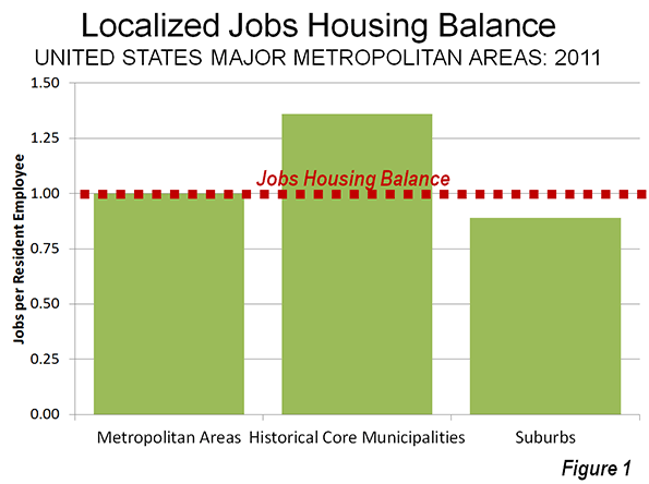
    Nonetheless, over the past two years the greatest historical core municipality growth has been in those with the most suburban (Figure 1) land use characteristics. (See Suburbanized Core Cities for discussion of how “Historical Core Cities” are defined).

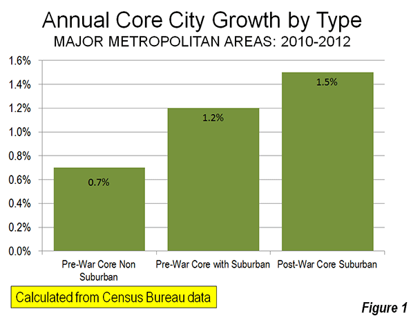
    Pre-War & Non Suburban Core Cities: The least suburban core cities, those with little postwar suburban development, grew 0.7 percent between 2010 and 2012. The strongest growth in this category was in Washington, which added 2.2 percent annually. In reaching a population of 634,000, Washington passed nearby Baltimore for the first time in its history. New York added the largest number of people in the category at 162,000.

    Pre-War and Suburban Core Cities: The Pre-War Core cities with large tracts of post-war suburban development grew at a 1.2 percent annual rate (Note 1). In this category, New Orleans grew the fastest, at an annual rate of 3.2 percent, as it continues to recover from Hurricane Katrina. Denver also grew strongly, at an annual rate of 2.5 percent.

    Post-War & Suburban Core Cities: These core cities, none of which had strong urban cores before World War II and which are virtually all suburban, grew at an annual rate of 1.5 percent. Austin, which is at the core of the fastest-growing major metropolitan area in the United States, grew the fastest in this category, at 2.9 percent.

    Metropolitan, Core City and Suburban Trends

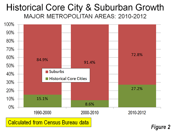
    The estimates also indicate that the suburban population boom that accompanied the housing bubble has run its course. During the 2000s, the share of major metropolitan area (over 1 million population) growth in historical core municipalities fell to approximately one-half the rate of the 1990s. That picked up in the late 2000s as housing construction came to a near standstill and the slower suburban growth rates that have continued through to 2012.

    In a few metropolitan areas, historical core municipalities attracted the majority of the population growth. The leader in this regard was Providence, with 75 percent of its metropolitan growth, which was miniscule. New Orleans captured nearly 2/3 of the growth in its metropolitan area, while New York accounted for 61 percent of its metropolitan area growth. San Antonio, San Jose, and Columbus also attracted more than one half of their metropolitan area growth, though the high share of core-city growth in San Jose and San Antonio was reflective of their high population shares (Table 1).

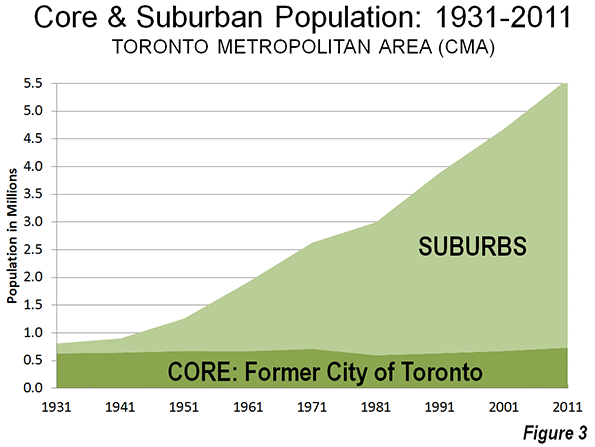
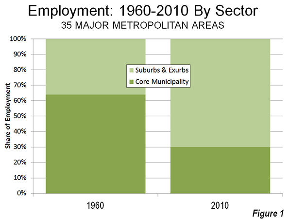
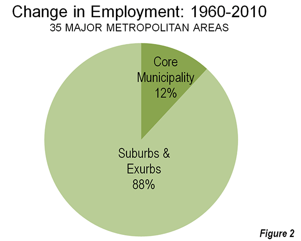
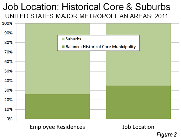
    Between 2000 and 2012, historical core municipalities accounted for 27.2 percent of the growth in major metropolitan areas (Figure 2). This is slightly more than their 26.4 percent of the population in 2010. It would be a mistake to interpret this as presaging the long predicted "return to the city." It would take a continuation of these growth rates for nearly 500 years for historical core municipality populations to struggle to 30 percent of the major metropolitan area population. At the same time, there have been recent indications of even more dispersion, as major metropolitan areas lost nearly two million domestic migrants to smaller areas between 2000 and 2011, according to Census Bureau data.

    Further, the trends in domestic migration indicate that people continue to move to the suburbs from elsewhere, while moving away from the core counties (migration data is not available below the county level). Overall, the core counties of major metropolitan areas lost 167,000 domestic migrants, while the suburban counties added 286,000 (Note 2).

    The domestic migration losses in some core counties were substantial. In the five counties that constitute New York, there was a loss of 139,000 domestic migrants (there was also a loss of 114,000 domestic migrants in the suburbs). Los Angeles County lost 111,000 domestic migrants, while Chicago’s Cook County lost 74,000. The largest gainers were in Austin (Travis County: 36,000), Atlanta (Fulton County: 32,000) and San Antonio (30,000). Core counties continued to attract most international migration, adding 757,000, compared to 589,000 in the suburban counties (Table 2).

    The Future?

    It seems apparent that the nation’s growth continues to be in a transitional period. Should a more normal and vibrant economy replace the current malaise, it seems likely that suburban growth will be renewed. That would not, however, preclude a continuation of the recent smaller inner-core population growth in the increasingly safer and more attractive downtown areas.

    Table 1
    Metropolitan and Historical Core CityPopulation: 2010-2012
    Metroplitan Area Metropolitan Area Change Historical Core City(s) Change Share of Growth
    Atlanta, GA        5,457,831         171,099         443,775        23,496 13.7%
    Austin, TX        1,834,303         118,017         842,592        51,955 44.0%
    Baltimore, MD        2,753,149           42,660         621,342            381 0.9%
    Birmingham, AL        1,136,650             8,600         212,038           (250) -2.9%
    Boston, MA-NH        4,640,802           88,400         636,479        18,885 21.4%
    Buffalo, NY        1,134,210            (1,301)         259,384         (1,926)
    Charlotte, NC-SC        2,296,569           79,534         809,798        21,221 26.7%
    Chicago, IL-IN-WI        9,522,434           61,329       2,714,856        19,258 31.4%
    Cincinnati, OH-KY-IN        2,128,603           14,023         296,550           (400) -2.9%
    Cleveland, OH        2,063,535          (13,705)         390,928         (5,886)
    Columbus, OH        1,944,002           42,037         809,798        21,221 50.5%
    Dallas-Fort Worth, TX        6,700,991         274,781       1,241,162        43,329 15.8%
    Denver, CO        2,645,209         101,731         634,265        34,241 33.7%
    Detroit,  MI        4,292,060            (4,187)         701,475       (12,302)
    Grand Rapids, MI        1,005,648           16,710         190,411          2,371 14.2%
    Hartford, CT        1,214,400             2,016         124,893            118 5.9%
    Houston, TX        6,177,035         256,579       2,160,821        63,604 24.8%
    Indianapolis. IN        1,928,982           41,105         834,852        14,410 35.1%
    Jacksonville, FL        1,377,850           32,254         836,507        14,723 45.6%
    Kansas City, MO-KS        2,038,724           29,386         464,310          4,523 15.4%
    Las Vegas, NV        2,000,759           49,490         596,424        12,637 25.5%
    Los Angeles, CA       13,052,921         224,079       3,857,799        65,172 29.1%
    Louisville, KY-IN        1,251,351           15,643         605,110          7,774 49.7%
    Memphis, TN-MS-AR        1,341,690           16,861         655,155          8,266 49.0%
    Miami, FL        5,762,717         198,060         413,892        14,384 7.3%
    Milwaukee,WI        1,566,981           11,073         598,916          4,176 37.7%
    Minneapolis-St. Paul, MN-WI        3,422,264           73,405         683,650        16,004 21.8%
    Nashville, TN        1,726,693           55,803         624,496        20,969 37.6%
    New Orleans. LA        1,227,096           37,233         369,250        25,421 68.3%
    New York, NY-NJ-PA       19,831,858         264,451       8,336,697      161,561 61.1%
    Oklahoma City, OK        1,296,565           43,573         599,199        19,196 44.1%
    Orlando, FL        2,223,674           89,263         249,562        11,258 12.6%
    Philadelphia, PA-NJ-DE-MD        6,018,800           53,459       1,547,607        21,601 40.4%
    Phoenix, AZ        4,329,534         136,647       1,488,750        41,198 30.1%
    Pittsburgh, PA        2,360,733             4,448         306,211            509 11.4%
    Portland, OR-WA        2,289,800           63,791         603,106        19,328 30.3%
    Providence, RI-MA        1,601,374               522         178,432            396 75.9%
    Raleigh, NC        1,188,564           58,074         423,179        19,232 33.1%
    Richmond, VA        1,231,980           23,879         210,309          6,072 25.4%
    Riverside-San Bernardino, CA        4,350,096         125,245         213,295          3,343 2.7%
    Rochester, NY        1,082,284             2,613         210,532              20 0.8%
    Sacramento, CA        2,196,482           47,355         475,516          9,028 19.1%
    St. Louis,, MO-IL        2,795,794             8,099         318,172         (1,122) -13.9%
    Salt Lake City, UT        1,123,712           35,839         189,314          2,871 8.0%
    San Antonio, TX        2,234,003           91,495       1,382,951        55,346 60.5%
    San Diego, CA        3,177,063           81,755       1,338,348        36,727 44.9%
    San Francisco-Oakland, CA        4,455,560         120,169       1,226,603        30,649 25.5%
    San Jose, CA        1,894,388           57,477         982,765        30,203 52.5%
    Seattle, WA        3,552,157         112,348         634,535        25,875 23.0%
    Tampa-St. Petersburg, FL        2,842,878           59,635         347,645        11,936 20.0%
    Virginia Beach-Norfolk, VA-NC        1,699,925           23,105         245,782          2,979 12.9%
    Washington, DC-VA-MD-WV        5,860,342         224,110         632,323        30,600 13.7%
    Total     173,283,025       3,770,067     45,771,761    1,026,581 27.2%
    Calculated from US Census Bureau data
    Table 2
    Migration: Major Metropolitan Areas
    Net Domestic Migration Net International Migration
    Metroplitan Area Core County(s) Suburban Counties Core County(s) Suburban Counties
    Atlanta, GA             32,368             4,672                8,122             31,891
    Austin, TX             36,045           30,339                9,536              2,161
    Baltimore, MD             (9,476)             9,895                4,282             14,336
    Birmingham, AL             (6,365)             2,141                1,709              1,119
    Boston, MA-NH             (2,596)             3,109              14,543             36,407
    Buffalo, NY             (4,920)            (1,473)                4,930                 440
    Charlotte, NC-SC             20,354           16,936                9,535              2,732
    Chicago, IL-IN-WI            (74,050)          (48,018)              36,540             15,580
    Cincinnati, OH-KY-IN            (10,814)            (3,155)                3,420              3,622
    Cleveland, OH            (24,548)            (2,628)                6,409              1,382
    Columbus, OH              3,116             2,366                9,220              1,088
    Dallas-Fort Worth, TX              9,745           88,765              20,652             22,153
    Denver, CO             17,317           29,839                3,447              6,393
    Detroit,  MI            (49,741)              (706)                7,716             13,973
    Grand Rapids, MI                 171                 59                1,794                 776
    Hartford, CT            (10,189)            (3,202)                9,480              1,428
    Houston, TX             20,101           50,554              42,096             12,295
    Indianapolis. IN             (6,523)           11,509                5,561              2,670
    Jacksonville, FL             (2,000)           12,461                5,991              1,546
    Kansas City, MO-KS             (6,842)             2,624                1,957              4,711
    Los Angeles, CA          (110,934)             8,439              88,868             23,635
    Louisville, KY-IN                (906)             1,837                3,871                 647
    Memphis, TN-MS-AR             (4,670)              (656)                3,727                 261
    Miami, FL                   26           44,255              66,308             44,873
    Milwaukee,WI            (11,271)               662                3,740                 911
    Minneapolis-St. Paul, MN-WI              2,706            (4,786)              11,583             11,424
    Nashville, TN              6,117           19,203                5,357              2,714
    New Orleans. LA             19,061              (585)                1,439              4,262
    New York, NY-NJ-PA          (139,190)        (114,335)            151,431           117,636
    Oklahoma City, OK              7,494           12,791                3,335              1,432
    Orlando, FL             16,507           15,163              21,115             10,779
    Philadelphia, PA-NJ-DE-MD            (14,535)          (18,095)              16,276             22,104
    Phoenix, AZ             42,243             4,716              18,971                 413
    Pittsburgh, PA              3,114             4,050                5,006                 783
    Portland, OR-WA              9,266           14,323                5,055              7,153
    Providence, RI-MA             (9,263)            (5,050)                6,428              2,988
    Raleigh, NC             25,546             3,409                7,207                 568
    Richmond, VA              1,965             3,781                1,656              4,908
    Riverside-San Bernardino, CA             (4,221)           33,207                6,649              6,184
    Rochester, NY             (5,738)            (2,222)                4,392                 583
    Sacramento, CA             (2,086)             6,472              11,150              3,172
    St. Louis,, MO-IL             (7,666)          (14,640)                2,322              6,677
    Salt Lake City, UT              1,486                 47                5,486                   28
    San Antonio, TX             30,130           16,031                7,417                 604
    San Francisco-Oakland, CA              1,736           17,103              12,294             36,783
    San Jose, CA             (7,029)               476              30,315                 104
    Seattle, WA             21,616             5,003              26,670              9,748
    Tampa-St. Petersburg, FL             20,153           15,875              12,823              7,086
    Virginia Beach-Norfolk, VA-NC             (4,405)            (7,859)                3,269             10,065
    Washington, DC-VA-MD-WV             14,170           21,026                6,199             73,365
    Total          (163,363)         285,728            798,480           588,593
    Calculated from US Census Bureau data


    Wendell Cox is a Visiting Professor, Conservatoire National des Arts et Metiers, Paris and the author of “War on the Dream: How Anti-Sprawl Policy Threatens the Quality of Life.

    —–

    Note 1: See 2010 historical core municipality list. This list does not include Grand Rapids, which now exceeds 1,0000,000 population as a result of the new metropolitan definitions, and is classified as Pre-War Core and Suburban.

    Note 2: Excludes the Las Vegas and San Diego metropolitan areas, which have only one county.

    Photo: Google Earth image of Cedar Park, Texas

  • The Evolving Urban Form: Toronto

    Toronto is the largest city (metropolitan area) in Canada and its principal commercial center. However, this is a relatively recent development. Toronto displaced Montréal is Canada’s largest city during the 1960s. Since the 1971 census, when the two Metropolitan areas were nearly identical size, Toronto has added approximately 3 million people, while Montréal has added approximately 1,000,000 (Figure 1).

    This shift is exceptional within the high-income world over the past half century.  Toronto’s ascendancy was in large part precipitated by the move by Québec, in which Montréal is the largest city, to assert the primacy of the French language even though much of the Montréal business community was Anglophone. Many of these businesses, and some of their employees, decamped to Toronto.

    Metropolitan, Suburban and Core Population Growth: 1931-2011

    Toronto has grown very rapidly. In 1931, the metropolitan area had little more than 800,000 residents. About 80% of these (630,000) lived in the former city of Toronto. Since that time, nearly all of the growth in the Toronto metropolitan area has been in the suburbs (Figure 2). The area of the former city of Toronto (abolished in 1998 as a part of a six jurisdiction amalgamation, see Note on the Toronto Amalgamation) has added little more than 100,000 residents while the suburban areas have added approximately 4.7 million. By 2011, the metropolitan area had grown to a population of 5.5 million (Figure 3).


    In recent decades, Toronto has been among the fastest-growing larger metropolitan areas in the high income world.

    The Larger Region: The Golden Horseshoe

    The Toronto metropolitan area is at the core of a much larger region of urbanization that is referred to as the Golden Horseshoe. The Golden Horseshoe stretches in the shape of a horseshoe from the US border at Niagara Falls (St. Catharine’s metropolitan area) through the Hamilton metropolitan area to Toronto and on to the Oshawa and Peterborough metropolitan areas to the east. The Golden Horseshoe (which can be defined in various ways), also includes the Kitchener, Brantford, Guelph, and Barrie metropolitan areas.

    Overall the Golden Horseshoe registered a population of approximately 8.1 million in the 2011 census. Approximately 9% of the population lives in the former city of Toronto, 3% in the inner core federal electoral districts of Toronto – Centre and Trinity – Spadina and another 6% in the balance of the former city. Approximately 91% of the population is in the rest of the Golden Horseshoe (Figure 5).
    Like many other metropolitan areas, Toronto’s core has experienced a resurgence. Between 2006 and 2011, the inner core two districts added 16.2% to their population (Figure 6). This was a much stronger increase than occurred in the federal electoral districts that roughly correspond to the balance of the former city of Toronto, which grew 1.8%. The inner suburbs grew somewhat more strongly, at 4.2%. This rate of growth, barely one-quarter that of the inner core districts, was a more than 1.5 times the actual population increase of the inner core districts.


    The outer suburbs within the metropolitan area grew 13.7%. While the outer suburban growth rate was less than that of the inner core districts, the actual population increase was more than nine times as great. The balance of the Golden Horseshoe grew 4.7%, slightly more than the inner suburbs.

    Between 2006 and 2011 the overwhelming majority – 92 percent – of population growth was outside the core roughly corresponding to the former city of Toronto. This is less than the percentage of the total population represented by the inner core in the 2006 census. This is similar to the dynamics of metropolitan population growth in the United States, where inner core districts dominated central city growth, but produce little or none of the overall growth because of the stagnant or declining populations in the areas immediately outside the inner core.

    The Urban Area

    The Toronto urban area (called “population centre” by Statistics Canada) had a population of approximately 5.1 million according to the 2011 census. With a land area of 675 square miles (1,750 square kilometers), Toronto’s population density is 7,590 per square mile (2,930 per square kilometer). Toronto is the only major urban area in the New World (Australia, Canada, New Zealand and the United States) that is more dense than Los Angeles, which had 7,000 residents per square mile (2,700 per square kilometer), according to the 2010 census (Note on extended urban areas).

    Canada’s Largest Employment Center

    It is not surprising that Canada’s largest employment center should be in its largest metropolitan area. Surprisingly it is not downtown Toronto, but rather the Pearson International Airport area, which is shared between the municipalities of Mississauga, Brampton, and Toronto that is the top job center. This large area covers approximately 45 square miles (120 square kilometers), an area as large as either the municipalities of Vancouver or San Francisco. The center is largely made up of low rise transportation and distribution facilities that stretched far from the airport itself. Overall, the Pearson International Airport center has an employment level of more than 350,000.

    In contrast  downtown Toronto has  approximately 325,000 jobs crammed into  an area of 2.3 square miles (6 square kilometers). This highly concentrated area is, however, the focal point of transit’s largest commuting market in Canada.

    The contrast between these two employment markets vividly illustrates the substantial strengths of transit in serving highly concentrated employment centers, like downtown Toronto, and its virtual inability to provide automobile competitive service in more highly dispersed employment centers (see Note on Transit and Employment Concentration)

    Overall, only 13 percent of the employment in the metropolitan area (as opposed to the Golden Horseshoe) is in downtown Toronto.

    As Goes Toronto, So Goes Canada

    Toronto and the Golden Horseshoe are particularly important to Canada. The Golden Horseshoe has more than one quarter of Canada’s population. This is an unusually high proportion of a nation’s population for one highly urbanized region and boasts an even larger share of its economic output. By comparison, the largest metropolitan region in the United States, New York, represents barely 7% of the nation’s population. In many ways, Canada’s prosperity, which has been impressive in recent years, depends on the success of Toronto and the Golden Horseshoe.

    See Also: A Toronto Condo Bubble?

    ————–

    Note on the Toronto Amalgamation: The former city of Toronto and five other municipal jurisdictions were amalgamated under an act of the Ontario government in 1998. The amalgamation was promoted by the government on efficiency grounds, claiming that hundreds of millions annually would be saved. I was hired by the former city to assist it in an effort to defeat the amalgamation proposal. Our side argued that the cost savings would not occur because of the necessity of harmonizing (the leveling up) labor costs and service levels. Despite advisory referendums that receive a minimum of a 70% no vote, the amalgamation went forward.

    The amalgamation is still a controversial subject. The financial argument appears to have been resolved in the favor of the position of the former city. A major Toronto business organization, the Toronto City Summit Alliance reported “The amalgamation of the City of Toronto has not produced the overall cost savings that were projected. Although there have been savings from staff reductions, the harmonization of wages and service levels has resulted in higher costs for the new City. We will all continue to feel these higher costs in the future.” My commentary  in the National Post on the tenth anniversary of the amalgamation summarized the experience.

    In a spirited debate in 2001 at Ryerson University, in downtown Toronto with a former Toronto transit commission official, my opponent and I agreed on one issue, that the amalgamation of Toronto had been a mistake.

    Note on Extended Urban Areas: In fact, the continuous urbanization of Toronto extends further, to the west into the Hamilton metropolitan area and to the east into the Oshawa metropolitan area. If these areas are combined into a single urban area, the population density falls to 7000 per square mile (2,700 per square kilometer). Even with this extension, Toronto would be more dense than an extended Los Angeles urban area (extending to include Mission Viejo and the western Inland Empire, at 6,200 per square mile or 2,400 per square kilometer (These larger urban area definitions are used in Demographia World Urban Areas)).

    Note on Transit and Employment Concentration: It is virtually impossible for employees throughout the metropolitan area to reach the airport area on transit that is time-competitive with the automobile. This disadvantage is not easily solved. If grade-separated rapid transit lines (such as a subway or busway) were built to the area, only a small percentage of the jobs would be within walking distance (within one quarter mile or 400 metres). Walks of up to 5 miles (8 kilometers) could be necessary from stations to employment locations.  This compares with the virtually 100 per cent of downtown jobs that are accessible by walking from subway and commuter rail (Go Transit) stations (See Improving the Competitiveness of Metropolitan Areas)

    Wendell Cox is a Visiting Professor, Conservatoire National des Arts et Metiers, Paris and the author of “War on the Dream: How Anti-Sprawl Policy Threatens the Quality of Life.

    Photograph: Google Earth Image of the Pearson Airport employment area (Canada’s largest employment area)

  • A Toronto Condo Bubble?

    Toronto has experienced a virtual explosion in high rise condominium construction in recent years, especially in the downtown area. According to Bloomberg, Toronto has the largest number of high-rise condominium towers under construction in the world.

    However concerns are being expressed that the market may be saturated and that a housing bubble is developing. The Toronto Starreports that new condominium sales declined 55 percent in the first quarter of 2013, compared to last year.

    At the same time, a huge number of new condominium units is under construction in Toronto. According to The Star, 57,000 units were being built during the first quarter. The first quarter build rate is reported as the largest rate ever. For their part, builders have scaled back plans for new towers

    Who is Buying?

    In an article entitled, “Toronto Condo Investors Under Water,” the Toronto Condo Bubble|Toronto Housing Bubble website (subtitled Largest Housing Bubble Except for Vancouver of Course) asked:  “… if condo living is the way of the future, then why is it that the majority of people who buy condos never actually live in them?”

    The question was in the context of a report by Scotiabank that between 45% and 60% of Toronto condominium purchasers were investors, rather than people who actually intended to live in the housing.

    Single Family Housing in Toronto: The Holy Grail

    At the same time, The Star points to indicators that the single family housing market retains considerable strength. Part of the reason is that this most desired type of housing is made far more difficult to build as a result of provincial land-use policies (urban containment, including the Toronto "greenbelt").According to The Star, "That’s made detached homes, in particular, the coveted Holy Grail of housing."

    Despite the explosion in condominium units, Statistics Canada data indicates that 71 percent of net new occupied housing in the Toronto metropolitan area was detached between 2006 and 2011.

    These market dynamics, rising detached house prices relative to incomes and heightened speculation are predictable outcomes of urban containment (land rationing) policies.

  • 9-Year Run: CEOs Rank Texas #1, California #50

    Each year, chiefexecutive.net ranks states based upon their business competitiveness. The latest rankings have just been published in 2013: Best and Worst States for Business.

    Texas on Top: For the 9th Year in a Row

    For the ninth year in a row, chiefexecutive.net ranks Texas as the most business friendly state. Noting the Texas cost of living advantage, chiefexecutive.net points out that “Young programmers and engineers can actually afford to live well in Austin, where the housing cost index is 300 percent lower than in San Francisco.” 

    It is not surprising that Austin has emerged as the fastest growing metropolitan area in the United States adding 3.1 percent to its population annually since 2010. This is an astounding rate of growth — twice that of the San Jose IT behemoth, which at current rate of growth will fall behind Austin in population by 2015. Austin’s growth rate is faster than some of the fastest growing developing world cities, such as Mumbai, Dhaka and Manila.

    However there is much more to Texas Austin. Dallas-Fort Worth is the fastest growing metropolitan area with more than 5 million people in the high income world, though at an average annual growth rate since 2010 of 1.9234 percent retains only a narrow lead over similar sized Houston (1.9227 percent). Smaller San Antonio is growing marginally more quickly both Dallas-Fort Worth and Houston (though less than 2 percent).

    Texas was joined in the top five by the South’s Florida, North Carolina and Tennessee, as well as Indiana, from the Midwest. Three of the top five (Texas, Florida and Tennessee) do not have a state income tax and chiefexecutive.net notes that other states are looking at tax reform that would improve the business climate.

    California: Bringing Up the Rear for the 9th Year in a Row

    Just as predictably as Texas ranking first, California has secured the bottom position for the ninth year in a row. A California CEO told chiefexecutive.net“On any particular element, if New Jersey is an ‘8’ on the pain-in-the-ass scale, California is a ‘9 … It’s an ungovernable state, and there’s no movement that will change that, though there are people who want to…” 

    Nearly as predictably, California is joined in the bottom five by older northeastern states New York, New Jersey and Massachusetts as well as Illinois, from which, like California, hundreds of thousands, even millions of people have fled since 2000.

    The complete state rankings can be viewed at http://chiefexecutive.net/best-worst-states-for-business-2013.

  • Slow the Presses!

    It has been a difficult time for newspapers. The industry has experienced serious challenges due to multiple factors going back at least to the early 1960s when the three major television networks began their extensive and widely popular evening news programs, with the likes of Walter Cronkite, Chet Huntley and David Brinkley.

    Recent Setbacks

    The rise of the Internet over the last two decades has posed a much larger challenge. More people were able to access more interactive news sources, including the Internet editions of major newspapers, nearly all of which were free in the beginning. Then there was Apple, with its ground-breaking iPad which made accessing news sources more user-friendly. Newspapers competed hard to design their own applications, which often required paid subscriptions. Of course, Ipad has competitors now and many newspapers have implemented paid firewalls for their Internet sites.

    However, the Great Recession may have dealt the most important blow to the print edition. The collapse of the housing market brought a catastrophic decline in real estate and help wanted classified advertisements, a key source of revenues. Added to this was a drop in overall business, which also reduced advertising revenues.

    Some large newspapers such as The Wall Street Journal,and The New York Times claim they have gained circulation. However, looking beneath the gross numbers provided by the Alliance for Audited Media, it is clear that virtually all of the gains are in on line editions, while print editions continue to decline. Even the online gains may be overstated, because a print edition subscriber who is also an online edition subscriber gets counted twice for the same newspaper.

    Smaller Press Runs

    A review of the change in circulation in the nation’s 20 largest newspapers since 1998 indicates the depth of the losses. The year 1998 is chosen because newspaper circulations remained at high levels and the losses to Internet editions and other media sources has not yet occurred.

    From 1998 to 2013, the 20 largest newspapers lost more than 5 million of their 13.4 million weekday print subscribers, a loss of nearly four out of ten subscribers (39 percent). At the same time, there were substantial differences among the top 20 papers in their losses (Table).

    Top 15 Newspapers in 1998: 1998-2013 Print Circulation
    Newspaper 1998 2013 % Change
    The Wall Street Journal      1,740      1,481 -14.9%
    USA Today      1,653      1,424 -13.8%
    The New York Times      1,067         731 -31.5%
    Los Angeles Times      1,068         433 -59.5%
    The Washington Post         759         431 -43.2%
    New York Post         438         409 -6.6%
    Chicago Tribune         673         368 -45.3%
    New York Daily News         723         360 -50.1%
    Arizona Republic         435         286 -34.3%
    Newsday (Long Island)         572         266 -53.5%
    Houston Chronicle         551         231 -58.0%
    Minneapolis Star Tribune         335         228 -32.0%
    The (Cleveland) Plain Dealer B.         382         216 -43.4%
    The Denver Post         342         214 -37.5%
    San Diego Union-Tribune         378         194 -48.7%
    The Dallas Morning News         480         191 -60.3%
    The Philadelphia Inquirer         429         185 -56.9%
    Chicago Sun-Times         486         185 -62.0%
    Newark Star-Ledger         407         180 -55.7%
    The Boston Globe         471         172 -63.5%
    Total    13,389      8,185 -38.9%
    In thousands
    Source: Alliance for Audited Media & predecessor


    Losers and Catastrophic Losers

    All of the newspapers lost subscribers, but some lost many more than others. The New York Post, a tabloid owned by Rupert Murdoch, posted the smallest loss, less than 30,000 of its 1998 subscriber base of 438,000.

    USA Today, Gannett’s unique national general-interest newspaper, experienced the second smallest loss, at 13.8 percent. USA Today, also the newest newspaper on the list (1982), is the nation’s second-largest newspaper and fell from a circulation of 1.65 million in 1990 to 1.42 million in 2013.

    Another Murdoch title, The Wall Street Journal, purchased in 2007, did a third-best in holding onto its print readership. The Journal retained its position as the largest daily newspaper in the nation, with circulation dropping from 1.74 million in 1998 to 1.48 million in 2013. This amounted to a small loss compared to other newspapers (14.9 percent). The 260,000 loss in actual subscribers was larger than the total current daily circulation of 10 of the top 20 US newspapers (such as the Houston Chronicleand The Boston Globe).

    The nation’s third largest newspaper, The New York Times, lost nearly one-third of its print circulation between 1998 and 2013. Even so, this was less than the loss rate of all but three newspapers (The New York Post, The Wall Street Journal and USA Today).

    The largest relative circulation loss was atThe Boston Globe, which saw a departure of nearly two-thirds (63.5 percent) of its subscribers. This was more than double the losses by its owner, The New York Times.

    Two other newspapers lost 60 percent or more of their readers between 1998 and 2013. The Chicago Sun-Times experienced a loss of 62 percent while The Dallas Morning News saw 60 percent of its subscribers flee. This huge loss is particularly notable, given that the Dallas-Fort Worth metropolitan area is one of the fastest growing regions in the world. For example, in Phoenix, which has also grown very rapidly, theArizona Republic lost only one third of its readership, having taken advantage of the rapidly expanding market.  

    Perhaps most disastrous has been the decline at the Los Angeles Times. For more than two decades, the LA Times had been the nation’s third or fourth largest newspaper, following The Wall Street Journal, USA Today and sometimes The New York Times. This ranking was not much changed in 2013, as the LA Times was the fourth largest newspaper.

    However, over 15 years, the LA Times lost nearly 6 out of every 10 of its subscribers. In 1998, the LA Times had 1,000 more subscribers than The New York Times, at 1,088,000. By 2013, print subscriptions at LA Times had fallen to 433,000. Over the period, The New York Times managed to secure a stranglehold on third position, opening a nearly 300,000 subscriber lead over the LA Times. Should the losses at the LA Times continue at this rate, it could be passed by both The Washington Post and the New York Post within a couple of years (Figure).

    In raw subscriber numbers, the LA Times losses were the most precipitous by far at 635,000, compared to second largest loss at the New York Daily News at 363,000. The Daily News continues a long slide,   having been the nation’s largest newspaper for decades to the 1970s. It is now the third-largest paper in the three paper New York City market, having been passed by the New York Post some time ago. The Daily News, however, still leads the suburban Newsdayand Newark Star-Ledger.

    Even Bigger Losses

    Some of the larger declines in newspaper circulation are not evident in the latest data. For example, The San Francisco Chronicle experienced a drop of 65 percent in its circulation from 1998 to 2012 (2013 data not available). The spectacular decline of Detroit’s two metropolitan dailies has outstripped all of the others over a longer period of time. In the middle 1980s, the Detroit Free Press and the Detroit News each had circulations of approximately 650,000. By 2012, the Free Press had fallen to approximately 135,000 and the News to under 80,000. These drops were much larger than the city of Detroit’s population loss. Now, the two papers offer home delivery only three days of the week (Thursday, Friday and Sunday), while subscribers are encouraged to use internet editions on other days.

    Of course, over the last 15 years, a number of familiar titles have been closed, such as the Rocky Mountain News (Denver), the separate Atlanta Journal and Constitution (now combined as the Atlanta Journal-Constitution) and the Cincinnati Post. The Seattle Post-Intelligencer took the intermediate step of shutting down its print edition, but retaining an Internet edition, which has remained a strong presence online.

    Where from Here?

    There have been other changes as well. Virtually all of the US broadsheets (the wide, familiar print format) are now printed in more compact editions, having been reduced from approximately 15 inches wide to 12 or even 11 inches wide (28, 30.5 and 38 centimeters). There are international format changes, as well. The Times of London (weekday edition) converted from broadsheet to tabloid in 2004, while The Sydney Morning Herald and Melbourne’s uniquely named The Age switched to tabloid format in March.

    The communications business has changed   over the past two decades. Newspapers have been trying to cope, but it   seems unlikely that print editions will experience any resurgence. The open question is whether the newer online strategies will save them from oblivion, but that’s hard to predict.

    Wendell Cox is a Visiting Professor, Conservatoire National des Arts et Metiers, Paris and the author of “War on the Dream: How Anti-Sprawl Policy Threatens the Quality of Life.

    Photo: Los Angeles Times headquarters courtesy of WikiCommons

  • Observations on Urbanization: 1920-2010

    Ninety years have made a world of difference in the United States. Between 1920 and 2010, the nation’s population nearly tripled. But that was not the most important development. Two other trends played a huge role in shaping the United States we know today. The first trend was increasing urbanization, a virtually universal trend, but one which occurred earlier in the high income countries, while the other was a rapidly falling average household size. 

    National Trends

    In 1920, the United States had just crossed the same 50 percent urbanization threshold that China recently crossed. By 2000, the United States was 81 percent urban. 

    The second trend was even more significant. Average household size has fallen from 4.6 in 1920 to 2.6 by 2000, where it remained in the 2010 census. The result is that there are now 7.7 times as many households (Note 1) in urban areas as there were in 1920 (Figure 1).

    Urban Area Trends

    In the 1960s, the Urban Land Institute sponsored research by Jerome P. Pickard (Note 2) to replicate urban area population and density data going back to 1920, using the generalized criteria that had been developed by the Census Bureau for the 1950 and 1960 censuses.

    According to Pickard’s work, there were five urban areas in the United States with more than 1 million population in 1920. Unfortunately, the publication did not include Detroit, which undoubtedly had an urban area population of more than 1 million in 1920 (Note 3). In addition, Pickard found nine urban areas with populations between 500,000 and 1 million.

    By contrast, today there are 42 urban areas with more than 1 million population and 38 with between 500,000 and 1 million population.

    In 1920, the five major urban areas for which there is data had an overall population density of 8,400 per square mile (3,700 per square kilometer). This figure dropped continually, except for between 1940 and 1950 as to its present level (Figure 2) of approximately 3,100 per square mile (1,200 per square kilometer).

    However, caution is required, because before 2000, urban areas generally contained only complete municipalities. Two of the nation’s major urban areas had substantial rural (greenfield) expenses inside their core cities in 1920. This was most pronounced in the core city of New York, where most of Queens and most of Staten Island were undeveloped. Between 1920 and 2010, these two boroughs added more than 1.8 million population, most of which was on greenfield land, rather than the densification of the existing urban neighborhoods. This was in effect, suburban expansion within the city of New York. The same dynamics occurred, to a lesser degree in core cities such as Philadelphia and Los Angeles.

    Pickard finds a population density of 10,600 per square mile (4,100 per square kilometer) for the New York urban area in 1920. It had fallen by half to 5,300 per square mile (2,050 per square kilometer) by 2010.

    Core City and Suburban Growth

    Over the period, the bulk of the population growth (92 percent) was in the suburbs (Figure 3). Even that figure, however, understates the extent of suburban growth. As was above, the inclusion of rural areas as urban in municipalities appears to have been a major driver of the population increase in the city of New York, which added 2.4 million people between 1920 and 2010. Among the other five major urban areas, which includes an estimate for Detroit (Note 2), the core municipalities lost population in each case over the 90 years, though they all continued to grow at least until 1950.

    All of the six major urban areas in 1920 were in the Northeast or the Midwest. The fastest growing urban area from 1920 to 2010 among the six was Detroit, despite the huge losses of its core municipality (Figure 4). No municipality in the world of Detroit’s 1950 size (1.85 million) has lost so much of its population (1.1 million) in all of history. Yet, the Detroit urban area is estimated to have added approximately 2.6 million people to its urban area population since 1920, for an approximately 240 percent increase in population. The Detroit urban area peaked in 2000 at 160,000 higher than in 2010. The second fastest growing larger urban area was Chicago, at approximately 175 percent, while Philadelphia gained 146 percent and Boston 142 percent.

    Urban Areas with 500,000 to 1,000,000 Population in 1920

    The nine urban areas with 500,000 to 1,000,000 population in 1920 had a much lower population density, at 7,200 per square mile (2,800 per square kilometer). This figure, however, is artificially low because of the Los Angeles urban area’s extremely small 1920 density (1,700 per square mile or 650 per square kilometer). Just a few years before the 1920 census, Los Angeles had annexed the San Fernando Valley and other largely rural areas. As a result the city quadrupled in land area. Again, the inclusion of rural areas in the core city rendered Pickard’s urban area (and that of the Census Bureau to at least in 1950) unreflective of actual urban densities in Los Angeles.

    Milwaukee: More Dense than New York

    The Milwaukee urban area, with a population of 504,000 had the highest density in the nation, at 10,900 per square mile (4,200 per square kilometer), which was the last time before 1990 that the New York urban area was not the most dense major urban area. In 1990, the Los Angeles area became more dense than  the New York urban area. By 2000, both the San Francisco and the all-suburban San Jose urban area had also passed New York,

    Falling Densities and Causes

    The population density declines were substantial over the period, at from 63 percent to 70 percent. At the same time, falling household sizes created the requirement for more houses and household densities fell at a slower rate, 37 percent in the largest areas and 50 percent in the smaller metropolitan areas. There were other factors as well, such as more efficient manufacturing and commercial operations, that took more space, urban planning requirements in some metropolitan areas (such as Boston and Atlanta) that required larger than market  building lots (large lot zoning)and the general preference for more land and space on the part of consumers. The US has not been alone in this. The trend toward lower densities has been virtually universal, from Mumbai and Manila to Moscow and Milan.


    Wendell Cox is a Visiting Professor, Conservatoire National des Arts et Metiers, Paris and the author of “War on the Dream: How Anti-Sprawl Policy Threatens the Quality of Life.

    —-

    Note 1: Assumes the same average household size for urban and rural areas.

    Note 2: Jerome P. Pickard, Dimensions of Metropolitanism, Urban Land Institute, 1967.

    Note 3: In 1920, the municipality of Detroit had a population of 993,000 and a population density of 12,700 per square mile (4,900 per square kilometer). Wayne County, which includes Detroit, had a population of 1,170,000. The land area of the county was approximately nine times that of the municipality, nearly all of it rural. On that basis it is estimated that the urban area would have had no more than 1,100,000 residents.

    Photo: New York in the 1920s (Singer Building in foreground, Woolworth Building in the background). Photograph by the U.S. Census Bureau, Public Information Office (PIO).

  • Job Dispersion in Major US Metropolitan Areas: 1960-2010

    The continuing dispersion of employment in the nation’s major metropolitan areas has received attention in two recent reports. The Brookings Institution has published research showing that employment dispersion continued between 2000 and 2010, finding job growth was greater outside a three mile radius from central business districts between 2000 and 2010 in 100 metropolitan areas Note 1). This assessment probably underestimates the extent of job dispersion, since it includes some suburban centers as central business districts (such as West Palm Beach, FL and Palo Alto, CA).

    Recently I showed that employment dispersion has reached a point that there is a virtual balance of jobs and housing in suburban areas, which contrasts with the continuing excess of jobs in core municipalities relative to resident workers. After that article was published, Richard L. Forstall forwarded me research he presented to the Southern Demographic Association in the 1990s that examined employment trends in core municipalities and suburban areas between 1960 and 1990. At the time, Forstall was at the United States Bureau of the Census. He also spent years supervising Rand McNally international metropolitan area population estimates (Note 2).

    Major Metropolitan Job Dispersion: 1950 to 2010 and

    Forstall provides detailed information for the 35 major metropolitan areas as of 1990 (over 1,000,000 population). This article augments the Forstall research with data from the 2010 census (Note 3).

    Consistent with both national and international trends, the half century between 1960 and 2010 indicated significant dispersion in metropolitan areas. This, of course, was a continuation of a trend that accelerated from the first quarter of the 19th century, when early mass transit systems allowed people to live in larger spaces, farther away from their work.

    The movement of residents from the urban core to the suburbs followed the even greater exodus from small towns and rural areas. But it was not long before residents of the homogeneous bedroom suburbs of the 1950s began to find more nearby employment opportunities.

    In 1960, 54% of the employment in the 35 major metropolitan areas was in the historical core municipalities, with the balance of 46% of the jobs in suburban and exurban areas. By 2010, the corner municipality share had dropped to 30%, while suburban and exurban areas contained 70% of the employment (Figure 1). Between 1960 and 2010, 88% of the new jobs were in the suburbs and exurbs, leaving only 12% of the growth in the core municipalities (Figure 2).

    Dispersion Greater in Metropolitan Areas with Pre-War Non-Suburban Cores

    However, even this distribution appears to mask an even greater dispersion. Among the metropolitan areas with "Pre-war non-suburban core municipalities," (such as San Francisco, Baltimore, Providence, New York, etc.) a full 102% of job growth was in suburban and exurban areas. Core city employment accounted for a minus two percent of employment growth (in other words, it declined). These are metropolitan areas with core cities that were virtually fully developed before World War II and which have added little to their land areas by annexation.

    The other metropolitan areas have core cities with large swaths of suburbanization and some, like Phoenix and Sacramento are virtually all suburban. In these metropolitan areas, approximately 25% of the job growth since 1960 has been in the core cities (Figure 3).

    Pre-War Non-Suburban Core Municipalities Losses and Gains

    Among the 18 metropolitan areas with "Prewar non-suburban" core municipalities, two thirds experienced losses in their core cities. The Rust Belt "ground zero" core cities of Detroit, Cleveland, and Buffalo all lost 40 percent or more of their employment, and were joined by second tier Rust Belter St. Louis. The core city of Pittsburgh, typically one of the Rust Belt’s big four, did much better, losing only five percent of its employment. Across the state, however, the core city of Philadelphia did much worse, dropping 23 percent of its employment. The core city of Chicago lost 20 percent of its employment.

    Perhaps most notable was the core city of Hartford, which lost 9 percent of its employment between 1960 and 2010. According to data in the Brookings Institution Global Metro Monitor, Hartford has emerged as the world’s most affluent major metropolitan area (measured by gross domestic product per capita) over the same period. All of Hartford’s job growth was in the suburbs and exurbs.

    The core city of New York did the best among the metropolitan areas with "Pre-War non-suburban" cores, attracting 16 percent of the employment growth over the half-century. Washington (DC) also did well, with a 12 percent share of new employment.

    Urban Dispersion and the Quality of Life

    The dispersed metropolitan area, along with its comprehensive roadway networks, has served the US well, especially in two important measures of the quality of life — housing affordability and mobility. Major metropolitan areas in the United States have some of the most affordable housing in the high-income world. The US has shorter work trip travel times than Canada or Western Europe and much shorter than the major metropolitan areas of Japan (with the most comprehensive rail systems in the world) and East Asia.

    This advantage was reiterated with the recent release of the Tom Tom Congestion Index, which showed traffic congestion in the metropolitan areas of Australia and New Zealand to be far worse than in US metropolitan areas of similar size. For example, Sydney is as congested as Los Angeles, despite having only one-third the population. Auckland (New Zealand) has worse traffic congestion than any US metropolitan area of similar size.

    Peter Gordon and Harry W. Richardson spotted this advantage nearly two decades ago (See Are Compact Cities a Desirable Planning Goal?), before there was international traffic congestion comparison data. Based upon their review of national travel surveys, they concluded:

    Suburbanization has been the dominant and successful mechanism for reducing congestion. It has shifted road and highway demand to less congested routes and away from core areas.

    Wendell Cox is a Visiting Professor, Conservatoire National des Arts et Metiers, Paris and the author of “War on the Dream: How Anti-Sprawl Policy Threatens the Quality of Life.

    ——-
    Note 1: The Brookings Institution report indicates that employment within a 3 mile radius of downtown (the central business district) increased in number and share only in the Washington, DC metropolitan area. However, this may not indicate an increase in central business district (downtown) employment. The large, nearby, but suburban employment centers of Rosslyn, Crystal City and downtown Alexandria may be located within the three mile radius (the report does not indicate the point from which the radius is drawn). The three mile radius used in the report is useful and represents the best reported data. However, it may not be representative of central business district employment encloses a huge area (28 square miles), which is more than 25 times the typical central business district geographical size and larger than the land areas of the core cities of Providence and Hartford and nearly two-thirds the size of the core city of San Francisco. Transit commuting to such nearby employment centers is routinely far lower than the share that ride transit to downtown.

    Note 2: Forstall is co-author (with Richard P. Greene and James B. Pick of seminal research that estimated the population densities of the largest metropolitan areas in the world (Which Are the Largest: Why Lists of Metropolitan Areas Vary So Greatly). Normally, metropolitan area densities cannot be validly compared because of widely varying criteria between nations. Further, in the United States, metropolitan area densities are nonsensical, because their building blocks vary in size too much. With its County-based definitions, US metropolitan areas include building blocks ranging from half the size of Orlando’s Walt Disney World (New York County, or Manhattan borough) to the size of the nation of Costa Rica (San Bernardino County). The use of such a crude building block results in the inclusion of huge amounts of rural territory that is outside the labor market or the commuting shed (metropolitan areas are typically defined as labor markets). Forstall and his coauthors applied criteria that was both consistent and rational. This exhaustive process limited the number of metropolitan areas for which they were able to make estimates to 28.

    Note 3: This analysis differs from Forstall’s approach in defining core cities using the historical core municipality classification. It should be noted that there have been changes in metropolitan definitions over the 50 years.

    Photo: Suburban employment in Chicago (by author)

  • The Evolving Urban Form: Nanjing

    Nanjing is one of China’s most historic cities. It is one of the four great ancient capitals of the nation, along with Beijing, Chang’an (Xi’an) and Luoyang. Its name means southern capital (Nan=south, Jing=capital), while the name of the current capital, Beijing means Northern capital. Nanjing was the national capital at various times, however generally for periods of no more than a few decades. Upon the establishment of the People’s Republic of China, the national capital was moved permanently to Beijing, where it had been for most of the previous five centuries.

    Nanjing is the capital of Jiangsu, which is China’s fifth most populous province. It has twice as many people as California (80 million) and a land area the size of Virginia. Nanjing is also one of the "four furnaces" of China, a title derived from its humid summers. The others include Wuhan (Hubei), Chongqing and sometimes Changsha (Hunan) or Nanchang (Jiangxi).

    Nanjing is reputed to have the world’s longest, though not the oldest surviving city wall, which was built in the 14th century (Photo).  The city is also the site of the second bridge ever built over the lower Yangtze River (Photo), opened in 1968 (the first was at Wuhan). The bridge carries both automobiles and trains. There are now five Yangtze River crossings in Nanjing.


    Nanjing City Wall


    Yangtze River (toward suburban Pukou qu)

    Yangtze Delta Megalopolis

    Nanjing is a big city in one of the world’s great urban mega-regions. It serves as the Western anchor of the Yangtze Delta region, a megalopolis (string of metropolitan areas) which consists of a string of sometimes adjacent urban areas, stretching through Suzhou to Shanghai and Hangzhou to Ningbo, with a population of approximately 60 million (plus additional millions in rural areas, outside the urban areas). This is at least a third more than live in the longer Washington-New York-Boston corridor, the original megalopolis.

    A trip through the Yangtze Delta corridor demonstrates only comparatively short sections that are not urbanized. One of the longest is the 10 mile (16 kilometer) section from the eastern urban fringe of Nanjing to the western fringe of Zhenjiang (location of the Pearl S. Buck Museum). Further, Nanjing’s southern fringe now meets that of Maanshan, in Anhui province (not a part of the Yangzte Delta).

    The Nanjing Urban Area

    Nanjing has grown rapidly. In 1950, the urban area population was approximately 1.0 million (see "Definition of Terms Used in the Evolving Urban Form Series"), a population some sources say was exceeded in the 15th century. The urban area has now reached 5.8 million. Nanjing is the world’s 59th largest urban area and the 13th largest in China. It is projected to have a population of more than 8 million by 2025 (Figure 1). The Nanjing urban area (Figure 2) covers approximately 440 square miles (1,140 square kilometers). This results in a population density of approximately 13,100 per square mile (5,100 per square kilometer).

    Consistent with the general principle that cities become less dense as they get larger, Nanjing’s population density has fallen significantly over the last 60 years, even as its geographical size has more than quintupled (Figure 3). Older historic land area data is not readily available, but if it is assumed that virtually all of Nanjing’s United Nations reported 1,000,000 population in 1950 lived within the 17 square mile (44 square kilometer) periphery of the city walls, the population density would have been more than 60,000 per square mile (more than 23,000 per square kilometer). The area within the city walls is indicated by green shading in the urban area representation (Figure 2).

    By 1970, the population had increased to over 1.4 million and if this population was contained inside the city walls, the population density would have approached 90,000 per square mile (35,000 per square kilometer).Indicating a similar density, the 2010 population of the most densely populated district (Golou qu), much of which is located inside the Wall 86,000 per square mile (33,000 per square kilometer).

    The Nanjing Metropolitan Area

    Nanjing is a prefecture (regional municipality) with 11 districts, of which nine are in the metropolitan area (Note 1). The core of Nanjing continues to grow, from 2.5 million in 2000 to 3.4 million in 2010, an increase of 34 percent (Note 2). But in comparison, the suburban districts grew from 2.3 million to 3.8 million, an increase of 64 percent (Figure 4). For the first time, suburban Nanjing has a larger population than the urban core. The suburbs accounted for 64 percent of the metropolitan area’s growth over the past decade, compared to 36 percent in the urban core (Figure 5).

    Pukou, a suburban district across the Yangtze River from the historic location of Nanjing, was by far the fastest growing part of the metropolitan over the past decade. By 2010, the population had risen to 710,000 from 225,000 in 2000, when it was largely rural. Two metro lines are planned to connect Pukou to the rest of the urban area, which is likely to encourage further suburban development.

    The Nanjing Economy

    Nanjing, like other cities in China, has been a beneficiary of China’s unprecedented poverty reduction, first launched by the economic reforms started by Deng Xiao Ping in the early 1980s. It is estimated that in 2012, Nanjing’s gross domestic product per capita (purchasing power parity adjusted) was approximately $25,000 annually. Nanjing’s GDP per capita is compared to that of other Chinese metropolitan areas and examples from the developed world in Table 6 (Note 3).

    A Strong Future

    Nanjing seems likely to continue its strong growth. This and Nanjing’s geographic location in one of the most vibrant mega-regions in the world should guarantee a continuing and strong contribution not only to the development of the Yangtze Delta megalopolis, but also to economic progress of China as a whole.

    Wendell Cox is a Visiting Professor, Conservatoire National des Arts et Metiers, Paris and the author of “War on the Dream: How Anti-Sprawl Policy Threatens the Quality of Life.

    —-

    Note 1: The districts (qu and counties) designated as urban by Nanjing prefecture (regional municipality) authorities Entire peripheral districts are designated when they begin to receive urban development. The "urban" designation in China, however, does not indicate continuous urbanization and is thus not an urban area in the internationally defined sense. The Chinese urban definition is thus similar to a metropolitan area (labor market).

    Note 2: The urban core includes the following districts (qu): Xuanwu, Biaxia, Qinhaui and Gulou.

    Note 3:  Estimated the Brookings Institution Global Metro Monitor, and other sources. See "World’s Most Affluent Metropolitan Areas: 2012" including the "Note."

    Top Photo: Zifeng Tower (all photos by author)

  • Chinese Cancel Treasure Island Investment as Brown Seeks High Speed Rail Funds

    California’s Governor Jerry Brown and an entourage of public officials and corporate executives has spent much of the last week traveling around China trying to drum up business for the state. One of his principal objectives is to entice Chinese investors to take a stake in the California high-speed rail project. From the Governor’s perspective, this makes all sense in the world.

    California’s high-speed rail program may be the current holder of the largest projected funding deficit of any infrastructure in the world, at approximately $50 billion. (That’s after shaving $30 billion off the project and losing the support of former California High Speed Rail Authority Chairman, former state Senator Quentin Kopp, who charges that the line is no longer "genuine high speed rail").

    As Governor Brown concludes his trip to the Orient, word comes from The San Francisco Chronicle that "A $1.7 billion deal with China Development Corp., the Chinese national railway and Lennar Corp. to construct 12,500 homes on the former Hunters Point Naval Shipyard in San Francisco and a string of high-rises on Treasure Island has collapsed." The project was to be built over up to three decades and would have housed 20,000 people. The deal is said to have fallen apart over not allowing the Chinese investors sufficient control and "unresolved tax issues."

    The now defunct deal may have been the largest serious Chinese investment proposal in California.

    There are important lessons for proponents of the high-speed rail system, who sometimes fantasize about China as the bailout investor of last resort. The Chinese, like the other investors who have found better things to do with their money are not likely to be swayed by the line’s excessively high cost or its modest ridership potential. Nor will the Chinese bear gifts to California.

    These issues are described in detail in the new Reason Foundation Updated Due Diligence report by Joseph Vranich and me.

  • US Suburbs Approaching Jobs-Housing Balance

    Suburban areas in the US metropolitan areas with more than 1 million total regional population, once largely seen as bedroom communities, are nearing parity between jobs and resident employees. The jobs housing balance, which measures the number of jobs per resident employee in a geographical area has reached 0.89 (jobs per resident workers) in these 51 major metropolitan areas, according to data in the 2011 one-year American Community Survey. This is well below the 1.39 ratio of jobs to resident employees in the historical core municipalities (Figure 1).

    The historical core municipalities still have a larger share of metropolitan employment than they have of resident workers. However, 65 percent of major metropolitan area jobs are now in the suburbs, where 74 percent of workers live (Figure 2). The 0.89 jobs housing balance index indicates that there are only 11 percent fewer jobs in the suburbs than resident workers. Overall, the jobs housing balance of metropolitan areas (a synonym for labor markets) is at or near 1.00.

    From Monocentric to Polycentric to Dispersed Cities
    The data indicates the extent to which the classical monocentric city has been left behind by the evolution of the modern metropolitan area. Before the near universal extension of automobile ownership, cities were necessarily much more monocentric. Transit lines tended to converge on downtown, which made downtowns far more dominant in their share of metropolitan employment than they are today.

    For example, in 1926, according to historian Robert M. Fogelson writing in Downtown: Its Rise and Fall: 1880-1950, in 1926 41 percent of Los Angeles residents went to downtown every day, a figure that had dropped to 15 percent by 1953, principally for work and shopping. Today, in a much larger metropolitan area that also includes Orange County, 3 to 5 percent of jobs are located downtown (depending on the geographical definition). The area not only lost a significant share of metropolitan employment, but saw its share of retail sales drop as regional shopping centers were built throughout the area. Similar trends occurred in virtually every metropolitan area of the United States.

    All of this occured as the automobile facilitated access to virtually everywhere in the metropolitan area, not just downtown.

    The emerging polycentricity of the city long was obvious to many analysts, but it was Joel Garreau who brought the issue to popular attention in his classic Edge City: Life on the New Frontier. Garreau documented the development of large suburban employment centers throughout the major metropolitan areas and provided a list. Later, Robert Lang of the University of Nevada Las Vegas took the issue further in his Edgeless Cities: Exploring the Elusive Metropolis, which examined office space outside downtown areas and edge cities in 1999. Gross office space was greatest outside both the downtowns and edge cities, according to Lang’s data (Note 1).

    Lang’s analysis is limited to office space, which is more concentrated in downtown areas than employment. On average, 2000 data indicates that downtown areas had approximately 10 percent of employment, well below downtown’s 36 percent share of office space (Figure 3).

    Even so, there remains a misconception today that cities remain monocentric. Yet as the figures show we are progressing toward a distribution of jobs that nearly matches its distribution of housing, with the exception of downtown (where there is the greatest imbalance, see below).

    Historical Core Municipalities: Where the Jobs-Housing Imbalance is the Greatest

    The excess of jobs in relation to residential workers is greatest in the historical core municipalities. It is driven by the downtown areas (central business districts or CBDs), which have by far the highest employment densities in the metropolitan areas. For example, in 2000, the downtown areas of the nation’s 50 largest urban areas had an average job density 92,000 per square mile. This is approximately 70 times the average non-downtown urban area employment densities (1,300 per square mile). Downtown residential densities, if they were readily available, would doubtless be a small fraction of the downtown employment figures.

    Largest Historical Core Municipality Jobs-Housing Imbalances

    The imbalance between jobs and housing is highest among the historical core municipalities of Washington (2.63), Salt Lake City (2.61), Orlando (2.48), Miami (2.44) and Atlanta (2.31). Yet, these large historical core municipality imbalances co-exist with generally near average suburban jobs housing balances. For example, in Washington there are 0.87 jobs per resident worker in the suburbs, or only 13 percent fewer jobs than workers who reside in the suburbs. In the other four metropolitan areas, the suburban jobs housing balance is above 0.80 (Figure 4).

    Smallest Historical Core Municipality Jobs-Housing Imbalances

    The smallest historical core municipality jobs housing imbalance is in San Jose (0.84), which is the only major metropolitan area in which has fewer jobs than resident workers (Figure 5). However, the municipality of San Jose is a "Post War Suburban" core municipality, having experienced virtually all of its growth since 1940. This is despite the fact that San Jose’s corresponding urban area is the third most dense (following Los Angeles and San Francisco). Generally higher suburban housing densities were built in San Jose compared to less dense urban areas – which extend over vast distances – such as New York, Philadelphia and Boston. San Jose is also the only metropolitan area in which there are more suburban jobs than suburban resident workers (1.41 jobs per worker).

    The other historical core municipalities with the least imbalance between employment and resident workers are Los Angeles (1.10), Chicago (1.17), Milwaukee (1.17) and New York (1.17). The surprising inclusion of New York is discussed below.

    Each of the historical core municipalities with the fewest jobs per resident worker has a higher than average jobs housing balance in its suburban areas. Los Angeles has 1.02 jobs per suburban resident worker, principally the result of importing workers from the adjacent Riverside-San Bernardino metropolitan area. Milwaukee also has more suburban jobs than suburban resident workers (1.01).

    New York

    New York has the second largest central business district in the world, following Tokyo. It therefore seems odd that the municipality of New York should have such a low ratio of jobs per resident worker. The borough of Manhattan, where the central business district is located, has 2.76 jobs per resident workers, higher than that of top ranked Washington, DC (above). There are 1,450,000 more jobs than resident workers in Manhattan.

    New York’s low ratio is the result of a huge shortage of jobs relative to workers the outer boroughs (the Bronx, Brooklyn, Queens and Staten Island). There are 830,000 fewer jobs than resident workers in the four outer boroughs. Their ratio of jobs per resident, at 0.71 is lower than all but five suburban areas in the other 50 major metropolitan areas (Figure 6).

    The suburbs of New York, ironically, are more job-rich than the outer boroughs. They boast an 0.91 jobs per resident worker, ranking 17th out of the 51 metropolitan areas.

    The New Normal

    The former assumption that "everyone works downtown" is a thing of the past. Dispersion of jobs throughout the metropolitan area has become the rule. The "old normal" was that of the bedroom community – people living in the suburbs and working in the core cities. The "new normal" is about downtown and the core city. To the extent that there is a distortion in the jobs housing balance throughout the modern metropolitan area, it is the result of a larger number of jobs than residents in the core cities (and especially downtown).

    Wendell Cox is a Visiting Professor, Conservatoire National des Arts et Metiers, Paris and the author of “War on the Dream: How Anti-Sprawl Policy Threatens the Quality of Life.

    ———————-

    Photo: Houston downtown (to the left), edge city (Texas Medical Center in the middle) and dispersed employment (rest of photo). Photo by author.

    Note 1: The total office space outside the primary downtowns, secondary downtowns and edge cities was 37.0 percent in reviewed 13 metropolitan areas. Primary downtowns accounted for 36.5 percent, secondary downtown for 6.5 percent and edge cities for 19.8 percent (this analysis classifies Beverly Hills, Mid-Wilshire and Santa Monica in Los Angeles  as secondary downtowns, rather than as primary as in the book. See tables 4-2 and 4-10).

    Note 2: The historical core municipalities are the largest municipalities in each metropolitan area, with the following exceptions.
    (a) Oakland and St. Paul are also historical core municipalities.
    (b) Norfolk is the historical core municipality in the Virginia Beach metropolitan area.
    (c) San Bernardino is the historical core municipality in Riverside San Bernardino
    (see Classification of Historical Core Municipalities)