Author: Wendell Cox

  • The Evolving Urban Form: Athens

    Around the fifth century BCE, Athens may have been the most important city in the West. Like China’s Chang’an (modern Xi’an), the "on and off" capital of China, Athens has experienced many severe "ups and downs" throughout its remarkable history. At its ancient peak, Athens is estimated to have had more than 300,000 residents (historic population estimates vary greatly). At least one estimate indicates that Athens may have fallen to a population of under 5,000 by the middle 19th century. The city, now having evolved into the modern manifestation of the metropolitan area (Attica region), peaked at 3.9 million in the early 2000s, but its population has begun to drop again.

    Athens is the capital of Greece and located at the south end of the Attica peninsula, on the Aegean Sea. The core municipality of Athens is located approximately 5 miles (8 kilometers) from the historic port of Piraeus, from which ferries operate to the Greek Islands.

    Metropolitan Dispersion

    Like virtually all of the world’s metropolitan areas, population growth has been concentrated in the suburbs and exurbs for decades.

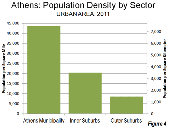
    The Athens municipality (the historic core city) peaked at 885,000 in 1981. At a population density of nearly 60,000 per square mile (23,000 per square kilometer), Athens once stood among the most dense municipalities in the world. However, the Athens municipality since has declined, with population losses in each of the three subsequent decades. Between 2001 and 2011, the population fell 125,000 to 664,000, a decline of 16%. The Athens municipality is still dense, however, at 44,000 per square mile (17,000 per square kilometer). The rest of the urban organism, as is usually the case, is considerably less so.


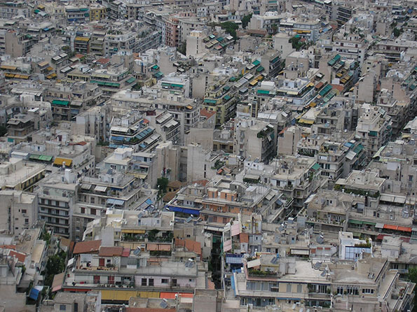
    Photo: Athens Core Density

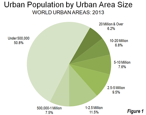
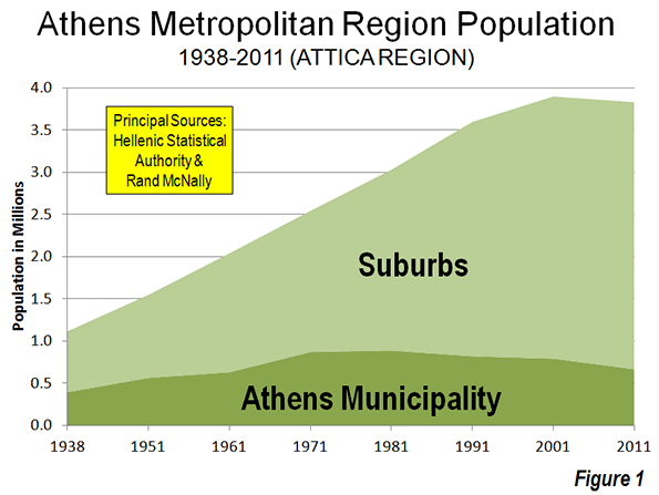
    Since 1951, suburban and exurban Athens (see The Evolving Urban Form Series Definitions) has accounted for 95% of the growth in the metropolitan region, adding 2.2 million new residents, compared to approximately 100,000 for the Athens municipality. Since 1971, all of the population growth has been in the suburbs and exurbs (Figure 1).

    However, over the last decade, population growth has dropped across the entire Athens metropolitan region. Certainly, the low Greek fertility rate is a factor (see The Rise of Post-Familialism: Humanity’s Future?). Greece’s total fertility rate (average number of children per women of child bearing age) is approximately 1.5, according to Eurostat, well below the replacement rate of 2.1 not to mention the 2.3 Greek figure in the late 1970s. More recently, it is likely that the Greek fiscal crisis has contributed to an even lower rate of increase by reducing the previously flow of international migration as well as discouraging family formation among native Greeks.

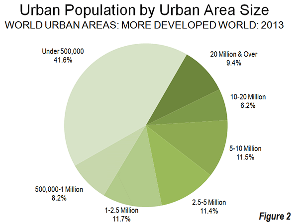
    Athens growth slowed dramatically well before the financial crisis. Between 1991 and 2001, the Athens metropolitan region added approximately 300,000 new residents. But  between 2001 and 2011, the metropolitan region lost 67,000 residents. However, the suburbs and exurbs gained marginally, adding 58,000 residents, partially offsetting the loss in the Athens municipality (Figure 2). Even so, the suburban population increase was miniscule compared to the 330,000 gain of the previous decade (photo: North Suburban Athens).


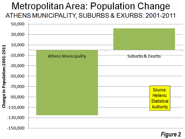
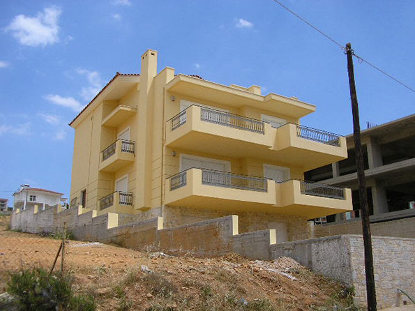
    Photo: North Suburban Athens

    The Urban Area

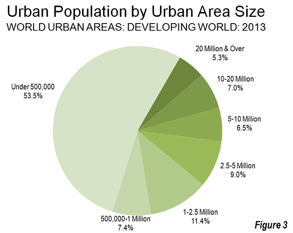
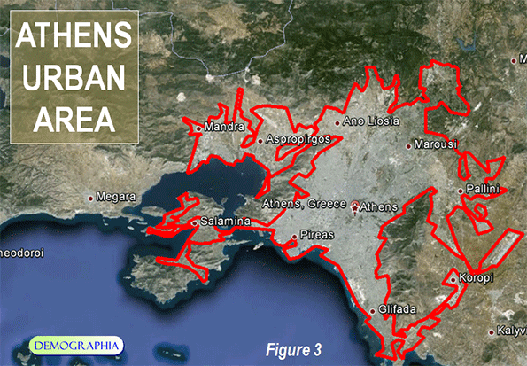
    Even with its slow and even negative growth, the  Athens urban area remains  among the most dense in the developed world (Figure 3). No major urban area in Western Europe, Japan or the New World (Australia, Canada, New Zealand and the United States) is as dense. The 2013 edition of Demographia World Urban Areasindicates that the Athens urban area has a population of 3.5 million (Note), living in a land area of 225 square miles (580 square kilometers), for a density of 15,600 per square mile (6,000 per square kilometer). This places Athens slightly ahead of London (15,300 per square mile or 5,900 per square kilometer), about double the density of Toronto or Los Angeles and more than four times that of Portland.

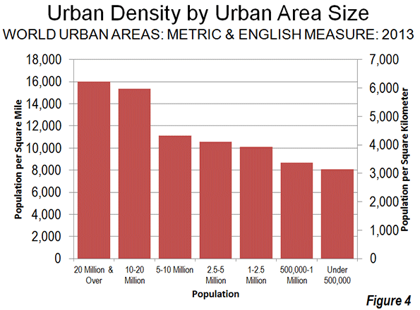
    As is typical around the world, the urban area of Athens exhibits a generally declining density from the core to the urban fringe. From the 44,000 per square mile (17,000 per square kilometer) Athens municipality density, the inner suburbs drop to approximately 20,000 per square mile (7,700 per square kilometer). This is still a high population density for inner suburbs, reflecting the fact that much of the area was developed before the broad achievement of automobile ownership (a similar situation is obvious in the inner ring suburbs of Paris). The outer ring suburbs have been more shaped by the automobile, yet have a density of 8,500 per square mile (3,300 per square kilometer), which still  is high by Western European standards (Figure 4).

    Affluence

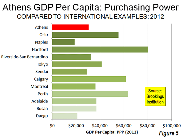
    Athens has below average affluence among the metropolitan regions of the developed world. According to data in the Brookings Institution Global Metro-Monitor, Athens had a gross domestic product, purchasing power parity adjusted (GDP-PPP) per capita of $30,500 in 2012. This trails the most affluent metropolitan regions around the more developed world. It is less than one-half the gross domestic product per capita of Hartford (US), the world’s most affluent major urban area ($79,900). The Athens GDP-PPP is approximately one-half that of regional leaders Perth (Australia) at $63,400, Calgary ($61,100), Tokyo ($41,400) and Busan (South Korea) at $36.900. Athens also ranks well below Western Europe’s most affluent metropolitan region, Oslo, at $55,500. Athens is also less affluent than the least major metropolitan areas with the lowest GDP-PPPs per capita in Australia (Adelaide), Canada (Montréal), and the United States (Riverside-San Bernardino). However, Athens has a higher GDP-PPP per capita than Sendai (Japan), Daegu (South Korea) and Naples (Figure 5), the least affluent major metropolitan areas in their respective geographies.

    Low Fertility, Declining Migration and An Uncertain Future

    Even as the national fertility rate dropped in the late 20th century, Athens continued to grow strongly due largely to international migration, especially from Albania. During the 1990s, virtually all of the population growth in Greece was the result of immigration, as the natural components of growth (births minus deaths) fell into decline. During the 2000s, immigration declined so severely that the nation lost population, most of it in the Athens metropolitan region (with the Athens municipality’s loss exceeding the nation’s) where the foreign born population has concentrated. Much of the decline in international migration resulted from the severe economic crisis.

    Athens typically exhibits the principal function of cities in civilization. When cities compete well by facilitating economic aspiration, they grow. When they do not, cities stagnate or fall into decline. For Athens, stagnation or decline seems the likely scenario in the foreseeable future.   

    Wendell Cox is a Visiting Professor, Conservatoire National des Arts et Metiers, Paris and the author of “War on the Dream: How Anti-Sprawl Policy Threatens the Quality of Life.

    —–

    Note: The difference between the metropolitan area and urban area population is the residents living in exurban areas (outside the urban area, but within the metropolitan area).

    Photo: The Acropolis (all photos by author)

  • Annual Update on World Urbanization: 2013

    Tokyo continues to be the world’s largest urban area with more than 37 million people, according to the recently released 9th Annual edition of Demographia World Urban Areas. Tokyo has held the top position for nearly 60 years, since it displaced New York. There have been only modest changes in the ranking of the world’s largest urban areas over the past year. The top four urban areas remain the same, with Jakarta (Jabotabek) second, Seoul third and Delhi fourth. Fast-growing Shanghai, however, assumed fifth place, displacing Manila where the latest census data showed less population growth than had been expected (Table 1).

    Table 1          
    LARGEST URBAN AREAS IN THE WORLD          
    Rank Geography Urban Area Population Estimate Land Area: Square Miles Density Land Area: Square Kilometers Density
    1 Japan Tokyo-Yokohama 37,239,000 3,300 11,300 8,547 4,400
    2 Indonesia Jakarta (Jabotabek) 26,746,000 1,075 24,900 2,784 9,600
    3 South Korea Seoul-Incheon 22,868,000 835 27,400 2,163 10,600
    4 India Delhi, DL-HR-UP 22,826,000 750 30,400 1,943 11,800
    5 China Shanghai, SHG 21,766,000 1,350 16,100 3,497 6,200
    6 Philippines Manila 21,241,000 555 38,300 1,437 14,800
    7 Pakistan Karachi 20,877,000 310 67,300 803 26,000
    8 United States New York, NY-NJ-CT 20,673,000 4,495 4,600 11,642 1,800
    9 Brazil Sao Paulo 20,568,000 1,225 16,800 3,173 6,500
    10 Mexico Mexico City 20,032,000 790 25,400 2,046 9,800
    11 China Beijing, BJ 18,241,000 1,350 13,500 3,497 5,200
    12 China Guangzhou-Foshan, GD 17,681,000 1,225 14,400 3,173 5,600
    13 India Mumbai, MAH 17,307,000 211 82,000 546 31,700
    14 Japan Osaka-Kobe-Kyoto 17,175,000 1,240 13,900 3,212 5,300
    15 Russia Moscow 15,788,000 1,700 9,300 4,403 3,600
    16 Egypt Cairo 15,071,000 640 23,500 1,658 9,100
    17 United States Los Angeles, CA 15,067,000 2,432 6,200 6,299 2,400
    18 India Kolkota, WB 14,630,000 465 31,500 1,204 12,100
    19 Thailand Bangkok 14,544,000 900 16,200 2,331 6,200
    20 Bangladesh Dhaka 14,399,000 125 115,200 324 44,500
    21 Argentina Buenos Aires 13,776,000 1,020 13,500 2,642 5,200
    22 Iran Tehran 13,309,000 525 25,400 1,360 9,800
    23 Turkey Istanbul 12,919,000 520 24,800 1,347 9,600
    24 China Shenzhen, GD 12,506,000 675 18,500 1,748 7,200
    25 Nigeria Lagos 12,090,000 350 34,500 907 13,300
    26 Brazil Rio de Janeiro 11,616,000 780 14,900 2,020 5,700
    27 France Paris 10,869,000 1,098 9,900 2,845 3,800
    28 Japan Nagoya 10,183,000 1,475 6,900 3,820 2,700
    Source: Demographia World Urban Areas (2013)


    Provisional census results moved Karachi into the top 10 for the first time, while two urban areas, Bangkok and Tehran, reached megacities status (over 10 million population), reflecting strong growth and the availability of more precise data for estimation.

    As before, the most dense megacity was Dhaka, Bangladesh, at 115,000 per square mile (45,000 per square kilometer). New York continues to have the largest urban footprint, covering nearly 4,500 square miles (more than 11,500 square kilometers) and the least dense megacity in the world.

    Coverage

    This year’s Demographia World Urban Areas report provides current and coordinated population, urban land area and density data for all 875 identified urban areas with 500,000 population or more as well as estimates for 650 smaller urban areas. The report includes a total population of approximately 1.86 billion in urban areas with 500,000 or more population and an overall population for urban areas of all sizes of 2.0 billion. These urban areas account for approximately 53% of the world’s urban population.

    Distribution of Population by Urban Area Size

    As was noted in What is a Half Urban World? a considerable share of the world’s urban population lives in smaller urban areas (as small as 200 population). In 2013 is estimated that 51% of the world’s urban population lives in urban areas with less than 500,000 population, based on the data in Demographia World Urban Areas. The 10 largest urban areas, each with over 20 million population, account for approximately 6% of the urban population while the 28 megacities, each with more than 10 million population, account for 13% of the population. Approximately 21% of the urban population is in the more than 375 urban areas with between 1 million and 5 million population (Figure 1).

    The share of the population in larger urban areas is greater in the more developed world than in the developing world. Only 42% of the population lives in urban areas with less than 500,000 population in the more developed world. The share of the population in megacities is greater than the world figure, at approximately 16% (Figure 2).

    A larger share of the population is in smaller urban areas in the developing world, at 54%. Combined, 13% of the developing world population is in the megacities and 20% of the population is in urban areas with between 1 million and 5 million population (Figure 3).

    Distribution of Population by Urban Area Size

    Generally, the larger urban areas have higher average population densities than smaller urban areas (Figure 4). Overall, the urban areas with more than 20 million population have a density of approximately 16,000 per square mile (6,200 per square kilometer), while urban areas between 10 million and 20 million population are nearly as dense at 15,400 per square mile (6,000 per square kilometer). The urban areas with from 5 million to 10 million population are considerably less dense, at 11,100 per square mile (4300 per square kilometer). The smallest urban areas (Note), below 500,000 population are estimated to have a density of approximately 8,100 per square mile (3,100 per square kilometer).

    A similar relationship exists in both the more developed and developing world, with the largest urban areas being considerably more dense than smaller urban areas. The megacities in the  more developed world have an average population density of approximately 9,000 per square mile (3,600 per square kilometer), compared to 3,700 per square mile (1,400 per square kilometer) for urban areas in the 500,000 to one million population range.

    However, urban areas in the developing world are considerably more dense in the less developed world, to be expected given the relationship between lower incomes and higher population densities. Developing world megacities are approximately 2.5 times as dense as megacities in the more developed world. The differences are even greater in smaller urban areas. Developing world urban with less than 5 million population are approximately four times as dense as those in the more developed world (Figures 5 and 6).

    However, megacities in both the more developed and developing world have both population growth and decreasing densities in common. This is illustrated in an examination of megacity trends, which indicates that in recent decades, all 23 examined experienced falling densities. The same is also true of the other five megacities (Karachi, Teheran, Lagos and Paris), which will be described in greater detail in future articles. (see Dispersion in the World’s Urban Areas). Cities everywhere are continuing to expand organically, with nearly all growth on the periphery.

    Distribution of Large Urban Areas

    The world’s largest urban areas are increasingly located in the developing world. Only three of the 10 urban areas with more than 20 million are located in the more developed world, Tokyo, Seoul and New York. Among the 28 megacities, only seven are in the more developed world. More than three quarters of the urban areas with 500,000 or more population are located in the developing world (658 of 875). There is a similar ratio with respect to population, with developing world urban areas having approximately 2.9 million population, while the urban population in the more developed world is approximately 850 million (Table 2).

    Table 2
    DISTRIBUTION OF WORLD URBAN AREAS BY SIZE
    Population More Developed World Developing World World Share in Developing World
    20 Million & Over 3 7 10 70.0%
    10-20 Million 4 14 18 77.8%
    5-10 Million 15 26 41 63.4%
    2.5-5 Million 28 76 104 73.1%
    1-2.5 Million 65 217 282 77.0%
    500,000-1 Million 102 318 420 75.7%
    Total 217 658 875 75.2%
    Source: Demographia World Urban Areas (2013)


    The Future of Urbanization

    This concentration of urbanization in the developing world is likely to become much greater in the decades to come. According to the United Nations, urban population will increase more than 2.5 billion between 2010 and 2050 in less developed regions, compared to less than 150 million in its more developed regions. By 2050, more than  85 percent of the world’s urbanization is expected to be in today’s less developed regions.

    Wendell Cox is a Visiting Professor, Conservatoire National des Arts et Metiers, Paris and the author of “War on the Dream: How Anti-Sprawl Policy Threatens the Quality of Life.

    ——–

    Note: The population density of urban areas under 500,000 is estimated by applying ratios from, Making Room for a Planet of Cities(Shlomo Angel, with Jason Parent, Daniel L. Civco, and Alejandro M. Blei) to the Demographia data.

    Photo: Travel by bajaj in Jakarta (by author)

  • Seeking Community in Vancouver’s High Rise Ghost Towns

    The Province in Vancouver reports (in "15% of downtown Vancouver condos sit empty, turning areas into ghost towns: Study") that "much of the downtown core is starting to look like B.C.’s ghost towns — with apartments languishing empty, businesses closing down and residents not feeling the sense of community they bought into." The study, by University of British Columbia (UBC) planning professor Andy Yan, indicates that the problem is most pronounced outside the long-established high-rise district of the West End. He notes that in Coal Harbour, well located adjacent to the downtown area along Burrard Inlet, approximately 25% of the condominium units are unoccupied.

    UBC economics professor Tour Somerville suggests that the number may even be higher, at 65% vacant, including both unsold units and units that have been purchased but not occupied by their owners. Vancouver has had an unusual amount of investment from mainland China, especially as that nation has substantially limited the purchase of condominium units for investment purposes.

    Reporter Mike Reptis of The Province notes the difficulties for businesses in the area, indicating that "it’s a problem to local small business owners and residents — especially in Coal Harbour — who have bought into the neighbourhood expecting more of a community, and more business."

    A long time convenience store manager complained that “foot traffic has slowed" and "local people can’t afford (to live here)," concluding that "small grocery stores are closing up" and "A lot of small companies are closing up.”

  • Commuting in Australia

    Data from the 2011 censuses indicates that mass transit is gaining market share in all of but one of Australia’s major metropolitan areas. The greatest increase as in Perth, at 21% , aided by the new Mandurah rail line to the southern urban fringe. On average, mass transit’s market share increased by 10.8% in the five metropolitan areas with more than 1 million population. This increase seems likely to be in response to both mass transit service improvements (such as in Perth) and higher petrol (gasoline) prices. The highest mass transit market share is in Sydney, at 22%, approximately equal to that of Toronto and greater than all major US metropolitan areas except New York (31%). Adelaide has the smallest transit market share, at 9.5%, which is nonetheless 50% above that of Portland, to which Adelaide officials have often looked as a model (Figure 1).

    At the same time, there was a personal vehicle (automobiles, motorcycles, taxis and trucks) market share in all 5 metropolitan areas, averaging 2.2% (Table). However, the much larger base of personal vehicle use prevented mass transit from materially reducing the share of the automobile in any of the metropolitan areas.

    Work Trip Market Share 2006-2011
    Major Metropolitan Areas in Australia
    2000 Personal Vehicles Mass Transit Bicycle Walk (Only) Work at Home Other
    Adelaide 81.2% 9.6% 1.5% 3.1% 3.5% 1.2%
    Brisbane 76.5% 13.2% 1.1% 3.5% 4.5% 1.2%
    Melbourne 76.7% 13.3% 1.3% 3.4% 4.2% 1.1%
    Perth 80.8% 10.0% 1.1% 2.5% 4.1% 1.5%
    Sydney 69.0% 20.3% 0.6% 4.7% 4.4% 1.0%
    Average 76.8% 13.3% 1.1% 3.5% 4.1% 1.2%
    2010
    Adelaide 81.1% 9.5% 1.3% 2.8% 3.7% 1.6%
    Brisbane 75.1% 14.3% 1.2% 3.5% 4.6% 1.4%
    Melbourne 74.5% 15.4% 1.5% 3.3% 4.1% 1.2%
    Perth 78.1% 12.1% 1.2% 2.6% 3.9% 2.0%
    Sydney 66.9% 22.2% 0.8% 4.6% 4.4% 1.1%
    Average 75.2% 14.7% 1.2% 3.4% 4.1% 1.4%
    Change in Market Share
    Adelaide -0.1% -0.6% -12.2% -7.4% 4.6% 32.1%
    Brisbane -1.8% 8.3% 10.5% 0.3% 0.5% 14.4%
    Melbourne -2.9% 15.6% 17.2% -4.4% -1.0% 10.8%
    Perth -3.3% 21.0% 11.3% 4.0% -3.9% 30.2%
    Sydney -2.9% 9.4% 30.3% -3.6% -0.4% 11.1%
    Average -2.2% 10.8% 11.4% -2.2% 0.0% 19.7%
    Source: Calculated from Australian Bureau of Statistics data


    Unlike the United States, where working at home is the fastest growing method of work access (and likely to pass mass transit in this decade), Australia’s working at home share has stayed constant. Working at home is also increasing in Canada.  

    Mass Transit: About Downtown

    In Australia, as in Canada and the United States, mass transit is dominated by commuting to the central business district (downtown). On average, 65% of mass transit commuters had a work trip destination in the urban core, which includes the central business district (downtown). This ranges from a low of 59% in Perth to a high of 73% in Adelaide (Figure 2). This concentration of mass transit destinations in the central business district is epitomized by Sydney, where there was a core share of all trips of nearly 60%. By contrast, in Parramatta, which includes one of the largest suburban business centers, is well served by not only the region’s rail system but also by an exclusive busway, the mass transit market share was 15%, one-fourth that of Sydney’s core.

    In the five large Australian metropolitan areas, nearly 21% of jobs are located in these urban core areas that include the central business district (Figure 3). The difficulty for transit in serving the nearly 80% of work trip destinations outside the urban core lies with far lower employment densities and mass transit travel times not remotely competitive with the automobile (on the assumption that services even available). On average, mass transit carries 200 times as many commuter to each square kilometer of core land area for each commuter carried per square kilometer in the rest of the urban area (urban centre).

    It is not surprising that the central business districts dominate mass transit commuting. They are the only locations in virtually any urban area that have a sufficient employment densities and a comprehensive enough radial rapid transit system to provide no-transfer service to a large number of riders.

    Australia’s Long Work Trip Travel Times

    The growth of transit has not reduced travel times but may have boosted it. In fact Australia’s workers already are traveling for longer times to work than in nearly all similar- or larger-sized metropolitan areas in Canada and the United States (Figure 4). For example, the average one-way work trip travel time in Melbourne is 36 minutes, which is longer than that of any major metropolitan area in the US or Canada.  Sydney’s one-way work trip travel time is 34 minutes. This exceeds that of all similarly sized or larger metropolitan areas in the three countries with the exceptions of New York and Washington, which are larger. In Improving the Competitiveness of Metropolitan Areas, I cited Statistics Canada data showing that mass transit work trip travel is much longer than by car and that transferring demand to transit would not improve average travel times.

    Both Melbourne and Sydney have slightly longer one-way travel times than larger Toronto, which is also larger, at 33 minutes. The Toronto Board of Trade, the Federation of Canadian Municipalities, and the Canadian Urban Transit Association have all expressed serious concern about Toronto’s long journey to work time, noting that it places is a competitive disadvantage relative to other metropolitan areas.

    Melbourne and Sydney also have longer one-way travel times than all of the other 12 US metropolitan areas with more than 4 million population. Perhaps the starkest comparison is with Los Angeles, often cited as having some of the worst traffic congestion in the high income world. Yet, despite having a urban population density higher than that of either Melbourne or Sydney and a far lower transit work trip market share, Los Angeles has a one-way work trip travel time of 28 minutes The secret in Los Angeles, is more dispersed work locations and a more comprehensive freeway system (though major parts of the planned freeway system were not built).

    Far starker is the comparison with Dallas-Fort Worth, which has a population density well below that of both Melbourne and Sydney and a much lower transit work trip market share (2%, compared to 22% in Sydney and 15% in Melbourne). Yet, in Dallas-Fort Worth, the average work trip travel time is 26 minutes, a full quarter less than in Melbourne and 8 minutes less than in Sydney.

    Where Should Planners "Put" People?

    A recent Infrastructure Australia report (The State of Australia’s Cities: 2012) cites "Marchetti’s Constant," which it characterizes as holding that "people will devote on average 90 minutes a day to travel and no more." (In fact, 90 minutes represents is a full 30 minutes greater than Marchetti indicates: See Note on Marchetti’s Constant).

    Infrastructure Australia continues "This suggests that improving the efficiency of urban transport systems by putting people in their economically optimal location within a total travel time of 90 minutes may be the key to improving the productivity of cities."

    "Putting people" where they have total travel time of 90 minutes seems a pessimistic goal; Sydney’s average daily travel time is now nearing 80 minutes. This justifies policy makers to further increase its already non-competitive work trip travel times. Economic research associates maximizing the number of jobs that can be reached by people in a metropolitan area in a specified time (such as 30 minutes) is critical to improving city productivity  (see The Need to Expand Personal Mobility.)

    The issue is not where to "put" people, but rather to facilitate more rapid access for commuters throughout the metropolitan area.

    Things are Likely to Get Worse

    In the end, there is only so much mass transit can do. Already the Australian metropolitan areas have high transit commute market shares to the cores, which leaves only modest room for improvement. At the same time there is little potential for material increases elsewhere in the metropolitan areas. Automobile competitive transit to these locations would be cost prohibitive, perhaps requiring annual expenditures rivaling the total income of the metropolitan area each year for operations, capital costs and debt service (see Megacities and Affluence: Transport and Land Use Considerations).

    Australian urban areas are generally underserved by freeways, despite their overwhelming reliance on personal vehicle travel. At the same time, urban consolidation, “smart growth” land use policies are increasing population densities without accommodating the inevitable associated additional personal vehicle demand (see Urban Travel and Urban Population Density). Things could get worse.

    Wendell Cox is a Visiting Professor, Conservatoire National des Arts et Metiers, Paris and the author of “War on the Dream: How Anti-Sprawl Policy Threatens the Quality of Life.

    —–

    Methodology: The analysis is based upon Australian Bureau of Statistics (ABS) data for capital city statistical divisions. The urban core was defined as the following local government areas: Sydney, North Sydney, Melbourne, Perth and Adelaide. In Brisbane, where the local government area is far larger, the inner Brisbane census division was used. Consistent data is limited to the central business district is not readily available. All trips which include transit as a mode are counted as transit. Workers who did not work on census day or who did not provide information were excluded from the analysis.

    Note on "Marchetti’s Constant:" Not only does Marchetti find a 60 minute, rather than a 90 minute average, but he also credits Zahavi of the World Bank with the concept, noting that with respect to travel:  "The empirical conclusion reached by Zahavi is that all over the world, the mean exposure time for man is around one hour per day.” While there are few references to Marchetti’s Constant in the academic literature, it might be more appropriately named "Zahavi’s Constant." In a further irony, Professor Peter Newman, a member of the board of Infrastructure Australia, cited 60 minutes (echoing Marchetti), rather than the 90 minute average in describing the "Zahavi/Marchetti Constant" in a Sydney Morning Herald commentary ("Why We’re in Reaching Our Limits as a One-Hour City" ).

    Photo: Downtown Brisbane (by author)

  • Portland’s Slothful Creative Class?

    In an article entitled "Portland area’s college-educated workers depress metro earning power by choosing low-paying fields, shorter hours," The Oregonian’s Betsy Hammond reports on a new study decrying the less than robust economic impact of Portland’s younger college graduates, especially males. According to Hammond, " the Portland metro area’s young college-educated white men are slackers when it comes to logging hours on the job, and that’s one reason people here collectively earn $2.8 billion less a year than the national average." The report is characterized as finding that "Portlanders tend to choose majors, careers and work hours that lead to low pay."

    The report, "Higher Education & Regional Prosperity; The Story Behind Portland-Metro’s Income Decline," was commissioned by the Value of Jobs Coalition. It documents a "startling decline in per capita income relative to the US" metropolitan average. Since 1997, metropolitan Portland’s per capita income has fallen from 5% above the national metropolitan average to 5% below.

    The report indicates that "the biggest driver of this trend is our college educated workers, who work less and earn less, creating a significant income gap," though cautiously notes that it is not clear whether” the lower hours and earnings are the result of a lack of higher-paying/time-intensive jobs available or the result "life style choice(s)" to not work in higher-paying jobs."

    The report found the largest differences compared to other metropolitan areas to be among white males from 25 to 39 years old. The differences with the rest of the country were substantially less among older white males.

  • New Metropolitan Area Definition Winners: New York, Charlotte, Grand Rapids, and Indianapolis

    Metropolitan America continues to expand. The new Office of Management and Budget metropolitan area definitions, based upon the 2010 census indicate that the counties composing the 52 metropolitan areas with more than 1 million population increased by 1.65 million from the previous definition. This includes more than 1.4 million new residents in the previous 51 major metropolitan areas and more than 200,000 in Grand Rapids, which has become the nation’s 52nd metropolitan area with more than 1 million population.

    The fastest growers due to the addition of counties were New York, Charlotte, Grand Rapids, and Indianapolis. New York had a 670,000 increase in its metropolitan population, resulting from the addition of Dutchess and Orange counties. New counties also increased the population of the Charlotte metropolitan area by 459,000, the Grand Rapids metropolitan area by 215,000 and Indianapolis by 132,000. The largest percentage gains were in Grand Rapids (28%) and Charlotte (26%).

    Ten metropolitan areas had population increases under 100,000 from expansion of the metropolitan area definitions.

    For the most part, the major metropolitan area county components were unchanged, with 31 having the same boundaries as under the previous definition. Six metropolitan areas were reduced in geographic size.

    The changes in population for 2000 based upon the new metropolitan area definitions are indicated in the table. The components of metropolitan areas are determined by commuting patterns to urban areas (not to the historical core municipalities).

    Effect of New Metropolitan Area Geographic Definition on Population: 2010
    Population Change Rank Metropolitan Area Old Definition New Definition (2013) Change % Change
    12 Atlanta, GA        5,268,860        5,286,728 17,868 0.3%
    15 Austin, TX        1,716,289        1,716,289 0 0.0%
    15 Baltimore, MD        2,710,489        2,710,489 0 0.0%
    15 Birmingham, AL        1,128,047        1,128,047 0 0.0%
    15 Boston, MA-NH        4,552,402        4,552,402 0 0.0%
    15 Buffalo, NY        1,135,509        1,135,509 0 0.0%
    2 Charlotte, NC-SC        1,758,038        2,217,012 458,974 26.1%
    15 Chicago, IL-IN-WI        9,461,105        9,461,105 0 0.0%
    46 Cincinnati, OH-KY-IN        2,130,151        2,114,580 (15,571) -0.7%
    15 Cleveland, OH        2,077,240        2,077,240 0 0.0%
    7 Columbus, OH        1,836,536        1,901,974 65,438 3.6%
    8 Dallas-Fort Worth, TX        6,371,773        6,426,214 54,441 0.9%
    15 Denver, CO        2,543,482        2,543,482 0 0.0%
    15 Detroit,  MI        4,296,250        4,296,250 0 0.0%
    3 Grand Rapids, MI           774,160           988,938 214,778 27.7%
    15 Hartford, CT        1,212,381        1,212,381 0 0.0%
    49 Houston, TX        5,946,800        5,920,416 (26,384) -0.4%
    4 Indianapolis. IN        1,756,241        1,887,877 131,636 7.5%
    15 Jacksonville, FL        1,345,596        1,345,596 0 0.0%
    48 Kansas City, MO-KS        2,035,334        2,009,342 (25,992) -1.3%
    15 Las Vegas, NV        1,951,269        1,951,269 0 0.0%
    15 Los Angeles, CA     12,828,837     12,828,837 0 0.0%
    51 Louisville, KY-IN        1,283,566        1,235,708 (47,858) -3.7%
    13 Memphis, TN-MS-AR        1,316,100        1,324,829 8,729 0.7%
    15 Miami, FL        5,564,635        5,564,635 0 0.0%
    15 Milwaukee,WI        1,555,908        1,555,908 0 0.0%
    6 Minneapolis-St. Paul, MN-WI        3,279,833        3,348,859 69,026 2.1%
    5 Nashville, TN        1,589,934        1,670,890 80,956 5.1%
    11 New Orleans. LA        1,167,764        1,189,866 22,102 1.9%
    1 New York, NY-NJ-PA     18,897,109     19,567,410 670,301 3.5%
    15 Oklahoma City, OK        1,252,987        1,252,987 0 0.0%
    15 Orlando, FL        2,134,411        2,134,411 0 0.0%
    15 Philadelphia, PA-NJ-DE-MD        5,965,343        5,965,343 0 0.0%
    15 Phoenix, AZ        4,192,887        4,192,887 0 0.0%
    15 Pittsburgh, PA        2,356,285        2,356,285 0 0.0%
    15 Portland, OR-WA        2,226,009        2,226,009 0 0.0%
    15 Providence, RI-MA        1,600,852        1,600,852 0 0.0%
    15 Raleigh, NC        1,130,490        1,130,490 0 0.0%
    52 Richmond, VA        1,258,251        1,208,101 (50,150) -4.0%
    15 Riverside-San Bernardino, CA        4,224,851        4,224,851 0 0.0%
    10 Rochester, NY        1,054,323        1,079,671 25,348 2.4%
    15 Sacramento, CA        2,149,127        2,149,127 0 0.0%
    47 St. Louis,, MO-IL        2,812,896        2,787,701 (25,195) -0.9%
    50 Salt Lake City, UT        1,124,197        1,087,873 (36,324) -3.2%
    15 San Antonio, TX        2,142,508        2,142,508 0 0.0%
    15 San Diego, CA        3,095,313        3,095,313 0 0.0%
    15 San Francisco-Oakland, CA        4,335,391        4,335,391 0 0.0%
    15 San Jose, CA        1,836,911        1,836,911 0 0.0%
    15 Seattle, WA        3,439,809        3,439,809 0 0.0%
    15 Tampa-St. Petersburg, FL        2,783,243        2,783,243 0 0.0%
    14 Virginia Beach-Norfolk, VA-NC        1,671,683        1,676,822 5,139 0.3%
    9 Washington, DC-VA-MD-WV        5,582,170        5,636,232 54,062 1.0%
    Total   167,861,575   169,512,899    1,651,324 1.0%


  • Sydney to Abandon Radical Urban Containment Policy

    The New South Wales government has proposed a new Metropolitan Strategy for the Sydney area which would significantly weaken the urban containment policy (also called urban consolidation, smart growth, livability, growth management, densification, etc.) that has driven if house prices to among the highest in the affluent New World (Australia, Canada, New Zealand and the United States) relative to household incomes.

    According to the Australian Financial Review, the state’s Liberal-National government plans to allow the building of more than 170,000 new homes, with the vast majority being on greenfield sites, largely beyond the current urban footprint. Premier Barry O’Farrell and his party had promised in their electoral campaign in 2011 to liberalize land-use regulation and to moderate the previous Labor government’s quota that required 70% of new houses to be built within the current urban footprint and 30% on greenfield sites. In fact, however, under the Labor government’s administration, new house building had been produced at a well below demand level.

    Among the major New World metropolitan areas rated in annual Demographia International Housing Affordability Surveys, Sydney has been the most unaffordable, along with Vancouver, in recent years. Sydney and Vancouver have had among the most stringent urban containment policies in the New World, and the resulting unaffordable house prices under such circumstances are consistent with economic principle.

    Premier O’Farrell told the Sydney Morning Herald that the government wanted to "make home ownership a reality again." He continued, "The more blocks of land (lots) we can release, the greater downward pressure we can put on housing because it’s been so high for so long." In a press release issued by his office, the Premier recalled that “Before the election, I said I wanted to ensure owning a home wasn’t a fading dream for young families" and noted that the massive housing package "will go a long way to delivering on that commitment."

    In the longer run (by 2031), the government intends to provide for a total of 545,000 new homes, while abandoning the practice of allocating locations based upon planning theory. Planning and Infrastructure Minister Bradley Hazzard told the Sydney Morning Herald that the government intended to “look further afield” than the presently planned greenfield suburban growth centers. He continued: "We’re trying to [be] less constrictive and restrictive and what we’re saying is the marketplace should have far more of a say in what the mix of housing is and where it should be,” adding that ”it doesn’t matter” what percentage was delivered in greenfield and established suburbs. He concluded: ”No one should be preoccupied by particular prescriptive formulas.”

    The government also indicated its intention to encourage one half of employment growth over the next 20 years to be in Western Sydney. Western Sydney is virtually across the urban area from the central business district. This dispersion of employment, along with roadway improvements in the area, is likely to improve the metropolitan balance between jobs and housing.

    The plan for greater job dispersion would, if successful, bring Sydney more into line with urban best practices, which are exhibited by the location of most new jobs in edge cities, as well as throughout the entire urban area. Sydney has among the longest work trip travel times in the New World. The one-way work trip travel time is newly reported in the Metropolitan Strategy to have reached 35 minutes. Work trip travel times are worse only in Melbourne, at 36 minutes. By comparison, Dallas-Fort Worth, with a larger population, a much lower urban area density and a mere fraction of the Melbourne or Sydney transit work trip market share has a far shorter one-way work trip travel time (26 minutes).

    The Sydney developments are the latest in a trend toward liberalizing urban land use in four nations.

    In October, the New Zealand government announced plans to liberalize land-use amid growing concern about the extent to which that nation’s urban containment policies have destroyed housing affordability. In the introduction to the 9th Annual Demographia International Housing Affordability Survey, Deputy Premier Bill English said:

    Land has been made artificially scarce by regulation that locks up land for development. This regulation has made land supply unresponsive to demand. When demand shocks occur, as they did in the mid-2000s in New Zealand and around the world, much of that shock translates to higher prices rather than more houses.

    Recent polling has shown support, by an almost 2 to 1 margin for government action to improve housing affordability, with even higher stronger support in the 18 to 34 age group, where the margin was more than 3 to 1.

    The United Kingdom Cameron government is also embarked on a program to liberalize that nation’s restrictive land use policies, which former Bank of England Monetary Policy Committee member Kate Barker found to be the cause of severe housing unaffordability in a report commissioned by the Blair Labour government. Planning Minister Nick Boles has characterized the unaffordability of housing as "the biggest social justice problem we have."

    In 2011, Florida repealed its statewide smart growth mandate and closed the administrative bureaucracy that had overseen the program. Before that, the government of the Australian state of Victoria substantially expanded the urban growth boundary of the Melbourne urban area.

  • Chicago: Outer Suburban and Exurban Growth Leader

    Greg Hinz at Crain’s Chicago Business congratulates Chicago for its nation-leading population growth. Heinz also notes that the far suburbs also gained population strongly, but there had been losses in the areas between the two. He asks: "the question now is whether the area can prosper with a thriving core but sinking neighborhoods and inner-ring suburbs around it."

    The area within 2 miles of downtown gained nearly 50,000 people between 2000 and 2010. No other US metropolitan area equaled this urban core population increase.

    The article cites a number of factors beyond population growth to indicate that the city of Chicago is outperforming the suburbs. Retail sales tax collections have increased faster in the city. However, Hinz also notes that there has also been a sizable proliferation of big-box stores (Target and Wal-Mart), which is made it possible for residents to shop in the city instead of the suburbs.

    Empty Nesters Not Flocking to Downtown

    Hinz notes that "empty nesters" are moving to the urban core. Yet this is not confirmed by the data. Between 2000 and 2010, the age cohort that was from 55 to 64 years old in 2000 dropped by 55 percent as a share of the population in the fast growing core census tracts of central Chicago. In contrast, in the city of Chicago overall, the loss was 25%, and the reduction was 24% in the entire metropolitan area (Figure 1). Our previous national research showed that the population losses in this cohort were the greatest in the core cities among the 51 major metropolitan areas.

    The article goes on to quote Alan Ehrenhalt to the effect that an "inversion" of the city to suburban movement pattern is occurring, and "it’s happening more in metropolitan Chicago than just about any other city in the country."

    "Inversion" implies "turning upside down." For an inversion to have occurred, there would need to have been a reversal of the trend in movement from the core cities to the suburbs. The most important indicator of any such inversion would be that domestic migration would show a flow from a suburbs to cities. It does not. Domestic migration from Cook County, in which Chicago is located, was minus 740,000 between 2000 and 2011 (Note). Domestic migration in the suburban counties was a plus 139,000. Thus, there was no net migration from the suburbs to Cook County (Figure 2).  

    The City of Chicago Outside Downtown

    The story was much different outside the core area. The balance of the city, where 93 percent of the people live, lost 250,000 residents – a loss greater than that of any municipality in the nation over the period – including Detroit. The losses were pervasive. More than 80 percent of the city’s 77 community areas located outside the core lost population.

    Thus, the core area boom is far more than negated by the losses in the balance of the city. The losses that were sustained in the area between the urban core and the outer suburbs and exurbs were virtually all in the city itself.

    Inner Suburbs

    At the same time, the inner ring suburbs (between the city and 20 miles from the core for this analysis) grew only modestly, gaining less than 20,000 between 2000 and 2010. This is not unexpected, especially in a metropolitan area with slow growth, like Chicago. Urban areas tend to grow organically, with the greatest growth on the urban fringe. As the urban fringe moves further from the core, growth will be less in the established developed areas. 

    An important exception is the small pockets of growth developing and occupying previously disused warehouse and commercial and even railroad yard areas. The core of Chicago is among these, along with Portland’s Pearl District, the Washington Avenue corridor in St. Louis, the Third Ward in Milwaukee, and others. The exit of commercial activities permitted conversion to residential uses, often decades after the abandonment of previous uses.

    Outer Suburban and Exurban Growth

    The overwhelming reality of metropolitan growth in Chicago, however, is that the outer suburbs and exurbs continue to capture virtually all growth. Overall, areas outside 20 miles from the core of Chicago gained 573,000 residents between 2000 and 2010. By contrast, the entire metropolitan area gained only 362,000 residents. As a result, these outer suburbs and exurbs accounted for 158% of the Chicago metropolitan area’s population growth between 2000 and 2010. The core gains, city and inner suburban losses are illustrated in Figure 3.

    Approximately 52 percent of the metropolitan area population is now in the outer suburbs and exurbs. If Chicago’s outer suburbs and exurbs were a separate metropolitan area, they would rank as the 10th largest in the nation, with a population of nearly 5 million, between Atlanta and Boston.

    Chicago: Outer Suburban and Exurban Growth Leader

    As significant as Chicago’s core population growth has been over the last decade, it has been substantially overshadowed by outer suburban and exurban growth. Approximately 12 residents were added in the outer suburbs and exurbs for each new resident in the urban core. Like its urban core growth, Chicago’s growth in the urban core led the nation. Only one other metropolitan area, St. Louis, exceeded 100 percent in its population growth outside a 20 mile radius from downtown (Figure 4).

    Wendell Cox is a Visiting Professor, Conservatoire National des Arts et Metiers, Paris and the author of “War on the Dream: How Anti-Sprawl Policy Threatens the Quality of Life.

    Photograph: Outer suburbs of Chicago (by author)

    Note: Domestic migration data is not available below the county level.

  • Nerdwallet.com Mixes Apples and Oranges on “Worst Cities for Drivers”

    The website nerdwallet.com mixes apples and oranges in producing a list of the 10 worst "cities" for car drivers in the United States. The ratings hardly matter, since the nerdwallet.com score is based on a mixture of urban area and municipality data.

    The Apples: Nerdrwallet.com uses the Texas Transportation Institute traveled the may delay measures for urban areas. These are areas of continuous urban development that always include far more population than is in the central city or municipality. There is no data for the traffic congestion measures at the central city level. These traffic congestion scores are nerdwallet.com’s "apples."

    The Oranges: The oranges of the population densities for the core municipalities. For example, the density shown for New York is that of the city, at 27,000 per square mile. The urban area has a density of approximately 5000 per square mile.

    The Comparison: The net effect is that nerdwallet.com uses the city of New York, with its 8 million people in approximately 300 square miles to the New York urban area with approximately 18 million people in 3,400 square miles. These are not the same things and any score derived from the mixing of these two definitions is inherently invalid.

    This is one of all too many examples of comparisons that are made in the press between "cities," with editors and fact checkers taking insufficient care to ensure that they are using comparable data.

  • Top GOP Budget Officials Call for Investigation of Xpress West High Speed Train from Victorville to Los Angeles

    Congressman Paul Ryan, chairman of the House of Representatives Budget Committee and Sen. Jeff Sessions, Ranking Member of the Senate Budget Committee have expressed serious reservations on the proposed taxpayer loan to the Xpress West high-speed rail line that would operate two thirds of the way between Los Angeles and Las Vegas (from Victorville).

    A joint letter dated March 7 to United States Secretary of Transportation Ray LaHood called the taxpayer risks untenable. They asked for a Government Accounting Office investigation of the project and asked Secretary LaHood to suspend final determination on the taxpayer loan until the GAO investigation is completed.