Author: Wendell Cox

  • The Beauty of Urban Planning from the Ground

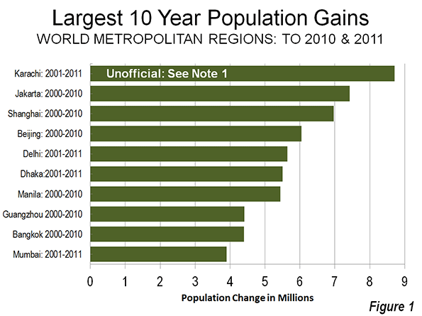
    In a piece called The Beauty of Urban Planning from Space, the Sustainable Cities Collective highlights views from space of uniquely designed street pattern designs in various cities around the world. There are ten examples that illustrate the zenith of urban planning.

    As attractive as the street patterns are, they highlight the inevitable inability of designers, or anyone else for that matter, to influence much more than small changes in the overall urban form.

    The Incomplete Street Patterns

    This point is evident in eight of the 10 urban areas illustrated, where the unique street pattern comprise only part of a much bigger city. The eight are Belo Horizonte, Brazil; Brasilia, Brazil, Washington, DC; New Haven, CT; La Plata, Argentina; Jaipur, India; Adelaide, Australia; and Canberra, Australia.

    The best known example may be Washington, DC, where L’Enfant’s street pattern served most of the city for more than a century, which is probably a world record for a growing urban area. Yet, today, L’Enfant’s design covers less than five percent of the urban area that today has more people than the nation at the time L’Enfant received his position.

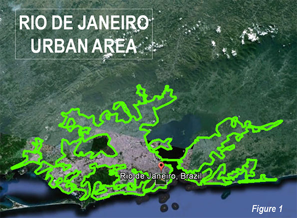
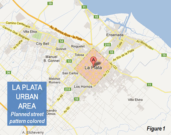
    In La Plata (See end note on La Plata) the street design comes the closest to covering the whole urban area (Figure 1, from Google Maps). Taking design a bit further, every street is numbered in this city that was planned to be the capital of Argentina’s largest province (Buenos Aires, which is separate from the provincial equivalent city of Buenos Aires). Three other of the examples were also new cities planned as capitals, including Brasilia, Canberra and, of course, Washington.

    Stagnant Cities

    The other two examples are a dying mining town (El Salvador, Chile), which has lost more than two thirds of its population and an Italian medieval fortress town, Palmanova. The latter is more a museum than a dynamic urban area. It is confined to its original area and its population could fit into London’s Royal Albert Hall (approximately 5,000).

    Belo Horizonte, Brazil

    The Belo Horizonte Centro (Note on Belo Horizonte) street pattern is unique. It was part of the inspiration for my Urban Tours by Rental Car website (rentalcartours.net) and a map of Centro was incorporated into the logo (Figure 2).
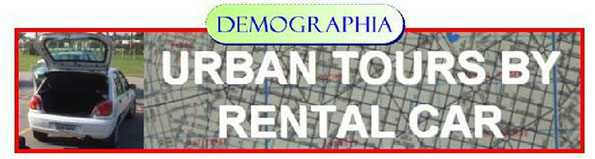

    Figure 2

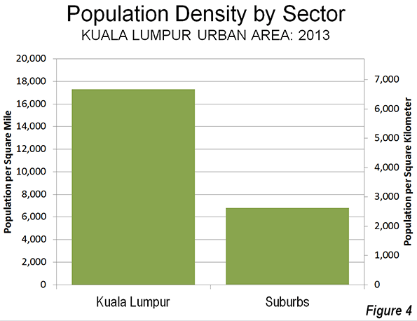
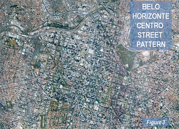
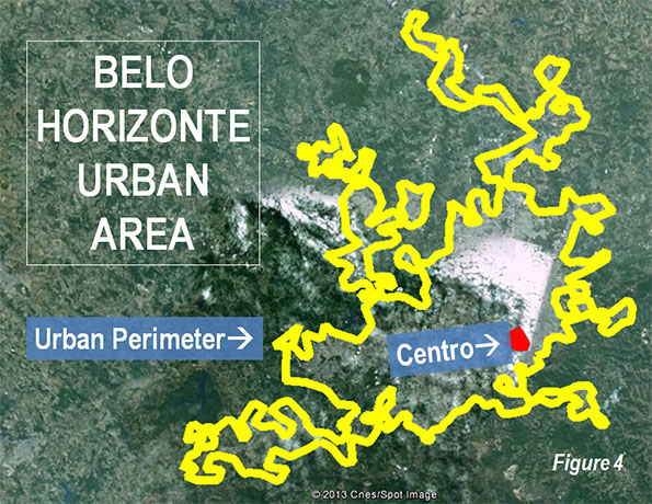
    In Centro, diagonals are superimposed on a conventional north-south/east-west street pattern (Figure 3, from Google Earth). However Centro’s street pattern covers less than one percent of the Belo Horizonte urban area, three square miles out of more than 400 (five square kilometers out of 650). Figure 4 shows Centro in red, engulfed by the much larger urban area, outlined in yellow.

    The first rental car tour described the Belo Horizonte Centro street pattern:

    Belo Horizonte represents both the best and worst in urban planning. The core has, at least from map inspection, a pleasing street layout. In a flair that outdid L’Enfant’s Washington diagonals, Belo Horizonte Centro has a grid of streets on which is superimposed a grid of diagonals. Of course, the resulting eight street intersections make traffic more of a difficulty than with the four that are usual or the grade separations of Brasilia. Centro has a number of wide boulevards, many with green, treed medians and, in the Brazilian style, some with four roadways — center express lanes and outside local lanes. These “three median” streets, give a pleasing feeling. The overall result is an impression similar to that of Barcelona, and a particularly attractive core that would do most European cities proud. 

    But, not far from Centro the randomness begins. To the north is the river, and clearly no attempt
    was made to continue the pattern beyond that. To the south are hills that would have precluded expansion of the plan. Nor does the pattern extend far to the less challenging east or west

    Unscrambling Means and Ends

    Street patterns from space provide no indication of urban planning’s effectiveness, nor of urban policy of which planning is a part. Planning is a means, not the end of cities.

    Over the past two centuries, billions of people have moved to cities. They did not move for the fountains, architecture, or museums (otherwise they would all live in the ville de Paris or Manhattan). In short, urban planning principles of any era have had little impact in the growth of cities.

    Urban planning’s current "top-down" genre is rather new. Until the British Town and Country Planning Act of 1947 and similar measures, planners contented themselves to design street networks (which the Sustainable Cities Coalition highlights so well) and other necessary infrastructure, such as water and sewer networks. Their handiwork is obvious in the 19th century designed street grid of Manhattan, the straight streets of Phoenix and the modified grid of the Toronto metropolitan area. These are the broad functions emphasized by New York University Professor Shlomo Angel in his Planet of Cities.

    Now, urban planning can work against the very justification of cities, the prosperity of its residents.

    Successful Cities

    The success of urban policy (and urban planning) can be judged by how well the purpose of the city is served – the reason people moved there in the first place. The purpose of the city was well articulated by former World Bank principal planner Alain Bertaud:  Large labor markets are the only raison d’être of large cities. Cities are much more about economics than aesthetics. (See end note on Sustainability).

    The successful city will facilitate greater affluence – higher discretionary incomes – among its residents.

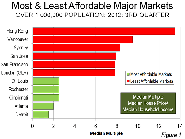
    Regrettably, there are notable failures in this regard. For example, the urban containment policies of smart growth, which ration land and raise the price of housing relative to incomes, have been adopted in cities from Sydney to Toronto and Portland. As a result, residents have less money to spend after taxes and paying for necessities and are less affluent than they would be without such policies. In his introduction to the 9th Annual Demographia Housing Affordability Survey, New Zealand’s Deputy Prime Minister Bill English pointed out that higher house prices that occur when land is "made artificially scarce by regulation that locks up land for development."

    Another problem is evident in excessive traffic congestion and slower travel times. Getting around town quickly contributes to greater economic growth and discretionary incomes. Public policy must facilitate mobility throughout the urban area. The mode — the means — is not important, the access is. Transit services are appropriate where time competitive with the automobile, such as to the largest downtowns (See Transit Legacy Cities). However, because of its unparalleled ability to provide rapid mobility throughout the urban area, public policy must also ensure a minimum of traffic congestion and effective access by cars and commercial trucks. The evidence is clear that the higher densities preferred by modern urban planning impede rapid mobility throughout the urban area (see Urban Travel and Urban Population Density).

    Finally, by facilitating housing affordability and more free-flowing traffic, the important objective of alleviating poverty is served (an objective that cannot sustainably be served without economic growth)

    The Beauty of Urban Planning from the Ground

    The "beauty of urban planning" is reliably appreciated from the ground, not from space. The test is how well people live, not what the city looks like. The subject is people, not architecture or urban form (see Toward More Prosperous Cities: A Framing Essay on Urban Policy, Planning, Transport and the Dimensions of Sustainability).

    Wendell Cox is a Visiting Professor, Conservatoire National des Arts et Metiers, Paris and the author of “War on the Dream: How Anti-Sprawl Policy Threatens the Quality of Life.

    —–

    Note on La Plata: La Plata is in the Buenos Aires metropolitan area, approximately 35 miles (60 kilometers) south of Centro in Buenos Aires. However, it is a separate urban area because of a comparatively break in the continuous urbanization between La Plata and Buenos Aires. Buenos Aires province is by far the nation’s largest provincial level jurisdiction, with a population five times as great as the city of Buenos Aires. Much of the population is concentrated near the city of Buenos Aires, with which it forms one of the world’s megacities. The Buenos Aires also has the largest land area and would rank 6th if it were in the United States (nearly as large as New Mexico).

    Note on Belo Horizonte: Belo Horizonte is capital of the state of Minas Gerais. Belo Horizonte is Brazil’s third largest urban area, after Sao Paulo and Rio de Janeiro, with a population of more than 5 million — approximately the population of the Miami urban area (which stretches from southern Dade County to northern Palm Beach County)

    Note on Sustainability: Urban policies that would artificially constrain urban expansion (such as with urban growth boundaries) and discourage automobile travel have often been cited as principal strategies for reducing greenhouse gas emissions. However, important reports indicate little potential for greenhouse gas reductions from these policies, with the overwhelming share resulting from improved fuel economy. Moreover, recent research in England suggested that such policies should not "automatically be associated with the preferred growth strategy" (see Questioning the Messianic Conception of Smart Growth).

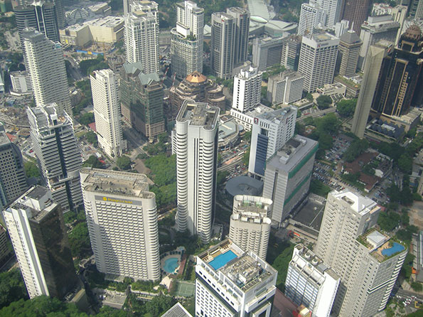
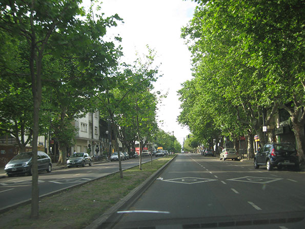
    Photo: Belo Horizonte Centro from Nova Lima (by author)

  • The (White) British are Leaving (London)

    As reported in The Evolving Urban Form: London, last July the Greater London Authority (GLA), located inside the Green Belt, grew strongly from 2001 to 2011, though remains well below its peak estimated population in 1939. Substantial domestic migration from the core area to the exurbs was a major contributor to their growth during between 2000 and 2010 (Figure 1).

    Obviously, with all that growth and all that domestic out-migration, international migration had to be driving the population growth in the GLA. The British Broadcasting Corportation (BBC) confirms that, reporting that, for the first time "white British" residents of GLA represent a minority of the population. At 45 percent, this population segment is down from 58 percent in 2011.

    Whites, however, remain a majority, with more than 1.3 who do not consider themselves British, according to the 2011 census data. The combined white population is nearly 60 percent of the GLA total. The table below provides the ethnic data as reported by the Office for National Statistics.

    Greater London Authority: Ethnicity
    2011 Census
    All categories: Ethnic group      8,173,941 100.0%
    White: English/Welsh/Scottish/Northern Irish/British      3,669,284 44.9%
    White: Irish         175,974 2.2%
    White: Gypsy or Irish Traveller              8,196 0.1%
    White: Other White      1,033,981 12.6%
    Mixed/multiple ethnic group: White and Black Caribbean         119,425 1.5%
    Mixed/multiple ethnic group: White and Black African            65,479 0.8%
    Mixed/multiple ethnic group: White and Asian         101,500 1.2%
    Mixed/multiple ethnic group: Other Mixed         118,875 1.5%
    Asian/Asian British: Indian         542,857 6.6%
    Asian/Asian British: Pakistani         223,797 2.7%
    Asian/Asian British: Bangladeshi         222,127 2.7%
    Asian/Asian British: Chinese         124,250 1.5%
    Asian/Asian British: Other Asian         398,515 4.9%
    Black/African/Caribbean/Black British: African         573,931 7.0%
    Black/African/Caribbean/Black British: Caribbean         344,597 4.2%
    Black/African/Caribbean/Black British: Other Black         170,112 2.1%
    Other ethnic group: Arab         106,020 1.3%
    Other ethnic group: Any other ethnic group         175,021 2.1%
    Source: Office for National Statistics, United Kingdom
  • Transit Legacy Cities

    Transit’s greatest potential to attract drivers from cars is the work trip. But an analysis of US transit work trip destinations indicates that this applies in large part to   just a few destinations around the nation. This is much more obvious in looking at destinations than the more typical method of analysis, which looks at the residential locations of commuters. This column is adapted from my new Heritage Foundation Backgrounder "Transit Policy in an Era of the Shrinking Federal Dollar."

    Transit Legacy Cities

    Transit commuting is heavily concentrated to destinations in just the six core cities (historical core municipalities) of New York, Chicago, Philadelphia, San Francisco, Boston and Washington (Backgrounder Chart 9). I call them the "transit legacy cities," because their high transit market shares relate to their development before the automobile became dominant. Because there is such a lack of clarity in the use of terms that apply to cities, it is important to emphasize that the transit legacy cities are municipalities, not the surrounding metropolitan areas or urban areas, where the majority of residents live (Note 1). 


    The transit legacy cities account for nearly 55 percent of the nation’s transit commuters, by work trip destinations, according to the American Community Survey (2008-2010). By contrast, the transit legacy cities have an overall national employment market share barely one-tenth their national transit share (6 percent). Moreover, combined, the transit legacy cities cover a land area little larger than the core city (municipality) of Jacksonville, Florida.

    At the same time, the "other side of the coin" is that commuting to other destinations is dominated by the automobile, from the suburbs in metropolitan areas with transit legacy cities, and even more so in the other 45 major metropolitan areas (with more than 1,000,000 population) and the balance of the nation.

    Legacy Cities: Transit’s Strength

    The extent of the concentration in the six transit legacy cities is illustrated in Backgrounder Table 1. In some ways, transit is, first and foremost,  really a New York story. More than one-third of all transit work-trip commuting is to destinations in the core city of New York. The dominance is even greater for high-capacity subways/elevated services, a mode in which where New York represents two-thirds of national commuting.

    The Key: Large, Concentrated, Well Served Downtowns: The concentration of transit commuting in the six transit legacy cities reflects the factor that is probably more responsible than any other for attracting people from cars to transit. This is a highly concentrated downtown area (central business district, or "CBD") from which a dense network of rapid transit services radiates.

    The six transit legacy cities are also home to the six largest CBDs in the nation, where transit’s share of commuting is far higher than compared to the rest of the nation. Approximately three quarters of commuters to the sprawling Manhattan CBD in New York (south of 59th Street) commuted by transit in 2000. Less well known is that New York also contains the CBD with the second largest transit work trip destination, downtown Brooklyn (58 percent), which is followed by downtown Chicago (55 percent).

    In addition, between nearly 40 percent and more than 50 percent of commuters used transit to the CBDs of Boston, San Francisco, Philadelphia and Washington. While covering a land area less than one-half the size of Orlando’s Walt Disney World, these downtowns accounted for 35 percent of national transit commuting.

    Outside the Transit Legacy Cities: Automobile and Work at Home Country

    So what about the 94 percent of US commuters who work outside the transit legacy cities? The answer is that the automobile dominates, and transit has been overtaken by working at home. In the suburban areas of metropolitan areas with transit legacy cities, the car carries 18 times as many people to work locations as transit. In the core municipalities of the 45 major metropolitan areas without legacy cities, cars carry 29 times as many commuters as transit, and 51 times as many in the suburbs. Outside the nation’s major metropolitan areas, cars carry 82 times as many commuters as transit (Backgrounder Table 1)

    Further, outside the transit legacy cities, working at home (including telecommuting) provides access to twenty percent more jobs than transit (Backgrounder Table 3).

    An American Love Affair with the Automobile?

    The enduring myth of the American love affair with automobile is countered by the huge transit market shares to city downtowns . For example, commuters to Manhattan are five times as likely to use transit as cars. On the other hand, commuters to the edge city of Parsippany, on the I-287 corridor in suburban New Jersey are 50 times as likely to use their cars as transit. Yet both employment centers serve the same labor market. The issue is not preferences, it is rather rational choice. It would be irrational for most people to commute to Manhattan by car, principally because of the traffic congestion and cost, particularly for parking. It would similarly be irrational for most people to commute to Parsippany by transit, because it either could not be done at all, or it would take too long.

    Transit’s work trip destination market share is an effective measure of its relevance to the market.

    And lest anyone should counter that the answer is more money, consider this.

    A Cost Not A Revenue Problem

    Portland (with a core city that is not a legacy city) has long been held out as a model for improving transit. Yet, after billions of dollars in federal and local tax subsidies, more than 50 times as many people travel to work to suburban locations by car as by transit. More than five times as many work at home as use transit, and working at home costs taxpayers virtually nothing. Yet, despite all these billions, Portland’s transit system is in crisis. Tri-Met’s  Executive Director Neil McFarlane has warned of 70 percent service cuts over 12 years without substantial changes to union contracts.

    Transit’s fundamental problem is not insufficient revenue but insufficient cost control. Since 1983, national transit expenditures have risen at an inflation-adjusted rate nine times that of its increase in commuters (Note 2). Even if costs were under control, it would be financially impossible to provide automobile-competitive transit throughout the modern urban area, as Professor Jean-Claude Ziv and I showed in our WCTRS paper (Megacities and Affluence: Transport and Land Use Considerations).

    Celebrating Transit

    Yet, beyond its inability to convert generous taxpayer subsidies into corresponding ridership increases, transit deserves credit for the large number of people it moves to jobs in the legacy cities. This success should be celebrated although it remains an impossible, prohibitively expensive, dream elsewhere.

    Wendell Cox is a Visiting Professor, Conservatoire National des Arts et Metiers, Paris and the author of “War on the Dream: How Anti-Sprawl Policy Threatens the Quality of Life.”

    —-

    Note 1: Each of the transit legacy cities has a lower population than the surrounding suburbs. This ranges from nearly 45 percent of the population in the suburbs of the New York metropolitan area to little more than 10 percent in Washington.

    Note 2: Within the first 30 days of my time on the Los Angeles County Transportation Commission, I became convinced that transit’s principal problem was cost control (see Toward More Prosperous Cities). This was then and today remains clear from the above-inflationary escalation of unit costs. Regrettably that trend continues today and has seriously impeded transit’s ability to increase ridership.

    —–

    Photo: Downtown Philadelphia (by author)

  • America’s Oldest Cities

    One of the most important turning points in the social history of the United States occurred at the beginning of the 1940s. This is not about Pearl Harbor or the Second World War, but  rather about the economic, housing and transportation advances that have produced more affluence for more people than ever before in the world.

    After being delayed by World War II, people began moving from the overcrowded cities to spacious (for that time) houses in the suburbs. They increasingly traveled to work and other destinations by car. These trends were at least two decades old at the time, but had been put on hold by the Great Depression. The prewar city (metropolitan area) was considerably denser, more oriented to mass transit and largely monocentric. By 2010, all major metropolitan areas had developed an urban form that was overwhelmingly suburban and polycentric, with the rise of edge cities and the even greater dispersion of edgeless cities. On average, areas outside the traditional downtowns (central business districts) accounted for 90 percent of metropolitan employment in 2000, ranging from a high of more than 95 percent in metropolitan areas like Phoenix, San Jose and Tampa-St. Petersburg to a low of 80 percent in New York.

    Rating Metropolitan Areas by Pre-War Residential Development

    Although dense urban cores persist in most metropolitan areas, their size and significance varies greatly. This can be illustrated by data from the 2007- 2011 American Community Survey, which makes it possible to rank metropolitan areas by their shares of pre-World War II residential development.

    This article uses the percentage of dwelling units, both owner and renter occupied constructed before 1940 to rate the ages of the nation’s 51 major metropolitan areas (those with more than 1 million population in 2010).  Overall, America’s major metropolitan areas are overwhelmingly postwar in their urban development, with approximately 14% of residences built before 1940. By comparison the 1940 populations of today’s major metropolitan counties were just 35 percent of their 2010 populations.

    Oldest Metropolitan Areas

    The nation’s oldest metropolitan areas, not surprisingly, are concentrated in the Northeast and the upper Midwest. Overall population growth has been modest in these regions compared especially to the South and the West.

    • Boston is the oldest with 35.7% of its residences built before 1940. This varies from 55.6% in the historical core city of Boston to roughly 32 percent in the suburbs, which are the oldest themselves in the country.   
    • Nearby Providence is the second oldest metropolitan area, with 33.1% of its dwellings built before 1940. The city of Providence is also the second oldest among historical core municipalities, at 58.8%. Providence overall share of pre-1940 housing stands at 30.2%. It is notable that the Office of Management and Budget now considers Boston and Providence to be in the same combined statistical area (consolidated metropolitan area).
    • Buffalo is the nation’s third oldest metropolitan area with 30.5% of its residences preceding 1940. The core city of Buffalo is the oldest historical core municipality, with 62.8% of its housing predating 1940. Buffalo suburbs, however, are considerably newer, with only 20.1% older than 1940.
    • New York is the nation’s fourth oldest metropolitan area, with 28.9% of its dwellings having been built before 1940. The city of New York has a much lower prewar housing percentage than the top four, largely because of the substantial amount of green field housing built in the more distant sections of Queens and especially in Staten Island during the 1950s and 1960s. New York’s suburbs, which have accounted for nearly all of the growth in the metropolitan area have a pre-1940 housing share of 18.9%.
    • Rochester is the nation’s fifth-oldest metropolitan area, with 28.8% of its housing prewar. The historical core municipality of Rochester has a high 58.1% of its housing in prewar stock, while the suburbs have a 21.1% share.

    The next five oldest metropolitan areas are Pittsburgh, at 27.2%, Milwaukee and 23.3%, Cleveland 22.7% Chicago and 21.3% and Philadelphia at 21.2%. Among these, the oldest historical core municipalities are Cleveland, at 51.9% and Pittsburgh at 50.3%. Pittsburgh has the highest suburban pre-1940 housing stock, at 23.5%, the third highest in the nation after Boston and Providence (Figure 1).

    Youngest Metropolitan Areas

    The nation’s youngest major metropolitan areas are concentrated in the South and West, comprising 28 of the 51.

    • Las Vegas is the youngest major metropolitan area.  "Sin City" has had the greatest percentage population growth since 1940, and is now approaching a population of 2 million, compared to less than 20,000 in 1940. Only 0.3% of the housing stock in Las Vegas was built pre-war.
    • Phoenix, which is grown from little more than 200,000 people in 1940 to more than 4 million people today, has a pre-1940 housing stock of only 1.0%. The city of Phoenix has a miniscule pre-1940 housing stock of 1.9%.
    • The third youngest major metropolitan area is Orlando with 1.7% of its housing stock having been built before 1940.
    • Perhaps surprisingly, Miami is the fourth youngest major metropolitan area with only 2.2% predating 1940. The historical core municipality of Miami, however, has one of the highest densities in the United States and a comparatively strong 10.6% of its housing is prewar.
    • Austin is the fifth youngest major metropolitan area, with 2.5% of its housing predating the war.


    Tampa St. Petersburg, Houston, Riverside-San Bernardino, Raleigh and Dallas-Fort Worth round out the 10 youngest major metropolitan areas. Each of these has a pre-1940 housing stock between 2.7% and 3.1% (Figure 2).

    Data for all metropolitan areas is provided in the table.

    Table
    Share of Housing Units Constructed Before 1940
    US Metropolitan Areas Over 1,000,000 Population in 2010
    Rank Metropolitan Area Metropolitan Area Historical Core Municipality(s) Rank Suburbs Rank HCM
    1 Boston, MA-NH 35.7% 55.6% 4 32.4% 1 1
    2 Providence, RI-MA 33.1% 58.8% 2 30.2% 2 1
    3 Buffalo, NY 30.5% 62.8% 1 20.1% 5 1
    4 New York, NY-NJ-PA 28.9% 41.3% 12 18.9% 6 1
    5 Rochester, NY 28.8% 58.1% 3 21.1% 4 1
    6 Pittsburgh, PA 27.2% 50.3% 7 23.5% 3 1
    7 Milwaukee,WI 23.3% 38.9% 16 14.0% 10 1
    8 Cleveland, OH 22.7% 51.9% 6 15.4% 8 1
    9 Chicago, IL-IN-WI 21.3% 43.8% 10 11.6% 13 1
    10 Philadelphia, PA-NJ-DE-MD 21.2% 39.1% 14 14.9% 9 1
    11 San Francisco-Oakland, CA 20.4% 45.5% 9 9.2% 15 1
    12 Hartford, CT 19.3% 43.1% 11 16.7% 7 1
    13 Cincinnati, OH-KY-IN 17.2% 41.3% 13 12.6% 11 1
    14 St. Louis,, MO-IL 15.8% 54.4% 5 10.3% 14 1
    15 Minneapolis-St. Paul, MN-WI 15.0% 46.7% 8 6.1% 24 1
    16 Baltimore, MD 14.4% 39.0% 15 6.8% 22 1
    17 Portland, OR-WA 13.1% 31.8% 19 5.5% 25 2
    18 Columbus, OH 12.5% 12.6% 31 12.4% 12 2
    19 Louisville, KY-IN 12.3% 16.9% 27 8.1% 20 2
    20 Indianapolis. IN 12.1% 15.6% 28 8.8% 16 2
    21 Los Angeles, CA 12.0% 20.2% 26 8.3% 18 2
    22 Detroit,  MI 12.0% 31.7% 22 8.2% 19 1
    23 Kansas City, MO-KS 11.9% 21.5% 24 8.8% 17 2
    24 New Orleans. LA 11.7% 31.7% 21 3.0% 35 1
    25 Seattle, WA 11.1% 29.9% 23 6.1% 23 2
    26 Richmond, VA 9.0% 32.0% 18 4.1% 31 2
    27 Salt Lake City, UT 8.9% 31.8% 20 3.1% 34 2
    28 Washington, DC-VA-MD-WV 8.6% 36.1% 17 4.6% 29 1
    29 Denver, CO 7.1% 21.4% 25 2.1% 43 2
    30 Birmingham, AL 6.8% 15.6% 29 4.5% 30 2
    31 Oklahoma City, OK 6.7% 8.8% 34 4.9% 27 2
    32 Memphis, TN-MS-AR 5.6% 8.8% 35 2.3% 41 2
    33 Virginia Beach-Norfolk, VA-NC 5.4% 1.1% 50 7.0% 21 2
    34 San Jose, CA 5.3% 5.5% 42 5.1% 26 3
    35 Nashville, TN 5.1% 6.9% 39 3.9% 33 2
    36 San Antonio, TX 5.1% 5.7% 40 4.1% 32 2
    37 Sacramento, CA 4.6% 11.5% 32 2.7% 36 3
    38 San Diego, CA 4.3% 7.0% 38 2.1% 42 2
    39 Charlotte, NC-SC 4.0% 3.3% 46 4.6% 28 2
    40 Jacksonville, FL 3.8% 4.7% 43 2.3% 40 2
    41 Atlanta, GA 3.2% 14.5% 30 2.0% 45 2
    42 Dallas-Fort Worth, TX 3.1% 5.7% 41 2.5% 38 2
    43 Raleigh, NC 2.8% 3.1% 47 2.6% 37 3
    44 Riverside-San Bernardino, CA 2.7% 7.9% 37 2.5% 39 3
    45 Houston, TX 2.7% 4.6% 45 1.6% 47 2
    46 Tampa-St. Petersburg, FL 2.7% 8.4% 36 1.9% 46 2
    47 Austin, TX 2.5% 3.0% 48 2.0% 44 3
    48 Miami, FL 2.2% 10.6% 33 1.5% 48 2
    49 Orlando, FL 1.7% 4.7% 44 1.3% 49 3
    50 Phoenix, AZ 1.0% 1.9% 49 0.6% 50 3
    51 Las Vegas, NV 0.3% 0.3% 51 0.3% 51 3
    Total 13.6% 25.5% 9.0%

    Notes:
    Calculated from American Community Survey 2007-2011
    HCM: Historical core municipality category: (1) Pre-War & Non-Suburban, (2) Pre-War & Suburban, (3) Post-War Suburban. There is one HCM per metropolitan area, except in in San Francisco-Oakland (San Francisco and Oakland) and Minneapolis-St. Paul (Minneapolis & St. Paul). Otherwise, the HCM is the first named municipality in the metropolitan area name, except in Virginia Beach-Norfolk, where it is Norfolk and Riverside-San Bernardino, where it is San Bernardino.

    Not All Core Cities are the Same

    This analysis indicates the substantial differences between not only the nation’s metropolitan areas, but even more the differences between the core municipalities. For example, the core cities of Phoenix and Philadelphia have approximately the same population. Yet they could not be more different. Philadelphia has a long history, including a time as the nation’s largest city around the period of the Revolutionary War. Phoenix, in contrast, is a product of the post-World War II boom. By 2010, Phoenix had become the nation’s 6th largest municipality. Its 65,000 population in 1940 would rank it around 600th today. Figure 3 shows the average, maximum and minimum pre-war housing stock percentages by metropolitan area, historical core municipality and suburbs.

    Categorizing Core Municipalities

    In Suburbanized Core Cities, we classified the nation’s core municipalities into three categories, based upon the extent of their pre-automobile development (This was described further in a paper co-authored with Peter Gordon of the University of California, Cities in Western Europe and America: Do Policy Differences Matter?).

    The categories included "Pre-War Non-Suburban," which are core municipalities that were of high density in 1940 and have expanded their boundaries little since that time. Philadelphia, Baltimore and Providence are examples of these. The second category was "Post-War and Suburban," which includes municipalities that had a dense core of more than 100,000 residents in 1940, but contain large swaths of post-War suburban development (such as Los Angeles, Milwaukee and Atlanta). The third category was Post-War Suburban, which includes core cities that had little or no dense urban core in 1940 (such as Phoenix, Austin and San Jose).

    Figure 4 illustrates the huge differentials in the pre-1940 housing stock between the metropolitan areas as classified by their historical core municipalities.

    Commonalities

    Even so, metropolitan areas are much more similar than their historical core municipalities. The bottom line is one different than one tends to hear in the urban-core-oriented press. In most of America the detached house predominates and virtually all development since 1940 has been suburban, both inside and outside the historical core municipalities.

    Wendell Cox is a Visiting Professor, Conservatoire National des Arts et Metiers, Paris and the author of “War on the Dream: How Anti-Sprawl Policy Threatens the Quality of Life.”

    —-

    Photograph: Boston (by author)

  • Dispersion in the World’s Largest Urban Areas

    No decade in history has experienced such an increase in urban population as the last. From Tokyo-Yokohama, the world’s largest urban area (population: 37 million) to Godegård, Sweden, which may be the smallest (population: 200), urban areas added 700 million people between 2000 and 2010.

    Nearly one in 10 of the world’s new urban residents were in the fastest growing metropolitan regions (see: Definition of Terms used in "The Evolving Urban Form" Series), which added nearly 60 million residents. They ranged from a an estimated increase of more than 8.5 people in Karachi (Note 1) to 3.9 million people in Mumbai (Figure 1). The average population growth in these 10 metropolitan regions was 6 million, approximately the population of Dallas-Fort Worth or Toronto, which were fast-growers on their own in comparison to other high income world cities.

    By comparison, the largest growth over any single decade over the past half century in US metropolitan areas has been less than one half of the 6 million average: 2.43 million in New York (1920s) and 2.37 million in Los Angeles (1950s). Only Tokyo-Yokohama (1960s) and Shenzhen (1990s) have added more than 5 million people in a single decade before the last decade.

    Growth has been overwhelmingly concentrated outside the urban cores (Note 2) in these 10 fastest growing metropolitan region. Excluding Karachi (for which sufficient data is unavailable), approximately 85 percent of the growth was outside the urban cores (A 42 million increase in the suburbs and 8 million in the urban cores).

    Dispersion in World Megacities

    This is consistent with the findings of The Evolving Urban Form series, which is now two years old. These analyses have generally demonstrated that urban spatial expansion (pejoratively called "sprawl") is world-wide and contrary to some perceptions, not limited to the United States. Cities expand geographically as they add population, though this organic tendency is sometimes contained by urban planning. Peripheral growth is virtually always at lower densities than in urban cores, which means that as cities grow they tend to become less dense (Note 3).

    This process ironically is sometimes accelerated by planning decision-making. London‘s greenbelt —which banned the extension of housing into the near periphery of the city — has result in even greater sprawl to far outside the principal urban area. This trend since World War II, has forced commuters to travel longer times and distances to the urban core (All of metropolitan London’s growth has been suburban for 100 years, with a loss of 1.8 million in inner London, while the suburbs and exurbs grew by 10.5 million).

    The Evolving Urban Form has now covered 23 of the world’s 28 megacities (Note 4). As the Table indicates, population growth has been strongly oriented away from the urban cores and toward more suburban areas

    Table
    Summary of Megacity Population Trends
    URBAN AREA CORRESPONDING METROPOLITAN REGION
    Bangkok 10 Years: 55% of growth outside core municipality
    Beijing 10 Years: 99% of growth outside core districts
    Buenos Aires 60 Years: 100%+ of growth outside core municipality
    Cairo 16 Years: 2/3 of growth outside core governate
    Delhi 10 Years: 90% of growth outside core districts
    Dhaka 10 Years: 50% of growth outside core municipalities
    Guangzhou-Foshan 10 Years: 75%+ of growth outside core districts
    Istanbul 25 Years: 100%+ growth outside core districts
    Jakarta 20 Years: 85% of growth outside core jurisdiction
    Kolkata 20 Years: 95% of growth outside core municipality
    Los Angeles 60 Years: 85% growth outside core municipality
    Manila 60 Years: 95% growth outside core municipality
    Mexico City 60 Years: 100%+ of growth outside core districts
    Moscow 8 Years: 95% of growth outside core districts
    Mumbai 50 Years: 98% of growth outside core districts
    New York 60 Years: 95% growth outside core municipality
    Osaka-Kobe-Kyoto 50 Years: 95% of growth outside core municipalities
    Rio de Janeiro 10 Years: 95% of growth outside core districts
    Sao Paulo 20 Years: 2/3 of growth outside core municipality
    Seoul 20 Years: 115%+ of growth outside core municipality
    Shanghai 10 Years: 99% of growth outside core districts
    Shenzhen 10 Years: 70%+ of growth outside core districts
    Tokyo 50 Years: 95% of growth outside core municipalities


    In US examples, New York and Los Angeles, 95 percent and 85 percent of growth respectively of their corresponding metropolitan region growth has occurred outside the core municipalities since 1950. But these US regions are joined by middle income Buenos Aires and Mexico City where all growth has been outside urban core since 1950. In lower income Manila, 95 percent of the growth has been outside the urban core since 1950.

    The world’s largest metropolitan region, Tokyo-Yokohama, has experienced a virtual monopoly of suburban growth over the past 50 years, as has Japan’s second largest metropolitan region, Osaka-Kobe-Kyoto.

    Over the past quarter century, all of Istanbul‘s growth has been outside the urban core. The urban expansion has been going on for much longer, as is illustrated over the past 60 years (Figure 2). Cairo‘s urban expansion is similarly substantial (Figure 3). In one of the developing world’s poorer megacities, nearly all population growth in the Mumbai region has been outside the urban core for 50 years

    For the last 20 years, more than 115 percent of the growth in the Seoul-Incheon metropolitan region has been outside the core city. In the world’s second largest urban area, Jakarta (Jabotabek), growth is also strongly suburban, accounting for 85 percent of growth over the past two decades. In Kolkata suburban growth has been 95 percent over the same two decades.

    The same tendency is evident in the other megacities. Over the past decade or two, nearly all population growth in China’s four megacities (Shanghai, Beijing, Guangzhou-Foshan and Shenzhen), Delhi and Rio de Janeiro has been outside the urban cores.

    Dispersion in Other Large Urban Areas

    The Evolving Urban Form has also examined smaller urban areas. The same pattern of dispersal is evident there as well even in traditionally compact cities. Zürich, for example has had all of its growth outside the core city since 1950. All of the growth in Barcelona and Milan has been outside the core cities for 40 years. Even high density Hong Kong has experienced all of its growth outside the urban core for three decades. Low income Addis Abeba indicates a pattern of urban expansion is not unlike that of Istanbul or Cairo (Figure 4). In megacity wannabe Chicago (1.4 million short), 125 percent of growth since 1950 has been outside the core; this number reflects that the central city has been shrinking even as the periphery expands. Even in fast-growing Dallas-Fort Worth, more than 80 percent of population growth over the past 60 years has been outside the city of Dallas (which itself is largely suburban in form, see Suburbanized Core Cities).

    The one notable exception to the peripheral growth model is Quanzhou (Fujian, China), which is developing under an even more dispersed pattern, described by Yu Zhu, Xinhua Qi, Huaiyou Shao and Kaijing He at Fujian Normal University. Typically, urban areas expand from an urban core on the periphery. Quanzhou is experiencing "in situ" urbanization, the spontaneous conversion of rural areas into urban development that does not expand from the urban core. The result is a sparsely developed urban area (especially for China), with plenty of land for potential infill development in the future.

    The Future of Urbanization

    It is likely that urban areas will continue to expand as they grow larger, consistent with what appears to be both economic pressures and market preferences for lower cost, more spacious housing. For example, fast growing Ho Chi Minh City is expected to see virtually all of its population increase over the next 15 years outside the urban core. Not surprisingly Shlomo Angel, Jason Parent, Daniel Civco, Alexander Blei and David Potere at the Lincoln Land Institute project significant expansions of urban land by mid-century. And, Angel, in his Planet of Cities, notes how important it is to allow the expansion, in order to improve the quality of life for the majority of people, who deserve to live as well as people in the West.

    —-

    Note 1: Incomplete results of the 2011 Pakistan census have been reported by media in both Pakistan and India. However, no official announcement of the results has been identified from Pakistan census authorities. The Karachi population increase would be the largest metropolitan region 10 year rate of increase in history.

    Note 2: Urban cores are generally the core historical jurisdiction, which often contains substantial non-core areas, even outside the United States. Core district data within these jurisdictions is used where available. Thus, this estimate over-states the urban core population increase.

    Note 3: The driving factor in declining densities is principally transportation advances. Substantial urban expansion began with the coming of mass transit in the 19th century. However an even greater expansion began occurring with the availability of the automobile. As automobile orientation replaces transit orientation, densities tend to decline until it nearly all travel is by automobile. Even among automobile oriented urban areas, there can be large differences in urban densities. For example, transit’s market share in the Boston urban area is substantially greater than in the Los Angeles urban area. Yet the Los Angeles urban area has a population density of 7000 per square mile (2,700 per square kilometer), more than three times that of the Boston urban area, at 220 per square mile (850 per square kilometer). The difference is that in Los Angeles residential development has largely occurred densities determined by the market, with single-family housing being typically built on 1/4 acre lots. In Boston, suburban lot sizes were forced higher by urban planning requirements for large lot zoning. The result is much greater land consumption than would have occurred if people’s preferences (the market) had driven development. If Los Angeles had been developed at the same low density as Boston, its urban land area would equal that of the state of Connecticut.

    Note 4: Megacities are urban areas with more than 10 million population. Five megacities remain to be described in The Evolving Urban Form (Karachi, Lagos, Nagoya, Paris and Teheran). Corresponding metropolitan regions are used for this analysis, since historic urban area data (areas of continuous urban development) is not available for most nations.

    Wendell Cox is a Visiting Professor, Conservatoire National des Arts et Metiers, Paris and the author of “War on the Dream: How Anti-Sprawl Policy Threatens the Quality of Life.”

    —–

    Photo: New detached housing, suburban Tokyo-Yokohama (by author).

  • The Evolving Urban Form: Rio de Janeiro

    Rio de Janeiro was the capital of Brazil from before independence from Portugal was declared in 1822. That all changed in 1960, when the capital moved to the modern planned city of Brasilia, more than 500 miles (800 kilometers) inland. The move, however, did nothing to slow Rio de Janeiro’s growth, as the metropolitan area (as designated by Brazil’s census agency, the Instituto Brasileiro de Geografia e Estatística),  added 7 million people – a 150 percent increase in population – over the ensuing 60 years

    The placement of the federal government in Brasilia has had positive economic impacts on the interior, but it did not make Rio de Janeiro less crowded (factor Indonesian officials should note as they consider moving the capital from Jakarta,).

    The Urban Area

    However, it is clear that Rio de Janeiro has fallen behind even faster growing Sao Paulo, which has become one of the world’s 10 largest urban areas (with a population of approximately 20.5 million in 2013). Nonetheless, as an urban area with a 2013 population of 11.6 million (Figure 1) Rio de Janeiro still ranks among the world’s megacities (urban areas over 10 million).

    The urban area covers 720 square miles (1,870 square kilometers),   a population density of 16,100 per square mile (6,200 per square kilometer). This is similar to the density of Sao Paulo, 20 percent above that of Buenos Aires, but 35 percent less dense than the western hemisphere’s most dense megacity, Mexico City. In contrast, Rio is more than twice as dense as the most dense Canadian and US urban areas, Toronto and Los Angeles, but less than 1/6th the density of Dhaka, the world’s most dense megacity.

    Metropolitan Dispersion

    As this series on world urbanization has shown, cities tend to become less dense as they grow (at least until they reach predominantly automobile oriented densities). This can be seen in Rio de Janeiro as well. Since the 2000 census, virtually all of the population growth has been in less dense areas. The inner core (the districts or bairros of Zona Centro), for example, accounted for two percent of the urban area’s growth over the past decade. The larger, inner core (around the urban core) accounted for three percent of the growth (principally the Zona Sul and some additional bairros adjacent to Zona Cento and Zona Sul).

    A Suburbanized Core City: Like many core municipalities around the world, Rio de Janeiro contains large expanses of suburbanization (Photo: Rio’s In-City Suburbs). The suburban portions of the municipality accounted for 43 percent of the growth, while the outside-the-municipality suburbs and exurbs (inside the metropolitan area, but outside the urban area) represented 53 percent of the growth (Figure 2). Most of the growth outside the municipality of Rio de Janeiro has been across Guanabara Bay, with the large suburbs of Niteroi and São Gonçalo, and to the north, where there are a number of large municipalities (such as Duque de Caxias and Nova Iguaçu).


    Photo: Rio’s In-City Suburbs

    This preponderance of growth outside the dense core has been developing since 1950. The municipality of Rio de Janeiro has added 3.9 million residents since 1950, while the suburbs and exurbs have added 4.8 million. The municipality continues to have more than half of the population (53 percent), down from 76 percent in 1950 (Figure 3). However, the retention of this strong share of the population has been made possible only by the large amount of land available for suburban development within the municipality (this is similar to the experience of other suburbanized core cities, such as San Jose, Edmonton, Phoenix, Denver, and Kansas City).

    The Physical Setting

    Rio de Janeiro sits on the Atlantic Coast and is one of the world’s leading tourist beach areas (Copacabana and Ipanema). The urban area straddles Guanabara Bay, with the municipality of Rio de Janeiro on the west side. A bridge leads to Niteroi, on the east side. The municipality of Rio de Janeiro covers virtually the same land area as the city of Los Angeles and like its American counterpart also includes mountainous areas. The mountains include Sugar Loaf and Corcovado, site of the world famous "Cristo Redentor" statue ("Christ the Redeemer") and others.  North and West of the mountains are the broad plains that contain most of the suburbanization (both within and outside the municipality).

    Favelas

    Favelas, also called shantytowns or informal housing proliferate throughout much of Latin America. It is estimated that 20 percent of new municipality’s population lives in favelas. The largest of these is Rocinha, which accounted for a full one third of the inner and outer core growth over the last 10 years, despite having less than 5% of the population. Rocinha is located on a steep hill adjacent to affluent São Conrado, which provides employment for many residents. This is typical for shantytowns around the world, which are located near principally domestic labor opportunities, since residents generally have only limited mobility options to employment in the rest of the urban area. The favela to affluent neighborhood model represents an effective example of a "jobs – housing balance," though   rooted in poverty and gaping class distinctions. (Photo: Rocinha Favela & São Conrado, top).

    Transport

    Mass transit is very important in Rio de Janeiro. More than one half of all travel is on the Metro, commuter railways, buses and informal vans. In recent decades, the rail share of travel has been falling substantially, while the van share of travel has increased substantially. Vans have also made serious inroads into mass transit ridership in other urban areas of Brazil.

    This dependence on transit does not mean that the roads are uncongested. For example, Avenida Brasil, the main arterial leading to Centro from the North carries more than 200,000 vehicles each day, a figure that exceeds that of many US urban freeways. A new peripheral freeway is under construction arcing around the urban area from west to east.

    Gross Domestic Product

    According to the Brookings Institution Global Metro Monitor, Rio de Janeiro had a gross domestic product per capita of approximately $16,300 in 2012. This would rank Rio de Janeiro 100th out of the 300 top metropolitan area economies in the world (Note 1). This is below Latin American leaders Buenos Aires ($26,100) and Sao Paulo ($23,700). It is also below the more affluent Chinese metropolitan areas, such as Shenzhen ($28,000) and Shanghai ($21,400). Rio, however, ranked above Cape Town ($15,700) and Cairo ($10,000).

    Life After the Capital Leaves

    The growth of Rio de Janeiro shows that there is, indeed, life after the national capital leaves. Rio has experienced strong economic growth in recent years and remains a dynamic urban region.

    Wendell Cox is a Visiting Professor, Conservatoire National des Arts et Metiers, Paris and the author of “War on the Dream: How Anti-Sprawl Policy Threatens the Quality of Life.”

    —-

    Note: These rankings are based on the 300 metropolitan areas with the largest total gross domestic product (not per capita gross domestic product). As a result, many metropolitan areas that are more affluent per capita are not included because their total gross domestic product is not rank in the top 300. This would include a large number of metropolitan areas in the United States, Europe Canada and elsewhere. The ranking of metropolitan areas in China is adjusted for the 2010 census, which includes migrant workers. Additional details are provided in Endnote 19 in the Brookings Global Metro Monitor.

    Top Photo: Rocinha Favela & São Conrado (photos by author)

  • World’s Most Affluent Metropolitan Areas: 2012

    Late in 2012, the Brookings Institution published its annual Global Metro Monitor (by Emilia Istrate and Carey Anne Nadeau), which estimates economic data for the 300 world metropolitan areas with the largest gross domestic product (GDP). The Global Metro Monitor also provides estimates of the GDP per capita for each of the qualifying metropolitan areas. The surprising news: after at least five years of the most laggard economic performance in adult memory, the United States continues to dominate the highest GDP per capita data.

    Summary by Geography

    Among the 10 metropolitan areas with the highest GDP per capita, nine are in the United States (Figure 1). Hartford ($79,900 per capita), for the second year in a row, was ranked the most affluent metropolitan economy by Brookings. The US accounts for 36 of the top 50 metropolitan economies, and 67 of the top 100.

    Europe is also strongly represented, with 23 of the most affluent 100 economies as rated by Brookings. Yet for the most part European metropolitan regions were concentrated between 50th and 100th. Only seven European metropolitan areas made the top 50. The highest ranking was Edinburgh, Scotland ($59,400), at 21st. Two former East Bloc European metropolitan economies also broke into the top 100, Prague at 70th and Moscow at 92nd.

    East Asia placed 3 metropolitan areas in the top 100. Singapore ($62,500) did best at 14th.  Singapore’s ranking behind so many US metropolitan areas may be surprising, since Singapore has a higher GDP per capita than the United States. However, the most affluent US metropolitan areas are more affluent than Singapore, which is both a city and a country. The highest ranking Chinese metropolitan area was Macau, the former Portuguese Special Administrative Region, which ranked 26th.

    No mainland Chinese metropolitan area was in the top 100. However, should China’s economic growth continue at its fast pace, it will not be long before the most affluent metropolitan areas break into the top 100. The strongest candidates could be Suzhou and Wuxi (between Shanghai and Nanjing) and Hong Kong neighbor Shenzhen (Note).

    Two Middle Eastern metropolitan economies were represented in the top 100, both in the top 50. Oil-rich Abu Dhabi ($66,500) was the only metropolitan area outside the United States to place in the top 10, ranking 8th, while Kuwait City ($56,100) ranked 32nd.

    Three of Canada’s largest metropolitan areas made the list, led by Calgary ($61,600), which ranked 15th, while Edmonton ($52,000) rounded out the top 50. Two of Australia’s largest metropolitan areas were represented. The most affluent was Perth ($63,400), which ranked 11th and was the second ranking metropolitan area outside the United States (Figure 2). Perth was also the only Australian metropolitan area to rank in the top 50.

    None of the metropolitan areas of Latin America, South Asia (such as India or Indonesia) or Africa was ranked in the top 100.

    Highlights: Metropolitan Area Highlights

    Some of the metropolitan areas that might have been expected to be ranked the highest were instead well down on the list.

    This is particularly evident with respect to the large financial centers. New York ranked 12th, behind Perth and immediately ahead of Des Moines, which experienced the greatest percentage growth in financial sector jobs in the United States over the last five years (See: The Dispersion of Financial Center Jobs). Other principal financial centers were ranked even lower, London was ranked 51st, behind its perennial competitor, Paris, which was 43rd.

    Other money centers did even worse, with Frankfurt 53rd, Hong Kong 65th, and Tokyo 112th. Canada’s principal financial center, Toronto, was ranked 96th, well behind Calgary and Edmonton (but ahead of Ottawa at 108th, Vancouver at 114th, and Montreal at 150th). Australia’s leading financial center, Sydney, was ranked 88th, far behind Perth but ahead of Melbourne (113th).

    Information technology centers were well represented in the top 10, including San Jose (2nd), Boston (5th), Durham, home to most of Research Triangle Park (6th), San Francisco (7th), and Seattle (9th).

    The high rankings of Abu Dhabi, Perth, Calgary, as well as Houston (10th), Kuwait City (32nd), Oslo (34th) and Edmonton (50th) demonstrate the importance of natural resources to metropolitan economies.

    GDP Per Capita and Urban Population Density

    There has been considerable confusion about cities, productivity and population density. For example, the urban scaling research of the Santa Fe Institute has been misinterpreted to indicate that higher density cities are more productive. In fact, the research specifically denies any such relationship, finding that productivity generally rises simply as a function of higher metropolitan populations (see Density is not the Issue: The Urban Scaling Research). Further, it has often been suggested that as cities grow they become more dense. In contrast, the evidence is overwhelming that cities tend to become less dense as they grow (see The Evolving Urban Form).

    Supplementing the Brookings Institution GDP per capita estimates with population density estimates (from Demographia World Urban Areas) provides further indication that greater affluence is not associated with higher population density.

    For example, Hartford, with the highest GDP per capita of all 300 metropolitan areas covered by Brookings has an urban area density (1,800 per square mile or 7000 per square kilometer) similar to that of Atlanta, the least dense urban area in the world with more than 2 million population. Bridgeport and Durham (North Carolina) have similarly low densities and are ranked in the top 10. San Jose (5,800 per square mile or 2,200 per square kilometer) and San Francisco (6,300 per square mile or 2,400 per square kilometer) have the highest density urban areas among the 10 most affluent metropolitan areas, though their densities are low to middling by European standards and well below East Asian densities (Figure 3).

    Out of the 100 most affluent metropolitan areas (Figure 4), 35 have population densities under 2,500 per square mile (1,000 per square kilometer). Many have very low densities, with 17 have density similar to or lower than Atlanta (such as Knoxville, TN, Little Rock, AR, Worcester, MA and Columbia, SC).

    Another 33 metropolitan areas have urban densities between 2,500 and 5,000 per square mile (1,900 per square kilometer). This includes metropolitan areas such as Denver, Perth, Dallas-Fort Worth, Houston, Vancouver, Portland and Seattle. There are also 26 metropolitan areas with between 5000 and 10,000 per square mile (3,900 per square mile), such as Los Angeles, Paris, Stockholm, Toronto and Vienna. There were only six metropolitan areas with urban densities above 10,000 per square mile (3,900 per square kilometer), Macau, Hong Kong, Singapore, London, Kuwait City and Prague.

    The Future?

    The continued strong showing of the United States in the world affluent metropolitan area league tables cannot be taken for granted. While it seems likely that US metropolitan areas will not be displaced by their European counterparts, the strong growth in Canada and Australia could propel their metropolitan areas much higher. And then, there is always China and other increasingly affluent cities of east Asia.

    Wendell Cox is a Visiting Professor, Conservatoire National des Arts et Metiers, Paris and the author of “War on the Dream: How Anti-Sprawl Policy Threatens the Quality of Life.”

    —–

    Note: The GDP per capita of metropolitan areas in China is adjusted, using the population figures from the 2010 census (which included the urban migrant population). The issue is described in Endnote 19 in the Brookings Global Metro Monitor.

  • Demographic and Economic Challenges: The 9th Annual Demographia International Housing Affordability Survey

    The just released 9th Annual Demographia Housing Affordability Survey (pdf) indicates that housing affordability has deteriorated modestly in the last year. A number of major metropolitan areas remain severely unaffordable.

    Highlights: Metropolitan Areas

    Among the 337 Metropolitan markets analyzed, Hong Kong remained the most unaffordable, with a median multiple (median house price divided by pre-tax median household income) of 13.5, up nearly a full point from last year’s 12.6. No other housing market has ever reached such an intense level of unaffordability since the Survey began (Los Angeles reached 11.5 in 2007).

    Rounding out the least affordable major markets (over 1,000,000 population) were Vancouver at 9.5, Sydney at 8.3, San Jose (US) at 7.9, and a tie in fifth place between San Francisco and London (Greater London Authority) at 7.8. The most affordable markets were Detroit at 1.5 (Note 1); Atlanta, at 2.0 (Note 2); and Cincinnati, Rochester (US), and St. Louis at 2.5 (Figure 1).

    Rating Housing Affordability

    The Demographia Housing Affordability Surveydefines four housing affordability categories (Table 1), starting with "affordable." Affordable housing markets have a median multiple of 3.0 or less, the upper bound of overall housing affordability that existed virtually across all major markets in the United States, the United Kingdom, Canada, Australia, Ireland and New Zealand before the adoption of urban containment policy (also called densification policy, urban consolidation, compact cities, smart growth, or growth management).


    Table 1

    Demographia International Housing Affordability Survey

    Housing Affordability Rating Categories

    Rating

    Median Multiple

    Severely Unaffordable

    5.1 & Over

    Seriously Unaffordable

    4.1 to 5.0

    Moderately Unaffordable

    3.1 to 4.0

    Affordable

    3.0 & Under


    Highlights: Nations

    Of all nations, only the United States has affordable major markets and a strong representation in the moderately unaffordable category. Six major markets in the United States were rated in the severely unaffordable category, including San Jose, San Francisco, San Diego, Los Angeles and New York.

    Canada had two markets rated moderately unaffordable, while one half of its major markets were rated severely unaffordable, including Vancouver, Toronto and Montréal. Ireland’s one major market, Dublin, was rated moderately unaffordable.

    One half of the major markets in the United Kingdom were also rated severely unaffordable, including London (GLA), Plymouth & Devon, the London Exurbs (Southeast and East of England), Bristol, Liverpool, Newcastle, Birmingham, and Sheffield. All of the major markets in Australia (Sydney, Melbourne, Brisbane, Perth and Adelaide), China (Hong Kong), and New Zealand (Auckland) were rated severely unaffordable (Table 2).

    Hong Kong and Singapore are the world’s largest city-states. An analysis of a large share of the Singapore market suggests a median multiple of approximately 6.0, which is substantially more affordable than Hong Kong.

    Table 2

    Housing Affordability Ratings by Nation: Major Markets (Over 1,000,000 Population)

     Nation

    Affordable

    (3.0 & Under) 

    Moderately

    Unaffordable (3.1-4.0)

    Seriously Unaffordable (4.1-5.0)

    Severely Unaffordable (5.1 & Over)


    Total


    Median

    Multiple

     Australia

    0

    0

    0

    5

    5

    6.5

     Canada

    0

    2

    1

    3

    6

    4.7

     China (Hong Kong)

    0

    0

    0

    1

    1

    13.5

     Ireland

    0

    1

    0

    0

    1

    3.6

     New Zealand

    0

    0

    0

    1

    1

    6.7

     United Kingdom

    0

    0

    8

    8

    16

    5.1

     United States

    20

    20

    5

    6

    51

    3.2

     TOTAL

    20

    23

    14

    24

    81


    Longer Term Trends

    Over the years of the Demographia International Housing Affordability Survey, housing affordability has improved by far the most in Ireland. It has also improved in the United States. Affordability in Canada’s major markets was the most favorable in 2004, but has seen large Median Multiple increases in each of the three largest metropolitan areas. As a result, there is increasing concern about housing affordability in Canada.

    Australia and New Zealand have had the most unaffordable major markets, with every market being severely unaffordable in every year, reflecting earlier adoption of densification policy by states and metropolitan areas. Housing affordability has also been severely unaffordable in United Kingdom major markets over the period covered (Figure 2).

    A Competitive Land Supply: Key to Housing Affordability

    Overwhelming economic evidence indicates that urban containment policies, especially urban growth boundaries raise the price of housing relative to income. This inevitably leads to a reduced standard of living and increases poverty rates, because the unnecessarily higher costs of housing leave households with less discretionary income to spend on other goods and services. The higher costs ripple into rental markets, tightening the budgets of lower income households, who already suffer from lower discretionary incomes.

    The principal driver of unaffordable housing relative to median incomes is failure to maintain a "competitive land supply." Brookings Institution economist Anthony Downs describes the process, noting that more urban growth boundaries can convey monopolistic pricing power on sellers of land if sufficient supply is not available, which, all things being equal, is likely to raise the price of land and housing that is built on it. This has, more often than not, been associated with urban containment policy and virtually never with the more liberal land use policy that preceded it.

    Recent Policy Developments

    The last year has seen public policy progress. The New Zealand central government plans to expand the land supply and provide alternatives for infrastructure finance, both of which are likely to lead to improved housing affordability. In his Introduction to this years’ Survey, Hon. Bill English, Deputy Prime Minister of New Zealand pinpoints the factors leading to the policy changes:

    It costs too much and takes too long to build a house in New Zealand. Land has been made artificially scarce by regulation that locks up land for development. This regulation has made land supply unresponsive to demand. When demand shocks occur, as they did in the mid-2000s in New Zealand and around the world, much of that shock translates to higher prices rather than more houses.

    The Conservative-Liberal Democrat Coalition is proposing policies to build housing on more competitively priced land, to improve housing affordability. Planning Minister Nick Boles has called Britain’s lack of housing affordability "the biggest social justice crisis we have," and called it bigger than education and unemployment (video). These proposals have been long in coming. It has been four decades since Sir Peter Hall and associates documented the consequences of urban containment, and nearly a decade since the similar conclusions of Kate Barker for the Labour Government.

    In Hong Kong, facing public demonstrations on issues such as housing affordability, the government has adopted a plan to improve housing affordability.

    However, the policy is deteriorating in California, where state regulations could virtually outlaw new single-family housing on the urban fringe. In the last year housing affordability losses have been substantial and could portend another housing bubble in this state that precipitated Great Financial Crisis with its egregious house price increases.

    Evolving Perspectives

    Planning perspectives could be evolving. New York University Professor Shlomo Angel writes in his book Planet of Cities of the importance of housing affordability and argues against urban planning restrictions that restricting adequate housing to ordinary households.

    A team of UK academic researchers questioned the "default" preference for urban containment policy. This is an important development, since much of urban planning is committed to outlawing more liberal land-use policies.

    The Economic Challenge

    Nations around the world face serious economic challenges. Governments have taken on unaffordable obligations, and repayment continues to elude authorities in the United States, the European Union, and elsewhere. Future demographic trends are likely to only exacerbate this difficulty, driven by plummeting birth rates and a rising elderly population (See The Rise of Post-Familialism: Humanity’s Future?).

    Urban policy needs a "reset." The emphasis should be shifted away from "designing" urban areas toward facilitating a better standard of living for the people who live in them. In his epic Civilization: The West and the Rest, historian Niall Ferguson, in his Civilization notes that

    The success of the civilization is measured not just in its aesthetic achievements but also, and surely more importantly in the duration and quality of life of its citizens.

    This requires greater affluence and less poverty, both of which require more affordable housing.

    —–

    Note 1: The city of Detroit has experienced a severe economic decline. However, the Detroit metropolitan area (which includes the city, the suburbs and exurbs) has fared much better. The city (municipality or local government authority of Detroit experienced a population loss from 1,850,000 to 714,000 in the last 60 years, while suburban and exurban areas added 2.2 million. There are a variety of theories about Detroit’s municipal decline, involving both "push" and "pull" factors (such as the incompetence and corruption of the municipal government to the not unrelated attraction of suburban living).  Further, the overall population growth rate of the Detroit metropolitan area has not been strong, but exceeded that of the other three worst hit "Rust Belt metropolitan areas, Cleveland, Buffalo and Pittsburgh (which lost population). Metropolitan Detroit’s growth rate was similar to that of the New York metropolitan area (35 percent compared to 42 percent), which ranked 46th in growth (out of 51) compared to Detroit’s 48th.

    Note 2: At the peak of the housing bubble, affordability deteriorated to a moderately unaffordable 3.1 in Atlanta. Atlanta had been among the high income world’s fastest-growing metropolitan areas for at least three decades, but slowed briefly during the Great Financial Crisis. Growth has returned, with Atlanta ranking third in net domestic migration among US metropolitan areas with more than 5 million population.

    —-

    Photograph: Hong Kong (by author)

    Wendell Cox is a Visiting Professor, Conservatoire National des Arts et Metiers, Paris and the author of “War on the Dream: How Anti-Sprawl Policy Threatens the Quality of Life.”

  • The Evolving Urban Form: Kuala Lumpur

    The Kuala Lumpur region of Malaysia is generally defined by the state of Selangor and two geographical enclaves (the federal territories of Kuala Lumpur and Putrajaya), carved from the state. These enclaves are the two seats of the federal government. Kuala Lumpur houses the national parliament and Putrajaya the executive and judicial branches.

    Population Growth in the Kuala Lumpur Region

    The Kuala Lumpur region had a population of approximately 7.1 million, according to the 2010 census. This includes 1.6 million in the federal territory (core city) of Kuala Lumpur and 5.5 million in the suburbs (which include Putrajaya). The region has experienced strong growth since modern Malaysia evolved between 1957 and 1963. In 1950, the region had only 900,000 residents. By 1980, the population had more than doubled to nearly 2.4 million and by 2010, the population had tripled from its 1980 level.

    Unlike many urban cores, the city of Kuala Lumpur continues to experience strong population growth. Since 1980 (the first census after the creation of the new territory), the city has experienced a population increase of 77 percent.

    Yet, the suburbs and exurbs (Note 1) have grown far more rapidly. The suburbs and exurbs have grown 280 percent and have added nearly six times the population increase of the city (Figure 1).  This general distribution of growth continued over the past decade, with the suburbs attracting 83 percent of the new population, while the city of Kuala Lumpur received 17 percent of the growth (Figure 2).


    The region continues to grow faster than the nation and at the current growth rate, the Kuala Lumpur region could approach a population of 10 million by 2025.

    The Urban Area

    The Kuala Lumpur urban area (area of continuous urban development) has an estimated population of 6.6 million (2013). Kuala Lumpur ranks as the 49th largest urban area in the world (Note 2). The urban area covers an estimated 750 square miles (1,940 square kilometers), ranking it 42nd largest in the world. The population density is 8,800 per square mile (3,400 per square kilometer). Among the 70 world urban areas with more than 5,000,000 population, Kuala Lumpur ranks 56th in population density, with approximately the same density as Western European urban areas in the same size classification (Figure 3).

    The highest population densities are in the city of Kuala Lumpur, at 17,300 per square mile (6,700 per square kilometer), approximately the density of the city of San Francisco. The suburban areas have a population density of 6,800 per square mile (2,600 per square kilometer), approximately five percent higher than the suburbs of Los Angeles (Figure 4).

    The Economy

    Kuala Lumpur is a prosperous region by developing world standards. Only high-income Singapore is more prosperous in Southeast Asia. According to the most recent Brookings Global Metro Monitor, Kuala Lumpur has gross domestic product per capita of $23,900 annually (based on purchasing power). This is higher than all metropolitan economies in Latin America other than Brasilia, Monterrey and Buenos Aires. If Kuala Lumpur were in China, it would rank in the top quarter of the richest per capita metropolitan economies (Note 3).

    The Setting

    The urban area stretches from the core of Kuala Lumpur more than 20 miles (32 kilometers) westward to Port Klang on the Strait of Malacca, with similar expanses to the north and south. The urban area stretches less than 10 miles into the Titiwangsa Mountains, which forms the central cordillera of the Malay Peninsula.

    Physical Description

    The Kuala Lumpur urban area is located in a densely forested tropical region. The urban areas somewhat low density has permitted retention of substantial greenery. As a result, Kuala Lumpur appears to be among the "greenest" urban environments in East Asia, and for that matter, in the world. The greenery is especially evident in residential areas, where most housing is either detached or row house (Photos).


    Detached housing

    Row Houses

    However, the greenery also extends to the central business district (Photo: Kuala Lumpur’s Green Central Business District), where the largest buildings are much less densely packed than in most large world cities. Kuala Lumpur’s central business district is home to the Petronas Towers (Photograph above), twin towers that became the tallest buildings in the world upon completion in 1998, displacing Chicago’s Sear’s Tower (now Willis Tower). The title was lost to Taipei’s Tower 101 in 2004.


    Photo: Kuala Lumpur’s Green Central Business District

    Kuala Lumpur is not monocentric. The central business district accounts for only 12 percent of regional employment, a figure that is projected to decline (Figure 5). The central business district share is slightly more than the United States average (10 percent) and less than the Western European average (18 percent).

    Transport

    The Kuala Lumpur region principally relies on personal mobility (cars and motorcycles) for its transportation. As late as 1985, 35 percent of travel in the Kuala Lumpur was by mass transit. By 2010, this had fallen to between 10 and 12 percent. This is after opening three metro lines, a monorail and three commuter rail lines, with the metro and monorail lines having opened since 1995. Kuala Lumpur’s mass transit market share is more reflective of a high-income nation region than a middle income nation, comparable to Sydney, Toronto or New York and one-third below that of Western Europe. However, Kuala Lumpur is much more transit dependent than most US metropolitan areas, at five to 10 times that of Los Angeles, Portland, Seattle, Dallas-Fort Worth and Phoenix.

    The Kuala Lumpur region is served by an extensive network of expressways. One segment includes the "SMART" tunnel, which is a 6 mile (10 kilometer) long tunnel that serves both vehicles and storm water. While the tunnel has levels dedicated to both vehicles and storm water, the entire tunnel can be converted to storm water usage when there is serious flooding.

    Prospects

    Kuala Lumpur seems well positioned for the future. As the urban area has expanded in population and land area, its populace has achieved a level of affluence toward which much of the world strives.

    Wendell Cox is a Visiting Professor, Conservatoire National des Arts et Metiers, Paris and the author of “War on the Dream: How Anti-Sprawl Policy Threatens the Quality of Life.”

    ——————

    Note 1: See "Definition of Terms used in The Evolving Urban Form"

    Note 2: The comprehensive Demographia World Urban Areas is published at least annually, with the next (9th) annual edition due in the Spring of 2013.

    Note 3: The ranking for Chinese metropolitan areas is adjusted, using the population figures from the 2010 census (which included the urban migrant population). The issue is described in Endnote 19 in the Brookings Global Metro Monitor.

    ——————-

    Photograph: Petronas Towers (all photos by author)

  • The Dispersion of Financial Sector Jobs

    When you think of financial services, one usually looks at iconic downtowns such as New York’s Wall Street, Montgomery Street San Francisco’s or Chicago’s LaSalle Street. But since the great financial crisis of 2007-8 the banking business is on the move elsewhere. Over the last five years (2007 to 2012), even as the total number of financial jobs has declined modestly, they have been growing elsewhere.

    This is the conclusion of an analysis of data supplied by Moody’s Analytics for an article in The Wall Street Journal ("Meet Them in St. Louis: Bankers Move). This analysis adjusts the data provided by Moody’s Analytics, combining portions of metropolitan areas (called "metropolitan divisions")into their complete metropolitan areas (See Note 1).

    The financial sector tends to be comparatively concentrated. In 2007, approximately one-third of the financial sector jobs reported by Moody’s were located in the New York metropolitan area. New York is the home of one of world’s largest financial sector hubs, Manhattan.

    New York: Financial Sector Employment Losses and Dispersion

    However, the New York metropolitan area and the other four largest concentrations of financial sector jobs – New York, Chicago, Boston, Los Angeles and San Francisco – accounted all of the net job losses over the period. Between 2007 and 2012, the five largest financial sector markets, lost 39,000 jobs. Outside these five metropolitan areas, the number of financial sector jobs increased by 12,000 (Figure 1).

    The extent of this dispersal away from the five most concentrated markets is illustrated by the decline in their financial sector jobs compared to the other metropolitan areas. In 2007, the five most concentrated markets had 32,000 more financial sector jobs than the other metropolitan areas. By 2012, the other metropolitan areas achieved a total number of 19,000 more financial sector jobs than the five most concentrated markets (Figure 2).

    The dispersion of financial sector jobs is evident even within the New York area itself. The central metropolitan division of the New York metropolitan area (New York-White Plains-Wayne), which includes Manhattan, lost 19,000. However, the balance of the New York metropolitan area experienced a 2500 increase in financial sector jobs, resulting in a overall loss of 16,500 jobs in the metropolitan area

    Not all of the New York metropolitan area jobs were lost to places like Dallas-Fort Worth and Des Moines. The balance of the New York combined statistical area (formerly called consolidated metropolitan statistical areas) added 2000 jobs, principally in the Bridgeport (Fairfield County, Connecticut) metropolitan area (Figure 3). Thus, while the core of the New York metropolitan area was losing 9 percent of its financial sector jobs, the more suburban balance of the combined area gained 11 percent, even as the total region lost employment.

    California: Substantial Financial Sector Employment Losses

    However, New York’s percentage losses paled by comparison to those in the Los Angeles (Los Angeles and Riverside-San Bernardino) and San Francisco combined (San Francisco and San Jose) statistical areas. The losses in the Los Angeles area were 21 percent, while in the San Francisco area the losses reached 17 percent. The losses in Los Angeles and San Francisco regions exceeded that of the New York combined statistical area, which had three times as many financial sector jobs in 2007. San Diego also experienced a 5percent job loss, while Sacramento’s loss was miniscule. Overall, California lost 17 percent of its financial sector jobs between 2007 and 2012.

    Texas: Gaining Financial Sector Employment

    The large metropolitan areas of Texas and did better. Dallas-Fort Worth, Houston, San Antonio and Austin added 5400 financial sector jobs, an increase of 14 percent (Figure 4).

    Metropolitan Area Performance

    St. Louis added 5,600 financial sector jobs, the most of any single metropolitan area (Figure 5). The Washington area added 4,400, followed by Phoenix (3,900), Dallas-Fort Worth (2,600) and Bridgeport (2,000). New York, as mentioned above, lost 16,500 financial sector jobs, the most of any individual metropolitan area (Figure 6). Boston had the second largest loss (8,300), followed by Los Angeles (6,800), Miami (4,800) and San Francisco (4,400).

    The metropolitan areas with the largest percentage gains include net job leader St. Louis which grew 85 percent (Figure 7). Phoenix gained 36 percent, Washington 28 percent, Tampa-St. Petersburg 18 percent and Dallas-Fort Worth 14 percent. Des Moines, which had only 1,400 financial sector jobs in 2007 had the largest percentage gain, at 96 percent.

    Miami had the largest loss, at 27 percent (Figure 8). Charlotte, having risen to prominence with its large banks may have been in the wrong place at the wrong time, losing 24 percent of its financial sector jobs, followed by Boston and Los Angeles (19 percent) and San Francisco (17 percent).

    Dispersing to Lower Density Areas

    The data is not sufficiently precise to distinguish between central business district, urban core and suburban trends. However, the metropolitan areas with high density historical core municipalities (above 10,000 persons per square mile or 4,000 per square kilometer in 2010), suffered a loss of 35,000 financial sector jobs between 2007 and 2012, more than the total national metropolitan loss of 27,000. The six high density historical core municipalities (Note 2) include New York, Chicago, Philadelphia Boston, San Francisco and Miami all suffered significant losses while the metropolitan areas with less dense cores gained 9,000 financial sector jobs (Figure 9).

    Further, the losses were concentrated in the metropolitan areas with the four most dense major urban areas, Los Angeles, San Francisco, San Jose and New York and the losses in these areas exceeded the overall industry loss. This movement away from density reinforces the often misconstrued conclusions of the Santa Fe Institute Urban Scaling research to the effect that metropolitan area size was a principal determinant of productivity, however not urban density (see: Density is Not the Issue: The Urban Scaling Research). Larger, less dense regions did far better — for example Houston, Dallas and St. Louis — than their more dense rivals.

    Dispersion to Housing Affordability

    There is also a strong trend of financial sector job gains where housing is more affordable and job losses where housing is less affordable. This is indicated by the median multiple (median house price divided by gross median household income) data from the 8th Annual Demographia International Housing Affordability Survey (Table below).


    Demographia International Housing Affordability Survey

    Housing Affordability Rating Categories

    Rating

    Median Multiple

    Severely Unaffordable

    5.1 & Over

    Seriously Unaffordable

    4.1 to 5.0

    Moderately Unaffordable

    3.1 to 4.0

    Affordable

    3.0 & Under


    Metropolitan areas rated as affordable (median multiple 3.0 or lower) gained 9,300 financial sector jobs between 2007 and 2012. Metropolitan areas rated moderately unaffordable (median multiple 3.1 to 4.0) gained 2,600 jobs. The metropolitan areas with the most unaffordable housing suffered a net loss in financial sector jobs. Seriously unaffordable (median multiple 4.1 to 5.0) metropolitan areas lost 3,700 jobs. Metropolitan areas rated seriously unaffordable (median multiple 5.1 or higher) lost 35,000 jobs. This is more than the overall loss reported in the data of 27,000 (Figure 10).

    Financial Sector Jobs: Reflecting Urban Dispersion

    The dispersion of financial sector jobs away from concentrated areas may come as a surprise, given the close association that the industry has with the largest central business districts. Yet, the trend mirrors the more general, but overwhelming trends of dispersion indicated over the last decade in both population and domestic migration.

    Wendell Cox is a Visiting Professor, Conservatoire National des Arts et Metiers, Paris and the author of “War on the Dream: How Anti-Sprawl Policy Threatens the Quality of Life.”

    ——

    Note 1: The data used in this analysis is limited to that provided in The Wall Street Journal article. Data was provided for only is only for a part of the Boston metropolitan area (the Boston-Quincy metropolitan division).

    Note 2: In 1940, at least 15 of the historical core municipalities had population densities exceeding 10,000 per square mile (4,000 per square kilometer)

    Photo by Flickr user IABoomerFlickr