Author: Wendell Cox

  • BBC Monster Traffic Jam List Includes Lexington, Kentucky? Really?

    The British Broadcasting Corporation (BBC) has just published a list of 10 "monster commutes" around the world. Some are to be expected, and are usually found on any list of extreme traffic congestion, such as Jakarta, Bangkok, Manila, Mumbai, Seoul, Nairobi and Dhaka.

    Lexington? However, reading further it becomes clearer that the BBC story deserves its own exhibit in the "Ripley’s Don’t Believe It" Room at the British Museum. BBC lists Lexington, Kentucky as one of 10 with "monster traffic jams." At first I thought BBC might have listed the wrong "L" place, having intended to cite Lagos or Lima instead. Not so, however since BBC quotes a Lexington commuter who claims to have spent an hour commuting to work one morning.

    That, surely is not the experience of the average Lexington resident. According to the United States Census Bureau, the average work trip travel time, one way, in the Lexington metropolitan area is 21 minutes. This compares to the US national average of approximately 25 minutes. Researchers David Hartgen and M. Gregory Fields estimated the excess travel time during peak hour in Lexington at five percent in 2003 (traffic congestion has not become serious enough to warrant the attention of the long-standing Texas Transportation Institute’s congestion reporting system). A quick review of data supplied by INRIX suggests that about 150 out of more than 180 rated US, European and Canadian metropolitan areas have worse traffic congestion than Lexington.

    Austin? Perhaps a stronger case can be made for the inclusion of Austin, Texas on the list. But even so, Austin barely makes the most congested quarter of the INRIX international list. Austin’s worse than average traffic congestion is the result of its late development an express roadway system, as this metropolitan area of the nearly 2,000,000 population was the last in the nation to connect two freeways together.

    BBC’s Austin commuter is quoted as indicating that he commutes by car, for which "I castigate myself daily." He continues: “I see two things that make me feel both guilty and shocked. A vacant city bus inching along my route and an empty tram cutting across traffic at 5pm." He misses the point. If the city bus is a vacant and the tram is empty, it is because they do not meet the needs of a sufficient number of customers (needs, which by the way can only be defined by consumers, not planners).

    The proof is the crowded buses and trains that converge on six large downtown areas in the United States, where 40 percent to 75 percent of commuters use transit. This is not because the people who work south of 59th Street in Manhattan, in Chicago’s Loop, or the downtown areas of Philadelphia, Washington, Boston or San Francisco have more effectively managed their guilt than the Austin commuter. It is rather because transit meets their needs. Commuters are rational. They take the mode of transport that best suits their needs. Transit’s market shares around the country (many of them miniscule) speak volumes about how well transit meets the needs of potential customers.

    Finally, BBC’s Austin commuter claims that it takes 45 minutes to drive three kilometers (2 miles) to work (walking would be as fast for most people). It is hard to imagine a more unrepresentative commute in Austin. According to the United States Census Bureau, the average one way commute in Austin in 2011 was 26 minutes. Somehow 85 percent of Austin commuters get to work in less time than the Austin commuter, and they travel a lot farther.

  • Flocking Elsewhere: The Downtown Growth Story

    The United States Census Bureau has released a report (Patterns of Metropolitan and Micropolitan Population Change: 2000 to 2010.) on metropolitan area growth between 2000 and 2010. The Census Bureau’s the news release highlighted population growth in downtown areas, which it defines as within two miles of the city hall of the largest municipality in each metropolitan area. Predictably, media sources that interpret any improvement in core city fortunes as evidence of people returning to the cities (from which they never came), referred to people "flocking" back to the "city" (See here and here, for example).

    Downtown Population Trends: Make no mistake about it, the central cores of the nation’s largest cities are doing better than at any time in recent history. Much of the credit has to go to successful efforts to make crime infested urban cores suitable for habitation, which started with the strong law enforcement policies of former New York Mayor Rudy Giuliani.

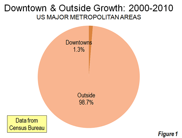
    However, to characterize the trend since 2000 as reflective of any "flocking" to the cities is to exaggerate the trend of downtown improvement beyond recognition. Among the 51 major metropolitan areas (those with more than 1 million population), nearly 99 percent of all population growth between 2000 and 2010 was outside the downtown areas (Figure 1).

    There was population growth in 33 downtown areas out of the 51 major metropolitan areas. As is typical for core urban measures, nearly 80 percent of this population growth was concentrated in the six most vibrant downtown areas, New York, Chicago, Philadelphia, Washington, Boston and San Francisco.

    If the next six fastest-growing downtown areas are added to the list (Dallas-Fort Worth, Houston, Los Angeles, Portland, San Diego and Seattle), downtown growth exceeds the national total of 205,000 people, because the other 39 downtown areas had a net population loss. Overall, the average downtown area in the major metropolitan areas grew by 4000 people between 2000 and 2010. That may be a lot of people for a college lacrosse game, but not for a city. While in some cases these increases were substantial in percentage terms, the population base was generally small, which was the result of huge population losses in previous decades as well as the conversion of old disused office buildings, warehouses and factories into residential units.

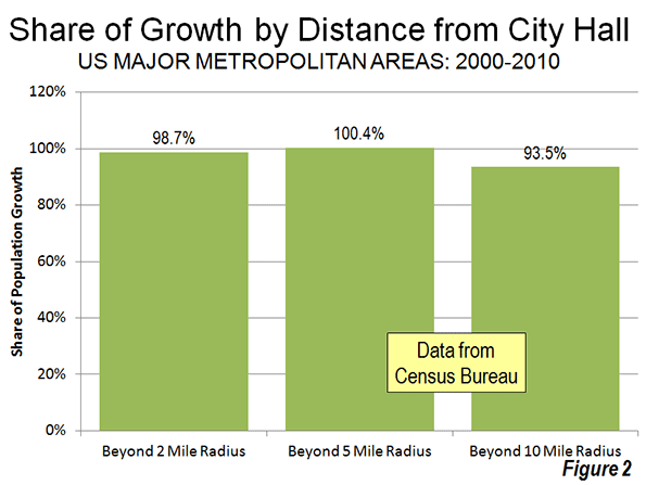
    Trends in the Larger Urban Cores: The downtown population gains, however, were not sufficient to stem the continuing decline in urban core populations. Among the 51 major metropolitan areas, the aggregate data indicates a loss of population within six miles of city hall. In essence, the oasis of modest downtown growth was more than negated by losses surrounding the downtown areas. Virtually all the population growth in the major metropolitan areas lay outside the six mile radius core, as areas within the historical urban core, including downtown, lost 0.4 percent.

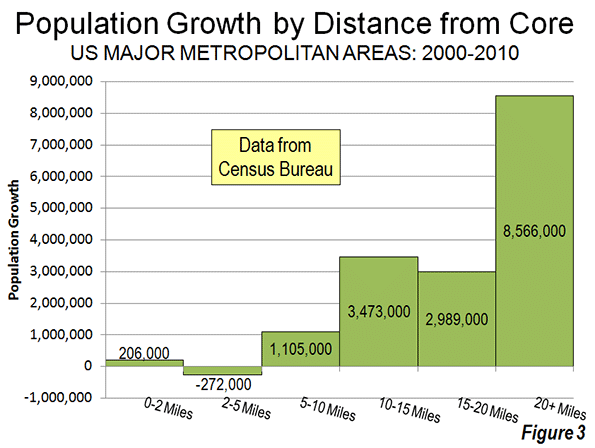
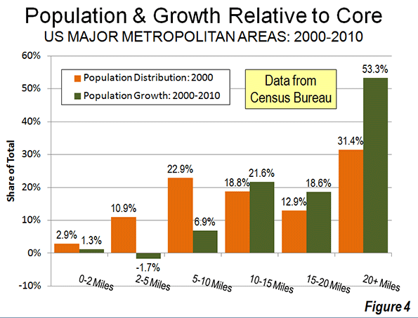
    Even when the radius is expanded to 10 miles, the overwhelming majority of growth remains outside. Approximately 94 percent of the aggregate population growth of the major metropolitan areas occurred more than 10 miles from downtown (Figure 2). Figure 3 shows that more than one-half of the growth occurred 20 miles and further from city hall. Further, the population growth beyond 10 miles (10-15 mile radius, 15-20 miles radius and 20 mile and greater radius) from the core exceeded the (2000) share of population, showing the continuing dispersal of American metropolitan areas (Figure 4).

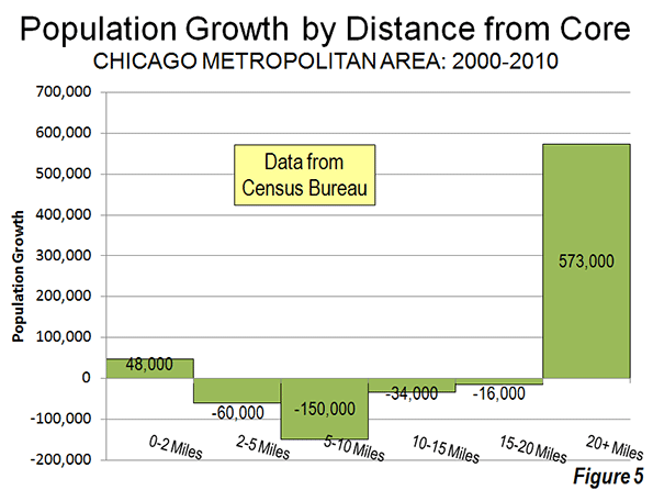
    Chicago: The Champion? The Census Bureau press release highlights the fact that downtown Chicago experienced the largest gain in the nation. Downtown Chicago accounted for 13 percent of the metropolitan area’s growth with an impressive 48,000 new residents. However, while downtown Chicago was prospering, people were flocking away from the rest of the city. Within a five mile radius of the Loop, there was a net population loss of 12,000 and a net loss of more than 200,000 within 20 miles (Figure 5). Only within the 36th mile radius from city hall is there a net population gain.

    Cleveland: Comeback City and Always Will Be? In view of Cleveland’s demographic decline (down from 915,000 in 1950 to 397,000 in 2010), any progress in downtown Cleveland is welcome. But despite the frequently recurring reports, downtown Cleveland’s population growth was barely 3,000. Despite this gain, the loss within a 6 mile radius was 70,000 and 125,000 within a 12 mile radius. Beyond the 12- mile radius, there was a population increase of nearly 55,000, which insufficient to avoid a metropolitan area population loss.

    Other Metropolitan Areas: A total of 30 major metropolitan areas suffered core population losses, despite the fact that many had downtown population increases.

    • Five major metropolitan areas suffered overall population losses (Buffalo, Cleveland, Detroit, Pittsburgh and Katrina ravaged New Orleans).
    • St. Louis, with a core city that holds the modern international record for population loss (from 857,000 in 1950 to 319,000 in 2010), experienced a population decline within a 27 mile radius of city hall. Approximately 150 percent of the growth in the St. Louis metropolitan area was outside the 27 mile radius. Even so, there was an increase of nearly 6,000 in the population of downtown St. Louis.
    • There were population losses all the way out to a considerable distance from city halls in Memphis (16 mile radius), Cincinnati (15 mile radius) and Birmingham (14 mile radius). The three corresponding downtown areas also lost population.
    • Despite having one of the strongest downtown population increases (12,000), population declined within a 10 mile radius of the Dallas city hall. This contrasts with nearby Houston, which also experienced a strong downtown increase (10,000) but no losses at any radius of the urban core.
    • Milwaukee experienced a small downtown population increase (2,000), but had a population loss within an11 mile radius.

    The other 21 major metropolitan areas experienced population gains throughout. Even so, most of the growth (77 percent) was outside the 10 mile radius. San Jose had the most concentrated growth, with only 24 percent outside a 10 miles radius from city hall. All of the other metropolitan areas had 60 percent or more of their growth outside a 10 mile radius from city hall.

    As we have observed before, 2000 to 2010 was, unlike the 1970s and other decades, more friendly to the nation’s core cities, although less so than the previous decade. Due to the repurposing of old offices and other structures, sometimes aided by subsidies, small downtown slivers may have done better than at any time since before World War II. But the data is clear. Suburban growth was stronger in the 2000s than in the 1990s. The one percent flocked to downtown and the 99 percent flocked to outside downtown.

    Population Loss Radius: Major Metropolitan Areas
    Miles from City Hall of Historical Core Municipality*
    Major Metropolitan Areas (Over 1,000,000 Population Share of Metropolitan Growth Population Loss Radius (Miles)
    "Outside Downtown" (2- Mile Radius) Outside 5-Mile Radius Outside 10-Mile Radius
    MAJOR METROPOLITAN AREAS: TOTAL 98.7% 100.4% 93.5% 6
    Atlanta, GA 99.6% 101.1% 99.9% 9
    Austin, TX 98.1% 96.7% 81.9% 0
    Baltimore, MD 106.5% 118.7% 99.5% 9
    Birmingham, AL 104.2% 132.5% 124.9% 14
    Boston, MA-NH 90.8% 76.9% 67.3% 0
    Buffalo, NY Entire Metropolitan Area Loss
    Charlotte, NC-SC 99.1% 97.4% 75.0% 3
    Chicago, IL-IN-WI 86.7% 103.3% 144.6% 35
    Cincinnati, OH-KY-IN 105.1% 126.8% 135.2% 15
    Cleveland, OH Entire Metropolitan Area Loss
    Columbus, OH 100.5% 104.3% 86.9% 7
    Dallas-Fort Worth, TX 99.0% 101.0% 100.7% 10
    Denver, CO 98.0% 100.3% 89.8% 5
    Detroit,  MI Entire Metropolitan Area Loss
    Hartford, CT 99.2% 92.7% 67.2% 0
    Houston, TX 99.2% 99.5% 98.0% 0
    Indianapolis. IN 102.1% 112.1% 89.6% 8
    Jacksonville, FL 100.2% 106.3% 85.3% 8
    Kansas City, MO-KS 99.5% 109.0% 113.3% 12
    Las Vegas, NV 101.4% 98.0% 63.6% 4
    Los Angeles, CA 97.3% 102.2% 97.6% 8
    Louisville, KY-IN 102.5% 108.5% 90.9% 8
    Memphis, TN-MS-AR 101.2% 118.5% 143.5% 16
    Miami, FL 99.4% 93.0% 91.3% 0
    Milwaukee,WI 95.9% 109.0% 107.5% 11
    Minneapolis-St. Paul, MN-WI 97.4% 99.2% 100.1% 7
    Nashville, TN 100.0% 101.4% 92.4% 7
    New Orleans. LA Entire Metropolitan Area Loss
    New York, NY-NJ-PA 93.5% 81.7% 68.9% 0
    Oklahoma City, OK 100.1% 96.8% 83.5% 2
    Orlando, FL 99.7% 99.4% 84.2% 0
    Philadelphia, PA-NJ-DE-MD 92.6% 98.8% 96.3% 7
    Phoenix, AZ 100.7% 101.8% 93.6% 6
    Pittsburgh, PA Entire Metropolitan Area Loss
    Portland, OR-WA 95.0% 91.5% 62.7% 0
    Providence, RI-MA 96.2% 91.7% 70.1% 0
    Raleigh, NC 99.6% 93.0% 67.7% 0
    Richmond, VA 95.7% 91.7% 70.2% 0
    Riverside-San Bernardino, CA 99.5% 97.2% 85.8% 0
    Rochester, NY 146.9% 149.3% 82.5% 9
    Sacramento, CA 99.9% 94.4% 79.5% 0
    Salt Lake City, UT 98.9% 95.1% 84.1% 0
    San Antonio, TX 101.1% 102.5% 86.7% 7
    San Diego, CA 96.3% 94.1% 90.1% 0
    San Francisco-Oakland, CA 90.7% 87.6% 82.2% 0
    San Jose, CA 95.1% 79.1% 24.3% 0
    Seattle, WA 96.5% 91.9% 81.4% 0
    St. Louis,, MO-IL 94.8% 119.7% 148.9% 27
    Tampa-St. Petersburg, FL 98.6% 97.8% 83.7% 0
    Virginia Beach-Norfolk, VA-NC 93.1% 90.1% 82.3% 0
    Washington, DC-VA-MD-WV 97.5% 94.5% 87.9% 0
    Calculated from Census Bureau data
    *Except in Virginia Beach-Norfolk, Where Virginia Beach is used


    ——-

    Notes:

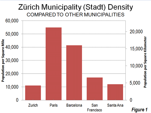
    Population Weighted Density: In its report, the Census Bureau uses "population-weighted density," rather than average population density to compare metropolitan areas. The Census Bureau justified this use as follows:

    "Overall densities of CBSAs can be heavily affected by the size of the geographic units for which they are calculated. Metropolitan and micropolitan statistical areas are delimited using counties as their basic building blocks, and counties vary greatly across the country in terms of their geographic size. With this in mind, one way of measuring actual residential density is to examine the ratio of population to land area at the scale of the census tract, which—of all the geographic units for which decennial census data are tabulated—is typi­cally the closest in scale to urban and subur­ban neighborhoods".

    The Census Bureau rightly points out the problem with comparing metropolitan area density. However, it is a problem of the federal government’s making, by virtue of using metropolitan area building blocks (counties) that are sometimes too large for designation of genuine metropolitan areas. These difficulties have been overcome by the national census authorities in Japan in Canada, for example, where smaller building blocks are used (such as municipalities or local government authorities).

    Further, the Census Bureau already has a means for measuring population density at the census tract level, which is "the closest in scale to urban and suburban neighborhoods." This is the urban area.

    "Population-weighted density" is an interesting concept that can provide an impression of the density that is perceived by the average resident of the metropolitan area. Unfortunately, in its report, the Census Bureau is less than precise with its terminology and repeatedly fails to modify the term density with the important "population-weighted" qualification. This could lead to considerable misunderstanding.

    The Census Bureau did not provide average population densities based for the mileage radii. Because of large bodies of water (such as Lake Michigan in Chicago can reduce land areas, it was not possible to estimate population densities by radius.

    Census Bureau Revision of Incorrect Report: We notified the Census Bureau of errors in its press release and report on September 27. The problems included substitution of San Francisco population data for Salt Lake City as well as metropolitan population in the supporting spreadsheet file. On September 28, the Census Bureau issued a revised press release and report to rectify the errors. Later the erroneous spreadsheet was withdrawn and had not been re-posted as of October 1. We have made corrections to the spreadsheet for this analysis.

    Note: Larger "Downtown" Populations in Smaller Metropolitan Areas: Because of the broad 2-mile radius measure used by the Census Bureau, most of the population increase characterized as relating to downtown occurred outside the major metropolitan areas. This is simply because in smaller metropolitan areas, such an area (12.6 square miles) will necessarily contain a larger share of the metropolitan area. Further, many smaller metropolitan areas are virtually all suburban and had experienced little or no core population losses over the decades that have been so devastating to many large core municipalities. On average, 2.7 percent of the population of major metropolitan areas was within a two-mile radius of city hall in 2010. By comparison, in smaller metropolitan areas, approximately 12.7 percent of the population was within a two mile radius.

    Photograph: Chicago Suburbs: (where nearly all the growth occurred), by author

  • Census Bureau Finds 3.2 Million More People in Salt Lake City?

    Today the US Bureau of the Census released a fascinating report on metropolitan area population growth by radius from the corresponding city halls. The report provides summary tables indicating the metropolitan areas that had the greatest and least growth, for example, near the downtown areas.  I was surprised to find that Salt Lake City had done so well, having seen is population rise from 336,000 to 355,000 within a two mile radius of city hall (Table 3-7). That struck me as odd. A two mile radius encompasses an area of only 12.6 square miles, for a density of about 28,000 per square mile. Only the city San Francisco has densities that high over such a large area in the West. Moreover, all of the municipality of Salt Lake City is within two miles of city hall, and the 2010 census counted only 186,000 people in the entire  city of more nearly 110 square miles.

    In reviewing the backup file, Worksheets “Pop2000″, Pop2010”, “Density2000” and “Density 2010”), I discovered that Salt Lake City’s data was actually that of San Francisco and that metropolitan Salt Lake City was credited with 3.2 more people than it had Another surprise was that the San Francisco metropolitan area was reported with 260,000 people, less than one-third the population reported for the core city of San Francisco in 2010. Santa Fe had a reported population 3.4 million people, about 1.4 million people more than live in the entire state of which it is the capital. Further, in at least 35 cases, the populations for metropolitan areas did not correspond to those reported in the 2010 census.

    Obviously this is the kind of automated (computer) error that can happen to anyone or any agency. Nonetheless, an immediate correction would be appropriate.

    With considerable effort, we were able to get through to the public information office at the Bureau of the Census to notify them of the error.

    Until a corrected report is issued, any analysis of the report will need to be very cautious indeed. We look forward to the revision.

  • The Road Less Understood

    The Economist confuses ends (objectives) and means in its current number examining the peaking of per capita automobile use in the West in two articles ("The http://www.economist.com/node/21563327" and "Seeing the Back of the Car"). In congratulating metropolitan areas for trying "to change the way people move around," The Economist reminds that Portland (Oregon) has developed light rail and that policy supports transit in Los Angeles. So much for the means, but what about the ends?

    In Portland: Transit Loses Ground and a Skeptical Public: Portland, for example, has had anything but stellar performance. Transit has not kept up with growth, having lost 25 percent of its commuting (work trip) share since before the first light rail line was opened in 1986 (Note 1). With five new light rail lines, transit in Portland not only fell short of attracting its previous bus only share of commutes, but also sustained losses greater than the national rate (Figure 1).

    The people of the Portland area may not share The Economist’s ardor. Just last week, The Oregonian headlined "Clackamas County anti-rail measure passes comfortably; effect could resonate for decades," reporting on a 60-40 vote to require referenda for future rail expenditures. As if that were not enough, a similar measure passed by a similar margin in King City, a municipality in Washington County and Tigard, one of the area’s largest municipalities, has placed the matter on the November ballot.

    But Portland does have a substantial success missed by The Economist. Working at home is growing rapidly. From 1980 to 2011, working at home (mostly telecommuting) increased by 55,000. This is more than three times the growth in rail transit commuting (17,500). During the last decade, working at home passed transit as a work access mode in Portland, and with virtually no public expenditures (as opposed to the billions for new rail lines). There has been a 375,000 increase in car use by one-way commuters since 1980, and, not surprisingly, a quadrupling of excess travel time in peak period traffic (based upon Texas Transportation Institute data). In the end, Portland built an extensive rail system and the riders have not come. Portland didn’t expand its highway system, and they came anyway (National 2010-2011 journey to work data is summarized here.).

    In Los Angeles: Long on Rail Lines, Short on Passengers: The Economist rightly points out that Los Angeles has implemented policies to get people out of cars. Indeed, Los Angeles has been the poster child for transit development. In little more than two decades, 11 metro, light rail, and suburban rail lines have been opened. Probably no metropolitan area in the world has opened more miles of new rail service in that period. Matthew Yglesias, writing in Slate was so impressed that he called Los Angeles "America’s next great mass transit city."

    The results are less convincing. The total daily one-way commutes on the 11 rail lines is only 32,000, smaller than the number of people carried daily on a single lane of the San Diego Freeway (I-405) where it crosses over Wilshire Boulevard. Meanwhile, working at home has risen more than four times that of rail commuting since 1990 (Figure 2). Los Angeles may be better described as “America’s next great telecommuting city." However, the auto is still king. From 1990 to 2011, solo automobile commuting increased 340,000, two percentage point gain, three times that of transit.

    Younger People: Driving More to Work and Telecommuting More

    The Economist also jumps on the "young people forsaking driving" bandwagon, a subject that has attracted the attention of others. But, young people are driving more, at least to work. Since 2000, the increase in driving alone to work by people aged 15 to 24 was nearly 260,000, compared to a 4,000 loss in transit commuting. Working at home was up almost as much as driving, at 200,000. Even so, with the declining size of the younger work force, transit’s share was up. From 2000 to 2011, the share of 15-24 year old workers rose from 5.4 percent to 5.8 percent (Figure 3), virtually the same as the overall increase in transit market share of from 4.6 percent to 5.0 percent (Note 2). As with Portland and Los Angeles, the last 11 years saw a much larger increase in working at home, from 3.3 percent to 4.3 percent.

    Further, to the extent working at home, social media and online shopping replace the need for driving among younger adults (and everyone), all the better.

    The Fantastical Claim: 50,000 Passengers Per Hour

    The Economist repeats the specious claim that rail lines can carry 50,000 passengers per hour in each direction. If your world is limited to Paris between Chatelet and Gare de Lyon and the handful of similar places, maybe so. But in most of the rest of the world, it is the stuff of fairy tales.

    The 2011 data shows the extent of the illusion.  The fantastical rail line carrying 50,000 per hour would carry the equal of all the daily rail commuters in Dallas or Miami in less than 20 minutes. It would take only about five minutes to handle the daily rail transit commuting volume in Minneapolis or Salt Lake City.

    Further, some of the new systems have been manifestly unsuccessful in attracting commuters. For example, in Charlotte, there was a strong increase in transit commuting between 2000 and 2011, with transit’s market share rising 64 percent. Yet, more than 60 percent of the new commuters were on buses, rather than on light rail, reflecting a long overdue increase in artificially low service levels. In Phoenix, 85 percent of the transit commuting increase was on buses, rather than the light rail line. The fantastical 50,000 per hour line would take only handle this load in about two minutes.

    Where Rail Works and Why

    None of this is to suggest that rail transit does not have its place. As I pointed out in a Hong Kong Apple Daily commentary, rail transit makes all the sense in the world where appropriate (see: "Hong Kong’s Rail Expansion: Avoiding Western Pitfalls"). Appropriate circumstances include huge central business districts with high employment density and radial rail transit service from throughout the metropolitan area. American Community Survey data indicates that just six municipalities (not metropolitan areas) account for 93 percent of the nation’s rail commuting destinations. The city of New York, alone is the destination of 65 percent of national rail commuters. Another 28 percent commute to the cities of Chicago, Philadelphia, Washington, Boston and San Francisco. Within these six cities, the overwhelming share of transit commuting is to the downtowns (central business districts), which, combined, cover a land area less than half the size of Orlando’s Disney World.

    Why Driving Has Peaked

    Alan Pisarski told us in 1999 "(Cars, Women and Minorities: The Democratization of Mobility in America") that the demand for driving would soon peak. Women were driving nearly as much as men and cars were becoming the dominant mode of transport for low income people. Cars already carry the overwhelming majority of low-income commuters. A "love affair with the automobile" mentality misled many who should have known better into believing that people would eventually drive 24 hours per day. In fact, the huge increase in driving to the 2000s was more about democratizing mobility and access, and as the Washington Times recently put it, prosperity (see "A world without cars:
    The internal-combustion engine has freed mankind"). If home-based access can take up the slack, it would do more for the environment and people’s lives than all the expensive, largely ineffective rail system imagined by the media and the well-financed rail lobby.

    ——

    Note 1: The data in this article is largely taken from the journey to work reports of the US Census (1980, 1990 and 2000) and the American Community Survey (one year data 2011).

    Note 2: The overall 5.0 percent transit market share figure may be high. The USDOT National Household Travel  Survey (NHTS) indicates that people who commute by transit tend to use other modes (such as automobiles) often. NHTS data indicates that, overall transit accounted for 3.7 percent of commuters and an even lower 2.7% of commuting miles in 2009.

    Photo: Harbor Freeway (I-110), Los Angeles (by author)

  • A Summary of 2011 Commuting Data Released Today

    The Census Bureau’s American Community Survey released its annual one-year snapshot of demographic data in the United States. As usual, this included journey to work (commuting data), which is summarized in the table below.

    American Community Survey Commuting Data
    2011, 2010 & 2000
    ESTIMATES of Total Commuters 2000 2010 2011
    Drive Alone 97.10 104.86 105.64
    Car/Van Pool 15.63 13.27 13.39
    Transit 5.87 6.77 6.96
    Bicycle 0.49 0.73 0.78
    Walk 3.76 3.80 3.89
    Motorcyle, Taxi & Other 1.24 1.60 1.63
    Work at Home 4.18 5.92 5.99
    Total 128.28 136.94 138.27
    In Millions
    MARKET SHARE
    Drive Alone 75.70% 76.57% 76.40%
    Car/Van Pool 12.19% 9.69% 9.68%
    Transit 4.57% 4.94% 5.03%
    Bicycle 0.38% 0.53% 0.56%
    Walk 2.93% 2.77% 2.81%
    Motorcyle, Taxi & Other 0.97% 1.17% 1.18%
    Work at Home 3.26% 4.33% 4.34%
    Total 100.00% 100.00% 100.00%
    Sources: 2000, 2010 Census &  2011 American Community Survey


    Trends Since 2010

    As estimated employment improved from 137.9 million in 2010 to 138.3 from 2010 to 2011, there was an increase of 800,000 in the number of commuters driving alone, which, as usual, represented the vast majority of commuting (105.6 million daily one way trips), at 76.40 percent. This was not enough, however, to avoid a small (0.17 percentage point) decline in market share.

    Car pooling experienced a rare increase of 120,000 commuters, which translated into a 0.1 percentage point loss in market share, to 9.68 percent. Transit increased 190,000 commuters, and had a 0.09 percentage point increase in market share, to 5.03 percent. This brought transit’s market share to above its 2008 share of 5.01 percent and near its 1990 market share of 5.11 percent.

    Working at home increased by 70,000, with a modest 0.1 percentage point increase from 2010.

    Trends Since 2000

    Even with declining falling household incomes and rising gasoline prices, single-occupant commuting continued to rise between 2000 and 2011. Solo drivers increased nearly 8 million, more than the total transit commuting in 2011. Car pooling continued its long-term decline, falling 2.2 million. Transit did well (as would be expected with unfavorable economic conditions and unprecedented gasoline price increases), as we noted last year, having added 1.1 million commuters. This was spread thinly around the country, though with a 70 percent concentration in New York and Washington, DC. Over the period, working at home experienced an increase of 1.8 million, the largest increase outside solo driving.

    Media Attention

    For the most part the commuting data was ignored by the media — and for good reason. The one year changes were predictably modest. However, the exception was USA Today, with a top of the webpage "Fewer Americans Driving Solo" headline. In fact, as noted above, the short term and long term trends reflected an increase in solo driving. Moreover, reading the story it would be easy to get the impression that a sea change had occurred in how people get to work. To its credit, however, USA Today appropriately labeled the likely reasons for the mountains it made into molehills — the economy and gasoline prices.

  • 2011 Census Sub-County Allocations Masquerade as Population Estimates

    This is by far the most difficult article I have ever had to write. I have been a fan of the US Bureau of the Census since I began following its numbers in the second grade. Much of my career has been spent analyzing these numbers and those of similar national statistical bureaus around the world. Yet, the 2011 sub-county estimates produced by the Census Bureau should never have been released, because they were not estimates, but they were rather "fair share" allocations of county population growth (or loss).

    Analysts believing the numbers to be estimates have spent considerable ink in explaining the results. Some articles noted that core cities were adding population faster than suburban areas, such as an article based on Brookings Institution research in The Wall Street Journal. Others, such as me noted that there was evidence of faster core growth in some metropolitan areas, but that core county migration data (the lowest geographical level available) continued to overwhelmingly show net domestic migration to the suburbs.

    In fact, however, it turns out that no-one knows that is happening to sub-county populations, in the historic cores or in the suburbs. Regrettably the results announced by the Census Bureau were virtually meaningless. This was revealed on newgeography.com by Chris Briem of the University of Pittsburgh just days after the release of the estimates. Briem reviewed the Census Bureau’s sub-county population estimation methodology for 2010-2011 and found that county populations had largely been allocated to sub-county jurisdictions based upon their share of the 2010 population. The result is that all sub-county jurisdictions in each country grew (or lost population) by nearly the same percentage. Obviously, this cannot be.

    Brownstown Charter Township: Rising Population in Reversal?

    This means, for example, that Brownstown Charter Township, a rare oasis of population growth (suburban or core city) in Wayne County, Michigan was apportioned virtually the same percentage population loss as occurred in the county. Like the city of Detroit, which since 1950 has managed to shed more people than live in all but two Canadian core cities, Brownstown is reported to have lost the same 1.0 percent that is reported to have occurred in the city and the county (Note). How different this is from the 2000s, when Brownstown grew an average of 2.9 percent annually, while Detroit lost 2.8 percent and Wayne County 1.3 percent annually (Figure 1). We hope Brownstown’s citizenry was not alarmed by this sudden turnaround.

    A One Year Change in Methodology

    The problem results because of a single year change in the way the Census Bureau estimates population below the County level. As the Bureau indicates in its methodology notes:

    "Our method of producing housing unit estimates is different this year than in years past. The Vintage 2011 housing unit estimates do not rely on the usual components of housing change (building permits, non-permitted builds, mobile home shipments, and housing loss), which we used last decade to produce the housing unit estimates. Instead, we created the Vintage 2011 estimates by extrapolating the average monthly change in housing units at the county level, then summing these estimates to create estimates for the states and nation. To produce subcounty housing unit estimates, we distributed the extrapolated county estimates down to each subcounty area within a county based on 2010 Census proportions."

    The meaninglessness of the estimates is evident in examinations of two metropolitan areas where the core cities were reported to have grown faster than suburban areas, Miami and Orlando.

    Miami Metropolitan Area

    Figure 2 shows that in the Miami metropolitan area, the many cities and towns in the core Miami-Dade County grew at virtually the same population rate as the county overall. This means, for example, that the core city of Miami also grew at the same rate, according to the Census Bureau figures. The same thing can be seen in suburban Broward County, where all of the cities grew at virtually the same rate as the county as well as in Palm Beach County. From Figure 2, it can be seen that the estimates show the city of Miami could have grown faster than all the suburbs in Broward County and Palm Beach County, and at virtually the same rate as the suburbs and Miami-Dade County. No judgments can be made about relative population trends where estimates simply allocate the change base upon the base year distribution of population.

    Figure 3 indicates the extent to which this methodology varies with the more comprehensive "components of housing change" methodology previously used by the Census Bureau (above). These annual population increase rates, between 2000 and 2010 are for the very same sub-county jurisdictions in Figure 2. This kind of variation in population growth rate would be expected in any year, rather than the flat-lined Census Bureau allocations

    Orlando Metropolitan Area

    Figure 4, covering the Orlando metropolitan area indicates the same situation. Each of the sub-county jurisdictions in the four metropolitan area counties is reported to have grown at approximately the same rate as its home county. Any conclusion that the city of Orlando grew faster than the suburbs, such as those in Lake and Seminole counties is invalid, since the city population growth is simply an allocation of the county growth.

    Figure 5 shows of the annualized growth rate for the sub-county jurisdictions of the Orlando metropolitan area of between 2000 and 2011. Again, there was a huge variation in growth between the sub-county jurisdictions. A dispersion of growth rates would have had the "fair share" population estimation mythology been employed for 2010 to 2011.

    Justifying the One Year Change

    The Census Bureau indicates that it changed its methodology for the current estimation year because “we are presently evaluating the 2010 housing estimates relative to the 2010 Census results, and considering improvements to the existing housing unit method for the new decade." Fair enough. Calling allocations estimates, however, is not.

    Further, at least some at the Census Bureau perceive that these to be genuine estimates. The accompanying press release entitled "Texas Dominates List of Fastest-Growing Large Cities Since 2010 Census, Census Bureau Reports." Actually, the Census Bureau has no data on which cities grew the fastest between 2010 and 2011, nor does anyone else.

    Unfortunate Timing

    It is unfortunate that the Census Bureau determined to go forward with meaningless estimates at the very same time important statistical gathering programs such as the American Community Survey are under threat of defunding by the Congress.

    Beware: Make No Comparisons

    One of the purposes of sub-county population estimates is to provide information on the relative growth between jurisdictions. The estimates are also used in the Census Bureau’s challenge process, which allows cities to seek revision of their population estimates, leading to a greater allocation of federal funding. We assume that no population challenges will be accepted based upon these allocations. Indeed, based on the latest Census of Government counts, more than 35,000 municipalities and minor civil divisions would seem to have standing for challenges.

    Fortunately, there are plans to return to estimates rather than allocations for the 2012 round. The 2011 estimates should be withdrawn. Census Bureau should make it clear allocations did not represent genuine estimates of population change.

    We have redacted part of our article analyzing the 2011 sub-county population estimates.

    Postscript: Headline Illusions

    The misleading issue of historical core cities drawing people from suburban areas was raised anew by a recent article headlined "We’re In The Midst Of A Huge Migration From Suburbs To Cities" in The Business Insider. The article was attributed to Rolf Pendall, director of the Urban Institute Metropolitan Housing and Communities Policy Center, who said no such thing. Pendall’s article in Atlantic Cities was more appropriately headlined "The Next Big Question Facing Cities: Will Millennials Stay?" A good question.

    Wendell Cox is a Visiting Professor, Conservatoire National des Arts et Metiers, Paris and the author of “War on the Dream: How Anti-Sprawl Policy Threatens the Quality of Life.”

    —-

    Note:  There were minor variations in the second decimal digit of the growth rates because of the small group quarters portion (people in dormitories, prisons and other group housing) population change, for which the Census Bureau produced genuine estimates.

    Map photo by Bigstock.

  • The Evolving Urban Form: Zürich

    Zürich is the largest urban area in Switzerland. The core city (stadt) of Zürich is located at the northern end of Lake Zürich, which is glacial and similar to the "finger lakes" of upstate New York. Lake Zürich is approximately 25 miles/40 kilometers long and 1-2 miles/1.5-3 kilometers wide. The urban area extends south along most of the lake and over hills to the East and West and further North.

    Zürich, like larger Paris and Barcelona is a favorite among urban aficionados. Two reasons: the apparent compactness of its urban core and it has one of the world’s best transit systems. Yet, as is shown below, Zürich looks and feels denser than the reality experienced by its citizenry. Moreover the urban core is surrounded by a sea of anything-but-compact suburbanization, as is the case in Paris and virtually all other large Western urban areas. A visit confined to the smallish, but architecturally pleasing precincts of the core can lead to a profound misinterpretation of the urban form (See Louvre Café Syndrome: Misunderstanding Amsterdam and America).

    The City of Zürich (Stadt)

    Like virtually all European core cities that have not substantially annexed new land or consolidated with other jurisdictions, the city of Zürich has lost population. Zürich reached its population peak in 1960, with 440,000 people. Since that time, the population has fallen to 373,000, a loss of 15 percent. The city is not very dense despite its reputation to the contrary. The land area is 34 square miles/89 square kilometers, which yields a 2010 population density of 11,000 per square mile/4200 per square kilometer. This is less than two thirds the density of the city of San Francisco and similar to that of some Los Angeles suburbs, such as Santa Ana, Inglewood or Alhambra (Figure 1).

    The city is divided into nine districts. The densest, the 5th district, covers 1.1 square miles/2.9 square kilometers and has a density of 24,000 per square mile/9200 per square kilometer. By comparison, Westlake, the most densely populated community planning district in the city of Los Angeles covered three times as much land and had a population density of 34,000 per square mile/13,000 per square kilometer in 2000 (latest data available). This is 40 percent greater than the highest Zürich district density.

    The Urban Area

    According to the Federal Office of Statistics (FSO), the Zürich urban area (urban agglomeration) has a population of approximately 1.2 million and covers a land area of 420 square miles/1085 square kilometers. The population density is comparatively low, at 2800 per square mile/1075 per square kilometer.

    Zürich’s development since World War II has mirrored the international trend towards suburbanization. In 1950, the urban area included the city of Zürich and 14 additional municipalities. The city, with a population of 390,000, contained more than 85 percent of the urban area population as defined at that time. Since 1950 all growth in the Zürich urban area has been in the suburbs. By 2010, the city of Zürich represented only 32 percent of the urban area population (Figure 2). Suburban areas account for 68 percent of the population and more than 90 percent of the urban land area.

    At each decennial census year, FSO adds new municipalities to the urban area as appropriate. In 1950, the urban area included the city of Zürich as well as 14 additional municipalities. By 2000, the urban area included the city of Zürich and 130 other municipalities (Figure 3). FSO is reviewing 2010 census results and is likely to add more municipalities to the urban area within the next year. The population of the urban area as presently defined has nearly doubled since 1950. The population trend for the city of Zürich and the six suburban rings (as presently defined) is illustrated in the Table.

    Zürich Urban Area: Population of Core Municipality & Suburban Rings: 1950-2010
    1950 1960 1970 1980 1990 2000 2010
    Urban Area: (Agglomeration Zürich)   605,765   801,124   947,011   970,073   1,021,859   1,080,728   1,188,566
    City of Zürich (Stadt)   390,020   440,170   422,640   369,522      365,043      363,273      372,857
    1st Ring (1950)     59,324     97,124   132,014   136,787      135,777      138,936      153,674
    2nd Ring (1960)     45,989     73,560   120,492   140,088      154,226      168,812      192,469
    3rd Ring (1970)     13,396     19,135     44,178     59,823         67,567         73,364         82,693
    4th Ring (1980)     64,259     83,036   113,195   132,444      145,165      159,021      183,878
    5th Ring (1990)     32,777     41,483     52,329     60,240         72,402         82,862         94,244
    6th Ring (2000)     46,616     62,163     71,169         81,679         94,460      108,751
    1950 Population for 6th Suburban Ring (2000) Not Available
    Source: Statistik Stadt Zürich & FSO


    In recent decades, population growth has gradually moved farther to the periphery of the urban area. This is illustrated by Figure 4, which shows a population trends for the city, the first three suburban rings (1950 to 1970) and the outer three suburban rings (1980 to 2000). By 2000, the three inner suburban rings exceeded the population of the city of Zürich. The outer three suburban rings passed Zürich in population by 2010 (Photo: Suburbs of Zürich).

    Suburbs of Zürich

    Suburban densities are considerably lower than that of the city of Zürich. Suburban Zürich has an overall population density of approximately 2100 per square mile/800 per square kilometer. As would be expected, the population densities decline substantially with distance from the city of Zürich (Figure 5). The first ring suburbs (1950) have a population density of 4500 square mile/1800 per square kilometer. This is about a quarter higher than the aggregate suburban density of Portland or New York, but only two-thirds as dense as the Los Angeles suburbs. The lowest population density is in the sixth suburban ring (2000) at approximately 1200 per square mile/450 per square kilometer. This is slightly above the approximate 1000 per square mile/400 per square kilometer international standard used by national statistics agencies in designating urban areas (Note 1).

    Similarly, employment has become more dispersed as jobs follow residents toward lower density suburban areas. Less than 15 percent of the urban area’s employment is in the central business district, a figure similar to that the average of US, Canadian and Australian urban areas.

    Getting Around and To Zürich

    Zürich is served by one of the world’s most effective transit systems, which necessarily focuses on the central business district and provides an intense mesh of service in the core city. Among the approximately 90 urban areas of the world for which the Millennium Cities Database provides service information, Zürich ranked 22nd in transit service intensity (transit vehicle kilometers divided by urban area square kilometers), with a service-level approximately 15 percent that of Hong Kong (Note 3). Among the European urban areas surveyed, only Barcelona and Milan had more intense transit service.

    However, as is the case in all urban areas of Western Europe (as well as the United States, Canada and Australia), the overwhelming majority of motorized travel in the Zürich urban area is by car. Zürich’s automobile market share, in distance traveled, is approximately 75 percent, similar to that of Paris and approximately 15 percent below that of the New York, Toronto or Sydney urban areas.

    Zürich, as the nation’s largest urban area, is unique in not having been linked to its national freeway (motorway) system until recently. Only since 2009 has Zürich been connected to nearby Lucerne (only 30 miles/50 kilometers away) or beyond  through the St. Gotthard tunnel to Milan and the South. The new Uetliberg Tunnel (A4 motorway) connects to the exurb of Zug. For the first time Switzerland’s main north-south motorway connects to its principal route, the east-west A1 motorway   (Note 2).

    No motorway dissects the city of Zürich. However, a swath is cut through the city of Zürich by the national railway system. Starting at Zürich Station and extending to the north city limits, the railway divide is from 150 to 450 meters/650 to 1500 feet wide (Photo: Zürich Railway Divide). This may be wider than any freeway in the world. For example, the 26-lane Katy Freeway in Houston, the 18-lane Autopista Panamericana in Buenos Aires and the 14-lane MacDonald Cartier Freeway in Toronto all have average widths of 150 meters/650 feet or less.

    Zürich Railway Divide (from Hardbrücke)

    Zürich: Compact Core, Suburban Reality

    Like urban residents throughout the high-income world, the residents of Zürich (and other Swiss urban areas) have chosen to live in larger, more comfortable houses, often with yards (gardens). At the same time, the historical urban core remains intact as a frequent or occasional destination for both tourists and residents, most of whom live in the suburbs.

    Wendell Cox is a Visiting Professor, Conservatoire National des Arts et Metiers, Paris and the author of “War on the Dream: How Anti-Sprawl Policy Threatens the Quality of Life.”

    —–

    Photo: Zürich Urban Core Street Scene (photos by author)

    Note 1: Such as INSEE (France), National Statistics (UK), Statistics Canada, United States Census Bureau, Census of India,

    Note 3: According to Millennium Cities Database information, only Manila had more intense transit service than Hong Kong (85 percent higher service intensity).

    Note 2: Switzerland speed limits are slow by European standards, but generally higher than those in the United States, Canada and Australia. The national speed limit on the motorway system is 120 kilometers per hour/75 miles per hour. Speed limits are higher in France and Italy at 130 kilometers per hour/81 miles per hour. In Germany, most of the autobahn system is not subject to speed limits. The highest speed limit in the United States is now planned for a new toll road (C-130) between San Antonio and Austin, at 85 miles per hour/137 kilometers per hour and on some other Texas and Utah roads at 80 miles per hour/129 kilometers per hour. Elsewhere in the United States, Canada and Australia, speed limits are lower than in Switzerland and nearly all Europe.

  • Tokyo: Population Swan Dive Predicted

    In a recent Evolving Urban Form article, we speculated that Tokyo, the world’s largest urban area (population more than 35 million) could be displaced by fast-growing Jakarta or Delhi as early as 2030. If the prediction of central jurisdiction administrators and academics come true, Tokyo could be passed by many other urban areas in population by 2100.

    The Japan Times reports forecasts that the population of the Prefecture of Tokyo, the central jurisdiction of the metropolitan area, could decline by nearly 50 percent (chart) between 2010 and 2100 (Note). Yet, while the overall population is dropping in half, the elderly population would increase by more than 20 percent. The resulting far less favorable ratio of elderly to the working population would present unprecedented social and economic challenges.

    The article provides no information on the population of the entire urban area in 2100. The Prefecture of Tokyo constitutes somewhat over one third of the present population of the urban area.

    During the last census period (between 2005 2010) the four prefecture Tokyo metropolitan area (Tokyo, Kanagawa, Saitama and Chiba), gained approximately 1,100,000 new residents, while the balance of the country was losing 1,400,000 residents. Japan is forecast to suffer substantial population losses in the decades to come. The United Nations forecasts that its population will decline from approximately 125 million in 2010 to 90 million in 2100. This is the optimistic scenario. The National Institute of Population and Social Security Research forecasts a drop to under 50 million, a more than 60 percent population reduction.

    There are serious concerns about the projected population decline. According to the Japan Times, the researchers said that " … it will be crucial to take measures to turn around the falling birthrate and enhance social security measures for the elderly,"  A professor the National Graduate Institute for Policy Studies, expressed concern that "If the economies of developing countries continue growing, the international competitiveness of major companies in Tokyo will dive."

    —-

    Note: the Prefecture of Tokyo government is called the Tokyo Metropolitan Government. This term can mislead, because the prefecture itself is not the metropolitan area, but only part of the four prefecture metropolitan area. The pre-– amalgamation predecessor of the current city of Toronto was called the Municipality of Metropolitan Toronto. Like the Prefecture of Tokyo, the Municipality of Metropolitan Toronto comprised only part of the Toronto metropolitan area. Confusion over these terms not only resulted in incorrect press reports, but even misled some academic researchers to treat these sub-metropolitan jurisdictions as metropolitan areas.

  • Obama Fuel Economy Rules Trump Smart Growth

    The Environmental Protection Agency (EPA) has just finalized its regulation requiring that new cars and light trucks (light vehicles) achieve average fuel efficiency of 54.5 miles per gallon (MPG) by 2025 (4.3 liters per 100 kilometers). This increase in the "CAFE" standard (Corporate Average Fuel Efficiency) is the second major step in the Obama Administration’s program to improve light vehicle fuel efficiency. In 2010, EPA adopted regulations requiring 35.5 MPG average by 2016 (6.6 liters per 100 kilometers).

    The EPA standard is based upon carbon dioxide (CO2) grams emitted per mile of light vehicle travel, with an average of 163 grams per mile (101 per kilometer) to be achieved in 2025. This is slightly above the 2020 European Union standard of 152 grams per mile (95 grams per kilometer). Of course, the regulations have both supporters and detractors, with the automobile manufacturers being among the supporters.  

    Assuming the objectives are met, the reductions in CO2 emissions will dwarf the modest gains forecast from anti-suburban smart growth policies. For decades, this powerful movement has sought to limit or prohibit suburban expansion and even outlaw the detached housing that most people prefer. This includes railing against automobile use and seeking to coerce people out of their cars (as expressed by Secretary of Transportation Ray LaHood).

    The anti-suburban movement has many labels in addition to "smart growth," such as “densification policy," "compact cities," "growth management," "urban consolidation," etc. The origins can be traced back to just after World War II, with the enactment of the British Town and Country Planning Act. The policy origins of smart growth in the United States date from the 1960s (the state of Hawaii) and 1970s (the state of Oregon and California local jurisdictions).

    Forecast CO2 Emission Reductions from Smart Growth

    With concerns about greenhouse gas (GHG) emissions (principally carbon dioxide, or CO2), proponents saw the opportunity to force people back into the cities (from which most did not come) and turn smart growth into an imperative for "saving the planet." This is no exaggeration. As late as last month, this was claimed by fellow panelists at a Maryland Association of Counties conference. As is indicated below, the data shows no such association.

    Even forecasts by proponents fall short of demonstrating an apocalyptic necessity for smart growth. The Cambridge Systematics and Urban Land Institute Moving Cooler report attributed only modest reductions in CO2 emissions to smart growth’s land use and mass transit policies (Moving Cooler was criticized on this site by Alan Pisarski. See ULI Moving Cooler Report: Greenhouse Gases, Exaggerations and Misdirections). The data in Moving Cooler suggests an approximately 50 million ton reduction in CO2 emissions from these smart growth strategies by 2035 (interpolating between 2030 and 2050 figures).

    The more balanced Transportation Research Board Driving and the Built Environment: The Effects of Compact Development on Motorized Travel, Energy Use, and CO2 Emissions  produced similar figures, however it indicated skepticism about whether their higher range projections were "plausible."

    Comparing Smart Growth to the Previous Fuel Economy Standard

    At the 2005 fuel economy rate and the projected driving increase rate in the US Department of Energy Annual Energy Outlook:2008 (AEO), CO2 emissions from light vehicles would have increased 64 percent from 2005 to 2035 (Note 1). This could be called the "baseline" case or the "business as usual" case. This would have resulted in a CO2 emissions increase from light vehicles of approximately 0.75 billion tons.

    Using the more aggressive Moving Cooler forecast, the smart growth transport and land use strategies would only minimally reduce CO2 emissions from the baseline case (64 percent above 2005 levels) to 60 percent. This is "chicken feed" (Figure 1).

    Forecast CO2 Emission Reductions from the 54.5 MPG Standard

    Under the previous 35.5 MPG standard, AEO:2008 and AEO:2012,  a 19 percent reduction in CO2 emissions from cars and light trucks would occur from 2005 to 2035. We modeled the new regulations based upon AEO:2012 forecasts for the earlier regulation. This yielded a 2035 CO2 emission reduction of 35 percent from 2005 (Figure 2), despite a healthy one-third increase in driving volumes over the period. The calculation also includes an upward adjustment for the rebound effect, as lower costs of driving encourage people to drive more, which EPA estimates at 10 percent ("induced traffic"), which is indicated in Figure 3.


    Achievement of the 54.5 MPG standard would reduce CO2 emissions from light vehicles from 1.9 billion annual tons in 2035 under the 2005 baseline to approximately 0.750 billion metric tons in 2035. Approximately 70 percent of the decline in CO2 emissions would be from improved fuel economy, while 30 percent would be from slower annual increase in vehicle travel that has been adopted in AEO:2012 (Figure 4). The increase in driving is now forecast at 33 percent from 2005.

    The contrast between the potential CO2 emissions from smart growth and fuel economy is stark. By comparison, the annual overall reduction in CO2 emissions (from the 2005 baseline) would be virtually equal to the 30 year impact of smart growth (Figure 5).

    Comparison with Transit

    The 35.5 MPG standard would make cars and light trucks less CO2 intensive than transit. At work trip vehicle occupancy rates, the average new light vehicle would emit less in CO2 per passenger mile in 2016 than transit in all but eight of the nation’s 51 metropolitan areas over 1,000,000 population. The 2025 54.5 MPG standard would drop that number to two (Note 2). Even before these developments, there was only scant potential for replacing automobile use with transit (much less walking or cycling) because of its long travel times. According to data in a Brookings Institution report, less than 10 percent of jobs in the largest metropolitan areas can be reached by the average resident in 45 minutes on transit (Note 3).

    Smart Growth: Not Needed to "Save the Planet"

    Smart growth is an exceedingly intrusive policy that would attempt to enforce personal behaviors,    counter to people’s preferences, by attempting to dictate where people live and how they travel. This is expensive as well as intrusive. It is also detrimental to the economy, which is already taking a toll in lower household discretionary income (especially from higher house prices) and stunted economic growth.

    A report by The McKinsey Corporation and The Conference Board  indicated that sufficient CO2 emissions could be achieved with "…no downsizing of vehicles, home or commercial space and traveling the same mileage" and "…no shift to denser housing." Or, more directly, smart growth is unnecessary, in addition to producing little "gain" for the "pain."

    Wendell Cox is a Visiting Professor, Conservatoire National des Arts et Metiers, Paris and the author of “War on the Dream: How Anti-Sprawl Policy Threatens the Quality of Life.”

    —-

    Note 1: The 2030 to 2035 driving volume is estimated using the annual percentage increase from 2025 to 2030 in AEO: 2008, which has data through 2030.

    Note 2: Calculated from 2010 National Transit Database summary by Randal O’Toole of the Cato Institute. These calculations assume the 250 gram per mile standard for new light vehicles in 2016 and the vehicle occupancy ratio of 1.13 for work trips from the 2009 National Household Travel Survey.

    Note 3: Limited transit access is not just an American problem. In Paris, with arguably the best transit system in the western world, the average resident of a suburban new town on the regional metro (RER) can reach twice as many jobs by car as by transit in an hour, according to Fouchier and Michelon.

    Prius photo by Bigstock.

  • Evolving Urban Form: São Paulo

    São Paulo is Brazil’s largest urban area and ranks among the top 10 most populous in the world. Between 1950 and 1975, São Paulo was also among the globe’s fastest growing urban areas. For two decades starting in 1980 São Paulo ranked fourth in population among the world’s urban areas, but has been displaced by much faster growing urban areas like Manila and Delhi.

    São Paulo became Brazil’s largest urban area, displacing Rio de Janeiro, in the middle 1960s. There has been no looking back. By 2025, the United Nations forecasts that São Paulo will have 10 million more people than Rio (Figure 1).

    São Paulo is the capital of Brazil’s largest state, also called São Paulo. The 2010 census counted more than 41 million people in the state, more than live in California. The state of São Paulo is substantially more densely populated than California, occupying only two thirds of the land area (approximately the size of Oregon).

    There are other large urban areas in the vicinity of São Paulo. Campinas, an urban area of 2.5 million people, is located 60 miles (100 kilometers) north and San Jose dos Campos, an urban area of 600,000 is located 60 miles (100 kilometers) to the west.

    A 20th Century City

    Like many developing world megacities, São Paulo is a creation of the 20th century. In 1900, the population was 240,000. By 1950, the population had reached two million and now is approximately 20,200,000.

    São Paulo is located on a small plateau, over the mountains from the Atlantic Ocean 2500 feet (750 meters) above sea level, approximately the same elevation as Madrid. São Paulo is the world’s second largest urban area not located on an ocean or sea coast (Delhi is the largest).

    São Paulo is located 50 miles (80 kilometers) from the seaport of Santos, which is an urban area of 1.7 million. Santos is reached by one of the world’s most spectacular freeways, the Rodovia dos Imigrantes, which winds down the mountainside, with the southbound lanes crossing over the northbound lanes like the Interstate 5 Grapevine north of   Los Angeles, the grade down from Puebla (Mexico) to the city of Orizaba on Autopista 150D and a section of the N205 approaching Chamonix-Mont-Blanc in France.

    São Paulo’s Urban Expanse

    São Paulo is a comparatively dense urban area, at 16,500 persons per square mile, or 6400 per square kilometer. This makes São Paulo somewhat less than double the density of Paris, but still one quarter the density of Hong Kong or Mumbai and one seventh the density of Dhaka. The urban area covers 1,225 square miles (3,175 square kilometers), similar in size to the Miami and Washington DC urban areas.

    São Paulo is hardly a "compact city." The urban area stretches nearly 60 miles/100 kilometers east to west and more than 30 miles/50 kilometers north to south. The core city covers nearly as much area as the core city of Houston.

    Recent Growth and Suburbanization

    The central city (municipio) of São Paulo continues to grow. In the last 10 years, São Paulo  has grown from 10.4 million to 11.2 million. A majority of the urban area population, 57 percent, continue to live in the central city. However there is much stronger growth in the suburbs, reflecting the trends in nearly all other major urban areas of the world. Since 1950, São Paulo’s suburbs have experienced an explosive   growth, rising from under 200,000 residents to 8.4 million. This exceeds the core city’s growth over the same period of 7.46 million (Figure 2).

    In the last 10 years, suburban São Paulo has grown from 6.7 million to 8.4 million people, capturing   more than two thirds of the population growth. Since 1950, when the suburbs had approximately 5 percent of the population, they have increased their share in every census. However, if the strong growth of the city and the suburbs continues at the rates of the last 10 years, it could be 30 years before a majority of the population lives in the suburbs.

    Deficient Transport

    Like most nations, Brazil has a freeway or motorway system. There is a freeway between São Paulo and Rio de Janeiro and a freeway from São Paulo to the nation’s third largest urban area, Belo Horizonte. These and other freeways emerge from the urban periphery, without traversing the core.

    Yet, there is no way for trucks to traverse the São Paulo urban area from East to West without getting tied up in São Paulo’s monumental central area traffic. Nor is there a freeway for port traffic to cross the urban area south to north toward Campinas. Thus, truck traffic from the affluent urban areas of the South, such as Curitiba and Porto Alegre and the port at Santos is forced on to the Avenida Marginal Tiete and Avenida Marginal Pinheiros, forging an overused route adjacent to the urban core on both the west and north sides. East-west and north-south commercial traffic is combined on this roadway.

    However, São Paulo is building a long overdue ring road, the Mario Covas Beltway. Less than one half of this route is now in operation and the whole circle will not be completed until 2015.

    São Paulo is also on the trouble fraught high speed rail route proposed to run from Rio de Janeiro to Campinas. The route was roundly criticized by The Economist, which noted the low-balled costs, the astronomical ridership projections and the likelihood that Brazilian taxpayers would have to foot quite a bill to make it happen. This line was covered in more detail in Private Investors Shun Brazil High Speed Rail and High Speed Rail in Brazil: The Need for Guarantees.

    From Monocentricity to Polycentricity

    A number of other megacities in the developing world have added new commercial cores, becoming more polycentric, as the old central business district becomes comparatively less important. This is evident in Istanbul, Mexico City and Manila. In recent decades, most of the core-type commercial development has occurred along Avenida Paulista (two miles/three kilometers west of Centro) and then later, Luis Berrini (another 6 miles/10 kilometers further to the southwest).

    The Shantytowns

    As drivers travel on the Avenidas Marginal and the Mario Covas Beltway, they pass many shantytowns (favelas) close to the roadways. This can be a shocking site for North American rental car tourists. In more recent decades, favelas have developed not only on the urban fringe, but adjacent to affluent areas in the core (Photo). There are also corticos, which tend to be old subdivided houses and more centrally located. Both of these are increasingly interspersed through the urban area. A mid 1990s estimate placed the number of people living in this sub-standard housing at one quarter of the people in the central city of São Paulo.

    Favela and Affluence, core city of São Paulo

    City of Hope

    The origins of this movement to Sao Paulo are clear. People moved from the poor countryside, often from the sugar plantations of the Northeast. As bad as life may look to affluent northerners, things are much better here than back in the countryside. Otherwise they would go home, which occurs with no material frequency. São Paulo, like all big metropolitan areas, is a city of hope.


    Wendell Cox is a Visiting Professor, Conservatoire National des Arts et Metiers, Paris and the author of “War on the Dream: How Anti-Sprawl Policy Threatens the Quality of Life.”

    Lead Photo: Paulista Avenue (by author)