Author: Wendell Cox

  • Atlanta Resoundingly Rejects Transit Tax

    Atlanta area voters said "no" to a proposed $7 billion transportation tax that was promoted as a solution to the metropolitan area’s legendary traffic congestion, despite a campaign in which supporters outspent opponents by more than 500 to one.

    With 99 percent of the precincts reporting, the Atlanta Journal Constitution reported that the measure lost 63% to 37%. This 26% margin of loss was nearly three times the margin shown in most recent poll by the Journal-Constitution. Proponents had claimed on the weekend that the measure was "dead even" three days before the election.

    Proponents spent heavily on the campaign, with reports ranging up to $8.5 million in campaign donations, indicating a cost to contributors of more than $30 per vote. Opponents raised less than $15,000.

    The tax issue failed in all 10 counties. The defeats were modest in Fulton County (the core county, which includes most of the city of Atlanta) and DeKalb County (which contains the rest of Atlanta). Huge "no" vote margins were recorded in the largest suburban counties. In Gwinnett County, the no votes prevailed by a margin of 71% to 29%. In adjacent Cobb County, the margin was 69% to 31%.

    On election morning, the Atlanta-Journal Constitution featured opposing commentaries by regional planning agency (Atlanta Regional Commission) Chairman Tad Leithead and me. Chairman Leithead stressed the view that the tax would lead to reduced traffic congestion, job creation and economic development. My column stressed the view that the disproportionate spending on transit (53 percent of the money for one percent of the travel market) would not reduce traffic congestion.

  • China Personal Vehicles Now More than US

    China Web quotes the nation’s Ministry of Public Security to the effect that China’s personal vehicle fleet (automobiles and motorcycles) reached 217 million at the end of June. This would place China ahead of the United States, which had approximately 200 million personal vehicles in 2010 and led the world for perhaps for most, if not all of the last century.

    China has 114 million automobiles and 103 million motorcycles, a substantially different mix than in the more affluent United States. The US has 192 million automobiles and 8 million motorcycles.

    Motorcycles are particularly useful in China’s growing and congested cities and are the logical stepping stone for buyers who are likely to eventually own cars. Many of the motorcycles are "E-Bikes," which use a plug-in battery operated technology. These motorcycles are so fuel efficient that their greenhouse gas (GHG) emissions per passenger kilometer approximate those of a full bus.

    In 2011, China also took the lead in freeway mileage, displacing the US. The United States, with its interstate highway system had led the world in freeway mileage for at least one-half century.

  • Density is Not the Issue: The Urban Scaling Research

    The "urban scaling" research of Geoffrey West, Luis Bettencourt, Jose Lobo, Deborah Strumsky, Dirk Helbing and Christian Kuhnert on cities has attracted considerable attention (references below). They have provided strong quantitative evidence, based upon voluminous econometric analysis that cities tend to become more efficient as they grow in population.

    Specifically, West, a theoretical physicist, and his team show that measures such as gross domestic product per capita and income per capita rise, on average, 15 percent with each doubling of city population. They draw parallels with the animal kingdom, noting that larger animals tend to be more efficient than smaller ones, and comparing elephants, efficient because of their size, to cities.

    This is all very attractive, especially the elephant analogy, which appropriately suggests that cities are organisms.

    The Urban Organism

    Yet the research has been widely reported to suggest that density as opposed to size is the key to urban productivity. West et al look at cities as "integrated economic and social units," at the "level of metropolitan statistical areas (MSAs); in the European Union, larger urban zones (LUZs); and in China, urban administrative units." This is the economic, or functional manifestation of the urban organism (the urban area, the area of continuous urbanization, is the physical manifestation). In so doing, West, et al demonstrate a familiarity with urban geography that is all too rare, even among analysts who have studied cities for far longer.

    The key issue here is what constitutes a “city”.  New York is a good, example, as headquarters to the national media, a world class city and as urban as it gets in the United States. But the New York metropolitan area, the "integrated economic and social unit" is not Manhattan or even five boroughs. It stretches from a bit west of Blooming Grove Township, in Pike County 25 miles west of Port Jervis, a city 90 miles from Manhattan located in western Orange County, NY, to Montauk Point in Suffolk County and from north of West Point, in Putnam County to Egg Harbor Township, in Ocean County, New Jersey (that’s nearly 30 miles south of Toms River). Suffice it to say most of this vast region is not dense at all.

    Divining Density

    Yet, some analysts have characterized the West, et al research as being about higher densities, Richard Florida wrote in The Wall Street Journal:

    Researchers at the Santa Fe Institute have been able to demonstrate that bigger, denser cities literally speed up the metabolism of daily life.

    That’s only half right. The research was about city size, not density, as the authors indicate (below).

    All too typical of the way that suburbanized America is disparaged by the media, Jonah Lehrer, of The New York Times sputtered that:

    In recent decades, though, many of the fastest-growing cities in America, like Phoenix and Riverside, Calif., have given us a very different urban model. These places have traded away public spaces for affordable single-family homes, attracting working-class families who want their own white picket fences.

    In reality, the kind of suburbs found in Phoenix and Riverside-San Bernardino will be found surrounding every one of the nation’s core cities, including New York, an urban area that covers  more land area than any urban area in the world at 3,450 square miles (8,935 square kilometers), according to the Census Bureau. That’s twice the expanse of the Los Angeles urban area. Granted, New York’s Hudson Valley suburbs are greener and more affluent than most in Phoenix, but their population density is nearly the same. Moreover, neither Phoenix nor New York (think Staten Island or much of Long Island) should be ashamed of attracting "working class families who want their own white picket fences." Why demean aspiration?

    Urban blogger James Withow refers to their "remarkable findings" that "raise interesting policy issues on density." Another analyst wrote "West offers data that shows cities create economies of scale that suburbs and small towns cannot match." This is patently absurd since, as noted above, West did not study any part of the urban organism below the metropolitan area. There was no attempt to make a distinction between the productivity of say, Manhattan or Brooklyn, to White Plains or even Blooming Spring Township. No core city or suburb is an "integrated economic and social unit."

    West et al on Density

    Indeed, West et al make it very clear that their findings have nothing to do with urban population density. They tested for correlations population growth and income, patents and violent crimes, and found "no significant trend exists between residuals for income, patents and violent crime and population growth or density." They further note their equations showed an "R2 consistent with zero" (in every day English, that means they found no relationship between density and the other variables).

    This conclusion was correct, though comparing metropolitan area densities is less than ideal. Just to check, we reran the equations with urban density data and found that this approach too produced an "R2 consistent with zero," not only for income, patents and violent crimes, but also gross metropolitan product.

    West et al pointed out that:

    The shape of the city in space, including for example its residential density, matter much less than (and are mostly accounted for by) population size in predicting indicators of urban performance. Said more explicitly, whether a city looks more like New York or Boston or instead like Los Angeles or Atlanta has a vanishing effect in predicting its socio-economic performance. (emphasis by author)

    In other words, the same improvement in urban performance would be predicted from doubling the population of Atlanta, with an urban density of 1,700 per square mile (700 per square kilometer) as in New York, with more than three times Atlanta’s density or Los Angeles’ with more than four (Los Angeles is highest density large urban area in the United States).

     It turns out – counter the misunderstandings of some urbanists – that higher or lower density simply does not matter according to the West, et al research.

    It’s About Density Thresholds and Efficient Labor Markets

    Cities (integrated economic and social units) are created by reaching urban density thresholds. They tend to become more productive as they grow, so long as they are not too large to function as a labor market. Density doesn’t matter particularly. Indeed, the general tendency is for cities to become more dispersed (less dense) as they grow, as indicated by longer term data in the US, Canada and around the world.

    For example, the Seattle and Houston urban areas have population densities much lower than those of Paris, London, Hong Kong and even Los Angeles – yet they still rank higher among the most productive metropolitan areas in the world, according to the Brookings Institution Global Metropolitan Monitor 2011. Brookings rates Hartford as the most productive metropolitan area in the world, yet its urban population density is nearly as low as Atlanta’s.

    Finally, the Brookings list excludes the world’s most dense major city, Dhaka. That’s because the economic output of its 15 million people is insufficient to make a list that includes cities one-tenth its size. Dhaka combines the highest population density in the world with perhaps the lowest per capita economic output of any megacity in the world.

    Allowing Organisms to Grow

    As West et al suggests, cities, like elephants, are organisms. Both expand (dare we say "sprawl") as they grow. This should be cause for concern, given planning dictates that would restrain urban organism, such as urban growth boundaries. These restraints are akin to depriving a large mammal of sufficient space to roam and feed. That’s no way to treat a productive organism, or a great city.

    ——-

    Reference Materials:
    Growth, innovation, scaling, and the pace of life in cities
    Urban Scaling and Its Deviations: Revealing the Structure of Wealth, Innovation and Crime across Cities
    2010 US Urban Area Data

    ——-

    African Bush Elephant photo by flickr user nickandmel2006.

    Wendell Cox is a Visiting Professor, Conservatoire National des Arts et Metiers, Paris and the author of “War on the Dream: How Anti-Sprawl Policy Threatens the Quality of Life.”
  • The Evolving Urban Form: London

    The 2011 census results show that London (the Greater London Authority, which is Inner and Outer London) experienced its greatest percentage population growth in more than 100 years (1891 to 1901). London added nearly 1,000,000 new residents since 2001. That growth, however, is not an indication that "people are moving back to the city." On the contrary, National Statistics data indicates that London lost 740,000 domestic migrants between 2001 and 2011. The continuing core net domestic migration losses have been replicated in other major European metropolitan core areas, such as Milan, Vienna, Stockholm and Helsinki.

    Instead as typical in major European core municipalities, the vast majority of the growth in London has come from net international migration. London added 690,000 residents between 2001 and 2010. This pattern has become more prevalent since European Union enlargement, when Eastern Europeans began moving in much larger numbers to the United Kingdom and other richer areas of the old EU-15.
    London first became the world’s largest urban area in the first quarter of the 19th century, displacing Beijing. At that time, London was approaching 1.4 million residents, living in an urban area of approximately 15 square miles. Today, Inner London, the Outer London suburbs and two rings of exurbs spread 10,500 square miles (27,000 square miles), with a population of 20.3 million. Beijing, meanwhile, has grown so fast that it may once again surpass London in the next decade. However, other metropolitan regions are much larger, such as Tokyo and Jakarta.

    Meanwhile, the urban area (the continuous built up area), circumscribed for more than one-half century by the Greenbelt, appears to have a population of 9.5 million, which would place it 27th in population in the world.

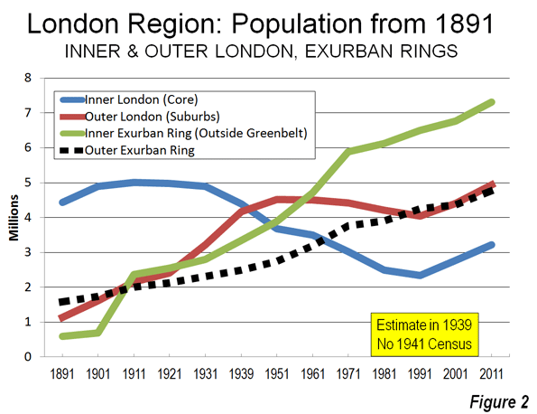
    Over the past century, London has experienced substantial ups and downs in its population and still remains below its 1939 population, even with the large gain over the past decade. Over the same period, Inner London lost millions of its residents and only recently has begun to gain some back, largely due to net international migration gains. Outer London gained in the first half of the 20th century, plateaued and then also gained strongly in the last decade. The exurban areas virtually monopolized growth for most of the post-World War II period (Table) until recently.

    London Region: Population 1891-2011
    Year London Region London (Greater London Authority) Inner London (Historical Core) Outer London (Suburbs) Exurbs (Outside Greenbelt) 1st Exurban Ring (Historical Counties Adjacent to Green Belt) 2nd Exurban Ring
    1891 7,752,000 5,574,000 4,432,000 1,142,000 2,178,000 595,000 1,583,000
    1901 8,931,000 6,507,000 4,898,000 1,609,000 2,424,000 691,000 1,733,000
    1911 11,526,000 7,162,000 5,002,000 2,160,000 4,366,000 2,365,000 2,001,000
    1921 12,071,000 7,386,000 4,978,000 2,408,000 4,684,000 2,553,000 2,131,000
    1931 13,229,000 8,111,000 4,898,000 3,213,000 5,119,000 2,805,000 2,314,000
    1939 8,617,000 4,441,000 4,176,000
    1951 14,832,000 8,193,000 3,680,000 4,513,000 6,635,000 3,891,000 2,744,000
    1961 15,911,000 7,997,094 3,492,881 4,504,213 7,918,000 4,720,000 3,198,000
    1971 17,028,000 7,453,000 3,031,000 4,422,000 9,659,000 5,894,000 3,765,000
    1981 16,644,000 6,713,000 2,498,000 4,215,000 10,035,000 6,127,000 3,908,000
    1991 17,139,000 6,393,000 2,343,000 4,050,000 10,746,000 6,497,000 4,249,000
    2001 18,313,000 7,172,000 2,766,000 4,406,000 11,141,000 6,773,000 4,368,000
    2011 20,256,700 8,164,000 3,222,000 4,942,000 12,092,700 7,318,700 4,774,000
    Sources
    Census except 1939
    Greater London Authority, 1939


    The London Region

    The London region is composed of the Greater London Authority (GLA), which includes Inner London, the historical core municipality, covering approximately the same geographical area as the old London County Council from the 1890s to the 1960s and Outer London, the great suburban expanse consisting of detached and semi-detached housing.

    GLA is surrounded by the Greenbelt, established to contain the expansion of the urban area after World War II, and, at least at first, to decentralize London’s unhealthy and overcrowded conditions. Beyond the Greenbelt are the East of England and the Southeast, which are composed of a first exurban ring of historical county areas, adjacent to the Greenbelt, and a second ring of historical county areas in the East and Southeast, beyond the first ring. Virtually all new urban expansion in the London region was forced into the exurbs by the Greenbelt. As a result, all of the London region’s growth (6 million) since World War II has been outside the Greenbelt (Figure 1).

    Inner London

    Inner London has been a population growth miracle over the past two decades. The 2011 population was 3.2 million, up more than 450,000 from 2001 and nearly 900,000 since 1991. However, the 1991 figure of 2.3 million was more than one-half below the 5,000,000 peak reached in 1911. Even though historical core city losses are typical (where geography is held constant), Inner London’s loss was huge, at more double those sustained in Chicago (since 1950) and Paris (since 1921). The core of Inner London was developed as a walking city and expanded substantially with the coming of transit.  At approximately 26,000 residents per square mile (10,000 per square kilometer), Inner London is less than one-half the density of the ville de Paris and far less dense not only than Manhattan but even less dense than the New York City boroughs of Brooklyn and the Bronx.

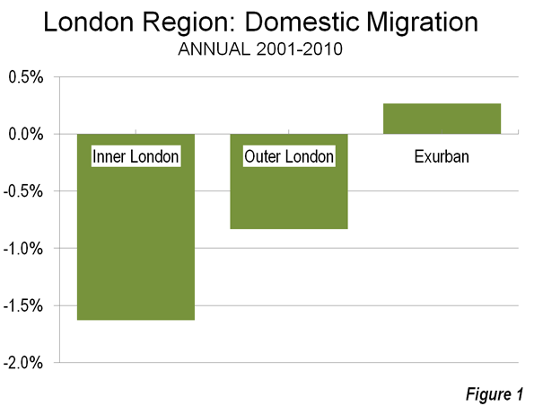
    Yet despite the recent increases, inner London’s 2011 population is lower than counted in the 1861 census (yes, 1861) Even  with the population increase Inner London lost 390,000 domestic migrants (Figure 2) to other parts of Great Britain between 2001 and 2010 (the detailed 2011 data is not yet available at this level).

    Tower Hamlets, one of London’s 32 boroughs, is an example of this population roller-coaster. Tower Hamlets is located just to the east of the Tower Bridge in Inner London on the north bank of the Thames. It is home to substantial new development spurred by the rapid growth of the financial services industry both in the "square mile" ("city of London) and Canary Wharf. Tower Hamlets grew to 254,000 in 2011, a nearly 80 percent increase from the 142,000 registered in 1981, less than its 1801 population (Note: London Boroughs). But like Inner London, Tower Hamlets used to be much more populous, reaching a record for a London borough at 597,000 residents in 1901. It then lost more than 75 percent of its population over the next 80 years.  

    Outer London

    Outer London, which was combined into the Greater London Council in 1965 (and the Greater London Authority in 2000) also grew strongly, from 4.4 million to 4.9 million and is now at its peak population. Outer London’s population density is 10,000 per square mile (4,000 per square kilometer), approximately the same as the District of Columbia. Like Inner London, Outer London also lost domestic migrants, with a net 310,000 residents leaving for other parts of the United Kingdom (Figure 2).

    The Greenbelt

    Since World War II, the London urban area (principally composed of Inner and Outer London) has been surrounded by the Greenbelt on which development is not permitted. The Greenbelt ranges from 10 to 20 miles wide (25 to 50 kilometers) and covers more than three times the size of the Greater London Authority. The Greenbelt has been cited, along with related policies, with substantially raising house prices and contributing to London’s longer commutes than Paris, where there is no greenbelt.

    Exurban London

    Despite their more modest growth in the last decade, the exurbs have been effective in attracting net domestic migration. From 2001 to 2011, three was a net inflow of domestic migrants of 320,000 (Figure 2). Much of this appears to be people leaving London. During the last year, more than 50,000 residents of London moved to the exurbs. Net international migration to the exurbs had been fairly small earlier in the decade, but increased substantially in the later years. By 2009-2010, two thirds of the London region’s net international migration was to the exurbs, and only one-third to London.

    First Exurban Ring

    The first exurban ring includes the historical counties that border on the outside of the Greenbelt. These areas added approximately 550,000 residents between 2001 and 2011 and reached a new population peak, at 7.3 million.

    Second Exurban Ring

    The second exurban ring includes the counties of the East of England and the Southeast that are outside the first ring. These areas added more than 400,000 new residents, and reached a new peak population of 4.8 million.

    London and England

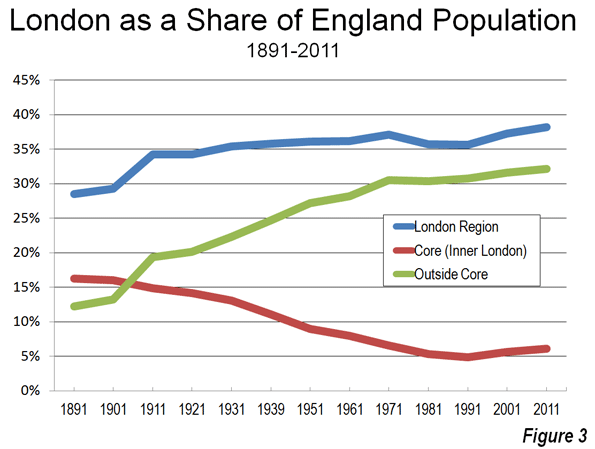
    In contrast to the 1991-2001 decade, the 2001-2011 decade indicated a significant slowdown in the share of England’s population growth in the London region. In the previous decade, all of England’s growth occurred in the greater London region. In the last decade, 50 percent of England’s growth took place around the capital. Overall, the core of London (Inner London) population has steadily fallen relative to the rest of England England’s while the suburbs and exurbs have grown to include one-third of England’s residents (Figure 3). So as Japan is moving to Tokyo, England is still moving to London, but not nearly so fast.

    Wendell Cox is a Visiting Professor, Conservatoire National des Arts et Metiers, Paris and the author of “War on the Dream: How Anti-Sprawl Policy Threatens the Quality of Life.”
    —-

    Note: London Boroughs: The 32 boroughs of London were defined after the creation of the Greater London Council in 1965 (which was abolished in 1986). The Greater London Authority provides data to show the historical population figures for the boroughs, going back to the initial census (1801). The new Greater London Authority was established in 2000, with less power than the previous Greater London Council. The 32 boroughs continue to operate, providing local public services.

    Photograph: London Suburbs (Outer London) by author

  • Transportation for Tomorrow: Driverless Cars

    Economist Clifford Winston of the Brookings Institution outlines the surface transportation system of the future in a Wall Street Journal commentary, "Paving the Way for Diverless Cars." Winston notes "a much better technological solution is on the horizon" than high speed rail "as an effective way to reduce highway congestion" as the Obama administration in Washington and the Brown administration in Sacramento contend. Indeed, not even the voluminous planning documentation used to justify high speed rail provides evidence that the 21st century edition of an early 19th century technology can materially reduce traffic congestion.

    Already Google has conducted experiments with the automated car that have been so successful that they are now permitted in Nevada. Winston suggests that by automating cars, it will be necessary to separate automobile traffic from truck traffic, which will make it possible to provide additional traffic lanes within the existing road footprint. Non-automated cars and trucks would continue to operate in conventional, wider lanes on the same right-of-way. Another advantage would be that with the automated control, more cars could be accommodated in each lane. The need for highway expansion would be largely displaced by substantially improving capacity by upgrading highways with 21st century technology.

    Winston has been a critic of overly expensive urban rail systems and transit subsidies. Driverless cars were also the subject of a Wall Street Journal commentary by Randal O’Toole in 2010.

  • Housing Affordability Protests Occurring in “Livable” Hong Kong, Not “Sprawling” Atlanta

    The Economist has published another in its city rating series, under the headline "The Best city in the World." This one was the result of a contest examining ways to elaborate on its rating system. The winner, Filippo Lovato, added a spatial dimension to the ratings, which included a 5 point rating of "sprawl," a pejorative term for the natural expansion of cities (which in this article means urban areas, areas of continuous urban development). Much of the urban planning literature is pre-occupied with combating urban sprawl, though urban expansion continues virtually everywhere around the world, as cities add population and become more affluent.

    Livability for Whom?

    As Jon Copestake, the Editor of the Economist Intelligence Unit’s Cost of Living and Livability surveys and I discussed in front of a Property Institute of Western Australia meeting, The Economist livability ratings are not aimed at average resident households, but rather at an international audience, such as corporate executives and corporate relocation services. This distinction can be important.

    Hong Kong was top ranked for livability in the new Economist list. Doubtless this is accurate for well paid executives posted temporarily, who are granted substantial housing allowances by their employers and who can live in luxury condominiums within a short walk or taxi ride to their jobs in Central (the core of the Hong Kong central business district).

    For local residents, livability is measured differently than for jet-setters or corporate executives.

    Hong Kong: Smart Growth Model

    With the developed world’s highest urban area density and lowest automobile market share, Hong Kong beguiles anti-sprawl "smart growth" crusaders, for whom these two characteristics are the "two great commandments."

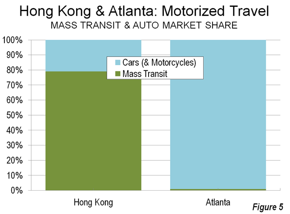
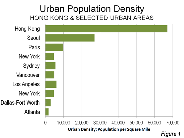
    The entire  Hong Kong urban form (urban area) is as dense as Manhattan at 67,000 per square mile (25,900 per square kilometer), but is more than twelve times the density of the New York urban area: the city and its “sprawling” surrounding suburbs (5,300 per square or 2,100 per square kilometer). Similarly, Hong Kong is somewhat more dense than the ville de Paris, but seven times the density of the Paris urban area (9,800 per square mile or 3,800 per square kilometer). This hyper-density combined with one of the world’s strongest central business districts give Hong Kong a nearly 80% mass transit share of motorized travel, nearly 10 times that of the New York urban area and more than three times that of the Paris urban area (Figure 1).

    "Livable" Hong Kong?

    To its permanent and unsubsidized residents, though, Hong Kong’s spatial Nirvana does not provide much in terms of livability.

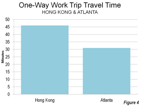
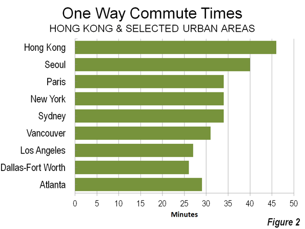
    Excessively Long Commutes Hong Kong’s high density indicates that jobs and houses are relatively close to one another, which should indicate that commute times would be short. Not so. Commutes are among the longest in the developed world – only Tokyo residents take more time to get to work. (Figure 2)

    The average one way commute is 46 minutes in Hong Kong, well above the developed world average of 33 minutes for urban areas over 5,000,000 population. By comparison, commuters in similarly sized Dallas-Fort Worth (26 minutes) and "gridlocked" Los Angeles (27 minutes) get to work much faster. Commuting also takes longer in Hong Kong than in Paris (34 minutes) and London (37 minutes).  Lengthy commutes impose an economic price and make Hong Kong less livable.

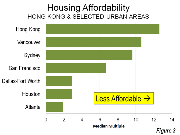
    Exorbitant House Prices: Hong Kong’s housing, the largest household budget item, is profoundly unaffordable. The 8th Annual Demographia International Housing Affordability Survey rates Hong Kong as the most costly out of 325 metropolitan areas. The median house price in Hong Kong’s is 12.6 times the median annual gross household income (the "median multiple"), which leaves little more than a pittance in discretionary income for many households. Perhaps this is why Hong Kong’s fertility rate has fallen to rock bottom levels near the lowest on the planet – people cannot afford kids.

    Even during the housing bubble, coastal California never became so unaffordable. Hong Kong housing is nearly twice as costly as San Francisco (6.7 median multiple) and more than four times as costly as Dallas-Fort Worth (2.9), Houston (2.9) or Atlanta (Figure 3).

    Concern about housing affordability has become so intense that it is an issue in public protests, which The Economist reports to have drawn up to 400,000 people earlier this month (link to photo). Exorbitant house prices make Hong Kong less livable.

    "Sprawling" Atlanta

    Things are much different in "sprawling" Atlanta, which The Economist’s spatial list ranks as the worst among the US entries. Atlanta is at the opposite end of the density spectrum from Hong Kong, with the lowest urban population density of any major developed world urban area.

    Short Commutes: Atlanta’s low density would suggest that jobs and houses must be so far apart that commute times are very long. Again, not so. Atlanta commuters have among the shortest travel times (29 minutes) in the world among urban areas of similar size (see Note: Jobs-Housing Balance). Shorter travel times make Atlanta more livable (Figure 4).

    Other similarly sized US urban areas do even better, such as Dallas-Fort Worth (26 minutes) and Atlanta’s leaders know that traffic congestion need to be eased to improve Atlanta’s competitiveness. But the political process politics has offered a dysfunctional plan that would spend more than half of a new tax on mass transit, which is used by only the one percent. Less than one half of the money would be spent on the roads that the 99 percent use (Figure 5). Any strong growth will overwhelm the stingy highway improvements, and if the voters approve the July 31 referendum, Atlanta’s travel time advantage over Hong Kong could narrow.

    Affordable House Prices: Despite being the bane of planning orthodoxy, Atlanta’s has far better housing affordability than Hong Kong. The median multiple is 1.9, compared to Hong Kong’s 12.6. Hong Kongers pay six times as much of their income for their houses (which are also two-thirds smaller than in Atlanta). So far, there have been no protests against Atlanta’s low house prices. Better housing affordability makes Atlanta area more livable.  

    The Hong Kong Model

    Hong Kong’s high density (more than double that of any other large developed world urban area) is an accident of history, the result of geo-politics, not urban planning. Further, China’s impressive new cities are being built at a small fraction of Hong Kong densities. Yet, Hong Kong has given much to the world. Not least is the fact that its market oriented economy served as the model for economic reform which has radically improved livability for hundreds of millions of people in China.

    Further, Hong Kong is attractive as one of the world’s premier tourist destinations. For aficionados of cities, like me, Hong Kong is intensely interesting. It is the ultimate in urbanization. It is a wonderful place to visit and to live – if someone else is paying the bills.

    However, the interplay between Hong Kong’s hyper-dense urban form and its transportation system burdens Hong Kong residents dearly, both in time and money. For them, Hong Kong is hardly a model of livability.

    ——————-

    Note: Commuting in Dallas-Fort Worth: Larger Dallas-Fort Worth has faster average work trip travel times than Atlanta, at 26 minutes, which are principally are aided by its much superior freeway (motorway) systems and arterial street (non-freeway boulevard) systems. Transit carries about one-half the share (0.6%) of travel in Dallas-Fort Worth as in Atlanta.

    Note: Jobs-Housing Balance: One of urban planning’s principal goals is to achieve a jobs-housing balance, wherein jobs and housing are so close that people can walk to work or use transit, minimizing travel times and distances. Hong Kong is best in this, with its small urban footprint. Yet, despite having achieved the ultimate, it takes Hong Kongers much longer to get to work than Atlantans. The comparison of Hong Kong and Atlanta shows this theoretical measure to be of little importance. A better indicator of the jobs-housing balance is practical – how long it takes to get to work.

    Note: Travel Times by Car and Transit: Mass transit has substantially longer average work trip travel times than cars in nearly all of the world metropolitan areas for which data is available. In Atlanta, the average work trip by car (single-occupancy) was 29 minutes in 2007, compared to 54 minutes for mass transit.

    ———-

    Wendell Cox is a Visiting Professor, Conservatoire National des Arts et Metiers, Paris and the author of “War on the Dream: How Anti-Sprawl Policy Threatens the Quality of Life.”
    Photograph: Kowloon, Hong Kong (by author)

  • Core City Growth Mainly Below Poverty Line

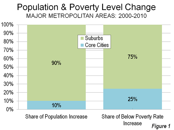
    Over the toughest economic decade since Great Depression, the nation’s core cities continued to gain more than their share the below poverty line population in the 51 metropolitan areas with more than 1,000,000 population. Between 2000 and 2010, core cities (Note 1) attracted approximately 10 percent of the increase in population (Note 2) while adding 25 percent of the increase in people under the poverty line (Figure 1).

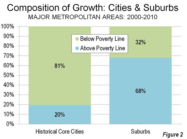
    Most New Core City Residents in Poverty: The core city poverty trend was overwhelming. In the core cities of the 51 metropolitan areas with more than 1,000,000 population (2010), 81 percent of the aggregate population increase was under the poverty line. This compares to the 32 percent of the suburban population increase that was below the poverty line. This may be a much lower figure than the concentration in the core cities, but even that also is far too high (Figure 2).

    The trend in core city poverty concentration was also pervasive. In 39 of the 51 metropolitan areas, core cities accounted for a greater share of poverty level population growth than overall population growth. One of the exceptions was Louisville, where the core city expanded to nearly six times its 2000 land area and more than doubled its population (Note 3). The result was to convert Louisville into a largely suburban city, which masks the high poverty rate in genuine urban core of the former city.

    Poverty in the Suburbs: At the same time, as core city population growth has stalled, much of the numeric increase in the below poverty line population has been in the suburbs. In 2010, the Brookings Institution reported that a majority of the metropolitan population below poverty was in the suburbs (Note 3). This is to be expected, since suburban areas account for nearly 75 percent of major metropolitan area population.

    Partially in response to the Brookings Institution finding, there has been some misinterpretation as to the relative economic fortunes of the core cities and the suburbs. This is consistent with the continuing "drumbeat" of the "return to the cities," which results of the last definitive ten year census only briefly quieted. The "great inversion" cited by Aaron Ehrenhalt and others, wherein the affluent "flock" (the recurring term) to the cities, as the suburbs are ghettoized, remains far from an actual reality.  

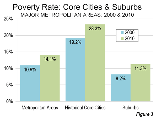
    Overall the average major metropolitan area poverty rate rose from 10.9 percent in 2000 to 14.1 percent in 2010. Rather than gentrify, the core city rate rose from 19.2 percent to 23.3 percent, while the suburban rate rose from 8.2 percent to 11.3 percent (Figure 3).

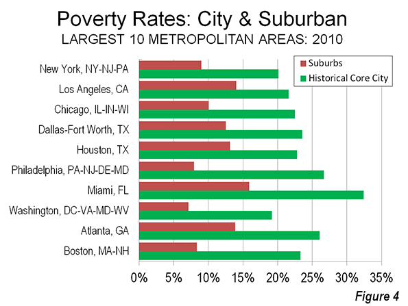
    Core City Poverty Rates Double the Suburbs: In 2010, core city poverty rates were higher in every major metropolitan area than in the suburbs. Overall, average core city poverty rates were more than double that of the suburbs in most metropolitan areas (27 of 51). Among the 10 largest metropolitan areas, the core cities of New York, Chicago, Houston, Philadelphia, Miami, Washington and Boston (Figure 4) suffered poverty rates more than double  those of their suburbs. The cities of Milwaukee and Hartford had the highest poverty rates relative to their suburbs, at four or more times.

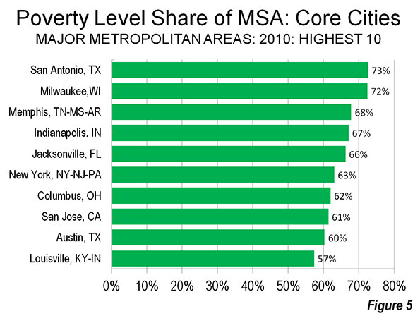
    Shares of Poverty Level Population in the Core Cities: On average, 41 percent of metropolitan area populations living below the poverty rate resided in the core cities. The city of San Antonio had the highest share of its metropolitan below poverty population, at 73 percent, followed closely by the city of Milwaukee, at 72 percent. New York City accounted for 63 percent of its metropolitan below poverty line population and the city of San Jose 61 percent. Even after incorporating suburbs, the city of Louisville contained 57 percent of its metropolitan below poverty level population (Figure 5).

    Highlights of the 2010 Data: The 2010 poverty rates for metropolitan areas, core cities and suburbs are shown in the table below. Highlights of the data are described below:

    Metropolitan Areas: The highest metropolitan area poverty rates were in Memphis (19.1 percent), New Orleans (17.4 percent) and Riverside-San Bernardino (17.1 percent). The lowest metropolitan area poverty rates were in Washington (8.4 percent), Hartford (10.1 percent) and Boston (10.3 percent).

    Core Cities: The city of Detroit had the highest poverty rate, at 37.6 percent, The city of San Bernardino, whose city council voted to file for bankrupcty on July 10, had the second highest poverty rate at 34.6 percent, and Cleveland ranked third highest, at 34.0 percent.  The lowest core city poverty rates were in high-tech centers, the city of San Jose (12.6 percent), the city of Seattle (14.7 percent and in the two core cities of San Francisco-Oakland (15.7 percent). Despite the strong metropolitan area showing (#1) and high suburban ranking (#3), the city of Washington had only the 15th lowest poverty rate among core cities.

    Suburbs: The highest suburban poverty rates were in Riverside-San Bernardino (16.2 percent), Miami (15.9 percent) and Oklahoma City (15.2 percent). The lowest suburban poverty rates were in Baltimore (6.7 percent), Milwaukee (6.9 percent) and Washington (7.1 percent), with Baltimore and Washington profiting from strong federal government employment and contracting.

    The data reflects the continuation of longer term trends as wealth losses continue to afflict many core cities and as domestic migrants continue to move away (As was previously reported core counties, the lowest level at which there is migration data, have predominantly lost domestic migrants, both between 2000 and 2009 and in the latest estimates, between 2010 and 2011.) The problem, however is much larger. Both the core cities and the suburbs are are challenged by heightened poverty rates. The entire urban form, from the exurbs and the suburbs to the core cities   need  a substantial reduction in poverty, although  present economic trends are working against this   result.

    2010 Poverty Rates: Major Metropolitan Areas, Core Cities & Suburbs
    Poverty Rates
    Metropolitan Area (MSA) Historical Core City (HCM) MSA City Suburbs City/  Suburbs
    Atlanta, GA Atlanta 14.8% 26.1% 13.9% 1.88
    Austin, TX Austin 15.9% 20.8% 11.7% 1.78
    Baltimore, MD Baltimore 11.0% 25.6% 6.7% 3.80
    Birmingham, AL Birmingham 17.0% 29.5% 14.2% 2.08
    Boston, MA-NH Boston 10.3% 23.3% 8.3% 2.80
    Buffalo, NY Buffalo 14.4% 30.2% 9.7% 3.13
    Charlotte, NC-SC Charlotte 14.5% 17.2% 12.6% 1.36
    Chicago, IL-IN-WI Chicago 13.6% 22.5% 10.0% 2.24
    Cincinnati, OH-KY-IN Cincinnati 14.0% 30.6% 11.4% 2.69
    Cleveland, OH Cleveland 15.1% 34.0% 10.7% 3.19
    Columbus, OH Columbus 15.7% 22.6% 10.5% 2.16
    Dallas-Fort Worth, TX Dallas 14.6% 23.6% 12.5% 1.88
    Denver, CO Denver 12.5% 21.6% 9.7% 2.21
    Detroit,  MI Detroit 16.6% 37.6% 12.4% 3.02
    Hartford, CT Hartford 10.1% 31.2% 7.8% 3.99
    Houston, TX Houston 16.5% 22.8% 13.1% 1.74
    Indianapolis. IN Indianapolis 14.8% 21.1% 9.1% 2.31
    Jacksonville, FL Jacksonville 15.3% 16.7% 13.1% 1.28
    Kansas City, MO-KS Kansas City 12.4% 20.4% 10.0% 2.05
    Las Vegas, NV Las Vegas 15.1% 16.0% 14.7% 1.09
    Los Angeles, CA Los Angeles 16.3% 21.6% 14.0% 1.54
    Louisville, KY-IN Louisville 15.3% 18.9% 12.2% 1.55
    Memphis, TN-MS-AR Memphis 19.1% 26.5% 12.0% 2.20
    Miami, FL Miami 17.1% 32.4% 15.9% 2.04
    Milwaukee,WI Milwaukee 15.5% 29.5% 6.9% 4.30
    Minneapolis-St. Paul, MN-WI Minneapolis & St. Paul 10.9% 23.7% 7.6% 3.10
    Nashville, TN Nashville 15.4% 20.8% 12.2% 1.71
    New Orleans. LA New Orleans 17.4% 27.2% 13.4% 2.02
    New York, NY-NJ-PA New York 13.8% 20.1% 9.0% 2.24
    Oklahoma City, OK Oklahoma City 15.9% 16.8% 15.2% 1.11
    Orlando, FL Orlando 14.7% 18.5% 14.2% 1.30
    Philadelphia, PA-NJ-DE-MD Philadelphia 12.7% 26.7% 7.9% 3.36
    Phoenix, AZ Phoenix 16.3% 22.5% 13.0% 1.73
    Pittsburgh, PA Pittsburgh 12.2% 22.3% 10.7% 2.08
    Portland, OR-WA Portland 13.4% 18.5% 11.7% 1.59
    Providence, RI-MA Providence 13.7% 30.5% 11.7% 2.60
    Raleigh, NC Raleigh 12.9% 18.4% 10.0% 1.84
    Richmond, VA Richmond 11.6% 25.8% 8.9% 2.91
    Riverside-San Bernardino, CA San Bernardino 17.1% 34.6% 16.2% 2.13
    Rochester, NY Rochester 14.2% 33.8% 9.3% 3.62
    Sacramento, CA Sacramento 15.1% 21.5% 13.3% 1.62
    St. Louis,, MO-IL St. Louis 13.3% 27.8% 11.5% 2.42
    Salt Lake City, UT Salt Lake City 13.1% 22.3% 11.3% 1.98
    San Antonio, TX San Antonio 16.3% 19.1% 11.7% 1.64
    San Diego, CA San Diego 14.8% 17.4% 13.0% 1.34
    San Francisco-Oakland, CA San Francisco & Oakland 10.9% 15.7% 9.0% 1.74
    San Jose, CA San Jose 10.6% 12.6% 8.4% 1.49
    Seattle, WA Seattle 11.7% 14.7% 11.1% 1.33
    Tampa-St. Petersburg, FL Tampa 15.4% 21.3% 14.6% 1.46
    Virginia Beach-Norfolk, VA-NC Norfolk 10.6% 16.4% 9.7% 1.69
    Washington, DC-VA-MD-WV Washington 8.4% 19.2% 7.1% 2.69
    Average (Unweighted) 14.1% 23.3% 11.3% 2.18
    Data from American Community Survey, 2010


    Wendell Cox is a Visiting Professor, Conservatoire National des Arts et Metiers, Paris and the author of “War on the Dream: How Anti-Sprawl Policy Threatens the Quality of Life.”
    Photograph: Downtown Detroit (by author)

    ———————-

    Note 1: "Historical core municipalities," which are defined here. One such city is designated in each metropolitan area, except in Minneapolis-St. Paul and San Francisco-Oakland. In each of the metropolitan areas, these are the core cities of the metropolitan area at the beginning of the great automobile-oriented suburban expansion. These cities represent at least the urban core. However, in most cases, these cities  include considerable post-war suburban development is not genuinely urban core, largely due to post-1950 annexations.

    Note 2: The data in this analysis is extracted from the American Community Survey for 2010 and the United States Census of 2000. The metropolitan areas for both years are as geographically defined in 2010. The total population figures are the population for which poverty status has was determined by the Bureau of the Census (in each year this was approximately 98 percent of the total population).

    Note 3: The city of Louisville reached its population peak of 390,000 in 1960. Its highest density was nearly 9,300 per square mile (3,600 per square kilometer) in 1950, when it had a population of 370,000 in 40 square miles (100 square kilometers). The suburban incorporating consolidation of 2000 left the city with under 600,000 population in 340 square miles and a population density of 1,700 per square mile (700 per square kilometer), one of the lowest core city population densities in the nation.

    Note 4: The Brookings Institution report compared its "primary cities" to suburbs for 95 metropolitan areas. The primary cities included some that were little more than small towns at the beginning of the great automobile oriented suburban expansion, such as Aurora (Denver), Mesa (Phoenix), Santa Ana (Los Angeles), Fremont (San Francisco-Oakland) and Arlington (Dallas-Fort Worth), which is not served by mass transit. Each of these municipalities is classified as suburban in this analysis.

  • Pakistan: Where the Population Bomb is Exploding

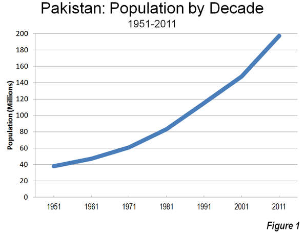
    In much the developed, as well as developing world, population growth is slowing. Not so in Pakistan according to reported preliminary results of the 2011 Pakistan census. Here population is growing much faster than had been projected. Pakistan’s population stood at 197.4 million in 2011, an increase of 62.7 million from the last census in 1998 (Note 1). The new population is 20 million more than had been forecast in United Nations documents. Some of the additional growth is due to refugees fleeing Afghanistan, but this would not be enough to account for the majority of the under-projection error.  

    Pakistan: Moving Up the League Tables

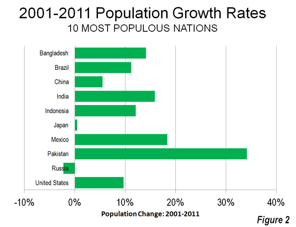
    As a result, Pakistan has passed Brazil and become the world’s 5th most populous nation, following China, India, the United States and Indonesia. Pakistan’s 11 year growth rate is estimated at 34.2 percent, nearly double that of second ranking Mexico, at 18.2 percent, where the birth rate (as indicated by the total fertility rate) is projected to drop to under replacement rate by the end of the decade. Perhaps most significantly, Pakistan’s growth rate is more than double the rates of India (15.9 percent) and Bangladesh (14.1 percent),which have long had reputations for strong growth (Table and Figure 1). At this growth rate, Pakistan could become the world’s fourth most populous nation by 2030, passing Indonesia.

    Table
    10 Most Populous Nations: 2000-2011: Population Trends
    Rank Nation 2000 2011 Change % Change
    1 China    1,278.0    1,348.0        70.0 5.5%
    2 India    1,071.0    1,241.0       170.0 15.9%
    3 United States       285.5       313.1        27.6 9.7%
    4 Indonesia       216.2       242.3        26.1 12.1%
    5 Pakistan       147.1       197.4        50.2 34.2%
    6 Brazil       176.9       196.7        19.8 11.2%
    7 Bangladesh       131.9       150.5        18.6 14.1%
    8 Russia       146.1       142.8         (3.3) -2.3%
    9 Japan       125.9       126.5          0.6 0.5%
    10 Mexico         97.0       114.8        17.8 18.4%
    Population in Millions
    Population data from UN, except for Pakistan (from Pakistan census)
    2000 Pakistan population estimated from 1998-2011 growth rate.

    Remarkably, while much of the world has seen a reduction in fertility rates and population growth, Pakistan’s growth rate has increased. Between 1991 and 2001, Pakistan grew 25 percent, a rate that increased by more than one third (to 34 percent) between 2001 and 2011 (Figure 2). Pakistan’s total fertility rate (TFR — the number of live births the average woman has in her lifetime) is reported by the UN to be 3.2. This is well above India’s rate of 2.6 and far above the Bangladesh rate of 2.2 (which is only barely above the generally accepted replacement rate of 2.1). Pakistan’s fertility rate is the highest of any of the largest countries and one of the highest in the world outside sub-Saharan Africa.

    Not surprisingly, the average household size is very high, at 6.8. This is a slight decline from the rate of 6.9 in 1998. By comparison, more developed countries, such as in Europe and North America, tend to have average household sizes of from 2.2 to 2.6.

    Karachi: World’s Leading Urban Area by 2030?

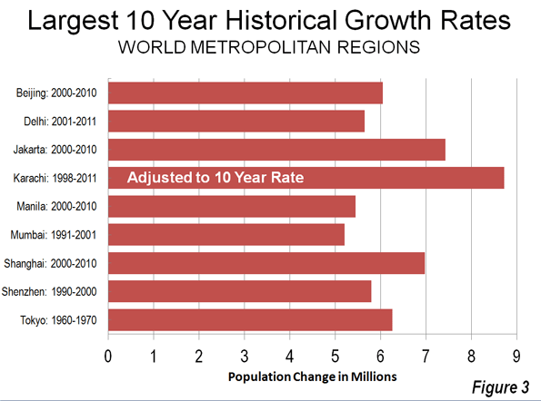
    Pakistan’s largest metropolitan region and capital of Sindh province, Karachi, grew even faster. Between 1998 to 2011, Karachi grew from 9.8 million to 21.2 million, adding more than 11 million people (115 percent). No metropolitan region in the world has ever grown so much in so little a period. This 13 year growth rate, adjusted to 10 years, is 8.7 million. Until the last decade, only Tokyo, among the larger world metropolitan regions, had ever grown more than 6 million in 10 years (6.2 million from 1960 to 1970). Between 2000 and 2010, Jakarta grew 7.4 million, Shanghai grew 7.0 million and Beijing added 6.0 million people.  (See Figure 3.)

    Mexico City and Sao Paulo, with their reputations for explosive growth rates, are now expanding at only 3 million (or less) per decade, and their growth is slowing. The fastest growing metropolitan regions in regions in Europe and North America peaked at similar numbers. New York’s greatest growth was 3.4 million between 1920 and 1930, while Los Angeles grew 3.1 million from 1980 to 1990.

    The early census results indicate an urban area (area of continuous urban development, a part of a metropolitan area) population of approximately 19.5 million, which would rank Karachi as the 7th largest in the world. With an urban land area of approximately 310 square miles (800 square kilometers),  Karachi has an average population density of approximately 63,000 per square mile (24,000 per square kilometer), making it more dense than any "megacity" (urban area over 10 million population) except for Dhaka (Bangladesh) at 115,000 per square mile (44,000 per square kilometer) and  Mumbai (80,000 per square kilometer and 31,000 per square mile)

    Karachi’s strong growth now places it among a group of large and rapidly growing urban areas that could challenge Tokyo to become the world’s largest urban area in 20 years. Indeed, should Karachi’s now 6.0 percent growth rate fall to 4.0 percent, Karachi would still be the world’s largest urban area in 2030, followed by Jakarta, given its present growth rate. With Tokyo likely to begin losing population by that time, Delhi may pass Tokyo by 2030 as well.

    At the same time, Karachi is densifying in an unusual way: it is increasing its average household size. While the average household size is dropping modestly in the nation as a whole, Karachi’s average household size rose from 6.7 to 7.3 between 1998 and 2011, meaning that nearly 10 percent of any recent density increase is within housing units (it is not known whether this is due to higher local fertility rates or "doubling up" of family units in housing units).

    As the largest metropolitan area of one of the world’s largest nations, Karachi draws residents from the rest of the nation (and outside) to take advantage of its economic opportunities. Pakistan is not a rich country, with a gross domestic product (purchasing power parity) of less than $3,000 per capita in 2011. This compares generally to rates of $30,000 to $40,000 in the larger European Union economies, $40,000 to $50,000 in Australia, Canada, United States and Hong Kong and $60,000 in Singapore. However, incomes are higher in Karachi than in the rest of the country.

    As huge numbers of people have migrated to Karachi, many have been forced to live in informal settlements (slums), as squatters. In 2000, it was estimated that approximately 5 million of Karachi’s residents (nearly 50 percent) at the time lived in slums.

    Hyderabad

    Hyderabad (Pakistan, not India) is the second largest metropolitan region in the province of Sindh. Hyderabad’s claim to fame is that it is growing even faster than Karachi. Between 1998 and 2011, Hyderabad grew from 1.4 million to 3.4 million, or 129 percent.

    Other Areas

    So far, the reported census results are limited to the provincial data and local data in the province of Sindh. However, in view of the strong growth rates around the nation, it seems likely that the count in the nation’s second largest urban area, Lahore, will surpass 10 million.

    Urban Growth in Pakistan

    Finally, any review of suburban and exurban land use on Google Earth suggests that Pakistan is taking the advice of the United Nations in its State of the World Population Report 2007: Unleashing the Potential of Urban Growth, which said (Note 2):

    (a) expanding their city limits; (b) planning for road grids in the areas of expansion; (c) locating
    the required 25- to 30-metre-wide right-of-way for the infrastructure grid on the ground

    Radiating both from Karachi and Hyderabad, there are new grids of streets for housing and other development of a type that will allow the burgeoning cities of Pakistan to grow and perhaps even breathe at the same time.

    Wendell Cox is a Visiting Professor, Conservatoire National des Arts et Metiers, Paris and the author of “War on the Dream: How Anti-Sprawl Policy Threatens the Quality of Life.”
    ——————

    Photo: Map of Karachi by Wikipedia user Nomi887

    Note 1: This population includes the areas of Kashmir administered by Pakistan (and claimed by India) and excludes the areas of Kashmir administered by India (and claimed by Pakistan).

    Note 2: This concept was pioneered by Professor Schlomo (Solly) Angel of New York University and Princeton University, who proposed that developing world urban areas provide grids of dirt roads to accommodate their rapidly growing populations. This would ensure a better planned urban area and lead to more healthful living conditions (and avoid the necessity of high-density slums or shantytowns).

  • The Economist on the Costs of London’s Green Belt

    The Economist reminds readers of the economics of housing (or for that matter, oil or any other good or service): constraining the supply of a good or service in demand raises its price. In a 14-page feature on London, The Economist decries the high cost of housing in London. And, for good reason, the 8th Annual Demographia International Housing Affordability Survey showed London to have a median multiple (median house price divided by median household income) 6.9 in the fourth quarter of 2011. This figure, which would be more like 3.0 in a normally functioning market, is exceeded by few other major metropolitan areas, though Hong Kong, Vancouver, Sydney are more unaffordable.

    The Economist noted that:

    … perhaps the biggest constraint on development in London is the Green Belt. Established after the war, it runs (with perforations) all around London, to a depth of up to 50 miles, and bans almost all building on half a million hectares of land around the city.

    Not only has this constraint led to higher house prices, but it has resulted in greater urban expansion and imposed greater costs, in time and money on commuters.

    … it has pushed it into the greater south-east, thus spoiling the countryside across a bigger area. It has also raised the cost of housing and forced workers to travel farther. Commuting costs in London are now higher than in any other rich-world capital.

    One alternative is to relax the Green Belt controls. The Economist points out that allowing development one mile into the Green belt would add one-sixth to the developable area of London. The Economist also notes that "far more than would be needed to make a huge difference to housing availability" and that opening the Green Belt "might not be an environmental disaster."

    The Economist calculates that "the average London worker can buy half an average home." Britain would gain if the interests of those with a stake in a poorer middle class and greater poverty were to finally give way to the general welfare.

  • Portland Mixed-Use Condo Converts to Rentals, Mixed Use Nixed

    The Oregonian reports that suburban Hillsboro’s first mixed use condominium development is no more. Washington Street Station, was built near the suburb’s small but historic downtown (see Note on Hillsboro).

    The project was opened in 2009, one block from the Hillsboro Central station on Portland’s Max (photo) light rail line. The four floor building, located in a generally low-rise residential area with detached housing, was to have had commercial development on the street floor and owner occupied condominiums on the top three floors. But the market was not there. As 2012 began, none of the 20 units had been sold.

    At that point, new owners decided to convert the condominiums to rental units and to convert the first floor commercial space into apartments as well.

    Local planning officials indicate no concern about converting the condominium development to rental units, or the loss of the first planned mixed use development in the city. The Oregonian article indicates, however, that a soon to be built development, located just blocks away, will be required to remain mixed use for at least 30 years.

    ——

    Note on Hillsboro: Hillsboro is typical for a mid-20th century exurb that has been engulfed by the expansion of a growing urban area. In 1950, the Portland urban area had a population of 500,000 (density 4,500 per square mile or 1,750 per square kilometer ), and Hillsboro was a compact exurb with less than 5,000 population, located outside the urban area. Today, the Portland urban area has approximately 1,850,000 residents (density 3,500 per square mile or 1,350 per square kilometer). Hillsboro, which is inside the urban area has more than 90,000 residents, most of whom are beyond walking distance from downtown and have much more convenient access to the big box stores (including the claimed largest "Costco" in the world), shopping centers and strip malls that do most of the retail business. Hillsboro is also the heart of "Silicon Forest" with its information technology manufacturing (such as Intel). As a result, the jobs-housing balance in Hillsboro now exceeds that of Portland according to 2010 American Community Survey data (1.48 jobs per resident worker in Hillsboro compared to 1.45 in the city of Portland).