Author: Wendell Cox

  • Special Report: Census 2011: Urban Dispersion in Canada

    Canada now has fastest-growing population in the G-8 (Note 1), according to the results of the 2011 census, released last week. Canada’s growth rate from 2006 to 2011 exceeded that of the United States by nearly one-third and is nearly one half greater than just a decade ago. The population rose from 31.6 million in 2006 to 33.5 million in 2011.

    The move west continues. For the first time in history, the provinces west of Ontario (Manitoba, Saskatchewan, Alberta and British Columbia) account for more population than the provinces east of Ontario (Quebec, New Brunswick, Nova Scotia, Prince Edward Island and Newfoundland). Two-thirds of the growth was due to immigration, a development cited in a census editorial by the Toronto Star as a solution to the nation’s fertility deficit.

    … we need to make more babies. But we are not, to the extent we need to. Canada’s birth rate of 1.67 children per woman is well below the minimum of 2.0 required. Therefore, we need to get more immigrants, which we are.

    The Major Metropolitan Areas

    Canada’s six major metropolitan areas (over 1,000,000 population) grew even half again as quickly as the nation — 9.3% over five years. Within these metropolitan areas, the pattern of urban dispersion continued, with 83% of the population increase in the largest metropolitan areas (Toronto, Montréal and Vancouver) occurring outside the central municipalities. For the first time, the population in the suburbs of "905" (so-called for its area code), exceeded the population of the amalgamated municipality of Toronto. Similarly, for the first time, the island of Montréal (this includes the ville de Montréal and other municipalities) had a smaller population than the rest of the metropolitan area. According to the The Gazette:

    Most of the people who leave the 514-area (the island -ed) for the 450 (off the island -ed) do so reluctantly. They are often young people with children (or who hope to have children). They enjoy the city’s stimulation and its proximity to workplaces, shopping and entertainment. But they leave because there’s not enough suitable housing in their price range. The taxes are also high and services spotty. Not the greatest place to to raise a family.

    Dispersion continued in Ottawa- Gatineau, Calgary and Edmonton, though not as obvious because most suburban areas are inside these proportionately larger central municipalities. Even so, 56% of the growth in the six major metropolitan areas was outside the central municipalities (Table 1).

    Table 1
    Metropolitan Area Population Trend:
    Central Municipalities & Peripheral Municipalities
    Population (000) Change (000)
    Central Muncipality Surrounding Muncipalities Metropolitan Area Central Muncipality Surrounding Muncipalities Metropolitan Area
    Toronto         2,615            2,968          5,583            112               358             470
    Montreal         1,650            2,175          3,824               29               160             189
    Vancouver            604            1,710          2,313               25               171             197
    Ottawa-Gatineau            883               353          1,236               71                 31             103
    Calgary         1,079               136          1,215               90                 28             118
    Edmonton            812               348          1,160               82                 43             125
    Total         7,643            7,689       15,332            410               791          1,201
    Change in Population Share of Growth
    Central Muncipality Surrounding Muncipalities Metropolitan Area Central Muncipality Surrounding Muncipalities Metropolitan Area
    Toronto 4.5% 13.7% 9.2% 23.8% 76.2% 100.0%
    Montreal 1.8% 7.9% 5.2% 15.3% 84.7% 100.0%
    Vancouver 4.4% 11.1% 9.3% 12.9% 87.1% 100.0%
    Ottawa-Gatineau 8.8% 9.8% 9.1% 69.4% 30.6% 100.0%
    Calgary 9.2% 25.5% 10.8% 76.7% 23.3% 100.0%
    Edmonton 11.2% 14.1% 12.1% 65.5% 34.5% 100.0%
    Average 6.6% 13.7% 9.3% 43.9% 56.1% 100.0%


    Urban Core Analysis

    Recent amalgamations and aggressive annexation policies make more difficult an analysis of the growth between urban cores and more suburban areas. Only one of the six central municipalities retains boundaries that reflect the core urbanization that preceded the explosive automobile-oriented suburban expansion (Table 2). The same situation exists in US metropolitan areas, where only 19 of the 51 largest metropolitan areas have central municipalities with boundaries that have remained relatively constant over the past 60 years (see Suburbanized Core Cities).

    Table 2
    Metropolitan Area Population Trend:
    Urban Core & Outside
    Change in Population Change (000)
    Urban Core Outside Metropolitan Area Urban Core Outside Metropolitan Area
    Toronto            703            4,880          5,583               45               425             470
    Montreal            930            2,894          3,824                 9               180             189
    Vancouver            604            1,710          2,313               25               171             197
    Ottawa-Gatineau            218            1,019          1,236                 7                 96             103
    Calgary            128            1,087          1,215                 4               114             118
    Edmonton            123            1,037          1,160                 2               123             125
    Total         2,705          12,626       15,332               92           1,109          1,201
    Change in Population Share of Growth
    Urban Core Outside Metropolitan Area Urban Core Outside Metropolitan Area
    Toronto 6.8% 9.5% 9.2% 9.5% 90.5% 100.0%
    Montreal 0.9% 6.6% 5.2% 4.6% 95.4% 100.0%
    Vancouver 4.4% 11.1% 9.3% 12.9% 87.1% 100.0%
    Ottawa-Gatineau 3.2% 10.4% 9.1% 6.6% 93.4% 100.0%
    Calgary 3.0% 11.8% 10.8% 3.1% 96.9% 100.0%
    Edmonton 2.0% 13.4% 12.1% 1.9% 98.1% 100.0%
    Average 3.4% 10.5% 9.3% 6.5% 93.5% 100.0%
    Urban core based upon federal electoral districts (see text)


    The core versus suburban trends are better illustrated by examining areas more representative of the historic cores. This following analysis uses federal electoral districts that roughly conform to the urban cores as they existed in the early 1950s, at the beginning of the automobile oriented expansion. Federal electoral districts generally had a population of approximately 100,000 in 2006.

    Toronto: The Toronto metropolitan area grew 9.5%, adding 470,000 new residents.

    The central municipality of Toronto contains considerable post World War II suburban development, as a result of a late 1990s municipal amalgamation imposed by the provincial government. Federal electoral districts (Note 2) that roughly match to the former municipality of Toronto’s early 1950s boundaries grew 45,000, from a population of 658,000 in 2006 to 703,000 in 2011. This 6.8% increase represents some of the strongest growth in 80 years, though the population of the former municipality tended to hover between 600,000 to 700,000. The core growth between 2006 and 2011 was concentrated in the Trinity-Spadina and Toronto Centre electoral districts, where the population rose 38,000 (16%). These two districts have grown strongly as a result of Toronto’s high rise condominium boom. The balance of the urban core grew only 2%.

    Areas outside the core added 425,000 population, nearly 10 times the increase of the core. The percentage increase was also stronger, at 9.5%. Approximately 85% of this region’s growth was outside the municipality of Toronto, which The National Post characterized as explosive.

    Montréal: Montréal was the slowest growing major metropolitan area, at 5.9%, adding 189,000 new residents.

    Like Toronto, expansion of Montréal’s municipality boundaries include considerable amounts of post-war development. Yet the core of the ville de Montréal has become considerably less dense. In 1951, the ville de Montréal had a population of 1,022,000 people in 131 square kilometers. By1996 (before an amalgamation), the population had dropped to 1,017,000 in 186 square kilometers. This represents a 30% loss in density. Between 2006 and 2011, nine federal electoral districts (Note 3) in the urban core experienced 0.9% population growth from 922,000 in 2006 to 930,000 2011. No significant densification was evident in these districts.

    The areas outside the core added 180,000 people, 95% of the population growth. Nearly 90% of this growth was outside the ville de Montréal.

    Vancouver: The Vancouver metropolitan area grew 9.3% between 2006 and 2011 and, despite all the popular literature about the city’s “smart growth” policies, most growth was dispersed. "The population of the City of Vancouver, the urban core, is flat-lining or even declining notes the Globe and Mail. In contrast, "Surrey, Coquitlam and … Port Moody are growing fast — shifting Metro Vancouver’s centre of gravity east." The Vancouver Sun reported that suburban Surrey would surpass the population of the municipality of Vancouver in the next decade (Note 4).

    The municipality of Vancouver has retained virtually its early 1950s boundaries. The municipality grew 4.4% from 2006 to 2011, adding 25,000 residents. One -half the growth was in the densifying Vancouver-Centre electoral district, which includes downtown and English Bay. The rest of the core municipality grew at only one-fourth the rate of downtown. Despite the downtown gains, the suburbs accounted for 87% of the metropolitan area growth. Seven new suburban residents were added for every new resident in the municipality of Vancouver.

    Ottawa-Gatineau:  The Ottawa-Gatineau metropolitan area straddles the Ontario-Québec border, with the national capital in Ottawa. Ottawa-Gatineau added 9.1% to its population between 2006 and 2011, rising to 1,236,000.

    A 1990s amalgamation brought much of the former suburban area into the central municipality. Two federal electoral districts (Note 5) that are representative of the urban core grew 3.2%, from 211,000 to 217,000. Areas outside this core grew 10.4%, from a population of 923,000 to 1,019,000. Non-core area growth accounted for 94% of the metropolitan area’s population growth.

    Calgary: The Calgary metropolitan area grew 12.6%, to a population of 1,215,000 (Note 6). Calgary is one of the world’s most successful post World War II metropolitan areas. Like Edmonton, Phoenix and San Jose, Calgary has virtually no pre-automobile core. However, uncharacteristic for a new metropolitan area, Calgary has developed one of the strongest central business districts – largely due to the oil industry – in North America, and Emporis ranks Calgary’s skyline as 57th in the world, just ahead of Seattle.

    The core federal electoral district (Calgary-Centre), the most dense in the Calgary metropolitan area, experienced growth of 3.0% from 2006 to 2011. This district is comparatively large in land area, but has a   population density one-third that of Vancouver-Centre. All of the electoral districts surrounding Calgary-Centre have much lower densities.

    Most of the growth occurred the northern and western portion of the municipality of Calgary and beyond. Overall, the population growth rate outside the core electoral district was 11.8%. Non-core areas of the Calgary metropolitan area accounted for 97% of the growth.

    Edmonton: Like Calgary, Edmonton is a post-World War II metropolitan area. The Edmonton metropolitan area added 12.1%, to its population, growing to 1,160,000. The core Edmonton-Centre electoral district, the most dense in the metropolitan area, grew only 2.0%, from 121,000 to 123,000. This district has less than one-quarter the density of Vancouver-Centre. Areas outside the core grew 13.4% from 914,000 to 1,037,000. The non-core areas accounted for 98% of the area’s growth. Some of the greatest growth was in the western half of the municipality of Edmonton.

    Suburban Gains Dwarf Core Densification

    Toronto and Vancouver are experiencing significant increases in downtown populations. But the base is so small that these gains are dwarfed by the scale of suburban population increases. At the same time, central municipality areas outside downtown have lagged. Thus, the 2011 census shows that across Canada, urban dispersion continues, results similar to recent results from the United States as well as a number of major metropolitan areas in the both the developed and the developing world. More than 93% of growth was outside the urban cores.

    Wendell Cox is a Visiting Professor, Conservatoire National des Arts et Metiers, Paris and the author of “War on the Dream: How Anti-Sprawl Policy Threatens the Quality of Life

    ————

    Note 1: The G-9 includes Canada, France, Germany, Italy, Japan, the Russian Federation, the United Kingdom, and the United States.

    Note 2: Toronto Centre, Toronto-Danforth, Trinity-Spadina, Parkdale-High Park, Davenport and St. Paul’s.

    Note 3: Westmount-Ville Marie, Mount Royal, Notre-Dame-de-Grâce – Lachine, Outremont, Papineau, Ahutsic, Jeanne-Le Ber, Laurier-Sainte-Marie and Rosemont-La Petite-Patrie

    Note 4: If Surrey exceeds Vancouver in population, it is to be wondered if Canada’s third largest metropolitan area will be called Surrey instead of Vancouver. A similar displacement of the historic core municipality occurred in the United States when the population of Norfolk was exceeded by suburban Virginia Beach, with the first name of the metropolitan area changing accordingly.

    Note 5: Ottawa-Centre and Ottawa Vanier

    Note 6: This 12.6% figure differs from the 10.8% in Tables 1 & 2, which is calculated using actual data reported by Statistics Canada. Statistics Canada indicates that the data "excludes census data for one or more incompletely enumerated Indian reserves or Indian settlements."

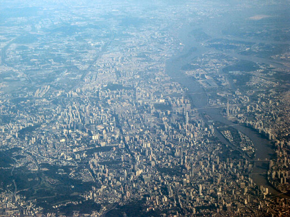
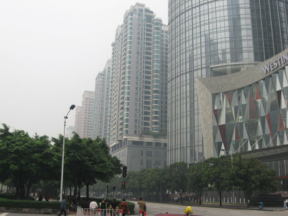
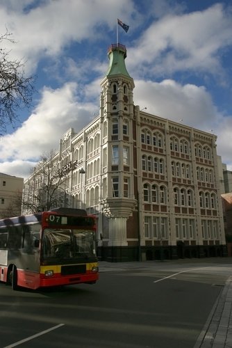
    Photo: Condominium buildings and the CN Tower, Downtown Toronto (by author)

  • 2011 Canada Census: Strong Growth & Suburbanization Continues

    Statistics Canada has just released the first results of the 2011 census. The nation’s population rose to 33.5 million, from 31.6 million in 2006. This is a 5.9 percent growth rate, up from a 5.4 percent rate between 2001 and 2006 and nearly one-half above the 4.0 percent growth rate from 1996 to 2001.

    Suburbanization continued apace in Canada’s largest metropolitan areas. Overall, the suburbs accounted for 83 percent of the population growth in Toronto, Montreal and Vancouver, with 17 percent of the growth in the central municipalities. In the other major metropolitan areas (Ottawa-Gatineau, Calgary and Edmonton), the central municipalities themselves encompass nearly all of the suburban development, so that the core-suburban population increase proportion is masked.

  • How Lower Income Citizens Commute

    One of the most frequently recurring justifications for densification policies (smart growth, growth management, livability, etc.) lies with the assumption that the automobile-based mobility system (Note 1) disadvantages lower income citizens. Much of the solution, according to advocates of densification is to discourage driving and orient both urbanization and the urban transportation system toward transit as well as walking and cycling.

    Of course, there is no question but that lower income citizens are disadvantaged with respect to just about everything economic. However, there are few ways in which lower income citizens are more disadvantaged than in their practical access to work and to amenities by means of transit, walking and cycling. Indeed, the impression that lower income citizens rely on transit to a significantly greater degree than everyone else is just that – an impression.

    The Data: This is illustrated by a compilation of work trip data from the five-year American Community Survey for 2006 to 2010. In the nation’s 51 major metropolitan areas (more than 1,000,000 population), 76.3% of lower income employees use cars to get to work, three times that of all other modes combined (Figure 1).

    Admittedly, this is less than the 83.3% of all employees who use cars for the work trip, but a lot more than would be expected, especially among those who believe that transit is the principal means of mobility for low income citizens. Overall, 8 times as many lower income citizens commuted by car as by transit. In this analysis, lower income citizens are defined as employees who earn less than $15,000 per year, which is approximately one-half of the median earnings per employee of $29,701. .

    Perhaps most surprising is the fact that only 9.6% of lower income citizens used transit to get to work. This is not very much higher than the 7.9% of all workers in the metropolitan areas who use transit. (Table 1).  

    Table 1
    Work Trip Market Share: 2006-2010
    Lower Income Employees and All Employees
    Metropolitan Areas Over 1,000,000 Population
      Lower Income Employees
    All Employees Market Share Employees Earning Under $15,000 Annually Market Share
    Car, Truck & Van: Alone 56.72 73.4% 9.56 63.1%
    Car, Truck & Van: Carpool 7.67 9.9% 2.00 13.2%
    Car, Truck & Van: Total 64.38 83.3% 11.56 76.3%
    Transit 6.14 7.9% 1.46 9.6%
    Walk 2.19 2.8% 0.89 5.9%
    Other (Taxi, Motorcyle, Bicycle & Other) 1.34 1.7% 0.39 2.6%
    Work At Home 3.24 4.2% 0.85 5.6%
    Total 77.29 100.0% 15.16 100.0%
    In Millions
    Note: Median Earnings: $29,701
    Source: American Community Survey: 2006-2010


    Transit’s small market share has to do with its inherent impracticality as a means of getting to most employment. According to ground-breaking research by the Brookings Institution, low-income citizens could reach only 35 percent of jobs in the major metropolitan areas by transit in 90 minutes. In other words, you cannot get from here to there, at least for most trips. It is no more reasonable for lower income citizens to spend three hours per day commuting than it is for anyone else. A theoretical 90 minute one-way standard is no indicator of usable mobility. It is likely that only about 8 percent of jobs are accessible by lower income citizens in 45 minutes (Note 2) and 4 percent in 30 minutes.

    Automobility: Among the major metropolitan areas, lower income citizens use automobiles to get to work most in Birmingham (90.6%). Fourteen other metropolitan areas have lower income automobile market shares of 85% or more, including Charlotte, Detroit, Dallas-Fort Worth, Indianapolis, Jacksonville, Kansas City, Louisville, Memphis, Nashville, Oklahoma City, Raleigh, San Antonio, St. Louis and Tampa-St. Petersburg. As in all things having to do with urban transportation, there are two Americas: New York and outside New York. By far the lowest automobile market share for low income citizens is in New York, at 49.3%. The second lowest lower income automobile market share is in San Francisco-Oakland, at 63.1%. Washington and Boston are also below 70% (Table 2).

    Table 2
    Work Trip Market Share: Car, Truck or Van: 2006-2010
    Lower Income Employees and All Employees
    Metropolitan Areas Over 1,000,000 Population
      Lower Income Employees
    Metropolitan Area All Employees Employees Earning Under $10,000 Employees Earning $10,000-$14,999 All Under $15,000 (Combined)
    Atlanta, GA 88.3% 82.1% 83.8% 82.8%
    Austin, TX 87.2% 77.8% 82.3% 79.5%
    Baltimore, MD 85.9% 73.8% 77.7% 75.1%
    Birmingham, AL 94.6% 89.3% 92.6% 90.6%
    Boston, MA-NH 77.2% 66.4% 73.4% 68.5%
    Buffalo, NY 89.7% 79.8% 84.3% 81.3%
    Charlotte, NC-SC 90.9% 85.3% 88.5% 86.4%
    Chicago, IL-IN-WI 80.0% 73.0% 77.0% 74.4%
    Cincinnati, OH-KY-IN 91.2% 82.7% 87.9% 84.4%
    Cleveland, OH 87.3% 78.1% 84.3% 80.3%
    Columbus, OH 90.8% 80.3% 87.1% 82.6%
    Denver, CO 85.3% 76.9% 82.1% 78.9%
    Detroit. MI 93.1% 85.8% 89.9% 87.2%
    Dallas-Fort Worth, TX 91.5% 85.4% 88.7% 86.7%
    Hartford, CT 89.7% 76.8% 83.1% 78.8%
    Houston. TX 90.7% 83.6% 86.4% 84.7%
    Indianapolis, IN 92.6% 85.1% 90.2% 86.9%
    Jacksonville, FL 91.6% 85.4% 88.3% 86.5%
    Kansas City,  MO-KS 90.6% 85.2% 87.6% 86.2%
    Los Angeles, CA 84.7% 70.8% 74.1% 72.2%
    Las Vegas, NV 89.7% 80.0% 82.4% 81.0%
    Louisville, KY-IN 92.4% 85.6% 87.6% 86.3%
    Memphis, TN-MS-AR 93.3% 85.0% 89.6% 86.7%
    Miami, FL 88.3% 79.0% 80.9% 79.9%
    Milwaukee, WI 89.3% 78.0% 83.5% 79.8%
    Minneapolis-St. Paul, MN-WI 86.8% 76.9% 81.1% 78.2%
    Nashville, TN 92.0% 86.8% 89.5% 87.8%
    New Orleans, LA 90.0% 80.9% 83.8% 82.0%
    New York, NY-NJ-PA 57.6% 50.0% 48.1% 49.3%
    Oklahoma City, OK 93.1% 86.8% 90.8% 88.2%
    Orlando, FL 89.6% 79.7% 86.1% 81.8%
    Pittsburgh, PA 86.2% 77.9% 81.8% 79.2%
    Philadelphia, PA-NJ-DE-MD 82.1% 70.6% 76.2% 72.4%
    Phoenix, AZ 88.6% 80.5% 83.9% 81.8%
    Portland, OR-WA 81.6% 69.3% 75.1% 71.3%
    Providence, RI-MA 89.9% 79.9% 87.1% 82.3%
    Raleigh, NC 90.8% 84.0% 88.0% 85.4%
    Rochester, NY 89.9% 76.7% 87.0% 80.0%
    Riverside-San Bernardino, CA 90.6% 83.4% 87.1% 84.8%
    Richmond, VA 91.3% 83.2% 86.2% 84.2%
    Sacramento, CA 90.7% 80.8% 86.3% 82.9%
    San Antonio, TX 92.1% 85.7% 88.2% 86.6%
    San Diego, CA 85.9% 73.6% 79.9% 76.0%
    Seattle, WA 81.3% 72.4% 76.1% 73.7%
    San Francisco-Oakland, CA 72.4% 63.3% 63.4% 63.3%
    San Jose, CA 87.1% 74.3% 80.2% 76.4%
    Salt Lake City, UT 88.1% 79.6% 83.4% 81.0%
    St. Louis, MO-IL 91.1% 83.8% 88.6% 85.4%
    Tampa-St. Petersburg, FL 90.1% 84.1% 87.6% 85.5%
    Virginia Beach-Norfolk, VA-NC 89.8% 81.9% 81.8% 81.9%
    Washington, DC-VA-MD-WV 77.1% 67.8% 71.4% 69.0%
    Total: 51 Metropolitan Areas 83.3% 75.1% 78.3% 76.3%
           New York 57.6% 50.0% 48.1% 49.3%
          Outside New York 86.5% 77.8% 81.8% 79.3%
    Average of Metropolitan Areas 87.7% 78.9% 83.0% 80.4%
    Median 89.7% 80.0% 84.3% 81.8%
    Maximum 94.6% 89.3% 92.6% 90.6%
    Minimum 57.6% 50.0% 48.1% 49.3%
    Note: Median Earnings: $29,701
    Source: American Community Survey: 2006-2010


    Transit: It’s not surprising that New York has by far the highest transit market share among lower income commuters. However, New York’s lower income transit market share is only marginally higher than its market share among all commuters, at 31.5%, compared to 30.0% for the entire workforce. San Francisco-Oakland had the second highest lower income transit market share at 16.8%. Boston, Chicago, Philadelphia and Washington were also above 10%. The lowest transit market share among lower income citizens was 1.1% in Oklahoma City. Six other metropolitan areas had lower income transit market shares under 2.5%, including Birmingham, Indianapolis, Jacksonville, Nashville, Raleigh and San Antonio (Table 3).

    Table 3
    Work Trip Market Share: Transit: 2006-2010
    Lower Income Employees and All Employees
    Metropolitan Areas Over 1,000,000 Population
      Lower Income Employees
    Metropolitan Area All Employees Employees Earning Under $10,000 Employees Earning $10,000-$14,999 All Under $15,000 (Combined)
    Atlanta, GA 3.4% 5.6% 6.2% 5.8%
    Austin, TX 2.6% 5.9% 5.3% 5.6%
    Baltimore, MD 6.3% 9.8% 9.3% 9.6%
    Birmingham, AL 0.7% 1.8% 1.8% 1.8%
    Boston, MA-NH 11.9% 12.3% 13.3% 12.6%
    Buffalo, NY 3.7% 6.9% 5.8% 6.6%
    Charlotte, NC-SC 2.0% 3.5% 3.1% 3.3%
    Chicago, IL-IN-WI 11.4% 11.9% 12.5% 12.1%
    Cincinnati, OH-KY-IN 2.4% 4.3% 3.8% 4.1%
    Cleveland, OH 2.7% 5.3% 3.1% 4.5%
    Columbus, OH 1.7% 3.5% 3.8% 3.6%
    Denver, CO 4.6% 7.2% 7.2% 7.2%
    Detroit. MI 1.5% 3.5% 3.1% 3.3%
    Dallas-Fort Worth, TX 1.6% 2.6% 2.9% 2.7%
    Hartford, CT 2.8% 5.4% 5.0% 5.3%
    Houston. TX 2.6% 4.1% 4.3% 4.1%
    Indianapolis, IN 1.0% 2.6% 1.6% 2.2%
    Jacksonville, FL 1.1% 2.5% 2.4% 2.5%
    Kansas City,  MO-KS 1.7% 3.8% 3.4% 3.6%
    Los Angeles, CA 6.1% 11.7% 13.9% 12.6%
    Las Vegas, NV 3.6% 7.4% 7.6% 7.5%
    Louisville, KY-IN 2.2% 4.7% 3.7% 4.3%
    Memphis, TN-MS-AR 1.3% 3.3% 3.1% 3.3%
    Miami, FL 3.7% 7.9% 8.3% 8.1%
    Milwaukee, WI 3.7% 7.7% 7.4% 7.6%
    Minneapolis-St. Paul, MN-WI 4.6% 6.4% 6.4% 6.4%
    Nashville, TN 1.0% 1.8% 2.0% 1.9%
    New Orleans, LA 2.5% 5.0% 5.3% 5.1%
    New York, NY-NJ-PA 30.5% 30.0% 34.0% 31.5%
    Oklahoma City, OK 0.5% 1.3% 0.8% 1.1%
    Orlando, FL 3.9% 7.4% 5.9% 6.9%
    Pittsburgh, PA 5.8% 6.2% 6.4% 6.3%
    Philadelphia, PA-NJ-DE-MD 9.3% 12.2% 11.8% 12.1%
    Phoenix, AZ 2.2% 4.2% 4.9% 4.5%
    Portland, OR-WA 6.2% 9.3% 8.3% 8.9%
    Providence, RI-MA 2.6% 3.3% 3.2% 3.3%
    Raleigh, NC 0.9% 1.9% 2.1% 2.0%
    Rochester, NY 2.0% 4.8% 3.0% 4.2%
    Riverside-San Bernardino, CA 1.6% 2.7% 2.3% 2.6%
    Richmond, VA 1.9% 3.8% 4.4% 4.0%
    Sacramento, CA 2.2% 5.1% 4.6% 4.9%
    San Antonio, TX 1.3% 2.3% 2.8% 2.5%
    San Diego, CA 3.3% 6.9% 6.1% 6.6%
    Seattle, WA 8.2% 9.9% 10.5% 10.1%
    San Francisco-Oakland, CA 14.6% 15.8% 18.4% 16.8%
    San Jose, CA 3.3% 6.1% 6.0% 6.1%
    Salt Lake City, UT 3.2% 5.2% 4.5% 5.0%
    St. Louis, MO-IL 2.6% 4.8% 3.4% 4.4%
    Tampa-St. Petersburg, FL 1.4% 2.9% 2.3% 2.7%
    Virginia Beach-Norfolk, VA-NC 1.7% 3.8% 4.7% 4.1%
    Washington, DC-VA-MD-WV 13.9% 14.3% 15.8% 14.8%
    Total: 51 Metropolitan Areas 7.9% 9.4% 10.1% 9.7%
           New York 30.5% 30.0% 34.0% 31.5%
          Outside New York 5.1% 7.1% 7.4% 7.2%
    Average of Metropolitan Areas 4.3% 6.3% 6.3% 6.3%
    Median 2.6% 5.1% 4.7% 4.9%
    Maximum 30.5% 30.0% 34.0% 31.5%
    Minimum 0.5% 1.3% 0.8% 1.1%
    Note: Median Earnings: $29,701
    Source: American Community Survey: 2006-2010


    Automobile and Transit Metrics: The difference in automobile commuting between all employees and lower income employees turns out to be surprisingly small. The least variation is in Birmingham, where the automobile market share among lower income commuters is 4.3% below that of all commuters. Charlotte, Kansas City and Nashville also have lower income market share variations of less than 5%. The greatest variation is in Los Angeles, where the automobile market share among lower income commuters is 14.7% less than for all commuters. The lower income automobile market share is also at least 12.5% below that of all commuters in Baltimore, New York and Portland.

    Oklahoma City has the most lower income automobile commuters in relation to transit commuters, with 81.3 times as many lower income commuters using automobiles as opposed to transit. In Birmingham, Nashville and Raleigh, there are more than 40 lower income automobile commuters per transit commuter.  In contrast, the number of low-income automobile commuters in New York is 1.6 times that of lower income transit commuters. Again, New York is in a class by itself (Figure 2). Outside New York, there are 11.0 times as many lower income automobile commuters as transit commuters. San Francisco-Oakland (3.8) and Washington (4.7) are the only other metropolitan areas with fewer than five lower income automobile commuters per transit commuter (Table 4).

    Table 4
    Work Trip Market Share: 2006-2010
    Lower Income Employees and All Employees
    Metrics: Car, Truck or Van & Transit
    Metropolitan Areas Over 1,000,000 Population
    Lower Income Car, Truck or Van Market Share Compared to All Car Truck or Van Market Share Times Transit
    Metropolitan Area Employees Earning Under $10,000 Employees Earning $10,000-$14,999 All Under $15,000 (Combined)
    Atlanta, GA -7.0% -5.0% -6.3% 14.2
    Austin, TX -10.8% -5.5% -8.8% 14.1
    Baltimore, MD -14.1% -9.6% -12.6% 7.8
    Birmingham, AL -5.6% -2.1% -4.3% 50.7
    Boston, MA-NH -14.1% -5.0% -11.2% 5.4
    Buffalo, NY -11.1% -6.0% -9.4% 12.4
    Charlotte, NC-SC -6.1% -2.6% -4.9% 25.9
    Chicago, IL-IN-WI -8.8% -3.8% -7.0% 6.1
    Cincinnati, OH-KY-IN -9.3% -3.6% -7.4% 20.4
    Cleveland, OH -10.5% -3.3% -8.0% 17.7
    Columbus, OH -11.5% -4.0% -9.0% 23.1
    Denver, CO -9.8% -3.8% -7.5% 10.9
    Detroit. MI -7.8% -3.5% -6.4% 26.2
    Dallas-Fort Worth, TX -6.7% -3.0% -5.2% 31.7
    Hartford, CT -14.4% -7.4% -12.2% 15.0
    Houston. TX -7.9% -4.8% -6.6% 20.5
    Indianapolis, IN -8.1% -2.5% -6.2% 39.1
    Jacksonville, FL -6.8% -3.6% -5.6% 35.1
    Kansas City,  MO-KS -5.9% -3.4% -4.9% 23.7
    Los Angeles, CA -16.4% -12.4% -14.7% 5.7
    Las Vegas, NV -10.8% -8.1% -9.8% 10.8
    Louisville, KY-IN -7.4% -5.3% -6.6% 19.9
    Memphis, TN-MS-AR -9.0% -4.0% -7.1% 26.7
    Miami, FL -10.5% -8.4% -9.6% 9.9
    Milwaukee, WI -12.6% -6.5% -10.6% 10.5
    Minneapolis-St. Paul, MN-WI -11.4% -6.5% -9.8% 12.2
    Nashville, TN -5.7% -2.7% -4.6% 46.1
    New Orleans, LA -10.2% -6.9% -8.9% 15.9
    New York, NY-NJ-PA -13.1% -16.5% -14.4% 1.6
    Oklahoma City, OK -6.8% -2.5% -5.3% 81.3
    Orlando, FL -11.1% -3.9% -8.7% 11.8
    Pittsburgh, PA -9.7% -5.2% -8.2% 12.7
    Philadelphia, PA-NJ-DE-MD -14.0% -7.2% -11.8% 6.0
    Phoenix, AZ -9.1% -5.3% -7.6% 18.1
    Portland, OR-WA -15.1% -7.9% -12.5% 8.0
    Providence, RI-MA -11.1% -3.1% -8.4% 25.3
    Raleigh, NC -7.4% -3.1% -5.9% 42.8
    Rochester, NY -14.7% -3.3% -11.0% 19.1
    Riverside-San Bernardino, CA -8.0% -3.9% -6.5% 32.7
    Richmond, VA -8.9% -5.6% -7.7% 20.9
    Sacramento, CA -10.9% -4.8% -8.6% 17.0
    San Antonio, TX -7.0% -4.2% -6.1% 35.1
    San Diego, CA -14.3% -7.0% -11.5% 11.5
    Seattle, WA -10.9% -6.4% -9.3% 7.3
    San Francisco-Oakland, CA -12.5% -12.4% -12.5% 3.8
    San Jose, CA -14.7% -8.0% -12.3% 12.6
    Salt Lake City, UT -9.6% -5.3% -8.1% 16.3
    St. Louis, MO-IL -8.0% -2.8% -6.3% 19.6
    Tampa-St. Petersburg, FL -6.6% -2.7% -5.1% 31.8
    Virginia Beach-Norfolk, VA-NC -8.7% -8.9% -8.8% 19.8
    Washington, DC-VA-MD-WV -12.0% -7.3% -10.4% 4.7
    Total: 51 Metropolitan Areas -9.8% -6.0% -8.4% 7.9
           New York -13.1% -16.5% -14.4%                   1.6
          Outside New York -10.1% -5.5% -8.4% 11.0
    Average of Metropolitan Areas -10.1% -5.5% -8.5% 12.7
    Median -9.8% -5.0% -8.2%                17.0
    Maximum -5.6% -2.1% -4.3%                81.3
    Minimum -16.4% -16.5% -14.7%                   1.6
    Note: Median Earnings: $29,701
    Source: American Community Survey: 2006-2010


    A Line Driven in a Car: Why is this the case?  The "bottom line" has been perhaps best characterized by Marge Waller and Mark Allen Hughes in a research paper for the Progressive Policy Institute of the Democratic Leadership Council.

    In most cases, the shortest distance between a poor person and a job is along a line driven in a car. Prosperity in America has always been strongly related to mobility and poor people work hard for access to opportunities. For both the rural and inner-city poor, access means being able to reach the prosperous suburbs of our booming metropolitan economies, and mobility means having the private automobile necessary for the trip. The most important response to the policy challenge of job access for those leaving welfare is the continued and expanded use of cars by low-income workers

    Concerns about the automobile based urban transportation system excluding lower income citizens are misplaced. Despite all the hand-wringing, America’s lower income population has considerable access to cars and far greater mobility as a result. It is no more than a figment of planner’s imaginations that lower income citizens would be best served by constraining car use and trying to force them into transit service that more often than not gives circuitous, slower and often impossible for access to work opportunities.

    Wendell Cox is a Visiting Professor, Conservatoire National des Arts et Metiers, Paris and the author of “War on the Dream: How Anti-Sprawl Policy Threatens the Quality of Life

    —–

    Note 1: As used in this article, automobile includes cars, trucks and vans.

    Note 2: This estimate estimates lower income 45 minute access using the ration between 90 minute and 45 minute for all employees (as reported in the Brookings Institution report)

    Photograph: Classic early 1950s Buick, Sinsheim Auto & Technik Museum, Sinsheim, Baden-Württemberg, Germany (by author).

  • Trials, Tribulations and Middle Class Protest in Christchurch, New Zealand

    It has been a tough year and a half in Christchurch. Christchurch is the largest urban area South Island and second in size in New Zealand only to Auckland. On September 4, 2010, Christchurch was hit by a 7.1 magnitude earthquake, stronger than the 7.0 magnitude earthquake that with its aftershocks killed 300,000 people in Haiti in 2010. To the great fortune of Christchurch, there were no fatalities from the September quake.

    In Christchurch, the earthquakes just kept coming and the luck ran out. A major aftershock nearly a year ago (February 22, 2011) registered 6.3, but did much more damage to buildings and infrastructure weakened by the September 2010 quake. A total of 184 people lost their lives, with more than one-half of the victims in the Canterbury Television (CTV) building (photo), which collapsed. Many of the victims in the building were foreign students. The area’s tallest building, the 23-story Grand Chancellor Hotel (photo) was condemned and demolition is underway. Another major hotel, the Crowne Plaza, was too damaged to be repaired and will be demolished. A number of heritage buildings were also condemned and have either been demolished or will be, such as the Manchester Courts (photo), built more than 105 years ago and the Christchurch Press building (photos: before and after), which housed the city’s daily newspaper.

    The city’s fabled Christ Church Cathedral (Anglican/Episcopal) was badly damaged (photos: before and after). The damage was ecumenical, with the Catholic Cathedral of the Blessed Sacrament also suffering serious damage (photos: before and after). Strong aftershocks in June and December of 2011 did additional damage. Much of the central business district was declared a "red zone," off limits except for special permission (red zone map). Finally, the disasters have been a serious enough blow to the nation to cause postponement the 2011 census to 2013.

    For many of the survivors, the earthquakes were just the beginning. In the eastern part of the urban area, toward the Pacific Ocean, streets, houses and commercial buildings were undermined by liquefaction. New Zealand Prime Minister John Key said that 10,000 homes would need to be condemned. Some neighborhoods will not be rebuilt because of potential future liquefaction.

    In the meantime, there has been growing dissatisfaction with the area’s largest municipality (local government authority), the city of Christchurch. Replacement housing consents have been slow in coming and far slower than in neighboring suburban municipalities. This has caused considerable concern for households needing to move and rebuild.

    Then, the city council narrowly approved a 15 percent, $68,000 salary increase ($56,000 US) for the city council chief executive (city manager) Tony Marryatt. The pay raise ignited the unusual phenomenon of an everyday citizen’s protest movement. Marryatt initially defended the pay raise to $540,000 ($450,000 US) claiming he would be paid the market rate. As the debate intensified, Marryatt subsequently decided to decline the pay raise. That was not enough for the protesters, who include homeowners, business owners, members of the clergy and an array of citizens. Protesters demanded that Marryatt resign, that Mayor Bob Parker resign and that the national government schedule new elections.

    For his part, Mayor Parker’s television interview doublespeak characterizing the $68,000 as "not a pay rise" and then mumbling on about "paying the market rate," won him no friends. In the same interview, protest leader, the Reverend Mike Coleman questioned the council executive’s travel for golfing outings to North Island and travel to Australia’s resort Gold Coast. Coleman was particularly critical of Marryatt’s not having interrupted his Gold Coast vacation to return to Christchurch after the December aftershocks.

    On Wednesday, February 1, an estimated 4,000 people (according to the police) gathered in Christchurch at a rally to press their demands. A television report called the "most poignant moment" a speech by firefighter Kelvin Hampton, who told of having to perform a double amputation with "a hacksaw and a knife" above the knee of a victim. Hampton noted the irony that his annual salary was less than the salary increase for the council executive.

    A protest committee released an open letter to Dr. Nick Smith, the Minister for Local Government calling for the national government to:

    • Call for mid-term (unscheduled) elections for city council and mayor
    • "to impress on our council to develop a process that will address the issues around the council holding up the rebuild of Christchurch. This will include how and when to fast-track land-zoning changes, sub-divisions and other consents in an open and transparent way, while ensuring that the suitability of the land and the safety of the buildings is assured."

    The protest committee also called upon Mayor Parker and sitting councilors to "commit to transparency and accountability to the people they were elected to serve in the lead up to new elections."

    TVNZ highlighted the uniqueness of the protest, running a feature on Andrea Cummings, who had never participated in such a protest before. She and her husband run a small business in a hard hit neighborhood
    of east Christchurch. Like Ms. Cummings, most of the attendees had not protested before, though one lady indicated that she had participated in Viet Nam war protests in college.

    Where it goes from here cannot be said. Mayor Parker remains confidently in charge, with the council executive by his side. And, the protesters are determined to keep up the fight. Christchurch may never have seen such a thing before.

  • The Evolving Urban Form: Guangzhou-Foshan

    The Pearl River Delta of China is home to the largest extent of continuous urbanization in the world. The Pearl River Delta has 55 million people in the jurisdictions of Hong Kong, Shenzhen, Dongguan, Guangzhou, Foshan, Zhongshan, Jiangmen, Zhuhai and Macau. Moreover, the urban population is confined to barely 10 percent of the land area. These urban areas are the largest export engine of China and reflect the successful legacy of Deng Xiaoping’s reforms which had their start with the special economic zone in Shenzhen and spread to the rest of the Delta and then much of the nation.

    Adjacent Metropolitan Areas: However, the Pearl River Delta today is not a metropolitan area, as is often asserted. Instead it is rather a collection of adjacent metropolitan areas or labor markets (Figure 1). Metropolitan areas are not created by a large number of people living close to one another. Metropolitan areas are labor markets, crudely delineating the geography of the jobs-housing balance. There is little commuting between the Pearl River jurisdictions. Moreover, as labor markets, metropolitan areas cannot be international unless there is virtual free movement of labor (Note). In the case of Hong Kong and Macau, commuting between the neighboring jurisdictions of Shenzhen and Zhuhai requires crossing the equivalent of an international border.


    Integrating Guangzhou and Foshan: Transportation integration has already come to two of the jurisdictions, Guangzhou and Foshan. The adjacent prefectures (confusingly interpreted into English as "cities") are now linked by a subway and unlike the other Pearl River Delta jurisdictions, the continuous urbanization does not narrow at the border (Figure 1). There are even proposals to merge the adjacent prefectures.

    Guangzhou and Foshan are separated by a tributary of the Pearl River, with a number of bridges that provide similar crossing capacity as exists in cross-river metropolitan areas like Portland (Willamette River), Cincinnati (Ohio River) and St. Louis (Mississippi River).

    Guangzhou itself is the capital of Guangdong, the largest province of China, with approximately 105 million people. Guangdong is the third largest state or province (sub-national jurisdiction) in the world, trailing the states of Uttar Pradesh (contains the eastern suburbs of Delhi) and Maharashtra (capital Mumbai) in India.

    Guangzhou is larger than Foshan. It is better known to many Westerners as Canton, and for many years served as China’s “window” on the west. Even in China, the alternative name is still used, for example in the annual Canton Fair, one of the largest trade fairs in the world.

    Canton was also a principal flashpoint of 19th century hostilities between the British and Chinese. The First Opium War (1839-42) began at Canton and led to the cession of Hong Kong to Great Britain and the establishment of British treaty ports at Fuzhou, Xiamen, Ningbo, Shanghai and Canton (Guangzhou). After the Second Opium War (1856-60), other treat ports were established and France, the United States, Russia, Germany, Japan and others gained similar rights to the British from a weakened Chinese government.

    In 2010, the metropolitan area county and district level jurisdictions of Guangzhou-Foshan had 18.3 million people. This is an increase of 4.4 million from 2000 and 11.6 million from 1982. This is surely a rapid rate of growth, but Shanghai and Beijing grew even faster over the last decade, each adding more than 6 million people.

    Distribution of Population Growth: In contrast to Shanghai and Beijing, where virtually all of the growth has been outside the core, the Guangzhou-Foshan core is growing robustly. From 2000 to 2010, the core districts increased from a population of 4,040,000 to 5,050,000. With a land area of 107 square miles (279 square kilometers), the core is similar in size to the city (municipality) of Sacramento, which has less than one-tenth the population. The core density is 46,800 per square mile (18,100 per square kilometer), up from 37,500 per square mile (14,500 per square kilometer) in 2000. This is about one-third less dense than Manhattan or the ville de Paris (the central city).

    However, as is typical for metropolitan areas around the world, Guangzhou-Foshan’s growth has been most concentrated in suburban areas. The core accounted for 23% of the population growth over the past decade, while the suburbs accounted for 77%.

    The inner suburbs grew from a population of 6,670,000 to 8,400,000. The density rose from 5,000 to 6,300 per square mile (1,900 to 2,500 per square kilometer), similar to that of the San Francisco urban area. The inner suburbs accounted for 39% of the growth and grew 26%.

    The outer suburbs grew from a population of 3,150,000 to 8,200,000 over the past decade. The population density rose from 2,000 to 3,100 per square mile (800 to 1,200 per square kilometer), slightly more dense than the Philadelphia urban area and slightly less dense than the Portland urban area. The outer suburbs accounted for 38% of the growth and grew at the greatest rate, 53% (Figures 2 & 3, Table).


    Guangzhou-Foshan Metropolitan Area & Urban Area
    2000 & 2010 Census
    Metropolitan Area Core Inner Suburbs Outer Suburbs Total
    2000         4,040,000        6,670,000            3,150,000         13,860,000
    2010         5,050,000        8,400,000            4,820,000         18,270,000
    Change         1,010,000        1,730,000            1,670,000           4,410,000
    % 25% 26% 53% 32%
    Share of Growth 23% 39% 38% 100%
    Area (KM2)                   279               3,429                   4,003                  7,711
    Area (Square Miles)                   108               1,324                   1,546                  2,977
    Density (KM2)              18,100               2,400                   1,200                  2,400
    Density (Square Miles)              46,800               6,300                   3,100                  6,100
    Urban Area  Core   Suburbs   Total 
    2010         5,050,000          11,225,000         16,275,000
    Area (KM2)                   279                   2,894                  3,173
    Area (Square Miles)                   108                   1,117                  1,225
    Density (KM2)              18,100                   3,900                  5,100
    Density (Square Miles)              46,800                 10,000                13,300
    Notes
    Boundary changes render district area data incomplete.
    Core: Yuexiu, Liwan, Haizhu, Tianhe 
    Inner Suburbs: Baiyun, Huangpu, Panyu, Nansha, Nanhai, Changcheng
    Outer Suburbs: Huadu, Luogang, Gaoming, Shunde, Shanshi 
    Nansha is in the inner suburbs because 2000 data is combined with Panyu (should be in the outer suburbs)

    Earlier data shows this suburban pattern has been a long term trend.  Between 1982 and 2010, the suburbs accounted for 57% of the growth outside the city of Guangzhou as then defined (Figure 4). District boundary changes limit a more precise analysis based upon a core that did not include large areas without development.

    The Guangzhou-Foshan Urban Area: The soon to be released 8th Annual Demographia World Urban Areas will show the Guangzhou urban area (area of continuous development within the metropolitan area) to have a population of approximately 16.275 million, with a land area of approximately 1,225 square miles (3,173 square kilometers). Barring later data from the multiple national censuses that will soon be reporting data, Guangzhou-Foshan is likely to be ranked the 14th largest urban area in the world. The population density is approximately 13,300 per square mile (5,100 per square kilometer), roughly comparable to the London or Barcelona urban areas. The suburbs of the urban area have a density of approximately 10,000 per square mile (3,900 per square kilometer). Most of the new residential development is multi-unit, such as high rise condominium buildings and work related housing, including dormitories. However, there is some detached housing, which is very expensive.

    A Larger Metropolitan Area: In the longer run a much larger metropolitan (and urban) area could result, if Chinese residents begin traveling to work over much longer distances between these jurisdictions and should the border restrictions at Hong Kong and Macau be eliminated. To achieve this end, there will need to be important local transportation improvements between the jurisdictions, such as more urban railways (which are planned) and wider automobile ownership, to use the already comprehensive (toll) freeway system.

    Wendell Cox is a Visiting Professor, Conservatoire National des Arts et Metiers, Paris and the author of “War on the Dream: How Anti-Sprawl Policy Threatens the Quality of Life

    ——

    Note: International metropolitan areas can now exist in the European Union, where there is free movement of labor across national borders. For example, the Lille metropolitan area is located in both France and Belgium. France and Switzerland (not a member of the European Union) provide another example, where treaty provisions permit international movement of labor with little difficulty in the resulting international metropolitan areas of Geneva (Switzerland-France) and Basel (Switzerland-France).

    Photo (top): Pagoda: Temple of the Six Banyan Trees, Guangzhou (all photos by author)

  • Things Aren’t that Bad in Saginaw

    Our 8th Annual Demographia International Housing Affordability Survey included the Saginaw, Michigan metropolitan area, which we noted had the lowest Median Multiple (median house price divided by median household income) among the included 325 metropolitan areas. This made Saginaw the most affordable metropolitan market, principally due to depressed economic conditions. Saginaw has been ravaged by the loss of manufacturing jobs and a generally declining economy because of its strong industrial ties to the Detroit metropolitan area.

    D. Robertson of Freeman’s Bay (Auckland, New Zealand) must think that things are much worse, as indicated by a letter to the editor in the New Zealand Herald on January 24 (The Herald does not post letters to the editor on its internet site). Robertson says that including and prominently reporting the result of Saginaw Michigan (population 297 in 120-odd dwellings) was inappropriate. Robertson makes a 99.9% error, having apparently confused Saginaw, Missouri (population 297) with Saginaw, Michigan. According to the 2010 US Census, the Saginaw metropolitan area has a population of 200,169. That would be substantial enough to qualify Saginaw as one of New Zealand’s largest metropolitan areas if it were there.

  • “Jaw-Droppingly Shameless:” Mother Jones on California High Speed Rail Projection

    Kevin Drum of Mother Jones reports on the highly questionable "cost of alternatives" that has been routinely repeated by proponents of the California high speed rail project, in an article entitled "California High Speed Rail Even More Ridiculous than Before."

    The mantra goes something like, "yes high speed rail is expensive, but it would cost even more to not build it." Yes, indeed, it is expensive, starting at the low estimate of $98.5 billion the press and proponents usually cite to the nearly $118 billion that the California High Speed Rail Authority itself indicates. Advocates then cite a $171 billion figure as what Californian’s would have to pay if they didn’t build the line.

    Joseph Vranich and I detailed the flaws in this "alternatives estimate" in a Wall Street Journal commentary on January 10 ("California’s High Speed Rail Fibs"). We noted that the claim "sets a new low for planning projections in a field that has been rife with abuse." This was a reference to "strategic misrepresentation” ("lying") that has characterized rail project forecasts, according to top European academics.

    Drum goes further, calling the claim "jaw-droppingly shameless," an appropriate characterization based upon the method and documentation. He goes on to suggest that "A high school sophomore who turned in work like this would get an F."

    Regardless of the views that officials or the public may have on high speed rail, they are entitled to a standard of professional (and taxpayer financed) analysis above "jaw-droppingly shameless."

  • Preserving the “Ideal of a Property Owning Democracy:” Annual Demographia International Housing Affordability Survey

    Demographia and Performanceurbanplanning.org  have just released the 8th Annual Demographia International Housing Affordability Survey, with an introduction by Professor Robert Bruegmann of the University of Illinois at Chicago and author of Sprawl: A Compact History. The Survey is unique in providing cross-national housing affordability comparisons using the median house price data from leading indexes in Australia, Canada, Hong Kong, Ireland, New Zealand, the United Kingdom and the United States.

    The Demographia International Housing Affordability Survey employs the “Median Multiple” (median house price divided by gross annual median household income, before taxes) to rate housing affordability (Table 1). The Median Multiple is widely used for evaluating urban markets, and has been recommended by the World Bank and the United Nations and is used by the Harvard University Joint Center on Housing.

    Table 1

    Demographia Housing Affordability Rating Categories

    Rating

    Median Multiple

    Affordable

    3.0 & Under

    Moderately Unaffordable

    3.1 to 4.0

    Seriously Unaffordable

    4.1 to 5.0

    Severely Unaffordable

    5.1 & Over

    Historically, the Median Multiple has been remarkably similar in Australia, Canada, Ireland, New Zealand, the United Kingdom and the United States, with median house prices having generally been from 2.0 to 3.0 times median household incomes (historical data has not been identified for Hong Kong). This affordability relationship continues in many housing markets of the United States and Canada. However, the Median Multiple has escalated sharply in the past decade in Australia, Ireland, New Zealand, and the United Kingdom and in some markets of Canada and the United States. There has also been a substantial loss in affordability in recent years in Hong Kong.

    Housing Affordability in 2011

    Housing affordability was little changed in 2011, with the most affordable markets being in the United States, Canada and Ireland. The United Kingdom, Australia, New Zealand and Hong Kong continue to experience pervasive unaffordability (Figure 1).

    The Survey covers325 metropolitan markets, including the 81 major markets with more than 1,000,000 population (Table and Chart Attached). There were 24 affordable major markets, 20 moderately unaffordable major markets, 13 seriously unaffordable major markets and 24 severely unaffordable major markets (Table 2). The severely unaffordable major markets were principally in the United Kingdom (8), the United States (6), and Australia (5). Hong Kong was severely unaffordable and there were three severely unaffordable major markets in Canada and one in New Zealand (Table 2). Australia had the highest major market Median Multiple outside Hong Kong (Figure 2).


    Table 2

    Housing Affordability Ratings by Nation: Major Markets (Over 1,000,000 Population)

     Nation

    Affordable (3.0 & Under) 

    Moderately Unaffordable (3.1-4.0)

    Seriously Unaffordable (4.1-5.0)

    Severely Unaffordable (5.1 & Over)

    Total

    National Median

     Australia

    0

    0

    0

    5

    5

    6.7

     Canada

    0

    3

    0

    3

    6

    4.5

     China (Hong Kong)

    0

    0

    0

    1

    1

    12.6

     Ireland

    0

    1

    0

    0

    1

    3.4

     New Zealand

    0

    0

    0

    1

    1

    6.4

     United Kingdom

    0

    0

    8

    8

    16

    5.0

     United States

    24

    16

    5

    6

    51

    3.1

     TOTAL

    24

    20

    13

    24

    81


    The most affordable major market was Detroit, with a Median Multiple of 1.4. This Median Multiple is artificially low, arising from the collapse of housing demand in the most severely depressed major market in the United States. There were another 22 affordable major markets, the most affordable of which were Atlanta, Phoenix, Rochester, Cincinnati, Cleveland and Las Vegas. The strong growth markets of Dallas-Fort Worth, Houston, Orlando, Jacksonville, Nashville, Oklahoma City, Sacramento and Indianapolis also achieved affordable ratings.

    All major markets in Australia and New Zealand, as well as Hong Kong were severely unaffordable.
    Hong Kong was the least affordable major market (ranked 81st), with a median multiple of 12.6. Vancouver was second most unaffordable, at 10.6 (ranked 80th). Sydney was the third most unaffordable, at 9.2 (ranked 79th).  Melbourne and Plymouth & Devon all had Median Multiples above 7.0.

    Among all 325 markets surveyed, there were 128 affordable markets, 117 in the United States, 9 in Canada and 2 in Ireland. There were 71 severely unaffordable markets, principally concentrated in Australia and the United Kingdom (Table 3). Honolulu and Bournemouth & Dorsett (8.7) were the least affordable outside the major markets.

    Table 3

    Housing Affordability Ratings by Nation: All Markets

     Nation

    Affordable (3.0 & Under) 

    Moderately Unaffordable (3.1-4.0)

    Seriously Unaffordable (4.1-5.0)

    Severely Unaffordable (5.1 & Over)

    Total

    National Median

     Australia

    0

    0

    7

    25

    32

    5.6

     Canada

    9

    19

    1

    6

    35

    3.5

     China (Hong Kong)

    0

    0

    0

    1

    1

    12.6

     Ireland

    2

    3

    0

    0

    5

    3.3

     New Zealand

    0

    0

    3

    5

    8

    5.2

     United Kingdom

    0

    1

    12

    20

    33

    5.1

     United States

    117

    64

    16

    14

    211

    3.0

     TOTAL

    128

    87

    39

    71

    325


    Preserving the "Ideal of a Property Owning Democracy"

    One of the principal accomplishments of high-income world societies has been the expansion of property ownership and home ownership to the majority of the population. At the same time, there are dark economic clouds on the horizon. Governments in high income nations are faced with some of the most challenging times in their history. In this environment, the property owning middle class is likely to face significant challenges in the longer run. Since housing is largest element in household budgets, unaffordable housing is a serious threat to the standard of living.

    At the same time, the economic evidence shows that more restrictive land use regulations, such as urban growth boundaries, have been an important factor in the deterioration of housing affordability. On this point, economist Anthony Downs of The Brookings Institution stressed the importance of maintaining the "principle of competitive land supply." The escalation of house prices relative to incomes, from Sydney and Vancouver to London and across California testify to the failure of planning to maintain that principle. The record shows that smart growth (urban consolidation and compact cities policies) is incompatible with housing affordability.

    But there are signs of hope. Florida repealed its growth management law ("smart growth") in 2011. Further, a recent New Zealand government report outlined the importance of a competitive land supply in restoring housing affordability to that nation.

    Four decades ago, urbanologist Peter Hall expressed concern about the threat of such policies to the "ideal of a property owning democracy." The Demographia International Housing Affordability Survey is dedicated to younger generations who have right to expect they will live as well or better than their parents. In large measure due to land use planning that has made housing unaffordable, they may not.

    Wendell Cox is a Visiting Professor, Conservatoire National des Arts et Metiers, Paris and the author of “War on the Dream: How Anti-Sprawl Policy Threatens the Quality of Life

    —-

    Note: The 8th Annual Demographia International Housing Affordability Survey is sponsored in Canada by the Frontier Centre for Public Policy.

    Photo: Suburban Montréal (by author)

  • Why Housing is So Expensive in Metropolitan Washington

    Anyone familiar with housing affordability in the Washington (DC-VA-MD-WV) metropolitan area is aware that prices have risen strongly relative to incomes in the last decade.

    However, a recent Washington Post commentary by Roger K. Lewis both exaggerates the contribution of higher construction costs and misses the principal factor that has driven up the price of housing: more restrictive land-use regulations.

    Lewis compares construction costs in the early 1970s to current costs and finds that they are approximately 6 times as high. However, when the R. S. Means construction cost index for locations in the metropolitan area are adjusted for inflation, the increase is more like 15% (1970 to 2007).

    Lewis also indicates that construction costs have risen faster than the "relatively flat income curve." In contrast, Census Bureau data indicate that median household incomes in the Washington metropolitan area have increased more than 30% since the early 1970s, after adjustment for inflation. House construction costs are the flatter of the two, not incomes.

    While Lewis’ focus is affordable housing, costs in this low income sector are impacted by many of the same factors that drive overall housing affordability (overall house prices relative to incomes).

    Lewis does not consider the huge cost increase in the non-construction costs of housing. In the Washington metropolitan area, we have estimated that the land and the regulatory costs for a new house have been driven to more than 5.5 times the level that would be expected in a normal regulatory environment (see the Demographia Residential Land & Regulation Cost Index). The problem is that the restrictive land-use policies, such as the Montgomery County agricultural reserve, similar regulations in other metropolitan area counties and the large lot building restrictions in Loudoun County have driven the price of land up substantially, and with it, the price of housing. We estimate that more restrictive land use regulations have driven the price of a new house up approximately $75,000.

    Not surprisingly, Washington’s Median Multiple (median house price divided by median household income) remains more than a third above the 3.0 historic norm, at 4.0, even after the burst of the housing bubble. So long as governments in the Washington, DC area continue to strictly ration land for development, higher than necessary costs will continue to plague both housing affordability and affordable housing.

  • Mistaking an Aberration for the End of Home Ownership

    It is well known that home ownership has declined in the United States from the peak of the housing bubble. According to Current Population Survey data, the national home ownership rate fell 2.9 percentage points from the peak of the bubble (4th quarter 2004) to the third quarter of 2011.

    It is less well understood, however, that the spurt in home ownership was, like the housing bubble, an aberration. Looking over the data from the 2010 census, it seems clear that since 2000 the actual decline was a much smaller: 0.8 percentage points from the 2000 census. In fact the current home ownership rate tracks fairly well with that of the post 1960 and the entire pre-bubble period.

    The End of Home Ownership? Analysts such as Richard Florida suggest an end to the preference for home ownership, citing the losses from the bubble, which were, in fact, an aberration. Most recently, Xavier University’s Michael F. Ford wrote in the Washington Postabout home ownership having been driven to 69% by "guarantees" and "tax breaks," such as the mortgage interest deduction. He notes that this "spending spree" led to a loss of $6 trillion in US real estate value.

    Ford does not mention the fact that home ownership had hovered between 60% and 65% for more than three decades before the bubble, without suffering any such losses. Nor does he mention the roles played by Fannie, Freddie and Frank (D-Massachusetts), along with others in Washington, or the related "drunken sailor" mortgage policies concocted by lenders and Wall Street that anyone familiar with credit should have known could only lead to disaster. This was obvious to many observers, although shockingly not to the Federal Reserve Board, as recent reports indicate .

    There is no doubt that the "spending spree" led to the housing bust and triggered the Great Financial Crisis. However it was not the long-standing ownership support programs of the federal government that were primarily to blame. As late as the beginning of the decade, there was no bubble and the median multiple in major metropolitan areas averaged 2.9, within the maximum affordability rating of 3.0. The "spending spree" itself was a rational response to policies that turned housing into the equivalent of a speculative commodities market, with destructive results, in certain large markets. Critically the bubble did not appear in many others.

    Speculation and the "Bubble States:" The extent to which speculation fueled house price increases is the subject of a recent Federal Reserve Bank of New York paper by Andrew Haughwout, Donghoon Lee, Joseph Tracy and Wilbert van der Klaauw. The researchers examine investment, or speculation in real estate markets, during the housing bubble. Investors buy houses that they do not intend to live in for the purpose of making money. In normal times, this investment is principally for rental income or long term capital gains. However, in the highly charged housing markets that developed in some metropolitan areas, prices rose so rapidly, that "flipping" (short term ownership) became very profitable, at least for some.

    Pointing out that "The recent financial crisis—the worst in eighty years—had its origins in the enormous increase and subsequent collapse in housing prices during the 2000s," the New York Fed researchers show that speculative activity was much greater in California, Florida, Arizona and Nevada (which they label the "bubble states") than elsewhere. My analysis indicates that two-thirds of the house value drop in the nation before the Lehman Brothers collapse (September 15, 2008) occurred in the four "bubble states." According to the researchers, this greater speculative activity in these markets made the market more instable because unlike owner-occupiers, investors are far more likely to default on mortgage loans.

    Missing the Geography of Speculation (the Geography of "Smart Growth"): The New York Fed research, however, ignores the geography of speculation. Why was speculation was so much more rampant in the bubble states? There is no reason to believe that residents of California, Florida, Arizona or Nevada are any less interested in making money or, in general, any more greedy. Yet speculators largely stayed out of markets in high demand areas, such as Dallas-Fort Worth, Houston and Indianapolis. In fact, in large parts of the nation, there was little speculative activity. In these markets prices were not rising inordinately so speculators did not bother with them. Instead they focused on more volatile markets where prices were already rising strongly, further swelling local price increases.

    The geography of speculation corresponds largely to the geography of excessive land use restrictions, which created the shortage of land for housing that drove the prices up in the four bubble states (Note). It is a fundamental principle of economics that prices tend to rise where desired goods are in short supply.

    In California and Florida, restrictive land use policies (smart growth or growth management) created a shortage of land for new housing relative to demand. The largest metropolitan areas of Nevada (Las Vegas) and Arizona (Phoenix) are surrounded by government owned land that was auctioned for development at such a slow rate that prices rose by more than five times during the bubble.

    Astonishingly, having missed the geography of speculation, the New York Fed researchers suggest that a solution is to regulate speculation. There is a much simpler answer, which Florida has already implemented which is to repeal the restrictive land use regulations, without which inordinately speculative profits cannot occur.

    Meanwhile, as the speculators have been driven out of the market, and despite federal government efforts to prop-up the artificially high house prices, values have fallen to below 2000 levels for the first time (Figure 1). Based upon Federal Reserve Board and Census Bureau data, it is estimated that the average owner-occupied house value in 2011 (three quarters) has fallen to $211,000, which is down from a peak of approximately $345,000 in 2006 and $222,000 in 2000 (adjusted for inflation).

    So is Ownership now doomed? Yet the home ownership naysayers have little to cheer. Yes, home ownership dropped in the last decade. However, all of the loss was in mobile homes and boats. Even so, the number of mobile home owners remained greater than home owners living in apartments, including condominiums (Figure 2). In fact there was a slight increase in the share of households owning their own homes, if mobile homes and boats are excluded (Figure 3), with a rise from 60.6% in 2000 to 60.9% in 2010.

    There were 5,057,000 more home owners in 2010 than in 2000, and perhaps more surprisingly, 5,119,000 more home owners occupying detached housing. Detached, attached (town house) and apartment ownership each increased over the past decade (Figure 4). Contrary to new urbanist theoreticians, detached housing – not urban condos – overall accounted for the most housing growth, both owner-occupied and rentals.

    Xavier’s Ford calls the American Dream of home ownership a myth and even goes so far as to suggest that home ownership is "more important to special interests than it is to most Americans." In fact, Ford’s interpretation is delusional. That home ownership continued its advance, however modestly, in the face of the worst economic downturn in 80 years, reveals the durability and, indeed the reality of home ownership as an American Dream.

    Photo:  Preventing speculation (New Development, Dallas-Fort Worth suburbs)

    Note: Overall, the bubble states and other restrictively regulated metropolitan areas accounted for more than 90% of the pre-Lehman Brothers loss.

    Wendell Cox is a Visiting Professor, Conservatoire National des Arts et Metiers, Paris and the author of “War on the Dream: How Anti-Sprawl Policy Threatens the Quality of Life