Author: Wendell Cox

  • The Evolving Urban Form: Kolkata: 50 Mile City

    More than a decade ago, the Sierra Club and I crossed keyboards over urban density. The Sierra Club had just posted a new "neighborhood consumption calculator," that gave visitors the opportunity to look at the purported impacts of various density levels. The Sierra Club designated 500 dwelling units per acre as "efficient urban." Independently, Randal O’Toole and I quickly were on the Internet pointing out the absurdity of such high density. I noted that the so-called "efficient urban" density was far higher than that of the "black hole" of Calcutta, and high enough for all US residents to live in the Portland urban area.

    Within 24 hours of our responses, the "neighborhood consumption calendar" had been taken off the Internet. It was later to reappear with "efficient urban" density being discounted a full 80 percent, to 100 housing units per acre. This is still far more dense than nearly all of the world except for low income world shantytowns.

    The Kolkata Municipal Corporation (KMC): The central city of Calcutta, now called Kolkata, remains one of the densest on earth. Its population density is 63,000 per square mile (24,000 per square kilometer)  is nearly the same density as in Manhattan or the Ville de Paris. More accurately, it resembles the entire urban area densities of Mumbai and Hong Kong. The expanding suburbs of Kolkata have a population density of 25,000 per square mile (9,000 per square kilometer). The next edition of Demographia World Urban Areas (due out in the spring) will estimate the population density of the Kolkata urban area at 30,000 per square mile (12,000 per square kilometer).

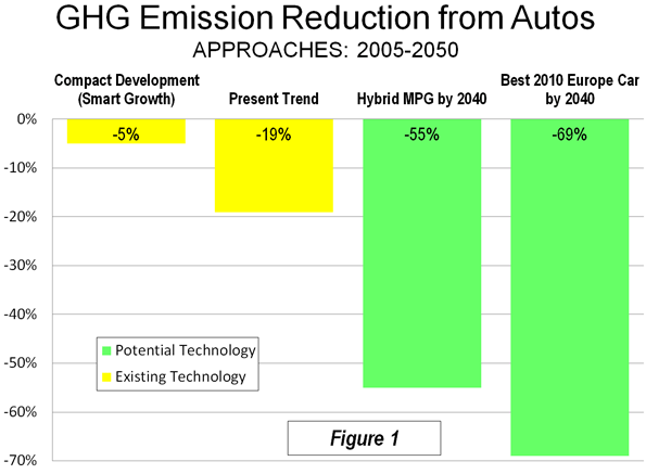
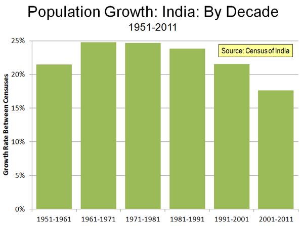
    Kolkata’s spreading urbanization, however, has been going on for at least a half century. Since the 1951 Census, the central city of Kolkata has accounted for only 19% of the urban area population growth. The central city has added nearly 1,800,000 people while the suburbs have added approximately 7,650,000 (Figure 1).

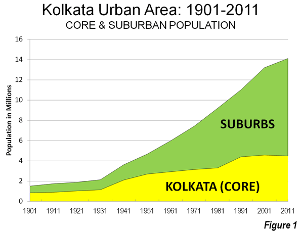
    Over the past two decades, the central city’s growth has been minimal, adding 87,000 people from 1991 to 2011, while the suburbs added more than 3 million new residents. This intensifies the pattern of the last half-century where most growth clustered close to the city core.

    Between 1901 and 1951, 59% of the growth in the Kolkata urban area was in the central city (Kolkata lost the British capital to Delhi in 1911).


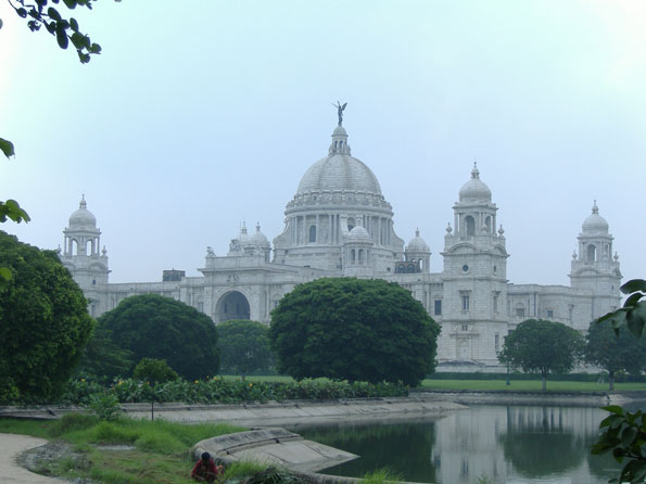
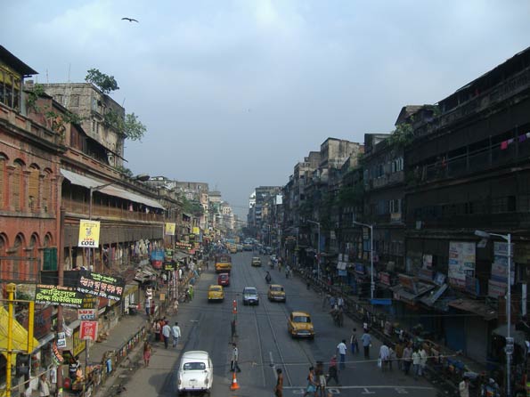
    Photo: Victoria Memorial, KMC

    Slower Growth in the Urban Area: Kolkata is an unusually shaped urban area, nearly 50 miles (80 kilometers) long and stretched along the Hooghly River, one of the many mouths of the Ganges. Dhaka, the megacity capital of Bangladesh used to be on a mouth, until the river’s course changed. The urban area averages little more than 10 miles (16 kilometers) in width. The municipality of Kolkata is in the south, on the east bank of the Hooghly, with most of the suburbs to the north or just across the river.

    Like a number of major urban areas around the world, Kolkata has seen its population growth slow markedly. The peak population growth decade was the 1930s, when there was an increase of 69%. Growth dropped to 29% during the 1940s but continued at 20% or more until 2001. However, between 2001 and 2011, the urban area growth rate dropped to 7%, as the area added only 900,000 new residents. Despite its earlier, smaller size, the Kolkata urban area had not added this few people since the 1921 to 1931 decade.

    In reality, Kolkata is getting less dense by the day. The results of the 2011 Census of India showed that every new resident of the Kolkata urban area was added in the suburbs (Note 1). Yes, the central city of Kolkata remains very dense but its population fell from 4,573,000 people in 2001 to 4,487,000 people in 2011. At the same time, the population of suburban Kolkata grew by nearly 1,000,000 people, and accounted for 110% of the population growth.


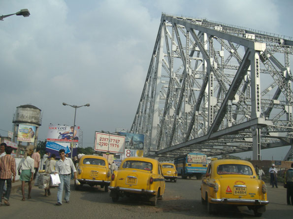
    Photo: Howra Bridge, Hooghly River (Howra)

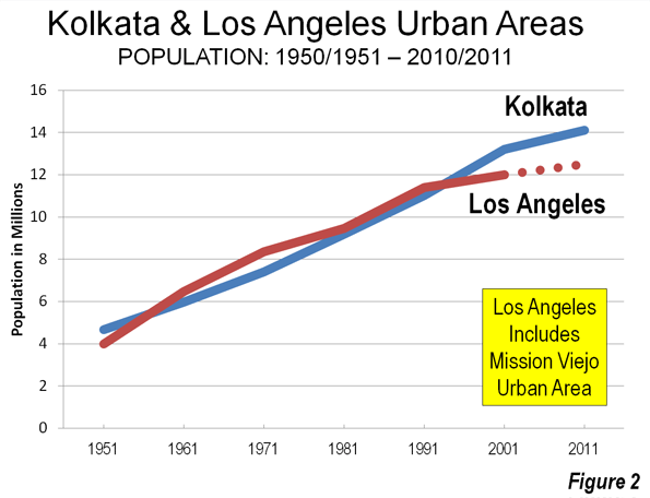
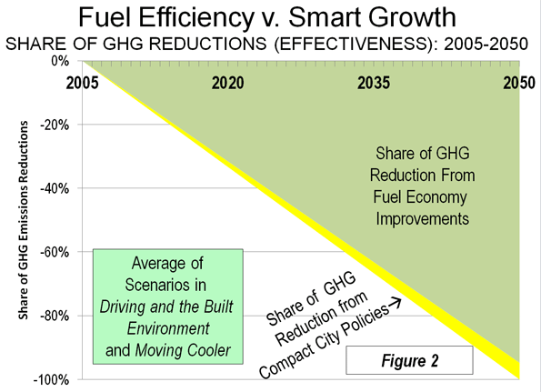
    Kolkata, Los Angeles and China: It also may seem strange that despite its huge typically third world growth since 1951, the Kolkata urban area grew at a rate similar to that of the Los Angeles urban area (Note 2). Los Angeles was larger from the 1960s to 1990, while Kolkata was larger in the 1950s and has been larger the last two decades (Figure 2). Still, Kolkata’s growth has fallen to high income world rates. Other Asian megacities (over ten million)  including Delhi, Shanghai, Beijing, Mumbai, Shenzhen, Manila, Jakarta, Dhaka and Guangzhou) have all experienced much faster growth over the past decade (Note 2). Shanghai and Beijing combined added nearly the same number of people as live in Kolkata.

    Hyper-Densities: Nonetheless, Kolkata continues to have some of the highest densities in the world. In 2001, one third of the central city population (1.49 million) live in slums and shantytowns (photo). They are crammed into just 2 square miles (5 square miles). This would be like all the population of the San Fernando Valley living within a radius 0.6 miles (1 kilometer) of Los Angeles City Hall or all the population of the city of Dallas in the space covered by the passenger terminals at Dallas-Fort Worth International Airport. This is more than 725,000 people per square mile (280,000 per square kilometer), and would nearly equal the "efficient density" definition that the Sierra Club wisely discarded. It can only be hoped that when the 2011 Census slum data is available, it will show that all of the city of Kolkata’s  population loss will have been from the slums.

    Kolkata, like that of other large urban areas around the world described in The Evolving Urban Form series, shows that, given a chance, people reveal their preferences by moving to more space, to construct a better life for themselves and their households.
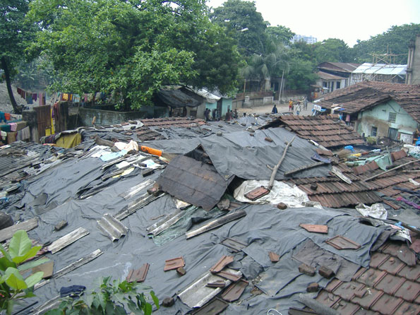

    Photo: KMC Slum

    Wendell Cox is a Visiting Professor, Conservatoire National des Arts et Metiers, Paris and the author of “War on the Dream: How Anti-Sprawl Policy Threatens the Quality of Life

    Kolkata Urban Area: Population 1901-2011
    Year Kolkata Municipal Corporation (KMC) Suburbs Kolkata Urban Area (Urban Aggolmeration) KMC Share of Growth KMC Growth Suburban Growth
    1901         848,000         662,000          1,510,000 56.2%
    1911         896,000         849,000          1,745,000 51.3% 5.7% 28.2%
    1921      1,031,000         854,000          1,885,000 54.7% 15.1% 0.6%
    1931      1,141,000         998,000          2,139,000 53.3% 10.7% 16.9%
    1941      2,109,000      1,512,000          3,621,000 58.2% 84.8% 51.5%
    1951      2,698,000      1,972,000          4,670,000 57.8% 27.9% 30.4%
    1961      2,927,000      3,057,000          5,984,000 48.9% 8.5% 55.0%
    1971      3,149,000      4,271,000          7,420,000 42.4% 7.6% 39.7%
    1981      3,305,006      5,888,994          9,194,000 35.9% 5.0% 37.9%
    1991      4,400,000      6,622,000        11,022,000 39.9% 33.1% 12.4%
    2001      4,573,000      8,633,000        13,206,000 34.6% 3.9% 30.4%
    2011      4,487,000      9,626,000        14,113,000 31.8% -1.9% 11.5%


    —–

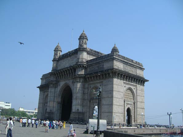
    (Lead Photo: Mahatma Gandhi Road, KMC.

    —–

    Note 1: This is the Kolkata "urban agglomeration," which is the term the Census of India uses to denote urban areas, or areas of continuous urban development. The Census of India, however, applies to criteria to its urban area definitions that make them difficult to compare to urban areas in other parts of the world. The Census of India does not, for example, allow an urban agglomeration to be defined across state lines. Thus, the Delhi urban area continues to be shown as smaller then the Mumbai urban area. This is despite the fact that the immediately adjacent urbanization of Delhi includes millions of additional people in the states of Haryana and Uttar Pradesh and is by international definition by far the largest urban areas in India. The other difficulty is that the Census of India includes the entire land area of any municipality in the urban area. Thus, where municipalities are particularly large in area, as in the case of Mumbai, considerably more land area is reported that he is truly urban. This can lower urban area densities by the inclusion of large areas that are rural. In the case of the call, urban area, the municipalities are generally much smaller, and the geographical definition of the Census of India is much closer to a genuine definition of an urban area or urban agglomeration.

    Note 2: The Mission Viejo urban area is included in the 2000 Los Angeles urban area population in this comparison. Much of this urban area was included in Los Angeles before the 2000 census and it seems likely that it will be reunited with Los Angeles in 2010. The 2010 US urban area geographical definitions have not yet been released. Based upon the change in the Los Angeles metropolitan area population, it is assumed that the Census Bureau’s urban area will show a population of approximately 12.5 million.

    Note 3: Chongqing is sometimes incorrectly characterized as a megacity, because of its status of a "provincial level municipality" in China. However, the Chongqing provincial municipality is largely rural, and covers a land area similar to that of Austria or Indiana. The Chongqing urban area has a population of approximately 7 million.

  • The Driving Decline: Not a “Sea Change”

    The latest figures from the United States Department of Transportation indicate that driving volumes remain depressed. In the 12 months ended in September 2011, driving was 1.1 percent below the same  period five years ago. Since 2006, the year that employment peaked, driving has remained fairly steady, rising in two years (the peak was 2007) and falling in three years. At the same time, the population has grown by approximately four percent. As a result, the driving per household has fallen by approximately five percent.

    There are likely a number of reasons for the driving decline, some of which are described below.

    Democratization of Mobility: The leveling off of driving is something analysts have expected for some time. More than ten years ago, Alan Pisarski noted that drivers licenses and automobility had saturated the market among the While-non-Hispanic population. For decades, driving had been increasing at a substantially faster rate than the population, as driving rates for women and minorities converged  upon the rate of White-non-Hispanic males.

    Clearly, the continued, extraordinary increase in driving of recent decades could not be expected to continue, since nearly all were already driving. Pisarski called this the "democratization of mobility" in a 1999 paper. At that time only African-Americans and Hispanics were still behind the curve. The recent economic difficulties have slowed the progress toward equal automobility for minorities. In 2009, American Community Survey data indicates that the share of Hispanic households without access to a car remained 40 percent above White-non-Hispanic Whites. The rate of African-American no-car households was 20 percent above that of White-non-Hispanics. The driving decline reflects in large part the failure of the economy to produce equal mobility opportunities for minority households.

    Higher Gasoline Prices and the Middle Class Squeeze: One of the most important factors has to be the unprecedented increase in gasoline prices. Over the past decade, gasoline prices have doubled (adjusted for inflation) and have remained persistently high. It has worsened in the last five years, with prices having risen more rapidly than in any period relative to the previous decade in the 80 years for which there are records. This has taken a huge toll on households. At average driving rates, budgets have increased by nearly $1,800 annually to pay for the higher gasoline prices. In a time (2000-2010) that median household incomes declined $3,700 (inflation adjusted), it is not surprising that people are driving less.

    Unemployment: Not Driving to Work: Today’s higher unemployment means that fewer people are driving to work. Employment peaked in 2006. Assuming average work trip travel distances, the smaller number of people working now would reduce travel per household by more than one percent (one-fifth of the household reduction).

    Shopping Less Frequently due to Higher Gasoline Prices: According to the Nationwide Household and Transportation Survey (2009), the average household makes 468 shopping trips annually. If shopping trips were reduced by one quarter in response to higher gasoline prices, the reduction in travel per household would be enough, along with the work trip reductions, to account for all of the decline over the past five years.

    Information Technology: Not Driving and Telecommuting Instead: Again, advances in information technology appear to have also added to the decline. Even while employment was falling, working at home (mainly telecommuting) increased almost 10 percent between 2006 and 2010 (latest data available) and telecommuting added six times as many commuters as transit. Working at home eliminates the work trip and is thus the most sustainable mode of access to employment. In just four years, in working at home removed as much automobile travel to work as occurs every day in the Salt Lake City metropolitan area.

    More Information Technology: Not Driving and Texting Instead? Adie Tomer at the Brookings Institution notes a decline in the share of people 19 years and under who have drivers licenses as potentially contributing to the trend. She cites University of Michigan research by Michael Sivak and Brandon Schoettle, who documented the decline. Sivak told The Michigan Daily that "a major reason for the trend is the shift toward electronic communication among America’s youth, reducing the need for ‘actual contact among young people.’"

    Still More Information Technology: Not Driving and Shopping On-Line Instead? And, as with electronic communication and telecommuting, there is also an information technology angle to shopping. The substantial increase in on-line shopping could be reducing shopping trips.

    Not Making Intercity Trips? All of the loss in driving has been in rural areas, rather than urban areas. Since the employment peak in 2006, urban driving has increased 0.4 percent (though driving per household has decreased). By comparison, rural driving has declined 6.0 percent (Note). This much larger rural driving decline could be an indication that people have reduced discretionary travel, such as longer trips that extend beyond the fringes of urban areas (Figure). As with transit, however, it would be a mistake to characterize Amtrak as having attracted much of the reduced rural travel (or for that matter from airlines, see If Wishes were Iron Horses: Amtrak Gaining Airline Riders?). Over the period, Amtrak’s gain (passenger mile) has been approximately one percent of the rural loss.

    Not Driving and not Transferring to Transit: Transit ridership trends have been generally positive over the past decade. Since 2006, transit ridership has risen 3.4 percent. This compares to the 1.1 percent decline in automobile use. However, it would be incorrect to assume attraction to transit as contributing materially to the decline in driving. Because transit has such a small market, even this healthy increase has budged its urban market share (now approximately 1.7 percent) up by barely 0.5 percentage points.

    Besides scale, there is another reason transit has not been the beneficiary of the driving reduction. Automobile competitive transit service is simply not accessible for most trips. For example, it is estimated that less than four percent of metropolitan jobs can be reached in 30 minutes by transit for the average metropolitan area resident. This compares to the more than 65 percent of automobile commuters who do reach their jobs in 30 minutes or less. In short, transit is not an alternative to the car for the vast majority of urban trips.

    It does no good to suggest this can be materially improved by increasing transit service. The most lucrative transit markets are already served, and new ones would be more expensive. This is illustrated by the exorbitant cost of adding ridership. Over the most recent decade, transit ridership increased 21 percent, which required an expenditure increase of 59 percent, nearly three times as much.

    Decentralization of Jobs and Residences: The 2010 census indicated that the American households continue to decentralize, increasingly choosing to live in single-family detached houses in the suburbs. The same trend has been occurring in employment locations, as Brookings Institution research indicates. Between 1998 and 2006, less than one percent of new employment was located within three miles of urban cores. Nearly 70 percent of the new jobs decentralized to outer suburban rings.

    The continuing dispersion of jobs and residences could dampen the increase rate of driving in the years to come, as households have greater opportunities to live in the suburban surroundings they prefer, while also commuting to the more proximate jobs that have moved to the suburbs.

    The Decline in Context: Among the potential causes, certainly the most important is the economic situation,with steeply declining household incomes and the worst economic situation since the 1930s. The longer term driving trends will be more apparent when (and if) prosperity restores healthy growth in employment. Moreover, with only a small part of travel being attracted to transit, a more significant shift could involve substitution of access by information technology (on-line). Even with the decline, however, there has been nothing like a "sea change" in how the nation travels.

    Note: The data on driving is estimated from Federal Highway Administration (FHWA) reports. FHWA produces monthly preliminary estimates, which are subsequently adjusted in annual reports.

    Wendell Cox is a Visiting Professor, Conservatoire National des Arts et Metiers, Paris and the author of “War on the Dream: How Anti-Sprawl Policy Threatens the Quality of Life

    Photograph: Harbor Freeway, Los Angeles

  • New Census Data Reaffirms Dominance of the South

    The 2011 state population estimates released earlier today by the Census Bureau show that the South has retained its dominant position in both population and growth over the last year. Southern states accounted for more than one half of the nation’s population growth between 2011 and 2000, despite having little more than one third of the population. Moreover, the South was the recipient of 95% of the inter-regional net domestic migration (people moving from one state to another), with the West accounting for the other 5%, with the losses split between the Northeast and the Midwest.

    Overall, a net 533,000 people moved from one state to another, somewhat above the low of 503,000 in 2008 and below the 573,000 at the beginning of the previous decade (2001). The figure, however, remained less than one-half that of the mid 2000s peak.

    The state data confirmed the "return to normalcy," that had been indicated by the 2010 American Community Survey data.

    The South Rises Again

    In 2011 (July 2010 to June 2011), seven of the top domestic migration gaining states were in the South. This is a restoration of the same dominance the South achieved in 2001 to 2006. Some of the states have changed, but the overall impact is little different.

    Texas:Texas again led the nation in net domestic migration, adding 145,000 people from other states to its population. This was a slight increase from the 143,000 net domestic migrants in 2009 (Note 1) and was the highest for Texas since the artificially intense exodus from Louisiana in the year (2006) following hurricanes Katrina and Rita. Texas has led the nation in net domestic migration for six years and ranked second in the nation over the 2001 to 2009.

    Florida: Most spectacularly, however, has been the performance of Florida. Florida had been a net domestic migration leader for years, and had been number one from 2001 through 2005. However, when its highly inflated house prices collapsed (New York Federal Reserve Bank research refers to Florida as one of the "four bubble" states, along with California, Arizona and Nevada), Florida lost domestic migrants for the first time in at least six decades, in both 2008 and 2009. That has been radically turned around. In 2011, Florida added 119,000 net domestic migrants, housing prices dropped to normal levels (Note 2). While this is less than one half the gains in 2004 and 2005, it exceeds the annual Texas increase in the previous decade by 20%.

    North Carolina and South Carolina: North Carolina ranked third, adding 41,000 net domestic migrants. This is an improvement from a fourth-place ranking in the previous decade. Neighboring South Carolina added 22,000 net domestic migrants and ranked sixth. This is an improvement from the previous decade’s ranking of seventh. The domestic migrants to North Carolina and South Carolina have been called "halfbacks," as some have suggested that many who had moved to Florida from the Northeast have subsequently moved to North Carolina and South Carolina, essentially one half of the way back to where they moved from originally.

    Tennessee, Georgia and Virginia: Tennessee (7th), Georgia (8th) and Virginia (9th) rounded out the South’s seven of the top 10 states. Tennessee improved from having been 8th in 2001 to 2009, while Georgia dropped from 5th and Virginia was a new entrant, having previously ranked 12th.

    Western Runners-Up

    While the West continued to show net domestic migration gains, this formerly fastest-growing area of the nation has fallen well behind.

    Washington: Washington ranked fourth in 2011, an improvement from ninth between 2001 and 2009. Washington added 35,000 net domestic migrants.

    Colorado: Colorado also improved its position, adding a net 31,000 domestic migrants and ranking fifth in 2011, which is up from its 10th ranking in 2001 through 2009.

    Oregon:Oregon ranked 10th, adding 14,000 net domestic migrants and was a new entrant to the top 10, having placed 11th between 2001 and 2009.

    Things Never Change: The Bottom 10

    A similar restoration of normalcy is evident in the bottom 10 states. From 2001 to 2009, all of the bottom 10 net domestic migration states were in the Northeast or the Midwest, joined by California. This changed somewhat in 2011, with formerly fast-growing Nevada, edging out one of the former bottom 10. There was some movement at the very bottom of the list.

    New York: New York recovered its last place position (51st), which it held overall between 2001 and 2009, but had yielded to California later in the decade. New York lost 114,000 net domestic migrants in 2011, which compares to the 1,650,000 loss between 2000 and 2009.

    Illinois:Illinois had the second-highest net domestic migration loss, sending 79,000 of its residents to other states. Illinois had ranked 49th in net domestic migration in the previous decade, with a 615,000 loss. Unlike the other biggest losers, New York and California, the Illinois rate in the single year of 2011 exceeded its annual rate of net domestic migration loss between 2000 and 2009.

    California:The bad news is that California continues to be among the most hemorrhaging states in net domestic migration. The 2000 to 2009 net domestic migration loss of 1,500,000 was more than the population of the cities (municipalities) of San Francisco and Sacramento combined. Perhaps it is good news that the net domestic migration loss dropped to 66,000 in 2011, less than half the annual rate in the previous decade. California ranked 49th in net domestic migration in 2011, an improvement from its 50th place position in 2001 through 2009.

    Michigan: Michigan continued its heavy losses, losing a net 57,000 domestic migrants in 2011 and ranking 48th. In the previous decade, Michigan had also ranked 48th and had a net loss of more than 535,000 domestic migrants.

    New Jersey, Ohio and Connecticut: New Jersey, Ohio and Connecticut occupied the next three higher positions in the bottom ten. The New Jersey and Ohio ranks of 47th and 46th were the same as in the previous decade. Connecticut ranked 45th in 2011 and had ranked 42nd, at the top of the bottom 10, in the previous decade. Each of these states experienced an acceleration of net domestic outmigration relative to their annual loss in the previous decade. In the previous decade, the New Jersey and Connecticut losses had been driven by the New York metropolitan area, which suffered the preponderance of the net domestic migration losses in the Northeast.

    Missouri and Indiana: The Midwestern states of Missouri and Indiana were new entrants to the bottom 10. Missouri ranked 44th in net domestic migration in 2011, losing 12,000, a substantial deterioration from its 20th ranking in the previous decade when the state added 41,000 residents from other states. Indiana ranked 43rd compared to its 32nd place ranking in the previous decade.

    Nevada: Nevada, which had ranked sixth in net domestic migration in the previous decade, occupied the top position in the bottom 10, at 42nd. Nevada lost 11,000 domestic migrants, compared to a gain of more than 360,000 in the previous decade. Like Florida, house prices had escalated sharply during the housing bubble and prices have since fallen back to normal levels. However, much of Nevada’s economy is tied to that of California, which could be a hindrance to the restoration of its previous growth.

    Other Notes

    The other "bubble state," Arizona ranked 11th in net domestic migration, adding 13,000 new residents from other states. As in Florida, house prices had escalated sharply but have since fallen back to normal levels. However, despite its healthy domestic migration, Arizona’s gain is far less than its annual rate in the previous decade.

    There are nothing but surprises in the balance of the top 15. Oklahoma, which has long exported people, especially to the West, ranked 12th in net domestic migration, an improvement from 19 in the previous decade. The District of Columbia ranked 13th, which is a strong improvement from its previous ranking of 37th. Louisiana continued its recovery, ranking 14th, which is an improvement from 45th in the previous decade. North Dakota, whose 2000 population was less than that of 1920, ranked 15th, which is an improvement from 31th in the previous decade.

    No Matter How Much Things Change They Stay the Same

    Both over the last decade and in 2011, the South accounted for 53% of the nation’s growth, the West 32%, with the Midwest rising from 8% to 9% and the Northeast falling from 7% to 6%. And, as indicated above, net domestic migration results were similar. The conclusion from the new census estimates is consistent with the old adage that "no matter how much things change, they stay the same."

    Net Domestic Migration by State:
    2001-2009 and 2011
    By 2011 Rank
    State 2011 2011 Rank 2001-2009 2001-2009 Rank
    Texas       145,315                   1        838,126                   2
    Florida       118,756                   2     1,154,213                   1
    North Carolina         41,033                   3        663,892                   4
    Washington         35,166                   4        239,037                   9
    Colorado         31,195                   5        202,735                 10
    South Carolina         22,013                   6        306,045                   7
    Tennessee         20,328                   7        259,711                   8
    Georgia         17,726                   8        550,369                   5
    Virginia         15,538                   9        164,930                 12
    Oregon         13,636                 10        177,375                 11
    Arizona         13,150                 11        696,793                   3
    Oklahoma           8,933                 12           42,284                 19
    District of Columbia           8,334                 13         (39,814)                 37
    Louisiana           7,085                 14       (311,368)                 45
    North Dakota           6,368                 15         (18,071)                 31
    Kentucky           5,761                 16           81,711                 15
    Arkansas           5,724                 17           75,163                 16
    Montana           3,888                 18           39,853                 21
    West Virginia           2,814                 19           17,727                 26
    South Dakota           2,610                 20             7,182                 27
    Delaware           2,347                 21           45,424                 18
    New Mexico           2,202                 22           26,383                 24
    Alabama           1,974                 23           87,199                 14
    Alaska               740                 24           (7,360)                 29
    Wyoming             (149)                 25           22,883                 25
    Idaho             (256)                 26        110,279                 13
    Utah             (826)                 27           53,390                 17
    Vermont             (841)                 28           (1,505)                 28
    Nebraska             (977)                 29         (39,275)                 36
    Maine          (1,000)                 30           29,260                 23
    Pennsylvania          (1,121)                 31         (33,119)                 34
    Iowa          (1,361)                 32         (49,589)                 40
    Hawaii          (2,320)                 33         (29,022)                 33
    Maryland          (2,994)                 34         (95,775)                 43
    New Hampshire          (3,645)                 35           32,588                 22
    Rhode Island          (6,273)                 36         (45,159)                 38
    Mississippi          (6,672)                 37         (36,061)                 35
    Kansas          (7,928)                 38         (67,762)                 41
    Minnesota          (8,073)                 39         (46,635)                 39
    Massachusetts       (10,886)                 40       (274,722)                 44
    Wisconsin       (10,990)                 41         (11,981)                 30
    Nevada       (11,113)                 42        361,512                   6
    Indiana       (11,412)                 43         (21,467)                 32
    Missouri       (11,831)                 44           41,278                 20
    Connecticut       (16,848)                 45         (94,376)                 42
    Ohio       (44,868)                 46       (361,038)                 46
    New Jersey       (54,098)                 47       (451,407)                 47
    Michigan       (57,234)                 48       (537,471)                 48
    California       (65,705)                 49   (1,490,105)                 50
    Illinois       (79,458)                 50       (614,616)                 49
    New York     (113,757)                 51   (1,649,644)                 51
    Data from US Bureau of the Census


    —–

    Note 1: The Census Bureau did not produce domestic migration data for 2010 (2009-2010). Any reference to 2010 in this article is based upon an interpolation of the 2010 estimate from 2009 and 2011 Census Bureau estimates.

    Note 2: By 2010, housing affordability in all of Florida’s four major metropolitan areas with the exception of Miami had been returned to a Median Multiple (median house price divided by median household income) of approximately 3.0 or less, which is the historical norm (See: 7th Annual Demographia International Housing Affordability Survey). During the housing bubble of the early to middle 2000s, the Median Multiple had risen to above 5.0 in all of the major metropolitan areas except Jacksonville.

    Wendell Cox is a Visiting Professor, Conservatoire National des Arts et Metiers, Paris and the author of “War on the Dream: How Anti-Sprawl Policy Threatens the Quality of Life

  • Florida Rising

    New Internal Revenue Service migration data, compiled by the Tax Foundation, confirms that more people are again moving to Florida than are moving out. After a loss in the number of 30,000 domestic migrants ("exemptions") in 2008-9 as indicated on tax returns, Florida added 30,000 in 2009-10. This is still a far lower net migration than before the burst of the housing bubble, but is an indication that Florida has returned to growth. Florida’s migration turnaround was recently noted in new American Community Survey data (see Domestic Migration: Returning to Normalcy?). Additionally, in 2009-10, Florida ranked third out of the 50 states and DC in personal income gains from net domestic migration relative to 2009. Only Montana (#1) and South Carolina (#2) did better.

  • Durban, Reducing Emissions and the Dimensions of Sustainability

    The Durban climate change conference has come to an end, with the nations of the world approving the "Durban Platform," (Note 1) an agreement to agree later on binding greenhouse gas (GHG) reduction targets by 2020. The New York Times reported: "Observers and delegates said that the actions taken at the meeting, while sufficient to keep the negotiating process alive, would not have a significant impact on climate change."

    Not surprisingly, not all are pleased by the largely toothless agreement. Nnimmo Bassey, chair of Friends of the Earth international, told The Guardian:"Delaying real action till 2020 is a crime of global proportions." Todd Stern, the United States representative, signed on to the deal but noted that "there is plenty the US is not thrilled about."

    There is general agreement that any program to reduce GHG emissions must do so in the most efficient (least expensive) manner. The United Nations Intergovernmental Panel on Climate Change (IPCC) has concluded that sufficient emissions reductions can be achieved for between $20 and $50 per ton. Any cost above that must be considered wasteful and likely to reduce economic growth, while increasing poverty.

    Yet, researchers often leap from identifying a strategy to reduce GHG emissions to recommending its implementation, without ever examining the cost.

    Often  missed for instance, is that reductions in some sectors may prove less expensive than in others. The European Conference of Ministers of Transport has noted that "It is important to achieve the required emissions reductions at the lowest overall cost to avoid damaging welfare and economic growth." Across-the-board targets would misallocate resources, unnecessarily reducing economic growth and increasing poverty. This is particularly important in transport, because IPCC data indicates the potential for cost effectively reducing GHG emissions from this sector is considerably less than its contribution to emissions.

    GHG Emissions from Automobiles: In the United States and other high income nations, however, mandates are being pursued that would impose far higher costs. Our new report, published by the Reason Foundation, Reducing Greenhouse Gas Emissions from Automobiles reviews two general approaches. The first is behavioral approaches, the favorite of policymakers, that would force people to leave the suburbs to live in higher densities ("compact city" or "smart growth" policies) and discourage personal mobility. The second is facilitative approaches, which would reduce GHG emissions through technological advances, minimizing the necessity for command and control mandates over people’s lives.

    Behavioral Approaches: In what passes for the conventional wisdom, current thinking would require densification for virtually all new development, while trying to force people out of cars to travel by transit, bicycle or walking, all characterized as "sustainable" transport modes. Further, these strategies would seriously impede personal mobility by increasing travel times and reducing access to employment. This reduction in accessibility to jobs would be a backward step for any nation interesting in longer term economic growth (Note 2).

    The behavioral strategies are described in two principal US reports: Driving and the Built Environment which was produced by the National Research Council and Moving Cooler, by a consortium of organizations led by the Urban Land Institute and Cambridge Systematics. Each of these reports provides detailed estimates of the GHG emission reductions to be expected from land-use and mass transit strategies by 2050 in the United States.

    The reductions are relatively modest, averaging less than 5% from the early 2000s to 2050 .  Driving and the Built Environment indicates that the drafters did not agree its most aggressive scenario was achievable. Moving Cooler was soundly criticized by the American Association of State Highway and Transportation Officials and on these pages by leading transport consultant Alan E. Pisarski (see: ULI Moving Cooler Report: Greenhouse Gases, Exaggerations and Misdirections).

    These proscriptive policies focus on housing and land use even thought nearly all of the improvement in GHG emissions would result from automobile fuel economy improvements, not compact city policies. Depending upon the scenario, between 89% and 99% of the reduction in GHG emissions from cars by 2050 (Figure 1) would be the result of fuel economy improvements, rather than from compact city policies (based on comparison base year, early 2000s, fuel economy).

    Moreover, even the modest 1% to 11% reduction (5% average) in GHG emissions due to compact city policies are likely high because of greater traffic congestion, which neither report considers. Higher density urban areas, such as compact city policies would require, would spark greater traffic congestion. This means that cars travel slower and in more erratic traffic conditions. This, ironically, increases fuel consumption and GHG emissions per mile or kilometer. Thus, as noted here before, under these policies, GHG emissions from cars could actually increase.

    Neither Driving and the Built Environment nor Moving Cooler report considers the economic impact of compact city land rationing, which drives up housing prices and could thus be expected to impose higher costs on households. The economic literature is virtually unanimous in associating higher land and thus house prices with smart growth type land rationing policies. The increased costs could be many times the IPCC $20 to $50 per ton of GHG emissions removed.

    Even the popular assumption that suburban housing produces materially greater GHG emissions is questionable. Most US research fails to capture the common GHG emissions from elevators, heating, air conditioning, lighting, etc. in larger multi-unit housing, which are costs attributed to the building itself (landlord or condominium building) as opposed to  household energy bills (simply because there are no data). Yet, research in Australia indicates that common GHG emissions render higher density multifamily housing more GHG intensive than either townhouses or detached housing. Also escaping many researchers is the fact that carbon neutral housing is being developed, which could remove any GHG emissions differences between housing types.

    Compact city or smart growth policies have little potential to reduce GHG emissions and would do so at exorbitant costs that are well beyond those identified by the IPCC. This is not surprising, since compact city and smart growth policies have been widely touted long before the general concern over climate change. Denser cities have been pushed as a means to improve “community,” spur economic efficiency,   reduce air pollution and deal with such ephemeral – given recent massive energy finds – notions of “peak oil”.

    Facilitative Approaches: Any achievable program to reduce GHG emissions must be multi-dimensional and focus primarily on achieving that goal in the most economically and socially beneficial manner and not be based upon tired policies designed long ago to serve other agendas. There is no need for expensive and draconian compact city approaches. A report by McKinsey and the Conference Board concluded that substantial and cost effective GHG emission reductions were possible, “while maintaining comparable levels of consumer utility,” which was defined as “no change in thermostat settings or appliance use, no downsizing of vehicles, home or commercial space and traveling the same mileage.” In other words, there is no need to interfere with people’s lives or preferences (Note 3).

    The most promising approaches involve improvements in fuel economy. For example, Volkswagen has developed a two-seater car that achieves 235 miles per gallon (US) of gasoline or petrol (1 liter per 100 kilometers). With current fuel economy averaging little over 20 miles per gallon (12 liters per 100 kilometers) in the United States, the frontiers of fuel economy improvement have barely been approached.

    Moreover, substantial GHG emissions reductions can be achieved at levels far below 235 miles per gallon. The United States Department of Energy, Energy Information Administration (EIA) forecasts that even if driving increases 29% from 2005 to 2025, GHG emissions from cars would be reduced by 7% (Note 4). If, as is demonstrably possible, the EIA forecast fuel efficiency improvements were to continue to 2050, the reduction would be 19%, despite an increase in driving of more than 60%. At a slower driving growth rate more consistent with more recent trends, the reduction could be 33% (Figure 2).

    Further, if the US light vehicle fleet (cars and sport utility vehicles) were to achieve the current fuel economy performance of the best hybrid vehicles, the reduction in GHG emissions would be between 55% and 64% by 2050. Matching European performance forecasts would reduce GHG emissions even more.

    A substantial increase in the fastest growing sector of commuting, working at home (often telecommuting), could also help. Nothing can cut emissions more thoroughly than working at home, which produces zero GHG emissions. Yet, this innovation – which already surpasses transit use in most American metropolitan areas – inexplicably receives little or no attention from planners intent on herding people into higher densities and travel modes that take longer.

    The great advantage of facilitative approaches is that, as the McKinsey-Conference Board report indicates, people are permitted to live their lives as they prefer even as emissions are reduced.

    The Dimensions of Sustainability: Perhaps the greatest problem with behavioral approaches is that they may not be sustainable at all. Sustainability is multi-dimensional. Compact city and smart growth policies lack financial sustainability because they spend far too much per ton of GHG emissions. They lack economic sustainability because they would impose substantially higher costs, especially on housing prices. Ultimately, unless humans radically change their demonstrated preferences, compact city and smart growth policies may not be politically sustainable because people are likely to resist them either at the ballot box, or by moving – as demonstrated in the latest census – even further out from the urban core or to smaller, less regulated and less dense regions. All three dimensions of sustainability, financial, economic and political, must be prerequisites to material GHG emissions reductions.

    Notes:

    (1) Reuters provides an early summary of the Durban Platform.

    (2) The strong connection between economic growth and minimizing urban travel times is identified in research such as by Prud’homme and Lee at the University of Paris and Hartgen and Fields at the University of North Carolina, Charlotte.

    (3) The McKinsey-Conference Board report was co-sponsored by Shell, National Grid, DTE Energy and Honeywell, as well as environmental advocacy organizations, the Environmental Defense Fund, the Natural Resources Defense Council (NRDC),

    (4) Proponents of compact city policies sometimes claim that fuel efficiency improvements cannot reduce GHG emissions because the increase in driving neutralizes their impact. EIA projections indicate otherwise, as is shown here.

    Wendell Cox is a Visiting Professor, Conservatoire National des Arts et Metiers, Paris and the author of “War on the Dream: How Anti-Sprawl Policy Threatens the Quality of Life

    Photograph from BigStockPhoto.com

  • Interstellar Geography: Finally Another M-Class Planet

    Finally astronomy has begun to keep up with the legendary television show, Star Trek. For decades, one of television’s strongest fan bases has been aware of "M-Class" (Earth-like) planets, on which carbon based, and often-human like life can exists. More often than not, such life did indeed exist in Star Trek. Until this past week, however, there was no hard evidence that our "M-Class" planet, Earth, had any company.

    That changed with the recent discovery of, Keplar-22b, which was discovered by a NASA team using the Keplar Space Telescope. The planet is described as the first of similar size to earth that has been found in the "goldilocks zone" of habitability relative to its sun.

    Of course, Star Trek had many more M-Class planets. But the race may be on. Researchers intend to use their results to extrapolate an estimate of the share of M-Class planets. Star Trek’s nearly half-century lead in this inventory could be at risk.

  • Tilting at (Transit) Windmills in Nashville

    As in other major metropolitan areas in the United States, Nashville public officials are concerned about traffic congestion and the time it takes to get around. There is good reason for this, given the research that demonstrates the strong association between improved economic productivity and shorter travel times to work. As Prudhomme and Lee at the University of Paris and Hartgen and Fields at the University of North Carolina Charlotte have shown, metropolitan areas tend to produce more jobs where employees are able to access a larger share of the jobs in 30 minutes.

    Ahead in Identifying the Problem: Moreover, Nashville officials are somewhat "ahead of the curve," since traffic congestion is far less severe there than in many other metropolitan areas. Among the 100 largest metropolitan areas in the United States, Nashville ranks 39th in the intensity of its traffic congestion, according to data compiled by INRIX, a traffic information firm. Nashville’s traffic congestion is even better compared to large Western European metropolitan areas .

    This favorable traffic situation is despite the fact that Nashville has among the lowest overall transit market shares in the United States or Western Europe (less than 0.5 percent of travel in the metropolitan area). The key to this success, like that of other American metropolitan areas in relation to their international peers is low density and decentralization of employment and other commercial locations.

    Missing the Point on Solutions: Yet, it is clear from an editorial in the Nashville Ledger that officials are inclined to embark on an expensive program of transit expansion. Judging from past experience, this   offers virtually no hope for reducing traffic congestion or for improving economic productivity in the Nashville metropolitan area.

    There are significant misperceptions among local officials about the potential outcomes of proposed commuter rail and bus rapid transit lanes. Perhaps the most important is the assumption that commuter rail and bus rapid transit will reduce travel times. In fact, at the national level, commuting by transit takes approximately twice as long as commuting by single occupant automobile, according to the Census Bureau’s American Community Survey for 2008 to 2010. Rail systems, such as subways (metros) and light rail do little better than transit in general, taking 95% longer than driving alone and two thirds longer than travel by car pools. There is thus virtually no hope that building new transit lines will reduce travel times.

    As often happens when costly new transportation programs are proposed, boosters often resort to erroneous information. The Nashville Ledger cites sources that indicate, for example, that suburban Franklin (in Williamson County, to the south of the Nashville-Davidson County core) has one of the longest work trip travel times in the nation. The reality is quite different. Franklin has an average work trip travel time (23.2 minutes), which is less than national average (25.3 minutes) and little more than Nashville-Davidson County (23.0 minutes).

    Nashville officials need look no further than their own eastern suburbs for evidence of the inability of new rail systems to reduce work trip travel times. In 2006, Nashville began commuter rail service from Lebanon, in Wilson County to downtown Nashville (the Music City Star). Currently, the Music City Star is locked in an intensive (and successful, according to the latest data) competition for last place in the number of riders among the nation’s commuter rail systems, just edging out Austin’s new lightly used system. Despite being the only first ring county with commuter rail service, Wilson County work trip travel times are longer than in the other first ring counties. Door-to-door travel times, which are the only travel times that count, have not been reduced by the rail line.

    Transit is About Downtown: Transit cannot be a comprehensive metropolitan transportation solution remotely competitive with automobile travel times, except to downtown. This is because the quicker, direct transit services from throughout the metropolitan area that are necessary to attract automobile drivers must focus on the most dense and largest employment center, which is downtown. The radial routes that may be capable of serving downtown effectively simply cannot be afforded for other areas of employment. Our research has indicated, the annual cost to provide automobile competitive transit service throughout an urban area in the United States would consume a huge share of the gross domestic product of any such area.

    In Nashville, downtown represents little more than 10% of the metropolitan area employment. Moreover, downtown Nashville represents a declining share of private sector employment in the metropolitan area. According to the Census Bureau’s County Business Patterns, the core Nashville ZIP codes that are served by shuttle buses from the commuter rail station lost 11% of their private sector jobs between 2000 and 2009 (latest data available). At the same time, private sector employment grew 4% in the balance of the Nashville metropolitan area (Note 1).

    Transit to Suburban Destinations: A Non-Starter: There have been proposals to require new suburban office development to be near transit stops. This would accomplish little, because transit access in areas other than downtown is so sparse. Among major metropolitan areas, nearly 65% of major metropolitan area workers are within walking distance of a transit stop, according to research by the Brookings Institution. But being near a transit stop does not mean that transit provides practical mobility to anything like 65% of jobs. The reality, according to the Brookings Institution data,  is that only 6% of jobs in the average metropolitan area of more than 1 million population can be reached by transit  by the average resident  in 45 minutes, a travel time nearly double that of the average commuter in the Nashville metropolitan area (Note 2). It seems likely that 30 minute transit access for commuters would be as low as 3% at the national level. This demonstrates the so frequently repeated fallacy equating access to a transit stop with usable access to the metropolitan area.

    Transit’s Large Downtown Niche Market: There is no question about the effectiveness (though not the cost efficiency) of transit in providing mobility along the most congested corridors to the nation’s largest downtown areas. This transit niche market accounts for nearly 75% of commuting to the Manhattan business core south of 59th Street, and more than 40% to the downtown areas of Brooklyn, Chicago, San Francisco, Boston and Philadelphia. Yet even in these metropolitan areas, where transit mobility is so important to downtown, transit work trip market shares to areas outside downtown are more akin to the national average of 5% (Figure), except in New York.

    Of course, Nashville’s downtown is not among these large transit-oriented cores. In 2000, census data indicated that 4% of employees commuted to downtown by transit. Even if all of the ridership on the Music City Star is made up of new downtown transit commuters, that figure would be little changed.

    The Need for Stewardship: Before Nashville commits hundreds of millions or billions of tax dollars to expensive transit projects transit in hopes of reducing traffic congestion or travel times, local officials should consider reality. Reducing traffic congestion and travel times are objectives generally beyond transit’s capability. Further, new lines can attract only a small share of commuters, because such a small share of jobs are downtown.

    —-

    Note 1: County Business Patterns provides employment information that largely excludes government employment. According to Bureau of Labor Statistics data, 53 percent of metropolitan Nashville’s increase in employment was government jobs between 2000 and 2009.

    Note 2: Calculated from Brookings Institution data.

    Photograph: Downtown Nashville from BigStockPhoto.com

    Wendell Cox is a Visiting Professor, Conservatoire National des Arts et Metiers, Paris and the author of “War on the Dream: How Anti-Sprawl Policy Threatens the Quality of Life

  • The Evolving Urban Form: Quanzhou

    Quanzhou? Quanzhou (pronounced "CHWEN-JOE"), despite its urban population that is approaching 5 million this urban area is so unfamiliar to Westerners and the rest of the world as to require an introduction. Quanzhou is a prefecture ("shi") in China’s Fujian province. Fujian is just to the north of Guangdong, home of Guangzhou, Shenzhen and Hong Kong’s former province (before the British) and just to the south of Zhejiang, the large rich province at the south flank of the Yangtze Delta (which abuts Shanghai). Quanzhou is also adjacent to Xiamen, one of the original special economic zones established by the legendary reformer Deng Xiao Ping.

    Quanzhou has more than 8 million people in an area similar in size to that of Los Angeles County (4,400 square miles or 11,200 square kilometers). Continuous urbanization spreads through 8 of Quanzhou’s 11 political subdivisions.  

    In Situ Urbanization: Quanzhou has experienced an unusual urban development pattern. Yu Zhu, Xinhua Qi, Huaiyou Shao and Kaijing He at Fujian Normal University have documented an "in situ" urbanization (or urbanization in place, rather than by expansion from a core) that involves conversion of rural areas in place to urban areas, with agricultural employment being replaced by non-agricultural employment. A similar process has been identified in the Indian state of Kerala and some other prefectures in south China. These could be the first natural examples that defy the expansion of urban areas from a core to the periphery that has been the rule since human kind gathered in settlements.

    Quanzhou: The Ultimate: Quanzhou appears to be the most extensive case of in situ urbanization in the world. The older multistoried and single family detached farm houses have become integrated into an urban fabric, though many are falling victim to demolition. Like the economic dynamos of Shenzhen, Dongguan and Guangzhou in Guangdong to the south, Quanzhou has become a major manufacturing center for exports and urbanization is intensifying.

    A Low Density Urban Area for China: The result of in situ urbanization has been a very low density urban area by Chinese standards- something more akin to what some Western planners decry as “sprawl”. Currently, the continuous urbanization of Quanzhou covers an area of more than 500 square miles (1,300 square kilometers) with an estimated population of more than 4.5 million people. At more than 9000 persons per square mile (3,500 per square kilometer), Quanzhou is a quarter more dense than Los Angeles, similar in density to Paris but slightly more than half as dense as Shanghai. Even at its   core, Quanzhou has comparatively low density compared to other Chinese urban areas. For example, the highest density local jurisdiction (Licheng) has a population density similar to that of the city of San Francisco (approximately 18,000 per square mile or 7000 per square kilometer). The three central jurisdictions of Shanghai are 8 times as dense.

    This low density pattern does not extend to nearby urban areas. For example, the core areas of Fuzhou, (Fujian’s capital), just 100 miles up the 8-lane freeway are four times as dense as the core of Quanzhou and the urban area more than double the density.

    Balanced Population Growth: Because it is urbanizing in place, Quanzhou’s population density is increasing throughout the large urban divisions. There is plenty of vacant land throughout the urban area for development, while redevelopment is also taking place at the usually hectic Chinese pace.

    The historic core jurisdictions of Licheng and Fengze grew approximately 30% between the 2000 and 2010 censuses. The largest nearby urban jurisdictions, Jin Jiang and Shi Shi combined for a population increase of approximately 34%, while the outer metropolitan jurisdictions grew only 3%. The outer jurisdictions have far more rural land and are less attractive to residents since low automobile ownership makes them less accessible (see table). There was a population loss of 6 percent in the rural jurisdictions, which is typical for China, as people move for better lives to the urban areas.

    Quanzhou (Fujian) Population Trend by Sector
    Sector 2000 2010 Change % Change
    Jurisdictions with Substantial Urbanization
    Historic Core: Licheng & Fengze      690,000      898,000    208,000 30%
    Near Urban (Jin Jiang & Shi Shi)   1,978,000   2,660,000    682,000 34%
    Outer Urban & Exurban   2,785,000   2,864,000      79,000 3%
    Balance of Prefecture (Principally Rural)   1,830,000   1,719,000  (111,000) -6%
    Total   7,283,000   8,141,000    858,000 12%
    Note: Urban extent estimated at over 4.5 million in 2010

    A Multi-Centric Urban Area: As would be expected in such a low density urban area, Quanzhou is multi-centered, following the pattern of urban areas like Los Angeles, Houston, and Mexico City. The largest center is the historic core, which is divided between Licheng and Fengze (Photograph: Historic core). This core is genuinely historic, with the Kaiyuan Temple (Buddhist) complex dating from 686 AD. Two similar towers (one shown above) were built during the Song Dynasty.


    Historic Core

    But the historic core has substantial modern development. There is extensive new residential high rise and mid-rise development on an island in the Jin river, which is the southern border of Fengze, just north of Jin Jiang. The new high speed rail station is located far from this core and more remote than the major airport, which is located in Jin Jiang.

    There is another strong center in Shi Shi, which is 12 miles (20 kilometers) southeast of the historic core. Shi Shi has a large stock of medium rise buildings and has a small, though dense core (Photograph: Shi Shi core). There are also a number of large residential developments under construction in Shi Shi and major parts of the old core are under redevelopment.


    Shi Shi Core

    Jin Jiang is the largest of the jurisdictions in the metropolitan area, with nearly one quarter of the population. It is located just across the Jin River from Fengze. Jin Jiang also has a commercial core (Photograph: Jin Jiang core), though it is less concentrated than the historic core and the core of Shi Shi. Jin Jiang is also home to the airport serving Quanzhou. New, large multi-building high-rise residential development are under construction in many areas of Jin Jiang.


    Jin Jiang Core

    Vanishing Old China: Quanzhou may be the best place to see remnants of China’s urbanization that preceded the rise of places like Shanghai, Beijing, Wuhan and Chengdu. All three of the largest urban jurisdictions are modern, but each has areas with the dusty roads one would expect to see in a lower income nation. At the same time, Quanzhou is on its way to becoming one of the large, prosperous urban areas of China. Already its gross domestic product and the population of its urban extent exceeds that of Fuzhou, the provincial capital. Most typical throughout urban Quanzhou are the multiple building high rise residential developments typical of all large Chinese urban areas. At the same time, there are wide expanses of demolition, where the remnants of the older buildings remain, as sites are readied for more modern projects.

    Replicability? The process of in situ urbanization requires very high rural densities that can equal or exceed the 1000 per square mile or 400 per square kilometer standard used to delineate urban areas by census authorities in Canada, France, the United Kingdom, the United States and some other nations. There would simply be too much space between villages and houses in the rural areas of places like Kansas, Saskatchewan or the Ukraine. As a result, it situ urbanization is likely to remain the rare exception. However, if the world, especially Europe, were to follow the integrative urban-rural model suggested by Thomas Sieverts at the University of Darmstadt (Cities without Cities), something like in situ urbanization would be the result.

    Lead Photo:
    Zenguo Tower at Kaiyuan Temple, Licheng district of Quanzhou (all photos by author)

    See the attached file for 100 more photos of the region.

    Wendell Cox is a Visiting Professor, Conservatoire National des Arts et Metiers, Paris and the author of “War on the Dream: How Anti-Sprawl Policy Threatens the Quality of Life

  • The Evolving Urban Form: Delhi

    It has been a time of ups and downs for Delhi, which has emerged as the largest urban area (area of continuous urban development) in India. By a quirk in the Census of India definitions, an urban area (urban agglomeration) may not cross a state or territorial boundary. As a result, Delhi continues to be the second largest urban area in India according to the Census of India.

    However, as a Population Reference Bureau reported, the population of the urban expanse of Delhi had exceeded that of Mumbai by 2007 to become the largest urban area. In 2007, the Population Reference Bureau noted that the continuous urbanization of Delhi extended into the adjacent states of Haryana and Uttar Pradesh (which has largest population of any sub-national jurisdiction in the world).

    In 2010, the United Nations placed the Delhi urban area population above that of all other urban areas in the world with the exception of Tokyo. This second ranking position was only temporary, since new census data showed stronger growth in Jakarta (Jabotabek) and Seoul. These developments, along with a smaller than anticipated population in the interstate Delhi urban area dropped Delhi to fourth position after the 2011 census. Even so, with its stronger growth, and given the plummeting birth rates in Korea, it can be expected that Delhi will exceed the population of Seoul within one or two years.

    Delhi has experienced some of the quickest and most substantial urban growth in the history of the world. Since the 1951 census, Delhi has grown from under 1.5 million people to a population of 22.6 million in 2011 (Figure 1). Delhi has been one of the fastest growing urban areas in history and (along with Jakarta, Seoul and Manila) has added approximately 20 million people over the past 60 years. Only Tokyo has added more new residents than these four urban areas, (25 million population).

    The national capital of India is the city of New Delhi (Note 1), which is a district of the National Capital Territory of Delhi. New Delhi is a fully planned national capital that is among the most impressive in the world, with broad expanses of green space not unlike that of Washington, DC. New Delhi became the capital in 1911, replacing Kolkata and much of the planned capital area was completed by the 1930s.

    An Interstate Urban Area

    This interstate urban area includes all of the urbanization of the National Capital Territory, which includes the urban core, as well as the adjacent Gahziabad and the Noida urban areas in the state of Uttar Pradesh and the Faridibad and Gurgaon urban areas in the state of Haryana.

    Between 2001 and 2011 (Figure 2):

    • The population of the inner area, which includes New Delhi and the Central, North, Northeast and East districts of the National Capital Territory grew 15 percent. This area accounted for 10 percent of the urban area growth.  Consistent with the experience of other inner areas (such as Mumbai, Shanghai, Chicago and Kolkata), inner core of this area (New Delhi and the Central District) lost population between 2001 and 2001 (14 percent).
    • The balance of the urban area inside the National Capital Territory grew by 2.8 million people, an increase of 33%. This area captured 47% of the interstate urban area population growth.
    • The urban areas outside the National Capital Territory grew slightly less, at 2.7 million and accounted for 44% of the interstate urban area population growth. These outer areas grew by far the fastest, from 2.6 million to 5.3 million, an increase of .


    Map of Dehli districts courtesy of wikipedia user Deeptrivia

    Between 2000 and 2011, the strongest growth was in the urbanization in Uttar Pradesh and to the southwest in Haryana.

    Gurgaon (photograph below), in Haryana, abuts Indira Gandhi International Airport on the south side, has emerged as an important corporate and information technology center. Gurgaon grew from 250,000 people in 2001 to 900,000 in 2011.

    Ghaziabad (photograph below), in Uttar Pradesh, is located adjacent to Delhi’s Northeast district and is the largest of the urban expanses beyond the National Capital Territory, having grown from approximately 975,000 people 2001 to more than 2,350,000 people in 2011.

    Noida (photograph below), in Uttar Pradesh, is another business center, is a special econonomic zone and includes a software technology park). Noida is located in Delhi and grew from approximately 300,000 in 2001 to nearly 650,000 in 2011.

    Faridabad (photograph below), in Haryana, is located directly to the south of the National Capital Territory and had the slowest percentage growth among the urban expanses beyond the National Capital Territory, growing from 1,050,000 people in 2001 two 1,400,000 people in 2011.

    The preponderance of growth in the suburban areas mirrors the trend in the previous census. Between 1991 and 200l, 26% of the growth was in the inner area and 74% of the growth in the outer areas of the National Capital Territory.

    Common Threads

    Even with its somewhat less than expected growth over the past decade, the Delhi continues to be among the fastest growing metropolitan regions in the world. Including adjacent rural areas, the Delhi metropolitan region (Note 2) added approximately 6.0 million people between 2001 and 2010 (growing from 20.4 million to 26.4 million). This compares to the 10 year gain of 7.4 million in Jakarta, 6.6 million in Manila and Shanghai and 6.1 million in Beijing.

    The Delhi urban area illustrates the same pervasive urban growth trend evident around the world. As urban areas become larger, they tend to grow most rapidly on their periphery as opposed in the core. As a result, contrary to popular misconception, they are overall becoming become less dense. In Delhi, as well as in all of the other urban areas or metropolitan regions examined in the Evolving Urban Form series, growth is concentrated in the suburbs and further out on the periphery.

    —-

    Note 1: The city of New Delhi is officially the capital of India. It is, however, only a small part of the National Capital Territory of Delhi. The city of New Delhi had a population of 134,000 in 2011, down one-quarter from 169,000 in 2001. While the term "New Delhi" has often been used to denote the urban agglomeration, both the government of India and the United Nations refer to the urban agglomeration as Delhi.

    Note 2: This metropolitan region definition includes the National Capital Territory and the Ghaziabad and Gatam Buddha Nagar (Noida) districts of Uttar Pradesh and the Gurgaon and Faridabad districts of Haryana (districts are analagous to counties in the United States).

    Top Photograph: India Gate in New Delhi. All photos by author

    Wendell Cox is a Visiting Professor, Conservatoire National des Arts et Metiers, Paris and the author of “War on the Dream: How Anti-Sprawl Policy Threatens the Quality of Life

  • Urbanizing India: The 2011 Census Shows Slowing Growth

    Provisional results from the 2011 census of India show a diminishing population, the lowest since independence in 1947. From 2001 to 2007, India’s population grew 17.6%, compared to a 20% to 25% growth rate in previous periods since the 1951 census. Even so, India is expected to virtually catch up with China in population by 2020, with United Nations forecasts showing a less than 1 million advantage for China. By 2025, the UN forecasts that India will lead China by more than 50 million people. Nonetheless, like many other developing nations, falling birth rates are substantially reducing population growth in India.

    Moving to the Cities

    India’s still strong growth reflects the fact that it remains a principally rural nation. According to the 2011 census, only 31% of the population of India lives in urban areas. Urban migration, of course, is continuing but at a considerably slower rate than in China. According to the United Nations, the urban population of India will be less than 35% in 2020 and approximately 40% in 2030.  Yet despite this, the number of new urban residents will be substantial. By 2030, another 225 million people will be added to the Indian urban areas, more than the population of Japan and Germany combined.

    The Largest Urban Areas

    During the last decade, the number of urban areas (areas of continuous urban development) in India rose by one half, from 34 to 51 (Table). However, growth was somewhat less than forecast in the largest urban areas, a phenomena that appears elsewhere, such as in now slower growing Mexico City, Sao Paulo, New York and Los Angeles. This pattern seems to be found all around the world, according to a report by the McKinsey Global Institute.

    India: Urban Areas Over 1,000,000 Population: 2011
    Rank
    Urban Area
    2001
    2011
    % Change
    1 Delhi, NCT-UP-HAR   15,358,000   21,622,000 41%
    2 Mumbai, MAH   16,554,000   18,790,000 14%
    3 Kolkata, WB   13,217,000   14,113,000 7%
    4 Chennai, TN     6,425,000     8,696,000 35%
    5 Bangalore, KAR     5,687,000     8,499,000 49%
    6 Hyderabad, AP       5,534,000     7,749,000 40%
    7 Ahmadabad, GUJ     4,519,000     6,352,000 41%
    8 Pune, MAH     3,756,000     5,050,000 34%
    9 Surat, GUJ      2,811,000     4,585,000 63%
    10 Jaipur, RAJ      2,324,000     3,073,000 32%
    11 Kanpur, UP     2,690,000     2,920,000 9%
    12 Lucknow, UP      2,267,000     2,901,000 28%
    13 Nagpur, MAH     2,123,000     2,498,000 18%
    14 Indore, MP      1,639,000     2,167,000 32%
    15 Coimbatore, TN      1,446,000     2,151,000 49%
    16 Kochi, KER     1,355,000     2,118,000 56%
    17 Patna, BH     1,707,000     2,047,000 20%
    18 Kozhikode, KER        880,000     2,031,000 131%
    19 Bhopal, MP     1,455,000     1,883,000 29%
    20 Thrissur, KER        330,000     1,855,000 462%
    21 Vadodara, GUJ     1,492,000     1,817,000 22%
    22 Agra, UP      1,321,000     1,746,000 32%
    23 Visakhapatnam, AP     1,329,000     1,730,000 30%
    24 Malappuram, KER        170,000     1,699,000 899%
    25 Thiruvananthapuram, KER        889,000     1,687,000 90%
    26 Kannur, KER        498,000     1,643,000 230%
    27 Ludhiana, PJ     1,395,000     1,614,000 16%
    28 Nashik, MAH      1,152,000     1,563,000 36%
    29 Vijayawada , AP     1,011,000     1,491,000 47%
    30 Madurai, TN     1,195,000     1,462,000 22%
    31 Varanasi, UP     1,212,000     1,435,000 18%
    32 Meerut, UP      1,167,000     1,425,000 22%
    33 Rajkot, GUJ     1,002,000     1,391,000 39%
    34 Jamshedpur, JH     1,102,000     1,337,000 21%
    35 Srinagar, JK        971,000     1,273,000 31%
    36 Jabalpur, MP      1,117,000     1,268,000 14%
    37 Asansol, WB     1,090,000     1,243,000 14%
    38 Vasai Virar, MAH        293,000     1,221,000 317%
    39 Allahabad, UP     1,050,000     1,217,000 16%
    40 Dhanbad. JH      1,064,000     1,195,000 12%
    41 Aurangabad, MAH        892,000     1,189,000 33%
    42 Amritsar, PJ     1,011,000     1,184,000 17%
    43 Jodhpur, RAJ        856,000     1,138,000 33%
    44 Ranchi, JH        863,000     1,127,000 31%
    45 Raipur , CHH        699,000     1,123,000 61%
    46 Kollam, KER        380,000     1,110,000 192%
    47 Gwalior, MP        866,000     1,102,000 27%
    48 Durg-Bhilainagar, CHH        924,000     1,064,000 15%
    49 Chandigarh, CH        809,000     1,026,000 27%
    50 Tiruchirappalli, TN        847,000     1,022,000 21%
    51 Kota, RAJ        705,000     1,001,000 42%
    Data derived from Census of India


    Delhi: Delhi (National Capital Territory, Uttar Pradesh and Haryana) was reported by the United Nations to have become the second largest urban area in the world, following Tokyo in 2010. However, the Delhi urban area was nearly 1,000,000 people short of the population than projected by the United Nations. However, over the decade, Delhi managed to become the nation’s largest urban area with a population of 21.6 million people, an increase of 41% over its 15.5 million people in 2001 (Note 1). This is an impressive accomplishment, since some demographers have long maintained that Mumbai could be destined to become the largest urban area in the world in future decades.

    Mumbai: Mumbai (formerly Bombay), in Maharashtra, placed second with a population of 18.8 million. This compares to a population of 16.6 million in 2001. The Mumbai urban area grow only 14% between 2001 and 2011, a much slower rate than before, driven by declines in the urban core of central Mumbai – another general global phenomena –  and only modest growth in the suburban Mumbai portion of the central city, with explosive growth in the suburban areas outside the central city (Note 2). Mumbai‘s 2011 population is approximately 1.5 million below the level that would have been indicated by the 2010 United Nations projection.

    Kolkata: India’s third largest urban area, Kolkata (formerly Calcutta), in West Bengal, registered a population of 14.1 million, an increase of only 7% from its 13.4 million population in 2001. Like the two larger urban areas, the current population of Kolkata is less than project by the UN. As in the case of Mumbai the shortfall is by approximately 1.5 million.

    Chennai: Chennai (formerly Madras), in Tamil Nadu, ranked fourth among India’s urban areas with a population of 8.7 million, up from 6.5 million in 2001. This 35% growth rate propelled Chennai to a population more than 1 million above expectation.

    Bangalore: Information technology center Bangalore (Karnataka) was the fastest growing of the urban areas over 5 million people, with a population of 8.5 million, an increase of 49% over its 2001 population of 5.7 million. Should Bangalore’s population growth rate continue, it is likely to pass Chennai over the next decade to become the fourth largest urban area. Like Chennai, Bangalore registered a population at least 1 million higher than anticipated.

    Hyderabad: Hyderabad (Andra Pradesh), another of the nation’s leading information technology areas, rose to a population of 7.7 million people, from 5.5 million in 2001. With a 40% growth rate, Hyderabad exceeded its population estimate by at least1 million people.

    Ahmadabad: Ahmadabad, in Gujarat, is the last of the seven urban areas with more than 5 million population had 6.4 million people, which is an increase from 4.5 million in 2001. Ahmadabad grew 41% and achieve the population at least one half million higher than was expected.

    Surat: The fastest growing urban area of the 16 Indian urban areas with more than 2 million people was Surat, in Gujarat. Surat grew from 2.8 million people to 4.6 million, for an increase rate of 63%.

    The Largest State or Province

    The state of Uttar Pradesh registered a population of just under 200 million people in the 2011 census. This makes Uttar Pradesh the largest sovereign national jurisdiction (state or province) in the world. Nonetheless, the largest urban area in Uttar Pradesh has a population of under 3 million: Kanpur. However the Delhi suburbs in Uttar Pradesh, Ghaziabad and Noida are slightly larger than Kanpur.

    Soon the Largest Nation

    As India edges toward becoming the most populous nation, it is clear that its growing urban areas will occupy more of the top positions among the world’s largest urban areas in the years to come. But the pattern here indicates, as elsewhere in the world, that most growth, and the most rapid growth, is occurring not in the largest megacities but in smaller, and perhaps more manageable, ones.

    ——-

    Note 1: This urban area definition includes adjacent urban areas in the state of Uttar Pradesh (Ghaziabad and Noida) and Haryana (Faridabad and Gurgaon, which borders Indira Gandhi International Airport opposite Delhi), which are not considered to be in the Delhi urban area by the census of India but are included in the United Nations definition.

    Note 2: This urban area definition includes the adjacent Panvel and the Navi Mumbai-Panvel urban areas. The latter is between Panvel and Navi Mumbai (proper) which is included in the Mumbai urban area by the census of India.

    Photographs by Author (Delhi, Mumbai, Kolkata)

    Wendell Cox is a Visiting Professor, Conservatoire National des Arts et Metiers, Paris and the author of “War on the Dream: How Anti-Sprawl Policy Threatens the Quality of Life