Author: Wendell Cox

  • Florida Repeals Smart Growth Law

    The state of Florida has repealed its 30-year old growth management law (also called "smart growth," "compact development" and "livability"). Under the law, local jurisdictions were required to adopt comprehensive land use plans stipulating where development could and could not occur. These plans were subject to approval by the state Department of Community Affairs, an agency now abolished by the legislation. The state approval process had been similar to that of Oregon. Governor Rick Scott had urged repeal as a part of his program to create 700,000 new jobs in seven years in Florida. Economic research in the Netherlands, the United Kingdom and the United States has associated slower economic growth with growth management programs.

    Local governments will still be permitted to implement growth management programs, but largely without state mandates. Some local jurisdictions will continue their growth management programs, while others will welcome development.

    The Need for A Competitive Land Supply: Growth management has been cited extensively in economic research because of its association with higher housing costs. The basic problem is that, by delineating and limiting the land that can the used for development, planners create guides to investment, which shows developers where they must buy and tells the now more scarce sellers that the buyers have little choice but to negotiate with them. This can violate the "principle of competitive land supply," cited by Brookings Institution economist Anthony Downs. Downs said:

    If a locality limits to certain sites the land that can be developed within a given period, it confers a preferred market position on those sites. … If the limitation is stringent enough, it may also confirm a monopolistic powers on the owners of those sites, permitting them to raising land prices substantially.

    This necessity of retaining a competitive land supply is conceded by proponents of growth management. The Brookings Institution published research by leading advocates of growth management, Arthur C Nelson, Rolf Pendall, Casey J. Dawkins and Gerrit J. Knapp that makes the connection, despite often incorrect citations by advocates to the contrary.   In particular they cite higher house prices in California as having resulted from growth management restrictions that were too strong.

    even well-intentioned growth management programs … can accommodate too little growth and result in higher housing prices. This is arguably what happened in parts of California where growth boundaries were drawn so tightly without accommodating other housing needs

    Nelson, et al. also concluded that “… the housing price effects of growth management policies depend heavily on how they are designed and implemented. If the policies tend to restrict land supplies, then housing price increases are expected” (emphasis in original). 

    In other words, if growth management policies do not maintain a competitive land supply, house prices are likely to rise in response. This is basic economics. Restricting the supply of any good or service in demand is likely to lead to higher prices, all things being equal.

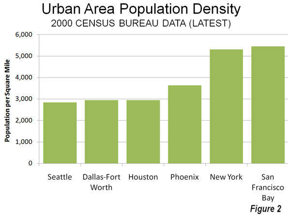
    The loss of a competitive land supply was seen during the real estate bubble in the unprecedented escalation of house prices in California (which was already high), Oregon, Washington, Phoenix, Las Vegas, parts of the Northeast and Florida. In these markets, the demand from more liberal lending standards was much greater than the land available for development under growth management plans and government land auctions.  By contrast, house prices generally stayed within historic norms in metropolitan areas where land supplies were not constrained by growth management programs, such as Dallas-Fort Worth, Houston, Atlanta, Austin, Indianapolis, Kansas City and elsewhere.

    Housing Price Escalation in Florida: In 2000, the four Florida metropolitan areas with more than 1,000,000 population had Median Multiples (median house price divided by median household income) near or below the historic norm of 3.0. By late in the next decade, all four metropolitan areas reached unprecedented levels of unaffordability. In Miami, the Median Multiple reached 7.2. In Orlando, the Median Multiple peaked at 5.2, 70 percent above the historic norm. In Tampa-St. Petersburg, the Median Multiple peaked at 4.8, 60 percent above the historic norm. The peak in Jacksonville was a more modest 3.6, though this was still an 80 percent increase.

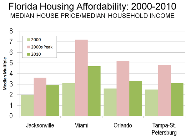
    By 2010, the Median Multiple has declined to hear the historic norm in Orlando and Tampa-St. Petersburg and slightly below in Jacksonville. The Median Multiple remained well above the historic norm in Miami, at 4.7.

    When Supply Lags Behind Demand: Florida’s housing cost escalation may have been surprising, since Florida has a reputation for liberal land-use regulation. However, the growth management act had long since turned the state toward a shortage of land supply relative to demand as described by Wachovia Bank in a 2005 analysis.

    "While all the stars seem to be perfectly aligned on the demand side, the supply of housing in Florida has been much more problematic. Even though residential construction has soared to new highs recently, the supply of housing has lagged woefully behind demand in recent years. This has been particularly true for single-family homes, where population growth, a rising homeownership rate, and strong demand for second homes and vacation properties created a demand for 560,000 new single-family homes between mid 2000 and mid 2004. During this period builders only delivered 540,000 units. When you add in the growing demand for townhouses and condominiums, buyers were looking to purchase 675,000 new homes during this period, while builders were supplied just 570,000 units. No wonder prices have been surging!

    The chief impediment to new construction has been a shortage of developable land. The shortage primarily results from a growing resistance to new development. The state is not running out of space. Nearly every community in Florida and the state itself are looking at some type of limitations on new residential development. While well intentioned, these initiatives are making it more time consuming and expensive to build homes in Florida. Others are taking land off the market, designating areas for green space, or preserving space for industrial development. The net result has been dramatically higher land prices across much of the state."

    The point of the Wachovia analysis is that unless there is a sufficient supply of land, the price of housing is likely to rise. Having a lot of land is not enough. There must be enough land to accommodate demand at affordable land and housing prices (Note).

    The Florida action is the most successful reversal of house price increasing growth management regulations to date.

    Other Advances: There have, however, then more modest advances.

    After taking office in 2003, Minnesota Governor Tim Pawlenty replaced the board of directors of the Metropolitan Council in Minneapolis-Saint Paul. The previous board had been spent on the following Portland style growth management policies, including the enforcement of a variant of the urban growth boundary. The new board exhibited more liberal attitudes toward residential development, and the housing bubble did not produce the extent of housing affordability in the Twin Cities that occurred in growth management areas such as Portland, California and Florida.

    The Conservative- Liberal coalition government of the United Kingdom has proposed modest relaxation of some of the world’s most restrictive land use regulations, which could lead to an improvement of housing affordability in the nation. Kate Barker, who was then a member of the Monetary Policy Committee of the Bank of England was commissioned to examine land-use regulation and housing affordability in England and found a strong association between the loss of housing affordability and restrictive land use policies. This association between Britain’s strong land use regulation and higher house prices was noted in the early 1970s research led by Sir Peter Hall of the University College, London.

    For the Future: The relaxation of overly restrictive growth management policies could not have come at a better time. With the squeeze on the middle-class getting tighter, fewer households can afford higher   housing costs associated with growth management areas. Moreover, responsive to the political consensus for job creation, more home construction will bring return more good-paying construction jobs in Florida.

    Wendell Cox is a Visiting Professor, Conservatoire National des Arts et Metiers, Paris and the author of “War on the Dream: How Anti-Sprawl Policy Threatens the Quality of Life

    —–

    Note: There has been a similar misunderstanding of the housing markets in Las Vegas and Phoenix, where developable land appears to stretch virtually to the horizon. However, what is usually missed is that both metropolitan areas are hemmed in by government land, some of which is periodically auctioned. During the housing bubble, the price per acre of residential land at auction in both metropolitan areas rose as much as the price for land rose over a similar period in Beijing, with its huge land price increases.

    Photo: Orlando (by author)

  • Smart Growth (Livability), Air Pollution and Public Health

    In response to the outcry by job creators about proposed new Nitrogen Oxides emission regulations, the Obama Administration has suspended a planned expansion of these rules.

    The Public Health Risks of Densification

    The purpose of local air pollution regulation is to improve public health. For years, regional transportation plans, public officials, and urban planners have been seeking to densify urban areas, using strategies referred to as “smart growth” or “livability.” They have claimed that densifying urban areas would lead to lower levels of air pollution, principally because it is believed to reduce travel by car. In fact, however, EPA data show that higher population densities are strongly associated with higher levels of automobile travel and more intense air pollution emissions from cars and other highway vehicles. In short, higher emissions cause people to breathe more in air pollution, which can be unhealthful. To use a graphic example, a person is likely to encounter a greater chance of health risk by breathing intense smoke from a fire than if they are far enough from the fire to dilute the intensity of the smoke.

    Overall, more intense air pollution detracts from public health. To put in the economic terms that appear so often in planning literature on "urban sprawl," more intense traffic congestion and the consequent higher air pollution emissions are negative externalities of smart growth and densification.

    This is illustrated by county-level data for nitrogen oxides (NOx) emissions, which is an important contributor to ozone formation. This analysis includes the more than 420 counties in the nation’s major metropolitan areas (those with more than 1 million in population).

    Seven of the 10 counties with the highest NOx emissions concentration (annual tons per square mile) in major metropolitan areas are also among the top 10 in population density (2008). The densest, New York County (Manhattan), has by far the most intense NOx emissions. Manhattan also has the highest concentration of emissions for the other criteria air pollutants, such as carbon monoxide, particulates, and volatile organic compounds (2002 data). New York City’s other three most urban counties (Bronx, Kings, and Queens) are more dense than any county in the nation outside Manhattan, and all land among the top 10 in NOx emission density (Table 1).

    Table 1
    Intensity of Nox Emissions (per Square Mile)
    NOx Emissions
    Rank County Compared to Average
    1 New York Co, NY           23.8
    2 San Francisco Co, CA           14.7
    3 Bronx Co, NY           13.7
    4 Washington city, DC           13.1
    5 St. Louis city, MO           12.4
    6 Arlington Co, VA           11.3
    7 Cook Co, IL           10.0
    8 Suffolk Co, MA             9.5
    9 Kings Co, NY             8.7
    10 Queens Co, NY             8.7
    Calculated from 2008 EPA Data


    NOx emission density data by county is provided in the document below, Annual Density of Highway Vehicle NOx Emissions by County: 2008. Overall, this data indicates that the average core county had a NOx density 3.9 times that of the average suburban county (Figure 1). By contrast, the average core county density is 4.5 times that of the average suburban county (Figure 2), indicating a strong relationship that is also shown in Figure 3.

    For example, in the New York metropolitan area, core New York County has NOx emissions that are nearly 15 times as intense in a given volume of air as suburban Morris County. In the Cleveland metropolitan area, core Cuyahoga County has a NOx emissions intensity 12 times that of suburban Geauga County. Charlotte’s core Mecklenberg County has a NOx emissions intensity more than five times that of suburban Union County.

    Traffic and Air Pollution

    More concentrated traffic also leads to greater traffic congestion and more intense air pollution, according to data available from EPA. The data for traffic concentration is similar to population density. Manhattan – despite its huge transit complex – has by far the greatest miles of road travel per square mile of any county, while seven of the densest counties are among the top ten in traffic intensity. As in the case of NOx emissions, the four highly urbanized New York City counties are also among the top 10 in the density of motor vehicle travel (Table 1).

    Table 2
    Intensity of Traffic (per Square Mile)
    Motor Vehicle Travel
    Rank County Compared to Average
    1 New York Co, NY 37.8
    2 Bronx Co, NY 22.3
    3 Fredericksburg city, VA 19.9
    4 Alexandria city, VA 15.8
    5 San Francisco Co, CA 15.6
    6 Arlington Co, VA 15.1
    7 Suffolk Co, MA 14.4
    8 Queens Co, NY 14.3
    9 Kings Co, NY 13.8
    10 Washington city, DC 13.1
    Calculated from 2005 EPA Data


    Traffic density data by county is provided in the second document below, Daily Density of Road Vehicle Miles by County: 2005. Overall, this data indicates that the average core county had a traffic density 3.7 times that of the average suburban county (Figure 4), again a difference similar to the difference in density (Figure 5).

    The overall relationship between higher population densities and both NOx concentration and motor vehicle traffic intensity is illustrated in Figure 6 and Figure 7. There is a significant increase in the concentration of both NOx emissions and motor vehicle travel in each higher category of population density. For example, the counties with more than 20,000 people per square mile have NOx emission concentrations 14 times those of the average county in these metropolitan areas, and motor vehicle travel is 22 times the average. A smaller sample of the most urbanized counties (those with 90 percent or more of the land urbanized) showed a stronger association. This findings are consistent with research by the Sierra Club and a model derived from that research by ICLEI–Local Governments for Sustainability, both strong supporters of the livability and smart growth strategies of densification.

    A Caution: The air pollution data contained in this report is for emissions, not for air quality. Air quality is related to emissions and if there were no other intervening variables, it could be expected that emissions alone would predict air quality. However there are a number of intervening variables, from climate, wind, topography and other factors. Again, Los Angeles County makes the point. As the highest density large urban area in the nation   Los Angeles under any circumstances would have among the highest density of air pollution emissions. However, the situation in Los Angeles is exacerbated by the fact that the urban area is surrounded by mountains which tend to trap the air pollution that is blown eastward by the prevailing westerly winds.

    The EPA data for 2002 can be used to create maps indicating criteria pollutant densities within metropolitan areas. An example is shown of  the Portland (OR-WA) metropolitan area (Figure 8), with the latter indicating the data illustration feature using Multnomah County (the central county of the metropolitan area), which is the most dense county and has the greatest intensity of NOx emissions and traffic congestion.

    The Goal: Improving Public Health

    These data strongly indicate that the densification strategies associated with smart growth and livability are likely to worsen the intensity of both NOx emissions and congestion of motor vehicle travel.

    But there is a more important impact. A principal reason for regulating air pollution from highway vehicles is to minimize public health risks. Any public policy that tends to increase air pollution intensities will work against the very purpose of air pollution regulation: public health. The American Heart Association found that air pollution levels vary significantly in urban areas and that people who live close to highly congested roadways are exposed to greater health risks. The EPA also notes that NOx emissions are higher near busy roadways. The bottom line is that all – things being equal – higher population density, more intense traffic congestion, and higher concentrations of air pollution go together.

    All of this could have serious consequences as the EPA seeks to expand its misguided regulations. For example, officials in the Tampa-St. Petersburg area have expressed concern that the metropolitan area will not meet the new standards, and they have proposed densification as a solution, consistent with the misleading conventional wisdom. The reality is that this is likely to make things worse, not better.  

    Less Livable

    There are myriad difficulties with smart growth and livability policies, not least their association with higher housing prices, a higher cost of living, muted economic growth, and decreased mobility and access to jobs in metropolitan areas. As the EPA data show, the densification policies of smart growth and livability also make air pollution worse for people at risk.

    Virtually all urban areas of Western Europe, North America and Oceania principally rely on cars for their mobility and there is no indicate that this will change. The air is less healthful for residents where traffic intensity is greater. As the air pollution intensity data shows, cars need space.

    Wendell Cox is a Visiting Professor, Conservatoire National des Arts et Metiers, Paris and the author of “War on the Dream: How Anti-Sprawl Policy Threatens the Quality of Life

    —–

    Note 1: The city (county level jurisdiction) of Fredericksburg, Virginia surprisingly ranks third in its concentration of motor vehicle travel yet ranks eighth much lower in population density. This reflects the high volumes of traffic through the  small municipality (and county-equivalent jurisdiction) carried on two of the East’s busiest roadways, Interstate 95 and US-1.

    Note 2: Additional analysis and information is available at Air Pollution, NOx Emissions, Traffic Congestion and Higher Population Density: The Association in Major Metropolitan Areas of the United States.

    Adapted from an article published by the Heritage Foundation.

    Photo of Manhattan traffic by carthesian.

  • Private Investors Shun Brazil High Speed Rail Bid

    In April of 2011 the California High Speed Rail Authority held a meeting of potential investors and vendors interested in participating in the proposed Los Angeles to San Francisco high-speed rail project. Project sponsors have insisted they could gain substantial private investment for the project. The Authority indicated that the meeting drew 2000 attendees at the Los Angeles Convention Center, which supporters indicated was proof of the interest of private investors in the project.

    Apparently believing the claims that high-speed rail is "profitable," the Brazilian government set about planning a line stipulating that private investors would build the infrastructure and operate a line, at their own risk.

    The federal government offered private investors the opportunity to bid on a concession for the proposed Rio de Janeiro to Sao Paulo and Campinas high-speed railroad (Trem de Alta Velocidade). None of the Los Angeles attendees or any others submitted a bid for the concession. It is also reported that two previous opportunities attracted no bidders.

    In reviewing the project documents for the high-speed rail line in Brazil, it is easy to understand why the 510 kilometer (310 mile) route drew no interest. In Brazil, investors would be required to put their own money at risk with no revenue guarantees. Rising capital costs could be a problem as well since California’s high speed rail costs have doubled in just three years, a line that virtually everyone understands will require heavy public subsidies, despite being far richer than Brazil.

    Capital Costs: The winning bidder in Brazil would have been granted a 40 year concession and would have been required to provide substantial funding toward the $20 billion (34 billion in Brazilian Reals) capital cost. If the international experience holds in Brazil, that cost could escalate to $40 billion (70 billion Reals) or more.

    The Rio de Janeiro to Campinas line would not be easy to construct. The mountains south of Rio will be challenging. Unlike California, little of the route is as flat as Kansas. The line would operate through two of the world’s megacities, Rio de Janeiro and São Paulo as well as two other large urban areas, Campinas and San Jose dos Campos. Unlike Los Angeles and San Francisco, Sao Paulo and Rio de Janeiro do not have well placed existing rail corridors that can (at least theoretically) be expanded to handle the fast trains. The urban densities are much higher in Brazil than in California, which means that the construction will be more disruptive. The Los Angeles and San Francisco urban areas have densities of from 6,000 to 7,000 per square mile (2,100 to 2,700 per square kilometer) while those in Sao Paulo and Rio de Janeiro range from 15,000 to 18,000 per square mile (6,000 to 7,000 per square kilometer).

    Protecting the Taxpayers: Interested in protecting Brazilian taxpayers, the government has required that any cost overrun be paid for by the winning bidder. This, combined with the requirement to support the capital costs and debt service out of passenger fares and other commercial revenues seems, likely to have discouraged bidders, who in other places – from France and the United Kingdom to Korea – can rely on taxpayers to cover the inevitable cost overruns.The lesson of Taiwan, where private investors have already lost most of their capital is likely fresh in the minds of potential bidders.

    Responsibility for Cost Overruns: Moreover, it is not realistic to expect a private concessionaire to have sufficient capital to pay for the extent of cost overruns. If there a concessionaire is ever selected for the Rio to Campinas line, it will likely be a limited liability firm, specifically designed to shield investors from the very kind of risk that the Brazilian government expects it to shoulder.

    Thus, as would likely have been the case in Florida if Governor Scott had not canceled the Tampa to St. Petersburg line, taxpayers can expect to pay for cost overruns, despite the best intentions and good faith of the Brazilian government. No private concessionaire has funds stashed away for losses like that.

    Ridership and Revenue: The ridership projections for the line appear to be aggressive. This is typical of the international experience in high-speed rail projects, where ridership projections average 65 percent higher than eventual ridership, according to investment grade research by Bengt Flyvbjerg of Oxford University, Nils Bruzelius of the University of Stockholm and Werner Rottengather of the University of Karlsruhe (Megaprojects and Risk: An Anatomy of Ambition). Ridership is forecast to be greater than the widely criticized California projections.

    Nonstop fares between Rio de Janeiro and São Paulo are projected at approximately US$100, similar to the fares that would be charged in California. The demand for travel at such a price is likely to be considerably less in Brazil, where the incomes are a fraction of those in California. Project documents indicate that large numbers of people will switch from other modes of transport.

    Two such modes, the car and bus, are used by people needing to travel as inexpensively as possible (whether in Brazil or the United States). The project assumes a unprecedented 50 percent of car travel would be diverted to the train. Reality is likely to be a small fraction of this. The potential for attracting bus riders was also exaggerated, projecting that 65 percent of this less affluent market would pay two to three times as much as current bus fares to ride the train.

    Next Steps: The government intends to restructure the bidding process and try again. Brazil had hoped that the high-speed line would be running in time for the 2014 FIFA World Cup (soccer) and then be available for the 2016 Olympics in Rio de Janeiro. Even 2016 may even prove an impossible challenge at this point.

    China Daily caught the reality of the situation in commenting on the missing bidders for the Rio to Campinas high speed rail line:

    ….the high-speed rail dream may be one area where the government will have to assume more of the risk … because of the long term investment and delay in making a profit.

    In a nation in which 11 of the 26 states have a gross domestic product less than the cost of the train, "investment" in high speed rail might not be the top priority. It is not surprising that no private investor is willing to take the risk for the potentially enormous losses, nor should taxpayers.

    —-

    Photograph: Avenida Paulista, Sao Paulo (by author)

    Wendell Cox served as a member of the Amtrak Reform Council. He authored high speed rail feasibility studies in Florida (The 1997 Evaluation of the FDOT-FOX Miami-Orlando-Tampa High Speed Rail Proposal for the James Madison Institute and the 2011 Reason Foundation report, The Tampa to Orlando High Speed Rail Project: A Taxpayer Risk Assessment) and North Carolina (Should North Carolina Add More Piedmont Trains, 2011,for the John Locke Foundation) and was co-author of the Reason Foundation’s The California High Speed Rail Proposal: A Due Diligence Report, with Joseph Vranich (2008).

  • Suburban “End-Times” Reality Check

    The Atlantic’s Alex Madrigal announces "The Beginning of the End for Suburban America," a wish and hope long dressed-up as reality by a well-placed few who believe that the "be – all and end – all" is living anywhere but the suburbs. This is not to suggest that there is anything wrong with living in the core urban core if that is what one wants to do. I certainly have enjoyed living part-time in the inner core of the ville de Paris for some years. At the same time, however, the behavior of people has revealed an overwhelming preference for more space. From New York to Paris and Tokyo, some people choose to live in dense urban cores and a lot more choose to live in suburbs (and exurbs).

    What data does Madrigal cite to show "the beginning of the end for suburban America"? Driving is down from a peak in 2007, also the year that employment peaked. These are not disconnected events. With the total unemployed now about equal to the number of employed workers in the New York and Chicago metropolitan areas, work trips that are not made nearly equal the decline in driving. The higher gas prices appear to have induced people (in the suburbs and in the dense cores) to make modest reductions in discretionary trips or to more efficiently organize their shopping trips.

    Madrigal also points out that in 2010 new houses were smaller than their peak (also 2007). The median house size was still larger than any year before 2005 and 100 square feet larger than 2000. Madrigal cites declining rates of demand increase for electricity.
    The connection between these trends and the suburbs is unclear. Madrigal does not separate the trends by residential geography, the more dense cores of metropolitan areas, the suburbs and exurbs of metropolitan areas and the balance of the nation. Granted, the data is not immediately available for such analysis.

    Fortunately, there is more precise data that differentiates between dense core and suburban trends. It is the United States Census, conducted every 10 years and most recently in 2010. Between 2000 and 2010, the core municipalities of the 51 metropolitan areas with more than 1 million population captured 9% of the population growth, while the suburbs and exurbs captured 91%. The suburbs actually did better in the 2000s than in the 1990s, when they accounted for only 85 percent of the growth.

    True, the relative decline of the denser cores did not resemble the disastrous decade of the 1970s. Further, the gains made by very small areas of the core over the past 10 years have been an important advance. But to suggest that the 2000s represent "the beginning of the end for suburban America" is profoundly at odds with reality.

    So, the decade of the 2000s was another false start for the heralds of the suburban "end-times." The wishing and hoping has to be delayed yet again.

  • The Evolving Urban Form: Milan

    Italy’s population growth has been stagnating in recent decades, but has turned around during the last decade, with the annual growth rate increasing 16 times (from 0.04 percent to 0.69 percent). According to United Nations data, Italy added more international migrants in the 2000s (3.8.5 million) than it added people in any ten year period since 1960. Some of the strongest growth has been in the Milan metropolitan region, which has begun to grow again after years of stagnation. This is not due to any increase in Italian birth rates but principally because of surging international migration.

    Much of this has to do with the enlargement of the European Union (EU) from 15 to 27 member states, and the consequent removal of all legal barriers to internal migration. The Milan metropolitan region, occupies much of Lombardy, Italy’s most populated region. Milan added 634,000 foreign residents in just six years (2000 to 2008, the latest year for which data is available).  The largest share, 103,000, was from the EU’s Romania, with 50,000 from Albania, 47,000 from Morocco, 30,000 each from Ecuador and Egypt and 27,000 from Ukraine. Over the period, more than 80 percent of Lombardy’s growth has come as a result of international immigration.  The key to this lies with the region’s economy, which is the strongest in Italy and all of southern Europe.

    International migration has also fueled large population increases elsewhere, especially in both northern and central Italy, such as Rome and Turin. Further south, however, growth (such as in the Naples area) has continued to be comparatively slow (Figure 1).

    The Urban Area: The Milan urban area is the largest in Italy. The Milan urban area stretches from the core of Milan northward to the Alps and includes development in the provinces of Varese (photo), Como, and Lecco (Photo: Lecco) as well as Monza and Brianza. The province of Como is home to the picturesque Lake Como, while Varese sits at the foot of the Simplon Tunnel (of "Venice Simplon-Orient Express" fame) and the highway over Simplon Pass to Brig in Switzerland’s Rhone Valley and the Matterhorn.


    Varese


    Lecco: Northernmost suburbs


    There is also considerable development both to the east and the west in the province of Milan and more limited development to the south. Overall, the urban area has a population of approximately 5,400,000 (Note 1), covering approximately 800 square miles (2,100 square kilometers) for a population density of approximately 6,700 per square mile (2,500 per square kilometer).  This is similar to that of Los Angeles or Toronto.

    Growth in the Metropolitan Region: Until the recent increase in international migration, the Milan metropolitan region was growing slowly and more recently even losing population. Between 1991 and 2001, the metropolitan region lost one percent of its population. However, since 2001 the metropolitan region has gained 9.0 percent, an improvement from the minus 1.1 percent between 1991 and 2001. The last decade’s growth was at an average annual increase rate of 0.96 percent which is slightly more than the United States (0.94 percent) and slightly less than Canada (1.04 percent). 

    The Inner City: The commune of Milan is the central municipality of Milan metropolitan region. The population of Milan peaked in 1971 at just under 1,700,000 people. By 2001 the population had fallen to approximately 1,250,000 people, a loss of approximately 25 percent and its lowest population since before the 1951 census. The central municipality of Milan continued to lose population to 2001. From 1991 to 2001, Milan lost more than 100,000 people and nine percent of its population. Milan is not unusual in this decline. Declines have been characteristic for virtually all Western European central municipalities, except where there was substantial greenfield space to accommodate new suburban development (such as in Rome).

    However, the commune of Milan has begun to grow again. Milan’s population has increased by nearly 70,000 people or 5.4 percent. Milan now has a population density of 18,600 per square mile (7,200 per square kilometer), slightly higher than that the city of San Francisco (Photo: Milan). Even with the recent increase, however, all of the growth in the Milan metropolitan region since 1991 has been in the suburbs and exurbs (Figure 2) and 87 percent in the last decade (Figure 3).


    Milan

    Much of the commune’s population increase has been the result of international migration, since many Italians continue to migrate to the surrounding suburban and exurban areas, as is the case in a number of European metropolitan regions.  Domestic out-migration continued from the commune of Milan, while the suburbs and exurbs attracted domestic migrants (Note 2).

    Inner Suburbs: The inner suburbs of Milan include portions of the province of Milan outside the commune of Milan and the (single) province of Monza and Brianzia, which was separated from the province of Milan earlier in the decade. The inner suburbs also lost population between 1991 and 2001. This was reversed between 2000 and 2010, when the inner suburbs added approximately 230,000 people, and grew at an overall rate of 9.4 percent. The inner suburbs have a population density of approximately 5,000 per square mile (1,900 per square kilometer), somewhat less than the Sydney urban area and 1.5 times that of Portland.

    Outer Suburbs and Exurbs: The outer suburbs and exurbs stretch north to the foot of the Alps, as well as to the south of the province of Milan. The largest population is to the north, with a far smaller population to the south, in the exurban provinces of Pavia and Lodi. Unlike the commune of Milan and the inner suburbs, the outer suburbs and exurbs have grown in each of the last decades.  Between 1991 and 2001, the outer suburbs and exurbs accounted for all the growth, though at a modest rate of 2.5 percent. The growth has substantially increased since 2001 with the addition of more than 245,000 new residents and a growth rate of 10.4 percent. International migration accounted for 93 percent between 2002 and 2008, 93 percent were foreign (202,000).

    Where the Immigrants are Moving: As might be expected with strong international migration, most of the new entrants have moved to the inner city and inner suburbs. Between 2002 and 2006, 97 percent of the population growth was from international migration, with an addition of 202,000. The overall foreign population increased 119 percent from 2002 to 2008. Yet, the percentage growth was much stronger in the outer suburbs and the exurbs, where the foreign population grew 171 percent (125,000). However, this represented a smaller share of the overall growth (67 percent), which is likely to be an indication of strong outbound domestic migration from the inner city and the inner suburbs to the outer suburbs and exurbs. There was also strong foreign population growth in the balance of Lombardy, with an increase of 147 percent, which constituted a somewhat higher share of overall growth, at 84 percent (Figure 4).

    Decentralizing, Diversifying Milan: Like the other international urban areas (Note 3), Milan continues to suburbanize, though growth has also resumed in the historic core municipality. At the same time, international migration is changing Milan and Italy. United Nations (UN) data indicates that the number of international migrants to Italy was 10 times higher in the 2000s than in the 1990s. The UN projects that the inflow will drop by 50 percent between 2010 and 2015 and then to approximately one-third the 2000s influx to beyond 2050. Whatever the result, because of its strong economy, the Milan area will doubtless continue to attract a disproportionate share of the new arrivals.

    Wendell Cox is a Visiting Professor, Conservatoire National des Arts et Metiers, Paris and the author of “War on the Dream: How Anti-Sprawl Policy Threatens the Quality of Life

    —–

    Note 1: Milan is one of a small number of large urban areas that is often dismissed as being much smaller than it really is. This is because data for metropolitan regions is not routinely produced in Italy and Milan. As a result, analysts often referred to the population of the historical core municipality which has only 20 percent of the metropolitan population. Similar problems of national reporting occur in Germany’s Rhine – Ruhr (Essen-Dusseldorf) metropolitan region and Jakarta, Manila and Kuala Lumpur. The Rhine-Ruhr does not appear on the United Nations urban agglomeration list of all over 750,000, despite the fact that it has 7 million people in close proximity, at near average Western European large urban area densities (7,100 per square mile or 2,800 per square kilometer, compared to the Western European average of 8,000 per square mile or 3,100 per square kilometer)

    Note 2: More detailed data is not available on the internet from the Istituto Nazionale di Statistica Italia, Italy’s statistical bureau.

    Note 3: See additional reviews in the "Evolving Urban Form" series, at : Beijing, Chicago, Dallas-Fort Worth, Jakarta, Los Angeles, Manila, Mexico City, Mumbai, New York, SeattleSeoul and Shanghai .

    Photo: Duomo (Cathedral), Milan. Photographs by author.

  • A Fly in the Econometrics? Exaggerating Urbanization

    I was surprised to read in Science Digest that the increase in the urban land from 2000 to 2030 could be as much as 590,000 square miles (1.53 million square kilometers), which Science Digest went on to say would house an increase in the urban population of 1.47 billion people. The shock was because the researchers are suggesting that the substantial urbanization that will occur over the first three decades of this century will be at American urban densities, 2500 per square kilometer or 1000 per square mile. 

    Urbanizing on 1 to 3 Acre Lots? But that was just the beginning. The econometric research, A Meta-Analysis of Global Urban Land Expansion by Karen C. Seto, Michail Fragkias, Burak Güneralp, and Michael K. Reilly, partially funded by the National Science Foundation, indicates that the increase in urban land area between 2000 and 2030 could be as much as 4,900,000 square miles, or 12,600,000 square kilometers. This is more than the area of Australia, Argentina and Mexico combined. It does, however, seem unlikely that developers and home builders will provide for the expanding urbanization in China, India, Indonesia, the Congo, South Sudan and Bangladesh with ranch houses on one to three acre lots.

    The 4.9 million square mile or 12.6 million square kilometer urban land increase figure is based upon the GRUMP database, which we reviewed a year ago. GRUMP found the world to have more than 1.3 million square miles of urban development or 3.5 million square kilometers. The GRUMP database is purported to use United States Census Bureau criteria for designating urban land, yet counts three times as much land in the United States as being developed as the Census Bureau. We also showed that the GRUMP urban area for Cairo was at least six times the actual urbanization based upon examination of Google Earth maps (Figure 1: map).

    ng-grump2


    At 4.9 million square miles or 12.6 million square kilometers the average new urbanization would be under 500 per square mile or 200 per square kilometer. These densities fall well short of the urban density thresholds of 1000 per square mile or 400 per square kilometer that are used by census authorities in Canada, France, the United Kingdom and the United States. These nations and others consider densities this low to be rural rather than urban. Indeed, parts of rural China have higher densities than the GRUMP density estimates.

    Estimating Gross World Urban Area: Other estimates of world urbanization are more modest than the GRUMP estimate, which indicated an urban land area of 3,532,000 in 2000. The US Geological Survey MODIS mapping system estimated world urban land area at 650,000 square kilometers in 2000. In A Planet of Cities, Shlomo Angel, Jason Parent, Daniel Civco, Alexander Blei, and David Potere (Angel) use USGS MODIS mapping and further modeling to estimate the 2000 world urban land area at 605,000 square kilometers. Another source, the European Union’s Global Land Cover system put the number at 308,000. The wide variation in estimates indicates the complexity of the task of estimating the world’s urban land area.

    The estimates can be evaluated by comparing their implied population densities.

    • The EU Global Land Cover estimate would have required an average urban population density of more than 9,000 per square kilometer (23,800 per square mile) in 2000, based upon the 2000 United Nations estimate of urban population. This is nearly as dense as the city of New York (not the urban area) and a quarter more dense than Singapore. Anyone who has traveled to urban areas around the world, large and small, would quickly observe that average densities approach neither New York City nor Singapore. The Global Land Cover estimate thus appears to be too low.
    • The GRUMP world land area estimate would mean that the average urban population was 800 per square kilometer in 2000 (2,000 per square mile). This would place the world urban population density at least 15 percent below that of the United States  (900 per square kilometer or 2,400 per square mile) or Canada in 2001 (1,000 per square kilometer or 2,500 per square mile). As every urban planner knows, the United States has the least dense urban areas of any major nation. GRUMP thus appears to substantially over-estimate the amount of urban land.
    • The MODIS and Angel estimates are similar. The MODIS estimate would require an average world urban density of 4,300 per square kilometer (11,100 per square mile), while the Angel estimate would indicate a world urban density of 4,700 per square kilometer (12,200 per square mile). These two estimates would appear the most accurate, because they are well above the US and Canadian densities and any visitor to Manila, Shanghai, Cairo or a myriad of other urban areas in the developing world cannot help but note the much higher densities. At the same time the MODIS and Angel are well below the EU Global Land Cover estimates, which appear to be very high (Figure 2). The MODIS and Angel estimates would indicate that approximately 0.5 percent of the world’s land area is urbanized.

    Demographia World Urban Areas also provides population, land area and urban density estimates, though its detailed data is limited to approximately the approximately 800 urban areas with more than 500,000 population. Applying the Angel, et al urban area size density ratios and projections for urban expansion to 2010 (Angel middle scenario), the Demographia world density estimate would be approximately 20 percent lower, while the urban land area would be 25 percent higher). Demographia World Urban Areas bases its estimates on national census bureau data for urban areas (Note) where it is available and for others estimates urban land area from Google Earth (these are the overwhelming majority of cases), using urban perimeters. More than 50 percent of the difference between the Demographia and Angel estimates results from the use of Census Bureau urbanization data in the United States.

    Believable and Unbelievable Projections: Angel also provides projections for the increase in urban land area. Between 2000 and 2030 Angel projects that new urbanization could be from a middle case of 700,000 square kilometers (270,000 square miles) to a high estimate of 1,160,000 square kilometers (445,000 square miles), with a low case of 360,000 square kilometers (140,000 square kilometers). These are believable figures that are only a small fraction of the high-end 12,600,000 square kilometer (4,900,000 million square miles) projections by Seto, et al.

    The circumstances that might lead to urbanization equaling the land area of Australia, Argentina and Mexico are not believable. A sufficient reasonableness test does not appear to have been conducted.

    Wendell Cox is a Visiting Professor, Conservatoire National des Arts et Metiers, Paris and the author of “War on the Dream: How Anti-Sprawl Policy Threatens the Quality of Life

    ——

    Note: Most of the world’s national census authorities provide geographical data for only legal jurisdictions, such as states, provinces, regions, counties, etc. In some nations, urban area is developed to indicate the population and land area of continuous urbanization. This occurs in the United States, Canada, the United Kingdom, France, Sweden, Denmark and other nations.

    Photo: Developing world urbanization trend to 2030 according to high-end proectiong based upon GRUMP. Houses on two acre lots in Morris County, New Jersey (suburban New York). From Google Earth Pro.

  • Urban Densities Exclude Rural Areas: Avent Postscript

    We recently noted that Ryan Avent was one third right in his recent Sunday New York Times article on urban density. Avent has posted a response suggesting that it is inappropriate to use average urban densities in urban productivity analyses, as we had done, but that "weighted average densities" should be used instead. Weighted average density was not mentioned in his New York Times article.

    In the interim, we were able to find the studies on urban density and productivity that seem to match those Avent refers to in his New York Times article. There are two studies concluding that doubling employment (not population) density increases productivity by six percent (Ciccone & Hall, 1996 and Harris & Ioannides, 2000), as Avent noted.  Another study (Davis, Fisher & Whited, 2007) indicates that doubling employment densities could increase productivity by as much as 28 percent, also as Avent noted.

    Urban and Rural Density Combined Are Not Urban Density: In contrast to Avent’s preference for weighted average density, each of the studies uses average density, like with our analysis. More importantly the econometric formulas in the studies do not include an urban density variable. The density variables in all three studies include rural areas.

    The studies use county, metropolitan area and sub-metropolitan area densities, each of which contain far more rural land than urban land. By definition, urban areas exclude rural areas and, as a result, the moment rural areas become a part of the calculation, the result cannot be urban densities. In 2000, Census Bureau data showed counties (county equivalent level jurisdictions), which comprise the entire nation, to be less than three percent urban and more than 97 percent rural (Figure 1). Metropolitan areas also have a similar predominance of rural land (Figure 1). Among major metropolitan areas (those with more than 1,000,000 population) in 2000, approximately 85 percent of the land was rural and 15 percent of the land was urban (Figure 2).

    Ciccone & Hall use employment density at the county level and thus mix urban and rural densities. Harris & Ioannides use employment densities at the metropolitan statistical area or the primary metropolitan statistical area level (a sub-metropolitan designation since replaced by the more appropriately titled "metropolitan division"). Davis, Fisher & Whited use employment densities at the metropolitan statistical area level. The two studies using metropolitan areas or parts of metropolitan areas also mix urban and rural densities.

    Urban Area Densities: Urban density is calculated at the urban area level, which is the area of continuous urban development. This is also called the urban footprint, which is generally indicated by the lights of the city one would see from an airplane on a clear night. Urban areas are delineated using the smallest census geographical units ("census blocks," which are smaller than census tracts) each ten years. The 2010 data will be released next year. Among urban areas, the highest density core urban area in a major metropolitan area (Los Angeles) is approximately four times the lowest (Birmingham).

    Nonsensical Metropolitan Area Densities: Theoretically, metropolitan areas are labor market areas, which include a core urban area (and sometimes more than one urban area) and nearby rural areas from which people commute to work in the urban area (can be called the "commuter shed"). However, in the United States, metropolitan areas are too coarsely defined for density comparisons with one another. US metropolitan areas are composed of complete counties or, in the six New England states, complete towns. This jurisdictionally based criteria can produce metropolitan areas that are much larger than genuine labor markets in a number of cases and some that are smaller. American metropolitan areas are not spatially consistent by any functional labor market definition. Metropolitan densities are thus nonsensical, no matter what density is being measured (such as population or employment density). Among major metropolitan areas, the highest density metropolitan area (New York) is 24 times that of the lowest density (Salt Lake City), six times the maximum difference in urban area density.

    Metropolitan Ireland and Happenstance: In the similarly sized San Francisco (as used by Davis, Fisher and Whited) and Riverside-San Bernardino metropolitan areas, San Francisco has 1,700 square miles of rural land, while Riverside-San Bernardino has 26,000, approximately 15 times as much. At more than 27,000 square miles, Riverside-San Bernardino covers more land area than the Republic of Ireland. The difference in population densities between metropolitan areas is determined in considerable measure by the size (land area) of the included counties, not by the number of people in cities.

    If the state of California were to carve out a new county composed of western Riverside and San Bernardino counties (as Colorado created Bloomfield County in the early 2000s), the land area of the metropolitan area could be reduced 95 percent, because the remainder would not meet the criteria for inclusion in Riverside-San Bernardino. The importance of the density variable for Riverside-San Bernardino in econometric formulas would be increased many times. With only 3,100 county level jurisdictions of varying sizes, this kind of incomparability cannot help but occur. The boundaries of metropolitan areas are defined by political happenstance.

    On the other hand, the nation’s urban areas are built up from 7,000,000 census blocks. This permits a fine grained definition that makes urban areas appropriate for density comparisons. The definition of urban areas is beyond political fiat.

    Metropolitan areas in the United States could be readily defined at the census block level, just like urban areas. Regrettably, the Office of Management and Budget missed another opportunity in the 2010 census to make the necessary criteria change. U.S. metropolitan area data is of great value for most analysis, but misleading for spatial or density analysis.

    Low-Density Productivity: Subregionalizing the density and productivity analysis would pose problems. Avent uses household incomes as his standard (and we agree that cost of living differentials are important). The San Jose metropolitan area has the highest household incomes of any major metropolitan area and would therefore be among the most productive. Yet, San Jose’s automobile-oriented Silicon Valley, to which much of the productivity is attributable, has a far lower employment density than the transit and pedestrian oriented cores of Manhattan and San Francisco (and yes, even not-so-transit oriented downtown Phoenix). In low-density Seattle, Microsoft’s automobile oriented Redmond campus probably ranks among the most productive real estate in the country, yet its employment density (like that of Silicon Valley) pales by comparison to the higher density cores of Seattle, Phoenix, Nashville, Oklahoma City and virtually every other downtown core of a major metropolitan area.

    At the End, Agreement: Avent concludes, "I just want to make sure we stop costing ourselves easy opportunities for growth." I could not agree more. It is time to abandon regulations that artificially raise housing prices, deprive households of a better standard of living, and drive them to places they would rather not live. For centuries, people have flocked to urban areas for better economic opportunities. Urban areas should be places where people can realize their aspirations, not places that repel them because it doesn’t suit the interests of those already there.

  • Avent on Cities: Understanding Part of the Equation

    Ryan Avent hits a home run, strikes out and earns a "yes, but," all in the same article ("One Path to Better Jobs: More Density in Cities") in The New York Times.

    A Home Run on Housing Regulation: Avent rightly notes that the land-use and housing regulations of metropolitan areas like San Francisco have not only driven housing prices higher, but also negatively impacted economic growth. Studies in the UK, the US and the Netherlands have demonstrated that significant restrictions on land use (called smart growth or urban containment) lead to reduced employment and economic growth in metropolitan areas. His comparison to OPEC is "right on" – that metropolitan areas like San Francisco have squeezed the supply of housing, which, of course, drives up house prices, just as restricting the supply of any good or service in demand will tend to do. Avent is also right in noting that high housing prices have driven huge numbers of people out of the San Francisco Bay Area to places like Phoenix. According to the Census Bureau, nearly 2,100,000 people moved from Los Angeles, San Francisco, San Diego and San Jose between 2000 and 2009 to other parts of the country.

    Striking Out on Density: The strikeout results from assumptions that are patently wrong. Cities (urban areas) do not get more dense as they add population. They actually become less dense. For example, the New York urban area has added 50 percent to its population since 1950, yet its population density has dropped by 45 percent (Figure 1). Between 2000 and 2010, most metropolitan population growth, whether in San Francisco, New York, Phoenix, Portland or Houston, was in the lower density suburbs (see: http://www.city-journal.org/2011/eon0406jkwc.html ). The same dispersion is occurring virtually around the world (see: http://www.demographia.com/db-evolveix.htm), from Seoul, to Shanghai, Manila and Mumbai. Rapid urban growth would mean even further dispersion and lower densities, not the higher density neighborhoods Avent imagines. Nonetheless, allowing the more affordable detached housing that people prefer would likely lead to stronger economic growth and more affluent residents in the San Francisco and other over-regulated metropolitan areas.

    A "Yes, But" on Productivity: Any comparison of incomes between metropolitan areas needs to take into consideration the cost of living. For example, the San Francisco Bay Area (San Francisco/San Jose) is one of the most expensive places to live in the country. The median house price is more than 2.5 times that of Phoenix, after accounting for income differentials. Avent does not control for the difference in the cost of living, which is largely driven by the higher cost of housing. The lower cost of living neutralizes much of the impact of lower incomes (such as in Houston) in metropolitan areas like Houston, Dallas-Fort Worth, Indianapolis, etc., where the OPEC model has not been applied to land use regulation.

    Finally, even controlling for the cost of living, there are substantial exceptions to any density-productivity thesis. For example, some of the greatest productivity gains information technology have come out of the Seattle area, which is the least dense major urban area in the 13 Western states, less dense than Houston, Dallas-Fort Worth and Phoenix. Even more impressively, Seattle’s urban density is barely one-half that of New York or San Francisco (Figure 2), yet its gross domestic product per capita is higher than New York and within 2 percent of San Francisco/San Jose. Seattle’s substantial contribution to the nation’s productivity has occurred while its population density was declining nearly 15 percent (since 1980).  

    Avent, like many analysts before appears to presume that population growth means higher densities. In fact, urban areas grow by dispersing, not densifying.

  • The Economist: The Great High Speed Train Robbery

    The Economist magazine has called on the British government to cancel plans for the HS-2 high-speed rail line that would run from London to Birmingham and Manchester. The Economist said:

    …these days politicians across the developed world hope new rapid trains, which barrel along at over 250mph (400kph), can do the same. But high-speed rail rarely delivers the widespread economic benefits its boosters predict. The British government—the latest to be beguiled by this vision of modernity—should think again

    The government claims the line will cost £32 billion line, however the international experiences suggests a figure more on the order of  £32  and the experience in this corridor itself suggests costs could rise even more (see The High Speed Rail Battle of Britain).

    A principal purpose for the line is to bridge the economic gap between the economic dynamo of Southeast England (including London) and the Midlands and North of the country. This does not convince The Economist:

    China suspended new projects after a fatal collision of two high-speed trains in July; Brazil delayed plans for a rapid Rio de Janeiro-São Paulo link, after lack of interest from construction firms. Yet governments remain susceptible to the idea that such projects can help to diminish regional inequalities and promote growth.

    The Economist doubts this will happen:

    In fact, in most developed economies high-speed railways fail to bridge regional divides and sometimes exacerbate them. Better connections strengthen the advantages of a rich city at the network’s hub: firms in wealthy regions can reach a bigger area, harming the prospects of poorer places. Even in Japan, home to the most commercially successful line, Tokyo continues to grow faster than Osaka. New Spanish rail lines have swelled Madrid’s business population to Seville’s loss. The trend in France has been for headquarters to move up the line to Paris and for fewer overnight stays elsewhere.

    The Economist reminds the government that:

    Britain still has time to ditch this grand infrastructure project—and should. Other countries should also reconsider plans to expand or introduce such lines. A good infrastructure scheme has a long life. But a bad one can derail both the public finances and a country’s development ambitions.

    Finally, The Economist says that there is better use for the money.

    The £32 billion at its disposal might well yield a higher return if it were spent on less glitzy schemes, such as road improvements and intra-city transport initiatives. If the aim is to regenerate “the north”, the current plan might prove a high-speed route in the wrong direction.

  • The Evolving Urban Form: Beijing

    China’s capital, Beijing, has long been one of the world’s largest urban areas. Some reports placed its population at over 1 million in 1800, which would have made Beijing the largest urban area  in the world at that time. Later in the nineteenth century, Beijing dropped below 1 million population, as London, Paris and later New York rose to prominence. As late as 1953, Beijing had a population of fewer than 3 million. Since then the city’s population has  increased more than six times (Figure 1).

    Beijing is one of China’s four "directly administered municipalities" or "provincial level municipalities," along with Shanghai, Chongqing and Tianjin (Note 1). Moreover, like Shanghai and Tianjin, Beijing is essentially a metropolitan area, composed of an urban area and exurbs approximating a labor market. This is unlike Chongqing, which has extensive rural areas and extends far beyond any plausible definition of a metropolitan area (having the land area approximately the size of Indiana or Austria).

    The Growing Beijing Urban Area: In the 1990s, Beijing added 2,700,000 people and had a population of 13.6 million in 2000. Between 2000 and 2010, Beijing population increased by more than double the previous increase, or an increase of 6 million people.

    The Expanding Beijing Urban Area: Based upon the most recent census, the next edition of Demographia World Urban Areas will estimate an urban area (urban footprint) population of 17 million, with an urban land area of 1,350 square miles (3,500 square kilometers) and an urban density of 12,600 per square mile (4,900 per square kilometer) in 2011. Beijing ranks as the world’s 12th largest urban area and is larger than any urban area in the United States or Europe with the exception of New York. As in other urban areas of China, there is considerable undeveloped land in enclaves within the suburban areas, which could develop further, raising both the population and the density.

    Falling Urban Densities: Even so, Beijing is far less dense than before. Deng and Huang at the State University of New York, Albany, place the 1949 urban land area at less than 25 square miles (63 square kilometers. Based upon its early 1950s population of less than 3,000,000, the population density of the entire urban area could have been more than 100,000 per square mile or 40,000 per square kilometer (precise urban population is not available). This is greater than the highest density major urban area today, Dhaka (Bangladesh) at 90,000 per square mile or 35,000 per square kilometer. Today’s urban Beijing may have an overall population density one-eighth that of the 1950s.

    This illustrates a reality often missed by urban analysts, who confuse population growth with increases in population density. In fact, as the Evolving Urban Form series (Note 2) indicates, dispersion is at least as important in the expansion of megacities as population growth itself. Population densities generally decline as urban areas add residents.

    Suburbanizing Beijing: Consistent with the international urban trends, most growth over took place outside the core (see table at bottom and Figure 2). As Beijing has suburbanized, it has added "ring roads," (beltways or loops) which except for the 1st ring road (around the Forbidden City) are freeways, often with Texas-style frontage roads (See "2nd Ring Road" photo). Now there are six ring roads and there has been some discussion of a seventh, which would extend to the adjacent Hebei province to the south. Real-time traffic conditions on the first five ring roads can be seen at the Beijing Traffic Management Bureau site (the 6th ring road is outside the map)


    2nd Ring Road with frontage roads

    At the same time, Beijing’s expansive suburbs do not resemble the low-density suburbanization of Phoenix, Portland, Perth or Paris. Much of the development is in high rise condominiums and a substantial part is lower quality, lower rise development that houses Beijing’s large and growing migrant population (referred to as the "floating population"), most of whom do not have Beijing resident (hukou) status. Even so, there is no shortage of detached luxury housing (called "villas") in western style developments. such as "Orange County." More recently there is increasing demand for a more modern version of the "siheyuan" (courtyard) housing makes up the renown "hutong" areas of Beijing and other Chinese cities. One website refers to the "siheyuan" as the Chinese version of the "American Dream" and a recent China Daily commentary even suggested that this type of housing should constitute the future expansion of Beijing.  However, a quick review of real estate offerings for the new siheyuans, makes it clear that they are simply unaffordable for a growing middle class that finds it difficult to afford new flats in high rises outside the 4th ring road.  

    Hutong neighborhood (Dongcheng qu)

    A map of Beijing’s districts can be seen here, with color coding that corresponds to the geographical divisions in the table.

    The Inner City: During the last census period, less than one percent of the population growth has been in the inner city, which consists of the districts of Xicheng and Dongcheng, largely inside the 2nd ring road and contains the Forbidden City, Tiananmen Square, the Drum Tower (see photo below) and Bell Tower, and the Yonghegong Lama Temple (Buddhist). These districts, which contain nearly all of the remaining hutong (see photo above) residences grew only 2.2 percent. At 61,000 people per square mile (23,500 people per square kilometer), inner Beijing approaches the population density of Manhattan or the Ville de Paris.


    Toward the Drum Tower, from Jingshan Park

    Outside the Inner City: More than 99 percent of Beijing’s growth was outside the inner city. The first and second ring suburbs accounted for 96 percent of the growth, while the outer areas accounted for three percent of the growth.

    First Ring Suburbs: The four inner suburban districts of Beijing captured 52 percent of the provincial growth between 2000 and 2000. Overall, the four suburban districts added 3.2 million people, a nearly 50 percent increase in population. The population density in the inner suburbs was 19,400 per square mile in 2010 (7,500 per square kilometer). This is a higher density than the city of San Francisco. The inner suburban districts are generally located within the 5th ring road. The first ring suburbs include the district of Chaoyang, which has the largest population and where at least one-half of the population    generally lack Beijing residency (hukou). Chaoyang is also home to the new Beijing "central business district," (CBD) which is the largest concentration of high rise towers in the urban area includes  the controversial architectural icon, the CCTV Headquarters (photo at the top). The development of the CBD in the inner ring suburbs and other major commercial development are indicative of a dispersion of employment that, if permitted to continue, could ease Beijing’s legendary traffic congestion.

    Second Ring Suburbs: The outer suburban districts accounted for 44 percent of the provincial population increase between 2000 and 2000 and 2010. However, the outer suburban districts had the highest growth rate, at 72 percent, The outer suburban districts are generally located outside the 5th ring road and include considerable rural territory. The population density is 2100 per square mile (800 per square kilometer). Beijing Capital International Airport is located in this area, though it is under the jurisdiction of the inner ring district of Chaoyang. This airport is now the world’s second busiest in passenger volume, following Atlanta and having passed perennial runner-up O’Hare International in Chicago. At current growth rates Beijing Capital International could become the world’s busiest airport within five years.

    Outer Areas: The outer areas are largely rural and well outside the urban area. Nonetheless, the growth rate in the outer areas was well above the national rate and six times the rate of the inner city. The outer areas gained 186,000 people, approximately four times the inner city gain.

    Future Challenges: The floating population Beijing (and Shanghai) represented most of the population growth from 2000 to 2010. More than 7 million of Beijing’s nearly 20,000,000 population are migrant workers.   Government officials have expressed concern at the rate of population growth and have indicated an interest in severely limiting future population growth. Among Beijing’s considerable challenges is providing sufficient water for its large population. Beijing lacks the plentiful supply of water that is available to many urban areas of central and southern China (example, Shanghai, Nanjing, Wuhan and Chongqing) and the government is building a system to divert water especially from the Yangtze River. The 2020 census results could reveal a significant slowdown in growth, if these problems are not sufficiently addressed. 


    Beihei Park

    Wendell Cox is a Visiting Professor, Conservatoire National des Arts et Metiers, Paris and the author of “War on the Dream: How Anti-Sprawl Policy Threatens the Quality of Life

    ——–

    Note 1: What are translated as "cities" in China are not cities as understood in the West. A "shi" in China (translated as "city") is actually a region that may approximate a metropolitan area or labor market area in the West (with an urban core and a much larger surrounding rural territory). Some "shis" are much larger, however, such as Chongqing, which covers a land area similar to that that of Austria and nearly as large as Indiana. Chongqing and many other "cities" are far larger than any plausible metropolitan area definition.

    "Shi" may exist either at the provincial level (as in the case of Beijing, Chongqing, Shanghai and Tianjin) or it may exist within a provincial level jurisdiction, such as Nanjing in Jiangsu. Guangzhou in Guangdong or Wuhan in Hubei. Every square mile of a province (excepting the provincial level jurisdictions) is divided into shis, prefectures or comparable units, in the same way that US states are divided into county level jurisdictions or the regions of France are divided into departments. To complicate matters more, shis themselves may have county (xian) level shis within their borders, such as Cixi, a county level shi with approximately 1,000,000 people within the Ningbo shi in Zhejiang province.

    Note 2: Other megacities reviewed in this series have been: Jakarta, Los Angeles, Manila, Mexico City, Mumbai, New York ,Seoul and Shanghai .

    Photo: CCTV Headquarters in new Beijing CBD, Chaoyang district. Photo by Iamdavidtheking.

    All other photos by author.