Author: Wendell Cox

  • Orlando’s Sunrail: Blank Checks Induced by Washington

    We are supposedly living in an age of austerity, but many federal programs are leading many states into overspending and potential fiscal insolvency.  Transit spending is a case in point, as is indicated by the proposed Orlando Sunrail commuter rail project.

    How Washington Induces Higher State and Local Spending: For decades, the federal government has encouraged state and local governments to build expensive projects, as is the case in Orlando. Under the Federal Transit Administration (FTA) "New Starts" program, state and local governments can obtain federal funding for such projects, contingent on their taxpayers providing "matching funding." This can be in the form of higher taxes, budget increases or in unplanned subsequent expenditures that are higher than projected. The responsibility for cost overruns and operating subsidies belong exclusively to state or local taxpayers.

    Inaccurate Cost Forecasts: This can prove very expensive. European researchers Bent Flyvbjerg, Nils Bruzelius and Werner Rottengather (Megaprojects and Risk: An Anatomy of Ambition) and others have shown that new rail projects routinely cost more than planned (Note 1).

    Flyvbjerg et al found that the average rail project cost 45 more than projected and that 80 percent cost overruns were not unusual. Cost overruns were found to occur in 9 of 10 projects. Moreover, they found that despite increased attention to these cost blow-outs, final costs continue to be far above the projections presented to public officials and the taxpayers at approval time. Further, they found that ridership and passenger fares also often fell short of projections, increasing the need for operating subsidies.

    Moreover, urban rail systems are of questionable value. Transport economist Clifford Winston of the Brookings Institution has noted that "the cost of building rail systems are notorious for exceeding expectations, while ridership levels tend to be much lower than anticipated" and that "continuing capital investments are swelling the deficit." 

    Federal policies, however, often force state and local taxpayers to guarantee the accuracy of notoriously inaccurate cost projections. The standard FTA "full funding agreement," a prerequisite for federal funding, requires state or local taxpayers to pay for any cost overruns. Further, if the projects are not completed, state and local taxpayers are required to pay back the federal grants (more on Florida’s experience with that later).

    Sunrail: The "Sunrail" commuter rail project is planned to parallel Interstate 4 in the Orlando metropolitan area. From the perspective of Florida taxpayers, the tragedy is that the project has proceeded so far. Project forecasts say that in 2030, Sunrail will add only 1,850 new round trip riders daily to Orlando’s already sparse transit ridership (barely half a percent of travel). Even if all Sunrail trips were for employment, it would not even be a "drop in the bucket" in a metropolitan area likely to add more than 400,000 jobs by 2030. Further, despite inferences to the contrary, this will have less than negligible impact on traffic congestion. It is likely that traffic on Interstate 4 will increase by at least 100,000 cars daily by 2030 (Note 3), many times the cars that Sunrail could possibly remove, even under its probably exaggerated ridership projections.

    Sunrail also will do little to increase job access to jobs in a metropolitan area where less than two percent of employment can be reached by the average commuter in 45 minutes using transit, according to Brookings Institution research. By contrast, at least more than 80 percent of jobs in the Orlando metropolitan area are reached in 45 minutes by car, and more than 55 percent in 30 minutes. Despite the high costs of all this and Sunrail’s negligible effect on regional mobility, politics may preclude cancellation of the project.

    Sunrail’s first phase is projected to cost $350 million (after a half-billion dollar right-of-way purchase). The Federal Transit Administration intends to pay a maximum of $175 million for the project. State taxpayers (through the Florida Department of Transportation) will be required to match that funding with another $175 million, though that amount could grow.

    Florida Taxpayers Already Burnt Once: In addition in paying for likely Sunrail cost overruns, Florida taxpayers would be obligated to fund service levels that satisfy the Federal Transit Administration. Otherwise the federal government can demand that taxpayers send the money back. This is no idle threat. When the Miami commuter rail system (Tri-Rail) provided service levels deemed insufficient, FTA demanded a return of $250 million in federal grants. This repayment was averted only by a state bailout that provided up to $15 million in annual subsidies to increase the service levels (Note 2).

    Essentially then, to obtain federal funding for Sunrail, Florida taxpayers must write a blank check out to a rail construction industry that has repeatedly demonstrated an inability to build rail projects for promised amounts.

    Negotiating a Way Out? Florida taxpayers, however, may have some options to avoid writing the blank check. In March, the US Department of Transportation (USDOT) desperately sought to find governments in Florida willing to provide a blank check to fund the now cancelled Tampa to Orlando high-speed rail line, with costs that were so low that they had "big cost overruns" written all over them.

    In a February 27 letter USDOT told local officials the federal grant repayment provisions were negotiable. Based upon this policy latitude available to USDOT, Florida officials could seek less unreasonable terms with USDOT. For example, a revision might be negotiated to limit Florida’s cost overrun liability to amounts resulting from state actions. Further, Florida should seek agreement that it does not have to operate service levels that are greater than required by demand or can be afforded. This would prevent a repeat of the unhappy Tri-Rail experience.  

    Provisions such as these would provide important protections to Florida taxpayers, who could otherwise be forced to pay hundreds of millions in cost overruns and higher operating subsidies and potentially higher taxes.

    Lessons for Taxpayers: Projects like Orlando’s Sunrail provide important lessons for the nation. The stimulus, now winding down, boosted questionable spending policies well outside the Beltway. Washington needs to stop writing blank checks on taxpayer accounts. It’s time for the feds to stop inducing state and local governments to mimic its fiscal irresponsibility.

    —–

    Notes

    1. Flyvbjerg is a professor at Oxford University in the United Kingdom. Bruzelius is an associate professor at the University of Stockholm. Rothengatter is head of the Institute of Economic Policy and Research at the University of Karlsruhe in Germany and has served as president of the World Conference on Transport Research Society (WCTRS), which is perhaps the largest and most prestigious international association of transport academics and professionals.

    2. The Florida Department of Transportation has made agreements local governments to participate in funding of Sunrail cost overruns. However, in the event that local governments are unable to pay their share, it may be expected that the state will pay, as it did in bailing out Miami’s Tri-Rail (discussed above).  

    3. Assumes that automobile traffic would grow at the projected population growth rate (based upon University of Florida population projections). 

    —–

    Wendell Cox is a Visiting Professor, Conservatoire National des Arts et Metiers, Paris and the author of “War on the Dream: How Anti-Sprawl Policy Threatens the Quality of Life

    Photo: Downtown Orlando (by author)
  • Federal Survey: Fewer Transit Commuters

    Results from the US Department of Transportation’s 2009 National Household Travel Survey indicate that transit’s work trip market share in the United States was only 3.7 percent in 2009. This is a full one quarter less than the 5.0 percent reported by the Bureau of the Census American Community Survey for 2009. Further, the NHTS data does not include people who work at home. If the work at home share of employment from the American Community Survey is assumed, the transit work trip  market share would be 3.5 percent.

    Much of the difference is due the differing questions asked in the two surveys. The American Community Survey asks how people "usually" got to work last week, while the National Household Travel Survey (NTHS) data is based upon actual diaries of travel kept by respondents. The NHTS reports that among people who respond that transit is their "usual mode" of travel to work, transit is used only 68 percent of the time. In contrast, the daily trip diaries report that commuters who drive alone are a larger share of the market than those who indicate driving alone as their usual mode of travel. People who report their usual mode as "car pool" actually use a car pool to get to work only 55 percent of the time, an even lower rate relative to "usual" mode than transit.

    The daily trip diaries from the NHTS also a large difference in travel times between automobile commuters (including car pools) and transit. The average automobile commute time was 22.9 minutes, while the average transit commute time was more than double, at 53.0 minutes.

  • The Evolving Urban Form: Jakarta (Jabotabek)

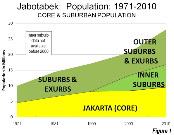
    There is probably no large urban area in the world that better illustrates the continuing dispersion of urban population and declining urban population density than Jakarta. Recently released 2010 census data indicates over the past decade that 84 percent of the metropolitan area (Jabotabek) population growth occurred in the suburbs (Note 1). This continues a trend which saw more than 75 percent of growth in the suburbs between 1971 and 2000 (Figure 1).

    Savannah State University (Georgia) Professor Deden Rukmana notes that this trend includes “many moderate and high-income families” who left the central city for better amenities while many poor people moved out to the fringe areas to escape what might be seen in the West as gentrification . 

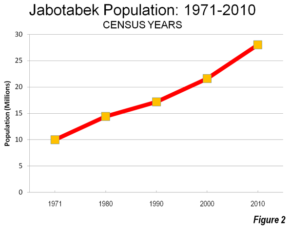
    The Megacity: Jabotabek: Jakarta is one of only a few world megacities (over 10 million) that have changed their names in recognition of their regional rather than core city focus (this sentence corrected from original). The most recent megacity with a new name is Mexico City, now referred to as the Valley of Mexico (Zona Metropolitana del Valle de México). Other examples are Tokyo-Yokohama (Kanto) and Osaka-Kobe-Kyoto (Keihansh1n).   Jakarta’s changed name, Jabotabek, represents an acronym made up of the beginning letters of the municipality of Jakarta and the three adjacent regencies (subdivisions of provinces), Bogor, Tangerang and Bekasi (Note 3). Jabotabek is one of the fastest growing megacities in the world and is experiencing accelerated growth. This is in contrast to the situation identified by the McKinsey Global Institute, which noted the declining growth rates of most megacities. In 2000, Jabotabek had a population of approximately 20.6 million, which by 2010 had risen to 28.0 million or 36 percent, nearly doubling its rate of population from the 1990s.    Jabotabek’s additional 7.4 million people is nearly equal to that of London (Greater London Authority), nearly as large as the city of New York and more people than live in the entire Greater Toronto area. In 2000, Jabotabek had a population of approximately 20.6 million, which by 2010 had risen to 28.0 million (Figure 2).

    Jabotabek’s unexpectedly high growth was greater than the 6.6 million added in both the Shanghai and Manila regions over the same period and above the 5.8 million increase in the Beijing region. The percentage growth in Shanghai and Beijing was slightly higher than in Jabotabek and slightly lower in Manila. The megacities of the United States, Western Europe and Japan have all fallen back to growth rates of less than five percent per decade (Tokyo-Yokohama, New York, Osaka-Kobe-Kyoto, Los Angeles and Paris).

    Population Trends by Sector: Population growth and rates are indicated in the table for the sectors of Jabotabek and the constituent jurisdictions.

    Jakarta Region (Jabotabek)
    Population by Sector: 2000-2010
    2000
    2010
    Change
    % Change
    Core: Jakarta 8.36 9.59 1.23 15%
    Inner Suburbs (Municipalities) 4.94 7.23 2.30 47%
    Tangerang 1.33 1.80 0.47 36%
    Tangerang Selatan 0.80 1.30 0.50 63%
    Depok 1.14 1.75 0.61 53%
    Bekasi 1.66 2.38 0.71 43%
    Outer Suburbs & Exurbs 7.30 11.20 3.90 53%
    Bogor (Municipality) 0.75 0.95 0.20 27%
    Bogor (Regency) 2.92 4.78 1.86 64%
    Tangerang (Regency) 2.02 2.84 0.82 41%
    Bekasi (Regency) 1.62 2.63 1.01 63%
    Jabotabek: Total 20.60 28.02 7.42 36%
    Population in millions


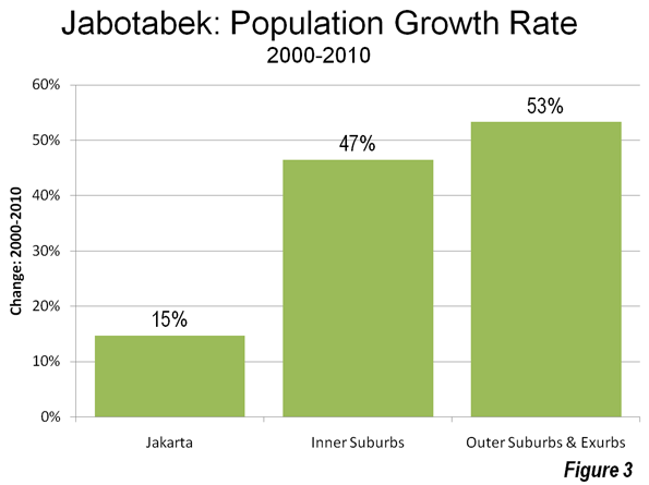
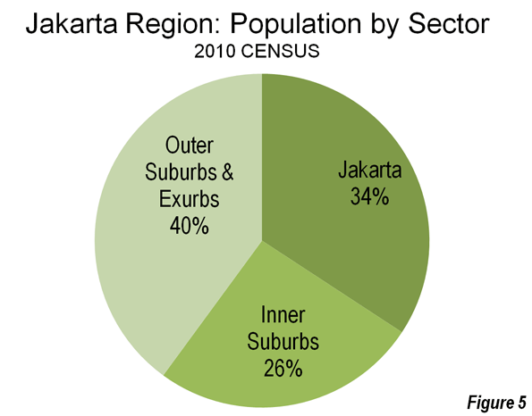
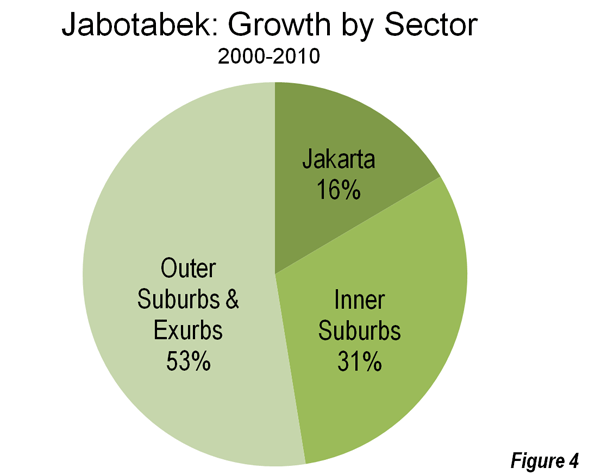
    City of Jakarta: The core city of Jakarta is the "Special Capital Region" of  Indonesia, similar to the District of Columbia in the United States, the Distrito Federal in Mexico or the Capital Federal in Argentina. This core of Jakarta grew 15 percent and added more than 1.2 million population, rising from 8.36 million in 2000 to 9.59 million in 2010, a turnaround from a loss of nearly 500,000 people between 1995 and 2000. The city of Jakarta captured 16 percent of metropolitan area growth and now accounts for 34 percent of the population of Jabotabek (Figures 3, 4 & 5).

    Inner Suburbs: The inner suburbs, which are made up for the purposes of this article by the municipalities of Bekasi, Tangerang, Depok and Tangerang Selatan (South Tangerang) grew 47 percent during the 2000, from 4.94 million to 7.23 million. These inner suburban municipalities captured 31 percent of the metropolitan area growth and now have 26 percent of the population of Jabotabek (Figures 3, 4 & 5).

    Outer Suburbs and Exurbs: The outer suburbs and exurbs (Note 2) experienced the greatest growth, at 53 percent, rising from 7.30 million to 11.20 million. For the first time, the outer suburbs surpassed the core with the largest population. The outer suburbs and exurbs accounted for 53 percent of the metropolitan area growth and now have 40 percent of the population of Jabotabek (Figures 3, 4 & 5).

    Urban Area:  The substantial growth of Jabotabek occurred principally in the urban area (the area of continuous development or the agglomeration). It appears likely that the urban area population will exceed 24 million (Note 4). It thus seems likely that the Jakarta urban area will again be ranked as the second largest in the world, following Tokyo-Yokohama. Jakarta had been displaced by Delhi (and Seoul-Incheon), for which United Nations 2010 estimates had indicated higher than anticipated population growth as Delhi passed Mumbai to become the largest in India.

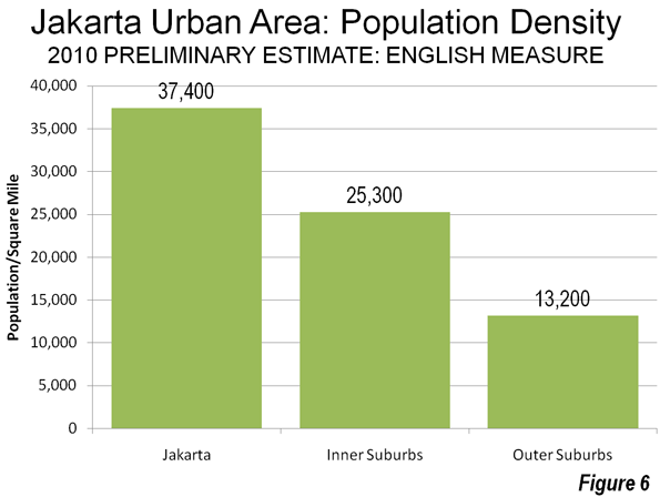
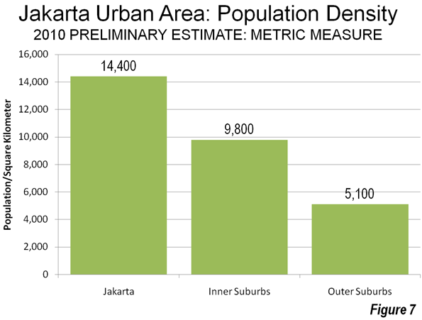
    Overall, the Jakarta urban area has a population density of approximately 22,000 per square mile or approximately 8500 per square kilometer. Yet the overall density of the Jakarta urban area has declined as population has moved to the outer suburbs which have a population density only one third that of the city of Jakarta. The inner suburbs have a population density that is only two thirds that of the city of Jakarta (Figures 6 and 7).


    Despite this, the Jakarta urban area is much denser than most large urban areas in the high income world. Overall, the Jakarta urban area is approximately 2.5 times as dense as the Paris urban area, more than three times as dense as the Los Angeles urban area, and approximately seven times as dense as the Portland urban area. Other urban areas in the developing world are even denser:  Delhi is more than 1.5 times as dense as Jakarta, Mumbai more than three times as dense and Dhaka is more than four times.


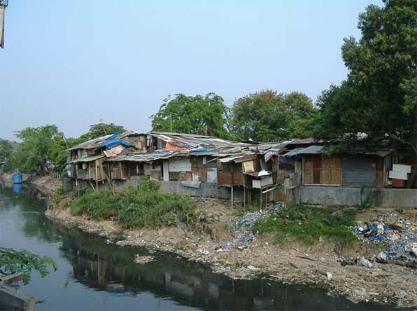
    Informal housing, city of Jakarta (photo by author)


    A Larger Metropolitan Area?  This continuing population growth could cause Jabotabek to expand even further. Indonesia’s President Susilo Bambang Yudhoyono (SBY) has proposed expanding the metropolitan area to include the regencies of Karawang, Serang, Purwakarta and Sukabumi as well as the municipalities of Serang, Sukabumi and Cilegon. Already, Jakarta’s continuous urbanization nearly reaches the Karawang urban area to the east (population over 600,000) and is nearing Serang regency to the west. SBY’s "Greater Jakarta" has a population approaching 36 million according to the 2010 census. Further pressure on suburban growth could be generated by plans in Jakarta to limit the core city’s population to 12 million.

    Yet even so it may take some decades, before Jakarta, or perhaps Delhi, could pass Tokyo-Yokohama’s nearly 37 million people to become the world’s largest urban area, assuming that they do not experience the reduced population growth so widespread in other megacities.   

    ———

    Notes:

    1. Caution should be used in making comparisons of metropolitan areas, especially between nations. There is virtually no consistency in the delineation of metropolitan areas between nations. In some cases, such as Japan, the United States, France and Canada, Metropolitan areas are based upon commuting patterns, but even between these nations there is no consistency.

    2. For the purposes of this article, suburbs are inside the urban area, but outside the central city (Jakarta). Exurbs are the portions of the metropolitan area (Jabotabek) outside the urban area.

    3. The provinces of Indonesia and the state of Virginia are subdivided similarly. In Virginia, all of the land area is divided into municipalities or counties. In the provinces of Indonesia, all of the land area is divided into municipalities (kota) and regencies (kapupaten). The regencies are further divided into sub-districts (kecamatan). Jabotabek is located in three provincial level jurisdictions, the Special Capital District of Jakarta, and the provinces of West Java (Java Barat) and Bantan. West Java has a population of 43 million, approximately 6,000,000 more than the largest state in the United States, California. Banten is bordered on the west by the Sunda Strait, location of Krakatoa, the volcano.

    Further, the name Jabotabek may not survive. As municipalities (Note 3) were carved out of the regencies in the 1990s and 2000s, the megacity was called Jabodetabek by some and proposed additions to the metropolitan area could bring even more variations. Inconsistent and alternative names probably make likely that sources will continue to call the megacity "Jakarta."

    4. This urban area population is much larger than reported by the United Nations, which for Indonesian urban areas limits its estimates to the jurisdiction of the core city, and thus excludes suburbs. As is generally the case throughout the world, the continuous urbanization of Indonesian urban generally areas extends far beyond core cities.

    —–

    Photograph: Luxury housing in Cileungsi sub-district, Bogor regency (outer suburbs), by author

    Wendell Cox is a Visiting Professor, Conservatoire National des Arts et Metiers, Paris and the author of “War on the Dream: How Anti-Sprawl Policy Threatens the Quality of Life

  • Transit: The 4 Percent Solution

    A new Brookings Institution report provides an unprecedented glimpse into the lack of potential for transit to make a more meaningful contribution to mobility in the nation’s metropolitan areas. The report, entitled Missed Opportunity: Transit and Jobs in Metropolitan America, provides estimates of the percentage of jobs that can be accessed by transit in 45, 60 or 90 minutes, one-way, by residents of the 100 largest US metropolitan areas. The report is unusual in not evaluating the performance of metropolitan transit systems, but rather, as co-author Alan Berube put it, "what they are capable of." Moreover, the Brookings access indicators go well beyond analyses that presume having a bus or rail stop nearby is enough, missing the point the availability of transit does not mean that it can take you where you need to go in a reasonable period of time.

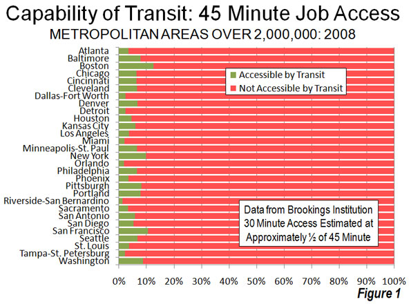
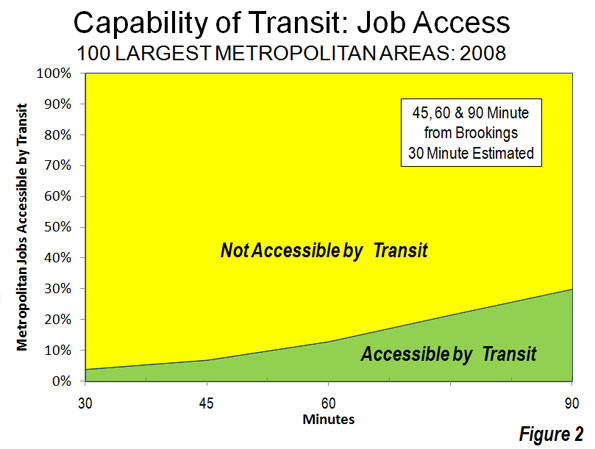
    Transit: Generally Not Accessible: It may come as a surprise that, according to Brookings, only seven percent of jobs in the nation’s largest metropolitan areas can be reached by residents in 45 minutes during the morning peak period (when transit service is the most intense). Among the 29 metropolitan areas with more than 2,000,000 population, the 45 minute job access average was 5.6 percent, ranging from 12.6 percent in Boston to 1.3 percent in Riverside-San Bernardino. The New York’s metropolitan area’s 45 minute job access figure was 9.8 percent (Figure 1).

    Brookings did not examine a 30 minute transit work trip time. However, a bit of triangulation (Note 1) suggests that the 30 minute access figure would be in the range of 3 to 4 percent, at most about 4,000,000 jobs out of the more than 100 million in these metropolitan areas.   At least 96 percent of jobs in the largest metropolitan areas would be inaccessible by transit in 30 minutes for the average resident (Figure 2).

    The Brookings report also indicates that indicates that 13 percent of employment is accessible within 60 minutes by transit and 30 percent within 90 minutes (Note 2). Brookings focuses principally on the 90 minutes job accessibility data. However, the reality is that few people desire a 45 minute commute, much less one of 90 minutes.

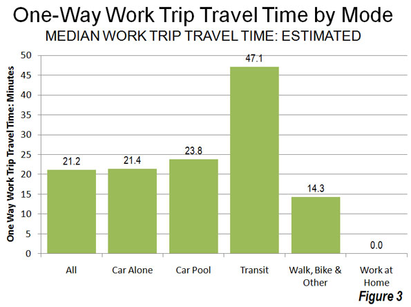
    In 2009, in fact, the median one way work trip travel time in the United States was 21 minutes (Note 3). Approximately 68 percent of non-transit commuters (principally driving alone, but also car pools, working at home, walking, bicycles, taxicabs and other modes) were able to reach work in less than 30 minutes. The overwhelming majority, 87 percent, were able to reach work in 45 minutes or less, many times transit’s seven percent. Transit’s overall median work trip travel time was more than double that of driving alone (Figure 3).

    A mode of transport incapable of accessing 96 percent of jobs within a normal commute period simply does not meet the needs of most people. This makes somewhat dubious claims that transit can materially reduce congestion or congestion costs throughout metropolitan areas. The Brookings estimates simply confirm the reality that has been evident in US Census Bureau and US Department of Transportation surveys for decades: that transit is generally not time-competitive with the automobile. It is no wonder that the vast majority of commuters in the United States (and even in Europe) travel to work by car.

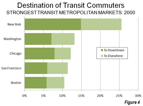
    Much of the reason for transit’s diminished effectiveness lies in the fact that downtowns — the usual destination for transit — represent a small share of overall employment. Downtown areas have only 10 percent of urban area employment, yet account for nearly 50 percent of transit commuting in the nation’s largest urban areas (Figure 4).

    Meanwhile, core areas, including downtown areas, represent a decreasing share of the employment market as employment dispersion has continued. Since 2001, metropolitan areas as different as Philadelphia, Portland, Dallas-Fort Worth, Salt Lake City, Denver and St. Louis, saw suburban areas gain employment share. Even in the city of New York, outer borough residents are commuting more to places other than the Manhattan central business district (link to chart).

    Transit: The Long Road Home: Transit problem stems largely from its relative inconvenience.    In 2009, 35 percent of transit commuters had work trips of more than 60 minutes. Only six percent of drivers had one way commutes of more than 60 minutes. For all of the media obsession about long commutes, more than twice as many drivers got to work in less than 10 minutes than the number who took more than an hour. In the case of transit, more than 25 times as many commuters took more than 60 minutes to get to work as those who took less than 10 minutes.

    Economists Peter Gordon and Harry W. Richardson have shown that the continuing dispersion of jobs (along with residences) has kept traffic congestion under control in the United States. Available data indicates that work trips in the United States generally take less time than in similar sized urban areas in Europe, Japan, Canada and Australia.

    Transit Access is Better for Low Income Citizens: The Brookings report also indicated that job accessibility was better for low income citizens than for the populace in general. Approximately 36 percent of jobs were accessible to low-income residents in 90 minutes, compared to the overall average of 30 minutes. This, of course, is because low income citizens are more concentrated in the central areas of metropolitan areas where transit service is better. But even this may be changing. For example, Portland’s aggressive gentrification and transit-oriented development programs are leading to lower income citizens, especially African-Americans, being forced out of better served areas in the core to more dispersed areas where there is less transit. Nikole Hannah Jones of The Oregonian noted:

    "And those who left didn’t move to nicer areas. Pushed out by gentrification, most settled on the city’s eastern edges, according to the census data, where the sidewalks, grocery stores and parks grow sparse, and access to public transit is limited." 

    Realistic Expectations: More money cannot significantly increase transit access to jobs. Since 1980, transit spending (inflation adjusted) has risen five times as fast as transit ridership. A modest goal of doubling 30 minute job access to between 6 and 8 percent would require much more than double the $50 billion being spent on transit today.

    Moreover, there is no point to pretending that traffic will get so bad that people will abandon their cars for transit (they haven’t anywhere) or that high gas prices will force people to switch to transit. No one switches to transit for trips to places transit doesn’t go or where it takes too long.

    Nonetheless, transit performs an important niche role for commuters to some of the nation’s largest downtown areas, such in New York, Chicago, Boston, San Francisco, and Philadelphia. Approximately half or more of commuters to these downtowns travel there by transit and they account for nearly 40 percent of all transit commuters in the 50 largest urban areas.   

    Yet for 90 percent of employment outside downtown areas, transit is generally not the answer, and it cannot be made to be for any conceivable amount of money. If it were otherwise, comprehensive visions would already have been advanced to make transit competitive with cars across most of, not just a small part of metropolitan areas.  

    All of this is particularly important in light of the connection between economic growth and minimizing the time required to travel  to jobs throughout the metropolitan area.

    The new transit job access is important information for a Congress, elected officials, and a political system seeking ways out of an unprecedented fiscal crisis.

    A four percent solution may solve 4 percent of the problem, but is incapable of solving the much larger 96 percent.

    Notes:

    1. For example at difference between transit commuters reaching work in less than 30 minutes and 45 minutes, Brookings employment access estimate of 7 percent at 45 minutes would become 3 percent at 30 minutes.

    2. The Brookings travel time assumptions appear to be generally consistent with data from the Census Bureau’s American Community Survey (ACS) and the US Department of Transportation’s National Household Transportation Survey (NHTS). Brookings, ACS includes the time spent walking to transit in work trip travel times (For example, the ACS questionnaire asks respondents how long it takes to get from home to work and thus includes the time necessary to walk to transit).

    3. Median travel times are estimated from American Community Survey data for 2009 and includes working at home. The "median" is the point at which one half of commuters take more time and one-half of commuters take less time to reach work and is different from the more frequently cited "average" travel time, which was 25.5 minutes in 2008.

    4. Is Transit Better in Smaller Metropolitan Areas? It is generally assumed that transit service is better in larger metropolitan areas than in smaller metropolitan areas. Yet, the Brookings data seems to indicate the opposite. Larger metropolitan areas tended to have less job access by transit than smaller metropolitan areas. In the largest 20 percent (quintile) of metropolitan areas, only 5.5 percent of employment was accessible within 45 minutes. This was the smallest quintile accessibility score, and well below the middle quintile at 9.2 percent and the bottom quintile at 8.3 percent. The top quintile included metropolitan areas with 2.6 million or more people, the middle quintile included metropolitan areas with 825,000 to 1,275,000 population and the bottom quintile included metropolitan areas between 500,000 and 640,000 (Figure 1). This stronger showing by smaller metropolitan areas probably occurs because it is far less expensive for transit to serve a smaller area. Further, smaller metropolitan areas can have more concentration in core employment.  Even so, smaller metropolitan areas tend to have considerably smaller transit market shares than larger metropolitan areas.

    Wendell Cox is a Visiting Professor, Conservatoire National des Arts et Metiers, Paris and the author of “War on the Dream: How Anti-Sprawl Policy Threatens the Quality of Life

    Photo: Suburban employment: St. Louis (by author)
  • World Urbanization Update: Delhi 2nd in a World of Smaller Urbanization

    Perhaps the most surprising development in urban areas over the past year was the ascendancy of Delhi to rank second in the world in population, following only Tokyo – Yokohama. Based upon the new United Nations population estimate, the 7th annual edition of Demographia World Urban Areas places Delhi’s population at 22.6 million. Tokyo – Yokohama, however, is in no immediate jeopardy of losing its number one status, with a population estimated at 36.7 million, approximately 70 percent greater than that of Delhi (Note 1). Demographia World Urban Areas includes population estimates  for all identified urban areas in the world with 500,000 or more residents. Among these 796 urban areas, 169 are in higher income nations and 627 are in lower income nations.

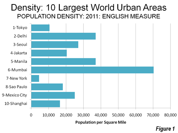
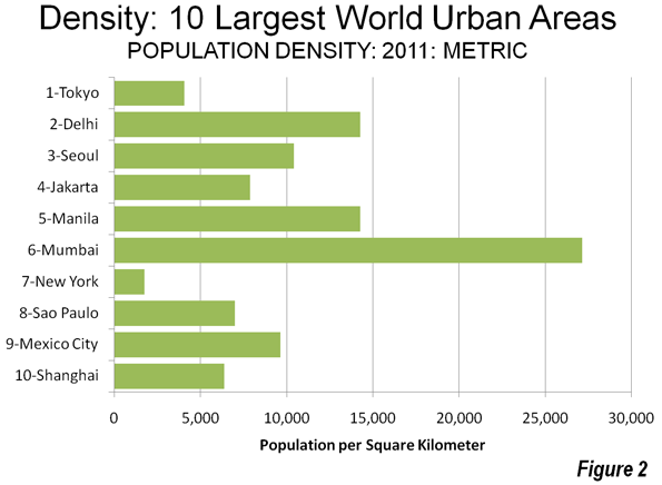
    The Largest Urban Areas: For years, demographers have been watching Mumbai on the assumption that it might eventually emerge as the largest urban area outside Tokyo – Yokohama. However, Mumbai, at 21.3 million, has fallen behind faster growing Delhi and now ranks as the sixth largest urban area in the world. Seoul-Incheon, in Korea, has emerged as the number three urban area, based upon higher than anticipated  suburban growth registered in the 2010 census and now shows a population of 22.5 million. Jakarta, Indonesia’s capital, now stands as number four, with a population of 22.2 million, followed by number five Manila at 21.3 million (Note 2). The next three largest world urban areas are in the Americas with New York at 20.7 million, Sao Paulo at 20.4 million and Mexico City at 19.6 million. The world’s 10th largest urban area is Shanghai (18.7 million), which experienced larger than anticipated growth toward the end of the decade (Table).

    10 Largest Urban Areas in the World: 2011
    Rank
    Geography Urban Area
    Current Year Population Estimate
    Land Area: Square Miles
    Density
    Land Area: Km2
    Density
    Density Year
    1 Japan Tokyo-Yokohama
    36,690,000
    3,500
    10,500
    9,065
    4,000
    2011
    2 India Delhi, DL-HAR-UP
    22,630,000
    605
    37,000
    1,567
    14,300
    2011
    3 South Korea Seoul-Incheon
    22,525,000
    835
    27,000
    2,163
    10,400
    2011
    4 Indonesia Jakarta
    22,245,000
    1,075
    20,400
    2,784
    7,900
    2011
    5 Philippines Manila
    21,295,000
    550
    37,000
    1,425
    14,300
    2009
    6 India Mumbai, MAH
    21,290,000
    300
    70,300
    777
    27,100
    2011
    7 United States New York, NY-NJ-CT
    20,710,000
    4,349
    4,500
    11,264
    1,800
    2000
    8 Brazil Sao Paulo
    20,395,000
    1,125
    18,100
    2,914
    7,000
    2011
    9 Mexico Mexico City
    19,565,000
    780
    25,000
    2,020
    9,700
    2011
    10 China Shanghai
    18,665,000
    1,125
    16,500
    2,914
    6,400
    2011


    Among the top ten urban areas, New York is by far the least dense, followed by Tokyo-Yokohama. They are also the most affluent, with seven of the remaining 10 far more dense and located in lower income countries, while Seoul-Incheon is more dense, but in a nation that is among the latest entrants to higher income status (Figures 1 & 2).


    Highest Population Densities: Dhaka, the capital of Bangladesh is the most dense with 90,600 persons per square mile or 35,000 per square kilometer. Dhaka ranks 24th in population in the world and crowds its approximately 11.5 million residents into 125 square miles or 325 square kilometers (less than the land area of the municipality of Portland, Oregon). Mumbai ranks second in population density, with 70,300 per square mile or 27,100 percent per square kilometer. Among high income urban areas, Macau is the most dense, at 70,000 per square mile or 27,000 per square kilometer, slightly ahead of its neighbor across the Pearl River, Hong Kong, which is estimated to have 66,100 residents per square mile or 25,500 per square kilometer. Of course, both Hong Kong and Macau have artificially high densities, driven by their enclave status. Comparatively few urban areas in the high income world exceed 15,000 per square mile (6,000 per square kilometer).

    Largest Urban Land Area: Although we commonly identify Gotham with the density of high-rise Manhattan, New York sprawls more than any of the top urban areas. Its urban area contains far the largest  land area, stretching to cover 4,350 square miles or 11,300 square kilometers. Los Angeles, more noted for its physical expanse, has approximately one-half the land area of New York and it extends less than both Tokyo – Yokohama and Chicago. Perhaps astonishingly, the Boston urban area covers approximately 95 percent of the land area of Los Angeles, though with only one-third the population.

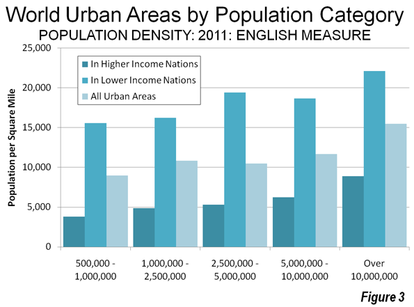
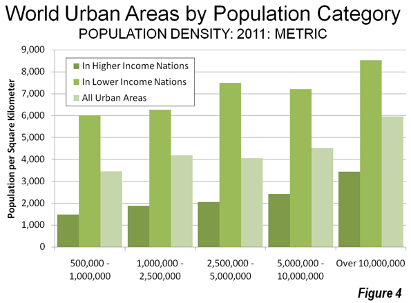
    Larger Urban Areas, Higher Density: As urban areas become larger, their population densities also increase. Moreover, as in the top 10 urban areas, lower income nations tend to have far higher densities than the urban areas located in the higher income nations(Figures 3 & 4).


    • Overall urban densities are approximately 9,000 per square mile (3,500 per square kilometer) in urban areas with between 500,000 and 1 million population and rise to 15,500 per square mile (6,000 per square kilometer) among urban areas with more than 10 million population.
    • Urban areas in higher income nations range from a population density of 3,800 per square mile (1,500 per square kilometer) among urban areas with from 500,000 to 1,000,000 population. Larger urban areas with more than 10 million population average o 8,900 per square mile (3,400 per square kilometer).
    • The urban areas located in lower income nations have far higher densities densities, ranging from 15,100 per square mile (6,000 per square kilometer) in the 500,000 to 1,000,000 population category and up to 22,100 residents per square mile (8,500 per square kilometer) in the over 10 million population category.           


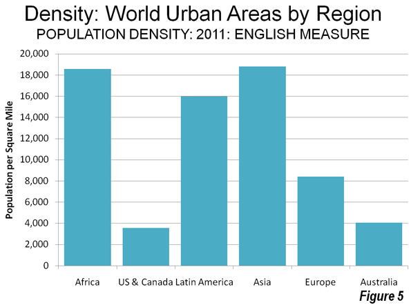
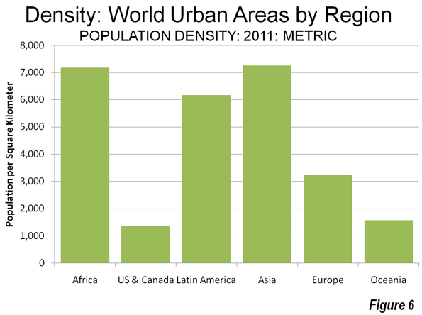
    Population Density by  Region: There is also considerable variation in urban population densities between the regions of the world (Figures 5 & 6).


    The lowest densities are in affluent areas. The United States and Canada, at 3,600 per square mile (1,400 per square kilometer), Oceania at 4,100 per square mile (1,600 per square kilometer) and Europe at 8,400 per square mile (3,200 per square kilometer). Latin American urban densities are 15,900 per square mile (6,200 per square kilometer), followed by Africa at 18,600 per square mile (7,200 per square kilometer) and Asia, at 18,800 per square mile (7,300 per square kilometer).

    The overall population density of urban areas with more than 500,000 residents in India is estimated at 37,000 per square mile (14,400 per square kilometer), which is more than double that of China, at 17,000 per square mile (6,700 per square kilometer).

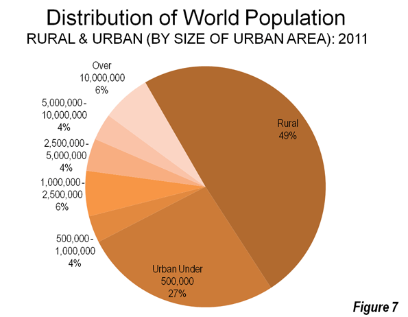
    A Smaller Urban World? A review of the size of the world urban areas shows the planet to be made up principally of rural areas and towns and cities with less than 500,000 population. In 2011, approximately 51 percent of the world is urban and 49 percent is rural. Urban areas ranging from just a few thousand residents to under 500,000 residents account for 27 percent of the world’s population, which constitutes a majority of its urban population. Among the larger urban areas, megacities (10,000,000 and larger) and the urban areas with between 1 million people and 2.5 million people each for approximately 6 percent of the world population. The other larger categories of urban areas each account for approximately 4 percent of the world’s population (Figure 5).

    The McKinsey Global Institute recently reported that the world’s megacities were growing less quickly than the other large urban areas. This development, along with the distribution of world urban population may indicate that world’s largest urban areas, especially the megacities, may not be the wave of the future; instead it may be smaller urbanized regions between 500,000 and 10 million.  These regions, with three times the population of the megacities, will likely shape urbanity over the next few decades.

    —————-

    Note 1: An urban area is an urban agglomeration or an urban footprint (area of continuous development). An urban area is the organism of the “city” in its spatial dimension. Census authorities in a number of nations have adopted similar definitions for urban areas (Examples are United States, Canada, United Kingdom, France, Norway, Sweden and Australia). Demographia World Urban Areas uses national census bureau data for both population and land area estimates where it is available and estimates urban land area from satellite imagery for all others.

    Note 2: for the purposes of this analysis, higher income urban areas are generally in nations with a gross domestic product of $20,000 per capita, purchasing power parity.

    Note 3: The urban area population estimates of Seoul-Incheon, Jakarta and Manila are considerably of love those reported by the United Nations. The United Nations data for these urban areas is based upon a far smaller definition of urbanization than is used in other urban areas. As additional explanatory notes are found in Demographia World Urban Areas.

    Photo: India Gate, Delhi (by author)
    Wendell Cox is a Visiting Professor, Conservatoire National des Arts et Metiers, Paris and the author of “War on the Dream: How Anti-Sprawl Policy Threatens the Quality of Life

  • This is Not the Way to Fix Toronto’s Transit

    Results and not ideology should guide transportation policy.

    Large city officials have been lobbying for a major program of federal transit subsidies for years. The push will likely intensify after the federal election.

    A principal resource in this campaign will likely be the Toronto Board of Trade’s third annual Scorecard on Prosperity, which finds Toronto’s transportation system to be among the worst in the world, ranking 19th out of 23 metropolitan areas. Other metropolitan areas also ranked poorly, such as Montreal at 12th, Calgary at 13th and Vancouver at 21st.

    However, a deeper look yields difficulties with the Board of Trade report.

    Automobiles dominate travel in all but two of the metropolitan areas (Hong Kong and Tokyo). Yet, only two of 11 indicators involve automobiles. Eight relate to non-automobile modes such as transit (one deals with freight). The Board of Trade comparisons are skewed because they give disproportionate weight to modes that are relatively minor in metropolitan mobility.

    However, the greatest difficulty with the Scorecard is the implied belief greater reliance on transit is preferable. In fact, transit is slower than cars for the majority of trips. Travel time needs to decrease to encourage metropolitan economic growth, as research at the University of Paris indicates. There is probably no more important transportation indicator regarding the economy.

    A Globe and Mail article rightly expresses particular concern that Toronto’s round-trip average work trip time ranks last at 80 minutes per day. However, at least two of the metropolitan areas had longer work trip travel times. The average work trip travel time in the Tokyo metropolitan area was 96 minutes in 2003 (the latest data available), according to the Japan Statistics Bureau. The Board of Trade failed to find a number for Hong Kong, which the government reported at 92 minutes in 2002. Yet, these travel time laggards rank first and second in the Board of Trade rankings.

    It should be a source of embarrassment that Dallas-Fort Worth, a bane of urban planners and with less than half the Toronto density, should have a work trip travel time one-third less and one-fifth less, respectively, than Calgary and Vancouver, the highest ranked Canadian metropolitan areas.

    It’s worse than that. Among all of the large American metropolitan areas, in or out of The Scorecard on Prosperity, all but New York have better work trip travel times.

    Except in the romantic minds of planners, little of the present car travel demand can be replaced by transit. Further, in virtually all of the metropolitan areas ranking above Toronto, the trajectory has been toward cars, so that the present figures are less favourable to transit than they would have been a decade or two ago.

    For transport to make the greatest possible contribution to economic growth and job creation, the transport system must provide quick mobility throughout the entire labour market (metropolitan area). Transit-favouring ideology will not do.

    The problem is evident. The $8 billion just committed by Mayor Rob Ford and Premier Dalton McGuinty to build an Eglinton subway should be used to reduce travel times as much as possible.

    A huge expenditure on a single street will not do that.

    So long as ideology trumps reality, Toronto’s calcified traffic will put it at a competitive disadvantage. The focus should be on results — the time it takes to get to work, rather than on means — whether the trip is by car or transit.

    Wendell Cox writes here as a Senior Fellow at the Frontier Centre for Public Policy in Winnipeg and is a regular contributor to NewGeography.com. This piece also appeared in the Toronto Sun.

  • Japan’s 2010 Census: Moving to Tokyo

    For years, demographers have been predicting that the population of Japan would begin to decline. The  census of Japan, conducted every five years, however, still continues to show slight population growth, with 288,000 people having been added between 2005 and 2010. This growth was so small that the nation of Japan added fewer people than seven US metropolitan areas (Dallas-Fort Worth, Houston, Washington, Atlanta, Riverside-San Bernardino, Phoenix and Raleigh) and less than the Toronto metropolitan area over the same period of time.

    A Less Populous Future: However, the 2010 census figure was higher than the estimates predicted. Still, longer-term projections indicate a substantial population decline. According to the 2010 census, Japan had approximately 128 million people. United Nations projections indicate that by 2050, Japan’s population will fall to 102 million. Although  the extent of urbanization is expected to increase from 68 percent to 80 percent, the overall urban population is expected to decline. This is an astonishing development, in light of the fact that the world urban population is expected to increase by nearly 3 billion over the same period.

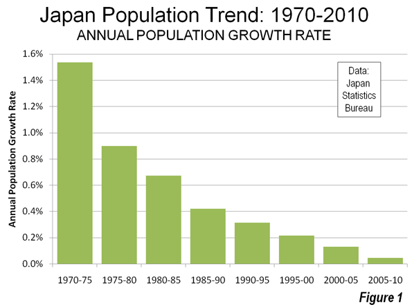
    The Falling Growth Rate: The decline in Japan’s population growth rate has been precipitous. Between 1970 and 1975, Japan experienced an annual population growth rate of 1.53 percent. This was the fastest growth rate experienced by the nation since 1900, with the exception of the strong growth   immediately after World War II, from 1945 to 1950. After 1975, however growth declined significantly, dropping to 0.89 percent annually between 1975 and 1980 and finally dropping to 0.05 percent annually between 2005 and 2010 (Figure 1).

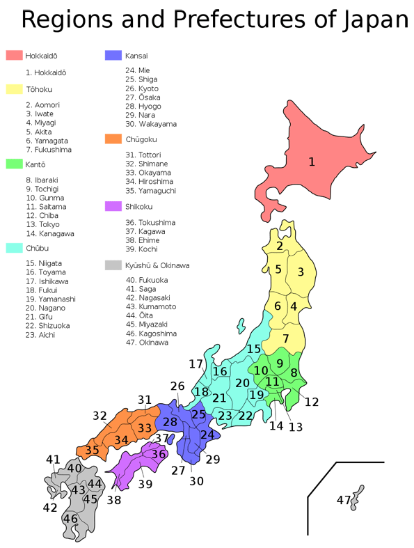
    Tohoku: Population Loss, Earthquake and Tsunami: The largest population losses were in the Tohoku region of northeast Honshu, which is the largest and most highly populated island (more than 80 percent of the population). The population declined there by more than three percent..   However, one of Tohoku’s prefectures, Miyagi, has grown strongly, adding 29 percent to its population since 1970, more than any prefecture outside the Tokyo-Yokohama, Nagoya and Osaka-Kobe-Kyoto areas. All of this, of course, was before the great earthquake and tsunami of March 11, 2011 which severely damaged many communities in Tohoku and took an especially severe toll in Miyagi and its capital, Sendai.

    All but two of Japan’s other regions experienced losses between 2000 and 2005, with growth only in Kanto (the broader Tokyo region, consisting of seven prefectures) and the island region (and prefecture) of Okinawa.

    Only the prefecture of Aichi  and four prefectures in the Tokyo – Yokohama area added more than 100,000 people. Nagoya is the capital of Aichi prefecture and forms the core of Japan’s third largest urban area. Small gains were also experienced in Osaka Prefecture (capital Osaka), at the core of the Osaka – Kobe – Kyoto urban area, the world’s 12th largest, with a population of 17 million. Shiga prefecture, halfway between Nagoya and Osaka grew slightly, as did Fukuoka prefecture, home of the Fukuoka and Kitakyushu urban areas.

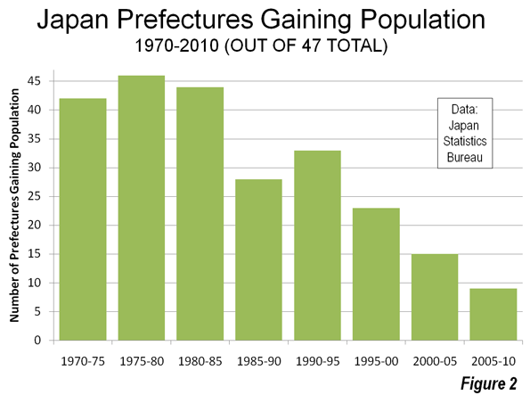
    Population losses were sustained in 38 of Japan’s 47 prefectures between 2005 and 2010 (Table). In contrast, during the much faster growing period of 1975 to 1980, 46 of Japan’s 47 prefectures gained   (Figure 2). Indeed, the only prefecture losing population during that period was Tokyo (includes the 23 wards of the former city of Tokyo and the "tama" suburbs), which was the nation’s fastest-growing prefecture during the last census period.

    Japan Population Trends by Region and Prefecture, 1970-2010
     
    1970 2000 2005 2010 Change Change from 2005 Share of Growth from 1970 Change from 1970
    JAPAN 104,663 126,926 127,768 128,056 288 0.2% 100.0% 22.4%
    REGION:Prefecture
    HOKKAIDO 5,184 5,683 5,628 5,507 -120 -2.1% 1.4% 6.2%
    Hokkaido 5,184 5,683 5,628 5,507 -120 -2.1% 1.4% 6.2%
    TOHOKU 9,031 9,818 9,635 9,335 -300 -3.1% 1.3% 3.4%
    Aomori 1,428 1,476 1,437 1,373 -63 -4.4% -0.2% -3.8%
    Iwate 1,371 1,416 1,385 1,331 -55 -3.9% -0.2% -3.0%
    Miyagi 1,819 2,365 2,360 2,348 -12 -0.5% 2.3% 29.1%
    Akita 1,241 1,189 1,146 1,086 -60 -5.2% -0.7% -12.5%
    Yamagata 1,226 1,244 1,216 1,169 -47 -3.9% -0.2% -4.7%
    Fukushima 1,946 2,127 2,091 2,029 -63 -3.0% 0.4% 4.3%
    KANTO 29,496 40,434 41,495 42,607 1,113 2.7% 56.0% 44.5%
    Ibaraki 2,144 2,986 2,975 2,969 -6 -0.2% 3.5% 38.5%
    Tochigi 1,580 2,005 2,017 2,007 -10 -0.5% 1.8% 27.0%
    Gumma 1,659 2,025 2,024 2,008 -16 -0.8% 1.5% 21.0%
    Saitama 3,866 6,938 7,054 7,195 141 2.0% 14.2% 86.1%
    Chiba 3,367 5,926 6,056 6,217 161 2.7% 12.2% 84.6%
    Tokyo 11,408 12,064 12,577 13,162 585 4.7% 7.5% 15.4%
    Kanagawa 5,472 8,490 8,792 9,050 258 2.9% 15.3% 65.4%
    CHUBU 18,091 21,628 21,774 21,715 -59 -0.3% 15.5% 20.0%
    Niigata 2,361 2,476 2,431 2,375 -57 -2.3% 0.1% 0.6%
    Toyama 1,030 1,121 1,112 1,093 -18 -1.7% 0.3% 6.2%
    Ishikawa 1,002 1,181 1,174 1,170 -4 -0.3% 0.7% 16.8%
    Fukui 744 829 822 806 -15 -1.8% 0.3% 8.4%
    Yamanashi 762 888 885 863 -22 -2.5% 0.4% 13.2%
    Nagano 1,957 2,215 2,196 2,153 -43 -2.0% 0.8% 10.0%
    Gifu 1,759 2,108 2,107 2,081 -26 -1.2% 1.4% 18.3%
    Shizuoka 3,090 3,767 3,792 3,765 -27 -0.7% 2.9% 21.8%
    Aichi 5,386 7,043 7,255 7,408 154 2.1% 8.6% 37.6%
    KANSAI 18,944 22,713 22,760 22,755 -5 0.0% 16.3% 20.1%
    Mie 1,543 1,857 1,867 1,855 -12 -0.7% 1.3% 20.2%
    Shiga 890 1,343 1,380 1,410 30 2.2% 2.2% 58.5%
    Kyoto 2,250 2,644 2,648 2,637 -11 -0.4% 1.7% 17.2%
    Osaka 7,620 8,805 8,817 8,863 46 0.5% 5.3% 16.3%
    Hyogo 4,668 5,551 5,591 5,589 -1 0.0% 3.9% 19.7%
    Nara 930 1,443 1,421 1,400 -21 -1.5% 2.0% 50.5%
    Wakayama 1,043 1,070 1,036 1,001 -35 -3.4% -0.2% -4.0%
    CHUGOKU 6,997 7,732 7,676 7,562 -114 -1.5% 2.4% 8.1%
    Tottori 569 613 607 588 -19 -3.1% 0.1% 3.4%
    Shimane 774 762 742 716 -26 -3.5% -0.2% -7.4%
    Okayama 1,707 1,951 1,957 1,945 -12 -0.6% 1.0% 13.9%
    Hiroshima 2,436 2,879 2,877 2,861 -16 -0.6% 1.8% 17.4%
    Yamaguchi 1,511 1,528 1,493 1,451 -41 -2.8% -0.3% -3.9%
    SHIKOKU 3,904 4,154 4,086 3,977 -109 -2.7% 0.3% 1.9%
    Tokushima 791 824 810 786 -24 -3.0% 0.0% -0.6%
    Kagawa 908 1,023 1,012 996 -17 -1.6% 0.4% 9.7%
    Ehime 1,418 1,493 1,468 1,431 -37 -2.5% 0.1% 0.9%
    Kochi 787 814 796 765 -32 -4.0% -0.1% -2.8%
    KYUSHU 12,071 13,446 13,353 13,204 -148 -1.1% 4.8% 9.4%
    Fukuoka 4,027 5,016 5,050 5,073 23 0.5% 4.5% 26.0%
    Saga 838 877 866 850 -17 -1.9% 0.1% 1.4%
    Nagasaki 1,570 1,517 1,479 1,427 -52 -3.5% -0.6% -9.1%
    Kumamoto 1,700 1,859 1,842 1,817 -25 -1.3% 0.5% 6.9%
    Oita 1,156 1,221 1,210 1,196 -13 -1.1% 0.2% 3.5%
    Miyazaki 1,051 1,170 1,153 1,135 -18 -1.6% 0.4% 8.0%
    Kagoshima 1,729 1,786 1,753 1,706 -47 -2.7% -0.1% -1.3%
    OKINAWA 945 1,318 1,362 1,393 31 2.3% 1.9% 47.4%
    Okinawa 945 1,318 1,362 1,393 31 2.3% 1.9% 47.4%
    In thousands
    Data from Japan Statistics Bureau


    Moving to Tokyo: Since 1970, 56 percent of Japan’s growth has been in the Kanto region, which includes Tokyo. During the last five years, all of Japan’s growth took place in the core of the Tokyo – Yokohama region. This includes the suburban prefectures of Chiba, Kanagawa and Saitama, along with the prefecture of Tokyo.  These four prefectures added 1.14 million people, nearly 4 times the population gain of the entire country. Tokyo is the national capital and forms the world’s largest urban area, with 37 million people.  

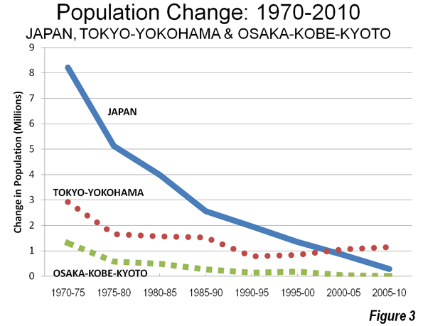
    Different Urban Areas: Different Fates: The fortunes of the prefectures in Japan’s two largest urban areas could hardly be more different. The four prefectures of the Tokyo – Yokohama area had added approximately 3,000,000 people in each five-year period until 1975. Since that time, growth has been slower, but the area has added 1 million or more people each five years from 1975 to 2010. On the other hand, the Osaka – Kobe – Kyoto area (Osaka, Hyogo, Kyoto and Nara prefectures), which also experienced strong growth after World War II, adding between one and two million people in each five year period until 1975, has seen its growth come to a virtual standstill. Over the past five years, Osaka – Kobe – Kyoto added only 12,000 people (Figure 3). As a result, Osaka – Kobe – Kyoto is easily the slowest growing mega-city in the world, by far.   Osaka – Kobe – Kyoto seems destined to fall substantially in world urban area rankings in the years to come. Tokyo – Yokohama, however, remains at least 14 million larger than any other urban area in the world, a margin that seems likely to be secure for decades to come.

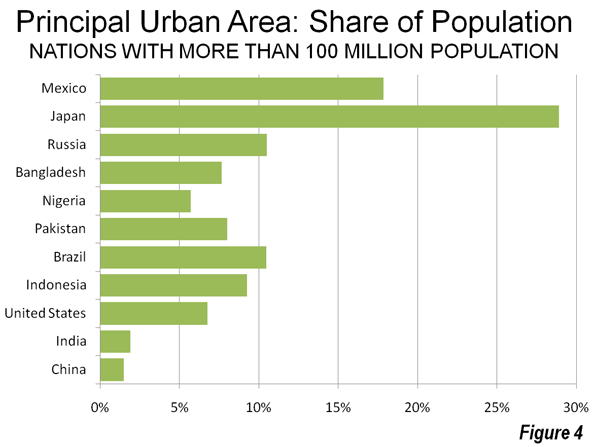
    The Impetus for Decentralization: These numbers suggest there is ample reason to worry about the concentration of population and power in the Tokyo – Yokohama area, which now contains nearly 30 percent of the nation’s population. None of the world’s largest nations, outside of Korea (which ranks 25th in population), are so concentrated in one urban area. Among other nations with more than 100 million the greatest concentration is in Mexico, where Mexico City accounts for less than 20 percent of the population. The largest urban areas in Brazil (Sao Paulo) and Russia (Moscow) have little more than 10 percent of the population. The largest urban area in the United States, New York, accounts for less than seven percent of the population, while in China (Shanghai) and India (Delhi), the largest urban areas house less than two percent of the population (Figure 4). Paris, the beneficiary of centuries of centralization, has less than 20 percent of the population.  

    Moving Away from Tokyo? There had long been proposals to move the national capital, but were not implemented, at least in partly because of Japan’s two decade-long economic difficulties. However, after the great earthquake and tsunami, these calls have been revived. One proposal would establish a series of auxiliary capitals around the nation, rather than simply moving the capital from Tokyo. Proponents have indicated concern that a major earthquake and tsunami in the Tokyo – Yokohama area could be far more damaging than the recent disaster in Tohoku. A recent proposal by former Japanese Chief Cabinet Secretary Yasuhisa Shiozaki (formerly the second ranking official in the national government) called on Japan to move parliament (the Diet) to the Fukushima area, near the damaged nuclear power plant as a part of a decentralization strategy.

    Despite these concerns, decentralization will be no easy matter. Moving the government would require a huge political shift, and that would just be the beginning. Shifting the commercial base and the population could well prove impossible.

    Nonetheless, the results of the 2010 census provide strong support for decentralization, a message that has been telegraphed by the earthquake and tsunami of March 11.

    Photo: Kyoto (by Jean Love)

    Wendell Cox is a Visiting Professor, Conservatoire National des Arts et Metiers, Paris and the author of “War on the Dream: How Anti-Sprawl Policy Threatens the Quality of Life

  • China: Urbanizing and Moving East: 2010 Census

    The National Bureau of Statistics of China has just released the first results of the 2010 census. The new figures portray a radically reduced population growth rate, rapid urbanization and an unprecedented domination of population growth by the East Coast.

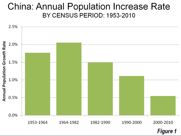
    Slowing Population Growth: China, the world’s most populous nation, grew rapidly until the early 1980s. The strongest growth since 1950 was in the 1964 to 1982 census period, during which the annual growth rate exceeded two percent. By the 1990 to 2000 period, the annual rate had fallen to 1.1 percent and then dropped in half to approximately 0.6 percent between 2000 and 2010 (Figure 1). The nation’s total population growth between 2000 and 2010 was approximately 75 million. In contrast, the 1964 to 1982 rate would have produced a population increase of 300 million people. Two key factors have   influenced this drop in population growth rate. The first is rapidly improving affluence, a factor routinely associated with lower birth rates around the world. The second factor is China’s one child policy, which is contributing to an aging of the population and has been associated with an increasing male to female birth ratio.

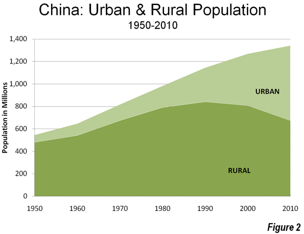
    Accelerating Urbanization: Between 2000 and 2010, China continued to urbanize at a pace and scale never seen before in world history (Figure 2).  China added approximately 205 million urban residents over 10 years, more urban residents than live in any country except for India and the United States. China’s urban population expansion was 2.5 times the estimated increase in rapidly urbanizing India. In 2010, nearly 50 percent of the population lived in urban areas, compared to 37 percent in 2000. This increase is well above expectations. The United Nations had projected an urbanization share of 47 percent, which would have converted to approximately 50 million fewer urban residents.

    A large share of the increase in urban population was from the nation’s large migrant population, which lacks registration (hukou status) at its current, generally urban place of residence. A floating population, this group rose from 120 million in 2000 to 220 million in 2010. This movement of 100 million people dwarfs the national population increase of 75 million. Previous data indicated that virtually all of Shanghai’s population growth was due to migration of (principally poorer) people from elsewhere, as has occurred elsewhere in the nation.
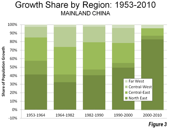
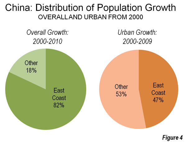
    Moving East: For the first time since 1950, one region of the nation was dominant (Figure 3), with 83 percent of growth on the already heavily urbanized East Coast. In contrast, the center (East Central and West Central regions) combined for only eight percent of the growth, which is down from 41 percent between 1990 and 2000 and 56 percent between 1964 and 1982 (Note 1) Regional and provincial level population trends are indicated in the table below (link to provincial level map).
    China Population Trends by Region & Province
    1990-2010
    1990 2000 2010 1990-2000 Change 2000-2010 Change Share of Growth: 1990-2000 Share of Growth: 2000-2010
    CHINA    1,130.49    1,262.28       1,332.77 11.7% 5.6% 100.0% 100.0%
    EAST COAST 428.61 493.84 552.20 15.2% 11.8% 49.5% 82.8%
    NORTH 165.08 182.06 200.20 10.3% 10.0% 12.9% 25.7%
      Beijing        10.82 13.82 19.61 27.7% 41.9% 2.3% 8.2%
      Hebei          61.08 67.44 71.85 10.4% 6.5% 4.8% 6.3%
      Shandong       84.39 90.79 95.79 7.6% 5.5% 4.9% 7.1%
      Tianjin        8.79 10.01 12.94 13.9% 29.3% 0.9% 4.2%
    CENTRAL 151.89 172.60 193.00 13.6% 11.8% 15.7% 28.9%
      Fujian         30.05 34.71 36.89 15.5% 6.3% 3.5% 3.1%
      Jiangsu        67.06 74.38 78.66 10.9% 5.8% 5.6% 6.1%
      Shanghai       13.34 16.74 23.02 25.5% 37.5% 2.6% 8.9%
      Zhejiang       41.45 46.77 54.43 12.8% 16.4% 4.0% 10.9%
    SOUTH 111.63 139.18 159.00 24.7% 14.2% 20.9% 28.1%
      Guangdong      62.83 86.42 104.30 37.5% 20.7% 17.9% 25.4%
      Guangxi        42.25 44.89 46.03 6.3% 2.5% 2.0% 1.6%
      Hainan         6.56 7.87 8.67 20.0% 10.2% 1.0% 1.1%
    NORTH EAST 99.33 106.55 109.52 7.3% 2.8% 5.5% 4.2%
      Heilongjiang   35.21 36.89 38.31 4.8% 3.9% 1.3% 2.0%
      Jilin          24.66 27.28 27.46 10.6% 0.7% 2.0% 0.3%
      Liaoning       39.46 42.38 43.75 7.4% 3.2% 2.2% 1.9%
    EAST CENTRAL 344.25 375.23 381.43 9.0% 1.7% 23.5% 8.8%
    NORTH 106.40 116.59 119.92 9.6% 2.9% 7.7% 4.7%
      Anhui          56.18 59.86 59.50 6.5% -0.6% 2.8% -0.5%
      Inner Mongolia 21.46 23.76 24.71 10.7% 4.0% 1.7% 1.3%
      Shanxi         28.76 32.97 35.71 14.6% 8.3% 3.2% 3.9%
    SOUTH 237.85 258.64 261.51 8.7% 1.1% 15.8% 4.1%
      Henan          85.51 92.56 94.02 8.2% 1.6% 5.3% 2.1%
      Hubei          53.97 60.28 57.24 11.7% -5.0% 4.8% -4.3%
      Hunan          60.66 64.40 65.68 6.2% 2.0% 2.8% 1.8%
      Jiangxi        37.71 41.40 44.57 9.8% 7.7% 2.8% 4.5%
    WEST CENTRAL 236.49 259.61 259.18 9.8% -0.2% 17.5% -0.6%
    NORTH 59.91 67.29 69.20 12.3% 2.8% 5.6% 2.7%
      Gansu          22.37 25.62 25.58 14.5% -0.2% 2.5% -0.1%
      Ningxia        4.66 5.62 6.30 20.7% 12.1% 0.7% 1.0%
      Shaanxi        32.88 36.05 37.33 9.6% 3.5% 2.4% 1.8%
    SOUTH 176.58 192.32 189.98 8.9% -1.2% 11.9% -3.3%
      Chongqing      28.86 30.90 28.85 7.1% -6.6% 1.5% -2.9%
      Guizhou        32.39 35.25 34.75 8.8% -1.4% 2.2% -0.7%
      Sichuan        78.36 83.29 80.42 6.3% -3.4% 3.7% -4.1%
      Yunnan         36.97 42.88 45.97 16.0% 7.2% 4.5% 4.4%
    FAR WEST 21.81 27.05 30.44 24.0% 12.5% 4.0% 4.8%
      Qinghai        4.46 5.18 5.63 16.2% 8.6% 0.5% 0.6%
      Tibet          2.20 2.62 3.00 19.3% 14.6% 0.3% 0.5%
      Xinjiang       15.16 19.25 21.81 27.0% 13.3% 3.1% 3.6%

    East Coast: The East Coast growth share of 83 percent is far higher than in previous census periods, which reached a high at 49 percent between 1990 and 2000. The share of growth was consistent within the sub-regions of the East Coast. The North, surrounding Beijing and the Yellow River (Huang He) Delta, accounted for 26 percent of the growth. The Central East Coast, with Shanghai and the Yangtze River (Changjiang) Delta at its core, captured 29 percent of the growth. The South, centering on the Pearl River Delta, and the megacities of Guangzhou, Shenzhen and Dongguan, accounted for 28 percent of the growth (Note 2).

    All of the 11 provincial level jurisdictions (Note 3) on the East Coast all except for Guangxi grew at least as fast as the nation. The fastest growth in the nation was in the three provincial level municipalities: Beijing, where the population increased 42 percent, Shanghai at 38 percent and Tianjin at 29 percent. Even so, Beijing’s population was a full two million less than some estimates, while Shanghai’s was nearly one million more than current city estimates.

    Outside the provincial level municipalities, Guangdong was the fastest growing in the nation, adding 21 percent. Guangdong became the nation’s largest provincial level jurisdiction, reaching 104 million and adding 18 million new residents. The Guangdong count was particularly surprising, roughly 7 million higher than would have been expected based upon 2009 population estimates. Zhejiang, adjacent to Shanghai grew 16 percent. Hainan, an island province carved from Guangdong in the 1980s, grew 10 percent.

    North East: The North East ("Manchuria" or "Dong Bei") accounted for only four percent of the nation’s growth, down significantly from previous census periods.  All three provinces grew at lower rates than the nation. These are traditional manufacturing areas that have not seen the sort of investment seen further south.

    East Central: The East Central provinces accounted for eight percent of the nation’s growth, down from 23 percent between 1990 and 2000. Among the seven provinces, only Shanxi and Jiangxi grew faster than the national rate. Hubei, home of Wuhan, one of the nation’s largest urban areas, experienced a loss of more five percent, the second largest population decline in the nation after Chongqing. The northern East Central jurisdictions grew at approximately one half the national rate, while the south grew at approximately one fifth the national rate.

    West Central: The seven West Central provincial level jurisdictions lost population in an amount equal to -0.6 percent of the national growth. This compares to an18 percent share of national growth between 1990 and 2000. The provincial level municipality of Chongqing experienced the largest rate of population loss in the nation at seven percent. Sichuan, from which Chongqing was carved in the 1990s, lost three percent of its population. Nonetheless, two provincial level jurisdictions in the West Central grew faster than the national rate, Ningxia and Yunnan. As in the East Central, the North grew at approximately one half the national rate. The South experienced heavy rural population losses, even as large urban areas, such as Chongqing and Chengdu experienced strong population gains.

    Far West: The jurisdictions of the Far West captured five percent of the national growth. The Far West grew the fastest among the regions, at 12.5 percent compared to 11.8 percent on the East Coast.  Each of the jurisdictions, Xinjiang, Tibet and Qinghai grew more quickly than the national rate. Nonetheless, with such a small population (30 million), the population growth in the Far West was barely one-half that of Beijing or Shanghai and little more than Tianjin.

    Provincial Losses, Urban Gains: Despite the uneven concentration of growth on the East Coast, the larger increase in (100 million) in migration from rural to urban areas led to a less uneven distribution of urban growth. The slow growth and even the population losses occurring in the interior mask huge growth in major urban areas of the same provincial level jurisdictions.

    Based upon 2009 estimates (provincial level urban data has not yet been released for 2010), the provincial level municipality of Chongqing gained 4.5 million urban residents (more than the population of Berlin), while the overall provincial level population loss was 2 million from 2000 to 2010. This illustrates one of the principal dynamic of population trends in China, as the countryside loses population to urban areas not only on the East Coast but also in the same general areas. The rural areas of Chongqing, which accounted for two-thirds of the population, lost more than 6 million residents, principally to the nearby Chongqing urban area as well as to other urban areas of the nation.

    In Sichuan, with its large and fast growing capital Chengdu, the urban population grew nearly 10 million, while  the provincial population was declining 3 million, indicating a rural loss of 13 million. Thus, while the East Coast accounted for 83 percent of the overall population growth, government estimates through 2009 indicate that only 47 percent of the urban population growth was on the East Coast (Figure 4). 

    Challenges: China faces no shortage of demographic challenges. An aging population will impose significant financial burdens on the generations to come, as is already happening in more affluent nations. The ratio of female to male births needs to be improved or social stability could be difficult to maintain in the decades ahead. The role of China’s one-child policy in these issues is now being debated and reviewed.

    The strong trend toward urbanization will continue for decades. The United Nations estimates that China will be nearly 75 percent urbanized in 2050 compared to the current 50 percent. The nation is expected to add 70 million residents, with an increase of 400 million in urban areas and a loss of 330 million in rural areas. Should these projections be reached, China’s rate of urbanization will be near the current levels in the affluent West. Even with more than one-half of urban growth now occurring outside the East Coast, there is a need to decentralize more of the growth to the emerging urban areas of the interior. This is something now widely recognized within Chinese planning and government circles.

    —–

    Photo: Wuhan (capital of Hubei) By author

    Note 1: There are various methods to categorize the regions of China. This classification is used to illustrate the differences in regional growth rates in the census periods since 1950. The provincial level municipality of Beijing is classified as East Coast because it is surrounded by provincial level jurisdictions (Hebei and Tianjin) which are coastal. Inner Mongolia, which stretches across the entire center of the nation is classified in the East Central because its population is more concentrated in that area. The regional population change between 1953 and 1964 includes an estimated allocation of population to provincial level jurisdictions into which abolished provinces (Rehe, or Jehol and Xikang) were merged during the period.

    Note 2: The Hong Kong and Macao Special Administrative Regions are also in the south, but are not included in the 2010 census data.

    Note 3: There are three types of provincial level jurisdictions in China, provinces, provincial level municipalities and autonomous regions.

    Wendell Cox is a Visiting Professor, Conservatoire National des Arts et Metiers, Paris and the author of “War on the Dream: How Anti-Sprawl Policy Threatens the Quality of Life

  • The Transportation Politics of Envy: The United States & Europe

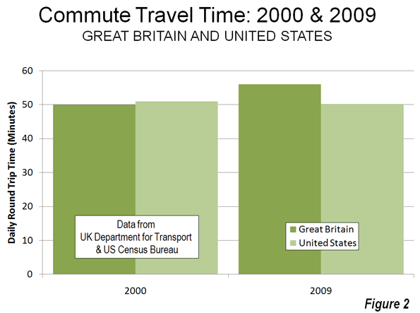
    The Department for Transport of the United Kingdom may be surprised to learn that the average round-trip commute in the nation is up to a quarter hour less than reflected in its reports. This revelation comes from an article in The Economist, ("Life in the Slow Lane") citing a survey indicating that the average commuter in the United Kingdom spends less than 40 minutes daily traveling to and from work in 2000. According to Regional Transport Statistics, published by the Department for Transport, the average commuter spent 50 minutes traveling to and from work in 2000. The UK government further indicates that the average commute time had risen to 56 minutes by 2009. The Economist relies on the much lower figure (and other similarly low estimates from other European nations) in fashioning an article criticizing transportation policy in the United States.

    Shorter US Commute Times: The Economist begins with the contention that the average work trip travel time in the United States is substantially greater than that of the number of European nations. The most reliable data says otherwise.

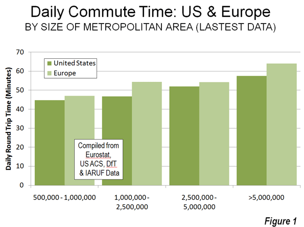
    The most comprehensive work trip data in Europe is maintained by Eurostat, the statistical agency of the European Commission. The Eurostat data indicates that average commute times in Europe are somewhat more than in the United States in metropolitan areas of similar size (Figure 1), when compared to the comprehensive data from the US Census Bureau. For example, among metropolitan areas of more than 5 million population, the daily round-trip average commute is under 58 minutes in the United States, less than the 64 minutes in Europe. European commute times are longer in all population categories (Note).

    Overall, the average round-trip travel time in the US metropolitan areas over 500,000 population is 23.6 minutes and 25.3 minutes in the European metropolitan areas.

    Moreover, there are indications that the US trend is favorable, at least in comparison to the United Kingdom. Between 2000 and 2009, UK government data shows average round trip commute times to have increased six minutes, while US government data indicates a decline of nearly one minute (Figure 2).

    The US: Less Traffic Congestion:  The Economist then asserts that traffic congestion is worse in US metropolitan areas than in Europe. According to The Economist:

    …with few exceptions (London among them) American traffic congestion is worse than western Europe’s. Average delays in America’s largest cities exceed those in cities like Berlin and Copenhagen.

    The reality is the opposite, according to the INRIX Traffic Scorecard and a more correct rendering of the point above would have been:

    … with few exceptions (Los Angeles among them) western Europe’s traffic congestion is worse than America’s. Average delays in some of western Europe’s smallest cities exceed those in cities like Atlanta, Houston and Dallas-Fort Worth.

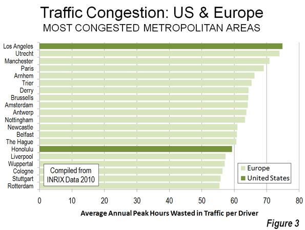
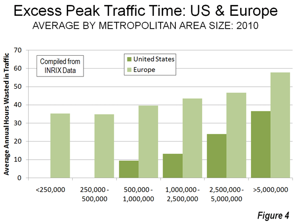
    INRIX compared 2010 peak period traffic delays in metropolitan areas of the United States and Europe. As with commuting time, the average travel delay per driver was greater in Europe than in the United States in every population classification. While Los Angeles has the worst congestion the approximately 200 metropolitan areas (one-half in the US and one-half in Europe), the next 13 worst were in Europe (Honolulu ranks 15th) and 18 of the worst 20 were in Europe (Figure 3). The third worst ranking US metropolitan area was San Francisco, at 28th, while Washington was 29th. Only seven of the 50 most congested metropolitan areas were in the United States. Of course, anyone who has driven extensively in the metropolitan areas of the US and western Europe knows that congestion is generally far worse in Europe, a fact confirmed by the INRIX data.

    Indeed, traffic congestion in the smallest European metropolitan areas (under 500,000) was worse than in the largest US metropolitan areas, those with over 5 million (There were no US metropolitan areas with less than 500,000 population in the INRIX data, see Figure 4). Those automobile-oriented, highly suburbanized banes of urban planning, Atlanta, Dallas-Fort Worth and Houston all ranked in the middle, between 90th and 110th. At least 75 European metropolitan areas had worse traffic congestion than all three.

    High-Speed Rail Envy: Finally, The Economist decries the lack of high-speed rail in the United States, noting that:

    The absence of true high-speed rail is a continuing embarrassment to the nation’s rail enthusiasts.

    It is hard to imagine a more pathetic standard for evaluating public policy than "satisfying rail enthusiasts."  It is well known that that governments from Washington to London, Athens and Lisbon are in serious financial difficulty. It is a time for limiting public expenditures to matters of genuine priority. That does not include high speed rail.

    The intercity road and airport systems are principally financed by users, in contrast to the operating subsidies and intense (100 percent) capital subsidies required by high-speed rail. This is evident in California with its now $65 billion first line that has more than doubled in real cost in a decade. It is also evident, closer to home for The Economist, where the controversial HS-2 high-speed rail proposal from London to Manchester and Leeds could easily double in cost (to £65 billion), based upon the best international research. Astoundingly, a doubling of cost would be a bargain for Britain’s taxpayers compared to two previous high-speed rail failures in the same corridor (See: The High Speed Rail Battle of Britain). The recurring environmental justifications ring hallow due to the high costs and the three generations or more it would require in California and the United Kingdom to eliminate the first gram of greenhouse gas.

    Transport policy could be improved in the United States, as well as in Europe. However, the starting point must be facts, not fancy, and certainly not envy.

    ——-

    Note: this analysis includes all data available for metropolitan areas in the United States (metropolitan statistical areas) and Europe (larger urban zones, the closest equivalent to US metropolitan areas). US data is complete, covering all 100 metropolitan areas with more than 500,000 population and is from the United States Census Bureau. European data is principally from Eurostat (94 larger urban zones and three from other sources). Paris data is from IAURIF (Institut d’aménagement et d’urbanisme de la région Île-de-France). Newcastle-upon-Tyne and Leeds data is from the UK Department for Transport.  Data is not available for a number of metropolitan areas with more than 500,000 population in Europe.

  • The Evolving Urban Form: Manila

    The Urban Area: The Manila urban area ranks as the world’s fifth largest urban area (area of continuous urban development) with a population of approximately 21,000,000 (Note 1) covering a land area of 550 square miles (1,425 square kilometers). The urban population density sits at approximately 38,000 people per square mile (14,500 per square kilometer).

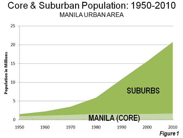
    Like nearly all major urban areas of the world, Manila has experienced substantial suburbanization over recent decades and substantially falling urban population densities. In 1950, the core municipality of Manila had a population of under 1 million people, and it represented approximately 60 percent of the urban area population. Over the intervening years, the core of Manila grew by approximately 700,000 people, while the balance of the urban area added nearly 20,000,000 people (Figure 1).

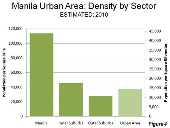
    A Forbes article indicates that Manila is the highest density major municipality in the world with a population density of nearly 115,000 per square mile (45,000 per square kilometer). This is more than double the population density of ville de Paris. The core has a population of approximately 1.7 million in a land area of 15 square miles (39 square kilometers).

    The densest district reaches nearly 180,000 people per square mile (70,000 per square kilometer). Even so, this is far less dense than some parts of Hong Kong (more than 1.1 million per square mile and more than 400,000 per square kilometer). Even higher densities existed in the early 20th century Lower East Side in New York (according Jacob Riis, author of A Ten Years’ War: An Account of the Battle with the Slum in New York). Even higher densities were reached during the late 1980s in Hong Kong’s now demolished Kowloon Walled City, variously estimated at up to 5 million per square mile (2 million per square kilometer).

    The inner suburbs, the balance of the National Capital Region now have approximately 10,600,000 residents. The population density drops substantially from the core to the inner suburbs to approximately 45,000 per square mile (18,000 per square kilometer).  The outer suburbs, which are composed of the portions of the urban area outside the National Capital Region, have a population of more nearly 8.5 million and a considerably lower density at 28,000 per square mile or 11,000 per square kilometer (Figure 2).

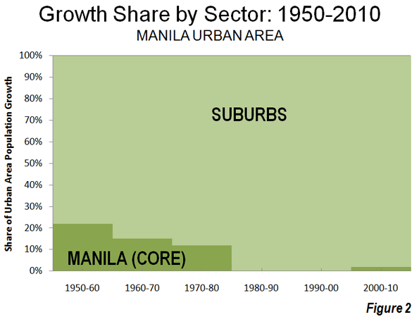
    As early as the 1950s, the suburbs have captured most of the urban areas growth. Between 1950 and 1980, the core municipality attracted between 10 percent and 20 percent of the urban area growth. The core municipality of Manila reached a population peak of nearly 1.6 million in 1980, which it has only been recently exceeded. From 1980 to 2000, virtually none of the urban growth took place in the core of Manila, though it captured roughly 2 percent of the growth from 2000 to 2010 (Figure 3).

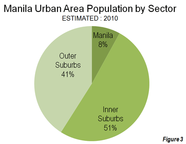
    As of 2010, it is estimated that eight percent of the population lives in the core municipality of Manila, 51 percent in the inner suburbs and 40 percent in the outer suburbs (Figure 4).

    The Metropolitan Area: Unlike urban areas, there are no international standards for the delineation of metropolitan areas (labor markets including extensions beyond urban areas). Serious attempts to compare international metropolitan area data have been rare (Note 2). Nonetheless, the evolution of Manila as a metropolitan area can be independently reviewed based upon a provincial level analysis.

    The Manila urban area occupies all or part of six provincial level jurisdictions. The largest population is in the National Capital Region, which is somewhat misleadingly referred to as "Metro Manila", despite being only a part of the metropolitan area. This is similar to Tokyo, where the prefecture of Tokyo is referred to as the "Tokyo Metropolis," yet represents only one third of the metropolitan area population. The metropolitan area also extends into the provinces of Rizal (from which the National Capital Region was carved in 1976), Cavite, Laguna, Bulucan and Batangas. The total population was estimated at 26.5 million in 2010 (Note 3).

    The metropolitan area’s population growth is strongly moving toward the outer suburbs (the five provinces outside the National Capital Region). Between 1970 and 1990, the inner suburbs captured 61 percent of the metropolitan area growth, compared to 36 percent in the outer suburbs. Between 1990 and 2010, the outer suburbs accommodated 64 percent of the metropolitan areas population growth, compared to 34 percent for the inner suburbs.

    Commercial Development: The suburbanization of Manila has not been limited to residences. New, world class commercial cores have been developed that have displaced many of the traditional functions of the older commercial core of Manila. Makati, a municipality to the east of Manila and within the National Capital Region now has the largest business district (photo), while a nearly as large commercial core has developed in Ortigas, just to the north (photo). There are other developing office centers such as the somewhat more distant commercial center near the southern border of the National Capital Region in Muntinlupa. This is similar to the kinds of newer commercial developments that have supplanted traditional business districts in urban areas such Mexico City (Reforma and Santa Fe) Sao Paulo (Paulista and Luis Carlos Berrini) and Istanbul (Levant).These developing country cities have experienced an economic decentralization of business that surpasses that of American edge cities.


    Makati


    Ortigas


    Manila’s Ominous Future? Manila faces an especially difficult future. The Philippines is projected to have one of the strongest urban growth rates in the world over the period to 2050. Since 1950, the Manila urban area has captured nearly 50 percent of the urban population growth of the nation. If this rate were to continue, the Manila urban area would reach a population of between 45 and 50 million by 2050. This is approximately 10,000,000 more than live in Tokyo, the world’s largest urban area today.

    But Manila faces even greater problems, related to the intense poverty of much of the population migrating to the urban area from the countryside. The Philippine Institute for Development Studies (PIDS) estimated that 4 million of the 11.5 million residents in the National Capital Region lived in slums (shantytowns or informal settlements) in 2010 (Photo).  PIDS indicates that this population is increasing at a rate of eight percent annually and is expected to reach 9 million by 2050. This would be nearly 60 percent of the projected population at that time, and does not include slum populations in the extensive suburbs beyond the limits of the National Capital Region.

    As if the poverty were not enough, Manila has been plagued by disastrous slum fires, the most recent within the past week. According to the Manila Times up to 10,000 people were left homeless by this most recent fire, which was in Makati, home of the metropolitan area’s largest and most prestigious business district.

    Manila also experiences some of the world’s worst traffic congestion, as people increasingly travel by car on its largely substandard road system. Perhaps even more surprisingly, a substantial number of detached housing communities have been developed, especially on the urban fringe.

    Manila’s challenge will be to accommodate the millions more who will seek a better life in the urban area and to do so while materially improving the standard of living as urgently as possible.

    ———

    Note 1: This urban area population is considerably above the figure reported by United Nations (11.6 million). United Nations figure is for the National Capital Region, which is also referred to as Metro Manila. In fact, the urban area stretches well beyond Metro Manila. This population estimate is based upon a build-up of smaller area population totals within the continuously develop urban area.

    Note 2: By far the most comprehensive attempt to apply consistent criteria to international metropolitan areas, was by urban expert Richard L. Forstall (who ran the Rand McNally "Ranally" international metropolitan area program), Richard P. Green and James B. Pick. The complexity of the research is indicated by the fact that their list is limited to the top 15 in the world. 

    Note 3: The metropolitan population is estimated by applying the 2000 to 2007 annual growth rate to from 2007.

    Wendell Cox is a Visiting Professor, Conservatoire National des Arts et Metiers, Paris and the author of “War on the Dream: How Anti-Sprawl Policy Threatens the Quality of Life

    Lead Photograph: Urban fringe development: Laguna province (outer suburbs). All photographs by author.