Author: Wendell Cox

  • Access in the City

    Access for residents to employment is critical to boosting city productivity. This has been demonstrated by researchers such as Remy Prud’homme and Chang-Woon Lee of the University of Paris, David Hartgen and M. Gregory Fields of the University of North Carolina, Charlotte. Generally, city productivity (economic growth and job creation) can be expected to improve more where employment access is better . Access is measured in the number of jobs that can be reached by the average employee in a certain period of time, like 30 minutes.

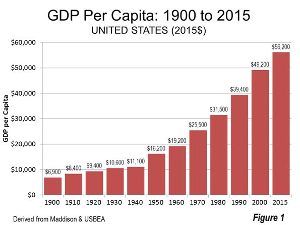
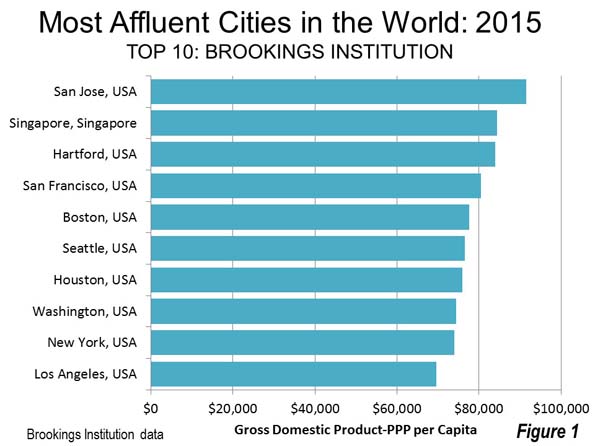
    Generally, US cities have seen strong productivity gains as they have become more accessible. In 1900, before the broad adoption of the automobile, US gross domestic product (GDP) per capita was $6,900 (2015 dollars). By 1930, when there were 90 percent as many motor vehicles as households in the nation, GDP per capita rose to $10,600. Now, even factoring in the economic reverses of the last decade, GDP per capita is more than five times that amount (Figure 1).

    Further, American metropolitan areas tend to have shorter work trip travel times and less traffic congestion than their counterparts elsewhere. Much of this is due to their more decentralized employment bases than elsewhere in the world, where decentralization has increased at a slower rate.

    Public officials and planners now have been given an important new tool for assessing access and improving metropolitan transportation. Researchers at the University of Minnesota Accessibility Laboratory have been studying accessibility in US employment markets (metropolitan areas) in the most detailed terms yet. The first report, in 2013, was authored by Professor David Levinson (on autos) and since that time Andrew Owen and Brendan Murphy have collaborated with Levinson in reports on autos, transit and walking. These modal reports measures access by the number of jobs that can be reached in a metropolitan area by the average employee in 10 minute intervals (from 10 to 60 minutes).

    This article summarizes access in the 30 and 60 minute travel times in 49 metropolitan areas (Note 1). The 30 minute trip is used because it is close to the average one-way work trip travel time in the United States (26.4 minutes in 2015). The 60 minute trip is used is the longest commute considered.  This “one hour economic circle” has also been adopted in Chinese cities, such as Chongqing for urban area planning, as recommended by former World Bank principal planner Alain Bertaud.

    Access by Automobile

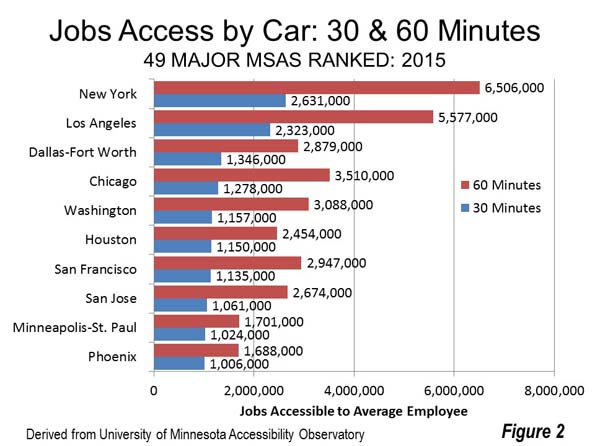
    As one would expect, more jobs can be accessed in the larger metropolitan areas. New York leads, with 2.6 million jobs accessible to the average employee within 30 minutes by auto. New York is closely followed by Los Angeles, only 12 percent lower at 2.3 million. With a population 35 percent below that of New York, and with the worst traffic congestion in the United States, this is a surprising result. The greater dispersion of jobs in Los Angeles certainly helps. In third position, Dallas-Fort Worth surprisingly edges out much larger Chicago, in fourth position. This undoubtedly is the result of DFW’s superior freeway system, which along with its arterial system has resulted in the best traffic congestion in the world for any metropolitan area over 5 million population. Washington (Note 2) and Houston rank fifth and sixth.

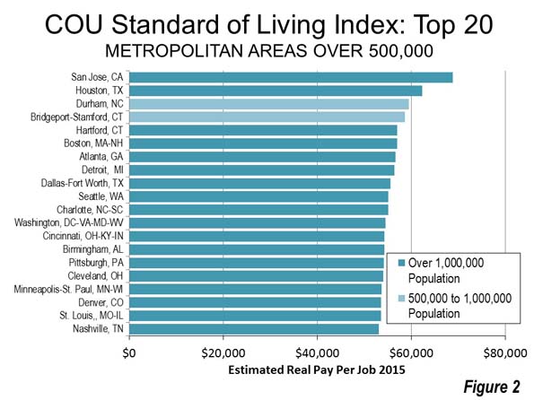
    Employment access by autos in 60 minutes is the highest in New York, and Los Angeles, with Chicago third (ahead of Dallas-Fort Worth), probably due to its larger overall labor market (42 percent more jobs than Dallas-Fort Worth). Washington, San Francisco and Dallas-Fort Worth have around 3,000,000 auto accessible jobs (Figure 2).

    Access by Transit

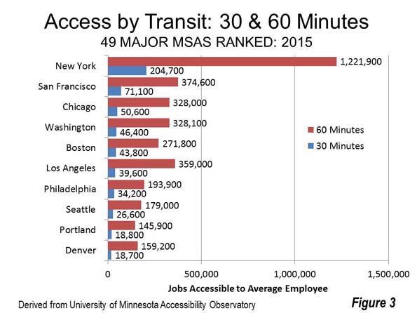
    Transit access is dominated by New York’s 200,000 jobs within 30 minutes access by transit. This is nearly three times that of second place San Francisco. The top five include three of the other metropolitan areas with the largest central business district (CBD or downtown) areas, Chicago, Washington and Boston, while Philadelphia, with the sixth largest CBD ranks seventh. Los Angeles ranks sixth. Seattle, Portland and Denver round out the top ten, well above their 15th, 24th and 21st population ranks. These high rankings may be a measure of their transit system quality, though access by transit is a mere fraction of their auto access.

    New York leads in 60 minute transit access, at more than 1.2 million, followed by Los Angeles, San Francisco, Washington and Chicago (Figure 3).

    Access by Walking

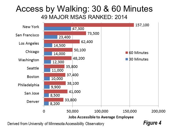
    New York also leads in 30 minute walk access, more than doubling that of second place San Francisco, at 47,300, followed by Los Angeles, Chicago and Washington. New York also leads in 60 minute walking access, at 157,100, followed, again, by San Francisco, Los Angeles, Chicago and Washington (Figure 4).

    Modal Comparisons

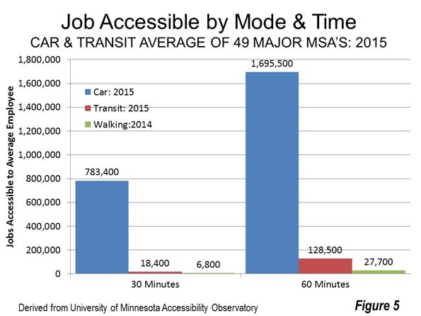
    The job accessibility differences between autos and transit are significant. On average among the 49 metropolitan areas, 30 minute access by car is 783,000 jobs, compared to only 18,000 for transit and 7,000 by walking. At 60 minutes, autos reach nearly 1.7 million jobs, compared to fewer than 130,000 for transit and 28,000 by walking. Thus, at 30 minutes, the accessible auto market is 43 times that of transit and 115 times that of walking (Figure 5).

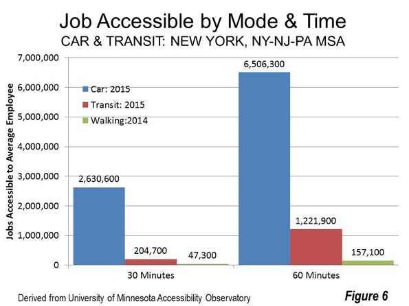
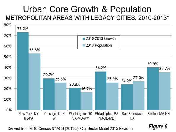
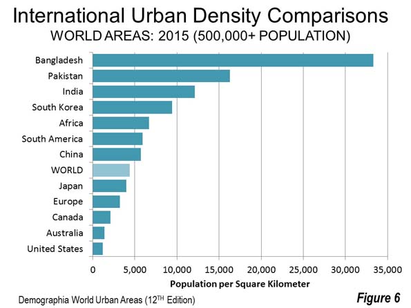
    The ultimate transit city in the United States is New York. There, the average employee can reach 2.6 million jobs by auto in 30 minutes, compared to 205,000 for transit and 157,000 by walking. Auto access in 30 minutes is 13 times that of transit and 56 times that of walking (Figure 6).

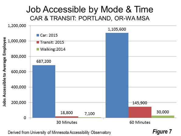
    Portland is a metropolitan area often cited for its urban transport policies, especially its extensive light rail system. Further Portland has a comparatively strong, traditional central business district (downtown) and has implemented policies intended to reduce car use and encourage transit and walking as well as increase urban densities. The average Portlander can reach 687,000 jobs in 30 minutes by car, 19,000 by transit and only 7,000 by walking. That’s only slightly better than the national average, with autos providing 37 times the access of transit and 97 times that of walking (Figure 7).

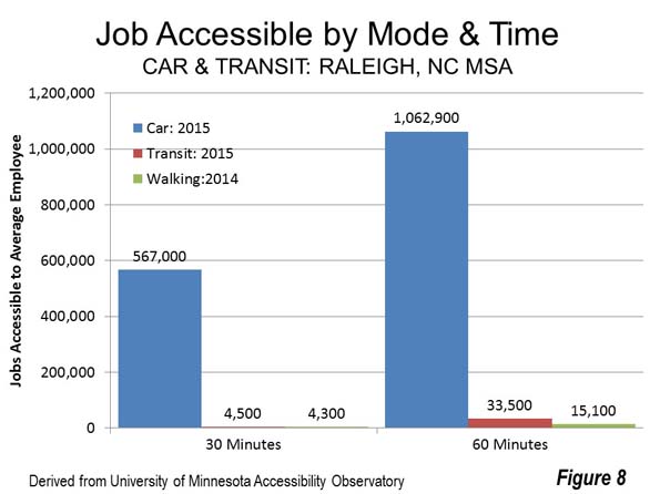
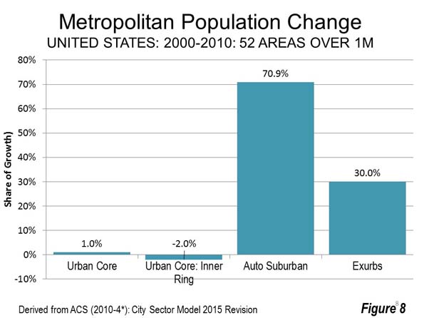
    Raleigh (Note 2) is certainly not a new city, but its explosive growth has given the metropolitan area a post-World War II urban form, with comparatively low density (one-half that of Portland) and very low transit ridership. The average employee in Raleigh can reach 567,000 jobs by car in 30 minutes, compared to 4,500 by transit and 4,300 by walking. Raleigh’s auto access is 125 times that of transit and 132 times that of walking, both higher than the national average (Figure 8).

    Extending Auto Mobility to All

    It is clear from the data that access to an auto provides unique advantages in comparison to transit or walking. Professor Robert Gordon, in his seminal The Rise and Fall of American Growth says that" "Much of the enthusiastic transition away from urban mass transit to automobiles reflected the inherent flexibility of the internal combustion engine—it could take you directly from your origin point to your destination with no need to walk to a streetcar stop, board a streetcar, often change to another streetcar line (which required more waiting), and then walk to your final destination."

    It might be asked, “how can it be that this is so in view of the many billions spent on new urban rail lines?” The answer is that transit cannot be competitive with the automobile in the modern urban area. Professor Jean-Claude Ziv and I concluded that it could take all of an urban area’s gross domestic product each year to build and operate such a system.

    At the same time, transit moves a large share commuters to the largest central business districts in the transit legacy cities. This is an important niche market, but not a large percentage overall.

    With the practical impossibility of replicating auto mobility for people who cannot afford cars, new thinking is needed. One approach could be auto ownership programs, according to Evelyn Bloomenberg and Margy Waller in a 2003 Brookings Institution paper. This could require shifting transit funding priorities toward employment access and the longer term economic growth that would produce.

    Note 1: The latest reports cover 50 metropolitan areas. This article deals with 49, because no transit data was provided for Memphis.

    Note 2: Some metropolitan areas are virtually adjacent to others. This can increase the jobs accessible because there is significant employment outside the metropolitan area, in an adjacent metropolitan area. Examples are San Francisco and San Jose, Washington and Baltimore, and Raleigh and Durham.

    Photo: Suburban Employment Center: Chicago (by author)

    Wendell Cox is principal of Demographia, an international public policy and demographics firm. He is a Senior Fellow of the Center for Opportunity Urbanism (US), Senior Fellow for Housing Affordability and Municipal Policy for the Frontier Centre for Public Policy (Canada), and a member of the Board of Advisors of the Center for Demographics and Policy at Chapman University (California). He is co-author of the "Demographia International Housing Affordability Survey" and author of "Demographia World Urban Areas" and "War on the Dream: How Anti-Sprawl Policy Threatens the Quality of Life." He was appointed to three terms on the Los Angeles County Transportation Commission, where he served with the leading city and county leadership as the only non-elected member. He served as a visiting professor at the Conservatoire National des Arts et Metiers, a national university in Paris.

  • Best Cities for Middle-Income Households: The Demographia Housing Affordability Survey

    The 13th Annual Demographia International Housing Affordability Survey measures middle-income housing affordability in 92 major housing markets (metropolitan areas with more than 1,000,000 population) in Australia, Canada, China (Hong Kong ), Ireland, Japan, New Zealand, Singapore, the United Kingdom and the United States. These include five of the largest metropolitan areas in the high income world, the megacities of Tokyo-Yokohama, New York, Osaka-Kobe-Kyoto, Los Angeles, and London, all with more than 10 million population.

    Rating Middle-Income Housing Affordability

    The Demographia International Housing Affordability Survey rates middle-income housing affordability using the “Median Multiple,” which is the median house price divided by the median household income. Historically, liberally regulated markets have exhibited median house prices that are three times or less that of median household incomes, for a Median Multiple of 3.0 or less. The ratings are in Table 1.

    Table 1

    Demographia International Housing Affordability Survey

    Housing Affordability Ratings

    Housing Affordability Rating

    Median Multiple

    Affordable

    3.0 & Under

    Moderately Unaffordable

    3.1 to 4.0

    Seriously Unaffordable

    4.1 to 5.0

    Severely Unaffordable

    5.1 & Over

    Median multiple: Median house price divided by median household income


    This year, the least affordable major housing markets Hong Kong (with an 18.1 median multiple — the median house price divided by the median household income). Sydney is second least affordable, at 12.2 and Vancouver is 11.8 is third, suffering a huge deterioration from last year’s 10.8. Auckland is fourth, at 10.0, San Jose at 9.6, Honolulu at 9.4, Los Angeles at 9.3 and San Francisco at 9.2 (Figure 1).

    Overall, there are 29 severely unaffordable major housing markets, including all in Australia (5), New Zealand (1) and China (1). There are 13 severely unaffordable major markets in the United States, out of 54. Seven of the United Kingdom’s 21 major markets are severely unaffordable and two in Canada. Toronto, Canada’s second most costly market experienced a deterioration in housing affordability equal to that of Vancouver, rising to a median multiple of 7.7 from 6.7.

    There are 11 affordable major housing markets in 2016, all in the United States. Rochester is the most affordable, with a Median Multiple of 2.5, followed by Buffalo (2.6), Cincinnati (2.7), Cleveland (2.7), Pittsburgh (2.7), Oklahoma City (2.9), St. Louis (2.9) and four at 3.0, Detroit, Grand Rapids, Indianapolis and Kansas City.

    Among the megacities, Osaka-Kobe-Kyoto is the most affordable, with a median multiple of 3.4, while Tokyo, the world’s largest urban area, has a seriously unaffordable median multiple of 4.7.

     “Best Cities” for Middle-Income Households

    Every year, “best cities” and “most livable cities” lists are produced by various organizations. Aimed at the high end of the housing market, these surveys evaluate housing affordability. Yet, the media often mischaracterizes the findings as relevant to the majority of households.

    In fact, a city cannot be livable, nor can it be a “best city” to middle-income households that cannot afford to live there. Households need adequate housing.

    The “best cities” for housing affordability are often better on middle-income outcomes that the high-end best cities that attract media attention for their luxury lifestyles. This is illustrated by a comparison between Dallas-Fort Worth, where housing affordability is far better and Toronto, which was rated as the “best city” by The Economist. In addition to better housing affordability, traffic congestion is better. Dallas-Fort Worth has the least traffic congestion of any city over 5,000,000 in the world. This is despite the fact that Toronto employs the most favored urban strategies, which Dallas-Fort Worth does not (such as densification and discouragement of auto use). This is not to dispute Toronto’s luxury rating, but it is of little use to the much larger number of middle-income households being priced out of home ownership (Figure 2).

    Another comparison shows that Kansas City has substantially better housing affordability than all of The Economist’s top 10 cities. In addition, Kansas City has the least traffic congestion of any city with more than 1,000,000 population (Figure 3) in the world (tied with Richmond).

    Urban Containment and Severely Unaffordable Housing

    Excessive land use regulation (housing regulation), principally urban containment policy, has been implemented in the major housing markets with severely unaffordable housing. Urban containment has been associated with much higher house prices, which is to be expected, because severe limitations on supply drive prices higher (as the experience with oil and OPEC shows). The process is illustrated in Figure 4.

    Prime Minister Bill English of New Zealand (then Deputy Prime Minister) noted in his introduction to the 9th Annual Demographia International Housing Affordability Survey that “Land has been made artificially scarce by regulation” locking up land for development. “This regulation has made land supply unresponsive to demand” and “translates to higher prices rather than more houses …”

    Excessive housing regulation has also been identified as having significantly reduced economic growth in the United States (nearly $2 trillion annually) and inequality internationally. It has made the job of central reserve banks more difficult by fueling inflation.

    Economic uncertainty is a substantial concern for households. It is important to keep housing affordable, so that households can have a better standard of living and poverty rates can be lower. This requires avoiding urban planning policies associated with artificially raising house prices, specifically the “killer app” of urban containment. Failing that, housing affordability is likely to worsen further.
    Paul Cheshire, Max Nathan and Henry Overman of the London School of Economics recently suggested that “… that the ultimate objective of urban policy is to improve outcomes for people rather than places” and that “… improving places is a means to an end, rather than an end in itself.”

    Following that policy prescription, a number of cities (such as Dallas-Fort Worth, Kansas City and others) have achieved the objective of putting people over place. For most of society, middle-income households as well as lower income households, the best cities are where governments have overseen local housing markets competently, evidenced by housing that is affordable, all else equal. In such cities, the cost of living tends to be lower, as households are able to afford a more affluent life.

    Oliver Hartwich, of the New Zealand Initiative notes in his introduction, “We should not accept extreme price levels in our housing markets. High house prices are not a sign of city’s success but a sign of failure to deliver the housing that its citizens need.”

    Wendell Cox is principal of Demographia, an international public policy and demographics firm. He is a Senior Fellow of the Center for Opportunity Urbanism (US), Senior Fellow for Housing Affordability and Municipal Policy for the Frontier Centre for Public Policy (Canada), and a member of the Board of Advisors of the Center for Demographics and Policy at Chapman University (California). He is co-author of the “Demographia International Housing Affordability Survey” and author of “Demographia World Urban Areas” and “War on the Dream: How Anti-Sprawl Policy Threatens the Quality of Life.” He was appointed to three terms on the Los Angeles County Transportation Commission, where he served with the leading city and county leadership as the only non-elected member. He served as a visiting professor at the Conservatoire National des Arts et Metiers, a national university in Paris.

    Photograph: Rochester, New York: Most Affordable Major Housing Market in 2016 by Theresa Marconi (Personal Communication) [CC BY-SA 3.0], via Wikimedia Commons

  • World Automotive Sales Setting New Records

    The world has come a long way since 1929, when 80 percent of the world’s car registrations were in the United States, which also manufactured 90 percent of the vehicles. Now China produces the most cars and its annual sales rank top in the world. China overtook the United States in vehicle sales during the Great Recession. But it’s not like Americans are no longer buying cars; the US broke its own record last year. In 2016, sales records were also set in nations as diverse as China, the United Kingdom, Canada, Australia and Mexico.  

    China

    China has emerged as the world’s largest automotive market. In 2016, China’s sales of passenger cars, light trucks (including sport utility vehicles, or SUVs) and commercial vehicles reached 23.9 million. This is 6.5 million more cars than were sold in the United States. This gap is likely to grow, because China’s large population offers greater opportunity for growth. The United States has about eight times as many vehicles per 1,000 population as China. The US leads in total vehicles with 260 million compared to China’s 140 million, according to OICA, the international vehicle manufacturers organization (Organisation Internationale des Constructeurs d’Automobiles), 

    From virtually the beginning of motorization more than a century ago, the United States dominated world automotive production but during  the Great Recession   China assumed sales leadership. As sales dropped precipitously in the US, Chinese sales rose 47 percent in 2009.

    Sales in 2016 were aided by temporarily lower taxes on small engine vehicles, which ended on December 31. Still, analysts expect another four to five percent growth in vehicle sales in 2017.

    As in a number of other nations with rising volumes, SUVs took an increasing share of total sales figures. SUV sales were up 44 percent, eight times the increase in passenger car sales. Now, nearly three-quarters as many SUVs as passenger cars are sold in China (Note).

    Buick was one of the international pioneers in China’s automobile market, from agreements after US President Richard Nixon’s early 1970s visit. Buicks had been favored by some government officials. and were the first American cars built in China (in a joint venture with local SAIC ). China’s Premier Zhou Enlai, who served from 1949 to 1976, owned one before World War II (Photo: Premier Zhou En Lai’s Buick, Museum in Nanjing). Today, 80 percent of the world’s Buicks are sold in China.

    In recent years the Chinese  market has become more diverse. Virtually all of the international players sell in China and there are a number of local manufacturers. Sweden’s flagship brand, Volvo, now owned by Chinese interests, who now ship a “made in China”  model to the United States (the only Chinese import).

    China’s infrastructure is well prepared for its record breaking sales. China leads the world in its length of motorways (freeways or controlled access expressways), with 123,500 kilometers (76,700 miles) as of the end of 2015 (Photo: G4 Expressway between Zhengzhou, Henan and Wuhan, Hubei). This compares to the latest available US total of 104,500 (64,900 miles) in 2014.

    China’s cities are served by extensive freeway systems. In Beijing  there are five freeway ring roads and a sixth partially opened. But cars have become so popular that the high city densities have predictably created both horrific traffic. Further, despite effective emission controls, the high density of traffic contributes to the country’s severe air pollution problems . The plan for a more decentralized Beijing and environs (Jin-Jing-Ji) is aimed at least partially at reducing traffic congestion.

    Photo: Zhou En Lai’s Buick, Zhou En Lai Museum, Nanjing

    Photo: G4 Expressway between Zhengzhou, Henan and Wuhan, Hubei

    United States

    A record 17.6 million light vehicles were sold in the second largest market, the United States, which broke last year’s record of record of 17.4 million. Light duty truck sales captured nearly 60 percent of the market, with an annual increase of 7.2 percent. This included SUV’s, (and “crossovers”) with 38 percent of the market and a 7.4 percent increase. Passenger cars continued their decline by 8.1 percent, to 40 percent of the market.

    Western Europe

    The core European Union 15 nations, along with Norway and Switzerland taken together account for the third largest car market.  . There was no new record there last year but the strongest volume since 2007. Nearly 14 million light vehicles were sold, approximately six percent below the record set in 1999.

    The United Kingdom set a record, with sales of 2.6 million vehicles, up two percent from 2015. Fifteen of the seventeen nations had sales increases. Italy, Portugal and Ireland had the greatest gains, at 17.5 percent, 16.2 percent and 15.8 percent respectively. Spain also exceeded a ten percent gain (10.9 percent), while Finland gained 9.3.

    Strong gains were also posted in Sweden, Finland, Denmark and Belgium, with increases of from seven to eight percent. However, neighboring Netherlands had by far the largest drop, 14.7 percent. Large markets France (up 5.1 percent) and Germany (4.5 percent) contributed importantly to the higher Western Europe sales number. Sales were down 2 percent in Switzerland.

    A More Mobile World

    In 2014, world vehicle sales reached 89 million (Figure 1). Between 2004 and 2014, world car sales rose at a rate of 3.3 percent annually. Even with the reverses of the Great Recession, this was a more than one-quarter increase from the 2.6 percent rate of the previous decade. If the trend of recent years continues, production will exceed 100 million by 2020.

    According to OICA, international vehicle manufacturers organization (Organisation Internationale des Constructeurs d’Automobiles), there were 1.2 billion vehicles in the world in 2014, 180 per 1,000 population.

    It might be expected that the greatest motorization would have been reached in the United States, the most affluent of the larger nations. That would be partly right, but not the 50 states, rather Puerto Rico is the most intensively motorized geography in the world, with 892 vehicles per 1,000 residents, according to OICA (Puerto Rico is routinely reported separately, for cars and other data .  This is surprising, given that Puerto Rico’s median household income was only one-third of the 50 states in 2015, and less than one-half that of 50th ranked Mississippi (Figure 2).

    The United States has to settle for fourth position, following Iceland and Luxembourg. Even that may seem high, especially in view of data in The Economist’s The World in Figures, which says that the US  ranks 36th in cars per 1,000 population. But in the United States, cars aren’t even half the story. In the US, peak sales of traditional passenger cars  was reached in 1974 and sales have dropped nearly 40 percent. Consumers have been buying SUVs and pickups instead. Motorization is measured by personal vehicles, not cars. According to OICA, in 2014 86 percent of Western European vehicles were cars, compared to 47 percent in the United States, In fact, in 2016, the top three selling vehicles in the United States were pickups, led by the Ford F Series, which is also the top seller in Canada (photo: Ford F-150 Pickup), where nearly two-thirds of 2016 sales were pickups and SUVs.

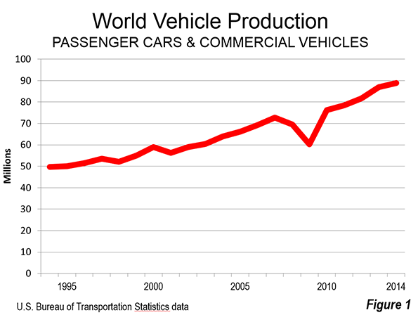
    Photo: Ford F-150 (2017 model)

    World motorization continues to grow strongly. The cars are cleaner , safer and will continue to get more environmentally friendly. The mobility they have facilitated has made an important contribution to the continuing improvements in the quality of life and will continue to do so, despite efforts of governments and planners to discourage their use.

    Note: Vehicle types may not be standardized in national reporting and thus caution is required in interpreting this data.

    Wendell Cox is principal of Demographia, an international public policy and demographics firm. He is a Senior Fellow of the Center for Opportunity Urbanism (US), Senior Fellow for Housing Affordability and Municipal Policy for the Frontier Centre for Public Policy (Canada), and a member of the Board of Advisors of the Center for Demographics and Policy at Chapman University (California). He is co-author of the “Demographia International Housing Affordability Survey” and author of “Demographia World Urban Areas” and “War on the Dream: How Anti-Sprawl Policy Threatens the Quality of Life.” He was appointed to three terms on the Los Angeles County Transportation Commission, where he served with the leading city and county leadership as the only non-elected member. He served as a visiting professor at the Conservatoire National des Arts et Metiers, a national university in Paris.

    Photo: Chang’an Avenue, Beijing by Australian cowboy at the English language Wikipedia [GFDL], via Wikimedia Commons

  • 2010-2013 Small Area Data Shows Strong Suburban & Exurban Growth

    The latest small area estimates from the Census Bureau indicate that suburban and exurban areas continue to receive the overwhelming share of growth in metropolitan areas around the country, with a single exception, New York. The new American Community Survey (Note 1) 5 year file provides an update of data at the ZCTA (zip code tabulation area), which are described below, as analyzed by the City Sector Model. The data was collected from 2011 through 2015, and can therefore be considered generally reflective of the middle year of the period, 2013.

    City Sector Model Analysis

    The City Sector Model classifies small areas into five categories based on population density, commuting mode and age of development (the criteria is described in Figure 7). There are two pre-World War II classifications, the Urban Core CBD (central business district) and the Urban Core Inner Ring. These areas are typified by substantial reliance on transit, walking and cycling for commuting and have higher population densities. There are also three post-World War II, classifications, the Early Suburbs, Later Suburbs and the Exurbs, both of which have lower population densities and substantial automobile orientation (Figure 1).

    The Overall Trends

    In contrast to the narrative that there has been a “return to the cities” (meaning the urban core, as opposed to cities in the functional sense or physical sense, which are metropolitan areas and urban areas respectively see Note 2 in a previous post), most new residents are located in the suburbs and exurbs. Between 2010 and 2013, The automobile oriented suburbs and exurbs captured 89.9 percent of the new population growth in 52 major metropolitan areas (over 1,000,000 population in 2013). By contrast, 10.1 percent of major metropolitan population growth was in the Urban Core. The Urban Core-CBD, (largely identified with the Central Business District), accounted for 0.8 percent of the growth, and the Urban Core: Ring, the neighborhoods surrounding the core, for the other 9.3 percent (Figure 2). Although the vast majority of growth is concentrated in the suburbs and exurbs, the urban core has reversed their long-term decline, after suffering a small loss in population between 2000 and 2010.

    Each of the five categories experienced population increases between 2010 and 2015 (Figure 3). However, only the Later Suburbs grew faster than its pre-existing share of the metropolitan population. The Later Suburbs had 26.9 percent of the population in 2010, yet added a much stronger 45.8 percent of the population increase from 2010 to 2013.

    The Earlier Suburbs grew faster than in the previous decade, but their 29.5 percent share of metropolitan growth was far less than their 41.5 percent population share in 2010. The Urban Core: CBD captured 0.8 percent of the growth, less than its prior 1.3 percent share, while the Urban Core: Inner Ring fell nearly one-third short of equaling its previous population share. The Exurbs, which were hit hard by the Great Recession, also fell short of gaining at the rate of their population  (Figure 4).

    New York and the Rest

     The New York metropolitan area, dominated the nation in urban core growth, with 73.2 percent of the population increase, leaving only 27.8 percent for the suburbs. Even this, however, is not likely an indication of a “return to the core city” because of apparent net domestic migration losses (Note 2) throughout the metropolitan area. In fact the city of New York was not attracting new domestic migrants at all, from the suburbs or elsewhere in the nation, with a net domestic migration loss of 400,000 between 2010 and 2015. All of the city of New York’s population gain was due to an excess of births over deaths and, as befits one of the world’s great global cities, international migration.

    New York’s domination of urban core growth was astounding in raw numbers, as well. More than one-half of all the urban core growth among the major metropolitan areas was in the New York metropolitan area. Washington was a distant second, with 11.2 percent of the urban core growth. Boston was close behind at 9.7 percent, followed by San Francisco-Oakland at 8.1 percent. The other two metropolitan areas with legacy core cities were substantially lower, with Philadelphia accounting for 4.1 percent and Chicago 3.7 percent. All of the 46 metropolitan areas without legacy core cities, accounted for only 10.6 percent of total urban core growth, one-fifth the growth in New York alone. As with so much, the story of high density urban cores in the United States is largely about New York (Figure 5).

    Nothing like New York’s domination of urban core growth over suburban and exurban growth occurred elsewhere, not even among the other five metropolitan areas with “legacy cities” (core cities). These are the metropolitan areas with the six largest central business district in the United States, and in which the core cities account for 55 percent of the national transit commuting destinations (despite having only six percent of the national employment).

    Boston, came the closest, with 39.9 percent of its growth in the urban core. There was one other metropolitan area with more than 30 percent of its growth in the urban core, Philadelphia at 36.2 percent. The Chicago urban core accounted for 29.7 percent of its growth, San Francisco for 24.5 percent and Washington for 20.8 percent. Each of these, with the exception of San Francisco, managed to have proportionally greater growth in its urban core than the population share already living there (Figure 6).

    The situation was much different in the 46 major metropolitan areas without legacy core cities. In these, nearly all population growth (98.6 percent) was in the suburbs and exurbs. This is slightly above the 94.5 percent of the population living there.

    Suburban Nation

    Using a different small area classification system, the Urban Land Institute (ULI) has reached similar conclusions on the distribution of metropolitan population and growth. Indicating that “America remains a largely suburban nation,” ULI indicates that 79 percent of the nation’s metropolitan population lives in the suburbs and that suburban areas accounted for 91 percent of metropolitan growth from 2000 to 2015. These trends are mirrored in large measure in Canada and Australia, according to work led by Professor David Gordon of Queens University in Kingston, Ontario.

    To be sure, the improvement in urban core fortunes is a very positive development. There is no question that urban cores are far nicer places than they were two decades ago and that their renewed growth makes the entire city, from the central business district to the sparsely populated exurbs, a better and more productive place. But the bulk of growth, and the preponderance of the population, remains firmly suburban.

    Note 1: The American Community Survey (ACS) uses sampling methods from which estimates are built, not actual counts like occur in the US Census every 10 years. The most reliable data is from the Census, which will be conducted next in 2020.

    Note 2: “Apparent” is used because domestic migration data is not reported below the county level (such as in ZCTA’s). However, much of the Urban Core is in the city of New York and all of the inner ring suburban counties lost domestic migrants, suggesting that net domestic migration gains could not have occurred.
    Wendell Cox is principal of Demographia, an international public policy and demographics firm. He is a Senior Fellow of the Center for Opportunity Urbanism (US), Senior Fellow for Housing Affordability and Municipal Policy for the Frontier Centre for Public Policy (Canada), and a member of the Board of Advisors of the Center for Demographics and Policy at Chapman University (California). He is co-author of the "Demographia International Housing Affordability Survey" and author of "Demographia World Urban Areas" and "War on the Dream: How Anti-Sprawl Policy Threatens the Quality of Life." He was appointed to three terms on the Los Angeles County Transportation Commission, where he served with the leading city and county leadership as the only non-elected member. He served as a visiting professor at the Conservatoire National des Arts et Metiers, a national university in Paris.

    Photo: NASA satellite view of New York’s urban core

  • Suburban Nations: Canada, Australia and the United States

    Professors David L. A. Gordon of Queens University (Canada) and Paul Maginn and Sharon Biermann of the University of Western Australia have now shown Australia to be a largely suburban nation. This follows on Professor Gordon’s work with colleagues in 2013 that came to the same conclusion on Canada based upon 2006 census data. By using census tract data, rather than municipality data, Gordon, et al were able to avoid the misleading but readily accessible jurisdictional analysis (central city versus suburbs) that equated large low-density central municipalities like Calgary and Edmonton, with more compact and dense municipalities like Vancouver and Montreal (or New York with Phoenix). The Gordon, et al criteria is illustrated in Figure 1.

    Broadly following the Gordon et al research, in the Spring of 2014, I published a similar “City Sector Model” using postal code tabulation areas (zip codes) for the major metropolitan areas of the United States. That criteria is illustrated in Figure 2.

    This article compares the Gordon findings in Canada and Australia and contrasts them with my findings in the United States.

    The Gordon Research: Canada and Australia

    In Australia, as in Canada, Professors Gordon, Maginn and Biermann divided metropolitan areas into four classifications at a small area level. The research called the urban core classification "active core," to note the greater dependence of residents on walking and cycling for commuting to work. They divided suburban areas into transit and auto suburban areas, and designated the more rural areas of metropolitan areas as exurban. In both countries, they used the functional or economic definition of cities, which is metropolitan areas or labor market areas (Note 1).

    Gordon, Maginn and Biermann’s analysis shows that Australia’s 27 metropolitan areas are 13 percent “active core”, nine percent transit suburbs, 69 percent auto suburbs and 10 percent exurban. This is nearly the same as the previous research on the 2011 Census of Canada which revealed 12 percent active core, 11 percent transit suburbs, 69 percent auto suburbs and eight percent exurban for all 33 metropolitan areas.

    The Major Metropolitan Areas (Over 1,000,000 Population) In the smaller number of Australian metropolitan areas with more than 1,000,000 population, the “active cores” are only slightly larger than those in Canada (12.4 percent of the metropolitan population versus 11.8 percent). But Canada’s major metropolitan areas has larger “transit suburbs” by a 12.2 percent to 10.0 percent margin. The “auto suburban” figures are virtually the same, with Australia at 70.5 percent and Canada at 70.7 percent. Finally, Australia has a slightly larger “exurbs,” at 7.2 percent compared to Canada’s 5.2 percent (Figures 3 and 4).

    Comparing to the United States

    In the United States, the City Sector Model uses somewhat different criteria. Gordon’s central classifications (“active core” and “transit suburb”) parallel the City Sector Model’s “urban core: CBD” and “urban core: inner ring.” Gordon’s “auto suburban” and “exurban” also roughly parallel the two “suburban” and the exurban City Sector Model classifications.

    Perhaps the largest difference between the two models is in the treatment of commuting. Professor Gordon’s approach is to classify the two central areas based on 50 percent higher than each metropolitan’s area average shares of walking, cycling and transit journey to work travel. The City Sector Model uses an across-the-board minimum 20 percent market share (transit, cycling and walking combined), to replicate a division between more dense pre-World War II development and the automobile oriented suburbs that followed.

    Comparing to the United States

    Of course, it is to be expected that the United States, with the lowest density built-up urban areas (called population centers in Canada and urban centres in Australia) would be even more suburban than Australia and Canada . This is indicated by the data (see Demographia World Urban Areas).

    There are large differences in the two more central classifications. In Australia, the two central areas have 22.4 percent of the metropolitan area population, somewhat less than Canada’s 24.0 percent. In the United States the two central areas have a smaller 14.8 percent of the metropolitan area population (Figure 5).

    Various factors account for this difference. There were, for example, huge urban core population losses   in the United States, but not in Canada and Australia. Another cause is the much earlier motorization of the United States, which by 1929, according to economist Robert Gordon, had achieved 0.9 vehicles per household and had 90 percent of the world’s registered vehicles (Note 2). With this unparalleled market penetration, the U.S. had a several decade long head start in automobile oriented suburbanization. Canada equaled the 1929 U.S. automobile market penetration in the middle 1950s and Australia in the middle 1960s.However, in the suburban classification, the metropolitan areas of the three nations were very similar. The US automobile suburb share of the population, at 68.8 percent was within two percentage points of both Canada and Australia. However, like the urban core, the suburbs showed considerably different results, with the United States having a 16.4 percentage exurban share, compared to approximately 10 percentage point lower shares in both Canada and Australia.

    Part of difference in the exurbs is the larger geographic size of U.S. metropolitan areas, which are far less representative in capturing the genuine labor market. The building geographical blocks used by the U.S. Office of Management and Budget are simply too large for sufficient preciseness. This is illustrated by the Riverside-San Bernardino metropolitan area, which covers an area about the same size as the Canadian province of New Brunswick or the Australian state of Tasmania. By contrast, in Canada, Statistics Canada uses municipalities to construct metropolitan areas, while Australia uses “Statistical Areas Level 4,” which are generally smaller than US counties (Note 3). When the boundaries of a metropolitan area are far larger than the actual commuting shed (as often happens in the United States), more people will be in the metropolitan area.

    At the same time, these results must be interpreted carefully, since there are differences in the criteria and geographical building blocks of metropolitan areas in all three nations.

    Comparison of Population Growth

    Professor Gordon’s research in both nations shows suburban growth   far out stripping growth in the central areas. In Canada, nearly 84 percent of major metropolitan area population growth between 2006 and 2011 was in the “auto suburbs” and “exurbs” (Figure 6). In Australia (27 metropolitan areas), the “auto suburbs” and “exurbs accounted” for nearly 78 percent of population growth (Figure 7). In the United States, the suburbs and exurbs accounted for over 85 percent   (Figure 8).

    Suburban World

    Contrary to planning preference for dense urbanization, suburbanization has occurred virtually wherever people can afford cars. This is even true in Europe, Japan and China. For example, the municipality of Paris continues to languish with a population a quarter below its level of 135 years ago (1881). The 8 million resident urban area growth since that time has been in the suburbs , which now cover more than 25 times the area of the ville de Paris (the central municipality). Other examples, such as the core municipalities of Copenhagen (from 1950), Barcelona and Milan (from 1970) have suffered significant population losses while all metropolitan area growth has been in the suburbs. There are many similar examples around the world.

    Even with the differing definitions, the data in Canada, Australia and the United States is remarkably similar. Of course, not all suburbs are the same, but it should not be surprising that the organic growth of cities continues on their edges.

    Note 1: For further information see: Paul Cheshire, Max Nathan and Henry G. Overman of the London School of Economics in their recent book, Urban Economics and Urban Policy: Challenging Conventional Policy Wisdom.

    Note 2: See Robert J. Gordon, The Rise and Fall of American Growth: The U.S. Standard of Living Since the Civil War, page 374, reviewed at http://www.newgeography.com/content/005364-robert-gordons-notable-history-economics-and-living-standards.  

    Note 3: The larger size of US exurbs is illustrated by the 11,400 square kilometer average areas outside the principal urban areas (exurbs) of US metropolitan areas. In Australia, the average outside the principal urban centres is 6,500 square kilometers, while in Canada the average area outside the principal population centres is 4,600 square kilometers (data based on metropolitan areas with more than 1,000,000 population).

    Wendell Cox is principal of Demographia, an international public policy and demographics firm. He is a Senior Fellow of the Center for Opportunity Urbanism (US), Senior Fellow for Housing Affordability and Municipal Policy for the Frontier Centre for Public Policy (Canada), and a member of the Board of Advisors of the Center for Demographics and Policy at Chapman University (California). He is co-author of the “Demographia International Housing Affordability Survey” and author of “Demographia World Urban Areas” and “War on the Dream: How Anti-Sprawl Policy Threatens the Quality of Life.” He was appointed to three terms on the Los Angeles County Transportation Commission, where he served with the leading city and county leadership as the only non-elected member. He served as a visiting professor at the Conservatoire National des Arts et Metiers, a national university in Paris.

    Photo: Brisbane, Australia Inner Suburbs (by author)

  • Back to the Future: Moving Interstate Again, to the South and West

    New data from the Census indicates that population growth and domestic migration patterns have continued to move away from the East and the Midwest to the South and West, at accelerated rates. Equally important, pre-Great Recession interstate mobility rates have been restored.

    The just released Census Bureau population estimates for the nation, states and the District of Columbia indicate a population increase for the South of 7.7 million between 2010 and 2016. The West gained 4.7 million. By contrast, the Midwest grew 1.1 million, while the East was even lower, at 900,000 (Figure 1). 

    Combined, the South and West accounted for 87 percent of the national growth. In 2011, the South and West captured 82 percent of the national growth. By 2016, the South and West had risen to 94 percent of the national population increase. The South, alone had 57 percent of the growth, up from 52 percent in 2011. The West also had a strong gain, from 31 percent in 2011 to 36 percent in 2016.

    Domestic Migration

    Not surprisingly, the South and West also dominated net domestic migration — the movement of residents from one state to another (Figure 2). The South attracted 2.3 million people from other regions, more people than live in the cities (municipalities) of Philadelphia and Boston combined. The South dominated domestic migration even more than population growth, attracting more than four times the new residents as the West, which had a net inflow of more than 500,000.  The Northeast lost 1.6 million domestic migrants, nearly as many people as live in Rhode Island and Vermont. The loss in the Midwest was 1.2 million, more people than live in the cities (municipalities) of Minneapolis, Cleveland and St. Louis combined.

    The South also led in the percentage of net domestic migrants in relation to the 2010 population, at 2.0 percent, nearly three times that of the West (0.7 percent).  The net loss in the Midwest was 1.8 percent, while the East sustained a loss of 2.9 percent (Figure 3)

    Perhaps most surprisingly, the South also led in population gains from immigration. Between 2010 and 2016, the South added 2.2 million foreign migrants. The East added 1.6 million, the West 1.3 million and the Midwest 800,000 (Figure 4).

    State Population Trends

    Texas has led the nation in total population growth. Total population growth includes the natural change (births minus deaths), international migration and net domestic migration.  Texas added 2.7 million residents, a 10.8 percent increased compared to its 2010 population. This is more than double the national rate of 4.7 percent. California was well behind, with a gain of 2.0 million, despite having started the decade with a 50 percent higher population. California’s growth rate was 5.3 percent.

    Florida added the third largest number of new residents, at 1.8 million, for a 9.6 percent growth rate from 2010. After that the gains were much less. Georgia and North Carolina gained somewhat more than 600,000. Washington, Arizona and Colorado added between 500,000 and 600,000 residents. Virginia and New York rounded out the top ten (Figure 5). New York generated large numeric, but small proportional increases early in the decade (1.9 percent), the result of its fourth largest population, after California, Texas, and Florida.

    Three states suffered population losses over the period. Illinois lost 30,000 residents and West Virginia lost 20,000. Vermont lost 1,000 and was joined by New England neighbors Maine, New Hampshire, Connecticut and Rhode Island in the bottom 10. However, Maine has begun to gain again (below). The bottom 10 included one southern state, Mississippi and two western states, Wyoming and New Mexico (Figure 6)

    State Domestic Migration Trends

    Throughout the decade, Texas has led in net domestic migration. But the race is much closer, with the Longhorn state leading second ranked Florida by only 500. Both states have gained between 866,000 and 867,000 net new residents from domestic migration since 2010 (Figure 7). Perhaps due to the energy downturn, domestic migration to Texas dropped by more than one-quarter, while Florida continued led the nation for the second straight year. In 2016, Florida added 207,000 net domestic migrants, compared to the Texas gain of 126,000. With the improving prospects for energy under the Trump administration, the competition could be stiff between the two states in the years to come.

    Other net domestic migration leaders added between 200,000 and 250,000, including Colorado, North Carolina, Arizona and South Carolina. Washington, Oregon, Tennessee and Georgia added between 100,000 and 200,000 net domestic migrants, as did Nevada, which ranked 11th, a remarkable turnaround. Nevada as well as Arizona, Georgia suffered serious setbacks during the Great Recession, but now show signs of significant recovery.

    The East and Midwest had a near monopoly on the bottom 10 in net domestic migration. New York lost 867,000 net domestic migrants, while Illinois lost 540,000. California’s loss was 383,000. New Jersey lost 336,000 and Michigan 216,000. Pennsylvania, Ohio and Connecticut lost between 100,000 and 200,000, while Maryland and Massachusetts lost between 70,000 and 100,000 (Figure 8).

    New York had the largest net domestic migration loss in 2016, at 191,000. Illinois lost 114,000, closely followed by California, at 109,000.

    Highlights

    The data also indicates significant shifts in growth rates during the decade.

    The largest drop was in the East, where the total population gain dropped 90 percent, from 245,000 in 2011 to 24,000 in 2016. In the Midwest, growth dropped from 174,000 to 103,000. Meanwhile, population rose 1,281,000 in the South, up from 1,199,000 in 2011. The West had the largest gain, from 697,000 to 822,000.

    New York’s population gain has declined every year, from 117,000 in 2011 to 27,000 in 2015 and a loss of 2,000 in 2016. Pennsylvania lost 8,000 residents in 2016, down from a 32,000 gain in 2011.

    Not all states in the West had positive trends. California gained only 256,000 in 2016, down from 344,000 in 2011. California’s gain dropped nearly 20 percent in just the last year. In 2016, California’s percentage growth trailed that of the United States for the first time in the decade (6.6 percent compared to the national rate 7.0 percent).  Between 2011 and 2015, California’s average, at 8.6 percent, was well above that of the nation (7.3 percent).

    The states to which Californians migrate in the greatest numbers gained as a result. Nevada’s population gain nearly quadrupled between 2011 and 2016, Idaho, Oregon and Arizona approximately doubled, while strong improvements were registered in Washington, Colorado and Utah.

    Florida added 367,000 new residents, a strong gain from the 2011 level of 247,000, while South Carolina’s gain nearly doubled. North Carolina, Georgia, Tennessee and Texas posted healthy increases. However, Maryland’s growth fell by more than one-half (55,000 to 21,000), while Virginia saw its gain drop from 84,000 in 2011 to 44,000 in 2016.

    Pervasiveness of Declining Growth

    At the national level, the annual growth rate continues to trend downward. In 2011, the United States added 0.75 percent to its population. By 2016, the rate had dropped to 0.70 percent. In 30 states, plus the District of Columbia, the growth rate dropped between 2011 and 2016.

    On the other hand, 20 states had stronger growth rates in 2016 than in 2011. Given the utter domination of the trends by the South and West, it is surprising that seven of these states are outside the West.

    In the East, the New England states of Maine, New Hampshire and Rhode Island had higher growth rates in 2016. At the same time, Vermont, where similar trends might be anticipated, slipped from modest growth in 2011 to a decline in 2016.

    Four Midwestern states also grew faster in 2016 than in 2011. These include Michigan, Missouri, Nebraska and Ohio. Michigan, the only state to reach more than 10 million and then fall below, has gained four years in a row, though remains below 10 million.

    Among these seven states, only Nebraska exceeded the national growth rate in 2016.

    Natural Increase Down, Mobility Up

    The natural population growth rate (births minus deaths) dropped from 4.7 percent in 2011 to 3.8 percent in 2016. At nearly 20 percent (18.8 percent), this is a huge reduction in just five years. At the same time the Great Recession-interrupted interstate mobility seems to have recovered. In 2016, there were 825,000 interstate moves, more than double the post-2000 low of 411,000 in 2011. The 2016 interstate move figure was greater than all but the three largest Housing Bubble years, 2005, 2006 and 2007. The 2016 moves also exceeded the 2001 to 2009 average by more than 10 percent (Figure 9).

    Back to the Future
    As we get farther from the Housing Bust and the Great Recession, population growth and domestic migration seem to be increasingly restored to prior trends around the nation.

    Wendell Cox is principal of Demographia, an international public policy and demographics firm. He is a Senior Fellow of the Center for Opportunity Urbanism (US), Senior Fellow for Housing Affordability and Municipal Policy for the Frontier Centre for Public Policy (Canada), and a member of the Board of Advisors of the Center for Demographics and Policy at Chapman University (California). He is co-author of the “Demographia International Housing Affordability Survey” and author of “Demographia World Urban Areas” and “War on the Dream: How Anti-Sprawl Policy Threatens the Quality of Life.” He was appointed to three terms on the Los Angeles County Transportation Commission, where he served with the leading city and county leadership as the only non-elected member. He served as a visiting professor at the Conservatoire National des Arts et Metiers, a national university in Paris.

    Photo of Zion National Park in Utah, the nation’s fastest growing state by Tobias Alt – Own workGFDLLink

  • The Evolving Urban Form: Houston

    Houston is a city (metropolitan area) of superlatives. The most recent Brookings Institution data shows that Houston has the seventh strongest per capita economy (gross domestic product) in the world (Figure 1). This places Houston above New York and more surprisingly, perhaps, other cities perceived to have strong economies are far below Houston and outside of the top 10, such as London, Tokyo and Chicago.

    The recently released COU Standard of Living Index also ranked Houston just behind San Jose in real pay per job for households entering the housing market (Figure 2).

    Distribution of Population Growth

     Houston is among the newer of the world’s great cities. It  has experienced sustained growth in every decade since the turn of the 20th century. The area constituting its metropolitan region (combined statistical area) has grown at more than 1.5 percent in each decade since 1900. In the 1920s and the 1980s, Houston grow at a rate of more than 3.5 percent annually at has grown an average of 2.2 to 2.3 percent annually since 2000. It took until 1950 for Houston to reach 1 million residents. By 1980, the population was 3.3 million and by 2015 had doubled to 6.8 million.

    As is typical for a growing city, the strongest early growth was in the core municipality (Houston) and then gradually shifted to the nearby suburbs and outer suburbs (Figure 3)

    At this point, near parity has been reached. The municipality of Houston, the suburbs within the core Harris County (the county also home to most of the city) and the outer suburbs, beyond Harris County have nearly equal populations, at approximately 2.3 million each (Figure 4).

    Like other cities that have experienced most of their growth since World War II, most of Houston is suburban. Between 2000 and 2013, the greatest growth was in the Later Suburbs and Exurbs. There was also growth in the Earlier Suburbs (Figures 5 and 7).

    Large Centers and Decentralization

    There was a similar pattern of growth in employment. The greatest growth was in the Later Suburbs and there was also strong growth in the Exurbs and the Earlier Suburbs (Figures 6 and 7). The central business district (downtown) ranks eighth in total employment in the nation and also experienced growth. The Texas Medical Center is the largest life sciences center in the world. The center is located south downtown and rivals some of the nation’s largest central business districts, larger than Minneapolis and nearly as large as Denver ,, with more than 100,000 employees (see photograph above). There are other large centers, such as the Port of Houston, the Galleria (Uptown) and the Energy Corridor. Houston is one of the best examples of a decentralized city, with major employment centers throughout.

    Higher than Average Urban Density

    Houston is often characterized as a “sprawling” urban area. In fact, however, Houston has a higher than average urban density for the United States (by eight percent) and an urban density approximately 75 percent higher than Atlanta and Charlotte and denser than Philadelphia and Boston. Even Portland, with its carefully cultivated international reputation for high density is only 18 percent denser than Houston (Figure 8). Of course, all US urban areas are less dense by international standards than their foreign counterparts.

    Attracting the Most New Residents

    Since 2010Houston has led the 53 metropolitan areas with more than 1,000,000 population in net domestic migration. In that time Houston has attracted 255,000 new residents from elsewhere in the nation, followed closely by in-state rival Dallas-Fort Worth (241,000). The four largest Texas metropolitan areas with more than 1,000,000 population were among the six attracting the largest net domestic migration, with fourth ranked Austin attracting 159,000 and sixth ranked San Antonio adding 122,000. Only third ranked Phoenix and fifth ranked Denver were from outside Texas. Eight of the top ten were from the South (Figure 9).

    There are at least two important keys to Houston’s attractiveness. Obviously, its strong job-creating economy has opened career opportunities for people from other parts of the country. In addition, Houston’s favorable housing affordability has been an important factor. Seminal recent academic research has pointed to the importance of housing affordability in attracting domestic migrants (such as Ganong and Shoag).

    Enviable Improvement in Relative Traffic Congestion

    Houston has been more successful in controlling traffic congestion than many other cities. In 2015, Houston tied with Boston for the 11th worst traffic congestion in the United States, according to the TomTom Traffic Index (Figure 10). This is a far better rating than in the middle 1980s, when the Texas Transportation Institute ranked Houston as having the worst traffic congestion in the nation.

    Since that time, Houston has managed to have spectacular population growth, yet has kept up with it by expanding its freeway and arterial systems, along with traffic management improvements. Los Angeles, San Francisco, Seattle, San Jose, New York, Honolulu, Miami, Portland, Washington and Chicago have seen their traffic congestion become worse than in Houston over the same period. Houston is larger in population than all but three of these nine metropolitan areas (New York, Los Angeles and Chicago), more than twice the size of San Jose and Portland and nearly seven times that of Honolulu. Further, exhibiting the association between greater traffic congestion and higher population density, all cities ranked worse than Houston have higher urban densities.

    World’s Energy Capital Poised for Employment Growth

    Houston is widely acclaimed as the energy capital of the world. Urbanscale.com says that “The only other U.S. city that rivals Houston’s domination of a single industry is New York’s preeminence in the financial sector.” Of course, Houston’s energy industry has faced considerable challenges over the past couple of years as Organization of Petroleum Exporting Countries (OPEC) have driven the price of oil down by producing more oil. However, the “good times” could return soon for Houston, as there are indications that OPEC will reduce its production. Further, and perhaps even more importantly, Houston could benefit from the new Trump administration’s commitment to a more consumer oriented energy policy, appearing likely to generate substantial employment and growth in the newly unleashed sectors.

    Photo: Texas Medical Center (by author)

    Wendell Cox is principal of Demographia, an international public policy and demographics firm. He is a Senior Fellow of the Center for Opportunity Urbanism (US), Senior Fellow for Housing Affordability and Municipal Policy for the Frontier Centre for Public Policy (Canada), and a member of the Board of Advisors of the Center for Demographics and Policy at Chapman University (California). He is co-author of the “Demographia International Housing Affordability Survey” and author of “Demographia World Urban Areas” and “War on the Dream: How Anti-Sprawl Policy Threatens the Quality of Life.” He was appointed to three terms on the Los Angeles County Transportation Commission, where he served with the leading city and county leadership as the only non-elected member. He served as a visiting professor at the Conservatoire National des Arts et Metiers, a national university in Paris.

  • World’s Most Affluent Areas: Dominated by Low Population Densities

    The Brookings Institution is again out with data on the world’s most affluent metropolitan areas. The GDP data is in Redefining Global Citieswhich contains a treasure trove of data. Again, United States metropolitan areas dominate the highest rankings, capturing nine of the top 10 positions. San Jose is rated with the highest gross domestic product (GDP) per capita, at $91,400 (purchasing power parity or PPP). This is an improvement from third in 2014 and second in 2012 (Figure 1). The top 10 is dominated by cities with relatively low urban densities, like those that characterize San Jose (core of the world’s leading information technology center , Silicon Valley).

    In 2015, San Jose finally passed even less dense Hartford, which had ranked second and first in the two previous reports. In 2014, Macau, the smaller of China’s two Special Administrative Regions (SAR) had ranked number one (the larger SAR is Hong Kong, ranked 32nd). There was a methodology change in 2015 that established a population threshold higher than that of Macau, however the government’s anti-corruption campaign was credited with reducing Macao’s gaming revenue substantially and dropping the GDP per capita by about 15 percent. If it had been rated, Macau’s GDP per capita would have remained in the top 10, but would have fallen from the top.

    Singapore broke into the top 10, positioning itself between San Jose and Hartford, rising from 14th place, with a GDP per capita of $84,300. The Hartford, metropolitan area, which lead the list in 2012 and ranks second in 2014 fell to third place, with a GDP per capita of $84,000. San Francisco rose from nine in 2014 to 4th, with a GDP per capita of $80,600. Boston ranked fifth, with the GDP per capita of $77,700, dropping from fourth place. The top 10 was rounded out by Seattle, Houston, Washington, New York and Los Angeles (Note 1).

    The US dominance was far less in the second 10, with positions 11, 12 and 13 being captured by Zurich, Perth (Australia) and Munich. Paris, often rated highly as a world city, ranked 17th, while Stockholm ranked 19th. The five US entries were Portland (14th), San Diego (16th), Minneapolis St. Paul (17th), Dallas-Fort Worth (18th), and Denver (20th).

    Thirty of the 50 most affluent cities were in the United States, and 16 were in Europe. Australia had two entries, while East Asia had two, Singapore and Hong Kong (Figure 2).

    As usual, the rankings produced results that would surprise people who do not regularly follow this data.  London, which is routinely in a neck and neck competition with New York as the strongest “world” city ranked 35th, just behind Columbus Ohio. Tokyo, home of the world’s largest urban area, ranked 60th, behind Shenzhen, China (59th). Toronto, Canada’s principal city, ranked 53rd, just behind San Antonio. Sydney, Australia’s largest city ranked 47th, just behind St. Louis and just ahead of Detroit.

    Expanded Contents: Redefining Global Cities

    The new Brookings Institution report contains far more data than is indicated above. There is labor productivity data, indicated by GDP per worker. San Jose also leads in this category, and again, nine US metropolitan areas are included in the top 10. The only non-US entrant is the industrial powerhouse of Dongguan, China, one of the world’s least known metropolitan areas, located between Hong Kong, Shenzhen, Guangzhou and Foshan (the latter three municipalities in Guangdong Province).

    The report also contains data on economic growth, tradable clusters, innovation, talent and connectivity (with multiple indictors in each category). With the three reports since 2012, the Brookings Institution has positioned itself as a premier source for regularly published world urban data.

    The Highest Productivity in the Lowest Urban Densities

    There have often been suggestions that productivity and innovation are associated with high urban densities. This year’s data provides ample refutation of any such claim. San Jose, the top city in both GDP per capita and labor productivity, is virtually all suburban, as is indicated by the City Sector Model (Figures 3 and 4). San Jose, without a pre-World War II core and world-class dispersion is illustrated in the photograph at the top.

    The highest built-up urban area density among the top 10 metropolitan areas in GDP per capita is in Singapore, which is also the only one exceeding the world average urban density in the top 30. All of the US metropolitan areas in the top 10 have urban population densities well below that of Singapore (Figure 5) and below that of the average Chinese and Western European urban areas. Indeed, US metropolitan areas, which dominate world affluence, have the lowest urban population densities in the world as is indicated in Figure 6 (Note 2). 

    Note 1: US city data not adjusted for PPP (regional price parities) within the United States. Application of regional price parities to personal or household incomes would yield considerably different rankings.

    Note 2: Built -up urban area data are the only reliable measure for comparing urban densities at the organic city level, which in the economic or functional sense is metropolitan areas, and in the physical sense is contiguous built-up urban areas . This excludes the administrative unit or “municipality,” which is simply a political construct. For further information see: Paul CheshireMax Nathan and Henry G. Overman of the London School of Economics in their recent bookUrban Economics and Urban Policy: Challenging Conventional Policy Wisdom. Virtually all metropolitan areas contain a principal built-up urban area and extensive rural areas (commuting sheds), which may also contain smaller urban areas. Thus, any comparison of metropolitan densities is not an urban comparison, but a mix of urban and rural densities. In most of the few countries that designate metropolitan areas, the rural land areas are substantially greater than the urban land areas. The matter is further complicated by the lack of international “building block” standards for metropolitan areas. These standards produce hugely different mixes of urban and rural in metropolitan areas. For example, the New York urban area represents only 42 percent of the land area. In Riverside-San Bernardino, the principal urban area has 2 percent of the metropolitan land area. In Paris, the land outside the principal urban area represents 83 percent of the metropolitan area. A recent post in the respected Marginal Revolution blog (“China Fact of the Day”) indicated that China’s metropolitan area densities were lower than those of the United States. As noted above, metropolitan density comparisons are not reflective of urban densities. China’s urban densities are nearly five times that of US urban areas (Figure 5).

    Wendell Cox is principal of Demographia, an international public policy and demographics firm. He is a Senior Fellow of the Center for Opportunity Urbanism (US), Senior Fellow for Housing Affordability and Municipal Policy for the Frontier Centre for Public Policy (Canada), and a member of the Board of Advisors of the Center for Demographics and Policy at Chapman University (California). He is co-author of the “Demographia International Housing Affordability Survey” and author of “Demographia World Urban Areas” and “War on the Dream: How Anti-Sprawl Policy Threatens the Quality of Life.” He was appointed to three terms on the Los Angeles County Transportation Commission, where he served with the leading city and county leadership as the only non-elected member. He served as a visiting professor at the Conservatoire National des Arts et Metiers, a national university in Paris.

    Photo by Michael from San Jose, California, USA (Santa Clara Valley – California) [CC BY 2.0], via Wikimedia Commons

  • Caltrain and Blended High Speed Rail Promise Peninsula Traffic Paralysis

    The following notice was issued by the Community Coalition on High Speed Rail in the San Francisco Bay Area.

    A TRANSPORTATION EXPERT CONFIRMS OUR WARNINGS:
    THE SO-CALLED "BLENDED" PROJECT WILL
    PARALYZE TRAFFIC ON THE PENINSULA

    Paul Jones, a mechanical and industrial engineer who was an Associate Professor of Industrial and Systems Engineering at the Georgia Institute of Technology, and who was the principal engineer in charge of the high-speed rail design study for the high-speed train from Madrid to Barcelona, Spain, has analyzed the traffic impacts that can be expected if the High-Speed Rail Authority (partnering with Caltrain) actually constructs its proposed "Blended System" project on the Peninsula.

    What is Mr. Jones’ bottom line conclusion? The following quotation is from the "Abstract" of his November 7, 2016 report, "Potential Traffic Paralysis Throughout the Peninsula: Blended Caltrain/High Speed Rail Impact on Street Traffic."

    (End of notice)

    The report is available at: http://www.cc-hsr.org/news-pdf/Paul-Jones-traffic-delays.pdf.

    Note: The California High Speed Rail project, of which this work is a part, has been evaluated in reports by Joseph Vranich and Wendell Cox, who predicted substantial cost escalation (http://www.reason.org/files/1b544eba6f1d5f9e8012a8c36676ea7e.pdf). This prediction turned out to be low. This was shown in a subsequent report, with an analysis indicating that the system is likely to require substantial subsidies to operate (http://reason.org/studies/show/california-high-speed-rail-report). A later report by Wendell Cox and Adrian Moore found that the high speed rail line that the reductions in greenhouse gas emissions (CO2) from passengers transferring from planes and cars would cost up to nearly $19,000 per metric tonne (http://demographia.com/CalHSRGHGAnalysis.pdf). This is more than 1,000 times the market price.

  • Tearing Down American Dream Boundaries: An Imperative

    Donald Trump’s election victory has been widely credited attracting households who have been “left behind,” by stagnating or declining income and lost jobs. But the left-behind also includes many households whose    standards of living are being reduced by the rising cost of housing. This is not about affordable housing for low-income households, itself very important, but a crisis among  middle-income households  no longer able to afford their own homes in some parts of the nation.

    Indeed, the lack of middle-income housing affordability has been associated with migration from more expensive to less expensive areas. Moreover, more people have been fleeing the states that supported Secretary Clinton, with their inferior housing affordability, and moving to those that supported Donald Trump (a net 1.45 million gain  in just  the last five years), where housing affordability is generally better.

    The differences in house prices are stunning. Between 1969 and 2014, the gap between the highest and lowest cost major metropolitan (over 1,000,000 population) housing markets had expanded 260 percent. This increase has been largely driven by markets that have become more restrictively regulated. In the more lightly regulated rental market the gap between the highest and lowest expanded only 30 percent, just one-ninth the change in the house price gap.

    In some highly regulated markets, notably California, it has become all but impossible to build the consumer-favored detached housing in the suburbs associated with the “American Dream.”

    In recent decades, California house prices have risen to as much as triple the costs relative to household incomes that exist in much of the rest of the country. A dense mesh of environmental regulation has been implemented,   far stronger than EPA regulations. Large parts of metropolitan areas are now off-limits for efficient housing tract construction, prohibited by “urban growth boundaries,” which can be characterized as “American Dream Boundaries.”

    Progressive politicians, dominant in California, talk incessantly about housing affordability, but blindly pursue policies that will make things even worse. It should not be surprising that the housing-cost adjusted poverty rate in California is the worst in union, underperforming even Mississippi. It should also not be surprising that Californians of every age group, including Millennials, are leaving state in larger numbers than they are being attracted.

    The San Francisco Bay Area’s two large metropolitan areas (San Jose and San Francisco) are the most unaffordable in the nation and rank fourth and seventh most unaffordable in the Demographia International Housing Affordability Survey among major metropolitan areas in nine nations. House prices have more than tripled relative to incomes since radical land-use regulation began. The problem is not a shortage of land. The Bay Area has more than enough developable land to accommodate up to four times the population. The shortage is in the amount of land governments allow to be developed. As a result, the Bay Area has become a rigged market that excludes many middle-income households by making housing unaffordable. This may be a boon for older property owners, but the burden falls most heavily on households that are minority or young. California’s housing affordability crisis is a profound public policy failure.

    The problem extends beyond California, especially to places like Oregon, Washington, Hawaii, Colorado, Maryland, and northern Virginia. The net effect is that households pay much more the necessary for housing and have a lower standard of living that is necessitated by government policy. It is no wonder that people think the future is less bright for their children.

    Moreover, no one should be misled by planning fantasies that backyard “Granny flats” or high-rise apartment towers are the answer. They have their market, but it does not include most aspiring households. Government has no business lowering living standards by forcing house prices up.

    A mortgage on a median priced house requires a qualifying income approximately double the median household income in San Diego, Los Angeles, San Francisco and San Jose (10 percent down payment assumption). In much of the country, by contrast, housing remains affordable, as in the past. A median income household can comfortably afford the median priced house in metropolitan areas like Dallas-Fort Worth, Atlanta and Kansas City.

    More Jobs and Economic Growth

    But beyond the lower standards of living attributable to American Dream Boundaries, building fewer detached houses than households demand has an important economic cost.

    Research by Chang-Tai Hseih of the University of Illinois, Chicago and Enrico Moretti at the University of California indicates that the gross domestic product was $2 trillion less than would have been expected in 2009, largely due to housing regulation. Matthew Rognlie of the Massachusetts Institute of Technology found that the widening inequality gap found by French economist Thomas Piketty was largely due to housing and suggested expanding the housing supply and re-examining land-use regulation.

    Jason Furman, President Chairman of President Obama’s Council of Economic Advisors has shown that single family houses make 2.5 times the contribution of apartment units to the gross domestic product. This fact eluded President Obama’s Department of Housing and Urban Development, which has spent years roaming the country inducing local officials to implement the policies like those noted above that make housing less affordable.

    But, as Furman’s data indicates, the detached housing Americans overwhelmingly prefer is better for the economy. This means more good jobs in building homes, economic ripple effects and additional revenues for local governments.

    Yet, seven years after the  Great Recession, California’s detached house construction rate is barely one half the national average.

    Much of this has to do with a planning philosophy called “smart growth,” often accompanied by prohibitions on new housing on the urban fringe. But there is nothing smart about policies that raise the price of houses for struggling families. Nor is there anything smart about reducing people’s standards of living. The more important priorities of facilitating better standards of living and reducing poverty are turned on their head by such myopic policies.

    It is time to restore priorities that put people first. Building the housing that people want would not only improve living standards, but would also boost the economy. The American Dream Boundaries need to be torn down.

    Wendell Cox is principal of Demographia, an international public policy and demographics firm. He is a Senior Fellow of the Center for Opportunity Urbanism (US), Senior Fellow for Housing Affordability and Municipal Policy for the Frontier Centre for Public Policy (Canada), and a member of the Board of Advisors of the Center for Demographics and Policy at Chapman University (California). He is co-author of the "Demographia International Housing Affordability Survey" and author of "Demographia World Urban Areas" and "War on the Dream: How Anti-Sprawl Policy Threatens the Quality of Life." He was appointed to three terms on the Los Angeles County Transportation Commission, where he served with the leading city and county leadership as the only non-elected member. He served as a visiting professor at the Conservatoire National des Arts et Metiers, a national university in Paris.

    Photograph: Suburban Kansas City (by author)