Author: Wendell Cox

  • Brookings Economist Decries Transit Subsidies, Calls For Privatization

    In his new book, Last Exit: Privatization and Deregulation of the U.S. Transportation System, Brookings Institution economist Clifford Winston contends that transit subsidies are largely the result of labor productivity losses, inefficient operations and counterproductive federal regulations.

    Winston finds that transit service is so underutilized, that load factors were at 18 percent for rail and 14 percent for buses in the 1990s, before the Federal transit administration stopped requiring transit agencies to report that information.

    Six Years Severance Pay: Winston cites the fact that dismissed transit employees may be eligible for up to six years severance pay, under requirements of federal law. For example, less costly services that could be provided under contract by private providers could result in the six-year severance payments if transit employees are laid off. No such benefit is available to other workers in the nation and an impediment that discourages cost-effective innovation.

    Costly Rail Systems: The nation’s urban rail systems, which have consumed so much of transit tax funding in recent decades, are the subject of considerable criticism.

    Winston reminds readers of the considerable literature that shows that "the cost of building rail systems are notorious for exceeding expectations, while ridership levels tend to be much lower than anticipated" and that "continuing capital investments are swelling the deficit." At the same time Winston questions transits high subsidy levels for rail transit, for example, noting that the average income of rail transit riders is approximately double that of bus transit riders.

    In particular, Winston criticizes the now under construction Dulles Airport rail line that will become a part of the Washington DC area transit system, noting that the route is not cost-effective. He characterizes cost overruns on the Dulles rail line and on the soon to be under construction Honolulu rail line as "inevitable." (This is despite the fact that both lines have already experienced substantial cost escalation.)

    Indeed, Winston notes that among all of the US rail systems, the subsidies exceed the benefits on all systems except for San Francisco’s BART.

    Public Sector Mismanagement: Winston offers an ominous conclusion. He says that "social desirability is hardly a demanding standard for a public enterprise to meet" and indicates that is that it is rare to find a public service not meeting that standard. However, of transit Winston concludes that "the fact that transit’s performance is questionable … Is indicative of the extent that transit and bus rail services have been mismanaged in the public sector and been compromised by public policy. It is notable that over the quarter century since transit began receiving income from the federal gasoline tax that its share of urban travel has dropped one third.

    Competition as an Answer: Last Exit indicates that transit can produce beneficial results, but makes a compelling case for reform. Winston suggests that transit could be improved by greater involvement of the private sector, following models such as the competitive tendering (competitive contracting) that now accounts for approximately one-half of Denver’s bus system.

    The international evidence, which Winston does not cite, is even more substantial. This includes the all of the world’s largest bus transit system, in London, the entire Copenhagen bus system, and the entire subway, commuter rail and bus systems of Stockholm. However the ultimate in privatization is Tokyo, the world’s largest urban area, where transit ridership is 1.5 times that of the entire United States. More than two-thirds of all transit ridership is carried by unsubsidized private rail and bus operators.

    Photo: Competitively tendered bus in London (photo by author)

  • Regional Exchange Rates: The Cost of Living in US Metropolitan Areas

    International travelers and expatriates have long known that currency exchange rates are not reliable indicators of purchasing power. For example, a traveler to France or Germany will notice that the dollar equivalent in Euros cannot buy as much as at home. Conversely, the traveler to China will note that the dollar equivalent in Yuan will buy more.

    Economists have attempted to solve this problem by developing "purchasing power parities," which are used to estimate currency conversion rates that equalize values based upon prices (Note 1). This helps establish the real value of money in a particular place.

    When people move from one region of the United States to another they can encounter a similar phenomenon. For example, a dollar is not worth as much in San Jose as it is in St. Louis. Research by the US Department of Commerce Bureau of Economic Analysis (BEA), for example, found that in 2006 a dollar purchased roughly 35 cents less in San Jose than in St. Louis. BEA researchers estimated "regional price parities" for states and the District of Columbia and for all of the nation’s metropolitan areas (Note 2). Regional price parities can be thought of as the equivalent of regional (state or metropolitan area) exchange rates. This research was covered in previous newgeography.com articles by Eamon Moynihan and this author.

    This article uses Department of Labor, Bureau of Labor Statistics metropolitan area consumer price indexes to estimate the 2009 cost of living and per capita personal income adjusted for the cost of living.

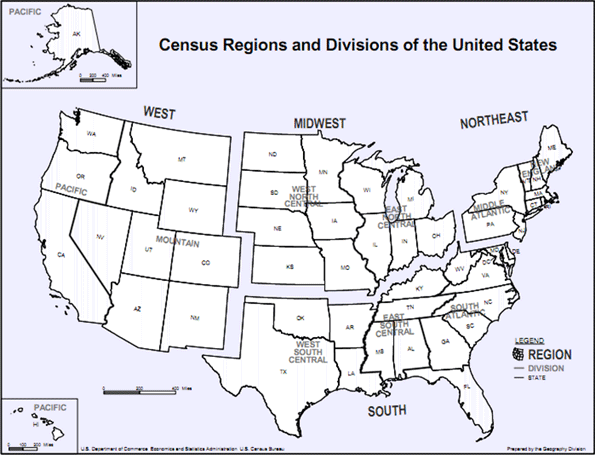
    Cost of Living: At the regional level (See Census Region Map, Figure 1), there are substantial differences in the cost of living (Figure 2). The lowest cost of living is in the Midwest, at 4.8 percent below the nation. The South has the second lowest cost of living at 3.9 percent above the national level. The West is the most expensive area, 13.5 percent above the national cost-of-living, while the Northeast’s cost-of-living stands 11.3 percent above the national rate.

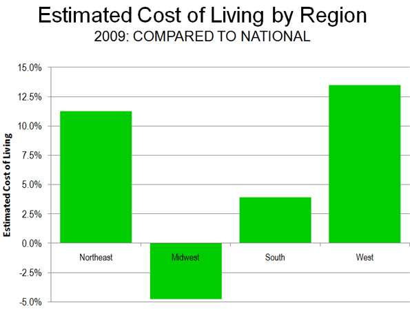
    The cost of living in the South may seem higher than expected. But if the higher cost metropolitan areas of Washington, Baltimore and Miami are excluded, the cost of living in the South falls to 1.5 percent below the national rate. If the California metropolitan areas are excluded from the West, the cost of living still remains 4.0 percent above the national rate.

    Per Capita Income: The highest unadjusted per capita incomes are in the Northeast, followed by the West, the South and the Midwest. Yet when metropolitan area exchange rates are taken into consideration, the order changes significantly. The Northeast remains the most affluent, and the Midwest moves from last place to second place. The South is in third place, the same as its income rating, while the West falls from second place to fourth place (Figure 3).

    Cost of Living: Variations in the cost of living, which is reflected by the metropolitan area exchange rates, remains similar in 2009 to the 2006 rankings.

    The Top Ten: The lowest costs of living were in (Table 1):

    1. St. Louis, where $0.891 purchased $1.00 in value at the national average.
    2. Kansas City, where $0.903 purchased $1.00 in value at the national average.
    3. Cleveland, where $0.921 purchased $1.00 in value at the national average.
    4. Pittsburgh, where $0.941 purchased $1.00 in value at the national average.
    5. Cincinnati, where $0.944 purchased $1.00 in value at the national average.

    Rounding out the most affordable 10 are two metropolitan areas in the South (Atlanta and Dallas-Fort Worth), two in the Midwest (Detroit and Milwaukee) and one in the West (Denver). No Northeastern metropolitan area was ranked in the top 10.

    Table 1
    Estimated Cost of Living: 2009
    Metropolitan Areas over 1,000,000 with Local CPIs
    Rank Metropolitan Area
    Metropolitan Exchange Rate: to Purchase $1.00 at National Average
    Compared to Lowest Cost of Living
    1
    St. Louis, MO-IL
    $0.891
    0%
    2
    Kansas City, MO-KS
    $0.903
    1%
    3
    Cleveland, OH
    $0.921
    3%
    4
    Pittsburgh. PA
    $0.941
    6%
    5
    Cincinnati, OH-KY-IN
    $0.944
    6%
    6
    Atlanta. GA
    $0.958
    8%
    7
    Detroit. MI
    $0.959
    8%
    8
    Milwaukee. WI
    $0.959
    8%
    9
    Dallas-Fort Worth, TX
    $0.976
    10%
    10
    Denver, CO
    $0.996
    12%
    11
    Minneapolis-St. Paul, MN-WI
    $1.000
    12%
    12
    Houston, TX
    $1.000
    12%
    13
    Tampa-St. Petersburg, FL
    $1.006
    13%
    14
    Phoenix, AZ
    $1.011
    14%
    15
    Portland, OR-WA
    $1.034
    16%
    16
    Chicago, IL-IN-WI
    $1.041
    17%
    17
    Philadelphia, PA-NJ-DE-MD
    $1.054
    18%
    18
    Baltimore, MD
    $1.068
    20%
    19
    Riverside-San Bernardino, CA
    $1.078
    21%
    20
    Miami-West Palm Beach, FL
    $1.085
    22%
    21
    Seattle, WA
    $1.120
    26%
    22
    San Diego, CA
    $1.151
    29%
    23
    Boston, MA
    $1.175
    32%
    24
    Washington, DC-VA-MD-WV
    $1.181
    33%
    25
    Los Angeles, CA
    $1.222
    37%
    26
    San Francisco-Oakland, CA
    $1.258
    41%
    27
    New York, NY-NJ-PA
    $1.281
    44%
    28
    San Jose, CA
    $1.343
    51%
    Estimated from BEA 2006 data, adjusted by local Consumer Price Index for 2006-2009


    The Bottom Ten: The most expensive metropolitan areas were:

    28. San Jose, where $1.343 purchased $1.00 in value at the national average.
    27. New York, where $1.281 purchased $1.00 in value at the national average.
    26. San Francisco, where $1.268 purchased $1.00 in value at the national average.
    25. Los Angeles, where $1.222 purchased $1.00 in value at the national average.
    24. Washington, where $1.181 purchased $1.00 in value at the national average.

    The bottom ten also included three metropolitan areas in the West (Riverside-San Bernardino, San Diego and Seattle), one in the Northeast (Boston) and one in the South (Miami). There were no Midwestern metropolitan areas in the bottom 10.

    Per Capita Income: Per capita income in 2009 was then adjusted for the cost of living.

    Top Ten:Washington has the highest per capita income, adjusted for the cost of living, at $47,800. San Francisco placed second at $47,500. Denver ranked third at $46,200, while the cost-of-living adjusted income in Minneapolis-St. Paul was $45,800 and $45,700 in Boston. The top 10 also included two Midwestern metropolitan areas (St. Louis and Kansas City), two from the Northeast (Baltimore and Pittsburgh) and one from the West (Seattle).

    Bottom Ten: The least affluent metropolitan area was Riverside-San Bernardino, with a per capita income of $27,800. Phoenix was second least affluent at $33,900 while Los Angeles was third least affluent at $35,000. The fourth least affluent metropolitan area was Tampa-St. Petersburg at $36,600 and the fifth least affluent metropolitan area was Portland at $37,400. The bottom 10 also included two metropolitan areas from the South (Atlanta and Miami), two from the Midwest (Cincinnati and Detroit) and one from the West (San Diego).

    The cost of living adjusted income data includes surprises. New York, commonly considered a particularly affluent metropolitan area, ranked 17th in cost-of-living adjusted income, and below such seemingly unlikely metropolitan areas as Pittsburgh, Kansas City, Cleveland, St. Louis and Milwaukee. These metropolitan areas also ranked above San Jose, which ranked first in unadjusted income in 2000, but now ranks 16th in cost of living adjusted income (Table 2).

    Table 2
    Personal Income Per Capita Adjusted for  the Cost of Liviing
    Metropolitan Areas over 1,000,000 with Local CPIs
    Rank (Cost of Living Adjusted)
    Rank (Unadjusted Income)
    Metropolitan Area
    Per Capita Income 2009: Adjusted for Cost of Living
    Per Capita Income 2009: Unadjusted
    1
    2
    Washington, DC-VA-MD-WV
    $47,780
    $56,442
    2
    1
    San Francisco-Oakland, CA
    $47,462
    $59,696
    3
    8
    Denver, CO
    $46,172
    $45,982
    4
    9
    Minneapolis-St. Paul, MN-WI
    $45,772
    $45,750
    5
    4
    Boston, MA
    $45,707
    $53,713
    6
    18
    St. Louis, MO-IL
    $45,288
    $40,342
    7
    7
    Baltimore, MD
    $44,908
    $47,962
    8
    15
    Pittsburgh. PA
    $44,848
    $42,216
    9
    19
    Kansas City, MO-KS
    $43,862
    $39,619
    10
    6
    Seattle, WA
    $43,730
    $48,976
    11
    13
    Houston, TX
    $43,581
    $43,568
    12
    16
    Milwaukee. WI
    $43,477
    $41,696
    13
    11
    Philadelphia, PA-NJ-DE-MD
    $43,247
    $45,565
    14
    21
    Cleveland, OH
    $42,734
    $39,348
    15
    12
    Chicago, IL-IN-WI
    $41,990
    $43,727
    16
    3
    San Jose, CA
    $41,255
    $55,404
    17
    5
    New York, NY-NJ-PA
    $40,893
    $52,375
    18
    20
    Dallas-Fort Worth, TX
    $40,494
    $39,514
    19
    23
    Cincinnati, OH-KY-IN
    $40,437
    $38,168
    20
    10
    San Diego, CA
    $39,647
    $45,630
    21
    24
    Detroit. MI
    $39,147
    $37,541
    22
    17
    Miami-West Palm Beach, FL
    $38,124
    $41,352
    23
    26
    Atlanta. GA
    $38,081
    $36,482
    24
    22
    Portland, OR-WA
    $37,446
    $38,728
    25
    25
    Tampa-St. Petersburg, FL
    $36,561
    $36,780
    26
    14
    Los Angeles, CA
    $35,045
    $42,818
    27
    27
    Phoenix, AZ
    $33,897
    $34,282
    28
    28
    Riverside-San Bernardino, CA
    $27,767
    $29,930
    Estimated from BEA 2009 income data and 2006 regional price parity data, adjusted by local Consumer Price Index for 2006-2009


    Some expensive metropolitan areas such as Washington, San Francisco and Boston ranked at or near the top, but their cost-of-living adjusted incomes were considerably less than the unadjusted incomes. On average, it took $1.20 to purchase $1.00 of value at national rates in these three metropolitan areas. Washington’s unadjusted per capita income was 40 percent ($16,100) higher than that of St. Louis, however when the cost of living is factored in, Washington’s advantage drops to 6 percent ($2,500).

    Caveats: The analysis above does not consider cost-of-living differentials within metropolitan areas. For example, data from the ACCRA cost of living index indicates generally higher prices in the cores of the largest metropolitan areas, such as New York (especially Manhattan), Chicago and San Francisco. Further, these data make no adjustment for relative levels of taxation. A cost of living analysis using disposable income would produce different results, dropping higher taxed metropolitan areas to lower rankings and raising lower taxed metropolitan areas higher.

    Cost of Living Differences: Will They Continue? The spread in cost-of-living between metropolitan areas have been driven wider over the last decade by the relative escalation of house prices in some metropolitan areas in the West, Florida and the Northeast. Whether these shifts in cost of living will be reflected in migration patterns will be one of the things to look for in the new Census.

    ———

    Note 1: Purchasing power parity data is published by the World Bank, the International Monetary Fund (IMF) and the Organization for Economic Cooperation and Development (OECD).

    Note 2: The BEA research applied regional price parity factors only to employee compensation and excluded other income. It is possible that, had the analysis been expanded to these other forms of income, the differences in cost of living would have been greater.

    Photo: Rosslyn, VA business district, Washington (by author)

    Wendell Cox is a Visiting Professor, Conservatoire National des Arts et Metiers, Paris and the author of “War on the Dream: How Anti-Sprawl Policy Threatens the Quality of Life

  • Double Digit Ridership Increase Leaves London-Paris-Brussels High Speed Rail Behind Projections

    The Eurostar, the high speed rail service that links London with Paris and Brussels remains more than 60 percent below its ridership projections as of 2010, according to recently released ridership information. This is despite a double digit (12 percent increase in ridership between 2009 and 2010.

    According to a Parliamentary inquiry, consultants projected that Eurostar ridership would reach nearly 25 million passengers by 2006. As of 2010, ridership still languishes below 10 million, at 9.5 million. Rosy ridership and revenue estimates have often occurred with major infrastructure projects, especially rail projects, as has been documented in research by Flyvbjerg et al.

    In 2009, the government of the United Kingdom has assumed £5.2 billion in debts of the builder/operator of the high-speed rail Channel Tunnel link to St. Pancras Station. This is in addition to the £1.7 billion that had been granted by the government to the builder/operator to extend the line.

  • Shrinking City, Flourishing Region: St. Louis Region

    Throughout the high income world, in this age of cities, many urban centers continue to shrink. This is particularly true in municipalities that have been unable either to expand their boundaries or to combine with another jurisdiction, subsequently running out of new developable land.

    For example, the city of Paris (as opposed to the metropolitan area or urban area, see Note) lost a quarter of its population between 1954 and 1999, while the loss in some core districts (arrondissements) was 75 percent. Copenhagen, which is often considered one of Europe’s most vibrant municipalities lost more than one-third of its population between 1950 and 2000. Other core municipalities have lost more than one-half million people, such as, London, Seoul, Glasgow, Berlin, Osaka, Chicago, Detroit, Philadelphia and St. Louis.

    City of St. Louis Population Loss: Yet no city which achieved the scale of a half million residents has lost a larger percentage of its population in peacetime than St. Louis. To some extent, this is a very old problem for a city that was once the largest in the Midwest but was passed in 1880 by Chicago.

    In 1950 the city population peak at 857,000 people and ranked 8th among the nation’s municipalities. By 2009, the latest estimates, the population was 357,000 (ranked 48th in the nation), a decline of nearly 60 percent from the peak.

    Metropolitan Population Gain: But as is the case for many “shrinking cities,” the region outside the municipal boundaries has continued to grow. In1950, the population of the metropolitan region (as currently defined) was 1,940,000. By 2009, the metropolitan region had grown to 2,890,000, for a population increase of nearly 1,000,000 (more than a 50 percent increase). St. Louis is a bi-state metropolitan area, with three quarters of the population living in Missouri and the balance in Illinois, a ratio than has been largely unchanged since 1900.

    The metropolitan region (or combined statistical area) includes the city of St. Louis, (a county equivalent jurisdiction), 8 counties in Missouri and 8 counties in Illinois. The St. Louis metropolitan region covers approximately 9,100 square miles (Figure 1), of which the principal urban area (area of continuous urbanization) covered 829 square miles (9 percent of the metropolitan region).

    As in the case of virtually all large high-income world metropolitan areas, population growth has principally occurred on the suburban fringe. For example, from 1965 to 2000, 110 percent of the growth in major metropolitan areas of Western Europe was in the suburbs, more than in the United States (90 percent since 1950).

    Distribution of Population: Even by these standards, St. Louis may be an extreme case. In 1950, 44% of the region’s population was in the city of St. Louis. The inner ring the counties of St. Louis, St. Clair (Illinois) and Madison (Illinois), accounted for another 41% of the population. Thus 85% of the metropolitan region’s population lived in the city or the inner ring counties. The other 15% lived in middle ring and outer ring counties.

    By 2009 the population of the city and the inner ring counties had fallen to 65% of the region. The city and county of St. Louis (which were combined until 1876), reached a combined population peak in 1970 and has lost 225,000 people since that time, falling below the 1960 census total.

    The middle ring counties represented 29% of the population while the outer ring counties had 6% of the population (Figure 2) in 2009. During the 2000s, the middle ring counties added more than 130,000 residents, while the city added 10,000.

    Consistent with the trend since the late 1950s, nearly all of the metropolitan region growth occurred outside the city and the inner ring between 2000 and 2009. The city is estimated to have accounted for 7% of the region’s growth. The inner ring counties actually shrank while the middle ring counties accounted for 76% and the outer ring counties 22% of the growth (Table 1 and Figure 3) for the region.

    Table 1
    St. Louis Metropolitan Region: Population Trend
    1900-2009
    Sector
    1900
    1950
    2000
    2009
     METROPOLITAN REGION (CA) 
    1,039,543
    1,942,848
    2,757,377
    2,892,874
     HISTORIC CORE 
    575,238
    856,796
    346,904
    356,587
     City of St. Louis 
    575,238
    856,796
    346,904
    356,587
     INNER RING 
    201,419
    794,651
    1,531,692
    1,524,482
     St. Louis Co. 
    50,040
    406,349
    1,016,364
    992,408
     Madison Co. (IL) 
    64,694
    182,307
    259,120
    268,457
     St. Clair Co. (IL) 
    86,685
    205,995
    256,208
    263,617
     MIDDLE RING 
    187,384
    213,394
    730,563
    833,706
     Franklin Co. (MO) 
    30,581
    36,046
    94,059
    101,263
     Jefferson Co. (MO) 
    25,712
    38,007
    198,740
    219,046
     St. Charles Co. (MO) 
    24,474
    29,834
    286,171
    355,367
     Bond Co. (IL) 
    16,078
    14,157
    17,650
    18,103
     Clinton Co. (IL) 
    19,824
    22,594
    35,536
    36,368
     Jersey Co. (IL) 
    14,612
    15,264
    21,655
    22,549
     Macoupin Co. (IL) 
    42,256
    44,210
    48,989
    47,774
     Monroe Co. (IL) 
    13,847
    13,282
    27,763
    33,236
     OUTER RING 
    75,502
    78,007
    148,218
    178,099
     Lincoln Co. (MO) 
    18,352
    13,478
    39,254
    53,311
     St. Francois Co. (MO) 
    24,051
    35,276
    55,743
    63,884
     Warren Co. (MO) 
    9,919
    7,666
    24,721
    31,485
     Washington Co. (MO) 
    14,263
    14,689
    23,410
    24,400
     Calhoun Co. (IL) 
    8,917
    6,898
    5,090
    5,019
     Metropolitan Region: Combined Statistical Area (2009 Definition) 

    Despite often well-orchestrated impressions to the contrary, the continuing dominance of suburban population growth in the St. Louis metropolitan region mirrors the experience in other major metropolitan areas across the nation.. This growth has not been, as is often supposed, at the expense of the city. Over the past sixty years suburban growth was actually three times the total net loss suffered by the city. Increasingly when people move to St. Louis, they actually mean that they are coming to the suburban periphery.

    Domestic Migration: Overall in the past decade, the St. Louis metropolitan region experienced only a modest domestic migration loss – far less than many other regions . Approximately 1.3 percent of the 2000 population, or 35,000 people moved from St. Louis to other parts of the nation. By comparison, in similar sized and sunny San Diego, the domestic migration loss was 127,000, with a percentage loss more than three times that of St. Louis. Who could have imagined that in a decade, Los Angeles would lose 1.3 million more domestic migrants than St. Louis and New York 2 million more (granted, from much larger bases).

    During the 2000s, the domestic migration trends within the St. Louis metropolitan region reflected the national trend of migration from core areas to the suburbs. According to US Census Bureau estimates, the 2000 to 2009 in domestic migration loss in the St. Louis metropolitan region was distributed as follows (Figure 4):

    • The city of St. Louis has lost a net 63,000 domestic migrants (18.0 percent of its 2000 population)
    • The inner ring counties have lost a net 59,000 domestic migrants(4.0 percent of the 2000 population), 57,000 of which were lost in St. Louis County
    • The middle ring counties gained a net 64,000 domestic migrants with a gain of 45,000 in St. Charles County (8.7 percent of the 2000 population).
    • The outer ring counties gained a net 24,000 domestic migrants (16.4 percent of the 2000 population) with nearly one half of the gain (11,000) in Lincoln County.

    Net international in-migration was the one bright spot for the city and inner suburbs, which gained the bulk of the 30,000 immigrants who came to region over the past decade (Table 2). But this was not nearly enough to balance the losses from domestic migration.

    Ultimately the St. Louis story reflects the deeper reality seen across the high-income (and even in some low and lower income world metropolitan areas, as future installments will indicate), albeit somewhat more exaggerated. Many core cities continue to stagnate or even shrink, but their regions remain vibrant, expressing a form of urbanism that, while often unappreciated, remains vital and expansive.

    ——–

    Note: Metropolitan areas are composed (outside New England) of complete counties or county equivalent jurisdictions. They include substantial rural expanses, which are economically tied to the principal urban area (the largest urban area in the metropolitan area). An urban area is an expanse of continuous urbanization, and contains no rural territory.

    Photo: St. Louis skyline (by author)

    Wendell Cox is a Visiting Professor, Conservatoire National des Arts et Metiers, Paris and the author of “War on the Dream: How Anti-Sprawl Policy Threatens the Quality of Life

  • Personal Income in the 2000s: Top and Bottom Ten Metropolitan Areas

    The first decade of the new millennium was particularly hard on the US economy. First, there was the recession that followed the attacks of 9/11. That was followed by the housing bust and the resulting Great Financial Crisis, which was the most severe economic decline since the Great Depression.

    Per capita personal incomes in America’s major metropolitan areas vary widely. Moreover, the changes in per capita incomes from 2000 to 2009 have also varied. The differences are particularly obvious when average incomes are adjusted for metropolitan area Consumer Price Indexes. The US Bureau of Labor statistics produces a Consumer Price Index for nearly 30 metropolitan areas. Among these, 28 metropolitan areas are covered by these local Consumer Price Indexes.

    While overall national inflation was approximately 25 percent between 2000 and 2009, the metropolitan area inflation indexes ranged from 16 percent in Phoenix to more than 32 percent in San Diego. Five additional metropolitan areas had 2000 to 2009 inflation of more than 30 percent, including Los Angeles, Riverside-San Bernardino, Miami, Tampa-St. Petersburg and San Diego. Four metropolitan areas experienced inflation of less than 20 percent, including Atlanta, Detroit and Cleveland and Phoenix.

    Overall, the 28 metropolitan areas covered by metropolitan inflation indexes averaged a per capita income decrease of 0.1 percent, after adjustment for inflation. Increases were achieved in 18 metropolitan areas, while decreases occurred in 10. The overall average declines occurred because the steepest loss (19 percent in San Jose), was far outside the plus 10 percent to minus 8 percent range of the other 27 metropolitan areas (Table).

    Metropolitan Area: Per Capita Income
    Metropolitan Areas Covered by Metropolitan Consumer Price Indexes
    Inflation Adjusted
    Rank Metropolitan Area
    2000 in 2009$
    2009
    Change
    1 Baltimore
    $    43,729
    $    47,962
    9.7%
    2 Pittsburgh
    $    39,024
    $    42,216
    8.2%
    3 Washington
    $    53,753
    $    56,442
    5.0%
    4 Philadelphia
    $    43,572
    $    45,565
    4.6%
    5 St. Louis
    $    38,636
    $    40,342
    4.4%
    6 Milwaukee
    $    40,028
    $    41,696
    4.2%
    7 Los Angeles
    $    41,382
    $    42,818
    3.5%
    8 Houston
    $    42,232
    $    43,568
    3.2%
    9 Cleveland
    $    38,396
    $    39,348
    2.5%
    10 Chicago
    $    42,761
    $    43,727
    2.3%
    11 Phoenix
    $    33,594
    $    34,282
    2.0%
    12 San Diego
    $    44,812
    $    45,630
    1.8%
    13 Kansas City
    $    39,020
    $    39,619
    1.5%
    14 New York
    $    51,638
    $    52,375
    1.4%
    15 Cincinnati
    $    37,852
    $    38,168
    0.8%
    16 Seattle
    $    48,651
    $    48,976
    0.7%
    17 Boston
    $    53,396
    $    53,713
    0.6%
    18 Minneapolis-St. Paul
    $    45,690
    $    45,750
    0.1%
    19 Denver
    $    46,205
    $    45,982
    -0.5%
    20 Miami-West Pallm Beach
    $    41,937
    $    41,352
    -1.4%
    21 Riverside-San Bernardino
    $    30,600
    $    29,930
    -2.2%
    22 Portland
    $    39,703
    $    38,728
    -2.5%
    23 Tampa-St. Petersburg
    $    38,048
    $    36,780
    -3.3%
    24 San Francico
    $    61,831
    $    59,696
    -3.5%
    25 Dallas-Fort Worth
    $    41,575
    $    39,514
    -5.0%
    26 Detroit
    $    40,412
    $    37,541
    -7.1%
    27 Atlanta
    $    39,775
    $    36,482
    -8.3%
    28 San Jose
    $    68,185
    $    55,404
    -18.7%
    Unweighted Average
    $    43,801
    $    43,700
    -0.2%

    The Top Ten: The strongest per capita personal income growth between 2000 and 2009 was in Baltimore, which had an inflation adjusted increase of 9.7 percent. This strong performance is not surprising due to Baltimore’s proximity to Washington and the federal government’s high paying jobs. It also receives spillover lucrative employment from federal contracts to health, defense and security companies. In fact, Baltimore did better than Washington. Washington, which extends from the District of Columbia and into Maryland, Virginia and West Virginia. Not that DC did badly; it boasted the third highest income growth, and 5.0 percent.

    However, perhaps the biggest surprise is the metropolitan area that slipped into the number two position between Baltimore and Washington. The Pittsburgh metropolitan area, which may have faced the most severe economic challenges of any major metropolitan area over the past 40 years, achieved per capita personal income growth of 8.2 percent. The Pittsburgh gain is all the more significant in view of the local financing difficulties which placed the city of Pittsburgh in the near equivalent of bankruptcy under Pennsylvania’s Act 47. However, as is the case in on number of metropolitan areas, the central city has become much less dominant and no longer seals the fate of the larger metropolitan area. Today, the city of Pittsburgh accounts for only 15 percent of the metropolitan area population.

    Philadelphia, the other long troubled region across the state, constitutes another surprise. Philadelphia placed fourth in per capita income growth at 4.6 percent only slightly behind Washington. The Philadelphia metropolitan area borders on that of Baltimore, stretching from Pennsylvania into New Jersey, Delaware and Maryland. Together with Washington and Baltimore, Philadelphia anchors the northern end of a corridor of comparative prosperity.

    Four of the next six positions are occupied by Midwest metropolitan areas. This may be unexpected because of the significant job losses sustained in this area since 2000. St. Louis, which stretches from Missouri into Illinois, ranked fifth in per capita income growth, at 4.4 percent. Milwaukee ranked sixth in its per capita income growth at 4.2 percent. Cleveland ranked ninth with per capita income growth of 2.5 percent, while Chicago placed 10th, with a gain of 2.3 percent in per capita personal income.

    Los Angeles was the only metropolitan area in the West to place in the top 10 in per capita income growth. Los Angeles ranked seventh growth of 3.5 percent. Houston replaced eighth with personal income growth of 3.2 percent.

    Overall, the East and Midwest captured six of the top ten income positions, while the South and West occupied four of the top ten positions.

    The Bottom 10: If the top 10 contained surprises, the bottom 10 could be even more surprising. Last place (28th) was occupied by San Jose, which experienced a stunning 18.7 percent decline in per capita inflation adjusted income between 2000 and 2009. This income loss is more than double that of the second-worst performing metropolitan area and more than triples that of all but two other metropolitan areas.

    The second worst position (27th) also contained a surprise, in Atlanta, which has enjoyed decades of unbridled growth. Yet, Atlanta experienced a per capita income loss of 8.3 percent. There was no surprise in the third to the last ranking (26th) of Detroit, with its automobile industry employment losses and the physical deterioration of its central city, which may be unprecedented in modern peace-time. Per capita incomes declined 7.1 percent in Detroit.

    Dallas-Fort Worth, which has also experienced strong growth in the past, posted a surprising fourth worst, with a per capita income decline of 5.0 percent. San Francisco, which has now replaced San Jose as the metropolitan area with the highest per capita income, ranked fifth worst and experienced a decline of 3.5 percent.

    All of the remaining bottom 10 positions were occupied by metropolitan areas that have developed a reputation for strong growth. Tampa St. Petersburg ranked 6th worst, with a per capita income loss of 3.3 percent. Portland (Oregon) ranked 7th worst with a personal income loss of 2.5 percent. Riverside San Bernardino, with the lowest per capita income ranking out of the 28 metropolitan areas, ranked 8th worst with a per capita income drop of 2.2 percent.

    The Miami (to West Palm Beach) metropolitan area ranked 9th in personal income growth with a loss of 1.4 percent from 2000 to 2009, while Denver topped out the bottom 10, ranking, with a per capita income loss of 0.5 percent

    Overall, the South and the West captured nine of the bottom ten positions, while only one Midwestern metropolitan area, Detroit, broke into the bottom ten.

    Of course, the 2000s certainly were an unusual time. But it does suggest that the dogma about the geography of regional prosperity needs to be challenged and perhaps thoroughly revised.

    Photo: Pittsburgh: Second Fastest Growing Income per Capita 2000-2009 (photo by author)

    Wendell Cox is a Visiting Professor, Conservatoire National des Arts et Metiers, Paris and the author of “War on the Dream: How Anti-Sprawl Policy Threatens the Quality of Life

  • China Expressway System to Exceed US Interstates

    This should be the year that China’s intercity expressway system exceeds the length of the US interstate highway system. China’s expressways are fully grade separated, freeway standard roadways, but unlike most interstate highways, have tolls.

    The China Ministry of Transport indicates that, as of the end of 2010, China had 46,000 miles (74,000 kilometers) of expressways. Currently, the expressways of China have a total length about 1,000 miles (1,600 kilometers) less than that of the US interstate highway system. In the last year, 5,500 miles (9,000 kilometers) of new expressways were completed. If that construction rate continues, China’s expressway system would exceed the interstate system length late in the first quarter of 2011.

    By 2020, China expects to have 53,000 miles (85,000 kilometers) of expressways. This compares to the US total of approximately 57,000 miles (92,000 kilometers), including non-interstate freeways. However, the China expressway mileage does not include the expressways administered by provincial level governments, such as in Beijing (with its five expressway ring roads), the extensive system of Shanghai and the expressways of Hong Kong. No data is readily available for the lengths of these roads.

    Now it is possible to travel, uninterrupted (except for traffic jams in the vicinity of the largest urban areas), from north to south from near the Russian border, north of Harbin (in Heilongjiang or Manchuria) to near the resort island of Hainan, well south of Guangzhou, Hong Kong and the Pearl River Delta and not far from the border with Viet Nam. This is a total distance of 2,700 miles (4,400 kilometers).

    East to west travel without signals is now possible from Shanghai to near the Myanmar (Burma) border, beyond Kunming, a distance of 1,800 miles (3,000 kilometers). In the longer run, it will be possible to travel from the Russian border in Manchuria to the border of Kazakhstan in Xinjiang, a distance of 3,500 miles (5,700 kilometers).

    The expressway system is indicated in the map below. The blue the routes have been opened and the red routes are yet to be completed.

  • Tampa to Orlando High-Speed Rail: Keeping Promises to Taxpayers?

    Florida’s Tampa to Orlando high-speed rail project could be barreling down the tracks toward taxpayer obligations many times the $280 million currently advertised. That is the conclusion of my Reason Foundation report, The Tampa to Orlando High-Speed Rail Project: Florida Taxpayer Risk Assessment.

    The 84 mile, purportedly $2.7 billion project is administered by Florida Rail Enterprise (a part of the Florida Department of Transportation) and would be built by a private builder/operator selected through a competitive process. There are a number of reasons to believe that there is slim prospect of limiting the obligation of Florida taxpayer to the promised $280 million.

    Capital Cost Overruns: The International Experience

    The international experience indicates that Florida taxpayers will indeed be fortunate if the bill is only $280 million. A team led by Oxford University professor Bengt Flyvbjerg found that passenger rail systems typically have cost overruns of 45 percent. Such a cost overrun would increase the bill for Florida taxpayers to $1.5 billion.

    Capital Cost Comparison to California

    However, the capital cost overrun could be even greater. The Tampa to Orlando line cost per mile is less than half that of the first segment of the California high-speed rail line, despite factors that should make the Florida line more expensive..

    In California, there is a concern that the eventual $45 billion or more required to complete the 500 mile route may not be obtained. As a result, the first segment (Borden to Corcoran in the agricultural San Joaquin Valley) is being built so that it can be used by the existing Amtrak service should the high-speed rail line not be fully completed.

    Thus the shorter $4.2 billion California segment excludes various elements that will need to be upgraded later for high-speed rail trains to operate. The $4.2 billion does not include the funding for trains, electric power infrastructure, train yards, train maintenance facilities and administrative facilities. More of the construction will be in agricultural and rural areas than in Florida which will tend to make the California project less costly. There will be only two “Amtrak” quality stations, as opposed to the five far more expensive high-speed rail stations on the Tampa to Orlando line.

    For example, Florida Rail Enterprise characterizes the potential Tampa station as having the “potential to be one of the most visible, dominant and iconic architectural features of the city.” This hardly suggests a process driven by cost control.

    The Tampa to Orlando line does have two cost advantages relative to the California line, including that right-of-way has largely already been obtained and that there will be less construction on viaducts. These factors however, seem unlikely to compensate for the elements that are excluded from the California costs.

    The Tampa Orlando high-speed rail line would cost $3 billion more if its cost per mile equals that of the California segment. All of these additional costs would be the responsibility Florida taxpayers and would raise their bill to nearly $3.3 billion (Figure).

    International Research: Subsidizing Operating Losses

    There is reason to believe that the line will suffer day to day operating losses, despite claims of Florida Rail Enterprise to the contrary.

    Just as the international research indicates costs are often understated, ridership and revenue is often overstated. Flyvbjerg’s team found that projections were, on average, 65% higher than the eventual actual ridership. If the Tampa to Orlando line were to match this average, Florida taxpayers would have pay $300 million more just over the first 10 years of operation to make up for operating losses. This would raise the bill for Florida taxpayers to $3.6 billion ($3.3 billion plus $300 million) with more likely after 10 years.

    The Tampa to Orlando Market: Operating Losses

    The Tampa to Orlando high speed rail line may not achieve even the already discounted average ridership performance evident in the international research. This would mean an even greater revenue shortfall and more in bills for Florida taxpayers.

    The Tampa to Orlando line will provide virtually no intercity travel time advantage compared to the car. It will, in fact, cost more than driving. It will cost a lot more in the likely event that an expensive taxi ride or a car rental at is required the destination. Even so, the ridership projections can be characterized as stratospheric. Florida Rail Enterprise assumes two thirds of the ridership of Amtrak’s Acela Express on the Northeast Corridor, despite the fact that the Acela market has eight times the population of the Tampa to Orlando market.

    Moreover, the Tampa to Orlando line will operate at average speeds 34 to 70 percent below that of high-speed rail trains in China, Japan and France. This is because the train will operate as a local shuttle between the Orlando International Airport, International Drive and Walt Disney World.

    The Bottom Line

    These risks combine to threaten Florida taxpayers with many times the claimed $280 million cost, like Massachusetts taxpayers, who were forced to pay much of the $16 billion in cost overruns on the “Big Dig” highway project. The risk to Florida taxpayers would be in contrast to the billions Governor Christie is saving New Jersey taxpayers by cancelling the “Access to the Regional Core” Hudson River tunnel for which costs were spiraling, consistent with the international research.

    Choices

    This would seem to be no time to saddle already overburdened taxpayers with additional and predictable obligations. Obviously, Florida taxpayers could be spared these risks by canceling the project.

    However, the lure federal funding could prove to be irresistible. If so, the state should provide ironclad provisions to limit taxpayer subsidies to the promised $280 million. The builder/operator should assume all financial risks and there should be no state financial guarantees. Further, megaprojects like the Tampa to Orlando line can be “too big to fail,” and it could be nearly impossible to stop construction once it is started, even as costs balloon. Thus, only the independently operable Orlando tourist shuttle segment (Orlando International Airport to International Drive and Walt Disney World) should be initially built. The extension to Tampa could be built later in the unlikely event that there is enough left of the $2.7 billion.

    Keeping Promises

    These decisions will soon be made by newly elected Governor Rick Scott, whose has stated that his evaluation will be driven by the impact on Florida taxpayers.

    Doc Dockery, former chairman of the now-defunct Florida High Speed Rail Authority and financier of a now repealed constitutional amendment that required building high speed rail has “pooh-poohed” the risk of cost overruns, noting that the Florida Department of Transportation “has said repeatedly” that any bidder must “give a fixed price. This means no cost overruns.” He continues, “how can this be more plainly stated?” Regrettably, the experience reveals the rhetoric to fall far short of what is required to protect taxpayers.

    If construction proceeds, the Governor and state will be exposed to an over-whelming challenge to keep the $280 million promise to taxpayers. If they succeed, it will be a first. Chances are they won’t.

    Photo: Concept for “iconic” Tampa station. Available at floridahighspeedrail.org.

    Wendell Cox is a Visiting Professor, Conservatoire National des Arts et Metiers, Paris and the author of “War on the Dream: How Anti-Sprawl Policy Threatens the Quality of Life

  • A Train to Nowhere: Not A Train Through Nowhere

    In expressing its opposition to the California High Speed Rail line, Washington Post editorialists noted that critics of the now approved Borden to Corcoran segment have called the line a “train to nowhere” (“Hitting the breaks on California’s high speed rail experiment“). The Post call this:

    …a bit unfair, since some of the towns along the way have expensively redeveloped downtowns that may now suffer from the frequent noise and vibration of trains roaring through them.

    What the Post missed, however, is that a “train to nowhere” is not a “train through nowhere.” There is no doubt that the high viaducts and the noisy trains have potential to do great harm to the livability of the communities through which it passes. This is one of the reasons that the French have largely avoided operating their high speed rail trains through urban areas, except at relatively low speeds. Stations, except for in the largest urban areas, are generally beyond the urban fringe and towns are bypassed. Yet, one of the decisions not yet made in California, for example, is whether the town of Corcoran will be cut in half by the intrusive, noisy line.

    There would be nothing but grief for the towns through which the California high speed rail lines would pass, but not stop (this is not to discount the disruption the line will cause even where it would stop, such as in Fresno). It may be a train to nowhere, but it is a train through places that people care about.

  • The Dispersing of Urbanism

    For more than a century, people have been moving by the millions to larger urban areas from smaller urban areas and rural areas. Within the last five years, the share of the world population living in rural areas has dropped below one-half for the first time. The migration to the larger urban areas has spread to lower income nations as the countryside seemingly empties into places like Chongqing, Jakarta and Delhi. In the United States, the rural population has declined from slightly more than 60% in 1900 to approximately 18% in 2010. In Australia, the rural population is expected to decline to below 10% later in this decade.

    Of course, the driving factor in this urban migration is the quest for opportunity. People have flocked to urban areas because opportunities are greater.

    Yet if the opportunities are in metropolitan areas, indications are that this is taking place over a wider area than in the past. A review of income growth between 2001 and 2006 in four nations shows that incomes rose more in some surrounding regions than within the metropolitan areas, at least during the first half of the decade. It will be interesting to see if these patterns have changed in the second half of the decade, something we will be able to discern once the 2010/2011 round of census data is available.

    Australia

    This dispersion of opportunity is particularly evident in Australia, where data from the last two national censuses indicates that incomes overall have risen more quickly outside some major metropolitan areas. In three of five cases (the three largest) incomes rose higher outside rather than inside the major metropolitan areas (Figure 1).

    • In Sydney, the largest metropolitan area in Australia, median household incomes declined 6.6% relative to those of the state of New South Wales.
    • Melbourne median household incomes declined 3.5% relative to those of the state of Victoria.
    • Brisbane median household incomes declined 4.4% relative to those of the state of Queensland.
    • Median household incomes in Perth rose marginally more than those in the state of Western Australia (0.2%), while Adelaide incomes rose the strongest against state (South Australia) incomes at 4.4%.

    New Zealand

    Mimicking the largest metropolitan areas in Australia, Auckland, New Zealand’s largest metropolitan area, experienced a median personal income loss of 4.4% relative to that of the nation between 2001 and 2006 (Figure 1).

    Canada

    A similar story has unfolded in Canada. Major metropolitan area median household incomes declined relative to provincial incomes in one half of the cases (Figure 2). The largest relative losses occurred in arguably two most dynamic metropolitan areas :

    • Toronto, which accounts for nearly one fifth of Canada’s population experienced a median household income decrease of 4.4% relative to that of the province of Ontario. Steve LeFluer’s recent article shows that within the Greater Toronto area, the core city, with its amalgamated inner suburbs, has the lowest median household income.
    • Calgary, Canada’s energy capital, also experienced a median household income decrease of 4.4% relative to its province, Alberta.

    Vancouver’s median household income also fell, 3.3% relative to that of British Columbia’s.

    Three metropolitan areas experienced faster economic growth:

    • By far the strongest growth income growth occurred in Montréal, where median household incomes increased 8.4% relative to incomes in Québec.
    • The nation’s capital, Ottawa (a metropolitan area that straddles the borders of Ontario and Québec) experienced a median household income increase of 2.6% relative to the weighted median of the two provinces.
    • Edmonton, Alberta’s capital, experienced income growth marginally above that of the province (0.2%).

    United States

    A review of data in the United States indicates similar results. The same time span (2001 to 2006) was analyzed for the 34 metropolitan areas with more than 1 million population that are in a single state. State personal incomes per capita rose at a greater rate than the metropolitan area rates in 18 of the 34 cases (Figure 3).

    Two California metropolitan areas performed the best. In Los Angeles personal income per capita rose 3.6% relative to that of California in San Diego, per capita income rose at 6% relative to that of the state.

    Other metropolitan areas, including Las Vegas, Salt Lake City, Seattle, Oklahoma City, Cleveland, Pittsburgh and Jacksonville experienced income per capita increases of between 1% and 2% relative to those of their respective states.

    The largest loss occurred in information technology intensive San Jose, where incomes dropped 7.4% relative to those of California. Austin, capital of the nation’s second-largest state, experienced the second largest drop at 5.7% relative to incomes in the state of Texas, which as one of the leading information technology centers in the nation, generally mirrors the San Jose performance.

    Other losses between 2% and 5% relative to their states occurred in Rochester, Dallas-Fort Worth, Atlanta, Tampa-St. Petersburg, Riverside-San Bernardino, Orlando and Buffalo.

    Among the 15 multi-state metropolitan areas, eight experienced income increases relative to the states in the largest share of the population lives (this state with the historical core municipality) and seven declined. Perhaps the most surprising finding is that two metropolitan areas (New York and Washington), which have been among the most consistent in providing economic opportunities experienced only modestly greater income growth than their states.

    • New York, one of the two or three principal financial centers of the world, experienced income growth only 0.6% relative the weighted average of the states of New York and New Jersey, where nearly all of the area is located (Pike County, Pennsylvania is also in the metropolitan area).
    • Washington, where federal government and related in one can be counted upon to produce income growth, experienced only a modest rise of 0.3% relative to the weighted average of the two states (Virginia and Maryland) that comprise nearly all of the metropolitan area (Jefferson County, West Virginia is also in the metropolitan area).

    Metropolitanizing the World?

    These trends suggest a shift in metropolitan fortunes, at least in advanced countries. Historically incomes have grown much more strongly in metropolitan areas than in other areas. Now incomes are rising more quickly or at least nearly as quickly outside some major metropolitan areas as they are inside. It can no longer be blithely assumed that large metropolitan areas experience greater economic growth than their less urban hinterlands. The differences may be fading away, shaped not so much by proximity to the core but by other regional factors.

    We currently can only speculate as to the reasons for this development. The expansion of personal mobility and the ability of people to commute from outside major metropolitan areas may be one reason. Perhaps the most important factor is the rise of the information economy, which has freed some people from more intense urban living by permitting working at home part or all of the time. The proliferation of shopping opportunities, through franchised chains, the outward movement of immigrants, and online ordering may have made formerly remote areas more able to fulfill the needs and desires of people who previously would have inclined to live in more urban surroundings.

    These developments are consistent with the net migration of more than 2 million people away from metropolitan areas of more than 1 million population between 2000 and 2009 in the United States. Further, the phenomenon may be spreading beyond the high income world. As recently noted, in China, economic opportunities may be expanding in rural areas.

    ——

    Note

    This analysis compares metropolitan incomes to incomes in larger political jurisdictions (such as the metropolitan area of San Diego and California). An analysis that compared the area within the larger jurisdiction, but outside the metropolitan area, would yield a somewhat a difference (whether higher or lower), because the larger jurisdiction data available includes the metropolitan areas.

    Photo: “Outback” New South Wales: Faster Income Growth than Sydney (by author)

    Wendell Cox is a Visiting Professor, Conservatoire National des Arts et Metiers, Paris and the author of “War on the Dream: How Anti-Sprawl Policy Threatens the Quality of Life

  • Overselling Transit

    A recent op-ed in the Los Angeles Times eloquently illustrated the limits of mass transit in modern societies. This is not to imply that that transit does not have its place, nor that it does not provide a most useful service where it can. The problem has been the overselling of a mode that has very serious limitations. This has led to misallocations of financial resources that could be more efficiently used for the roadway expansions that would relieve traffic congestion and reduce both air pollution and greenhouse gas emissions while encouraging greater job creation and economic growth.

    The op-ed in question was by Karen Leonard, a professor at the University of California, Irvine and Sarah Hays, a Los Angeles architect. The article noted the neighborhood opposition to the “Expo” Line (Exposition Boulevard line) and efforts by the authors to gain support for the line. The neighborhood in question is Cheviot Hills, a tony neighborhood with a median house price of $850,000 in the city of Los Angeles and located between Beverly Hills and Culver City.

    What is significant about the op-ed, however, is not so much the neighborhood as the concluding line and the author credits.

    “So we continue to walk our neighborhoods talking with our neighbors, hoping that this time the quiet majority will finally prevail and we will all gain the choice of leaving our cars at home.

    Karen Leonard is an anthropology professor at UC Irvine. Sarah Hays is a Los Angeles architect. They are co-chairs of Light Rail for Cheviot Hills (lightrailforcheviot.org).

    UC Irvine? It is doubtful that the Expo line will make it possible for anyone in the foreseeable future who lives in Cheviot Hills to “leave their car at home.” The University of California, Irvine is located in the middle of Orange County, approximately 50 miles from Cheviot Hills.

    It is useful to consider what leaving the car at home in Cheviot Hills would mean for a mythical professor at the University of California, Irvine once the Expo line is fully operational.

    On Monday*, the professor needs to be in class at 8:00 am, which requires arrival on campus by 7:45 a.m. On the assumption that the mythical professor lives in the middle of Cheviot Hills, the trip would involve leaving the house at 3:45 a.m. and walking 20 minutes to the transit stop. The favored Expo light rail line would likely not be available that early, so the first leg of the trip would be on a bus. (If the Expo line is operating early enough for the trip, the professor could leave home approximately 25 minutes later).

    Three transfers later, the mythical professor arrives at the campus, at 7:20 a.m., in plenty of time to have coffee and get to the classroom before 8:00. While the professor requires four hours from leaving his or her car at home to the necessary arrival time at campus, a neighbor could have driven nearly all the way to Las Vegas for breakfast.

    If it is assumed that the mythical professor is able to get out of a staff meeting at 3:00 pm, the return trip would take more than 3 hours, part of it on the Expo line.

    Tuesday would be little better, assuming a 10:00 a.m. class start and that the professor gets away by 5:15 p.m. The trip to Irvine would have the advantage of starting on the Expo line, but would still take more than 3 hours, door to door. The return trip, including bus rides, a Green Line ride, a Harbor Freeway Busway ride and an Expo light rail ride would be about 4 hours and 30 minutes, with little wait in Irvine for service.

    These transit commutes would hardly be comfortable or productive, though they would include all conventional forms of transit available in Los Angeles (there are no trolley buses, inclined planes or ferries in Los Angeles). The total door-to-door time would be up to 7.5 hours for a work day of 7 hours. Needless to say, it is unlikely that with this schedule, any professor would ever leave his or her car at home.

    Finally, there is a myth people cannot leave their cars at home and walk or take transit to work. In fact, there are probably no work locations in urban America where people cannot choose to live close enough to work to walk or take transit. But choosing to leave the car at home is not as important as other choices, even for advocates for transit improvements. Otherwise they would live close enough to leave their cars at home. Of course, most people value other things more than leaving the car at home, such as a nice neighborhood, a nice car, a low crime rate and a host of other considerations. Otherwise no professor would live in Cheviot Hills and work at UC Irvine. Indeed, they would probably live in the faculty housing made available by UC Irvine.

    All of this illustrates what transit cannot do; provide automobile competitive service for most of the trips that are taken in the modern American (and even European) urban area.

    It is also worth recognizing that transit has been substantially improved in Los Angeles over the past 20 years (whether it has grown cost effectively is dealt with in another article). Spending aside, these improvements have made it possible to make any one-way trip in the Los Angeles urban area in less than four hours, at least during the middle of the day. This is to the credit of the Metrolink commuter rail system, the subway, rapid busways and the more rapid of the light rail lines. But this is hardly tempting to Angelenos whose median commute time by car is 24 minutes. As elsewhere in the nation (and as in Western Europe, Canada and Australia), transit can sometimes compete with the automobile to core (principally downtown) locations. The suburban to suburban trips, however, largely are simply beyond transit’s capability.

    Of course, some drivers commute much longer, as in the case of the mythical professor at UC Irvine, whose trip would be between one and one and one-half hours each way. In Los Angeles, 8 percent of people in cars have commutes that are more than one hour. And virtually all of them find this commute, however maddening, is far shorter and more comfortable than a similar trip taken by transit.

    —-

    *Correction: The Monday trip from Cheviot Hills to UC-Irvine has been corrected to reflect a subsequently identified better itinerary. The article has been revised to assume this trip.

    —-

    Photograph: Interstate 5 (on the way to Irvine) in Orange County

    Wendell Cox trained on the Exposition corridor between the University of Southern California (USC) and Culver City (near Cheviot Hills) as a member of the USC cross country team. He was appointed to three terms on the Los Angeles County Transportation Commission (one of two agencies merged later to form the MTA) and participated in decisions to authorize the Green Line light rail line, the Harbor Freeway Busway, the Red Line Subway and Interstate 105, all used by the mythical professor commuting to UC Irvine.