Author: Wendell Cox

  • A Bump in the Road to Chinese Urbanization?

    China has been urbanizing at a break-neck pace. Between 1980 and 2010, nearly China’s urban areas have added 450 million people, nearly 1.5 times the population of the United States. Nearly one-half (47%) of the nation’s population now lives in urban areas and the figure is expected to exceed 60% by 2030, according to United Nations data.

    According to The Asia Times, 230 million of these new residents are temporary migrants. They are people who have migrated from rural areas to take jobs in factories or other generally lower paid occupations. Under the nearly 60-year old Chinese residency permit system (“hukou”) citizens have either rural or urban residency rights. A principal purpose of this system was to limit the flow of rural residents to the urban areas.

    As Deng Xiaoping’s reforms took effect in the early 1980s, industrial production and exports skyrocketed and this required rural labor to migrate to the urban areas. Migrants were granted temporary status, but not permanent. It is possible, but difficult to transfer one’s hukou from rural to urban. Yet the demand for such transfers has been overwhelming.

    Yet, an article in the national newspaper, China Daily could mean a slowdown in the trend. The issue is the cost of living. Reporter Wang Yan notes that, for the first time, there is now a growing demand for transferring hukou residential status from urban to rural. There are currently no routine national procedures for such transfers.

    A survey of 120,000 temporary migrant workers in urban areas working by the Chinese Academy of Social Sciences research center found that only 25 percent would be interested in trading their rural residency permits for urban residency permits. The survey covered working age adults in 106 prefectures with large urban areas.
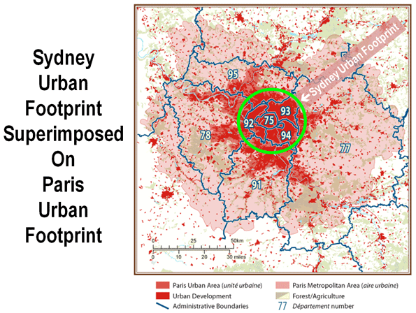
    The driving factor is economic. As in the United States, where differences in housing affordability are strongly associated with domestic migration trends, costly urban housing in China could be fueling a new attraction for rural areas. The cost of housing has risen substantially in China’s urban areas. At the same time, the cost of housing is near-zero in the rural areas. Further, residents of rural areas within prefectures with large urban areas have the hope of selling their land for urban development in the longer run and making a substantial profit. However, this new-found affection for the countryside is likely to be limited to areas relatively close to urban centers, to which rural residents can commute for better paying jobs.

    The government has announced plans to reform the hukou residency permit system. According to Zhang Yi, director of the Chinese Academy of Social Sciences research center is a system that “ensures freedom of migration.”

    The United Nations projections may be right. The stated preferences identified in the Chinese Academy of Social Sciences survey may not ultimately reveal themselves in actual behavior. But predictions are no more than predictions.

    Picture: Shenzhen: Luxury Housing (foreground) and Migrant Housing (background)

  • Special from Sydney: Misunderstanding Paris

    Reporters, columnists and even consultants often misunderstand urban areas and urban terms. The result can be absurd statements that compare the area in which the writer lives to somewhere else where the grass is inevitably greener, bringing to mind an expensive competitiveness report that suggested St. Louis should look to Cleveland as a model. Sometimes this is the result of just not understanding and other times it results from listening to itinerant missionaries from idealized areas who have no sense of the reality.

    A most recent example is from the Sydney Morning Herald, one of Australia’s largest and most respected newspapers.

    Columnist Elizabeth Farrelly told her readers that Paris covers one-quarter the land area (urban footprint) of Sydney and has a population of 5.5 million. In fact, the urban footprint of Paris is at least five times larger and the population nearly double.

    According to the Institut national de la statistique et des études économiques (INSEE), the statistics bureau of France, the urban footprint of Paris was 2,723 square kilometers in 1999 and the population in that area was 10,143,000 in 2006 (both figures are the latest data available).

    In contrast, according to the Australian Bureau of Statistics (ABS), the statistics bureau of Australia, the urban footprint of Sydney was 1,788 square kilometers in 2006. However, even the 50 percent larger urban footprint of Paris may actually understate the difference, because ABS uses a lower population density threshold than INSEE for urban versus rural classification. The difference between the two urban footprints is shown in the figure below.

    Ms. Farrelly also decried the continuing sprawl that she perceives in Sydney, despite the fact that no urban area in the new world, except perhaps Vancouver, has shut down home construction on its fringe to a greater degree (nor even has Paris). The effect of Sydney’s development Berlin Wall is housing affordability so bad that it is second only behind Vancouver out of nearly 275 metropolitan areas in the 6 nations we cover in the Demographia International Housing Affordability Survey.

  • 2010 Census: South and West Advance (Without California)

    For a hundred years, Americans have been moving south and west. This, with an occasional hiccup, has continued, according to the 2010 Census.

    During the 2000s, 84 percent of the nation’s population growth was in the states of the South and West (see Census region and division map below), while growth has been far slower in the Northeast and Midwest. This follows a pattern now four decades old, in which more than 75 percent of the nation’s population growth has been in the South and West. Indeed in every census period since the 1920s the South and West attracted a majority of the population growth.

    In the first census after World War II, in 1950, the East and the Midwest accounted for 58 percent of the nation’s population, with the South and West making up 42 percent. Since that time, the East and the Midwest have added less than 40 million people, while the South and West added nearly 120 million. Today, the ratios are nearly reversed, with 60 percent of the population living in the South and West and only 40 percent in the East and Midwest.

    The dominance of the South and West was overwhelming. The 24 fastest growing states were all in the South and West. The fastest growing state outside the West and South, surprisingly, was South Dakota, which added a second decade of unprecedented growth, after having gained almost no population between 1930 and 1990.

    Fastest and Slowest Growing States: The fastest growing states were the adjacent Mountain states of Nevada (35.1%), Arizona (24.6%), Utah (23.8%) and Idaho (21.1%). The only large state among the top five growing states was Texas, at 20.1%. These all greatly exceeded the national average growth rate of 9.7%

    Michigan was the only state to lose population (-0.6%) and became the first state in American history to ever exceed 10 million population (earlier in the decade) and then to fall back below that figure. Rhode Island grew only 0.4%. Louisiana grew only 1.4%, which in itself is an accomplishment given the 5 % loss that occurred between 2005 and 2006 after Hurricanes Katrina and Rita. Ohio ranked fourth lowest, gaining only 1.6%. New York continued its laggard performance, gaining only 2.1%. Since the late 1960s, New York (long the largest state) has added little more than one million people, while California added 19 million and has nearly doubled New York’s population.

    California: But all was not well in California. In every 10 year period after the 1920s, California added more people than any other state, until now. Between 2000 and 2010, Texas added 4.1 million people, nearly one million more than California.

    In no decade following the Depression (1930s) has California added so few new residents as in the 2000s. In the 1940s, California’s population rose by 3.7 million, starting from a 1940 base of 6.9 million. During the 2000s, the population increase was 3.4 million, on a 2000 base of 33.8 million.

    California still grew little faster than the national rate (10.0 percent compared to 9.7 percent). Yet this remains the lowest population growth rate for the state since its first Census, in 1850.

    Regional Analysis: The data, both state and regional, that is the basis of the regional analysis below is shown in Tables 1 and 2.

    The South: The South has had the largest share of the nation’s population since the 1940 census and it is now home to nearly 115 million people. The growth has been substantial, with 73 million new residents from 1950 to 2010, expanding 143%, more than twice the national growth rate of 104%. Overall, the South led national growth in the last decade, with a 14.3% rate and adding 14.2 million people. After Texas, the fastest growing states were North Carolina (18.5%), Georgia (18.3%) and Florida (17.6%), which had seen its growth reduced during the housing collapse. South Carolina (15.3%) also grew strongly. Outside of Louisiana, the slowest growth was in West Virginia (2.5%) and Mississippi (4.3%).

    The West: Since 1950, the West has added 58 million people, growing 256%. The West grew the second fastest among the regions, at 13.8% and added 8.7 million residents. As noted above, four of the five fastest growing states were in the Mountain West. In addition, Colorado grew 16.9%.

    The Midwest: Until the emergence of the South in 1940, the Midwest had been the nation’s largest region. Growth has been very slow. Since 1950, the Midwest has added 22.5 million people, but grown only 50 percent, or one-half the national rate of 104 percent. The Midwest had no states that grew above the national rate and had two of the states with the least growth (Michigan and Ohio). Perhaps signaling the rise of the upper Midwest, both North and South Dakota are growing faster than many Eastern or Midwestern states. After decades of population loss, South Dakota experienced unusual growth for the second decade in a row, while North Dakota, grew enough this decade to recover from decades of population loss dating to 1930.

    The Northeast: The nation’s former commercial heartland, the Northeast, has for its third census placed as the nation’s least populated region. A prediction in 1950 that the region housing New York, Philadelphia and Boston would fall so much in relative terms would have been considered absurd. Yet, from 1950 to 2010, the region added 16 million people, for the lowest regional growth rate (40%). The region added less than 2,000,000 population between 2000 and 2010, for a growth rate of 3.2%. The fastest growing state was New Hampshire, at 6.5%, reflecting the growth of its Boston suburbs and exurbs. All other states had growth rates less than one-half of the national rate.

    “Kudos” to the Bureau of the Census: Finally, congratulations are due the Bureau of the Census. In 2000, the Bureau was embarrassed by its under-estimation of the population during the previous decade. At the 1990 to 1999 estimation rate, the 2000 population would have been nearly 7,000,000 below the number of people actually counted in the census. The improvement during the decade of the 2000s was substantial. At the 2000 to 2009 estimate rate, the nation would have had 500,000 more people than were counted in 2010. Missing by less than 0.2 percent is pretty impressive.

    Table 1
    Regional Population: 1950-2010 (Census)
    Division/REGION 1950 1960 1970 1980 1990 2000 2010
    New England 9,314,453 10,509,367 11,841,663 12,348,493 13,206,943 13,922,517 14,444,865
    Middle Atlantic 30,163,533 34,168,452 37,199,040 36,786,790 37,602,286 39,671,861 40,872,375
    NORTHEAST 39,477,986 44,677,819 49,040,703 49,135,283 50,809,229 53,594,378 55,317,240
    East North Central 30,399,368 36,225,024 40,252,476 41,682,217 42,008,942 45,155,037 46,421,564
    West North Central 14,061,394 15,394,115 16,319,187 17,183,453 17,659,690 19,237,739 20,505,437
    MIDWEST 44,460,762 51,619,139 56,571,663 58,865,670 59,668,632 64,392,776 66,927,001
    NORTHEAST & MIDWEST 83,938,748 96,296,958 105,612,366 108,000,953 110,477,861 117,987,154 122,244,241
    Southeast 21,182,335 25,971,732 30,671,337 36,959,123 43,566,853 51,769,160 59,777,037
    East South Central 11,477,181 12,050,126 12,803,470 14,666,423 15,176,284 17,022,810 18,432,505
    West South Central 14,537,572 16,951,255 19,320,560 23,746,816 26,702,793 31,444,850 36,346,202
    SOUTH 47,197,088 54,973,113 62,795,367 75,372,362 85,445,930 100,236,820 114,555,744
    Mountain 5,074,998 6,855,060 8,281,562 11,372,785 13,658,776 18,172,295 22,065,451
    Pacific 15,114,964 21,198,044 26,522,631 31,799,705 39,127,306 45,025,637 49,880,102
    WEST 20,189,962 28,053,104 34,804,193 43,172,490 52,786,082 63,197,932 71,945,553
    SOUTH & WEST 67,387,050 83,026,217 97,599,560 118,544,852 138,232,012 163,434,752 186,501,297
    UNITED STATES 151,325,798 179,323,175 203,211,926 226,545,805 248,709,873 281,421,906 308,745,538


    Table 2              
    States and DC: Population 1950-2010 (Census)  
       
    State 1950 1960 1970 1980 1990 2000 2010
                   
    Alabama 3,061,743 3,266,740 3,444,165 3,893,888 4,040,587 4,447,100 4,779,736
    Alaska 128,643 226,167 300,382 401,851 550,043 626,932 710,231
    Arizona 749,587 1,302,161 1,770,900 2,718,215 3,665,228 5,130,632 6,392,017
    Arkansas 1,909,511 1,786,272 1,923,295 2,286,435 2,350,725 2,673,400 2,915,918
    California 10,586,223 15,717,204 19,953,134 23,667,902 29,760,021 33,871,648 37,253,956
    Colorado 1,325,089 1,753,947 2,207,259 2,889,964 3,294,394 4,301,261 5,029,196
    Connecticut 2,007,280 2,535,234 3,031,709 3,107,576 3,287,116 3,405,565 3,574,097
    Delaware 318,085 446,292 548,104 594,338 666,168 783,600 897,934
    District of Columbia 802,178 763,956 756,510 638,333 606,900 572,059 601,723
    Florida 2,771,305 4,951,560 6,789,443 9,746,324 12,937,926 15,982,378 18,801,310
    Georgia 3,444,578 3,943,116 4,589,575 5,463,105 6,478,216 8,186,453 9,687,653
    Hawaii 499,794 632,772 768,561 964,691 1,108,229 1,211,537 1,360,301
    Idaho 588,637 667,191 712,567 943,935 1,006,749 1,293,953 1,567,582
    Illinois 8,712,176 10,081,158 11,113,976 11,426,518 11,430,602 12,419,293 12,830,632
    Indiana 3,934,224 4,662,498 5,193,669 5,490,224 5,544,159 6,080,485 6,483,802
    Iowa 2,621,073 2,757,537 2,824,376 2,913,808 2,776,755 2,926,324 3,046,355
    Kansas 1,905,299 2,178,611 2,246,578 2,363,679 2,477,574 2,688,418 2,853,118
    Kentucky 2,944,806 3,038,156 3,218,706 3,660,777 3,685,296 4,041,769 4,339,367
    Louisiana 2,683,516 3,257,022 3,641,306 4,205,900 4,219,973 4,468,976 4,533,372
    Maine 913,774 969,265 992,048 1,124,660 1,227,928 1,274,923 1,328,361
    Maryland 2,343,001 3,100,689 3,922,399 4,216,975 4,781,468 5,296,486 5,773,552
    Massachusetts 4,690,514 5,148,578 5,689,170 5,737,037 6,016,425 6,349,097 6,547,629
    Michigan 6,371,766 7,823,194 8,875,083 9,262,078 9,295,297 9,938,444 9,883,640
    Minnesota 2,982,483 3,413,864 3,804,971 4,075,970 4,375,099 4,919,479 5,303,925
    Mississippi 2,178,914 2,178,141 2,216,912 2,520,638 2,573,216 2,844,658 2,967,297
    Missouri 3,954,653 4,319,813 4,676,501 4,916,686 5,117,073 5,595,211 5,988,927
    Montana 591,024 674,767 694,409 786,690 799,065 902,195 989,415
    Nebraska 1,325,510 1,411,330 1,483,493 1,569,825 1,578,385 1,711,263 1,826,341
    Nevada 160,083 285,278 488,738 800,493 1,201,833 1,998,257 2,700,551
    New Hampshire 533,242 606,921 737,681 920,610 1,109,252 1,235,786 1,316,470
    New Jersey 4,835,329 6,066,782 7,168,164 7,364,823 7,730,188 8,414,350 8,791,894
    New Mexico 681,187 951,023 1,016,000 1,302,894 1,515,069 1,819,046 2,059,179
    New York 14,830,192 16,782,304 18,236,967 17,558,072 17,990,455 18,976,457 19,378,102
    North Carolina 4,061,929 4,556,155 5,082,059 5,881,766 6,628,637 8,049,313 9,535,483
    North Dakota 619,636 632,446 617,761 652,717 638,800 642,200 672,591
    Ohio 7,946,627 9,706,397 10,652,017 10,797,630 10,847,115 11,353,140 11,536,504
    Oklahoma 2,233,351 2,328,284 2,559,229 3,025,290 3,145,585 3,450,654 3,751,351
    Oregon 1,521,341 1,768,687 2,091,385 2,633,105 2,842,321 3,421,399 3,831,074
    Pennsylvania 10,498,012 11,319,366 11,793,909 11,863,895 11,881,643 12,281,054 12,702,379
    Rhode Island 791,896 859,488 946,725 947,154 1,003,464 1,048,319 1,052,567
    South Carolina 2,117,027 2,382,594 2,590,516 3,121,820 3,486,703 4,012,012 4,625,364
    South Dakota 652,740 680,514 665,507 690,768 696,004 754,844 814,180
    Tennessee 3,291,718 3,567,089 3,923,687 4,591,120 4,877,185 5,689,283 6,346,105
    Texas 7,711,194 9,579,677 11,196,730 14,229,191 16,986,510 20,851,820 25,145,561
    Utah 688,862 890,627 1,059,273 1,461,037 1,722,850 2,233,169 2,763,885
    Vermont 377,747 389,881 444,330 511,456 562,758 608,827 625,741
    Virginia 3,318,680 3,966,949 4,648,494 5,346,818 6,187,358 7,078,515 8,001,024
    Washington 2,378,963 2,853,214 3,409,169 4,132,156 4,866,692 5,894,121 6,724,540
    West Virginia 2,005,552 1,860,421 1,744,237 1,949,644 1,793,477 1,808,344 1,852,994
    Wisconsin 3,434,575 3,951,777 4,417,731 4,705,767 4,891,769 5,363,675 5,686,986
    Wyoming 290,529 330,066 332,416 469,557 453,588 493,782 563,626
                   
    United States 151,325,798 179,323,175 203,211,926 226,545,805 248,709,873 281,421,906 308,745,538

    Wendell Cox is a Visiting Professor, Conservatoire National des Arts et Metiers, Paris and the author of “War on the Dream: How Anti-Sprawl Policy Threatens the Quality of Life

    Photo by Travelin’ Librarian – Michael Sauers

  • Smart Growth and the Quality of Life

    The idea of “smart growth” should be like mom and apple pie. But take a closer look and you find, for the most part, that smart growth policies often have unintended consequences that are anything but smart.

    If housing is unaffordable, the cost of living is high and people are leaving, it probably means that a state rates higher in smart growth policies. That’s the story from an analysis of the new Smart Growth America state ratings on transportation policies the organization believes would reduce greenhouse gas emissions. The new ratings are based upon strategies recommended in Moving Cooler, a smart growth oriented report authored by Cambridge Systematics in 2009 (Note 1).

    The new Smart Growth America ratings and the Moving Cooler strategies relied, in large measure, on strategies that would force higher population densities, virtually stop development on and beyond the urban fringe, and seek to, in the immortal words of Transportation Secretary Ray Lahood, “coerce” people out of cars.

    Yet when the new ratings are arrayed alongside measures of the quality of life, such as housing affordability and the cost of living, smart growth shows its less attractive side. You can see this, for example, in patterns of domestic migration states with the highest Smart Growth America scores also suffer the highest net domestic out-migration. .

    Quality of Life Indicators: The following analysis compares the Smart Growth America ratings of the states with quality of life indicators, which include lower house prices, a lower cost of living and a greater net domestic migration (Note 2).

    • Housing Affordability: Housing affordability is measured using a median value multiple (Note 3), which is the median house value by the median household income (from the 2009 American Community Survey). Economic research generally indicates that smart growth land use policies lead to higher house prices and lower levels of housing affordability. A lower housing affordability score means that housing is more affordable, and is an indication of a better quality of life. Generally, the median value multiple was 3.0 or below until the housing bubble and remains at that level in some states.
    • Cost of Living: The overall cost of living was examined using regional price parities developed by the Bureau of Economic Analysis (US Department of Commerce) in the form of “regional price parities.” Regional price parities are the domestic equivalent of “purchasing power parities,” which are used to adjust personal income and gross domestic product data between nations. A lower score means that the cost of living is lower and is an indication of a better quality of life.
    • Net Domestic Migration: Net domestic migration rates are for the period of 2000 to 2009 and based upon Bureau of the Census data and is calculated as a percentage of the 2000 population. A higher score means that more people are moving in than moving out. A state with a higher score is more attractive to movers than states with lower scores, which is also an indication of a better quality of life.

    The Top (Mostly Bottom) Ten

    Generally, the states with the highest Smart Growth America ratings perform the worst by these quality of life indicators.

    California is first in Smart Growth America score, at 82 (out of a possible 100). Yet, California ranks 49th in housing affordability, 48th in cost of living and 45th in net domestic migration, having lost 4.4 percent of its population (1.5 million) to other states since 2009. California’s average rank among the quality of life indicators is 47, essentially a mirror image of its Smart Growth America rating. Only New York has a worse average ranking (49th).

    Maryland is second in Smart Growth America score, at 77. However, Maryland ranks 42nd in housing affordability, 41st in the cost of living and 36th in net domestic migration, having lost 1.8 percent of its residents (nearly 100,000) to other states since 2000. Maryland’s average rank is 40th on the quality of life indicators.

    New Jersey ranks third, with a Smart Growth America score of 75. New Jersey ranks 45th in housing affordability, 47th in the cost of living and 47th in domestic migration, having lost 4.5 percent of its population (450,000) to other states during the decade. Among the top ten, only California has a worse average ranking than New Jersey’s, at 46th on the quality of life indicators.

    Connecticut ranks fourth, with a Smart Growth America score of 70. Connecticut ranks 40th in housing affordability, 46th in cost of living and 40th in domestic migration, having lost 2.8 percent (nearly 100,000) of its population. Connecticut’s average rank is 42th in the quality of life indicators.

    Washington is fifth in Smart Growth America score, at 68. Washington ranks 44th in housing affordability and 40th in cost of living. Washington ranked much higher, however, in domestic migration at 14th, with a gain of 4.0 percent (240,000). Washington, like other western states, has been the recipient of strong migration from even more expensive coastal California. Washington’s average rank is 33rd in the quality of life indicators.

    Oregon ranks sixth, with a Smart Growth America score of 65. The state ranks 47th in housing affordability (trailing Hawaii, California and New York), but has a higher average cost of living ranking (31st) and in domestic migration, principally because it, like Washington is a favored destination by people fleeing California.

    Seventh ranked Massachusetts (64) scores much more consistently in the quality of life indicators, at 46th in housing affordability, 45th in the cost of living, 44th in net domestic migration and 45th overall.

    Neighboring Rhode Island (61) ranks eighth and is also a consistent performer, ranking 43rd in housing affordability and net domestic migration, 44th in the cost of living and 43rd overall.

    Delaware and Minnesota share 9th place with a Smart Growth America score of 59. Delaware’s average ranking is 28th, and Minnesota’s average ranking is 29th. Delaware’s ranking, near the top of the bottom 25 is driven by a high net domestic migration rate. Minnesota scores similarly in all quality of life indicators.

    Two states scoring the worst in the quality of life indicators were notably absent in the Top (Mostly Bottom) Ten. New York’s average rank was 49, compared to its Smart Growth America rank of 21. Hawaii’s average quality of life indicator rank was 46 and its Smart Growth America rank was 15. Some of the worst housing affordability and highest costs of living drove their low quality of life scores.

    States with Higher Quality of life Indicators

    The five states with the lowest Smart Growth America scores are Nebraska, North Dakota, West Virginia, Mississippi and Arkansas. These states surely qualify as “flyover” country, being well removed from the more elite coasts. Yet, each of these states scores considerably better than Smart Growth America’s top ten states, with some of the nation’s best housing affordability and lowest costs of living. Slightly more people moved out of these states than moved in. However, bottom ranked Arkansas (Smart Growth America score of 2) attracted 75,000 net domestic residents, almost 1.6 million more than Smart Growth America’s top ranked California and 170,000 more than second ranked Maryland.

    Texas (15th), North Carolina (16th) and Georgia (17th) were among the higher scoring large states in the quality of life indicators. The high Texas ranking resulted from higher rankings in housing affordability and net domestic migration. Georgia and North Carolina had among the highest rankings in net domestic migration.

    Statistical Analyses

    For fun, I did a quick statistical analysis, which indicated that inferior housing affordability and a higher cost of living are associated with a higher Smart Growth America score, at a 99 percent level of confidence (Note 4).

    This relationship is evident in Table 1, which is a summary by Smart Growth America scores. Housing affordability and the cost of living all improve as the Smart Growth America score declines. At this level, a similar relationship is evident in the net domestic migration rate, with the exception of states with a Smart Growth America score of under 20. The states with the highest Smart Growth America ratings (60 and over) lost 2.5 million domestic migrants, while the states with scores from 40 to 60 lost 500,000. States with Smart Growth America ratings under 40 gained 2.5 million domestic migrants, more people than live in all of the nation’s municipalities except for New York, Los Angeles and Chicago. Table 2 provides detailed data for all states.

    Table 1
    Quality of Life Indicator Summary by Smart Growth Score
    Smart Growth America Score
    Housing Affordability
    Cost of Living
    Net Domestic Migration Rate
    Net Domestic Migration
    60 & Over             

    5.1
          

    114.5
    -1.7%
         

    (2,035,132)
    40 to 60             

    4.3
          

    102.2
    1.8%
            

    (501,121)
    20 to 40             

    3.3
            

    87.7
    2.2%
          

    2,576,584
    Under 20             

    2.6
            

    79.2
    -0.5%
                  

    (517)
    Table 2
    Smart Growth America Transportation Ratings & Quality of Life Indicator Summary by State
    Smart Growth America Rating
    Quality of Life Indicators
    State
    Housing Affordability
    Cost of Living
    Net Domestic Migration Rate
    Average Rank
    Value
    Rank
    Value
    Rank
    Value
    Rank
    Value
    Rank
    California
    82
    1
         

    6.5
    49
    129.1
    48
    -4.4%
    45
    47
    Maryland
    77
    2
         

    4.6
    42
    106.5
    41
    -1.8%
    36
    40
    New Jersey
    75
    3
         

    5.1
    45
    125.6
    47
    -5.4%
    47
    46
    Connecticut
    70
    4
         

    4.3
    40
    121.6
    46
    -2.8%
    40
    42
    Washington
    68
    5
         

    5.1
    44
    102.9
    40
    4.0%
    14
    33
    Oregon
    65
    6
         

    5.3
    47
    95.4
    31
    5.2%
    9
    29
    Massachusetts
    64
    7
         

    5.3
    46
    120.8
    45
    -4.3%
    44
    45
    Rhode Island
    61
    8
         

    4.9
    43
    113.7
    44
    -4.3%
    43
    43
    Delaware
    59
    9
         

    4.4
    41
    97.7
    34
    5.8%
    8
    28
    Minnesota
    59
    9
         

    3.6
    26
    92.6
    28
    -0.9%
    32
    29
    Vermont
    57
    11
         

    4.2
    37
    99.5
    36
    -0.2%
    29
    34
    Illinois
    53
    12
         

    3.7
    28
    99.2
    35
    -4.9%
    46
    36
    Virginia
    51
    13
         

    4.3
    38
    102.1
    39
    2.3%
    19
    32
    Wisconsin
    51
    13
         

    3.4
    21
    91.5
    24
    -0.2%
    28
    24
    Hawaii
    50
    15
         

    8.1
    50
    133.4
    50
    -2.4%
    38
    46
    Pennsylvania
    50
    15
         

    3.3
    20
    94.2
    29
    -0.3%
    30
    26
    Arizona
    45
    17
         

    3.9
    30
    94.4
    30
    13.5%
    2
    21
    Florida
    45
    17
         

    4.1
    34
    99.9
    37
    7.2%
    6
    26
    Michigan
    45
    17
         

    2.9
    12
    92.5
    27
    -5.4%
    48
    29
    Nevada
    42
    20
         

    3.9
    32
    100.4
    38
    17.9%
    1
    24
    New York
    41
    21
         

    5.6
    48
    131.8
    49
    -8.7%
    50
    49
    New Mexico
    37
    22
         

    3.7
    27
    83.5
    14
    1.4%
    23
    21
    Colorado
    36
    23
         

    4.3
    39
    97.1
    32
    4.7%
    10
    27
    Utah
    36
    23
         

    4.1
    33
    86.5
    19
    2.4%
    18
    23
    Kentucky
    35
    25
         

    2.9
    13
    80.8
    4
    2.0%
    21
    13
    Tennessee
    35
    25
         

    3.3
    19
    84.7
    18
    4.6%
    12
    16
    Alaska
    34
    27
         

    3.5
    23
    106.7
    42
    -1.2%
    33
    33
    Maine
    33
    28
         

    3.9
    31
    92.2
    26
    2.3%
    20
    26
    South Carolina
    33
    28
         

    3.2
    18
    83.2
    13
    7.6%
    5
    12
    New Hampshire
    32
    30
         

    4.1
    35
    113
    43
    2.6%
    17
    32
    Georgia
    31
    31
         

    3.4
    22
    87.9
    23
    6.7%
    7
    17
    Kansas
    31
    31
         

    2.6
    7
    83.6
    16
    -2.5%
    39
    21
    Idaho
    30
    33
         

    3.8
    29
    82.7
    10
    8.5%
    3
    14
    Iowa
    28
    34
         

    2.5
    3
    82.9
    11
    -1.7%
    35
    16
    Ohio
    28
    34
         

    3.0
    15
    87.2
    21
    -3.2%
    42
    26
    Texas
    27
    36
         

    2.6
    6
    91.7
    25
    4.0%
    15
    15
    North Carolina
    26
    37
         

    3.6
    25
    86.9
    20
    8.2%
    4
    16
    Missouri
    25
    38
         

    3.1
    16
    81.3
    7
    0.7%
    27
    17
    Oklahoma
    24
    39
         

    2.6
    4
    81.6
    8
    1.2%
    24
    12
    Alabama
    23
    40
         

    3.0
    14
    80.8
    4
    2.0%
    22
    13
    Louisiana
    23
    40
         

    3.2
    17
    83.6
    16
    -7.0%
    49
    27
    Montana
    23
    40
         

    4.2
    36
    83.1
    12
    4.4%
    13
    20
    South Dakota
    23
    40
         

    2.8
    11
    82.3
    9
    1.0%
    26
    15
    Wyoming
    21
    44
         

    3.5
    24
    97.4
    33
    4.6%
    11
    23
    Indiana
    20
    45
         

    2.7
    9
    83.5
    14
    -0.4%
    31
    18
    Nebraska
    18
    46
         

    2.6
    5
    87.3
    22
    -2.3%
    37
    21
    North Dakota
    18
    46
         

    2.4
    1
    79.5
    3
    -2.8%
    41
    15
    West Virginia
    13
    48
         

    2.5
    2
    70.3
    1
    1.0%
    25
    9
    Mississippi
    12
    49
         

    2.7
    8
    80.8
    4
    -1.3%
    34
    15
    Arkansas
    2
    50
         

    2.7
    10
    78.2
    2
    2.8%
    16
    9
    Housing Affordability: Median House Value/Median Household Income, 2009
    Cost of Living: Regional Price Parities, 2006
    Net Domestic Migration: 2000-2009 Migration/2000 Population

    ——————-
    Note 1: Moving Cooler has been criticized by Alan Pisarksi (ULI Moving Cooler Report: Exaggerations and Misconceptions) and this author (Reducing Vehicle Miles Traveled Produces Meager Greenhouse Gas Emissions Returns) in previous newgeography.com articles.

    Note 2: There are additional quality of life indicators, such as shorter work trip travel times, less intense traffic congestion, less intense air pollution, more living space, etc.

    Note 3: This measure is based upon median house value, which is the only data available at the state level. The median value multiple is different from the Median Multiple (median house price divided by median household income), which is widely used in metropolitan area analysis (such as in the Demographia International Housing Affordability Survey).

    Note 4: Details of the regression analysis: The dependent variable was the Smart Growth America score. The independent variables were the cost of living indicator and the domestic migration rate. The coefficient of determination (R2) was 0.55. (The positive relationship to the cost of living was strong, with a probability of only 1 in 10,000 that the result could have occurred by chance. The indicated association with the net migration rate was weak; the chance association cannot be ruled out).

    Wendell Cox is a Visiting Professor, Conservatoire National des Arts et Metiers, Paris and the author of “War on the Dream: How Anti-Sprawl Policy Threatens the Quality of Life

  • Building the Train to Nowhere

    The California High Speed Rail Authority has approved building its first 54 miles in the San Joaquin Valley. A somewhat longer route, 65 miles, has been indicated in a number of press reports, but Authority documents indicate that only 54 miles of high speed rail track will be built. The route would start in Corcoran, and go through Fresno to Borden, a small, unincorporated community south of Madera. All of this would cost $4.15 billion. The route would include two stations, in Fresno and Hanford/Visalia.

    The segment was adopted under pressure by the United States Department of Transportation, which was interested in ensuring that the line would be usable (have “independent utility”) by Amtrak should the high speed rail project be cancelled due to lack of funds. The first section of the California high speed rail line would instead be a somewhat incongruously high-tech Corcoran to Borden spur, or perhaps more accurately stub to the region’s rather sparse conventional rail services.

    There are appear to have been concerns that growing opposition movements in the San Francisco and Los Angeles areas could have delayed construction, which could have put the federal money at risk. The Sacramento Bee’s Dan Walters, perhaps the leading political columnist in the state implied an ulterior motive:

    “You’d have to be terminally naive not to believe that the splashy announcement, made personally by an Obama administration official in Fresno, was to help an embattled local congressman, Democrat Jim Costa, stave off a very stiff Republican challenge.”

    Officials representing communities – many of them with high levels of unemployment – on the segment itself were elated, as any would be at the prospect of a rush of new construction jobs, regardless of what was being built. But, most everywhere else the reaction to the selection largely has been negative. Walters labeled it the “train to nowhere” in a November 29 commentary. State Senator Alan Lowenthal, who chairs the legislative committee overseeing the high speed rail project said that the Authority “could be creating an ‘orphan’ stretch of track, that will never be used by high-speed trains.”

    Richard Tolmach, president of the California Rail Foundation, an intercity rail advocacy organization, told Authority members ” It’s a crazy idea. He went on to say that “You guys are gonna be a laughingstock in Congress.”

    Already, problems are building in the now more decidedly more conservative Congress. California Republican Congressman Jerry Lewis and 27 colleagues have introduced the “American Recovery and Reinvestment Rescission Act,” which would apply unspent stimulus money to the deficit, including $2 billion that has been promised to the California high speed rail line.

    Batteries (and Trains) Not Included: Even after the $4.15 billion has been spent, the Corcoran to Borden rail stub will be incomplete. The Authority’s plan includes only the building of the rail bed and the necessary viaducts. There is no money for trains. There is no money for the electrical infrastructure necessary to power the trains. Trains and electricity infrastructure would add at least 15 percent to the bill, based upon previous California High Speed Rail reports. Thus, when and if completed, the trains and electrification would lift the cost of the Corcoran to Borden high speed rail stub to at least $4.8 billion.

    Bare Bones Stations: The plan calls for building only “basic” stations, with two tracks (one in each direction). That is fine if the line is serving Amtrak and there are only a few trains per day. But the high speed rail plan assumes frequent trains, including some that stop at all stations, some express trains that skip some stations and some express trains running non-stop from the Transbay Terminal in San Francisco to Union Station in Los Angeles. The only place that an express train can pass a slower train is at a station. That means that passing tracks must be built at virtually all stations. The passing tracks (two interior tracks in addition to the two tracks for stopped trains) required in stations are illustrated in this California High Speed Rail illustration (also above).

    The full system, or (perhaps the more likely outcome) a truncated San Jose to Palmdale line (with slower running lines over the commuter rail tracks into San Francisco and Los Angeles), would require passing tracks at the Fresno and Hanford/Visalia stations. Rebuilding these stations would increase the cost above the $4.8 billion, and that’s before the seemingly inevitable cost escalation.

    Indeed, the Corcoran to Borden stub entails a potentially large cost increase compared to previous California High Speed Rail Authority documents. After making all of the necessary adjustments to update the last available segment costs to the cost accounting method (“year of expenditure” dollars), the cost of the Corcoran to Borden stub could be at least 30 percent higher than would have been expected in the present $43 billion San Francisco to Anaheim cost.

    Applied to the entire line, a 30 percent cost escalation could take the price of the San Francisco to Anaheim line to more than $55 billion. Based upon cost ratios released by the Authority in 2008, the later extensions to Sacramento and San Diego would lift the bill to more than staggering $80 billion. Even that does not pay the entire bill, because promises have been made in state legislation for improvements across Altamont pass from Stockton to the East Bay and Oakland.

    Not that coming up with any of this money will be easy, particularly with a more deficit conscious Congress. Congressman John Mica of Florida, who will likely lead the House of Representatives Transportation and Infrastructure Committee has promised a review of all federal high speed rail grants. The Authority expects to obtain funding from local governments in California, a number of which are teetering toward financial insolvency.

    The Authority expects between $10 and $12 billion from private investors. These potential investors will all be aware of the fact that virtually every dollar of private investment in new high-speed rail lines has been lost or required a government bailout. They will not participate without subsidies, which are prohibited by California law. Finally, all these elements of the financing plan will be made even more problematic if the first phase of the project continues to rise from $43 billion to $55 billion.

    Washington analyst C. Kenneth Orski noted that the Corcoran to Borden stub could “become a huge embarrassment for the Administration” and that by its train to nowhere ”casts doubt on the soundness of the entire federal high-speed rail program and its decision-making process.”

    Then, even if California gets to keep the federal money, there are still formidable financial barriers. A likely result is high speed rail in Amtrak mode which probably won’t make much difference to passengers riding the infrequent San Joaquin service. After the Authority action, Bill Bronte, who heads the rail division of the California Department of Transportation said that “The improvements in performance might be less than one would expect.” But that might not bother contractors and consultants who can feast on what might prove to be the most expensive conventional intercity train project in history.

    Wendell Cox is a Visiting Professor, Conservatoire National des Arts et Metiers, Paris and the author of “War on the Dream: How Anti-Sprawl Policy Threatens the Quality of Life

  • Honolulu Rail Costs Balloon, Ridership Projections Called High

    Hawaii Governor Linda Lingle has released an independent analysis of the proposed Honolulu rail program to the public and to elected officials. The report was commissioned by the state Department of Transportation. Infrastructure Management Group, CBRE Richard Ellis and Thomas A Rubin performed the equivalent of a “due diligence” report on the project, and according to the Honolulu Star-Advertiser, indicated that the project would rise in cost by $1.7 billion to $7.0 billion for the 20 mile long line.

    In addition, the consultants indicated that operating subsidies could be substantially higher than forecast, and that the city of Honolulu could become saddled with heavy debt by the project. Further, the consultants noted the likelihood that ridership projections might not be met.

    Post-rail transit system usage and fare revenue are likely to be substantially lower than that projected in the current Financial Plan, since the Plan’s projection would require an unprecedented and unrealistic growth in transit utilization for a city that already has one of the highest transit utilization rates in the country.

    The findings of cost escalation and over-projection of ridership have been noted as a fairly routine occurrence in international infrastructure research.

    —–

    Note: Honolulu rail project planning documents indicated greenhouse gas emission reductions as a benefit of the project. Demographia published an analysis indicating that the impact on greenhouse gas emissions either a marginal increase or a marginal decrease depending upon performance. It was projected that any reduction would have been at costs per ton many times above international standards.

  • Stuck in the Station: The High-Speed Rail “Low Ball Express”

    You know that something is up when a Washington Post editorial advises that the Obama Administration do a “reality check” on its plans for high speed rail. From the beginning, there was more slow-speed than high speed rail, however both components of the plan could be in trouble. The Onion joined the issue with a satirical video announcing a federal “high-speed bus” program that would replace the high-speed rail plans.

    The Post criticized Secretary of Transportation Ray LaHood for not allowing Wisconsin and Ohio to use the federal money to make needed highway improvements instead:

    “This blunt refusal to heed the fresh mandate of Ohio and Wisconsin’s voters seems hard to justify – especially since using the money for other infrastructure would have created jobs, just as building trains would have.”

    Wisconsin and Ohio: This is vividly illustrated by recent election results, when successful gubernatorial candidates in two states vowed to kill two of the slower lines that had already received substantial federal funding. Wisconsin’s Scott Walker took aim at the Milwaukee to Madison line, which would average less than 60 miles per hour, despite reaching speeds of 110. Ohio’s John Kasich says that Ohio’s Cincinnati to Cleveland train is “dead” It could have been named the “Ohio Fast Mail,” because it would have averaged 50 miles per hour, about the same as the Fast Mail over the longer New York and Niagara Falls route — in 1877! These trains would have operated at average speeds from one-third to one-fourth those achieved by the Wuhan to Guangzhou trains in China.

    Illinois: There are also problems in Illinois. That state received $1.1 billion from the federal government to ramp up Chicago to St. Louis speeds to 110 miles per hour and to make the trip in four hours. Yet, the state received only about one-third of the requested $3 billion from the federal government for this project. It is a fair question where the rest of the money is coming from. Illinois had proposed to contribute only one percent of the cost ($4 million), leaving the project still nearly $2 billion short, before the seemingly inevitable cost overruns (which are already an inflation adjusted 8 times earlier projections). Illinois, which by some accounts is in as bad shape fiscally as California, simply does not have the money to complete the job.

    Incremental High Speed Rail? One of the most cynical myths about slower speed rail is that it is a “stepping stone” to genuine high speed rail, which is now being built in some countries to operate from 200 to 220 miles per hour. Such claims are patently misleading. The slower speed 110 mile per hour trains will run on tracks shared with freight trains and there will be some grade crossings (intersections with roads where trains, trucks and cars could conceivably collide). Genuine high speed rail requires starting all over.

    Illinois provides an example. The unfunded $3 billion slower speed line is not enough. The state has also sought federal funding to plan a genuine high speed rail line that would cost an additional $12 billion, according to a Midwest High Speed Association report. However, this amount would rise substantially, since it does not include rail-cars, maintenance facilities, stations and, of course, cost overruns. There is nothing incremental about building one line and then abandoning it to build another.

    California and Genuine High Speed Rail? Maybe Not: Meanwhile, the news is not encouraging to proponents of the nation’s two genuine high speed rail lines, in California and Florida.

    For two years, the California High Speed Rail Authority has been concentrating its attention on planning for the two most expensive sections of its proposed $43 billion (before cost-overruns) line from Los Angeles (Anaheim) to San Francisco. Plans that some claim would create a Berlin Wall across the largely affluent cites of the Peninsula led to a “boondoggle rally” attended by 500 people in Palo Alto. Community concerns have also been raised about the line through Orange County and southeastern Los Angeles County.

    Now, however, the federal government has virtually steered all of promised money to the San Joaquin Valley, requiring that it be spent between Merced and Bakersfield. The provisions of the high speed bond issue will require that state funding to be spent where the federal money is spent.

    The federal department of transportation has not indicated its rationale for this decision, but the new strategy could indicate that a modicum of sanity may be at work. Clearly the state of California does not have the money to build the system. Joe Vranich and I raised this issue in our Due Diligence report on the system, published by the Reason Foundation. We noted that the proposed 2:40 travel time from San Francisco to Los Angeles Union Station would more likely erode to 3:40, because the trains will not be able to travel as fast as planned in the urban areas, and they are not likely to attain their aggressive planned speeds on other portions of the route. We also suggested the likelihood that only part of the system would be built, with trains operating at conventional speeds over conventional tracks for the final 60 or more miles into San Francisco and Los Angeles. With insufficient money, there could be pressure to cut the genuine high speed rail portion of the system back even more than that, given the federal requirement for confining construction to the San Joaquin Valley, which now barely supports minimal air service and has largely traffic-free freeways.

    Proponents have been mouthing fairy tales about French, Chinese or Japanese investment in the system. Can they be so naive to believe that French or Japanese taxpayers will pay for high speed rail system in California? In fact, any such “investment” would be loans and would have to be paid back. Around the world, virtually all private investment for high speed rail has been either lost or bailed out by taxpayers.

    Perhaps the best that proponents can hope for is that some 220 mile per hour track will be built on the flat-as-Kansas agricultural land in the San Joaquin Valley. Trains could continue from the northern terminus (Merced) to San Francisco and from the southern terminus (Bakersfield) to Los Angeles and Anaheim on upgraded conventional rail tracks. This would bring the now discarded slower speed rail vision of Ohio and Wisconsin to California. Trains might well average 70 miles per hour or somewhat more.

    It could be even worse. Californians Advocating Responsible Rail Design (CARRD) reveals that the California High Speed Rail Authority has revealed “Plan B.” Its October 2009 application to the US Department of Transportation indicated that “In the event of significant delays or abandonment of the HST program, the Merced/Fresno Program would have created rail crossing benefits, as well as provided the potential for significant improvement to the existing San Joaquin intercity passenger service operated by Amtrak and underwritten in part by the state.”

    Florida: People were also having second thoughts about the genuine high-speed line between Orlando and Tampa. The two cities are so close together than even if the train reached the speed of light, given waiting in a rental car line and driving to and from the stations, car travel could be faster.

    Congressman John Mica, who seems likely to be Chair of the House Infrastructure and Public Works Committee in the next congress, has suggested that the line be truncated to a local operation between Orlando International Airport and Disneyworld. Governor Elect Rick Scott is now reviewing the project.

    International: The international news is barely any better. The Chinese government is now reviewing the wisdom of its huge expenditures on high speed rail, as a result of a critical report from the Chinese Academy of Sciences. And, as in California, communities are resisting along a proposed high speed rail line in England. Moreover, cost overruns have been routine, as have been revenue and ridership shortfalls relative to the always rosy projections.

    At least in the United States, the high-speed rail “low-ball express” remains stuck in the station. The actual costs, however, will certainly rise well above the low-ball estimates.

    Photo: The Fast Mail (1877 Average Speed Equal to Cancelled Ohio High Speed Rail Train): Harper’s Weekly, 1877.

    Wendell Cox is a Visiting Professor, Conservatoire National des Arts et Metiers, Paris and the author of “War on the Dream: How Anti-Sprawl Policy Threatens the Quality of Life

  • Rasputin’s Tunnel?

    First, New Jersey Governor Chris Christie cancelled the proposed intercity and suburban rail tunnel between New Jersey and Manhattan because of the financial obligations its out-of-control costs could impose on the state’s taxpayers. Then he delayed the final decision, under pressure from Secretary of Transportation Ray LaHood and other supporters of the tunnel. In the end, the proponents were unable to provide the financial guarantees necessary to keep New Jersey from having to pay more than it had committed and Christie cancelled the tunnel for good. Or so it appeared.

    Now, the tunnel may be back. Mayor Michael Bloomberg of New York City has studies underway that could lead to extending subway Line 7 from a station at 34th Street and 11th Avenue to New Jersey instead.

    Early press reports suggest the line can be built for $5.3 billion, which is approximately one-half the cost of the previous proposal. It is more likely that Governor Christie will buy the Brooklyn Bridge with tax money than this amount is in the “ball park.” The subway tunnel would be only four blocks (15 percent) shorter than the cancelled tunnel.

    The previous tunnel had the less than attractive name, “Access to the Regional Core.” Given the back and forth history of this project, a more appropriate name might be “Rasputin’s Tunnel,” after the Russian mystic whose enemies failed in multiple attempts to murder (though in the end, they succeeded).

  • The Overdue Debate: Smart Growth Versus Housing Affordability

    American households face daunting financial challenges. Even those lucky enough not to have suffered huge savings and retirement fund losses in the Great Recession seem likely to pay more of their incomes in taxes in the years to come, as governments attempt pay bills beyond their reasonable financial ability. Beyond that, America’s declining international competitiveness and the easy money policies of the Federal Reserve Board could well set off inflation that could discount further the wealth of households.

    In this environment, the last thing governments need do is to raise the cost of anything. It is bad enough that taxes may have to rise and that a dollar will probably buy less. America’s standard of living could stagnate or it could even decline.

    The Choice: Smart Growth or Affordability

    The Washington Examiner, however, succinctly put the choices that face the nation, states and localities with respect to the largest element of household expenditure — housing. In an editorial entitled “Take Your Pick: Smart Growth or Affordable Housing,” the Examiner noted:

    “No matter how much local politicians yammer about how much they support affordable housing, they are the principal cause of the problem via their land use restrictions, such as the urban growth boundary in Montgomery County and large-lot zoning in Loudoun County.”

    The editorial was in response to our Demographia Residential Land & Regulation Cost Index, which estimated the extent to which the land to construction ratio had risen in metropolitan regions. The principal finding was that the share of land and regulatory costs to new house prices had risen only with the impostion of more restrictive land use policies. This is principally because strategies such as urban growth boundaries, suburban large lot zoning and geographical growth steering (such as allowing state financial assistance only in areas meeting smart growth criteria) makes land for housing unnecessarily scarce, raising its price just as surely as OPEC’s oil rationing raises the price of gasoline.

    Urban planner and mayor of Ventura, California Bill Fulton objected to our attributing these increases to land and regulation, instead suggesting that smart growth increases homes prices much less than we claimed although, he admits, “at least a little“ . The pro-smart growth study Costs of Sprawl — 2000 concedes that a number of smart growth strategies can increase house prices (See Table 15-4). Thus, the debate is not about whether more restrictive land use policies raise the price of housing, but rather by how much.

    More often, however, proponents of more restrictive land use regulations have avoided and even denied that the inconvenient truth linking their policies with higher housing costs. Rarely, if ever, have proponents of such policies fully disclosed to elected or appointed officials that more restrictive land use policies would lead to higher house prices. It is doubtful that any urban planning department ever sent representatives to an NAACP chapter to explain how fewer African-Americans would be able to own their own homes, despite already having a one-third lower home ownership rate than non-Hispanic whites. Similarly, the planners probably never told La Raza chapters that Hispanic households, also with a one third less home ownership rate, would find home ownership more costly. Nor was the message delivered to the religious organizations concerned with improving the standard of living for lower income households.

    Pervasive Evidence

    Yet the evidence that smart growth boost prices substantially seems incontrovertible. An early 1970s research effort led by renowned urbanologist Peter Hall quantified the impacts of the restrictive Town and Country Planning Act of 1947, which brought smart growth measures to England. The result, The Containment of Urban England revealed how strict regulations on development had driven the price of land for development from five to ten times the value of comparable on which development was not permitted, but might be permitted in the future. More recently, Bank of England Monetary Policy Committee member Kate Barker, was commissioned by the Blair Labour government to review housing affordability and land regulation. She attributed England’s more steeply rising house prices relative to continental Europe to its more restrictive land use regulations.

    The same effect is evident in the United States. Dartmouth’s William Fischel noted that California house prices were similar to those in the rest of the nation as late as 1970. By 1990, however, California house prices had escalated well ahead of the nation. Fischel found that the higher prices could not be explained by higher construction cost increases, demand, the quality of life, amenities, the property tax reform initiative (Proposition 13), land supply or water issues. His conclusion was that the expansion of land use restrictions were the culprit.

    Let Them Eat Cake?

    The disregard at least some smart growth proponents show about house prices may be characterized, for example, in a comment on the Planetizen website:

    “… smart growth can lead to more expensive housing. So what? At least it’s REAL value, generated by a higher quality of life, easier commutes, more transit options, walkability and a more enriched cultural experience…” (emphasis in original)

    Perhaps it never occurred to the proponents of more restrictive land use policies that not all households have the benefit of incomes typical of urban planners or new urbanist architects. One has to question the “REAL values” of smart growth since most housing consumers place their highest emphasis on things like privacy, security and good schools, not always available at a decent price in urban areas.

    In fact, higher priced housing reduces the discretionary income that is crucial to an acceptable standard of living to many households. Millions of households will not be in the market for “a more enriched cultural experience” until they can afford the housing they desire.

    Housing Affordability and the Cost of Living

    It is not accidental that the cost of living is higher (both in nominal terms and relative to incomes) in metropolitan regions where land use regulation is the strongest, such as San Diego, Washington-Baltimore, Seattle or Boston. Nor is it accidental that house prices have escalated to 40 percent above historic norms in Portland, Oregon, where planners have skimped on geographical urban growth boundary expansions, choosing instead to look skyward, seeking higher densities. California’s aspiration under Senate Bill 375 for new housing at 20 units to the acre offers a more than Jakarta level of density (residential densities above 30,000 per square mile) that could escalate the unprecedented exodus of people and businesses.

    Higher Housing Costs: The Poverty Connection

    The acknowledged relationship between more restrictive land use regulation and higher house prices also applies to standards of living, which are sent lower, and poverty rates, which must inevitably be pushed higher. This constitutes a second inconvenient truth: as discretionary income drops, more households fall into poverty. This creates a difficulty for proponents of more restrictive land use regulation, because there is no constituency for increasing poverty. It is no wonder they have generally discounted, ignored or even denied the nexus between smart growth and higher housing costs.

    Considering the financial uncertainty American households face, it is long past time that the choice between smart growth and housing affordability be seriously debated.

    —-

    Photograph: “Low density” smart growth development adjacent to the urban growth boundary (Hillsboro) in suburban Portland (by author)

    Wendell Cox is a Visiting Professor, Conservatoire National des Arts et Metiers, Paris and the author of “War on the Dream: How Anti-Sprawl Policy Threatens the Quality of Life

  • Australian Local Governments Stop Forced Amalgamation

    Local government consolidations are often proposed by a wide range of interests, often out of the belief that they will produce more efficient (less costly) governments. Much of the academic literature supports this view. However, the evidence indicates that material savings routinely fail to occur from such amalgamations. The claimed $300 million annual savings in Toronto’s megacity quickly became higher costs and a larger bureaucracy.

    As in the Canadian provinces of Ontario and Quebec the Australian state governments of New South Wales (Sydney is the capital), Victoria (Melbourne is the capital) and Queensland (Brisbane is the capital) have been aggressive in forcing municipalities to merge over the last two decades. Often these attempts have met with opposition from residents. A forced amalgamation in Montreal was so unpopular that a new provincial government established mechanisms to “demerge.” Despite formidable barriers, 15 cities chose independence.

    Sometimes amalgamations are proposed for much smaller jurisdictions than 2.5 million population Toronto or even the 1990s merger that created the 90,000 population city of Melbourne, which is the core city of the Melbourne metropolitan area.

    In July, the New South Wales government announced intentions to amalgamate three jurisdictions ranging with a total population of 35,000. The city of Armidale-Dumaresque, Uralla Shire and Gyura Shire are located in the “New England” region of New South Wales, one-half way between Sydney and Brisbane. The amalgamation would have replaced the local governments with the New England Regional Council, a mega-jurisdiction of 5,000 square miles (13,000 square kilometers), a land area approximately equal in size to the area of the states of Delaware, Rhode Island and the province of Prince Edward Island (Canada) combined.

    The proposal met with determined opposition, from citizens and from the local governments. For example, the Uralla Shire Council submittal to the state Local Government Boundaries Commission, cited pitfalls of local government consolidations, relying on both Australian and international research. The Armidale Express reported that two former Guyra Shire council members mobilized that community against the amalgamation. There were substantial concerns. One was an interest in preserving historic communities, and the nearly universal aversion to moving city hall farther away. Errors were claimed in state government analyses that led to the amalgamation proposal and fiscal concerns were raised.

    In the end, the Local Government Boundaries Commission recommended against the proposed amalgamation. Minister for Local Government, Barbara Perry made the announcement on November 17. Uralla, Guyra and Armidale-Dumaresque will not be forced to amalgamate.

    The decision brought immediate positive responses from local leaders. Uralla Shire Mayor Kevin Ward said that he couldn’t be happier with the decision. Guyra Shire Mayor Hans Heitbrink said that the decision not to merge the three councils speaks volumes about the spirit of the communities who fought to save their separate local government areas. Armidale-Dumaresq Mayor, Peter Ducat, spoke of the stress that the decision will relieve for council staff and the community.

    They have reason to be pleased. Rarely, if ever, in recent decades have Australian jurisdictions retained their communities and their local democracies in the face of state amalgamation proposals.