Author: Wendell Cox

  • The Hudson Tunnel: Issues for New Jersey

    New Jersey Governor Chris Christie sent shockwaves through the transportation industry on last Thursday when he cancelled the under-construction ARC (Access to the Regional Core) rail tunnel under the Hudson River from New Jersey to New York (Manhattan).

    The Governor accepted the Access the Regional Core (ARC) Executive Committee’s recommendation to “pull the plug” on the expensive project because of cost overruns. The project was to have cost $8.7 billion, but could escalate up to $14 billion according to the Governor’s office. All of any such cost overrun would have to be absorbed by the state of New Jersey, which like many other states is in dire financial straits.

    Christie said:

    “I have made a pledge to the people of New Jersey that on my watch I will not allow taxpayers to fund projects that run over budget with no clear way of how these costs will be paid for. Considering the unprecedented fiscal and economic climate our State is facing, it is completely unthinkable to borrow more money and leave taxpayers responsible for billions in cost overruns. The ARC project costs far more than New Jersey taxpayers can afford and the only prudent move is to end this project.”

    Governor Christie indicated that the project could become New Jersey’s “Big Dig,” referring to the Boston highway project that he said escalated in cost by 10 times (that is not a typo).
    Yet supporters of the tunnel were unanimous in their condemnation of Christie’s move, from Paul Krugman of The New York Times to the Regional Plan Association.

    New Jersey Senator Frank Lautenberg announced that Christie had backed down, noting his “reversal of yesterday’s decision to kill” the tunnel project. Referring to a meeting between US Secretary of Transportation Ray LaHood and Governor Christie, Lautenberg said “The Secretary was clear with Governor Christie: if this tunnel doesn’t get built, the three billion dollars will go to other states. We can’t allow that to happen.” Lautenberg listed a litany of benefits such as a reduction of greenhouse gas emissions by 70,000 tons annually. He also noted that New Jersey would have to reimburse the federal government the $300 million it had received for the tunnel. Senator Robert Menendez added that “New Jersey taxpayers don’t want to own a $600 million hole to nowhere.”

    However, under examination, it is unclear whether Christie had “reversed” his position. Christie agreed to consider “options to potentially salvage” a tunnel project based upon options (not made public) offered by LaHood. New Jersey and Federal officials will be meeting on the matter over the next two weeks. Christie, however, reaffirmed his concern about project finances, stating that” the ARC project is not financially viable “ and its expectation “to dramatically exceed its current budget remains unchanged. ” The Newark Star-Ledger cited state officials as saying that the decision does not represent a reversal of Christie’s original decision.

    Thus, everything may be up in the air. Given that, here are a few issues the state of New Jersey may like to consider as it finalizes its decision:

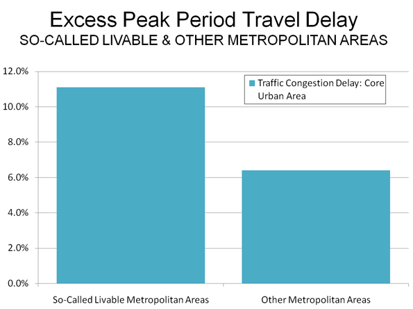
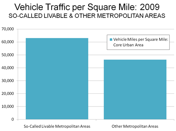
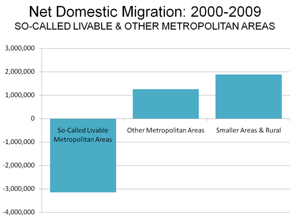
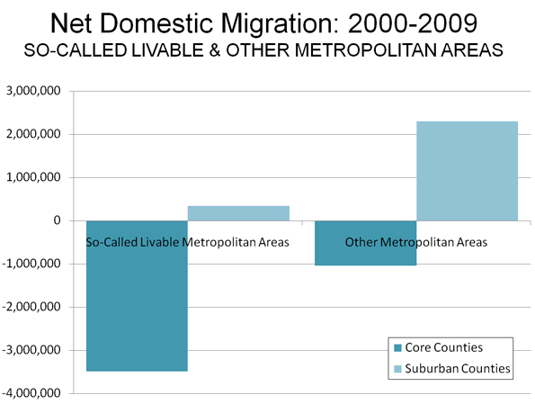
    1. Exaggerating the Need for the Project The new rail tunnel is to serve a purported increase in commuter rail ridership to Manhattan jobs in the future. The project’s Final Environmental Impact Statement says that Midtown Manhattan’s employment will grow from its present 2.6 million by another 500,000 by 2030. This is unlikely. Manhattan’s entire employment (not just Midtown) peaked at 2.4 million in 2008. One might expect the planners could have gotten something so simple correct. Manhattan employment remains below 2001 levels and never rose more than 35,000 even at the peak of the last boom (annual figure, from 2001). The consultants also are projecting a 1.6 million population increase west of the Hudson River (New Jersey suburbs along with the New York counties of Rockland and Orange) by 2030. However, the New Jersey and New York metropolitan counties to the west of the Hudson are more likely to grow only 1.1 million, based upon official state projections (Note). The questionable population and employment projections reveal that the “need” for the new tunnel may have been grossly overstated.

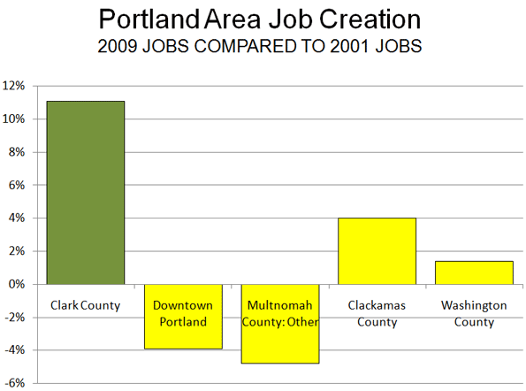
    2. Exporting New Jersey Jobs to New York Why should New Jersey pay to build more capacity so that its people can work across the state line? Why should they not work in New Jersey? New Jersey is often thought of an economic afterthought in Manhattan centric media and business interests (such as by The New York Times). In fact only a small share of New Jersey commuters travel to Manhattan for work. Even in the New Jersey counties that border New York, only 12% of commuters work in Manhattan. In the other New York metropolitan area counties in the metropolitan area, the figure drops to 5%.

    The trends here are also important. Since 1956, every new job in the New York metropolitan area has been created outside Manhattan (Manhattan’s employment is 400,000 lower now than back then). New Jersey depends on New Jersey far more than it does New York. New Jersey has developed successful new office complexes in Jersey City, New Brunswick, along the I-287 Belt Route and elsewhere. Perhaps New Jersey should seek to minimize work trip lengths and encourage the next 500,000 jobs to be created in the state rather than in New York. Downtown Newark, for example, has excellent transit access and could use substantial new employment investment. This might prove more beneficial for New Jersey and its taxpayers.

    3. Costs Could Rise Even Higher The tunnel could easily climb in cost beyond the now feared $14 billion. Big Dig cost escalation continued almost to the project’s opening. There is no reason to expect it will be different with the Hudson tunnel. It has been reported that one of LaHood’s options is simply to lower cost projections. New Jersey should buy that option only if the federal government underwrites all of the cost overruns. However, such a deviation from federal policy would bring stiff opposition from other parts of the country.

    4. The Cost of Reducing Greenhouse Gas Emissions Like so many transit projects, the reduction of greenhouse gas (GHG) emissions is raised as a benefit of the tunnel. But at what cost? Each of the 70,000 annual tons of greenhouse gas emissions removed would require a capital expenditure of $16,000. The present market price for greenhouse gases is $20 per ton. New Jersey could accomplish the same objective for just $1.4 million annually.

    The Decision Much rides on Governor Christie’s decision. It may be better for the state to have a $600 million tunnel to nowhere than a $14, $20 or $25 billion tunnel that may not really be needed. Moreover, frustration is building with Washington’s “plunder” philosophy that encourages wasting money at home, so that another state doesn’t get the chance. Digging the nation out of its present (and future) malaise seems likely to require fresher thinking than this.

    If Governor Christie musters the courage to stop this project now, it could be a shot across the bow of an international vendor and consulting engineering community that has routinely low-balled costs only to later jack them up, confident that no project would be canceled once started.

    ——–

    Note: This figure is derived using New York 2030 projections and New Jersey 2025 projections, increased by the 2020-2025 growth rate to project 2030 population.

    Wendell Cox is a Visiting Professor, Conservatoire National des Arts et Metiers, Paris and the author of “War on the Dream: How Anti-Sprawl Policy Threatens the Quality of Life

    Photo: Hudson River looking south between Lower Manhattan and Jersey City (photo by author)

  • Decade of the Telecommute

    The rise in telecommuting is the unmistakable message of the just released 2009 American Community Survey data. The technical term is working at home, however the strong growth in this market is likely driven by telecommuting, as people use information technology and communications technology to perform jobs that used to require being in the office.

    In 2009, 1.7 million more employees worked at home than in 2000. This represents a 31% increases in market share, from 3.3 percent to 4.3 percent of all employment. Transit also rose, from 4.6% to 5.0%, an increase of 9% (Note). Even so, single occupant automobile commuting also rose, from 75.7% to 76.1%, despite the huge increase in gasoline prices. The one means of transport that continued to decline was car pooling, which saw its share decline from 12.1% in 2000 to 10.0% in 2009.

    The increase in working at home was pervasive in scope. The share of employees working at home rose in every major metropolitan area (over 1,000,000 population), with an average increase of 38%. The largest increase was in Charlotte – ironically a metropolitan area with large scale office development in its urban core – with an 88% increase in the work at home market share. In five metropolitan areas, the increase was between 70% and 80% (Richmond, Tampa-St. Petersburg, Raleigh, Jacksonville and Orlando). Only five metropolitan areas experienced market share increases less than 20% (New Orleans, Salt Lake City, Rochester, Buffalo and Oklahoma City). Nonetheless, the rate of increase in the work at home market share exceeded that of transit in 49 of the 52 major metropolitan areas. Transit’s increase was greater only in Washington, Seattle and Nashville (where the transit market share is miniscule).

    The working at home market share increase was also strong outside the major metropolitan areas, rising 23%.

    Working at home is fast closing the gap with transit. In part driven by the surge in energy prices since earlier in the decade, transit experienced its first increase since data was first collected by the Bureau of the Census in 1960. Yet working at home is growing more rapidly, and closing the gap, from 1.7 million fewer workers than transit in 2000 to only 1.0 million fewer in 2009. At the current rate, more people could be working at home than riding transit by 2017. This is already the case in much of the country outside the New York metropolitan area, which represents a remarkable 39 percent of the nation’s transit commuters. Taking New York out of the picture, 31% more people (1.35 million) worked at home than traveled by transit, more than 4 times the 7% difference in 2000 (Table 1, click for additional information).

    Table 1
    Transit & Work at Home Share of Commuting
    Major Metropolitan Areas: 2000 & 2009
      Transit Work at Home
    Metropolitan Area 2000 2009 2000-2009 2000 2009 2000-2009
    New York 27.4% 30.5% 11.4% 2.9% 3.9% 32.6%
    Los Angeles 5.6% 6.2% 11.6% 3.5% 4.8% 35.3%
    Chicago 11.3% 11.5% 2.0% 2.9% 4.0% 37.1%
    Dallas-Fort Worth 1.8% 1.5% -13.3% 3.0% 4.1% 37.0%
    Philadelphia 8.9% 9.3% 3.7% 2.9% 3.9% 35.0%
    Houston 3.2% 2.2% -29.2% 2.5% 3.4% 37.4%
    Miami-West Palm Beach 3.2% 3.5% 9.7% 3.1% 4.5% 48.0%
    Atlanta 3.4% 3.7% 8.7% 3.5% 5.6% 59.9%
    Washington 11.2% 14.1% 26.6% 3.7% 4.5% 22.7%
    Boston 11.2% 12.2% 9.8% 3.3% 4.3% 31.9%
    Detroit 1.7% 1.6% -4.7% 2.2% 3.1% 40.1%
    Phoenix 1.9% 2.3% 17.5% 3.7% 5.3% 44.3%
    San Francisco-Oakland 13.8% 14.6% 6.0% 4.3% 6.0% 40.5%
    Riverside 1.6% 1.8% 9.0% 3.5% 4.6% 32.6%
    Seattle 7.0% 8.7% 25.0% 4.2% 5.1% 23.6%
    Minneapolis-St. Paul 4.4% 4.7% 6.4% 3.8% 4.6% 20.6%
    San Diego 3.3% 3.1% -7.0% 4.4% 6.6% 50.2%
    St. Louis 2.2% 2.5% 14.2% 2.9% 3.5% 22.5%
    Tampa-St. Petersburg 1.3% 1.4% 11.0% 3.1% 5.5% 75.7%
    Baltimore 5.9% 6.2% 5.8% 3.2% 3.9% 23.2%
    Denver 4.4% 4.6% 4.3% 4.6% 6.2% 36.4%
    Pittsburgh 5.9% 5.8% -2.9% 2.5% 3.2% 28.5%
    Portland 6.3% 6.1% -3.0% 4.6% 6.1% 32.9%
    Cincinnati 2.8% 2.4% -13.4% 2.7% 3.8% 40.3%
    Sacramento 2.7% 2.7% 0.8% 4.0% 5.4% 33.1%
    Cleveland 4.1% 3.8% -8.1% 2.7% 3.4% 25.0%
    Orlando 1.6% 1.8% 15.4% 2.9% 4.9% 71.4%
    San Antonio 2.7% 2.3% -12.5% 2.6% 3.4% 29.0%
    Kansas City 1.2% 1.2% 4.6% 3.5% 4.3% 24.7%
    Las Vegas 4.4% 3.2% -26.8% 2.3% 3.3% 45.1%
    San Jose 3.4% 3.1% -9.6% 3.1% 4.5% 44.4%
    Columbus 2.1% 1.4% -35.0% 3.0% 4.1% 36.7%
    Charlotte 1.4% 1.9% 32.2% 2.9% 5.4% 88.1%
    Indianapolis 1.3% 1.0% -22.2% 3.0% 3.7% 24.7%
    Austin 2.5% 2.8% 11.7% 3.6% 5.9% 64.6%
    Norfolk 1.7% 1.4% -17.7% 2.7% 3.4% 27.9%
    Providence 2.4% 2.7% 12.8% 2.2% 3.6% 64.5%
    Nashville 0.8% 1.2% 38.5% 3.2% 4.3% 34.6%
    Milwaukee 4.2% 3.7% -12.5% 2.6% 3.2% 25.3%
    Jacksonville 1.3% 1.2% -9.1% 2.3% 4.0% 73.8%
    Memphis 1.6% 1.5% -8.1% 2.2% 3.1% 41.3%
    Louisville 2.0% 2.4% 20.2% 2.5% 3.1% 22.9%
    Richmond 1.9% 2.0% 6.5% 2.7% 4.7% 76.8%
    Oklahoma City 0.5% 0.4% -13.0% 2.9% 3.1% 4.7%
    Hartford 2.8% 2.8% -1.3% 2.6% 4.0% 53.6%
    New Orleans 5.4% 2.7% -50.3% 2.4% 2.9% 19.2%
    Birmingham 0.7% 0.7% -2.3% 2.1% 2.7% 29.5%
    Salt Lake City 3.3% 3.0% -10.1% 4.0% 4.7% 17.8%
    Raleigh 0.9% 1.0% 10.7% 3.5% 6.0% 74.4%
    Buffalo 3.3% 3.6% 7.9% 2.1% 2.3% 8.3%
    Rochester 2.0% 1.9% -4.3% 2.9% 3.3% 13.7%
    Tucson 2.5% 2.5% 1.8% 3.6% 5.0% 36.3%
    Total 7.5% 8.0% 6.4% 3.2% 4.4% 37.7%
    Other 1.0% 1.2% 12.3% 3.4% 4.2% 23.0%
    National Total 4.6% 5.0% 9.2% 3.3% 4.3% 30.9%
    Major metropolitan areas: Over 1,000,000 population in 2009
    Metropolitan Area definitions as of 2009
    Data from 2000 Census and 2009 American Community Survey

    The rise of working at home is illustrated by the number of major metropolitan areas in which it now leads transit in market share. In 2000, working at home had a larger market share than transit in 28 of the present 52 major metropolitan areas. By 2009, working at home led transit in 38 major metropolitan areas, up 10 from 2000. Between 2000 and 2009, the working at home market share increased nearly 6 times as much as the transit share in the major metropolitan areas (38.4% compared to 6.4%).

    Working at Home Leaps Above Transit In Portland and Elsewhere: Perhaps most surprising is the fact that Portland now has more people working at home than riding transit to work. This is a significant development. Portland is a model “smart growth” having spent at least $5 billion additional on light rail and bus expansions over the last 25 years. Portland was joined by other metropolitan areas Houston, Miami-West Palm Beach, New Orleans and San Jose, all of which have spent heavily on urban rail systems. Working at home also passed transit in Cincinnati, Hartford, Las Vegas, Raleigh and San Antonio (Table 2).

    Table 2
    Work at Home Share Greater than Transit
    Major Metropolitan Areas
    Atlanta Houston Norfolk Sacramento
    Austin Indianapolis Oklahoma City Salt Lake City
    Birmingham Jacksonville Orlando San Antonio
    Charlotte Kansas City Phoenix San Digo
    Cincinnati Las Vegas Portland San Jose
    Columbus Louisville Providence St. Louis
    Dallas-Fort Worth Memphis Raleigh Tampa-St. Petersburg
    Denver Miami-West Palm Beach Richmond Tucson
    Detroit Nashville Riverside
    Hartford New Orleans Rochester
    Indicates working at home passed transit between 2000 and 2009

    Further, the shares are close enough at this point that working at home could surpass n transit in Milwaukee, Cleveland and Minneapolis-St. Paul in the next few years.

    Transit: About New York and Downtown

    As noted above, transit also has gained during this decade. However, the gains have not been pervasive. Out of the 52 major metropolitan areas, transit gained market share in 29 and lost in 23. As usual, transit was a New York story, as the New York metropolitan area saw its transit work trip market share rise from 27.4% to 30.5%. New York accounted for 47% of the increase in transit use, despite representing only 37% in 2000. New York added nearly 500,000 new transit commuters. This is nearly five times the increase in working at home (106,000). Washington also did well, adding 125,000 transit commuters, followed by Los Angeles at 73,000 and Seattle at 41,000.

    Transit’s downtown orientation was evident again. This is illustrated by the fact that more than 90% of the increased use in the major metropolitan areas occurred in those metropolitan areas with the 10 largest downtown areas (New York, Los Angeles, Chicago, Philadelphia, Houston, Atlanta, Washington, Boston, San Francisco and Seattle). Among these, only Houston experienced a decline in transit commuting.

    Implications

    Working at home has been the fastest growing component of commuting for nearly three decades. In 1980, working at home accounted for just 2.3% of commuting, a figure that has nearly doubled to 4.3% in 2009. This has been accomplished with virtually no public investment. Moreover, this seems to have happened without any loss of productivity. Companies like IBM, Jet Blue and many others have switched large numbers of their employees to working at home. These firms, which necessarily seek to provide the best return on their investment for stockholders and owners would not have made these changes if it had interfered with their productivity.

    Over the same period, and despite the recent increases, transit’s market share has fallen from 6.4% of commuting in 1980 to 5.0% in 2009. At the same time, gross spending over the period rose more than $325 billion (inflation and ridership adjusted) from 1980 levels. Inflation adjusted expenditures per passenger mile have more than doubled since that time.

    Given the remarkable rise of telecommuting, its low cost and effectiveness as a means to reduce energy use, perhaps it’s time to apply at least some of our public policy attention to working in cyberspace. It presents a great opportunity, perhaps far greater and far more cost-effective than the current emphasis on new rail transit systems.

    ———-

    Note: Work trip market share reflects transit in its strongest market, trips to and from work. Transit’s overall impact, measured by total roadway and transit travel (passenger miles) is approximately 1%, compared to the national work trip market share of 5%.

    Wendell Cox is a Visiting Professor, Conservatoire National des Arts et Metiers, Paris and the author of “War on the Dream: How Anti-Sprawl Policy Threatens the Quality of Life

    Photograph: DDFic

  • Portland Metro’s Competitiveness Problem

    Portland Metro’s president, David Bragdon, recently resigned to take a position with New York’s Bloomberg administration. Bragdon was nearing the end of his second elected term and ineligible for another term. Metro is the three county (Clackamas, Multnomah and Washington counties) planning agency that oversees Portland’s land use planning and transportation policies, among the most stringent and pro-transit in the nation.

    Metro’s jurisdiction includes most of the bi-state (Washington and Oregon) Portland area metropolitan area, which also includes the core municipality of Portland and the core Multnomah County.

    Local television station KGW (Channel 8) featured Bragdon in its Straight Talk program before he left Portland. Some of his comments may have been surprising, such as his strong criticism of the two state (Washington and Oregon) planning effort to replace the aging Interstate Bridge (I-5) and even more so, his comments on job creation in Portland. He noted “alarming trends below the surface,” including the failure to create jobs in the core of Portland “for a long time.”

    Bragdon was on to something. Metro’s three county area suffers growing competitive difficulties, even in contrast to the larger metropolitan area (which includes Clark and Skamania counties in Washington, along with Yamhill and Columbia counties in Oregon). This is despite the fact that one of the most important objectives of Metro’s land use and transportation policies is to strengthen the urban core and to discourage suburbanization (a phenomenon urban planning theologians call “sprawl”).

    Anemic Job Creation: Jobs have simply not been created in Portland’s core. Since 2001, downtown employment has declined by 3,000 jobs, according to the Portland Business Alliance. In Multnomah County, Portland’s urban core and close-by surrounding communities, 20,000 jobs were lost between 2001 and 2009. Even during the prosperous years of 2000 to 2006, Multnomah County lost jobs. Suburban Washington and Clackamas counties gained jobs, but their contribution fell 12,000 jobs short of making up for Multnomah County’s loss. The real story has been Clark County (the county seat is Vancouver), across the I-5 Interstate Bridge in neighboring Washington and outside Metro’s jurisdiction. Clark County generated 13,000 net new jobs between 2001 and 2009 (Figure 1).

    Domestic Migration: Not only are companies not creating jobs in the three county area, but people are choosing to locate in other parts of the metropolitan area.

    Between 2000 and 2009, the three counties – roughly 75% of the region’s total population in 2000 – attracted just one-half of net domestic migration into the metropolitan area. Washington’s suburban Clark County, across the Interstate Bridge, added a net 48,000 by domestic migration and has accounted for 40% of the metropolitan area’s figure all by itself.

    Core Multnomah County, which had nearly double Clark County’s 2000 population, added only 4,000 net domestic migrants, at a rate less than 1/20th that of Clark County. Suburban Clackamas and Washington counties did better, but between them achieved barely one-half of the Clark County rate.

    Exurban Columbia and Yamhill counties, outside the jurisdiction of Metro but inside the metropolitan area, added nearly 13,000 domestic migrants, more than three times that of Multnomah County, despite their combined population less than one-fifth that of Multnomah’s in 2000.

    Effects of Pro-Transit Policies: Portland’s unintended decentralization has even damaged the much promoted, and subsidized, public transit agencies. Despite Portland’s pro-transit policies, the three county transit work trip market share fell from 9.7% in 1980, before the first light rail line was opened, to 7.4% in 2000, after two light rail lines had opened. Two more light rail lines and 9 years later, (2009) the three county transit work trip market share had fallen to 7.4%, despite the boost of higher gasoline prices. The three county transit work trip market share loss from 9.7% in 1980 to 7.4% in 2009 calculates to a near one-quarter market share loss. By contrast, Seattle’s three county metropolitan area, without light rail until 2009, experienced a 5% increase in transit work trip market share from 1980 to 2009 (8.3% to 8.7%).

    While taxpayer funded transit was attracting less than its share of new commuters out of cars, one mode –unsupported by public funds – was doing very well. Between 1980 and 2009, working at home rose from 2.2% of employment to 6.2%. in the four county area (including Clark County). Thus, nearly as many people worked at home as rode transit to work in 2009 (Note). Already, working at home accounts for a larger share of employment than transit in the larger 7 county metropolitan area. All of this is despite Portland’s having spent an extra $5 billion on transit in the last 25 years on light rail expansions and more bus service. (Figure 2).

    Why is the Three County Area Doing Less Well? Why have Portland’s policies that are designed to help the core failed to draw jobs and people? People who move to the Portland area from other parts of the nation are probably drawn by the lower house prices in Clark County, where less stringent land use regulation has kept houses more affordable. New housing in Clark County is also built on average sized lots, rather than the much smaller lots that have been required by Metro’s land use policies. House prices are also lower in the exurban counties outside Metro’s jurisdiction.

    As Metro has forced urban densities up in the three county area and failed to provide sufficient new roadway capacity, traffic congestion has become much worse. A long segment of Interstate 5 in north Portland seems in a perpetual peak hour gridlock unusual for a medium sized metropolitan area, which is obvious from Google traffic maps that show average conditions by time and day of week. Even more unusual is the gridlock on a long stretch of the US-26 Sunset Highway that serves the suburban Silicon Forest of Washington County. A long overdue expansion will soon provide some relief on US-26. However transportation officials seem in no hurry to provide the additional capacity necessary to reduce both greenhouse gas emissions and excessive travel delays on Interstate 5 in north Portland. People who move to Clark or the exurban counties can avoid these bottlenecks by working closer to home or even in the periphery of the three county area.

    Portland has important competitive advantages, such as a temperate climate and marvelous scenery. It also helps to be close to hyper- uncompetitive California, which keeps exporting households to neighboring states. But a higher cost of living driven by policies that have kept prices 40% higher than before the housing bubble (adjusted for household incomes), and increasing traffic congestion make Portland’s three county area less competitive and nearby alternatives more attractive.

    This is not surprising. More intense regulation deters business attraction and expansion. An economic study by Raven Saks of the Federal Reserve Board concluded that … metropolitan areas with stringent development regulations generate less employment growth. At least part of the reason the Metro region’s diminished competitiveness lies with a failed strategy that appears to be having the exact opposite effect to what has been advertised – and widely celebrated – among planners from coast to coast.

    Note: 1980 three county data not available on-line.

    Wendell Cox is a Visiting Professor, Conservatoire National des Arts et Metiers, Paris and the author of “War on the Dream: How Anti-Sprawl Policy Threatens the Quality of Life

    Photograph: South Waterfront Condominiums, Portland. Photo by author

  • The Commonwealth Bank of Australia/UBS-Demographia Data Dispute

    The Age (Melbourne) headlined a story “CBA Accused of Choosing its Facts.” CBA is the Commonwealth Bank of Australia, while UBS is the Swiss investment house. Commonwealth produced a report comparing housing affordability in Australian metropolitan areas to international metropolitan areas (Australian Housing and Mortgages: CBA Mortgage Book Secure). According to The Age:

    Investment forums and housing blogs were alive with talk yesterday that an 18-page presentation used by the bank had replaced unfavourable housing affordability figures with data showing housing costs were not out of step with other cities in the world.

    One slide compared Australian housing affordability to several cities, citing figures from a combination of the US urban planning research house Demographia and the investment bank UBS.
    The slide showed housing in Sydney and Melbourne was more affordable than cities such as San Francisco, New York and Vancouver. But it used UBS data exclusively for the Australian cities, and Demographia data for the overseas cities.

    The data were not comparable. Commonwealth relied upon Median Multiple data (median house price divided by median household income) from the 6th Annual Demographia Housing Affordability Survey for international metropolitan areas. However, Commonwealth used a median/average multiple (median house price divided by average household income) calculated by UBS, the Swiss investment house, for Australian metropolitan areas. These are very different indicators.

    There would have been nothing wrong with having used the median/average multiple, had it been shown for all metropolitan areas, Australian and international. However, comparing the median/average multiple to the Median Multiple is invalid. Average household incomes are routinely higher than median household incomes and the use of an average income figure inappropriately biases Australian housing affordability relative to international metropolitan areas.

    For example, the UBS median/average multiple for Sydney is reported by Commonwealth to be 6.2. Commonwealth finds Sydney to be more affordable than San Francisco’s, which it indicates at 7.0. However, the San Francisco figure is the Median Multiple and the comparable figure for Sydney is 9.1, making Sydney less affordable than San Francisco

    In fact, had the UBS median/average multiple been used for all metropolitan areas, including the international metropolitan areas, it is likely that the gap between Australian metropolitan areas and international metropolitan areas would be of similar magnitude to that shown in the Demographia International Housing Affordability Survey.

    From time to time, various interests have suggested alternate measures of housing affordability for Australia and then compared or suggested comparison to our Median Multiple data. Of course, that is invalid.

    The Age article by Eric Johnston was carried in other Fairfax Media outlets such asThe Sydney Morning Herald and the Brisbane Times, and the subject has been covered by financial blogs.

    Note: Author Wendell Cox of Demographia.com and Hugh Pavletich of PerformanceUrbanPlanning.com are co-authors of the Demographia International Housing Affordability Survey.

  • Unmanageable Jakarta Soon To Lose National Capital?

    Jakarta is the world’s third largest urban area with 22 million people (Note 1) and the second largest metropolitan area with 26.6 million people (Note 2). Jakarta is the capital of the world’s fourth most populous country, the Republic of Indonesia, which has 240 million people (following China, India and the United States). Jakarta is located on the island of Java, which covers slightly more land area than the state of New York and has 8 times the people (135 million). There is probably no smaller piece of real estate in the world that houses so many people.

    A Unique Metropolitan Name: Jakarta is the only megacity (urban area with more than 10 million people) in the world that has adopted a new name for its urban and metropolitan area: Jabotabek, which combines the beginning letters of Jakarta and the suburban jurisdictions of Bogor, Tangerang and Bekasi.

    Jabotabek is also one of the world’s fastest growing urban areas and the prospects are for even stronger growth. The United Nations expects Indonesia to add 90 million people to its urban areas over the next 40 years. If Jabotabek gets its present share of Indonesian urbanization, its population would double.

    Jabotabek’s Unmanageable Problems: For already crowded Jabotabek and its even more crowded core of Jakarta, this is bad news. Jabotabek covers nearly the same land area as Paris (more than 1,000 square miles), but has more than twice the population. And unlike Paris, with its well-planned streets and multi-story buildings, much of Jabotek is made up of low-slung, terribly crowded makeshift slums.

    Jabotabek may have the most intense traffic congestion in the world. One report says road speeds average little more than 5 miles per hour. The government has plans to expand the freeway system, which is already extensive for a developing world megacity. But, Jabotabek’s density is already far above the critical mass of dispersion required for automobiles to serve efficiently, especially in the longer run. Automobile ownership is reportedly rising as much as 15% annually.

    Of course, every public official’s answer seems to be transit. Sadly, Jabotabek has anything but a transit friendly urban form, despite its high population density. Jabotabek may be the ultimate, dispersed Asian urban area, with little of a commercial core (though larger Delhi has even less) and even that is spread out. There’s no concentration of buildings, for example, as dense as downtown San Diego. Thus, building the kind of hub and spoke transit system that could effectively serve a dense commercial core makes no sense since economic activity is already so dispersed.

    Exclusive busways have been built. But the construction of two monorails has been suspended and there are plans to build a metro (subway). Given Jabotabek’s commercial dispersion, nothing short of an 800 meter rapid transit grid could possibly make a difference. This would bring everyone within the international transit standard of 400 meters, which given Jakarta’s dispersion is the only way a rapid transit system would work.

    That would cost far more than all of the personal income in the area each year in capital and operating expense. Jabotabek falls short of the critical mass needed in a commercial or even a residential core to make transit a viable solution.

    Thus, Jabotabek sits in the broad no-man’s land ill suited for transit and too dense for cars. However, in Jabotabek, as in Mumbai and Bangkok, having the choice between a transit system that cannot get you where you need to go and being stuck in traffic, people opt for the traffic as soon as they can afford it.

    There are other massive problems. Jakarta city is on a lowland on the Java Sea and has severe drainage and flooding problems. Rising sea levels could make things even worse. Urban planner Yayat Supriyatna says that the present core of Jakarta should halve its present population of over 9 million.

    Move the Capital? The nation’s leaders think they have an answer: move the capital. President Susilo Bambang Yudhoyono has called upon the government to prepare a study of the options. The entire national government could be moved completely out of Jakarta, or most of the government functions could be moved to another part of Jabotabek. Traffic is high on the list of ills that the President justifiably cites.

    Others, such as Siti Zuhro of the Indonesian Institute of Sciences are concerned that the capital needs to be moved away from Jabotabek altogether, to escape its problems. Speaker of the House of Representatives Marzuki Alie has suggested moving the capital to Central Kalimantan province, on the island of Borneo (Figure 1). This location has the advantage of being centrally located geographically to the nation. It is also conveniently accessible to komodo dragons, but far away from the population center of Java. A 1.5 hour flight would be required, or a far longer ferry ride. Neither travel option seems likely to facilitate the effective operation of democratic institutions in a low income nation.

    The president has expressed doubts about moving the capital to Borneo. He has suggested locations within Jabotabek, such as to Jonggol, which is 30 miles southeast of Jakarta city in Bogor regency. Indeed, fifteen years ago, planning was well along for moving the capital to Jonggol, That move was cancelled because of the east Asian financial crisis in the late 1990s. Others have mentioned moving the capital the adjacent suburbs of Bekasi or Tangerang (Figure 2), the latter of which has the advantage proximity to Sukarno-Hatta International Airport (one of the most modern in the world).

    Learning From Others? There are no easy answers, and the record of national capital relocations provides little guidance.

    Brazil moved its capital to Brasilia in 1960 to honor a 70 year old provision for internal development in its constitution. Since that time, former capital Rio de Janeiro has nearly tripled in population and spread to occupy the flats beyond the mountains that used to constrain it. Pakistan’s relocated capital at Islamabad has considerable advantages over former capital and megacity Karachi. Yet, Karachi has added more than 10 million people since the government moved. National capitals can be moved from megacities, but that may not slow down megacity growth. Moreover, given Jabotabek’s dominance (6 times as large as second ranked Bandung), it seems inconceivable that the commercial heart of the nation would move or that rural migrants would stream into smaller urban areas, where incomes seem likely to remain lower.

    Some have suggested copying the Malaysian model of government offices to the suburbs (like Jabotabek’s Jonggol). However, Putrajaya was quickly engulfed by the urbanization of Kuala Lumpur. Strategies that might work on the urban fringe of a much smaller, slower growing, more affluent and more manageable urban area of 6 million people (Kuala Lumpur) may not be appropriate for an urban area adding the equivalent of a Kuala Lumpur every decade. Given Jabotabek’s explosive growth, any new government center would be quickly surrounded and many of Jakarta city’s problems would be replicated.

    Jabotabek: The Dimensions of Expansion: Jabotabek continues to grow and is on course to become the world’s largest urban area and metropolitan area by 2030.

    Meanwhile, Jabotabek is not only expanding its population and land area, it’s adding to its name. Many now refer to it as Jabodetabek, adding extra letters for the suburb of Depok. Recently, a new city was carved out of Tangerang regency, South Tangerang. Jabotabek’s continuous urbanization has now stretched eastward into Karawang regency.

    Jabotabek the unmanageable could become Jabodetasokabek the unpronounceable.

    —–

    Note 1: The most recent edition (July 2010) of Demographia World Urban Areas and Population Projections lists Jakarta as the second largest urban area in the world (July 2010). New United Nations data now shows Delhi to have risen above Jakarta, with a population of more than 22,100,000. The Jabotabek urban area (like the Manila urban area) is routinely shown by international sources to have a far smaller population, however such estimates exclude huge populations in continuous urbanization in suburban jurisdictions.

    Note 2: While there are no international metropolitan area standards, it is generally agreed that the Jabotabek metropolitan area is second in size only to the Tokyo metropolitan area. If Karawang Regency is included (into which Jabotabek’s continuous urbanization stretches), Jabotabek’s metropolitan population in 2010 rises to 28.7 million, approximately 50% more than that of New York. Metropolitan areas and urban areas are often confused. Unlike urban areas, metropolitan areas include rural areas from which people commute into the urban area for employment, while urban areas are limited to the continuous urbanization (development) within metropolitan areas. See Urban Terms Defined.

    —–

    Wendell Cox is a Visiting Professor, Conservatoire National des Arts et Metiers, Paris and the author of “War on the Dream: How Anti-Sprawl Policy Threatens the Quality of Life

    Photograph: Jakarta (photograph by author)

  • Missing the Point on Jobs: The “More Transit – More Jobs” Report

    The Transit Equity Network has just published a study called More Transit – More Jobs in which it suggests switching 50% of highway funding to transit in 20 metropolitan areas to create an additional 180,000 jobs over the next five years. Their basic thesis is that each kajillion in spending can produce more jobs in transit than in highways. We don’t comment on that, because, frankly, the purpose of transportation spending is neither to create transit jobs nor highway jobs.

    We spend on transit and highways because of benefits that extend beyond any direct employment. And, the extent of those benefits cannot be compared between the two modes. At current rates of spending each billion dollars spent on highways supports about 25 times as much personal mobility as one spent on transit. Beyond that, highway spending supports the movement of more than 1.25 billion ton miles of truck freight, which keeps product prices low and supports our affluent life style. Transit carries 0.0 ton miles of freight. Researchers such as Prud’homme & Chang-Wong and Hartgen & Fields have shown that the type of ubiquitous mobility provided by road systems produce greater economic growth. Moving money out of roads would increase traffic congestion, destroy jobs and increase product prices by slowing down trucks.

    Why, on earth, then would anyone make such a dubious proposal? To paraphrase Bill Clinton, “It’s the ideology, stupid.” As we wrote within the past week, much of transportation spending over the last 25 years has been solidly based in an anti-mobility ideology that has produced virtually nothing in return. Already, transit, which accounts for one percent of national travel and no freight movement, accounts for more than 20% of spending on highways and transit combined. Things would be better if that were raised to 60%?

    If the Transit Equity Network were right (which it is not), then why stop at 50% for transit? Why not take all of the transit and highway money and just employ people to dig holes with shovels and then fill them up again. The only costs would be wages, benefits, shovels and administration. We could save money by not buying concrete, rails, fancy trains or palatial administrative buildings. Another advantage is that the holes would require no longer term operating subsidies.

    So, we need to do more than dump the ideology. We need also to dump the stupidity. Government does not exist for the purpose of government services and transportation programs do not exist for the good of transportation employees or vendors. Each dollar of infrastructure expenditures should be used to facilitate the greatest economic benefit throughout society as a whole, not just among people employed in transit (or highways for that matter).

  • China: Two Modernizations (Decentralization and Living Away from the Job)

    American and European planners have long sought to improve the “jobs-housing” balance, seeking to place residents and jobs within walking or cycling distance. Of course, planners don’t place people anywhere. Not surprisingly, their efforts have largely failed, from the new towns of the London area, where people travel about as far to work as anywhere else, to fabled failures of Stockholm, where high rise housing close to suburban employment centers now houses migrants who tend to have far lower incomes than native Swedes.

    In the time of Mao Zedong, China had achieved perhaps the ultimate in the jobs-housing balance. Companies provided housing for their workers, who were able to walk to their jobs in the same compound. However, the economic reforms instituted by Deng Xiaoping and his successors has led to an abandonment of this model (Danwei housing) and millions of Chinese households have been lifted out of poverty into affluence. Most Chinese households do not aspire to “living on top” of the factory or office.

    Foxconn (Hon Hai Precision Industry), one of the world’s largest companies, is among the last to provide large amounts of housing to its workers. In its Shenzhen “Long Hua Campus,” which covers only one square mile, Foxconn employs 450,000 people (Figure). They are housed on the campus or nearby in company provided units.

    Shenzhen directly borders Hong Kong and Dongguan, which borders the Guangzhou-Foshan urban area. All together, these contiguous Pearl River Delta urban areas, along with others down the western shore to Macao have nearly 50 million people, more than live in any geographic area of the same size anywhere else in the world. These Guangdong province urban areas, along with the special economic regions of Hong Kong and Macau have become one of the world’s leading manufacturing and export areas. Shenzhen itself has been estimated to have a population of between 10 million and 15 million, depending on how the migrant workers are estimated. Shenzhen and other major manufacturing centers of China are estimated to house as many as 200 millions migrants from other parts of China (especially rural areas), coming to work in jobs that pay far higher wages than can be earned at home.

    Foxconn itself is the world’s largest manufacturer of consumer electronic technology, producing Apple’s I-Pod and I-Phone and making products for Dell, Hewlett-Packard, Sony, as well as the Nintendo, Wii entertainment systems.

    According to a report in The Wall Street Journal, Foxconn has plans to abandon its Danwei housing and move away from its “perfect” jobs-housing balance to the spatial arrangements that Chinese, Americans and Europeans routinely choose — to work where they like and live where they like.

    Foxconn has had its share of difficulties. There have been the multiple employee suicides at the Long Hua Campus. The company has faced rising costs in its Pearl River Delta operations, including higher wage costs. In its attempt to retain competitiveness, Foxconn is seriously rethinking its business model and appears likely not only get out of the housing business, but will also move many of its operations into central and western China, where costs and wages are lower. This also makes sense in relation to government policy, which seeks to develop the center and west.

    Overall, Taiwan headquartered Foxconn employs 920,000 people in China, the equivalent of the entire work force in the Portland or Kansas City metropolitan areas.

    Foxconn plans to increase its workforce in China from 920,000 to 1,300,000 and intends for many of its employees to be in new facilities in places like Chengdu (capital of Sichuan), Wuhan (capital of Hubei), Zhengzhou (capital of Henan) and Chongqing (capital of the provincial level Chongqing municipality). Foxconn’s decentralization, and the location of other new and expanded businesses in the center and west is strongly supported by China’s substantial infrastructure investment. The nation already has more than 40,000 miles of interstate equivalent highways. When all of the gaps are completed, trucks will be able to reach east coast ports from Zhengzhou or Wuhan in about days drive and little more than two days from Chongqing and Chengdu.

    At the same time, corporate executives can get to Beijing, Shanghai and the Pearl River Delta and other East Coast urban areas in 2.5 hours or less through some of the world’s most modern airports.

    Finally, the more decentralized operations will allow the migrant workers to live much closer to their homes, rather than having to travel all the way to the East Coast. This will make more frequent visits to rural villages and families possible.

    —-

    Photo: Wuhan (photo by author)

  • The Livable Communities Act: A Report Card

    With much fanfare, the Banking Committee of the United States Senate approved the Livable Communities Act (S. 1619, introduced by Democratic Senator Dodd of Connecticut). A purpose of the act is expressed as:

    …to make the combined costs of housing and transportation more affordable to families.

    The Livable Communities Act would provide financial incentives for metropolitan areas to adopt “livability” policies, which are otherwise known as “smart growth,” “growth management” or “compact city” polices.

    “Livability” is the latest rallying cry for planners who want to draw lines around urban areas and force people out of their cars and into denser housing. Secretary of Transportation Ray LaHood has defined livability as “if you don’t want an automobile, you don’t have to have one.” This meaningless slogan presumes that people are forced to have cars. If you are rich enough, you can live without a car on the Upper East Side of Manhattan or Chicago’s Gold Coast. If you are poor enough, you cannot afford a car, which means fewer job prospects and higher retail prices from merchants serving a captive market.

    Perhaps someday we will be beamed from place to place as in Star Trek. However, in the interim, a serious alternative to the car – hopefully a far cleaner, more efficient version – does not loom on the horizon. For all but a privileged few, cars and the quality of life and cars will remain “joined at the hip”. This is why research shows a strong correlation between the automobile access in an urban area and economic growth.

    The Report Card

    It is not premature to issue a report card on the Livable Communities Act, since the effect of its favored policy prescriptions are already well known. Metropolitan areas more inclined toward the act’s menu of livability policies (such as Los Angeles, San Francisco, Portland, Washington and others) are compared to other metropolitan areas (such as Dallas-Fort Worth, Atlanta, Indianapolis, Kansas City and others). Our analysis shows that, for most people, livability policies produce less livability, in terms of higher costs and a lesser quality of life, especially in greater traffic congestion, longer travel times and more exposure to air pollution (Note 1). They will therefore be referred to as “so-called” livability policies.

    Housing Affordability: The Livable Communities Act seeks to make housing more affordable. Sadly, the record associated with such policies in terms of affordability is nothing short of dismal.


    The Livable Communities Act receives an “F” for home ownership affordability


    House prices are considerably higher in the metropolitan areas more inclined toward so-called livability policies. The so-called livable metropolitan areas have nearly 50% higher house prices, after adjustment for incomes (Figure 1). If house prices were at the same level relative to incomes as in the other metropolitan areas, the median price would be $80,000 less. This would mean about $5,000 less in annual mortgage payments. In the least affordable so-called livable metropolitan areas, fewer than 40% of households can afford the median priced house (Los Angeles, New York and San Jose). In all the other metropolitan areas, more than 70% of households can afford the median priced house (Note 2). It takes a lot of gasoline to equal that difference.

    The Livable Communities Act receives an “F” for rental affordability.

    Rents are also higher in the so-called livable metropolitan areas (Figure 2). The US Department of Housing and Urban Development “fair market rents,” (estimated at the 40th percentile of the rental market, including utilities) for a two bedroom apartment was 25% higher in the so-called livable metropolitan areas in relation to the fourth household income quintile (top of the bottom 25%).

    Why Housing is More Expensive in Livable Metropolitan Areas: The land use regulations typical of the so-called livable metropolitan areas force house prices up by prohibiting development on most available land (urban growth boundaries), imposing building moratoria or, in some cases, by requiring excessively large suburban lot sizes, making it impossible to build housing that is affordable to middle income households. All things being equal, prices increase where supply is restricted, as indicated by a broad economic literature.

    Transportation

    According to the findings in the Livable Communities Act the nation wastes 4.2 billion hours in traffic congestion and loses $87 billion annually from the costs of congestion. The congestion cost is principally the cost of time.

    Transportation Costs: Since commuting by transit nearly always takes longer than commuting by car (twice as long in 2007), any switch to transit is likely to increase costs (lost time is lost time, whether in a train or in a car). The balance of congestion costs are in excess fuel consumption, which would likely also increase under the so-called livability policies, because higher densities produce greater traffic intensities (this from Sierra Club based research), which means more congestion and slower travel speeds, which reduces fuel economy.

    The Livable Communities Act receives an “F” for transportation affordability

    Transportation Quality of Life: So-called livability policies worsen traffic congestion and air pollution. This is indicated by the latest INRIX traffic scorecard showing that average travel delays during peak travel periods are nearly 75% greater in the so-called livable metropolitan areas (Figure 3). Federal Highway Administration data indicates that the intensity of traffic is more than one-third higher in the so-called livable metropolitan areas (Figure 4)


    The greater traffic intensity also has negative health impacts. The American Heart Association noted that being close to congested roadways increases the likelihood of heart attack and stroke. The American Heart Association cites a study indicating that “a person’s exposure to toxic components of air pollution may vary as much within one city as across different cities.” Obviously, such exposure will be greater where traffic densities are higher.

    The Livable Communities Act receives an “F” on transportation related quality of life issues.

    Consumer Preferences

    In its findings, the Livable Communities Act says that the demand of new housing in dense, walkable (so-called “livable”) areas is 15 times the supply. This misses the extensive overbuilding of dense, walkable communities that ended in the huge condominium bust in Portland, Seattle, Los Angeles, Miami, Atlanta, Chicago and elsewhere. The supply of such housing exceeds the demand, particularly at the current price points.

    Consumer preferences are not revealed by planners’ delusions from surveys people answer in the abstract. For example, most people want shorter commutes, but they vastly prefer single family houses to apartments. In the real context of issues like costs, living space, or schools, people express their priorities.

    The “litmus” test of so-called livability is what people do, not what they say they might do. Households continue to vote with their cars and are moving away from so-called “livable” areas. According to 2009 domestic migration data compiled by the Bureau of the Census:

    • The so-called livable metropolitan areas lost more than a net 3,140,000 residents to other areas of the nation, while other metropolitan areas gained more than 1,000,000 and smaller areas gained nearly 2,000,000 (Figure 5).
    • Nearly 3,500,000 residents left the core counties of the so-called livable metropolitan areas for other parts of the nation, while the suburbs gained 340,000 residents.
    • In the other metropolitan areas, more than 1,000,000 residents left the denser core counties, while the suburbs gained 2,300,000 (Figure 6).


    The Livable Communities Act receives an “F” for consistency with consumer preferences

    The Report Card: Not Livable at All

    The Livable Communities Act report card is shown below. In other words, if enacted, it is likely to produce a failing grade for families even if it wins straights A’s with planners, academics and inner city developers.

                                     Report Card

    Livable Communities Act

    Subject

    Grade

    Home Ownership Affordability

    F

    Rental Affordability

    F

    Transportation Affordability

    F

    Transportation Quality of Life

    F

    Consistency with Consumer Preferences

    F

    Overall Grade

    F

    Additional Comments: The favored policies would reduce mobility to major parts of the metropolitan area, which would reduce access to potential employment opportunities and retail establishments with lower prices.

    Note 1: The analysis covers metropolitan areas with more than 1,000,000 population. The “so-called” livable metropolitan areas are classified as those with “more restrictive” land use regulation by Demographia. The other metropolitan areas have less restrictive land use regulation. See note 7 of http://www.demographia.com/db-overhang.pdf.

    Note 2: Calculated from the National Association of Homebuilders-Wells Fargo Housing Opportunity Index.

    Wendell Cox is a Visiting Professor, Conservatoire National des Arts et Metiers, Paris and the author of “War on the Dream: How Anti-Sprawl Policy Threatens the Quality of Life

    Photo: Overbuilding Dense Walkability in Miami (photograph by author)

  • Strikes and Transit Alternatives in London

    The Wall Street Journal notes that the London Underground (metro or subway) is on strike and that transit riders are having to find alternate ways to get around. This is of course, not good news, and the transit strikes that happen often in places like Paris and periodically in places like Los Angeles and Philadelphia are a serious impediment to transit’s growth (along with spending on extravagant projects and excessive and rising operating costs).

    But London is actually well prepared for this emergency. Unlike Paris, Chicago and New York (where making transit strikes illegal did not prevent one), London’s buses and underground are organized in a manner that provides riders with an alternative.

    The key is competitive tendering (competitive contracting) of bus service. One of the Thatcher government’s most successful reforms was its reorganization of transit in London. It began in 1985, when a small part of the world’s largest public bus system was put out to competitive bid. London Transport retained control of the schedules, fares, logos and bus liveries, so that the now privately operated services were an integral part of the system. Riders did not know the difference between the public and private services, until a few years later when the privately operated services began achieving better service reliability than the public services.

    By 2000, the entire London bus system had been converted to competitive tendering, with multiple contractors providing the service. Costs per mile dropped by 50%, adjusted for inflation, while service was expanded and ridership rose. Regrettably, some of the efficiency gains were lost once Ken Livingstone assumed the mayorality of the new Greater London Council, while Transport for London (the successor to London Transport) failed to pay sufficient attention to retaining economic competitiveness between the contractors. Still, things are far better today than they were 25 years ago.

    This competitively tendered bus system makes it possible for underground riders to get to their destinations by bus, albeit somewhat more slowly.

    Having an alternative is crucial. I recall that in response to a Southern California Rapid Transit District (SCRTD) bus strike (Note), I asked the Torrance and Gardena bus operations to “open their doors” as they traveled through low-income south central Los Angeles on their way to downtown (regulatory restrictions required them to operate in “closed door more” so as not to compete with the services of the larger Southern California Rapid Transit District). It was not long before one of my fellow Los Angeles County Transportation Commission members complained to Mayor Bradley (who had appointed me), which resulted in my withdrawal of the request. My colleague had been more concerned about the good of already well compensated transit employees to a greater extent than south central Los Angeles residents who relied on the buses for their livelihood (granted, this geographic area was outside the electoral constituency of the member).

    It is well to remember the less than sage views of Herbert Morrison, Deputy Prime Minister to Clement Atlee in the United Kingdom in the late 1940s. Morrison, the founder of the publicly operated London Transport opined that conversion of privately operated services to publicly operated services would be more efficient and better serve the public because public employees would be driven by an ethic of public service. While Nobel Laureate James Buchanan and the public choice school of economics put an academic end to such muddled thinking, London Underground’s workers are in the process of providing even more tangible evidence.

    —-

    Note: SCRTD was the operating predecessor to the current Los Angeles County Metropolitan Transportation Association. The board on which I served, the Los Angeles County Transportation Commission was the policy predecessor.

    Photograph by the Author

  • City of Austin Approves Big Greenfield Development

    Despite its smart growth policies, the city of Austin has approved a new development on the urban fringe that will include new detached housing starting at $115,000.

    Austin is the third fastest growing metropolitan area with more than 1,000,000 residents in the United States, following Raleigh, North Carolina and Las Vegas. The city of Austin accounted for 53% (672,000) of the metropolitan area’s 1.27 million population in 2000, but has seen more than 70% of the growth since that time go to the suburbs. Now the metropolitan area has 1.65 million people, and the city has 785,000.

    The Austin metropolitan area managed to experience only modest house price increases during the housing bubble, though other metropolitan areas in Texas (Dallas-Fort Worth, Houston and San Antonio) did even better (see the Demographia International Housing Affordability Survey). Austin’s Median Multiple (median house price divided by median household income) peaked at 3.3, slightly above the historic maximum norm of 3.0. Like other Texas markets, there has been little price decline during the housing bust, illustrating the lower level of price volatility and speculation identified by Glaeser and Gyourko with less restrictive land use regulation. This stability has helped Texas weather the Great Recession better than its principal competition, the more intensely regulated states of California and Florida.

    The city of Austin, however, is rare in Texas for generally favoring the more restrictive (smart growth) land use policy devices that have been associated with the extreme house price escalation in California, Florida, Portland, and many other metropolitan areas. The city’s freedom, however, to implement the most draconian policies and drive house prices up is severely limited by far less restrictive land use policies in the balance of its home county (Travis), neighboring Williamson County (usually among the fastest growing in the nation), Hayes County and the other counties in the metropolitan area.

    Austin is competing. This is illustrated by the recent Austin city council action to approve a new “mega” development on the urban area’s eastern fringe that could eventually add 5,000 new houses, town houses and apartments. The first phase will be 350 detached houses that the developer indicates will be priced from $115,000 to $120,000 (including land), an amount less than a building lot San Diego, Los Angeles, Vancouver and Australia.

    By comparison with other developments in the Austin area, however, these houses may be expensive. One home builder is currently advertising new detached houses, only 7 miles from downtown Austin for $90,000. These are not the least expensive in Texas. Detached houses in Houston are being advertised for $79,000.

    A case study in the 3rd Annual Demographia International Housing Affordability Survey showed that the median income Austin household could purchase the median priced house for 11 years less income than in Perth, Australia (this includes mortgage interest). While both Austin and Perth have been growing rapidly, Austin’s faster growth is evidence of stronger demand, which, all things being equal, would have been expected to drive house prices up more than in Perth. But, with more restrictive land use regulation, all things are never equal.