Author: Wendell Cox

  • What’s Behind China’s Big Traffic Jam

    The world press has been fixated on the “Beijing” traffic jam that lasted for nearly two weeks. There is a potential lesson here for the United States, which is that if traffic is allowed to far exceed roadway capacity, unprecedented traffic jams can occur.

    The Inner Mongolia Traffic Jam: First we need to understand that this was not a “Beijing” traffic jam at all,or even on the outskirts of Beijing. The traffic jam came no closer to Beijing than 150 miles (250 kilometers) away, beyond the border of the city/province of Beijing, through the province of Hebei and nearly to the border of Inner Mongolia. The traffic jam then extended for more than 60 miles (100 kilometers) from near the Inner Mongolia border to Jingxi, in the region/city of Ulanqab. In reality this would be like calling a New York City traffic jam something that originated from Springfield, Massachusetts to Boston’s I-495 beltway (Figure 1).

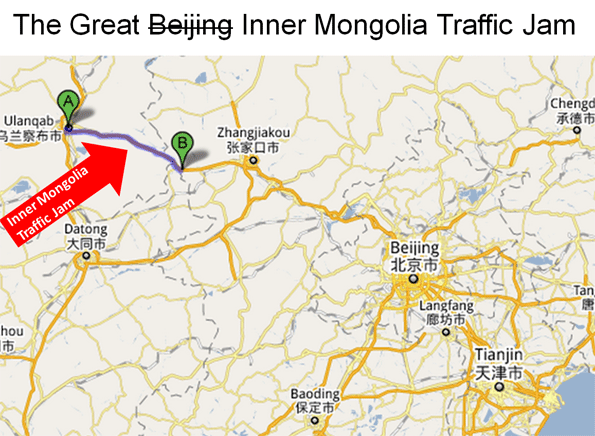
    However, even the New York City example understates the complexity of the Chinese traffic jam. Beijing, China’s national capital, is one of the world’s largest urban areas (with a population of nearly 14 million). The city is situated at the northwestern limit of the densely populated part of China (which is called “China Proper”) that runs from Manchuria in the north to Yunnan in the south.

    Beijing’s urbanization ends at the mountains less than 30 miles from the Forbidden City, Beijing’s core. The area beyond the mountains, through which the Great Wall runs, possesses only intermittent and generally minor urbanization. The area is dominated by grassland, and some rice farming. In this environment, it is not surprising that there were few alternatives for traffic to the G-110 Expressway (freeway), just as there would be few alternatives for traveling between Casper and Cheyenne, Wyoming on Interstate 25.

    Continuing the I-25 comparison, the Inner Mongolian traffic jam more closely resembled traffic destined for Denver, with the congestion stretching from north of Cheyenne for another 60 miles, not far from the south end of the Powder River Basin, America’s largest coal producing region. This is a particularly appropriate comparison, because the type of traffic that caused the Inner Mongolian jam, coal trucks, would similarly jam I-25, were it not for the high-capacity freight rail system that moves most of the coal from the Powder River Basin to the nation’s electricity generation plants in the Midwest, East and South.

    Like Interstate 25, the G-110 Expressway is a high quality divided and grade separated four lane road. As with Wyoming’s I-25, Inner Mongolia has an old 2-lane road (National Route 110) that parallels the G-110 for much of the way. This is not a viable alternative for the truck traffic volumes that are needed to supply the megacity of Beijing with its electric power.

    Beijing’s First World Traffic: The Beijing city commission has announced that traffic flows continue to slow in Beijing. In the first half of 2010, the average speed dropped to 14 miles per hour (24 kilometers per hour). This is despite the fact that the urban area has a world class expressway system, with a fifth ring expressway (beltway) mostly completed (Note 1) and radial expressways feeding the inner areas. The surface arterial system in the inner area consists of a dense network of wide streets, providing capacity that certainly exceeds that of the city of Chicago or the four highly urbanized boroughs of New York, Manhattan, Brooklyn, the Bronx, and Queens (Note 2).

    Beijing’s inner area traffic congestion is like that of New York City. The population density is 30,000 people per square mile (the approximate density also of the four New York boroughs), too high to move the volume of traffic over a freeway and expressway system. Higher population densities are associated with greater traffic congestion, slower speeds, stop and go traffic and more intense pollution. Beijing and New York share all of these conditions.

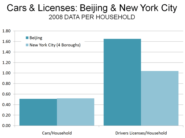
    There is a perception that the traffic situation could become substantially worse in Beijing, and that could well be the case. However, it is surprising that the Bejing (the city/province) is already well along in private vehicle ownership and use. Beijing has achieved a car ownership rate almost equal to that of New York City’s dense boroughs. In 2008, the dense boroughs of New York City had 0.52 cars per household, while Beijing had achieved a 0.51 rate. One report now places Beijing’s car ownership one third higher than in 2008, which would place Beijing’s car ownership rate 20% above that of New York City.

    By 2008, Beijing already had 1.5 times as many drivers per household as New York City’s dense boroughs (Figure 2). The difference appears to be in commercial drivers licenses, which account for nearly one-half of Beijing’s 9.4 million driver’s licenses. With the coal truck traffic and heavy truck traffic to the port of Tianjin, little more than 100 miles (160 kilometers) away, it is possible that trucks comprise a higher share of the traffic volume in Beijing than in New York City (Note 3).

    Local authorities are seeking to reduce the traffic congestion problem by building one of the world’s largest Metro (subway) systems. By the middle of the decade, nearly 350 miles (561 kilometers) should be open. Some lines will extend to outside of the fifth ring road, where much of the population growth is occurring. The Beijing Metro, like that of Mexico City, has been designed to better serve the contemporary urban area. Both are characterized by a concentration of grid routes and less by radial routes. Beijing also has ring routes. This design is especially appropriate for Beijing, which as is typical for many large Asian urban areas and unlike New York, Chicago or Hong Kong, has a decentralized core. Large office buildings in the center are more sparsely spread around a larger area, larger than these concentrated central business districts. Yet, even with this appropriate route design, the decentralization of retail and office activity necessitates time-consuming transfers that can make cars faster, even in Beijing’s traffic.

    China is also encouraging the use of electric cars, subsidizing buyers willing to switch from cars powered by fossil fuels. This will not ease traffic congestion, but it will reduce air pollution.

    At the same time, a period review of traffic conditions on the Internet will show Beijing’s worst traffic congestion to be concentrated in the high density core while in the much less dense expanding suburbs, traffic conditions are considerably better. Additionally, there is discussion of a seventh ring road and Beijing officials continue to improve their roadway network. As in US urban areas, Beijing’s continued decentralization could allow traffic to eventually be managed. Economists Peter Gordon and Harry W. Richardson have found that “suburbanization has been the dominant and successful mechanism for reducing congestion.”

    Clearing the Traffic: Meanwhile, there are reports that authorities have eased the traffic jam in Inner Mongolia. A longer term solution might be to add a couple of additional lanes in each direction. This should not be too difficult in a nation that by the end of the year will have nearly as many miles of freeway (43,000 or 70,000 kilometers) as the original US interstate system and will probably lead the world early in the next decade. This is a key to improving the competitiveness of Chinese urban areas. Sufficient roadway investment to handle growing travel demand will be just as important to maintain the competitiveness of US urban areas.

    —-

    Note 1: Beijing has six ring roads, however the first is the arterial road surrounding the Forbidden City, which is not an expressway.

    Note 2: Staten Island is excluded because its urban form is principally that of a post-war suburb, with a much lower population density.

    Note 3: This assumes comparability of data, which may not be fully reliable due to incomplete information.

    —-

    Wendell Cox is a Visiting Professor, Conservatoire National des Arts et Metiers, Paris and the author of “War on the Dream: How Anti-Sprawl Policy Threatens the Quality of Life

    Photo of Beijing Fourth Ring Road by archlife

  • Commuter Rail Brings Slower Transit in Austin

    Commuter rail is often sold to the public as a faster means of travel than buses. This can be true if the drive to the park and ride lot is short and your destination is within walking distance of a station. However, it is apparently not true in Austin.

    The Austin American-Statesman reports that bus riders showed up at a Capital Metro hearing this week to oppose cancellation of two express bus routes that parallel the new commuter rail line. Their complaint? Taking the train takes longer.

    As has become typical for new urban rail projects, Austin’s commuter rail line is carrying considerably fewer riders than projected. During its first month of service, daily ridership averaged 900 (450 each way), less than one-half the projected 2,000. This is less than 1/100th of Capital Metro’s daily bus ridership.

  • The Housing Bubble: The Economists Should Have Known

    Paul Krugman got it right. But it should not have taken a Nobel Laureate to note that the emperor’s nakedness with respect to the connection between the housing bubble and more restrictive land use regulation.

    A just published piece by the Federal Reserve Bank of Boston, however, shows that much of the economics fraternity still does not “get it.” In Reasonable People Did Disagree: Optimism and Pessimism About the U.S. Housing Market Before the Crash, Kristopher S. Gerardi, Christopher L. Foote and Paul S. Willen conclude that it was reasonable for economists to have missed the bubble.

    Misconstruing Las Vegas and Phoenix: They fault Krugman for making the bubble/land regulation connection by noting that the “places in the United States where the housing market most resembled a bubble were Phoenix and Las Vegas,” noting that both urban areas have “an abundance of surrounding land on which to accommodate new construction” (Note 1).

    An abundance of land is of little use when it cannot be built upon. This is illustrated by Portland, Oregon, which is surrounded by such an “abundance of land.” Yet over a decade planning authorities have been content to preside over a 60 percent increase in house prices relative to incomes, while severely limiting the land that could have been used to maintain housing affordability. The impact is clearly illustrated by the 90 percent drop in unimproved land value that occurs virtually across the street at Portland’s urban growth boundary.

    Building is largely impossible on the “abundance of land” surrounding Las Vegas and Phoenix. Las Vegas and Phoenix have virtual urban growth boundaries, formed by encircling federal and state lands. These are fairly tight boundaries, especially in view of the huge growth these areas have experienced. There are programs to auction off some of this land to developers and the price escalation during the bubble in the two metropolitan areas shows how a scarcity of land from government ownership produces the same higher prices as an urban growth boundary

    Like Paul Krugman, banker Doug French got it right. In a late 2002 article for the Nevada Policy Research Institute, French noted the huge increases auction prices, characterized the federal government as hording its land and suggested that median house prices could reach $280,000 by the end of the decade. Actually, they reached $320,000 well before that (and then collapsed).

    In Las Vegas, house prices escalated approximately 85% relative to incomes between 2002 and 2006. Coincidentally, over the same period, federal government land auctions prices for urban fringe land rose from a modest $50,000 per acre in 2001-2, to $229,000 in 2003-4 and $284,000 at the peak of the housing bubble (2005-6). Similarly, Phoenix house prices rose nearly as much as Las Vegas, while the rate of increase per acre in Phoenix land auctions rose nearly as much as in Las Vegas.

    In both cases, prices per acre rose at approximately the same annual rate as in Beijing, which some consider to have the world’s largest housing bubble. According to Joseph Gyourko of Wharton, along with Jing Wu and Yongheng Deng Beijing prices rose 800 percent from 2003 to 2008 (Figure). This is true even thought we are not experiencing the epochal shift to big urban areas now going on in China.

    The Issue is Land Supply: The escalation of new house prices during the bubble occurred virtually all in non-construction costs such as the costs of land and any additional regulatory costs. It is not sufficient to look at a large supply of new housing (as the Boston Fed researchers do) and conclude that regulation has not taken its toll. The principal damage done by more restrictive land regulation comes from limiting the supply of land, which drives its price up and thereby the price of houses. In some places where there was substantial building, restrictive land use regulations also skewed the market strongly in favor of sellers. This dampening of supply in the face of demand drove land prices up hugely, even before the speculators descended to drive the prices even higher. Florida and interior California metropolitan areas (such as Sacramento and Riverside-San Bernardino) are examples of this.

    Missing Obvious Signs: There are at least two reasons why much of the economics profession missed the bubble.

    (1) Unlike Paul Krugman, many economists failed to look below the national data. As Krugman showed, there were huge variations in house price trends between the nation’s metropolitan areas. National averages mean little unless there is little variation. Yet most of the economists couldn’t be bothered to look below the national averages.

    (2) Most economists failed to note the huge structural imbalances that had occurred in the distorted housing markets relative to historic norms. Since World War II, the Median Multiple, the median house price divided by the median household income, has been 3.0 or less in most US metropolitan markets. Between 1950 and 2000, the Median Multiple reached as high as 6.1 in a single metropolitan area among today’s 50 largest, in a single year (San Jose in 1990, see Note 2). In 2001, however, two metropolitan areas reached that level, a figure that rose to 9 in 2006 and 2007. The Median Multiple reached unprecedented and stratospheric levels in of 10 or more in Los Angeles, San Francisco, San Diego and San Jose- all of which have very restrictive land use and have had relatively little building. This historical anomaly should have been a very large red flag.

    In contrast, the Median Multiple remained at or below 3.0 in a number of high growth markets, such as Atlanta, Dallas-Fort Worth and Houston and other markets throughout the bubble.. Even with strong housing growth, prices remained affordable where there was less restrictive land use regulation.

    Seeing the Signs: Krugman, for his part, takes a well deserved victory lap in a New York Times blog entitled “Wrong to be Right,” deferring to Yves Smith at nakedcapitalism.com who had this to say about the Federal Reserve Bank of Boston research:

    It is truly astonishing to watch how determined the economics orthodoxy is to defend its inexcusable, economy-wrecking performance in the run up to the financial crisis. Most people who preside over disasters, say from a boating accident or the failure of a venture, spend considerable amounts of time in review of what happened and self-recrimination. Yet policy-making economists have not only seemed constitutionally unable to recognize that their programs resulted in widespread damage, but to add insult to injury, they insist that they really didn’t do anything wrong.

    Maybe we should have known better: beware economists bearing the moment’s conventional wisdom.

    ——

    Note 1: The authors cite work by Albert Saiz of Wharton to suggest an association between geographical constraints and house price increases in metropolitan areas. The Saiz constraint, however, looks at a potential development area 50 kilometers from the metropolitan center (7,850 square kilometers). This seems to be a far too large area to have a material price impact in most metropolitan areas. For example, in Portland, the strongly enforced urban growth boundary (which would have a similar theoretical impact on prices) was associated with virtually no increase in house prices until the developable land inside the boundary fell to less than 100 square kilometers (early 1990s). A far more remote geographical barrier, such as the foothills of Mount Hood, can have no meaningful impact in this environment.

    Note 2: William Fischel of Dartmouth has shown how the implementation of land use controls in California metropolitan areas coincided with the rise of house prices beyond historic national levels. As late as 1970, house prices in California were little different than in the rest of the nation.

    Wendell Cox is a Visiting Professor, Conservatoire National des Arts et Metiers, Paris and the author of “War on the Dream: How Anti-Sprawl Policy Threatens the Quality of Life

    Photograph: $575,000 house in Los Angeles (2006), Photograph by author

  • China’s Sliver of a Housing Bubble

    Few finance issues have received such a wide range of opinions among financial experts than the “housing bubble” in China. This is an issue of international importance because what happens in what is now the world’s 2nd largest economy affects the rest of the world.

    Differing Views: There are frequent reports of excessively high purchase prices on new housing, which when compared with measures of average household income make it appear that China has the highest house price to income ratios in history. Andy Xie, a Shanghai economist formerly with Morgan Stanley sees a huge housing bubble, which he expects to burst. Stephen Roach, chairman of Morgan Stanley Asia denies there is a bubble, claiming that there is sufficient demand from the continuing migration to the cities for the housing market to be healthy.

    I have been reluctant to weigh in on the debate, simply because there has been insufficient data available to calculate inferior housing affordability measures (such as average price to average income), much less the data that would permit Median Multiples to be calculated. (The Median Multiple is the “middle” house price divided by the “middle” household income and is optimal for measuring middle income housing affordability).

    The problems in assessing China’s housing affordability have been manifold:

    • There has been virtually no median household income data.
    • There appears to be no data available on the median house price

    This means that it is impossible to calculate the Median Multiple.

    Housing Occupancy in Urban China

    Having visited all but two of China’s 20 largest urban areas and traversed them, east to west and north to south from the countryside to the countryside (as I do in obtaining photos and impressions for my “Rental Car Tours“), however, two things are obvious.

    • New high-rise housing is being built at a furious pace in the largest urban areas.
    • Nonetheless, the volume of this new housing pales by comparison to the lower rise, older housing that was built before the present boom (which appears to have started in the 1990s). It is clear that the vast majority of people do not live in the new high rise buildings.

    Nonetheless the press has been filled with absurd reports to the effect that there are 65 million empty housing units in China. The absurdity of this now discredited number is illustrated by the following.

    (1) All of China’s urban areas with more than 500,000 population, where much of the new high rise housing has been built, have less than 300 million people. At the average household size, this means there are no more than 100 million households. In such an environment, 65 million empty units would stick out like a sore thumb. They do not.

    (3) 65 million vacant units is more houses than have been constructed since 1990.

    The New National Economic Research Institute Data: Finally, however, some clarity may be being brought to the issue. Credit Suisse sponsored groundbreaking research by National Economic Research Institute (NERI) of the China Reform Foundation in Beijing, which was led by Deputy Director Dr. Wang Xiaolu. Dr. Wang’s principal contribution is to show that household incomes are considerably higher in China than official statistics indicate. This “grey income” or “hidden income” includes bonuses paid by local governments, payments to public officials, revenues from land development and other sources of income that are not reported in official data and amounts to 90% more than reported figures (report (Analyzing Chinese Grey Income, published by Credit Suisse). In the top decile (top 90-100% of household incomes), grey income added 200% to reported incomes, while in the second decile (80%-90%), grey income more than doubled reported incomes. Buried in the NERI report is median household income data and average multiple housing affordability indicators that are the best information yet made available.

    China’s Average Multiple: Credit Suisse analyst Jinsong Du takes the NERI further to calculate housing affordability indicators that are far below the claims about the Chinese housing bubble. The average (mean) house price was 4.0 times the average disposable household income in 2008, after accounting for “grey income.” Based upon the national ratio of gross income to disposable income (from the China Yearbook), this would indicate an “average multiple” (average house price divided by gross average household income) of 3.7. This is similar to the US average multiple figure of 3.4 (Figure 1) in the same year (2008).

    China’s Median Multiple? This leaves the question of the Median Multiple. There is still no available median house price data. However, it is clear that the new housing is largely irrelevant to median house prices. According to data in the China Yearbook (Table 5-42), only 13% of the 31 million new houses were affordable to lower and middle income people (Figure 2). The new luxury units, with their widely touted prices, remain a minority of the houses, and, as a result, none of these can be the “middle” or median price

    In fact, the median priced house could be of a design similar to a Danwei (live-work unit) type design built before 1990. This is the type of housing that any walk or drive through a Chinese urban area will demonstrate to be dominant (and which is illustrated in the photograph above). There are huge disparities in both house prices and incomes in China. It would not be surprising for China’s Median Multiple to be similar to its average multiple, as is the case in the United States.

    Further, there is a huge difference between the US bubble and the Chinese bubble. In the United States the bubble drove up prices across all income spectrums in the impacted metropolitan areas. It burst largely because middle income households had taken on debt they could not afford. In China, the bubble may be limited to the top of the income scale, the very households that NERI finds are making two to three times as much as the official reports indicate.

    China’s Sliver of a Bubble: None of this is to suggest that house prices at the top of the market are not high. One of America’s leading housing economists, Joseph Gyourko of Wharton, along with Jing Wu and Yongheng Deng found that residential real estate auction prices rose 800% from 2003 to 2008 in Beijing (Note). Recently the government has taken action to cool the high end of the market and to encourage development of more housing for middle and lower income households. At the same time, the Gyourko research team found that new house prices had fallen relative to household incomes in Chengdu, Wuhan, Tianjin and Xi’an, all urban areas with more than 4,000,000 population.

    To accurately assess housing affordability it is necessary to have complete data. Housing affordability cannot be assessed in London using data from Belgravia, nor will Upper East Side data tell an accurate story about New York. The same is true in China. Stephen Roach said that China has a “sliver of a bubble.” That’s what the data seems to show.

    ——————

    Note: This annual rate of increase is approximately the same as was experienced in per acre government land sales in Las Vegas and Phoenix before the peak of the bubble (both urban areas are tightly ringed by “virtual” urban growth boundaries composed of government owned land).

    Wendell Cox is a Visiting Professor, Conservatoire National des Arts et Metiers, Paris and the author of “War on the Dream: How Anti-Sprawl Policy Threatens the Quality of Life

    Photograph: Median priced (?) flats in Fushun, Liaoning (photograph by the author)

  • Australian Opposition to Loosen Land for Housing

    The opposition Liberal-National Coalition, locked in a close battle with the ruling Labor Party in Australia’s Saturday elections, has adopted a housing policy to improve the nation’s housing affordability. The policy would require states to monitor housing affordability and to release more land for development. There would also be a review of the efficacy of development charges.

    Australia suffers from some of the most unaffordable housing in the world, with a Median Multiple (median house price divided by median household income) of 6.8, which is more than double the historic norm of 3.0. With recent interest rate increases, the median household would have to pay more than 50% of its gross income to service a mortgage on the median priced house. Little more than 15 years ago, house prices were affordable in Australia, which had seen home ownership rise from approximately 40% before World War II to approximately 70%. The principal cause of the loss of housing affordability has been the virtual universal adoption of “smart growth” (“urban consolidation”) land use restrictions, which have (among other things) made it virtually impossible to develop inexpensive housing on the urban fringes, with the price of rationed land driven up many times.

    The Coalition’s housing policy includes the following provisions that are directly related to removing the urban consolidation barriers to affordable housing:

    In order to continue to receive federal funds, States and Territories will need to increase land supply and reform their planning and approval systems under the National Affordable Housing Agreement (NAHA).
    States and Territories will need to set affordability targets to guide land releases and dwelling approvals. In order to receive federal funds States and Territories would need to demonstrate that they had a plan for delivering these targets and those approvals and land releases occurred consistent with the targets established.
    The Coalition will review of State, Territory and local developer charges, which have been contributing an increasing component to the cost of development. State and local governments that build higher charges into the cost of housing will be less able to meet their home affordability obligations under the Compact.

    Housing affordability has been an issue of substantial concern in Australia for years and has emerged as the top concern among voters in this election. State governments have talked about housing affordability, but have done little. Over the past five years, house prices have continued to rise relative to incomes. Just in the last nine months, a mortgage payment on the median priced house has risen from $500 in Adelaide to more than $800 in Sydney.

    The Coalition policy, however, represents the second significant development in recent weeks (Note). The first was an expansion of the Melbourne urban growth boundary by 440 square kilometers. All of this may signal an overdue attention to housing affordability in Australia.

    —–

    Note: Performance Urban Planning statement on the Coalition housing policy.

    —–

    Photograph: Adelaide: Urban fringe land (no houses allowed). Photograph by author

  • New York Commuting Profile: From Monocentrism to Edgeless City

    The US Bureau of the Census has just released detailed county to county and place (municipality) to place work trip flow tables. This new data is the most comprehensive since the 2000 census and covers 2006 to 2008.

    The county to county data is particularly useful for analysis in the nation’s largest metropolitan area (Note 1), New York. The New York metropolitan area has more than 19 million people and stretches across 6,700 square miles of land area, one half of it in the urban area, which is the urban footprint that includes all areas, including suburbs, in the continuous urbanization (3,350 square miles) and the other half rural (Note 2). This area is composed of 23 counties, which makes far finer grain analysis possible than in Los Angeles, with just two counties or San Diego, where its single county precludes any county based metropolitan area analysis.

    The New York metropolitan area’s counties extend east to west from Suffolk on Long Island to Pike in Pennsylvania and north to south from Putnam in the Hudson Valley to Ocean on the New Jersey shore. Surprisingly, it does not include Fairfield and New Haven counties in Connecticut, which have strong economic ties to the urban area (and which are a part of the larger, Census designated “combined statistical area”). Indeed, major parts of these two counties can be considered part of the New York urban area (Note #3).

    Median house age is a useful indicator of the urban form in segments of a metropolitan area. This examination breaks the New York metropolitan area into rings. The core is New York County (Manhattan, where the median construction date of owned dwellings is 1942). The first ring is the other four boroughs of New York City. The inner ring includes counties outside the city in which the median aged house was built in the 1950s, while the outer ring includes counties in which the median aged house was built in the 1960s or later. The one anomaly is Staten Island (Richmond County) which although politically part of the city of New York, demonstrates a mean housing age closer to that of the outer ring (median construction date 1971). Visually it resembles late suburban New Jersey much more than it does the rest of the city. However, Staten Island’s strong ties to the city justify its classification with the other boroughs.

    Comparatively Centralized: New York is one of the most centralized large urban areas in the high income world,with only Tokyo ranking higher among areas over 5 million population. The Manhattan business district, located to the south of 59th Street is the world’s second largest (following Tokyo’s Yamanote Loop). But in terms of employment density Manhattan has more than double the employment density. What was, at least until recently, indisputably the world’s most spectacular skyline leads many to conclude that nearly everyone works in Manhattan.

    A Highly Decentralized Metropolitan Area: Yet in reality, New York is a highly decentralized metropolitan area. Approximately 74% of employment is outside Manhattan and the jobs are comparatively evenly dispersed among the sectors. There is more employment in the inner ring suburbs than in Manhattan (28%). Even the outer ring is competitive has nearly as many jobs, at 24%. Finally, the balance of the city, the four boroughs, has 22% of the employment (Figure 1).

    Wide Variations in the Jobs-Housing Balance: It is hard to understate the intensity of Manhattan’s central business district employment. Manhattan has 2.71 jobs for every resident worker. An important tenet of modern urban planning theory is to achieve a balance of jobs and housing. Manhattan’s jobs/housing imbalance is certainly the most acute of any county in the United States, yet it is to Manhattan that purveyors of smart growth densification policies are routinely drawn.

    Manhattan’s huge excess of jobs contrasts with employment the rest of the the city, where the jobs-housing balance at the county level is 0.67, the lowest in the metropolitan area. The inner ring suburbs have the highest jobs-housing balance at 0.93, while the outer suburbs have a jobs-housing balance of 0.87 (Figure 2), nearly one-third higher than the non-Manhattan boroughs (three of which are more dense than any major municipal jurisdiction in the nation). The city’s strongest jobs-housing balance is in Brooklyn (Kings County), at 0.72, which is lower than all of the suburban counties except for the most remote (Pike, Putnam and Sussex).

    Manhattan’s Impact: Diminishing Rapidly with Distance: There is no doubt that Manhattan remains the core of the New York economy, but that is less true the further you go out. While nearly 70% of the core’s workers commute from outside Manhattan, the employment influence of Manhattan drops off like the temperature falls the further you get away from a fireplace.

    86% of Manhattan’s resident workers have jobs in Manhattan, but only 35% of workers living in the city’s other boroughs work in Manhattan. This falls off to 14% in the inner suburban counties and 6% in the outer suburban counties (Figure 3). In Sussex County and Ocean County, New Jersey, only 2% of resident workers commute to Manhattan.

    Working Close to Home: At the same time a larger number of resident workers outside Manhattan work in their home counties than work in Manhattan. In the balance of the city, 46% of workers have jobs in the same counties. The inner suburban counties employ 56% of their resident workers, while the outer suburban counties employ 63%. Overall, 58% of New Yorkers work in their county of residence, more than double the share that work in Manhattan (Figure 4). In Richmond County (Staten Island), Suffolk County and Rockland counties in New York and Pike County, Pennsylvania, more than 80% of jobs are filled by local residents.

    Local Workers Generally Come from the Same Counties: A review of the residential location of workers by job location reinforces the dominantly local nature of commuting in New York. Overall, 56% of jobs are filled by residents of the same county. The figure is the highest in the outer ring suburban counties, at 73%. The inner ring suburban areas draw 60% of their workers from the same county, while the balance of the city draws 69%. In Manhattan, with its seriously out of balance jobs and housing, just 32% of the jobs are filled by it residents (Figure 5).

    Dispersion: Past and Present. All of this is a huge change from a half-century ago. In 1956 (according to data in the classic Anatomy of A Metropolitan Area, by Edgar M. Hoover and Raymond Vernon), Manhattan accounted for 43% of the metropolitan area’s employment (1950 metropolitan definition). Since that time, employment has fallen substantially in Manhattan and risen elsewhere. There have been gains in the outer boroughs, related principally to the strong population growth Queens and Staten Island. There were also gains in the inner suburban counties. The strongest gains were in the outer suburban counties (Figure 6).

    The dispersion is continuing. As Ed McMahon and I showed in Empire State Exodus, there is considerable migration from New York to Pennsylvania, as people are moving to metropolitan areas such as Allentown and Wilkes-Barre. Obviously, as the modest level of commuting from the outer counties of metropolitan New York indicates, relatively few of these people are commuting to Manhattan. This impression may be more a product of the fact the Manhattan-based media only recognizes workers when they actually make it into town; those who stay in the periphery, it seems, might as well live on another planet.

    New York, with as by far the strongest central business district in the nation, still has moved from virtual monocentrism, to the Edge Cities polycentrism of Joel Garreau and increasingly even to the amorphous Edgeless Cities employment dispersion of Robert Lang. The strong core continues to regenerate, but no longer exerts anything like its former dominant influence.

    ——-

    Note 1: For complete data.

    Note 2: For a description of urban terms (metropolitan area, urban area, etc).

    Note 3: Demographia World Urban Areas includes the continuous urbanization of southwestern Connecticut as a part of the New York urban area.

    ——-

    Table 1
    COMMUTING IN THE NEW YORK METROPOLITAN AREA (2006-2008): SUMMARY BY GEOGRAPHIC RING
    RINGS Ring Jobs/Housing Balance (Jobs per Resident Worker) Workers Employed in Residence County Share of Jobs Filled by County Residents Workers Employed in New York County (Manhattan) Average One-Way Work Trip Time (Minutes): Residence Average One-Way Work Trip Time (Minutes): Workplace Median Year Owned Housing Built
    NYC: Manhattan 1 2.719 86.3% 31.7% 86.3%                30.3                49.1 1942
    NYC: Balance 2 0.674 46.4% 68.8% 35.6%                42.0                37.3 1939-1971
    Inner Ring 3 0.927 56.0% 60.4% 14.4%                30.5                29.1 1950-1956
    Outer Ring 4 0.870 63.1% 72.5% 6.2%                31.3                26.0 1967-1983
    New York MSA 1.000 57.6% 57.6% 26.1%                34.5                35.5 1955
    Derived from American Community Survey data (2006-2008)
    Note: MSA work trip times (residence and work location) differ because commuters from outside the MSA are included


    Table 2
    COMMUTING IN THE NEW YORK METROPOLITAN AREA (2006-2008): SUMMARY BY COUNTY
    COUNTIES Ring Jobs/Housing Balance (Jobs per Resident Worker) Workers Employed in Residence County Share of Jobs Filled by County Residents Workers Employed in New York County (Manhattan) Average One-Way Work Trip Time (Minutes): Residence Average One-Way Work Trip Time (Minutes): Workplace Median Year Owned Housing Built
    New York Co., NY 1 2.719 86.3% 31.7% 86.3%                30.3                49.1 1942
    Bronx Co., NY 2 0.676 44.3% 65.6% 36.8%                41.1                35.7 1950
    Kings Co., NY 2 0.721 51.2% 71.0% 36.7%                42.3                39.0 1939
    Queens Co., NY 2 0.645 42.4% 65.7% 36.0%                42.0                37.5 1949
    Richmond Co., NY 2 0.585 47.3% 80.8% 26.3%                42.7                29.8 1971
    Bergen Co., NJ 3 0.960 56.7% 59.1% 15.0%                29.3                27.2 1956
    Essex Co., NJ 3 1.052 53.6% 50.9% 9.7%                30.8                31.8 1953
    Hudson Co., NJ 3 0.892 47.1% 52.8% 23.6%                32.4                35.1 1950
    Passaic Co., NJ 3 0.797 45.3% 56.8% 4.3%                27.0                28.0 1954
    Union Co., NJ 3 0.969 50.7% 52.3% 7.1%                33.0                27.6 1954
    Nassau Co., NY 3 0.884 59.1% 66.8% 14.8%                31.6                30.0 1954
    Westchester Co., NY 3 0.928 67.3% 72.6% 19.9%                33.6                27.7 1955
    Hunterdon Co., NJ 4 0.736 49.5% 67.2% 3.7%                31.4                28.2 1978
    Middlesex Co., NJ 4 0.943 58.5% 62.0% 7.7%                26.9                25.8 1968
    Monmouth Co., NJ 4 0.880 63.4% 72.0% 8.2%                33.2                23.8 1970
    Morris Co., NJ 4 1.097 58.7% 53.5% 5.4%                29.4                31.2 1967
    Ocean Co., NJ 4 0.723 63.4% 87.7% 2.0%                31.1                21.3 1977
    Somerset Co., NJ 4 0.988 46.7% 47.3% 5.6%                31.0                31.1 1978
    Sussex Co., NJ 4 0.565 44.5% 78.8% 2.3%                38.2                23.7 1972
    Putnam Co., NY 4 0.441 30.9% 70.1% 8.0%                37.0                24.4 1967
    Rockland Co., NY 4 0.763 61.2% 80.1% 12.0%                29.8                25.1 1969
    Suffolk Co., NY 4 0.872 76.2% 87.4% 5.7%                29.8                23.5 1967
    Pike Co., PA 4 0.574 45.9% 80.0% 4.6%                44.1                25.2 1983
    New York MSA 1.000 57.6% 57.6% 26.1%                34.5                35.5 1955

    ——-

    Wendell Cox is a Visiting Professor, Conservatoire National des Arts et Metiers, Paris and the author of “War on the Dream: How Anti-Sprawl Policy Threatens the Quality of Life

    Photo: Levittown (Nassau County): Inner Suburban (photo by author)

  • Misunderstanding the Bubble and Burst in Sacramento

    An opinion piece in the Sacramento Bee by Sean Wirth of the Environmental Council of Sacramento could not have been more wrong in its characterization of the causes of the housing bubble in Sacramento.

    The article starts out promisingly, correctly noting that:

    • The housing bubble spawned the Great Recession
    • Demand exceeded the inventory of houses in the Sacramento area
    • Sacramento prices “soared sky high”


    But it is all downhill from there, with the suggestion that the extraordinary price increases in Sacramento were the result of too much suburbanization (the theological term in urban planning circles is “sprawl”). In fact, all things being equal, house prices tend to escalate where the supply is more constrained, not less. Where suburbanization is allowed, the market can supply enough housing to avoid inordinate house price increases. Where suburbanization is severely constrained, a legion of evidence indicates that house prices are prone to rise. It is all a matter of basic economics. George Mason University economist Daniel Klein puts it this way:

    Basic economics acknowledges that whatever redeeming features a restriction may have, it increases the cost of production and exchange, making goods and services less affordable. There may be exceptions to the general case, but they would be atypical.

    Housing is not atypical and Sacramento house prices soared in response to the tough use regulations. By the peak of the bubble, the Median Multiple (median house price divided by median household income) had risen to 6.8, well above the historic norm of 3.0. Many houses were built, but not enough to satisfy the demand, as Mr. Wirth indicates. Building many houses is not enough. There need to be enough houses to supply the demand, otherwise land prices soar, driving up house prices.

    Unless a sufficient supply is allowed, speculators and flippers will “smell the blood” of windfall profits, which are there for the taking in excessively regulated markets.

    During the housing bubble, house prices rose well above the historic Median Multiple norm only in metropolitan areas that had severe constraints land use constraints (called “smart growth” or “growth management”). This included Sacramento, other California markets, Miami, Portland, and Seattle and other markets around the country.

    At the same time, more liberal development regulations allowed a sufficient inventory of housing to meet the demand in high growth areas like Atlanta, Dallas-Fort Worth, Houston and Austin. In each of these places (and many others), the Median Multiple remained near or below the historic norm of 3.0, even with the heightened demand generated by a finance sector that had lost interest in credit-worthiness. As would be expected, speculators and flippers avoided the traditionally regulated markets, where an adequate supply of affordably priced housing continued to be produced.

    Wirth expresses understandable concern about the house price losses since the bust. From the peak to the trough, the drop in Sacramento median house prices was more than 55%. However, this is to be expected once a serious economic decline is precipitated, especially in the sector that precipitated the crash (in this case housing). Economists Ed Glaeser of Harvard and Joseph Gyourko of Wharton have shown that not only (1) are house prices higher in more restricted markets but also that (2) there is greater price volatility in more highly regulated markets. Indeed, it is likely that the housing bust would have been much less severe or even avoided altogether if constraints on land had not driven the prices and subsequent mortgage losses so high in California and a few other states that they could not be absorbed by financial institutions. At the time of the Lehman Brothers collapse, 11 “ground zero” markets (including Sacramento), all highly regulated, accounted for 75% of the mortgage losses in the nation, with a per house loss rate of 15 times that of traditionally regulated markets.

    Wirth’s article expresses opposition to a Sacramento County decision to allow more development to occur on the urban fringe. He would prefer to force development into the existing urban footprint. The economic consequences of such folly are well known. In Australia, such policies have driven led to a doubling or tripling of house costs relative to incomes. The annual mortgage cost of the median priced house has risen to 50% of the median pre-tax household income, in a country that defines mortgage stress at the 35% level. Before the adoption of smart growth policies, Australia’s housing affordability was similar to that of liberally regulated markets in the United States.

    Avoiding the next housing bubble requires not repeating the mistakes that led to the last. Sacramento’s young and lower income households can only hope that the additional land approved by the Board of Supervisors will be enough of a safety valve to keep housing affordable so that they can become owners rather than renters.

    Photograph: Sacramento (author)

  • Cars, People & Carbon Neutrality: A Symbiosis

    The potential for a symbiotic relationship between the environment, cars and people may be about to take a giant leap forward. London’s Daily Telegraph reports that a group of engineers from Genco have developed a bio-bug (Volkswagen bug) that runs on human waste. The car is powered for 10,000 miles from the excrement from 70 households (annually). The human waste bio-bug would be carbon neutral because it would not add any greenhouse gas to that already produced. The fuel would be produced at sewage plants, which already produce the necessary methane fuel from waste. While the technology, fully implemented, would not produce sufficient methane to power the entire fleet of cars, it would be a significant step forward and is further indication of the potential for technology to make substantial greenhouse gas emission reductions.

    Bio-Bug Photo

  • Vancouver: Moving to the Suburbs

    A few weeks ago, The New York Times touted purported savings that a household would save by living in the core city of New York (in Brooklyn) instead of the suburbs (South Orange, New Jersey). The article downplayed the 1,000 fewer square feet the money bought in Brooklyn and did not consider the 40% higher cost of living.

    The Province in Vancouver has now followed with a near identical story, except that the urban household in will make do with even less space. The city of Vancouver household will live in 800 square feet, or 1,200 fewer square feet in the high rise condominium than in a suburban Coquitlam detached house used in the comparison. Like The Times, The Province is little concerned with the smaller size of the house and misses the fact that the cost of living is from 10% to 20% less in the suburbs and exurbs than it is in the city of Vancouver.

    Nonetheless, according to Tsur Somerville, director of the University of British Columbia UBC Centre for Urban Economics and Real Estate, who assisted in developing the figures for The Province, “If all they cared about were the dollars, they wanted to have $600,000 worth of real estate and then minimize their out-of-pocket costs, all else being considered, then being in the city is better,” A commenter appropriately notes the volatility of strata (condominium association) fees, which suggests that out-of-pocket costs could rise significantly.

    Canadians are not listening to “their betters” any more than Americans. US Census data indicates a continuing strong migration of people from the central cities and strong migration to the suburbs, despite heroic efforts on the part of the media and others to mask the reality.

    “Being in the city” may be preferable to some in the Vancouver area, however not to the majority of the age group (25 to 44 years) most likely to move is voting for the suburbs, according to a recent Statistics Canada report. According to the report:

    “… there continues to be a migration of many young adults and families from central municipalities to surrounding municipalities, while few move in the opposite direction.”

    For every one person who moved from the suburbs to the city of Vancouver between 2001 and 2006 (in the age group):

    • Among all in the age group, 1.8 people moved to the suburbs from the city for every person moving to city from the suburbs.
    • Among those in the age group with advanced degrees, 1.7 people moved to the suburbs for every person moving to the city.
    • Among those earning $100,000 to $150,000, 3.4 people moved to the suburbs for every person moving to the city. The ratio fell to 2.0 times for those making over $150,000.
    • More than 25% of the age group population who had their first children between 2001 and 2006 moved to the suburbs from the city, more than five times as many as moved to the city from the suburbs.

    A table in the Statistics Canada report shows people in “creative class” occupations moving in greater numbers to the suburbs than to the city.

    However, not everyone is moving in larger numbers to the suburbs.

    • More of the lowest income people are moving to the city than to the suburbs.
    • Artists have moved in greater numbers to the city than to the suburbs.
    • University professors and other university personnel have moved in greater numbers to the city than to the suburbs, perhaps explaining why so many in these groups misunderstand the direction of the migration.

    The Statistics Canada report provided a similar analysis for Canada’s two larger metropolitan areas, Toronto and Montreal. In Toronto, moves to the suburbs were 3.5 times moves to the city, while in Montreal 2.7 central city dwellers moved to the suburbs for every suburbanite moving to the city. This does not, however, necessarily indicate that the exodus to the suburbs is stronger in Toronto and Montreal. It is rather an indication of the fact that these two central cities represent a larger share of their metropolitan population than Vancouver. This means that more of the core out-migration is captured in Toronto and Montreal.

    So, the media continues the “drumbeat” and the people keep marching — in the opposite direction.

  • Melbourne: Government Seeking Housing Affordability

    Once a country known as “lucky” for its affordable quality of life, Australia has achieved legendary status as a place where public policies have destroyed housing affordability for the middle class. Draconian land rationing policies (called “urban consolidation” in Australia and more generally “compact city” policy or “smart growth”), have made it virtually illegal to build houses outside tightly drawn urban growth boundaries that leave virtually no room for new construction beyond the urban fringe. As a result, house prices have increased to the point that Australia now suffers one of the most unaffordable markets in the world.

    The consequences of this may finally be dawning on some governments. The state of Victoria, for example, is expanding its urban growth boundary around Melbourne.

    Severely Unaffordable Australia: The Reserve Bank of Australia (the central bank) has described the considerable extent to which house prices have increased relative to incomes since the 1980s. The annual Demographia International Housing Affordability Survey makes similar findings, showing that the price of housing has doubled or tripled relative to household incomes over the past quarter century. All major markets in Australia are “severely unaffordable.” This has occurred in a country that has long boasted one of the largest home ownership shares in the world, which epitomized the “Great Australian Dream.” Until urban consolidation policies were widely adopted and strictly enforced, Australia’s housing affordability (measured by the Median Multiple, which is the median house price divided by median household income) was virtually the same as that of the United States.

    That has changed radically. Over the past two years, the median house price in Melbourne, has risen by 30%.

    Expanding Melbourne’s Urban Growth Boundary: In this environment, it comes as welcome news that the Brumby Labor government has enacted an expansion of the Melbourne urban growth boundary. The initiative attracted broad based support, including that of the Liberal-National opposition in the Victoria (state) parliament. The government expects that the expansion will “maintain” housing affordability.

    There was, not surprisingly, the kind of hysteria that has become typical of Australian land use debates. Suburban Casey Mayor Lorraine Wreford expressed concern that the expansion would consume agricultural land and increase food costs. In fact, the higher costs that Melburnians are paying for housing as a result of the urban growth boundary is more than enough to pay grocery bills for the neighbors on both sides.

    The “loss of agricultural land” argument is even more daft in Australia than in the United States. Australia’s agricultural production continues to improve, which has permitted huge amounts of land to be abandoned and returned to its natural state. Since 1981, an area nearly the size of New South Wales has been taken out of agricultural production. Lest anyone think that urbanization is a factor, this is more than 50 times the land area of all the urbanization that has developed in Australia since western colonization began.

    Will it be Enough? The risk, however, is that the urban growth boundary expansion may not be enough to materially improve housing affordability. The expansion is modest, at less than 170 square miles (440 square kilometers*). Worryingly, the government indicates that this will be the last urban growth boundary expansion in this generation.

    How Much Land is Needed for Housing Affordability? However, US experience indicates that a surprisingly small amount of developable land beyond the urban fringe may be enough to keep land and house prices from escalating.

    For example, Portland’s urban growth boundary appears to have had little cost escalation impact on house prices until the 1990s, when urban fringe developable land within the urban ground boundary fell to less than 10% compared in relation to the already developed urban footprint (Note). This is the equivalent of a developable ring around Portland of less than one/half mile (0.8 kilometers in Portland).

    As the developable land became more scarce, house prices escalated. Now, Portland house prices are more than one-third above the historic Median Multiple norm of 3.0 and they peaked at more than 60% above during the housing bubble.

    Similarly, there are virtual urban growth boundaries in Las Vegas and Phoenix. These development constraints are defined by circumferential government owned land, which has been released to the market at rates intended to maximize revenues, which means they minimize housing affordability. Yet these constraints appear to have had little impact on prices until developable fringe land dropped to below 20% relative to the urban footprint.

    Strengthening Melbourne’s Competitive Position? The Victorian action may have been impelled by a recognition that the affordability-driven economic stagnation already existent in Sydney could well spread. This could help to restore Melbourne to its role as Australia’s principal urban area, more than a century after having been dethroned by Sydney. Bernard Salt, one of the nation’s leading demographers, has predicted that Melbourne’s population will exceed that of Sydney by in less than 20 years.

    Offering Australia’s future generations the chance to live out the Great Australian Dream by improving housing affordability could not only expand Melbourne’s competitive edge over Sydney, but could even neutralize fast-growing Brisbane’s trajectory. Ross Elliot has suggested that the new Southeast Queensland Regional plan could seriously retard growth in that vibrant area.

    Are Australian House Prices in a Bubble?

    There is a raging debate over whether Australia’s housing price boom is an asset bubble. International financial analysts Edward Chancellor, who correctly predicted the Great Recession, believes that Australian housing is a bubble that will burst before long. Others disagree. Either way, Australia loses.

    • If Australia’s price boom is a bubble, history says it will burst (as virtually all do), likely inflicting serious damage to the economy. In this regard, Australia could be more at risk than the United States was in its housing bubble burst, since housing in virtually every market, large and small, has been driven up to unsustainable levels. In the United States, the bubble was contained within markets accounting for about one-half of housing, where Australian-type planning policies were in operation. Other markets, such as Houston, Dallas-Fort Worth, Atlanta and much the Great Plains did not experience the bubble.
    • If Australia’s planners have simply succeeded in raising the long term price of housing and there is no bubble (as many Australian analysts suggest), then future generations of Australians will have much less money to spend and their standard of living will lower than it would otherwise have been.

    Regrettably, the spirited debate over an Australian “bubble” is far different that the public deliberations that preceded the adoption of urban consolidation policies in Australia. For the most part, state governments and planning academics carefully avoided any discussion of the housing affordability consequences. Perhaps this was out of ignorance. But whatever the intentions, the smart growthers have imposed great costs on both present and future generations of Australians.

    —–

    Note: This is a far smaller area than recent research suggesting a relationship between geographic constraints (mountains and other undevelopable land) and higher house prices. Research by Albert Saiz at Wharton uses a 50 kilometer (30 mile) radius from the urban core to identify the share of land that can be developed. The data in the research would indicate that more than 1,750 square miles are developable, yet Portland is among the more geographically constrained according to this analysis. This seems to be an unreasonably large area for measuring the impact of geographical constraints. It is nearly 4 times the urban footprint of Portland and is nearly 60 times the developable land area that exhibited virtually no impact on housing affordability in Portland in the early 1990s and is more land area than covered by all but 8 of the world’s largest urban areas. It is to be expected that that politically imposed development constraints (strongly enforced as in Portland and Australia) render any more remote geographical constraints irrelevant.

    Photo: Inside the expanded urban growth boundary: Western Freeway toward Melton (photography by author)

    *The original version of this essay read 17 square miles and 44 square kilometers.