Author: Wendell Cox

  • Evangelicals: Preventing and Causing the Housing Bubble

    The International Monetary Fund has published some of the most peculiar econometric research in recent history in Irrational Exuberance in the US Housing Market: Were Evangelicals Left Behind? In it, Christopher Crowe associates the financial behavior of Evangelical Protestant Christians with more stable US markets during the housing bubble. It is well known that the housing bubble was concentrated in some metropolitan areas and largely missed others, such as Dallas-Fort Worth, Atlanta, Houston, Indianapolis and many others, most of them with stronger underlying demand than in the metropolitan areas with huge house price increases. Crowe’s research raises the possibility that Evangelicals kept house prices down by not speculating, due to their religious beliefs.

    Evangelicals generally believe in missionary and conversion activities and tend to hold to beliefs that were largely liberalized in large portions, but not universally in the “mainstream” Protestant churches (such as Episcopal, United Church of Christ, Lutheran, Presbyterian, Methodist, Baptist and Disciples of Christ churches) during the first half of the 20th century. In recent decades, Evangelical churches have grown strongly, Evangelical membership is now 50% greater than that of “mainstream” Protestantism (even with its Evangelical remnants), which has been relegated to “mainstream” in name only.

    The Crowe thesis is generally that Evangelicals, allegedly with an “intense” belief in “end times” theology (such as the “imminent” return or the “second coming” of Jesus Christ) were less inclined to speculate in housing, which kept house prices from rising strongly in metropolitan areas with larger concentrations of Evangelicals.

    There are some rather substantial difficulties with the thesis.

    The first problem is relates to speculation. Rising prices are needed for there to be any incentive to speculate. If, for example, the numerous Evangelicals in Dallas-Fort Worth had undertaken a furious speculative frenzy, prices would not have gone up, instead more houses would have been built. This is because the liberal land use regime in Dallas-Fort Worth permits housing to be built in response to demand and nullifies any potential for speculative gain. Evangelicals, of course, like Catholics, Mainstream Protestants, Jews and Atheists are not stupid and were no more inclined to speculate on housing in the plentiful Dallas-Fort Worth market than they would have been climb over one another to offer higher prices for sand on the beach.

    Another difficulty is that Crowe’s characterization of Evangelical beliefs is a caricature. In fact, the nation’s 40 million Evangelicals, including 15 million Southern Baptists more than 2 million Missouri Synod Lutherans, more than 1 million members of the African Methodist Episcopal Zion Church, non-denominational megachurch members and others behave similarly to other Americans in the economic sphere. Crowe hypothesizes that “that a belief in the end times reduces incentives to save simply because agents put a lower expectation on the future being realized.” It would have been equally reliable to conjecture on the subsurface geology of an undiscovered planet.

    Evangelicals like nice houses. They like nice cars. They like their children to be well clothed and to go to good schools. They do not refuse raises offered by their bosses because they expect shortly to be caught up into heaven like the prophet Elijah. True, some “end times” Christians have sold their property and trekked to mountaintops or otherwise awaited dates wrongly prophesied by their leaders. It happened in 1844 and in 1914, but these were not Evangelicals.

    While Crowe’s research suggests an Evangelical stabilizing effect on housing markets, an opposite, but no less improbable thesis was advanced in an Atlantic Monthly article entitled “Did Christianity Cause the Housing Crash?” This article suggests that the “prosperity” gospel preached in some Evangelical churches led parishioners to take on obligations they could not afford, leading to the bursting of the bubble, though it is mercifully devoid of spurious regressions. Author Hanna Rosin names names, such as Joel Osteen of Houston’s Lakewood Church and Rick Warren, whose Saddleback Church in Southern California hosted President Obama as a candidate. It would not be surprising if a future article in The Atlantic pontificated about abandoned suburban megachurches.

    One can only wonder what the other nearly 90 percent of Americans were doing while Evangelicals were simultaneously causing and preventing the housing bubble.

    Wendell Cox a contributing editor of newgeography.com is the son of an Evangelical clergyman (Pentecostal), became Presbyterian and later an Episcopalian.

    Photo: Hollywood Presbyterian Church: An Evangelical Church in a Mainstream Protestant Denomination (by the author).

  • Transit in Los Angeles: Celebrating the Wrong Thing

    Los Angeles area transit officials celebrated 20 years of urban rail at a Staples Center event on July 23. Over the past 20 years, Los Angeles has opened 2 metro (subway) lines, 4 light rail lines and two exclusive busways (though apparently busways aren’t worth celebrating). Surely, there is no question but that Los Angeles has been successful in opening a lot of new transit infrastructure.

    At the same time, however, The Los Angeles Times reported that Professor James Moore of the University of Southern California, blames the disproportionate financial attention paid to rail projects reduced transit ridership by 1.5 billion (with a “b”) over the same period. The reason is, as Tom Rubin put it, is that many more people can be carried for the same money on buses, “Had they run a lot of buses at low fares, they could have doubled the number of riders.” Rubin was chief financial officer of the Southern California Rapid Transit District, one of the two predecessors of the present transit agency (MTA). The other was the Los Angeles County Transportation Commission, to which I was appointed to three terms.

    Transportation experts were also quoted to the effect that the rail system has done little to reduce traffic congestion or increase the use of mass transit much beyond the level in 1985, when planning for the Metro Blue Line began. Indeed. Traffic congestion has gotten much worse, and traffic volumes have increased materially. Our recent article showed that transit market shares had declined.

    These results are in stark contrast to Houston, which in 1984 had the worst traffic congestion in the nation. Houston set about to solve the problem by expanding its roadway capacity. Since 1984, Houston’s traffic grew twice as fast as that of Los Angeles, and population grew three times as fast (at least in part because many Californians were moving to Texas). Houston also added freeway mileage at double the percentage rate of Los Angeles. The reward was an increase in traffic congestion less than one-third that of Los Angeles (Figure). The most recent INRIX Scorecard shows Los Angeles traffic congestion to be more than 2.5 times as intense as Houston’s.

    Spending money on the right things makes a big difference. One can only wonder how different things might have been if Los Angeles had invested in the capacity people need (more roads) rather than in politically correct transit facilities that have no potential to reduce traffic congestion or to improve mobility and economic performance.

    There is a lesson from Los Angeles experience both for other areas and other government functions. The test of government performance is outputs, not inputs. Thus, it is appropriate to celebrate large transit market share increases or significant improvements in student achievement, not how many miles of rail are built or how much money is spent on education.

    Photograph: Los Angeles and the San Fernando Valley (by the author)

  • The Fifth Estate Clarifies US Driving and Transit Figures

    Late on July 26 (Washington time), The Fifth Estate corrected the attribution by Professor Peter Newman of Curtain University to the effect that driving was down 43% and transit up 65% in the United States. This issue had been the subject of my column on the same morning. It was a simple decimal error (in the reporting) and has now been corrected on the site. Driving is now reported as being down 4.3% and transit up 6.5%. Professor Newman provided slides with the data to Ms. Tina Perinotti, who forwarded them to me.

    While the new figures are less inconsistent with the official figures than the former, there are still material inconsistencies.

    Driving Trend: Official Data: The slides provided simply refer to the two figures as relating to the past year, without a source or specific period. The 4.3% driving decline is more than double the largest annual decline reported by the official source for such information, the Federal Highway Administration (Figure 1).

    Transit Trend: Official Data: We reviewed the data published from the official sources for transit data (the American Public Transportation Association and the Federal Transit Administration) and found no recent annual data indicating a 6.5% increase in ridership (either in boardings or in passenger miles). Much of the transit ridership gain from 2007 to the peak year of 2008 was lost in 2009, according to data posted by APTA in early March (Figure 2). A later first quarter report by APTA indicates further losses. Moreover, as we indicated in our article, the percentage decline in transit use since the peak year of 2008 is many times that of the decline in driving.

    Not All Percentages Are the Same: Care must also be used in comparing percentage changes between transit and driving, because so little travel is on transit. For example, a one percent increase in roadway urban travel converts to about one-third of a mile per person per day. A one percent increase in transit use converts to about 30 feet per person per day, about the same distance as walking from one side to the other of the average bedroom and back.


    Note: It is possible that the 4.3% driving decline was taken from an interim Federal Highway Administration report indicating that driving declined 4.3% in March 2008 compared to March 2007 (a monthly comparison, not a year on year comparison). This FHWA report, however, is subject to annual revision based upon the more comprehensive Highway Performance Monitoring System, which in 2009 revised the March 2008 such that the annual change became 2.7%.

  • Driving and Transit in America: Myths from Down Under

    I nearly fell off my bicycle when I read that driving had declined 43% in the United States and transit use had increased 65%. Australia’s The Fifth Estate attributes these figures to Professor Peter Newman of Sydney’s Curtin University at an event at the Hassell architectural and urban planning firm offices in Sydney. In speaking about a declining driving trend in Australia, The Fifth Estate reports Professor Newman as saying that:*

    “… new research from the United States shows this is not a localised trend – car use in the US has plunged 43 percent and there has been a 65 percent leap in public transport use.”

    As anyone remotely familiar with US transport trends knows, the statement is erroneous. The driving claim is more than 20 times (2,000%) the reality, while transit has seen no ridership increase remotely approaching 65% since World War II, when gasoline (petrol) and tires were rationed.

    Professor Newman is one of the world’s leading advocates of compact city policies (urban consolidation or smart growth policies), and was co-author of Cities and Automobile Dependence (with Professor Jeffrey R. Kenworthy). This 1990 volume broke new ground in reporting international transport data (one can take issue with commentary in the book, but the data is solid as have been subsequent revisions under Professor Kenworthy’s leadership). Professor Newman has also served as Sustainability Commissioner for the state of New South Wales (Sydney is the capital) and serves on the federal government’s Infrastructure Advisory Council.

    In view of Professor Newman’s prominence, Australian colleagues asked me for clarification on the matter. I contacted Tina Perinotti, author of the story (by whom I had been interviewed while on a national speaking tour of Australia in 2006). She indicated concern said she would investigate it and make any necessary correction. The last I heard, she had been referred to a Brookings Institution publication. I responded that nothing would be found at Brookings to support the absurd notion that driving is down 43% and transit is up 65% (since we all rely on the same authoritative data sources). Approaching one month after publication (July 24), the error has neither been retracted nor clarified.

    The actual data shows the following:

    Driving Trends in the United States: According to the Federal Highway Administration of the United States Department of Transportation, driving is down from its 2007 historic peak. The price of gasoline rose 90% from early 2007 to middle 2008, which combined with the worst economic downturn since the Great Depression (See Note), resulted in a 1.9% decline from 2007 to 2008. By comparison, the largest previous post-war decline in driving was 1.4% during the 1973-1974 energy crisis. The first five months of 2010 indicate a 1.7% reduction in driving from 2007, however driving has been up each of the last three months. The decline in urban areas (where transit operates) is smaller, at 1.1%. Either figure is a far cry from 42%.

    Transit Trends in the United States: Transit ridership increased, especially as gasoline prices rose. While skyrocketing gasoline prices produced a modest decline in driving from 2007 to 2008, transit ridership increased more than 5%. In context, however, the ridership increases were inconsequential (Figure), because transit accounts for such a small share of urban travel (under 2%). During the gasoline price spike, only 10% of the loss in urban highway passenger miles was transferred to transit. It seems likely that people just traveled less or combined trips. More recently, transit ridership has begun declining. Data from the American Public Transportation Association indicates that transit ridership (first quarter annualized) has declined 6% from its 2008 peak. Over the same period, urban driving declined by less than one-tenth of the transit rate, at 0.4%.

    Trends in Australia: As in the United States, modest driving declines occurred in Australia. According to data from the Bureau of Infrastructure, Transport and Regional Economics, driving declined 0.04% in the five largest capital cities (Sydney, Melbourne, Brisbane, Perth and Adelaide), as gasoline prices increased (from the peak in 2007 to 2008). Over the same time period, transit ridership was up 6%. A more recent annual report by the New South Wales Department of Transport indicated that driving had dropped 1%. However, the three year period covered (July 2006 to June 2009) included the gasoline price spike, which was an important factor in reducing driving. The same report found that automobile ownership in Sydney had increased over the same period, which would seem to evidence the lack of any cultural shift (though cultural shifts are not indicated by miniscule numbers).

    It is not surprising that neither Australians nor Americans have seen their streets and highways freed from congested traffic. Indeed, in Sydney one way work trips take just as long as before (34 minutes) and longer than any US metropolitan area except New York.

    * Subsequently corrected by The Fifth Estate

    —–

    Note: For a description of the connection between compact city policies (smart growth), US housing bubble, and subsequent international financial crises, see Root Causes of the Financial Crisis: A Primer.

    —–

    Photograph: Freeway and transit in Perth, Western Australia (by the author)

    Wendell Cox is a Visiting Professor, Conservatoire National des Arts et Metiers, Paris. He was born in Los Angeles and was appointed to three terms on the Los Angeles County Transportation Commission by Mayor Tom Bradley. He is the author of “War on the Dream: How Anti-Sprawl Policy Threatens the Quality of Life.

  • How Much of the World is Covered by Cities?

    For years, planners and others have raised concerns about the amount of land that urbanization occupies, especially in the United States and other developed nations. My attention was recently drawn to an estimate that 2.7% of the world’s land (excluding Antarctica) is occupied by urban development. This estimate, which is perhaps the first of its kind in the world, is the product of the Columbia University Socioeconomic Data and Applications Center Gridded Population of the World and the Global Rural-Urban Mapping Project (GRUMP) and would amount to 3.5 million square kilometers.

    While the scholars of Columbia are to be complimented for their ground breaking work, their estimate seems very high, especially in light of the fact that in the United States, with the world’s lowest density urban areas, only 2.6% of land is urbanized. Further, the data developed for our Demographia World Urban Areas and Population Projections would seem to suggest a significant overstatement of urbanization’s extent. Demographia World Urban Areas and Population Projections data are generally from national census authorities and examination of satellite photography.

    The GRUMP overestimation is illustrated by the following.

    GRUMP places the total of all urban extents in the United States at 754,000 square kilometers, more than three times the 240,000 square kilometers reported by the Bureau of the Census in 2000. This is despite the fact that GRUMP uses the same urbanization criteria as the Bureau of the Census. At the average GRUMP population density, most US urban areas would not even qualify as urban under the national standards used in countries such as the US, Canada, the UK and France.

    The overestimation can be illustrated by Cairo, which surrounded by desert land virtually devoid of urbanization. GRUMP places Cairo’s urban land area (“urban extent”) at 10,900 square kilometers. Cairo is well known among demographers as one of the world’s most dense urban areas. Yet the GRUMP urban density, at 1,550 per square kilometer would make Cairo no more dense than Fresno, though somewhat more dense than Portland. The Demographia Cairo urban area is estimated at 1,700 square kilometers, more than 80% smaller. The contrast between the GRUMP and Demographia land area estimates is illustrated in the figure. There are a numerous additional discrepancies of similar scope.


    One problem with the GRUMP estimates is their reliance on lights at night as observed from satellites. The problem is that lights illuminate large areas and any estimates based upon them would be likely to be inflated. Documentation associated with GRUMP acknowledges this effect, which it refers to as “blooming.”

    But “blooming” is not the only problem. The poorest urban areas tend to have fewer lights and are thus illuminated to a larger degree than more affluent areas. The result, in the GRUMP data is that some of the project’s most dense urban areas are in fact not the world’s most dense. For example, low income Kinshasa (former Leopoldville), in the Democratic Republic of the Congo is indicated by GRUMP to be 40% more dense than Hong Kong. The reality is that Hong Kong is twice the density of Kinshasa, the difference being the effect of “blooming,” combined with more sparse electricity consumption in the African urban area.

    Demographia World Urban Areas and Population Projections accounts for more than 50% of world urbanization and includes all identified urban areas with 500,000 population or more. These urban areas cover only 0.3% of the world’s land area. There is only the most limited data for smaller urban areas. However, it is generally known that smaller urban areas tend to be less dense than larger urban areas (which makes one wonder why the anti-sprawl interests have targeted larger urban areas). In the United States, the urban areas with less than 500,000 population average about one-half the density of larger urban areas. University of Avignon data indicates that the smaller urban areas of western Europe are about 60% less dense than the larger ones.

    If it the US 50% less factor is assumed, then urbanization would cover approximately 0.85% of the world’s land (1.1 million square kilometers).

    If the European 60% less factor is assumed, then urbanization would cover 1% of the world’s land (1.3 million square kilometers).

    By these estimates, the GRUMP urbanization estimates would be more than 200% high.

    GRUMP has contributed a useful term to the parlance of urban geography — the “urban extent.” An urban extent is simply continuous urbanization, without regard to labor markets or economic ties. For example,

    The Tokyo urban extent might be considered to run from the southern Kobe suburbs, through the balance of the Osaka-Kobe-Kyoto urban area, Otsu, Nagoya, Hamamatsu, Shizuoka and through the Tokyo urban area to the northern suburbs, a distance of 425 miles (GRUMP calls the Tokyo urban extent the world’s largest).

    China’s Pearl River Delta, with its physically connected but relatively economically disconnected, urban areas (including at least Hong Kong, Shenzhen, Dongguan, Guanzhou-Foshan, Zhongshan, Jiangmen, Zhuhai and Macao) is another example.

    Despite its difficulties, the GRUMP project is an important advance and it is to be hoped will produce more accurate estimates in the future.


    Note: The Demographia Cairo urban area is also the urban extent (the extent of continuous urban development). It includes the 6th of October new town and New Cairo, but excludes the 10th of Ramadan new town, which is physically disconnected from the Cairo urban extent.

    Photograph: In the GRUMP Cairo Urban Area (by the author)

  • US Leads World in Greenhouse Gas Reduction

    For years, the United States has been portrayed by both international and domestic interests as an environmental outlaw, because of its high rate of greenhouse gas (GHG) emissions. The United States, Canada and Australia have the highest GHG emissions per capita in the world. Further, the United States has historically had the highest overall GHG emissions, until having recently been passed by China.

    It is likely to come as a surprise that the US has become a model for its reduction in GHG emissions over the last decade. According to a report by the Netherlands Environmental Assessment Agency, GHG emissions per capita fell more in the United States from 2000 to 2009 than in any other area reviewed. The Agency also reported that there had been no growth in global GHG emissions in 2009.

    Per capita GHG emissions fell 16% in the United States from 2000 to 2009. This is half again as large as the 11% reduction in the highest income portion of the European Union (EU-15). Among EU-15 nations for which data was provided, per capita GHG emissions were down 14% in the United Kingdom, 12% in France and Italy, and 11% in Germany. Spain, where economic reality is forcing a reduction in support for its highly touted “green” energy program, reduced per capita GHG emissions by little more than one-third the US rate, at 6%. The Netherlands achieved a 3% reduction (Figure).

    In both the United States and Europe, the deep recession contributed to a reduction between 2008 and 2009. Between 2000 and 2008 (pre-recession), US GHG emissions per capita declined 9%, while EU-15 emissions declined 7%.

    Canada’s GHG emissions declined 9% from 2009 to 2009, while Japan’s per capita GHG emissions declined at one-half the US rate (8%). Australia’s emissions rose 1%, while emissions per capita rose 18% in South Korea.

    GHG emissions per capita increased in all of the developing nations surveyed except for the Ukraine (-12%) and Brazil (-1%). Such increases are not surprising, as people in developing nations move from the countryside to urban areas and as they seek greater affluence.

    There was more good news for the United States. Biofuel use in road freight transport was more than double that of the European Union (EU-27). This is significant because road transport volumes in the EU-27 are nearly the same as in the United States.

    Photograph: Southern Greenland (by the author)

  • How Texas Avoided the Great Recession

    Lately, Texas has been noted frequently for its superior economic performance. The most recent example is the CNBC ratings, which designated the Lone Star state as the top state for business in the nation. Moreover, Texas performed far better than its principal competitor states during the Great Recession as is indicated in our How Texas Averted the Great Recession report, authored for Houstonians for Responsible Growth.

    Introduction: How Texas averted the Great Recession:

    One reason that Texas did so well is that it fully escaped the “housing bubble” that did so much damage in California, Florida, Arizona, Nevada and other states. One key factor was the state’s liberal, market oriented land use policies. This served to help keep the price of land low while profligate lending increased demand. More importantly, still sufficient new housing was built, and affordably. By contrast, places with highly restrictive land use policies (California, Florida and other places, saw prices rise to unprecedented heights), making it impossible for builders to supply sufficient new housing at affordable prices (overall, median house prices have been 3.0 times or less median household incomes where there are liberal land use policies).

    The Great Recession: The world-wide Great Recession was the deepest economic decline since the Great Depression: This downturn hit average households very hard. According to Federal Reserve Board “flow of funds” data, gross housing values declined 9 quarters in a row through the first quarter of 2009. The previous modern record is a single quarter. From the peak to the trough, household net worth was reduced a quarter, which is more than 1.5 times the previous record decline.

    Texas Largely Avoided the Great Recession. Texas has largely escaped the economic distress experienced around the nation, and especially that of its principal competitors, California and Florida. By virtually all measures, Texas has performed better in growth of gross domestic product, employment, unemployment, personal income, state tax collections, and consumer spending This is in part due to much less mortgage distress in Texas. At the bottom of the economic trough, the Brookings Institution Metropolitan Monitor ranked the performance of the 6 largest Texas metropolitan areas among the top 10 in the nation. The latest Metropolitan Monitor ranked each of the 6 metropolitan areas in the highest performance category.

    Throughout the past decade, Texas has experienced far smaller house price increases than in California, Florida and many other states. During the bubble, California house prices increased at a rate 16 times those of Texas, while Florida house prices increased 7 times those of Texas. As a result, after the bubble burst, subsequent house price declines were far less severe or even non-existent in Texas. Texas had experienced its own housing bubble in the 1980s, however even then overall prices did not exceed the Median Multiple of 3.0 (The Median Multiple is the median house price divided by the median household income).

    Unlike Texas, all of the markets with steep house price escalation had more restrictive land use regulations. This association between more restrictive use regulation and higher house prices has been noted by a wide range economists, from left-leaning Nobel Laureate Paul Krugman to the conservative Hoover Institution’s Thomas Sowell. It is even conceded in The Costs of Sprawl —2000, the leading academic advocacy piece on more restrictive land use controls, which indicates the potential for higher house or land prices in 7 of its 10 recommended strategies.

    Comparing Texas and California: Unlike California, housing remained affordable in Texas. California’s housing affordability – in relation to income – largely tracked that of Texas (and the nation) until the early 1970s (Figure). After more restrictive land use regulations were adopted prices started to escalate. This relationship has been well demonstrated by William Fischel of Dartmouth University. Other factors have had little impact. Construction cost increases have been near the national average in California. Other factors, like underlying demand as measured by domestic migration, have been lower in California than in Texas..

    Comparing Texas and Florida: The contrast with Florida is similar. Housing affordability in Florida was comparable to that of Texas as late as the 1990s. However, with strict planning control of land for development in Florida, land prices rose substantially when profligate lending increased demand.

    Comparing Texas and Portland: Further, the Texas housing market avoided the huge price increases that have occurred in Portland (Oregon), which relies on extensive restrictive land use regulation. In 1990, Portland house prices relative to incomes were similar to those of the large Texas metropolitan areas. At the recent peak, the median Portland house price soared to approximately 80% above Texas prices. Portland did not experience the price collapses of California, but due to the greater price volatility associated with smart growth price declines in relation to incomes that were five times those of Texas.

    How the Speculators Missed Texas: Speculation is often blamed as having contributed to the higher house prices that developed in California and Florida. This is correct. Moreover, with some of the strongest demand in the United States, Texas would seem to have been a candidate for rampant speculation. After all, it happened back in the 1970s when a huge oversupply of housing, industrial, retail and office space collapsed in the face of falling energy prices.

    But it did not happen this time, despite solid population growth. During the housing bubble, Dallas-Fort Worth and Houston ranked second and third to Atlanta in population increases among metropolitan areas with more than 5 million population. Austin is the nation’s second fastest growing metropolitan area with more than 1 million population. Each of these metropolitan areas had strong underlying demand, as indicated by domestic migration data.

    Yet the speculators were not drawn to the metropolitan areas of Texas. This is because speculators or “flippers” are not drawn by plenty, but by perceived scarcity. In housing, a sure road to scarcity is to limit the supply of buildable land by outlawing development on much that might otherwise be available.

    However, the speculators did not miss California and Florida. Nor did they miss Las Vegas or Phoenix, where the price of land for new housing rose between five and 10 times as the housing bubble developed. Despite their near limitless expanse of land, much of it was off limits to building, and the exorbitant price increases were thus to be expected.

    The Threat: Yet, despite the success of the less restrictive land use policies in Texas, there are strong efforts there to impose more smart growth policies. The impact could be devastating, especially from strategies that ration land that would raise land and house prices, as has occurred in California and Florida. In 2009, Governor Perry vetoed a bill that would have required the state to promote smart growth. Federal initiatives, under proposed climate change and transportation acts could do much to destroy not only the affordability of Texas metropolitan markets, but could also make Texas less competitive in the decades ahead.

    Photograph: Suburban San Antonio (by the author)

    Wendell Cox is a Visiting Professor, Conservatoire National des Arts et Metiers, Paris. He was born in Los Angeles and was appointed to three terms on the Los Angeles County Transportation Commission by Mayor Tom Bradley. He is the author of “War on the Dream: How Anti-Sprawl Policy Threatens the Quality of Life.

  • 60% of GDP Too Much for High Speed Rail: Vietnam National Assembly

    In a surprise move, the Vietnam National Assembly rejected plans proposed by the government to built a high speed rail line from Ho Chi Minh (Saigon) to Hanoi.

    Some opponents expressed concern that the line would not be competitive with air service. The 900 mile route, which was to operate at up to 186 miles per hour, would take between five and six hours to make the trip between Vietnam’s two principal cities. This compares to the current two hour trip by air. Concerns were expressed that this travel time, combined with fares that would need to be competitive with those of airlines would be insufficient to make the line a viable economically.

    But the strongest objections were expressed with respect to the context of such a large expenditure in a developing nation. The high speed rail line would have cost an amount equal to 60% of Vietnam’s gross domestic product, even before the cost overruns that have typically plagued such projects. This is akin to spending $8.5 trillion on high speed rail in the United States (more than $25,000 per capita).

    National Assembly member Nguyen Minh Thuyet told the Agence France-Press that some children in the Central Highlands can only get to school by swinging on a cable across a river because they have no bridge, questioning the validity of such an expensive project in light of the nation’s low income.

    Photograph: Ho Chi Minh (Saigon)

  • SPECIAL REPORT: Move to Suburbs (and Beyond) Continues

    Anyone who challenges the notion that the long predicted exodus of people from the suburbs to the city has been wildly overstated is sure to generate some backlash from urban boosters. Alan Berube of the Brookings Institution contends in a New Republic column that “head counts” better reveal city trends than property trends or the massive condo bust. He points to a Brookings Institution analysis by Bill Frey, entitled “Texas Gains, Suburbs Lose in 2010 Census Review,” which compares trends in major cities and suburbs, but offers not a sentence demonstrating any actual population “loss” in suburbs (his point is that their growth rates have declined).

    However, Berube has a point. Head counts are the issue. The annual Bureau of the Census “head count” of domestic migration reveals that the suburban to urban core exodus is as elusive as it has ever been. Gross population totals reveal nothing with respect to movements between the suburbs and the core. There is no doubt that core city population trends have improved, and this is a good thing. However, there is not a shred of evidence that suburbanites are picking up and moving to the cores.

    Domestic Migration: This is indicated by a “head count” of migration trends during the decade and during the last year. Each year, the Bureau of the Census estimates the number of people who move between counties (domestic migration) and the number of people who move into metropolitan areas from outside the nation (international migration). The data is estimated at the county (equivalent) level, which means that, except where cities are counties (such as Baltimore, San Francisco and others), individual core city data is not available. Thus, the analysis has to rely on core versus suburban counties in metropolitan areas (Note 1).

    In short, the nation’s urban cores continue to lose domestic migrants with a vengeance, however are doing quite well at attracting international migration. Thus, core growth is not resulting from migration from suburbs or any other part of the nation, but is driven by international migration.

    The following analysis covers all but four (48) metropolitan areas with more than 1,000,000 population as of 2009. San Diego, Las Vegas and Tucson are excluded because they include only one county, so there is only a core county and no suburban county. New Orleans is excluded due to the special circumstances of the huge population losses from Hurricane Katrina.

    Generally, domestic migrants are leaving the nation’s largest metropolitan areas. Between 2000 and 2009, a net 1,900,000 domestic migrants moved to areas of the nation outside the largest metropolitan areas (Table 1). Domestic migration losses occurred 24 of the 48 metropolitan areas. In the last year (2008-2009), the net domestic out-migration for all 48 regions in total was 22,000, 90% below the 2000-2008 annual rate. A somewhat smaller number of metropolitan areas, 22, experienced domestic migration losses in the last year. Most observers, including Berube, trace this diminishing loss to the recession, which has made movement in any direction more difficult over the past two years.

    Table 1
    Domestic Migration: Major Metropolitan Areas
    2000-2009
    2008-2009
    Core County Classification
    Metropolitan Area
    Metropolitan Area
    Core
    Suburban
    Metropolitan Area
    Core
    Suburban
    1
    New York   (1,920,745)   (1,222,290)     (698,455)       (110,278)     (77,381)    (32,897)
    3
    Los Angeles   (1,337,522)   (1,102,202)     (235,320)         (79,900)     (76,674)      (3,226)
    2
    Chicago       (547,430)      (705,403)      157,973         (40,389)     (31,114)      (9,275)
    4
    Dallas-Fort Worth        307,907      (262,982)      570,889           45,241       (7,494)      52,735
    1
    Philadelphia       (112,071)      (154,338)         42,267           (7,577)       (5,496)      (2,081)
    4
    Houston        242,573        (69,736)      312,309           49,662       19,002      30,660
    4
    Miami-West Palm Beach       (284,860)      (297,637)         12,777         (29,321)     (25,142)      (4,179)
    1
    Washington       (110,775)        (39,814)       (70,961)           18,189         4,454      13,735
    3
    Atlanta        412,832            3,243      409,589           17,479         7,579        9,900
    1
    Boston       (232,984)      (100,485)     (132,499)             6,813             (32)        6,845
    2
    Detroit       (361,632)      (306,467)       (55,165)         (45,488)     (34,794)    (10,694)
    4
    Phoenix        530,579        404,840      125,739           12,441         4,651        7,790
    2
    San Francisco-Oakland       (343,834)      (245,796)       (98,038)             7,977           (207)        8,184
    4
    Riverside-San Bernardino        457,430        375,055         82,375               (616)       13,174    (13,790)
    3
    Seattle           42,424        (27,407)         69,831           17,035       11,053        5,982
    2
    Minneapolis-St. Paul         (22,865)      (138,395)      115,530           (2,503)       (1,989)          (514)
    1
    St. Louis         (42,151)        (62,990)         20,839           (4,532)       (3,197)      (1,335)
    4
    Tampa-St. Petersburg        254,650          89,385      165,265             4,663         2,630        2,033
    1
    Baltimore         (35,938)        (74,328)         38,390           (3,687)       (4,883)        1,196
    2
    Denver           61,108        (44,839)      105,947           19,831         6,369      13,462
    2
    Pittsburgh         (49,438)        (57,532)           8,094             1,144            401           743
    2
    Portland        120,437            3,811      116,626           16,320         7,053        9,267
    2
    Cincinnati         (18,313)        (87,976)         69,663               (384)       (2,833)        2,449
    4
    Sacramento        135,038          32,369      102,669             4,733       (1,185)        5,918
    2
    Cleveland       (133,679)      (151,448)         17,769         (10,191)     (10,875)           684
    4
    Orlando        218,108          46,341      171,767           (4,279)       (6,275)        1,996
    4
    San Antonio        175,552          96,856         78,696           18,984       10,797        8,187
    3
    Kansas City           30,181        (33,910)         64,091             3,929           (417)        4,346
    4
    San Jose       (233,133)      (226,545)         (6,588)           (5,361)       (4,829)          (532)
    3
    Columbus           32,087        (36,024)         68,111             5,018         1,907        3,111
    4
    Charlotte        243,399        104,402      138,997           19,211         8,299      10,912
    3
    Indianapolis           70,271        (53,039)      123,310             7,034       (1,209)        8,243
    4
    Austin        224,227          52,842      171,385           25,654       10,484      15,170
    2
    Norfolk-Virginia Beach         (19,172)        (19,391)              219           (8,052)       (3,559)      (4,493)
    2
    Providence         (50,151)        (38,129)       (12,022)           (6,736)       (4,939)      (1,797)
    3
    Nashville        120,684        (20,101)      140,785           10,826            128      10,698
    2
    Milwaukee         (72,668)        (89,476)         16,808           (2,336)       (3,585)        1,249
    4
    Jacksonville        125,881          17,866      108,015             1,758       (3,415)        5,173
    4
    Memphis           (8,834)        (61,325)         52,491           (5,276)       (7,867)        2,591
    3
    Louisville           33,700           (7,692)         41,392             2,122            262        1,860
    2
    Richmond           74,650           (4,839)         79,489             2,751                 3        2,748
    3
    Oklahoma City           41,523           (8,164)         49,687             8,798         3,236        5,562
    3
    Hartford           (9,385)        (22,089)         12,704           (1,847)       (1,949)           102
    3
    Birmingham           26,420        (26,550)         52,970             2,418       (1,424)        3,842
    3
    Salt Lake City         (32,760)        (43,779)         11,019               (164)           (911)           747
    4
    Raleigh        190,438        150,583         39,855           20,095       16,070        4,025
    2
    Buffalo         (53,191)        (47,780)         (5,411)           (1,711)       (1,806)              95
    2
    Rochester         (42,163)        (35,354)         (6,809)           (1,937)       (1,224)          (713)
    Total   (1,903,595)   (4,548,659)   2,645,064         (22,439)   (199,153)   176,714
    Major metropolitan areas: Population over 1,000,000 in 2009
    Core county classifications: See Table 2

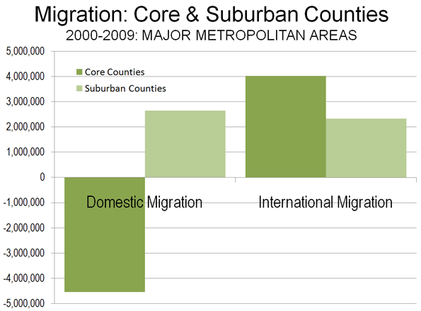
    The core counties lost domestic migrants, often at very high rates. Between 2000 and 2009, more than 4,500,000 people moved out of the core counties. This is more people than live in the cities of Los Angeles and Washington, DC combined. The suburban counties did substantially better gaining more than 2,600,000 domestic migrants (nearly as many people as live in the city of Chicago), but not enough to negate the core losses. Over the past year, the core counties lost 200,000 domestic migrants, an annual rate approximately two-thirds less than the rate from 2000 to 2008. Suburban counties gained 175,000, a more than 40% reduction from the 2000-2008 annual rate. All of these rate changes are consistent with expectations in a recession, as fewer people move.

    If anything, the trends of the past decade indicate a further dispersal of America’s metropolitan population, with an additional 200,000 domestic migrants moving to the exurban counties adjacent to and beyond the major metropolitan areas (Note 2). Reflecting the effects of the recession, exurban areas lost 4,000 domestic migrants in the last year. This one year loss rate is less than 1/10th of the core county domestic migration loss rate over the same period. Another nearly 1.7 million domestic migrants left the major metropolitan areas and their exurbs altogether, moving to smaller metropolitan areas, smaller urban areas and rural areas.

    Between 2000 and 2008, 36 cores experienced domestic migration losses, compared to 10 suburban areas. The cores did better in the last year, with 29 losing domestic migrants, while 13 suburban areas lost domestic migrants. Further, more people moved into (or fewer moved out of) the suburbs from other parts of the country than to the cores in 42 of the 48 metropolitan areas between 2000 and 2009 and in 2008-2009.

    Moreover, not all urban cores are the same. Some, including most of the fast growing areas, are far more suburban than others. This is illustrated by a classification of core counties (Table 2) based upon the share of owner occupant housing built after 1949 (For for statistical purposes the beginning of automobile oriented suburbanization was with the census of 1950).

    Table 2
    Core County Classifications (Extent of Suburbanization)
    Core County Classification
    Share of Owner-Occupied Houses Built After 1949
      Dominant Urban Cores
    Less than 50%
      Moderately Suburban
    50% = <75%
      Substantially Suburban
    70% = <85%
      Predominantly Suburban
    85% & Over
    Data from 2000 US Census

    For example, in the core counties of the St. Louis and Boston metropolitan areas, there is little suburbanization, with more than 70% of houses having been built before 1950. Their growth truly reflects the attractiveness of traditional, relatively dense urban living. On the other hand, in the core county of the Austin metropolitan area, less than 10% of the houses were built before 1950, while in Phoenix, the figure is 3%. In these and other core counties that encompass large suburban areas, the vast majority of “urban” growth follows a highly suburbanized, auto-oriented model.

    The domestic migration results by core county classification are as follows:

    • Dominant Urban Core Central Counties (less than 50% of the housing stock built after 1949) lost 1.650 million domestic migrants, or 14.0% of their 2000 population. In the last year, the loss was 87,000.
    • Moderately Suburban Core Central Counties (50% to 69% of the housing stock built after 1949) lost 1.970 million domestic migrants, or 10.0% of their 2000 population. In the last year, the loss was 83,000.
    • Substantially Suburban Core Central Counties (70% to 84% of the housing stock built after 1949) lost 1.380 million domestic migrants, or 7.2% of their 2000 population. In the last year, the loss was 58,000.
    • Predominantly Suburban Core Central Counties (85% and more of the housing stock built after 1949) gained 450 thousand domestic migrants, or 2.0% of their 2000 population. In the last year, the gain was 29,000.

    By no stretch of the imagination, then, can it be validly claimed that the overall trend is people moving from the suburbs to the core. The evidence suggests that the more urban the core county, the greater are the domestic migration losses.


    International Migration: The real story with respect to core growth is international migration. The 48 metropolitan areas gained 6.4 million international migrants from 2000 to 2009 and 620,000 in 2008-2009. International migration, also impacted by recession, dropped by nearly a 15% drop from the 2000-2008 annual rate (Table 3).

    Table 3
    International Migration: Major Metropolitan Areas
    2000-2009
    2008-2009
    Core County Classification
    Metropolitan Area
    Metropolitan Area
    Core
    Suburban
    Metropolitan Area
    Core
    Suburban
    1
    New York     1,075,016      622,538      452,478        100,669     57,674      42,995
    3
    Los Angeles        803,614      628,303      175,311           75,062     58,557      16,505
    2
    Chicago        363,134      265,156         97,978           33,363     24,236        9,127
    4
    Dallas-Fort Worth        323,941      203,732      120,209           31,571     19,785      11,786
    1
    Philadelphia        122,733         50,761         71,972           12,944        5,560        7,384
    4
    Houston        289,648      252,098         37,550           27,996     24,371        3,625
    4
    Miami-West Palm Beach        506,423      318,888      187,535           51,548     32,380      19,168
    1
    Washington        310,222         23,112      287,110           31,904        2,096      29,808
    3
    Atlanta        207,238         42,082      165,156           20,288        4,093      16,195
    1
    Boston        191,014         64,359      126,655           19,250        6,522      12,728
    2
    Detroit           93,625         44,177         49,448             8,723        4,132        4,591
    4
    Phoenix        214,067      209,326           4,741           21,833     21,364           469
    2
    San Francisco-Oakland        257,318      161,324         95,994           24,376     15,373        9,003
    4
    Riverside-San Bernardino           90,652         46,829         43,823             8,464        4,313        4,151
    3
    Seattle        126,973         98,983         27,990           12,919        9,971        2,948
    2
    Minneapolis-St. Paul           84,440         69,262         15,178             8,234        6,756        1,478
    1
    St. Louis           29,782         11,794         17,988             2,928        1,112        1,816
    4
    Tampa-St. Petersburg           74,173         42,568         31,605             8,045        4,762        3,283
    1
    Baltimore           43,949         10,852         33,097             4,604        1,125        3,479
    2
    Denver           93,916         45,338         48,578             8,738        4,251        4,487
    2
    Pittsburgh           19,225         16,326           2,899             1,901        1,596           305
    2
    Portland           70,901         28,755         42,146             6,680        2,677        4,003
    2
    Cincinnati           22,364         12,754           9,610             2,245        1,260           985
    4
    Sacramento           64,275         47,169         17,106             6,056        4,420        1,636
    2
    Cleveland           28,002         20,168           7,834             2,826        1,987           839
    4
    Orlando           95,500         61,171         34,329           11,720        7,381        4,339
    4
    San Antonio           31,595         28,157           3,438             3,303        2,940           363
    3
    Kansas City           34,339         12,613         21,726             3,404        1,262        2,142
    4
    San Jose        170,452      168,009           2,443           16,347     16,116           231
    3
    Columbus           39,755         38,261           1,494             4,063        3,915           148
    4
    Charlotte           48,176         34,522         13,654             4,678        3,332        1,346
    3
    Indianapolis           27,676         22,058           5,618             2,809        2,239           570
    4
    Austin           65,958         56,828           9,130             6,406        5,516           890
    2
    Norfolk-Virginia Beach                421         (1,546)           1,967                867             81           786
    2
    Providence           34,926         25,547           9,379             3,753        2,741        1,012
    3
    Nashville           36,570         26,208         10,362             3,850        2,760        1,090
    2
    Milwaukee           26,814         22,612           4,202             2,706        2,292           414
    4
    Jacksonville           15,066         12,046           3,020             1,760        1,397           363
    4
    Memphis           19,845         17,801           2,044             2,093        1,874           219
    3
    Louisville           16,437         12,778           3,659             1,685        1,291           394
    2
    Richmond           17,061           4,161         12,900             1,805           440        1,365
    3
    Oklahoma City           23,717         18,698           5,019             2,394        1,878           516
    3
    Hartford           30,266         25,871           4,395             3,230        2,784           446
    3
    Birmingham           14,485         10,644           3,841             1,557        1,151           406
    3
    Salt Lake City           41,216         39,416           1,800             3,855        3,684           171
    4
    Raleigh           36,923         32,141           4,782             3,560        3,103           457
    2
    Buffalo             9,671           8,387           1,284                940           814           126
    2
    Rochester           12,796         11,657           1,139             1,243        1,123           120
    Total     6,356,310   4,024,694   2,331,616        621,195   390,487   230,708
    Major metropolitan areas: Population over 1,000,000 in 2009
    Core county classifications: See Table 2

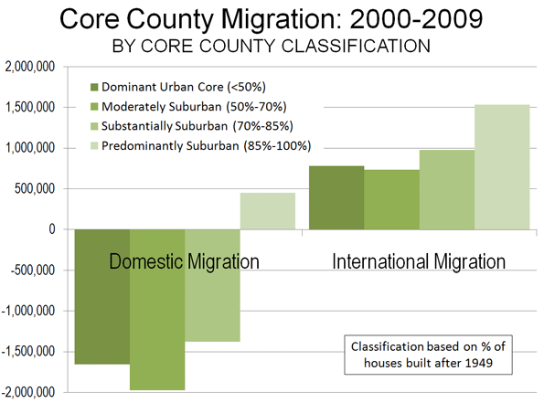
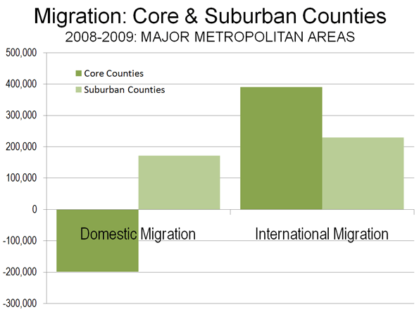
    The core counties gained 4.0 million net international migrants between 2000 and 2009. The international migration gains in the dominant urban and moderately suburban core counties were not sufficient to compensate for the domestic migration losses (Figure 3). Surprisingly, the strongest gain in international migration from 2000 to 2009 was not in the more urban core counties, but rather was in the predominantly suburban core counties, at a 6.8% rate compared to 2000 populations.

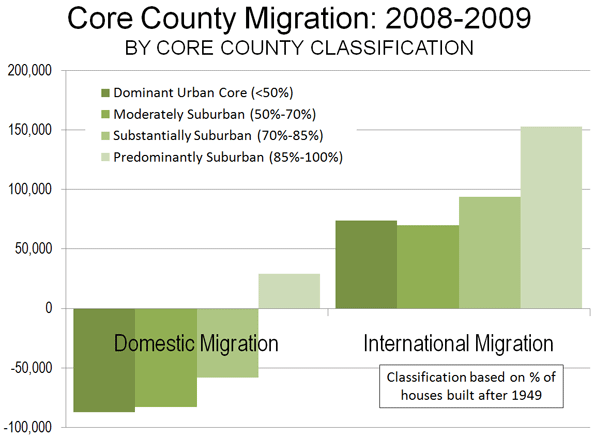
    In 2008-2009, the core county gain was 390,000, approximately 15% below the 2000-2008 annual rate (Figure 4). The suburban counties gained international migrants, though fewer than the cores, adding a net 2.3 million between 2000 and 2009. Between 2008 and 2009, the suburbs added a net 230,000 international migrants, a 12% decline from the 2000-2008 annual rate.

    This of course measures only initial international migration. Over time many immigrants likely will head for the suburbs, which now are home to a majority. Core cities may be playing more of a “revolving door” role where they take in immigrants (and young people) for several years, then lose them, but replace the loss with newcomers.

    The Exodus: Elusive as Ever: The much ballyhooed suburban hegira has not begun, despite it having been announced repeatedly (Table 4). There is no doubt that the cores are doing better than in recent decades, particularly since the deep recession began. But the relative better urban performance may have more to do with stagnation than anything endlessly alluring about inner city life.

    Table 4
    Domestic, International & Total Migration: Major Metropolitan Areas
    PERSONS
    Net Domestic Migration: 2000-2009
    Net Domestic Migration: 2008-2009
    Net International Migration: 2000-2009
    Net International Migration: 2008-2009
    Net Total Migration: 2000-2009
    Net Total Migration: 2008-2009
    Core Counties (Share of Post-1949 Housing)   (4,548,659)     (199,153)      4,024,694         390,487        (523,965)     191,334
      Dominant Urban Core (Less than 50%)  (1,654,245)      (86,535)        783,416          74,089       (870,829)     (12,446)
      Moderately Suburban (50%-69%  (1,969,014)      (83,099)        734,078          69,759    (1,234,936)     (13,340)
      Substantially Suburban (70%-84%)  (1,377,714)      (58,419)        975,915          93,585       (401,799)       35,166
      Predominantly Suburban (85% & Over)       452,314        28,900     1,531,285        153,054     1,983,599    181,954
    Suburban Counties     2,645,064       176,714      2,331,616         230,708      4,976,680     407,422
    48 Major Metropolitan Areas   (1,903,595)       (22,439)      6,356,310         621,195      4,452,715     598,756
    Exurban Counties        198,294          (4,053)         364,498           36,740          562,792        32,687
    48 Metropolitan Areas & All Exurban Counties   (1,705,301)       (26,492)      6,720,808         657,935      5,015,507     631,443
    4 Excluded Metropolitan Areas          19,958         14,553         225,767           23,400          245,725        37,953
    All (52) Major Metropolitan Areas & Exurban Counties   (1,685,343)       (11,939)      6,946,575         681,335      5,261,232     669,396
    Smaller Metropolitan & Rural     1,685,343         11,939      1,678,369         173,570      3,363,712     185,509
    United States 0 0      8,624,944         854,905      8,624,944     854,905
    Major metropolitan areas: Population over 1,000,000 in 2009
    Excluded metropolitan areas: San Diego, Las Vegas & Tucson (no suburban county) and New Orleans (due to Hurricane Katrina)
    Exurban counties of excluded metropolitan areas are included (Las Vegas and New Orleans)

    As in Europe, people are moving to the urban cores. But also, as in Europe, they are moving there from across national borders, rather than from the suburbs (Figures 3 & 4). This will surprise urbanites who cannot imagine meaningful lives in the suburbs, but will not shock the many millions more suburban residents content enough not to move. The exodus from the suburbs to the core will not have begun until more moving vans head away from the suburbs than to them. To this point, this is simply not occurring. And when the economy recovers, history suggests that the gap between suburban and core growth rates may begin expanding again.


    Note: There is one core county in each metropolitan area, which is the county containing the first named city, except for in New York, where all five counties (boroughs) are included, in San Francisco-Oakland, where Alameda County (Oakland) is also included and in Minneapolis-St. Paul, where Ramsey County (St. Paul) is also included.

    Note: The exurban counties are those included in combined statistical areas (as designated by the Bureau of the Census), which have major metropolitan areas as their core.

    Photo: Suburban Minneapolis-St. Paul

    Wendell Cox is a Visiting Professor, Conservatoire National des Arts et Metiers, Paris. He was born in Los Angeles and was appointed to three terms on the Los Angeles County Transportation Commission by Mayor Tom Bradley. He is the author of “War on the Dream: How Anti-Sprawl Policy Threatens the Quality of Life.

  • Beijing on Track to Be World’s Busiest Airport

    For years, the world’s busiest airports in passenger volume have been Atlanta’s Hartfield-Jackson International and Chicago’s O’Hare. However, there are indications that this long dominance may be about to end. According to Airport Council International data for 2009, Chicago O’Hare had fallen to 4th position, following Atlanta, London-Heathrow and Beijing Capital International Airport.

    Beijing’s Capital International increased its passenger volume by 17% in 2009, while European and American airports were experiencing slight declines due to the recession. Beijing’s increase is more significant, because growth might have been expected to level off after the 2008 Olympics, which were held in Beijing. Between 2008 and 2009, Beijing rose from 8th in the world to 3rd, and from 20th place in 2004, when its volumes were approximately one-half the present level.

    Early 2010 data (first quarter) indicates that Beijing Capital International has become the second busiest airport in the world, trailing only Atlanta. Passenger volumes were up 10.5% from a year earlier. If the current rate of growth continues, Beijing should pass Atlanta in two to three years, even if the American economy improves.

    London’s 130 million annual passenger traffic was the greatest of any metropolitan area in the world in 2009 (distributed among five airports). The new Conservative-Liberal Democrat government seems determined, however, to forfeit this ranking, having banned further London airport expansions to combat what it calls “binge flying.”

    New York was second with passenger traffic of 105 million at its three major airports, while Tokyo was third at 95 million. “Binge flying” does not seem to be a concern in Japan, where Tokyo’s Haneda Airport is adding a fourth runway and will soon serve international flights again, providing competition to more distant Narita. Atlanta’s single airport handles an annual passenger volume of 88 million.

    Other airports in China are also growing. In the Pearl River Delta (the world’s largest “mega-region,” an area of adjacent urban areas), the four large airports, Hong Kong, Guangzhou and Shenzhen accommodated passenger traffic of more than 105 million in 2009. Traffic at Shanghai’s Pudong and Hongqiao grew 14% and 10% respectively.

    Overall Chinese air traffic is also growing rapidly. Over the past 10 years, annual passenger volumes have risen an average of more than 25%. This compares to an average annual growth rate of 3.2% in the European Union (EU-27), 1.6% in the United States and 1.1% in Japan (Figure). The US continues to be dominant in passenger volumes, at 940 billion annual passenger kilometers, compared to 560 billion in the European Union, 280 billion in China and 80 billion in Japan (data calculated from US, Europe, China and Japan national sources).