Author: Wendell Cox

  • The Need to Expand Personal Mobility

    Few books in recent memory have started from as optimistic or solid a foundation as Reinventing the Automobile: Personal Urban Mobility for the 21st Century. Reinventing the Automobile conveys a strong message that improved personal mobility is necessary and desirable:

    “Have we reached the point where we now must seriously consider trading off the personal mobility and economic prosperity enabled by automobile transportation to mitigate its negative side effects? Or, can we take advantage of converging 21st century technologies and fresh design approaches to diminish those side effects sufficiently while preserving and enhancing our freedom to move about and interact? This book concludes the latter.”

    The authors include William J. Mitchell, Professor of Architecture, and Media Arts and Sciences at the Massachusetts Institute of Technology directs the Smart Cities research group at the MIT Media Lab, Christopher Boroni-Bird, Director of Advance technology Vehicle Concepts at General Motors and Lawrence D. Burns, who consults on transportation, energy and communications systems and technology. The book is published by the MIT Press.

    Getting Urban Economics Right

    The authors start with getting the urban economics right. They recognize that the “freedom and prosperity benefits” of the automobile “have been substantial.” They note that the automobile industry “set the stage for the growth of the middle class,” something that has been labeled the “democratization of prosperity.” The authors say that the car “enabled modern suburbia” and “powered a century of economic prosperity.” This refreshing treatment is consistent with the overwhelming economic evidence that links personal mobility with prosperity, such as by Remy Prud’homme and Chang-Wong Lee, David Hartgen and M. Gregory Fields and others. It is also at considerable odds with the widely accepted, somewhat nostalgic planning orthodoxy that rejects private automotive transport as “unsustainable”, unaesthetic and anti-social. This ideology embraces the illusion that forcing people to travel longer, with less personal flexibility somehow will improve the economy and raise the standard of living.

    The Future of the Automobile?

    The authors envision a automobile characterized by a new “DNA.” It starts with smaller cars, fueled by electricity and hydrogen (fuel cell technology). It also begins with an understanding that the cars used in many mundane urban operations today – for example getting to the market or pick up the kids at school – are over-engineered. They are far larger than is needed for most trips, their capacity for speed exceeds urban requirements and their range between refueling is also more than needed.

    The authors would re-engineer urban vehicle to the needs of metropolitan dwellers, an “ultra-small vehicle” (USV). The designs proposed include far lighter cars that can be easily “folded” up to minimize parking space requirements. Cars would be connected to one another by wireless technology, all but eliminating the possibility of collisions. The cars would be small enough that they could be assigned special dedicated lanes on current freeways and streets. Travel would be less congested because the dedicated lanes would have a far higher vehicle capacity, while the interconnectedness would allow cars to safely operate closer to one another.

    The combination of electricity, hydrogen, wireless technology and the USV would bring additional benefits. This would permit improved vehicle routing, as drivers would be advised take alternate less congested routes. This would also, in time, lead to self-drive cars, about which Randal O’Toole has recently written, made possible by the use of wireless technology and that dedicated lanes would make possible.

    Empowering Transit Riders through Car Sharing

    Car sharing is an important part of this future, for dwellers of dense urban cores, according to Reinventing the Automobile. The author’s note that car sharing can solve the “first mile-last mile” problem making it possible for transit users to speed up their trips by not having to walk long distances to and from transit stops. Indeed, car sharing programs are set to be adopted in urban cores with some of the world’s best transit systems, such as Paris, and London. Privately operated car sharing systems have been established in a number of US metropolitan areas, such as Atlanta, Denver and San Francisco.

    Progress with Conventional Strategies

    The longer term vision of the MIT Press authors may take a while to unfold, but we can already see potential for progress. Just this week, “super-car” developer Gordon Murray announced development of an urban car (the T25), smaller than the “Smart,” which would achieve nearly 60 miles per gallon, with plans for marketing within two years. Volkswagen has developed a “1-litre” car, which would achieve 235 miles per gallon on diesel fuel. All of this makes the 51 mile per gallon Toyota Prius seem gluttonous by comparison

    These developments and the Reinventing the Automobile vision show that it is unnecessary to tell people in America (or Europe or the developiung world) that they must give up their automobiles. That is good news. The social engineering approaches requiring people to move from the suburbs to dense urban cores and travel by slower, less frequent transit are incapable of achieving serious environmental gains (see below) and can not seriously be considered progress or desirable by most people in advanced countries.

    The Superiority of Technology

    This is illustrated by recent developments in automobile technology and research (Figure).

    • Before the adoption of the new 2020 and 2016 new car fuel economy standards, the US light vehicle fleet was on track to increase its greenhouse gas (GHG) emissions nearly 50% from 2005 to 2030 (the green dotted line in the figure).
    • As a result of the new fuel economy standards, Department of Energy projections indicate that greenhouse gas emissions from light vehicles will be one-third less by 2030 compared to the 2005 fleet (the yellow dotted line), and this is at the standard projected driving increase rates that could well be high.
    • The smart growth strategies of land rationing, densification and discouraging driving would produce, at best, a marginal reduction in GHG emissions, using the mid-point of the recent proponent research (Moving Cooler), indicated by the solid blue line. Actually, this overstates the impact of smart growth, since it discounts the substantial GHG emissions gains that result from higher fuel consumption in more congested traffic produced by densification.
    • The potential for technological advance is illustrated by the green solid line, which estimates the GHG emissions from light vehicles in 2030 if the average fuel economy were equal to today’s best hybrid technology.

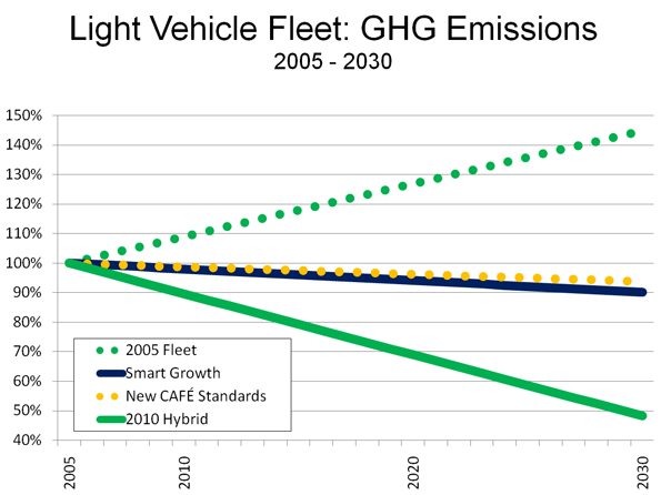
    Overall auto-centered technology-based strategies – such as the improved fuel economy standards and the hybrid fuel economy – would each produce about 15 times as much benefit as the smart growth strategies proposed by such studies as Moving Cooler. This approach would not only be far more productive in terms of environmental improvement but would not require interfering with people’s lives in ways that would require longer trips times, less convenience, seriously retarded job access and, inevitably, fewer jobs and lower levels of economic growth.

    Technology: The Only Way

    It would be a mistake – and likely political folly – to force a re-engineering our way of life in order to enact strategies with dubious environmental benefits. In the final analysis, personal mobility must be retained and expanded, because there is no alternative that is acceptable to people, whatever system of government they happen to live under. Reinventing the Automobile paints the most optimistic picture to date and, if given due serious treatment, could prove a debate changer.

    Photograph: Manila suburbs

    Wendell Cox is a Visiting Professor, Conservatoire National des Arts et Metiers, Paris. He was born in Los Angeles and was appointed to three terms on the Los Angeles County Transportation Commission by Mayor Tom Bradley. He is the author of “War on the Dream: How Anti-Sprawl Policy Threatens the Quality of Life.

  • Phantom Exodus Driven by Phony Cost Comparisons

    If Tara Siegel Bernard of The New York Times is right, (city of) New Yorkers must be among the most irrational people in the world. In “High-Rise or House with Yard,” she describes the purported financial advantages of living in a co-op apartment in Brooklyn versus suburban South Orange, New Jersey.

    The irrationality is that, despite the money that households can save by staying in the city, a net more than 350,000 left for the suburbs between 2000 and 2007, as E. J. McMahon and I found in Empire State Exodus, which summarized IRS inter-county migration data. Indeed, each of the city’s five boroughs lost domestic migrants to the suburbs during the period. An analysis by The New York Times itself found that the city had lost net domestic migrants to every suburban county in the metropolitan area as well as to every county in newly exurban northeastern Pennsylvania. This includes Allentown-Bethlehem and Scranton-Wilkes Barre, toward which New Jersey land use regulations have driven new development.

    “High Rise or House with Yard” stands alone in claiming that New York City is less costly than its suburbs. The most recent (and authoritative) ACCRA cost of living index for Brooklyn is a full 40% higher than in the South Orange (the Newark-Elizabeth area). This is before considering the fact that the Brooklyn home is a 1,000 square foot coop apartment with two bedrooms and one bath, while the suburban home is a 2,000 square foot house in South Orange with four bedrooms and 2.5 baths. Smaller apples may well be less expensive than bigger oranges. The Times also assumes that the suburban resident will commute by train to Manhattan, at more than $400 per month. It is also possible that, like 80% of South Orange commuters, the new suburbanite may choose to work in the New Jersey suburbs. Maybe New Yorkers are not all that irrational after all.

    Moreover, people are moving even further than the suburbs and exurbs, with almost as many people moving from New York City even further away. The latest Bureau of the Census data indicates that every borough experienced a net domestic migration loss between 2000 and 2009. More than 1.2 million residents left New York City, nearly as many people as live in the cities of Washington and Boston combined.

    • Manhattan lost more than a 140,000 net domestic migrants, more people than live in the city of Hartford.
    • Brooklyn lost nearly 450,000 net domestic migrants, more people than live in the city of Miami.
    • Queens lost a 420,000 net domestic migrants, nearly as many people as live in the city of Cleveland.
    • The Bronx more than 200,000 net domestic migrants, more people than live in the city of Providence, Rhode Island.
    • Staten Island did much better, losing only 5,000 net domestic migrants. But then, much of Staten Island looks more like suburban New Jersey than New York City

    In the face of these losses of which at least some at The New York Times are aware, the article notes that “Many empty-nesters are giving up the high-maintenance house in the suburbs in exchange for the attractions of city life.” Not that many.

    Photo: New Jersey Suburbs

  • Kudos to Houston Traffic from IBM

    IBM has released its annual “Commuter Pain Index,” which ranks traffic congestion in 20 metropolitan areas around the world. According to IBM, the Commuter Pain Index includes 10 issues: “1) commuting time, 2) time stuck in traffic, agreement that: 3) price of gas is already too high, 4) traffic has gotten worse, 5) start-stop traffic is a problem, 6) driving causes stress, 7) driving causes anger, 8) traffic affects work, 9) traffic so bad driving stopped, and 10) decided not to make trip due to traffic.”

    Each metropolitan area is given a score between 0 and 100, with the highest score indicating the worst traffic congestion (See Table).

    IBM Commuter Pain Index: 2010
    Metropolitan Areas Ranked by Worst Traffic Congestion
    Rank Metropolitan Area Score (Worst to Best)
    1 Beijing 99
    1 Mexico City 99
    3 Johannesburg 97
    4 Moscow 84
    5 Delhi 81
    6 Sao Paulo 75
    7 Milan 52
    8 Buenos Aires 50
    9 Madrid 48
    10 London 36
    10 Paris 36
    12 Toronto 32
    13 Amsterdam 25
    13 Los Angeles 25
    15 Berlin 24
    16 Montreal 23
    17 New York 19
    18 Melbourne 17
    18 Houston 17
    20 Stockholm 15

    Favorable Urban Planning Characteristics Associated with Intense Traffic Congestion: The worst traffic congestion was recorded in the developing world metropolitan areas of Beijing, Mexico City, Johannesburg, Moscow, Delhi and Sao Paulo. In many ways, these metropolitan areas exhibit characteristics most admired by current urban planning principles. Automobile ownership and per capita driving is low. Transit carries at least 40% of all travel in each of the metropolitan areas. Yet traffic is intense. This is due to another urban planning “success,” objective, high population densities. Higher population densities are inevitably associated with greater traffic congestion (and more intense local air pollution), whether in the United States or internationally. All six of these metropolitan areas scored 75 or above, where a score of 100 would be the worst possible congestion.

    The next five metropolitan areas have accomplished nearly as much from an urban planning perspective. Milan, Buenos Aires, Madrid, London and Paris all achieve more than 20% transit market shares, and their higher urban densities also lead to greater traffic congestion. Each scores between 35 and 52.

    Traffic congestion is less in the next group, which includes Toronto, Los Angeles, Berlin, Amsterdam and Montreal. With the exception of Berlin, transit market shares are less, though the urban densities in all are above average US, Canadian and Australian levels. Amsterdam, the smallest metropolitan area among the 20, scores surprisingly poorly, since smaller urban areas are generally associated with lower levels of traffic congestion.

    The Least Congested Metropolitan Areas: Four metropolitan areas scored under 20, achieving the most favorable traffic congestion ratings. New York scores 19, with its somewhat lower density (the New York urban density is less than that of San Jose). Even lower density Melbourne and Houston score 17, tying for the second best traffic conditions. Stockholm achieves the best traffic congestion score, at 15, despite its comparatively high density. Stockholm is probably aided by its modest size which is similar to that of Orlando (Florida).

    The Houston Advantage: Perhaps the biggest surprise is Houston’s favorable traffic congestion ranking.

    • Houston has the lowest urban density of the 20 metropolitan areas.
    • Houston has the lowest transit market share, by far, at only 1%.
    • Houston also has the highest per capita automobile use among the IBM metropolitan areas.

    Yet Houston scored better than any metropolitan area on the list except for much smaller Stockholm. As late as 1985, Houston had the worst traffic congestion in the United States, according to the annual rankings of the Texas Transportation Institute. Public officials, perhaps none more than Texas Highway Commission Chair and later Mayor Bob Lanier led efforts to improve Houston’s road capacity, despite explosive population growth. Their initiatives paid off. By 1998, Houston had improved to 16th in traffic congestion in the United States. The population growth has been incessant, so much so that Houston has added more new residents since 1985 than live in Stockholm and more than half as many as live in Melbourne. While Houston had slipped to 11th in traffic congestion by 2007, the recent opening of a widened Katy Freeway and other improvements should keep the traffic moving in Houston better than in virtually all of the world’s other large metropolitan areas.

    Photo: Freeway in Houston

  • University of California Report Calls Cambridge Systematics High-Speed Rail Ridership Forecast Unreliable

    A just-released report by the Institute of Transportation Studies at the University of California-Berkeley finds that the ridership projections prepared by Cambridge Systematics (CS) for the California high speed rail system are “not reliable.”

    Authors Samer Madanat (director of ITS-Berkeley and a professor of civil and environmental engineering), Mark Hanson (UC-Berkeley professor of civil and environmental engineering) and David Brownstown (chair of the Economics Department at UC-Irvine) essentially reported that the projections had such large error margins that the system could either lose a lot of money or make a lot of money:

    … the combination of problems in the development phase and subsequent changes made to model parameters in the validation phase implies that the forecasts of high speed rail demand-and hence of the profitability of the proposed high speed rail system-have very large error bounds. These bounds, which were not quantified by CS, may be large enough to include the possibility that the California HSR may achieve healthy profits and the possibility that it may incur significant revenue shortfalls.

    Biased High Speed Rail Projections: Given the overwhelming history of upwardly biased ridership and revenue projections in major transport projects, it seems far more likely that reducing the margins of error would produce projections with much smaller ridership numbers and major financial losses. Major research by Oxford University professor Bent Flyvbjerg, Nils Bruzelius (a Swedish transport consultant) and Werner Rottenberg (University of Karlsruhe and former president of the World Conference on Transport Research) covering 80 years of infrastructure projects found routine over-estimation of ridership and revenue (Megaprojects and Risk: An Anatomy of Ambition). The evidence is so condemning that Dr. Flyvbjerg has referred to the planning processes for such projects as consisting of “strategic misrepresentation” and “lying” (his words) to advance projects that might not otherwise be implemented.

    Broad Concern about the Reliability of California High Speed Rail Projections: The University of California report joins other reports that have questioning the veracity of the Cambridge Systematics projections. During the run-up to the 2008 statewide bond issue, the California Senate Transportation and Housing Committee, chaired by Senator Alan Lowenthal (D-Long Beach) indicated concerns. Illustrating continuing concerns, the committee commissioned the University of California study.

    Doubts have been expressed by the California Legislative Analyst and the California State Auditor. The Reason Foundation Due Diligence Report, authored by Joseph Vranich and me in 2008 estimated the ridership projections to be at least 100% high (see High Speed Rail: Untimely Extravagance presented at the Heritage Foundation last week in Washington).

    Investment Grade Projections Far Lower: The Cambridge Systematics ridership projections publicized that were used in the statewide bond election were more than 150% above the “investment grade” projections that had been produced by Charles Rivers Associates for the California High Speed Rail Authority a decade ago. Even “investment grade” projections can be high, as the recent bond default and bankruptcy of the Las Vegas Monorail indicates. In that case the “investment grade” ridership projections were 150% above the actual achieved average, nonetheless bond holders lost their investments. (Our 2000 report accurately projected the Monorail ridership).

    Undermining GHG Emissions Reduction Claims: Meanwhile, the California high speed rail proposal has come under criticism with respect to its environmental claims. The high speed rail line has been promoted as a means for reducing greenhouse gas (GHG) emissions in the state. Yet another recently released University of California report indicates that it could take as long as 71 years to save enough GHG emissions by attracting airline passengers and drivers to cancel out the emissions produced in constructing the project. More defensible ridership projections could lengthen this period considerably.

    Response to Criticism: The body of the University of California high speed rail study is 10 pages, followed by approximately 40 pages of comments and response by Cambridge Systematics and a letter from the California High Speed Rail Authority requesting that the University of California authors to consider the comments. This review is performed by the University of California authors, as they reject virtually all Cambridge Systematics criticisms in the final four pages of the report.

    Photograph: Cover of Megaprojects and Risk: An Anatomy of Ambition

  • Surprise, Frisco and Beaumont Among Fastest Growing

    The Bureau of the Census has updated its city (municipality or local government area) population estimates for 2009. Predictably, anti-suburban interests saw more indication of the elusive (read non-existent) exodus from the suburbs to the central cities. One analyst even suggested that a “high quality” of life in one central city (Washington, DC) might have kept people from moving to the suburbs. In fact, since 2000, nearly 40,000 people (domestic migrants) have moved out of the city of Washington and in the last year, the city gained 4,500 residents while the suburbs gained 13,700.

    In contrast, Buffalo News reporter Jack Ray looked at the data and noted that some cities in that metropolitan area were growing rather quickly, while others were losing population. Generally, he found that outer suburban communities were growing more quickly. Ray’s analysis was reflective of trends around the nation.

    There are nearly 20,000 incorporated cities, towns and villages in the United States. Population trends in these cities show that urban areas are growing most strongly on their suburban fringes or even in their exurbs. For example, two-thirds of the fastest growing 100 municipalities in the nation were suburbs or exurbs in the nation’s major metropolitan areas (those with more than 1,000,000 population). The other third were all municipalities in smaller metropolitan areas or outside metropolitan areas.

    The extent of this growth on the edge is illustrated by an examination of the nation’s municipalities of 25,000 or greater population that grew more than 25% between 2000 and 2009.

    • Among the 89 municipalities that grew 50% or more, 59 were in major metropolitan areas and all were suburbs (nearly all near the urban fringe) or exurbs. The total population growth among these suburbs and exurbs was 2.2 million from 2000 to 2009, for an average growth rate of 91%. These major metropolitan suburbs and exurbs grew 1.8 million, while the municipalities outside the major metropolitan areas added 400,000.
    • Among the 119 municipalities that grew between 25% and 50%, 69 were in major metropolitan areas. This included 67 suburbs and exurbs. It also included 2 central cities, Raleigh (39%) and Atlanta (28%). These major metropolitan area suburbs and exurbs gained 1.7 million residents, while the two central cities gained a total of 200,000. The municipalities outside the major metropolitan areas grew 1,000,000.

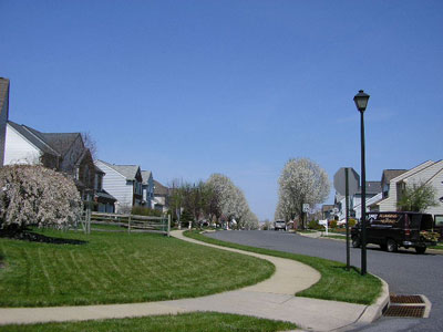
    Combined, the fastest growing suburbs and exurbs with more than 25,000 population grew more than 3.5 million, while the municipalities outside the major metropolitan areas grew 1.5 million, for a combined growth of more than 5.0 million. The smaller high growth municipalities (under 25,000), nearly 1,200 of them, both major metropolitan and outside, grew another 2.5 million.

    The fastest growing municipalities, excluding the two central cities of Raleigh and Atlanta, accounted for nearly one-third of the nation’s growth between 2000 and 20009.

    Most of the fast growing suburbs and exurbs have names that are simply not recognizable. Yet, a half-dozen added nearly as many or more new residents than all of the 20-plus central cities combined in the major metropolitan areas that do not have large swaths of suburbanization inside their borders. These include such places as Phoenix suburb, Surprise, Dallas-Fort Worth suburb Frisco and Riverside-San Bernardino suburb Beaumont.

    In Crabgrass Frontier: The Suburbanization of the United States, Kenneth Jackson noted that central Philadelphia began losing population in the early 19th century. The dispersion of America continues.

    Photograph: Exurbs of New York: Pike County, Pennsylvania

  • Aspiring to The Russian Dream

    Bloomberg Business Week reports that the Russian government wants to move urban residents from their “cramped” high rise apartments to new suburban developments. Single family houses would be built in joint ventures with private developers. Present plans are to develop 2.5 million acres of suburban homes. This is a very large program. At Los Angeles densities, this amount of land would be sufficient to house about 28,000,000 people, roughly double the present population of the Moscow urban area.

    As occurred before in the United States, expanding suburban home ownership could generate a democratization of prosperity that brings far better living conditions to middle income households. Already, more affluent households have built European and American style detached houses outside Moscow’s 8-lane ring road (see photograph).

    Photograph: New detached housing, northern Moscow suburbs (Veshki).

  • Despite Transit’s 2008 Peak, Longer Term Market Trend is Down: A 25 Year Report on Transit Ridership

    In 2008, US transit posted its highest ridership since 1950, a development widely noted and celebrated in the media. Ridership had been increasing for about a decade, however, 2008 coincided with the highest gasoline prices in history, which gave transit a boost.

    Less reported was the fact that despite higher ridership, transit’s market share (of transit and motor vehicles) has fallen since the 1950s. In 1955, transit’s market share was over 10%. By 2005, transit’s share had dropped to 1.5%, but recovered only to 1.6% in 2008. Transit’s all time peak ridership was in 1945, driven up by World War II and gas rationing. It is thus not surprising that national transit ridership (boardings) declined 3.8% in 2009 as gasoline prices moderated.

    Market Share by Major Urban Area

    Demographia has released urban area roadway and transit market share estimates for 2008, based upon Federal Transit Administration and Federal Highway Administration data. The table below compares 2008 with 1983 market share data for 56 urban areas with a corresponding metropolitan area population of more than 900,000 (complete data).

    Urban Areas: Roadway & Transit Market Share: 2008
    Ranked by 2008 Transit Market Share
    With 25 Year (1983) Comparison
        2008 1983 Roadway Share % Change
    Rank Urban Area Roadway Share Transit Share:  Roadway Share Transit Share: 
    1 New York 89.0% 11.0% 87.7% 12.3% 1.5%
    2 San Francisco 95.0% 5.0% 93.7% 6.3% 1.4%
    3 Washington 95.5% 4.5% 96.1% 3.9% -0.6%
    4 Chicago 96.1% 3.9% 94.2% 5.8% 2.0%
    5 Honolulu 96.2% 3.8% 93.2% 6.8% 3.2%
    6 Boston 96.7% 3.3% 97.5% 2.5% -0.8%
    7 Seattle 97.2% 2.8% 97.6% 2.4% -0.4%
    8 Philadelphia 97.3% 2.7% 96.0% 4.0% 1.4%
    9 Portland 97.7% 2.3% 97.6% 2.4% 0.1%
    10 Salt Lake City 97.8% 2.2% 99.1% 0.9% -1.3%
    11 Los Angeles 98.1% 1.9% 98.1% 1.9% 0.0%
    12 Denver 98.2% 1.8% 98.5% 1.5% -0.3%
    13 Baltimore 98.3% 1.7% 97.7% 2.3% 0.6%
    14 Pittsburgh 98.6% 1.4% 97.3% 2.7% 1.3%
    15 Miami-West Palm Beach 98.7% 1.3% 98.8% 1.2% -0.1%
    16 Atlanta 98.8% 1.2% 98.0% 2.0% 0.8%
    16 Cleveland 98.8% 1.2% 98.0% 2.0% 0.8%
    16 Las Vegas 98.8% 1.2% 99.6% 0.4% -0.8%
    16 Minneapolis-St. Paul 98.8% 1.2% 98.8% 1.2% 0.0%
    16 San Diego 98.8% 1.2% 99.3% 0.7% -0.5%
    21 San Jose 99.0% 1.0% 99.0% 1.0% 0.0%
    22 Austin 99.1% 0.9% 99.7% 0.3% -0.6%
    22 Houston 99.1% 0.9% 99.0% 1.0% 0.1%
    22 Milwaukee 99.1% 0.9% 98.3% 1.7% 0.8%
    22 Sacramento 99.1% 0.9% 99.0% 1.0% 0.1%
    22 San Antonio 99.1% 0.9% 98.7% 1.3% 0.4%
    27 St. Louis 99.2% 0.8% 99.0% 1.0% 0.2%
    28 Buffalo 99.3% 0.7% 98.5% 1.5% 0.8%
    28 Providence 99.3% 0.7% 98.9% 1.1% 0.4%
    30 Charlotte 99.4% 0.6% 99.3% 0.7% 0.1%
    30 Cincinnati 99.4% 0.6% 98.7% 1.3% 0.7%
    30 Dallas-Fort Worth 99.4% 0.6% 99.4% 0.6% 0.0%
    30 Hartford 99.4% 0.6% 98.7% 1.3% 0.7%
    30 Orlando 99.4% 0.6% 99.7% 0.3% -0.3%
    30 Phoenix 99.4% 0.6% 99.4% 0.6% 0.0%
    30 Rochester 99.4% 0.6% 98.9% 1.1% 0.5%
    30 Tucson 99.4% 0.6% 98.9% 1.1% 0.5%
    38 Detroit 99.5% 0.5% 98.8% 1.2% 0.7%
    38 Fresno 99.5% 0.5% 99.3% 0.7% 0.2%
    38 New Orleans 99.5% 0.5% 97.4% 2.6% 2.2%
    38 Norfolk-Virginia Beach 99.5% 0.5% 99.2% 0.8% 0.3%
    38 Riverside-San Bernardino 99.5% 0.5% 99.6% 0.4% -0.1%
    43 Columbus 99.6% 0.4% 98.6% 1.4% 1.0%
    43 Louisville 99.6% 0.4% 98.9% 1.1% 0.7%
    43 Memphis 99.6% 0.4% 99.4% 0.6% 0.2%
    43 Tampa-St. Petersburg 99.6% 0.4% 99.5% 0.5% 0.1%
    47 Bridgeport 99.7% 0.3% 99.8% 0.2% -0.1%
    47 Jacksonville 99.7% 0.3% 99.4% 0.6% 0.3%
    47 Kansas City 99.7% 0.3% 99.4% 0.6% 0.3%
    47 Nashville 99.7% 0.3% 99.4% 0.6% 0.3%
    47 Raleigh 99.7% 0.3% 99.9% 0.1% -0.2%
    47 Richmond 99.7% 0.3% 99.1% 0.9% 0.6%
    53 Indianapolis 99.8% 0.2% 99.3% 0.7% 0.5%
    54 Birmingham 99.9% 0.1% 99.5% 0.5% 0.4%
    54 Oklahoma City 99.9% 0.1% 99.9% 0.1% 0.0%
    54 Tulsa 99.9% 0.1% 99.6% 0.4% 0.3%
    Unweighted Average 98.7% 1.3% 98.3% 1.7% 0.4%
    All Urban Areas Combined 98.4% 1.6% 97.5% 2.5% 0.9%
    Based upon passenger miles
    Core urban areas in metropolitan areas with more than 900,000 population in 2009.
    Derived from Federal Transit Administration and Federal Highway Administration data
    Los Angeles and Mission Viejo urban areas combined
    San Francisco, Concord and Livermore urban areas combined
    Historic transit market share data at http://www.publicpurpose.com/ut-usptshare45.pdf
    Maryland commuter rail (MARC) assigned to Washington, DC

    In 1983, transit systems started receiving support from federal taxes on gasoline. This was also the first year that the National Transit Database reported on the same annual basis as it does today. One justification for using funds from road users was the hope of attracting people from cars to transit. The national data above and the urban area below show that the overwhelming share of new travel has, nonetheless, continued to be captured by motor vehicles rather than transit. Among the 56 urban areas, 13 experienced gains in transit market share from 1983 to the peak year of 2008, while 37 posted losses and six had no change. Transit was able to capture only 0.9% of new urban travel between 1983 and 2008, while roadways captured 99.1%. (Note 1).

    The Top 10: Still a New York Story

    #1: New York: The nation’s predominant urban area remains New York, with an 11.0% transit market share. In 2008, 41% of the national transit ridership (passenger miles) was in New York, with much of it either in or focused upon New York City. The New York City Transit Authority, and a host of local public and private systems, principally serve New York City destinations and account for a remarkable 38% of the nation’s transit ridership. Even so, transit’s market share dropped from 12.3% in 1983. As a result, the roadway market share in New York increased 1.5% between 1983 and 2008, the fourth largest gain in the nation. Transit attracted 8.7% of the new demand between 1983 and 2008, while roadways attracted 91.3%.

    #2: San Francisco: San Francisco had the nation’s second highest transit market share in 2008, at 5.0%. This is a decline from 6.3% in 1983. Nonetheless, San Francisco moved up from 6th place in 1983. This produced a 1.4% increase in the roadway market share between 1983 and 2008, the fifth largest gain in the nation. Transit accounted for 2.2% of the new demand, while roadways attracted 97.8%.

    #3: Washington: Washington placed third in transit market share in 2008, at 4.5%. This represents a gain from 3.9% in 1983 and an improvement from 6th place. Washington was the only urban area among the top five to experience an increase in transit market share. Much of Washington’s transit increase was on its expanding Metrorail system and the MARC commuter rail system (most of the ridership on this Maryland based system commutes to Washington. Overall, transit in Washington has attracted 5.1% of new travel over the past 25 years, while roadways attracted 94.9% of new demand.

    #4: Chicago: Chicago ranked fourth in transit market share, at 3.9%. In 1983, Chicago had ranked 3rd, with a market share of 5.8. The roadway market share in Chicago increased 2.0% from 1983 to 2008, the third largest road travel gain in the nation. Transit attracted 1.3% of new demand over the period in Chicago, while roadways attracted 98.7%.

    #5: Honolulu: Honolulu ranked fifth in transit market share, at 3.8%. This is a significant drop from 1983, when Honolulu ranked 2nd in the nation, with a transit market share of 6.8%. Honolulu’s roadway market share gain was the largest in the nation between 1983 and 2005, at 3.8%. Transit ridership also dropped in Honolulu from 1983 to 2008, so that roadways accounted for all new travel.

    #6: Boston: Boston ranked sixth in transit market share in 2008, at 3.3%. This is a gain from 2.5% in 1983, when Boston ranked 9th. Much of Boston’s increase is attributable to its commuter rail expansion. Transit captured 4.1% of new demand, while roadways attracted 95.9%.

    #7: Seattle: Seattle’s principally all bus transit system ranked 7th in 2008 with a market share of 2.8%. This is an increase from 2.4% in 1983, when Seattle ranked 10th. Transit captured 3.1% of new travel over the past 25 years, while roadways accounted for 96.9%.

    #8: Philadelphia: Philadelphia slipped from the 5th largest transit market share in 1983 (4.0%) to 8th in 2008, at 2.7%. Philadelphia’s transit system, one of the most comprehensive in the nation, captured just 1.4% of new travel over the last quarter century, while roadways captured 98.6%.

    #9: Portland: Portland ranked 9th in transit market share in 2008, at 2.3%. This is a decline from 2.4% in 1983 and occurred despite opening the most extensive new light rail system in the nation over the period. Transit attracted 2.2% of new travel over the period, while roadways attracted 97.8%.

    #10: Salt Lake City: Salt Lake City, at 10th, is a new entrant to the top 10 transit market share urban areas, with a share of 2.2%. In 1983, Salt Lake City ranked 34th, with a transit market share of 0.9%. Even with this increase, however, roadways captured the bulk of new travel, at 96.2%, while transit attracted 3.8%, due to transit’s small 1983 base.

    Other Urban Areas: There were also notable developments among the urban areas that did not place in the top 10 in 2008 transit market share.

    Las Vegas: Las Vegas improved its ranking more than any other urban area, moving from 49th in 1983 to 16th in 2008 (in a tie with Atlanta, San Diego, Cleveland and Minneapolis-St. Paul). In 1983, Las Vegas had a transit market share of 0.4%, which improved to 1.2% in 2008. This was an especially notable achievement, because Las Vegas experienced substantial population growth over the period. During the period, Las Vegas established a 100% competitively contracted transit system, the only such transit system in the nation and has seen ridership expand by more than 10 times. Nonetheless, as in other gaining urban areas, such as Salt Lake City and Washington, the transit ridership base was so small that roadways captured nearly all the new demand, at 98.6% (transit obtained 1.4%).

    Atlanta: Atlanta both (1) was the fastest growing larger urban area in the developed world between 1983 and 2008 and (2) built the second most new rail capacity in the nation, in its expansion of the MARTA Metro (trailing only Washington’s Metro). Yet, Atlanta’s transit market share fell from 2.0% to 1.2% between 1983 and 2008, with transit attracting only 0.9% of new travel.

    New Rail Urban Areas: Transit market shares generally failed to increase in urban areas opening new light rail or metro systems over the period (excludes urban areas with new rail systems that were not open at the beginning of fiscal year 2008).

    • Six urban areas with new rail systems experienced market share declines, including Portland, Baltimore, Houston, Sacramento, St. Louis and Buffalo.
    • Four urban areas with new rail systems had static transit market shares, including Los Angeles, Minneapolis-St. Paul, San Jose and Dallas-Fort Worth.
    • Three urban areas with new rail systems experienced transit market share increases. The largest increase was in Salt Lake City (and the largest of any urban area). Denver and Miami-West Palm Beach also experienced increases.

    Where from Here? It might have been expected that transit would have attracted far higher ridership numbers when gasoline prices achieved such heights. Yet, nationally, transit market share increase was only from 1.5% to 1.6%, even as roadway demand was declining modestly.

    Transit’s principal marketing problem lies in its problem serving destinations outside downtown. Downtowns typically account for only 10% of urban area employment. Some trips in an urban cannot even be made on transit. For example, Portland’s extensive transit system connects only about two-thirds of the jobs and residences within the (Tri-Met) service area (Note 2). Further Tri-Met’s award deserving internet trip planner shows that some trips to outside downtown destinations can require more than two hours, even when light rail is used.


    Note 1: This data relates only to passenger transportation. Urban roadways, unlike transit, also carry a substantial amount of local and intercity freight, which is not reflected in this data.

    Note 2: According to Metro’s 2004 Regional Transportation Plan, 78% of the residences and 86% of the jobs in the Tri-Met service area were within walking distance (1/4 mile) of a transit stop. This means that approximately 67% of residences and jobs are within 1/4 mile of a transit stop (0.78 * 0.86). Metro’s plans envision this figure dropping to 59% by 2020 (this data does not include Clark County in Washington, part of which is in the urban area).

    Wendell Cox is a Visiting Professor, Conservatoire National des Arts et Metiers, Paris. He was born in Los Angeles and was appointed to three terms on the Los Angeles County Transportation Commission by Mayor Tom Bradley. He is the author of “War on the Dream: How Anti-Sprawl Policy Threatens the Quality of Life.

  • Decentralized Growth and “Interstate” Highways in China

    Andrew Batston of The Wall Street Journal writes of China’s decentralization, with the growing employment in interior urban areas. Until the last decade, most of China’s spectacular urban population and employment growth had occurred on the East Coast, especially in the world’s largest megaregions of the Pearl River Delta (Hong Kong-Shenzhen-Dongguan-Guangzhou-Foshan-Jiangmin-Zhongshan-Zhuhai-Macao), the Yangtze Delta (Ningbo-Shaoxing-Hangzhou-Shanghai-Suzhou-Wuxi-Changzhou-Nangjing) and Beijing-Tianjin. Millions of migrant workers had traveled to the East Coast from the interior to take jobs paying far more than they could earn at home.

    But that has changed. Industrial production and jobs have expanded substantially in the interior, making it possible for people to take jobs closer to home, in Chongqing, Chengdu, Xian, Changsha, Wuhan, Shenyang, Taiyuan and many more urban areas. This is a fortuitous development, because the mega-regions are already sufficiently populated and could have well grown far larger if the interior development had not taken place.

    However, jobs have become more plentiful in the interior. China’s growing US interstate standard expressway (freeway) system has been an important contributor to this development. Like the US system, there are no grade crossings and all roadways have at least two lanes of traffic in each direction.

    Now, a number of interior urban areas are now within a day’s truck drive of the East Coast ports and those that are not are within two days. According to China Daily, the 65,000 kilometers (over 40,000 miles) of the national expressway system is open. This does not include extensive provincially administered systems, such as in Beijing, where four full freeway ring roads are open and a fifth is at least half complete (Beijing has six ring roads, but the first is not a freeway). Shanghai has an extensive locally administered freeway system, as do some other urban areas.

    By comparison, the US interstate system is approximately 46,000 miles (this excludes 1,000 miles of 2-lane interstate designated conventional highway in Alaska), and a total of 57,000 miles including non-interstate freeways. China is expected to displace the United States in freeway mileage by the end of the decade, when plans call for more than 60,000 miles.

    Photograph: National Expressway Route G-040 near Taiyuan, Shanxi

  • Time to Dismantle the American Dream?

    For some time, theorists have been suggesting that it is time to redefine the American Dream of home ownership. Households, we are told, should live in smaller houses, in more crowded neighborhoods and more should rent. This thinking has been heightened by the mortgage crisis in some parts of the country, particularly in areas where prices rose most extravagantly in the past decade. And to be sure, many of the irrational attempts – many of them government sponsored – to expand ownership to those not financially prepared to bear the costs need to curbed.

    But now the anti-homeowner interests have expanded beyond reigning in dodgy practices and expanded into an argument essentially against the very idea of widespread dispersion of property ownership. Social theorist Richard Florida recently took on this argument, in a Wall Street Journal article entitled “Home Ownership is Overvalued.”

    In particular, he notes that:

    The cities and regions with the lowest levels of homeownership—in the range of 55% to 60% like L.A., N.Y., San Francisco and Boulder—had healthier economies and higher incomes. They also had more highly skilled and professional work forces, more high-tech industry, and according to Gallup surveys, higher levels of happiness and well-being. (Note)

    Florida expresses concern that today’s economy requires a more mobile work force and is worried that people may be unable to sell their houses to move to where jobs can be found. Those who would reduce home ownership to ensure mobility need lose little sleep.

    The Relationship Between Household Incomes and House Prices

    It is true, as Florida indicates, that house prices are generally higher where household incomes are higher. But, all things being equal, there are limits to that relationship, as a comparison of median house prices to median house prices (the Median Multiple) indicates. From 1950 to 1970 the Median Multiple averaged three times median household incomes in the nation’s largest metropolitan areas. In the 1950, 1960 and 1970 censuses, the most unaffordable major metropolitan areas reached no higher than a multiple of 3.6 (Figure).

    This changed, however, in some areas after 1970, spurred by higher Median Multiples occuring in California.

    William Fischel of Dartmouth has shown how the implementation of land use controls in California metropolitan areas coincided with the rise of house prices beyond historic national levels. The more restrictive land use regulations rationed land for development, placed substantial fees on new housing, lengthened the time required for project approval and made the approval process more expensive. At the same time, smaller developers and house builders were forced out of the market. All of these factors (generally associated with “smart growth”) propelled housing costs higher in California and in the areas that subsequently adopted more restrictive regulations (see summary of economic research).

    During the bubble years, house prices rose far more strongly in the more highly regulated metropolitan areas than in those with more traditional land use regulation. Ironically many of the more regulated regions experienced both slower job and income growth compared to more liberally regulated areas, notably in the Midwest, the southeast, and Texas.

    Home Ownership and Metropolitan Economies

    The major metropolitan areas Florida uses to demonstrate a relationship between higher house prices and “healthier economies” are, in fact, reflective of the opposite. Between August 2001 and August 2008 (chosen as the last month before 911 and the last month before the Lehman Brothers collapse), Bureau of Labor Statistics data indicates that in the New York and Los Angeles metropolitan areas, the net job creation rate trailed the national average by one percent. The San Francisco area did even worse, trailing the national net job creation rate by 6 percent, and losing jobs faster than Rust Belt Pittsburgh, St. Louis, and Milwaukee.

    Further, pre-housing bubble Bureau of Economic Analysis data from the 1990s suggests little or no relationship between stronger economies and housing affordability as measured by net job creation. The bottom 10 out of the 50 largest metropolitan areas had slightly less than average home ownership (this bottom 10 included “healthy” New York and Los Angeles). The highest growth 10 had slightly above average home ownership (measured by net job creation). Incidentally, “healthy” San Francisco also experienced below average net job creation, ranking in the fourth 10.

    Moreover, housing affordability varied little across the categories of economic growth (Table).

    Net Job Creation, Housing Affordability & Home Ownership
    Pre-Housing Bubble Decade: Top 50 Metropolitan Areas (2000)
    Net Job Creation: 1990-2000 Housing Affordability: Median Multiple (2000) Home Ownership: Rate 2000
    Lowest Growth 10  7.4%                                2.8 62%
    Lower Growth 10 14.9%                                3.1 63%
    Middle 10 22.8%                                3.2 64%
    Higher Growth 10 30.9%                                2.6 61%
    Highest Growth 10 46.9%                                2.9 63%
    Average 24.7%                                2.9 62%
    Calculated from Bureau of the Census, Bureau of Economic Analysis and Harvard Joint Housing Center data.
    Metropolitan areas as defined in 2003
    Home ownership from urbanized areas within the metropolitan areas.

    Home Ownership and Happiness

    If Gallup Polls on happiness were reliable, it would be expected that the metropolitan areas with happier people would be attracting people from elsewhere. In fact, people are fleeing with a vengeance. During this decade alone, approximately one in every 10 residents have left for other areas.

    • The New York metropolitan area lost nearly 2,000,000 domestic migrants (people who moved out of the metropolitan area to other parts of the nation). This is nearly as many people as live in the city of Paris.
    • The Los Angeles metropolitan area has lost a net 1.35 million domestic migrants. This is more people than live in the city of Dallas.
    • The San Francisco metropolitan area lost 350,000 domestic migrants. Overall, the Bay Area (including San Jose) lost 650,000, more people than live in the cities of Portland or Seattle.

    Why have all of these happy people left these “healthy economies?” One reason may be that so many middle income people find home ownership unattainable is due to the house prices that rose so much during the bubble and still remain well above the historic Median Multiple. People have been moving away from the more costly metropolitan areas. Between 2000 and 2007:

    • 2.6 million net domestic migrants left the major metropolitan areas (over 1,000,000 population) with higher housing costs (Median Multiple over 4.0).
    • 1.1 net domestic migrants moved to the major metropolitan areas with lower house prices (Median Multiple of 4.0 or below).
    • 1.6 million domestic migrants moved to small metropolitan areas and non-metropolitan areas (where house prices are generally lower).

    An Immobile Society?

    Florida’s perceived immobility of metropolitan residents is curious. Home ownership was not a material barrier to moving when tens of millions of households moved from the Frost Belt to the Sun Belt in the last half of the 20th century. During the 2000s, as shown above, millions of people moved to more affordable areas, at least in part to afford their own homes.

    Under normal circumstances (which will return), virtually any well-kept house can be sold in a reasonable period of time. More than 750,000 realtors stand ready to assist in that regard.

    Of course, one of the enduring legacies of the bubble is that many households owe more on their houses than they are worth (“under water”). This situation, fully the result of “drunken sailor” lending policies, is most severe in the overly regulated housing markets in which prices were driven up the most. Federal Reserve Bank of New York research indicates that the extent of home owners “under water” is far greater in the metropolitan markets that are more highly restricted (such as San Diego and Miami) and is generally modest where there is more traditional regulation, such as Charlotte and Dallas (the exception is Detroit, caught up in a virtual local recession, and where housing prices never rose above historic norms, even in the height of the housing bubble). Doubtless many of these home owners will find it difficult to move to other areas and buy homes, especially where excessive land use regulations drove prices to astronomical levels.

    Restoring the Dream

    There is no need to convince people that they should settle for less in the future, or that the American Dream should be redefined downward. Housing affordability has remained generally within historic norms in places that still welcome growth and foster aspiration, like Atlanta, Dallas-Fort Worth, Houston, Indianapolis, Kansas City, Columbus and elsewhere for the last 60 years, including every year of the housing bubble. Rather than taking away the dream, it would be more appropriate to roll back the regulations that are diluting the purchasing power and which promise a less livable and less affluent future for altogether too many households.

    Note. Among these examples, New York is the largest metropolitan area in the nation. Los Angeles ranks number 2 and San Francisco ranks number 13. The inclusion of Boulder, ranked 151st in 2009 seems a bit curious, not only because of its small size, but also because its advantage of being home to the main campus of the University of Colorado. Smaller metropolitan areas that host their principal state university campuses (such as Boulder, Eugene, Madison or Champaign-Urbana) will generally do well economically.

    Photograph: New house currently priced at $138,990 in suburban Indianapolis (4 bedroom, 2,760 square feet). From http://www.newhomesource.com/homedetail/market-112/planid-823343

    Wendell Cox is a Visiting Professor, Conservatoire National des Arts et Metiers, Paris. He was born in Los Angeles and was appointed to three terms on the Los Angeles County Transportation Commission by Mayor Tom Bradley. He is the author of “War on the Dream: How Anti-Sprawl Policy Threatens the Quality of Life.

  • Second Thoughts on the Condo Market

    Mega-builder Larry Murren, whose company (MGM Mirage) opened the “largest privately funded construction project in U.S. history” told WSJ (the Wall Street Journal Magazine) that if he had to do it all over again, he would reconsider the condo-residential component of the project. “We would have built about half of those units” at the new $8.5 billion “City Center” development.

    The less than stellar performance condominium sales in the project was reported by the Las Vegas Review Journal, which indicated that only 78 of the project’s approximately 675 condominium units have sold. MGM Mirage is not alone in this plight. The Review Journal further notes that Las Vegas has a reports a 250 month or nearly 21 year supply of unsold condominium units. This means that some of today’s unsold units could still be on the market for parents in a suburban Las Vegas house to move to when their newborn heads off to college. These numbers qualify Las Vegas for finals of the Condo Bust World Cup, against other strong competitors Miami and Dubai.

    Murren credits a mixed-use symposium as the inspiration for City Center. Murren would not be the first developer to have been smitten by over-promotion of condominium market prospects. However the balance of Center City (shopping, entertainment, hotels and casinos) appears to be doing far better than the condominium element.

    Second thoughts have been occuring to a number of additional central city condominium developers around the nation as the central city condominium market continues its meltdown. The most recent evidence comes with condo auctions in the cores of Baltimore, St. Petersburg and Boston.

    In Baltimore, Pier Homes at Harborview has scheduled an auction of new units with minimum bids discounted from 55% to 75% below list prices. This means that the minimum bid, the Baltimore Sun indicates that only half of the units (completed two years ago) have been sold.

    In St. Petersburg, units in the 36-story Signature Place condominium tower were auctioned last month, with average bid prices 50% off the previous list prices. The Boston Globe indicates that “another” condo/loft auction is to occur in that city on June 26, with minimum bid prices up to 60% off list.

    The extraordinary risk of the central city condominium market was summarized by Larry Murphy, a Las Vegas real estate analyst: “It takes two to three years to build a high-rise project, and it can’t be done in phases like a new-home subdivision. All of the units have to be built at once.” He further noted that “Most of the units are sold within the first three months of completion. After that, sales drop off dramatically.” These inherent complexities of the condominium market will not be solved by mixed use seminars.