Author: Wendell Cox

  • Curbing Euro-Envy

    Times are tough in the newspaper business. For example, The New York Times used to have a robust fact-checking department. Either the staff has been laid off or maybe they can’t keep up with the errors, either of which could explain the op-ed piece “Europe Energized.”

    Hill’s piece is classic cheerleading. He would have us believe that Europe has significantly reduced its reliance on oil, as its governments have enticed the citizenry out of cars and into mass transit and planes. Starting with the contention that Europe has the same standard of living as the United States, he indicates that Europe has made much greater progress in reducing energy use and carbon emissions.

    In fact, Europe does not enjoy the same standard of living as the United States. In 2009, the gross domestic product (purchasing power parity) was approximately one-third less ($14,000 less). For most households in Europe and the United States, that is a not an inconsequential amount of money. One reason for Europe’s lower rates of energy consumption is its historically lower income levels.

    Hill claims substantial reductions in oil consumption relative to the United States. However, Europe has not sworn off oil. Indeed, according to International Energy Agency (IEA) data, Europe’s oil consumption per capita dropped only marginally more than that of the United States between 1980 and 2006. Nor has Europe done a better job of becoming more energy efficient. Measured in tons of oil equivalence, the United States has reduced its per capita energy consumption more than Europe since 1980, again based upon IEA data. It is, of course, easier to reduce oil consumption with near static population growth.

    EU data indicates that mass transit’s market share in Europe has been declining for decades (like in the United States). Further, despite all the new high speed rail lines, cars and airplanes have accounted for the greatest travel increases. In 1995, airplanes carried a slightly smaller volume (passenger kilometers) than passenger railways, including high speed rail. By 2008, airlines were carrying 37% more passenger kilometers than rail, despite a huge expansion of high speed rail. Since 1995, at least 15 passenger kilometers have been traveled by car for every additional passenger kilometer traveled by rail, high speed or not. Meanwhile, Europe’s truck dependent freight system is less fuel efficient than America’s, which relies to a greater degree on freight railroads.

    None of this is to suggest that Europe does not lead the United States in some fields. There is no question that cars get much better mileage in Europe. By 2020, new cars are scheduled to achieve more than 60 miles per gallon, which is near double the US expectation. Europe is leading the way in automobile fuel efficiency and is demonstrating the massive extent to which improved fuel efficiency can accomplish tough environmental goals.

    Yet, curiously, no interest has been expressed by the Euro-Envious to implement European highway speed limits. Recently, Italy raised maximum speeds on some roads to 93 miles per hour, France, Austria, Denmark, Slovenia and others have 81 mile per hour limits and there are no speed limits on much of the German autobahn system. No US speed limits are this high.

    Having happily lived both within the pre-1200 (AD) boundaries of Paris and the urban fringes of four major US urban areas, it seems that both sides of the Atlantic have their strengths and weaknesses. Detailing them requires getting the facts right.

  • The Declining Human Footprint

    There are few more bankrupt arguments against suburbanization than the claim that it consumes too much agricultural land. The data is so compelling that even the United States Department of Agriculture says that “our Nation’s ability to produce food and fiber is not threatened” by urbanization. There is no doubt that agricultural production takes up less of the country’s land than it did before. But urban “sprawl” is not the primary cause. The real reason lies in the growing productivity of American farms.

    Since 1950, an area the size of Texas plus Oklahoma (or an area almost as large as France plus Great Britain) has been taken out of agricultural production in the United States, not including any agricultural land taken by new urbanization (Note 1). That is enough land to house all of the world’s urban population at the urban density level of the United Kingdom.

    America’s Spectacular Agricultural Productivity

    Even with less land, agriculture’s performance has been stunning. According to US Department of Agriculture data, US farm output rose 160% between 1950 and 2008. Productivity per acre rose 260%. In particular , California’s farms – often cited as victims of sprawl – have done quite well. Between 1960 and 2004 (Note 2), the state’s agricultural productivity rose 2.3% annually and 3.0% per acre. By comparison national agricultural productivity rose less over the same period at 1.7% overall and 2.2% per acre.

    According to the United States Department of Agriculture, from 1990 to 2004 (latest data), California’s agricultural production rose 32% and on less farm land.

    Of course, there has been substantial reduction of farmland close to some metropolitan areas, but overall the impact of urbanization nationally has not been substantial. For example, since 1950:

    In addition, the nation’s agriculture is subsidized to the tune of more than $15 billion annually, which is strong evidence that more land is being farmed than is required. Subsidies increase the supply of virtually anything beyond its underlying demand. This can be illustrated by imagining how much less transit service there would be if it were not 80% subsidized. Suffice it to say, America is not threatened by “disappearing farmland.”

    America has less farmland because it has not needed as much as before to serve its customers. Thus, considerable farmland has been returned to a more natural state. Generally, this has got to be good for the environment. Land that is left to nature does not require fertilization, for example. The same interests that have frequently claimed that farmland has been disappearing also decry the loss of open space. In fact, the withdrawal of redundant farmland has produced considerable open space – call it open space sprawl.

    Repeat it Often Enough….

    None of this has kept “disappearing farmland” from being a rallying cry among those who would construct Berlin Walls around the nation’s urban areas. Yet the extent to which Bonnie Erbe of Politics Daily and National Public Radio embraced the fiction was surprising. Her “Vanishing Farmland: How It’s Destabilizing America’s Food Supply,” was accompanied by “meant to indict” photograph of farm equipment next to new suburban housing.

    Ms. Erbe’s principal source was a web page from the American Farmland Trust, which seeks to conserve farm land. In its California Agricultural Land Loss & Conservation: The Basic Facts, the American Farmland Trust argues for more “efficient” (i.e. denser) urbanization and claims that, “One-sixth…” (17%) “… of the land urbanized since the Gold Rush … has been developed since 1990.” That might be an impressive figure, if it were not that the state has added 7 million urban residents since 1990, which is one-fourth (25%) of all the urban population added since the Gold Rush and equal to the 1990 population of New York City.

    It is worth noting that California has agricultural preservation measures already in place for farm owners and, finally, that no one can compel an unwilling farm owner to sell their land to a developer or anyone else (except perhaps a government agency through eminent domain).

    In California, as elsewhere in the nation, urbanization has not been the principal cause of farm land reduction. According to the US Census of Agriculture, farmland declined in California from 2002 to 2007 by 2.2 million acres. That 5 year reduction in farmland is approximately equal to the expansion of all California urban areas over the 50 years between 1950 and 2000.

    Most Development is Not Urban

    In the same document, the American Farmland Trust indicates support for the radical urban land regulations. Policies such as in Sacramento’s Blueprint that raise significantly inflate the price of land, make housing less affordable. The agricultural, property and urban planning interests who would ration land for people and their houses have missed a larger targets such as ultra-low density “ranchettes” favored by a small wealthy minority who live in the country, but are not farmers.
    According to the US Department of Agriculture, rural, large lot residential development (non-agricultural) covered 40% more land than all of the nation’s urbanization in 2000. These parcels represent “scattered single houses on large parcels, often 10 or more acres in size.” Further, since 1980, the increase in this rural residential development has been one-third greater than the land area occupied by all of the urban areas in the nation with more than 1,000,000 population.

    Finally, if there is a serious threat to agriculture, it is from over-zealous regulation that has put farmers at risk. Water reductions in the San Joaquin Valley – mostly the result of environmental demands – likely have taken more land out of production than any sprawl-happy developer.

    Declining Human Footprint: An International Phenomenon

    The human footprint, as measured by the total urban and agricultural land has been declining for decades, both in the nation and California, where the greatest growth has occurred (Figure 1 & 2). The same is also true of Europe (EU-15), Canada and Australia, where all of the urbanization since the beginning of time does not equal the agricultural land recently taken out of production. Even in Japan, the human footprint has been reduced. It may be surprising, but human habitation and food production has returned considerable amounts of land to a more natural state in recent decades, while America’s urban areas were welcoming 99% of all growth since 1950.


    Note 1: This assumption represents the worst case, since not all land on which new urbanization was developed had previously been farmed.

    Note 2: State data is available only between 1960 and 2004.

    Photograph: Metropolitan Chicago, 2007 (Grundy County)

    Wendell Cox is a Visiting Professor, Conservatoire National des Arts et Metiers, Paris. He was born in Los Angeles and was appointed to three terms on the Los Angeles County Transportation Commission by Mayor Tom Bradley. He is the author of “War on the Dream: How Anti-Sprawl Policy Threatens the Quality of Life.

  • Dhaka’s Dangerous Development

    It has been a horrendous week in Dhaka, the capital of Bangladesh and the world’s most dense urban area (104,000 population per square mile/40,000 per square kilometer). On Tuesday, a five story residential building collapsed, killing 23 people in the building and in other structures in the path of the collapse. Then, on Thursday evening, a fire started on the lower floors of an 8-story residential building in the old town section of Dhaka. By the time it was controlled, 117 people had died and 8 buildings had been destroyed (link to Daily Star photo).

    Disastrous fires are an unfortunate fact of life in the hyper-dense informal settlements (shantytowns) that pervade large urban areas in developing countries. In April, 7,000 people were left homeless in a Manila shantytown fire (photo), while the homes of 4,000 families were destroyed in another Manila fire just three weeks later.

    While Dhaka has no shortage of shantytowns, this was not a shantytown fire. The bigger risk is the sprawl of high rise buildings (5 stories to 20 or more), which are home to most of the people who do not live in shantytowns. The Daily Star now reports in an article entitled, “Filled-up, Full of Risk” that much of the land is “reclaimed” and “marshy” in Dhaka and not suitable for multi-story buildings. Recent heavy rains have made the situation worse, and at least three additional buildings have begun to tilt since Tuesday’s collapse.

    Dhaka is built on one of the most challenging sites for an urban area. It sits on one of the world’s largest river deltas (the Ganges-Brahmaputra). The combined river course (called the Padma) is only miles to the west. Only 200 years ago, the Brahmaputra itself ran to the east of Dhaka and then changed course. This illustrates the instability of the riverine system, which completely surrounds the urban area with tributaries and river channels.

    A map produced in the Daily Star, illustrates the problem. The red areas are considered safe for building multi-story buildings. Virtually all of these areas are now developed. However, large sections of high rise buildings have been developed outside the red areas (see photo), especially between Mirpur and Gulshan. Virtually all of the areas that can be developed are unsuitable for high rises. With a population expected to rise from the current 10 million to 16 million by 2025, Dhaka needs room to grow. It will not be easy.

    Photo: Multi-story buildings between Mirpur and Gulshan

  • Urban Economies: The Cost of Wasted Time

    Much has been written in recent years about the costs of congestion, with ground breaking research by academics such as Prud’homme & Chang-Wong and Hartgen & Fields showing that the more jobs that can be accessed in a particular period of time, the greater the economic output of a metropolitan area. Greater access to jobs not only improves economic growth, but it also opens greater opportunities for people and households to fulfill their aspirations for a better quality of living.

    Congestion costs are principally the cost of wasted time, which the most recent Texas Transportation Institute (TTI) Annual Mobility Report places at $15.47 per hour. It is important to understand that much of this cost is not because the car is not moving. It is rather because time that could be used more productively is being consumed.

    Steve Polzin of the University of South Florida has raised a related issue that has been virtually absent from urban planning discussions in a Planetizen blog entitled “The Cost of Slow Travel.” Noting that transit travel time is considerably slower than auto travel times, Polzin broadly estimates that slower travel on transit costs the nation $44 billion, which is two-thirds the $66 billion. Polzin does not suggest that this is a final, “take to the bank” lost productivity number, but does suggest attention to the issue.

    Such thinking is long overdue. Wasted time is wasted time. Most wasted time occurs with respect to travel during peak periods, when most people are commuting to or from work. The $66 billion in wasted time by automobile translates into $550 per commuter per year in the United States (Based upon 2007 commuting data from the American Community Survey). The cost of wasted time for transit is 12 times as high, at $6,500 per commuter, using Polzin’s estimate. Of course, as Polzin is quick to point out, these are not final figures. However, they are a starting point for important (and perhaps “inconvenient”) economic research that has been largely kept off the agenda up until now.

  • The Suburban Exodus: Are We There Yet?

    For many years, critics of the suburban lifestyles that most Americans (not to mention Europeans, Japanese, Canadians and Australians) prefer have claimed that high-density housing is under-supplied by the market. This based on an implication that the people increasingly seek to abandon detached suburban housing for higher density multi-family housing.

    The Suburbs: Slums of the Future?

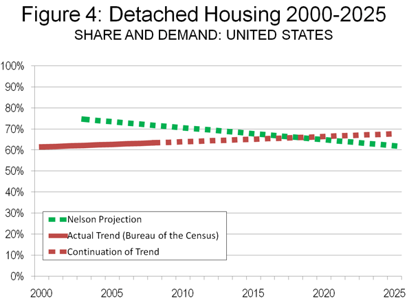
    The University of Utah’s Arthur C. (Chris) Nelson, indicated in an article (entitled “Leadership in a New Era“) in the Journal of the American Planning Association. that in 2003, 75% of the housing stock was detached and 25% was attached, including townhouses, apartments, and condominiums. By 2025 he predicts that only 62% of consumer will favor detached homes, (Note 1). He also predicts a major shift in consumer preferences from housing on large lots (defined as greater than 1/6th of an acre) to smaller lots (Note 2). This, he suggests, would create a surplus of 22 million detached houses on large lots.

    This predication is largely made on the basis of “stated preference” surveys which the author, Dr. Emil Malizia of the University of North Carolina (commenting on the article in the same issue), and others indicate may not accurately reflect the choices that consumers will actually make. Dr. Nelson’s article has been widely quoted, both in the popular press and in academic circles. It has led some well-respected figures such as urbanist and developer Christopher Leinberger to suggest in an Atlantic Monthly article that “many low-density suburbs and McMansion subdivisions, including some that are lovely and affluent today, may become what inner cities became in the 1960s and ’70s—slums characterized by poverty, crime, and decay.”

    The Condo Market Goes Crazy

    Misleading ideas sometimes have bad consequences. The notion that suburbanites were afflicted with urban envy led many developers to throw up high-rise condominiums in urban districts across the country. Sadly for these developers, the Suburban Exodus never materialized, never occurred. As a result, developers have lost hundreds of millions, if not billions of dollars and taxpayers or holders of publicly issued bonds could be left “holding the bag” (see discussion of Portland, below).

    This weakness has been seen even in the nation’s strongest condominium market, New York City, where one developer offered to pay purchaser’s mortgages, condominium fees and real estate taxes for a year as well as closing costs.

    But the damage is arguably worse in other major markets which lack the amenities and advantages of New York.

    Take, for example, Raleigh (North Carolina), where low density living is the rule (the Raleigh urban area is less dense than Atlanta). The News and Observer reports that the largest downtown condominium building (the Hue) “considered a bold symbol of downtown Raleigh’s revitalization,” has closed its sales office and halted all marketing efforts. The development’s offer of a free washing machine, dryer, refrigerator, and parking space were not enough to entice suburbanites away from the neighborhoods they were said to be so eager to leave.

    This is not an isolated instance. Around the nation, condominium prices have been reduced steeply to attract buyers. New buildings have gone rental, because no one wanted to buy them. Other buildings have been foreclosed upon by banks; and units have been auctioned. Planned developments have been put on indefinite hold or cancelled.

    Miami: Of Little Dubai and Cadavers

    Miami’s core neighborhood (downtown and Brickell, immediately to the south) has experienced one of the nation’s most robust condominium building booms. More than 22,000 condominium high rise units were built between 2003 and 2008. Miami could well have more 50-plus story condominium towers than any place outside Dubai.

    As a result, Miami has suffered perhaps the most severe condominium bust in the nation. According to National Association of Realtors data, the median condominium price in the Miami metropolitan area has dropped 75% from peak levels (2007, 2nd Quarter). By comparison, the detached housing decline in the metropolitan area was 50%; the greatest detached housing price decreases among major metropolitan areas were from 52% to 58% (Riverside-San Bernardino, Sacramento, San Francisco and Phoenix).

    The most recent report by the Miami Downtown Development Authority indicates that 7,000 units still remain unsold. The Brickell area is home to the greatest concentration and largest buildings and has the highest ratio of unsold units at 40%.

    Icon Brickell (see photograph above) may be the largest development in the core. Icon Brickell consists of three towers, at 58, 58 and 50 floors and a total of nearly 1,800 units. Despite opening in 2008 and offering discounts of up to 50%, barely one-third (approximately 620) of the units have been sold, according to the Daily Business Review, which also reported on May 13 that the developer had transferred control of two of the towers to construction lenders.

    One building, Paramount Bay, was referred to by The New York Times as a “47-story steel and glass cadaver” with a lobby “like a mortuary.” A real estate site indicates that only one of the buildings 350 units has been sold.

    More recently sales have inched up in the core but due not to any suburban exodus. According to The Miami Herald, huge discounts that have lured Europeans, Canadians, and Latin Americans to the core. The real estate and consulting firm Condo Vultures notes that more than 1,000 of the sales are to a few bulk buyers, a market segment some might refer to as “speculators.”

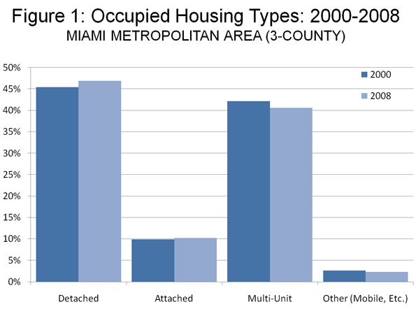
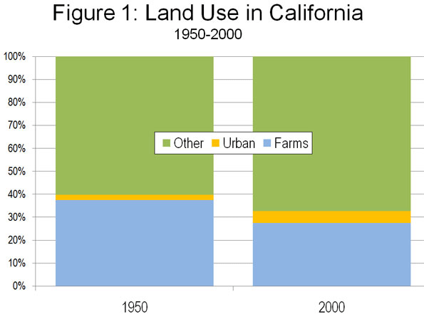
    The latest data from the US Bureau of the Census confirms that there is no fundamental shift away from detached housing in the Miami area, as housing trends point toward more detached housing. In 2000, 48.1% of residents in the Miami metropolitan area lived in detached housing. By 2008, the figure had risen to 49.2% (Figure 1). Essentially, the Suburban Exodus remains a mirage.

    Portland: Gift Certificates for Distressed Developers

    If developer greed was the motive in Miami, government subsidies have been the driving force in Portland. The city of Portland will soon have issued nearly $450 million in urban renewal bonds, provides 10-year tax property tax forgiveness, and reduced development fees, which the Portland Development Commission (PDC) has called “gift certificates” for developers (Note 3).

    Gift certificates have not been enough to cure Portland’s sickly downtown condominium market. The Oregonian reported that prices were down, on average, 30% over the year ended the first quarter of 2010. Remarkably prices in the much ballyhooed Pearl District are plummeting even more than those in the rest of the Portland area. According to DQ News, the median sale price of a house in the Pearl District dropped four times the average in Multnomah County and an even greater six times decline relative to suburban counties over the past year.

    There is more. Just this year, the Pearl District has seen its Eddie Bauer, Adidas, and Puma stores close.

    One condominium building the Encore, is reported to have sold only 17 of 177 units. A recent auction of units at the largest building in the city, the John Ross brought prices “far below the replacement cost” according to The Oregonian’s Ryan Frank, who noted that “it will likely be years before there’s a new high-rise condo built.” Late last year, the Pearl District’s Waterfront Pearl was reported to have sold only 31% of its units and had not sold a unit for a year.

    The Portland Development Commission itself has become part of the condominium bust story. PDC had indicated it was considering relocating its offices to a new 32-story mixed use tower (Park Avenue West), which was to have included condominiums, offices, and retail stores. For more than a year, the proposed 32-story tower has been an unsightly hole in the ground, with construction suspended. PDC decided to stay put in its older, less expensive offices. Even before PDC decided not to locate in Park Avenue West, the developers eliminated the plans for 10 floors of condominiums, doubtless because it made no economic sense to add to an already flooded market.

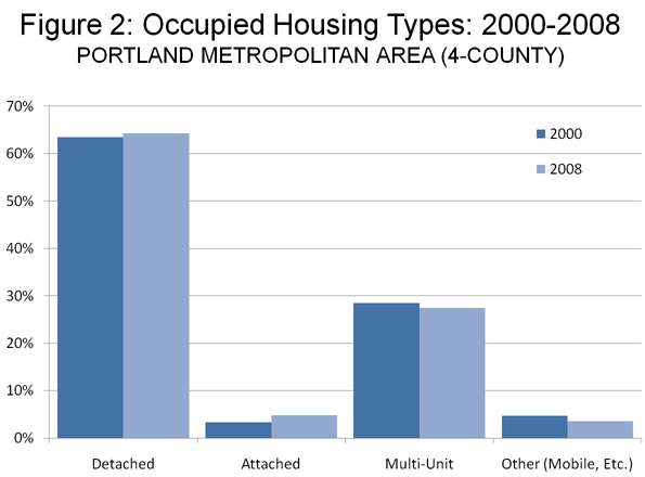
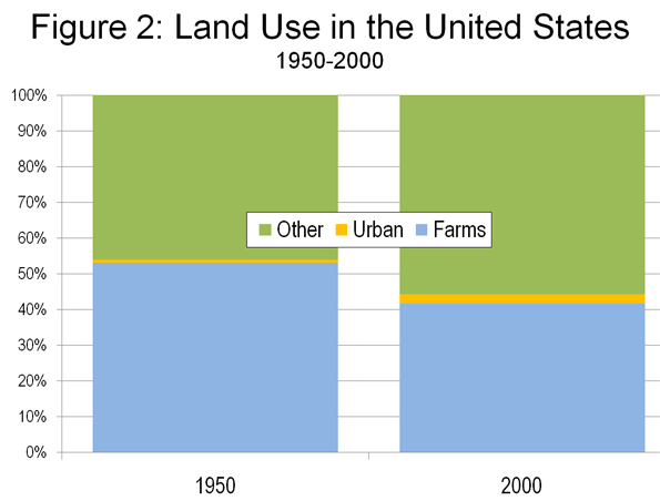
    In Portland, like in Miami, the fact remains that suburbia has not been abandoned. Despite the high density over-building in the Pearl District and elsewhere in the core, detached housing has become even more popular in the region. According to data from the Bureau of the Census, the share of households living in detached housing in the Portland metropolitan area rose from 63.7% in 2000 to 64.5% in 2008 (Figure 2).

    High-Rise Condos: Slums of the Future?

    To say that the high-rise condominium market has fallen on hard times would be an understatement. The condo bust in New York has become so acute that Right to the City, a coalition of community organizations has called upon “the City to acquire the tax delinquent buildings through tax foreclosure and convert vacant units into permanently affordable housing for low-income New Yorkers.” In a report entitled People without Homes and Homes without People: A Count of Vacant Condos in Select NYC Neighborhoods, Right to the City points out that there are more than 4,000 empty condo units in 138 buildings, with owners delinquent on nearly $4 million in taxes to the city.

    Owners of new condominiums around the nation who paid pre-bust prices for their units may not be inclined to stay around if they are surrounded by less affluent renters who have been attracted by desperate building owners and lenders.

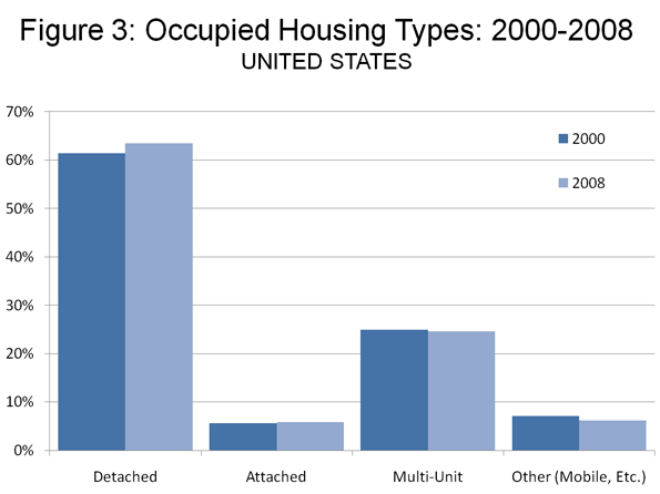
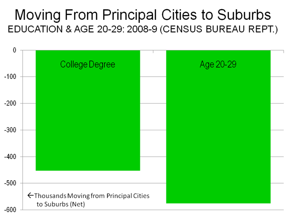
    Are these dark towers of discounting the slums of tomorrow? Only the data and time will tell and it’s too early to know, but preliminary findings show little of the predicted shift toward higher density living (Figure 3). Certainly national data indicates, if anything, a slightly strengthening market for detached, rather than attached housing (Figure 4).

    • Between 2000 and 2008, the share of households living in detached housing rose from 61.4% to 63.5%.

    • A similar trend is shown by the national building permits data. Between 2000 and 2009, 75.2% of residential building permits in the United States were for detached housing. This is up strongly from 69.6% in the 1990s and nearly equals the highest on record (the 1960s), when 77.7% of residential building permits (housing units) were detached houses.


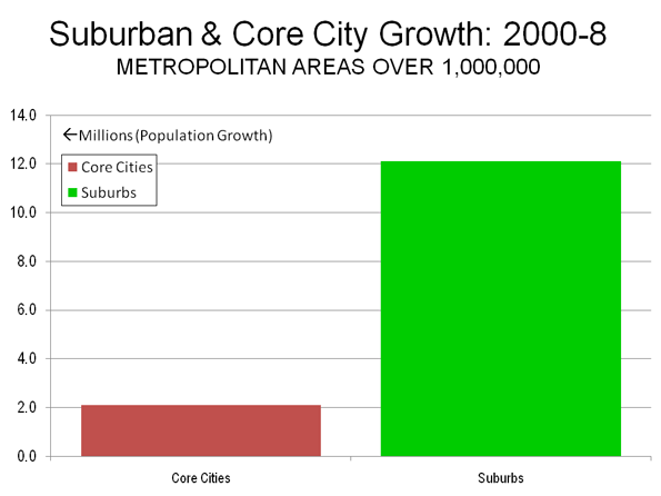
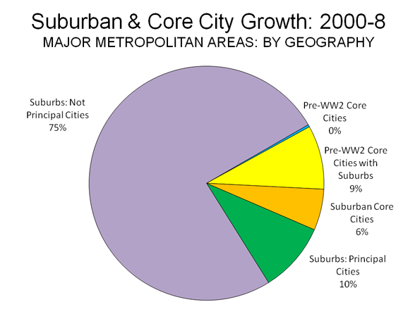
    Looking at the data, there remains little evidence that the stated preferences on which the predictions relied have been translated into the reality of a shift in preferences toward smaller lots in cores or inner ring suburbs. Domestic migration continues to be strongly away from core counties to more suburban counties. Core cities are growing less quickly than suburban areas. Exurban areas are growing faster than central areas, including inner suburbs.

    Clearly, the Suburban Exodus has not begun and there is little reason to believe that it will anytime soon.


    Note 1: In estimating the 2003 share of detached housing (75%), Dr. Nelson uses “one-unit structures” data from the 2003 American Housing Survey Table 2-3. US Bureau of the Census American Housing Survey personnel responded to my request for clarification, indicating that “one-unit structures” includes … single detached housing units, mobile homes, and single attached housing units (such as a townhouse).” Thus the 75% detached estimate is high because it includes mobile homes and single attached housing. As is indicated above, data from the US Bureau of the Census data indicates that the share of detached housing of detached plus attached housing in 2000 was 61.4%. This figure, coincidentally, is virtually the same as the 62% Dr. Nelson predicts for 2025.

    Note 2: The assumption that consumers prefer small lot detached housing may not be sufficiently robust and may even be exaggerated. Dr. Nelson appears to principally rely on research by Myers and Gearin (2001) (in the journal Housing Policy Debate) for concluding that consumers prefer small lot rather than larger lot detached housing, defining small lot development as 1/6th of an acre or less or less than 7,000 square feet. Yet neither figure appears in Myers and Gearin. Moreover, a National Association of Home Builders commenter (also in Housing Policy Debate) questions how its data was characterized by Myers and Gearin in justifying a finding of preference for smaller lots (the survey is unpublished). Without access to the original surveys referenced in Myers and Gearin, it is impossible to judge what respondents may have had in mind as the dividing line between large lots and small lots.

    Note 3: This characterization was on the Portland Development Commission website (accessed January 2, 2007). It was cited in our report, Zero Sum Game: The Austin Streetcar and Development and subsequently removed from the website. A large share of Portland’s urban renewal bonds are insured by Ambac Financial Corporation, which has reported losses exceeding $1 billion in the last two quarters. Ambac indicated that it has “insufficient capital to finance its debt service and operating expense requirements beyond the second quarter of 2011 and may need to seek bankruptcy protection.” Ambac was the insurer of State of Nevada bonds to build the Las Vegas Monorail, which has already entered bankruptcy and is unable to pay its bonds.

    Wendell Cox is a Visiting Professor, Conservatoire National des Arts et Metiers, Paris. He was born in Los Angeles and was appointed to three terms on the Los Angeles County Transportation Commission by Mayor Tom Bradley. He is the author of “War on the Dream: How Anti-Sprawl Policy Threatens the Quality of Life.

    Photo: Icon Brickell, Miami

  • Racing China: The Australia Housing Bubble

    “The writing is on the wall for the Australian dream,” according to Professor Joe Flood at the Flinders University Institute for Housing, Urban and Regional Research. That was before recent predictions that Australia’s overheated housing market may be headed for even higher prices. Real estate experts have recently predicted a doubling of house prices in all five of the largest metropolitan areas over the next decade.

    Sydney, the largest metropolitan area, according to Australian Property Monitors (APM), can be expected by 2019 to experience a median house price increase to $1.124 million in 2019. This would double the 2009 figure of $569,000 (Note). Sydney is already the second most unaffordable metropolitan area in the English speaking world , according to our Demographia International Housing Affordability Survey, with a Median Multiple (median house price divided by median household income) of 9.1, trailing only Vancouver. Sydney’s higher priced housing has been blamed for stunting economic growth and job creation and appears to be a major factor in the continuing migration out of the state of New South Wales. One of Australia’s leading demographers, Bernard Salt, has projected that Sydney could fall to second largest in the nation, behind Melbourne in less than 20 years.

    Melbourne median house prices are also expected to rise above $1.1 million according to projections by property expert Michael Yardney. This would represent more than twice the $480,000 price in 2009.

    Brisbane, which has generally been less unaffordable than Sydney, would have a median house price equal to that of Sydney by 2019. This is more than double the 2009 price of $430,000.

    Perth would experience the greatest house price inflation, also rising to above $1 million, compared to the 2009 figure of $460,000.

    Adelaide would also see house prices rise to more than $1.2 million, according to APM. In 2009, the median house price in Adelaide was $370,000.

    Australia’s Race with China: Recent data indicates that prices are rising furiously toward the doubling the experts have projected. The Australian Bureau of Statistics (ABS) House Price Index indicates that prices have risen 20% over the past year. This is more than 1.5 times the 12% annual rate posted in China’s house price bubble that has its government and so many of the world’s leading economists so concerned.

    As of the 1st quarter, the greatest annual price inflation was in Melbourne, at 28%, a rate that would place it 3rd out of 70 metropolitan areas if it were in China. Prices in Sydney were up 21% from a year ago, which would also rank it 3rd out of 70 in China. At this rate, Sydney could become less affordable than Vancouver within six months and could even surpass high-priced Hong Kong. Brisbane, Adelaide and Perth all experienced price increases between 10% and 15%, and would all place in the top 20 out of 70 Chinese metropolitan areas.

    ABS indicated that the house prices increased more than in any other annual period in the 8 year history of its House Price Index. According to the Wall Street Journal’s Marketwatch, Economist Glenn Maguire of SocGen Asia Pacific in Hong Kong said “These are bubble like numbers … It’s the type of return that basically encourages speculation.” Marketwatch also predicted, on the basis of the house price trend, that the Reserve Bank of Australia (RBA) would raise interest rates, which it did a day later.

    Working for the Mortgage: Meanwhile, because variable rate mortgage loans predominate in Australia, the interest rate increase places an immediate burden on thousands of Australian households. The Housing Industry Association indicates that interest rate increases over the past six months will result in a first-home buyer mortgage payment increase of more than $300 per month.

    This is not good news for the large numbers of households already in mortgage stress, defined by the government when 35% or more of the budget goes to housing expenses. Just six months ago, a median income household purchasing the median income house in Sydney or Melbourne would have had mortgage payments that consumed 50% to 57% of their gross income. Now, the figure would be 60% to 67%. Needless to say, the median priced house is well beyond the means of the median income household. By contrast, if Melbourne and Sydney had the same housing affordability as faster growing Atlanta and Dallas-Fort Worth, the median income household would pay at least $25,000 less in annual mortgage payments for the median priced house.

    Rigging the Market: The housing affordability crisis is the direct result of excessive land use regulations that have artificially limited the supply of land, driving up house prices and fostering speculation. Before these regulations (called “urban consolidation” or “smart growth”) were adopted, housing was as affordable in Australia as in Atlanta or Dallas-Fort Worth. Median Multiples across the nation were 3.0 or below. Now the Median Multiple is between 6.7 and 9.1 in the five largest metropolitan areas. Analysts often suggest that Australia’s population growth rate is driving up prices. While Australia is growing, it grew faster over the 20 years following World War II, and still accommodated a quickly increasing home ownership share. Further, much faster population growth in Dallas-Fort Worth and Atlanta has not driven prices up. Since 2000, these two American metropolitan areas added 40% more population than the five largest Australian metropolitan regions, despite having a smaller combined population.

    This also impacts the other side of the housing equation, the ability of consumers to afford mortgages. The Urban Task Force says that Sydney’s especially onerous regulations have driven up the price of consumer goods while dampening income and employment growth. Australian Property Monitors economist Matthew Bell says that the answer to the housing affordability problem is to increase the supply of housing, a view shared by the Reserve Bank of Australia. The political reality, however, suggests that “The shortages are going to get much, much worse in Sydney” as Jason Anderson, a senior economist with BIS Shrapnel told Agence France-Presse.

    Professor Flood noted that “The country that promised limitless land, cheap housing and near universal home ownership to all comers now has the most expensive housing in the world amid very tight housing and land markets and little prospect of restoring the balance.” Flood’s research indicates a dramatic decrease in home ownership among younger households over the past 20 years.

    Alternate Futures

    Not everyone thinks that house prices can continue their stratospheric rise. US investment expert Edward Chancellor believes that the housing market is overdue for a price collapse, noting that house prices are well above historic measures. Chancellor won the George Polk award for his 2007 article Ponzi Nation, which warned of the housing collapse in the United States and the international damage that could follow. Of course, a housing collapse in Australia would have much less impact on international markets than the one that rocked the much larger US economy, but could do great damage at home.

    The good news is that house prices could be brought under control if there was a change in policy. The state government of Victoria (Melbourne is the capital) is about to significantly expand its “urban growth boundary, allowing more house construction and lower new house prices. Policies such as these could provide a preferable soft landing for the housing market. But this would require state and local governments finally to turn their backs on 20 years of devastating social engineering.


    Note: The Australian dollar is currently worth about US$0.90. The latest (2008) data indicates that Australia had a gross domestic product of $37,400 per capita (purchasing power parity), which compares to $46,500 in the United States, according to the OECD.

    Wendell Cox is a Visiting Professor, Conservatoire National des Arts et Metiers, Paris. He was born in Los Angeles and was appointed to three terms on the Los Angeles County Transportation Commission by Mayor Tom Bradley. He is the author of “War on the Dream: How Anti-Sprawl Policy Threatens the Quality of Life.

    Photograph: Detached housing conforming to plan in suburban Perth

  • Near-New Seattle Residential High-Rise Faces Demolition

    Seattle’s tony Belltown condo neighborhood hardly needs more bad news. Like many other similar areas in central city cores, the supply of new high rise condominiums has far outstripped the demand. Over the past year, the downtown area condominium market has experienced a median price decline of 35%. Units in at least three downtown buildings have been auctioned off at prices from 30% to 50% below the latest, already discounted prices.

    Yet things have gotten even worse. A 25 story apartment building, only 9 years old, will be demolished due to substandard construction. Owners of the McGuire Apartments (photo on web here), Carpenters Union Local 131 and the Multi-Employer Property Trust issued a letter recently announced saying that “Since the necessary repairs are impractical, the decision … is to dismantle the building.” The letter also indicated that tenants would be assisted in finding new housing.

    A local blogger (Hideous Belltown) has provided a more than one-year long chronicle of the building, since scaffolding was erected, and concluding with two “death-watch” entries.

    The Seattle tower may be the newest and tallest building to ever be demolished, especially in the United States.

  • $300,000-$400,000 for a Levittowner?

    An article in The Wall Street Journal details the difficulties that were faced by home owners caught in the Goldman Sachs/John Paulson finance scheme (“The Busted Homes Behind a Big Bet“). The article calls the situation a “dizzyingly complex transaction, involving 90 bonds and a 65-page deal sheet. But it all boiled down to whether people … could pay their mortgages.” There is plenty of blame to go around, but surely there were both big winners and big losers is these deals. The big winners were Goldman Sachs and John Paulson. The big losers were the homeowners, though they were not without blame, since they were not forced to take out the excessively large mortgages.

    The striking thing about this story, however, is the photograph of a Levittown style house in Aberdeen township, New Jersey, a distant suburb nearly 40 miles from New York City. The picture in the article cannot be directly linked, and the best view is on an interactive slide show linked to the article. We have provided a photograph of a near somewhat smaller house in Levittown (see photo).

    In 2006, the owner had refinanced the house with a $308,750 loan, indicating a value more than triple that of comparable housing in much of metropolitan America.

    Levittown, of course, was the late 1940s housing development on Long Island that set the stage for the automobile oriented suburban expansion that did so much to create the largest and most affluent middle class in the world. The Levittown houses were very small, starting at about 750 square feet, though many have been expanded. It was not long before suburban housing became larger, eventually rising to the present 2,250 square foot median. The Wall Street Journal’s Aberdeen township house is under 1,500 square feet, according to Zillow and was built in 1953.

    The Wall Street Journal article misses a significant point. How could such a modest (and doubtless comfortable) house have become so valuable that it could justify refinancing for more than $300,000? The answer is simple. During the real estate bubble, house prices in New Jersey exploded. The state’s restrictive land use regulation largely prohibit new housing on the suburban fringe, leaving prices nowhere to go but up and up strongly. Between 2000 and 2006, the median house value in Monmouth County, where Aberdeen Township is located, rose 125% (according to US Bureau of the Census data). 2006 data for Aberdeen township is not readily available.

    By the peak of the bubble, the median value house in Monmouth County was 5.8 times the median household income, up from 3.0 times in 2000. In 2000, prices were even lower in Aberdeen township, at 2.3 times incomes – well within the 3.0 standard that defined housing affordability for at least one-half century.

    While owners were borrowing $300,000 or more on their modest early 1950s houses in Aberdeen township, households were buying brand new houses of the same size for under $120,000 in Dallas-Fort Worth, Atlanta, Houston, Indianapolis and a host of other metropolitan areas where the American Dream had not been outlawed. Expansion of the housing supply was allowed, and prices stayed within historic norms. For example, in Indianapolis, house prices were less than one-half that of Monmouth County, after adjusting for income levels.

    Meanwhile, a judgment of $370,000 has been entered against the owner of the Aberdeen township Levittowner. The auction in late April by the Monmouth County Sheriff for a price that is probably closer to its real value if it had been in a rationally regulated jurisdiction: $100.

  • The Real State of Metropolitan America

    The week opened with an important report on metropolitan demographics by the Brookings Institution, only to be followed by the Census Bureau’s annual report on migration, which contained a different message than the Brookings report. We offer yet a third analysis, since both the Brookings and the Census Bureau reports classify up to one-sixth of suburban population as not being in the suburbs.

    Brookings: The new Brookings State of Metropolitan America report examined trends in the 100 largest metropolitan areas using Census Bureau data between 2000 and 2008 (the census and the American Community Survey). Brookings highlighted findings that some “primary cities” were experiencing an increase in white population, while the rest of the metropolitan area (which it called suburbs) was becoming more diverse. Not uncharacteristically, the core city oriented press took the bait and embellished a bit on the findings. MSNBC characterized the report as indicating that “many younger, educated whites move to cities for jobs and shorter commutes.” Brookings, which largely shares and encourages the urbanist media spin, calls this movement of young, educated whites from suburbs to the cities “bright flight.”

    Brookings also expanded is previous finding that the majority of people in poverty live in suburbs to note that a majority of Hispanic and African-Americans now live in the suburbs. This is really not all that surprising, since suburban areas continue to grow faster and comprise the overwhelming share of metropolitan population.

    Census Bureau: Just a day or two later, the Census Bureau published its annual analysis of migration in the nation. The basis of this report is the Current Population Survey, which like the American Community Survey is conducted by the Census Bureau. The Census Bureau report received considerably less press attention than the Brookings report, perhaps it would be hard to characterize any of its findings as being consistent with the favored “death of the suburbs” line. The previous annual editions back to the beginning of the decade indicate little difference from the 2008-2009 migration trends in the current report.

    The Census Bureau analysis indicates that, almost regardless of the category, many more people are moving from “principal cities” to what it refers to as “suburbs.”

    • Every ethnic group is moving to the suburbs in greater numbers than to principal cities. Three times as many Hispanics are moving from principal cities to the suburbs as from the suburbs to principal cities. The same is true for twice as many African-Americans and Asians. Whites are moving to the suburbs at 1.5 times the rate of their moving to principal cities (Figure 1).
    • Every age group but one is moving to the suburbs at substantially above the rate of movement to the principal cities. There is strong movement among people aged from 20 to 25 to the suburbs rather than the principal cities (Figure 2). The one exception was that among people over 85 years of age, not exactly the epitome of the “bright flight” cited by Brookings and the media.
    • The overwhelming migration from principal cities to the suburbs, rather than from suburbs to principal cities was characteristic across all income categories.
    • There is, in reality, little “bright flight” to report. Among people with college and graduate degrees, nearly twice as many moved from principal cities to suburbs as moved from suburbs to principal cities (Figure 2). While the Census report does not provide mobility information on educational attainment by age, there was strong movement of young adults to the suburbs (noted above).


    The trends in the Census report are consistent with the domestic migration trends that we have previously reported.

    What is a Suburb? There are significant problems with definition of the term “suburb in each of the reports.

    The Office of Management and Budget (OMB), which establishes metropolitan area criteria switched to the “principal city” terminology for the 2000 census, partly to make it clear that principal cities were not inner cities or central cities. The criteria designates as principal cities, the largest in each metropolitan area, any city over 250,000 and any city with more than 50,000 population in which total employment exceeds the workforce.

    Among the 52 major metropolitan areas (those with more than 1,000,000 population), OMB designates 230 principal cities. The Census Bureau report calls everything outside a principal city a suburb. In fact, most of the principal cities are themselves suburbs, developed since World War II as urban areas and expanded outward from their cores.

    For example, principal city Schaumburg, Illinois is located well outside the core city of Chicago and contains a large suburban employment center (“edge city”). Bellevue, the large suburban employment center in the Seattle area is a principal city and not called a suburb by the Census Bureau. Cerritos, California is one of the 25 principal cities of the Los Angeles metropolitan area. Cerritos used to be called Dairy Valley, since it consisted largely of dairy farms until the middle 1950s.

    The Brookings report, in recognition of this problem, calls its non-suburbs primary cities and limits them to no more than three for any metropolitan area. Still, many suburbs are designated as primary cities and not counted in the suburban data, such as Mesa, Arizona (Phoenix), Arlington, Texas (Dallas-Fort Worth), and Cary, North Carolina (Raleigh).

    Suburban versus core analysis needs to be considerably more precise to be meaningful. It would be best to define the characteristics of the core and analyze metropolitan areas at the census tract level, rather than at the city level. However, the data at the city level is far more accessible and is thus predominantly used.

    What is a Core City? Even so, it is important to recognize that there are substantial differences among core cities (which are, broadly speaking, the only parts of urban areas that are not suburbs). Core cities may be divided into three broad categories:

    Pre-World War II Core Cities: These are core cities that have essentially the same boundaries as in 1950. There are 21 Pre-World War II Core Cities in the major metropolitan areas (See Table 2 below). These were largely built before the automobile became dominant, and once were predominately walking and transit cities. New York, Chicago, Boston, Philadelphia and San Francisco are probably the best examples.

    Pre-World War II Core Cities with Suburbs: Many pre-World War II core cities either included wide swaths of vacant developable land in 1950 or annexed substantial amounts of vacant or suburban land after 1950. These cities have cores that are similar to the Pre-World War II Core Cities, but also include suburbs that are little different than the inner suburbs outside the city. For example, in 1950, Los Angeles contained substantial amounts of non-urban land in the San Fernando Valley, which was eventually covered with suburban development. Other cities, such as Milwaukee, Portland, Seattle, Austin and Houston annexed considerable suburban land after 1950. These annexations did not always result in increased population. For example, Salt Lake City doubled its land area between 1950 and 2000, yet retained essentially the same population. Milwaukee nearly doubled its land area, yet lost 40,000 residents.

    Suburban Core Cities: A number of core cities developed predominantly after World War II and as a result, have little, if any pre-World War II core. The largest of these is Phoenix, which recently passed Philadelphia to become the nation’s 6th largest city. San Jose, Charlotte, Orlando and Las Vegas are also examples of Suburban Core Cities.

    Another Perspective: The following analysis (expanded version available here) is offered to indicate general trends in suburbs when non-suburban areas are defined to exclude demonstrably suburban areas. (This may sound circular, but both Brookings and the Census Bureau define some suburban areas as non-suburban.)

    Table 1
    Population Trends: Metropolitan Areas Over 1,000,000: 2000-2008 by Geography
    2000
    2008
    Change
    %
    Metropolitan Areas   152,382,483      166,564,617     14,182,134 9.3%
      Core Cities     43,818,674        45,922,606        2,103,932 4.8%
         Pre-WW2 Core Cities      20,172,850       20,219,342            46,492 0.2%
         Pre-WW2 Core Cities with Suburbs     18,472,298       19,723,295       1,250,997 6.8%
         Suburban Core Cities (Post WW2)        5,173,526          5,979,969          806,443 15.6%
      Suburbs   108,563,809      120,642,011     12,078,202 11.1%
        Suburbs Classified by OMB as Principal Cities    17,968,287       19,334,689       1,366,402 7.6%
        Suburbs Not Classified as Principal Cities    90,595,522     101,307,322    10,711,800 11.8%
    Calculated from US Bureau of the Census Data
    For classification of core cities, see Table 3
    2008 Population of "Suburbs Classified as Principal Cities" is slightly understated because there are no late official estimates for 7 "census designated places." (which are not cities): 2000 estimates used.

    Generally, suburbs continue to grow much faster than the core cities (Table 1 and Figure 3). Between 2000 and 2008:

    • Suburbs added 12.1 million residents, growing 11.1%.
    • Core cities added 2.1 million residents, growing 4.8%. The greatest growth was in the Post War (Suburban) Core Cities, at 15.6%. The Pre-War Core Cities with Suburbs grew 6.8% and the Pre-War Cities grew 0.2% (Figure 4).


    Virtually all of the core city growth was in the more suburban core cities, which is another indication that suburbanization is continuing. Further, the principal cities that are really suburban grew at a rate of 7.6%, more than double that of the core cities. This would seem to indicate that the migration data from the Census Bureau indicating a continued migration to the suburbs is, if anything, materially understated (by classification of some suburbs as principal cities).

    At the same time, the demographic trends and prospects in the nation’s core cities are better than in the past. The rampant lawlessness that drove so many out of the cities in the 1970s has been replaced by law enforcement strategies developed under former New York mayor Rudi Giuliani. Core cities would become more attractive to future residents with serious reform of school performance and business regulation. Until that occurs, however, it seems unlikely that the movement from the cities to the suburbs will be reversed.

    The city-centric media, with its faith-based demographics, continue to announce the demise of the suburbs. However, until migration data shows a net movement from the suburbs to the core cities, it will remain little more than disingenuous hype. At this point, it is not even close. From 2000 to 2008, suburban counties in major metropolitan areas gained 2,000,000 domestic migrants, while the core counties lost 4,600,000 domestic migrants (Note).


    Note: Domestic migration data is reported at the county level and is thus not available for core cities, except where they are coterminous with counties (Such as New York, San Francisco, Baltimore and Washington).

    Table 2
    Metropolitan Areas and Core Cities
    Metropolitan Area Core City (ies) Type of Core City
    Atlanta-Sandy Springs-Marietta, GA  Atlanta Pre-WW2 Core City with Suburbs
    Austin-Round Rock, TX  Austin Pre-WW2 Core City with Suburbs
    Baltimore-Towson, MD  Baltimore Pre-WW2 Core City
    Birmingham-Hoover, AL  Birmingham Pre-WW2 Core City with Suburbs
    Boston-Cambridge-Quincy, MA-NH  Boston Pre-WW2 Core City
    Buffalo-Niagara Falls, NY  Buffalo Pre-WW2 Core City
    Charlotte-Gastonia-Concord, NC-SC  Charlotte Pre-WW2 Core City with Suburbs
    Chicago-Naperville-Joliet, IL-IN-WI  Chicago Pre-WW2 Core City
    Cincinnati-Middletown, OH-KY-IN  Cincinnati Pre-WW2 Core City
    Cleveland-Elyria-Mentor, OH  Cleveland Pre-WW2 Core City
    Columbus, OH  Columbus Pre-WW2 Core City with Suburbs
    Dallas-Fort Worth-Arlington, TX  Dallas Pre-WW2 Core City with Suburbs
    Denver-Aurora-Broomfield, CO  Denver Pre-WW2 Core City with Suburbs
    Detroit-Warren-Livonia, MI  Detroit Pre-WW2 Core City
    Hartford-West Hartford-East Hartford, CT  Hartford Pre-WW2 Core City
    Houston-Sugar Land-Baytown, TX  Houston Pre-WW2 Core City with Suburbs
    Indianapolis-Carmel, IN  Indianapolis Pre-WW2 Core City with Suburbs
    Jacksonville, FL  Jacksonville Pre-WW2 Core City with Suburbs
    Kansas City, MO-KS  Kansas City Pre-WW2 Core City with Suburbs
    Las Vegas-Paradise, NV  Las Vegas Suburban Core City (Post -WW2)
    Los Angeles-Long Beach-Santa Ana, CA  Los Angeles Pre-WW2 Core City with Suburbs
    Louisville/Jefferson County, KY-IN  Louisville Pre-WW2 Core City with Suburbs
    Memphis, TN-MS-AR  Memphis Pre-WW2 Core City with Suburbs
    Miami-Fort Lauderdale-Pompano Beach, FL  Miami Pre-WW2 Core City
    Milwaukee-Waukesha-West Allis, WI  Milwaukee Pre-WW2 Core City with Suburbs
    Minneapolis-St. Paul-Bloomington, MN-WI  Minneapolis Pre-WW2 Core City
    Minneapolis-St. Paul-Bloomington, MN-WI  St. Paul Pre-WW2 Core City
    Nashville-Davidson–Murfreesboro–Franklin, TN  Nashville Pre-WW2 Core City with Suburbs
    New Orleans-Metairie-Kenner, LA  New Orleans Pre-WW2 Core City
    New York-Northern New Jersey-Long Island, NY-NJ-PA  New York Pre-WW2 Core City
    Oklahoma City, OK  Oklahoma City Pre-WW2 Core City with Suburbs
    Orlando-Kissimmee, FL  Orlando Suburban Core City (Post -WW2)
    Philadelphia-Camden-Wilmington, PA-NJ-DE-MD Philadelphia Pre-WW2 Core City
    Phoenix-Mesa-Scottsdale, AZ  Phoenix Suburban Core City (Post -WW2)
    Pittsburgh, PA  Pittsburgh Pre-WW2 Core City
    Portland-Vancouver-Beaverton, OR-WA  Portland Pre-WW2 Core City with Suburbs
    Providence-New Bedford-Fall River, RI-MA  Providence Pre-WW2 Core City
    Raleigh-Cary, NC  Raleigh Suburban Core City (Post -WW2)
    Richmond, VA  Richmond Pre-WW2 Core City with Suburbs
    Riverside-San Bernardino-Ontario, CA  Riverside Suburban Core City (Post -WW2)
    Rochester, NY  Rochester Pre-WW2 Core City
    Sacramento–Arden-Arcade–Roseville, CA  Sacramento Pre-WW2 Core City with Suburbs
    Salt Lake City, UT  Salt Lake City Pre-WW2 Core City with Suburbs
    San Antonio, TX  San Antonio Pre-WW2 Core City with Suburbs
    San Diego-Carlsbad-San Marcos, CA  San Diego Pre-WW2 Core City with Suburbs
    San Francisco-Oakland-Fremont, CA  San Francisco Pre-WW2 Core City
    San Francisco-Oakland-Fremont, CA  Oakland Pre-WW2 Core City
    San Jose-Sunnyvale-Santa Clara, CA  San Jose Suburban Core City (Post -WW2)
    Seattle-Tacoma-Bellevue, WA  Seattle Pre-WW2 Core City with Suburbs
    St. Louis, MO-IL  St. Louis Pre-WW2 Core City
    Tampa-St. Petersburg-Clearwater, FL  Tampa Pre-WW2 Core City with Suburbs
    Tucson, AZ  Tucson Suburban Core City (Post -WW2)
    Virginia Beach-Norfolk-Newport News, VA-NC  Norfolk Pre-WW2 Core City with Suburbs
    Washington-Arlington-Alexandria, DC-VA-MD-WV Washington Pre-WW2 Core City
    See: Core City Classification Definitions

    Wendell Cox is a Visiting Professor, Conservatoire National des Arts et Metiers, Paris. He was born in Los Angeles and was appointed to three terms on the Los Angeles County Transportation Commission by Mayor Tom Bradley. He is the author of “War on the Dream: How Anti-Sprawl Policy Threatens the Quality of Life.

    Photograph: Suburban core city: Phoenix

  • When Saving 90% is Not Enough: The Transit Savings Report

    The American Public Transportation Association (APTA) is publishing monthly Transit Savings Report to illustrate the purportedly great savings that can be achieved by giving up the car and traveling by transit instead. APTA compares the average cost of buying a monthly transit pass to replace a car, which is assumed to travel 15,000 miles annually.

    The latest edition was made public on April 6 and reveals astounding savings, as was reported by The Wall Street Journal and other press-release echoing press outlets. The APTA release indicates that households could save from $8,174 to $13,784 annually by giving up a car for transit in the 20 urban areas with the highest transit ridership. Overall, the APTA figures calculate to an average savings of $10,183. The APTA press release does not say how much the monthly bus pass would cost. However, our own quick survey of 17 major transit systems indicates that a monthly pass averages approximately $90 per month, or $1,080 per year. This means that getting rid of the car and riding transit instead saves approximately 90%, ($10,183 divided by [$1,080 + $10,183]) at least according to APTA (Note).

    With savings such as these, a visitor from Mars to APTA’s Fantasyland might expect that nearly all urban travel should logically be by transit rather than by cars. But, alas, no. Nothing could be further from the truth. In fact, cars, which APTA tells us cost nearly 10 times transit, account for more than 98% of motorized travel in US urban areas.

    Profligate Americans? What could possibly explain this paradox? Surely, there is plenty of evidence that Americans would much rather spend less than more on products of equal value. This has been painfully evident to “legacy” airlines that have had to lower their prices to compete with discount carriers like Southwest Airlines. Traditional supermarkets have lost hoards of customers stores like Wal-Mart or Costco over amounts that pale by comparison to the savings that APTA would have us believe are so readily available by rejecting our “love affair” with the automobile.

    Of course, the choice is not that simple. Americans no more have a love affair with the automobile than with flush toilets or refrigerators. The American (and Canadian, Australian, European and Asian) love affair is not with products, but rather with the better life style that the products make possible. People have refrigerators because they keep food fresh and prevent spoiling. Under certain circumstances, however, refrigerators are not practical, such as when one uses a cooler instead at a picnic. Transit is like that. It makes sense for some trips, but not a large share in the overall scheme of things.

    The Largest Downtowns: Where Transit Works Best: For the overwhelming majority of trips, the automobile provides much faster and generally more comfortable travel than can be made available by transit. There are times, however, when transit is superior. For example, the car is particularly impractical for commuting into crowded Manhattan, which is served by an enormous subway, commuter rail and bus system that extends to the further reaches of the metropolitan area.

    This is evident in data from the latest US Bureau of the Census American Community Survey, which indicates that transit accounts for 80% of the motorized commuter travel to Manhattan. Manhattan’s business district has nearly 2,000,000 jobs in a relatively small area, and riding transit and the average transit commute is only slightly longer than the average car commute. With Manhattan’s world class traffic, transit is a demonstrably superior competitor to the car.

    This, in reality, simply demonstrates that transit is “about downtown.” Consumer preferences demonstrate that commuting to some of the nation’s largest downtown areas is better by transit. The impressive skyscrapers can leave the impression that downtowns are dominant in metropolitan employment. However, downtowns represent only 10% of metropolitan employment. The largest downtowns are well situated for transit service, by virtue of their high employment densities and the fact that transit systems focus on them.

    These include central business districts, including New York’s Manhattan and Brooklyn, Chicago, Boston, Philadelphia and San Francisco. All of these downtown areas where transit is dominant were added together, they would cover barely one-third of the expanse Orlando’s Walt Disney World. But consumer preferences also show that the car provides superior mobility to virtually all other destinations. Our already heavily indebted public sector could not begin to provide a level of service to replicate transit’s downtown access throughout the urban area.

    Transit even has difficulty competing in the dense outer boroughs of New York City. While slightly more people commute to Brooklyn jobs by transit than by car, the reverse is true in the Bronx. Twice as many people commute to jobs in Queens by car than transit, despite the borough’s having a population density greater than that of San Francisco, the nation’s second most dense large municipality.

    Transit’s share falls off even more sharply in the suburbs of New York. Nine times as many people commuting to jobs in inner suburban Nassau County use cars as use transit. Commuters to outer suburban Suffolk County use cars 40 times as much as transit.

    Consumers make these choices not because cars are inherently superior to transit or vice versa. A commuter who lives in New Brunswick, New Jersey and works in Manhattan, usually takes a New Jersey Transit train or bus to work, because the car competes poorly for such a trip. The neighbor, however, who works in the suburban I-287 corridor takes the car, because transit cannot compete for that trip.

    It remains true that for the overwhelming majority of trips cars meet the needs of consumers far better than transit. Cars are faster and deliver people within walking distance of their destinations.

    Even the ultimate — making transit free — makes little difference. In 1990, Austin, Texas eliminated fares. Yet the share of travel in the Austin area by car declined about a quarter of one percent. For most urban travel, transit is so uncompetitive that you can’t even give it away.


    Note: None of the above should be interpreted to be an acceptance of the APTA figures. APTA assumes annual parking costs of $1,850, yet most parking outside downtowns. Some might object that there is a cost to this free parking, but to ignore its costs is quite appropriate, given that APTA’s figures do not include subsidies to transit, which would quadruple its cost. Further, APTA uses especially high costs for automobile use, which assume that everyone purchases a new car every five years. This substantially overstates the cost of cars relative to transit.

    Wendell Cox is a Visiting Professor, Conservatoire National des Arts et Metiers, Paris. He was born in Los Angeles and was appointed to three terms on the Los Angeles County Transportation Commission by Mayor Tom Bradley. He is the author of “War on the Dream: How Anti-Sprawl Policy Threatens the Quality of Life.

    Photo: New Jersey Turnpike