Author: Wendell Cox

  • Overcrowded California

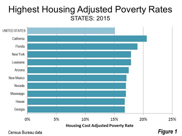
    In its decades of unprecedented population growth, California was a land of superlatives. Regrettably, the superlatives have changed from mostly positive to largely negative. For example, the latest Census Bureau Supplemental Poverty Estimates, indicated that California continues to have the highest poverty rate of any state, after adjustment for housing costs (Figure 1). Not even Mississippi can compete with that, sitting 3.6 percentage points lower. California metropolitan areas undoubtedly resemble this shameful performance, though the Census Bureau does not provide data below the state level.

    It should not be surprising that this backdrop is accompanied by some of the highest rates of housing overcrowding in the nation, according to the latest American Community Survey data (2015). Overcrowding is estimated by the number of people living in a dwelling unit per room. That raises the critical question of what is a room? The American Community Survey gives the following instruction on how to count rooms:

    "When counting the number of rooms in a home for the American Community Survey (ACS), please count rooms separated by built-in archways or walls that extend out at least 6 inches and go from floor to ceiling. Include only whole rooms used for living purposes, such as living rooms, dining rooms, kitchens, bedrooms, finished recreation rooms, family rooms, enclosed porches suitable for year-round use, etc.

    DO NOT count bathrooms, kitchenettes, strip or pullman kitchens, utility rooms, foyers, halls, open porches, balconies, unfinished attics, unfinished basements, or other unfinished space used for storage."

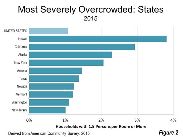
    Overcrowding is generally defined as a household having more than one person (of any age) per room in a dwelling unit. Severe overcrowding is more than 1.5 persons per room. A household is the people living in a housing unit, whether a detached house, an apartment, a mobile home or other.

    Degrees of Overcrowding

    California generally leads in both overcrowding and severe overcrowding. The state’s share of overcrowded households in the nation is 27 percent, while the state has 30 percent of severely overcrowded households, almost 3 times its 11 percent share of households.

    Only Hawaii has a higher severe overcrowding rate than California, at 3.8 percent of households California’s severe overcrowding rate is 2.9 percent. By contrast, average for the United States is a much lower 1.1 percent. Alaska has the third most severe overcrowding rate, at 2.3 percent, while New York has the fourth most severe overcrowding, at 2.1 percent. Arizona ranks fifth at 1.5 percent (Figure 2).

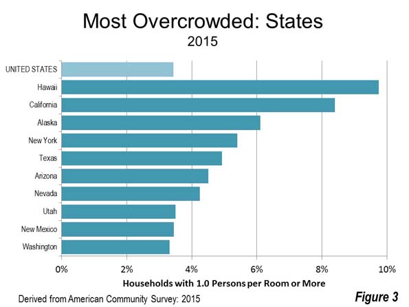
    The situation is similar with respect to basic overcrowding, more than one person per room. Hawaii also leads in this category at 9.7 percent, followed by California at 8.4 percent. The national overcrowding rate is 3.4 percent. Again, Alaska ranks third at 6.1 percent, followed by New York and 5.4 percent and Texas at 4.9 percent (Figure 3).

    Metropolitan Areas

    California metropolitan areas dominate in terms n both of the highest severe overcrowding rates and the highest overcrowding rates, to a far greater extent than one would expect from a highly developed, still affluent state.

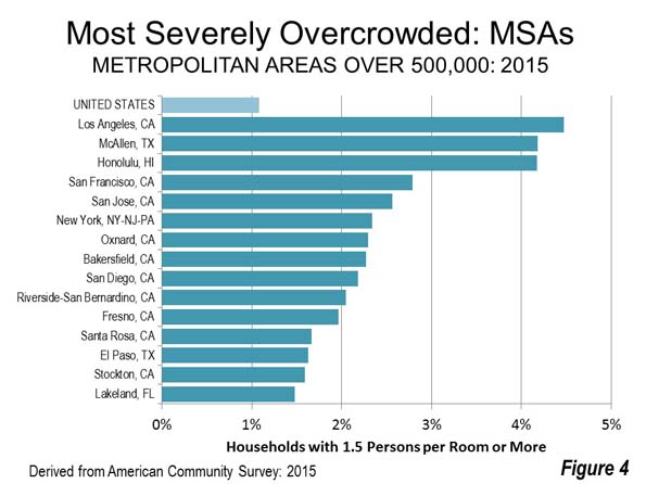
    California is home to 12 of the 106 metropolitan areas with more than 500,000 population (as of 2015). 10 of the 15 most severely overcrowded metropolitan areas are in California. My birthplace of Los Angeles has the worst rate in the United States, with 4.5 percent of its households in living in severely overcrowded conditions. This is more than four times the national rate of 1.1 percent. McAllen, Texas, in the Rio Grande Valley, is the second most severely overcrowded (4.2 percent), leading the third ranked Honolulu (4.2 percent) in the second digit.

    Two of California’s and the nation’s most wealthy metropolitan areas are among the most severely overcrowded (more than 1.5 persons per room), both in the San Francisco Bay Area. These include San Francisco itself (#4) and San Jose (#5). New York is the sixth most severely overcrowded.

    Other California metropolitan areas among the most severely overcrowded are Oxnard (#7), in the Los Angeles area, Bakersfield (#8) and Fresno (#11) in the San Joaquin Valley, San Diego (#9), Riverside San Bernardino (#10) in the Los Angeles area as well as Santa Rosa (#12) and Stockton (#14) in the San Francisco Bay Area (Figure 4).

    Only two of California’s metropolitan areas with more than 500,000 residents do not rank in the most severely overcrowded metropolitan areas, Sacramento and Modesto.

    California’s dominance in basic overcrowding (over one person per room) is more complete, with 11 of its 12 largest metropolitan areas represented in the most overcrowded 15. Only Sacramento was exempted.

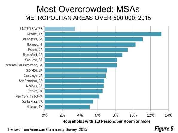
    The same three metropolitan areas lead the pack, though in a somewhat different order. McAllen has an overcrowding rate of 13.2 percent, nearly 4 times the national rate of 3.4 percent. Los Angeles is the second most overcrowded, at 11.1 percent, while Honolulu repeats its third ranking at 10.3 percent.

    The next at nine most overcrowded metropolitan areas are all in California, including Fresno (#4), Bakersfield (#5), San Jose (#6), Riverside-San Bernardino (#7), Stockton (#8), San Diego (#9),
    San Francisco (#10), Modesto (#11), in the San Joaquin Valley and Oxnard (#12). Santa Rosa has the 14th largest overcrowding rate (Figure 5).

    Contributing Factors

    Two characteristics stand out with respect to the states and metropolitan areas most overcrowded, high international immigration rates and high housing costs. High housing costs were cited as a factor in California’s high overcrowding rates by the state Legislative Analyst. High housing costs are also a problem in Hawaii and New York, which are among the 10 most crowded states in both categories as are there largest metropolitan areas. In addition, states that are magnets for international immigration are also represented among the most overcrowded, such as California, New York, Arizona, New Mexico and Nevada.

    Overcrowding has important social consequences, especially for children. For example, Claudia D. Solari at the University of North Carolina, Chapel Hill and Robert D. Mare of UCLA found in research focused on the city of Los Angeles that overcrowded housing significantly harms children, regardless of socioeconomic characteristics, negatively impacting school achievement, behavior and physical health. They conclude that these factors can persist throughout life, affecting their future socioeconomic status and adult well-being.”

    California, with its progressive ideals, needs to match its performance with its rhetoric. The state’s working class is clearly being hemmed in, and face a future that is hardly that promised by its political class.

    Wendell Cox is principal of Demographia, an international public policy and demographics firm. He is a Senior Fellow of the Center for Opportunity Urbanism (US), Senior Fellow for Housing Affordability and Municipal Policy for the Frontier Centre for Public Policy (Canada), and a member of the Board of Advisors of the Center for Demographics and Policy at Chapman University (California). He is co-author of the “Demographia International Housing Affordability Survey” and author of “Demographia World Urban Areas” and “War on the Dream: How Anti-Sprawl Policy Threatens the Quality of Life.” He was appointed to three terms on the Los Angeles County Transportation Commission, where he served with the leading city and county leadership as the only non-elected member. He served as a visiting professor at the Conservatoire National des Arts et Metiers, a national university in Paris.

    Photo: Downtown Los Angeles toward the Hollywood Hills and the San Fernando Valley (by author)

  • There are “Left-behind” in the Blue States Too

    The 2016 presidential election revealed a strongly divided nation. Donald Trump’s victory has been characterized as a “landslide” by some, noting the surprisingly high electoral vote tally. Others note the likelihood that Hillary Clinton will win the popular vote. In any event, the result is far different than many expected. In its last pre—election prediction of the electoral vote, the Los Angeles Times gave Hillary Clinton one-half more electoral votes (352) than she will apparently receive (232). Her apparent popular vote victory (approximately 300,000 at this point) is so concentrated that without California she would have lost the popular vote by more than 3,000,000 (based on trends at this writing).

    Just about everyone agrees that the pollsters got this election very wrong. It appears that Trump voters, especially rural voters were significantly under sampled in polling. Generally, it is agreed, that the secret to the success of the Trump campaign was the mobilization of voters who believed that they had been “left-behind” by the “system.” This was the key to the strong Republican performance in the Rust Belt and especially in “coal country.”

    In these areas, working households who had depended on manufacturing or mining employment have seen jobs disappear and incomes drop in the last two decades. It was, overall, an election pitting the more fortunate “elite,” especially the West Coast and in Northeastern metropolitan areas against middle and lower middle income households that have not done well. These are households that feel they have been “left-behind” in a national economy that has yet to restore inflation-adjusted 1999 median incomes.

    Yet the “left-behind” were evident in voting patterns even in the more prosperous Blue State metropolitan regions (combined statistical areas), especially in outer suburban counties, which often have smaller populations.

    New York

    The New York metropolitan region, with its high nominal household income, has a number of counties in which Donald Trump polled well.

    The four most highly urban boroughs of the city delivered overwhelming mandates to Clinton, with as much as 89 percent of the vote in Manhattan and the Bronx, 80 percent in Brooklyn and 75 percent in Queens. She also received strong support from inner suburban counties, 65 percent in Westchester, 74 percent in Hudson (Jersey City), 77 percent and Essex (Newark) and 66 percent in Mercer (Trenton) and Union (Elizabeth).

    However, some of the outer counties showed strong support for Donald Trump. For example, he received 66 percent of the vote in New Jersey’s Ocean County, and more than 60 percent of the vote in Sussex County, New Jersey and won other suburban New Jersey counties such as Monmouth, Hunterdon, Morris. Trump also took Suffolk County in eastern Long Island, and the Hudson Valley counties of Putnam, Orange and Dutchess, where the FDR Library is located.

    Even farther out, Trump managed above 60 percent majorities in Pennsylvania’s Pike and Carbon counties and also won Northampton County (Bethlehem).

    Washington-Baltimore

    There was strong support for Trump in Washington – Baltimore metropolitan region, with its lucrative government jobs machine. Northernmost Franklin County, Pennsylvania provided a 71 percent majority to Trump, while Maryland’s Washington County, just across the border, provided 64 percent. Closer to Baltimore, Carroll and Harford provided Trump 65 percent and 60 percent majorities. Across the Chesapeake Bay Bridge from an Annapolis, Queen Anne’s County voted 66 percent for Trump. Southeast of Washington, St. Mary’s County voted 60 percent for Trump.

    West Virginia’s Hampshire County provided the largest majority in the metropolitan region to Trump at 78 percent, while Berkeley County provided a 60 percent vote. Amazingly, every county in the state of West Virginia voted for Trump, despite its decades of Democratic Party domination, providing Trump a 62 to 27 percent landslide.

    The situation was similar in outer counties across the Potomac River in Virginia. Warren County voted 66 percent and Frederick County 65 percent for Trump. Facquier  and Culpepper counties supported Trump at 60 percent.

    The “Left” Coast

    There were even pockets of strong Trump support in some metropolitan regions of the so-called “Left Coast.”

    For example, in the Portland metropolitan region, Linn County voted 60 percent for Trump. Among the 11 suburban Portland counties, six supported Trump. Perhaps most surprisingly, Marion County, home of Oregon’s capital (Salem) supported Trump. Marion County was one of only two Clinton supporting states in which the capital county supported Trump (the other being Storey County in Nevada).

    California was not to be left out. In the Sacramento metropolitan region, five of the seven suburban counties supported Donald Trump.

    Minneapolis-St. Paul

    Trump managed to command surprisingly strong support in the suburbs of high-income Minneapolis-St. Paul. Beyond Clinton’s predictably strong support in core Ramsey (St. Paul) and Hennepin counties (Minneapolis), all but two of the 19 suburban counties supported Trump. Support was strongest in the outer suburban counties. The entire northeastern corner of the metropolitan region provided strong support to Donald Trump. In Stearns County (St. Cloud), Trump received 60 percent of the vote and an even higher 65 percent in adjacent Benton and Shelburne counties.

    Wright County, which is adjacent to central Hennepin County, voted 63 percent for Trump. There was a wall of strong support across the remainder of the metropolitan region’s northern tier, with a 65 percent majority in Isanti County, 64 percent in Mille Lacs County and 61 percent in Chisago County. The southeastern corner of the metropolitan region also supported Trump strongly, with Le Sueur County providing 62 percent and Sibley County providing the largest Minneapolis – St. Paul area majority for Trump at 67 percent.

    Denver

    Denver, with its information technology industry and its high nominal household income supported Hillary Clinton strongly. Yet, four suburban counties supported Trump, Douglas, Weld, Park and Elbert.

    What is Behind the Trump Support in Blue States?

    While the metropolitan regions discussed above have not endured the huge manufacturing and resource industry losses of the Rust Belt metropolitan regions, some households have faced serious economic challenges. Here the culprit is a high cost of living, most evident in especially high house prices. Many middle income residents are “driving until qualified” to find the housing they desire at a price they can afford.

    Like those in the less economically favored parts of the nation, they are having difficulty sustaining their standard of living. With the prospect of mortgage interest increases and price increases from strengthening regulation, the ranks of the “left-behind” could grow, and with it the Trump coalition. Or, a Democratic Party returning to its roots could seize the opportunity, though that seems less likely.

    Wendell Cox is principal of Demographia, an international public policy and demographics firm. He is a Senior Fellow of the Center for Opportunity Urbanism (US), Senior Fellow for Housing Affordability and Municipal Policy for the Frontier Centre for Public Policy (Canada), and a member of the Board of Advisors of the Center for Demographics and Policy at Chapman University (California). He is co-author of the “Demographia International Housing Affordability Survey” and author of “Demographia World Urban Areas” and “War on the Dream: How Anti-Sprawl Policy Threatens the Quality of Life.” He was appointed to three terms on the Los Angeles County Transportation Commission, where he served with the leading city and county leadership as the only non-elected member. He served as a visiting professor at the Conservatoire National des Arts et Metiers, a national university in Paris.

    Electoral map by Ali Zifan (This file was derived from:  USA Counties.svg) [CC BY-SA 4.0], via Wikimedia Commons

  • Canada’s Middle-Income Housing Affordability Crisis

    The Canadian Mortgage and Housing Corporation (CMHC) has issued a “red warning” for the entire housing market in Canada.” According to CMHC the red warnings are due to “strong evidence of problematic conditions for Canada overall. Home prices have risen ahead of economic fundamentals such as personal disposable income and population growth. This has resulted in overvaluation in many Canadian housing markets.”

    This pattern has been present  in Canada for at least a decade. This was the subject of a policy report authored by Ailin He, a PhD candidate in economics at McGill University (Montréal) and me (Canada’s Middle-Income Housing Affordability Crisis), which was published by the Frontier Centre for Public Policy in Winnipeg. The report covered all census 33 metropolitan areas and two smaller census agglomerations.

    The Executive Summary (adapted) and selected charts from Canada’s Middle-Income Housing Affordability Crisis are reproduced below.

    Canada has a serious middle-income housing affordability crisis. Canada’s house prices have grown nearly three times that of household income since 2000. This contrasts with the stability between growth in house prices and household income during the previous three decades. These house-price increases have raised serious concerns at the Bank of Canada and at international financial organizations such as the Organisation for Economic Co-operation and Development (OECD) and the International Monetary Fund (IMF).

    This public policy report examines overall housing affordability in 35 housing markets, including all 33 CMAs and two census agglomerations (Section 1).

    Higher house prices reduce the standard of living and constrain economic growth. Housing affordability is analyzed using indicators with comparisons between housing markets and within individual housing markets over time. Price-to-income multiples are used. Higher house prices mean less home buyer discretionary income (the amount left over after paying for necessities such as housing, food, clothing and transportation). Households have less income available for purchasing other goods and services, which can constrain economic growth and job creation. Moreover, less discretionary income translates into lower standards of living (Sections 1.1 and 1.2).

    There was serious deterioration in middle-income housing between 2000 and 2015. This analysis shows that house prices rose faster than income in each of the 35 markets. The largest losses in housing affordability occurred in the six markets with a population of more than one million (Calgary, Edmonton, Montréal, Ottawa-Gatineau, Toronto and Vancouver), where house prices rose on average 3.3 times that of household income. More alarmingly, house prices rose more than four times household income in Vancouver and Toronto. In the five metropolitan areas with between 500,000 and one million residents (Hamilton, Kitchener-Waterloo, London, Québec and Winnipeg), house prices rose 3.2 times that of household income. Even in the smaller markets, house prices rose on average by at least double that of household income (Section 2).

    Substantial mortgage affordability losses could occur with the expected interest increases. Should mortgage interest rates rise by 2020 as projected by The Conference Board of Canada, approximately 800,000 fewer households will be able to qualify for a mortgage on an average-priced house, all else being equal. This could have an impact sooner than expected, since many Canadian mortgages require renewing every five years (Section 3).

    Higher house prices have made it more difficult for middle-income households to afford the housing that Canadians have preferred for decades. Higher house prices appear to have been a principal factor in a trend toward smaller houses and condominiums across Canada between 2001 and 2011. This shift is most evident in Vancouver and Toronto, where housing markets also have the most-restrictive land-use regulation (Section 4).

    Restrictive land-use policy is associated with housing affordability losses. International economic literature associates more-restrictive land-use regulation with diminished housing affordability. The largest housing affordability losses have occurred in metropolitan areas (markets) that have adopted urban containment land-use strategies, which severely limit the land that can be used for building houses on and beyond the urban fringe. Consistent with basic economics, this reduction of land supply is associated with rising land prices, which lead to higher house prices. Without the substantial reform of restrictive land-use policies, housing affordability is likely to continue deteriorating (Section 5).

    Higher house prices impose adverse social and economic consequences. Higher house prices are associated with increased rates of internal migration out of higher-cost markets, increased inequality, overcrowding, the greater public expenditure that is required to support low-income housing and losses to the economy (Section 6).

    Solving the middle-income housing affordability crisis will require policy reforms. There is considerable evidence that restrictive land-use policies are associated with significant losses in housing affordability in Canada as is the case elsewhere. Metropolitan areas with restrictive land-use policy should undertake reforms aimed at improving housing affordability. There should be a moratorium on the adoption of urban containment policy where it is not yet in place. Concerns have been expressed about the potential for high house prices and high household debt to complicate the ability of central banks (such as the Bank of Canada) to perform their monetary policy responsibilities.  Conclusion:  that middle-income housing affordability in Canada is a profound social and economic crisis that warrants serious and concentrated public policy attention (Section 7).

    Wendell Cox is principal of Demographia, an international public policy and demographics firm. He is a Senior Fellow of the Center for Opportunity Urbanism (US), Senior Fellow for Housing Affordability and Municipal Policy for the Frontier Centre for Public Policy (Canada), and a member of the Board of Advisors of the Center for Demographics and Policy at Chapman University (California). He is co-author of the “Demographia International Housing Affordability Survey” and author of “Demographia World Urban Areas” and “War on the Dream: How Anti-Sprawl Policy Threatens the Quality of Life.” He was appointed to three terms on the Los Angeles County Transportation Commission, where he served with the leading city and county leadership as the only non-elected member. He served as a visiting professor at the Conservatoire National des Arts et Metiers, a national university in Paris.

    Photograph: Calgary (by author)

  • A Tour of The Bund in Shanghai

    One of the great pleasures of China is a walk along the Bund promenade.

    Shanghai’s Bund is one of China’s great tourist and historic sites. Its history lessons are from two distinctively different periods. All of this can be witnessed from the raised promenade along the west bank of the Huang Pu River, which separates the old Puxi (west of the river) commercial core of Shanghai from the new, iconic business district that has grown up in Pudong (east of the river). It is clear that the promenade at the Bund is a very popular local tourist attraction as well.

    The Bund became a center of British commerce in the mid-19th century and remained a part of the Shanghai International Settlement (through a 1860s merger of the British and American concessions) until the beginning of World War II. Most of the buildings were built in the first quarter of the 20th century.

    This article will provide a quick tour of the western style buildings in Puxi, behind the promenade and a few views of Pudong (the Lujiazui business district) across the river. The tour starts at the south end of the Bund and continues approximately 1.2 kilometers (0.75 miles) to Suzhou Creek, just beyond the north end of the Bund. The western buildings are located along Zhongshan East #1 Road, facing the Huang Pu. The promenade is between the buildings and the Huang Pu, across from which is the Lujiazui business district of Pudong. Generally, the names used for the buildings are the original or pre-World War II, though the there can be conflicting names. I would be pleased to be advised of any corrections.

    Image 1 shows a broad sweep of the central Bund from the south to north. It includes the four most iconic buildings.

    The Hong Kong and Shanghai Banking Corporation (HSBC) Building is the large domed building near the left of the picture. It was constructed in 1923 and served as the local branch of this UK bank until 1955, six years after the establishment of the People’s Republic of China. When the bank left, it ceded title to the Shanghai People’s Government, which used the building as its headquarters for some years. It is now the Shanghai Pudong Development Bank Building.

    The Customs House is just to the north of the Shanghai Pudong Development Bank Building, with the tall clock tower was opened in 1927.

    The Peace Hotel is farther north, with the green peaked tower. It was originally the Sassoon Hotel and was the north building of the hotel complex. It is now the Fairmont Peace Hotel. Across the street, is the south building of the Peace Hotel, now called the Swatch Art Peace Hotel.

    The Bank of China Building is just to the north of the Peace Hotel. Construction began on the building in the mid-1930s and it was opened after the start of World War II, in 1942.

    The illustrations start at the south end of the Bund, just north of the Pudong Ferry Terminal

    Image 2: Asia Building

    Image 3: Shanghai Club

    Image 4: Union & Nish in Navigation Buildings

    Image 5: Nishin Navigation & China Merchants Bank Buildings

    Image 6: Great Northern Telegraph to HSBC Building

    Image 7: Great Northern Telegraph & Bund #6

    Between Bund #6 and the Hong Kong & Shanghai Bank Buildings, Fuzhou Road reaches Zhongshan Road. Fuzhou Road has been known for its bookstores, though there have been fewer in recent years.

    Image 8: Original Hong Kong & Shanghai Bank (HSBC) Building, now Shanghai Pudong Development Bank.

    Image 9: HSBC Bank & Customs House Buildings

    Image 10: Customs House and buildings to the south

    Image 11: Customs House

    Image 12: Bank of Shanghai & Russo-Chinese Bank

    Image 13: Russo-Chinese Bank, Bank of Taiwan (original name, Taiwan was occupied by Japan when built) and the North China Daily News buildings. The North China Daily News was the leading English newspaper of China until it closed at the beginning of World War II.

    Image 14: Bank of Taiwan, North China Daily News & Chartered Bank

    Image 15: North China Daily News Peace Hotel South Building, Peace Hotel (North) and Bank of China buildings

    The Peace Hotel north and south buildings are across Nanjing Road opposite one another. Nanjing Road is an important shopping street, and a few more blocks inland becomes a pedestrian mall. It is also famous for offers from local students to join them in tea drinking ceremonies or at art exhibitions at which they claim to have work on display. This can be a costly experience and is not recommended.

    Image 16: Peace Hotel (North) and Bank of China

    Image 17: Peace Hotel (North) and Bank of China

    Image 18: South from Peace Hotel (North) to North China Daily News

    Image 19: Yokohama Specie Bank and Yangtze Insurance buildings

    Image 20: Jardine Matheson, Yangtze Insurance, Yokohama Specie Bank and Peace Hotel (north and south buildings). Jardine Matheson was an early trading company that got its start in Guanghou (Canton) and Hong Kong.

    Image 21: Glen Steamship Lines and Bank of Indochina

    Image 22: North end of the historic bund buildings on Zhongshan Road (Glen Steamship Lines and Bank of Indochina).

    Image 23: Waibaidu Bridge over Suzhou Creek, Broadway Mansions and Russian Consulate

    Image 24: Central Bund, including HSBC, Customs House and North China Daily News buildings from the World Finance Centre. The Shanghai World Finance Center has an opening at the top and locals refer to it as the “bottle opener” for its resemblance (Image 33).

    Image 25: Northern Bund, including North China Daily News, Peace Hotel, Bank of China and Jardine Matheson Buildings from the Shanghai World Financial Tower.

    Images 26 to 28: Promenade views

    Image 29: View of Pudong’s Lujiazui business district from the Bund promenade (across the Huang Pu). The Pearl of the Orient Tower is to the left. The tallest building, on the right, is the Shanghai Tower, second tallest building in the world (127 stories).

    Image 30: Northern tip of Lujiazui business district from the promenade

    There are a number of additional Western-style buildings that were a part of the International Settlement in Puxi. Many are on the East – West streets leading from Zhongshan Road as well as on some North – South streets, such as Sichuan Middle Road. Some buildings of the same era are located on Nanjing Road. The Park Hotel, located across the street from People’s Park was the tallest building in Asia when it was built in 1934 (Image 31), and may be the best known local hotel, along with the Peace Hotel, on the Bund.

    The Bund is close to other interesting tourist areas. The Yu Garden dates to the 16th century and is the very architectural conception of China for some tourists. As Chinese as is its appearance, not much of Chinese cities looks like this. Yu Garden now hosts extensive shopping, as well as the Huxinting Teahouse (Image 32, at night).

    The Bund sightseeing tunnel provides a short rail service from East Beijing Road (across the street from the Bank of China) under the Huang Pu to Lujiazui, near the Pearl of the Orient Tower. From there overhead walkways provide access to Lujiazui skyscrapers, include the three tallest (Image 33), which are virtually across the street from one another. These include the Shanghai Tower (second tallest in the world), the Shanghai World Financial Center and the shortest, the Jin Miao Tower, which is taller than the Empire State Building in New York and nearly as tall as the Willis Tower (former Sears Tower), in Chicago, the tallest in the world for a quarter of a century.

    From here, it is a short walk to the ferry terminal for a short right to the south end of the Bund (Image 34), completing the circle tour that began with Image 2.

    Finally, the Bund promenade is also a very well designed urban space that has become one of Shanghai’s most important public meeting spaces. It is well appointed with places to sit, relax or read a book. Like Le Jardine du Luxembourg in Paris and New York’s Central Park, there are few places to better spend a Saturday afternoon.

    Photograph at Top: Central Bund (Hong Kong & Shanghai Bank and Customs House), by author

    Wendell Cox is principal of Demographia, an international public policy and demographics firm. He is a Senior Fellow of the Center for Opportunity Urbanism (US), Senior Fellow for Housing Affordability and Municipal Policy for the Frontier Centre for Public Policy (Canada), and a member of the Board of Advisors of the Center for Demographics and Policy at Chapman University (California). He is co-author of the "Demographia International Housing Affordability Survey" and author of "Demographia World Urban Areas" and "War on the Dream: How Anti-Sprawl Policy Threatens the Quality of Life." He was appointed to three terms on the Los Angeles County Transportation Commission, where he served with the leading city and county leadership as the only non-elected member. He served as a visiting professor at the Conservatoire National des Arts et Metiers, a national university in Paris.

  • Toronto Area Housing Market Rigged Against Millennials

    In a Globe and Mail column, Margaret Wente accurately describes Toronto’s housing affordability crisis and its principal cause. The Toronto area’s house prices have escalated strongly relative to incomes since the province enacted its “Places to Grow” urban planning regime. The resulting destruction of the competitive market for new residential has driven prices up, just as oil prices rise when OPEC implements strong supply restrictions.

    Wente concluded her article:

    “The solution to the affordability crisis isn’t high-density housing and mass transit in the burbs. It’s to give people what they want – by getting the ideologues out of the way and restoring a sensible balance between supply and demand. Can we do that and be environmentally responsible too? Central planners who think we can’t should be required to raise their families in an apartment block in Oshawa and take the bus to work. They’d find a better way soon enough.”

    It’s no wonder that international researchers are increasingly pointing to house price escalation as a leading driver of rising inequality. Nor should it be surprising that a new Canada Mortgage and Housing Corporation report will issue its first “red warning” on Canada’s housing market, principally due to out of control house price escalation in the Vancouver and Toronto metropolitan areas.

  • The House Prices are Too Damned High

    In recent years, the plight of renters in a stagnant economy has been covered extensively. A book title incorporated the phrase “the rent is too damn high” (by Matthew Iglesias). The “Rent is Too Damn High Party” ran candidates in both city and state of New York elections. However, as bad as rent increases have been, more serious has been the escalation of house prices in the major metropolitan areas of the United States.

    The Expected Nexus

    Generally, a closely aligned relationship between trends in owner occupied and rented housing costs would be expected . This was certainly true until 1970 (Note 1).  In 1949 there was a 135 percent difference between the lowest median household value and the highest in the major metropolitan areas (Note 2). There was a similar 114 percent difference between the lowest gross rent and the highest (Figure 1). The house value variation was 18 percent higher than the rent variation.

    By 1969 median house values varied a maximum of 134 percent from the lowest figure to the highest, a slight reduction from the 135 percent difference across the United States in 1949. Median gross rents varied a maximum of 107 percent among the same metropolitan areas, down modestly from 1949’s 114 percent (Figure 2). The house value variation was 25 percent higher than the rent variation.

    The close relationship between the variations in house value and rent   was substantially broken in more recent decades. The 2015 American Community Survey shows that the variation among the major metropolitan areas in median house values is now a staggering 509 percent. The range between the least expensive and most expensive rental markets is a much smaller 158 percent (Figure 3). The difference in the variations between house value and rents across the nation rose to 222 percent, nearly nine times the 1969 figure.

    Among the 10 metropolitan areas with the largest house price increases between 1969 and 2015, house values increases averaged 226 percent, nearly 350 percent more than the 65 increase in median rents, both figures inflation adjusted (Figure 4).

    Of course, the hideously expensive California metropolitan areas are well represented, such as San Jose, San Francisco, Los Angeles and San Diego, among the most impacted. Even inland Sacramento, with significant housing affordability problems often over-shadowed by the Bay Area, is included. However, the huge differences extend to metropolitan areas outside California, such as Denver, Baltimore, Portland, Seattle and Boston.

    The broken relationship between rent and house value could imply severe distortion in either the rental market or the owned housing market.

    If the Rent is Too Damn Low

    Distortions in the market could have prevented rents to retain their relationship with rising house values.

    The implications are ominous. If the increase in rents had kept up with the increase in house values, the median gross rent in the San Francisco metropolitan area would have been approximately $3,700 per month, compared to the actual $1,600 per month in 2015. This would suggest that rents in 2015 were $2,100 below market in San Francisco. If this is true, then the rent is too damn low in San Francisco. The situation would be even worse down the road in San Jose where to keep up with house prices rents need to be $4,700 per month, $2,800 per month higher than market.

    If the rental market is distorted, then rents are far too low in other metropolitan areas. In Los Angeles, San Diego, Baltimore, Sacramento and Portland rents are between $1,000 and $1,400 too low. Rents would be at least $800 below market in Boston, Seattle and Denver (Figure 5).

    If House Prices are Too Damn High

    If the owned housing market became distorted relative to the rental market between 1969 and 2015, then it is the rents that are too damn high.  If house values had risen at the same rate as rents, none of the 53 markets would have exceeded a price to income ratio of 5.0, which denotes is denoted as “severely unaffordable” in the Demographia International Housing Affordability Survey. This would be a substantial improvement, given that 11 major markets actually were severely unaffordable in 2015.

    The 10 major metropolitan areas with the largest house value increases would have had hugely lower house prices. In San Jose, the median house value would have been equal to 3.2 years of median household income in 2015. This is considerably better than the actual 8.1 years, representing a 55 percent improvement. In San Francisco the median house value would have been equal to 3.5 years of median household income. This would be a 60 percent improvement on the actual 8.1 ratio in 2015 (Note 3). 

    In Los Angeles, Portland, Sacramento and San Diego, house values would have been about 50 percent less if they had risen at the same rate as rents. In Boston, Denver and Seattle, house prices would have been between 40 percent and 45 percent less (Figure 6).

    It’s the House Prices that are Too Damned High

    Rents have risen faster than incomes, but nothing compared to the increase in house prices. Clearly, house prices are too damn high. The huge increase between 1969 and 2015 in house prices is an anomaly that has become extreme in recent decades. The ranges in rents (1949, 1969 and 2015) and the ranges in house values in 1949 and 1969 were far more similar and reflected a reality more in line with the stability that would be expected in non-distorted markets (Figure 7). Indeed, the large increase in the 1969-2015 rent range could well have been influenced upward by the virulent house price increase (reflected in land prices).

    It seems likely that rents across the country are much more reflective of an efficiently operating market, while there are serious distortions in the owned housing market.

    Finally, owner-occupied housing, especially detached housing, has been under assault by restrictive urban planning regulations since 1970. House prices are most out of alignment in markets where this has occurred, especially in California, Oregon, Washington, and the Denver, Baltimore and Washington, DC metropolitan areas. More often than not, these regulations have evolved into urban containment policy (Note 4), which draws arbitrary lines around cities beyond which detached housing tracts are not permitted (See: Urban Containment, Endangered Working Families and Beleaguered Minorities). Obviously, as in goods and services generally, this regulatory over-reach makes housing less affordable (See: People Rather than Places, Ends Rather than Means: LSE Economists on Urban Containment).

    There has been no such assault on multi-family building, which represents the bulk of rentals. This is not to suggest that rental regulation is perfect, only that the market distortions have been far more severe in reference to the owned housing market in some metropolitan areas, such as those identified above.

    All of this has serious consequences for the nation and its threatened middle income households. With median household incomes below nearly two decades ago (perhaps for the first time in US history), economic stagnation and younger people burdened by rising college debt, lower house prices are a necessity in the over-regulated metropolitan areas. Yet there seems little desire on the part of most governments, particularly in the most severely impacted markets, to do much about it.

    Note 1: These censuses collected house value and rent data for the previous year, 1949 and 1969 respectively. The rent and house value data referenced in this article was first available in the 1950 census.

    Note 2: The 53 metropolitan areas with more than 1,000,000 population in 2015 (in 1950, only 51 of these had achieved metropolitan area status). The rent ranges cited in this article are calculated by dividing the highest major metropolitan area rent by the lowest major metropolitan area rent in the particular year. The house value ranges cited in this article are calculated by dividing the highest major metropolitan area house value by the lowest major metropolitan area house value in the particular year.

    Note 3: Some analysts cite topographic barriers for creating the scarcity of land that has driven house price up so much in the San Francisco Bay Area (which includes both the San Francisco and San Jose metropolitan areas). As indicated in a previous article, there is far more land available for greenfield residential development in the Bay Area than would be required by even the strongest population growth.

    Note 4: With respect to urban containment policy, Boston is an exception, which is the only seriously unaffordable major metropolitan area in the Demographia International Housing Affordability Survey that does not have urban containment policy. Boston has large lot zoning so expansive that it has created a severe shortage of land for development, with urban containment-like effects on house prices. Boston’s urbanization covers more land area than all urban areas in the world except New York and Tokyo, despite having only a fraction of their populations (See: The Evolving Urban Form: Sprawling Boston).

    Photo: Sacramento: An inland California unaffordable housing market (by author)

    Wendell Cox is principal of Demographia, an international public policy and demographics firm. He is a Senior Fellow of the Center for Opportunity Urbanism (US), Senior Fellow for Housing Affordability and Municipal Policy for the Frontier Centre for Public Policy (Canada), and a member of the Board of Advisors of the Center for Demographics and Policy at Chapman University (California). He is co-author of the "Demographia International Housing Affordability Survey" and author of "Demographia World Urban Areas" and "War on the Dream: How Anti-Sprawl Policy Threatens the Quality of Life." He was appointed to three terms on the Los Angeles County Transportation Commission, where he served with the leading city and county leadership as the only non-elected member. He served as a visiting professor at the Conservatoire National des Arts et Metiers, a national university in Paris.

  • Diedre McCloskey’s Trickle-Out Economics

    Economics, history, English and communications Professor Diedre N. McCloskey, of the University of Illinois, Chicago offers a unique interpretation of economic history  that is well summarized in the subtitle of her book, “Bourgeois Equality: How Ideas, Not Capital or Institutions Enriched the World.”

    This is a magisterial volume, which Matthew Ridley praised in his Times of London review, saying “It is so rich in vocabulary, allusion and fact as to be a contender for the great book of our age.” That is not an exaggeration.

    As would be expected of any economic history, McCloskey emphasizes the material advancement that has transformed human lives in so much of the world since 1800. Finding that that the cradle of this advancement was northwestern Europe, and in particular the Netherlands and Great Britain, McCloskey rejects notions of geographic or cultural determinism, suggesting it could have arisen from other parts of the world, especially China and India.

    Not Capital Nor Institutions

    Despite predominant theories to the contrary, neither capital accumulation nor institutions were pivotal in the substantially rising standards of living. McCloskey creatively illustrates the problem with institutions:

    “You can set up British – style courts of law, and even provide the barristers with wigs, but if the judges are venal and the barristers have no professional pride and if the public disclaims them both, then the introduction of such a nice sounding institution will fail to improve the rule of law.”

    She rejects the idea that the progress of the previous two centuries represented the continuation of progress already underway. Indeed, annual economic growth had staggered along at from less than 0.1 before 1800. McCloskey contrasts this with what she calls a “hockey stick” phenomenon, in which per capita incomes grew by factors of from 10 to 30 times — 1,000 percent to 3,000 percent  per cent from 1800 to 2010.

    The Problem

    The problem was the bifurcation of society into a small privileged class and a far larger number of commoners, the bourgeoisie. Opportunity was largely limited to the privileged class.

    “The former aristocratic or Christian or Confucian elites, then, had contempt for business, and taxed it or regulated it at every opportunity, keeping it within proper bounds. Such social regulation was the chief obstacle preventing the march to the modern, namely, the withholding of honor from betterment and dignity from ordinary economic lives.”

    The result was a social structure characterized by “extortion, not protection,” what McCloskey calls the “Aristocratic Deal.”

    The Great Enrichment

    However, this was to change in the years leading up to 1800. McCloskey describes changing attitudes that encouraged participation of commoners and a “partial erosion of hierarchy.” The “Aristocratic Deal” was replaced by the “Bourgeois Deal,” which became “unevenly, the ruling ideology.”

    “The deal crowded out earlier ideologies, such as ancient royalty or medieval struck aristocracy or early modern mercantilism or modern populism. The bettering society of liberalism which, when true to itself, was not led by the great king or the barons of the bureaucrats or the mob, all of whom took their profits from zero sum and the monopoly of violence.”

    McCloskey refers to this advancement as the “Great Enrichment.” The key was what she calls “trade-tested betterment,” characterized as commoners joined   a free market for ideas. All of this led to a radical improvement in the standard of living, the result of “allowing free entry to compete with the monopolies that the aristocrats or the plutocrats had arranged under the aegis of a captured government.”

    This liberated ordinary people, who became generally equal under the law who were “freed from ancient suppression of their hopes.” The Great Enrichment, she says, is the most important secular event since the invention of agriculture,” adding that it “restarted history.”

    Reversion

    But for all the progress, there have been strong headwinds. According to McCloskey, the rhetoric took a decidedly negative turn about around 1848, the banner year of revolutions. It was led by the “clerisy,” artists, the intelligentsia, journals, professionals and bureaucrats, which “misled its earlier commitment to a free and dignified common people.” She attributes the attack to a “new and virulent detestation of the bourgeoisie.”

    In more recent years, the clerisy has sought to replace the focus on equality of opportunity with equality of results. McCloskey objects, so much so that a chapter is entitled: “What Matters is not Equality of Outcome, but the Condition of the Working Class.” She effectively makes the case that poverty can be generally measured only absolutely, not relatively.” Otherwise there can be no eradication of poverty. “

    Nonetheless, she is concerned about low income citizens, indicating the need to find effective ways to reduce poverty. She shares the concerns of the Left: “In our desire to help the poor, we bleeding heart libertarians stand in solidarity with our social democratic friends – if not usually agreeing with them on exactly which policies have helped the poor.” Her concern is that “we actually help the billion [the world’s remainingpoor], not merely indulge our indignation and our conviction of ethical superiority by supporting policies that in fact make them worse off.”

    A Sampling of Observations

    Throughout the book, McCloskey provides useful observations.

    Importantly, she notes that an economy exists for the benefit of consumers, not producers. “After all the point of an economy’s production for production for consumption not protection of existing jobs using old tools – horses candles and control drill presses.”

    She challenges much of “progressive” thought, noting that protection of trades and jobs is inappropriate and that government should not be in the business of choosing winners (or losers).

    She discusses “first act, second act and third act” economics, which requires competent analysts to look beyond the immediate consequences to the ultimate consequences of policy. Henry Hazlitt made this the core of his best-selling book Economics in One Lesson, seven decades ago, though economists, often working for governments, have not always heeded this advice.

    Finally, McCloskey colorfully dismisses much of the current politically correct thought: “…end-state egalitarians would argue that markets ‘enslave’ and therefore the people can be saved only by forced – march liberation, hopefully provided by the Brahmans now in power…”

    High Density Economics

    Bourgeois Equality is the second of two great volumes on economic history in just a year. The first was The Rise and Fall of American Growth: The U.S. Standard of Living Since the Civil War by Professor Robert Gordon of Northwestern University, a long ride on the Chicago El (Metro) from McCloskey’s University of Illinois, Chicago . Both volumes are yet more evidence of Chicago’s high density of ground-breaking economic analysis.

    The setting of the two books is considerably different, with Gordon focusing on the United States and technological advancement. Gordon is somewhat more pessimistic about the future, which is understandable from his historic analysis. McCloskey’s view is more optimistic.

    Nonetheless, my years have taught me a profound respect for the ability of entrenched institutions, to block achievement of better living standards, while professing the opposite. This makes me prone to pessimism (as I indicated in the Gordon review). Professor McCloskey would not agree:

    "Pessimism on the basis of the most alarming of today’s trends is jolly good fun. … But since 1800 it has been a poor predictor."

    Trickle-Out Economics

    For decades there have been debates about “trickle-down economics.” More recently, Nobel Laureate Paul Krugman characterized the Obama stimulus programs as “trickle-up economics” (the effect of which is debatable). Professor McCloskey tells us that that economic growth comes from ordinary people not by the beneficence of those above. We could call it “trickle-out” economics.” To the considerable extent her analysis is right, McCloskey describes that may be the ultimate flowering of democracy.

    Wendell Cox is principal of Demographia, an international public policy and demographics firm. He is a Senior Fellow of the Center for Opportunity Urbanism (US), Senior Fellow for Housing Affordability and Municipal Policy for the Frontier Centre for Public Policy (Canada), and a member of the Board of Advisors of the Center for Demographics and Policy at Chapman University (California). He is co-author of the “Demographia International Housing Affordability Survey” and author of “Demographia World Urban Areas” and “War on the Dream: How Anti-Sprawl Policy Threatens the Quality of Life.” He was appointed to three terms on the Los Angeles County Transportation Commission, where he served with the leading city and county leadership as the only non-elected member. He served as a visiting professor at the Conservatoire National des Arts et Metiers, a national university in Paris.

    Photo: Cover: Bourgeois Equality: How Ideas, Not Capital or Institutions Enriched the World.

  • California’s Attack on Rule of Law

    Morris Brown, founder of Derail (a citizen group opposed to California’s high speed rail project) writes over at Fox and Hounds Daily that newly enacted California Assembly Bill 1889 is unconstitutional.

    Brown could not be more on the mark. In 2008, the California legislature had placed a number of protections in a Proposition authorizing bonds for California’s high speed rail line. These were intended as enticements to voters to approve the proposition. The legislature and Governor promised. The people approved. And, now the legislature and Governor have gone back on their promise.

    In short, the legislature and Governor have revised the conditions of the proposition, something that requires a vote of the people. With respect to high speed rail (and perhaps other propositions) California has replaced rule of law with rule of men (and women). That this should have occurred with respect to a voter approved proposition is particularly egregious, since such measures (such as initiative and referendum) were Progressive Era reforms, under Governor Hiram Johnson in 1911, intended to permit the people to take legislative authority from the legislature and governor when they felt it appropriate.

    Meanwhile, the California high speed rail project has become a legendary “white elephant,” with costs going through the roof and little hope for achieving the promised travel time between San Francisco and Los Angeles.

    Brown’s analysis can be accessed here….

  • Urban Containment, Endangered Working Families and Beleaguered Minorities

    Working families and the middle class are becoming an increasingly endangered species in   many parts of United States. Median household income remains below its 1999 peak (inflation adjusted). But the problem is not just stagnant incomes. Expenses are also rising, especially the costs of housing in some cities. As a result, it is becoming more and more difficult to make ends meet.

    Much of this has to do, as explained below, with attempts to stop development on the urban periphery which is indispensable to keeping housing affordable. Such prohibitions have been widely advocated by the  planning establishment. Moreover, a new White House Housing Development Toolkit,  rightly identifies housing unaffordability as an important issue but does not mention the important role of greenfield development in keeping costs down.

    Housing Affordability Problem

    Housing costs are generally responsible for the difference in cost of living between US cities (metropolitan areas). The range between cities in the Bureau of Economic Analysis (BEA) cost of living index (Regional Price Parities) in housing cost is far greater than that of its other two elements — 13 times goods and eight times services other than rents. It is no wonder that households are moving to affordable markets.

    Excessive land use regulation is a major cause of seriously unaffordable housing. Usually, these regulations include urban containment policy, which restricts or even prohibits building middle income detached housing on the urban fringe. As sure as OPEC cutbacks drive up the price of gasoline, urban planning land cutbacks drive up house prices. There is plenty of evidence that the law of supply and demand operates in urban land markets — that restricting the availability of land for development pushes land (Figure 1) and house prices up (See: A Question of Values: Middle-Income Housing Affordability).

    By definition, housing affordability must be measured in relation to incomes. It should also be compared to trends over time both within the metropolitan area (housing market) and between metropolitan areas (See Canada’s Middle-Income Housing Affordability Crisis).

    The most acute problem is in California, where house prices are up to four times those in liberally regulated US metropolitan areas. Before excessive land use regulations were imposed, housing affordability in California, prices relative to incomes, were similar to the rest of the nation, rarely exceeding 3.0 (measured by the “median multiple,” the median house price divided by the median household income).

    There is little comprehension of the seriousness of the housing affordability problem. With serious concerns being raised about income inequality, housing affordability represents one of the most important threats both to the well-being of middle-income households and poverty reduction. More than anywhere in the country, the price of middle income housing is beyond the reach of most middle income California households, including  those who would easily qualify in liberally regulated markets.

    At the same time, middle-income households in other excessively regulated markets, like Seattle, Portland, Denver, Miami, Boston and New York have seen their house prices double (or more) as regulations have been stiffened.  Finally, all of this increases the demand for subsidized housing. While there is plenty of rhetoric about affordable housing for lower income households, there is not and there is not likely to ever be enough money.

    The key issue is the cost of residential land under the house. Average residential land values are at least 75 percent of the house and land value in San Jose and San Francisco (Note 1), 70 percent in Los Angeles and 65 percent in San Diego. Our analysis of Lincoln Institute of Land Policy data indicates that the average house structure in the four California metropolitan areas had an average value is only 25 percent higher than that of the other major metropolitan areas. By contrast, the land value was more than 650 percent higher. It would be too expensive for middle income households to buy vacant residential lots, even if they intended living in tents.

    With such expensive land, there is virtually no hope to restore housing affordability without tackling the issue of land head on. In the meantime, house prices weigh heavily on all households, and many are leaving California, particularly in their mid-thirties and above.

    Lower Income Minorities: African Americans and Hispanics

    The situation for housing is far worse for ethnic groups with lower incomes. The maximum housing affordability disadvantage faced by African Americans and Hispanics is illustrated in the following examples. In the San Francisco MSA, the median value house would cost the equivalent of 9 more years of median African-American income than for Asian or White-Non-Hispanics. This has escalated from 1.3 years before regulations were strengthened. An Hispanic household would need six more years of median income to pay for the median valued house in the San Jose MSA. There also large spreads, both for African-American and Hispanic households in other highly regulated metropolitan areas, such as Los Angeles, San Diego, Portland, Boston and New York (See Figure 2 and Table: Housing Affordability: Overall and by Ethnicity).

    Planning’s “Killer App”

    It is popular to contend that housing affordability can be restored through   building higher densities. There are no examples of restoring metropolitan area housing affordability through intensification. A principal problem is higher prices. A City Sector Model (Figure 3) analysis indicates that the urban core rents per room are well above that of the suburbs (Figure 4). The differences are even greater in cities with the more aggressive intensification programs, such as Portland, Seattle and Los Angeles (Note 3).  Housing units are also smaller (Figure 5). “Granny flats,” basements and apartments are too small for many middle-income households. Forced intensification impairs the quality of life for many people, particularly families (Note 4)

    These policies also have the effect of widening economic divisions. Matthew Rognlie of the Massachusetts Institute of Technology examined French economist Thomas Piketty’s research on rising inequality and concluded that much of the observed inequality stems from housing. He went on to suggest re-examining the land use regulations that create scarcity, toward the end of increasing housing supply. My colleague Hugh Pavletich, co-author of Demographia International Housing Affordability Survey argues that without the “safety valve” of greenfield development, because housing cannot be kept affordable since urban containment destroys the competitive market for land.

    New Zealand consultant Phil Hayward observes: “There might be other policy mixes by which housing supply within a growth boundary could be made the means of keeping housing affordable, but publicly and politically, the debate is nowhere near tackling the complexities involved” (See The Myth of Affordable Intensification).

    Further, large lot or rural zoning is frequently cited as an impediment to housing affordability. This is consistent with economic theory, but its influence is miniscule compared to urban containment (Note 5). The metropolitan areas with substantial large lot zoning had an average price-to-income ratio of 3.0 in 2014, at the upper bound of affordability. This is in contrast with the seriously unaffordable price-to-income ratios (from 5.1 to 9.7) that have urban containment policy . The highest price-to-income ratios are in California’s large metropolitan areas, where there are smaller lot sizes.

    Based on the unparalleled damage they do to housing affordability, urban containment boundaries may be planning’s “killer app.” A principal objective of urban containment policy is to curb the outward expansion of cities (“urban sprawl”). But the “medicine” is far worse than the “cure” — lower standards of living and greater poverty, inflicting particular harm to lower income minorities.

    Necessary Reforms

    Unfortunately, housing affordability has not become an issue in this election year. Yet, policy reforms are appropriate:

    1. Urban containment policy should not be implemented where it has not been adopted.
    2. In urban containment metropolitan areas, improved housing affordability targets should be adopted (price to income ratios), with “event triggered” liberalization of urban fringe land use if the targets are not met. Similar reforms have been proposed in New Zealand and by Paul C. Cheshire, Max Nathan and Henry G. Overman of the London School of Economics.
    Housing Affordability: Overall and By Ethnicity
    Major Metropolitan Areas
    Median Multiple (Years of Median Income Needed to Buy the Median Priced House)
    Additional Years Requried
    All Asians and White Non-Hispanics African Americans Hispanic African Americans Hispanic
    United States 3.5 3.1 5.3 4.3 2.2 1.2
    Atlanta, GA 3.1 2.6 4.1 4.3 1.5 1.8
    Austin, TX 3.6 3.0 4.9 5.0 1.9 2.0
    Baltimore, MD 4.0 3.4 5.7 4.3 2.3 1.0
    Birmingham, AL 3.0 2.6 4.6 3.8 2.0 1.2
    Boston, MA-NH 5.0 4.5 9.3 9.2 4.8 4.7
    Buffalo, NY 2.6 2.3 5.1 5.3 2.8 3.0
    Charlotte, NC-SC 3.2 2.7 4.8 4.3 2.1 1.5
    Chicago, IL-IN-WI 3.6 2.9 6.4 4.5 3.5 1.6
    Cincinnati, OH-KY-IN 2.8 2.6 5.3 3.7 2.8 1.2
    Cleveland, OH 2.8 2.4 4.9 3.9 2.5 1.5
    Columbus, OH 2.9 2.6 4.6 3.7 2.0 1.1
    Dallas-Fort Worth, TX 2.8 2.2 4.1 3.8 1.8 1.5
    Denver, CO 4.5 4.0 7.4 6.3 3.3 2.3
    Detroit,  MI 2.8 2.4 4.7 3.6 2.3 1.2
    Grand Rapids, MI 2.7 2.6 5.2 3.7 2.7 1.1
    Hartford, CT 3.4 3.0 5.4 6.5 2.4 3.6
    Houston, TX 2.7 2.0 4.0 3.6 2.0 1.6
    Indianapolis. IN 2.7 2.4 4.5 4.0 2.1 1.6
    Jacksonville, FL 3.2 2.9 4.8 3.7 2.0 0.9
    Kansas City, MO-KS 2.7 2.5 4.5 3.7 2.0 1.2
    Las Vegas, NV 4.2 3.7 6.0 4.9 2.3 1.2
    Los Angeles, CA 8.6 6.8 12.0 11.1 5.2 4.2
    Louisville, KY-IN 2.9 2.7 4.9 3.4 2.3 0.7
    Memphis, TN-MS-AR 2.9 2.1 4.1 3.5 2.0 1.4
    Miami, FL 4.8 3.8 6.2 5.5 2.4 1.8
    Milwaukee,WI 3.5 3.0 6.9 5.0 3.9 2.0
    Minneapolis-St. Paul, MN-WI 3.3 3.0 7.3 5.1 4.3 2.1
    Nashville, TN 3.3 3.0 5.2 4.2 2.2 1.2
    New Orleans. LA 3.9 3.1 6.0 4.5 3.0 1.5
    New York, NY-NJ-PA 6.0 4.8 8.8 9.2 4.0 4.4
    Oklahoma City, OK 2.8 2.5 4.5 3.4 2.0 0.9
    Orlando, FL 3.4 2.9 4.4 4.3 1.5 1.4
    Philadelphia, PA-NJ-DE-MD 3.7 3.1 6.2 5.8 3.1 2.8
    Phoenix, AZ 3.9 3.5 5.4 5.2 1.9 1.7
    Pittsburgh, PA 2.6 2.5 5.4 3.4 2.9 0.9
    Portland, OR-WA 4.7 4.5 8.7 6.0 4.2 1.5
    Providence, RI-MA 4.3 4.0 6.7 7.6 2.7 3.7
    Raleigh, NC 3.4 2.9 5.1 5.7 2.1 2.7
    Richmond, VA 3.6 3.0 5.4 4.1 2.4 1.1
    Riverside-San Bernardino, CA 5.3 4.7 6.6 6.0 1.8 1.3
    Rochester, NY 2.6 2.3 4.6 4.5 2.3 2.2
    Sacramento, CA 5.4 4.9 8.4 6.8 3.6 1.9
    St. Louis,, MO-IL 2.9 2.6 4.9 3.5 2.3 0.9
    Salt Lake City, UT 3.8 3.6 6.2 5.3 2.6 1.7
    San Antonio, TX 2.7 2.2 3.1 3.3 0.9 1.1
    San Diego, CA 7.2 6.2 9.3 9.5 3.1 3.3
    San Francisco, CA 8.1 6.9 15.8 11.6 8.8 4.7
    San Jose, CA 8.1 6.9 11.6 12.7 4.7 5.8
    Seattle, WA 4.8 4.4 7.8 7.0 3.4 2.6
    Tampa-St. Petersburg, FL 3.4 3.2 4.7 4.0 1.5 0.8
    Tucson, AZ 3.5 3.1 5.0 4.2 1.8 1.1
    Virginia Beach-Norfolk, VA-NC 3.9 3.4 5.7 4.7 2.3 1.3
    Washington, DC-VA-MD-WV 4.3 3.6 5.9 5.8 2.3 2.2
    Data from American Community Survey: 2015
    AFFORDABILITY RATINGS    
    Affordable 3.0 or below
    Moderately Unaffordable 3.1 to 4.0
    Seriously Unaffordable 4.1 to 5.0
    Severely Unaffordable   5.1 and over


    Note 1: Commentators sometimes suggest the high housing prices in the San Francisco Bay Area are the result of land shortages created by topographic constraints, such as bodies of water and mountains. In fact, there is plenty of developable land in the Bay Area, which includes both the San Francisco and San Jose MSAs (See: The Incompatibility of Forced Densification and Housing Affordability).

    Note 2: This is without considering subsidies and tax breaks that can reduce some rents below market levels.

    Note 3: African American 1969 median household is estimated based on the variation in African American median family income from the overall median in that year. Median household income data was not published for ethnicities in the 1970 census. 

    Note 4: The planning establishment sometimes glosses over the reduced quality of life entailed in its efforts to discourage detached housing and force people into higher density housing. This is not their job. The quality of life can only be judged by households themselves.

    Note 5: Boston is an exception, which is the only seriously unaffordable major metropolitan area without urban containment policy. Boston has large lot zoning so expansive that it has created a severe shortage of land for development, with urban containment-like effects on house prices. Boston’s urbanization covers nearly as much land area as the Tokyo urban area, despite having only one-seventh the population. (See: The Evolving Urban Form: Sprawling Boston).

    Photo: Market Street, San Francisco, looking toward the Ferry Building (by author)

    Wendell Cox is principal of Demographia, an international pubilc policy and demographics firm. He is a Senior Fellow of the Center for Opportunity Urbanism (US), Senior Fellow for Housing Affordability and Municipal Policy for the Frontier Centre for Public Policy (Canada), and a member of the Board of Advisors of the Center for Demographics and Policy at Chapman University (California). He is co-author of the “Demographia International Housing Affordability Survey” and author of “Demographia World Urban Areas” and “War on the Dream: How Anti-Sprawl Policy Threatens the Quality of Life.” He was appointed to three terms on the Los Angeles County Transportation Commission, where he served with the leading city and county leadership as the only non-elected member. He served as a visiting professor at the Conservatoire National des Arts et Metiers, a national university in Paris.

  • Transit: About Downtown and the Core

    Transit best serves commuting destinations that have high concentrations of employment. For the most part, this means downtowns, or central business districts (CBDs). This is where transit lives up to its “mass transit" name, carrying many people concurrently and efficiently to concentrated destinations. When the same people return home, the “mass” is at the origin, and destinations are dispersed throughout the metropolitan area outside of downtowns, much of transit service is anything but mass, as residents of suburban and other communities frequently note “all the empty buses.”

    According to the City Sector Model, high density downtowns have an average of more than 23,000 jobs per square mile, 30 times the major metropolitan area average. CBD densities rise above 100,000 per square mile in New York and Chicago.  

    This article analyzes transit commuting destinations in the 53 major metropolitan areas (1,000,000 or more residents in 2014). The data is all taken from the 2006-2010, which has been developed by the ASHTO Census Transportation Planning Package from the ACS data and is the latest available for detailed employment locations. We used this data to develop Demographia United States Central Business Districts, which is described in this previous post.

    Summary of Transit Commuting

    CBD’s typically have the most important concentration of tall buildings in metropolitan areas, and typically the tallest buildings. The strongest CBDs were established before the automobile became dominant, and mechanized transport, in the form of transit, was radially oriented toward downtown. To this day, many people, including some in the press and urban planning perceive downtown to be where most of the jobs are.  Yet, the high density CBD’s (over 20,000 jobs per square mile) account for only eight percent of the employment in the 53 major metropolitan areas, and far less in many.

    As an example, the Chicago CBD, including the Chicago Loop (photo at the top of the article) includes some of the tallest buildings in the United States and 500,000 jobs, yet accounts for only 11 percent of the metropolitan area employment. These jobs are concentrated in an area of only 3.4 square miles (8.8 square kilometers). By contrast, the built up urban area is 2,700 square miles (7,000 square miles) and the metropolitan area covers 7,200 square miles (18,500 square kilometers). This concentration of so many jobs in such a small area contributes to some the nation’s worst traffic congestion, even with a high transit market share.

    The suburbs and exurbs dominate metropolitan employment, containing 65 percent of the jobs in the major metropolitan areas. The balance of the jobs (27 percent) are in the historical core municipalities, but outside the CBD (Figure 1)

    These highest CBD densities can attract very high levels of transit usage. Despite their small share of metropolitan employment, the CBDs dominate transit commuting. Approximately 45 percent of transit commuters work in the CBDs. Another 34 percent work in the balance of the core municipalities. Finally, only 21 percent were in the suburbs and exurbs, where the 65 percent employment market share is more than triple (Figure 2).

    Six transit legacy cities (historical core municipalities, including New York, Chicago, Philadelphia, San Francisco, Boston and Washington) within metropolitan areas dominate transit commuting, accounting for 72 percent of work trip destinations in the major metropolitan areas and 55 percent in the nation as a whole. These municipalities are also home to the six largest CBDs. New York dominates the legacy cities, with 60 percent of the transit commuting. This is to be expected, since New York is far more dense and has by far the largest CBD.

    By contrast the six legacy cities have only about 10 percent of the jobs in the major metropolitan areas, and only six percent of the jobs in the nation. Indeed, downtown commuting in the legacy cities exceeds all commuting in the 47 other metropolitan areas (Figure 3). This is despite the fact that the population of the 47 other metropolitan areas is nearly 2.5 times of the metropolitan areas with legacy cities.

    Transit commuting is heavily skewed toward CBDs in the metropolitan areas with legacy cities, and are also the highest in other metropolitan areas. However, transit market shares to work locations in the suburbs are small, even in legacy cities (Figures 4 and 5).


    Central Business District

    Overall 41.4 percent of major metropolitan CBD commuters accessed work by transit.

    In the legacy cities, 64 percent of work access is by transit and 13 percent in the other 47 metropolitan areas.

    The nation’s six largest CBDs, not surprisingly, had the largest transit market shares. In New York, south of 59th Street, transit’s market share is approximately 77 percent. In Chicago, transit share to the CBD is 57 percent, in Boston 52 percent, in San Francisco 51 percent and between 40 percent and 50 percent in Philadelphia and Washington. Seattle, Pittsburgh and Minneapolis-St. Paul followed at between 30 percent and 40 percent. Portland ranked 10th at 27 percent.

    At the other end of the scale, the numbers are very modest. The bottom 10 in CBD market share all have three percent or fewer of their commuters using transit. The lowest figures are in Oklahoma City, at 0.9 percent, and Birmingham, at 1.3 percent (Figure 6).

    Outside the CBD in the Core Municipalities

    In the core municipalities and outside the CBDs, the overall transit market share was 10.5 percent. This was a much higher 29.5 percent in the metropolitan areas with legacy cities and a very small 4.5 percent in the other 47 metropolitan areas.

    Some legacy cities have relatively high transit market shares outside the CBDs. As in its CBD transit market share, New York stands well above the others, at 39 percent. New York is joined by the other five legacy city metropolitan areas, with Washington and Boston having 25 to 30 percent transit market shares in the core municipalities outside the CBDs.

    The bottom 10 in the core municipality outside the CBD category all have two percent or smaller transit shares. Again, Oklahoma City ranks last, at 0.6 percent (Figure 7).

    In addition, there are secondary central business districts with large transit market shares in some metropolitan areas. In New York, Brooklyn, which had a transit work trip market share of 60 percent, higher than second ranking Chicago and second only to New York’s principal central business district in Manhattan. Another New York secondary central business district, the Jersey City Waterfront, across the Hudson River from Lower Manhattan, has a 51 percent transit commuting share, while 26 percent of downtown Newark’s commuters used transit. In Washington, Rosslyn attracts 23 percent of its commuters by transit.

    Suburbs and Exurbs

    Perhaps the most surprising finding is the very low transit work location market shares in the suburbs and exurbs (the metropolitan area outside the core municipalities), even in the metropolitan areas with legacy cities. Only 4.5 percent of commuters used transit even in the metropolitan areas with legacy cities. In the other 47 metropolitan areas, the figure was 1.7 percent. Overall the suburban and exurban transit work at market share was 2.5 percent. Employment in the suburbs of even the legacy city metropolitan areas is more similar to the post-World War II automobile urban form than the core cities in the same metropolitan areas.

    The highest suburban and exurban transit market shares were in Washington, at 6.3 percent and New York, in a near statistical tie. Legacy city metropolitan areas San Francisco and Philadelphia ranked third and 10th. Legacy city metropolitan area Chicago did not make the top 10.

    The 10 lowest suburban and exurban market shares were all 0.4 percent or less. Four metropolitan areas congregated at the bottom at near three percent, including Jacksonville, Oklahoma City, Raleigh and last-place Indianapolis (Figure 8).


    The table below contains market share for each of the 53 metropolitan areas, including CBDs, the balance of core municipalities, the suburbs and exurbs and totals.

    Transit is About Downtown and the Core

    The concentration of transit commuting destinations in the legacy cities and in the historical core municipalities that surround them illustrates where transit can play a significant role in mobility and access. At the same time, the small transit share elsewhere shows transit’s very limited potential (both in metropolitan areas outside the legacy cities and the 47 other metropolitan areas). This reality is confirmed by the losses and small gains in transit market share from the nation’s newer rail transit systems, which have largely been constructed outside the legacy cities. Transit is fundamentally about downtown and the core.

    Transit Work Trip Market Share by Work Location
    2006-2010
    Metropolitan Area CBD Balance: Core Municipality Suburbs & Exurbs Total
    Atlanta, GA 14.18% 7.35% 1.76% 3.31%
    Austin, TX 5.12% 3.42% 0.41% 2.56%
    Baltimore, MD 17.72% 10.79% 2.34% 5.26%
    Birmingham, AL 1.32% 1.26% 0.35% 0.69%
    Boston, MA-NH 52.18% 25.52% 4.13% 11.66%
    Buffalo, NY 11.52% 7.13% 1.74% 3.60%
    Charlotte, NC-SC 8.77% 2.22% 0.47% 1.93%
    Chicago, IL-IN-WI 57.40% 16.76% 2.13% 11.32%
    Cincinnati, OH-KY-IN 13.25% 4.76% 0.95% 2.43%
    Cleveland, OH 15.09% 6.20% 1.74% 3.70%
    Columbus, OH 4.89% 2.15% 0.55% 1.59%
    Dallas-Fort Worth, TX 14.04% 3.00% 0.66% 1.54%
    Denver, CO 19.79% 5.22% 2.19% 4.68%
    Detroit,  MI 7.48% 4.79% 0.74% 1.45%
    Grand Rapids, MI 1.72% 1.95% 0.67% 1.06%
    Hartford, CT 8.13% 5.71% 1.61% 2.57%
    Houston, TX 13.15% 3.00% 0.41% 2.56%
    Indianapolis. IN 2.64% 1.29% 0.26% 1.00%
    Jacksonville, FL 2.33% 1.27% 0.30% 1.09%
    Kansas City, MO-KS 7.00% 2.45% 0.44% 1.23%
    Las Vegas, NV 5.61% 3.78% 3.37% 3.56%
    Los Angeles, CA 22.48% 9.74% 3.85% 6.01%
    Louisville, KY-IN 6.47% 2.71% 0.78% 2.19%
    Memphis, TN-MS-AR 3.52% 1.69% 0.43% 1.32%
    Miami, FL 9.35% 7.37% 2.82% 3.59%
    Milwaukee,WI 11.05% 5.97% 1.43% 3.43%
    Minneapolis-St. Paul, MN-WI 31.54% 7.75% 1.35% 4.52%
    Nashville, TN 3.58% 1.20% 0.36% 0.95%
    New Orleans. LA 6.69% 4.93% 0.81% 2.44%
    New York, NY-NJ-PA 76.60% 39.22% 6.25% 30.40%
    Oklahoma City, OK 0.95% 0.57% 0.30% 0.48%
    Orlando, FL 2.91% 3.06% 1.10% 1.65%
    Philadelphia, PA-NJ-DE-MD 44.18% 18.72% 2.76% 9.14%
    Phoenix, AZ 11.82% 2.95% 1.37% 2.19%
    Pittsburgh, PA 32.52% 11.33% 1.37% 5.75%
    Portland, OR-WA 26.96% 7.95% 2.38% 6.12%
    Providence, RI-MA 10.47% 4.00% 1.04% 1.74%
    Raleigh, NC 1.75% 1.42% 0.27% 0.88%
    Richmond, VA 4.93% 4.26% 0.80% 1.77%
    Riverside-San Bernardino, CA 1.75% 2.04% 1.14% 1.19%
    Rochester, NY 6.55% 2.04% 1.22% 2.00%
    Sacramento, CA 12.97% 2.87% 1.34% 2.66%
    St. Louis,, MO-IL 11.24% 6.51% 1.32% 2.53%
    Salt Lake City, UT 12.18% 5.26% 1.67% 3.64%
    San Antonio, TX 6.44% 2.49% 0.66% 2.27%
    San Diego, CA 10.22% 3.44% 2.16% 3.19%
    San Francisco-Oakland, CA 50.68% 19.32% 4.35% 14.22%
    San Jose, CA 8.39% 2.88% 3.38% 3.36%
    Seattle, WA 36.99% 13.46% 3.22% 8.37%
    Tampa-St. Petersburg, FL 3.10% 1.76% 1.18% 1.36%
    Tucson, AZ 6.05% 2.88% 1.30% 2.48%
    Virginia Beach-Norfolk, VA-NC 3.17% 2.34% 1.45% 1.67%
    Washington, DC-VA-MD-WV 47.07% 26.26% 6.30% 13.85%
    Sources: 2006-2010 ACS & Demographia Central Business Districts

    Wendell Cox is principal of Demographia, an international pubilc policy and demographics firm. He is a Senior Fellow of the Center for Opportunity Urbanism (US), Senior Fellow for Housing Affordability and Municipal Policy for the Frontier Centre for Public Policy (Canada), and a member of the Board of Advisors of the Center for Demographics and Policy at Chapman University (California). He is co-author of the “Demographia International Housing Affordability Survey” and author of “Demographia World Urban Areas” and “War on the Dream: How Anti-Sprawl Policy Threatens the Quality of Life.” He was appointed to three terms on the Los Angeles County Transportation Commission, where he served with the leading city and county leadership as the only non-elected member. He served as a visiting professor at the Conservatoire National des Arts et Metiers, a national university in Paris.

    Photo: Chicago CBD, with 11 percent of metropolitan employment, with the balance of the city of Chicago and the expansive suburbs beyond (by author).