Author: Wendell Cox

  • The Asian Urban Ascendancy

    Urbanization doubtlessly has been the most significant demographic trend in the world for at least a century and promises to become even more significant in the future. The trend began in the United States and Western Europe as people moved by the millions from the countryside to the urban areas, where employment and a better life were possible.

    World Urbanization: By 1950, approximately 30% of the world’s population lived in urban areas (that is they did not live in rural areas). The number has passed 50% in the last few years and the United Nations estimates that 60% of the population will live in urban areas by 2030. Today, China has approximately the same urban population share as did the United States 100 years ago (45%), and will reach 60% by 2030. Even with its slow population growth, China will add 270 million people to its urban areas by 2030. Only 30% of India’s population is urban, which will increase to 40% by 2030. This apparently modest increase will amount to 250 million new urban residents. Thus, combined, China and India will add about 60% more population to their urban areas than live in the United States today.

    As late as 1950, 10 of the world’s 20 largest urban areas were in the United States or Europe. Asia accounted for 6. There was only two “megacities” (urban area with a population of more than 10 million), New York and Tokyo. Over the next 50 years, Tokyo signaled the urban ascendancy of Asia, adding more than 20 million people, a larger population than lived in the second largest urban area in 2000.

    Demographia World Urban Areas: The continuing Asian urban ascendancy is illustrated in our 6th Annual Edition of Demographia World Urban Areas. This list includes all identified urban areas (Note) in the world with more than 500,000 population, and, unlike other lists estimates the urban land area and population density of each.

    Things have changed markedly since 1950. Now, 13 of the 20 largest urban areas in the world are in Asia. Only three are in the United States or Europe (New York, Los Angeles and Moscow). For the first time in at least 200 years, none of the top 5 urban areas in the world are in the United States or Europe. Now, all five of the largest urban areas in the world are in Asia. There are now 26 megacities, up from 2 in 1950. At current growth rates, there could be 39 megacities by 2030, only five of which will be in the United States or Europe (New York, Los Angeles, Moscow, Paris and Chicago)

    Tokyo remains the largest urban area (35.2 million) in the world, far larger than any other. Yet, with a slow growth rate, Tokyo is predicted to increase to only 36.0 million by 2030 and could be displaced by Jakarta.

    Jakarta is estimated to be the world’s second largest urban area, with 22.0 million people. This is a larger population than indicated on some lists, which fail to include all of the suburbs within the urban footprint. At currently projected growth rates, Jakarta could edge out Tokyo to become the largest urban area in the world by 2030, at 37.0 million. Jakarta is also unique in having adopted an official metropolitan area name, Jabotabek (taken from JAkarta, along with the large suburban municipalities of BOgor, TAngerang and BEKasi).

    Mumbai ranks third with a population of 21.3 million. Some demographers expect that Mumbai could become the largest urban area in the world eventually. The trends suggest that it will not even prevail as India’s largest urban area, falling to fifth in the world, behind Delhi. Currently projected growth rates indicate a population of 31.4 million by 2030.

    Delhi is the fourth largest urban area, with a population of 21.0 million. Like Jakarta, Delhi’s population is often under-estimated by limiting its urbanization to the National Capital Territory. However, the large, adjacent suburbs of Faridibad, Ghaziabad and Nodia add considerably to estimates. At projected growth rates, Delhi could have 32.8 million people by 2030 and be ranked as the fourth largest urban area in the world.

    Manila ranks fifth and is another urban area often characterized as having a smaller population than the reality. Various lists confine Manila to the National Capital District, which has about 11 million people. This is rather like thinking of the Toronto area as confined within the city limits of Toronto, missing half of the urban area population. In fact, the urban organism in Manila (and Toronto) extends to where the rural areas begin, and that gives Manila a population of 20.8 million. The currently projected growth rate indicates that Manila could reach 34.1 million by 2030, to rank third in the world.

    Predictions are Just Predictions: Of course projections are speculative and often do not come true. Before the 1985 earthquake, for example, many demographers expected Mexico City to become the largest urban area in the world. Since that time, Mexico City has grown, but not at the spectacular rate that was expected. In 1985, Mexico City was the third largest urban area in the world. Today Mexico City ranks 9th and could fall to 12th by 2030.

    New York, which had been the perennial leader from early in the 20th century to 1950, fell to 6th place in 2010 and looks likely to fall further, to 10th in 2030. London, which had led the world from the early 19th century until New York assumed the top position, fell from 3rd place in 1950, to 29th in 2010 and could fall to 46th by 2030.

    Urban Land Area: Housing and serving 10 million or more people takes a lot of space. The New York urban area covers the largest land area in the world, at 4,300 square miles (11,300 square kilometers), followed by Tokyo (3,400/8,700), Chicago (2,300/6,000), Los Angeles (2,200/5,800) and Boston (2,100/5,500). Another 17 urban areas cover more than 1,000 square miles or 2,500 square kilometers (such as Paris, Sao Paulo, Mexico City and Buenos Aires).

    Urban Density: Dhaka, the capital of Bangladesh, has been growing very rapidly and especially its high-density slum or shanty town population, which can reach densities as high as 2,500,000 per square mile (1,000,000 per square kilometer). Dhaka is estimated to be the densest urban area in the world, with more than 100,000 people per square mile (40,000 per square kilometer). The “historical accident” city-states of Hong Kong and Macao are in a virtual three way tie with Mumbai (65,000/25,000), followed by Surat (India) at 55,000/21,000. The highest US urban area density is in Los Angeles, at 6,400/2,500; while Western Europe’s highest urban area density is in Madrid, at 14,100/5,400.

    Of course, as the Dhaka case indicates, average densities can mask huge variations. The differences in density (density gradients) tend to be the greatest in developing world urban areas, where shantytown densities can be substantially greater than the Lower East Side of New York in 1910. However, average urban densities are the appropriate overall density measure for the urban organism, which includes everything from the core of the urban area, through the suburbs, ending at the countryside.

    Of Urbanization and Aspiration: Much has been written about the challenges of urbanization and it is clear they are accelerating. UN estimates indicate that virtually all of the population increase in the world will be in urban areas between 2010 and 2030. There is a simple reason for this. The urban areas are far better places to live, even for low income people, than rural areas. This is because urban areas have strong economies. If conditions were better outside the urban areas, then the millions who have migrated to the favelas of Rio de Janeiro and Sao Paulo would long since have returned to their roots in northeastern Brazil. Jakarta and Karachi would be emptying out. Urban areas will continue to grow strongly, because people are driven by their aspirations, which are far better served in the urban areas.


    Note: An urban area is an urban agglomeration or an urban footprint (area of continuous development). An urban area is the organism of the “city” in its spatial dimension. A metropolitan area is the organism of a city in its economic dimension and includes labor market areas that extend beyond the urban area. Census authorities in a number of nations have adopted similar definitions for urban areas (Examples are United States, Canada, United Kingdom, France, Norway, Sweden and Australia). Demographia World Urban Areas uses national census bureau data for both population and land area estimates where it is available and estimates urban land area from satellite imagery for all others, applying the international urban area criteria to the greatest possible extent.

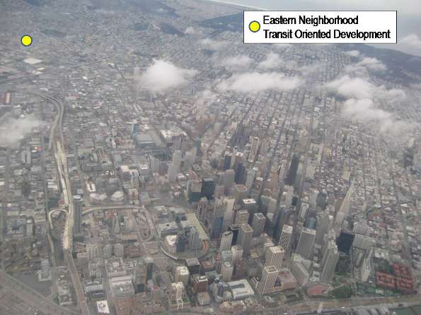
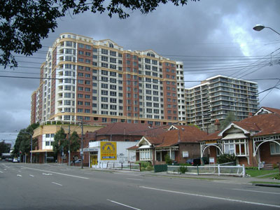
    Photograph: Suburban Manila

    Wendell Cox is a Visiting Professor, Conservatoire National des Arts et Metiers, Paris. He was born in Los Angeles and was appointed to three terms on the Los Angeles County Transportation Commission by Mayor Tom Bradley. He is the author of “War on the Dream: How Anti-Sprawl Policy Threatens the Quality of Life.

  • The Myth of the Strong Center

    At the height of the foreclosure crisis the problems experienced by some so-called “sprawl” markets, like Phoenix and San-Bernardino-Riverside, led some observers to see the largest price declines as largely confined to outer ring suburbs. Some analysts who had long been predicting (even hoping for) the demise of the suburbs skipped right over analysis to concoct theories not supported by the data. The mythology was further enhanced by the notion – never proved – that high gas prices were forcing home buyers closer to the urban core.

    Yet a summary of the trends over the past 18 months show only minor disparities between geographies within leading urban regions. Overall house prices escalated similarly in virtually all areas within the same metropolitan areas and the price drops appear to have also been similar. This is in contrast to a theory that suggests that huge price drops occurred in the outer suburbs while central city prices held up well.

    Summary of 18 Month Subarea Price Declines: This is indicated by a review of 8 metropolitan areas: Los Angeles, the San Francisco Bay Area, San Diego, Sacramento, Atlanta, Chicago, Portland and Seattle (see end note), for which subarea data is readily available (see table). On average, central area median house prices (all houses, including condominiums), fell 3% in relation to the overall metropolitan area average. Inner suburban areas experienced a 3% gain relative to metropolitan area prices, while outer suburban areas changed at the metropolitan area average. In actual price reduction terms, core areas declined 28.8%, inner suburban areas declined 25.7%, and outer suburban areas declined 27.1%. The overall average metropolitan area decline was 27.2%. There was, however, considerable variation in the figures by metropolitan area (see figure below).

    MEDIAN HOUSE PRICE CHANGES BY GEOGRAPHICAL SECTOR
    8 Metroplitan Areas
    CALIFORNIA MARKETS Central Inner Suburbs Outer Suburbs Overall
    Los Angeles -45.3% -30.0% -41.5% -37.1%
    San Francisco Bay -38.0% -39.1% -38.6% -38.6%
    San Diego -36.5% -37.4% -37.0% -36.9%
    Sacramento -53.6% -36.3% -37.5% -44.0%
    OTHER MARKETS
    Atlanta -11.6% -17.0% -15.8% -15.8%
    Chicago -21.0% -16.3% -17.5% -17.8%
    Portland -10.0% -14.5% -15.7% -13.5%
    Seattle -14.2% -14.7% -13.2% -13.7%
    AVERAGE -28.8% -25.7% -27.1% -27.2%
    Estimated from Data Quick information
    California Markets: July 2008 to January 2010
    Other Markets: 2008-2nd Quarter to 2009-4th Quarter

    Where Central Area Losses were Greatest: Over the past 18 months, central areas posted the largest losses in three of the areas. Further, in each of these areas, the smallest price drops were experienced in the inner suburbs.

    • Sacramento had the steepest central area relative price decline. Central area prices declined 37% relative to inner suburban prices, where the smallest losses occurred. The central area price loss averaged 53.6%, compared to the overall metropolitan area loss of 44.0%. The inner suburbs experienced the smallest loss, at 36.3%.
    • Los Angeles also had a steep central area relative price decline. Central area prices declined 45.3%, compared to the overall metropolitan area loss of 37.1%. The inner suburbs experienced the smallest loss, at 30.0% while outer suburbs lost 41.5%.
    • Chicago’s greatest losses also occurred in the central area, but were of a much smaller magnitude. Central area prices declined 21.0%, compared to the overall metropolitan area loss of 17.8%. The inner suburbs experienced the smallest loss, at 16.3%. The outer suburbs lost 17.5%.

    Where Suburban Losses were the Greatest: In two areas, the central area price losses were the least, Atlanta and Portland. Yet, the magnitude of these losses was modest. It is interesting to note that the metropolitan areas with the smallest relative losses in the central areas pursued radically different policies with respect to development. Portland’s “smart growth” policies favor central development at the expense of suburban development, while Atlanta’s more liberal policies do not attempt to steer development to the core.

    • Atlanta’s greatest price declines occurred in the inner suburbs, which experienced a loss of 17.0%, slightly more than that of the outer suburbs (15.8%). In comparison, the central area price drop was the least, at 11.6%, The metropolitan area loss was 15.8%.
    • Portland’s greatest price declines occurred in the outer suburbs which experienced a 15.7% loss, compared to the inner suburbs, at 14.5. The lowest decline was in the central area at 10.0%. The metropolitan area loss was 13.5%.

    Little Difference in Some Markets: There was little difference in the price declines among geographic sectors in three of the metropolitan areas. In the San Francisco Bay area, San Diego and Seattle, the differences between central, inner suburban and outer suburban price declines were all within a 2% range.

    Core Condominium Market Crisis

    However, core area markets where condominiums predominate indicate substantial difficulties in some of the metropolitan areas. These markets are generally only a small part of central cities, principally around downtown areas or major centers. For example, in the Portland area, the core condominium areas ring the downtown area and include the Pearl District and the South Waterfront District. The central area, which encompasses the entire city of Portland, however, is much larger and has a much larger share of detached housing.

    Demand has been so weak in the core condominium markets that substantial price reductions have occurred and a number of buildings have been forced to sell units at auction. Other buildings have given up altogether on selling and have rented condominiums. Some of the price drops, especially in Atlanta, Portland and Seattle are far greater than occurred overall in the respective metropolitan markets. The condominium implosion has not received nearly the level of attention in the national or local media that was accorded the housing bubble and collapse itself.

    Portland: A local television station video indicates that Portland’s condominium market is in crisis. A report in The Oregonian indicates that the downtown area has a “glut” of condominiums and that February sales prices averaged 30% below list. A luxury new 15-story building in the Pearl District (The Wyatt) is now being leased instead. Units at The Atwater in the South Waterfront district were auctioned, with minimum bid prices more than 50% lower than list. The John Ross, also in the South Waterfront District, is Portland’s largest condominium project and will be auctioning its units. Minimum bid prices average 70% below the previous top list prices. The smallest units have a minimum bid price of $110,000. By comparison, over the past year, the median house price in the Portland metropolitan area has dropped approximately 10%.

    Atlanta: Atlanta has a “vast oversupply” of condominiums. The uptown (including Atlantic Station) and Buckhead markets of Atlanta appear to be experiencing some of the worst market conditions in the nation. The prestigious Mansion on Peachtree, a combination hotel and condominium development, was unable to sell 75% of its residences and was recently sold in foreclosure at approximately $0.30 on the dollar. The winning auction bids at The Aqua condominium in Uptown averaged 50% below the last asking price. In Atlantic Station, units at The Element were auctioned at substantial discounts. Among conventional sales, condominium price reductions of up to 40% have been reported. One building has offered discounts of $100,000 per bedroom. Some new buildings have been converted to rentals, while planned projects have been placed upon hold.

    Seattle: Things are little better in Seattle. The overbuilt downtown area condominium market has experienced a median price decline of 35% over the past year. Units at The Gallery in tony Belltown were auctioned off at minimum prices 50% below the last list prices (which had already been discounted). Units at The Brix, on Capitol Hill, attracted bids at auction averaging 30% below previous list prices. Later this month, unsold units at 5th & Madison will be auctioned, at minimum prices below 50% of previous list. For comparison, median house prices in the Seattle metropolitan area declined 6% over the past year.

    Chicago: The downtown area of Chicago has been among the most vibrant condominium markets for more than a decade. However, in 2009, condominium sales fell to the lowest level since 1997. At current sales rates, the downtown area has a supply of more than five years, with annual sales of less than 600 and more than 3,000 units available or under construction.

    Los Angeles: Few markets have seen as many condominium buildings planned as downtown Los Angeles, and few have seen so many put on hold. A recent issue of the Los Angeles Downtown News lists approximately 50 downtown condominium projects. More than three-quarters of the projects have been scaled back, have had construction slowed or are on “hold.” The market has been so weak that a number of developers have taken losses by auctioning condominium units that they have not been able to sell conventionally.

    San Diego: The downtown San Diego condominium is substantially overbuilt. Developers have leased units that were to have been sold and there is virtually no construction of new units.

    Rental Conversions: Even these grim reports, however, may mask an even bigger problem. It is estimated that more than 20,000 condominiums units are completed or nearly completed, but are not listed for sale in Miami. In what is by far the nation’s strongest condominium market, Manhattan, more than 6,000 condominium units are completed or nearly completed, but not listed for sale.

    In core cities, few issues have been as divisive as the conversion of rental units to condominiums. But, now the opposite is now occurring – condominiums are being converted into apartments for rent: This is trend that undermines markets in a way that cannot be measured by median prices, since it replaces generally high-paying condo owners for generally less flush renters. This puts those who bought at higher prices in these markets at a particular disadvantage.

    Conclusion: Overall, contrary to the mythology developed early in the bubble, suburbs and even exurbs have generally performed about as well as closer in markets. The big imponderable will be the future of the core condominium market, which is experiencing significant financial reverses largely ignored by the national media.


    Note: As used in this article, the Los Angeles metropolitan area is the Los Angeles-Riverside Combined Statistical Area, the San Francisco area is the San Francisco-San Jose Combined Statistical Area and all other metropolitan areas are the corresponding metropolitan statistical areas. http://demographia.com/db-prdistr2010.pdf>Subareas defined.

    Photograph: Condominium construction, Atlanta, weekend of the Lehman Brothers collapse.

    Wendell Cox is a Visiting Professor, Conservatoire National des Arts et Metiers, Paris. He was born in Los Angeles and was appointed to three terms on the Los Angeles County Transportation Commission by Mayor Tom Bradley. He is the author of “War on the Dream: How Anti-Sprawl Policy Threatens the Quality of Life.

  • Transit Oriented Development: If Not San Francisco, Where?

    “The Great Transit Oriented Development Swindle?” reads the headline in the Fog City Journal, one of the growing number of internet newspapers providing serious, professional web-based journalism as an alternative to declining print newspapers (and their often less than effective web sites).

    The article does not directly answer the question in the headline, but certainly provides enough ammunition to what has become a commonly accepted mantra among planners and urban boosters. It reveals how transit oriented development (TOD) is often based upon fragile foundations that amount to an ideological swindle. It is important to recognize that the Fog City Journal is no right wing or libertarian organ. There is little market for that in the city of San Francisco. The leftish bent of the Fog City Journal, combined with author Marc Salomon’s unusually incisive (and footnoted) analysis makes this article noteworthy. It also seems clear that the author is a proponent of more transit service and funding, not less – even though he is highly skeptical about the current TOD craze.

    Transit Oriented Development: The idea behind transit oriented development is that, in new, higher density developments, people use transit more and cars less. Transit oriented development has become a first principle of some, who seem to believe that cities can become vibrant in part by strangling new suburbs out of existence. Transit oriented development is at the very heart of the Obama Administration’s “livability agenda,” and is frequently cited admiringly by Secretary of Transportation Ray LaHood.

    Eastern Neighborhoods: Salomon’s subject is San Francisco’s Eastern Neighborhoods, where transit oriented development is proposed. From the beginning Salomon identifies a fundamental problem: “Transit Oriented Development is predicated upon the notion that existing transit infrastructure is attractive enough such that residents of new units will take transit to work instead of drive. He continues: “The existing transit system, both regional and local, is not capable of handling existing demand.”

    Salomon correctly notes that “San Francisco is not the regional employment center.” In fact, nearly 90% of employment in the San Francisco-San Jose area is not in downtown San Francisco. Indeed, Silicon Valley, not downtown San Francisco, has long been the largest employment center in the area and there are also major job concentrations in the suburban belt east of Oakland.

    No Better Place for Transit Oriented Development: Yet, there are few places in the world better served by transit than the Eastern Neighborhood transit oriented development. The project is no more than a long walk from downtown San Francisco (Figure 1). Residents will be able to access frequent “Muni” bus services. The development would be well served by BART (the regional metro), midway between two stations, both of which access four routes. There are few places in the world where a non-transfer station serves that many routes. Salomon analyzes transit from the center of the development, the corner of Mission and 20th Streets.

    Transit Oriented Development: Forcing Longer Commutes: Salomon’s concern starts with the recognition that these systems are already overcrowded. However there is more. Even with their heavy (and highly subsidized) loads, the virtually unparalleled level of transit service available from Mission and 20th cannot compete with the automobile. Salomon’s analysis shows that, on average, transit oriented development residents working at jobs at the 30 largest firms in the San Francisco Bay area would spend nearly 3.5 as much time traveling to work by transit than if they drove themselves. The best transit travel time would be more than double the auto travel time, while the worst would near five times (Figure 2).

    Transit Oriented Development: Making Traffic Congestion Worse: Mirroring the research on the association between higher densities and greater traffic congestion, Salomon suggests that without substantial additional transit spending, transit oriented development “in San Francisco will most likely diminish transit reliability by increasing auto trips–the precise opposite of transit oriented development’s stated goals.” On this point, however, it is well to remember that no transit system has ever been seriously conceived, much less proposed or implemented that could provide competitive mobility between Mission and 20th and the dispersed employment throughout the San Francisco Bay Area. A transit system that reaches all of the dispersed employment in a modern American or European urban area at travel times competitive with the car could require annual expenditures that approach or even exceed the gross domestic product of the area.

    Unaffordable Transit Oriented Development: But Salomon is not through. Insufficient transit service is only part of the problem. There is a fundamental problem with the thesis that “cities need to densify their urban cores to support greater densities of development.” But, he says, “this is predicated upon the assumption that housing in the urban core and periphery are fungible, that the core and periphery compete interchangeably for buyers.”

    Unlike most urban advocates and the Secretary of Transportation, it is apparent that Salomon understands the first principle of “livability.” Livability requires affordability. In San Francisco suburb of Brentwood, for example, Salomon notes that the median house price is $298,000. Brentwood is located in eastern Contra Costa County, approximately 50 miles from downtown San Francisco. But there is no need to travel that far, since there is an abundance of jobs much closer.

    This compares to a median price of $627,000 for an apartment/condominium near the proposed transit oriented development in San Francisco. Further, the house in Brentwood will be more than double the size of condo in the transit oriented development, as data from zillow.com indicates. Thus, the new home buyer will pay less than one-fourth the cost per square foot in Brentwood compared to the transit oriented development (Figure 3). The Brentwood household will also enjoy a backyard that would not come with a 23rd floor flat.

    Lifestyles of the Few: None of this is to suggest that transit oriented development cannot be attractive. The mistake, however, is the outsized enthusiasm of its proponents. Like a Mini Cooper or sportscar, transit oriented development serves the needs and wants of a narrow niche market, but by no means anything close to the majority.

    Salomon concludes:

    In order for transit oriented development to check sprawl, prospective home buyers would be expected to make the choice between purchasing a $300K unit in Brentwood or a unit costing twice that much in San Francisco. Further, in order to check motor vehicle commutes, the assumption would be that someone paying that urban location premium would more than double their commute time by taking transit.

    Simply stated, many of the claims of transit oriented development proponents simply do not “pencil out.” TOD residents will have to drive, unless their jobs are within walking distance. Further, in the dynamic economy that has developed in US urban areas, few can assume that they will always work in the same place. Most importantly, however, very few suburbanites could afford the tony TODs. That’s not a problem, however, since most of them are probably not sorely tempted.

    Photograph: Market Street Toward the Ferry Building, San Francisco

    Wendell Cox is a Visiting Professor, Conservatoire National des Arts et Metiers, Paris. He was born in Los Angeles and was appointed to three terms on the Los Angeles County Transportation Commission by Mayor Tom Bradley. He is the author of “War on the Dream: How Anti-Sprawl Policy Threatens the Quality of Life.

  • What Seneca Falls Can Learn from Toronto

    One of the most enduring myths in public policy is that local government consolidations save money. The idea seems to make sense, and most of the academic studies support the proposition. However, rarely, if ever, does the promised reduction in public expenditures or taxes actually take place.

    Residents will vote March 16 on a proposal that would merge the village government of Seneca Falls, New York into the more rural and adjacent town of Seneca Falls. Under state law, this can occur without the consent of the town into which the village would be merged.

    Paltry Savings and the Risks: A consultant report suggests savings that can only be characterized as pitiful. Out of a combined budget of $13 million, less than $400,000 would be saved, and even that figure is by no means sure, according to the consultant.

    Voters may want to consider the following specific risks that could make achievement of the expected savings and tax reductions impossible:

    Proponents expect to receive $500,000 annually in funding from a state program that seeks to encourage municipal consolidations. The state program is slated for cuts. Further, with New York’s serious budget difficulties, such a superfluous program could be a prime candidate for discontinuance. Thus, one of the principal factors expected to lower taxes might not survive in the longer run.

    Presently, the village has a police department, while the town does not. The new town government is not likely to be able to get away with providing a higher level of police protection in the former village than in the merged town. One of two outcomes seems likely: (1) The first is that the present police protection (and budget) would be spread throughout the merged town. This would dilute police protection in the former village area. (2) The second is that the higher level of police protection in the village would be spread throughout the merged town. This would mean larger expenditures that could easily erase the already minimal projected savings.

    The consultant proposes that a new town hall be built. The costs of this building could substantially erode the projected operating cost savings.

    A principal reason that municipal consolidations rarely save money is that the necessary “harmonization” of service levels and employee compensation costs inevitably migrate to the level of the more costly former jurisdiction. The police issue in Seneca Falls is a prime example of the service harmonization cost risk.

    Learning from Toronto: Seneca Falls does not have to look far to see how local government consolidation can lead to more spending and higher taxes. Less than 150 miles away as the crow flies, Toronto residents were glowingly told of the lower taxes and expenditures that would result from consolidating six jurisdictions into a “megacity” in the late 1990s. As we and others predicted at the time, things have not worked out. Toronto’s spending has risen strongly under the consolidated government. Despite its much smaller population, the risks are similar in Seneca Falls.

  • The Harvard $7 Per Gallon Study: Missing the Point Completely

    A new study by researchers at the Belfer Center for Science and International Affairs at Harvard University suggests that President Obama’s greenhouse gas (GHG) reduction goal will require gasoline prices of from $7.15 to $8.71 per gallon by 2030. This is not only untrue, but also represents a “roadmap” to economic and environmental folly.

    The study begins with the assumption that the transportation sector would need to reduce its GHG emissions by the same 14% percentage as the overall goal for the economy, as proposed by President Obama (Note).

    “Across the Board Reductions” are Absurd: The Harvard assumption is flawed from the start. GHG emissions reduction is not about “across the board” reductions of the same percentages applied to economic sectors. Such an approach could result in serious misallocation of resources, as opportunities for less expensive GHG emissions reductions in some sectors are ignored, while more expensive strategies are implemented in other sectors.

    The Appropriate Price for GHG Reduction: The study itself assumes that the present GHG price is $30 and that the price will rise to $60 by 2030. Reports by the Intergovernmental Panel on Climate Change and McKinsey/The Conference Board say that sufficient GHG emission reductions can be achieved at below $50 per ton. It is fair to suggest, therefore, that any strategy costing more than the $50-$60 range must be rejected as being too expensive.

    The Harvard study notes that GHG

    …prices at their projected levels are far too small to create a significant incentive to drive less. Fuel prices above $8/gallon may be needed to significantly reduce U.S. GHG emissions and oil imports.

    This should tell us something. Achieving the proposed reduction is GHG emissions from the transportation sector is just too expensive. If the current market price for GHG emissions cannot significantly reduce gasoline usage, then strategies that can be achieved for the market price should be implemented (in other sectors). Such an approach would by no means interfere with the potential to achieve GHG emissions reductions, rather it would facilitate less disruptive achievement.

    $7 Per Gallon Gasoline: The Harvard study goes on to suggest that gasoline prices of $7.15 to $8.71 per gallon by 2030 might be necessary to achieve the overall GHG reduction goal in the transportation sector. These higher prices would be the result of significantly higher fuel taxes. The resulting cost of GHG emissions reductions could be more than $500 per ton (compared to the Department of Energy 2030 gasoline price projection). While the Harvard report “poo-poos” the economic impact of doubling gasoline prices, a Reason Foundation report (and previous research at the University of Paris by Remy Prud’homme and Chang Wong Lee) has found a strong relationship between mobility (driving more) and economic growth.

    Focusing on Ends, Not Means: No one should believe it will be easy to achieve any eventual GHG emission objective. Success will be greatly enhanced by focusing on “ends” rather than “means.” This means employing the least costly and least disruptive strategies, without regard to how much we drive, where we live, how much power we consume or any other peripheral (and irrelevant) consideration.

    At a price of $500 or more, the Harvard report’s price per ton could be nearly 10 times as much as the $60 GHG price assumed in the very same report. Such an increase in the price of gasoline would be both absurd and unnecessary.

    ——

    Note: There are multiple proposals for economy wide GHG emissions reductions. Congressional have been for 17% to 20% reductions by 2020.

  • Sydney: Choking in its Own Density

    The Daily Telegraph reports that air pollution is getting worse in Sydney, with one in ten days rating “poor” in 2009. Critics of the ruling Labor state government claim that increasing air pollution and the lack of public transport are the cause. They are half right.

    Sydney’s Densification is Intensifying Traffic Congestion: Sydney’s intensifying traffic congestion contributes substantially to rising air pollution.

    The increasing traffic congestion is an inevitable consequence of the state government’ s “metropolitan strategy” which is “jamming” high rise residential buildings into suburban detached housing neighborhoods. The mathematics of traffic and densification is that unless each additional resident drives minus kilometers and minus hours, there will be more traffic, even before considering the impacts of intensifying commercial and heavy vehicle traffic.

    The road system was not built for higher densities and neither was other infrastructure such as sewers or the water system, as Tony Recsei has noted in his preface to the 6th Annual Demographia International Housing Survey.

    The fact is that higher densities are strongly associated with more traffic, which means greater traffic congestion. The additional stop and go traffic produces greater pollution on the roads adjacent to which people and their children live. It also means more greenhouse gas emissions, because fuel consumption increases as traffic congestion intensifies.

    The association between higher densities and greater traffic congestion is also indicated by the ICLEI-Local Governments for Sustainability Density-VMT Calculator, based upon Sierra Club research. According to the Calculator, under the urban consolidation (“smart growth”) scenario, residential housing would be 37 housing units per hectare, as opposed to its “business as usual” scenario at a density of 10 housing units per hectare. The density of traffic (vehicle kilometers per square kilometer) under the higher density “urban consolidation” strategy would be 2.5 times as high as under the “business as usual” scenario.

    According to federal Bureau of Transport and Regional Economics, Sydney’s total traffic volume is projected to increase nearly 20% over the next decade. Nearly half of the increase will come from commercial and heavy vehicles. With little or no expansion of the urban footprint, there will be nowhere for the new traffic to go except onto the existing already over-crowded roadways.

    Stuck in Sydney’s Traffic: Already, the average one-way trip to work in Sydney is longer than in all but one of the 52 metropolitan areas in the United States with more than 1,000,000 population. Only New York takes as long as Sydney, because so many people use public transport, which is inherently slower for nearly all trips.

    Of Blind Faith: Public Transport: Public transport serves as an article of faith to which officials cling in the innocent or cynical hope that it can reduce traffic congestion. There is no doubt of the good that public transport can do to get people to the central city (CBD), with its highly concentrated employment. However, Sydney’s CBD oriented system is over-crowded. A succession of state governments have been incapable of providing sufficient service to make the trip comfortable for the less than 20% of Sydney employees who work there. Proposals to centralize more of Sydney’s employment in the CBD could not be more wrong-headed.

    Transit is about the CBD, whether in Sydney, Toronto, Portland or Atlanta. The public transport system capable of attracting a significant number of commuters to the smaller concentrated centers like Chatswood, Parramatta, or Norwest (much less the dispersed employment throughout the rest of the metropolitan area) has never been conceived, much less seriously proposed or built.

    Why We Regulate Air Pollution: Public health was the very justification for regulating air pollution. Air pollution’s negative impacts are principally local. The consequences are measured reduce the quality of life of people intimately exposed to the more intense air pollution from nearby roads.

    Higher densities come with a price. Higher densities are producing greater traffic congestion, higher levels of air pollution and greater public health risks. This is just the beginning.

    Photograph: Strathfied, Sydney: Densification of detached housing neighborhood.

  • New Traffic Scorecard Reinforces Density-Traffic Congestion Nexus

    Inrix, an industry provider of traffic information, has just published its third annual Traffic Scorecard, which ranks the nation’s 100 largest metropolitan areas based upon the intensity of their peak hour traffic congestion in 2009. The results provide further evidence of the association between higher urban population densities and more intense traffic congestion.

    Los Angeles, Again: Not surprisingly, Los Angeles is again the most congested metropolitan area over 1,000,000 population. In Los Angeles, roadway travel takes nearly 34.7% more in peak periods than when there is no congestion. This means that a trip that would take 30 minutes without congestion would take, on average 40.5 minutes during peak periods.

    The principal measure used by Inrix is the Travel Time Index, which was developed by the Texas Transportation Institute (TTI), for its congestion reports that started in 1982. TTI’s latest Urban Mobility Report is for 2007. The Inrix measures are developed from actual GPS vehicle readings. This information is also provided to TTI to assist in preparation of its annual Urban Mobility Report.

    Measuring Delay: In the new edition, Inrix switches from using the Travel Time Index to what it calls the Travel Time Tax. The difference between the two measures is that the Travel Time Tax measures the percentage of delay, such as 35% in Los Angeles, while the Travel Time Index would state the figure as 1.35. The new method is preferable because differences in traffic congestion are more readily apparent. . For example, a metropolitan area having a Travel Time Tax of 15% would have 50% worse traffic congestion than a metropolitan area having a Travel Time Tax of 10%. This large difference is not as obvious when comparing the Travel Time Index values of 1.15 and 1.10. The “Travel Time Tax” parlance, however, is less than optimal and this article will use “average congestion delay” instead.

    Ranking the Metropolitan Areas: The average congestion delay in Los Angeles was much worse than in the other largest metropolitan areas, just as its core urban area density is well above that of anywhere else in the US, including New York (where far less dense suburbs more than negate the density advantage in the core city). It also doesn’t help that a number of planned freeways were cancelled in Los Angeles over the last 50 years.

    Among the large metropolitan areas, Washington, DC had the second worst Average congestion delay, at 22.4%, followed by San Francisco, at 21.5%, Austin at 20.7% and New York at 19.7%. Austin may seem to have placed surprisingly high, however this was the nation’s last large metropolitan area to open a full freeway to freeway interchange and has only recently begun to develop a comprehensive freeway system, through the addition of toll roads. Austin’s late roadway development is the result of two factors. Austin was too small in 1956 to receive a beltway under the interstate highway system and an anti-freeway movement delayed construction for decades.

    Inrix also develops an average congestion delay for the worst commuting hour. Los Angeles also has the most congested worst hour, with an average congestion delay of 69%. Austin ranked second worst at 55%, while San Francisco was third at 46%, Washington, DC fourth at 45% and New York fifth at 44%.

    Honolulu: Almost as Bad as Los Angeles: Smaller metropolitan areas also exhibited intense traffic congestion. Honolulu had an average congestion delay nearly as bad as Los Angeles, at 32.4% and a worst hour average congestion delay of 64%. The core urban area of Honolulu has the highest density of any metropolitan area between 500,000 and 1,000,000 population. New York exurb Bridgeport-Stamford had a worst hour average congestion delay of 63%, with a peak period average congestion delay of 18.0%.

    Inrix: Density and Traffic Congestion: Virtually all of the congestion and most of the analyzed road mileage is in the urban areas, rather than in the rural areas that make up the balance of the metropolitan areas. The metropolitan areas with more dense urban areas tend to have worse traffic congestion, as the table below indicates.

      • Metropolitan areas with core urban densities (see Note 1) of more than 4,000 per square mile had peak period average congestion delays of 18.4%, which is more than three times that of metropolitan areas with core urban densities of less than 2,000 (5.9%).

      • Metropolitan areas with core urban densities of more than 4,000 per square mile had worst peak hour average congestion delays of 37.5%, which is nearly 2.4 times that of metropolitan areas with core urban densities of less than 2,000 (15.9%).

    These relationships are similar to those indicated in the Texas Transportation Institute data for 2007.

    Traffic Congestion & Urban Density in the United States: 2009
    Core Urban Area Density (2000) Peak Period Average Congestion Delay: 2009 Compared to Least Dense Category Worst Hour Average Congestion Delay: 2009 Compared to Least Dense Category
    Over 4,000 18.4% 3.26 37.5% 2.36
    3,000-3,999 10.0% 1.76 22.3% 1.41
    2,000-2,999 7.3% 1.30 17.7% 1.12
    Under 2,000 5.6% 1.00 15.9% 1.00
    Density: Population per square mile
    Travel Time Tax: Additional travel time required due to traffic congestion
    2000 population density is the latest reliable data
    Calculated from INRIX & 2000 Census data

    Sierra Club Data Also Shows Nexus: Moreover, the association between higher densities and greater traffic congestion is indicated by the ICLEI-Local Governments for Sustainability Density-VMT Calculator, which is based upon Sierra Club research. According to the Calculator, under the “smart growth” scenario, residential housing would be 15 units per acre, as opposed to its “business as usual” scenario at a typical density of four housing units per acre. The density of traffic (vehicle miles per square mile) under the higher density “smart growth” strategy would be 2.5 times as high as under the “business as usual” scenario (Figure).

    The Inevitable Comparisons: Invariably, analysts (smart growth advocates and me) like to point out relationships between Portland, with its “smart growth” policies and Atlanta, the least dense major urban area in the world. The Inrix data shows Portland to have an average peak hour delay of 12.2%, which is 15% worse than Atlanta (10.6%). Portland is nearly twice as dense as Atlanta, while Atlanta’s traffic congestion is made worse by one of the most decrepit freeway and arterial systems in the nation.

    A National Vision: Inrix has also developed a monthly national congestion delay factor. Inrix notes that traffic congestion had been improving as driving declined due to the Great Recession. However, Inrix refers to reduction in driving as “lucky,” and notes that without a “national vision” that “includes addressing congestion as a national priority,” greater traffic congestion will result.

    There is indeed good reason to address traffic congestion. As David Hartgen and M. David Fields have shown, there is a strong relationship between the higher levels of mobility that occur with less congestion and greater economic growth. Obviously that relationship extends to higher urban densities, which are associated with economically counter-productive levels of traffic congestion.

    But there is more than jobs and the economy. More intense traffic congestion produces more intense air pollution as well as more greenhouse gas emissions. It is well to remember that public health was the rationale for air pollution regulation. Air pollution’s negative impacts are so local that they are measured in the quality of life of individual people, especially those in close proximity to unnecessarily overcrowded roads. It is ironic that the higher density promoted by smart growth advocates exposes urban residents to more intense air pollution.


    Note 1: 2000 core urban area (urbanized area) population densities are used in this analysis because there is no later reliable information. The next reliable urban area density data will be a product of the 2010 census. The Federal Highway Administration (FHWA) produces later urban area density figures, many of which are substantially inconsistent with those of the United States Bureau of the Census, which is the primary source of such information. For example, as late as 2005, FHWA reported the Houston urban area to have 1.3 million fewer people than the Bureau of the Census, while reporting a land area nearly 250 square miles larger than the census had measured. Of course, this is a physical impossibility. The result was that Houston’s density was overstated by 45%.

    Note 2: Inrix also ranks metropolitan areas using an “overall congestion” measure, which is simply all congestion added up. As a result, the overall congestion measure is heavily weighted by population. This is illustrated by comparing Los Angeles and Honolulu. These metropolitan areas have very similar average congestion delays, as noted above. This means that drivers encounter similar traffic delays during peak in Los Angeles and Honolulu. However, Honolulu’s overall congestion measure is 95% less than that of Los Angeles, principally driven by the fact that Honolulu’s population is 93% less. As such, the overall congestion measure is of little relevance to people in their day to day commute or as a comparative measure of the intensity of congestion between areas.

    Photograph: Los Angeles City Hall.

    Wendell Cox is a Visiting Professor, Conservatoire National des Arts et Metiers, Paris. He was born in Los Angeles and was appointed to three terms on the Los Angeles County Transportation Commission by Mayor Tom Bradley. He is the author of “War on the Dream: How Anti-Sprawl Policy Threatens the Quality of Life.

  • Obama Throws Life-Line to Smart Growth Areas

    President Obama has announced a special program of assistance for home owners in the five states that have been hit hardest by the housing crisis. The proposed program is targeted at California, Florida, Arizona, Nevada and Michigan, where house price declines are more than 20% from the peak of the bubble.

    The greatest losses occurred in California, Florida, Arizona and Nevada (see note), where peak to trough house price loses exceeded 40% in all 12 metropolitan areas over 1,000,000 population except Jacksonville. These markets accounted for 70% of the gross housing value loss in the nation before the Lehman Brothers collapse. House prices were driven to unprecedented levels of up to four times historic norms by overly prescriptive land use regulations (“growth management” or “smart growth”) that makes land unaffordable.

    Average losses were more than $175,000 in the markets of these states, more than 10 times those in traditionally regulated markets such as Atlanta, Dallas-Fort Worth, Houston, Indianapolis, Kansas City and Cincinnati. These intense losses were beyond the ability of the mortgage industry to sustain and it is generally acknowledged that this precipitated the Great Recession.

    Smart growth had nothing to do with the Michigan price collapse. There, the strong economic downturn pushed prices down even as the state escaped without a housing bubble.

    The President’s program means that the nation is now paying twice for smart growth policies. The first payment was, of course larger, which cascaded into the huge household wealth losses in the Great Recession.


    Note: While Las Vegas and Phoenix are sometimes perceived as not having prescriptive land use policies, the Brookings Institution ranks both metropolitan areas as toward the more restrictive end of the regulatory spectrum. These overly prescriptive regulatory environments are exacerbated by the fact that in both metropolitan areas much of the developable suburban land is owned by government, and is being auctioned, though at a rate less than demand. These factors combined to drive auction prices per acre up nearly 500% in Phoenix and nearly 400% in Las Vegas during the housing bubble.

  • Norfolk Light Rail: Expensive Rising Tide

    The Virginian Pilot reports that the cost of the Hampton Roads (Virginia Beach-Norfolk metropolitan area) “Tide” light rail line has now escalated to nearly $340 million. This is up nearly one-half from the estimates made when the project was approved by the Federal Transit Administration. According to federal documentation, the line will carry 7,100 daily passengers in 2030. This means that the capital cost alone will amount to an annual subsidy of approximately $6,500 per daily passenger (using Office of Management and Budget discount rates), plus an unknown additional operating subsidy. This is enough to lease every daily commuter a new Ford Taurus for the life of the project (assumes a new car every 5 years and includes future car price inflation).

    The light rail line cannot be expected to do much for transportation. Even if the line reaches its projected ridership (many do not) by 2030, it will carry only 0.1% of the travel in the metropolitan area (one out of every 1,000 trips).

  • The Heavy Price of Growth Management in Seattle

    The University of Washington Study: Economist Theo Eicher of the University of Washington has published research indicating that regulation has added $200,000 to house prices in Seattle between 1989 and 2006. Eicher told the Seattle Times that “Seattle is one of the most regulated cities and a city whose housing prices are profoundly influenced by regulations.”

    Not surprisingly, this caused consternation in the planning community, which would prefer to minimize or dismiss any negative consequences of planning regulations on housing affordability.

    The Washington Chapter of the American Planning Association (W-APA) published a response. Admitting that “land use regulations do add costs to housing”, it criticizes the Eicher study for focusing “solely on cost” and ignoring how land use regulations add to the quality of life. (Note 1). A recent Washington Policy Center report provides a detailed critique of the W-APA report. This article evaluates Seattle housing affordability trends using basic price and income data and the Median Multiple (median house price divided by median household income), a standard affordability measure that has been recommended by both the World Bank and the United Nations.

    How Growth Management Raises House Prices: It has been established that overly prescriptive land use regulation (called growth management or smart growth) raises house prices. As the former governor of the Reserve Bank of New Zealand Donald Brash has pointed out the affordability of housing is overwhelmingly a function of just one thing, the extent to which governments place artificial restrictions on the supply of residential land.

    However, the mere adoption of growth management or smart growth polices does not increase housing costs. Where, for example, an urban growth boundary (a favored strategy of growth management) is drawn far enough from the urban area, there may be little interference with developable land values. This was the case in Portland, for example, in its early growth management days. However, as land was developed and the urban growth boundary was not moved sufficiently outward in response, land became more scarce and land prices were driven up, leading to Portland’s severe housing unaffordability.

    How Growth Management Drives Up House Prices: Land prices are driven up as market participants perceive scarcity. When government policies constrict the supply of land, developers purchase “land banks” to ensure that they have access to land inventory. Without growth management, developers and builders can purchase land when they need it, because governments have not placed artificial restrictions on its supply.

    In the more prescriptive environment, property appraisals rise and sellers are able to obtain higher prices because development is prohibited on most land. In short, sellers face less competition and can command much higher prices.

    Sometimes growth management proponents claim that their communities have sufficient land available for building. However, the interplay between land buyers and sellers creates a rigged game that leads to higher land prices. This is obvious in everywhere from Seattle and Portland to California and Florida. In these markets, there is not a sufficient supply of “affordable land” for building. A New Zealand government’s “2025 Taskforce” found the price of comparable land to be about 10 times as high if it is inside an urban growth boundary rather than outside (essentially across the road).

    Seattle’s Lost Housing Affordability Decade: During the decade of the housing bubble (1997 to 2007), the median house price increased from $169,000 to $395,000 in Seattle. In 1997, Seattle’s housing affordability was rated “moderately affordable,” with a Median Multiple of 3.3 (median house price divided by median household income). By 2007, the Median Multiple had escalated to 6.2, indicating housing unaffordability worse than any major metropolitan area between World War II and 1997. (Figure 1). Of course, other markets, particularly in California, became even more unaffordable after 1997.

    In Seattle and other more prescriptive markets, house prices exploded during the housing bubble. At the same time, many other markets experienced only modest house price increases. The easier money and profligate lending practices thus produced very different results. In more prescriptive markets, like Seattle, both underlying and speculative demand drove prices to unprecedented heights. In the more responsive markets, the generally higher underlying demand was accommodated by planning systems that permitted sufficient new housing to be built on affordable land and price escalation was far more modest (as were subsequent price losses).

    New House Example: The role of Seattle’s growth management in driving up land and house prices is obvious. According to W-APA, approximately 62% of the cost of a new house in 1999-2000 was in construction costs. A new house in 1997 costing the same as a median house price would have involved approximately $105,000 in construction costs. Based upon subsequent house cost increases and the decline in house construction costs relative to the rest of the nation in Seattle, construction costs on the same house should have risen $40,000 from 1997 to 2007 (Note 2). At the same time, the median house price in Seattle increased $225,000. Less ss than 20% of the cost escalation could be attributed to construction cost inflation. Nearly $185,000 was due to other factors, principally higher land prices.

    Comparing Seattle to Dallas-Fort Worth: Things were very different in more responsive markets, as is illustrated by Dallas-Fort Worth (Figure 2). Dallas-Fort Worth, now the nation’s fourth largest metropolitan area, trailing only New York, Los Angeles and Chicago has grown more than twice as fast as Seattle (21.2% from 2000 to 2008, compared to 9.6%). Dallas-Fort Worth’s underlying demand has been even greater relative to Seattle, as indicated by its net domestic migration. Dallas-Fort Worth has added more than 10 times as many domestic migrants (260,000 versus 23,000) and more than 5 times its 2000 population (5.0% v. 0.8%). Moreover, and perhaps surprisingly, the Dallas-Fort Worth urban area (along with Houston) is more compact (read “sprawls” less) than Seattle (Note 3). Finally, the share of sub-prime mortgages was higher in Dallas-Fort Worth than in Seattle.

    Yet, despite this huge demand, housing affordability has remained below the historic Median Multiple norm of 3.0. In 2007, the Dallas-Fort Worth Median Multiple was 2.7. The median house price increased $32,000 from 1997 to 2007 and more than 70% of the change was due to construction costs.

    In 1997, the Seattle median house price was $54,000 higher than in Dallas-Fort Worth. By 2007, the price of a median house in Seattle had escalated to nearly $250,000 more than its counterpart in Dallas-Fort Worth (Since 2007, house prices have dropped $90,000 in Seattle and $5,000 in Dallas-Fort Worth, illustrating the more intense price volatility of tightly regulated markets. Even so, Seattle housing affordability remains materially worse than before).

    Driving Households out of the Home Ownership Market: If 1997 housing affordability (using the Median Multiple) had been retained, 50% of Seattle households would have been able to qualify for a mortgage on the median priced house. However, by 2007 only about 20% of Seattle households could have qualified for a mortgage on the median priced house in 2007 at present FHA underwriting standards (Note 4).

    Impact on Minority Households: The highest price, however is being paid by Seattle’s minority households (Figure 2).

    • The share of African-American households able to qualify for a mortgage on the median priced house declined nearly 70% compared to 1997 affordability (Median Multiple). At 1997 housing affordability, more than 25% of African American households would have been able to qualify for a mortgage on the median priced house in 2007. In reality, by 2007, less than 10% of African-American households could have qualified for a mortgage on the median priced house.
    • The share of Hispanic households able to qualify for a mortgage on the median priced house declined more than 70% compared to 1997 affordability (Median Multiple). At 1997 housing affordability, more than 35% of Hispanic households would have been able to qualify for a mortgage on the median priced house in 2007; by 2007 than number had plunged to less than 10%.

    The High Price of Growth Management in Seattle: The 10-year trend of house prices increases in the Seattle metropolitan area supports Eicher’s analysis. We readily admit to the charge of evaluating housing affordability “solely on price.” There is still the dubious W-APA claim that land regulation adds to the quality of life. But whose quality of life? As housing affordability declines, the quality of life may be raised for some, but only by keeping others down.


    Notes:

    (1) The W-APA report makes the common error of presuming that land use restraints were not a factor in the house price escalation of Phoenix and Las Vegas. In fact, the Brookings Institution ranks both metropolitan areas as toward the more restrictive end of the regulatory spectrum. These overly prescriptive regulatory environments are exacerbated by the fact that in both metropolitan areas much of the developable suburban land is owned by government, and is being auctioned, though at a rate less than demand. These factors combined to drive auction prices per acre up nearly 500% in Phoenix and nearly 400% in Las Vegas during the housing bubble. Despite their high building rates, these land restrictions denied sufficient affordable land for development to keep house prices from rising rapidly. Further, W-APA refers to Phoenix and Las Vegas as having “relatively unfettered sprawl,” yet both are more compact than Seattle. In 2000, the Las Vegas urban area (area of continuous urban development) was 62% more dense than Seattle and the Phoenix urban area was 28% more dense than Seattle (calculated from US Bureau of the Census data).

    (2) There are no reliable sources for median new house prices at the metropolitan area level. Generally, however, US Bureau of the Census data indicates that in the West, the median priced new house costs have averaged 6% more than the median priced house in the 2000s. Construction cost escalation (national and Seattle) is calculated from R.S. Means Residential Square Foot Costs (1997 and 2007 editions).

    (3) In 2000, the Seattle urban area had a density of 2,844 persons per square mile. Dallas-Fort Worth had a density of 2,946 and Houston had a density of 2,951. All three were relatively close to Portland (3,340), but well behind Los Angeles (7,069), which is the most dense major urban area in the nation.

    (4) Estimated assuming a FHA “front end ratio” of 29%, (mortgage, property tax and homeowners insurance divided by gross annual income) and a 10% down payment. Calculated using 2007 American Community Survey income data for the Seattle metropolitan area.


    Wendell Cox is a Visiting Professor, Conservatoire National des Arts et Metiers, Paris. He was born in Los Angeles and was appointed to three terms on the Los Angeles County Transportation Commission by Mayor Tom Bradley. He is the author of “War on the Dream: How Anti-Sprawl Policy Threatens the Quality of Life.