Author: Wendell Cox

  • Report: Florida Losing Population

    This should be filed with other improbable stories under the subject “beach running out of sand.” The St. Petersburg Times reports that Florida has lost population for the first time since 1946. University of Florida demographers are due to release a report that the state lost 50,000 residents in the year ended April of 2009. This is in stark contrast with the state’s addition of more than 300,000 residents in every year of the decade through 2006

    The article cites housing price increases as driving out families with children and the resulting housing contraction with driving out construction workers. Florida’s housing bubble related price increases were perhaps the highest in the nation, following California.

    There had already been ominous signs, with the United States Bureau of the Census reporting net outward domestic migration in 2008. As late as 2005, there had been a net gain in domestic migration of 267,000.

  • Is the Stage Set for Another Housing Bubble?

    Both the world and the nation remain in the midst of the greatest economic downturn since the Great Depression. But with all the talk of “green shoots” and a recovery housing market, we may in fact be about to witness another devastating bubble.

    As we well know, the Great Recession was set off the by the bursting of the housing bubble in the United States. The results have been devastating. The value of the US housing stock has fallen 9 quarters in a row, which compares to the previous modern record of one (Note). This decline has been a driving force in a 25 percent or a $145,000 average decline (inflation adjusted) in net worth per household in less than two years (Figure 1). The Great Recession has fallen particularly hard on middle-income households, through the erosion of both house prices and pension fund values.

    This is no surprise. The International Monetary Fund has noted that deeper economic downturns occur when they are accompanied by a housing bust. This reality is not going to change quickly.

    How did the supposedly plugged-in economists and traders in the international economic community fail to recognize the housing bubble or its danger to the world economy? It is this failure that led Queen Elizabeth II to ask the London School of Economics (LSE) “why did noboby notice it?”. Eight long months later, the answer came in the form of a letter signed by Tim Besley, a member of the Monetary Policy Committee of the Bank of England (the central bank of the United Kingdom) and Professor Peter Hennessey on behalf of the British Academy.

    The letter indicated that some had noticed what was going on,

    But against those who warned, most were convinced that banks knew what they were doing. They believed that the financial wizards had found new and clever ways of managing risks. Indeed, some claimed to have so dispersed them through an array of novel financial instruments that they had virtually removed them. It is difficult to recall a greater example of wishful thinking combined with hubris.

    The letter concluded noting that the British Academy was hosting seminars to examine the “Never Again” question.

    Among those that noticed were the Bank of International Settlements (the central bank of central banks) in Basle, which raised the potential of an international financial crisis to be set off by a bursting of the US housing bubble. Others, like Alan Greenspan, noticed, telling a Congressional Committee that “there was some froth” in local markets. Others, across the political spectrum, like Nobel Laureate Paul Krugman, Thomas Sowell and former Reserve Bank of New Zealand Governor Donald Brash both noticed and understood.

    Missing the Housing Market Fundamentals: The housing market fundamentals were clear. With more liberal credit, the demand for owned housing increased markedly, virtually everywhere. In all markets of the United Kingdom and Australia, house prices rose so much that the historic relationship with household incomes was shattered. The same was true in some US markets, but not others (Figure 2).

    On average, major housing markets in the United Kingdom experienced median house prices that increased the equivalent of three years of median household income in just 10 years (to 2007). The increases were pervasive; no major market experienced increases less than 2.5 years of income, while in the London area, prices rose by 4 years of household income. In Australia, house prices increased the equivalent of 3.3 years of income. Like the UK, the increases were pervasive. All major markets had increases more than double household incomes.

    Based upon national averages, the inflating bubble appears to have been similar, though a bit more muted in the United States, with an average house price increase equal to 1.5 years of household income. But the United States was a two-speed market, one-half of which experienced significant house price increases and the other half which did not. In the price escalating half, house prices increased an average of 2.4 times incomes. The largest increases occurred in Los Angeles, San Francisco and San Diego, where house prices rose the equivalent of 5 years income. In the other half of the market, house prices remained within or near historic norms relative to incomes. A similar contrast is evident in Canadian markets. In some, house prices reached stratospheric and unprecedented highs, while in others, historic norms were maintained.

    Underlying Demand: Greater Where Prices Rose Less: The difference between the two halves of the market was not underlying demand. Overall, the half of the markets with more stable house prices indicated higher underlying demand than the half with greater price escalation. Overall, the housing markets with higher cost escalation lost more than 2.5 million domestic migrants from 2000 to 2007, while the more stable markets gained more than 1,000,000 (Calculated from US Bureau of the Census data).

    The Difference: Land Use Regulation: The primary reason for the differing house price increases in US markets was land use regulation, points that have been made by Krugman and Sowell. This is consistent with a policy analysis by the Dallas Federal Reserve Bank, which indicated that the higher demand from more liberal credit could either manifest itself either in house price increases or in construction of new housing. Virtually all of the markets with the largest housing bubbles had more restrictive land use regulation.

    These regulations, such as urban growth boundaries, building moratoria and other measures that ration land and raise its price collaborated to make it impossible for such markets to accommodate the increased demand without experiencing huge price increases (these strategies are often referred to as “smart growth”). In the other markets, less restrictive land use regulations allowed building new housing on competitively priced land and kept house prices under control. The resulting price distortions leads to greater speculation, as has been shown by economists Edward Glaeser and Joseph Gyourko.

    A Wheel Disengaged from the Rudder: The normal policy response of interest rate revisions had little potential impact on the price escalating half of the housing market, because of the impact of restrictive state, metropolitan and local housing regulations. These regulations materially prohibited building on perfectly suitable land and thus drove the price up on land where building was permitted. So, while Greenspan and the Fed saw the “froth” in local markets, they missed its cause. The British Academy letter to the Queen is similarly near-sighted. Restrictive land use regulation has left central bankers in a position like a ship’s captain trying to steer a massive vessel with a wheel that is no longer connected to the rudder

    The Bubble Bursts: When teaser mortgage rates expired and other interest rates reset, a flood of foreclosures occurred, which led to house price declines that negated much of the housing bubble price increases in the United States. The most significant of these took place in restrictive markets, especially in California and Florida. By September of 2008, the average house had lost nearly $100,000 of its value in the more restrictively regulated half of the market, and averaged $175,000 in these “ground zero” markets. These losses were unprecedented and far beyond the ability of mortgage holders to sustain. This led to “Meltdown Monday,” when Lehman Brothers collapsed and the Great Recession ensued.

    By comparison, the losses in the more stable half of the market were modest, averaging approximately one-tenth that of the price escalating half.

    Can We Avoid Another Bubble? The experience of the Great Recession underscores the importance of having a Fed and other central banks that not only pay attention, but also understand. This requires “getting their hands dirty” by looking beyond macro-economic aggregates and national averages.

    This does not require an increasing of authority of the Federal Reserve or other central banks. As Donald L. Luskin suggested in The Wall Street Journal, we “don’t want the Fed controlling asset prices.” All we really need is for the Fed and other central banks to notice and understand what is going on, not only in housing, but in other markets as well.

    A public that depends upon central banks to minimize the effect of downturns deserves institutions that are not only paying attention, but also understand what is driving the market. The Fed should use its bully pulpit, both privately and publicly, to warn state and local governments of the peril to which their regulatory policies imperil the economy.

    There are strong indications that future housing bubbles could be in the offing. Not more than a year ago, the state of California enacted even stronger land use legislation (Senate Bill 375), which can only heighten the potential for another California-led housing bust in the years to come, while reducing housing affordability in the short run. There is a strong push by interest groups in Washington to go even further (see the Moving Cooler report), making it nearly impossible for housing to be built on most urban fringe land. This is a prescription for another bubble, this time one that would include the entire country, not just parts of it.


    Note: Quarterly data has been available since 1952 from the Federal Reserve Board Flow of Funds accounts


    Wendell Cox is a Visiting Professor, Conservatoire National des Arts et Metiers, Paris. He was born in Los Angeles and was appointed to three terms on the Los Angeles County Transportation Commission by Mayor Tom Bradley. He is the author of “War on the Dream: How Anti-Sprawl Policy Threatens the Quality of Life.

  • Toward Carbon Free Petroleum Cars

    On-board sequestration could make zero carbon dioxide emission petroleum cars possible, according to research conducted by Dr. Andrei Federov and David Damm at the Woodruff School of Mechanical Engineering at Georgia Tech. According to Science Daily:

    …the Georgia Tech team outlines an economically feasible strategy for processing fossil or synthetic, carbon-containing liquid fuels that allows for the capture and recycling of carbon at the point of emission. In the long term, this strategy would enable the development of a sustainable transportation system with no carbon emission.

    Ultimately, the approach would involve carbon capture within petroleum vehicles. The petroleum would be processed into hydrogen, for propulsion and carbon dioxide. The carbon dioxide would be converted, on board, to liquid fuel and removed at gasoline stations. The liquid fuel would then be sent to power plants, where it would be used to produce electricity. As the necessary infrastructure is being developed, the captured carbon dioxide would be removed at gasoline stations and “sequestered in geologic formations, under the ocean or in solid carbonite form.”

    This breakthrough demonstrates that it is not necessary to target the automobile or the automotive lifestyle that pervades modern living to achieve sufficient reductions in greenhouse gases. This is particularly important, given the imperative for maintaining economic growth and employment growth, which is closely linked to high levels of personal mobility.

    The research was financed by the United States federal government and the Georgia Tech “Creating Energy Options” program.

  • Reducing Vehicle Miles Traveled Produces Meager Greenhouse Gas Emission Reduction Returns

    Senators Jay Rockefeller (D-West Virginia) and Frank Lautenberg (D-New Jersey) have introduced legislation that would require annual per capita reductions in driving each year. Another bill, the National Transportation Objectives Act, introduced by Representative Rush Holt (D-Indiana), Representative Russ Carnahan (D-Missouri) and Representative Jay Inslee (D-Washington.) would require a 16 percent reduction in driving in 20 years.

    Last week, a highly publicized report by the Urban Land Institute (Moving Cooler) also called for policies that would reduce the vehicle miles traveled (VMT) by people in their cars. This report was analyzed here by Alan Pisarski). The reductions in driving would be achieved by highly intrusive land use policies that would make it impossible for most Americans to live where they want, allow for only minor expansion of roadway capacity and force almost all new development to be within existing urban footprints. It would employ such radical strategies as forcing people to pay $400 per year to park their cars in front of their own homes.

    The assumption behind these initiatives is that reducing driving will produce substantial reductions in greenhouse gas emissions. It sounds like a simple enough proposition, since cars emit greenhouse gases in direct proportion to the gasoline they consume. It would seem logical that reducing their use would lower their emissions by a similar percentage. Moving Cooler assumes that for every 10 percent reduction in driving miles, there will be a 9 percent reduction in greenhouse gas emissions.

    Meager GHG Emission Reductions from Reducing Driving: But things are not nearly so simple. It appears that reducing vehicle miles would not produce a similar reduction in greenhouse gases from cars.

    It is well known that at the slower speeds of vehicle operation in cities, fuel economy tends to decline with speed. Further, as congestion increases, so does fuel consumption, due to longer idling periods (such as at signals or in stopped traffic), more acceleration and more deceleration. Thus, not only does fuel economy drop when average speeds drop, but it drops even further when traffic congestion intensifies. The extent to which any reduction in urban driving would reduce greenhouse gas emissions is not at all well known, simply because there has been insufficient research on the subject.

    Perhaps the best indication is a comparison of Environmental Protection Agency (EPA) “driving cycles,” which are tests used to estimate some emissions (although not greenhouse gases) and fuel economy. There is considerable data for the normal urban cycle, which replicates driving conditions in most of the nation’s urban areas. There is much less information available for the “New York City Cycle,” which replicates the congested traffic conditions in New York City, which is far more congested than any of the nation’s urban areas (Note).

    Under the New York City Cycle average speeds are two-thirds less than under the average urban cycle. This reduction in speed and increase in congestion results in a 50 percent loss in fuel economy, according to an Argonne National Laboratory Study. Thus, between New York City and the average urban area, fuel efficiency drops at a rate 80 percent of the lower driving rate in New York City.

    On average, vehicle travel in New York City is approximately 8 miles per capita daily. In the average large urban area outside New York City (such as the Phoenix urban area, or for that matter the suburbs of New York City), vehicle travel is approximately 24 miles per day per capita. Thus, per capita driving in New York City is 67 percent less than in Phoenix. However, because of the loss in fuel consumption, the greenhouse gas emissions from cars per capita is only 31 percent less (Figure 1). Thus, the limited data indicates that nearly one-half of the greenhouse gas emissions difference between New York City driving rates and Phoenix driving rates are cancelled out by the impacts of slower speeds and increased congestion.

    Shortcomings of Policies to Reduce Driving: UCLA’s Lewis Center for Regional Policy Studies Program on Local Government Climate Action Policies raised concerns about relying on VMT reduction policies in a submittal to the California Air Resources Board:

    Especially in congested areas of California, VMT is an inadequate proxy for vehicle greenhouse gas emissions.

    Yet it is precisely more intense traffic congestion that we can expect if federal laws and policies should force most development into present urban footprints. Between 2010 and 2030, nearly 70,000,000 residents will be added to US urban areas, an increase of more than 25 percent. This increase would mean that the legislation introduced by Congressmen Hold, Carnahan and Inslee would require a one-third reduction in per capita driving to achieve its overall 16 percent reduction. Per capita driving declines such as those envisioned by the Congressmen or Moving Cooler have never occurred before in any American (or international) urban area. By comparison, charging people $400 to park their cars in front of their houses seems utterly reasonable.

    Further, higher population densities are associated with more intense traffic, both at the national and international level. Policies such as recommended by Moving Cooler would produce little additional highway capacity to handle the far higher levels of driving produced by a larger population. We could expect traffic congestion to increase markedly. It would take longer to get to work and local air pollution would be more intense (a health impact largely ignored by proponents of higher densities).

    The Economic Cost: A serious economic toll would be produced by more grid-locked urban areas, because of the positive relationship between personal mobility and economic performance. Remy Prud’homme and Chang-Woon Lee of the University of Paris have shown that greater economic mobility is associated with greater economic growth. Greater personal mobility also alleviates poverty, according to a Progressive Policy Institute study):

    In most cases, the shortest distance between a poor person and a job is along a line driven in a car. Prosperity in America has always been strongly related to mobility and poor people work hard for access to opportunities. For both the rural and inner-city poor, access means being able to reach the prosperous suburbs of our booming metropolitan economies, and mobility means having the private automobile necessary for the trip. The most important response to the policy challenge of job access for those leaving welfare is the continued and expanded use of cars by low-income workers.

    The UCLA submission further notes that policies aimed at reducing driving could damage the economy:

    … policies which seek to reduce VMT may hinder economic growth without reducing emissions.

    The relationship between greater mobility and economic prosperity is also demonstrated at the national level. This is vividly illustrated in the chart from the United States Department of Energy (Figure 2).

    The significant improvements in fuel economy from higher mileage cars and less carbon intensive fuels will do far more to reduce greenhouse gas emissions from cars than the meager results that can be achieved by heavy handed policies to “coerce” people out of their cars (as Secretary of Transportation Ray LaHood put it). And, critically, it would do so with far less impact on both economic and physical mobility.

    Both the Economy and Greenhouse Gas Emissions at Stake: With the economic challenges facing the nation, policy makers need to steer clear of strategies that hobble the economy, like forcing people to drive less (or pay $400 to park in front of their houses) and make only minor improvements in reducing emissions. Indeed, a society with less money will have less to spend on reducing emissions through the adoption of new technologies that offer greater hope for creating a more prosperous as well as more environmentally sustainable society.


    Note: The New York City refers to the City of New York, not the metropolitan area or the urban area.


    Wendell Cox is a Visiting Professor, Conservatoire National des Arts et Metiers, Paris. He was born in Los Angeles and was appointed to three terms on the Los Angeles County Transportation Commission by Mayor Tom Bradley. He is the author of “War on the Dream: How Anti-Sprawl Policy Threatens the Quality of Life.

  • Rating World Metropolitan Areas: When Money is an Object

    American metropolitan areas have been the subject of considerable derision. Often characterized as inferior to those of Australia, Canada, Europe and even of Japan by planners and politicians who travel abroad, there has long been a desire to reshape American cities along the lines of foreign models. Yet, despite this, American metropolitan areas generally provide a standard of living to their residents unmatched anywhere in the world. This is based upon the latest comparative economic data for the world’s most affluent metropolitan areas.

    International Rankings: American metropolitan areas never seem to place near the top of “quality of living” or “livability” indexes, such as those published by The Economist and the Mercer consulting group. On the other hand European, Australian and Canadian metropolitan areas usually grab the honors, frequently led by the likes of Vancouver, Melbourne, Zurich or Vienna.

    The media routinely reports these rankings without serious analytical analysis, which can lead to misunderstanding or even misrepresentation in comparing metropolitan areas on issues of living standards (Note 1). As Owen McShane pointed out on this site before, these ratings serve their purpose, which is to rank metropolitan areas based upon their “attractiveness to expatriate executives”. Not only do these lists fail to consider housing affordability, as McShane indicates, they also do not consider the overall economic performance of metropolitan areas in regard to their residents, which is not an insignificant matter. These highly publicized international listings might be thought of as “money is no object” ratings.

    When Money is an Object: The problem here: money is an object for the great majority of people living in the world’s metropolitan areas. This is true in Kinshasa, Seattle, Vancouver or Vienna.

    When the available measures of affluence or the standard of living are considered, the picture for US cities drastically improves. Here the US metropolitan areas dominate the list. The best available data is gross domestic product (GDP) per capita, adjusted for national level purchasing power (Note 2). Metropolitan area GDP data is now produced by the Bureau of the Census in the United States and regional data generally conforming to most metropolitan areas is available for the European Union by Eurostat (Note 3). Data for other metropolitan areas can be estimated from other national and regional sources.

    In 2005 (the latest available data), The Economist top ten averaged 57th in GDP per capita in the world. Mercer’s top ten did even worse, averaging 62nd. None of The Economist or Mercer top 10 ranked was among the 25 metropolitan areas with the highest GDP per capita. Vienna ranked best, at 27th. Perennial favorites Vancouver and Melbourne ranked 71st and 72nd (Table 1). Zurich, another rating champion, ranks 74th, just ahead of Oklahoma City. In contrast, only 5 of the 51 large metropolitan areas in the United States ranked behind Vancouver, Melbourne and Zurich.

    Table 1
    Top 10 Economist & Mercer "Cities"
    Ranked by Affluence
    (GDP per Capita, Purchasing Power Parity)
    Metropolitan Areas over 1,000,000 Population
    City or Metropolitan Area GDP per Capita: Rank among Top 100 World Metropolitan Areas The Economist Mercer
    Vienna 27 2 1
    Perth 28 5
    Munich 40 7
    Calgary 46 6
    Frankfurt 51 8
    Sydney 62 9 10
    Toronto 67 4
    Vancouver 71 1 4
    Melbourne 72 3
    Zurich 74 10 2
    Helsinki 84 7
    Auckland 84 5
    Dusseldorf 99 6

    100 Most Affluent World Metropolitan Areas: GDP per capita estimates for 2005 are provided for the 100 most affluent metropolitan areas in the world with more than 1,000,000 residents (Table 2).

    Dominance of the United States: It is perhaps not surprising that San Jose, California ranks as the richest major metropolitan area in the world, with a 2005 GDP per capita of $78,700. Number 2, however, is a surprise: Charlotte, NC-SC, which not only pirated away San Francisco’s largest bank some years ago and has now displaced the tony city by the Bay in the runner-up position. San Francisco and Washington, DC rank third and fourth most affluent in the world. Brussels, grown fat on the largesse of its European Union taxpayers, ranks 5th.

    The dominance of the United States is illustrated below.

    • The US has 8 of the 10 richest metropolitan areas in the world. Only Stockholm, at number 9, joins Brussels in the top 10 from outside the United States.
    • The US has 22 of the top 25 metropolitan areas (Figure)
    • 37 of the most affluent 50 metropolitan areas are in the United States. By contrast, Mercer ranks only seven US “cities” in the top 50.
    • 46 of the 70 richest metropolitan areas are in the United States

    Only one of the 51 US metropolitan areas with more than 1,000,000 fails to make the top 100 in the world, Riverside-San Bernardino ($25,800), which could just as easily be considered a part of the Los Angeles metropolitan area, just as San Jose could be considered a part of the San Francisco metropolitan area.

    Outside the United States: Outside the United States, the metropolitan areas of Australia and Canada perform best relative to their size. All five of Australia’s largest metropolitan areas placed in the top 100, with one in the top 50. Five of Canada’s six top metropolitan areas made the top 100, with one in the top 50. Europe placed 33 of its metropolitan areas in the top 100, with 11 in the top 50 and 22 in the second 50.

    The top 100 list provides some surprises.

    • One eastern European metropolitan area has already entered the top 100. Prague ranks 48th, with a GDP per capita of $42,400, which is more than Frankfurt or Phoenix.
    • London, arguably the world’s financial capital, ranks 44th, at $42,700. Some listings show London much higher, however such rankings exclude the outer portion of the metropolitan area, which these estimates include.
    • Tokyo-Yokohama ranks 79th, at $35,700. This ranking is lower than others, which either ignore purchasing power or exclude most of the metropolitan area by focusing only on the high income core (the prefecture of Tokyo).
    • The world’s two large “city-states,” Singapore and Hong Kong also make the list. Singapore ties Louisville and Sacramento at 53rd, with a GDP per capita of $41,500. Hong Kong ranks 79th, at $35,700. Moreover, it would not be surprising if other Chinese metropolitan areas begin to break into the top 100 over the next decade.

    Ranking Metropolitan Areas for People: American metropolitan areas provide their residents a superior standard of living. True enough, the mountains and water features of Vancouver or Zurich are superior to those of Oklahoma City or Charlotte. However, the average resident does not have enough money to spend much time boating in Vancouver or Zurich or taking in what may be a better cultural life. The standard of living may well be better for those with money in Vancouver, Vienna, Melbourne or Zurich than it is in an American metropolitan area. However, most people cannot afford to live like financiers and other “jet-setters.” For everyday people, the American metropolitan area remains the best place in the world to live.

    Table 2
    Top 100 World Metropolitan Regions 
    Gross Domestic Product per Capita: 2005 Estimates
    Purchasing Power Parity
    Metropolitan Areas over 1,000,000 Population
           
    Rank Nation Metropolitan Area GDP per Capita
    1 United States San Jose $78,700
    2 United States Charlotte $67,900
    3 United States San Francisco $65,400
    4 United States Washington $65,300
    5 Belgium Brussels $63,700
    6 United States Boston $59,000
    7 United States Seattle $57,600
    8 United States New York $56,200
    9 Sweden Stockholm $55,100
    10 United States Hartford $55,000
    11 United States Denver $54,700
    12 United States Minneapolis-St. Paul $54,600
    13 Germany Hamburg $53,500
    14 United States Dallas-Fort Worth $53,000
    15 United States Houston $51,900
    16 United States Indianapolis $51,800
    17 United States Philadelphia $50,100
    18 United States San Diego $50,000
    19 United States Atlanta $49,600
    20 United States Los Angeles $49,100
    21 United States Chicago $48,400
    22 United States Salt Lake City $48,200
    23 United States Milwaukee $47,800
    24 United States Nashville $47,700
    24 United States Columbus (Ohio) $47,700
    26 United States Las Vegas $47,400
    27 Austria Vienna $47,000
    28 Australia Perth $46,700
    29 United States Portland (Oregon) $46,600
    30 United States Kansas City $46,400
    31 United States Richmond $46,200
    32 United States Orlando $45,900
    32 United States Cleveland $45,900
    34 France Paris $45,700
    35 United States Memphis $45,500
    35 United States Detroit $45,500
    37 United States Austin $45,300
    37 United States Raleigh $45,300
    39 Ireland Dublin $44,300
    40 Germany Munich $43,800
    40 United States Baltimore $43,800
    42 United States Birmingham $43,500
    43 United States Miami $42,900
    44 United Kingdom London $42,700
    44 Denmark Copenhagen $42,700
    46 Canada Calgary $42,600
    46 United States Cincinnati $42,600
    48 Czech Republic Prague $42,400
    48 United States Phoenix $42,400
    50 Netherlands Utrecht $41,900
    51 Germany Frankfurt $41,800
    52 United States New Orleans $41,600
    53 United States Sacramento $41,500
    53 United States Louisville $41,500
    53 Singapore Singapore $41,500
    56 United States Pittsburgh $41,400
    57 Canada Ottawa $41,200
    57 United States Jacksonville $41,200
    59 Netherlands Amsterdam $41,000
    60 United States St. Louis $40,900
    61 France Lyon $40,400
    62 Australia Sydney $40,100
    63 Norway Oslo $40,000
    64 United States Rochester $39,900
    65 Italy Milan  $39,100
    66 United States Virginia Beach $39,000
    67 Canada Toronto $38,200
    68 Belgium Antwerp $37,900
    68 United States Tampa-St. Petersburg $37,900
    68 Australia Brisbane $37,900
    71 Canada Vancouver $37,600
    72 Australia Melbourne $37,100
    73 Japan Nagoya $37,000
    74 Switzerland Zurich $36,900
    75 United States Oklahoma City $36,800
    76 Germany Stuttgart $36,700
    77 United States Providence $36,100
    78 Germany Nuremburg $35,900
    79 Japan Tokyo-Yokohama $35,700
    79 China Hong Kong $35,700
    81 Netherlands Rotterdam-Hague $35,600
    82 Spain Madrid $35,500
    83 Italy Rome $35,400
    84 New Zealand Auckland $35,300
    84 Finland Helsinki $35,300
    86 Canada Edmonton $35,200
    87 Greece Athens $34,700
    88 Spain Bilbao $34,600
    89 France Toulouse $34,500
    90 Italy Turin $34,200
    90 United States San Antonio $34,200
    92 Australia Adelaide $33,500
    93 United States Buffalo $33,400
    94 Japan Shizuoka-Hamamatsu $32,500
    95 Spain Barcelona $32,300
    96 Japan Fukuoka-Kitakyushu $31,300
    97 Germany Cologne $31,000
    98 France Marseille $30,400
    99 Germany Essen-Dusseldorf $30,200
    100 Germany Hannover $29,900
    (1) Purchasing power parity. Metropolitan areas over 1,000,000 population for which data is available. Based upon data from Eurostat, US Bureau of Economic Analysis and Japan Statistics Bureau. 
    (2) US data for metropolitan areas from Bureau of Economic Analysis. Scaled to World Bank 2005 GDP PPP figure.
    (3) European data for metropolitan regions from Eurostat regional data. There is no generally accepted metropolitan area definition in Europe. Scaled to World Bank 2005 GDP PPP figure.
    (4) Japan data from Japan Statistics Bureau Scaled to World Bank 2005 GDP PPP figure.
    (5) London metropolitan area is Greater London plus the historic counties of Berkshire, Buckinghamshire, Essex, Herfordshire, Kent and Sussex (including unitary authorities), which are adjacent to the London green belt. Some London metropolitan region GDP estimates exclude suburban areas outside the Greater London Authority. This analysis includes these suburban areas, using GVA scaling from UK National Statistics to estimate non-metropolitan contribution included in Eurostat data (Bedfordshire, Oxfordshire, East Sussex and West Sussex).
    (6) Estimates for the following metropolitan areas scaled to 2005 from 2002 estimates using the closest available change estimate (metropolitan, state/provincial or nation) of the change in GDP per capita (http://www.demographia.com/db-gdp-metro.pdf): Metropolitan areas in Australia and Italy as well as Essen-Dusseldorf, Lyon, Marseille, Dublin, Auckland, Oslo, Zurich, Vancouver, Toronto and Ottawa.
    (7) Metropolitan area data for Calgary and Edmonton estimated from local sources.

    Note 1: Another problem with these kinds of rankings is that can be misleadingly unrepresentative. For example, Mercer ranks more than 200 “cities,” which sounds like a significant number. By cities, Mercer appears to mean municipalities (the website is unclear and Mercer has not responded to our request for clarification of what they mean by “city”), of which there are many in all first world metropolitan areas. Some have as few as 50,000 to 100,000 residents. Mercer ranks White Plains, New York (population: 57,000), in the New York metropolitan area, but has no ranking for the many larger cities in the metropolitan area, except for New York itself. Considering that the United States alone has nearly 275 municipalities of more than 100,000 population, the Mercer list appears to be far from comprehensive.

    Note 2: The national purchasing power parity conversion factor does not permit comparison of standards of living within nations. For example, anecdotal data would indicate that the cost of living is considerably higher in the San Jose, San Francisco and New York metropolitan areas than in the rest of the country. While not generally available, a purchasing power parity analysis within the United States could show metropolitan areas with lower GDPs per capita to have superior standards of living.

    Note 3: The European Union does not formally delineate metropolitan areas, however provides regional data that in most cases is a rough approximation of metropolitan areas.


    Wendell Cox is a Visiting Professor, Conservatoire National des Arts et Metiers, Paris. He was born in Los Angeles and was appointed to three terms on the Los Angeles County Transportation Commission by Mayor Tom Bradley. He is the author of “War on the Dream: How Anti-Sprawl Policy Threatens the Quality of Life.

  • Elected Official Domestic Migration from San Francisco?

    San Francisco, like every other core county in a metropolitan area of more than 1,000,000 (with the exception of New Orleans) continues to lose domestic migrants. Between 2000 and 2008, US Bureau of the Census data indicates that more than 10 percent of San Franciscans have left for other counties. But if one is a member of the San Francisco Board of Supervisors (board of county commissioners), it may be convenient for only part of the family to join the exodus.

    According to the San Francisco Chronicle Supervisor Chris Daly moved the wife and kids to exurban Fairfield, claiming that the environment was better there for the kids, since they would live closer to their grandparents. Doubtless the environment will be better there for the kids in a lot of ways – more places to play, a safer environment and probably better schools.

    What’s more, the Supervisor moved the family to a cul-de-sac, that urban form most despised by the most orthodox urbanites.

    It is understandable that Supervisor Daly himself did not move, announcing that he continues to “eat, sleep and bathe” in his San Francisco home. Don’t be surprised, however, if when Supervisor Daly’s term expires, he should find the shower and bathtub more to his liking in the exurbs.

  • Subsidies, Starbucks and Highways: A Primer

    At a recent Senate Banking Committee hearing, Senator Robert Menendez of New Jersey, responding to comments about large transit subsidies, remarked that the last federal highway bill included $200 billion in subsidies for highways.

    The Senator should know better. The federal highway bill builds highways with fees paid by highway users, not by subsidies. Perhaps the Senator was frustrated at having just heard an effective fact-based dismantling of transit lore in testimony by the Cato Institute’s Randal O’Toole and felt it necessary to strike out at the mode by which nearly all travel occurs in the United States.

    In fact, virtually all of Senator Menendez’s $200 billion for federal highway spending come from user fees, which are paid by people and companies that use the highways, not subsidies. The Menendez comment might simply result from ignorance. But often the error appears to be the purposeful muddying of an issue that has become so common in public affairs.

    The “subsidy” litany is accepted by many in the public, who have better things to do than to check the veracity of statements by public “servants”. As a result, we offer this primer on the subject, not only for casual observers of public policy, but also for any members of Congress who might have an interest in veracity.

    What is A Subsidy?

    A government subsidy occurs when taxpayers are forced to pay for a government service, whether or not they use it. Subsidies are legitimate. Subsidies are needed to fund government services demanded by the electorate, such as welfare services and education. On the other hand, payments made by users of a government service (or private goods and services) in proportion to their use are not subsidies. They are user fees, including taxes on the use of gasoline and other fuels.

    This point can be illustrated by looking at the electricity industry. No one would suggest that Potomac Power, Pacific Gas and Electric or other privately owned utilities that are supported by payments from consumers are subsidized. Similarly, government owned utilities like the Los Angeles Department of Water and Power, Austin Energy and the Tennessee Valley Authority are not subsidized, since they receive their funds from users. It would have been no more absurd to characterize user payments to electricity companies as subsidies than to characterize the federal highway program as subsidized (Note 1).

    There is a simple way to tell the difference between subsidies and user payments. With subsidies you pay whether or not you use the service. In contrast, with user fees, you don’t pay if you don’t use. People who don’t use electricity from the Los Angeles Department of Water and Power don’t pay and people who don’t use the highways don’t pay either.

    Transit Subsidies

    Everyone agrees that transit is subsidized. Approximately one-quarter of transit’s operating and capital funding comes from passenger fares. Nearly all of the rest is subsidies. Moreover, an “open and shut” case can be made for subsidies to transit as a welfare service in core cities where it provides the only mobility for some lower-income residents who do not have access to cars. The case is, however, less than “open and shut” with respect to the substantial subsidies for upper-middle income commuters such as those from Connecticut, the Hudson Valley and New Jersey to Manhattan, or from tony East Bay suburbs to San Francisco, or for well-paid Maryland and Virginia commuters into the District of Columbia.

    A 2004 United States Department of Transportation (USDOT) report indicated that federal subsidies to transit amounted to $0.16 per passenger mile in 2002. Our update of this report estimated that the federal subsidy had risen to $0.17 per passenger mile by 2006. Overall, federal subsidies to transit were $7.7 billion in 2002, which increased to $8.6 billion in 2006 (Figure 1).

    Subsidies to Highways

    Virtually all federal highway spending was financed by fees paid by users in proportion to their use of the highways. There was no taxpayer subsidy.

    Indeed, the USDOT report indicates that in 2002, the federal government made a profit on automobile use of highways of $0.001 and had made a profit in every year since 1990, the first year reported upon. Overall, automobile use of the highways earned the federal government a profit of $4.5 billion in 2002 and $5.5 billion in 2006 (Figure 1).

    The profits made by the federal government on highways indicate that highways are, in fact, subsidizing other government services. Senator Menendez neglected to mention, of course, that last highway bill (called “SAFETEA-LU,” its predecessor was called “ISTEA,” pronounced by insiders as “ice tea”) included $34 billion in subsidies by highway users for transit. For more than 25 years, federal law has required an add-on to highway user fees to support transit. Today nearly 15 percent of highway user fees are used to subsidize transit. In fact, road users pay 15 times as much in gas taxes per passenger mile on transit as they paid for highway expenditures (Figure 2).

    The profits do not stop at the federal level. Federal Highway Administration data indicates that user fees exceed the federal and state share of money spent on state highways, these being intercity highways, urban freeways and some other urban roadways. Only at the local government level are expenditures more than highway user fees, indicating subsidy.

    A real world parallel: Most of us have had Starbucks coffee. Our Starbucks coffee is not subsidized; rather we pay for it, 100% of it (Note 2). We can call this a price or we can use the public policy synonym, a user fee. As in the case of highways, those who do not drink Starbucks coffee do not pay for it. However, if Starbucks were financed like the federal highway program, 15 percent of the price of the coffee would be taken to subsidize tea drinkers (the authorizing legislation might be called ICECAFE).

    Airports

    While Senator Menendez did not refer to airports, those afflicted with a love affair with trains frequently claim that airports are subsidized in order to argue for massive expenditures on high speed rail, intercity rail and Amtrak. They are nearly as wrong as Senator Menendez. The air transportation system is overwhelmingly paid for by users, through taxes on tickets and airport fees. As in the case of highways, only those who use airports and the commercial air system pay for them.

    There are relatively small subsidies to commercial air transportation. The USDOT report found subsidies per passenger mile of approximately one-half penny.

    By comparison, the nation’s intercity passenger rail system (Amtrak) was subsidized to the extent of $0.21 per passenger mile in 2002, according to the USDOT report. Our report found that the figure had edged up to $0.24 in 2006, more than 50 times the subsidy to the commercial air system (Figure 1).

    These commercial air subsidies, however small, should be eliminated. Failing that, train proponents have grounds to ask for up to a half-penny per passenger mile of subsidy for high speed rail and intercity rail. Beyond that, equity requires that high speed rail and intercity rail be financed the same way as the commercial air system: with passenger fares, taxes on rail tickets and fees for the use of railroad stations.

    The Bottom Line

    The bottom line is that you pay for your coffee from Starbucks, you pay for your electricity from the Los Angeles Department of Water and Power and you pay for your federal highways with your own money, not with subsidies by people who do not use them.


    Note 1: Of course, if general taxpayer funding is provided to electric utilities, such payments would be subsidies, whether the utility is privately owned or owned by government.

    Note 2: All of this assumes that the local Starbucks is not the recipient of special tax incentives or abatements that might have been used by local government as enticement to locate in the community.

    Wendell Cox is a Visiting Professor, Conservatoire National des Arts et Metiers, Paris. He was born in Los Angeles and was appointed to three terms on the Los Angeles County Transportation Commission by Mayor Tom Bradley. He is the author of “War on the Dream: How Anti-Sprawl Policy Threatens the Quality of Life.

  • Death of the Suburbs: Part Nauseum

    For decades, those who know best have been chronicling the death of the suburbs. In every new announcement of demographic data, they find evidence that people are “moving back” to the core cities, even though they never moved away. The coverage of the latest Bureau of the Census city population estimates set a new standard. “Cities Grow at Suburb’s Expense During Recession” was the headline in The Wall Street Journal. The New York Daily News headlined “Census Shows Cities are Growing More Quickly than Suburbs.”

    Robert E. Lang, co-director of Washington’s Metropolitan Institute at Virginia Tech noted that inner suburbs that have developed transit systems grew more last year and that others will begin to grow faster in the future. Lang specifically cites the Washington, DC suburbs of Alexandria and Arlington. William Frey of the Brookings Institution told Time magazine that the cities are “a lot better” able to withstand the “ups and downs” in the economy.

    This is something for which no evidence was reported, but it was the “inside-the-beltway” (Washington) spin that Time and other media have been eager to adopt. Even the latest government numbers still showed the suburbs with a growth rate more than 20 percent above that of the core cities.

    Premature Death Syndrome?

    Despite the spin, an analysis of the 51 metropolitan areas with more than 1,000,000 population indicates that the nation’s suburbs are in no danger of being displaced as growth leaders by the central city. To start with, suburbs represent nearly 75 percent of the nation’s major metropolitan population. Further, the overwhelming evidence is that people continue to move out of the core cities in far larger numbers than they are moving in (net domestic migration).

    In 2008, the core cities accounted for 23 percent of growth in the largest metropolitan areas. This is up from the decade annual average of 16 percent (Note 1). But this improvement is not the result of more people moving to the core cities but a huge decline in domestic migration, which has driven suburban growth for decades. Thus, the story in the latest census estimates is not that the cities are growing faster. It is rather that people are generally staying put amidst the steepest economic decline since the Great Depression. Stunted hopes, not a sudden enthusiasm for urban living, have driven the relative change.

    Table 1
    Metropolitan Area, Suburban and Core City Population: 2000-2008
    Metropolitan Areas Over 1,000,000
      Metropolitan Area Suburbs Core City
    Metropolitan Area 2000 2008 Change 2000 2008 Change 2000 2008 Change Share of Growth
    Atlanta       4,282       5,376       1,094       3,861       4,838          977          421          538          117 11%
    Austin       1,266       1,653          387          602          895          293          664          758            94 24%
    Baltimore       2,557       2,667          110       1,909       2,030          122          649          637          (12) -11%
    Birmingham       1,053       1,118            64          811          889            77          242          229          (13) -21%
    Boston       4,402       4,523          121       3,813       3,914          101          589          609            20 16%
    Buffalo       1,169       1,124          (45)          877          853          (24)          292          271          (21)
    Charlotte       1,340       1,702          362          770       1,014          244          570          687          117 32%
    Chicago       9,118       9,570          452       6,222       6,717          494       2,896       2,853          (43) -9%
    Cincinnati       2,015       2,155          141       1,683       1,822          138          331          333              2 1%
    Cleveland       2,148       2,088          (60)       1,671       1,655          (17)          477          434          (43)
    Columbus       1,620       1,773          154          904       1,018          114          716          755            39 26%
    Dallas-Fort Worth       5,196       6,300       1,104       4,006       5,020       1,014       1,190       1,280            89 8%
    Denver       2,194       2,507          313       1,638       1,908          270          556          599            43 14%
    Detroit       4,458       4,425          (32)       3,512       3,513              1          945          912          (33)
    Hartford       1,151       1,191            40       1,027       1,066            40          124          124            (0) 0%
    Houston       4,740       5,728          989       2,761       3,486          725       1,978       2,242          264 27%
    Indianapolis       1,531       1,715          184          749          917          168          782          798            16 9%
    Jacksonville       1,126       1,313          187          390          505          116          737          808            71 38%
    Kansas City       1,843       2,002          159       1,442       1,563          122          401          439            38 24%
    Las Vegas       1,393       1,866          473          909       1,307          399          484          558            74 16%
    Los Angeles     12,401     12,873          472       8,697       9,039          342       3,704       3,834          130 28%
    Louisville       1,165       1,245            80          613          687            74          552          557              6 7%
    Memphis       1,208       1,224            16          518          554            36          690          670          (20) -130%
    Miami       5,027       5,415          388       4,663       5,002          338          363          413            50 13%
    Milwaukee       1,502       1,549            47          905          945            40          597          604              8 16%
    Minneapolis-St. Paul       2,982       3,230          248       2,599       2,847          248          383          383              0 0%
    Nashville       1,318       1,551          233          772          954          183          546          596            51 22%
    New Orleans       1,316       1,134        (182)          832          822          (10)          484          312        (172)
    New York     18,353     19,007          653     10,338     10,643          305       8,016       8,364          348 53%
    Oklahoma City       1,098       1,206          108          590          654            64          508          552            44 41%
    Orlando       1,657       2,055          398       1,464       1,824          360          193          231            37 9%
    Philadelphia       5,693       5,838          146       4,179       4,391          212       1,514       1,447          (66) -46%
    Phoenix       3,279       4,282       1,003       1,952       2,714          762       1,326       1,568          242 24%
    Pittsburgh       2,429       2,351          (78)       2,095       2,041          (54)          334          310          (24)
    Portland       1,936       2,207          271       1,406       1,650          244          530          558            28 10%
    Providence       1,587       1,597            10       1,413       1,425            12          174          172            (2) -23%
    Raleigh          804       1,089          284          514          696          182          290          393          102 36%
    Richmond       1,100       1,226          126          902       1,024          121          198          202              4 3%
    Rochester       1,042       1,034            (8)          822          827              5          219          207          (13)
    Riverside-San Bernardino       3,278       4,116          838       3,020       3,821          800          258          295            38 4%
    Sacramento       1,809       2,110          301       1,399       1,646          247          409          464            55 18%
    St. Louis       2,724       2,841          116       2,378       2,486          109          347          354              7 6%
    Salt Lake City          973       1,116          143          791          934          143          182          182            (0) 0%
    San Antonio       1,719       2,031          312          555          680          125       1,164       1,351          187 60%
    San Diego       2,825       3,001          176       1,597       1,722          124       1,228       1,279            51 29%
    San Francisco       4,137       4,275          137       3,360       3,466          106          778          809            31 23%
    San Jose       1,740       1,819            79          841          871            29          899          948            50 63%
    Seattle       3,052       3,345          292       2,489       2,746          258          564          599            35 12%
    Tampa-St. Petersburg       2,404       2,734          329       2,100       2,393          293          304          341            37 11%
    Tucson          849       1,012          163          359          470          111          489          542            52 32%
    Virginia Beach       1,580       1,658            78       1,346       1,424            78          234          234            (0) 0%
    Washington       4,821       5,358          537       4,249       4,766          517          572          592            20 4%
    Total   152,409   166,323     13,914   109,318   121,097     11,778     43,090     45,226       2,136 15%
    Population in 000s                    
    City share column blank where both metropolitan area & city lost population          
    Metropolitan areas are named after their largest city or cities. The first city listed is the core city, except in Virginia Beach where the core city is Norfolk.
    Italization indicates that core city was largely built out in 1960 and has annexed little or no territory.
    Calculated from US Bureau of the Census data for county based metropolitan areas  

    On close examination, the recent better relative performance of the cities stemmed from three factors, none of which involved people moving to them from the suburbs or anywhere else in the nation.

    (1) Decline in Domestic Migration

    Suburban growth has declined because the economic downturn has reduced the number of residents moving from one part of the country to another (domestic migrants). In 2008, net domestic migration fell to 30 percent below the decade average. The suburbs and exurbs were the largest gainers from domestic migration in past and have thus declined the most. This is not surprising, given the fact that a major part of subprime mortgage crisis that precipitated the Panic of 2008 (or the Great Recession) was the granting of mortgages to under-qualified households who stretched their financial resources to move to places where housing was the least expensive. Many of these households defaulted on their mortgages, were forced out of their houses and moved away.

    Nonetheless, as a new Bureau of the Census report indicated, in each of 12 large metropolitan areas analyzed the percentage growth in the exurbs was greater than in the core city. So even in the worst of times, the basic claim by the “inside-the-beltway” analysts and the media were totally off-base.

    The slowdown in net domestic migration also has pushed up city population growth. Fewer people moved away from the core cities than in the past. This, however, is different from people moving into the cities from the suburbs.

    It seems likely that stronger domestic migration gains will be restored to the suburbs when the economy improves. In the meantime, the growth rates of both the core cities and the suburbs have converged toward the natural rate of growth (births minus deaths).

    (2) Net International Migration

    County level data indicates that net international migration was only 9 percent below the decade average in 2008. The core cities have routinely attracted more international migrants than the suburbs. This, combined with a decline in domestic migration among metropolitan areas with more than 1,000,000 population helped to improve the growth rate of the core counties relative to the suburbs.

    (3) Not Adding Up: City Estimates

    Putting it frankly, the births minus deaths, plus domestic migration and international migration fall far short of the increases being reported in the core cities. This can be shown by examining the only core cities for which full “component of population change” data is available (natural increase, net domestic migration and net international migration). The Bureau of the Census does not release component data at any level of government below counties or their equivalents. In five cases, cities are fully consolidated with counties.

    The consolidated city-counties are New York (an amalgamation of five counties, or boroughs), Philadelphia, San Francisco, Baltimore and Washington (DC). Some places referred to as consolidated city-county governments are not genuine amalgamations, because some separate cities remain, such as in Miami, Jacksonville, Louisville and Indianapolis. An examination of the components of population in the five genuinely consolidated city-county jurisdictions reveals huge unallocated discrepancies (the Bureau of the Census term is “residuals”).

    Combining the births, deaths, net domestic migration and net international migration all of the five cities produces a population loss. The difference is the unallocated residual, which is huge in four of the five city-counties and a number of others and is small in most places that are not core cities.

    This unexplained “residual” is largely the result of the Bureau of the Census population “challenge” program. Four of the five consolidated cities have mounted successful challenges to their estimates and have thus added significantly to their populations. In San Francisco and Washington, the challenges added more population than the 2000-2007 gain (2008 challenges are yet to be filed). In New York, the challenges amounted to 80 percent of the 2000-2007 growth (Table 2).

    Table 2
    Unallocated Residuals & Estimates Challenges : 2000-2007
    Fully Consolidated City-County Jurisdictions
      Change in Population: 2000-2007 Unallocated Residual: 2000-2007 Successful Census Challenges: 2000-2007
    With Successful Challenges      
    Baltmore               (8,400)            34,700                 56,400
    New York            294,500          325,000               236,100
    San Francisco              21,700            37,400                 34,200
    Washington              16,100            19,900                 31,500
    Subtotal            323,900          417,000               358,200
    No Successful Challenges      
    Philadelphia             (65,200)             (6,800) 0
    Unallocated Residual: Population Change not accounted for in births, deaths, international migration or domestic migration
    Calculated from US Bureau of the Census data.  

    This is just the beginning of the story. More than one-half of the core city growth in the decade has been attributable to similar challenges. In contrast, only three percent of suburban population growth has been attributable to challenges. It does seem curious that the Bureau of the Census that has produced such erroneous estimates in places like New York (230,000), Atlanta’s Fulton County (110,000) and St. Louis (40,000), missed not a soul Los Angeles, Chicago, Cleveland, Phoenix and a host of other core cities and thousands of counties. The next census (2010) may be a good gauge of the challenge program’s accuracy, although it is not beyond imagining that anti-suburban elements may seek to politicize the results.
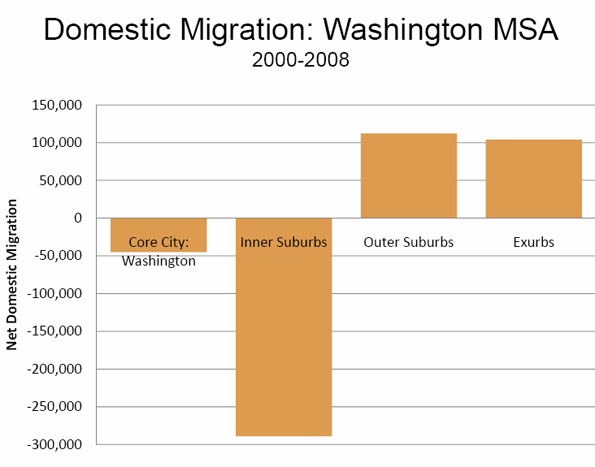
    Inner Suburbs

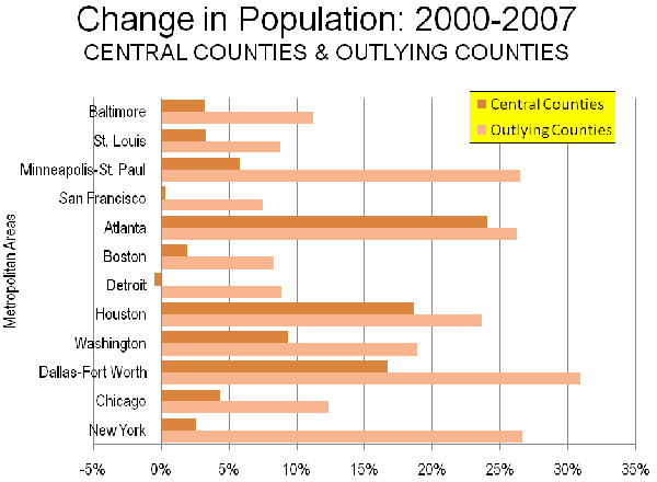
    Further, the theory of inner suburban growth is left wanting, even in the Washington area. Despite their transit improvements, between 2000 and 2008, Arlington and Alexandria lost 45,000 domestic migrants, both losing in every year except 2008 (in both cases, additions due to challenges were greater than the 2000-2007 population increase). Washington’s other inner suburbs, Fairfax County, Montgomery County and Prince Georges County are served by the same transit system (largely paid for by the taxpayers around the country), yet between them have lost another 240,000 domestic migrants between 2000 and 2008. On the other hand, the second ring suburbs have gained 112,000 migrants and the exurbs have gained 104,000 (See Figure). During the last year, the inner suburbs grew at approximately one-third the rate of the outer suburbs. And despite the subprime induced distress in the exurbs, the inner suburbs could achieve no better a rate. Analysts may trade anecdotes at coffee houses about people moving to the city or the inner suburbs from the exurbs or beyond. However, the Bureau of the Census data is clear. For every anecdote that that moves in, more than one moves out.

    The Numbers Tell it All

    When the 2008 county and metropolitan area population estimates were published a few months ago, we showed that the central counties (Note 2) continue to lose residents at a rapid rate. Among the metropolitan areas with more than 1,000,000 population, central counties lost 4.6 million domestic migrants, while suburban counties gained 2.0 million domestic migrants between 2000 and 2008. Over the past year, the core counties lost a net 314,000 domestic migrants while the suburbs gained 197,000 (Table 3).

    Table 3
    Domestic Migration: Core and Suburban Counties: 2000-2008
    Metropolitan Areas over 1,000,000 Population
      Latest Year: 2007-2008 Decade: 2000-2008
    Metropolitan Area Suburban Core Total Suburban Core Total
    Atlanta          32,925          10,126          43,051        395,836          (1,749)        394,087
    Austin          24,216          10,825          35,041        156,890          41,142        198,032
    Baltimore          (6,000)          (6,352)        (12,352)          32,952        (67,923)        (34,971)
    Birmingham            5,658          (2,356)            3,302          48,700        (25,755)          22,945
    Boston          (2,889)          (5,372)          (8,261)      (154,086)        (99,006)      (253,092)
    Buffalo             (358)          (4,127)          (4,485)          (5,933)        (48,232)        (54,165)
    Charlotte          21,327          13,060          34,387        125,223          93,513        218,736
    Chicago               921        (43,031)        (42,110)        160,765      (667,507)      (506,742)
    Cincinnati            3,803          (7,372)          (3,569)          65,905        (85,538)        (19,633)
    Cleveland               861        (15,757)        (14,896)          14,726      (141,445)      (126,719)
    Columbus            3,325             (826)            2,499          64,211        (40,624)          23,587
    Dallas-Fort Worth          62,022        (18,847)          43,175        514,011      (254,016)        259,995
    Denver          13,940            3,932          17,872          86,262        (50,881)          35,381
    Detroit        (17,020)        (45,140)        (62,160)        (53,478)      (273,695)      (327,173)
    Hartford               379          (4,065)          (3,686)          10,789        (21,639)        (10,850)
    Houston          38,559          (1,835)          36,724        279,389        (89,222)        190,167
    Indianapolis          11,747          (5,040)            6,707        113,378        (51,262)          62,116
    Jacksonville            8,723          (3,955)            4,768        101,954          20,185        122,139
    Kansas City            4,908          (3,495)            1,413          57,007        (34,481)          22,526
    Las Vegas (*)
    Los Angeles        (12,033)      (103,004)      (115,037)      (232,281)   (1,006,985)   (1,239,266)
    Louisville            4,281               818            5,099          38,420          (9,798)          28,622
    Memphis            5,986        (10,533)          (4,547)          49,979        (52,412)          (2,433)
    Miami        (18,598)        (28,399)        (46,997)          31,551      (252,098)      (220,547)
    Milwaukee               939          (7,382)          (6,443)          13,987        (86,392)        (72,405)
    Minneapolis-St. Paul            1,179          (4,619)          (3,440)          61,162        (86,920)        (25,758)
    Nashville          17,172             (547)          16,625        128,921        (19,094)        109,827
    New Orleans          (2,520)          22,856          20,336        (72,561)      (233,021)      (305,582)
    New York        (68,081)        (76,018)      (144,099)      (672,435)   (1,118,025)   (1,790,460)
    Oklahoma City            5,707             (226)            5,481          42,399        (10,302)          32,097
    Orlando          10,495          (7,342)            3,153        174,428          55,611        230,039
    Philadelphia          (9,639)        (12,209)        (21,848)          36,553      (144,849)      (108,296)
    Phoenix          22,614          28,463          51,077        117,550        411,697        529,247
    Pittsburgh            1,169          (3,601)          (2,432)            5,221        (60,564)        (55,343)
    Portland          10,641            7,355          17,996        106,163          (4,247)        101,916
    Providence          (3,983)          (6,643)        (10,626)        (13,399)        (34,136)        (47,535)
    Raleigh            6,030          23,238          29,268          35,263        132,769        168,032
    Richmond            5,625               937            6,562          76,608          (4,095)          72,513
    Riverside-San Bernardino (*)
    Rochester             (425)          (3,325)          (3,750)          (7,121)        (36,181)        (43,302)
    Sacramento            8,255          (3,731)            4,524          97,304          34,798        132,102
    St. Louis               561          (6,253)          (5,692)          17,988        (57,090)        (39,102)
    Salt Lake City            1,407          (1,164)               243          10,191        (41,646)        (31,455)
    San Antonio          10,850          11,941          22,791          69,824          84,409        154,233
    San Diego (*)
    San Francisco            4,092            1,414            5,506      (269,093)        (80,543)      (349,636)
    San Jose             (528)          (2,097)          (2,625)          (6,119)      (221,378)      (227,497)
    Seattle            7,894            3,975          11,869          61,244        (38,132)          23,112
    Tampa-St. Petersburg            8,610          (2,100)            6,510        169,346          91,106        260,452
    Tucson (*)
    Virginia Beach        (11,093)          (4,430)        (15,523)            7,486        (15,941)          (8,455)
    Washington        (16,637)          (1,622)        (18,259)        (77,894)        (43,457)      (121,351)
    Total        197,017      (313,875)      (116,858)     2,015,186   (4,645,051)   (2,629,865)
    * Indicates no suburban county(ies)
    Calculated from US Bureau of the Census data for county based metropolitan areas

    There is a simple test that the reporters and the analysts can apply. When the cores experience net domestic migration gains and the suburbs experience net domestic migration losses, only then can it be claimed that people are moving to the cores are gaining at the expense of the suburbs. The reality is that between 2000 and 2008, there was not a single instance out of the 51 metropolitan areas with more than 1,000,000 population where there was suburban net out-migration and core county net in-migration. There was one case in 2008, but it was an anomaly. The suburbs of New Orleans lost a modest number of domestic migrants, while the city gained strongly. This occurred because people moved back to the city in large numbers, after more than half left due to Hurricane Katrina.

    Spin can change perceptions, but not reality. People are not moving from the suburbs to the core cities. The reverse continues to be true, even in the worst of times.


    Note 1: Excludes New Orleans due to significant population variations from Hurricane Katrina.

    Note 2: Counties are the smallest jurisdiction for which the Bureau of the Census publishes migration data.

    Reference: Demographia 2000-2008 Metropolitan Area Population & Migration: http://www.demographia.com/db-metmic2004.pdf

    Wendell Cox is a Visiting Professor, Conservatoire National des Arts et Metiers, Paris. He was born in Los Angeles and was appointed to three terms on the Los Angeles County Transportation Commission by Mayor Tom Bradley. He is the author of “War on the Dream: How Anti-Sprawl Policy Threatens the Quality of Life.

  • Go to Oklahoma, Young Man

    One of the great migrations of Americans was from Dust Bowl Oklahoma to California during the Great Depression. People came from all over the parched plains to California; South Dakotans, Nebraskans, Oklahomans and others. But only one group had a name. No one called them Dakoties, nor Nebies, but they did call them “Okies.” Their legacy was spread by John Steinbeck’s Grapes of Wrath. Indeed, so many came to California that it enacted an “anti-Okie” law, which was duly set aside by the United States Supreme Court (Edwards v. the People of California).

    How things change. A Sacramento Bee article reports on the migration of Californians to, of all places Oklahoma and nearby states. For decades, Oklahoma has been the ultimate of “flyover country,” one of the last places people on the coast would think of moving to. Yet, as I pointed out in 2005, Oklahoma has become more competitive, at least partially because its advantages in housing costs and hassle free commuting. Moreover, it’s more than Californians. Seattle, which lost home-grown Boeing to Chicago some years ago, lost its NBA “Supersonics” to Oklahoma City last year. Having spent most of my life on the coast, I never would have imagined that Oklahoma City would become competitive with California and Seattle. But it has.

  • Exurban Growth Greater than Central Growth: Census Bureau

    The US Bureau of the Census has just released an analysis of suburbanization showing that the nation continues to suburbanize, despite the consistent media “spin” that people are leaving the suburbs to move to core cities.

    The report, Population Change in Central and Outlying Counties of Metropolitan Statistical Areas: 2000 to 2007, goes further than our previous 2000 to 2008 analysis that showed strong domestic outmigration from central counties to suburban counties and beyond.

    Our report compared trends between the core county (such as the 5 county New York City core) of each major metropolitan area. The new report compares population trends between what it terms “central counties” and outlying counties. The Bureau of the Census considers any county in the metropolitan area that is generally beyond the urban area (urban footprint) to be outlying. Thus, in Chicago, the report considers not only the core county of Cook, but also 9 additional counties as around it as central (Figure 1). Not surprisingly this means the bulk of the metropolitan area population is in the central counties (92%), however there is rapid movement even further out to the outlying counties.

    This Bureau of the Census report tells us more about exurbanization than suburbanization. Exurbanization might be thought of growth that occurs outside the urban area, including its historic suburban periphery. It represents, if you will, “sprawl beyond sprawl”. You usually can tell when you are in an exurb because you have to drive through countryside to get to the “city” (For definition of urban terms, such as metropolitan area, urban area and city, see this document).

    Between 2000 and 2007, these outlying counties grew 13.1 percent, nearly double that of the central counties, which includes the suburbs, at 7.8 percent (Figure 2). The report goes on to compare detailed results for the 12 metropolitan areas with more than 2,500,000 population that have outlying counties. In every case, the outlying counties grew faster than the central counties. On average, the outlying counties grew at 2.3 times the rate of the central counties (Figure 3).

    • In San Francisco, the outlying county growth was 25 times that of the central counties.
    • In New York, the outlying county growth was 10 times that of the central counties.
    • In Boston and Minneapolis-St. Paul, the outlying country growth was between four and five times the growth in the central counties.
    • In Baltimore, the outlying county growth was 3.5 times the growth in the central counties.
    • In St. Louis, Washington (DC) and Chicago, the country growth was between two and three times the growth in the central counties.

    The strongest central county performance occurred not in the much ballyhooed “cool” dense urban areas of the Northeast or Pacific Coast but in the largest metropolitan areas of the south, Atlanta, Houston and Dallas-Fort Worth.

    • In Dallas-Fort Worth the outlying county growth was 1.9 times the growth in the central counties.
    • In Houston the outlying county growth was 1.3 times the growth in the central counties.
    • In Atlanta, the outlying county growth was 1.1 times the growth in the central counties.

    The worst central county performance occurred in Detroit, where there was a net population loss. The outlying counties grew nearly 9 percent.

    It may seem surprising that the Bureau of the Census analyzed only 12 metropolitan areas. Regrettably, Census metropolitan area definitions makes a broader analysis virtually impossible. Many metropolitan areas do not have outlying counties. That does not mean they do not have outlying or exurban areas. Riverside-San Bernardino is a good example. At the eastern end of this metropolitan area, a recluse might live less than 40 miles from the Las Vegas strip, yet be separated by 175 miles of desert and mountains from the edge of the Riverside-San Bernardino metropolitan area. The problem is that most metropolitan areas are defined by counties, and some counties contain much more area than can reasonably be considered as part of the labor market.

    This fixation with county boundaries is unnecessary. Decades ago Statistics Canada figured out how to define metropolitan areas below the county level. The Bureau of the Census approach tends to obscure the growth of outlying areas, particularly in the largest counties. This is illustrated by our analysis of the Riverside-San Bernardino area from 2000 to 2006, which showed outlying areas to be growing at 2.5 times the rate of the core urban area.

    Nonetheless, the conclusion of the new report is clear. The nation’s most remote suburbs – its exurbs – are growing much faster than the central counties. Whether this trend will now reverse, of course, is up to debate. Perhaps demographic changes and higher energy costs will slow expansion on the outer fringes. More likely, the current recession may well lead to less exurban growth, but history suggests this may prove only a short-lived trend.

    Wendell Cox is a Visiting Professor, Conservatoire National des Arts et Metiers, Paris. He was born in Los Angeles and was appointed to three terms on the Los Angeles County Transportation Commission by Mayor Tom Bradley. He is the author of “War on the Dream: How Anti-Sprawl Policy Threatens the Quality of Life.