Author: Wendell Cox

  • Smart Growth Bill Vetoed

    Texas Governor Rick Perry has vetoed a bill that would have created a state level “smart growth” program. The veto message is below.

    June 19, 2009

    Pursuant to Article IV, Section 14, of the Texas Constitution, I, Rick Perry, Governor of Texas, do hereby disapprove of and veto Senate Bill No. 2169 of the 81st Texas Legislature, Regular Session, due to the following objections:

    Senate Bill No. 2169 would create a new governmental body that would centralize the decision-making process in Austin for the planning of communities through an interagency work group on “smart growth” policy. Decisions about the growth of communities should be made by local governments closest to the people living and working in these areas. Local governments can already adopt “smart growth” policies based on the desires of the community without a state-led effort that endorses such planning. This legislation would promote a one-size-fits-all approach to land use and planning that would not work across a state as large and diverse as Texas.

    IN TESTIMONY WHEREOF, I have signed my name officially and caused the Seal of the State to be affixed hereto at Austin, this the 19th day of June, 2009.

    RICK PERRY
    Governor of Texas

    Reference: http://governor.state.tx.us/news/veto/12632/

  • New Mitsubishi Car: Climate Friendlier than New York Transit

    Further demonstrating the ability of technology to reduce greenhouse gas (GHG) emissions, Mitsubishi has announced development of a lithium battery driven car, to be sold within two years. The car, the “MIEV Plug-In Electric First Drive” would travel as much as 100 miles (160 kilometers) between charges.

    United States Data and Comparisons: GHG Emissions per Passenger Mile/Passenger KM are indicated below (From power plants – variation is due to mix of fuel sources used in producing electricity)

    Average United States: 61 grams/37 grams

    Lowest (Vermont): 1.4 grams/0,7 grams

    Highest (North Dakota): 102 grams/62 grams

    The average GHG reduction compared to the current US automobile and sport utility vehicle fleet average would be 83 percent. The car would emit approximately less than one-half the GHGs per passenger mile as transit in New York area (the best in the nation) and one-fourth the overall US transit average.

    European Union Comparison: The MIEV would be 40 percent less GHG intensive that is required by the newly adopted European Union fuel economy requirements for 2020 (the equivalent of 101 grams per passenger mile or 62 grams per passenger kilometer).

    The above calculations assume the US national vehicle occupancy rate of 1.6. The comparison to the present fleet includes upstream production and transport activities.

    Sources: Mitsubishi site, Edmunds Review

  • Special Report: Infill in US Urban Areas

    One of the favored strategies of current urban planning is “infill” development. This is development that occurs within the existing urban footprint, as opposed that taking place on the fringe of the urban footprint (suburbanization). For the first time, the United States Bureau of the Census is producing data that readily reveals infill, as measured by population growth, in the nation’s urban areas.

    2000 Urban Footprint Populations

    The new 2007 estimates relate to urban areas or urban footprints as defined in 2000 and are produced by the American Community Survey program of the Bureau of the Census. Urban areas are the continuous urbanization that one would observe as the lights of a “city” on a clear night from an airplane. It is the extent of development from one side of the urban form to the other. Further, urban areas are not metropolitan areas, which are always larger and are defined by work trip travel patterns. Metropolitan areas always include adjacent rural areas, while urban areas never do.

    The Process of Infill

    Although embraced with often religious passion within the urban planning community, infill is neither good nor bad in terms of social or environmental impact. Infill always increases population densities and that means more traffic. If road capacity is increased sufficiently, traffic congestion can be kept at previous levels. If on the other hand, nothing is done, traffic congestion is likely to increase along with population. This means slower traffic and more stop and go operations, which inevitably increases the intensity of air pollution with the potential to cancel out any reductions in greenhouse gas emissions (GHG) that might occur if average car trip lengths decline. Similar difficulties can occur with respect to other infrastructure systems, such as sewer and water. Expanding roads, sewer and water systems in already developed areas can be far more expensive than new systems on greenfield sites. Regrettably, boosters of infill routinely ignore these issues.

    But infill has been going on for years, along with suburbanization, both in the United States and in other first world nations. This is indicated by the general densification trend that occurred in US urban areas between 1990 and 2000 and the longer term densification trends that occurred in a number of southwestern urban areas, such as Los Angeles, San Jose, Riverside-San Bernardino, Phoenix, Dallas-Fort Worth and Las Vegas. All these traditionally “sprawling” areas have, in fact, been densifying since 1960 or before. Since 2000, 33 of the nation’s 37 urban areas with a population exceeding 1,000,000 population experienced population infill to their 2000 urban footprints.

    Infill in Traditionally Regulated Markets (More Responsive Markets)

    Infill is a natural consequence of the traditional post-World War II land use regulation, which tends towards accommodating both demographic growth and market forces. This has been replaced by more prescriptive (often called “smart growth”) land use regulation in some urban areas. Under traditional regulation, suburban development followed a “leap frog” process, moving ever further out. This is roundly condemned in today’s planning literature and among leading academics and policy makers.

    Leap frog development occurs where urban development skips over empty land and creates a less continuous urban fabric. Land is developed based upon the interplay between sellers and buyers. Due to fewer planning restrictions, no seller can be sure that their land will be purchased since there is always plenty of land that buyers can otherwise purchase. This keeps land prices down. In the more responsive markets, it is typical for land and site infrastructure costs to be 20 percent of the total price land and house price.

    Infill occurs as land that has been “leaped” over is subsequently purchased for development. Again, because buyers have plenty of choices, prices of the infill land remains low, so that land and infrastructure costs remain relatively affordable in relationship to the overall new house purchase price.

    The result is an urban area that is generally continuous, though with a transitional “ragged edge.” The ragged edge enabled the broad expansion of home ownership that occurred in the decades following World War II by keeping house prices low.

    Infill in More Prescriptive Markets (Smart Growth)

    The infill process is quite dramatically different in more prescriptive markets. Infill might be mandated as a percentage of total development or by severely limiting the development allowed to occur closer to the urban fringe. Sellers of land on which development is permitted have disproportionate power to charge higher prices because the planning regime seriously limits the availability of alternative sites for buyers. This, of course, flows through to house prices. The share of land and site infrastructure can rise to two-thirds of the house and land cost. The urban area may have a “clearer” edge, but at a significant loss in housing affordability.

    Infill Trends in the 2000s

    The new infill estimates indicate that American urban areas continue to densify. Between 2000 and 2007, the 33 of the 37 urban areas of more than 1,000,000 population experienced densification in their 2000 urban footprints. The average population infill increase was 5.6 percent (See Table the following table).

    Population Infill in 2000 Urban Footprints
    2000-2007
      Population Change: 2000 Urban Footprint Population Density of 2000 Urban Footprint in 2007  
    Urban Area 2000 Census 2007 Estimate Change % Rank Rank
    Riverside–San Bernardino, CA       1,506,816      1,800,117     293,301 19.5% 1         4,110 8
    Atlanta, GA       3,499,840      4,118,485     618,645 17.7% 2         2,100 36
    Austin, TX         901,920      1,051,962     150,042 16.6% 3         3,308 17
    Las Vegas, NV       1,314,357      1,518,835     204,478 15.6% 4         5,311 5
    Houston, TX       3,822,509      4,370,475     547,966 14.3% 5         3,377 16
    Portland, OR–WA       1,583,138      1,779,705     196,567 12.4% 6         3,755 12
    Phoenix, AZ       2,907,049      3,254,634     347,585 12.0% 7         4,078 9
    Dallas–Fort Worth, TX       4,145,659      4,549,281     403,622 9.7% 8         3,236 18
    Orlando, FL       1,157,431      1,267,976     110,545 9.6% 9         2,799 24
    San Antonio, TX       1,327,554      1,440,794     113,240 8.5% 10         3,540 14
    Tampa–St. Petersburg, FL       2,062,339      2,209,067     146,728 7.1% 11         2,754 25
    Sacramento, CA       1,393,498      1,488,647       95,149 6.8% 12         4,034 10
    Seattle, WA       2,712,205      2,896,844     184,639 6.8% 13         3,040 21
    Miami, FL       4,919,036      5,243,679     324,643 6.6% 14         4,703 6
    Washington, DC–VA–MD       3,933,920      4,174,187     240,267 6.1% 15         3,611 13
    Denver, CO       1,984,887      2,087,803     102,916 5.2% 16         4,192 7
    Indianapolis, IN       1,218,919      1,278,687       59,768 4.9% 17         2,316 34
    Columbus, OH       1,133,193      1,175,132       41,939 3.7% 18         2,960 22
    Kansas City, MO–KS       1,361,744      1,408,900       47,156 3.5% 19         2,413 31
    Virginia Beach, VA       1,394,439      1,442,494       48,055 3.4% 20         2,742 26
    San Jose, CA       1,538,312      1,588,544       50,232 3.3% 21         6,110 2
    Los Angeles, CA     11,789,487    12,171,625     382,138 3.2% 22         7,302 1
    Cincinnati, OH–KY–IN       1,503,262      1,546,730       43,468 2.9% 23         2,305 35
    Baltimore, MD       2,076,354      2,133,371       57,017 2.7% 24         3,128 19
    San Diego, CA       2,674,436      2,747,620       73,184 2.7% 25         3,514 15
    New York, NY–NJ–CT     17,799,861    18,223,567     423,706 2.4% 26         5,440 4
    Minneapolis–St. Paul, MN       2,388,593      2,438,359       49,766 2.1% 27         2,727 27
    Chicago, IL–IN       8,307,904      8,467,804     159,900 1.9% 28         3,992 11
    St. Louis, MO–IL       2,077,662      2,103,040       25,378 1.2% 29         2,540 30
    Milwaukee, WI       1,308,913      1,324,365       15,452 1.2% 30         2,719 28
    Boston, MA–NH–RI       4,032,484      4,077,659       45,175 1.1% 31         2,350 33
    Providence, RI–MA       1,174,548      1,183,622        9,074 0.8% 32         2,353 32
    Philadelphia, PA–NJ–DE–MD       5,149,079      5,178,918       29,839 0.6% 33         2,880 23
    San Francisco, CA       3,228,605      3,214,137      (14,468) -0.4% 34         6,099 3
    Detroit, MI       3,903,377      3,831,575      (71,802) -1.8% 35         3,041 20
    Pittsburgh, PA       1,753,136      1,687,509      (65,627) -3.7% 36         1,981 37
    Cleveland, OH       1,786,647      1,705,917      (80,730) -4.5% 37         2,641 29
    Total  116,773,113  122,182,066  5,408,953 5.6%
    Data from US Bureau of the Census

    Riverside-San Bernardino, long castigated as a “sprawl” market, had the largest population infill, at 19.5 percent. Atlanta ranked number two, at 17.7 percent. This is a real surprise, since Atlanta was the least dense major urban area in the world in 2000, ranked second in 2000s infill. As a result, it is likely that Pittsburgh- often held up as a model of urban regeneration – is now the world’s least dense major urban area. On the other hand, if Atlanta’s infill rate continues, its 2000 urban footprint will be more dense than that of Boston by 2015.

    Austin ranked third, adding 16.6 percent population to its 2000 urban footprint. Las Vegas ranked fourth, with a 15.6 percent increase in its 2000 urban footprint. The density of Las Vegas is increasing so rapidly that by the 2010 census its 2000 urban footprint will be more dense than the 2000 New York urban footprint, should the current rates continue.

    Perhaps most surprising of all is that Houston ranked fifth, added 14.3 percent to its 2000 urban footprint. This may surprise those who have denounced Houston’s largely deregulated regulatory environment, both in the city and in unincorporated county areas in the suburbs. Yet overall Houston’s infill exceeded that of smart growth model Portland. The Rose City stood at sixth, adding 12.4 percent to its 2000 urban footprint.

    Perhaps equally surprising, Portland remains less dense than average for a western urban area. Its 2000 urban footprint density trailing Los Angeles, San Jose, San Francisco, Las Vegas, Denver, Riverside-San Bernardino, Phoenix and Sacramento, while leading only San Diego and Seattle.

    The top ten were rounded out by Phoenix (7th), Dallas-Fort Worth (8th), Orlando (9th) and San Antonio (10th). It is worth noting that like Houston, the unincorporated suburbs of Austin, Dallas-Fort Worth and San Antonio have largely deregulated land use regulation, yet these urban areas ranked high in infill.

    Interestingly some of the greatest infill growth also took place in the fastest growing, traditionally “sprawling” cities. Atlanta also had the largest numeric increase in the population of its 2000 urban footprint, at more than 600,000. Houston was a close second, at nearly 550,000.

    In contrast, population losses since 2000 in the urban footprints of Cleveland, Pittsburgh, Detroit and San Francisco, means these urban areas experienced no population infill. San Francisco’s loss enabled San Jose to move into second position nationally after Los Angeles in the population density of its 2000 urban footprint.

    How the Core Cities Fared

    The core cities (municipalities) attracted, on average, their population share. Approximately 30 percent of the infill growth occurred inside the core cities. Even this figure may be a bit high, due to the impacts of annexation

    All of the infill in Philadelphia, Baltimore, Chicago, Providence and Minneapolis-St. Paul occurred outside the core cities. The city of Portland attracted barely 10 percent of its urban area infill, despite highly publicized (and subsidized) infill projects such as the Pearl District. Core cities attracted the largest share of infill growth in such diverse cities as San Antonio, San Jose, Columbus, Phoenix and New York.

    Note: Additional information available at http://www.demographia.com/db-uzafoot2007.pdf

    Wendell Cox is a Visiting Professor, Conservatoire National des Arts et Metiers, Paris. He was born in Los Angeles and was appointed to three terms on the Los Angeles County Transportation Commission by Mayor Tom Bradley. He is the author of “War on the Dream: How Anti-Sprawl Policy Threatens the Quality of Life.

  • A New Auto Industry Model: Not Too Big to Fail

    “A new business model” is what Jack Nerad of Kelly Blue Book called the proposed sale of Saturn by General Motors (GM) to Roger Penske’s Penske Automotive Group.

    What makes it a new model is that Penske would only buy the brand and the dealer network. Penske would subcontract vehicle production other manufacturers, though for the first two years, the GM Saturn plant would produce the cars. Doubtless, Penske will buy vehicles from assembly plants able to provide the best quality for the dollar, establishing competition at the factory rather than corporate level. This radical departure solves the fundamental problem leading to the near-death of the American automobile industry.

    Following World War II, America had little competition. Industrial powers such as in Europe and Japan were flat on their backs and American manufacturers had a “clear field.” American labor and management bid up the price of heavy manufactured goods so much that they became less competitive when war torn economies recovered.

    Americans paid over and over again in their automotive purchases. They paid first through reliability difficulties that were the inevitable result of attempting to compete on price with foreign firms with costs that were competitive in world markets. Finally, they paid with more than $60 billion in loans to General Motors, GMAC and Chrysler. Canadians also paid twice, most recently in more than $13 billion in loans that make their per capita contribution substantially higher than that of Americans. It is not at all clear that North American taxpayers will ever see these amounts repaid (American taxpayers are still waiting for the first penny of repayment from Amtrak on loans made more than 25 years ago).

    The recent loans were the result of a political consensus that GM and Chrysler were “too big to fail.” In an industry characterized by the Penske-Saturn model, the too-big-to-fail problem would be removed.

  • Painting the Town White: Technology and Greenhouse Gas Emissions

    “Paint the world white to fight global warming” was the astonishing headline from The Times of London. The paper was referring to a presentation made by United States Secretary of Energy, Dr. Stephen Chu at the St. James Palace Nobel Laureate Symposium last week. Chu was reported as saying that that this approach could have a vast impact. By lightening paved surfaces and roofs to the color of cement, it would be possible to cut carbon emissions by as much as taking all the world’s cars off the roads for 11 years. That would be no small accomplishment.

    Chu makes considerable sense and his underlying approach is wise: emphasizing inexpensive, simple and unobtrusive ways to reduce greenhouse gas (GHG) emissions. This is at the same time that Secretary of Transportation Ray LaHood has suggested “coercing” people out of cars and a bill by Senators Jay Rockefeller and Frank Lautenberg would require annual reductions in per capita driving. Strategies such as these are not inexpensive, they are not simple and they are not unobtrusive. Indeed, given the close association between personal mobility, employment and economic growth, such policies could have serious negative effects.

    The biggest problem with coercive strategies is that they are simply unnecessary. As Secretary Chu has indicated, huge reductions can be achieved in GHG emissions, without interfering in people’s lives or threatening the economy. There’s more to this story than paint.

    The Cascade of Technology

    There is a virtual cascade of technological advances that have been spurred by the widely accepted public policy imperative to reduce GHG emissions. Here are just a few.

    Vehicle Technology

    Some of the most impressive advances are in vehicle technology. GHG emissions from cars are directly related to fuel consumption. Thus, as cars require less fuel, GHG emissions go down at the same rate.

    By now, everyone is aware that the Administration has advanced the 2020 vehicle fuel efficiency (CAFE) standards to 2016, matching the California requirements. These requirements apply to the overall fleet, both cars and light trucks (which are predominantly sport-utility vehicles). Recently published research by Robert Puentes of the Brookings Institution finds that per capita automobile use had fallen off even before gasoline prices exploded, so it seems reasonable to suggest that future vehicle travel will rise at approximately the population growth rate, rather than the robust growth rates previously forecast. At the new 35.5 miles per gallon, the nation could be on a course to reduce GHG emissions from cars and light trucks by more than 20 percent by 2030, despite the increase in driving as population increases.

    This is just the beginning. There are advances well beyond the 35.5 mile per gallon standard. The most efficient hybrid cars now achieve 50 miles per gallon. The European parliament has adopted a nearly 70 mile per gallon standard for 2020. The President has often spoke of his commitment for the nation to develop 150 mile per gallon cars, while Volkswagen has already developed a 235 mile per gallon car.

    A French company plans to market a car powered by compressed air at city traffic speeds, producing almost no GHG emissions, while at higher speeds it uses gasoline to get more than 100 miles per gallon.

    Fuel Technology

    Progress is also being made on alternative fuels and on making present fuels cleaner.

    Technologies are being developed to produce gasoline from carbon dioxide.

    There are even substantial advances in air travel emissions. Air New Zealand has announced tests that show the feasibility of using biofuels based upon the jatropha plant. The airline reports that, gallon for gallon, the biofuel reduced GHG emissions 60 to 65 percent relative to jet fuel. Jatropha is a non-food crop, and therefore its use would have little or no impact on food prices.

    Carbon Neutral Housing

    We have previously reported on the development of a carbon neutral, single story 2,150 square foot suburban house in Japan. The resulting 100 percent reduction in GHG emissions means that there is no reason that such housing cannot continue to be available to those who prefer it.

    Electricity Generation

    One of the most intractable challenges will be producing sufficient supplies of electricity while considerably reducing GHG emissions. Obviously, one approach with great potential is nuclear power, which the environmentally conscious French have successfully used to produce approximately three-quarters of their demand.

    Further, substantial advances are coming in solar power. For example a Massachusetts Institute of Technology team has developed a solar concentrator system that increases power production “by a factor of 40.” The process is now under commercial development.

    Even Buck Rogers seems to be getting into the game. California’s Pacific Gas and Electric Company is partnering with a startup firm to produce solar energy in space and to beam it to earth by microwaves. This process could produce as much as 10 times the energy as ground based solar connectors.

    Further, international efforts continue toward developing nuclear fusion power generation. This non-polluting technology, still largely theoretical, could revolutionize power production in decades to come.

    The Color of Paint

    Some of the technological advances above may not in fact make a substantial contribution to reducing GHG emissions in the longer run. However, these developments and others likely to come underscore the fact that technology, that is human ingenuity, can materially reduce GHG emissions, while permitting people and the economy to go about their business. Serious attempts to force behavior modification backwards to the past seem likely to fail.

    So, there is no reason to retreat to an idealized yesterday to meet the thinly disguised social engineering goals of the few while leaving the many worse off. Secretary Chu has caught the spirit of the right approach. We should be painting the town white with innovation and should reject the coercion that has been embraced by those who naively (or perhaps even purposefully) would paint the future a more somber color. As in the past, human ingenuity appears up to the challenge, if we give it the chance.

    Wendell Cox is a Visiting Professor, Conservatoire National des Arts et Metiers, Paris. He was born in Los Angeles and was appointed to three terms on the Los Angeles County Transportation Commission by Mayor Tom Bradley. He is the author of “War on the Dream: How Anti-Sprawl Policy Threatens the Quality of Life.

  • Portland: A Model for National Policy?

    United States Secretary of Transportation Ray LaHood and Washington Post columnist George Will have been locked in debate over transit. Will called LaHood the “Secretary of Behavior Modification” for his policies intended to reduce car use, citing Portland’s strong transit and land use planning measures as a model for the nation. In turn, the Secretary defended the policies in a National Press Club speech and “upped the ante” by suggesting the policies are “a way to coerce people out of their cars.”

    These are just the latest in a series of media accounts about Portland, usually claiming success for its policies that have favored transit over highway projects as well as its “progressive” land use policies. Portland has also become the poster child for those who advocate planning restrictions and subsidies favoring higher density development in parts of the urban core.

    Indeed if Secretary LaHood has his way, Portland could become The Model for federal transportation policy. So perhaps it is appropriate to review what it has accomplished.

    Portland’s Mediocre Results

    Portland’s record of transit emphasis began more than 30 years ago, when the area “traded in” federal money that was available to build an east side freeway to build its first light rail line. The east side light rail opened in 1986. Since that time, Portland has significantly increased its transit service, especially opening three more light rail lines (West Side, North Side and Airport) as well as a downtown “streetcar.”

    Portland’s Static Transit Market Share: With these new lines and expanded service, Portland has experienced a substantial increase in transit ridership. Passenger miles have increased more than 130 percent since 1985, the last year before the first light rail line was opened. This is an impressive figure.

    However, over the same period, automobile use increased just as impressively. In 1985, approximately 2.1 percent of motorized travel in the Portland urban area was on transit and it remained 2.1 percent in 2007, the latest year for which data is available.

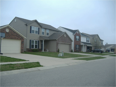
    Portland’s Declining Transit Work Trip Market Share: One of transit’s two most important contributions to a community is providing an alternative to the automobile for the work trip (the other important contribution is mobility for low income citizens). Work trip rider attraction is important because much of this travel is during peak periods, when roadways are operating at or above full capacity. In 1980, the last year for which data is available before the first light rail line opened, United States Bureau of the Census data indicates that transit’s work trip market share was 9.5 percent in the Portland area counties of Clackamas, Multnomah and Washington covered by Portland’s strong land use policies. Yet despite this, and the transit improvements, the work trip market share has not grown. By 1990, transit’s market share had dropped a third, to 6.3 percent. It rose to 7.6 percent in 2000 and by 2007 had fallen back to 6.8, despite opening two new light rail lines since 2000 (Figure 1). Remarkably, transit’s 2007 work market share was 28 percent behind its 1980 share and had fallen 10 percent since 2000.
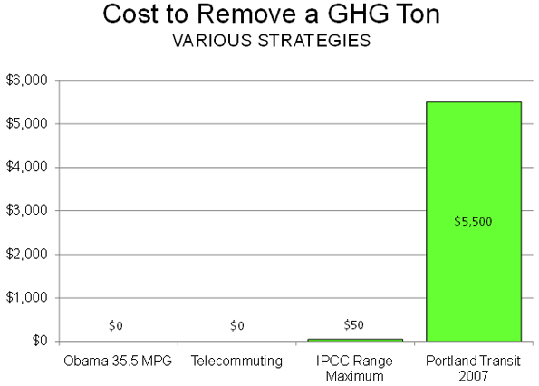
    Figure 1:

    Yes, Portland did increase its transit use, but failed to increase the share of travel on transit and the proportion of people riding transit to work declined.

    Driving the Portland Evangelism: GHG Emissions

    Secretary LaHood’s affection for Portland appears to principally be that its policies can materially assist in the objective of reducing greenhouse gas (GHG) emissions. The data is available to test that claim.

    We examined GHG emissions per capita by transit in Portland and the urban personal vehicle fleet, including cars and personal trucks (principally sport utility vehicles). Overall, including upstream emissions (such as refining and power production), transit in Portland is about 50 percent more GHG friendly per passenger mile than the 2007 vehicle fleet. If all of the increase in transit passenger miles from 1985 to 2007 replaced automobile passenger miles, then reduction of approximately 50,000 GHG tons can be said to have occurred as a result in 2007 (though as is indicated below, things are not that simple).

    That sounds like a large number, until you consider that Portland traffic produces more than 8,000,000 GHG tons per year. Transit’s expansion has reduced GHG emissions by approximately 0.6 percent annually over 22 years. This pales in comparison to the 83 percent national reduction over a 45 year period that would be required by the Waxman-Markey bill being considered by Congress.

    The Cost of GHG Emission Reduction

    Moreover, GHG emission reduction requires a context. Not all GHG emission reduction strategies make sense. Given the widely held principle that GHG emission removal must not hobble the economy, it is crucial that costs (per ton of GHG removed) be a principal criteria. If excessively costly strategies are employed, the result will be wasted financial resources, which will translate into diminished economic growth and higher levels of poverty. According to the United Nations Intergovernmental Panel on Climate Change (IPCC), between $20 and $50 per ton is the maximum amount necessary to accomplish deep reversal of CO2 concentrations between 2030 and 2050. It is fair to characterize any amount above $50 per ton as wasteful and likely to impose unnecessary economic disruption.

    Even that cost may be high. The current “market rate” is about $14 per ton, which appears to approximate the amount that figures such as former vice-president Al Gore, Speaker of the House Nancy Pelosi and California Governor Arnold Schwarzenegger pay to offset their GHG emissions from flying.

    Portland Costs of GHG Emission Reduction

    This $14 to $50 range provides the context for comparing the cost of GHG emission reduction through transit expansion in Portland. Annual transit costs in Portland more than tripled from 1985 to 2007 (including inflation adjusted operating costs and the annual capital costs of the light rail lines), an annual increase of more than $325 million. This figure is reduced to capture the consumer cost savings from reduced automobile gasoline and maintenance costs. The final result is a cost of approximately $5,500 per ton of GHG removed.

    This is 110 times the IPCC $50 maximum and nearly 400 times the Gore-Pelosi-Schwarzenegger standard. If the United States were to spend as much to remove each ton of the likely 83 percent national reduction target, the cost would be $30 trillion annually, more than double the gross domestic product. To call the Portland GHG cost reduction figure extravagant would be an understatement.

    Traffic Congestion Increases GHG Emissions

    There is not a one-to-one relationship between reduced driving levels and reduced GHG emissions. As traffic congestion increases, urban travel speeds decline and “stop-and-start” traffic increases, fuel consumption is reduced (miles per gallon declines). Some or even all of the supposed gain from reduced driving can be negated by the higher GHGs from traveling in greater traffic congestion.

    Portland’s traffic congestion has increased substantially since before light rail. Further, by 2007 Portland’s traffic congestion had become worse than average for a middle-sized urban area and worse than in much larger Dallas-Fort Worth, Atlanta, Philadelphia and Phoenix.

    Further, according to information in the Texas Transportation Institute’s Annual Mobility Report, the amount of gasoline wasted due to peak period traffic congestion in Portland rose 18,000,000 gallons from 1985 to 2005 (latest data available, adjusted for the population increase), simply due to greater traffic congestion. The increase in GHG emissions from this excess fuel consumption is estimated to be approximately 200,000 tons annually. This is four times the estimated reduction in GHG emissions that was assumed to have occurred from the increase in transit ridership.

    The bottom line: The Portland model inherently produces more congestion and increases GHG emissions. Failure to expand roadways to meet demand and forced densification increase traffic congestion.

    Better Models

    The ineffectiveness of Portland’s model strategies in GHG emission is in contrast to other strategies. Between 2000 and 2007, the share of people working at home in Portland rose more than one quarter. If transit and working at home should continue their 2000s rates, transit’s work trip share will be less than that of working at home by 2015. Working at home eliminates the work trip, resulting in substantial GHG emission reductions and does it at a cost of $0.00 per ton.

    Another approach is the Obama Administration’s automobile fuel efficiency strategy. About the same time as the LaHood-Will debate was heating up, the President announced that automobile manufacturers would be required to increase their corporate average fuel efficiency for cars and light trucks to 35.5 miles per gallon by 2016, a 75 percent performance improvement from that of the present fleet. If this fuel efficiency could be achieved in Portland today, the reduction in GHG emissions would be more than 40 percent. This new policy would eventually close 90 percent of the gap between personal vehicles and transit in Portland.

    President Obama indicated that this strategy is costless. The higher costs that consumers will pay for cars will be more than made up by the fuel cost savings. Thus, according to the President, this policy costs $0.00 per ton of GHG emissions removed, less than the IPCC’s $50 and less than Portland’s $5,500. Of course, it is not possible to achieve 35.5 miles per gallon now, but it will be (Figure 2).

    Figure 2:

    The best hybrid cars now achieve 50 miles per gallon, which makes them less GHG intensive than transit in Portland. President Obama has gone further, indicating the potential for developing 150 mile per gallon cars. The curtain could be rising on a future of cars that emit less GHG emissions per passenger mile than transit. People and officials genuinely concerned about GHG emissions should applaud these advances. On the other hand, people and officials who value coercive behavior modification more than GHG emission reduction are likely to resist.

    The Consequences of Coercing People Out of Cars

    Moreover, Portland policies ignore a crucial factor: how automobiles facilitate economic growth and employment. Generally, the research indicates that the economic performance of metropolitan areas is enhanced by greater mobility. Moreover, no transit system provides the extensive mobility made possible by the automobile, not in America and not even in Europe. Coercing people out of cars coerces some out of employment and into poverty.

    Even where transit service is available, it generally takes longer than traveling by car. In 2007, travel to work by transit took 3:50 (three hours and 50 minutes) per week longer than driving in the nation’s largest metropolitan areas. With all of Portland’s transit improvements, it still takes approximately 3:15 longer per week to commute by transit than by driving. It appears that Secretary LaHood would add more than three hours (time many don’t have) to our work trip each week.

    The Land Use Cost

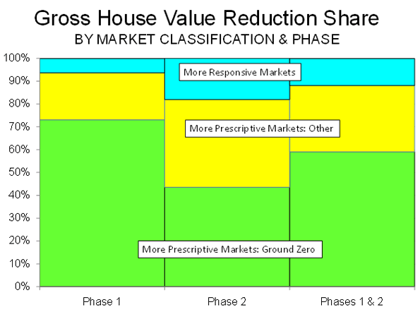
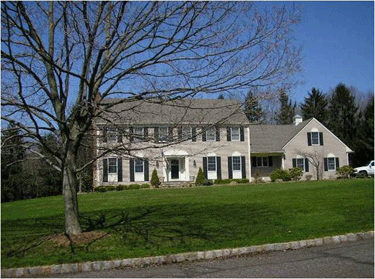
    The second plank of The Model is strong land use regulation (smart growth), which economic research shows to materially increase house costs, which would lead to a lower standard of living.

    Time to Turn Off the Ideological Autopilot

    The policies of The Model Portland have no serious potential for reducing GHG emissions and could even make it worse. On the other hand, the rapidly developing advances possible from improved vehicle technology, something the Administration espouses, show great promise. Behavior modification a la The Model turns out not only to be undesirable, but also unnecessary.

    Wendell Cox is a Visiting Professor, Conservatoire National des Arts et Metiers, Paris. He was born in Los Angeles and was appointed to three terms on the Los Angeles County Transportation Commission by Mayor Tom Bradley. He is the author of “War on the Dream: How Anti-Sprawl Policy Threatens the Quality of Life.

  • City & Suburban Trends: Sometimes it Helps to Look at the Data

    Jonathan Weber writes that “Most demographic and market indicators suggest that growth and development across the country are moving away from the suburban and exurban fringe and toward center-cities and close-in suburbs,” in an article for MSNBC entitled Demographic trends now favor downtown: Growth across the country moves away from suburban and exurban fringe.

    One might wonder what country Weber is writing about. In the United States, growth and development continues to be concentrated in suburban and exurban areas. Moreover, strong domestic migration continues away from the center cities and close-in suburbs, as evidenced by the fact that between 2000 and 2008, 4.6 million domestic migrants left the core counties of the metropolitan areas over 1,000,000 population, while 2.0 million moved into the suburban counties.

    The case is apparently furthered by the obligatory reference and photograph of The Model, Portland, Oregon. However, even in Portland, the suburbs are doing far better than the core. Since 2000, the suburbs have gained 106,000 domestic migrants, while the core county (Multnomah) has lost 4,000 domestic migrants. The IRS micro-data further indicates that the core continues to lose net domestic migration to the suburban counties.

    It appears that the only trend indicating that the suburbs are losing out to central cities is the exponential increase in articles blindly parroting “death of the suburbs” dogma.

  • Housing Downturn Update: We May Have Reached Bottom, But Not Everywhere

    It is well known that the largest percentage losses in house prices occurred early in the housing bubble in inland California, Sacramento and Riverside-San Bernardino, Las Vegas and Phoenix. These were the very southwestern areas that housing refugees fled to in search of less unaffordable housing in California’s coastal metropolitan areas (Los Angeles, San Francisco, San Diego and San Jose).

    Yet now the prices in these hyper-expensive markets are beginning to fall. Once considered widely immune from the severe housing slump, the San Francisco area now has muscled its way into the list of biggest losers. The newly published first quarter 2009 house price data from the National Association of Realtors indicates that prices are down 52.5 percent from the peak. Only Riverside-San Bernardino and Sacramento have experienced greater losses out of the 49 metropolitan areas with a population of more than 1,000,000 for which there is data (see table below). Other metropolitan areas that have seen prices drop more than 50 percent include Phoenix, Las Vegas and, for very different reasons, that rustbelt sad sack, Cleveland.

    Table 1
    Median House Price Loss: Metropolitan Areas Over 1,000,000 Population
    Rank Metropolitan Area
    Median House Price % Loss from 2000-2008 Peak
    Median House Price Loss from 2000-2008 Peak
          1 Riverside-San Bernardino, CA -57.7% $235,600
          2 Sacramento, CA -56.5% $219,600
          3 San Francisco, CA -52.5% $444,800
          4 Phoenix, AZ -51.9% $139,200
          5 Cleveland, OH -51.5% $74,300
          6 Las Vegas, NV -51.3% $163,800
          7 Los Angeles, CA -48.8% $289,400
          8 San Jose, CA -48.0% $415,000
          9 San Diego, CA -47.5% $291,900
        10 Miami-West Palm Beach, FL -47.3% $185,200
        11 Orlando, FL -43.1% $117,200
        12 Tampa-St. Petersburg, FL -42.2% $98,800
        13 Washington, DC-VA-MD-WV -37.3% $165,900
        14 St. Louis, MO-IL -35.8% $56,300
        15 Chicago, IL -35.2% $100,900
        16 Atlanta, GA -34.4% $60,600
        17 Memphis, TN-MS-AR -34.0% $49,400
        18 Providence, RI-MA -33.6% $102,600
        19 Boston, MA-NH -32.5% $140,200
        20 Cincinnati, OH-KY-IN -28.6% $42,600
        21 Richmond, VA -27.9% $66,800
        22 Indianapolis, IN -26.6% $34,300
        23 Minneapolis-St. Paul, MN-WI -25.9% $60,800
        24 Columbus, OH -24.5% $38,400
        25 Denver, CO -24.1% $61,200
        26 Birmingham, AL -23.2% $39,300
        27 Jacksonville, FL -22.4% $44,600
        28 Charlotte, NC-SC -22.1% $48,700
        29 New York, NY-NJ-PA -21.9% $104,700
        30 Virginia Beach-Norfolk, VA -21.2% $54,000
        31 Kansas City, MO-KS -20.4% $32,400
        32 Seattle, WA -20.1% $79,500
        33 Pittsburgh, PA -19.0% $24,300
        34 Hartford, CT -17.7% $47,800
        35 Portland, OR-WA -17.0% $51,100
        36 Baltimore, MD -16.3% $47,900
        37 New Orleans, LA -15.6% $27,800
        38 Philadelphia, PA-NJ-DE-MD -15.2% $37,000
        39 Louisville, KY-IN -15.1% $21,500
        40 Rochester, NY -14.5% $18,000
        41 Houston, TX -13.6% $21,800
        42 Dallas-Fort Worth, TX -13.5% $21,100
        43 Buffalo, NY -13.1% $15,000
        44 Milwaukee, WI -12.1% $27,800
        45 Salt Lake City, UT -6.7% $16,500
        46 San Antonio, TX -6.2% $9,800
        47 Austin, TX -6.1% $11,900
        48 Raleigh, NC -5.3% $12,600
        49 Oklahoma City, OK -3.3% $4,500

    Cleveland, the newest entrant to the “over 50” club, fell largely because of the collapse of its industrial economy. It remains the only one of the thirteen mega-losers without prescriptive land use policies (sometimes called “smart growth”), which raise house prices by rationing land for development and imposing more stringent regulatory requirements. Cleveland illustrates a point made in a previous commentary: that the huge house price losses in the housing downturn have spread broadly from the original metropolitan areas that precipitated Meltdown Monday, the Lehman Brothers bankruptcy on September 15, and the Panic of 2008.

    During Phase I of the housing downturn (through September 2008), the largest losses were concentrated in the “Ground Zero” markets of California, Florida, Las Vegas, Phoenix and Washington, DC. In each of these 11 markets, median house prices dropped at least 25 percent, with per house over $100,000 except in Tampa-St. Petersburg during Phase I. These markets, all with more prescriptive planning, accounted for nearly 75 percent of the gross house value loss in the nation, with other more prescriptive markets accounting for another 20 percent. The more responsive markets, where land use regulation follows more traditional market-driven lines, accounted for slightly more than 5 percent of the loss.

    The Chart below and Table 1 in The Housing Downturn in the United States: 2009 First Quarter Update financial collapse, however, now has spread the losses much more generally. In Phase II, the Ground Zero markets represented 44 percent of the loss, the other more prescriptive markets 38 percent and the more responsive markets 18 percent.

    As of the first quarter of 2009, prices had dropped in all major metropolitan areas. The average per house loss in the Ground Zero markets was still the highest, at 48 percent, though the overall all loss had increased to 34 percent.

    There are indications that the housing downturn may be slowing. The latest data indicates that the median house price increased in March, though not enough to forestall a loss in the first quarter. Another indicator is the fact that the Median Multiple (median house price divided by median household income) has fallen to a national level of 3.1, which is slightly more than the 2.9 historic rate and well below the 4.6 peak.

    The best news of all is that the Median Multiple has dropped to 3.8 in the Ground Zero markets, which is equal to the historic level and well below the peak of 7.3. In the other more prescriptive markets, the Median Multiple is at 3.5, above the 2.9 historic average but well below the peak of 4.8. In the more responsive markets, the Median Multiple has dropped to 2.6, just above the historic average of 2.5 and below the peak figure of 3.2.


    Prices have fallen so much that they now stand at historic 1980 to 2000 Median Multiple levels in 18 of the 49 metropolitan areas. Critically, this includes the Ground Zero markets of Riverside-San Bernardino, Sacramento, Phoenix and Las Vegas.

    Other Ground Zero markets have seen much of their price inflation whittled away, but still have a way to go. Prices need to decline $33,500 to reach the historic Median Multiple level in Los Angeles, $32,300 in Miami, $31,200 in Washington, $18,500 in San Francisco, $11,100 in San Diego and only $1,700 in Tampa-St. Petersburg.

    In other markets, however, prices still have some distance to go before the historic Median Multiple is reached. The largest decrease would have to occur in New York, at $122,000, followed by Portland ($95,000), Seattle ($94,000), Baltimore ($75,000) and Salt Lake City ($74,000). Other markets, including Philadelphia, Virginia Beach, Milwaukee and Ground Zero San Jose would need to have price declines of more than $50,000 to restore their historic Median Multiples. See Table 2.

    Table 2
    Median House Price Reduction Required to Reach Historic Price/Income Ratio (Median Multiple)
    Median House Price Reduction Required to Reach 1980-2000 Median Multiple
    Median Multiple
    Rank Metropolitan Area
    1980-2000 Average
    2000-2008 Peak
    Current (2009: 1st Quarter)
          1 New York, NY-NJ-PA $122,200             3.9            7.7           5.8
          2 Portland, OR-WA $94,700             2.7            5.4           4.4
          3 Seattle, WA $94,400             3.3            6.2           4.7
          4 Baltimore, MD $74,700             2.6            4.6           3.7
          5 Salt Lake City, UT $73,800             2.6            4.3           3.8
          6 Philadelphia, PA-NJ-DE-MD $61,500             2.4            4.2           3.4
          7 San Jose, CA $55,400             4.5          10.2           5.1
          8 Virginia Beach-Norfolk, VA $53,600             2.6            4.7           3.5
          9 Milwaukee, WI $51,400             2.8            4.4           3.8
        10 Boston, MA-NH $41,900             3.5            6.1           4.1
        11 Los Angeles, CA $33,500             4.5          10.1           5.1
        12 Miami-West Palm Beach, FL $32,300             3.4            7.0           4.0
        13 Jacksonville, FL $32,000             2.3            3.6           2.9
        14 Washington, DC-VA-MD-WV $31,200             2.9            5.3           3.3
        15 Providence, RI-MA $29,400             3.1            5.4           3.6
        16 Raleigh, NC $26,700             3.3            3.9           3.7
        17 Austin, TX $20,500             2.8            3.3           3.2
        18 San Francisco, CA $18,500             5.0          11.2           5.2
        19 Denver, CO $18,000             2.9            4.3           3.2
        20 Minneapolis-St. Paul, MN-WI $15,700             2.4            3.6           2.6
        21 Hartford, CT $14,300             3.1            4.2           3.3
        22 San Diego, CA $11,100             4.9            9.5           5.1
        23 Buffalo, NY $10,900             1.9            2.5           2.1
        24 Charlotte, NC-SC $10,100             3.0            4.1           3.2
        25 Richmond, VA $9,500             2.8            4.1           3.0
        26 Louisville, KY-IN $8,100             2.4            3.1           2.6
        27 Chicago, IL $7,800             2.9            4.8           3.0
        28 San Antonio, TX $5,200             3.0            3.3           3.1
        29 Orlando, FL $4,000             2.9            5.2           3.0
        30 Pittsburgh, PA $3,400             2.1            2.8           2.2
        31 Tampa-St. Petersburg, FL $1,700             2.8            4.7           2.8
    Las Vegas, NV  At or Below              3.4            5.3           2.7
    Riverside-San Bernardino, CA  At or Below              3.7            6.6           3.0
    Sacramento, CA  At or Below              3.6            5.6           2.8
    Memphis, TN-MS-AR  At or Below              3.0            3.1           2.0
    New Orleans, LA  At or Below              3.1            3.3           2.8
    Phoenix, AZ  At or Below              2.8            4.7           2.4
    Atlanta, GA  At or Below              2.4            3.1           2.0
    Birmingham, AL  At or Below              3.0            3.5           2.7
    Cincinnati, OH-KY-IN  At or Below              2.3            2.8           2.0
    Cleveland, OH  At or Below              2.2            2.8           1.4
    Columbus, OH  At or Below              2.4            2.9           2.2
    Dallas-Fort Worth, TX  At or Below              2.7            2.7           2.4
    Houston, TX  At or Below              2.5            2.9           2.5
    Indianapolis, IN  At or Below              2.1            2.3           1.7
    Kansas City, MO-KS  At or Below              2.5            2.9           2.3
    Oklahoma City, OK  At or Below              2.8            2.9           2.8
    Rochester, NY  At or Below              2.2            2.4           2.0
    St. Louis, MO-IL  At or Below              2.2            2.9           1.9
    Median Multiple: Median house price divided by median household income.

    These price reductions may or may not occur in over-valued metropolitan areas like New York, Portland and Seattle, all of which are also experiencing serious increases in unemployment. However, given the pervasive evidence that the market is returning to the vicinity of historic price ratios, it would not be surprising if significant price reductions happen in these metropolitan areas, which were previously seen and saw themselves as immune to the fallout that hit the less well-regarded ground zero markets.

    Additional information is available in:
    The Housing Downturn in the United States: 2009 First Quarter Update

    Wendell Cox is a Visiting Professor, Conservatoire National des Arts et Metiers, Paris. He was born in Los Angeles and was appointed to three terms on the Los Angeles County Transportation Commission by Mayor Tom Bradley. He is the author of “War on the Dream: How Anti-Sprawl Policy Threatens the Quality of Life.

  • Moving Away from the City: The Reality Missed by the Fairfax County Survey

    Political “spin” descended to a new low today with the publication of survey results purporting to suggest that suburban residents and workers are pining for city life. The Washington Business Journal dutifully reported that Today’s suburban workers and residents miss the amenities of cities. The survey sponsor, the Fairfax County (Virginia) Economic Development Authority noted that “almost half of workers who work in the suburbs, say they want more public transportation, more housing options, greater access to useable green space or a better variety of job opportunities – typical features of cities.”

    All of this may sound impressive until you realize that no one urban “amenity” was mentioned by more than 25 percent of respondents. That means, for example, that 77 percent of responding suburban residents did not consider “access to convenient public transportation” important enough to mention, while 23 percent did.

    According to the Economic Development Authority, the survey indicates that 52 percent of residents “say they would move to a community that offered more of these” urban amenities.

    The survey got the moving part right, but missed by a mile on where they are moving. From 2000 to 2008, more than 100,000 domestic migrants left Fairfax County, 11 percent of its 2000 population. But they didn’t move to the city (Washington) or to more urban Alexandria or Arlington, because all of these lost domestic migrants as well. Indeed, the only counties in the Washington, DC area that gained domestic migrants are further from the city than Fairfax County.