Author: Wendell Cox

  • Portland Columnist Calls for Abandonment of the WES Commuter Rail Line

    Portland Tribune columnist (see "My View: WES is a Mess: Time to Pull the Plug") Bill MacKenzie took the occasion of a Tri-Met (transit agency for the Oregon side of the Portland, OR-WA metropolitan area) approval to purchase two used Budd Rail Diesel Cars (RDC) for the Wilsonville to Beaverton commuter rail line to call for its abandonment.Fconcl In addition to the $1.5 million purchase cost, $550,000 will be required for refurbishment. When then are ready for service, they will surely older than most Tri-Met employees, since the last Budd RDC’s were built in the early 1960s.

    He mocks the agency’s general manager, Neil MacFarlane, who justified the purchase as necessary to accomodate future passenger growth: "Oh sure, plan for massive ridership growth,"MacKenzie scoffs. He continues, In early 2009, TriMet predicted WES would have 2,400 daily riders its first year of operations and 3,000 by 2020." In 2015, the line carried fewer than 1,900 riders each weekday, and its cost per boarding was more than four times that of buses (not counting capital costs).

    He concluded that: "Even if WES reaches 3,000 average daily boardings, operating costs per boarding ride will remain much higher than for buses and MAX. The fact is, WES is a train wreck. It’s time to shut it down."

  • Surprising Ordos: The Evolving Urban Form

    Ordos, in China’s Autonomous Region of Inner Mongolia (equivalent to a province) has received international notoriety as a "ghost city." I had already visited one other ghost city and found the reports considerably exaggerated (The Zhengzhou New Area in Henan, a commercial and residential district). But Ordos has received by far the most publicity.

    It turns out that in reality the people far outnumber the ghosts, something I should have recognized when it was difficult to find a hotel room six months before my visit. Ghosts do not generally need hotel rooms.   But the ghost city label is an exaggeration.

    Defining Ordos

    What is Ordos? Ordos (E’erduosi) is one of the more than 300 municipality level jurisdictions that constitute China and cover virtually all of its land area. Like other municipalities, Ordos is divided into districts which are translated broadly as county level jurisdictions. China has about 2,900 county level jurisdictions, compared to the 3,100 county level jurisdictions in the United States. There is an important difference, however. In the United States, with a few exceptions, municipalities are within counties and there may be many municipalities within counties. In China, counties are within municipalities.

    Ordos is one of 12 municipalities in Inner Mongolia. Ordos is composed of eight districts. The Ordos metropolitan area is located in the urban district of Dongsheng and the "banner" (Inner Mongolian title for county) of Ejin Horo (the urbanized part of which is Azhen). The Kangbashi new area, to which the ghost city stories refer, is split between Dongsheng and Ejin Horo.

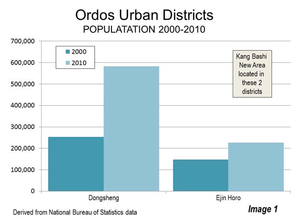
    Contrary to the “ghost city” meme, population growth has been strong in these two districts. In Dongsheng, the 2010 census counted approximately 580,000 residents, an increase of 130 percent over the 2000 census. The population of Ejin Horo rose 53 percent to approximately 225,000 residents. Overall, these two adjacent districts represent a labor market (metropolitan area) of nearly 810,000 residents, which grew more than 100 percent between 2000 and 2010 (Image 1).

    Ordos is located in the northern half of the Ordos Loop of the Yellow River, which with the Yangtze is one of China’s two great rivers. After passing Lanzhou (capital of Gansu), the eastward flowing river takes a sharp left turn to the north for approximately 600 kilometers (375 miles), then a sharp right turn back to the east for 300 kilometers (200 miles), turning south for 600 kilometers and finally turning east toward the Yellow Sea.

    Overall, the population of Ordos was approximately 1.94 million in the 2000 census and had grown 42 percent since 2000. As a result, Ordos was by far the fastest growing of the 12 municipalities in Inner Mongolia. The municipality grew at more than double the rate of the capital, Hohhot (Huhehaote), and approximately seven times the overall rate of Inner Mongolia. The growth rate of Ordos was also five times China’s national 10 year growth rate of 7.8 percent.

    The municipality covers a land area of 87,000 square kilometers, somewhat larger than Austria. Ordos Most of the population is in the more rural districts.

    Genghis Khan

    Genghis Kahn, founder of the Mongol empire (13th century), history’s largest contiguous empire plays importantly in the history of Ordos. Genghis Kahn is reputed to have been so impressed by Ordos that he wanted his personal effects buried here. The effects are buried at a mausoleum approximately 10 miles (25 kilometers) south of Kangbashi. The actual burial place of Genghis Kahn is not known, and consistent with Mongol tradition, is secret.

    The So-Called "Ghost City:" Kangbashi New Area

    The part of Ordos to which the "Ghost City" stories have referred is the Kangbashi New Area. It is adjacent to and north of the urbanization of Azhen in Ejin Horo. The Kangbashi new area covers approximately 350 square kilometers (135 square miles) in the Dongsheng and Ejin Horo districts at the time of the 2010 census. Thus, a census population count is not readily available. Informal estimates placed the population at under 30,000 in 2010. A more recent informal estimate by an Ordos municipal official indicated that the registered population had reached 72,000 in 2012 and would soon rise to 100,000. 

    Development of the Kangbashi New Area

    Ordos is one of the most affluent municipalities of China. It is comparatively new wealth, which is the result of vast coal reserves that have been increasingly called upon since 2000 to support China’s spectacular growth.  . According to People’s Daily, by 2012 the gross domestic product per capita of Ordos exceeded that of both Spain and South Korea.

    With the huge natural resource revenue gains, municipal officials decided to build a new city approximately 16 miles (25 kilometers) south of the municipal seat in Dongsheng. In 2006, the municipal seat was moved from Dongsheng to the Kangbashi new area. Both the Kangbashi New Area and Ejin Horo are within commuting distance of much larger Dongsheng, via the Dongsheng Expressway. As of 2012, the municipality indicated that at least one half of the municipal functions had been moved to Kangbashi.

    The Ordos Ceremonial Mall

    Some national governments in the world have built new capital cities or districts and taken the opportunity to order them around what might be called ceremonial malls — government buildings, monuments and cultural institutions arranged around a central axis. Governments that build new capital cities have unique opportunities to build ceremonial malls. Perhaps the first of these was Washington, with its Capitol Mall (The Supreme Court to the Lincoln Memorial) and the later developed mall from the White House to the Jefferson Memorial.

    Other particularly notable examples are Delhi, Canberra and Brasília. Perhaps the most famous such mall, though without the adjacent buildings and memorials, which had already been built elsewhere, is The Mall, running from Buckingham Palace to Trafalgar Square in London. This mall is somewhat different than the others, because it was built after most of the government buildings, which are located elsewhere.

    Ceremonial malls can be built by local governments as well, and Ordos has built one of world-class dimensions. The table below compares the Ordos mall with other representative government malls. With a length of 2.7 miles (4.3 kilometers), the Ordos mall is approximately the equal of Washington’s Capitol Mall and Canberra’s middle mall, (Federation Mall/ANZAC Parade). The Ordos mall is somewhat shorter than the Delhi mall and less than one half the length of the Brasília mall, parts of which remain undeveloped. The Ordos mall is more than twice as long as The Mall in London.

    The Ordos mall is more extensive, for example, than what may be the largest local government mall in the United States, in Los Angeles. This mall is shared by the city and the county of Los Angeles, with more than five times as many residents. In fact, the Ordos mall is of sufficient expanse and design to be mistaken for the centerpiece of a newly built national capital.

    In short, the Ordos mall is world class and already attracting tourists, principally from around China. As with the rest of China, international tourism is in its infancy and holds great potential for growth.

    Selected Ceremonial Malls
    Dimensions (KM) Dimensions (Miles)
    Location Length Axis Width Length Axis Width Government Population (Millions)
    Brasilia 9.7 0.21 6.0 0.13 National 195
    Delhi 5.2 0.24 3.2 0.15 National 1225
    Washington (Capitol Mall) 4.3 0.50 2.7 0.31 National 310
    Ordos 4.3 0.18 2.7 0.11 Local 2
    Canberra (Federation Mall/ANZAC Parade) 4.3 0.03 2.7 0.02 National 22
    London (The Mall) 1.3 0.06 0.8 0.04 National 62
    Los Angeles 1.1 0.08 0.7 0.05 Local 10
    Axis width is minimum central area around which buildings and monuments are organized
    Canberra & Washington have more than one mall
    Some of Brasilia mall is undeveloped

    Touring the Ordos Mall

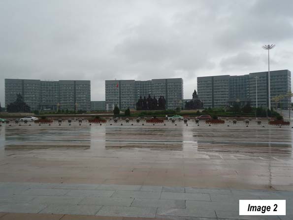
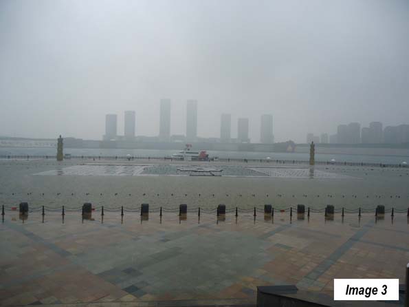
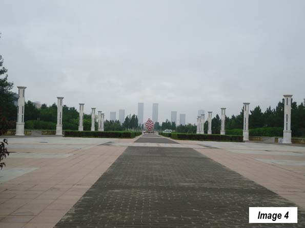
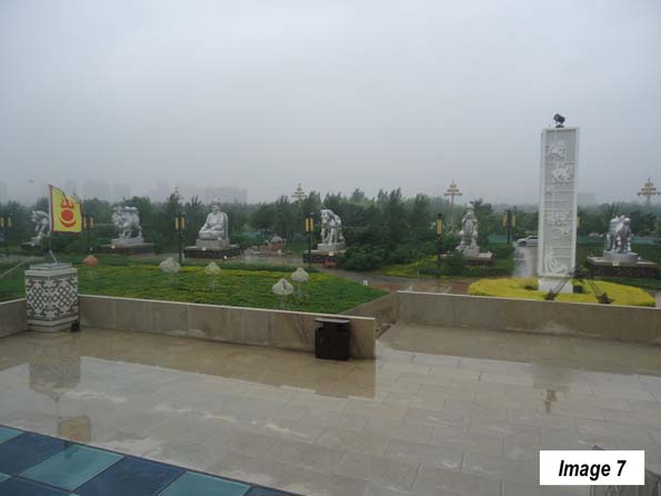
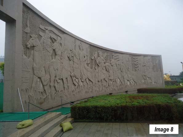
    The core of the mall is an axis, one large block wide, composed of greenery and statues (Images 2-13).

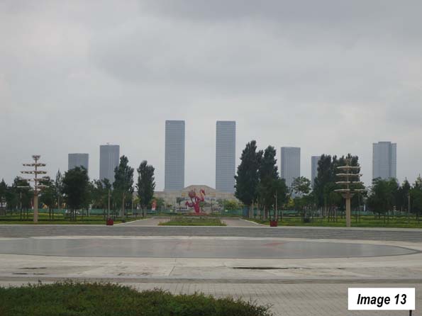
    The mall stretches from municipal buildings at the north (Image 2) to a lake (Image 3), across which are skyscrapers, anchoring the mall on the south (Images 4 and 13). This interruption by a lake is similar to the Canberra mall described above

    Near the north end of the mall is the Genghis Khan statue (Image 5).

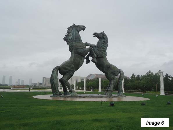
    The two horse’s statue is in the square to the south of the Genghis Khan statue (Image 6).

    Each side of the mall is defined by one-way streets that are four lanes wide.

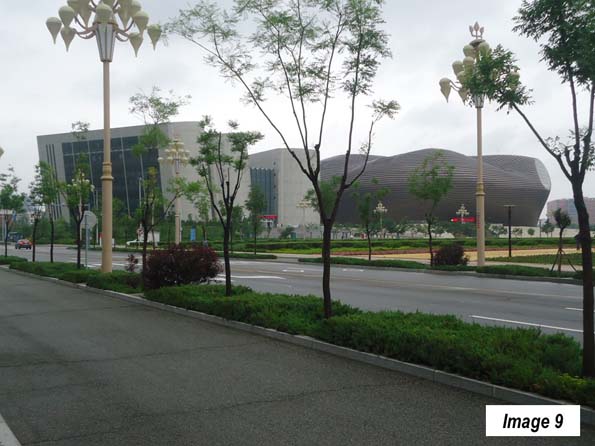
    Among the two most important government buildings on the mall are the Library of Ordos and the Ordos Museum (to the left and right, respectively, in Image 9). Neither of these buildings will be pleasing to aficionados of traditional architecture, including the author. I agree with Chinese President Xi, who suggested that China needed no more weird buildings, referring to the CCTV Tower in Beijing, which local taxi drivers told me is referred to as the  "underpants" building. Of course, architecture is a matter of taste.

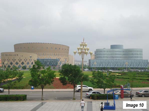
    Across the mall is the Ordos National Theatre and the Ordos Culture and Arts Center (Image 10, left and right). The circular and curved lines of these buildings offer a welcome refuge from the more courageous architecture of the Library and Museum, in the author’s view.

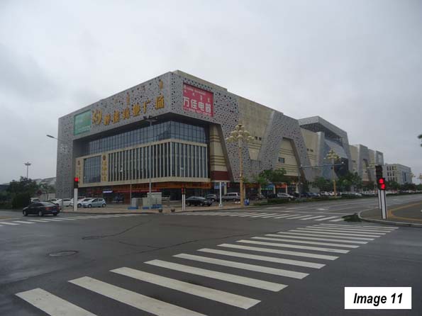
    The mall also includes commercial buildings (Image 11). These buildings include a wide array of retail stores, such as large electronic and home appliance outlets, banks and other facilities. Within a one block walk of my hotel there were at least seven restaurants from which to choose. Generally, ghosts do not require this density of eating establishments.

    Residential Areas

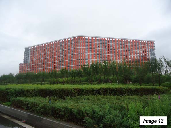
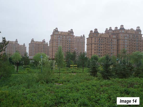
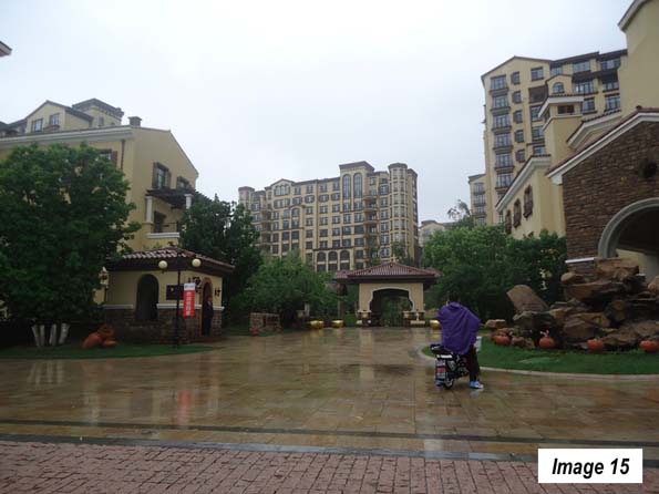
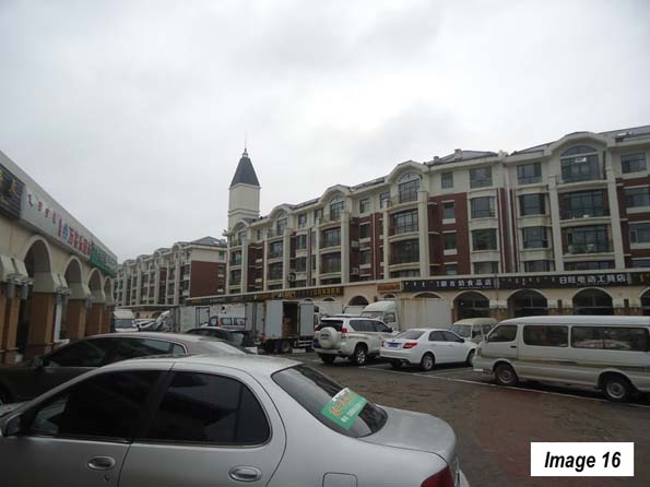
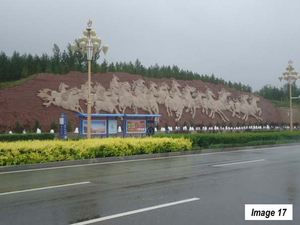
    There are a variety of residential areas surrounding the mall on three sides (the south end of the mall is bordered by the urbanization of Ejin Horo). The residential buildings tend to be from 5 to 12 floors (Images 14 – 16), and include the equivalent of strip malls (Image 16) that are close at hand for residents and can have full parking lots. The residential areas also include some monumental treatments (Image 17).

    Outside the Built-Up Urban Area

    The built-up area of Kangbashi is relatively small, covering less than 10 square miles (25 square kilometers), or less than 10 percent of the Kangbashi new area.

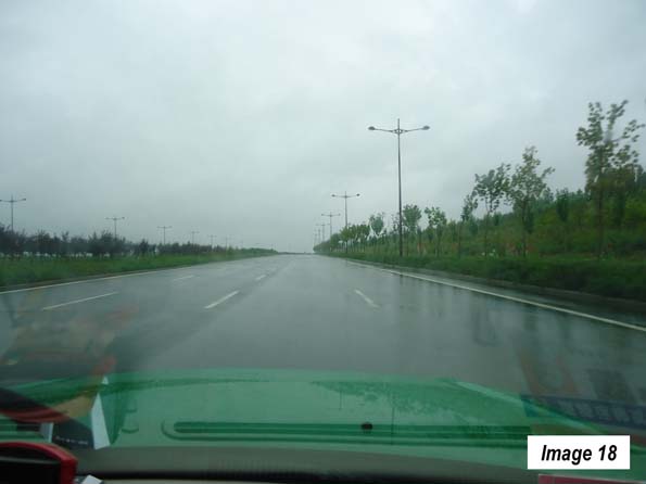
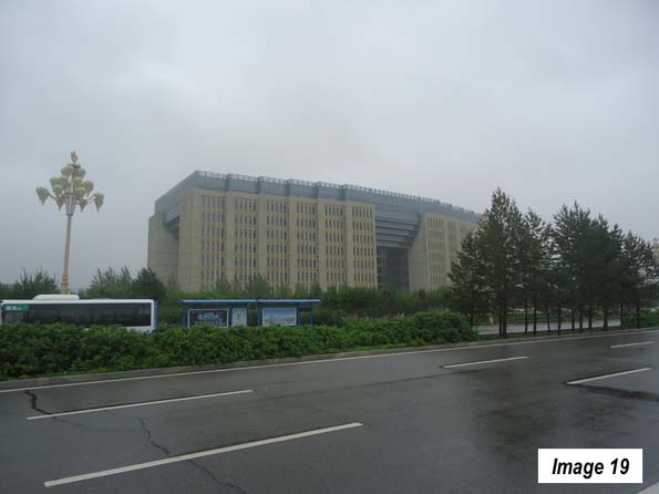
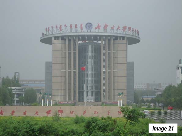
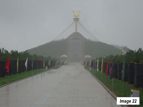
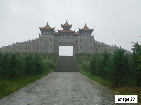
    Most of the "Ghost City" articles to limit their coverage to the small developed area. With the exception of a major roadway skeleton (along which there is virtually no development in many areas), much of the Kangbashi New Area is not a city at all. There are some small pockets of residential development spread throughout the area and a number of government buildings similarly dispersed beyond the built-up area (Images 18-24). At the same time, the parking lots were far from empty.

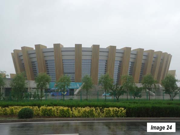
    There are also a number of religious sites outside the built up urban area (Images 22 & 23) and three similarly designed sports facilities (Image 24).

    The traffic volumes are well below the capacity of the more than ample arterial street system. But this is not unusual for newer suburban areas in China, where eight lane streets can be the rule.

    What About the People?

    Much of the ghost city coverage has been based on an assumption that   few if any residents have arrived. A number of articles point out that the present development has been built for 300,000 residents and that the population is much less (above). Yet, the municipality indicates that the 300,000 resident projection is for 2020. Whether or not Ordos will reach that population by 2020 cannot yet be known.

    Some of the ghost city articles have claimed that the Kangbashi new area was projected to have 1 million residents. However, the municipality’s website indicates that the 1,000,000 vision was for a much larger area than the Kangbashi new area. It also included Dongsheng, which alone already has nearly 600,000 residents as well as the urbanization of Ejin Horo. In other words, under the plan the area was already well on its way to achieving the eventual projection.

    Other articles point out that there are few people walking on the streets. But, as Chai Jiliang, chief publicity officer of Kangbashi told China Daily in 2012: "So, why do local residents who mostly own private cars and have convenient public transportation have to walk on the streets if there are no major public events?" There is further evidence of people, the establishment of a campus of the Beijing Normal University in the Kangbashi new area. Indeed a recent article in The New York Times Style Magazine, by Jody Rosen,   reported not only that there were people in the Kangbashi new area, but that they were generally happy with their city.

    Ejin Horo

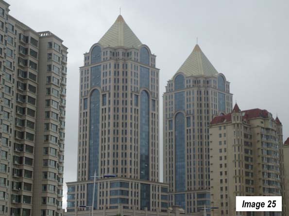
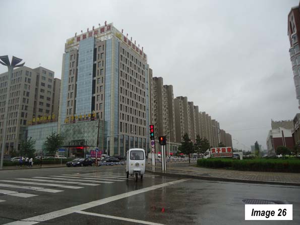
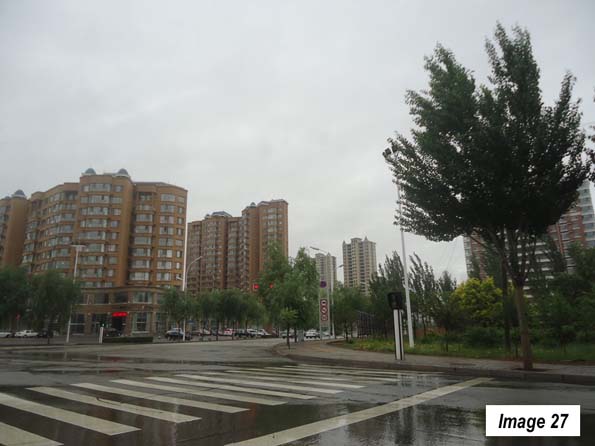
    Perhaps the biggest surprise was the Ejin Horo urbanization (Azhen), immediately to the south of the Kangbashi New Area (Images 25-27). The tallest buildings are here and some of the most impressive commercial architecture. Just across the principal bridge from the Kangbashi New Area are two buildings resembling the One World Wide Tower on Eighth Avenue in New York (Image 25). Ejin Horo also has many condominium towers that are often taller than those in the Kangbashi New Area. Unlike the Kangbashi New Area, Ejin Horo appears to have grown more organically in response to market demand. The area’s international airport is also located in Ejin Horo.

    Big Dreams, Big Challenges

    The Kangbashi new area  does face some problems. Like the rest of China, there are a number of uncompleted building projects, as the economy is not growing nearly as quickly as before. Though, again, I expected many more based on the negative published reports.

    There has been a severe reduction in house prices, as the Chinese economy has gotten worse. There are reports that many of the apartments and condominiums are empty, though no information was found on the extent of unsold houses or the number that have been purchased simply as investments to hold (and have no residents). It is not unusual for Chinese buyers to invest in additional properties, leaving them empty, a situation that is also been reported in central Vancouver. However, there was no lack of cars in the parking lots of the residential districts.

    Peoples Daily reports that coal extraction volumes are down significantly, which when combined with substantially lower coal prices in recent years has cut severely into the revenues of the Ordos municipality. The municipality is seeking additional revenue enhancing strategies, such as tourism (there are 9 million tourists annually), automobile manufacturing and solar power facilities.

    Liu Qiang, a People’s Daily columnist noted that "There are worries that Ordos, with its huge debts and years of mismanagement, will repeat Detroit’s road to bankruptcy," While noting that Chinese municipalities are not permitted to file bankruptcy, the columnist suggests that " China’s local government debt, if not being better managed, might potentially pose a systematic risk greater than in Detroit."

    Big dreams are not limited to cities in China. Ordos may have built civic monuments and infrastructure beyond its means. Only time will tell whether such visions can be sustained. The reality, however, is that Ordos, including the Kangbashi new area, is surprisingly vibrant and functioning with real people.

    Note 1: Inner Mongolia is a part of China. Mongolia (often called "Outer Mongolia) is an independent nation located between China and Russia.

    Note 2: The Evolving Urban Form is a newgeography.com metropolitan and urban area profiles from around the world. The more than 50 articles on in the series can be accessed here.

    Photo: Genghis Kahn Mausoleum, Ordos, Inner Mongolia, China by Fanghong (Own work) [CC BY-SA 3.0 or GFDL], via Wikimedia Commons

    Wendell Cox is principal of Demographia, an international pubilc policy and demographics firm. He is a Senior Fellow of the Center for Opportunity Urbanism (US), Senior Fellow for Housing Affordability and Municipal Policy for the Frontier Centre for Public Policy (Canada), and a member of the Board of Advisors of the Center for Demographics and Policy at Chapman University (California). He is co-author of the “Demographia International Housing Affordability Survey” and author of “Demographia World Urban Areas” and “War on the Dream: How Anti-Sprawl Policy Threatens the Quality of Life.” He was appointed to three terms on the Los Angeles County Transportation Commission, where he served with the leading city and county leadership as the only non-elected member. He served as a visiting professor at the Conservatoire National des Arts et Metiers, a national university in Paris.

  • Expo Line Expansion Fails to Stem L.A. Transit Loss

    The long awaited and highly touted Santa Monica extension brought an approximately 50 percent increase in ridership of the Los Angeles Expo light rail line between June 2016 and June 2015. The extension opened in mid May 2016. In its first full month of operation, June 2016, the line carried approximately 45,900 weekday boardings (Note), up from 30,600 in June 2015, according to Los Angeles Metropolitan Transportation Authority (MTA) ridership statistics.

    However MTA ridership continued to decline, with a 51,900 loss overall. Bus and rail services other than the Expo line experienced a reduction of 67,300 boardings (Figure).

    Between June 2015 and June 2016, rail boardings rose 30,500, while bus boardings declined 82,400. In other words there was a loss of 2.7 bus riders for every new rail rider over the past year. Los Angeles transit riders have considerably lower median earnings than in the cities with higher ridership, and lower than the major metropolitan average (see the analysis by former Southern California Rapid Transit District Chief Financial Officer Tom Rubin and "Just How Much has Los Angeles Transit Ridership Fallen?" and ) here and here).

    Note: A passenger is counted as a boarding each time a transit vehicle is entered. Thus, if more than one transit vehicle is required to make a trip, there can be multiple boardings between the trip origin and destination. Because the addition of rail services, as in Los Angeles, can result in forcing bus riders to transfer because their services can be truncated at rail stations, the use of boardings as an indicator of ridership can result in exaggeration, as the number of boardings per passenger trip is increased. This may have produced a decline of as much as 30 percent in actual passenger trips since 1985, as a number of rail lines have been opened in Los Angeles. 

  • The Shorter Commutes in American Suburbs and Exurbs

    An examination of American Community Survey (ACS) data in the major metropolitan areas of the United States shows that suburbs and exurbs have the shortest one-way work trip travel times for the largest number of people. The analysis covers metropolitan areas with more than 1,000,000 population in 2012, from the 2010-2014 ACS (2012 average data) using the City Sector Model.

    The City Sector Model

    The City Sector Model classifies small areas (zip codes) of major metropolitan areas by their urban function (lifestyle). The City Sector Model includes five sectors (Figure 1). The first two are labeled as “urban core,” (Urban Core: CBD and Urban Core: Ring) replicating the urban densities and travel patterns of pre-World War II US cities, although these likely fall short of densities and travel behavior changes sought by contemporary urban planning (such as Plan Bay Area). There are two suburban sectors, the Earlier Suburbs and Later Suburbs. The fifth sector is the Exurbs, which is outside the built-up urban area. The principle purpose of the City Sector Model is to categorize metropolitan neighborhoods based on their intensity of urbanization, regardless of whether they are located within or outside the boundaries of the historical core municipality (Note 1).

    One Way Commute Times by Urban Sector

    The commuting data excludes employees who work at home, whose commute times would be zero.

    The shortest one-way commute times are experienced by residents of the Earlier Suburbs, with a 26.6 minute travel time. This is nearly equalled for residents of the central business districts (Urban Core: CBD), with an average commute of 26.7 minutes. Commuters living in the Later Suburbs had a somewhat longer commute, at 28.0 minutes, while commuters living in the Exurbs had an average one-way commute of 29.5 minutes. The longest commute times were experienced by residents of the Urban Core: Ring (32.5 minutes), which is the part of the urban core that excludes the central business district, (Figure 2) and is characterized by high densities and lower levels of automobile use than in the suburbs and exurbs.

    The functional city sectors with the shortest commutes had more jobs than resident workers. The Earlier Suburbs possess 1.08 jobs for every resident worker (Note 2). The ratio was much higher in the Urban Core: CBD, where there were nearly 5.99 jobs for every resident worker. Such an imbalance could not be replicated throughout a metropolitan area, because by definition, a labor market has a ratio of jobs to resident workers of approximately 1.00. To replicate the national CBD ratio throughout the metropolitan area would require, for example, that the New York metropolitan area have  54 million jobs for its 9 million workers.   

    Not surprisingly, with such a surplus jobs relative to workers, the Urban Core: CBD, the chances of finding suitable employment nearby is far greater. However, this advantage can, by definition, be available only to a very few, as is indicated by the fact that the Urban Core: CBD’s are home to only 1.5 percent of the resident workers in the major metropolitan areas. In the broader context of the urban core (including both the CBD and the Ring), this advantage is offset and average travel times are greater (below).

    In the Later Suburbs, there were 0.90 jobs per resident worker, which matches that sector’s ranking in work trip travel time (third). The  ring around the urban core (Urban Core: Ring) , had the longest average work trip travel time. The Exurbs had the lowest ratio of jobs to resident workers, at 0.71, yet had an average travel time that was shorter than that of the Urban Core: Ring (Figure 3).

    Pre-World War II and Post-War Urban Form

    The two combined urban core sectors are defined in the City Sector Model to replicate what remains of the pre-World War II city that was characterized by far higher densities and less reliance on automobile transportation, as opposed to the suburban and exurban sectors that have dominated urban growth for seven decades. If the two urban core sectors are combined (Urban Core: CBD and Urban Core: Ring), the number of jobs per resident worker is 1.28. This healthy ratio, however, is not sufficient to preserve any travel time advantage for residents of the combined urban core. In the combined urban core sectors, the average one-way travel time of 31.9 minutes, well above each of the other three functional sectors (Figures 4 and 5). The Urban Core: Ring has nearly nine times as many resident workers as the Urban Core: CBD.

    The Pre-War urban form has considerably higher population densities than those of the post-war urban form. For example, the Urban Core: CBD has a population density exceeding 23,000 per square mile (9,000 per square kilometer), more than 80 percent of the New York City population density level. The Urban Core: Ring has a population density exceeding 11,000 per square mile. The combined area population density of the two Urban Core sectors is 11,500 per square mile, or 4,400 per square kilometer (Figure 6).

    The two Urban Core sectors largely rely on commuting modes currently favored by urban planning policy, transit, cycling and walking. In contrast, the suburban and exurban sectors rely on commuting modes discouraged by urban planning policy, automobiles and car and van pools (Figure 7).

    The combined urban core sectors have more than four times the density of the Earlier Suburbs and nearly nine times the density of the Later Suburbs. With these much higher densities and their reliance on the favored transport strategies, it might be expected that they would enjoy the best commute times. However, as noted above, when the two urban core sectors are combined, their average travel time is longer than the suburban and exurban sectors. This is despite the far lower densities of the two suburban sectors and the often world densities of the exurban sector.

    The Key: Lower Densities & Job Dispersion

    These results are likely to be surprising to many in the press as well as planners who often equate residential distance from central business districts as resulting in longer commutes. The reality, however, is that central business districts account for only 8 percent of employment in major US metropolitan areas, and reach the highest at 22 percent in New York, 50 percent above second place San Francisco (14.4 percent) and nearly 10 times that of Los Angeles (2.4 percent).

    Generally speaking, employment is dispersed throughout the metropolitan area. When combined with the generally lower density urbanization within metropolitan areas, the result is shorter commutes for residents  in the suburbs and exurbs. As it turns out the data shows that higher employment densities in the urban core are associated with longer, not shorter commutes, as is commonly assumed.

    Note 1: In some cases the functional urban core extends beyond the boundaries of the historical core municipality (such as in New York and Boston). In other cases, there is virtually no functional urban core (such as in San Jose or Phoenix). Functional urban cores accounted for 14.7 percent of the major metropolitan area population in 2012. By comparison, the jurisdictional urban cores (historical core municipalities) had 26.6 percent of the major metropolitan population, many of which have large tracts of functional suburban development.

    Note 2: Estimated by dividing the percentage of jobs in each sector by the percentage of resident workers. Working at home is excluded.

    Wendell Cox is principal of Demographia, an international pubilc policy and demographics firm. He is a Senior Fellow of the Center for Opportunity Urbanism (US), Senior Fellow for Housing Affordability and Municipal Policy for the Frontier Centre for Public Policy (Canada), and a member of the Board of Advisors of the Center for Demographics and Policy at Chapman University (California). He is co-author of the "Demographia International Housing Affordability Survey" and author of "Demographia World Urban Areas" and "War on the Dream: How Anti-Sprawl Policy Threatens the Quality of Life." He was appointed to three terms on the Los Angeles County Transportation Commission, where he served with the leading city and county leadership as the only non-elected member. He served as a visiting professor at the Conservatoire National des Arts et Metiers, a national university in Paris.

  • Fastest Metropolitan Area Growth Continues in Prairie Provinces

    The latest Statistics Canada population estimates indicate that much of the nation’s growth continues to be in the census metropolitan areas (CMAs) of the Greater Golden Horseshoe, centered on Toronto, and in the Prairie Provinces of Alberta, Saskatchewan and Manitoba.

    In addition to Toronto, the Greater Golden Horseshoe includes Hamilton, Kitchener-Waterloo, Oshawa, Brantford, Barrie, Peterborough St. Catherine’s-Niagara and Guelph census metropolitan areas. The Prairie Provinces metropolitan areas are Calgary, Edmonton, Winnipeg, Saskatoon and Regina.

    Between the 2011 census and 2015, the Greater Golden Horseshoe accounted for 30.3 percent of the national population increase (Figure 1). The five Prairie Province metropolitan areas had 29.1 percent of the growth.

    Growth in the Greater Golden Horseshoe was above its national share of the population of 25 percent. The Prairie Province CMA growth was more than 2.5 times its population share, which was less than 11 percent in 2011.

    The CMAs outside the Greater Golden Horseshoe and the Prairie Provinces accounted for approximately 34 percent of the growth, somewhat more than their 30 percent share of the population. Areas outside the CMA’s accounted for only seven percent of the growth, a fraction of their 34 percent population share. This is a continuing indication that the metropolitan areas continue to draw more of the population growth.

    Changing Distribution of Growth

    The last decade and a half has seen substantial changes in the distribution of CMA growth. Between 2001 and 2006, the Golden Horseshoe metropolitan areas welcomed 40 percent of Canada’s population growth, well above the 30 percent over 2011 to 2015. At the same time, the Greater Golden Horseshoe reduction in the share of growth has been compensated by the gain in the Prairie Province metropolitan areas. Between 2001 and 2006, the share of national growth was 19 percent, which rose to 29 percent over 2011 to 2015.

    The population growth rate has slowed considerably in the Greater Golden Horseshoe metropolitan areas, from 1.7 percent annually between 2001 and 2006 to 1.1 percent between 2011 and 2015. Growth has risen considerably in the Prairie Province metropolitan areas, from 1.2 percent annually between 2001 and 2006 to 2.8 percent between 2011 and 2015. Numerically, the Prairie Province metropolitan area growth is now challenging that of the Greater Golden Horseshoe, despite the latter’s more than twice as many residents (Figure 2).

    Winnipeg’s would pass Québec in population by the 2021 census, if the growth rates of the last four years continue and would become the 7th largest metropolitan area.

    Fastest Growing Metropolitan Areas

    Five of the six fastest growing metropolitan areas between 2011 and 2015 were in the Prairie Provinces. Calgary, Edmonton and Saskatoon topped the list, growing more than three percent annually (Figure 3). This is an extraordinary rate, better than three times the national growth rate. Regina grew 2.5 percent annually. Over this period, Calgary and Edmonton have both grown larger than Ottawa-Gatineau, which had been the fourth largest CMA for at least 40 years. One can expect growth in the two Alberta cities to slow with the decline in energy prices,  while the other prairie metropolitan areas, less oil dependent, though resource dependent, should do better.  

    Winnipeg, which was the nation’s fourth largest metropolitan area until 1961 and nearly as large as Vancouver as late as 1931, has begun once again  to grow more quickly, after decades of lackluster growth. Having slipped to 8th largest by 2001, Winnipeg ranked sixth in growth since 2011, trailing only the four other Prairie Province metropolitan areas and fast growing Kelowna, BC (1.8 percent annual growth). Unusually, Winnipeg’s growth rate exceeded that of Toronto between 2011 and 2015. Winnipeg’s annual growth rate was 1.6 percent, more than double its 2001-2011 growth (0.7 percent). Should Winnipeg’s growth continue at the most recent rate through the 2021 census, it could exceed the population of the Québec CMA and would trail only the six metropolitan areas with more than 1,000,000 population.

    The changing growth rates of the largest CMAs is indicated in Figure 4, which indicates the rising growth rates in the Prairie province metropolitan areas, with more mixed performance among the other larger CMAs.

    Largest Metropolitan Areas

    Canada has eleven metropolitan areas with more than 500,000 residents. Toronto remains by far the largest, at more than 6 million and seems unlikely to be challenged in the foreseeable future. Montréal is closing in on 4.1 million, while Vancouver has just passed 2.5 million (Figure 5).

    The Future

    Canada’s fastest growing metropolitan areas also face the greatest growth challenges. The energy downturn has been particularly rough on Calgary and Edmonton, exacerbated by the disastrous Fort McMurray fire. There was a noticeable downturn in growth between 2014 and 2015 in both CMAs, yet only Kelowna grew faster in the last year. Other Prairie province metropolitan areas, less impacted by the energy decline, have seen their population growth rates fall. The growth rate was one third less than the 2011 to 2015 rate in Saskatoon and about 30 percent less in Regina between 2014 and 2015. Winnipeg fared best, maintaining 90 percent of its 2011-2015 growth rate.

    Other metropolitan areas face challenges every bit as complex. The economic dynamo of Toronto should continue to grow, though has faced strong domestic out-migration between 2004 and  2014, as the population disperses to outer metropolitan areas in the Greater Golden Horseshoe and outside Ontario altogether (See: "Moving from Canada’s Biggest Cities"). Montréal also experienced strong domestic migration losses, with half moving to other parts of Québec and half to other provinces. Vancouver, despite its incomparable attractiveness is also losing net domestic migrants. In all three metropolitan areas, the rising cost of living seems likely to be a major factor in the losses, with "tanking" housing affordability the apparent cause. Vancouver now ranks as the third least affordable major metropolitan area among 87 in the nine nations covered by the Demographia International Housing Affordability Survey, while Toronto’s house prices have risen at more than four times average household incomes since 2001 (see the Frontier Centre policy report: "Canada’s Middle-Income Housing Affordability Crisis"). House prices escalated almost as much in Montréal.

    With the outcomes of these conflicting influences unclear, Canada’s metropolitan area growth could go in different directions. This could range from growth patterns that are similar in the coming years, to the continued discovery by households of smaller metropolitan areas, a higher quality of life is possible because of the lower cost of living. This, has already been evident in the smaller metropolitan areas of Ontario and Québec, as households have been exiting Toronto and Montréal. Meanwhile, Canada is in the midst of its every five year census for 2016, the results of which should be available in seven months (February 2017).

    Photo: North Saskatchewan River from Edmonton central business district (by author).

    Wendell Cox is principal of Demographia, an international pubilc policy and demographics firm. He is a Senior Fellow of the Center for Opportunity Urbanism (US), Senior Fellow for Housing Affordability and Municipal Policy for the Frontier Centre for Public Policy (Canada), and a member of the Board of Advisors of the Center for Demographics and Policy at Chapman University (California). He is co-author of the "Demographia International Housing Affordability Survey" and author of "Demographia World Urban Areas" and "War on the Dream: How Anti-Sprawl Policy Threatens the Quality of Life." He was appointed to three terms on the Los Angeles County Transportation Commission, where he served with the leading city and county leadership as the only non-elected member. He served as a visiting professor at the Conservatoire National des Arts et Metiers, a national university in Paris.

  • Outer California: Sacramento Sends Jobs (and People) to Nashville

    A reader comment on a feature by John Sanphillipo (“Finally! Great New Affordable Bay Area Housing! Caught my eye.”). The comment ("You shouldn’t have to go to Nashville") expressed an understandable frustration about the sad reality that firms leaving coastal California often skip right over the Central Valley “where the housing costs are reasonable, there are some lovely old homes on tree lined streets, the humidity is less, the mountains are nearby, and you can drive there in 2-3 hours rather than fly.”

    Would that it were true. In fact, as this article will show, housing costs are anything but reasonable, given the median income, in the Central Valley, which along with the rest of the non-coastal portion of the state, will be referred to as Outer California in this article.

    California Housing Affordability: Into the Abyss

    California’s severely unaffordable housing is legendary, having escalated from approximately the average national price to income ratio in 1970. This is most evident in the four largest coastal metropolitan areas, Los Angeles, San Francisco, San Diego and San Jose. Out of the 87 major markets (over 1 million population) in nine nations, these markets ranked fourth, seventh and in a ninth place tie for the least affordable 8n the 12th Annual Demographia International Housing Affordability Survey. Their median multiples (median house price divided by median household income) required from 8.1 to 9.8 years income to purchase the median priced house. This compares to the affordability of these and other California markets which had median multiples of approximately 3.0 or less in 1970 and in prior years (Figure 1).

    The housing unaffordability of these markets, with an average median multiple of 8.8 is rivaled by the smaller coastal markets (such as Monterey County, San Luis Obispo, Santa Barbara and Ventura County), with their median multiple of 7.0. Both market categories are rated as severely unaffordable. But housing has become seriously unaffordable even in Outer California, where the average median multiple is 4.7(Figure 2). House prices have been escalating relative to incomes in Outer California since the housing bust, before which their housing affordability was even worse than now (below).

    Housing Affordability in Outer California

    A few examples will make the point. Riverside-San Bernardino, and exurban metropolitan area adjacent to Los Angeles had a severely unaffordable median multiple of 5.2 in 2015. Sacramento, had a seriously unaffordable median multiple of 4.7. Both of these major metropolitan areas reached far higher median multiples in the run-up to the housing bust, with Riverside San Bernardino reaching 7.6 and Sacramento reaching 6.6.

    But the problem is by no means limited to the largest metropolitan areas. Stockton, now officially a part of the larger San Jose-San Francisco combined statistical area as a result of a housing cost driven exodus of commuters from the Bay Area has a severely unaffordable median multiple of 5.3. Things were much worse in the run-up to the bust, at 8.6. Even long depressed Fresno, far from either the Bay Area or Los Angeles, is nearing severe unaffordability, with a median multiple of 5.0 and reached 7.2 during the bubble. More remote Chico, one of the smallest US markets in the Demographia survey also has a median multiple of 5.0 (see Central Valley map at the top).

    Modesto, a 2020 candidate for addition to the San Jose – San Francisco combined statistical area due to the overspill of households seeking houses they can afford, also has a seriously unaffordable median multiple of 4.5. Modesto reached 7.6 during the bubble.

    Among the 29 markets rated in California, the most affordable was Bakersfield, which in a few years is likely to follow Fresno into the over 1 million category. During the bubble, Bakersfield reached a median multiple of 6.6. Small town Visalia, nestled against the Sierra foothills, tied Bakersfield’s most affordable 4.3 median multiple, and reached an astounding 5.8 during the bubble. Hanford also tied for the most affordable.

    The comparison to the bubble peaks is particularly important because it illustrates the volatility of housing markets. Even in small markets, house prices are prone to explode when demand exceeds supply, due in large part to land use regulatory and environmental law structure that restricts housing even in more remote areas,   driving prices up (See William A. Fischel, Regulatory Takings). Figure 3 shows that California house prices in each of the three geographic categories were even more unaffordable during the bubble than today.

    Even at their current housing affordability levels, the housing markets of Outer California are considerably overpriced. This is indicated by Figure 2, which compares the median multiples in Stockton, Fresno, Bakersfield, Modesto, Redding, Chico, Merced, Madera and the Imperial Valley’s El Centro with severely unaffordable and overregulated Portland, Seattle and Denver, as well as Nashville and other major markets that are more affordable than any in California (Figure 4).

    Indeed, out of the 231 US markets in the Demographia International Housing Affordability Survey, the 27 California markets represent nearly half of the 58 most expensive.

    Meanwhile, a recent report by Zumper indicated among the 50 largest municipalities in the nation, four of the most expensive seven are also in California, with the city of San Francisco ranked number one, followed   San Jose at third, the city of Oakland at fifth and the city of Los Angeles at seventh. Eight of the most expensive municipalities out of the 100 largest are also in California, such as Palo Alto in the Bay Area, Coronado in the San Diego area and Santa Monica in the Los Angeles area.

    As if the regulatory and legal structure that combined with the artificially higher demand from loose lending policies were not enough, barely a decade later California is in the process of implementing one of the most radical land-use regulatory structure in a liberal democracy. It will be far more difficult in many areas to build the detached housing that is been the mainstay of the state, which already has the highest urban population density in the nation (see: “California declares war on suburbia"). This suggests that housing affordability is likely to worsen further.

    There is good reason for a both companies and middle income households to stay away from or leave California.

    More than Housing Affordability

    But people and businesses are moving to places like Nashville for reasons other than housing affordability. The state could hardly make it more clear that most business is not welcome. For at least 10 years, CEO Magazine has rated California as having the least favorable business climate. With competition like Illinois, Connecticut and New Jersey, to be ranked 50th with such regularity is a notable underachievement.

    Data recently released by the California Manufacturers & Technology Association (CMTA) indicated that California ranked last among the states in per capita attraction of manufacturing investments in 2015. Corporate relocation specialist Joseph Vranich continues to add to a long but for California unfortunate list of companies and jobs that have recently left the state (see: "California companies had for greatness – out of California).

    Of course, California is a beautiful place with one of the best climates in the world. But   millions of people and many companies have found greener pastures in Nashville, Austin, Dallas-Fort Worth, Houston, Charlotte, Atlanta and elsewhere. People will continue to visit, but the exodus is likely to continue.

    Wendell Cox is principal of Demographia, an international pubilc policy and demographics firm. He is a Senior Fellow of the Center for Opportunity Urbanism (US), Senior Fellow for Housing Affordability and Municipal Policy for the Frontier Centre for Public Policy (Canada), and a member of the Board of Advisors of the Center for Demographics and Policy at Chapman University (California). He is co-author of the “Demographia International Housing Affordability Survey” and author of “Demographia World Urban Areas” and “War on the Dream: How Anti-Sprawl Policy Threatens the Quality of Life.” He was appointed to three terms on the Los Angeles County Transportation Commission, where he served with the leading city and county leadership as the only non-elected member. He served as a visiting professor at the Conservatoire National des Arts et Metiers, a national university in Paris.

    Photo: Map of Central Valley (Sacramento Valley to the north, San Joaquin Valley to the south) courtesy of the U.S. Geological Survey

  • Breaking News: End of the World Avoided (Brexit)

    June 24, 2016 14:30 CDT

    Thanks to modern technology, I have had the pleasure of spending nearly all of the last 18 hours with the United Kingdom’s cable news network, Sky News, watching the election returns and aftermath [of the successful British European Union referendum (Brexit). Four weeks, the "Remain" campaign has been explaining that leaving the EU would result in huge economic and market disruption.

    When, contrary to expectation, it became clear fairly early in the evening that Brexit would pass, there were frequent reminders of these predictions. The value of the pound sterling dropped from $1.50 to $1.32 as the votes continue to be counted and there was never the slightest indication of a turnaround.

    When the markets opened, there were indeed losses. And, a number of the financial experts, political consultants and members of Parliament interviewed were quick to point out that the predictions were correct. For most of the day following the election, watching Sky News gave the impression that there had been a disastrous financial meltdown. However, now, more than 12 hours after the final declaration at Manchester City Hall, Sky News is beginning to suggest that the financial losses may have been modest.

    The leading stock market index in London, the FTSE 100 experienced an 8.7 percent drop in early trading. However by the close of trading, the decline had fallen to only 3.15 percent, the largest drop in five months. Five months? Perhaps most amazingly, today’s close was higher  by two percent than Monday’s opening. The day’s loss would have needed to be 75 percent higher to have been among the 10 worst in history. Yes, this was a big loss, but must have surely been disappointing to the analysts who were basking in their own exaggerations earlier in the day. By the end of the day, the pound had recovered to $1.37.

    Nor did the London stocks do worse than those on the continent. French and German stock prices were down more than twice as much as the FTSE 100, as well as in Tokyo. Stocks in Spain and Italy were down four times as much.

    Of course it is far too early to predict the economic impact of Brexit. But it was humorous watching the "spin doctors" whose narrative seemed to be "we told you so." I think there is much more to this than that SW1 is out of touch with the people, "SW1" is the postal code prefix for Parliament in Westminster and has the same connotation of separation from the people as "inside the beltway," as applied to Washington.

    It may be that the insiders have lost credibility with too many voters. One former Labor consultant, who was as effective in missing the point as any other, poignantly suggested that perhaps too many of the voters had not participated in the post-recession recovery. Hear! Hear!

  • Downtowns Dominate New Zealand Transit Commuting

    The statistical authorities of various nations survey commuting behavior of their citizens in periodic population censuses and related surveys. Most of this data relates to the residential location of workers, but not to the work location. Both sets of data are important for understanding the dynamics of mobility within urban areas. However, in some countries, like Canada and the United States work location is not readily available. As a result, items of analysis such as how people get to work and the density of employment in parts of urban areas can be difficult, if not impossible to obtain. For example, based on the last two censuses, we have produced reports estimating the shares of employment in the downtown areas of major metropolitan areas.

    New Zealand has a model program that provides detailed information both on residential location and work location. The work location data is not only important as a model for other statistical authorities, but also reveals trends which the more limited data in other countries suggest. This article will describe the commuting data in the three largest metropolitan areas in New Zealand (Note). The analysis focuses on the 2013 census, which was postponed from 2011 as a result of the disastrous Christchurch earthquakes. As will be shown below, these events had major implications in the commuting data for New Zealand’s second largest metropolitan area.

    Auckland

    Auckland has by far the largest metropolitan area in New Zealand, with approximately 1.6 million residents. As a result of the recent local government consolidation, Auckland has emerged as the only entire metropolitan area in the high income world of more than 1 million population that is administered by a single local government. It will soon be followed by Honolulu, which has a single local government, and which is soon to pass 1 million population.

    Auckland houses about one third of New Zealand’s population. As a result, Auckland is dominates New Zealand. By comparison, the New York metropolitan area, in its most liberal definition (combined statistical area) represents only seven percent of the US population.

    The Statistics New Zealand data indicates that the Auckland central business district (CBD or downtown area) has approximately 13.6 percent of the jobs (Figure 1) in the metropolitan area (the city of Auckland, or the Auckland Regional Council). This is nearly double the US average for major metropolitan areas (over 1 million population), which is 7.0 percent, but well below New York’s 22.0 percent. It is about the same as that of Canada’s major metropolitan area average, and that of Canada’s largest metropolitan area, Toronto. It also duplicates the Sydney CBD share of metropolitan employment.

    As is typical of large, more centrally oriented metropolitan areas, transit commuting is focused on the CBD in Auckland. In 2013, approximately 47 percent of all job locations accessed by transit in the metropolitan area   were in the CBD. This was up from 45 percent in 2001 (Figure 2). More than one-half of the new transit commuters between 2001 and 2013 work in the CBD. This is despite the fact that the CBD represents only one percent of the built-up urban area.

    Between the 2001 and 2013 censuses, Auckland experienced an increase in its transit work trip market share from 6.1 percent to 7.7 percent. However, as is typical of transit market shares, there was considerable variation. Transit carried 26.7 percent of the work trips to the CBD as designated by Statistics New Zealand. In the rest of the metropolitan area only 4.7 percent of the jobs were accessed by transit. Overall, transit carries 7,7 percent of work trips in Auckland (among commuters providing information), which is up from 6,1 percent in 2001. While this is a modest work trip market share, it is at least a full percentage point above that of urban planning model Portland.

    Wellington

    Wellington is the national capital and third largest metropolitan area with nearly 500,000 residents. But despite its smaller population, Wellington has the nation’s largest CBD, by a whisker and by far the largest transit commute share in the nation.

    In 2013, Wellington’s Statistics New Zealand designated CBD had approximately 80,000 jobs. This represents a very high 37 percent of the employment in the metropolitan area (Figure 3). While there are no comprehensive international CBD employment data, the anecdotal information indicates that this level of CBD employment is well above that of all major metropolitan areas in the United States, Canada and Australia, and two-thirds above New York, which has the highest CBD share of any major metropolitan area in these nations.

    The dominance of the CBD in transit destinations is even more apparent in Wellington than in Auckland. In 2001, the CBD accounted for 66 percent of the transit commuting locations in the metropolitan area. By 2013 this increased to 74 percent. In fact all of the increase in transit work trips was to CBD locations, as commuting to other locations declined (Figure 4).

    In 2013, transit carried 33.6 percent of employees to the CBD, up from 28.6 percent in 2001. Transit carried 6.2 percent of the travel to jobs outside the CBD. Overall, transit carried 15.7 percent of work trips in the metropolitan area, up from 14.7 percent in 2001. This is a sizeable transit market share, which would place Wellington ahead of all US metropolitan areas in the United States except New York and San Francisco.

    Christchurch

    Christchurch is New Zealand’s second largest metropolitan area, with nearly 600,000 residents.

    Christchurch is a special case, due to the devastating earthquakes that hit the area in 2010 and 2011. Because of the disruption, the New Zealand government postponed the 2011 census to 2013.

    The core of Christchurch, Cathedral Square suffered particular damage, ruining the city’s historic cathedral, the remains of which were demolished. The Statistics New Zealand designated CBD experienced a more than 50 percent loss in employment from the previous census (2006). In 2001, a very respectable 16.1 percent of employment was in the CBD. By 2013, that figure had declined to 7.3 percent (Figure 5).

    Christchurch has not had the strength of transit ridership of Wellington or Auckland. In 2013, only 5.9 percent of CBD commuters used transit. Overall, transit carries approximately 2.3 percent of work trips in the Christchurch metropolitan area in 2013.

    Transit is About Downtown

    New Zealand’s strongest CBD and transit markets provide further evidence that "transit is about downtown." Both Auckland and Wellington experienced comparatively strong increases in transit work trip ridership between 2001 and 2013. Yet most of the additional work transit work trip destinations were concentrated in the CBD in Auckland, and all of the new trips had CBD destinations in Wellington.

    This is similar to the situation in the United States. In the US, 55 percent of transit commuting destinations are in the six municipalities (as opposed to metropolitan areas) that have the largest CBDs, measured by employment. Transit commuting is also heavily skewed toward the CBDs in Canada and Australia.

    Wendell Cox is principal of Demographia, an international pubilc policy and demographics firm. He is a Senior Fellow of the Center for Opportunity Urbanism (US), Senior Fellow for Housing Affordability and Municipal Policy for the Frontier Centre for Public Policy (Canada), and a member of the Board of Advisors of the Center for Demographics and Policy at Chapman University (California). He is co-author of the “Demographia International Housing Affordability Survey” and author of “Demographia World Urban Areas” and “War on the Dream: How Anti-Sprawl Policy Threatens the Quality of Life.” He was appointed to three terms on the Los Angeles County Transportation Commission, where he served with the leading city and county leadership as the only non-elected member. He served as a visiting professor at the Conservatoire National des Arts et Metiers, a national university in Paris.

    Photograph: Downtown Auckland (by author)

  • Dublin Facing Another Housing Bubble?

    In a recent column in the Sunday Independent, Ireland’s largest weekend newspaper, one of Ireland’s leading economists, Colm McCarthy of University College (Dublin) raised the prospect another housing bubble in Dublin, Ireland’s leading weekend newspaper. Dublin is the nation’s capital and home to approximately 40% of the population. This is a potentially serious concern, given the economic devastation that the previous Dublin housing bubble contributed to across Ireland during 2006-2010.

    The Housing and Economic Bust in Ireland

    Ireland suffered one of the worst economic reversals of any nation during the Great Financial Crisis. This had been preceded by Ireland’s impressive economic advance, which had the nation registering a higher gross domestic product per capita-purchasing power parity (GDP-PPP) than even its former colonial overlord, the United Kingdom. Anyone who had predicted in 1960 that Ireland would be more prosperous than the United Kingdom would have been summarily dismissed.

    But the Great Financial Crisis brought an 11.3 percent reduction in GDP-PPP to Ireland between 2006 and 2010. This was nearly double the reduction in the United Kingdom (6.0 percent). The loss was nearly three times the peak to trough decline in the United States (4.0 percent). Unemployment reached above 15 percent and Ireland required bail-out loans totaling €67.5 billion ($75 billion or C$95 billion) from the European Union and the International Monetary Fund.

    Happily, however, Ireland has struggled back and now has nearly reached its peak 2006 GDP-PPP. But as in the United States and elsewhere, restoration of previous levels of prosperity at the national level has not made whole many of the individual victims of the downturn (Figure 1).

    Urban Containment Policy and Higher House Prices

    In a previous Sunday Independent commentary, McCarthy noted asserted  Ireland’s land use regulations had been an important contributor to the housing bubble (see: “Urban Containment and the Housing Bubble in Ireland”).

    Ireland’s planning regulations have been copied and imported from the British Town and Country Planning Act of 1947, which have been largely responsible for the continuing and worsening housing crisis in the United Kingdom. In Ireland, as in the United Kingdom, these regulations deny planning permission to suburban locations. McCarthy attributes the "dysfunctionality of the housing market" in Dublin to such land use restrictions, which are called "urban containment” as well as other terms (such as growth management, smart growth, livability, compact city policy, etc.).

    McCarthy notes that the housing shortage in Dublin is not caused by a lack of housing so much as it is by restrictions imposed by planners (planning permission), which slows the pace of home building. This policy environment drives house prices up, which reduces household discretionary incomes and results in a lower standard of living than would have occurred without urban containment.

    Urban Growth Boundaries

    As elsewhere, Ireland’s urban containment policies seek to minimize the urban footprint (urban land area) by rationing land for housing development, often by urban growth boundaries. Urban growth boundaries come in various forms, such as lines around cities that forbid new urban residential development on the outside, euphemistic "growth areas," usually small and  inadequate, outside of which building is not permitted. This includes the apparent intention very difficult to build new detached housing on the urban fringes in California metropolitan areas, with a strong policy preference for high density, transit oriented development. Urban growth boundaries may be urban containment’s "killer app."

    The problem is that restricting the supply of any good or service (such as land for housing) leads to higher prices as demand swamps supply (other things being equal). A similar relationship between supply restrictions and higher prices can be seen in the fluctuating price of oil, based especially on OPEC production decisions, the large increases in banana prices in Australia, when periodic cyclones produce shortates by devastating crops.

    Urban growth boundaries and related land rationing strategies are associated with huge price differentials between land that may or may not be developed. In Auckland and Portland, virtual “across the street” land values vary on average by 10 or more times at the urban growth boundary. In the United Kingdom, differences of hundreds of times have been cited in the UK by London School of Economics researchers Paul Cheshire, Max Nathan and Henry Overman. The impact of urban growth boundaries on land within a metropolitan area is illustrated in Figure 2. The theoretical economic relationship is that land prices are forced higher within the urban growth boundary, while declining to the outside, where development is severely restricted (other things being equal, with the assumption that the urban growth boundary is “binding,” or strongly enforced).

    Not surprisingly, urban growth boundaries are the most common feature of the severely unaffordable housing markets (where the median multiple exceeds 5,0) in the 12 annual editions of the Demographia International Housing Affordability Survey.

    The Next Housing Bubble?

    McCarthy details rising land and house prices in the Dublin area that have largely driven first time home buyers out of the Dublin area. Many are being forced to buy housing that is affordable 70 to 80 kilometers (35 to 40 miles) away. This requires “a daily commute of up to two hours through the vacant countryside. “McCarthy refers to the "huge rolling prairies of land that can be found north and west of the ring road” (The M-50 belt route) on which new housing could be built as close as 10 to 12 km from the city center (6 to 7 miles).

    The locations McCarthy refers to could easily shelter households in less expensive housing, without the necessity of long commutes, producing, ironically, perhaps  less of the dreaded “sprawl”.

    Not surprisingly, rents in Dublin are now reported to be higher than at the peak of the property bubble. Further, the problem is spreading to other parts of the country. In Cork, with its burgeoning information technology growth, with firms like Apple and Pay Pal, there are concerns that the shortage of housing could limit further business expansion.

    Needed Reform

    A Dublin and an Ireland interested in not repeating the devastating economics of a decade ago would be wise to heed economist McCarthy’s advice. He calls for cheaper housing, which requires “the zoning for residential development of the very large volume of derelict and undeveloped land in the Dublin area.” Ireland’s middle-class needs more jobs, but it also needs lower house prices to maintain its affluence.

    Photograph: Dublin by Barcex (Own work) [CC BY-SA 3.0], via Wikimedia Commons

    Wendell Cox is principal of Demographia, an international pubilc policy and demographics firm. He is a Senior Fellow of the Center for Opportunity Urbanism (US), Senior Fellow for Housing Affordability and Municipal Policy for the Frontier Centre for Public Policy (Canada), and a member of the Board of Advisors of the Center for Demographics and Policy at Chapman University (California). He is co-author of the “Demographia International Housing Affordability Survey” and author of “Demographia World Urban Areas” and “War on the Dream: How Anti-Sprawl Policy Threatens the Quality of Life.” He was appointed to three terms on the Los Angeles County Transportation Commission, where he served with the leading city and county leadership as the only non-elected member. He served as a visiting professor at the Conservatoire National des Arts et Metiers, a national university in Paris.

  • The Evolving Urban Form: Detroit

    Probably no city in the high income world evokes impressions of urban decline more than Detroit — and for good reason. The core city of Detroit has lost more of its population than any developed world city of more than 500,000 since 1950. The city’s population peaked at 1,850,000 residents in 1950 and at its decline rate since 2010 could drop below 650,000 residents by 2020 census.

    It was not always this way. During the first half of the 20th century Detroit was one of the fastest-growing core cities in the United States. Among the 20 largest core cities in 1950, only Los Angeles grew faster, percentage wise, than Detroit. The city of Los Angeles grew from 102,000 in 1900 to 1,970,000 in 1950. The city of Detroit almost matched that, growing from 286,000 to 1,850,000.

    The city’s nearly 1.6 million population increase exceeded that of all other US municipalities except Los Angeles, Chicago and New York, which grew at an unprecedented pace over the period, adding more than 4.5 million residents.

    The current defined area of the Detroit metropolitan area grew by 1950 to nearly 6 times its 1900 population, to 3,170,000 from 530,000. The growth of the metropolitan area from 1900 to 1940 closely tracked that of the fast growing Los Angeles metropolitan area, which widened its lead substantially through the end of the century (Figure 1). The Los Angeles area, which was only slightly larger than the Detroit area in 1940 reached a population of more than three times that of Detroit by 2010

    The city of Detroit began to lose population after 1950. It lost 180,000 people between 1950 and 1960 and   approximately 155,000 between 1960 and 1970. The 1970s were a particularly bad time for the many large core cities, and Detroit lost more than 300,000 people, or 20% of its population by 1980. But if Detroit was exceptional, it was not alone; virtually all large US core cities that did not annex territory between 1950 and 1980 lost population.

    In fact, Detroit’s loss was not even the worst. During the 1970s, the city of St. Louis lost 27% of its population, dropping to little more than half its 1950 size, from 857,000 to 452,000. At this point and through 2010, St. Louis had the less than enviable record of the largest population loss for a major high income world municipality. As of 2010, the city of St. Louis had lost 62.8% of its population, more than the city of Detroit’s 61.6% (Figure 2).

    But things were about to change. Between 2010 and 2015 the decline rate in both cities was moderated. But city of Detroit’s loss was large enough to wrest away the title for the largest decline from the city of St. Louis. According to the US Census Bureau’s 2015 estimates, Detroit has lost 63.3% of its population since 1950 while St. Louis lost somewhat less, at 63.1%.

    Having spent considerable time in both cities, however, one does not get the same sense of urban devastation in St. Louis as in Detroit. The urban decline of city of St. Louis has been far more graceful than the city of Detroit. A long-time Detroit and St. Louis resident and commentator writing in the St. Louis Beaconcalled the differences “quite striking,” noting that Detroit’s devastation was far wider spread and that neighborhoods continue to thrive in large parts of the city of St. Louis.

    Obviously, Detroit has faced huge challenges and probably greater challenges than St. Louis or the Rust Belt cities of Pittsburgh, Cleveland and Buffalo. Indeed, one of Pittsburgh’s strengths is its strong civic community downtown, with its large banks, its still strong neighborhoods and striking physical location. One of Detroit’s banks moved its headquarters to Dallas.

    Figure 3 graphically illustrates the population trends in the Detroit metropolitan area since 1950. The city of Detroit’s massive loss is indicated by the first bar for each year. But despite the city’s losses between 1950 and 1970, totaling more than 340,000 residents, the balance of Wayne county (of which Detroit is the county seat) nearly doubled in population, from 585,000 to 1,150,000. However, since that time, suburban Wayne County (outside the city of Detroit) has stagnated downward to 1,088,000 residents (Figure 3).

    The other suburban counties have done far better. The largest of these are Oakland County to the northwest of the city and Macomb County, which is straight north from downtown. Since 1950, Oakland County has grown from 400,000 residents to nearly 1.25 million in 2015. Macomb County, famous for the “Reagan Democrat” blue-collar worker vote, grew from 190,000 in 1950 to 860,000 in 2015. The smaller counties of Lapeer, Livingston and St. Clair also expanded strongly. Overall, the suburbs outside Wayne County grew by 240%, from 735,000 in 1950 to more than 2.5 million in 2015.

    Early on, the metropolitan area continued to add people strongly. Between 1950 and 1970, the metropolitan population rose by 40%, to more than 4.3 million. The population dropped in both the 1980 and 1990 censuses. But in 2000, a new peak of 4.45 million was reached. The metropolitan area losses resumed with lower figures indicated for the 2010 census and in the 2015 estimates (4.275 million). The "ups and downs" of the metropolitan population are illustrated in Figure 4.

    Given my own experience, the decline of Detroit is particularly surprising. As a consultant to Oakland County Executive Daniel T. Murphy between 1985 and 1990, I had the pleasure of witnessing firsthand cooperative efforts between the suburban leadership and the city of Detroit (under then Mayor Coleman Young) on transportation issues. Murphy and Young had established a regional cooperative process referred to as the "Big Four" along with Wayne County Executive Bill Lucas and then Wayne County Executive Edward H McNamara (and current Detroit mayor Mike Duggan, who was Deputy County Executive), along with the leadership of the Macomb County Commission. It was clear to me that there was a very real commitment on the part of all four to deal with the pressing problems of the area.

    The good news is that there are signs of a turnaround in Detroit. I doubt we will ever see Detroit return to a its peak population of 1.85 million or even 1 million. Even the lower figure would require a reversal unprecedented in developed world urban history, made far more unlikely by the slow population growth of the Upper Midwest and laggard fertility rates nationally. (Note). But, for the first time in decades, there are signs of hope out of the city and its leadership. Good luck, city of Detroit and Mayor Duggan.

    Note: See Wendell Cox, “International Shrinking Cities, Analysis, Classification and Prospects,” in Harry W. Richardson and Chang Woon Nam, Shrinking Cities: A Global PerspectiveRoutledge, 2014.

    Wendell Cox is principal of Demographia, an international pubilc policy and demographics firm. He is a Senior Fellow of the Center for Opportunity Urbanism (US), Senior Fellow for Housing Affordability and Municipal Policy for the Frontier Centre for Public Policy (Canada), and a member of the Board of Advisors of the Center for Demographics and Policy at Chapman University (California). He is co-author of the “Demographia International Housing Affordability Survey” and author of “Demographia World Urban Areas” and “War on the Dream: How Anti-Sprawl Policy Threatens the Quality of Life.” He was appointed to three terms on the Los Angeles County Transportation Commission, where he served with the leading city and county leadership as the only non-elected member. He served as a visiting professor at the Conservatoire National des Arts et Metiers, a national university in Paris.

    Photo: downtown Detroit