Author: Wendell Cox

  • Six Nova Scotia Municipalities Reject Amalgamation

    For years, some provincial governments in Canada have been either forcing municipal amalgamations or offering incentives for municipalities to merge. This has included municipalities from the largest (Toronto), which was forced into a merger over voter disapproval in 1998 in an advisory election to rural municipalities with fewer than 1,000 in Manitoba, forced to merge by the recently defeated provincial government.

    A heated debate has ensued for decades over the issue. Those who believe amalgamations are beneficial claim that costs will drop along with taxes. They claim amalgamations reduce duplication of services. Those who believe that amalgamations tend to be harmful (in most situations, this writer), note that merging the cost structures and political cultures of even adjacent municipalities is likely to raise costs and taxes and note that the duplication of services claim ignores the fact that municipalities have exclusive service areas that preclude such a result.

    Besides the disagreements over the quantitative evidence, the local opponents invariably rely on their own interest in keeping government close to home, not believing that bigger government routinely produces greater efficiencies.

    The pressure to amalgamate continues in Canada. Recently, six Pictou County, Nova Scotia municipalities began to consider amalgamating. Two dropped out, but the remaining four took advantage of a provincial government program to study amalgamation and then place the question before voters.

    The province offered $27 million for infrastructure costs, operating costs and transitional costs, in the event that the amalgamation took place. On May 28, the voters soundly rejected the amalgamation, by a nearly two to one margin. Residents in New Glasgow supported the amalgamation strongly, residents in Pictou narrowly defeated it, while residents of Stellarton and the municipality of Pictou County opposed the measure by three to one margins. According to The News, only four wards or districts approved the plan out of the 21 in the four municipalities. The Newsarticle includes a detailed chronology of the events leading up to the rejection.

    According to CTV News, The Nova Scotia Utility and Review Board had projected the merger would produce annual savings of $500,000 annually, which pales by comparison to more than 50 times higher provincial offer of $27 million as an incentive to amalgamate. Further, as has been shown in Toronto and elsewhere, higher costs can result, even where substantial savings have been projected.

  • Best World Cities for Traffic: Dallas-Fort Worth, Kansas City, Indianapolis and Richmond

    The 2015 Tom Tom Traffic Index shows that Dallas-Fort Worth has the least overall congestion among world (urban areas) with more than 5,000,000 population. The Tom Tom Traffic Index for Dallas-Fort Worth is 17, which means that, on average, it takes 17 percent longer to travel in the urban area because of traffic congestion.

    The Tom Tom Traffic Index rates traffic congestion in nearly 300 world cities. This article examines overall traffic congestion levels in two categories of cities, those with more than 5,000,000 population and those with between 1,000,000 and 5,000,000 population.

    Over 5,000,000 Population

    Tom Tom rated traffic congestion in 38 urban areas with more than 5,000,000 population. Five of the 10 least congested cities are in the United States, including five of the top seven. China placed two cities in the top 10 (Figure 1).

    With its Tom Tom Traffic Index of 17, Dallas-Fort Worth was far ahead of Philadelphia and Madrid, which tied for second at 23. This gap of six points is the largest among the 38 cities except for the seven that separate number 36 Istanbul and number 37 Bangkok.

    Atlanta ranked fourth, with a Traffic Index of 24, followed by Houston at 25. Suzhou achieved China’s best traffic congestion, with a Traffic Index of 26 and was tied for sixth best with Chicago. There was a three way tie for eighth.

    Because of a four way tie for 10th place, the bottom 10 in traffic congestion among the more than 5 million population included 13 cities (Figure 2). The greatest traffic congestion was in Mexico City, with a Travel Index of 59. This means that a 30 minute trip can generally be expected to take 48 minutes, 18 minutes more than without congestion. Bangkok, which is often suggested as one of the most congested cities in the world, ranked second worst with a Traffic Index of 57.

    Rio de Janeiro had the fifth worst traffic congestion with a Traffic Index of 47, while Moscow’s legendary traffic congestion rated a 44. Los Angeles, long the most congested city in the United States, had a Traffic Index of 41, and ranked seventh worst. Chengdu in China tied Los Angeles. The eighth and ninth most congested cities were St. Petersburg, at 40 and Tianjin at 39. London and three cities in China, Beijing, Chongqing, and Hangzhou tied for 10th worst traffic, at 38.

    1,000,000 to 5,000,000

    Generally traffic congestion is less severe in smaller cities, all things being equal. This is illustrated among the cities with between 1 million and 5 million population (Figure 3). Three United States cities tied for the best traffic congestion, Kansas City, Indianapolis and Richmond, Virginia, each possessed  a Traffic Index of 10. Because of a four way tie for 10th place, 13 cities are included in the top 10 and only one of these 13 cities is outside the United States.

    Cleveland ranks fourth, with a Traffic Index of 13, followed by St. Louis, Milwaukee, which are tied at fifth with a traffic index of 14. The conurbation (urban areas that have grown together, in this case Katowice, Gliwice and Tychy) Katowice, Poland had a Traffic Index of 14 and   Salt Lake City and Cincinnati for the seventh best traffic congestion.

    The three cities tying for 10th best traffic congestion all had a Traffic Index of 15 and were Minneapolis-St. Paul, Phoenix, Detroit and Columbus.

    Four other cities ranked above much larger Dallas-Fort Worth, with a Traffic Index of 16. These included Charlotte, Jacksonville, Memphis and Raleigh. Louisville tied Dallas-Fort Worth, at 17. Dallas-Fort Worth is approximately twice the population of the largest cities in the 1 million to 5 million classification, Detroit and Minneapolis-St. Paul and more than three times the population of Katowice.

    Three cities were tied for the worst traffic congestion in the 1 million to 5 million category with a Traffic Index of 43, Recife and Salvador in Brazil and Bucharest in Romania. Five of the bottom ten cities were in Europe, with Dublin, one of the smaller cities having a particularly high Traffic Index 40, nearly as bad as much larger Los Angeles (Figure 4).

    Overall Rankings

    Confirming the ratings above, the United States had the overall best traffic conditions (Figure 5), in all three population categories (under 1 million, 1 million to 5 million and over 5 million), though South Africa tied the United States in the over 5 million category.

    Progress

    Every year, it seems like more cities are added to the international traffic comparisons. This year’s addition of Bangkok, with its dreadful reputation for traffic was a huge step in the right direction. Bangkok, of course has bad traffic for decades, but was edged out by Mexico City. I still wonder whether the prize does not belong to Jakarta (as it did for the “start-stop” index a few years ago), and I hope that data on India’s huge cities and the cities of Japan will soon be available.

    Wendell Cox is principal of Demographia, an international pubilc policy and demographics firm. He is a Senior Fellow of the Center for Opportunity Urbanism (US), Senior Fellow for Housing Affordability and Municipal Policy for the Frontier Centre for Public Policy (Canada), and a member of the Board of Advisors of the Center for Demographics and Policy at Chapman University (California). He is co-author of the “Demographia International Housing Affordability Survey” and author of “Demographia World Urban Areas” and “War on the Dream: How Anti-Sprawl Policy Threatens the Quality of Life.” He was appointed to three terms on the Los Angeles County Transportation Commission, where he served with the leading city and county leadership as the only non-elected member. He served as a visiting professor at the Conservatoire National des Arts et Metiers, a national university in Paris.

    Photo: Bangkok: not the worst traffic congestion (photo by author)

  • Problems in the Orange County Grand Jury Light Rail Report

    Earlier this month (May 9, 2016) the Orange County (California) Grand Jury issued a report entitled: “Light Rail: Is Orange County on the Right Track,” which is on the Grand Jury website here. The report largely concludes that it is not and that there is a need for a light rail system in Orange County. On page 7, the 2016 Grand Jury report says: “No Grand Jury has reported on development of light rail systems in Orange County.”

    In fact, there was a previous report, at: http://www.ocgrandjury.org/pdfs/GJLtRail.pdf, which is a 1999 report of the Orange County Grand Jury entitled: “Orange County Transportation Authority and Light Rail Planning.” Both the 1999 and 2016 reports are on the Orange County Grand Jury website as of May 25, 2016. The 1999 report reached fundamentally different conclusions than the 2016 report. Obviously, the 2016 report makes no attempt to reconcile its findings or analysis with the 1999 report.

    Inappropriate Density Comparison

    There are additional problems with the 2016 Grand Jury Report. In making the case for light rail in Orange County, the 2016 Grand Jury put considerable emphasis on the fact that Orange County’s population density is higher than that of Los Angeles County. The reason for Orange County’s population density advantage is the fact that much of Los Angeles County is in the largely undevelopable Transverse Ranges (including the San Gabriel Mountains), with a considerable amount of rural (not urban) desert. The difference is that Orange County’s land area is approximately two-thirds urban, while Los Angeles County’s land area is about one-third urban. This renders the overall density comparison for urban transportation planning meaningless.

    Indeed, the urban density of Los Angeles County is substantially higher than that of Orange County. According to the United States Census Bureau, the population density of the urban areas in Los Angeles County was 6,859 per square mile in 2010, well above Orange County’s 5,738. Los Angeles County’s densest census tract is nearly 2.5 times the density of any census tract in Orange County.

    Transit is About Downtown

    Even so, urban rail ridership bears little relationship to overall urban population density (otherwise the San Jose urban area would be a better environment for rail than the New York urban area). In 2010, San Jose’s density was about 5,820, while New York’s was 5,319 (Los Angeles was 6,999, including the most dense parts of Los Angeles and Orange County and part of San Bernardino County).

    One of the most important keys to transit ridership is the concentration of work destinations in a dense central business district (CBD), to which nearly all high capacity and frequent transit services converge. In the United States, 55 percent of all transit commuting destinations are in the six largest municipalities (such as the city of New York or the city of San Francisco, as opposed to metropolitan areas) with the largest central business districts. This is dominated by New York with about 2,000,000 employees in its CBD. On the other hand, San Jose has one of the smallest central business districts of any major metropolitan area and a correspondingly smaller transit market share than the national average. Orange County, with an urban form far more like San Jose than New York or San Francisco, has little potential to materially increase transit ridership with light rail.

    The record of new urban rail in the United States is less than stellar, evaluated on the most important metric. Generally, new urban rail has resulted in only minor increases in transit’s miniscule market share and in some cases there have been declines.

    In the case of Los Angeles, on which the Grand Jury relies for its conclusion favoring light rail development, three one-half cent sales taxes and spending that has amounted to more than $16 billion on development of new rail lines. Yet, transit ridership has fallen, as reported in the Los Angeles Times (see: “Just How Much has Los Angeles Transit Ridership Fallen”). Former SCRTD (predecessor to the MTA) Chief Financial Officer Thomas A. Rubin has also suggested that the MTA ridership decline may be greater if adjusted for the increased number of transfers that have occurred in the bus-rail system compared to the previous bus system (For example, a person traveling from home to work who starts on a bus, transfers to rail and finished the trip on a bus, counts as three, not one).

    Required Responses:

    The Grand Jury report notes:

    “The California Penal Code Section 933 requires the governing body of any public agency which the Grand Jury has reviewed, and about which it has issued a final report, to comment to the Presiding Judge of the Superior Court on the findings and recommendations pertaining to matters under the control of the governing body. Such comment shall be made no later than 90 days after the Grand Jury publishes its report (filed with the Clerk of the Court).”

    This would apparently require a response by August 9, 2016

    Permission Granted to Cite or Quote this Article or the Linked Documents

    Any respondent is hereby granted permission to cite or quote from this article or the linked documents.

  • Suburbs (Continue to) Dominate Jobs and Job Growth

    Data released by the federal government last week provided additional evidence that the suburbs continue to dominate metropolitan area population growth and that the biggest cities are capturing less of the growth than they did at the beginning of the decade. The new 2015 municipality population estimates from the Census Bureau indicated that virtually all of the 15 fastest growing municipalities with more than 50,000 residents were suburbs, and five were in Texas (See Census Bureau poster, Figure 1). Further, in the major metropolitan areas (more than 1,000,000 population), nearly 75 percent of the population growth was in outside the historical core municipalities (the suburbs as defined by municipal jurisdiction).

    But that’s only half of the story. The suburbs and exurbs also continue to dominate employment and employment growth, according to the annual County Business Patterns data. County Business Patterns is a particularly effective measure of genuine job location preferences (both employers and employees), since it largely provides data for private employment.

    Analysis of the data using the City Sector Model indicates that both over the longer and shorter term, the outer reaches of US metropolitan have been more than holding their own in employment growth.

    The City Sector Model

    The City Sector Model classifies small areas (zip codes) of major metropolitan areas by their urban function (lifestyle). The City Sector Model includes five sectors (Figure 2). The first two are labelled as “urban core,” replicating the urban densities and travel patterns of pre-World War II US cities, although these likely fall short of densities and travel behavior changes sought by contemporary urban planning (such as Plan Bay Area). There are two suburban sectors, earlier and later. The fifth sector is the exurbs, outside the built-up urban area. The principle purpose of the City Sector Model is to categorize metropolitan neighborhoods based on their intensity of urbanization, regardless of whether they are located within or outside the boundaries of the historical core municipality (Note).

    Most Jobs are Outside the Urban Core

    The 2014 data indicates that more than 80 percent of employment in the nation’s major metropolitan areas is in functionally suburban or exurban areas (Figure 3). The earlier suburbs have the largest share of employment, at 44 percent. The later suburbs and exurbs combined have 37.0 percent, while the urban cores have 18.9 percent, including the 9.1 percent in the downtown areas (central business districts, or CBDs).

    These numbers reveal dispersion since 2000. Then, the earlier suburbs had even more of the jobs, at 49.4 percent, 5.3 percentage points higher than in 2014. Virtually all of the lost share of jobs in the earlier suburbs was transferred to the later suburbs and exurbs, which combined grew from 31.4 percent in 2000 to 37.0 percent in 2014. The urban cores had 19.4 percent of the jobs (8.8 percent in the CBDs), slightly more than the 18.9 percent in 2014 (Figure 4).

    Things have been much more stable since 2010, with a small loss in the earlier suburbs (-1.1 percentage points), a small gain in the urban core (plus 0.1 percentage points), which includes a 0.3 percentage point gain in the CBDs. The later suburbs gained 1.0 percentage points, while the exurbs held the same share as in 2010 (Figure 5).

    Most Jobs Growth Since 2010 has been Outside the Urban Core

    Between 2010 and 2014, more than 80 percent of the employment growth was in the suburbs and exurbs (Figure 6), approximately the same figure as their overall combined share of employment. The later suburbs have added more than their employment share since 2010 (39.7 percent compare to 24.8 percent), while the earlier suburbs and the exurbs have added a smaller percentage compared to their 2010 share of jobs (30.8 percent versus 45.2 percent and 10.6 percent versus 11.2 percent, respectively).

    In the last year (2013 to 2014), the data has remained similar, with smaller changes in the same direction as before (Figure 7). The earlier suburbs experienced a small loss (0.3 percentage points), while the later suburbs gained 0.2 percentage points, the exurbs gained 0.1 percentage points and the urban cores remained constant (including no change in the CBDs).

    Where the Jobs are By Urban Sector

    There is substantial variation in the distribution of jobs within metropolitan areas.

    Not surprisingly, the largest urban core job concentrations are in the metropolitan areas with older and larger core municipalities. Nearly 52 percent of the employment in the New York metropolitan area is in the urban core, which includes the nation’s largest central business district. Chicago, Washington, Boston and San Francisco, with the next four largest CBDs (though all small compared to New York) also rank among the 10 metropolitan areas with the greatest employment share in their urban cores (Figure 8). Only 16 of the 52 major metropolitan areas had more than 20 percent of their employment in urban cores (36 had 80 percent or more of their employment in the suburbs or exurbs).

    The metropolitan areas with greater job concentration in the earlier suburbs typically experienced more of their growth in the decades immediately following World War II. Hartford has the largest share of employment in the earlier suburbs, at 81.7 percent (Figure 9). Los Angeles, perhaps the original polycentric city, ranks second, at 72.3 percent. This list also includes Rust Belt metropolitan areas that have either grown little or lost population (Detroit, Cleveland, Pittsburgh and Buffalo).

    The metropolitan areas that have had the greatest recent population growth dominate in later suburban and exurban employment (Figure 10). More than 82 percent of Raleigh’s employment is in the later suburbs and exurbs. All but one of the 10 metropolitan areas with the largest job share in the later suburbs and exurbs were among the 15 fastest growing in terms of overall population between 1980 and 2010. The one exception is Grand Rapids, which ranked 27th in growth from 1980 to 2010.

    Balanced Metropolitan Areas

    The meme that people were moving back to the city (urban core) has been with us for decades. For just as long, there have been virtually no reality to the narrative. . The overwhelming share of the population lives and works the suburbs and exurbs. This is where both population growth continues and job growth is concentrated. One fortunate result is metropolitan areas with remarkable balances between home and employment locations, and among the shortest work trip travel times in the world.

    ——

    Note: In some cases the functional urban core extends beyond the boundaries of the historical core municipality (such as in New York and Boston). In other cases, there is virtually no functional urban core (such as in San Jose or Phoenix). Functional urban cores accounted for 14.7 percent of the major metropolitan area population in 2012. By comparison, the jurisdictional urban cores (historical core municipalities) had 26.6 percent of the major metropolitan population, many consisting of large tracts of functional suburban development.

    Wendell Cox is principal of Demographia, an international pubilc policy and demographics firm. He is a Senior Fellow of the Center for Opportunity Urbanism (US), Senior Fellow for Housing Affordability and Municipal Policy for the Frontier Centre for Public Policy (Canada), and a member of the Board of Advisors of the Center for Demographics and Policy at Chapman University (California). He is co-author of the "Demographia International Housing Affordability Survey" and author of "Demographia World Urban Areas" and "War on the Dream: How Anti-Sprawl Policy Threatens the Quality of Life." He was appointed to three terms on the Los Angeles County Transportation Commission, where he served with the leading city and county leadership as the only non-elected member. He served as a visiting professor at the Conservatoire National des Arts et Metiers, a national university in Paris.

    Photograph: Suburban fringe, St. Louis (by author)

  • Honolulu Rail: It Just Keeps Getting Worse

    There seems to be no end to the difficulties facing Honolulu’s urban rail project. In an editorial, Honolulu’s Civil Beat noted that federal officials fear the project cost may reach $8.1 billion, which is more than 50 percent above the “original estimate” of $5.2 billion. The cost blowout of nearly $3 billion would be far more than state consultants suggested in a 2010 report. That report, by the Infrastructure Management Group (IMG) in conjunction with the Land Use and Economic Management Group of CB Richard Ellis and Thomas A. Rubin estimated a “most likely scenario” in which the rail cost overrun would have been $909 million (Note).

    This is, however, a particular concern to local citizens, since it has been suggested that no rail project has cost more in relation to its population base in US history. If the the project costs $8.1 billion, the IMG et al report estimate will have turned out to be far too conservative, less than one-third the overrun. At $2.9 billion this extra cost is nearly $3,000 for every man, woman and child in Honolulu. It is more than $8,500 per household.

    The Civil Beat editorial is here.

    Note: Thomas A. Rubin’s more recent analysis of rail and transit ridership in Los Angeles is here.

  • New York’s Incredible Subway

    The New York subway is unlike any other transit system in the United States. This system extends for 230 miles (375 kilometers) with approximately 420 stations. It serves the four highly  dense boroughs of the city (Manhattan, Brooklyn, Queens and the Bronx), each of which is 20 percent or more denser than any municipality large municipality in the United States or Canada. Much of the fifth borough, Staten Island, looks very much like suburban New Jersey and has no subway service, though has a more modest system, the Staten Island Railway.

    Overall, the older Metros (Note 1), New York’s subway, along with London’s Underground and the Paris Metro dominated the world’s urban rail systems for decades. Until the recent emergence of Chinese urban areas (Beijing and Shanghai), London had the longest extent of track in the world, followed by New York.

    As one of the original Metros in the world, it might be thought that the New York City Subway’s best days are over. That would be a mistake. It is true that ridership reached a peak in the late 1940s and dropped by more than half between the late 1970s and the early 1990s. However, since that time ridership has more than doubled, according to American Public Transportation Association data. And it is not inconceivable that new records may be set in the years to come.

    Perhaps the most incredible thing about the New York City Subway has been its utter dominance of the well-publicized national transit ridership increases of the last decade. According to annual data published by the American Public Transportation Association (APTA), ridership on the New York City Subway accounts for all of the transit increase since 2005. Between 2005 and 2015, ridership on the New York City Subway increased nearly 1 billion trips. By contrast, all of the transit services in the United States, including the New York City Subway, increased only 800 million over the same period. On services outside the New York City subway, three was a loss of nearly 200 million riders between 2005 and 2015 (Figure 1).

    The New York City subway accounts carries nearly 2.5 times the annual ridership of the other nine largest metro systems in the nation combined (Figure 2). This is 10 times that of Washington’s Metro, which is losing ridership despite strong population growth , probably partly due to safety concerns (see America’s Subway: America’s Embarrassment?). Things have gotten so bad in Washington that the federal government has threatened to close the system (See: Feds Forced to Set Priorities for Washington Subway).

    The New York City subway carries more than 11 times the ridership of the Chicago “L”, though like in New York, the ridership trend on the “L” has increased impressively in recent years. The New York City subway carries and more than 50 times the Los Angeles subway ridership, where MTA (and SCRTD) bus and rail ridership has declined over the past 30 years despite an aggressive rail program (See: Just How Much has Los Angeles Transit Ridership Fallen?).

    With these gains, the New York City Subway’s share of national transit ridership has risen from less than one of each five riders (18 percent) in 2005 to more than one in four (26 percent) in 2015. This drove the New York City metropolitan areas share of all national transit ridership from 30 percent in 2005 to over 37 percent in 2015.

    Subway ridership dominates transit in the New York City metropolitan area as well, at 67 percent. Other New York City oriented transit services, including services that operate within the city exclusively and those that principally carry commuters in and out of the city account for 28 percent of the ridership. This includes the commuter rail systems (Long Island Railroad, Metro-North Railroad and New Jersey Transit) and the Metro from New Jersey (PATH) have experienced ridership increases of approximately 15 percent over last decade (Note 2).

    Other transit services, those not oriented to New York City, account for five percent of the metropolitan area’s transit ridership (Figure 3). By comparison, approximately 58 percent of the population lives outside the city of New York. The small transit ridership share not oriented to New York City illustrates a very strong automobile component in suburban mobility even in the most well-served transit market in the country.

    Last year (2014), APTA announced that the nation’s transit ridership had reached the highest in modern history, having not been higher since 1957. In fact, the ridership boom that produced the record can be attributed wholly to the New York City Subway. If New York City Subway ridership had remained at its 2005 level, overall transit ridership would have decreased from 9.8 billion in 2005 to 9.6 billion in 2015. The modern record of 10.7 billion rides would never have been approached.

    Thus, transit in the United States is not only a "New York Story," but it has also been strongly dependent on the New York Subway in recent years. After decades of decline, the revival of the New York subway is a welcome development.

    Note 1: “Metro” is the international generic term for grade separated rapid transit systems. In the United States, the Federal Transit Administration refers to this transit mode as "heavy rail."

    Note 2: Separate data is not available in the APTA reports on the for-profit commuter bus operators serving the city of New York from New Jersey.

    Wendell Cox is principal of Demographia, an international pubilc policy and demographics firm. He is a Senior Fellow of the Center for Opportunity Urbanism (US), Senior Fellow for Housing Affordability and Municipal Policy for the Frontier Centre for Public Policy (Canada), and a member of the Board of Advisors of the Center for Demographics and Policy at Chapman University (California). He is co-author of the “Demographia International Housing Affordability Survey” and author of “Demographia World Urban Areas” and “War on the Dream: How Anti-Sprawl Policy Threatens the Quality of Life.” He was appointed to three terms on the Los Angeles County Transportation Commission, where he served with the leading city and county leadership as the only non-elected member. He served as a visiting professor at the Conservatoire National des Arts et Metiers, a national university in Paris.

    Photo: New York City Subway diagram by CountZ at English Wikipedia, CC BY-SA 3.0

  • Developing Economies Dominate Per Capita GDP-PPP Growth

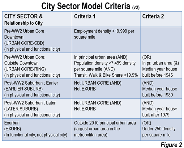
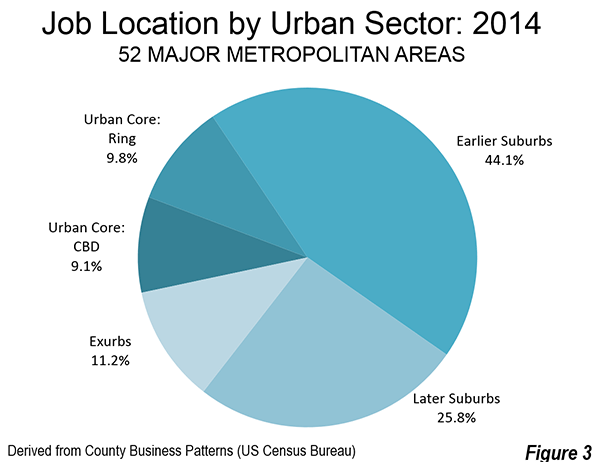
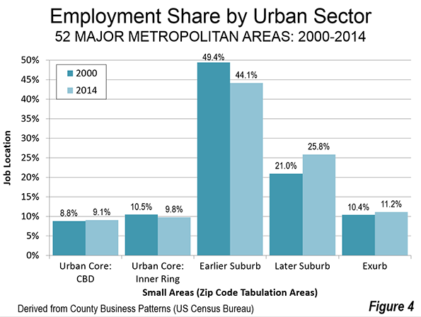
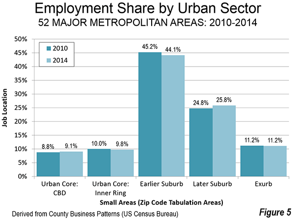
    The world’s developing economies have dominated purchasing power economic growth over the last 35 years, according to the most recent gross domestic product (GDP-PPP) per capita data from the International Monetary Fund (IMF). This article summarizes economic growth for three periods, including from the earliest IMF data (1980 to 2015), the intermediate 2000 to 2015 period and the more recent 2010 to 2015 timeframe. The full data is available on the Demographia website, at http://www.demographia.com/db-imf2015.pdf.

    GDP per capita provides a measure of comparative income for individuals in an economy, as opposed to overall GDP data, which is a measure of an economy’s total production. This is an important distinction, because an economy may have a very high overall GDP, while its residents have relatively low income. For example, India has the world’s fourth largest GDP, yet with its population approaching 1.3 billion, ranks 126th in GDP per capita (out of the 190 countries and sub-national geographies included in the database). On the other hand, China’s Macao Special Administrative Region has the third highest GDP per capita in the world, but barely manages to be within the 100 largest economies, due to its much smaller population (approximately less than 600,000).

    Fastest Growing Economies

    2010-2015: The most recent period exhibited remarkable geographic diversity among the fastest growing economies. Asia contributed 13 entries out of the top 20, with Africa adding three (Ethiopia, Ghana and the Democratic Republic of the Congo), Europe two (Latvia and Lithuania), Oceana one (Papua New Guinea) and North America one (Panama). The fastest growing economy was Turkmenistan, at 67 percent, closely followed by Mongolia at 63 percent and Ethiopia at 61 percent. China, which has sustained strong growth throughout all of the periods examined, ranked fourth at 54 percent. Myanmar, now emerging from decades of dictatorship,  was the fifth fastest growing economy, at 49 percent (Figure 1).

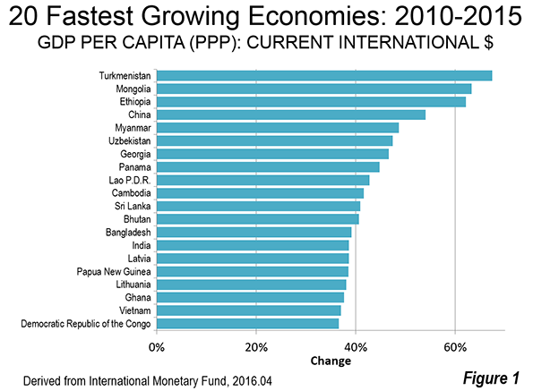
    The top 20 included two of the world’s poorest economies, third ranked Ethiopia, with a GDP per capita of $1,800 and the Democratic Republic of the Congo (DRC), which ranked 19th, with a GDP per capita of $800 (both figures are after the 2010-2015 increase). The improvement in the DRC is thus very encouraging, but it is  from a severely impoverished base.

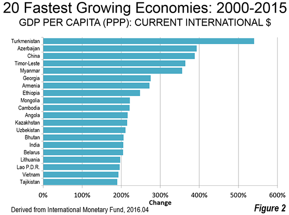
    2000-2015: Perhaps surprisingly, nine of the 20 fastest growing economies over the interim period (2010-2015) are former Soviet republics. Turkmenistan was, as between 2010 and 2015, the fastest growing, at 540 percent. Turkmenistan was joined by fellow former Soviet Azerbaijan , which grew 393 percent. Other former Soviet republics in the top 20 included Georgia, Armenia, Kazakhstan, Uzbekistan, Belarus, Lithuania and Tajikistan.  However, the largest former Soviet republic of all, the Russian Federation, was not among the fastest growing but placed a respectable 45th .

    China ranked third in economic growth, only slightly below Azerbaijian.at 388 percent. Timor-Leste, recovering from its intense ethnic conflict, ranked fourth. Myanmar ranked fifth.

    1980-2015: Over the longer period (1980-2015), Equatorial Guinea grew the fastest, at more than 8,000 percent, driven by its rich oil resources. China ranked second, at 4,500 percent. This huge increase was from a second worst in the world GDP per capita, which was a mere  $300 in 1980. Small Bhutan ranked third, at 1,627 percent, followed by the Republic of Korea (South Korea), which grew 1,572 percent, to become one of the world’s strongest economies. Vietnam ranked fifth, growing 1,283 percent (Figure 3).

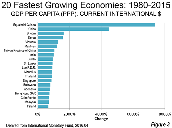
    Three of the world’s richest economies, with GDP’s per capita above $50,000, were also among its fastest growing between 1980 and 2015. These included Singapore (14th), Hong Kong (17th) and Ireland (20th).

    Slowest Growing Economies

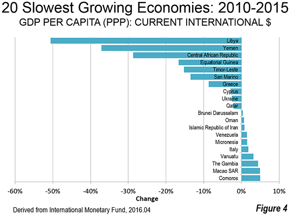
    2010-2015: The slowest growing economies in the last five years have suffered serious civil disorder.  Troubled Libya experienced a more than halving of its GDP per capita between 2010 and 2015. In 2010, Libya had a GDP per capita of $29,600, more than long-time European Union (EU-15) members Greece ($29,000) and Portugal ($26,500). By 2015, Libya had dropped to $14,600, less than Brazil ($15,600) and the Dominican Republic ($15,000).

    Similarly unstable Yemen experienced a loss of 37 percent, from $4,200 to $2,700.

    The Civil war ravaged Central African Republic lost 29 percent in GDP per capita. This is made worse by the fact that the Central African Republic ranked 185th in GDP per capita in 2010 out of the 189 geographies for which there is data. The 2015 data shows the Central African Republic to rank dead last in GDP per capita, 190th out of 190.

    Oil producing Equatorial Guinea experienced a loss of 17 percent in its GDP per capita, which is particularly significant, since Equatorial Guinea had the largest gain of any economy between 1980 and 2015.

    Three current European Union members were among the slowest growing economies. Greece had the 7th largest loss (-8.8 percent), while Cypress had the 8th largest loss (2.9 percent). Italy was the 16th slowest growing economy, gaining 1.8 percent (Figure 4).

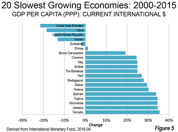
    2000-2015: The largest loss in GDP per capita between 2000 and 2015 was experienced by the oil producing United Arab Emirates. The next three greatest losses were in Libya, the Central African Republic and Yemen, which also sustained the largest losses between 2010 and 2015. The same three European Union members as in 2010-2015 made the 2000-2015 slowest growth list, Italy, Greece and Cypress (Figure 5).

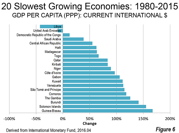
    1980-2015: Libya and the United Arab Emirates were the only geographies to post GDP per capita losses over the past 35 years. Miniscule growth was experienced in the third slowest growing Democratic Republic of the Congo, though as indicated above, the DRC managed to make the top 20 in growth between 2010 and 2015.

    The Future

    While there is much to celebrate about economic growth over the last 35 years and even in the more recent periods, far too much of the world lives in poverty and middle-income standards of living are declining, especially in the high-income world. These factors were the subject of discussions at the 2014 Brisbane G20 conference, when world leaders adopted a communique stressing a commitment to improving standards of living and eradicating poverty.

    Yet, a year and half later, International Monetary Fund Managing Director Christine Lagarde expressed a cautionary note in introducing the organization’s latest World Economic Outlook. The IMF indicated that Director Legarde warned that the recovery remains too slow, too fragile, with the risk that persistent low growth can have damaging effects on the social and political fabric of many countries. It is to be hoped that future reports will show large numbers of people exiting poverty, and a resumption in the rise of middle-income living standards. If these run in tandem, the world economy will be in the best shape in history.

    Wendell Cox is principal of Demographia, an international pubilc policy and demographics firm. He is a Senior Fellow of the Center for Opportunity Urbanism (US), Senior Fellow for Housing Affordability and Municipal Policy for the Frontier Centre for Public Policy (Canada), and a member of the Board of Advisors of the Center for Demographics and Policy at Chapman University (California). He is co-author of the “Demographia International Housing Affordability Survey” and author of “Demographia World Urban Areas” and “War on the Dream: How Anti-Sprawl Policy Threatens the Quality of Life.” He was appointed to three terms on the Los Angeles County Transportation Commission, where he served with the leading city and county leadership as the only non-elected member. He served as a visiting professor at the Conservatoire National des Arts et Metiers, a national university in Paris.

    Photograph: Addis Abeba, capital of Ethiopia (3rd fastest growing economy 2010-2015)

  • Feds Forced to Set Priorities for Washington Subway

    The Washington Metro passenger safety fiasco (see: America’s Subway: America’s Embarrassment?) has only gotten worse. On May 10 the Washington Post  reported the federal government has twice threatened to close the system if the Washington Area Metropolitan Transportation Authority (WMATA) failed to “take actions to keep passengers safe.” U.S. Secretary Anthony Foxx.

    According to the Post, “The most recent incident to illicit that threat came last Thursday after an arcing insulator exploded near a platform at Federal Center SW. The explosion, a fireball followed by a shower of sparks, was captured by Metro’s security cameras. On Tuesday, at a sit down with reporters, Transportation Secretary Anthony Foxx described his reaction to the video. ‘It was scary.’”

    But Foxx went on to say that “even more worrisome was Metro’s conduct following the incident.” Foxx indicated that Metro’s response had not been sufficient in view of the seriousness of the incident.”

    On the next day (May 11), Federal Transit Administration Acting Administrator Carolyn Flowers took the unusual action of a letter to WMATA General Manager Paul Wiedefeld, itemizing and prioritizing the necessary repairs: “I am therefore directing WMATA to take immediate action to give first priority to these repairs.” The letter is reproduced below.

    On the same day, the Post editorialized (“Metro’s Dangerous Complicity”): “An overhaul in Metro’s culture is what is needed; that begins with accountability.

    Not only is this an embarrassment for America’s Subway (as a previous Washington Post article suggested, see “Metro sank into crisis despite decades of warnings”), but the necessity for the nation’s second most patronized subway, in perhaps the nation’s most sophisticated metropolitan area, having to be directed (appropriately) by a federal agency is even more astounding.

    At the same time, it is important to note the extraordinary nature of this case. There are many Metro (heavy rail) systems in the nation, as well as many light rail and commuter rail systems. Nor should it be assumed that Metro’s burden is anything more than a result of its own failures. Somehow, for example, New York’s subway manages to safety carry more than 10 times as many riders. None of the many systems has ever required such intervention by the federal government on passenger safety, which is perhaps the most basic requirement of transportation systems. This is not “business as usual.”

  • Focus on Cost-Effective GHG Emissions: Report

    The Reason Foundation has published my new research reviewing the potential for urban containment (or other restrictive policies that are sometimes called “smart growth”) to reduce greenhouse gas (GHG) emissions. Principal reports cited by advocates of urban containment are reviewed. The conclusion is that only minimal reductions if the gains from improved automobile fuel economy are excluded. Of course, fuel economy improvements have nothing to do with urban containment policy, but are unrelated policy options that allow people to avoid draconian lifestyle changes that probably are impossible anyway.

    The report, "Urban Containment: The Social and Economic Consequences of Limiting Housing and Travel Options" expresses concern that the use of costly GHG reduction strategies, such as urban containment, has the potential to create significant economic disruption and unemployment. The report concludes that sufficient GHG emission reductions can be achieved without urban containment policy and its attendant economic problems: "The key is focusing on the most cost-effective strategy, without unnecessarily interfering with the dynamics that have produced the nation’s affluence."

    Read more and download the full report at Reason.com

    Photograph: BMW i3. 124 miles per gallon equivalent electric car (currently available)
    by TTTNISOwn work, CC0, https://commons.wikimedia.org/w/index.php?curid=34818839

  • More Californian’s Continue to Drive Despite Policies to Discourage

    “California Commuters Continue to Choose Single Occupant Vehicles,” according to a report by the California Center for Jobs and the Economy. The Center indicated:

    “The recent release of the 2014 American Community Survey data provides an opportunity to gauge how California commuters have responded to this shifting policy. The data clearly reflects that even with the well-documented and rapidly rising costs of the state’s traffic congestion and costs associated with the deteriorating condition of the state’s roads, California workers continue to rely on single occupant vehicles for the primary mode of commuting.  Moreover, their reliance on this mode of travel continues to grow both in absolute and relative terms (emphasis in original).

    California has experienced substantial growth since 1980. There are approximately 7,000,000 more workers today than 35 years ago. The Census Bureau data shows that 83 percent of the new commuting has been by single-occupant automobile. Working at home accounted for 11 percent of the new commuting, while transit accounted for less than one half that figure, at 4.5 percent (Figure). In 1980, transit accounted for more than three times the volume as working at home. By 2014, the number of people working at home exceeded that of transit commuters.

    The Center noted that state policies to discourage single-occupant commuting had been of little effect:

    “The substantial investments in public transit, bike lanes, and other alternative modes have not produced major gains in commuter use.  Instead, these investments appear to have simply shifted the choices made by commuters who already are committed to getting to work through modes other than single occupant vehicles.   From 1980 to 2000, public transit use grew by 116,000 while “other” modes dropped by the same amount.  From 1980 to 2005, public transit use grew by 121,000 while “other” modes dropped by 113,000.  In the following years, 1/3 of the growth in public transit and “other” modes was offset by reductions in carpool use.”

    The report credited impressive public transit gains in the San Francisco Bay Area, but went on to say that:

    “even in the Bay Area, growth of public transit and the “other modes” has come largely from the shrinking relative use of carpooling.” 

    While improving transit ridership is a good thing, to the extent that it removes passengers from car pools, there is no gain in traffic, because the car and driver are still on the road.

    The report laid considerable blame on the cost of houses in California:

    “California, the growing body of land use, energy, CEQA, and other regulations affecting housing cost and supply has put both the cost of housing ownership and rents within traditional employment centers out of the reach of many households.” 

    California’s housing affordability is legendarily desperate. Since the imposition of strong land use regulations began in the early 1970s, the median house price has risen from three times (or less) times median household incomes in of the state’s metropolitan areas to over nine times today in the San Jose and San Francisco metropolitan areas, over eight times in the Los Angeles and San Diego areas and over five times in the Riverside-San Bernardino area (Inland Empire).

    Perhaps the most important “take-away” from the report was that: “The current de facto policy of trying to reduce commuting by increasing congestion and its associated costs to commuters has to date not shown itself to be successful.” Simply stated, the vast majority of jobs and destinations in all of California’s urban areas are not accessible by transit in a reasonable time. The question for most California commuters is, for example, not whether to drive or take transit to work, but whether to go to work at all, since most jobs are not readily accessible except by car.