Category: Demographics

  • Job Creation Under the Next President

    Retraining the employed and the unemployed for higher value-added skills is now more important than simply adding to the number of jobs.

    Coal and steel magnate Wilbur Ross, a senior policy advisor to the Trump campaign, has just made in the pages of the Wall Street Journal an economic prediction that looks mathematically unattainable.

    Writing with Professor Navarro of UC – Irvine, Mr. Ross forecast that policies enacted by a President Trump would lead to the creation of 25 million new jobs, ostensibly over an eight year period:

    Donald Trump will cut taxes, reduce regulation, unleash our abundant energy and eliminate our trade deficit through muscular trade negotiations that increase exports, reduce imports and eliminate cheating. These policies will double our economic growth rate, create 25 million new jobs, boost labor and capital incomes, generate trillions of additional tax revenues and reduce debt as a percentage of GDP.

    To evaluate the 25 million figure, remember that new job creation during the booming Ronald Reagan and Bill Clinton two-term presidencies amounted to 16.1 million and 22.5 million, respectively. Given the growth of the population, you could say that a 25 million target compares reasonably to these figures. It is optimistic but, on the face of it, not outlandish.

    That is, until you scrutinize the underlying demographics. A new job requires not only an open paid position but also a person to occupy this position. In order to have 25 million new jobs, we need 25 million people to fill these jobs. So does the US even have 25 million people who would be available in the next eight years? It doesn’t seem like we do.

    job numbers

    Now as at any time, there are three main sources of new workers:

    Increase in working-age population: During the 1980s decade (which includes the two Reagan terms), the population aged 20 to 64 grew by 18.5 million. During the 1990s (including the two Clinton terms), it grew by 19.1 million. In the coming decade ending in 2025 by contrast, it will only grow by a much smaller 2.6 million.

    What explains this decline in growth for this segment? Simply put, there were many more new babies in the 1960s than in the 1910s, resulting in strong growth in the 1980s. But there were only a few more babies in the 2000s than in the 1950s, resulting in lower growth in the 2016-25 decade. Put another way, a rising number of boomers are turning 65 every year and exiting the 20-64 age bracket. This means that, unlike in the 1980s and 1990s, a large percentage of people going into these 25 million jobs will have to come from other sources.

    Immigration: Assuming an annual influx of one million immigrants (green card holders), we estimate another 7 new million workers for the decade, and a prorated 5.6 million over eight years.

    The idle and unemployed: The current official unemployment rate is hovering around 5%. However, the U6 measure of unemployment now stands at 9.7%, not far from its historical average. If we assume generously that U6 will drop by 3% towards its low of October 2000, there would be an additional 4.8 million people available for work.

    Adding all these figures (and making adjustments from 10 to 8 years where needed), we see that there is still a shortfall of 12.5 million people, or half the 25 million needed to meet the new supply of jobs.

    Keeping an open mind, we could speculate that an additional 12 or 13 million people, counting for example a large number of women and elderly, could decide to join or remain in the labor force. But this seems unlikely within the big economic boom described by Mr. Ross and Professor Navarro. If the economy will be doing that well, fewer spouses may choose to work and more people will retire early.

    Finally, the next President could increase the number of immigrants to address the labor force shortfall. This decision would require doubling or tripling the number of visas and green cards awarded annually, a policy that runs against the grain of Trump campaign pledges.

    To sum up, an optimistic level of job creation under the next President, whether Trump or Clinton, would be 12 to 15 million. But even this lower target will prove to be too ambitious if, as is widely anticipated, automation and the internet of things take over more job functions.

    Further, because the marginal demand for jobs will be less than in the past, an effort to boost the supply looks not only ill-fated but also misdirected, like that of a general preparing to fight the last war. At this juncture of changing demographics and increased automation, it will be more important to upgrade jobs to higher value-added functions than to simply count the number of net new jobs. Bringing the old jobs back would in theory provide much needed relief to households that are struggling, but retraining these same workers for better jobs will ultimately lead to more favorable outcomes.

    In this vein, investments in education and retraining seem more critical now than in the past. Rather than merely adding jobs, a more promising employment strategy for the next President would be to facilitate retraining programs for people who have not kept up with the economy because of outsourcing or other factors.

    All this will probably be unconvincing to Mr. Ross and Professor Navarro who downplay the role of demographics in the economy and who believe that a sufficient amount of can-do spirit will overcome the facts of a hard-nosed analysis:

    Some falsely assert that the U.S. and other developed countries have settled into a “new normal” of slower economic growth due to greater competition from developing countries and demographic changes beyond our control.

    But to quote Mr. Trump’s running mate, Gov. Mike Pence, “People in Scranton know different. People in Fort Wayne know different.”

    We shall see.

    One clear fact remains however: the golden decades ending in 2005 were in part powered by a fast-growing population and a declining dependency ratio, two conditions that are now fading.

    Sami Karam is the founder and editor of populyst.net and the creator of the populyst index™. populyst is about innovation, demography and society. Before populyst, he was the founder and manager of the Seven Global funds and a fund manager at leading asset managers in Boston and New York. In addition to a finance MBA from the Wharton School, he holds a Master’s in Civil Engineering from Cornell and a Bachelor of Architecture from UT Austin.

    Photo: neetalparekh
  • Erasing Anglo cultural heritage risks what makes our republic diverse

    It’s increasingly unfashionable to celebrate those who made this republic and established its core values. On college campuses, the media and, increasingly, in corporate circles, the embrace of “diversity” extends to demeaning the founding designers who arose from a white population that was 80 percent British.

    In this American version of Mao’s “Cultural Revolution,” which tried to eviscerate traces of China’s past, venerable buildings are being renamed, athletes refuse to stand for the national anthem and, on some campuses, waving the American flag is now considered a “microaggression,” while English students at Yale want to avoid reading the likes of Milton, Shakespeare and Chaucer.

    Of course, some changes are justified. Asking anyone, particularly African Americans, to revere the Confederate flag or attend schools named after the founder of the Ku Klux Klan is, indeed, offensive. But in our zeal to address old wrongs, we may also be sacrificing the very things that have made this republic so attractive to millions from distinctly different backgrounds for the last two centuries.

    Why we come here

    Just to clear the air, I have not a single drop of British blood in me. The closest ties I have to what I consider my cultural and political home country come from my great uncle Simon, who served in Gen. Allenby’s Jewish brigade in World War I, and that my wife, born in Montreal, came into the world a subject of Her Majesty, Queen Elizabeth. Career wise, I did work for a think tank in London for several years.

    But what ties most Americans to the founders is not race, but our embrace of a political and legal culture based on distinctly Anglo-Saxon ideas about due process, representative government, property rights and free speech. These proved infinitely superior to the divine right of czars, kaisers, emperors and other hereditary autocrats for generations of non-Anglo-Americans.

    This system, always capable of amendment, has allowed waves of traditional outsider groups — African Americans, Latinos, women, Mormons, Jews and Muslims — to join the economic, political and cultural mainstream. In some cases, as in the case of President Obama, they have also secured the highest reaches in the national firmament.

    Read the entire piece at the Orange County Register.

    Joel Kotkin is executive editor of NewGeography.com. He is the Roger Hobbs Distinguished Fellow in Urban Studies at Chapman University and executive director of the Houston-based Center for Opportunity Urbanism. His newest book, The Human City: Urbanism for the rest of us, will be published in April by Agate. He is also author of The New Class ConflictThe City: A Global History, and The Next Hundred Million: America in 2050. He lives in Orange County, CA.

    Photo: William Robert Shepherd [Public domain], via Wikimedia Commons

  • The House Prices are Too Damned High

    In recent years, the plight of renters in a stagnant economy has been covered extensively. A book title incorporated the phrase “the rent is too damn high” (by Matthew Iglesias). The “Rent is Too Damn High Party” ran candidates in both city and state of New York elections. However, as bad as rent increases have been, more serious has been the escalation of house prices in the major metropolitan areas of the United States.

    The Expected Nexus

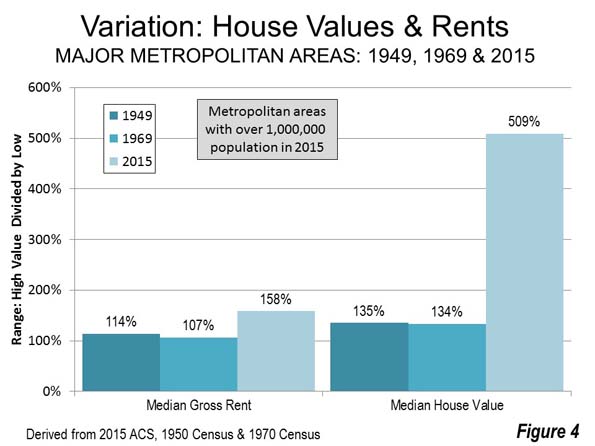
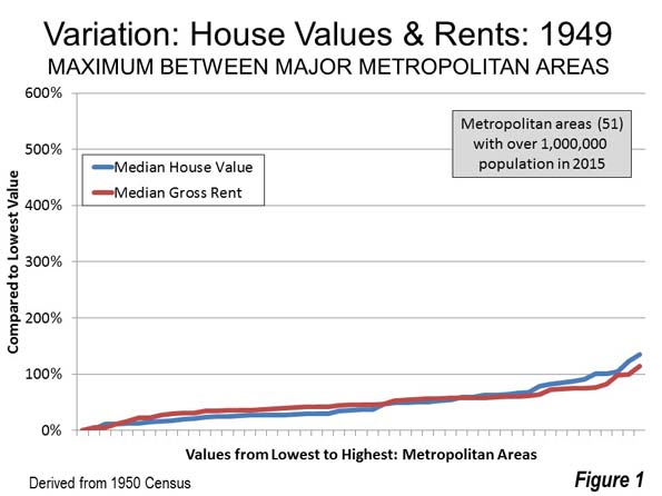
    Generally, a closely aligned relationship between trends in owner occupied and rented housing costs would be expected . This was certainly true until 1970 (Note 1).  In 1949 there was a 135 percent difference between the lowest median household value and the highest in the major metropolitan areas (Note 2). There was a similar 114 percent difference between the lowest gross rent and the highest (Figure 1). The house value variation was 18 percent higher than the rent variation.

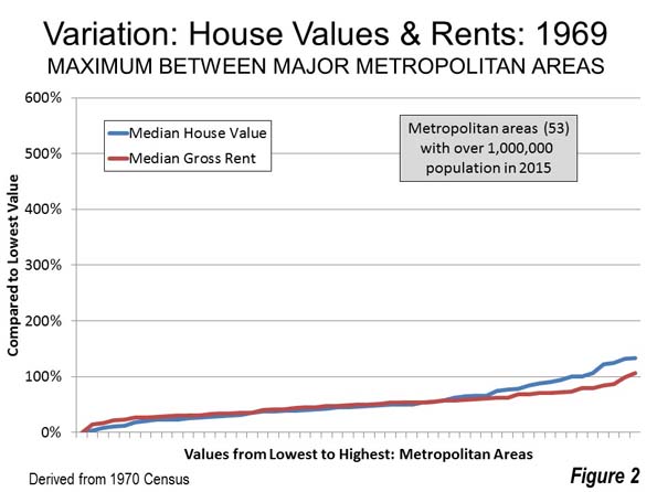
    By 1969 median house values varied a maximum of 134 percent from the lowest figure to the highest, a slight reduction from the 135 percent difference across the United States in 1949. Median gross rents varied a maximum of 107 percent among the same metropolitan areas, down modestly from 1949’s 114 percent (Figure 2). The house value variation was 25 percent higher than the rent variation.

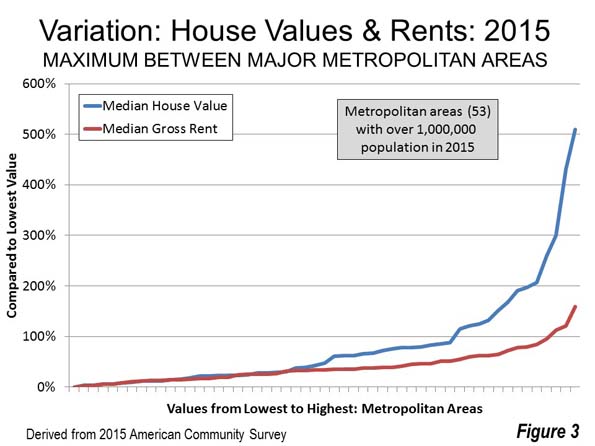
    The close relationship between the variations in house value and rent   was substantially broken in more recent decades. The 2015 American Community Survey shows that the variation among the major metropolitan areas in median house values is now a staggering 509 percent. The range between the least expensive and most expensive rental markets is a much smaller 158 percent (Figure 3). The difference in the variations between house value and rents across the nation rose to 222 percent, nearly nine times the 1969 figure.

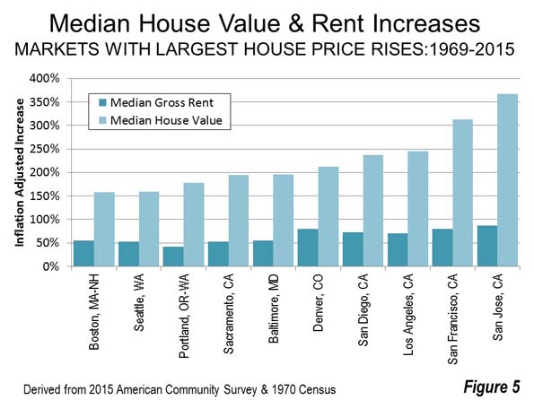
    Among the 10 metropolitan areas with the largest house price increases between 1969 and 2015, house values increases averaged 226 percent, nearly 350 percent more than the 65 increase in median rents, both figures inflation adjusted (Figure 4).

    Of course, the hideously expensive California metropolitan areas are well represented, such as San Jose, San Francisco, Los Angeles and San Diego, among the most impacted. Even inland Sacramento, with significant housing affordability problems often over-shadowed by the Bay Area, is included. However, the huge differences extend to metropolitan areas outside California, such as Denver, Baltimore, Portland, Seattle and Boston.

    The broken relationship between rent and house value could imply severe distortion in either the rental market or the owned housing market.

    If the Rent is Too Damn Low

    Distortions in the market could have prevented rents to retain their relationship with rising house values.

    The implications are ominous. If the increase in rents had kept up with the increase in house values, the median gross rent in the San Francisco metropolitan area would have been approximately $3,700 per month, compared to the actual $1,600 per month in 2015. This would suggest that rents in 2015 were $2,100 below market in San Francisco. If this is true, then the rent is too damn low in San Francisco. The situation would be even worse down the road in San Jose where to keep up with house prices rents need to be $4,700 per month, $2,800 per month higher than market.

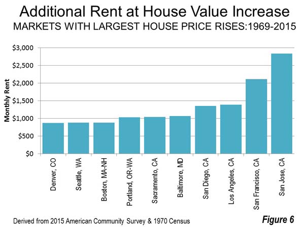
    If the rental market is distorted, then rents are far too low in other metropolitan areas. In Los Angeles, San Diego, Baltimore, Sacramento and Portland rents are between $1,000 and $1,400 too low. Rents would be at least $800 below market in Boston, Seattle and Denver (Figure 5).

    If House Prices are Too Damn High

    If the owned housing market became distorted relative to the rental market between 1969 and 2015, then it is the rents that are too damn high.  If house values had risen at the same rate as rents, none of the 53 markets would have exceeded a price to income ratio of 5.0, which denotes is denoted as “severely unaffordable” in the Demographia International Housing Affordability Survey. This would be a substantial improvement, given that 11 major markets actually were severely unaffordable in 2015.

    The 10 major metropolitan areas with the largest house value increases would have had hugely lower house prices. In San Jose, the median house value would have been equal to 3.2 years of median household income in 2015. This is considerably better than the actual 8.1 years, representing a 55 percent improvement. In San Francisco the median house value would have been equal to 3.5 years of median household income. This would be a 60 percent improvement on the actual 8.1 ratio in 2015 (Note 3). 

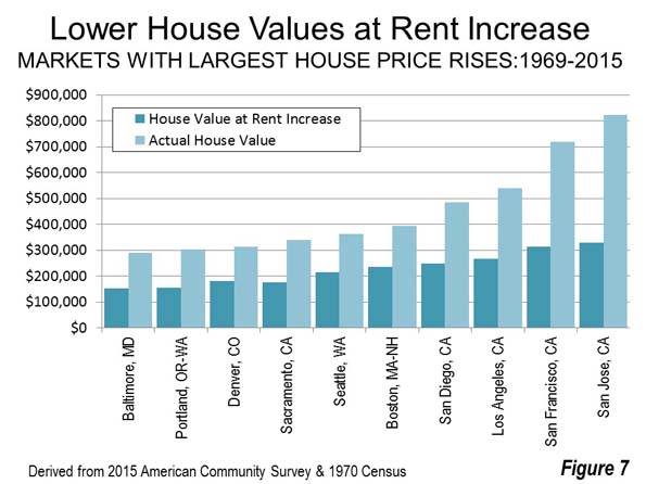
    In Los Angeles, Portland, Sacramento and San Diego, house values would have been about 50 percent less if they had risen at the same rate as rents. In Boston, Denver and Seattle, house prices would have been between 40 percent and 45 percent less (Figure 6).

    It’s the House Prices that are Too Damned High

    Rents have risen faster than incomes, but nothing compared to the increase in house prices. Clearly, house prices are too damn high. The huge increase between 1969 and 2015 in house prices is an anomaly that has become extreme in recent decades. The ranges in rents (1949, 1969 and 2015) and the ranges in house values in 1949 and 1969 were far more similar and reflected a reality more in line with the stability that would be expected in non-distorted markets (Figure 7). Indeed, the large increase in the 1969-2015 rent range could well have been influenced upward by the virulent house price increase (reflected in land prices).

    It seems likely that rents across the country are much more reflective of an efficiently operating market, while there are serious distortions in the owned housing market.

    Finally, owner-occupied housing, especially detached housing, has been under assault by restrictive urban planning regulations since 1970. House prices are most out of alignment in markets where this has occurred, especially in California, Oregon, Washington, and the Denver, Baltimore and Washington, DC metropolitan areas. More often than not, these regulations have evolved into urban containment policy (Note 4), which draws arbitrary lines around cities beyond which detached housing tracts are not permitted (See: Urban Containment, Endangered Working Families and Beleaguered Minorities). Obviously, as in goods and services generally, this regulatory over-reach makes housing less affordable (See: People Rather than Places, Ends Rather than Means: LSE Economists on Urban Containment).

    There has been no such assault on multi-family building, which represents the bulk of rentals. This is not to suggest that rental regulation is perfect, only that the market distortions have been far more severe in reference to the owned housing market in some metropolitan areas, such as those identified above.

    All of this has serious consequences for the nation and its threatened middle income households. With median household incomes below nearly two decades ago (perhaps for the first time in US history), economic stagnation and younger people burdened by rising college debt, lower house prices are a necessity in the over-regulated metropolitan areas. Yet there seems little desire on the part of most governments, particularly in the most severely impacted markets, to do much about it.

    Note 1: These censuses collected house value and rent data for the previous year, 1949 and 1969 respectively. The rent and house value data referenced in this article was first available in the 1950 census.

    Note 2: The 53 metropolitan areas with more than 1,000,000 population in 2015 (in 1950, only 51 of these had achieved metropolitan area status). The rent ranges cited in this article are calculated by dividing the highest major metropolitan area rent by the lowest major metropolitan area rent in the particular year. The house value ranges cited in this article are calculated by dividing the highest major metropolitan area house value by the lowest major metropolitan area house value in the particular year.

    Note 3: Some analysts cite topographic barriers for creating the scarcity of land that has driven house price up so much in the San Francisco Bay Area (which includes both the San Francisco and San Jose metropolitan areas). As indicated in a previous article, there is far more land available for greenfield residential development in the Bay Area than would be required by even the strongest population growth.

    Note 4: With respect to urban containment policy, Boston is an exception, which is the only seriously unaffordable major metropolitan area in the Demographia International Housing Affordability Survey that does not have urban containment policy. Boston has large lot zoning so expansive that it has created a severe shortage of land for development, with urban containment-like effects on house prices. Boston’s urbanization covers more land area than all urban areas in the world except New York and Tokyo, despite having only a fraction of their populations (See: The Evolving Urban Form: Sprawling Boston).

    Photo: Sacramento: An inland California unaffordable housing market (by author)

    Wendell Cox is principal of Demographia, an international public policy and demographics firm. He is a Senior Fellow of the Center for Opportunity Urbanism (US), Senior Fellow for Housing Affordability and Municipal Policy for the Frontier Centre for Public Policy (Canada), and a member of the Board of Advisors of the Center for Demographics and Policy at Chapman University (California). He is co-author of the "Demographia International Housing Affordability Survey" and author of "Demographia World Urban Areas" and "War on the Dream: How Anti-Sprawl Policy Threatens the Quality of Life." He was appointed to three terms on the Los Angeles County Transportation Commission, where he served with the leading city and county leadership as the only non-elected member. He served as a visiting professor at the Conservatoire National des Arts et Metiers, a national university in Paris.

  • The US Census Digs Deeper: Where Were Your Ancestors From?

    Over 45 million Americans identify their dominant ancestry as German and 22,000 identify theirs as Marshallese, from the Marshall Islands in the Pacific. But in the US Census proposed new form for 2020, both of these groups get their own box to check for the first time. In the previous 2010 form (shown below), German-Americans would simply check ‘White’ and Marshallese-Americans would check ‘Other Pacific Islander’.

    In the 2020 form therefore, the US Census is seeking more disclosure and more granularity in the population data. This desire for more detail is not evenly spread however. The Marshallese, 0.01% of the US population, get as much real estate on the form as do German-Americans, 14% of the population. Germany being a country of many regions and Bundesländer, there would surely be more fragmentation in that 14% if anyone cared enough to know the percentage who claim for example Bavarian vs. Hessian ancestry.

    This extra layer of detail would make sense if the US Census was agnostically gathering data about ancestry. The Census would then determine a certain hurdle, say 1% or 2% of population, beyond which a group would get its own check box. But as we will see below, the Census has specific policy-related reasons for gathering this data.


    Fifty Shades

    The proposed new form (shown below with annotations by Pew Research) has nearly tripled in size from 2010 and now includes a new section for Americans of ‘Middle Eastern or North African’ (MENA) ancestry who had been until now categorized as ‘White’. Notwithstanding this new privilege, the six national origins listed in the MENA section (Lebanese, Syrian, Iranian, Moroccan, Egyptian and Algerian) altogether add up to well below 1% of the population.

    Of course, this is the percentage of people who ‘self-identify’ as Middle Eastern or North African. Their actual number is likely to be higher if you account for the fact that some still prefer to self-identify as white. Even with this adjustment however, the MENA groups probably don’t exceed 2% of the population.

    screen-shot-2016-10-06-at-10-54-39-am-2

    A similarly sized section is reserved for ‘Native Hawaiian and Other Pacific Islander’ (including the Marshallese) but here again, the entire section and its six choices represent a small percentage that is less in total than 0.25% of the population. Here then are six choices to cover fewer than 0.25% of Americans, same as the six choices under the ‘White’ heading to cover 60%+ of Americans who are of European descent.

    Because each major heading only includes six ethnic or national identifiers, many large groups of Europeans are not represented by the available choices. For example, Scottish and Norwegian are 5.5 million and 4.4 million, or 1.7% and 1.4% of the population, but are not on the form.

    Even within a section, the inclusion of some countries and exclusion of others are not straightforward. For example, in the new ‘Hispanic, Latino or Spanish’ category, Guatemalan with a population of 1.38 million is left out to make room for Colombian with 1.08 million. This may come from a desire to have at least one South American country listed among the six in this category. By contrast in the 2010 census, most Americans of Hispanic, Latino and Spanish ancestry would check the ‘White’ box.

    In its effort to obtain a comprehensive picture, the Census has to grapple with the complication of data that is is part race, part ethnicity and part national origin.

    One solution is to do away with the headline categories (White, Hispanic, Black, Asian etc.) and to simply list the 40-odd subcategories. Yet this would still overweigh some and underweigh others.

    Another solution then is to simply list all the countries of the world. But this in turn would not provide enough information on race. Is an American of South African ancestry black or white? To be thorough, an adjacent question could request this information. But then is an Argentinian of German ancestry ‘White’ or ‘Hispanic, Latino or Spanish’? Is the Paris-born son of Moroccan immigrants ‘French’ or a descendant of MENA ancestors?

    The point here is that there is little racial or ethnic homogeneity in many countries, even if most Americans associate their own ancestry with one or two specific nationalities. The key phrase in this data collection is ‘self-identify’, meaning the way each American chooses to identify him or herself. The offered choices are in many cases convenient shortcuts rather than objective identifiers.

    Data for Policy

    A third solution in theory would be to opt for simplicity and to do away with this type of data collection altogether. Not all nations request this information in their censuses. Censuses in Italy, the Netherlands, Norway and other countries make no mention of race or ethnicity. France passed a law in 1978 that makes it illegal for the census to collect data on race or ethnicity. A Brookings Institution article explains:

    Unlike many other West European countries, and very much unlike English-speaking immigrant societies such as the United States, Canada or Australia, France has intentionally avoided implementing “race-conscious” policies. There are no public policies in France that target benefits or confer recognition on groups defined as races. For many Frenchmen, the very term race sends a shiver running down their spines, since it tends to recall the atrocities of Nazi Germany and the complicity of France’s Vichy regime in deporting Jews to concentration camps. Race is such a taboo term that a 1978 law specifically banned the collection and computerized storage of race-based data without the express consent of the interviewees or a waiver by a state committee. France therefore collects no census or other data on the race (or ethnicity) of its citizens.

    The article goes on to discuss some policies and laws that were adopted to fight racism and to improve conditions in economically depressed parts of the country.

    The US however is different in many ways. It has several large groups of different ethnicities and a longer history of often difficult race relations. The US Census addresses the question of race data collection on its website:

    Why does the Census Bureau collect information on race?

    Information on race is required for many Federal programs and is critical in making policy decisions, particularly for civil rights. States use these data to meet legislative redistricting principles. Race data also are used to promote equal employment opportunities and to assess racial disparities in health and environmental risks.

    Looking at each in turn,

    Federal programs: It makes sense for the Census to identify the location of communities that receive some kind of government attention or assistance. Yet, when you consider the new form, it is not entirely clear why some programs should be tailor made for say Egyptian-Americans (represented on the new form, though only 0.08% of the population) but none for the numerous Scots-Irish (not represented, though 1% of the population) some of whom, according to this new book, have long endured a weak economy in Appalachia and would certainly welcome some assistance.

    One explanation is that the Census is counting the groups that are more likely to experience discrimination rather than any group that happens to be suffering economic distress. But if this is the case, why then have the choices of German, Irish, English etc. instead of just White?

    Redistricting:As often discussed elsewhere, redistricting that takes race or ethnicity in consideration can easily lead to gerrymandering, an undesirable way to define district boundaries.

    Employment, Health, Environment:Here again as with Federal Programs, it is not immediately obvious why the Census needs more granularity than it already had in 2010.

    Outside of the provision of government programs to specific groups, there seems to be no compelling reason for the Census to collect and distribute data on race, ethnicity or national ancestry. Of course, corporations also find this data useful in their effort to market their products to people of various cultural affinities. But private demographers could easily fill the gap if the Census did not collect the data with sufficient detail.

    The big question is whether the Census should be asking this question in the first place. Could government programs be effective by targeting poorer parts of the country without any data on race or ethnicity? It may be a good idea to analyze the experience of France in this regard.

    Politicians may like the fragmented information that helps them tailor their message specifically to the audience in every locality they visit. But on any given issue, a national politician should offer a consistent message whether he is speaking to a crowd in Minneapolis, San Diego or New York. And a local politician would already have a close knowledge of his district’s or state’s demographics.

    This piece first appeared at Populyst.net.

    Sami Karam is the founder and editor of populyst.net and the creator of the populyst index™. populyst is about innovation, demography and society. Before populyst, he was the founder and manager of the Seven Global funds and a fund manager at leading asset managers in Boston and New York. In addition to a finance MBA from the Wharton School, he holds a Master’s in Civil Engineering from Cornell and a Bachelor of Architect

    Photo: Travelin’ Librarian

  • A Capital Improvement and Revitalization Idea for Detroit

    You may have heard that Detroit is in the midst of a modest but enduring revival in and around its downtown. Residents and businesses are returning to the city, filling long-vacant skyscrapers, prompting new commercial development and revitalizing adjacent old neighborhoods. As a former Detroiter I’m excited to see the turnaround. After so many false starts, Detroit’s post-bankruptcy rebound seems very real.

    However, there seems to be a growing awareness that the city’s current revival has its limits. On one hand, what’s happening now in Detroit could be considered a rather elongated recovery for the city instead of growth, as the city races to catch up with cities that have had a 20-year head start on urban revitalization. One could argue that the Motor City is slowing losing its taint, and the investment that’s coming to the city now is investment that never left, or never left at such a scale, in other cities. Maybe its reclamation rather than revitalization.

    But more broadly speaking, there’s a sentiment that the city’s revival hasn’t been inclusive. In a majority-black city, startlingly few African-Americans appear to be involved in the rebound, either as developers, homebuyers or even consumers of new amenities. Because of this, two vastly different kinds of fears seem to trouble much of the city’s black community — the revitalization could burn through the city like a wildfire and lead to widespread displacement, or the rebound could peter out before it has a chance to transform even more of the city.

    How can that be? Maybe because people and businesses are coming back not because of an economic change in the city, but a socio/cultural one. Detroit is still the Motor City, and that won’t change anytime soon. Detroit will remain the headquarters of American auto production and be a key manufacturing center for generations to come, and it will continue to ride the wave of manufacturing ebbs and flows. That’s why I say the economy is driving little of what’s happening in Detroit today. The Big Three are only eight years away from a true existential threat, and are still in the process of righting the ship. By my eyes, Detroit still hasn’t found a new economic raison d’etre that could vault it into the next phase of its development.

    As the fears that drove white and middle-class flight from the city from the 1960’s onward recede into the distant memory, many people are willing to reconsider Detroit and return.

    Detroit is at an interesting juncture in its history. After 125 years of focusing on its national and global economic prominence and leaving city-building behind, maybe now Detroit can focus on being a thriving, livable city. For everyone. There is an opportunity for Detroit to build on its rich urban design legacy to include more of the city, and more of its people, in its revival. There is an opportunity to set the stage for good — even innovative — urban development in the Motor City as the city continues to search for a new economic catalyst.

    I believe the city should undertake a capital improvement/revitalization plan that utilizes its grand arterial streets — Gratiot, Woodward Grand River and Michigan avenues — and Grand Boulevard, the parkway necklace around the city’s inner core, as assets and foundations for growth. After that, the city could extend similar improvements to the locations where the arterial streets intersect with the defunct Detroit Terminal Railroad, further out from the city center. Finally, the improvements could be extended even further outward to Detroit’s other boulevard necklace, Outer Drive, near the city limits. Just as interstate highway development had the net impact of opening up outer bands of suburbia to city residents, this plan could open up languishing parts of the city for revitalization.

    Here’s the five-phase process:

    • Transform Gratiot, Woodward, Grand River and Michigan avenues into true boulevards — landscaped medians, streetscaping, wide sidewalks, bike lanes, etc. — from their sources in downtown Detroit to their intersections with Grand Boulevard.

    • Establish public squares where each new boulevard intersects with Grand Boulevard.

    • Develop a connected greenway along the path of the former Detroit Terminal Railroad.

    • Extend boulevard treatment along Gratiot, Woodward, Grand River and Michigan avenues to a new terminus at Outer Drive.

    • Complete and connect Outer Drive where necessary, and establish new public squares where the boulevards intersect with Outer Drive.

    Each step of the plan would include zoning changes along the affected areas with the intent of increasing residential and commercial development choice, and send a signal that the city is ready for transformation.

    Here’s how this project would look conceptually, looking at the entirety of Detroit:

    image of detroit

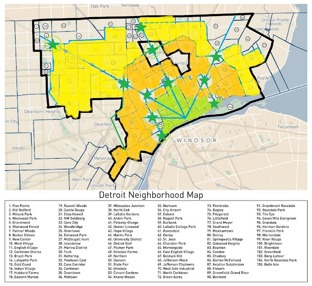
    First, please excuse my crude Microsoft Paint illustration. Hey, it serves its purpose. Second, let’s consider the broad areas of the city highlighted in various colors. The green areas are the downtown and downtown-adjacent areas that have been experiencing a pretty significant rebound over the last 5-10 years. In fact, you could say that revitalization took hold there with the opening of the Comerica Park baseball stadium in 2000 and the Ford Field football stadium in 2002. This area also includes the Midtown area north of downtown that includes Wayne State University and a host of city cultural institutions. The orange areas are the parts of the city that capture the dystopian imagination of Detroit. This area is quite — but not totally — abandoned, where much of the city’s older residential and industrial treasures have been lost. There’s still some intact neighborhoods that have a solid walkable foundation, but they’re often disconnected from each other by some serious abandonment. The yellow areas are the areas that might be described as imperiled; they could soon look like the orange zone if action isn’t taken, and in fact some parts of it (like the Brightmoor neighborhood, on the far west side, are quite abandoned already). The gray or uncolored areas on the far northeast and northwest edges of the city represent the most stable residential neighborhoods of the city, but they, too, are threatened by the challenges experienced by the rest of the city.

    When you hear Detroiters expressing concern that downtown revitalization isn’t reaching the neighborhoods, they often come from the yellow and gray/uncolored areas, with fewer and fewer voices coming from the relatively open orange areas. Viewed this way it can be understood that people see the city’s rebound as having a low ceiling; there is a half-empty quarter that sits between them and the promise of revitalization.

    My idea is to utilize strategic infrastructure investment and zoning reform to attract new development to key corridors, utilizing the city’s radial network. The radial blue lines on the map emanating from their intersection downtown represent (clockwise, from the left) Michigan, Grand River, Woodward and Gratiot avenues. The blue line that connects them, just outside the green revitalization area, is Grand Boulevard. The blue line that connects the radial streets further out is Outer Drive. The green stars represent public squares or plazas that could be built, and the light green circles indicate an approximate extent of impact outward from the squares or plazas. The green line that serves as the dividing line between the yellow and orange areas is the Detroit Terminal Railroad, and it would become a connecting trail.

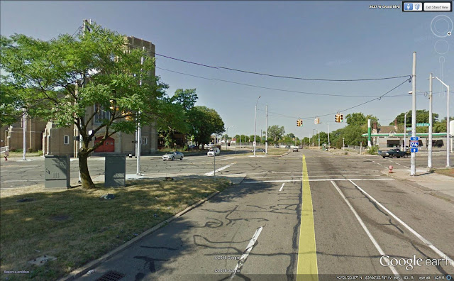
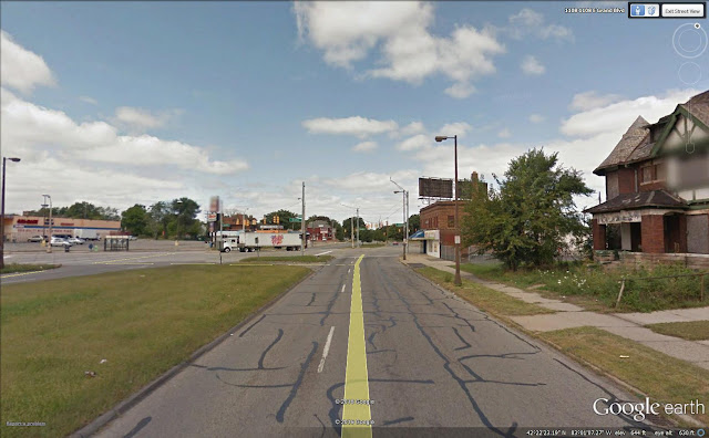
    Detroit was blessed early on with an excellent radial street system, but it quickly abandoned it as growth took hold in the early 20th century. Detroit missed an opportunity for grand public spaces at the same time that other cities were incorporating them into their urban fabric — and those public spaces became the foundation for their rebound. Consider this image, where Grand River Avenue intersects with Grand Boulevard:

    google image of grand river avenue intersecting with Grand Boulevard

    Or, worse yet, where Gratiot Avenue and Grand Boulevard meet:

    google image of Gratiot Avenue and Grand Boulevard

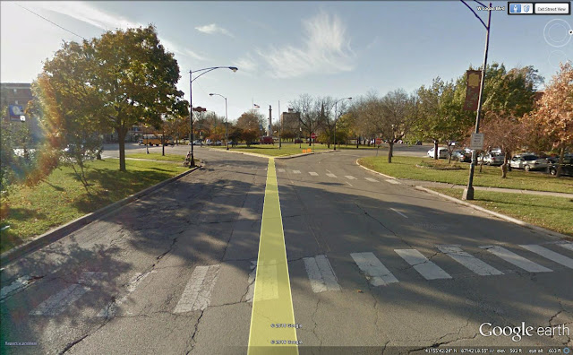
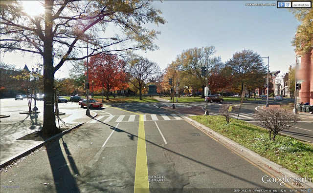
    This was a missed opportunity for Detroit to have majestic entryways into neighborhoods beyond the city center. This was also a missed opportunity to develop areas that could become more mixed use and multifamily in character, as opposed to the dominant single-family home city that Detroit is today.

    If Detroit had the foresight 100 years ago to make strategic infrastructure investments, it could have put in place something like Chicago’s Logan Square, located at Milwaukee Avenue and Logan Boulevard (also a radial street and boulevard intersection):

    google image of Chicago's Logan Square

    Or Logan Circle, in Washington, DC:

    google image of Logan Circle

    The public squares on the radial avenues could have the effect of drawing development and revitalization outward from the city center, as has happened in Chicago and DC. This could continue outward to the DTR trail and Outer Drive, if the city sees success in such a measure, finds the appropriate resources and desires to extend it further.

    Detroit should certainly see the merits of such an investment. The city renovated and rededicated a new Campus Martius Park in 2004, and it has become a focal point for downtown revitalization.

    Without a doubt, this would be a costly measure, maybe even a folly for a city just out of municipal bankruptcy and still struggling to provide basic city services. that’s why I would envision this as a long term proposal, perhaps a 10-year project.

    That’s the basis of the idea. I’ll follow up with more details soon.

    Top photo: detroit.curbed.com

    Pete Saunders is a Detroit native who has worked as a public and private sector urban planner in the Chicago area for more than twenty years.  He is also the author of “The Corner Side Yard,” an urban planning blog that focuses on the redevelopment and revitalization of Rust Belt cities.

  • Today’s Orange County: Not Right Wing—and Kinda Hip

    What comes to mind when you think about Orange County? Probably, images of lascivious housewives and blonde surfers. And certainly, at least if you know your political history, crazed right-wing activists, riding around with anti-UN slogans on their bumpers in this county that served as a crucial birthplace of modern movement conservatism in the 1950s.

    Yet today, Orange County—or the OC, as locals call it—is becoming a very different place. Today close to half the population of this 3-million person region south of Los Angeles are minorities, primarily Latino and Asian, and the county’s future belongs largely to them.

    These days you color the OC both ethnically diverse and politically purplish. The Republican share of the electorate has dropped from 55 percent in 1990 to under 40 percent today. Two of the seven people who represent the area in Congress are Latino, and a third is of Middle Eastern descent. Four of the 10 people the county sends to Sacramento are minorities, three Asians and one Hispanic. Asians, now 20 percent of the local population, represent the majority on the county Board of Supervisors. In 2012 Mitt Romney took the county with 53 percent of the vote; this year it may be far closer than that.

    The cultural landscape is also changing. What was historically a land of hamburger dives (we still have some) and little Mexican restaurants (we have many) is now home to some of Southern California’s best restaurants—including two on the top 30 list ofLos Angeles Times food critic Jonathan Gold. The OC is also home to one of the country’s leading venues for new plays, South Coast Repertory. Alongside the ubiquitous malls have arisen some of the nation’s most innovative urban environments, some of them revived small town main streets, from Santa Ana’s 4th Street Market to Orange to Laguna Beach and Fullerton.

    When urbanists talk about the future, they usually imagine an environment of dense buildings, connected by train transit and highly centralized workplaces. Yet the bulk of all the nation’s economic and population growth takes place in “post-suburbia,” a term first applied to the OC. Post-suburbia, noted two urban scholars in 1991, reflects a “decentralized, multi-centered area” that puts “into question the mainstream urbanist’s concept of central-city dominance.”

    This new geography of urbanity—far more than the much-discussed recovery of the urban core—dominates our metropolitan life; since 2000 over 80 percent of all metropolitan area jobs and population have remained outside the urban core. Post-suburbia predominates among our most demographically and economically vital regions, including STEM-intensive regions such as Silicon Valley, the northern reaches of Dallas, the western suburbs of Houston, Johnson County west of Kansas City or virtually anything around Raleigh or Austin. Orange County’s STEM sector (PDF) has expanded at twice the rate of L.A. County, despite all the considerable hype about the emergence of “Silicon Beach.”

    Post-suburbia was not designed to be a traditional commuter suburb, where people pile onto trains or the highways to get “downtown.” The vast majority of OC people work in the plethora of county worksites, and many others, particularly from the Inland Empire to the east, drive into the area for work.

    What places like the OC sell is both work and quality of life. The area ranks 10th out of 3,111 counties in the U.S. for natural amenities, and even outpaces Los Angeles among cities for best recreation. The roads are less congested, and there’s more open space. Urban Los Angeles has 9.4 acres of parks and recreation areas per 1,000 residents; Irvine has 37 acres per 1,000 residents, meaning that over 20 percent of the city’s land is dedicated to parks, five times the national average. No wonder the Irvine city motto is “Another Day in Paradise.”

    All changes are not for the better, of course, and one of the chief problems in today’s OC is the cost of housing. Irvine is a city of 236,000 people that was once a classic Anglo suburb and is now 40 percent Asian and less than half white. Housing, once distinctly middle class, now averages near $800,000, in large part due to purchases by Chinese investors. According to the real-estate information firm DataQuick, the 25 most common last names of homebuyers last year were Chen, Lee, and Wang.

    The landscape has also changed, with massive rows of multi-family houses crowding the wide boulevards of the city, clogging traffic and making “paradise” a little less bucolic. Since 2000, Orange County’s prices have increased 3.5 times that of incomes, one of the highest rates of increase in the country. The middle class who came to experience a Disneyland urban existence now finds the county largely beyond their means.

    These price increases have benefited many older property owners, particularly along the strip near the Pacific Ocean—now among the most expensive places to live in the country—but have sent rents soaring as well. Santa Ana, right next door to Irvine, is home now to much of the county’sgrowing homeless population, now estimated at 15,000, in large part reflecting rents increasingly out of reach to the working poor. If one full-time worker rents a two-bedroom apartment in Orange County they can expect to spend over 40 percent of their income (PDF) on rent.

    High prices are making the OC increasingly unaffordable for young families. Despite the assertions by density advocates, most millennials remain deeply interested in home ownership and generally move to places they can afford a house, which is usually somewhere else. This is one reason why Orange County, once an epicenter of youth culture, is going grey—and quickly.

    Orange County’s old folks feel little reason to move, short of being carried out feet first. The OC’s perfect weather, coupled with Proposition 13 protections, keeps seniors in their homes long after their offspring have left. With grey ponytails common even among surfers, the OC by 2040 is on track to be the oldest major county in California.

    The big hope may be the aging of millennials who by 2018 will on average be over 30. With safe cities and exceptional schools, the OC is a great place for “grownup millennials” looking to raise a family. Kina De Santis, CMO of the Orange County-based tech startup Motormood, calls it “very family oriented,” and Lee Decker, CMO at IGNITE Agency praises it for having the right environment for those with families who still want to focus on their startups, explaining, “As I prepare to get married to my kick ass and ridiculously supportive fiancé, I’m deciding to firmly root myself here in OC.” 

    In a famous scene from the play Hamilton, the future treasury secretary and his friend, Marquis de Lafayette, celebrate America’s revolutionary victory with the words—“immigrants, we get the job done.” As the OC evolves in the coming decades, the fast-growing foreign born population, and their offspring, will play the leading roles.

    In 1970, 80 percent of OC residents were non-Hispanic white. Many feared new immigrants, with the OC Grand Jury—a body of 19 to 23 members impaneled for one year to investigate and report on both criminal and civil matters within the county—in 1993 calling for a three-year ban on all immigration. Since 2000, the area’s Latino growth rate has been roughly 50 percent greater than Los Angeles’s. By 2014, the non-Hispanic white population dropped to 43 percent of the population, while the Hispanic share rose to 35.3 percent.

    The growth of the Asian population has been, if anything, more dramatic. One critical turning point was the arrival of the Vietnamese after the 1975 fall of Saigon, which turned Westminster from a sleepy town to one of the largest settlements of Vietnamese outside the mother country. More recently, Koreans and ethnic Chinese have arrived in significant numbers.

    Since 2000, Orange County’s Asian population has been growing at roughly 3 percent annually, roughly 50 percent faster than Los Angeles County. The OC’s rate is roughly equal to that of such Asian migration centers as Santa Clara, San Francisco, and New York. Overall, Orange County is the nation’s fourth most heavily Asian county over 1 million, at roughly 20 percent.

    Although they differ in appearance from the old OC denizens, these new OC residents are attracted by many of the same things that brought earlier immigrants to the area—single family homes, parks, and good public schools. They have created a dazzling series of ethnic “villages” from the heavilyVietnamese band from Westminster to Garden Grove, to the expanding “Little Korea” in the same area, the “Little Arabia in Anaheim and the El Centro Cultural de Mexico, located in Santa Ana.

    These newcomers and their kids are reshaping the OC’s culture, which plays a huge part in the area’s economy, employing well over 50,000 people; overall, the county lags only New York and Los Angeles in terms of the role of creative industries. In the past much of this was tied to the surfer culture, most notably serving as the fashion capital of the surf wear world—known to some Boomer adepts as “Velcro valley,” built around surf wear icons Hurley, Quicksilver, and O’Neill. The creative sector is adding jobs across a range of other industries such as architecture and interior design. Orange County is increasingly proving itself capable to draw the talent and support the lifestyle to compete with other creative powerhouses such as Los Angeles and New York.

    Immigrants provide much of the impetus. Much of the best food in Orange County is produced by newcomers and their children. The immigrant reshaping of the OC also is reflected in the bustling ethnic shopping malls that dot the county, packed with shops selling groceries, clothing, travel packages, and videos to the increasingly diverse population. Even more important is the growing cross-fertilization of ethnic styles and tastes. Urban amenities such as locally owned restaurants, bars, and retail shops at Huntington Beach’s Pacific City, keep things interesting as people are increasingly looking to spend their money on regionally tuned experiences (PDF), rather than typical suburban chains.

    Perhaps the most influential figure here is Shaheen Sadeghi, a Persian-American and former CEO of the surf wear line Quicksilver. Sadeghi’s company has taken a dozen sites, many of them deserted industrial and warehouse spaces, and converted them into exciting urban spaces. Perhaps his most impressive is the Packing House in Anaheim, a gigantic food court located in a former fruit-packing facility, which teems with ethnic food vendors.

    Critically, Sadeghi’s vision goes well beyond the usual urbanist dreamscape of a culture dominated by hip singles and childless couples. He wants to appeal to families, just in an updated way. “The international community tends to be more family oriented,” he notes, “on the weekend at the Packing House you’ll see a family from Asia putting all the tables and chairs together.”

    Building this new vision for OC will not be easy, he realizes, given the regulatory vise exercised by California regulators on small business. Yet he sees the area’s decentralization—epitomized by the county’s 34 separate cities—as providing consumers with greater diversity and choice. “Each city has its own identity, brand, and culture,” he suggests. “It’s like there’s more cookies in the cookie jar.”

    Sadeghi is bringing the old OC model to the future, proving that post-suburban “sprawl” can coexist with diversity and culture. Like the visionaries who created Disneyland, Irvine and other earlier iconic expressions of the county’s past, innovators like Sadeghi are willing to buck models, urban or otherwise, in pursuit of a unique sensibility. The OC should not aspire to become another Brooklyn, he suggests, but exploit all its natural advantages, as well as its efflorescent diversity to reinvent itself. “After all,” he says with an inner reassurance those of us who live here tend to have, “we still have a couple of things no one else has—ocean and good weather. And they aren’t going away.”

    Joel Kotkin is executive editor of NewGeography.com. He is the Roger Hobbs Distinguished Fellow in Urban Studies at Chapman University and executive director of the Houston-based Center for Opportunity Urbanism. His newest book, The Human City: Urbanism for the rest of us, will be published in April by Agate. He is also author of The New Class ConflictThe City: A Global History, and The Next Hundred Million: America in 2050. He lives in Orange County, CA.

  • America’s Next Great Metropolis Is Taking Shape In Texas

    If you drive south from Dallas, or west from Houston, a subtle shift takes place. The monotonous, flat prairie that dominates much of Texas gives way to a landscape that rises and ebbs.

    The region around Highway 35 is called the Hill Country, and although it does not seem so curvy to a Californian, it is some of the very nicest country in the state of Texas, attracting a growing coterie of wealthy boomers. It also turns out to be a growth corridor that is expanding more rapidly than any in the nation. The area is home to three of the nation’s 10 fastest-growing counties with populations over 100,000 since 2010.

    In fact, there is no regional economy that has more momentum than the one that straddles the 74 miles between San Antonio and Austin. Between these two fast-growing urban centers lie a series of rapidly expanding counties and several smaller cities, notably San Marcos, that are attracting residents and creating jobs at remarkable rates.

    Anchoring one end of the region is Austin, which has been the all-around growth champion among America’s larger cities for the better part of a decade. Texas Monthly has dubbed it the “land of the perpetual boom.”

    Austin has been ranked among the top two or three fastest-growing cities for jobs virtually every year since we began compiling our annual jobs rankings. Since 2000, employment in the Austin area has expanded 52.3%, 15 percentage points more than either Dallas-Ft. Worth or Houston.

    Comparisons with the other big metros are almost pathetic. Austin’s job growth has been roughly three times that of New York, more than four times that of San Francisco, five times Los Angeles’ and 10 times that of Chicago. Simply put, Austin is putting the rest of the big metro areas in the shade.

    Nor can Austin be dismissed as a place where low-skilled workers flee, as was said about other former fast-growing stars, notably Las Vegas. Just look at employment in STEM (science-, technology-, engineering- and math-related fields). Since 2001, Austin’s STEM workforce has expanded 35%, compared to 10% for the country as a whole, 26% in San Francisco, a mere 2% in New York and zero in Los Angeles. And contrary to perceptions, the vast majority of this growth has taken place outside the entertainment-oriented core, notes University of Texas professor Ryan Streeter, with nearly half outside the city limits.

    Austin has also been sizzling in the business services arena, the largest high-wage job sector in the country. Since 2001, employment in business services in the Austin area has grown 87%, more than any of the large Texas towns.

    No surprise then that Austin has become a magnet for people. Its population has grown at the fastest rate among U.S. metro areas above a million in the nation since 2000, an amazing 60%. That’s more than twice as fast as Atlanta, three times more than hipster haven Portland, roughly six times San Francisco and San Jose, and more than six times Los Angeles or New York. Much of the growth is coming from migration rather than births, and it boasts the highest rate of net in-migration of all the big Texas cities. The biggest sources of newcomers, according to an analysis of IRS data by the Manhattan Institute’s Aaron Renn, are California, the Northeast and Florida.

    San Antonio: The Emerging Upstart

    During the decades of Texas’ urban boom, San Antonio has been considered a laggard, a somewhat sleepy Latino town with great food and tourist attractions and a slow pace of life. “There has been a long perception of San Antonio as a poor city with a nice river area,” says Rogelio Sáenz, dean of the public policy school at the University of Texas-San Antonio.

    Economic and population data say otherwise. Since 2000, San Antonio has clocked 31.1% job growth, slightly behind Houston, but more than twice that of New York, and almost three times that of San Francisco and Los Angeles.

    And many of the new jobs are not in hospitality, or low-end services, but in the upper echelon of employment. This reflects the area’s strong military connections, which have made it a center forsuch growth industries as aerospace, and cyber-security. Although slightly behind Austin, San Antonio’s STEM job growth since 2001 — 29% — is greater than that of all other Texas cities, as well as San Francisco’s, and three times the national average.

    Similar growth can be seen in such fields as business and professional services, where the San Antonio area has expanded its job base by 44% since 2000. This just about tracks the other Texas cities, and leaves the other traditional business service hotbeds — New York, San Francisco, Chicago and Los Angeles — well behind. The city has also expanded its financial sector; the region ranked seventh in our latest survey of the fastest-growing financial centers. Once again, there is a military connection; much of the area’s financial growth has been based on USAA, which provides financial services to current and former military personnel around the country, and employs 17,000 workers from its headquarters in the city’s burgeoning northwest.

    But perhaps most encouraging has been the massive in-migration into San Antonio. Long seen as a place dominated by people who grew up there, the metro area has become a magnet for new arrivals. Since 2010, its rate of net domestic in-migration trails only Austin among the major Texas cities. Significantly, the area’s educated millennial population growth ranks in the top 10 of America’s big cities, just about even with Austin, and well ahead of such touted “brain centers” as Boston, New York, San Francisco.

    In the process, San Antonio is emerging as an attractive alternative for young professionals and families to an Austin that has become more congested and expensive. The cost of living in San Antonio is significantly lower than the other Texas cities, and less than half that of places like San Francisco and Brooklyn. As the vanguard of millennials moves into the family forming, childbearing and house-buying years in the coming decade, San Antonio, with its increasingly lively music, art and restaurant scence, is likely to grow in attractiveness.

    Greater San Marcos: Whoa Nellie!

    As impressive as San Antonio and Austin’s progress has been, the most dramatic locus for growth in the region is between the two cities. The San Marcos area, which lies at the center of the corridor, has clocked growth that is among the most rapid in the nation by several measures. Looking at population, two of the 10 fastest growing counties in the country since 2010 are located in this corridor — Hays and Comal. Their growth rate, 4% per annum since 2010, exceeds Austin’s 3% and is almost double the growth rate of Dallas-Ft. Worth and Houston.

    As is usual in Texas, and most American cities, urban growth tends to expand outwards, not only for population but also for jobs. Over the past decade, Hays and Comal’s job growth rate has been an astounding 37%, outpacing Austin’s impressive 31% growth, the other Texas cities, and over six times the pace of the country overall.

    Local boosters suggest that this growth will transform the San Marcos area into something like other suburban nerdistans, such as San Jose/Silicon Valley, north Dallas, Orange County and Raleigh-Durham. Certainly some of the same advantages those areas enjoyed are emerging, including the growth of Texas State University at San Marcos (now with over 38,000 students) as a major center of higher education.

    Equally important, note researchers John Beddow and James LeSage, the central location of the San Marcos area allows families to choose from not only local jobs, but those located in both San Antonio and Austin. And to be sure, tech, education, business and professional services are all growing rapidly, but so far much of the development is lower on the food chain, such as food service and wholesale trade. Amazon, for example, just recently opened a sprawling, 855,000-square-foot warehouse in San Marcos, which is slated to employ upwards of 1,000 people.

    Choices To Be Made

    If you were to look for the next great American metropolis, there’s probably no better bet than the emerging San Antonio-Austin corridor. The elements are all there: major universities, including the Austin and San Antonio campuses of the University of Texas, job and population growth, low housing prices and a burgeoning tech community. Perhaps even more important, this part of Texas is only marginally tied to the energy industry, which has become a huge drag on the economy of the state’s largest city, Houston.

    Yet there remain many challenges. One is transportation, particularly around freeway allergic Austin, although San Antonio has an excellent and largely free-flowing system. The Austin bottleneck is particularly troublesome because much of the city’s growth is to the north, which means commuters living in the San Marcos region have to navigate through painfully slow freeways. Another is education, despite the university presence. San Marcos and Austin may be above the national average in terms of the percentage of college-educated residents, but San Antonio and New Braunfels, a large town south of San Marcos, still lag.

    To maintain the area’s natural beauty, steps must be taken to prevent development from overrunning the Hill Country.

    But none of this should stop this region from coalescing into something that represents a Texas version of Silicon Valley — a little less dependent on the highest end of companies, less expensive and more diversified — providing a powerful new entrant among the nerdistans that increasingly dominate our national economy.

    This piece first appeared in Forbes.

    Joel Kotkin is executive editor of NewGeography.com. He is the Roger Hobbs Distinguished Fellow in Urban Studies at Chapman University and executive director of the Houston-based Center for Opportunity Urbanism. His newest book, The Human City: Urbanism for the rest of us, will be published in April by Agate. He is also author of The New Class ConflictThe City: A Global History, and The Next Hundred Million: America in 2050. He lives in Orange County, CA.

  • How to Make Post-Suburbanism Work

    Are you ready to become a “real” city yet, Southern California? Being “truly livable,” our betters suggest, means being “infatuated” with spending more billions of dollars on outdated streetcars (trolleys) and other rail lines, packing people into ever small spaces and looking toward downtown Los Angeles as our regional center.

    Our cognitive elites dislike the very idea that Los Angeles, as Dorothy Parker once supposedly described, has long been “72 suburbs in search of a city.” Yet, Southern California, as I discuss in a new Chapman University report, has from its early emergence grown around a “post-suburban” model of dynamic, smaller clusters. This urban form has become common in many major metropolitan areas as automobiles have replaced transit as the primary means of getting around.

    This model worked here brilliantly for most of the last half century — until planners, real estate speculators and California bureaucrats decided that we needed to emulate New York City and other older monocentric core cities. Like the provincials they consistently prove themselves to be, our leaders have generally complied.

    So, after nearly 15 years spent in pushing this direction, what have we accomplished? A transit system that barely serves as many people as it did before we started building trains, housing prices among the highest in the nation, super-high poverty rates and a population that continues to seek to go somewhere else, including some 1.6 million net domestic migrants who have left the L.A. and Orange County area since 2000.

    The density mirage

    Some see densification as necessary to meet the demands of an expanding population. Yet, both L.A. and O.C.’s populations are growing slower than both the state and national average. Nor has the pro-density regime relieved any of the pressure on housing and rent. For one thing, high-density housing is far more expensive on a per-square-foot basis, either for townhouses or detached housing. It can only accommodate the poor at the cost of massive subsidies.

    The drive to re-engineer our post-suburban form assumes that downtown Los Angeles can become like the more historic central business districts of New York, Chicago and San Francisco. These CBDs have from nearly double to 10 times the employment levels as downtown L.A. Suffice it to say, downtowns in New York, Chicago and San Francisco have retained regional significance, as others, including Los Angles, have declined in relative influence, with little growth in their share of regional employment. Even the most generous definition of downtown Los Angeles encompasses considerably less than 5 percent of the metropolitan area’s employment, and that share has not grown appreciably since 2000. All the net job growth has been in newer suburbs and exurbs.

    Fundamentally, in “post suburban” regions like southern California, the “sell” is a different one than in places like New York. It is based on a largely suburban quality of life. This does not mean we need to lag economically. Many of the most successful high-tech regions — notably, Silicon Valley; Austin, Texas; Raleigh-Durham, N.C., and the northern reaches of Dallas —– are largely suburban and less dense than the L.A. area. Certainly, densification policies so far have not turned Los Angeles County into a high-tech haven. The county suffers from below-average tech employment, while more suburban Orange County remains 20 percent above average. The fastest increases, albeit from a low base, are occurring in the Inland Empire.

    Read the entire piece at The Orange County Register.

    Joel Kotkin is executive editor of NewGeography.com. He is the Roger Hobbs Distinguished Fellow in Urban Studies at Chapman University and executive director of the Houston-based Center for Opportunity Urbanism. His newest book, The Human City: Urbanism for the rest of us, will be published in April by Agate. He is also author of The New Class ConflictThe City: A Global History, and The Next Hundred Million: America in 2050. He lives in Orange County, CA.

    Photo by Thomas Pintaric (Pintaric) [GFDL or CC-BY-SA-3.0], via Wikimedia Commons

  • Urban Containment, Endangered Working Families and Beleaguered Minorities

    Working families and the middle class are becoming an increasingly endangered species in   many parts of United States. Median household income remains below its 1999 peak (inflation adjusted). But the problem is not just stagnant incomes. Expenses are also rising, especially the costs of housing in some cities. As a result, it is becoming more and more difficult to make ends meet.

    Much of this has to do, as explained below, with attempts to stop development on the urban periphery which is indispensable to keeping housing affordable. Such prohibitions have been widely advocated by the  planning establishment. Moreover, a new White House Housing Development Toolkit,  rightly identifies housing unaffordability as an important issue but does not mention the important role of greenfield development in keeping costs down.

    Housing Affordability Problem

    Housing costs are generally responsible for the difference in cost of living between US cities (metropolitan areas). The range between cities in the Bureau of Economic Analysis (BEA) cost of living index (Regional Price Parities) in housing cost is far greater than that of its other two elements — 13 times goods and eight times services other than rents. It is no wonder that households are moving to affordable markets.

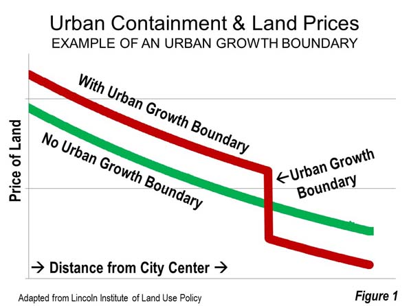
    Excessive land use regulation is a major cause of seriously unaffordable housing. Usually, these regulations include urban containment policy, which restricts or even prohibits building middle income detached housing on the urban fringe. As sure as OPEC cutbacks drive up the price of gasoline, urban planning land cutbacks drive up house prices. There is plenty of evidence that the law of supply and demand operates in urban land markets — that restricting the availability of land for development pushes land (Figure 1) and house prices up (See: A Question of Values: Middle-Income Housing Affordability).

    By definition, housing affordability must be measured in relation to incomes. It should also be compared to trends over time both within the metropolitan area (housing market) and between metropolitan areas (See Canada’s Middle-Income Housing Affordability Crisis).

    The most acute problem is in California, where house prices are up to four times those in liberally regulated US metropolitan areas. Before excessive land use regulations were imposed, housing affordability in California, prices relative to incomes, were similar to the rest of the nation, rarely exceeding 3.0 (measured by the “median multiple,” the median house price divided by the median household income).

    There is little comprehension of the seriousness of the housing affordability problem. With serious concerns being raised about income inequality, housing affordability represents one of the most important threats both to the well-being of middle-income households and poverty reduction. More than anywhere in the country, the price of middle income housing is beyond the reach of most middle income California households, including  those who would easily qualify in liberally regulated markets.

    At the same time, middle-income households in other excessively regulated markets, like Seattle, Portland, Denver, Miami, Boston and New York have seen their house prices double (or more) as regulations have been stiffened.  Finally, all of this increases the demand for subsidized housing. While there is plenty of rhetoric about affordable housing for lower income households, there is not and there is not likely to ever be enough money.

    The key issue is the cost of residential land under the house. Average residential land values are at least 75 percent of the house and land value in San Jose and San Francisco (Note 1), 70 percent in Los Angeles and 65 percent in San Diego. Our analysis of Lincoln Institute of Land Policy data indicates that the average house structure in the four California metropolitan areas had an average value is only 25 percent higher than that of the other major metropolitan areas. By contrast, the land value was more than 650 percent higher. It would be too expensive for middle income households to buy vacant residential lots, even if they intended living in tents.

    With such expensive land, there is virtually no hope to restore housing affordability without tackling the issue of land head on. In the meantime, house prices weigh heavily on all households, and many are leaving California, particularly in their mid-thirties and above.

    Lower Income Minorities: African Americans and Hispanics

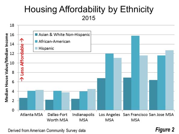
    The situation for housing is far worse for ethnic groups with lower incomes. The maximum housing affordability disadvantage faced by African Americans and Hispanics is illustrated in the following examples. In the San Francisco MSA, the median value house would cost the equivalent of 9 more years of median African-American income than for Asian or White-Non-Hispanics. This has escalated from 1.3 years before regulations were strengthened. An Hispanic household would need six more years of median income to pay for the median valued house in the San Jose MSA. There also large spreads, both for African-American and Hispanic households in other highly regulated metropolitan areas, such as Los Angeles, San Diego, Portland, Boston and New York (See Figure 2 and Table: Housing Affordability: Overall and by Ethnicity).

    Planning’s “Killer App”

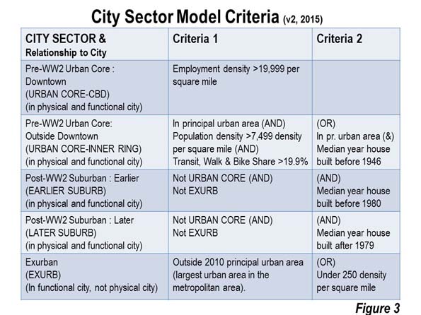
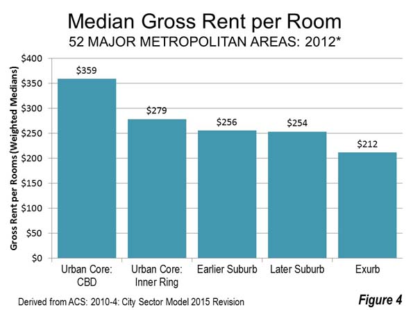
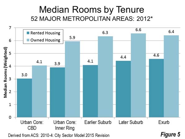
    It is popular to contend that housing affordability can be restored through   building higher densities. There are no examples of restoring metropolitan area housing affordability through intensification. A principal problem is higher prices. A City Sector Model (Figure 3) analysis indicates that the urban core rents per room are well above that of the suburbs (Figure 4). The differences are even greater in cities with the more aggressive intensification programs, such as Portland, Seattle and Los Angeles (Note 3).  Housing units are also smaller (Figure 5). “Granny flats,” basements and apartments are too small for many middle-income households. Forced intensification impairs the quality of life for many people, particularly families (Note 4)

    These policies also have the effect of widening economic divisions. Matthew Rognlie of the Massachusetts Institute of Technology examined French economist Thomas Piketty’s research on rising inequality and concluded that much of the observed inequality stems from housing. He went on to suggest re-examining the land use regulations that create scarcity, toward the end of increasing housing supply. My colleague Hugh Pavletich, co-author of Demographia International Housing Affordability Survey argues that without the “safety valve” of greenfield development, because housing cannot be kept affordable since urban containment destroys the competitive market for land.

    New Zealand consultant Phil Hayward observes: “There might be other policy mixes by which housing supply within a growth boundary could be made the means of keeping housing affordable, but publicly and politically, the debate is nowhere near tackling the complexities involved” (See The Myth of Affordable Intensification).

    Further, large lot or rural zoning is frequently cited as an impediment to housing affordability. This is consistent with economic theory, but its influence is miniscule compared to urban containment (Note 5). The metropolitan areas with substantial large lot zoning had an average price-to-income ratio of 3.0 in 2014, at the upper bound of affordability. This is in contrast with the seriously unaffordable price-to-income ratios (from 5.1 to 9.7) that have urban containment policy . The highest price-to-income ratios are in California’s large metropolitan areas, where there are smaller lot sizes.

    Based on the unparalleled damage they do to housing affordability, urban containment boundaries may be planning’s “killer app.” A principal objective of urban containment policy is to curb the outward expansion of cities (“urban sprawl”). But the “medicine” is far worse than the “cure” — lower standards of living and greater poverty, inflicting particular harm to lower income minorities.

    Necessary Reforms

    Unfortunately, housing affordability has not become an issue in this election year. Yet, policy reforms are appropriate:

    1. Urban containment policy should not be implemented where it has not been adopted.
    2. In urban containment metropolitan areas, improved housing affordability targets should be adopted (price to income ratios), with “event triggered” liberalization of urban fringe land use if the targets are not met. Similar reforms have been proposed in New Zealand and by Paul C. Cheshire, Max Nathan and Henry G. Overman of the London School of Economics.
    Housing Affordability: Overall and By Ethnicity
    Major Metropolitan Areas
    Median Multiple (Years of Median Income Needed to Buy the Median Priced House)
    Additional Years Requried
    All Asians and White Non-Hispanics African Americans Hispanic African Americans Hispanic
    United States 3.5 3.1 5.3 4.3 2.2 1.2
    Atlanta, GA 3.1 2.6 4.1 4.3 1.5 1.8
    Austin, TX 3.6 3.0 4.9 5.0 1.9 2.0
    Baltimore, MD 4.0 3.4 5.7 4.3 2.3 1.0
    Birmingham, AL 3.0 2.6 4.6 3.8 2.0 1.2
    Boston, MA-NH 5.0 4.5 9.3 9.2 4.8 4.7
    Buffalo, NY 2.6 2.3 5.1 5.3 2.8 3.0
    Charlotte, NC-SC 3.2 2.7 4.8 4.3 2.1 1.5
    Chicago, IL-IN-WI 3.6 2.9 6.4 4.5 3.5 1.6
    Cincinnati, OH-KY-IN 2.8 2.6 5.3 3.7 2.8 1.2
    Cleveland, OH 2.8 2.4 4.9 3.9 2.5 1.5
    Columbus, OH 2.9 2.6 4.6 3.7 2.0 1.1
    Dallas-Fort Worth, TX 2.8 2.2 4.1 3.8 1.8 1.5
    Denver, CO 4.5 4.0 7.4 6.3 3.3 2.3
    Detroit,  MI 2.8 2.4 4.7 3.6 2.3 1.2
    Grand Rapids, MI 2.7 2.6 5.2 3.7 2.7 1.1
    Hartford, CT 3.4 3.0 5.4 6.5 2.4 3.6
    Houston, TX 2.7 2.0 4.0 3.6 2.0 1.6
    Indianapolis. IN 2.7 2.4 4.5 4.0 2.1 1.6
    Jacksonville, FL 3.2 2.9 4.8 3.7 2.0 0.9
    Kansas City, MO-KS 2.7 2.5 4.5 3.7 2.0 1.2
    Las Vegas, NV 4.2 3.7 6.0 4.9 2.3 1.2
    Los Angeles, CA 8.6 6.8 12.0 11.1 5.2 4.2
    Louisville, KY-IN 2.9 2.7 4.9 3.4 2.3 0.7
    Memphis, TN-MS-AR 2.9 2.1 4.1 3.5 2.0 1.4
    Miami, FL 4.8 3.8 6.2 5.5 2.4 1.8
    Milwaukee,WI 3.5 3.0 6.9 5.0 3.9 2.0
    Minneapolis-St. Paul, MN-WI 3.3 3.0 7.3 5.1 4.3 2.1
    Nashville, TN 3.3 3.0 5.2 4.2 2.2 1.2
    New Orleans. LA 3.9 3.1 6.0 4.5 3.0 1.5
    New York, NY-NJ-PA 6.0 4.8 8.8 9.2 4.0 4.4
    Oklahoma City, OK 2.8 2.5 4.5 3.4 2.0 0.9
    Orlando, FL 3.4 2.9 4.4 4.3 1.5 1.4
    Philadelphia, PA-NJ-DE-MD 3.7 3.1 6.2 5.8 3.1 2.8
    Phoenix, AZ 3.9 3.5 5.4 5.2 1.9 1.7
    Pittsburgh, PA 2.6 2.5 5.4 3.4 2.9 0.9
    Portland, OR-WA 4.7 4.5 8.7 6.0 4.2 1.5
    Providence, RI-MA 4.3 4.0 6.7 7.6 2.7 3.7
    Raleigh, NC 3.4 2.9 5.1 5.7 2.1 2.7
    Richmond, VA 3.6 3.0 5.4 4.1 2.4 1.1
    Riverside-San Bernardino, CA 5.3 4.7 6.6 6.0 1.8 1.3
    Rochester, NY 2.6 2.3 4.6 4.5 2.3 2.2
    Sacramento, CA 5.4 4.9 8.4 6.8 3.6 1.9
    St. Louis,, MO-IL 2.9 2.6 4.9 3.5 2.3 0.9
    Salt Lake City, UT 3.8 3.6 6.2 5.3 2.6 1.7
    San Antonio, TX 2.7 2.2 3.1 3.3 0.9 1.1
    San Diego, CA 7.2 6.2 9.3 9.5 3.1 3.3
    San Francisco, CA 8.1 6.9 15.8 11.6 8.8 4.7
    San Jose, CA 8.1 6.9 11.6 12.7 4.7 5.8
    Seattle, WA 4.8 4.4 7.8 7.0 3.4 2.6
    Tampa-St. Petersburg, FL 3.4 3.2 4.7 4.0 1.5 0.8
    Tucson, AZ 3.5 3.1 5.0 4.2 1.8 1.1
    Virginia Beach-Norfolk, VA-NC 3.9 3.4 5.7 4.7 2.3 1.3
    Washington, DC-VA-MD-WV 4.3 3.6 5.9 5.8 2.3 2.2
    Data from American Community Survey: 2015
    AFFORDABILITY RATINGS    
    Affordable 3.0 or below
    Moderately Unaffordable 3.1 to 4.0
    Seriously Unaffordable 4.1 to 5.0
    Severely Unaffordable   5.1 and over


    Note 1: Commentators sometimes suggest the high housing prices in the San Francisco Bay Area are the result of land shortages created by topographic constraints, such as bodies of water and mountains. In fact, there is plenty of developable land in the Bay Area, which includes both the San Francisco and San Jose MSAs (See: The Incompatibility of Forced Densification and Housing Affordability).

    Note 2: This is without considering subsidies and tax breaks that can reduce some rents below market levels.

    Note 3: African American 1969 median household is estimated based on the variation in African American median family income from the overall median in that year. Median household income data was not published for ethnicities in the 1970 census. 

    Note 4: The planning establishment sometimes glosses over the reduced quality of life entailed in its efforts to discourage detached housing and force people into higher density housing. This is not their job. The quality of life can only be judged by households themselves.

    Note 5: Boston is an exception, which is the only seriously unaffordable major metropolitan area without urban containment policy. Boston has large lot zoning so expansive that it has created a severe shortage of land for development, with urban containment-like effects on house prices. Boston’s urbanization covers nearly as much land area as the Tokyo urban area, despite having only one-seventh the population. (See: The Evolving Urban Form: Sprawling Boston).

    Photo: Market Street, San Francisco, looking toward the Ferry Building (by author)

    Wendell Cox is principal of Demographia, an international pubilc policy and demographics firm. He is a Senior Fellow of the Center for Opportunity Urbanism (US), Senior Fellow for Housing Affordability and Municipal Policy for the Frontier Centre for Public Policy (Canada), and a member of the Board of Advisors of the Center for Demographics and Policy at Chapman University (California). He is co-author of the “Demographia International Housing Affordability Survey” and author of “Demographia World Urban Areas” and “War on the Dream: How Anti-Sprawl Policy Threatens the Quality of Life.” He was appointed to three terms on the Los Angeles County Transportation Commission, where he served with the leading city and county leadership as the only non-elected member. He served as a visiting professor at the Conservatoire National des Arts et Metiers, a national university in Paris.

  • Solidarity, not Division: Understanding London’s East End

    The East End of London has a long history of working-class community. It has been a place of industry, where the river Thames and the river Lea have provided work for many people. The area attracted many immigrants, including workers from Africa since Tudor times, sailors from China, former slaves from America, French Protestants facing religious persecution in the 1600s and Irish weavers working in the textile industries. There have been Jewish communities in the East End for centuries, too. The twentieth century saw an increase in immigrants from the former British colonies, including South Asia, particularly Bangladesh. Not only has it been a place to seek a livelihood, but it has also been a place of refuge.

    One side of my family hails from the East End and North East London, so I have a strong personal connection to this part of London. My ancestors worked in the local industries and on the river. We might not technically be ‘Cockneys’ (in that we weren’t all born within earshot of Bow Bells), but we are Cockney by nature. Family gatherings would include a raucous ‘knees-up’ (dancing and singing) and traditional local fare of jellied eels. We’re a working-class family who have lived in East London for generations.

    So I was interested when I came across a recent short BBC documentary called Last Whites of the East End. I was disturbed by the title, which suggested that white people in the area are somehow endangered – an odd idea and potentially a racist one. This racism was confirmed when I watched the show. The documentary focused on residents of Newham, one of the poorest working-class boroughs in England. The filmmakers interviewed a number of working-class residents about their experiences of living in the East End and the decisions of some of them to leave the area. The majority of the subjects were white, though they also included one man of Bangladeshi background and one man of white and Afro-Caribbean heritage.

    The narration of the documentary presented a racist agenda, describing the neighbourhood as at ‘tipping point’ with the ‘lowest white population in the UK’. It also noted a ‘dwindling cockney community’ who were in danger of disappearing in the face of increased immigration. Some of those interviewed were moving outside of London, to places like Essex, so they could live in areas with larger white populations. Some described themselves as ‘traditional East Enders’ and lamented the loss of the old community. They spoke of local services being shut down and the closure of the local pub. The film presented the interviewees as embodying white racism and a fear of the other, highlighting their reluctance to build bridges due to perceived differences. As one young white woman explained, they wanted to ‘stay with their own’.

    But there were many contradictions in the documentary, too. It included an elderly white woman, who was preparing to leave her home and move out of London, not due to her fear of her Muslim neighbours (as implied by the narration, despite the fact that she was obviously upset to say goodbye to her Somali neighbour), but because she was elderly and alone and wanted to move closer to her daughter. Like many of her neighbours, she had once been a new arrival to the neighbourhood, moving there from the north of England. The two people of colour in the film both spoke of their connections to the local area and their identification as East Enders. Like their white neighbours, they pointed to the changing environment, but I’d suggest that the changes they were criticising were not tied to the latest influx of new immigrants.

    Instead, they are matters of class. Gentrification and austerity are disrupting the lives of the working-class residents of the East End, not immigration. Housing has become too expensive, and government funding cuts are squeezing local schools and health services. Interviewees complained about the closure of a club which wasn’t just a local pub but also a community centre that elderly residents relied on for social events and to reduce isolation. Some white people are leaving, but, as I’ve seen with some friends and family members, that’s for financial reasons. They can purchase bigger properties if they sell their London homes, or they can pay less rent by moving to areas outside of London with smaller populations and less pressure on local services. And of course, not all of those leaving London are white.

    The documentary downplays this part of the story. It also downplays the working-class solidarity that connects residents despite their differences. Residents of the East End share the experience of hardship and struggle, and this shared struggle has a very long history. The East End has a tradition of political radicalism and collective action. East Enders have looked after each other during tough times and shown a united front against hostile external forces. Famously, in 1936, the local community stood up against a group of anti-Semitic fascists who wanted to march through a Jewish area. The confrontation, known as the Battle of Cable Street, was won because the community put their bodies on the line to keep the fascists out. The same community rallied during the Second World War and looked after each other during the bombing raids of the Blitz. More recently, local people have been supporting each other and engaging in collective action in the face of forced evictions as local public housing is sold and redeveloped for private profit.

    If the ‘traditional East End’ is disappearing, that isn’t because some working-class white are moving out of London. Working-class communities are not made up of just white people, and I’ve certainly never known a London that was mono-cultural. Yes, there are racist white working-class people. But the East End of London is a diverse and dynamic place, and always has been. It has also been a place of solidarity and struggle. The filmmakers chose to emphasize division instead of showing how East Enders act collectively, and it cast immigrants as a threat, when the real threats facing this community are austerity and gentrification.

    This piece first appeared at Working-Class Perspectives.

    Photo Credit: Daryl Hutchison, @daryldactyl