Category: Demographics

  • A Window Into the World of Working Class Collapse

    Some time back my brother recommended I watch the documentary film Medora, about a high school basketball team from rural Southern Indiana. I finally got around to doing it.

    Someone described this film as an “inverse Hoosiers“, which is an apt description. Hoosiers is a fictional retelling of the Milan Miracle, the legendary story of how tiny Milan High School (enrollment 161) won the state’s then single-class basketball championship in 1954.

    There’s no such happy ending in prospect in Medora (available on Netflix). The town’s basketball team had gone 0-22 the season before the film. The question is not whether they will win a championship or even the sectional, but if they can win just a single game.

    The basketball team is a proxy for the community as a whole, a once proud town fallen on hard times.  The town of Medora (pop ~700) and its surrounds, locals believe, used to be prosperous, socially cohesive, and have a great basketball team too.

    This history is part mythological. I don’t doubt that these towns once had all the doctors and lawyers and such that people say they did. I’ve heard the same stories about where I grew up (two counties south). But that was a different era and I doubt there was ever real prosperity. Rural and small town life has always been tough in America.

    But the social history certainly has much truth.  Even in my own childhood I remember that people not only didn’t lock their houses, they left their keys in their cars.  City water service, cable TV, garbage pickup, and even private telephone lines may not have been available, but it had its upsides too.

    Today those Mayberry like characteristics are long gone.

    In Medora we see not only poverty, but nearly complete social breakdown. I don’t recall a single player on the team raised in an intact family. Many of them lived in trailer parks. One kid had never even met his father. Others had mothers who themselves were alcoholics or barely functional individuals. They sometimes bounced around from home to home (grandmother, etc.) or dropped out of school to take care of a problematic mother.

    These kids are also remarkably unsophisticated about the world. Once we see someone drive to Louisville – to pick his mother up from a rehab center – and another time one kid visits a seminary, but otherwise there’s no indication that these kids have spent much time or in some cases ever left Medora. One flirts with enlisting in the military. Another with what appears to be a for-profit technical college. But all of these are clearly unable to apply an independent knowledge or critical thought to what the sales reps for these entities are telling them.

    Much of what structure exists in the town and the kids lives appears to be imported. Both the coach and one assistant coach appear to be from Bedford – 30 miles away. Neither really seems equipped to deal with these troubled kids.

    Nothing indicates that these kids have much prospect of success in life.

    Yet we see that there’s also little motivation on the part of the people in the town to actually change that.  They are steeped in nostalgia and cling to a idealized vision of a past community that they surely know can never be reclaimed, yet insist on grasping until it is physically pried from their grip.

    Medora is one of the last unconsolidated small town high schools left in Indiana. (I attended a small school, but one that was already consolidated, with the uninspiring name of South Central High School).  It’s clearly not really viable as an independent school – it’s facing a major budget shortfall during the film – yet they steadfastly refuse to consider consolidation.

    The town residents believe that the loss of the school would be the death knell of their community. They aren’t wrong about that. Merging the school would destroy the locus of identity. But the cold reality is that the modern world doesn’t need towns like Medora anymore. Always changing is the future as they say, but it’s hard to imagine anything that would sustainably restore the town.  America is full of towns like Medoras. Some of them may experience a miracle. Most won’t, and will slowly bleed away to a dysfunctional rump community. (Interesting, Medora’s population grew by 23% during the 2000s, something worthy of further investigation).

    The residents of Medora refuse to surrender their town and resolutely refuse to leave. In that they are not unlike the handful of people hanging on in depopulated Detroit neighborhoods who will accept planned shrinkage only over their dead bodies. It’s irrational to those of us who have no such attachment to a place, but it is clearly a sentiment that animates many such people all over the world.

    The National Review’s Kevin Williamson blames the residents of these towns for their own demise. This is manifestly false. The people in these communities did not change the structure of the economy to render their homes obsolete. They did not invent the technology that destroyed the need for agricultural labor. They did not create the divorce revolution. They did not invent Oxycontin.  These towns have always been belated, sometimes unwilling consumers of what is created elsewhere.

    Yet the fact that outside forces acted on them does not absolve them from taking action now. Williamson is right about that. Much of the rural Midwest was settled by homesteaders who ventured off into the risky unknown, or German immigrants like the Renn family. These places were created by people who embodied different values than those who live there now, people who had no choice but to do something desperate in response to desperate conditions.

    I chose to leave my hometown. Many other chose to stay. I know that many people there think it is God’s country and can’t imagine anyone ever leaving. I don’t want to claim that their attachment to place is less valid than my lack of it. Even in the city, to the extent that no one is attached to the place, to their neighborhood, for anything other than immediate self-interest, that’s not a good sign for the long term. I see today the consequences of viewing places purely as a mechanism for extracting personal or corporate profit in the now.

    Yet the reality is that to the extent that people do choose to stay in the Medoras of this world, their future prospects aren’t good. Nor are those of their children. But if they leave their towns will die, along with a way of life. This isn’t a pleasant choice. They didn’t ask to be faced with it. But it’s the choice they face nevertheless.

    Aaron M. Renn is a senior fellow at the Manhattan Institute, a contributing editor of City Journal, and an economic development columnist for Governing magazine. He focuses on ways to help America’s cities thrive in an ever more complex, competitive, globalized, and diverse twenty-first century. During Renn’s 15-year career in management and technology consulting, he was a partner at Accenture and held several technology strategy roles and directed multimillion-dollar global technology implementations. He has contributed to The Guardian, Forbes.com, and numerous other publications. Renn holds a B.S. from Indiana University, where he coauthored an early social-networking platform in 1991. His personal urban affairs website is Urbanophile, where this piece originally appeared.
  • The Future of Latino Politics

    The sad decline in race relations has focused, almost exclusively, on the age-old, and sadly growing, chasm between black and white. Yet this divide may prove far less important, particularly in this election, than the direction of the Latino community.

    This may be the first election where Latinos, now the nation’s largest minority group, may directly alter the result, courtesy of the race baiting by GOP nominee Donald Trump. If the GOP chooses to follow his nativist pattern, it may be time to write off the Republican Party nationally, much as has already occurred in California.

    Today, Latinos represent 17 percent of the nation’s population; by 2050, they will account for roughly one in four Americans. Their voting power, as the GOP is likely to learn, to its regret this year, is also growing steadily, to 12 percent of eligible voters this year, and an estimated 18 percent by 2028.

    Political geography may prove as critical here as rising numbers. African Americans, for historic reason, are heavily concentrated in deep blue cities, simply padding already existing Democratic supermajorities, or in the deep red South, where they are overwhelmed by a conservative white majority. In contrast, Latinos represent a growing constituency in critical swing states such as Florida, where they constitute one-fifth of the electorate, as well Virginia, Nevada, Colorado and, thanks to the genius of Donald Trump, perhaps even Arizona.

    Read the entire piece at The Orange County Register.

    Joel Kotkin is executive editor of NewGeography.com. He is the Roger Hobbs Distinguished Fellow in Urban Studies at Chapman University and executive director of the Houston-based Center for Opportunity Urbanism. His newest book, The Human City: Urbanism for the rest of us, will be published in April by Agate. He is also author of The New Class ConflictThe City: A Global History, and The Next Hundred Million: America in 2050. He lives in Orange County, CA.

    Photo by chadlewis76

  • So You Want a Revolution

    You say you want a revolution
    Well you know
    We’d all want to change the world.____ The Beatles (1968)

    Apparently not. Not any more. Not everyone wants to change the world. To the Beatles in 1968, when young people aged less than 30 added up to 52% of the US population, it might have looked like everyone wanted a revolution and that a nascent movement had a deep reserve of younger cohorts ready to push for change. But the percentage of the population aged less than 30 today is only 39% and falling. If 39% vs. 52% does not look like a big difference, consider that 13% of the US population is equivalent to 42 million additional young people who would be among us, if the percentage was the same as in 1968. A quarter to a third (10 to 14 million) would be in their 20s.

    At the same time, because older more conservative generations would weigh less in the total population mix, their moderating influence would be less effective at deterring the young. This shift in the age distribution of the population explains why the youth revolt gained traction in 1968 but more recent attempts such as Occupy Wall Street turned to farce and fizzled out.

    Meanwhile the over-45 age bracket now accounts for 41% of the US population (vs. 31% in 1968), its highest level ever and a level that explains the elevation of the two oldest presidential nominees in US history, Hillary Clinton and Donald Trump. It also helps explain why the nostalgia-powered Trump is still a contender while the youth-oriented Bernie Sanders has withdrawn. At this stage of the process in 1970, Sanders would have been the nominee while Clinton and Trump would have already left the scene.

    Speaking of revolutions, a recent op-ed in the Wall Street Journal draws an analogy between Iran in 1979 and Turkey today in the immediate aftermath of the aborted Turkish coup d’etat. Writes the author:

    Revolutions don’t require majorities, but rather angry and excited minorities that are willing to act violently to take power.

    Undoubtedly true, but they also require a critical mass of young people combined with fairly dismal economic conditions which Turkey does not have now to the same extent as Iran in 1979. In 1979 in Iran, the under 30 accounted for a huge 71% of the population and Iranian GDP per capita on a PPP basis was about $2,000 (in 2013 dollars). By contrast, in Turkey today, the under 30 are only 50% and GDP per capita is in excess of $10,000. That is enough young people to shake things up as the young did in the West in 1968 but probably not enough to impose a lasting change as the young did in Iran in 1979.

    A general hypothesis therefore is that the danger of civil unrest grows when per capita GDP is low and the population is young. Looking at successful uprisings in Algeria (1962), China (1949), Cuba (1952) and Iran (1979), we note that the under 30 numbered more than 60% in every case. Meanwhile revolts failed in Hungary (1956) and Czechoslovakia (1968) where the under 30 were less than 50% of total population. Of course, this is not a comprehensive list and there may be examples that refute the hypothesis. In addition, foreign interference as in Hungary and Czechoslovakia renders the age distribution less relevant to the outcome of a revolt. But it is a fair bet that a larger young population in a lower-income country heightens the risk of unrest.

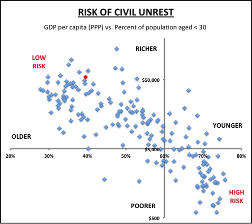
    The graph below shows for each country the per capita GDP in 2014 dollars and the percentage of people aged less than 30. The US is shown in red. The cutoff levels are set at $5000 for GDP per capita and at 60% for population aged under 30. Countries in the upper left quadrant are wealthier and have fewer young people and are as a result at lower risk of civil unrest. Countries in the lower right are younger and poorer and have in theory a higher risk of civil unrest. Iran in 1979 was clearly in the lower right high-risk quadrant. Turkey today is in the upper left lower-risk quadrant.

    GDPvsCivilUnrest


    Readers of this site may be familiar with this graph from a previous post discussing the relationship of fertility and national income. It is worth revisiting the earlier post to understand why some countries are outliers on the graph.

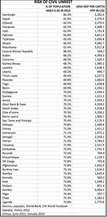
    So what are the countries that fall in the lower right quadrant? These countries have an under 30 population of 60% or more of total, and a GDP per capita of $5,000 or less. Here is the list.

    Screen Shot 2016-07-18 at 2.08.05 PM (2)


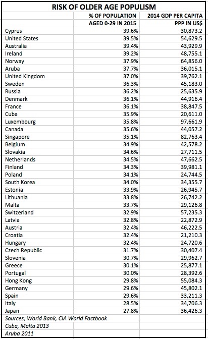
    At the other extreme, if we look at Brexit and the nomination of Donald Trump as examples of a new form of revolt that we may call ‘older age populism’, here are the countries that are exposed to it, using as cutoffs $20,000 for GDP per capita and 40% for population aged less than 30. Not surprisingly, most of these countries are part of the West and most enjoyed a significant demographic dividend in the three decades 1975-2005.

    Screen Shot 2016-07-18 at 2.26.03 PM (2)


    Of course, most revolutions end badly, and many end very badly. On the revolution train, idealists sit in the front and present in the early days the benign and seductive case for change. Radicals bide their time while sitting in the back and later take over with their nefarious plans. The Beatles knew it:

    But when you talk about destruction
    Don’t you know that you can count me out

    Full lyrics here.

    Read more about why Occupy Wall Street failed.

    Sami Karam is the founder and editor of populyst.net and the creator of the populyst index™. populyst is about innovation, demography and society. Before populyst, he was the founder and manager of the Seven Global funds and a fund manager at leading asset managers in Boston and New York. In addition to a finance MBA from the Wharton School, he holds a Master’s in Civil Engineering from Cornell and a Bachelor of Architecture from UT Austin.

  • How Demographics Explain the World

    Demographics may not be destiny, but they do play a huge role in driving the fortunes of society and the economy. Sami Karam of Populyst joined me for a podcast on demographic trends around the world. The conversation ranged from the rise of China to the fall of Japan – and even why Occupy Wall Street failed to achieve lift-off.

    Topics include:

    • 0:00 Introduction and overview of Sami Karam’s work
    • 2:20 Why Occupy Wall Street didn’t take off
    • 3:15 Demographics on the problems of the Japanese economy
    • 3:50 What does demographics tell us about the rise of China?
    • 7:49 What is the demographic future of Africa?
    • 12:45 How will declining European and booming African population interact?
    • 17:30 An overview of the Populyst Index
    • 21:32 Is the demographic dividend a Faustian bargain?

    If the embed doesn’t display for you, click over to listen on Soundcloud.

    Subscribe to podcast via iTunes | Soundcloud.

  • The Shorter Commutes in American Suburbs and Exurbs

    An examination of American Community Survey (ACS) data in the major metropolitan areas of the United States shows that suburbs and exurbs have the shortest one-way work trip travel times for the largest number of people. The analysis covers metropolitan areas with more than 1,000,000 population in 2012, from the 2010-2014 ACS (2012 average data) using the City Sector Model.

    The City Sector Model

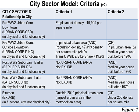
    The City Sector Model classifies small areas (zip codes) of major metropolitan areas by their urban function (lifestyle). The City Sector Model includes five sectors (Figure 1). The first two are labeled as “urban core,” (Urban Core: CBD and Urban Core: Ring) replicating the urban densities and travel patterns of pre-World War II US cities, although these likely fall short of densities and travel behavior changes sought by contemporary urban planning (such as Plan Bay Area). There are two suburban sectors, the Earlier Suburbs and Later Suburbs. The fifth sector is the Exurbs, which is outside the built-up urban area. The principle purpose of the City Sector Model is to categorize metropolitan neighborhoods based on their intensity of urbanization, regardless of whether they are located within or outside the boundaries of the historical core municipality (Note 1).

    One Way Commute Times by Urban Sector

    The commuting data excludes employees who work at home, whose commute times would be zero.

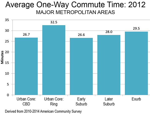
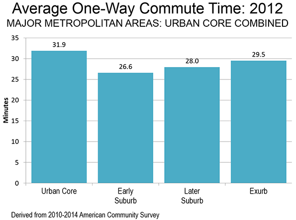
    The shortest one-way commute times are experienced by residents of the Earlier Suburbs, with a 26.6 minute travel time. This is nearly equalled for residents of the central business districts (Urban Core: CBD), with an average commute of 26.7 minutes. Commuters living in the Later Suburbs had a somewhat longer commute, at 28.0 minutes, while commuters living in the Exurbs had an average one-way commute of 29.5 minutes. The longest commute times were experienced by residents of the Urban Core: Ring (32.5 minutes), which is the part of the urban core that excludes the central business district, (Figure 2) and is characterized by high densities and lower levels of automobile use than in the suburbs and exurbs.

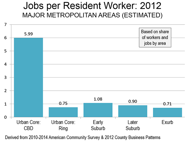
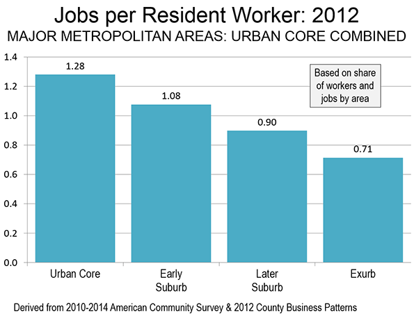
    The functional city sectors with the shortest commutes had more jobs than resident workers. The Earlier Suburbs possess 1.08 jobs for every resident worker (Note 2). The ratio was much higher in the Urban Core: CBD, where there were nearly 5.99 jobs for every resident worker. Such an imbalance could not be replicated throughout a metropolitan area, because by definition, a labor market has a ratio of jobs to resident workers of approximately 1.00. To replicate the national CBD ratio throughout the metropolitan area would require, for example, that the New York metropolitan area have  54 million jobs for its 9 million workers.   

    Not surprisingly, with such a surplus jobs relative to workers, the Urban Core: CBD, the chances of finding suitable employment nearby is far greater. However, this advantage can, by definition, be available only to a very few, as is indicated by the fact that the Urban Core: CBD’s are home to only 1.5 percent of the resident workers in the major metropolitan areas. In the broader context of the urban core (including both the CBD and the Ring), this advantage is offset and average travel times are greater (below).

    In the Later Suburbs, there were 0.90 jobs per resident worker, which matches that sector’s ranking in work trip travel time (third). The  ring around the urban core (Urban Core: Ring) , had the longest average work trip travel time. The Exurbs had the lowest ratio of jobs to resident workers, at 0.71, yet had an average travel time that was shorter than that of the Urban Core: Ring (Figure 3).

    Pre-World War II and Post-War Urban Form

    The two combined urban core sectors are defined in the City Sector Model to replicate what remains of the pre-World War II city that was characterized by far higher densities and less reliance on automobile transportation, as opposed to the suburban and exurban sectors that have dominated urban growth for seven decades. If the two urban core sectors are combined (Urban Core: CBD and Urban Core: Ring), the number of jobs per resident worker is 1.28. This healthy ratio, however, is not sufficient to preserve any travel time advantage for residents of the combined urban core. In the combined urban core sectors, the average one-way travel time of 31.9 minutes, well above each of the other three functional sectors (Figures 4 and 5). The Urban Core: Ring has nearly nine times as many resident workers as the Urban Core: CBD.

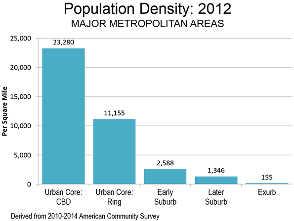
    The Pre-War urban form has considerably higher population densities than those of the post-war urban form. For example, the Urban Core: CBD has a population density exceeding 23,000 per square mile (9,000 per square kilometer), more than 80 percent of the New York City population density level. The Urban Core: Ring has a population density exceeding 11,000 per square mile. The combined area population density of the two Urban Core sectors is 11,500 per square mile, or 4,400 per square kilometer (Figure 6).

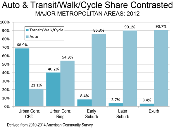
    The two Urban Core sectors largely rely on commuting modes currently favored by urban planning policy, transit, cycling and walking. In contrast, the suburban and exurban sectors rely on commuting modes discouraged by urban planning policy, automobiles and car and van pools (Figure 7).

    The combined urban core sectors have more than four times the density of the Earlier Suburbs and nearly nine times the density of the Later Suburbs. With these much higher densities and their reliance on the favored transport strategies, it might be expected that they would enjoy the best commute times. However, as noted above, when the two urban core sectors are combined, their average travel time is longer than the suburban and exurban sectors. This is despite the far lower densities of the two suburban sectors and the often world densities of the exurban sector.

    The Key: Lower Densities & Job Dispersion

    These results are likely to be surprising to many in the press as well as planners who often equate residential distance from central business districts as resulting in longer commutes. The reality, however, is that central business districts account for only 8 percent of employment in major US metropolitan areas, and reach the highest at 22 percent in New York, 50 percent above second place San Francisco (14.4 percent) and nearly 10 times that of Los Angeles (2.4 percent).

    Generally speaking, employment is dispersed throughout the metropolitan area. When combined with the generally lower density urbanization within metropolitan areas, the result is shorter commutes for residents  in the suburbs and exurbs. As it turns out the data shows that higher employment densities in the urban core are associated with longer, not shorter commutes, as is commonly assumed.

    Note 1: In some cases the functional urban core extends beyond the boundaries of the historical core municipality (such as in New York and Boston). In other cases, there is virtually no functional urban core (such as in San Jose or Phoenix). Functional urban cores accounted for 14.7 percent of the major metropolitan area population in 2012. By comparison, the jurisdictional urban cores (historical core municipalities) had 26.6 percent of the major metropolitan population, many of which have large tracts of functional suburban development.

    Note 2: Estimated by dividing the percentage of jobs in each sector by the percentage of resident workers. Working at home is excluded.

    Wendell Cox is principal of Demographia, an international pubilc policy and demographics firm. He is a Senior Fellow of the Center for Opportunity Urbanism (US), Senior Fellow for Housing Affordability and Municipal Policy for the Frontier Centre for Public Policy (Canada), and a member of the Board of Advisors of the Center for Demographics and Policy at Chapman University (California). He is co-author of the "Demographia International Housing Affordability Survey" and author of "Demographia World Urban Areas" and "War on the Dream: How Anti-Sprawl Policy Threatens the Quality of Life." He was appointed to three terms on the Los Angeles County Transportation Commission, where he served with the leading city and county leadership as the only non-elected member. He served as a visiting professor at the Conservatoire National des Arts et Metiers, a national university in Paris.

  • Population Change, 2015: Not Very Good News for Those Angry White Men

    Data on population growth from 2010 to 2015 show a continuing concentration of people in metropolitan areas, especially in the large areas with over a million people, where presumably traditional values are most challenged.  I show an amazing table, in which I have disaggregated population change by type of settlement, from the million-metro areas to the purely rural counties, comparing growth amounts and rates, plus noting how these areas actually voted in 2012. From the title, the news that growth is greatest in the biggest places seems bad for Republican prospects, but the accompanying maps also show that the greatest growth may well be in more Republican parts of metropolitan America – a story of geography vs. demographics.

    The data from the table are dramatic. Note that 275 million, or 86%, live in census-defined metropolitan areas (with urban agglomerations over 50,000), and 55.5% in just the 58 metro areas of over 1,000,000.  The biggest metro areas (but not the super large New York, Los Angeles, and Chicago) grew by 9.4 million, or 5.5%, the smaller metro areas by 3.4 million, or at 3.3 %, while non-metropolitan America dropped from 46.3 million to 46.1 million, down to 14% of the total population. 

    The final column of the table shows how these areas voted in the 2012 presidential election. Obama won the big metro areas of over one million by taking 57.6 percent of the 2 person vote, which enabled him to get almost 52% of the total US vote while winning the three megacities – New York, Los Angeles and Chicago – by an even wider margin. This meant that despite LOSING all other settlement categories – 48% in smaller metro areas, only 41% in micropolitan areas, and a pathetic 40 percent in rural small town America, the President still won handily.

    Population Change by Settlement Type, 2010 2015
      # Counties 2010 Pop 2015 Pop Change % Chg % of Pop 2015 % Obama, 2012
    Million Metro Center Counties          255   156,143    164,749      8,606 5.5% 51.3%
    Million Metro Outlying Counties          179     13,661      14,416         749 5.5% 4.5%
    Total Million Metros          434   169,804    179,165     9,355 5.5% 55.7% 57.6
    Other Metro Center Counties          473     85,634      89,005      3,371 3.9% 27.7%
    Other Metro Outlying Counties          259       7,025         7,086           61 0.9% 2.2%
    Total Other Metros          732     92,659      96,091     3,432 3.7% 29.9% 48.3
    Micro Center Counties          559     26,422      26,533         111 0.4% 8.3%
    Micro outly            92       1,080         1,070          (10) -0.9% 0.3%
    Total Micropolitan Areas          651     27,502      27,603         101 0.4% 8.6% 41.4
    Rural Sm Town          727     14,058      13,899       (159) -1.1% 4.3%
    Rural Sm Town          598       4,731         4,663          (68) -1.4% 1.5%
    Total Non-metro Counties      1,325     18,789      18,462       (327) -1.7% 5.7% 40
    ALL      3,142   308,774    321,435   12,664 4.1% 100.0% 52


    So the good news for the Democrats is that the greatest population growth occurred in larger cities where Obama did best in and fell in areas he did poorest in.

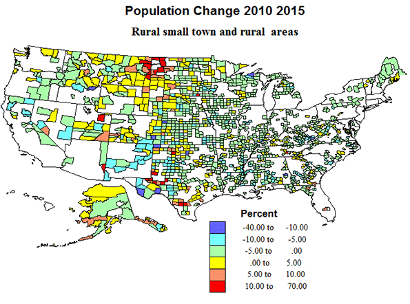
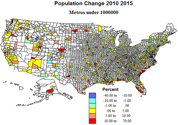
    But the story gets complicated once you get beyond the metro level. I now show maps, first of the pattern of population change by type of settlement, and then show how well Obama did in 2012 by these same settlement types. First we have a general map of population change for all US counties, in which I can display both the absolute change by symbol size and the percent change by color. Most apparent are the dominance of growth in metropolitan areas, especially in suburbs, and notably in the South and West. Note that quite a few of the growing counties appear to be in areas where Obama was not that strong (in maps to follow).

    Population Change by Settlement Type

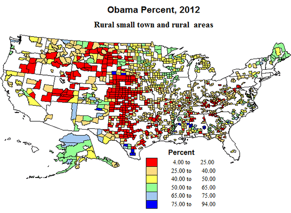
    Rural and rural-small town areas include about 40% of counties and of the territory, but now hold under 6 percent of the population. Modest population loss is most common, especially across the eastern half of the country, while the pattern of change is more complex in the western half, with pockets of gain in areas of energy development, as in ND-MT, and TX-OK, undoubtedly temporary, and scattered areas of growth in environmental amenity areas farther west. The greatest extent of rurality is still from west Texas, north through Oklahoma, Kansas, Nebraska, South and North Dakota  and Montana.

    Politically, Republican Romney swept most rural, small town territory over sizeable contiguous areas in the high plains, as well as the Mormon realm, but Democrats did win in majority Black counties in the south, Latino counties in Texas, and in Native American Indian counties in the far west. In sum, not a story to comfort Republican hopes.

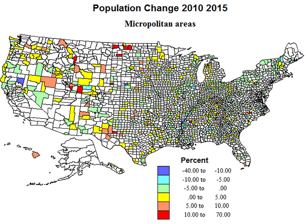
    Micropolitan areas now include about 20 percent of counties and of territory, and house almost nine percent of the population. They experienced only modest population growth from, 2010 to 2015. They are quite widely dispersed across the country, with the exception of most of California.  Just as with rural small-town territory, a pattern of modest loss prevails over the eastern half of the country and a more mixed pattern in the west, echoing the higher growth in areas of energy development, and in parts of the Mountain states and far west, including some environmentally attractive areas.

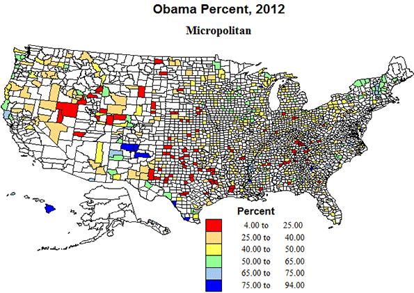
    Politically, the micropolitan areas, with urban agglomerations between 10 and 50 thousand were almost as supportive of Republican Romney as the more rural areas, and in essentially the same geographic areas, in southern Appalachia, the high plains from Texas to North Dakota and in the Mormon realm, and with the same Democratic outliers in majority minority areas. Again, a pattern not too comforting for Republican prospects.

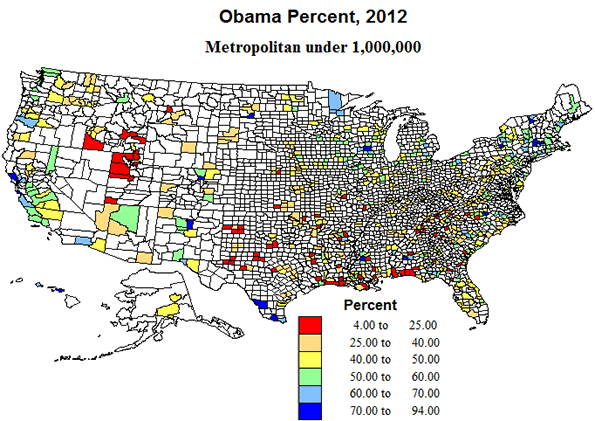
    Metropolitan areas under 1 million  represent what could be called middle, compromise America, with about one-fourth of US counties, and with 30% of the population. Their geographic pattern is one of broad distribution in the interior of the country, but with a marked coastal concentration in the Gulf and South Atlantic.  Similarly, growth was modest or losses occurred in most of the interior eastern US,  but big gains in southeastern coastal areas, and across most of the far west.

    Politically, too, these areas are intermediate, with Obama receiving 48% of the vote in 2012.  The outlying smaller metropolitan counties are indeed often quite rural.  Some of the growing areas were tilted  more  Republican, as on the Gulf coast and especially in the Mormon west, but in the Atlantic coastal states, and Pacific coast states, Obama did much better.  

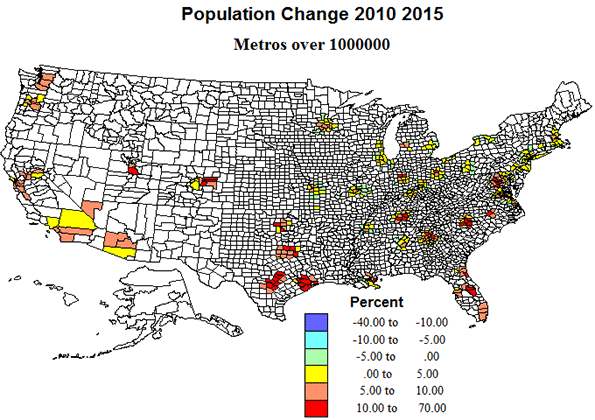
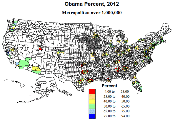
    Metro areas over 1 million.  Okay, these are the behemoths, one-seventh of counties with over half the population, and three-quarters of the growth.  But the fastest growth was across the south and in the west, with moderate growth and even modest losses in the north. The biggest metros – NY, Chicago and LA — grew well below national averages. Also, contrary to the perception of the death of suburbia, the outlying counties of this set experienced very high growth. 

    Politically, these suburban areas around the big metros may prove decisive, with the voting eligibility and inclinations of a diverse population critical to outcomes of the presidency and of Congress. Those suburban counties in the South appear to vote Republican, while those in the north and west became modestly Democratic. Size may benefit Democrats, but growth tilts Republican. Ultimately whichever proves most decisive may determine the election.

    Richard Morrill is Professor Emeritus of Geography and Environmental Studies, University of Washington. His research interests include: political geography (voting behavior, redistricting, local governance), population/demography/settlement/migration, urban geography and planning, urban transportation (i.e., old fashioned generalist).

  • The Meaning of the Baby Bust

    With a stronger economy and a growing number of women of child-bearing age, Americans should be producing offspring at a healthy clip. But the most recent data suggest that this is not happening, as the birthrate in 2015 dropped to a historic low. A new study from the University of New Hampshire suggests that these trends have resulted in 3.4 million fewer births since 2008, based on the pre-recession fertility rate, or roughly 15 percent fewer births than would have occurred at the 2007 birth rate.

    Once an exception to demographic decline, our country may be falling into the dismal pattern that is now common in other high-income countries, notably in East Asia and Europe. Europe’s demographic crisis is one reason European Union officials, particularly in Germany, opened the floodgates to mass migration from the Middle East and other unstable areas. In many parts of Europe, more people are dying than are being born.

    Now America may be joining the downward fertility spiral. Since the recession, the number of new children has plummeted, and it’s dropped the most precipitously for new mothers. The number of households with their own children in 2014 was 33 million, down from 35 million in 2005, even as the total number of households has shot up by nearly 6 million. By comparison, there are about 43 million households with dogs, according to the ASPCA’s low-end estimate.

    Shifts in child bearing will profoundly affect our geography, politics and economic future. Children, after all, define our future society, and provide the primary motivation for parents and grandparents. Without a strong familial structure, we will be facing a rather grim future, as an expanding older population grows ever more dependent on a shrinking base of young working-age people. Demographer Sami Karam notes that the 1980s Reagan boom benefited from demographics of that period, with a rising proportion of working people to retirees. With trends headed the opposite way, he suggests, no such expansion may even be possible today.

    To some, of course, an increasingly childless future represents something of an ideal. Many greens regard offspring as unwanted additional emitters of carbon, and historically have proposed limiting families. It also provides manna to those high-density developers who no longer will have to worry about renters seeking to establish themselves in homes best suited for raising children.

    Read the entire piece at The Orange County Register.

    Joel Kotkin is executive editor of NewGeography.com. He is the Roger Hobbs Distinguished Fellow in Urban Studies at Chapman University and executive director of the Houston-based Center for Opportunity Urbanism. His newest book, The Human City: Urbanism for the rest of us, will be published in April by Agate. He is also author of The New Class ConflictThe City: A Global History, and The Next Hundred Million: America in 2050. He lives in Orange County, CA.

  • Fastest Metropolitan Area Growth Continues in Prairie Provinces

    The latest Statistics Canada population estimates indicate that much of the nation’s growth continues to be in the census metropolitan areas (CMAs) of the Greater Golden Horseshoe, centered on Toronto, and in the Prairie Provinces of Alberta, Saskatchewan and Manitoba.

    In addition to Toronto, the Greater Golden Horseshoe includes Hamilton, Kitchener-Waterloo, Oshawa, Brantford, Barrie, Peterborough St. Catherine’s-Niagara and Guelph census metropolitan areas. The Prairie Provinces metropolitan areas are Calgary, Edmonton, Winnipeg, Saskatoon and Regina.

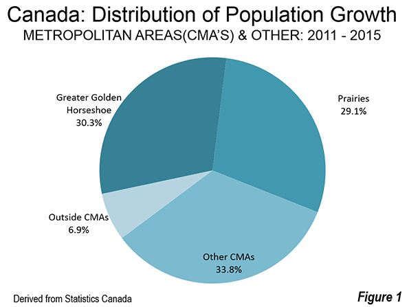
    Between the 2011 census and 2015, the Greater Golden Horseshoe accounted for 30.3 percent of the national population increase (Figure 1). The five Prairie Province metropolitan areas had 29.1 percent of the growth.

    Growth in the Greater Golden Horseshoe was above its national share of the population of 25 percent. The Prairie Province CMA growth was more than 2.5 times its population share, which was less than 11 percent in 2011.

    The CMAs outside the Greater Golden Horseshoe and the Prairie Provinces accounted for approximately 34 percent of the growth, somewhat more than their 30 percent share of the population. Areas outside the CMA’s accounted for only seven percent of the growth, a fraction of their 34 percent population share. This is a continuing indication that the metropolitan areas continue to draw more of the population growth.

    Changing Distribution of Growth

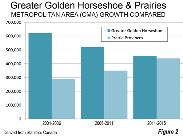
    The last decade and a half has seen substantial changes in the distribution of CMA growth. Between 2001 and 2006, the Golden Horseshoe metropolitan areas welcomed 40 percent of Canada’s population growth, well above the 30 percent over 2011 to 2015. At the same time, the Greater Golden Horseshoe reduction in the share of growth has been compensated by the gain in the Prairie Province metropolitan areas. Between 2001 and 2006, the share of national growth was 19 percent, which rose to 29 percent over 2011 to 2015.

    The population growth rate has slowed considerably in the Greater Golden Horseshoe metropolitan areas, from 1.7 percent annually between 2001 and 2006 to 1.1 percent between 2011 and 2015. Growth has risen considerably in the Prairie Province metropolitan areas, from 1.2 percent annually between 2001 and 2006 to 2.8 percent between 2011 and 2015. Numerically, the Prairie Province metropolitan area growth is now challenging that of the Greater Golden Horseshoe, despite the latter’s more than twice as many residents (Figure 2).

    Winnipeg’s would pass Québec in population by the 2021 census, if the growth rates of the last four years continue and would become the 7th largest metropolitan area.

    Fastest Growing Metropolitan Areas

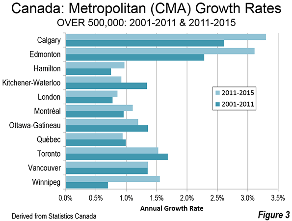
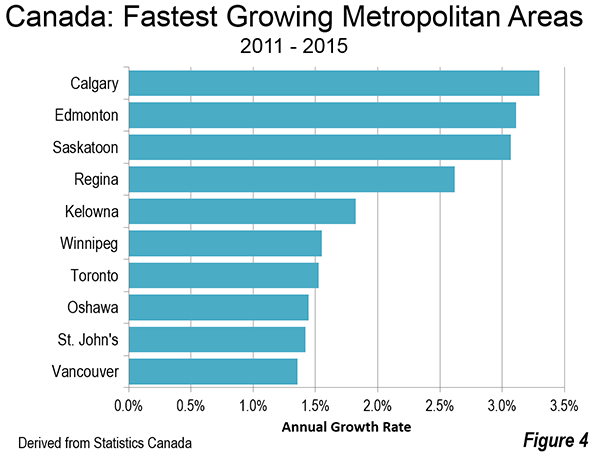
    Five of the six fastest growing metropolitan areas between 2011 and 2015 were in the Prairie Provinces. Calgary, Edmonton and Saskatoon topped the list, growing more than three percent annually (Figure 3). This is an extraordinary rate, better than three times the national growth rate. Regina grew 2.5 percent annually. Over this period, Calgary and Edmonton have both grown larger than Ottawa-Gatineau, which had been the fourth largest CMA for at least 40 years. One can expect growth in the two Alberta cities to slow with the decline in energy prices,  while the other prairie metropolitan areas, less oil dependent, though resource dependent, should do better.  

    Winnipeg, which was the nation’s fourth largest metropolitan area until 1961 and nearly as large as Vancouver as late as 1931, has begun once again  to grow more quickly, after decades of lackluster growth. Having slipped to 8th largest by 2001, Winnipeg ranked sixth in growth since 2011, trailing only the four other Prairie Province metropolitan areas and fast growing Kelowna, BC (1.8 percent annual growth). Unusually, Winnipeg’s growth rate exceeded that of Toronto between 2011 and 2015. Winnipeg’s annual growth rate was 1.6 percent, more than double its 2001-2011 growth (0.7 percent). Should Winnipeg’s growth continue at the most recent rate through the 2021 census, it could exceed the population of the Québec CMA and would trail only the six metropolitan areas with more than 1,000,000 population.

    The changing growth rates of the largest CMAs is indicated in Figure 4, which indicates the rising growth rates in the Prairie province metropolitan areas, with more mixed performance among the other larger CMAs.

    Largest Metropolitan Areas

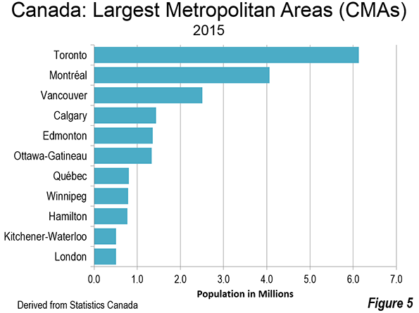
    Canada has eleven metropolitan areas with more than 500,000 residents. Toronto remains by far the largest, at more than 6 million and seems unlikely to be challenged in the foreseeable future. Montréal is closing in on 4.1 million, while Vancouver has just passed 2.5 million (Figure 5).

    The Future

    Canada’s fastest growing metropolitan areas also face the greatest growth challenges. The energy downturn has been particularly rough on Calgary and Edmonton, exacerbated by the disastrous Fort McMurray fire. There was a noticeable downturn in growth between 2014 and 2015 in both CMAs, yet only Kelowna grew faster in the last year. Other Prairie province metropolitan areas, less impacted by the energy decline, have seen their population growth rates fall. The growth rate was one third less than the 2011 to 2015 rate in Saskatoon and about 30 percent less in Regina between 2014 and 2015. Winnipeg fared best, maintaining 90 percent of its 2011-2015 growth rate.

    Other metropolitan areas face challenges every bit as complex. The economic dynamo of Toronto should continue to grow, though has faced strong domestic out-migration between 2004 and  2014, as the population disperses to outer metropolitan areas in the Greater Golden Horseshoe and outside Ontario altogether (See: "Moving from Canada’s Biggest Cities"). Montréal also experienced strong domestic migration losses, with half moving to other parts of Québec and half to other provinces. Vancouver, despite its incomparable attractiveness is also losing net domestic migrants. In all three metropolitan areas, the rising cost of living seems likely to be a major factor in the losses, with "tanking" housing affordability the apparent cause. Vancouver now ranks as the third least affordable major metropolitan area among 87 in the nine nations covered by the Demographia International Housing Affordability Survey, while Toronto’s house prices have risen at more than four times average household incomes since 2001 (see the Frontier Centre policy report: "Canada’s Middle-Income Housing Affordability Crisis"). House prices escalated almost as much in Montréal.

    With the outcomes of these conflicting influences unclear, Canada’s metropolitan area growth could go in different directions. This could range from growth patterns that are similar in the coming years, to the continued discovery by households of smaller metropolitan areas, a higher quality of life is possible because of the lower cost of living. This, has already been evident in the smaller metropolitan areas of Ontario and Québec, as households have been exiting Toronto and Montréal. Meanwhile, Canada is in the midst of its every five year census for 2016, the results of which should be available in seven months (February 2017).

    Photo: North Saskatchewan River from Edmonton central business district (by author).

    Wendell Cox is principal of Demographia, an international pubilc policy and demographics firm. He is a Senior Fellow of the Center for Opportunity Urbanism (US), Senior Fellow for Housing Affordability and Municipal Policy for the Frontier Centre for Public Policy (Canada), and a member of the Board of Advisors of the Center for Demographics and Policy at Chapman University (California). He is co-author of the "Demographia International Housing Affordability Survey" and author of "Demographia World Urban Areas" and "War on the Dream: How Anti-Sprawl Policy Threatens the Quality of Life." He was appointed to three terms on the Los Angeles County Transportation Commission, where he served with the leading city and county leadership as the only non-elected member. He served as a visiting professor at the Conservatoire National des Arts et Metiers, a national university in Paris.

  • European GDP: What Went Wrong

    First the two world wars, then a decline in the birth rate.

    Newspapers these days are full of stories on World War I which started 100 years ago. They are also full of stories on today’s anemic European economy, as for example with Italy’s negative growth rate in the second quarter and France’s struggle to reach 1% GDP growth this year. At first blush, these two sets of stories are unrelated. But on closer look, it is apparent that the economy today is a distant echo of the war a century ago. And it all comes down to Europe’s demographics.

    In my view, there are essentially three main catalysts of economic growth: innovation, demographics, and a favorable institutional framework. To illustrate this, imagine that a firm develops the best smartphone in the world but that there is only a potential market of 1 million buyers. Clearly, the wealth created by this innovation would be far smaller than if the potential market was 100 million buyers. Thus the importance of demographics.

    Now imagine that there is a market of 1 billion people but that there is no innovation of any kind. In this case, wealth creation would be greatly stunted and, with few new assets being created, wealth would become essentially a game of trading existing resources. Thus the importance of innovation. Finally, imagine a country where institutions are weak, where contract law is weak, where access to capital is difficult, where the government is corrupt and political risk is high. Here again there would not be much innovation because there would not be much capital or much incentive to innovate. Thus the importance of a favorable institutional framework.

    Too many deaths

    So going back to Europe, we could say that it has some innovation and that it has a favorable institutional framework, though in both cases to a lesser extent than the United States. What Europe lacks most is a strong demographic driver. It is enlightening in this regard to look at the sizes of European populations in the year 1900 vs. today:

     Population (millions)  1900 2014 Growth CAGR  TFR 
    France 38 66 74% 0.5%  1.98
    Germany 56 81 45% 0.3%  1.42
    Italy 32 61 91% 0.6%  1.48
    Russia 85 146 72% 0.5%  1.53
    Spain 20.7 46.6 125% 0.7%  1.50
    United Kingdom 38 64 68% 0.5%  1.88
    Brazil 17 203 1094% 2.2%  1.80
    China 415 1370 230% 1.1%  1.66
    Egypt 8 87 988% 2.1%  2.79
    India* 271 1653 510% 1.6%  2.50
    Indonesia 45.5 252 454% 1.5%  2.35
    Japan 42 127 202% 1.0%  1.41
    Mexico 12 120 900% 2.0%  2.20
    Nigeria 16 179 1019% 2.1%  6.00
    Philippines 8 100 1150% 2.2%  3.07
    United States 76 318 318% 1.3%  1.97

    * includes India, Pakistan, Bangladesh and Burma.

    Source: Various, United Nations. Data may include errors. Estimates vary due to shifting borders and uneven reporting.

    Two important points stand out:

    First, in 1900, European countries were not only the world’s economic and military powers. They were also among the most populous countries in the world. By contrast today, Russia is the only country in the top 10 most populous. Then Germany is 16th and France is 20th. More importantly, some of the new demographic powers, India, Nigeria, Egypt, Mexico, the Philippines and Indonesia, are growing at a healthy clip, as can be seen from their Total Fertility Ratios (TFR, see table) whereas European countries are growing very slowly at TFRs that will ensure stagnation or shrinkage in the sizes of their population. A ranking ten or twenty years from now may show no European countries in the top 20 most populous countries.

    Second, comparing European population sizes in 2014 vs. 1900 reveals a very slow annual increase in the 114 year period. And this is where the effects of the two World Wars, of the Spanish Influenza and of communism can be seen. Populations have grown with a CAGR of less than 1% per year for the last 114 years.

    The United States had fewer casualties in the two World Wars, more immigration and a strong post-war baby boom, resulting in a healthy 1.3% population CAGR and a near quadrupling of the population over the past 114 years. However, as I wrote previously, the US faces slower, sub 1% population growth in the next few decades.

    Here is the tally of deaths for some countries in the two World Wars:

     Millions of deaths  WW1 % of pop WW2 % of pop
     France    1.7 4.3%   0.6 1.4%
     Germany    2.8 4.3%   8.0 10.0%
     Italy    1.2 3.3%   0.5 1.0%
     Soviet Union    3.1 1.8% 22.0 14.0%
     UnitedKingdom    1.0 2.0%   0.5 0.9%
     United States    0.1 0.1%   0.4 0.3%

    Source: Various. Estimates vary widely and may include errors.

    Estimates of deaths from the Spanish Influenza of 1918-19 vary widely from 20 to 50 million people worldwide. And Stalin’s purges are estimated to have killed over 20 million. Tens of millions of people and a larger number of descendants would have been added to today’s European population had these events not occurred. I made the case last year that Europe’s economies and markets suffer from weak domestic demand and have for a long time been driven by events outside of Europe itself.

    Too few births

    In general, a large number of countries are facing a more challenging demographic period in the next fifty years compared to the last fifty. Since the 1970s, there had been a steady decline in the dependency ratios (the sum of people under 14 and over 65 divided by the number of people aged 15 to 64) of the US, Western Europe, China and others. This decline is explained by a lower birth rate and was accelerated by large numbers of women joining the work force in several countries. There were fewer dependents and more bread winners than in previous decades.

    In future years, dependency ratios are expected to rise due to the aging of the population in most countries and a decline in the number of workers per dependent. In the United States for example, baby boomers are swelling the number of dependents who rely on younger generations to support them in retirement (whether through taxes or through buoyant economy and stock market). But because boomers had fewer children than their parents, the burden on these children will be that much greater than it was on the boomers themselves.

    In effect, our demographics have pulled forward prosperity from future years. Had there been more children in the West in the 1970-2000 period, there would have been less overall prosperity during that time, but we would now look forward to stronger domestic demand and a stronger economy going forward.

    Note in the table below that the dependency ratio of Japan bottomed around 1990 which is the year when its stock market reached its all-time high; and that the dependency ratios in Europe and the US bottomed a few years ago around the time when stock markets reached their 2007 highs. The fact that several stock indices are now at higher peaks than in 2007 can be largely credited to America’s faster pace of innovation and to near-zero interest rates. Case in point: Apple’s market value has more than tripled since 2007.

    DependencyRatios

    India will soon be the most populous country in the world but because its dependency ratio is still declining, its growth profile may improve in future years. The same is true of Subsaharan Africa where the fertility rate is still high but declining steadily thanks to improved health care for women and declining infant mortality. As such both India and Subsaharan Africa could see faster economic growth than elsewhere, provided the institutional framework can be improved towards less corruption and more efficiency.

    Europe is in a bind in the sense that, even if it had the wherewithal to do so, it cannot now raise its birth rate without making its demographic situation worse in the near term (by raising its dependency ratio faster). For the foreseeable future, its economy will become even more dependent on exports towards the United States and emerging markets. The new frontier for European exports may well be in the old colonies of the Indian subcontinent and of Subsaharan Africa.

    Sami Karam is the founder and editor of populyst.net and the creator of the populyst index™. populyst is about innovation, demography and society. Before populyst, he was the founder and manager of the Seven Global funds and a fund manager at leading asset managers in Boston and New York. In addition to a finance MBA from the Wharton School, he holds a Master’s in Civil Engineering from Cornell and a Bachelor of Architecture from UT Austin.

    Lead photo 4 August 1914 (via Wikipedia)

  • Outer California: Sacramento Sends Jobs (and People) to Nashville

    A reader comment on a feature by John Sanphillipo (“Finally! Great New Affordable Bay Area Housing! Caught my eye.”). The comment ("You shouldn’t have to go to Nashville") expressed an understandable frustration about the sad reality that firms leaving coastal California often skip right over the Central Valley “where the housing costs are reasonable, there are some lovely old homes on tree lined streets, the humidity is less, the mountains are nearby, and you can drive there in 2-3 hours rather than fly.”

    Would that it were true. In fact, as this article will show, housing costs are anything but reasonable, given the median income, in the Central Valley, which along with the rest of the non-coastal portion of the state, will be referred to as Outer California in this article.

    California Housing Affordability: Into the Abyss

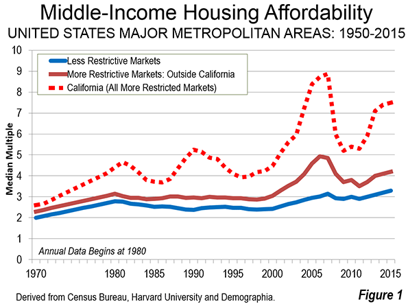
    California’s severely unaffordable housing is legendary, having escalated from approximately the average national price to income ratio in 1970. This is most evident in the four largest coastal metropolitan areas, Los Angeles, San Francisco, San Diego and San Jose. Out of the 87 major markets (over 1 million population) in nine nations, these markets ranked fourth, seventh and in a ninth place tie for the least affordable 8n the 12th Annual Demographia International Housing Affordability Survey. Their median multiples (median house price divided by median household income) required from 8.1 to 9.8 years income to purchase the median priced house. This compares to the affordability of these and other California markets which had median multiples of approximately 3.0 or less in 1970 and in prior years (Figure 1).

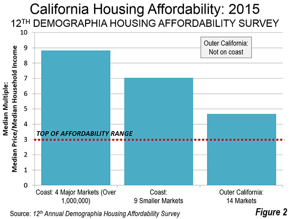
    The housing unaffordability of these markets, with an average median multiple of 8.8 is rivaled by the smaller coastal markets (such as Monterey County, San Luis Obispo, Santa Barbara and Ventura County), with their median multiple of 7.0. Both market categories are rated as severely unaffordable. But housing has become seriously unaffordable even in Outer California, where the average median multiple is 4.7(Figure 2). House prices have been escalating relative to incomes in Outer California since the housing bust, before which their housing affordability was even worse than now (below).

    Housing Affordability in Outer California

    A few examples will make the point. Riverside-San Bernardino, and exurban metropolitan area adjacent to Los Angeles had a severely unaffordable median multiple of 5.2 in 2015. Sacramento, had a seriously unaffordable median multiple of 4.7. Both of these major metropolitan areas reached far higher median multiples in the run-up to the housing bust, with Riverside San Bernardino reaching 7.6 and Sacramento reaching 6.6.

    But the problem is by no means limited to the largest metropolitan areas. Stockton, now officially a part of the larger San Jose-San Francisco combined statistical area as a result of a housing cost driven exodus of commuters from the Bay Area has a severely unaffordable median multiple of 5.3. Things were much worse in the run-up to the bust, at 8.6. Even long depressed Fresno, far from either the Bay Area or Los Angeles, is nearing severe unaffordability, with a median multiple of 5.0 and reached 7.2 during the bubble. More remote Chico, one of the smallest US markets in the Demographia survey also has a median multiple of 5.0 (see Central Valley map at the top).

    Modesto, a 2020 candidate for addition to the San Jose – San Francisco combined statistical area due to the overspill of households seeking houses they can afford, also has a seriously unaffordable median multiple of 4.5. Modesto reached 7.6 during the bubble.

    Among the 29 markets rated in California, the most affordable was Bakersfield, which in a few years is likely to follow Fresno into the over 1 million category. During the bubble, Bakersfield reached a median multiple of 6.6. Small town Visalia, nestled against the Sierra foothills, tied Bakersfield’s most affordable 4.3 median multiple, and reached an astounding 5.8 during the bubble. Hanford also tied for the most affordable.

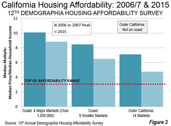
    The comparison to the bubble peaks is particularly important because it illustrates the volatility of housing markets. Even in small markets, house prices are prone to explode when demand exceeds supply, due in large part to land use regulatory and environmental law structure that restricts housing even in more remote areas,   driving prices up (See William A. Fischel, Regulatory Takings). Figure 3 shows that California house prices in each of the three geographic categories were even more unaffordable during the bubble than today.

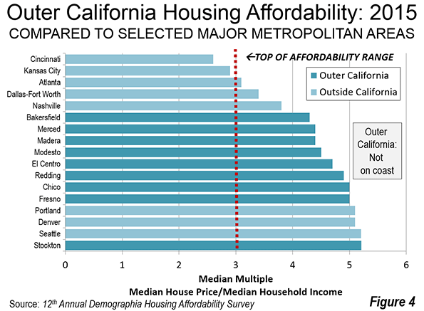
    Even at their current housing affordability levels, the housing markets of Outer California are considerably overpriced. This is indicated by Figure 2, which compares the median multiples in Stockton, Fresno, Bakersfield, Modesto, Redding, Chico, Merced, Madera and the Imperial Valley’s El Centro with severely unaffordable and overregulated Portland, Seattle and Denver, as well as Nashville and other major markets that are more affordable than any in California (Figure 4).

    Indeed, out of the 231 US markets in the Demographia International Housing Affordability Survey, the 27 California markets represent nearly half of the 58 most expensive.

    Meanwhile, a recent report by Zumper indicated among the 50 largest municipalities in the nation, four of the most expensive seven are also in California, with the city of San Francisco ranked number one, followed   San Jose at third, the city of Oakland at fifth and the city of Los Angeles at seventh. Eight of the most expensive municipalities out of the 100 largest are also in California, such as Palo Alto in the Bay Area, Coronado in the San Diego area and Santa Monica in the Los Angeles area.

    As if the regulatory and legal structure that combined with the artificially higher demand from loose lending policies were not enough, barely a decade later California is in the process of implementing one of the most radical land-use regulatory structure in a liberal democracy. It will be far more difficult in many areas to build the detached housing that is been the mainstay of the state, which already has the highest urban population density in the nation (see: “California declares war on suburbia"). This suggests that housing affordability is likely to worsen further.

    There is good reason for a both companies and middle income households to stay away from or leave California.

    More than Housing Affordability

    But people and businesses are moving to places like Nashville for reasons other than housing affordability. The state could hardly make it more clear that most business is not welcome. For at least 10 years, CEO Magazine has rated California as having the least favorable business climate. With competition like Illinois, Connecticut and New Jersey, to be ranked 50th with such regularity is a notable underachievement.

    Data recently released by the California Manufacturers & Technology Association (CMTA) indicated that California ranked last among the states in per capita attraction of manufacturing investments in 2015. Corporate relocation specialist Joseph Vranich continues to add to a long but for California unfortunate list of companies and jobs that have recently left the state (see: "California companies had for greatness – out of California).

    Of course, California is a beautiful place with one of the best climates in the world. But   millions of people and many companies have found greener pastures in Nashville, Austin, Dallas-Fort Worth, Houston, Charlotte, Atlanta and elsewhere. People will continue to visit, but the exodus is likely to continue.

    Wendell Cox is principal of Demographia, an international pubilc policy and demographics firm. He is a Senior Fellow of the Center for Opportunity Urbanism (US), Senior Fellow for Housing Affordability and Municipal Policy for the Frontier Centre for Public Policy (Canada), and a member of the Board of Advisors of the Center for Demographics and Policy at Chapman University (California). He is co-author of the “Demographia International Housing Affordability Survey” and author of “Demographia World Urban Areas” and “War on the Dream: How Anti-Sprawl Policy Threatens the Quality of Life.” He was appointed to three terms on the Los Angeles County Transportation Commission, where he served with the leading city and county leadership as the only non-elected member. He served as a visiting professor at the Conservatoire National des Arts et Metiers, a national university in Paris.

    Photo: Map of Central Valley (Sacramento Valley to the north, San Joaquin Valley to the south) courtesy of the U.S. Geological Survey